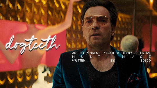
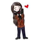
#*( new promo to fit colors ~
Text

I wasn't me , I ain't scared now
I wasn't me , I don't care now.
#&. ( self promo ) . */ so you've decided to become isolated and weird /#*( new promo to fit colors ~#dc rp#crime rp#horror rp#scream rp#indie oc rp#indie rp
22 notes
·
View notes
Text
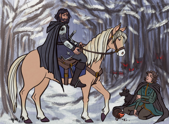
until we get further confirmation i have decided one of my headcanons about the unknown camp beads is that the bead before Percy’s first summer was about Clarisse’s first summer. she’s only a year older than Percy but seemingly became one of the most notable campers within a year of her joining, which i imagine was probably noteworthy enough to warrant a bead.
#pjo#riordanverse#percy jackson#clarisse la rue#also the new promo photos for the show include Annabeth's necklace having a red bead#which would be fitting for a Clarisse-inspired bead since it'd match her cabin's colors
53 notes
·
View notes
Text
okay. alright. am I revamped now. did I do it. am I forgetting something
#at some point I’ll have to fix my blog theme but today is not that day#I have a promo I have a carrd I have a pinned post#IS THAT EVERYTHING DID I DO IT#SOMEBODY HELP ME IM SO CONFUSED#ooc.#also I have a new icon. bc I do like the updated cover art actually it’s got the right color palette#the old one was like. it fit the fairy tale theme but it didn’t fit cress :(
0 notes
Text
So, just in general, where do yall get your inspirations for your promos? Just seeing templates and using those? Or do you actually work on your own thing?
#✫ Out of Clurblopf ✫ | OOC#I wish I wouldn't be thinking about doing a new promo already again ugh#problem is I have no idea what I want yet or how I want it to look#would love to have it colorful and/or glittery but both of these aren't always easy#and all these muses how am I supposed to fit them all onto sth#I know some ppl do promos with just a few of their muses but that'd feel off to me#(plus I would probably want to not include star if I have to choose; bc she's already so well know and interacted with#and making a promo without her wouldn't be right either kinda? idk)#okay here I go rambling again ugh time for sleep
0 notes
Text
The Subtle Art of Becoming "That Girl" in 2024 🌸✨
°❀°•❀•°❀°•°❀°•°❀°•°❀°•°❀°•°❀°•°❀°•°❀°•°❀°•°❀°•°❀°•°❀°
Hello beautiful souls! It's me, Sophia. If you are new reader then
Hi! I’m Sophia and I want to empower women to prioritize their well-being while pursuing their dreams🌟
Today, I woke up feeling extra inspired by the #thatgirl aesthetic. You know her – she's the girl who embodies self-love, radiates positivity, and just seems to have her life beautifully organized. Personally, I believe, she's not just a trend; she's a movement towards becoming the best version of ourselves. And guess what? Becoming "that girl" isn't about perfection; it's about progress. It's about embracing the journey of self-improvement, self-care, and love. So, let's dive into a few ways you can bring a little bit of "that girl" magic into your everyday life:
1. Morning Rituals ✨
Start your day with purpose. Whether it's a morning skincare routine, meditation, or writing down your thoughts in a daily planner, find what centers you. If you have been following me for a while then you know how important this is. Remember, it's these small rituals that set the tone for a productive, positive day.
2. Self-Care Sundays 🛁
Dedicate time each week to pamper yourself. This could be a long bath, a skincare routine, or even a cozy evening with a book. It's all about showing yourself some love and appreciation.
I remember back in my childhood my older sister used to always have pamper sundays and I would always try and follow her footsteps however, back then your girl was as lazy as one can be...so zero exceptions. Be better than me girls and make the future you be proud.
3. Clean Girl Aesthetic 🌿
Embrace the clean girl aesthetic with a minimalist wardrobe, clean makeup looks, and a tidy space. A clutter-free environment not only looks good but also brings a sense of calm and order to your mind. Clean home = clean mind + remember clean body
4. Find Your Fitness Love 💕
Whether it's pink pilates, yoga, or a brisk walk in the park, find a physical activity that you love. It's not just about the physical benefits but the mental clarity and energy boost it brings.
5. Nourish to Flourish 🍓
Eating well is a form of self-respect. Fill your plate with colors, textures, and nutrients. It's not just about looking good, but feeling good from the inside out.
6. Learn and Grow 🌱
Embrace new hobbies, read more books, and challenge yourself to learn something new often. Growth is a huge part of becoming "that girl".
7. Stay Organized 📒
Invest in a good daily planner to keep track of your goals, appointments, and to-dos. There's something incredibly satisfying about ticking off tasks and staying on top of your game.
And here's a little secret for you: part of my "that girl" journey includes creating pieces that speak to my soul. I stumbled upon this adorable Etsy shop aka my Etsy Shop [GlowInGrow] that just screams self-care and love. My THAT GIRL planner is something that I did with love and my own hands. For me, it's not just a planner, it's my way of helping others because that's what being her is. Being her means she shares her secrets to help the rest of the girlies. MESSAGE ME FOR THE PROMO CODE *hint*
Also this planner has got you covered from setting your intentions and tracking your habits to planning your meals and self-care routines perfect for anyone looking to add that extra touch of mindfulness and beauty to their daily routine. It's subtle, but oh, so beautiful. 🌟
AND REMEMBER;
Becoming "that girl" isn't an overnight transformation. It's about making small, meaningful changes that align with who you are and who you aspire to be. Let's embrace this journey together, one step at a time. 💕
Last but not least, at the end of your journey of becoming that girl awaits the future who is The Girl!
Stay safe and stay hot...
With Love,
Sophia
°❀°•❀•°❀°•°❀°•°❀°•°❀°•°❀°•°❀°•°❀°•°❀°•°❀°•°❀°•°❀°•°❀°
#thatgirl#selflove#selfcare#dailyplanner#glowup#selfimprovement#softgirl#lovecore#thatgirl2024#becomingher#That girl planner#that girl#that girl aesthetic#that girl routine#clean girl#daily planner#self love#self care#wonyoungism#becoming that girl#becoming her#self improvement#glow up#pink pilates princess#soft girl#that girl 2024
198 notes
·
View notes
Text
To everyone getting a new sewing machine, as well as everyone who is working on last-minute holiday presents:
If the decorative stitches on your sewing machine are coming out ugly, there's a few things to try.
Your decorative stitches are basically embroidery, so give the project the same support you'd give a machine hoop embroidery project.

Bobbin: embroidery bobbin thread is much thinner than standard sewing thread. This really cuts down on the bulkiness of the stitch. If you want your decorative stitching to lie flat, you want to reduce bulk. You're having problems in a satin stitch, where the thread piles up on itself, makes a knot, and stops feeding? Embroidery bobbin thread will help prevent that, because it takes a lot more embroidery bobbin to make a knot big enough to stop the feed teeth. It's also thinner, so you can fit more on a bobbin and need to change your bobbin less. Embroidery bobbin is usually only available in two colors, but it's made so that your top thread will wrap onto the back and look prettier.
Stabilizer: For any hoop embroidery project, you need stabilizer. You can also put it behind your fabric in a decorative stitch. This will keep the fabric lying flat, and support your stitches. Some decorative stitch patterns will have the stitches very close together, and many woven fabrics can't support that many stitches. Stabilizer is meant to provide that support. There's versions that tear away (my current favorite is tear-and-wash), or that stay in the fabric permanently. If the back of your project isn't visible, keeping the stabilizer in there will show off your stitches and make it more attractive.
You can buy a single promo pack of tear-away stabilizer for like $5, and if you're only using small strips of it to reinforce decorative stitching, it'll last you a really long time.
Thread: If you're doing a project with decorative stitching, you might as well use a decorative thread. Embroidery thread, must like my dear cat Teensy Buttons, is very pretty, but not very strong. While you don't want to use most machine embroidery threads for construction stitching, it does decorative stitching really well. If you're doing satin stitching, the shininess of the thread will really emphasize the stitching. For decorative stitching that's composed of single lines of stitching, switching to a 40wt embroidery thread will make the design stand out more.
Source:
Very pretty. Nothing going on in her head. We love T-Butt.
Anyway, when people call my store and are having decorative stitch problems, that's exactly what I tell them: Switch to embroidery bobbin, add some tear-away stabilizer, get some embroidery thread, look at how cute my cat is.
299 notes
·
View notes
Text
Live-Action Promo Pics: Ozai
Hi everyone, I know I’m pretty late to the party, but I just wanted to give my two cents on the costuming for the second batch of promo pics we got last month. Afterwards, I’m going to be doing a very thorough breakdown of both the fresh and familiar elements showcased in the new trailer. I’ll also be giving my two cents on the casting for the adult characters, as I feel they’re far along enough into their careers to not care what some random person on Tumblr thinks of them.
Ozai

What I Liked
The topknot crown (guan) looks great. They translated the simple look from the animated show into a really elaborate design in live-action that’s fitting of the Fire Lord’s status.
The facial hair looks quite realistic and natural. Facial hair on East/Southeast Asian men tends to grow pretty straight--- until they hit their senior years, when the head and facial hair start to get bushier.
The brocade pattern on his outer robe is cool. The diamond shapes remind me of the sort of patterns you tend to see on traditional Thai fabrics.
They retained his silhouette and color scheme. I know that’s the bare minimum, but I’m still happy that he’s immediately recognizable as Ozai, unlike his movie counterpart.
What I Didn’t Care For
His outfit is really red. I know it’s the Fire Nation’s signature color, but an abundance of bright red tends to be hard on the eyes. This is why most Fire Nation characters dress in much more muted reds, usually with black and grey as secondary colors. His solid red robe with all the shiny, gold detailing makes him look cartoonier than his counterpart in the actual cartoon.
I’m not a fan of the spaulders directly attached to his outer robe. Having them be sewn/glued on to the clothing makes them look flimsy, rather than imposing. It also bothers me that the layers of his spaulders aren’t uniformly curly--- although this is just a personal pet peeve of mine.
I really wish they had incorporated the triangular shoulder pieces from the show into his outfit. It would have made him look more imposing and offset some of the searing red in his outfit. It’s not as if there isn’t any precedent for this kind of armor either; there are real-world examples from SE Asia that they could have used as inspiration. (Picture below: Thai, Burmese, and Lao shoulder armor.)
This design is not amazing, but also not terrible. About what I was expecting: A recognizable, if somewhat underwhelming, interpretation of Ozai.
Overall, I give this look 5 evil goatees out of 10.
I will say that I’ve warmed up to Daniel Dae Kim as Ozai. He’s got an imposing and regal aura, but I still wish a younger actor was playing the role. It would have created an even starker contrast between the vicious younger brother and the wizened elder brother.
174 notes
·
View notes
Text
Spy x Family miscellaneous collab scans - part 1
I'm back with more HD scans! 😁 Since it doesn't look like we're getting another SxF artbook with new collab/promotional illustrations anytime soon, I thought it would be fun to make scans from other scannable sources like postcards, stickers, etc.
First, the "house painting" designs used for merch at this year's Jump Festa. I only got stickers of Twiyor but Anya and Bond have designs as well. These are some of my favorites, their poses are really dynamic and I love how the white looks with the bright paint colors ❤️ I got acrylic stands of these designs as well, which I'll share in a future merch post.

Next are the camping designs that I got postcards of at a recent Animate promotion (got acrylic stands as well). Loid doing the cooking and Yor getting firewood is fitting! Not sure what Bond wants to do with that pinecone though 😆
Next are cute chibi designs from the movie! They were used on box art and merch for the Meiji chocolate collab.
Next is postcard art from last year's Tower Records collab.
And lastly for this post, the Waku Waku Park promotion that's currently going on! I've had no luck getting acrylics with these designs but I got a clear file at least...didn't think it would scan well but it actually came out pretty good 😃 I love the pink/blue/white color coordination of their outfits (and Bond's bowtie!)

---
I have another batch of collab art scans that I'm going to share soon, and I plan to make more of these posts whenever I get a good amount of scannable items with promo/collab/merch designs that haven't been available in any artbooks.
#spy family#spy x family#sxf#spyxfamily#loid forger#yor forger#anya forger#bond forger#twiyor#sxf anime#sxf scans
125 notes
·
View notes
Text
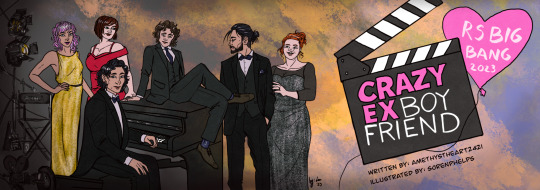
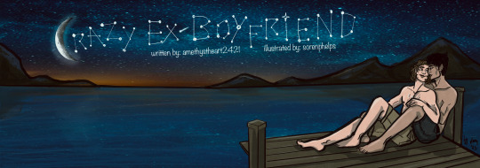

All the artwork I made for the fanfic Crazy Ex-Boyfriend by @amethystheart2421 for this year's @rsbigbang!
It was a wild run, we got paired up quite late due to our original pairs dropping out of the Bang, and even though it was already December and time was running thin, I decided to make this whole deal a way bigger challenge than it supposed to be... So I ended up drawing all 7 fantasy sequences, trying to mimic a different style for all of them, and finishing both versions of the banners I had in mind. I know, I know, but I swear even I wasn't aware that I am such an overachiever either!
Also, I usually like to hide little details as easter eggs on all of my artwork, so naturally this was the case with these too. I'm gonna list them one by one, also share a little story about each piece, sort of like a "directors cut werk", just so we stick to the screenplay motif. The numbers in brackets lists the order in which I drew the pictures.
The banners (1.,9.): I haven't watched Crazy Ex-Girlfriend the show, so I really had no idea about this whole thing, hence my initial idea of re-drawing one of the official promo posters of the show as the banner. But then Nicole shared the first scene with me when we got paired up, and also told me that her original artist wanted to draw the stargazing scene, which I also really liked. I sketched out both versions to see which one would look better, and also to warm up a bit for this version of the characters. (Nicole also shared some faceclaims, so except Sirius' and Lily's design, I tried to stick to her vision as much as I could.) The Netflix poster was considered the final one for quite a while. The stargazing banner was the last piece of artwork I finished, which I also edited to be used as Chapter dividers. I liked the idea so much I actually referenced the starry sky on the other pictures too. On the Netflix banner, Remus' socks and Sirius' suit handkerchief (how do you call those things in English, gahh) both have the starry pattern.
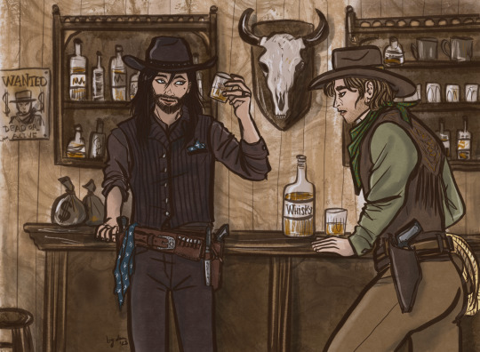
The western (3.): By this time it was decided that I'd do all fantasy sequences in a different art style, but I couldn't really come up with any specific style which could have fit the western vibes, so the characters are drawn in my own usual style, only the colouring is different. I tried to go for a sepia effect, without using a filter, I think I could pull it off well enough. I was considering to draw Sirius as a Native American for this, because I just don't see him as Caucasian in general, and also, Black Dog sounds like a badly translated indigenous name... But I discarded this idea for the sake of "historical accuracy" (and to save time, haha), as I think they wouldn't visit a saloon this way. I added the starry sky pattern to Sirius' handkerchief and... scarf? (I really should learn how certain textil items are called in English...) There is a wanted poster in the background with Voldy. And I swear I didn't mean to draw Remus looking this horny, it just kinda happened by accident! He is sure VERY fascinated by Sirius'... pistol.😜
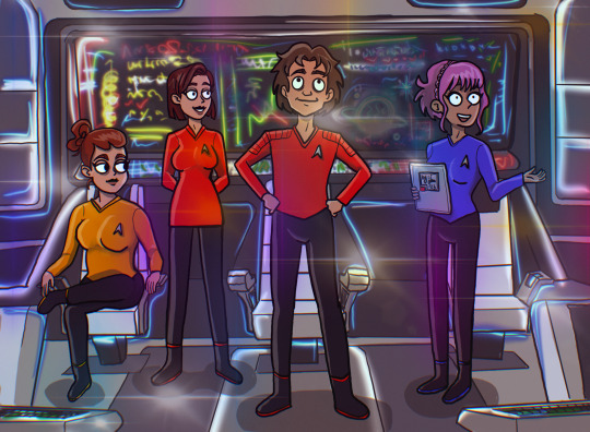
The Star Trek (6.): My original idea was to draw like usual and just add so many lensflares to the picture that it's not visible if I copied another style or not. But in the meantime I started to watch Star Trek: Strange New Worlds with my bf and also found out that there is a new cartoon too, so it was then settled. This style is very different from my own, but it was so much fun! It was weird not to draw every single strand of hair in excruciating detail, actually that was the hardest part, haha! I struggled a bit with the placement of the lensflares too, the first version had too many and too bright, it had a disco vibe rather than a spaceship. I wanted to add easter eggs to the background screen, but I was running out of time, so there's only one light blue star similar on the screen! Also now I know that the uniform colors are not really consistent in Star Trek, and Remus’ might have had to be gold as Captain…🤷🏻♀️
The Disney (2.): This one sparked the first idea in my head after I read all fantasy scenes Nicole kindly shared with me. When I first sketched this, I still had no idea that I will end up drawing for every chapter and the style copying was not settled either. It started with this piece, I had the vision of the wolf chasing scene from Beauty and the Beast, and we were discussing whether it's plausible to collect berries during the winter or not... I've tried to make the final piece look as classic Disney as I can, and since I could pull it off, it was not a question anymore whether I'd try to do this with other styles for the other scenes. Retrospectively, this one was the easiest to make, apparently my usual style is not that far from Disney (I grew up watching those movies, so it's not a surprise), but I had to really focus on drawing the animals, it's been ages since I last drew any! (The trick is to give them eyebrows, and bam, it's Disney style!) Sirius' armour, clothes and sword has the star, and I also designed his own "crest" with the black dog and a star on his shoulder plate. The whole concept of the picture is Sirius' side being very bright coloured, while Remus' with the scary wolves in the background being very dark. This might have worked better if it was not set in the winter, but I wanted to stick to the Beauty and the Beast vision I had.
The Comicbook (4.): I was very excited for this one, I really like the looks of the old Batman the animated series, and the way some of his comics are drawn. It's such a unique style, I really like the simple shapes and bold contrasts. Well, it turned out I am very bad at this! I struggled quite a bit trying to capture what I had in mind, but I couldn't even come close to it... So I kinda cheated a bit because I just traced the lineart directly from the reference pictures of Batman comic books I found online. I tried to make Remus less buff, but it looked very weird, so I let him keep his muscular Batman body instead. I drew the wolf mask and the whole Sirius panel, and the coloring went smoothly after I finalized the lineart, even though I only realized that I switched the colour schemes of Remus' superhero outfit when I looked up the quotes for the comic panels, oops. Overall I like how it looks, but I am not that proud of it as I had to "cheat".
The Hobbit (5.): I've probably spent the most time with this one! I actually really like Martin Freeman as an older Remus FC, so I was quite excited to do this piece. My original idea was to mimic John Howe's style, as he is the Tolkien illustrator god, but his level of skill and mine are very very far from each other... and as I struggled a lot with the Batman piece, I felt like going for a smaller challenge. That's why I decided to have a go at Alphonse Mucha's art nouveau style. Turned out it was the worst possible idea! 🤣 The whole point of art nouveau is depicting attractive ladies in an ethereal way... But if you switch the ladies with a fat hobbit, the vibe def won't be the same! The first version just looks so extremely absurd, it's both awful and hilarious. By the time I could fix the pose so it wouldn't look as ridiculous, the final style looked nothing like art nouveau... I still have no idea what style it is now, not my own or any of the ones I tried to capture, that's for sure. I considered adding the star pattern to that tablecloth, but I decided that the lupin flowers in the foreground and the whomping willow-like tree are enough reference for this pic! I like how it turned out in the end tho, I think I could do justice for the watercolor-looking coloring technique, and the end result looks a bit like a fancier version of old children's book illustrations... Which is essentially what The Hobbit is, so it all sorted itself out by the end.
The Anime (7.): I like anime (I'm a little picky about them tho), so it was not a question that I would give this style a try! I am a huge fan of cyberpunk (the genre), so initially wanted to do that, I'm such a slut for Ghost in the Shell and I really like the aesthetics of the Akira posters, but after reading the actual scene, it was not really fitting. So I saved the cyberpunk AU for later, and went for the post-apocalyptic vibe instead. Obviously anime had a great influence on my art style, so similar to the Disney one, it was not that much of a challenge to mimic it. However I'm not that good at drawing backgrounds, and oh boy, I really made myself get over this obstacle with this series of pictures! Also as I was more comfortable with this piece, I actually added the starry sky pattern from the beginning to the scarf/blanket Remus has on this picture!
The Sitcom (8.): The original idea was to copy Hanna Barbera's old family cartoons' style, but as my deadline was very close and after reading the scene I realized that it will have a shitton of characters, I quickly abandoned my original plan. So this one is drawn in my own style, sort of, the designs of the characters are more aligned with Nicole's vision (sans Sirius, Lily, and partly Peter). The hardest part was definitely to figure out how I could fit 10 characters into one picture, let alone sitting in a living room! Also, I had to actually draw the living room too, considering perspective and scaling... Something I am not that good at. In the end the coffee table is maybe a little too big, but I needed that to hide the legs of the characters sitting on the sofa, haha! Also, the sofa is the Millennial Dark Green Velvet Sofa, because I also want to have one and it really emphasizes the general existential dread! (Just kidding.) Also also, I just realized that I have no idea how to eat tacos without making a mess (they are not that popular where I live). I added the starry sky pattern to Sirius' shirt, and gave a Teenage Mutant Ninja Turtles T-shirt to Peter, as he is talking about that in the scene. I wanted to squeeze in further references to the newspaper Remus is holding, but it was too tiny. The star from Knight Sirius' armour is in the background on the bookshelf. Also that globe just makes no sense but I had no better idea how to fill the empty space 😅. Molly is holding a mug with "BEST MOM" written on it, and I intentionally made Marlene's eye colour the same as Remus', who btw should have worn a bathrobe according to the original scene, but it was too late to fix that by the time I realized it. All in all, I am quite satisfied with how it turned out, it has the necessary sitcom vibes. And it is kinda a record for me in terms of number of characters drawn (the most was 12, but that one has no background, so I'd call it a tie!)!! I am very proud of myself for pulling this piece off, it really is the achievement of the year!
TLDR; (I mean really, my rambling is just too long!) I am happy that I was paired up with Nicole, working with her was such a creative process! My absolute favourite thing to do is work on AUs, and she has provided me with the opportunity to do so, I am grateful! It was truly a pleasure to participate in this (even if it's not that clear from all the complaining I just had above, haha)! If you ask me nicely I might show you the cursed first version of the hobbit picture!
#r/s big bang#wolfstar#sirius black#remus lupin#regulus black#james potter#lily evans#nymphadora tonks#molly weasley#peter pettigrew#harry potter#marlene mckinnon#dorcas meadowes#crazy ex girlfriend#lotr au#cowboy au#disney au#star trek au#anime au#sitcom au#batman au#fanart#art by lau#lau draws with a tablet#collaboration#marauders#amethystheart2421
63 notes
·
View notes
Text
undefined
youtube
We got ANOTHER promo y’all!!! It’s technically a trailer but it’s thankfully very brief, given the runtime it’s hyping up is only two episodes, compared to usual TOH trailers that are advertising at least nine episodes! This is an official release and NOT a leak!
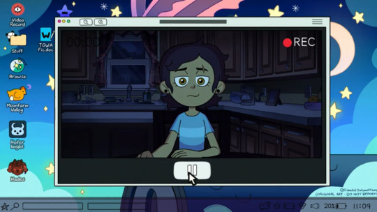
First off, Luz’s laptop!!! She’s doing this 11:09 pm at just 20%, she’s got references to Stardew Valley and Hollow Knight on her desktop, and I think that one Hades game? The one with Zagreus? Anyhow the Hollow Knight references are REAL, coupled with the S1 intro, makes you wonder if it influenced stuff like Hollow Mind…!
Luz also has a Good Witch Azura fanfic file! And she’s recently made art since her return to the human world; You can’t see all of it, but it appears to the Owl House’s roof, in a parallel to how the intro usually ends with Luz, Eda, and King on the roof when she ignites a light spell and pushes it into the sky! Augghhhh she’s coping…! And her username is @FriendofOwlsandTitans… Oh my GAWD! She accepts King as a TITAN she’s a friend to TITANS!!! Original art do not steal, just like her GF!
“All I ever wanted was to be good at something”… Good lord, if that doesn’t summize SO much about Luz. Her feelings of inadequacy. Her initial dreams of being a chosen one. Her desire to help others and be of service to them. Her need to JUSTIFY her own existence, to quote her girlfriend… That hit hard. Like I know but OW.
She’s making video diaries again as we guessed, but this time to HERSELF; Girl needs a place to vent, good for her! She probably stayed up and snuck to the kitchen to let herself indulge in her dark feelings and thoughts alone. Did Luz make a video for Eda and King and eventually give up, being forced to confront herself inward without any distractions? She says she knows what she has to do now, is… Is Luz about to do something rash? Something involving Belos? Babey don’t hurt yourself, or maybe she just means the general principle of making thing right!

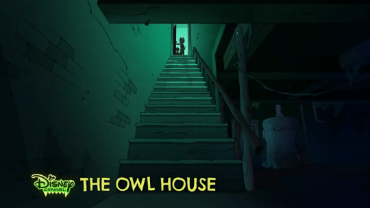
Then skipping past stuff we DO know, we see Luz and Hunter dressed up for Halloween! Hunter has a HOOTY mask, likely meant to invoke his Golden Guard persona, and Luz is honoring King OH MY GAWD WAAAIIIIII!!!!! She’s MOURNING her Titan brother, just like she mourned Eda! They’re in a dilapidated house, the shack where the Portal opens? They’re armed… Probably investigating paranormal activity, AKA Belos. This fits with another shot of them entering a basement with the same coloring as the house, atop the stairs!

We get a proper look at Amity and Gus’ new designs in the show’s own art style! They look AMAZING… They painted Hooty’s face on the door, pffft, but also ouch. The longing. Treating this place as an earthly version of the Owl House because it kind of is with its role and even coloration! If they miss Hooty you KNOW it’s been a while. Willow must’ve grown flowery vines outside to spruce up the place, it seems to have been converted into a fulltime hideout! If this was the old Wittebane home, I’m sure Caleb would appreciate it… Philip on the other hand.
The door seems to have just… Opened on its own as Amity looks back. Or did somebody, probably Luz and/or Hunter (seeing a glimpse of Gooplos?) quietly leave, and Amity only notices when she hears the door swinging behind them?

We have a hand, either Amity, Willow, or Hunter’s, reaching out to some glow-in-the-dark night decorations; Including a symbol of the moon and sun. This is likely one of the characters mourning and being reminded of the Collector, rather than in-universe connection.
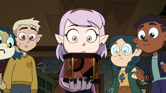
We see our cast, sans Luz, looking at some sort of box with styling reminiscent of the Portal! Not only does it suggest it was actually Caleb and his wife who made it (and Philip plagiarized), but also! Caleb must’ve left it behind in the human world. When Flapjack was pecking at the floorboards, was it to find this? It must be a clue, perhaps on how to make a portal, a Titan’s blood rift, etc.! Is this distraction what got Luz to sneak out earlier?
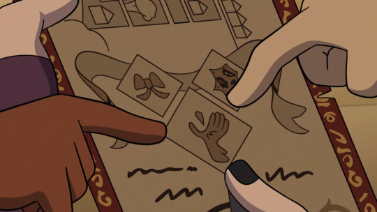
There’s some sort of book page we see next, presumably the contents of the box the kids found given their hands! I’m not sure the significance of the symbols, but the bottom one reminds me of the curse… Or is it just a reference to Clawthornes loving birds, AKA his wife? Is that some sort of teardrop? Maybe it’s Titan’s Blood and that’s meant to be a FURRY arm of a Titan! And what even IS that thing to the right?!
Hunter says “Did you know that HE was here?!” In a distressed voice. Is this him potentially confronting one of our protagonists for keeping information about Gooplos’ potential survival, regardless if they actually knew and were hiding? Or him talking about Philip and Caleb to perhaps Luz, with the realization that either was a town founder, and inquring as to how Luz didn’t notice!
Then we get Gus and Hunter THE BROS dressed up for Halloween, Hunter doesn’t want to hear spoilers because Gus is likely talking about a recent human hyperfixation of theirs! Brothers.
And then, finally… Luz and Hunter aren’t here, it’s just the other kids, maybe those two are at some other part of the zoo more personal like the aviary…
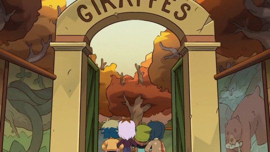
WE GET THE LONG-AWAITED ANSWER TO THE GIRAFFES!!! AFTER TWO YEARS, ARGUABLY THREE IF YOU CONSIDER WHEN THE FIRST TEASER THAT MENTIONED GIRAFFES WAS RELEASED!!! Since the very beginning, we have been haunted by this question and whether they’d answer it, but now… NOW…! It all comes to light.
The kids are obviously scared and locking arms in preparation, that’s so cute, venturing into ancient territory that hasn’t been traversed for generations. WILLOW HAS HER HAIRCLIP FROM WING IT LIKE WITCHES!!! Was it a gift from Amity, I MISSED IT SO MUCH! She takes a picture and a Giraffe, recognizing natives from its home realm, FREAKS…
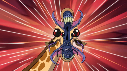
We get one idea of why Giraffes were banned and it makes sense. God the kids’ reactions are so funny. Of course Willow the Bravest is bold enough to step ahead and take pictures for the rest! This is such adorable levity and I appreciate the closure, this is their one chance so of course they’d take it after two months of debating if they should risk it! Mayhaps they regret that risk now.

#the owl house#the owl house season 3#analysis#luz noceda#the owl house hunter#willow park#amity blight#gus porter#augustus porter#vee noceda
640 notes
·
View notes
Note
Have you heard the news? Apparently Hannah said on tiktok they are reusing old costumes. She is orange, Naomi is teal and Gabriella is silver because an existing pink doesn’t fit her and I guess they don’t want to go look at the black ones :/

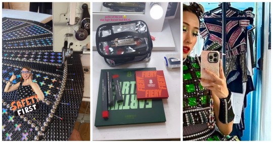
First of all so sorry for going MIA for two weeks in the middle of peak six chaos time. Life got crazy (read been drowning in work, working like crazy in cosplay for a contest and battling a bad cold all at once).
Second I'm throwing this all together because answers overlap.
For once I actually saw the bits of the live(s) everyone is talking about. The things we know for a fact are: current WE alts will wear alt costumes made for previous alts for their second covers, those costumes have been altered to fit them (to quote Hannah) properly, Hannah will wear orange, Naomi will wear teal and since there wasnt an alt costume that fit Gabriella well enough she will be wearing a silver swing costume.
Six has a very long history of reusing costumes (I really need to make part two of that post). And the reason is generally obvious: debuted earlier than expected, no time to make a new costume, only wearing it for a very short period of time, fits well enough to wear full time, etc. Giving new life to costumes that were worn for only a handful of times, are in great condition and fit is a really good reason. We have been saying alts wearing altered costumes was a possibility since cast change. And at one point things pointed to them having different ones as a sort of emergency backup (orange for Naomi and pink for Hannah).
It is a good plan.
As for what they are getting and why. All black costumes have been worn by queens that had only black and for long periods of time so those are likely all too broken down and retired. It is the same case for silver but those have a stronger construction and the way Hannah phrased it says they tried all alt costumes before considering silver. I don't think they aimed for having different colors for all of them since second covers are meant to be for emergencies only and in theory who goes on for what character could be moved around to avoid duplicates (we know there will be shows with duplicates because this is six but that is not the plan). So Gabriella could have ended up with teal/orange/pink its just that nothing fit well enough.
And why do I keep saying "fit well enough"? Because I think they are aiming for a post lockdown AUS situation. They got a great mix of Zara's costume being a perfect fit for Cristina, Chiara inheriting Ella's costumes and despite not wearing the pants outside of promos and tech the top and shorts were a great fit, and Madeline wearing a slightly altered version of Jen's teal costume. On all three cases there are small signs that the costumes weren't made for them but you need to look very closely at photos to notice which means it wasn't visible from the audience. And I think thats what will happen with the WE alts. Costume team would have gone through the full costume stock to find what fits best with some alteration. We will definitely look at every milimeter of those costumes to search for the alteration points. But the audience won't know someone has two holes of net less or a new waistband and thats what matters.
20 notes
·
View notes
Note
So, Gordon basically going from :
"Yep, the kid can come out whenever he wants" to a "Who's that home-wrecking keeping you away from me?"
After the whole time he and Bruce were living together.
He becomes suspicious when the orange marmalade starts to run out (Bruce always makes a sandwich for Selina, so he can catch up on all his cats' names) too quickly, when there's mascara on Bruce's shirts (Bruce is learning to do his eyelashes with a new kind of mascara) and he smells different (He got distracted on patrol and fell into a perfume window).
He doesn't know how to complain to him, or if he should complain to him after the (obvious accidental)kissing incident they shared.
But it's the same thing, you know?
That home-wrecker may can stole his marmalade, but not his emo meow meow!!
Not on his watch!
(While all this is going on in Gordon's head, Selina just laughs eating her marmalade sandwich, while Bruce tries not to stammer about how Jim looks manly in that police T-shirt and drinking coffee from a movie promo cup. God, that orange marmalade is so good, now she's going to ask Bruce to make her an extra sandwich.)

GODDD THIS IS FEEDING ME. SO GODDAM WELL. here's the thing; I'm pathetically weak for Bruce coming home, -- to the apartment, -- And he expected Gordon to do what he always does; Stay at the office so he won't have to stay with him.
But no. There's a whole man In his face, almost burning Bruce with chocholate liquor eyes set aflame with anger, " where the fuck were you?"
" I -- I was, -- that's none of your business," He's so braven, so ballsy, held together by a quivering spine as the other man looks down at him.
Bruce's eyes landing on elegant, bow shaped lips, romantic and kissable. He composes himself quickly. Any later and he'd kiss him,
" Boy, I know you like actin' stupid, but sometimes I feel like you ain't acting. You understand how this whole witness protection thing work, or I gotta draw it? You don't leave my sight. Point blank period."
" You didn't care until now,"
" If you knew what I cared for, you wouldn't just abandon me in the middle of the night, you, --" Jim won't lose his temper; it was the homicide to his first marriage, and he doesn't need it. Not with Bruce. " Just. Don't go again."
"...You can't bully me into agreeing with you."
" If that's how I came across, I'm sorry. Look, let's just talk about this later. You're fucking freezing. Where were you?"
Fighting Killer Croc in the sewers so you don't have to. " With...A friend."
"...Sure."
And here's the thing; Bruce absolutely gets jealous and possessive too! Have we not seen this little bitch throw a fit bc he thought Selina was Falcone's date?
Let's imagine for a moment that Jim's ex wife drops Barb off at Jim's because it's his week. He's awkward around new people, but there's a layer of hostility to it.
Something made of nasty things whenever Jim and her smile at eachother or share an inside joke, or grab eachother things, or talk with a mere smirk or brow tug.
Bruce being such a brat. Jim wants to introduce her to him while he colors with Barb, painting a pretty mermaid for her, or cropping small stickers to put on her wheelchair, and Bruce totally ignores her. "Mhm."
" You, uh... You alright?"
" I'm busy."
"...Alright," Bruce swallows down on a lump of tension watering his mouth. Maybe she knows Jim, but so does Bruce, and he knows when the man is pissed.
And if he shivers when Jim blows smoke in his face and slaps him gently for how he acted when Barb is sleeping, protected by the privacy of a bedroom they rarely share,...That's for him to know
156 notes
·
View notes
Text
2023-25 West End Alt Costumes
Hey y'all! I've already talked about the new alt costumes a few times in different places, but felt like it would be easiest to make one big post about this. If you haven't already, I'd suggest reading this post from the day the cast was announced breaking down potential color assignments for each.
Color assignments
First off, a few costumes we can reasonably assume:
- A silver swing costume has been in progress. This should be Meg Dixon-Brasil's.
- Naomi Alade has glitter eyeshadows in green, red, and orange as well as her palettes in those shades, so we can assume she has orange.
- We've also seen teal pants hanging up in the alts' dressing room. They seem to be the same design as Monique Ashe-Palmer and Ellie Jane Grant have. By elimination, these should be Gabriella Stylianou's; they're also up on the rack by her Aragon and Seymour costumes.
The two big questions (aka, what is going on with pink alt)
- First of all, we saw the top for a pink alt hanging in the dressing room. This was similar to Natalie Pilkington's, but not identical. When seeing that @lightleckrereins and I initially determined it could be either an altered version of Natalie's, or a costume for for Hannah Lowther. That still seems to hold true.
- Hannah Lowther also posted her makeup. It includes two pink glitters (a hot pink and light, everyone else has just gotten one for each so shouldn't be two Howard), two pink lipsticks, and two pink palettes. One of those lipsticks is the go-to assigned Howard lipstick while the other is their go-to assigned pink alt lipstick. One of the pink palettes lines up more with pink alt than Howard. She also didn't have any lipsticks that I'd expect for teal/black, or any nudes/silver makeup that would work for black; the Parr palette could possibly be used for teal but doesn't quite work and seems less likely.
- Natalie....also seems to have pink alt?? She posted a photo of herself in what is definitely pink alt makeup from this week. It's definitely new/current; it shows her and Meg in their new dressing room.
I feel like it's likely that they're both in pink alt, but of course this is Six so we'll have to wait on promo photos to know for sure.
Changed or new variations
I've also gotten some asks about the possibility of changed variations. We already know teal will have pants, so we can rule that out. It seems like Naomi will be wearing orange for A/S/H/P, which is roughly what it's been used for with pants, so it seems very unlikely to see anything there. Meg Dixon-Brasil should have the same silver alt as Shakira Simpson, with an open skirt, full Cleves, and Parr (I've talked about why I think Esme's Boleyn skirt was a one-off here).
That brings us to, again, the pink alt question. Some Hannah Lowther seems to have pink alt, she'd be wearing it for A/B/S/C, which the open skirt isn't a perfect fit for but is still easier/more obvious than a new variation.
As swing, Natalie Pilkington throws a little more into question if she is in fact in pink. However, she should still be able to wear her Seymour and Parr principal costumes, so I'd expect her to continue to wear those and then pink for A/B/C/H. That's exactly how pink alt has been used in the past, so I don't think it's likely that that would change or necessitate a new variation.
My only question (again, assuming they're both pink alt) would be if Hannah or Natalie get a change purely so they're not in exact duplicates, just like Natalie got for her black alt during the 21-22 UK Tour when her and Cassy Lee had duplicates. However, the chances of the West End getting to a double pink alt show where they really can't move things around and have to send them both on in pink alt is a lot less likely, particularly considering that they (presumably) both have two principal costumes as well. So...still considering this highly unlikely (but hey a girl can dream)
Other questions/notes
- What the hell is going on with potential double pink
- Assuming double pink, is black alt is being phased out entirely. This could just be a scenario where it's more logistically convenient for Natalie to seemingly keep S/P/pink, but in another scenario maybe they'd have black alt again. Or it might just be being phased out entirely - it's more simple than most of the other designs and doesn't quite fit into the design continuum. I have no good answer for this, so we'll just have to see (although my black-alt-cosplaying self would love to see it return eventually)
- If Natalie Pilkington will still wear her Seymour/Parr (with black or pink). I think this feels like an obvious yes, but we'll see.
- I realize I didn't post the full makeup breakdown for all of them. I'll do that in the next few weeks.
——————————
paulaspinallcostumes; naomialade1; thaotheresenguyen
sixthemusical; hannahlowther; natpilk1
#six the musical#six costumes#alternate costume#meg dixon brasil#natalie pilkington#naomi alade#hannah lowther#gabriella stylianou#six west end#silver alt#black alt#orange alt#teal alt#pink alt#six musical
49 notes
·
View notes
Text
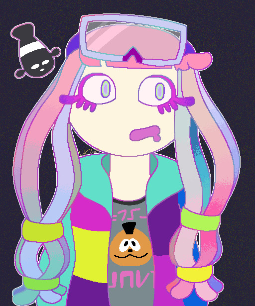
Had an awful day at work so I doodled Harmony in her cute new promo fit and coloring and now I feel a little better
#splatoon#splatoon 3#splatbands#harmony splatoon#chirpy chips#paruko splatoon#abxy#god she is so cute#rock that fit girl#I wish she had the multicolored hair all the time it so gorgeous
24 notes
·
View notes
Note
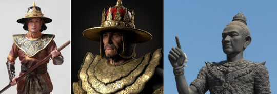
got any initial thoughts or head canons the new warlord mini boss
I put my eyes on this guy and immediately wondered what the helmet reminded me of... Then I remembered THIS INSUFFERABLE CUNT:

It makes me think the Warlord will have similar powers to repeatedly bring mobs back to life.
I imagine they are going for a (very vague) roman reference, what with the helmet decoration and the "Para Bellum" subtitle. You can see a bit of a "skirt" too, I think.
(Could the big hinged plates and overlapping pauldrons be Bourassa's idea of a lorica segmentata? I don't know how this man's brain works.)
Therefore... An invader, not just a warmonger, but a violent occupier and foreign tyrant? In the background of the promo we have gallows, barricades and cages. The ear necklace suggests not only conquest, but terror.
The Warlord's color scheme doesn't look like steel or iron, but bronze, perhaps because he's a threat from another time. An old, monstrous conqueror returned from the dead? It would fit the state of DD2's world.
Duelist is featured in the promo. It could be just because she's a new hero, but it'd be cool if the Warlord was tied to her backstory or the place she comes from, somehow. They did mention a special unlock quest (although this could be related to Reynauld instead).
20 notes
·
View notes
Text
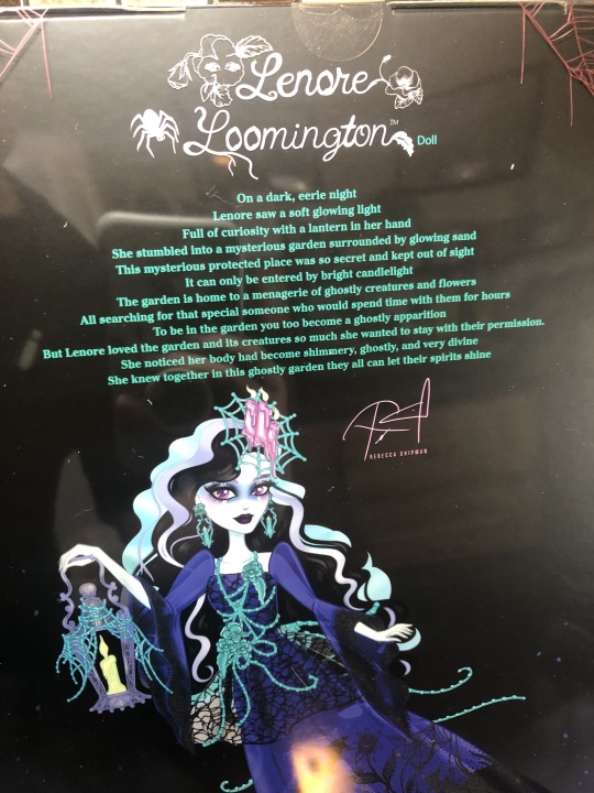
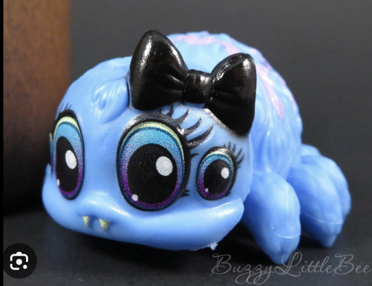
Lenore Loomington Review Part 1 of 2
I already did a preliminary post on here where I compared her price point to other Monster High dolls and delved into some head cannon to try and tie down her design choices and give her personality (I want to pretend she’s worth $81.95 by getting really attached to her….)

Here she is in box! She came in really quickly. Her box has some really bright hot pink and teal and has a plastic slip cover with more teal designs on the outside.
Good news: she already looks better than her promo pics, but her shimmery skin is a bitch to try and photograph.
Box photos and accessory break downs under the cut:

Trippy. :) The right side of the box. I like the effect, I just wish that the colors or the imagery tied more in with the character’s design.

The left side of the box has her name in a nice, specialized font.
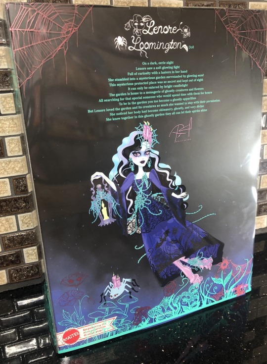
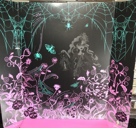
The back has a poem on it saying that Lenore followed a light to a spooky garden full of strange creatures and plants, decided to stay (with some “persistence”) and she died, becoming a ghost. Well, that’s a start of something.
The artwork on the back is fine too. The most interesting thing from this art is seeing the color differences in the art vs the doll (especially the shoes; seen here as a more lavender/duller color vs the brighter magenta that is seen on the doll).
A close up of the poem, the signature, and a bit of the artwork. The more I look at what I thought were vines on her accessories, might all be dewy spiderwebs….?

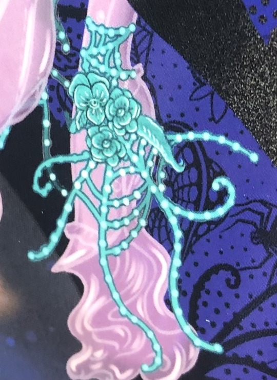
You can actually make out the detailed sculpting on the flowers better in this artwork than the actual pieces themselves (which is odd as I usually think that Mattel has the better sculpts when compared to competing companies).
The top of her box is also decorated.
Okay, now let’s rip this bad boy open.
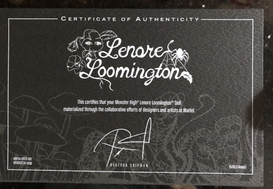
Here’s the Certificate of Authenticity, taped to the back of the inside sleeve the doll is strapped to. They got specialty textured paper for this, but it feels thinner than the usual paper-board thick ones.
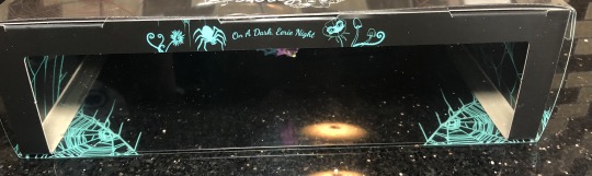
Here is the inner sleeve. It actually looks a bit menacing and it reminds me of looking at photo negatives.


Here’s a cute little rat, hiding in the corner, and the poem is also written in parts on the right hand side of the sleeve.
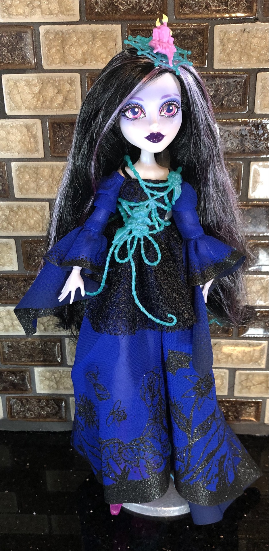
And here she is out of the box and after I ran a metal comb through her hair. Her hair is soft saran and is a bit fuzzy on the ends.
Let’s look at what she comes with…
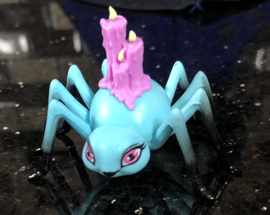
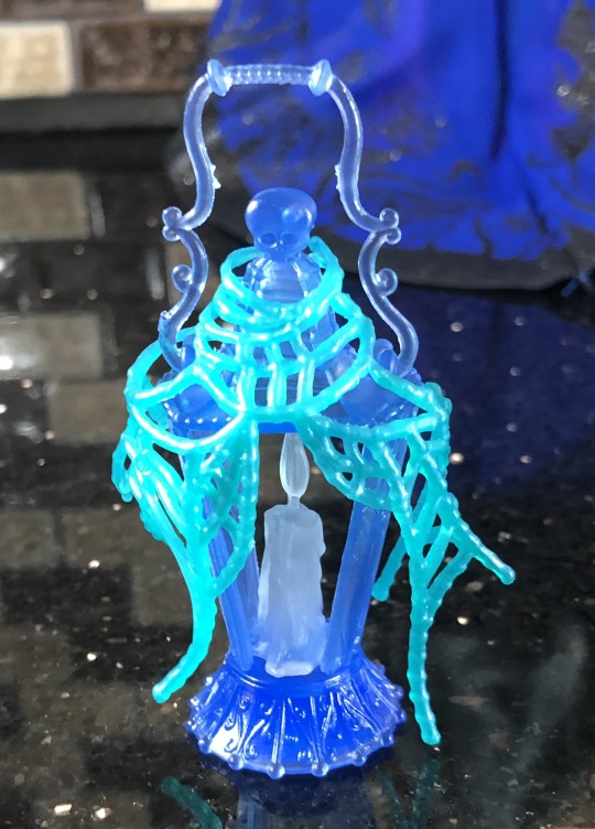
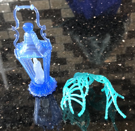
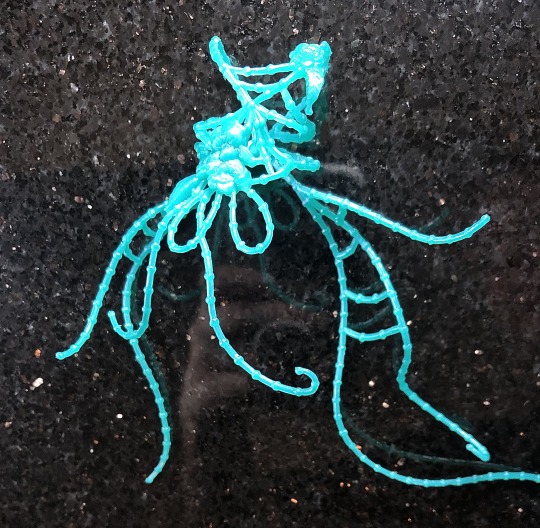
Here is her unnamed spider pet….? Captor?? Accessory maker…? The candles are not removable, but at least it’s a different sculpt than the other spider pets of Monster High.
(Webby from G2; credits to Serendipity Doll Boutique for Memphis Longlegs and BuzzyLittleBee for the G3 Tarantula pic).

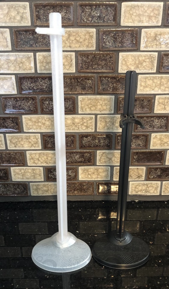
She also comes with a very tall, sparkly stand….and I get why it’s tall (so she can float) but it makes her hard to fit on my shelf, the bracket wants to bunch up her dress and my doll sinks farther down the stand once she is clipped onto it.
Here is her major “purse-akin” accessory. It has some cute detailing on it and it’s made of a really light plastic. Actually most of the plastic accessories feel like the really light plastic found on cheaper toys. I was expecting the plastic to be heavier and/or more rubbery (like the chains used in the Haunted Line).
The spiderwebs are removable and the candle glows in the dark (which is a really nice detail).

Okay, her earrings!

They have the eyeball pansies on top (they’re kinda hard to make out). And dripping candles under it. Sadly, their flames do not glow in the dark.

Here is the head piece. It’s connected to a headband and it also doesn’t glow in the dark (booooo). It’s an odd size and I feel like the spiderweb should have either been much bigger or much smaller (like stopping at the inner spoke of the spiderweb).
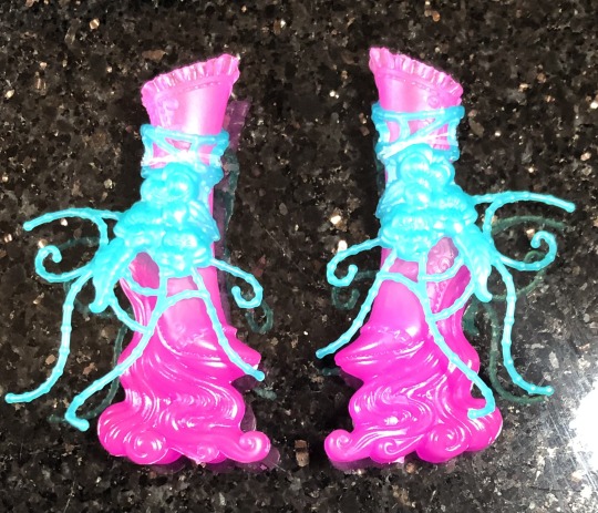
Everyone (me too, not going to lie) was giving her crap for having hot pink, blobby looking shoes.
And honestly, that’s because the photos for it were meh and the color was also….a choice….but I ended up liking them more than I thought I would.

The eyeball pansies shoe clip-on remind me of the Bloom and Gloom shoes (see Jane’s shoes? that hibiscus POPS in comparison to the mold Lenore was given)….but not executed as well. The sculpt on the flowers are really flat and blend in with one another. :/
Okay, now what shoes sculpt is hiding behind there???

Look at that hidden detail! The buttons have little button holes, all the little frills and stitching and all that filigree detail on the back of the boots….if only it was PAINTED….
The spectral waves on the bottom of her shoes are reminiscent of Art Class Draculaura’s paint shoes (credit for image: CoyoteCrowCollectables).
From her boots that I was pleasantly surprised with, to my least favorite piece from her: her belt…chest thing…
Again, the flowers don’t really pop out in the sculpt and it sits really baggy on her in random spots, it just doesn’t seem to lay well on her and needed a few more tweaks.
Now that her accessories are looked at, the next part of my review will focus on her dress(s) and comparisons to other Monster High dolls.
#monster high#aleta’s toys#doll collecting#monster high doll#dollbr#monster high dolls#doll collector#Lenore Loomington#Monster High skullector#mattel#monster high lenore#monster high g1#doll review
14 notes
·
View notes
Last Seen Blogs
beaniened
Shenanigans, Malarkey, and a Day in the Life
phandorajenkins
n a t a l a
labeldunno-blog
Dunno
dalukkard
Bienvenidos al Outworld