#it’s a lot of fun thinking more about details when designing now
Text
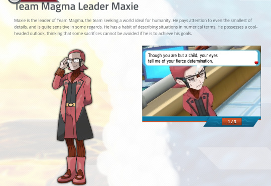
Maxie Infodump #1 - Little known character details from official media
I promised to post some of my maxie infodumps and headcannons, and I think I'll start it off with something simple. His official character bio that was hosted originally on the first release of ORAS
(this will be ORAS Maxie focused)
here is a transcript for easy reading:
"Maxie is the leader of Team Magma, the team seeking a world ideal for humanity. He pays attention to even the smallest of details, and is quite sensitive in some regards. He has a habit of describing situations in numerical terms. He possesses a cool-headed outlook, thinking that some sacrifices cannot be avoided if he is to achieve his goals."
Okay, so first, after looking at the original japanese version of this page,

小さいことまで細かく気にする、神経質なところがあり、さまざまなことを数字を交えてあらわすのが口癖。
目的を果たすためなら、犠牲が出ても仕方ないと考える冷徹な思想の持ち主でもある。
The one word in here I wanted to be sure of was 'sensitive' since it can have many meanings, and the original japanese gives us some possibilities with:
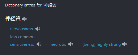
Personally I think (being) highly strung is the most likely option here, but either way its an interesting character trait. And we all know he certainly builds up frustration and tension and explodes a bit like a volcano. Even if he does manage to correct himself afterwards.
~ ANYWAYS ~
Now that we have the bio, let's break it down a little and look at some fun examples of it in action!
Maxie has a habit of describing situations in numerical terms. This typically comes out more when he is nervous or stressed. Here are some examples:
Ill just take ORAS as an example here since this is already getting pretty long...
In ORAS after fighting him at mt chimney, he lets you know in a specific numerical way, how much he fell behind:
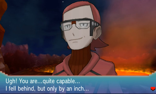
And then again, when you battle with him and lose in the Battle Resort where he just has to let you know the situation in numerical terms by giving you the exact lose chance according to his own calculations of course:
"So the great Maxie has fallen, even when battling alongside your team... I shall commit this curious phenomenon to memory. It had less than a 1 percent probability of occurring, you know."
this culminates in a really interesting interaction between him and courtney after the delta episode. While It's pretty clear that Maxie cares for his team and especially his admins, he definitely struggles when faced with his crying admin, and being unsure of what to say, he settles with a numerical quantifier again.
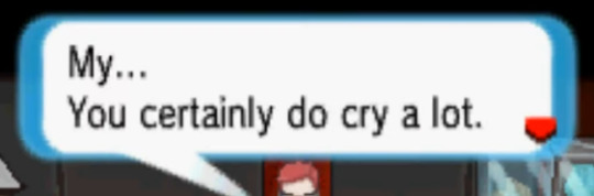
He assesses the situation, and decides to comment on how MUCH courtney is crying.
His "paying attention to even the smallest details" trait also ties into this habit of his, and is probably why he jumps to conclusions a little too early because of small things he's noticed. Accusing Tabitha of wanting his spot as leader, just because he disagreed with him is one of those situations.
Pokemon Masters EX has a lot of new scenes with Maxie, and I would love to talk all day about them, but I'll just pick out one here, and that's from the "A pasio Spectacle" event.
In this event, Maxie overhears team break members simply say the word 'glasses' and instantly jumps to the conclusion that not only did they want to talk to him, but that they noticed his "magnificent mega glasses" and would like to hear a lecture on how they were scientifically made.
https://www.youtube.com/watch?v=rZmmaf9bhD8&t=144s
here's a link to watch it, its worth it :D
He certainly picks up on small details, but tends to miss the bigger picture sometimes, which is fun because I believe archie tends to do the opposite.
Perhaps his mega glasses are actually designed to reflect this, because they work like horse blinders, and keep maxie looking straight ahead (trust me, I've made a pair of these, and you cannot see someone standing to your immediate side).
Looking straight ahead is also relevant to his life goal, of ensuring the bright future of humanity, and as he says: "propel humanity to greater heights of progress and evolution."
And that concludes my infodump regarding this one little bio that is no longer available without the wayback machine, and I just wanted to share it with any other Maxie fans out there :D
Next I think I might tackle the bigger topic of how Archie and Maxie have so many fun contrasts in personality and more. and then maaayyybe I'll feel comfortable enough sharing my headcannons and theories. But only if people want more lol, I am not good at writing big posts :>
69 notes
·
View notes
Text
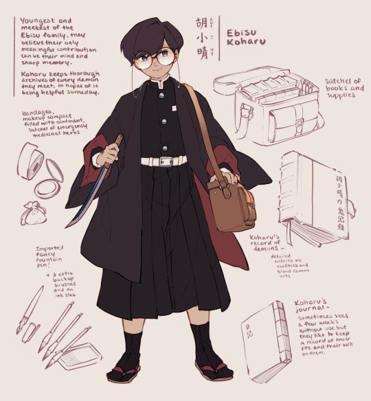
My brother recently got into Demon Slayer so I wanted to make a kny oc for him since I did it before with both me and my sister and never got around to my brother :)
But I started by refreshing my own design because wow?? It’s been 4 years since I first made my kny insert character and a lot of things are now outdated! Not to mention my art has improved a lot, I hope. More details under the cut!
Meet Ebisu Koharu: youngest of the Ebisu family and physically the weakest. They only barely passed Final Selection by hiding for the entire week and surviving off tips from their older siblings. Nonetheless, they still want to contribute, which is why they hold onto a thick, leather bound book that records every demon they’ve ever met in precise detail, with labeled diagrams and scribbled calculations in the margins of different strengths and weaknesses.
After spending a few years on the job, and properly seeing their data contribute to the successes of other demon slayers, they’ve come a bit more into their own as a competent researcher and fighter, though they still do tend to request paired missions with friends and family to act more as a support role rather than a fighter.
The Ebisu family is one of scholars. The eldest daughter Kaoru is a doctor, and the eldest son Shougen is a chemist. By nature, fighting is not necessarily their strong suit, which is why their family breathing style and techniques are all poison-assisted. Of the three, Koharu is the weakest and most averse to combat— they wield a short half-length blade, with more of a smooth ceremonial hilt and sheath than any practical weapon.
#kny oc#kimetsu no yaiba#demon slayer#it’s so much fun seeing my brother be so late to the party for kny lmao#I love him but his takes are kind of shit ngl.#his character will be absolutely hilarious to do as well#because you better believe I’m going to lean far into how much he simps for giyu#looking for names is so much more fun when I can read some kana and am not using google translate#I found out that the combination of me and my sister’s names form kanari which i will not stop thinking about for ages#four years of improvement and four years of character development! Better character design and research skills#it’s a lot of fun thinking more about details when designing now#I.e. brushes are wildly impractical tools for writing on the go so koharu’s main choice of stationery is an imported fountain pen that cost#a decent amount of their savings#and they wanted their records to last longer so they also invested in a proper leather bound journal (also imported) rather than#a normal string bound book like their normal daily journal. this is also why the books open in different directions#in the event that their fountain pen breaks they Will Cry but they will also commit the details to memory and write them in with a bruh#with a brush after the battle ends
329 notes
·
View notes
Text
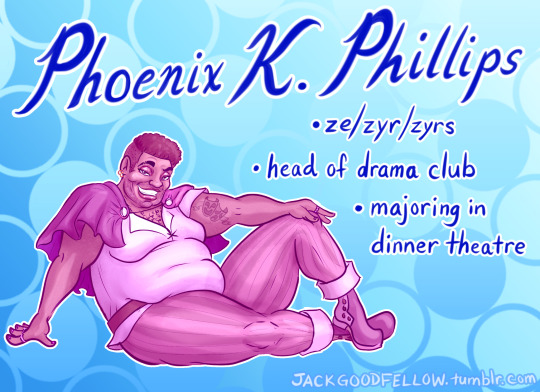

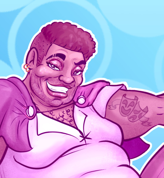
I made a new suitor for my horror-comedy dating manga concept I Escaped My Genre!
At this community cooking college, majoring in dinner theatre of course means that you must master the art of theatre AS WELL AS the art of cabaret-appropriate foods that align with the themes of whatever show you are doing!
But the college also has a vibrant student theatre scene: Phoenix is actually directing the Drama Club's production of Romeo & Juliet this spring as their end-of-year final! I wonder if Samo will try out! (And I wonder if Phoenix will end up looking romantically into Samo's eyes and finding that in that moment, all zyr carefully-curated bravado drops away, and suddenly, ze is no longer acting; ze is simply feeling, and it changes everything.)
Also, since I put so much work into this character design, Phoenix will absolutely be making an appearance in my graphic novel! (You can find my published scripts and concept art here, if you wanna make my day!)
#when i say cabaret-appropriate foods i mean foods that can easily and cleanly be eaten while ur eyes and body are turned towards the stage#[flashback to eating the world's messiest sandwich at my 1st cabaret show & THOROUGHLY embarrassing myself. the actors saw. it was awful.]#i escaped my genre#my art#phoenix k. phillips#hikari and simon and phoenix all have better and more carefully considered character design bc i drew the cover as a quick joke and i#drew those 3 after becoming invested so they turned out more detailed and interesting looking. if i did make this a real series i would#revamp some of the designs. i know that a lot of animes have similar-looking characters so that'd match the genre but#i care more about my characters having diverse faces and body types than i care about matching the exact style#but it is fine for now. it isn't like they are BAD character designs it's just that i could do better#junji ito#ito junji#horror#horror comedy#alt-text#image description#image descriptions#I've never known of a dinner theatre w thematically appropriate foods but it would be so fun!#i don't think samo is cast as a lead but maybe they're a small part and or an understudy. either way the audition affects phoenix very much#samo is very rarely shown speaking so. but sometimes you need to stand in for an actor who isn't at rehearsal#*very rarely shown speaking so i don't think juliet quite works but idk yet#anyway phoenix is gonna be a delight in The Blacksmith#original characters
7 notes
·
View notes
Text
LET'S TALK ABOUT LOKI'S SHOES (ACTUALLY, HIS WHOLE WARDROBE)
Production costs aside, clothes tell the audience about how characters think of themselves.
Loki's shoes in the S2 finale raised a lot eyebrows, but I find them quite fitting: they are comfortable, practical, and most importantly, they are humble. The camera brings this to our attention to communicate his evolution in character.

Loki has always dressed well, often times ostentatiously. Whether he is at war, passing as a Midgardian, or held captive as an Asgardian prisoner, Loki communicates his social class and sense of superiority through clothing. For him, clothing armors his fragile sense of self and against others' opinions of him. He intends to be perceived as deadly charming but ultimately unapproachable.
His attire in the first Thor movie is roughly equal parts green and gold, signifying his royal status. His style is dressed down for his brother's misadventures in Jotenheim, yet overall both silhouettes are lofty, princely, but not hardened or threatening.
In Avengers, Loki's look has more black and leather, with exaggerated emphasis on his shoulders meant to intimidate as he assumes the role of villain. The silhouette is very hard, heavy, and edgy. Gold detailing is prevalent as well. Combined with the goat's helm, this is Loki's most pretentious outfit, which speaks to an undercurrent of low self-esteem and a compulsive need to impress. There's no mistaking he is the main antagonist of the story.

In Thor 2, Loki's attire is similar to Avengers but the overcoat is exchanged for a less bulky version (perhaps conveying he is less guarded now that the effects of the Mind Stone are no longer influencing him). Loki's role likewise pivots from the harsh lines of a villain to the more flexible edges of a reluctant villain-turned-ally. This aligns with his character arc when he protects both Jane and Thor, seemingly sacrificing himself.
In Thor 3, Loki's silhouette is streamlined even further. The overcoat is done away with in favor of what appears to be a leather doublet, pauldrons, and vambraces. Gold accents are minimal. While stylish, Loki's attire is more practical than showy, and his helm serves the dual purpose of protection as well as weaponry. At this point in his arc, Loki has become a full antihero, joining his brother's side in rescuing as many Asgardians as possible, and eventually dying in a vain bid to protect Thor from Thanos.

The TVA does something very fun and interesting in taking away Loki's ability to dress himself. Since Loki cannot use his magic in the TVA, he is forced to wear the same clothing as his captor/advocate, who eventually becomes his best friend and peer.

Perhaps, on a subconscious level, this helped Loki to feel included. We know by his pwn admission that Loki fears being alone and desperately craves a sense of belonging. At the same time, he intentionally dresses to put people at a distance, thereby protecting himself from potential rejection at the cost of isolating himself further.
When Mobius gives him that TVA jacket for the first time, Loki seems uncharacteristically pleased. It is not an attractive jacket by any means, yet he neither scoffs at it nor refuses to wear it. Instead, Loki puts it on and is content when Mobius says it looks "smart" on him. He continues to dress like Mobius and, indeed, mimic some of his mannerisms such as placing his hands on his hips. Without clothing meant to push people away, Loki opens up, has more fun, and makes friends.
Loki's choice of attire as he assumes the mantle of God of Stories (and time) is fascinating. Setting aside the clear design inspiration from the comics, Loki's silhouette is soft, remarkably so. His colors are earthy hues of green, and the only bit of flare are the light gold trimming and crown. The look brings to mind the garb of sages and wise wizards rather than royalty or warriors. He's powerful yet approachable because there is humility in his bearing. And that humility springs from a well of healthy self-worth, self-love, and a deep love for others.
The shoes are not meant to be attractive. They are meant to help him ascend the throne, nothing more.
7K notes
·
View notes
Text
A Workshop for Creating Magical/ Fictional Crystals: A Guide from a Geologist
Hi folks, its me, here to talk about fictional writing again! Today I'm just tackling the idea of magical stones/mana stones by looking at existing minerals today and some neat properties that they have, and how you can apply these things to a fictional world. The goal is mainly to help you if you are stuck trying to come up with a unique magic system, or a unique identification/characteristic of your mineral.
First Things First: Mineral Shapes

I am exhausted, petered out, down-right fatigued by seeing every mineral depicted with having the crystal structure of calcite and quartz. There are soooooo many cooler, more interesting crystal structures, don't you think you would stop and take a look at a perfect cube in nature? It is completely unsettling.
Second: Color
Color within minerals can either be really important, or not important at all! It is your choice to decide if color is going to be something that means something to your mineral. But what are some times when the color is important? Well.... there are some elements that are called chromophores, this classification just indicates that these elements, when present, will determine the color of whatever they are in. So, if you wanted to treat mana like a chromophore, you could say, "Oh everything that contains mana turns green!" This could mean that regardless of the mineral, if that mineral is a specific color, it means it contains mana. This concept is exciting because you can just stop here and use minerals that already exist! You can also use it as an indicator for a magical ore! Chromophores are typically metals, so if you are making a new metal weapon, making the ore of that metal a unique color would make a lot of sense!
However, your mineral can also just be every color of the rainbow like quartz and perhaps that's what makes identifying your mana stones elusive and create an illusion of scarcity that your character can solve.

There are other things that can change the colors of minerals, like radiation damage, and electron exchange, but I think that is beyond what would be helpful! So lets talk about some unique color properties that happen in nature that seem magical in the first place! Maybe you don't need to design a mana stone, but you want a unique gemstone that only the royal family passes down or something (IDK).
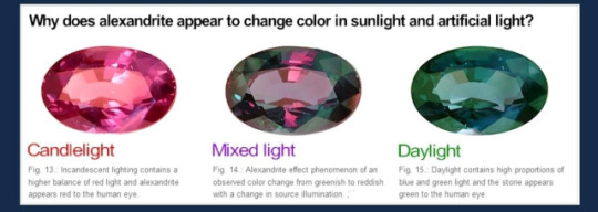
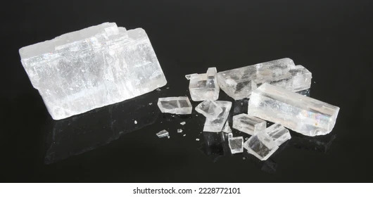
The first one is the alexandrite effect! This is where a mineral can change color in natural light vs. incandescent light. (the mineral itself is not changing, but the lights contain different amounts of different colors that then get absorbed by the stone). Even if you don't use electricity in your fictional world, you could have the colors change in the presence of light magic. This could create fun misunderstandings about what the mineral is reacting to!
Pleochroism
Pleochroism is something that most minerals have, it is frequently used to help identify minerals in thin sections, however minerals are usually not pleochroic enough for it to be visible to the naked eye! Pleochroism is just a fancy name to describe the change in how light is absorbed based on the angle of the mineral! So if you scroll up to the first image where I showed a lot of crystal shapes, most of them have angles where they are longer and shorter! This will effect the way light travels in the crystal. Tanzanite is a popular mineral that does this.

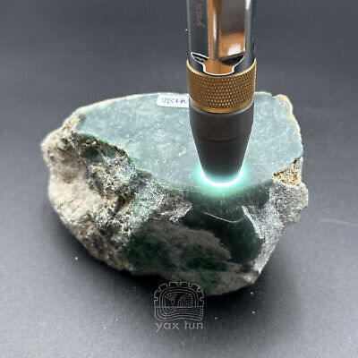
Photochromism
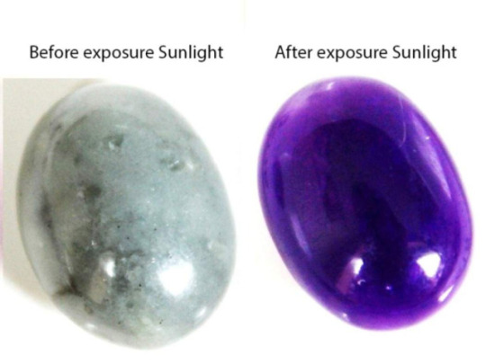
This is when a mineral will change color (in a reversible way) when exposed to UV light (or sunlight), I am not going to go too into the details of why this is happening because it would require me to read some research papers and I just don't feel like it. The mineral that is best known for this is Hackmanite!
Alright! These are all the really cool color effects that might inspire you or maybe not, but now I am going to talk about how you might find your minerals within a rock!
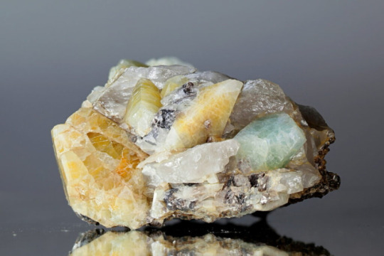
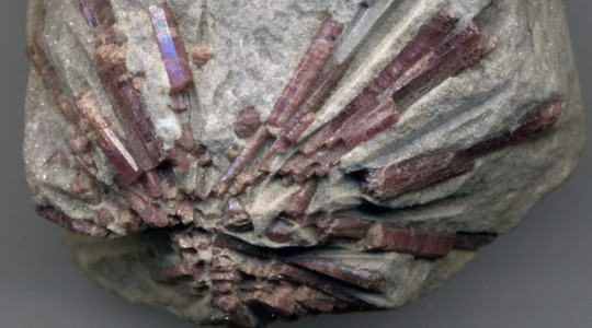
When I see a lot of magical caves/mines, typically I see them with some variation of a geode honestly, but most minerals are not found like that! Now I am sure most of you guys have seen a geode, so I will not really talk about those, but I will talk briefly about porphyroblasts which is when the mineral grows larger than the minerals around it, this happens in metamorphic minerals!

sorry random stranger, but this is an image of garnets inside a finer-grained rock at gore mountain in New York!
Another way you might find minerals is in a pegmatite! This is when all minerals are really large! This is a formed from really slow crystalizing magma!
But something else to think about is that your mineral might just be massive, it doesn't have to have distinct crystals, it may be similar to jadeite where small grains grow together which leaves it looking smooth and seamless! A note about all of these is that you would have to mine into the rock to find these, there would not be any natural caves in these rocks! Caves are only ever really formed in limestones and maybe marbles (rocks that react with acid).
How can your characters identify these minerals?
Typically when you are out in the field you will look to see what type of rocks the minerals are found in (The overall texture of the rock will tell you how it formed). If you know how the rock formed, it will narrow down the amount of minerals you need to think about by quite a bit! Next, you are going to look closely at it and observe its crystal structure, does it have an obvious crystal? if so what is the general shape? If it is broken, how did it break? Did it fracture like glass or did it break along uniform planes. Some minerals have a thing called cleavage (breaks along planes of weakness). If a mineral exhibits this habit, it will again help narrow this down. Next we can look at color. Color can be misleading, because minerals like quartz can be any color imaginable, but minerals like olivine will always be green! The next thing your character can do is test for hardness, minerals all have a specific hardness that can help identify it as well.
After you go through all of this, your mineral might have some special property! This could be magnetism, fluorescence, reactions to acid, or any of the color changing effects I mentioned above! Other than that, your character can take it back to a lab and do a number of things to identify it, but the most typical thing would be for them to make a thin section (very thin piece of the rock) and observe it under a cross polarized microscope!

On that note folks! I hope this helped in some way in thinking of new magic mineral properties! I have other guides that explore some different fictional worldbuilding issues you might run into, but if you have any topics you would like me to cover please that I haven't mentioned already, let me know!
#geology#rocks#creative writing#fictional world#worldbuilding#dnd#dnd worldbuilding#worldbuilding stuff#writing resources#info post#information#writing
4K notes
·
View notes
Note
hi, i ireally love your work and i don't know if you've answered this before but, what kinds of studies do you do or how did you learn color theory? i wanna get better at rendering and anatomy but im having trouble TT TT
Hi! Long answer alert. Once a chatterbox, always a chatterbox.
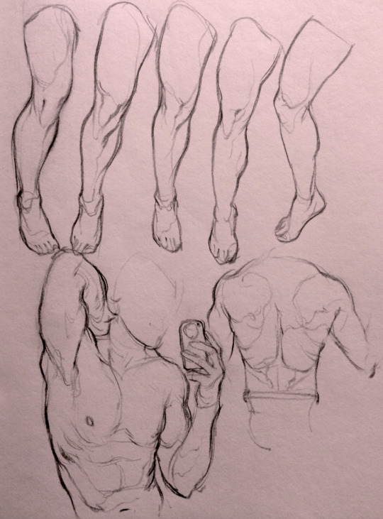
When I started actively learning how to draw about 10 1/2 years ago, I exclusively did graphite studies in sketchbooks. Here's a few examples—I mostly stuck to doing line drawings to drill basic shapes/contours and proportions into my brain. The more rendered sketches helped me practice edge control & basic values, and they were REALLY good for learning the actual 3D structure behind what I was drawing.


I'd use reference images that I grabbed from fitness forums, Instagram, Tumblr, Pinterest, and some NSFW places, but you could find adequate ref material from figure drawing sites like Line of Action. LoA has refs for people (you can filter by clothed/unclothed, age, & gender), animals, expressions, hands/feet, and a few other useful things as well. Love them.
Learning how to render digitally was a similar story; it helped a lot that I had a pretty strong foundation for value/anatomy going in. I basically didn't touch color at all for ~2 years (except for a few attempts at bad digital or acrylic paint studies), which may not have been the best idea. I learned color from a lot of trial and error, honestly, and I'm pretty sure this process involved a lot of imitation—there were a number of digital/traditional painters whose styles I really wanted to emulate (notably their edge control, color choices, value distributions, and shape design), so I kiiind of did a mixture of that + my own experimentation.
For example, I really found Benjamin Björklund's style appealing, especially his softened/lost edges & vibrant pops of saturated color, so here's a study I did from some photograph that I'm *pretty* sure was painted with him in mind.
Learning how to detail was definitely a slow process, and like all the aforementioned things (anatomy/color/edge control/values/etc.) I'm still figuring it out. Focusing on edge control first (that is, deciding on where to place hard/soft edges for emphasizing/de-emphasizing certain areas of the image) is super useful, because you can honestly fool a viewer into thinking there's more detail in a piece than there actually is if you're very economical about where you place your hard edges.
The most important part, to me, is probably just doing this stuff over and over again. You're likely not going to see improvement in a few weeks or even a few months, so don't fret about not getting the exact results you want and just keep studying + making art. I like to think about learning art as a process where you *need* to fail and make crappy art/studies—there's literally no way around it—so you might as well fail right now. See, by making bad art you're actually moving forward—isn't that a fun prospect!!
It's useful to have a folder with art you admire, especially if you can dissect the pieces and understand why you like them so much. You can study those aspects (like, you can redraw or repaint that person's work) and break down whether this is art that you just like to look at, or if it's the kind of art that you want to *make.* There's a LOT of art out there that I love looking at, probably tens of thousands of styles/mediums, but there's a very narrow range that I want to make myself.
I've mentioned it in some ask reply in the past, but I really do think looking at other artist's work is such a cheat code for improving your own skills—the other artist does the work to filter reality/ideas for you, and this sort of allows you to contact the subject matter more directly. I can think of so many examples where an artist I admired exaggerated, like, the way sunlight rested on a face and created that orange fringe around its edge, or the greys/dull blues in a wheat field, or the bright indigo in a cast shadow, or the red along the outside of a person's eye, and it just clicked for me that this was a very available & observable aspect of reality, which had up until that point gone completely unnoticed! If you're really perceptive about the art you look at, it's shocking how much it can teach you about how to see the world (in this particular case I mean this literally, in that the art I looked at fully changed the way I visually processed the world, but of course it has had a strong effect on my worldviews/relationships/beliefs).
Thanks so much for sending in a question (& for reading, if you got this far)! I read every single ask I receive, including the kind words & compliments, which I genuinely always appreciate. Best of luck with learning, my friend :)
2K notes
·
View notes
Text
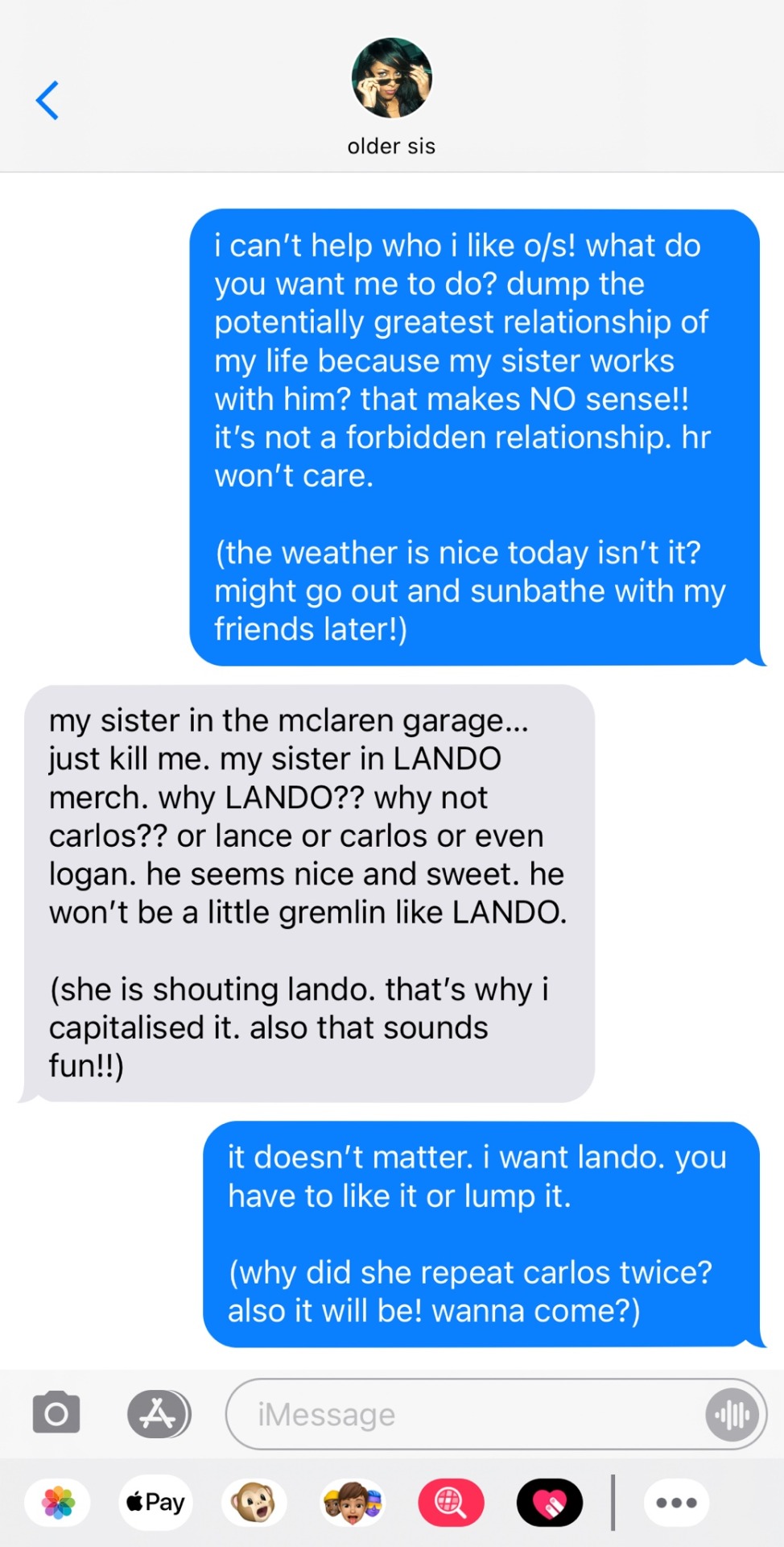
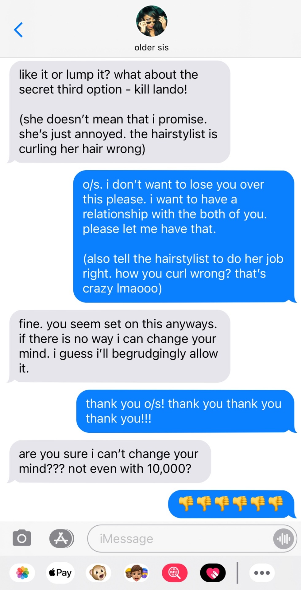
the talk.
pairing: lando norris x fellow driver’s sister!reader.
format: mixed media smau.
summary: when o/s asked you to apologise to lando she did not expect for you to start dating him? you decide to break the news over lunch at her favourite restaurant. we’ll see how that goes…
author's note: your favourite sisters on the grid are back! the baddest bitches. also you all voted on giving o/s a bf so keep an eye out for that. if you’re confused on the addition of o/s’s bff - read party in the u.s.a. for more clarification!
— part of the nepo sister universe —

liked by oldersister, oldersisterbff and 367,691 others.
yourusername: beachtime!! also someone needs to teach those girls in the second slide some manners…. nasty 😒
oldersister: you’re just jealous.
-> oldersisterbff: she doesn’t understand us pookie bear….
-> yourusername: sometimes it shocks me that you’re both older than me and also considered as the best in your respective fields….
user7: the beach designs are so cute!!
user1: what i would give to have o/s gently put her leg over my arm…
-> user2: what i would give to gently put my leg over o/s/bff’s arm…
user8: you think you’re so slick with the soft launch…
-> oldersister: omg i almost didn’t see it…
-> yourusername: THANKS A LOT user8 😒
-> user8: my bad bae 😩‼️
————————————————————————
————————————————————————
DINNER TRANSCRIPT BETWEEN OLDER SISTER L/N AND Y/N L/N
-> as detailed and described to her boyfriend LANDO NORRIS.
Y/N (monologue): so to start, i obviously allowed her to take us to a restaurant that she liked to get her in a good mood. i even get there early. i’m all ready, let be rephrase, i was all ready and early, when my sister walked in. she already was mad so i got a start on ordering my food so she’d have to pay the bill.
LANDO: you and your free dinners.
Y/N: keep talking and you’ll fund my ubereats for the next month. this is a monologue lando.
LANDO: got it babe. mouth zipped. no more words.
Y/N: okay so she sits down and gives me a glare. i’m like ‘oh my beautiful amazing sister who funds my eating habits. i wonder how i have annoyed you on this glorious day’.
Y/N as O/S: stop talking shit and tell me who you’re dating.
Y/N: oh no! my sweet glorious sister! i can’t tell you that! you might cut me off your credit card!
Y/N as O/S: i would never do that. i am a fair and sweet sister. i love you y/n and i will give you a lot of money to prove this.
Y/N: oh thank you! love you. then that’s the part where we hugged it out.
LANDO: has anyone ever told you that you should go into acting babe?
Y/N: yes! you think i have a future in it?
LANDO: yes! now tell me what really happened.
Y/N: i said i was dating you. she spat out her drink and started choking on something. we had to call the ambulance and take her to the hospital. she woke up and thought it was a nightmare. then i told her, she vomited and she fainted. to be honest…. i was expecting it to worse. that’s pretty tame. i think she likes you!
————————————————————————
liked by rollingstone, user67 and 1,283,892 others.
oldersister: thank you to rolling stone for photographing me as a part of their front cover. being interviewed in my own home seemed daunting but it was so seamless and fun.
we talked about betrayal, fashion and navigating being a barrier breaker. go read the full article on rolling stone’s website or in the physical march copy!
oldersisterbff: my best friend is so hot and sexy i love you 😍
-> oldersisterbff: hot, sexy and smart? what can’t you do bae?
-> oldersister: lots of things. like ending climate change.
-> oldersisterbff: i think you could 🤷🏼♀️
user17: yourusername hasn’t liked this… um…
-> user72: she doesn’t have to like every one of o/s’s post. you forget she actually sees her sister in person.
user455: i love listening to her thoughts. she’s so intelligent i love it.
-> user12: she has two degrees! one she got and an honorary one!
-> user23: unlike lando. does he even have his gcses?
-> user89: stop comparing the two lol. both of them have complained about how annoying it is.
-> user23: comparison is a part of the job. get over it.
user61: she’s so hot. need her sooo bad actually.
rollingstone: we loved having you o/s as our cover girl!
-> oldersister: i loved being your cover girl!
————————————————————————

————————————————————————
liked by oldersisterbff, yourbff and 308,727 others.
yourusername: my bitch pose is NAYYYSSTY…don’t ever play with the cat…. that ELBOWWW…
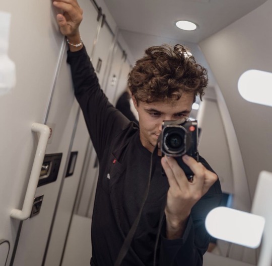
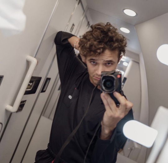
landonorris: when you said you were hard launching me… this isn’t what i was expecting tbh.
-> yourusername: u look cute mwah 😘
-> landonorris: i’ll take anything you give me stink 🤤🤤
oldersister: just vomited actually…. trigger warning next time please.
-> oldersisterbff: i’m omw babe.
-> oldersister: hurry i can feel the light fading from my eyes…
-> yourusername: BOOOOOO!!! you are not florence pugh.
user56: is this the betrayal o/s was talking about in the rolling stone interview??? she’s so dramatic lmaoooo.
oldersister: this is your man?
-> yourusername: yesss 😍😍😍
-> landonorris: hey sister in law 😁
-> oldersister: blocked for harassment.
-> landonorris: NOOOOOOO 😭
user73: how she a nepo baby twice. got f1 connections through her sister and her boyfriend?
-> user89: not how nepotism works tbh….
user67: he looks so goofy lmaooo.
-> yourusername: good keep thinking that. more for me.
-> user67: girl i want you not him 😭
-> landonorris: nuh uh 🙄👎🏼 you can’t have her user67.
————————————————————————
taglist: @23victoria @luckyladycreator2 @mxdi0 @booksandflowrs @charlesleclercsonlywife @molten-m122 @casperlikej @nichmeddar @decafmickey @evie-119 @ironmaiden1313 @d3kstar (wanna be removed? send an ask!)
— wanna be tagged in any future works? join my taglist! —
#jayde’s works ☆#nepo sister universe ✽#formula one x reader#f1 x reader#f1 imagine#f1 smau#formula 1 x reader#formula 1 imagine#f1 fanfic#f1 texts#lando norris x reader#lando norris x you#lando norris smau#lando norris#ln4 x y/n#ln4 imagine#ln4 fic#ln4#ln4 x reader#ln4 smau#formula one smau#formula one imagine#f1 x you#f1 fic
512 notes
·
View notes
Text
REBRANDING YOURSELF
COLLAB WITH THE HOTTIE????!!!!!!! @honeytonedhottie. LMAO NOT US PLANNING THIS IN LIKE DEC THEN RELEASING IN APRIL. I luv you so much ur my fav moot. moots who collab together, stay together. Check out her post on her page too, as usual, she makes the best points so y'all better listen.
Rebranding is a process in which you redefine who you are and how others perceive you. Each journey of rebranding yourself is personal and individual. When you rebrand yourself, you further align yourself with your higher you. This post is a guide to getting started on your journey!
UNDERSTAND YOUR CURRENT SELF.
So, take a step back and think about who you are as an individual right now. What are your values and beliefs? Does your external self reflect your inner self? Are you comfortable in your current environment?
These questions and more will help to see which aspects of your life you may need to redefine. See if there’s anything that doesn’t align with your higher self.
After that, pick those aspects that need to be redefined. Why do you want to change this? How has this been impacting you internally/externally? Does this aspect stem from your environment or yourself? See why this aspect needs to be improved.
DESIGNING YOUR BRAND
This is more of a fun step! So, using your aspects design how you want that specific thing to look and feel like. Avoid being vague or non-specific. Try to put in as much detail as you can for each aspect.
If you’d prefer, you don’t have to use ‘aspects’ and instead use your life generally. This is your redesign, so do whatever is more comfortable and achievable for you.
ASPECTS
Health
Social life
Career
Hobbies
Family
Finance
Spirituality
Personal development (mindset, goals, improvement)
Self care
Culture
Well-being
Things to include
Achievable goals
How your environment looks like
How your daily life like
How you see yourself
What do you feel after
Why this is alignment within yourself?
You can do this any way you want. The one I would recommend for redesigning your life would be a vision board, preferably a physical one. If you don’t want to do that, there are still a lot of options such as writing it down into a pretty poster, creating a playlist that will reflect your brand, creating a pretty list, or having sticky notes around your room as reminders.
Be creative and detailed with this. You should spend at least an hour if not more trying to redesign your life/aspects.
CREATING GOALS
Goals are so important, especially when we are moving in a different direction than we were before. As we’ve got the current status of who we are and what we want to be, creating goals should be easy.
Make your goals visible. Put a sticky note on your mirrors, put it as your laptop background, put a reminder on your phone, listen to a playlist that motivates you of your goals or anything else that will constantly remind you of your goals.
Other than that, remember that goals have to be achievable, mindful, and flexible.
ESTABLISHING HABITS
Habits are so important to rebrand yourself. Habits make up your identity. The way you act, speak, and do daily, can subconsciously influence you to be someone who isn’t in alignment with your higher self.
As much as it’s important to establish new habits that align with you, you have to root out the habits that are pushing you off track from achieving your goals.
The good thing is that you can do both at the same time. Replace those old habits, with brand new ones. For example, when you open your phone first thing in the morning instead of opening up TikTok, get YouTube opened and start a 5-minute meditation to start your day.
However, just because a habit is beneficial for you, it doesn’t mean it is in alignment for you. For many people, they prefer to read books as a productive alternative for leisure, however, you may not be able to read a book and focus. In that case, you may want to watch an educational video instead. You’re still getting the benefits, but just in a different way.
STEP FIVE: IMPLEMENTING YOUR BRAND DAILY
Think about all the little details of how this person would act, from morning until night. Embody their actions, words, aura, and vibes. This is when having a visual of your goals is good, so you can see what you need to do.
This includes no longer indulging in things your higher self wouldn’t do. Regardless of how much comfort, entertainment, or dopamine something gives you, you have to let it go if it is destroying your mind.
I way I recommend implementing your brand daily by creating a daily routine that focuses on a different goal each day of the week. E.g:
Monday - Practicing being mindful (meditation, journaling, connecting with your religion)
Tuesday - Fitness (pilates, weightlifting, hot girl walks)
Wednesday - Socialising (going out to meet new people/connecting with old friends)
Thursday - Productivity (Schoolwork, studying, business, workplace tasks)
Friday - Self-care (taking a slow day however you’d like)
ta-daa!! thanks 4 reading. now go follow @honeytonedhottie 💕😍
#becoming that girl#prettieinpink#that girl#green juice girl#clean girl#honeytonedhottie#that girl lifestyle#it girl energy#glow up#wonyoungism#that girl energy#that girl routine#it girl tips#it girl#pink pilates princess#pink pilates girl#self improvement#self care#self confidence#self development#self growth#self healing#self love#healing#healing journey#self awareness#gratitude#self reflection#self compassion#growth mindset
823 notes
·
View notes
Note
I know it would probably bring a lot of hate comments but I am begging you to roast the hazbin character designs because I'd love to have someone properly articulate why they don't work so I could send it to people who won't believe me when I tell them. 🫠 Understandable if you don't want to get into it though.
I don't think there's that much there to roast, honestly?
Those designs are clearly an extremely specific stylistic choice, and because that style is consistent throughout the show, it ultimately feels coherent with itself.
There are trade-offs being made. Because Hazbin's design style is SO stylized and so heavy on decoration and detailing, because it puts a lot of emphasis on costuming, it isn't as good at communicating specific character storytelling as a more grounded style could be (it's kind of the same tradeoff that stuff like Genshin Impact makes).
Like, why does Sir Pentious' hat have an eye and a mouth on it that makes its own expressions? Apparently not for very much reason at all, except that Pentious has a bit of an eyes-motif going on in his design and it was one more place to put an extra eye. And that's a valid criticism of his design, but also the entire show is designed like that, so frankly it would be weirder and more out of place if his design alone didn't have that kind of overelaborate decoration going on.
It does create a situation where I have a hard time "reading" the character designs sometimes. For example, Vox, Alastor and Pentious all wear a similar style of suit with upwards-turned shoulders, butterflies and pinstripes. Now, am I meant to read that as Vox imitating Alastor due to his crippling need to replace and outdo him, and Pentious imitating the style of powerful Overlords because he thinks that possessing their level of power will finally give him relief from his paranoia and self-loathing?
Or is it just a design fixation of the creator who keeps putting their characters in suits because that's just what they like? I can't really be sure, because sometimes design elements are used to intentionally tell stories about how characters relate to themselves, their world and one another, but plenty of other times designs look the way they do Because Of Vibes.
But again, that lack of clarity is clearly an intentional trade-off - and the benefit of that trade-off is a design style that is extremely varied, wild, expressive and memorable. Hazbin Hotel seems like a very easy show to draw fanart of, and a very fun show to draw fanart of. Those designs (especially the hyper-expressive faces) are begging to be the subjects of traumatic headcanons, unbearably cotton-candy soft fluff fantasies and weird, taboo, homoerotic power dynamics. Slaps roof of character design, this bad boy can express so much vicarious emotional intensity.
It's very exuberant, very excited about itself and very self-indulgent, it's a style that prioritizes visual impact and visual interest over readability (something which the animators of the show navigate with real skill, props to them) and individual aesthetics over worldbuilding.
And I don't blame anyone for being turned off by that (I certainly was the first time I started seeing those designs going around), but I would struggle to call the show's designs "bad" when they are clearly achieving exactly what they want to achieve.
I have some criticisms, especially re: how the show treats skinny bodies as an unquestioned, desirable default, and employs fatness as a means of alienating and abjecting the audience. That sucks very badly, and is a serious disappointment, and one of the few places where the show feels like it is being cowardly in its design philosophy. But I don't have it in me to do some kind of Hazbin Hotel Sucks And Here's Why takedown, its problems are not unique or extreme enough to warrant it, at least not as I currently understand them.
573 notes
·
View notes
Text
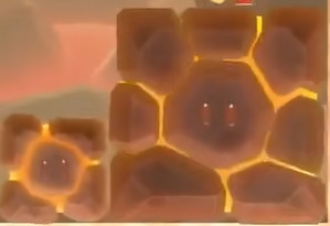
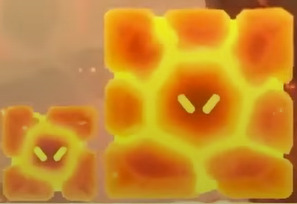
Name: Hot-Hot Rock
Debut: Super Mario Bros. Wonder
You know something I love about the Mario series? Its tendency to use reduplication to put emphasis on certain words. You thought your average everyday mountain was tall? Well this is a Tall Tall Mountain. You've never seen docks quite this dire before! And it's not even just adjectives that get in on the fun! Rock Rock Mountain, Ice Ice Outpost, I love that something can be more "rock" or "ice" than something else. Sometimes a word is so nice, you just wanna say it twice twice.
Hot-Hot Rocks are one of the latest additions to this long-running Mario trend, and also one of our latest Cubic Companions! You know, Blocks are very important to the Mario franchise, but how many enemies can you think of that are blocks...? The answer should be a lot. This was a Mod Hooligon Trick and you may or may not have fallen for it. I can't tell unless you tell me, alright?
Hot-Hot Rocks first appear in the level Hot-Hot Hot! (this is an example of a linguistic phenomenon known as "threeduplication"), where they serve as one of the primary obstacles. As long as Hot-Hot Rocks are Not-Hot, you can stand on them like any other platform. But when they start glowing red, you better get out of the kitchen, because Mario and friends can't stand the heat!

Of course, a little water is all it takes to turn Hot-Hot Rocks into Not-Hot Rocks for good, so spray them with Elephant Mario's trunk or a precariously placed pot of water, and they won't be able to hurt you anymore!
Hot-Hot Rocks have a symbiotic relationship with another new enemy called Kerpop, which will probably get its own post someday, likely courtesy of Mod Chikako. These guys act like Goombas most of the time, but when they touch a hot Hot-Hot Rock, they will pop and begin jumping around! How cute! This attention to detail is what makes Super Mario Bros. Wonder truly special.
That's about all there is to Hot-Hot Rocks, but we're not quite done yet, because this post is about to get all philisolophical(sic)! Because as Weird Mario Enemies, an important part of that title-we-love-to-defy-and-love-bringing-up-how-much-we-love-to-defy-it is knowing what an "enemy" is to begin with. And so we must ask ourselves: what is an enemy? What separates an enemy from an obstacle? And is there even a meaningful difference...?
I can't say I can give you an answer. But I can give you a bunch of thought exercises under the cut! You like those, right?
You do like those! Thanks for looking under the cut, I really appreciate it.
So if we want to have a discussion of what counts as an "enemy" in the context of a video game, we should probably have a rough definition of what we think an "enemy" is in the first place. It's tough to look for edge cases of something that doesn't have any edges.
I personally think a good starting definition is along the lines of "a character designed with the intent of hurting the player," or something roughly like that. And now that we have a definition, we can scrutinize the hell out of it!
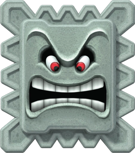
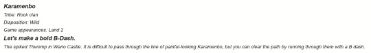
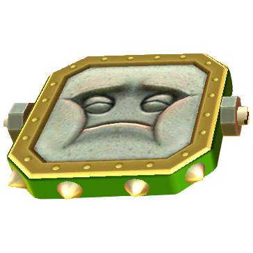
On the left we have Thwomp. Thwomp is a classic Mario Enemy. The kind you'd see featured on @regularmarioenemies. We invite Thwomp over for dinner every Sunday, and Thwomp always smashes the dinner table because that's just what Thwomp does. On the right we have Karamenbo. Karamenbo does the exact same thing that Thwomp does, but it doesn't have a face! And despite the fact they act the exact same way, this simple design difference leads to most people considering Thwomp an "enemy" and Karamenbo an "obstacle"!
Is the difference between an enemy and an obstacle really something so simple as having a face? And if so...
What do we make of Lava Bubble, another Classic Mario Enemy that only sometimes has a face? Are they only an enemy when they have a face? Or are they allowed to always be enemies in spite of their occasional facelessness? Or alternatively, are they prohibited from being enemies despite their occasional befacedness? I don't know, and my "the fact I am writing for this blog" tells me I should probably be an expert in this field!
And what about Moonsnake? What could easily be dismissed as a simple obstacle like a Spike Bar is revealed by in-game text to be a living creature! Does this allow it to be classified as an enemy instead? Does something become an enemy just because there's text saying it's alive? Do ghosts and robots count as alive? Is a thorny flower an enemy instead of an obstacle, or does the specific choice of the word "creature" make a meaningful distinction here?
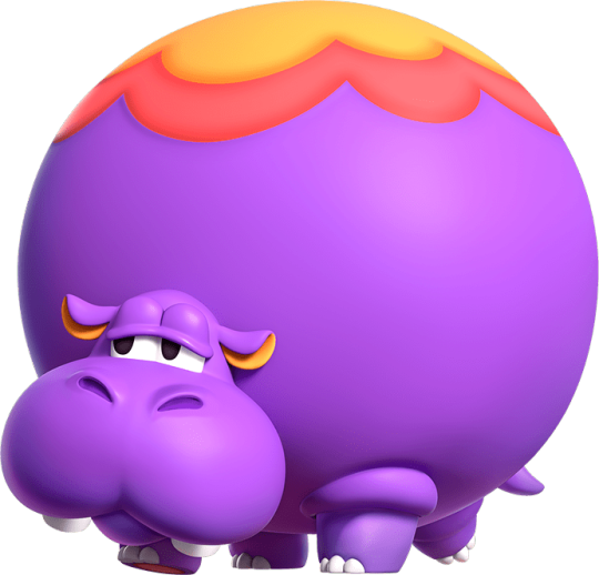
What if I told you there's official text calling Karamenbo a type of Thwomp, does that change your perception of it?
And we haven't even started touching on the idea of whether or not enemies need to hurt you. Let me ask you an important question...
Are Hoppos enemies? They can not hurt you. Whenever you touch them, you just bounce off, and sure, you might be bounced into something that can hurt you, but Hoppo is just an animal. Is it really Hoppo's fault? Could Hoppo be charged with manslaughter for bouncing Mario into a bottomless pit? Are bottomless pits a type of enemy?
Flomps, Bomps, these can not hurt you directly, but they can cause you to get hurt! And they're relatives of Thwomp, too! Do these factors matter in defining them as an enemy? Bomps act basically the same as the Push-Blocks from Super Mario Odyssey, and the wiki classifies those as mere platforms!
Is mayonnaise an enemy? I don't even know anymore!
Basically, enemies are a subclass of obstacle but there's not really a meaningful distinction that separates them. Literally the only thing that separates an enemy from an obstacle is the Vibes. Nothing else matters! Sorry! But what does that mean for our blog...?
Absolutely nothing! As I've said multiple times, we stopped caring about that distinction ages ago. We're hardly even a Mario blog anymore! I just wanted to subject you to my ramblings because I've had this in the back of my mind for a while now and well I had to say it somewhere.
And since I subjected you to several paragraphs of ramblings that amount to basically nothing... am I an enemy...?
496 notes
·
View notes
Text
I swear to god, Zanmu has just been on my mind recently, she's taking over my fucking brain please send help
Artist's Note:
Why is it that everytime I do a drawing of Zanmu I always make the canvas size fucking huge and it ends up being a living nightmare to fucking export. I swear to god I had to go from 1200 DPI to 600 to 350.
Exporting hell aside, I loved working on this piece. With Zanmu's design, I wanted to combine all the design details that I love and have seen in other people's drawings of Zanmu and give them my own personal touches. First of all, her sleeves were inspired by @amemenojaku's design for Zanmu, and I absolutley love that detail because not only does it make her feel more regal, it also can be a callback to Satori and old hell, and also gives me the idea that Satori's fashion sense was inspired by Zanmu because IRL a lot of historical fashion was inspired by what the nobles were wearing at the time, and since Satori was around since when Old Hell used to be Hell, she probably took some wardrobe inspo from her (or it could be my headcanon that Satori could've been Zanmu's royal advisor or she was in her court or something but that theory is kinda grasping at strings from other headcanons I have, but that's for a different post). Also, the eye makeup she has was inspired by @jothelion's drawings of Zanmu, and like, I fucking love that detail because it just adds so much like omg I just love it sm.
And now for the design details I put in. I gave Zanmu tassel earrings because I think they'd look great on her. I also really like to exaggerate her hair and really try to make it look wild, as well as having little grey hairs here and there. I also try to add some wrinkles to the corners of her eyes, but TBH I don't know how visible that detail is, since the image is pretty fucking big. I also really exaggerated the tassles/strings on her outfit, since I really wanted to play around with the potential flow they could have. Also, big fan of giving Zanmu longer sleeves and pants. IDK why but I just like how it flows better. Also big fan of making her taller, idk why a lot of fanart makes her short. Also, I placed her horns closer to the front of her head as I just think placing horns in that position looks cool.
Also, if you're wondering about the halo, I took some inspiration from a few of Caravaggio's paintings where he often depicts saints with this very thin halo around the top of their heads. I just liked that detail a lot so I thought I'd include it.
Fun fact, I was originally gonna make the four skeletons Chiyari, Biten, Enoko, and Hisami but I didn't like the prospect of having to draw four more characters, so I chose to replace them with skeletons (if you wanna get silly with it, Zanmu got Hisami to kidnap Aya, set up some skeletons with bones from her bone collection and told her to take a picture of her).
I kinda gave up on Zanmu's feet and the one skeleton's hands (as if drawing hands normally is hard enough but NOPE, HAD TO MAKE IT LIVING HELL FOR MYSELF BY MAKING IT A SKELETON) and the quality of the image may suffer because of how much I had to fucking compress it (Zanmu's presence alone was enough to make the computer lose all of it's desire and motivation to export the drawing of her lmao), but I have been hacking at this piece for a while now, plus I need to learn when to call it quits when it comes to drawings). Also as I was fixing up the hands there was one spot where I forgot to clean up with the sketch and I can't fucking unsee that now and it's going to fucking bother me until I fix it but fixing it requires going back and putting my computer through hell so yeah.
So yeah, that's about all I have to say with this drawing, it was fun but also a nightmare lol
#art#touhou project#fanart#touhou fanart#touhou 19#unfinished dream of all living ghost#zanmu nippaku#touhou#東方project#東方
518 notes
·
View notes
Text
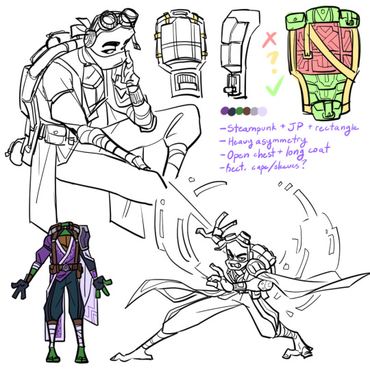


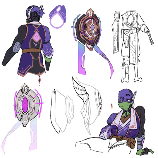

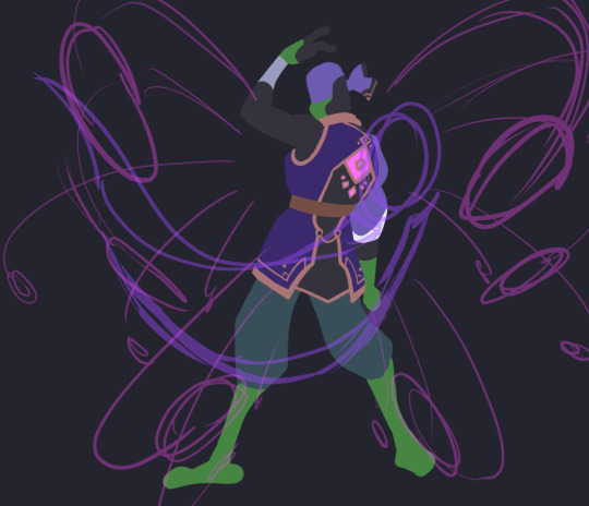
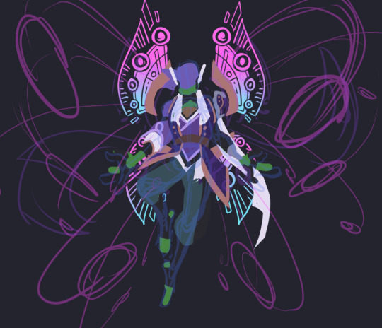
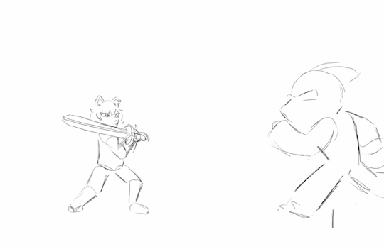
donnie had. SO. much concept art lol. i really enjoyed the whole design process though. his base design is very difficult to work with because of the battleshell, but it gave me a lot of chances to get creative and i'm happy with the results :)
(also as a disclaimer so i don't get asked about this: i don't have motivation to finish raph or the wish art for donnie, so i'm just posting what i've got)
i didn't annotate these as much since there'd be a lot to write, but i'll write out some of my thought processes and go into some detail about his final design below the cut if you're interested! (it's long. i'm talkative 😔)
1st row - first iteration; much more literal 1:1 translation of his design into a fantasy setting. very steampunk-y. ended up completely scrapping it because, simply put, he looked more like an npc than a playable character. obviously, several features did still carry over throughout the design process :3 also wanted to imagine his attack pattern cuz i thought it'd be fun to incorporate his spider arms.
this was actually the first design of any of them i'd come up with! i've definitely learned a lot about genshin's character design style since then and i think it shows 😂
2nd row - playing around with the idea of a floating battleshell (rather than a backpack-like one in the the show & first version), inspired by nahida's cape. also hard light constructs/attachments. was leaning too into the sci-fi and rectangular motifs with the design, but i liked the idea.
3rd/4rth rows - concepts for his final outfit and shell designs (the colored/more-detailed pics are the more finalized ones). took a lot of inspiration from sumeru this time around. it's a lot sharper, shinier, and less rectangular than his og aesthetic, but i think it's more in-line with genshin's design philosophies.
5th row - not entirely sure why i went through all the trouble of making a 3d model for this. i mostly just thought it'd be fun and good for reference. i was right, but i don't know what to do with it now lol. can't be bothered to be a perfectionist about it though, so don't look too closely at it 😭
6th row - incomplete thumbnails of his burst/wish art. not super sold on that "wing" design in particular, but i do like the idea of his shell splitting and deploying hard light weapons/rocket launchers/etc sort of like in canon.
battleshell/misc notes - i'm thinking his battleshell is controlled using the pink sensor on the back of his coat, possibly in combination with his headset. it floats behind him by default and is sturdy enough to protect his back, but he can also freely fly it around like a drone if he wants. the holes on the side are mainly for the spider arms and the banners(?) and handles(?) with the blue/pink gradient are made of hard light and only appear when the shell is in use.
i imagine like in the series, his tech here isn't necessarily very reliant on his vision/powers; much of it he likely made himself long before he received a vision and he just uses his vision to enhance it.
his burst is a barrage of missiles from his shell that lock onto an enemy and deal a large burst of electro damage in an AOE. not sure if i want his skill to be a deployable or some sort of electro-infusion/boost 🤔 maybe something that involves deploying his shell to boost his damage while leaving him vulnerable, like a glass canon? though i'm not sure he'd be that sort of risk-taker... 😅 dunno! his signature weapon would totally be his tech bo though.
that's about all i can think of. thanks for reading!
#rise of the teenage mutant ninja turtles#rottmnt donnie#rottmnt au#rise genshin au#rottmnt art#my art#mangastudio#3d#art#process
1K notes
·
View notes
Text

Out and about | New York City, NY | December 13, 2023
Clio Peppiatt 'Lucina Embellished Stretch Mesh Mini Dress' - $2,335.00
For the last few days I’ve thought a lot about how there’s been a certain uptick in the level of ‘glam’ in Taylor’s looks that harkens back to the early days of Midnights promotion. A time period when Taylor’s style was a two-tone mix of a patchouli hazed 70s apartment stuffed to the ceiling with well-loved vinyls over which a veneer of pinned up showgirl was laminated. Short hems, high heels, faux furs, dripping diamonds. I always felt this was an appropriate way to create a visual extension of an album that is positively full of emotions that are nuanced, complex, and that seem to be in direct opposition to one another even over the course of one track to the next. Over a year out from that album, much about Taylor’s life (professionally and personally) has been completely upended.
So to see her here now, effectively bookending Midnights fashion in a look that’s dark and ruminating and moonlit and celestial and mysterious yet sparkly and glam and alluring … it feels all the more appropriate on her birthday of all days. Adding another year of life to your experience tally often creates moments for reflection and to sift through memories - good and bad. Which sounds very much like the ethos of Midnights if you ask me.
On its surface, this is a fun party look (in a new-to-her brand which is an exciting new addition to her designer roster) that’s perfectly coordinated between the silver embellishments scattered like the night sky across her dress, to her bag, and even into the details of her shoes. Plus the extra shine factor of her jewels.
But like with any Taylor look, it’s one that gives me pause and makes me think of the context to what got us here and also to where she may be going.
Worn with: Anine Bing jacket, Messika earrings, Mazin Jewels necklace, Aquazzura bag and heels
Get the look: Topshop, $278.00
Photo by Gotham via Getty Images
521 notes
·
View notes
Text
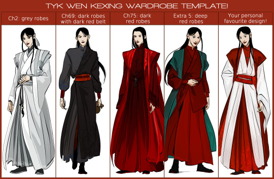
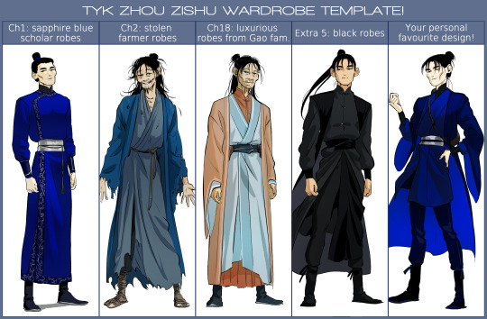
My version of the wardrobe template! yay!!
I had a LOT of fun doing this and feel like I could elaborate a bit more on each of those.
It's already linked up here, but here's once again a > link to the post.<
Anyway! More about these designs below!
So first, for WKX's template!
- Chapter 2: Grey robes
I had already made my design of those for the full TYK lineup I made a while back. I really, really like those, and took inspiration from some of the robes SHL!WKX wears in the show for the shapes.
- Chapter 69: dark robes with dark red belt
I expected to like that style for him, but not that much! I had seen a tutorial on how asymetrical hanfus were worn by archers in the past and that inspired me, purely on a fashion level of course. I like how intimidating he looks with those and enjoy the touches of blue in the inner layer of the robes.
- Chapter 75: dark red robes
The GVM robes! which I also designed a while back when researching for the illustrations of the Mt Fengya battle scenes that I wanted to make. I reworked them just a little bit and got rid of some details that I didn't like anymore. I tremendously pleated skirts for WKX so I went at it once again. I also used shifts in hues to make it look like it could have been drenched in blood.
- Extra 5: deep red robes
For the reminder (since apparently some people are not aware of extra 5's existance), this extra is set 5 years post-canon. I wanted WKX to wear something that looked comfortable for traveling but also practical and fashionable. The teal jacket is of course another nod at SHL since the red and teal combo was an absolute banger. Let's say I didn't want WKX to just sport an all-red look. Furthermore, the teal really works to adorn the red hues.
- My personal favourite
I actually don't really know whether those are my actual personal favourites, but I've come to LOVE WKX dressed in red and white thanks to @kwehxing's designs. I think it really suits him and on top of that it avoids the question "is this Hua Cheng" LMAO--okay jokes aside, I combined most of the shapes that I really like for WKX (wider shoulders, wide sleeves, and long robes with pleated inner robes) and I find him very elegant like this.
Now, for ZZS!
- Chapter 1: sapphire blue scholar robes
Those had already been designed before as well! They're my go to generic TC!ZZS robes, haha. I was a bit extra with the blue colour here, but oh well. I'm quite obsessed with the silver brocade cynching his waist, haha.
- Chapter 2: stolen farmer robes
A classic as well as far as I'm concerned--of course, inspired by his hobo fit in SHL because it was quite efficient. I'm forever fond of my scruffy hobo!Xu and his toes poking from his sandals.
- Chapter 18: luxurious robes from the Gao family
Those were a new design! Which I had a lot of fun coming up with. Putting ZZS in a different colour scheme was also really nice. For those who don't remember, ZZS feels quite ridiculous when he sees himself in a mirror wearing those fancy robes while being so emaciated and still sporting his hobo mask. I wanted to give this "out of place" feeling; and also work on a very "wuxia" style for the robes, since this is jianghu and they were provided by Gao Chong.
- Extra 5: black robes
I'm incredibly fond of this design. I worked quite a bit on it, since I wasn't sure of where I wanted to go. My main guidelines were: practical and cool. I really like ZZS having a lot of room to move so ideally not too much fabric in the way, and I think he also needs arm braces to be rid of annoying sleeves. Of course, him looking much healthier and having a dynamic ponytail really works to "complete the look", and I find that he looks really cool there haha.
- My personal favourite
This one has been refined over the months, but it's definitely, overall, my favourite look for him in terms of shapes and construction. I like that the robes are short, I like the more fashionable jacket. I'm especially into the "pants tucked into the boots" silhouette, as well as the little ribbons keeping them tight around the ankles. I'd say that this leg shape + short robes + a bun (or sometimes a ponytail) is THE ZZS design combo for me, haha. It looks practical and fun and adventurous, just how I like it.
To conclude the whole post, I had more fun doing this than I even expected, and needless to say that I'm very excited to see other versions of them following this template. It was a good opportunity to try and project what the characters look like throughout the book, and a fun design exercise as well. I actually don't really like doing character design usually, but for characters I'm obsessed with, it's of course a much nicer experience.
Anyway, thank you for reading!
214 notes
·
View notes
Text
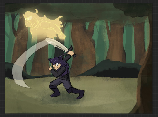
HOWDY EVERYONE- so excited to FINALLY be able to show off my piece for this year's Bumbleby Big Bang!
Unfortunately no accompanying story as of yet- but I really hope you guys get to read it someday! The premise involves Yang cursed to be trapped inside a sword, which was an idea I KNEW I had to make move.
Details and development stuff under the cut!
Lots of fun collaboration with the author, Celeste! We worked together to find the look-of-picture, Blake's outfit, how the Grimm look, the style of the sword, the whole shabang! I'm really happy with how it all turned out!
When I first saw all the prompts, even before claims opened, I got to work on a handful of exploration pieces based on some of the summaries, to decide which of the stories I was interested in would be the best fit. Here's the initial idea for this one I put together over a lunch break:
After showing Celeste, we got to work finding the look we wanted! Went back and forth a bit and found this great look for Blake! Also shoutout to Pinterest boards for visdev inspiration I love you Pinterest boards.

Just about everything stayed to final anim, with the simplification of getting rid of that purple cloth hanging from her belt, (since I already had the rope ends to think about working with), and the light purple strap across the chest, since leaving it out would simplify the linework on her chest.
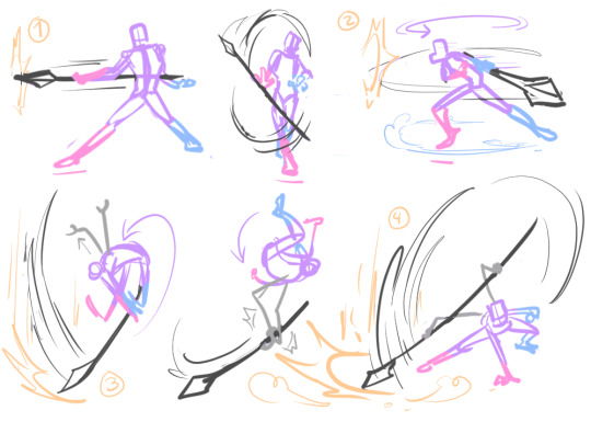
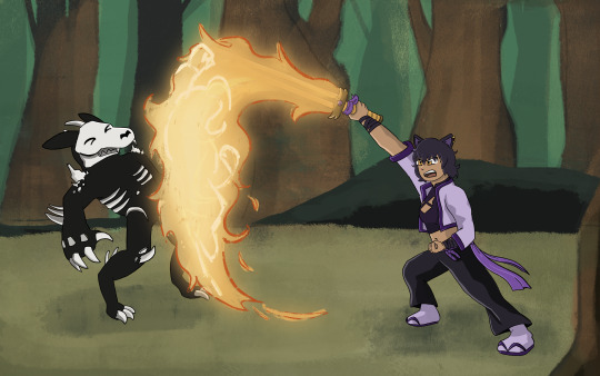
The sword also went through a bit of change! Celeste had the idea of Yang making the sword catch on fire, which I LOVED. I went with a split design so we can see the fire more clearly start from the hilt and grow to cover the whole blade.
And from there we brainstormed animation ideas! I went all over Youtube for video reference of sword work (that would be complex enough to be interesting, but short enough to be manageable). I found something we liked from Motion Actor Inc., a channel I've used LOTS for both personal and professional work (I work in 3D Animation, for those who don't know). I edited this together, to see the action from multiple places at once, which gave me the idea for that camera move that's in the final anim!
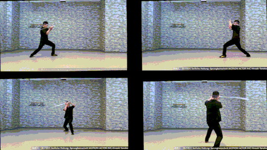
Now for the fun part! Make that badboy MOVE. For the cam turn, the first frame she's in the air I'm referencing the top left video, and the frame she lands I'm referencing the bottom left one. While she's airborne I'm just inbetweening that! No reference for the Grimm, just wanted it responding to her attacks, but I end up tweaking the roughs later on to make the block feel stronger.
Then from there we had to actually figure out Grimm designs! Nimona had just released, and Celeste and I loved it, so she asked if I could take some inspiration from Nimona's shadow form! GLADLY. Here's what I came up with!

I was going between how the movies and comic designed Nimona, really loving the almost liquid shadow of the movie, but also how the comics had this broken up/held together rougher form. Celeste liked the second to last one the best! The original plan was to have it leave a wispy shadow trail like the concept art, but to simplify the animation we left it solid instead!
Next up is tiedown! Basically just getting the roughs more on-model, so the lineart comes out nice and clean. I've also transferred the new Grimm design to the base from earlier, and fire's also outlined orange so it reads clearer. (SPOILER- if you look REAL close here, you can see Yang visible in the fire! I liked the idea of Blake's slash also doubling as Yang throwing a punch. The idea is in the concept art earlier but now it's working with the action.)

Next step- final look of picture!! I asked Celeste for sources of inspiration to draw from when thinking about environment design, and we got Nimona, She-Ra, and Owl House! Used each of those as springboards for shading style, colour palettes, and how the fire would look!

From there, we kept the straight trees/bush/lake/foreground greenery from the first one, the blues from the second, and the fire from the third!
Once I had this frame, it was a matter of working backwards and making the background work pre-camera turn (which was ABSOLUTELY the most challenging part of this process). Learned a lot doing this! Procreate isn't quite equipped to make something like this efficient, but I'm pleased to say that Dreams would make something like this easier in the future (keyframing objects instead of hand-drawing/spacing duplicates by hand, for example).
From then on it was just colouring the lineart, adding shading, and finishing up the background! Beginning-to-end this whole process was beginning of July to end of October!
I had an absolute BLAST putting all this together. Here's to next year where I find a way to do something even more ridiculously complicated!! It's fun!!!
#rwby#bumbleby#bumbleby big bang#bbb2023#blake belladonna#yang xiao long#(technically!!! look at the fire!!)#officialrocketart#officialrocketanimates#greatest hits#HOOO WHAT AN UNDERTAKING#so glad I came up with an idea pretty outside of my comfort zone but having the CLEAREST idea on how to execute it#means things went smoothly it just took a Long Time#AND I LEARNED LOTS#hope you guys can read the story one day!! its dope!!#bonus bonus fact for tag readers i didn't put in the post proper: i showed the rough pass to ANIMATION INDUSTRY COLLEAGUES for feedback#shoutout to ioana and v love you both lots#ioana for tightening up the rough pass and suggesting i smear the sword#and v for notes on my sword smears#okay i hope you guys enjoy!!!#it has been true for ages now but The Bees Motivate Me To Create#and in these trying times i thank them for that
387 notes
·
View notes
Text
I AM SPINNING I AM PACING I AM FULL ON FROLICKING IM SO EXCITED
@d1sc0rd1a THANK U FOR THESE TAGS
okayokayokayokay so pretty much all of these questions will be Officially Answered properly in the character design/intro pages im working on but also i am physically vibrating with excitement about the fact that you noticed all these details and i have very little self control so! lore dump time!!!
(minor tw for mentions of leos self-harm/self-destructive anxious behaviors and unhealthy coping skills)
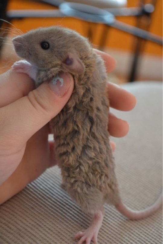
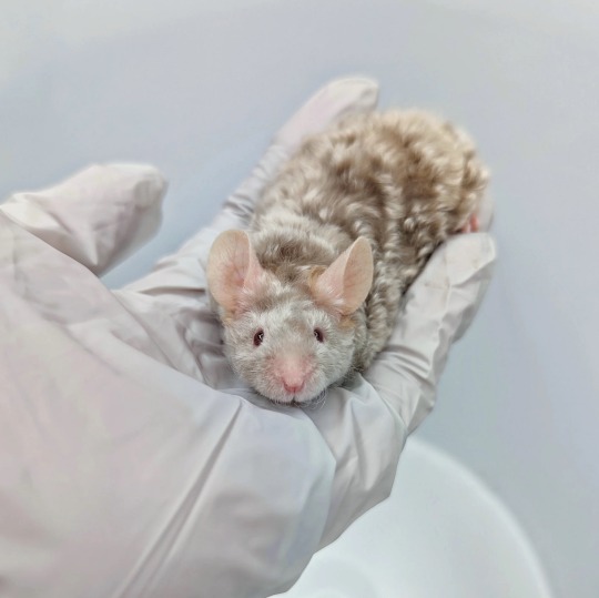
- mikey does indeed have curly fur! i believe he would be considered a 'rex' rat (pictured on the left) for this trait? though the curls can be more easily seen on mice (pictured on the right). or, at least it seems that way. have not delved too deeply into the details of rodent genes and husbandry, but id assume its the same sort of mutation considering curly haired mice are also referred to as rex sometimes? either way hes a extra floofy bby 🧡
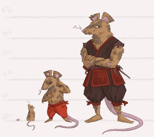
-as for raphie, unfortunately being more fluff and less shell than the average rapheal comes with its downsides. especially if you and your brothers occasionally encounter things like territorial dogs, hungry cats, or sewer crocodiles while exploring places ur dad said not supposed to go. (most of his scars will have more ninja related stories, but his ear i think got messed up from something very animal. probably around age 11 ish? old enough to sneak out from dads protection but young enough to not fully know how to handle himself alone against real danger. thankfully his ear injury looks worse than it actually is for the most part, as the damage was largely to the outer ear. his hearing wasnt super affected, except that he now has a bit of a harder time being able to track/pinpoint noises origins if its on his right side.)
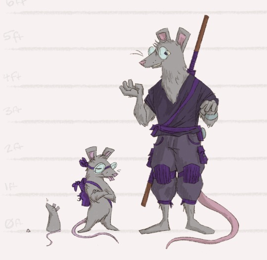
-also yep! dons got some glasses that just clip/rest on the bridge of his nose! theyre mostly just for home use, as they do fall off if hes knocked around. in the field he has some goggles he tends to use (theyre helpful as they have multiple additional functions like heat-imaging, extra zoom/telescoping, and recording capabilities. but also theyll give him headaches if he wears them for too long without breaks). contacts are theoretically also an option but he absolutely hates the sensation of putting them in. so sometimes when hes tired he'll just not bother with either clips or goggles and just squint and struggle. leo hates when he does that lol.
-speaking of leo, he is def an anxious baby :) he has a few patches of fur missing on his hand cos he has the tendency to tug on it while hes thinking. he yanked and chewed on his own tail a lot when he was younger too, which is why when hes older he usually wears some wraps to cover the scars left from that behavior. he finds those scars specifically to be kinda embarrassing and shameful because they werent from any battle or life-lesson, just his own 'inability to control himself'. all of his brothers have repeatedly called him out on the fact that that is not a healthy way to think about his anxiety or mental health, but leo insists hes fine. hes kinda convinced himself that a proper warrior always has control over his own body* and his own thoughts, thus he should be able to just like willpower-brute-force his way into 'being better'. (this line of thinking pisses raph off so much he has to leave and go hit something)
Splinter also tries to talk him through some of that internalized guilt/shame/everything, but splinters very metaphorical, poetic, and indirect when it comes to talking about Big Things, which combined with how much leo gets caught in his own head, makes it kinda hard to gauge how much these talks actually help
*this is made extra fun considering leos also ftm trans, so he is faced with a body that fundamentally disobeys him perhaps more than the average rat-man.
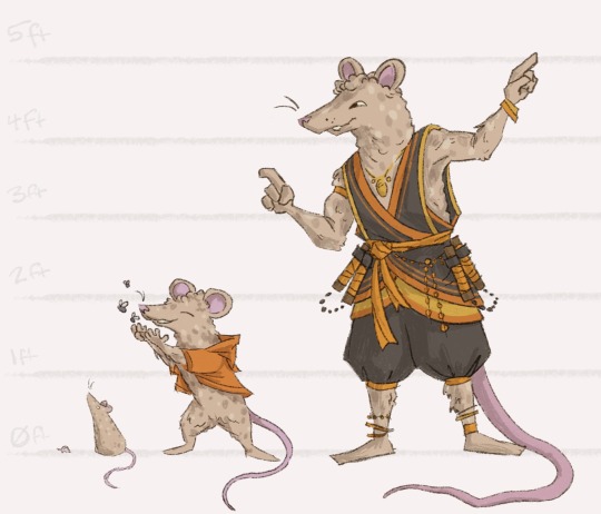
-and im still going back and forth between a few species for splinter, but im leaning mostly towards an African Spurred Tortoise! they have these beautiful if kinda subtle geometric shell patterns and are the third largest species of tortoise in the world. the only thing that doesnt fit perfectly with Splints is that (allegedly) their lifespan in captivity is around 50ish years, whereas im p sure Tortoise Splinter is well over 75, probably closer to 90 when the boys are born and hes mutated into Old Man Papa.
but maybe hes just a particularly long lasting African Spurred Tortoise.
the Hamato family has taken very good care of him for many decades after all. :)
(well. until everything all fell apart, that is.....)
#tmnt#rat sons#my art#tmnt au#literally bouncing around the room thinking about this all#my downstairs neighbors are gonna hate me#ask reply#sort of???#pats leos fucked up lil head#this bad boy can fit so much projection#get out of ur head idiot ur family loves and wants to help u#also looking at the chaco tortoise and ploughshare tortoise for splinter thoboth of those are smaller species than i think he is
417 notes
·
View notes
Last Seen Blogs
parulite
miracle daughter
0-scorch-the-earth-0
Scorch The Earth

amessystory-blog
A Little Story About Me and Him
spundad615
46 guy looking for a Badgirl. NSFW I8 AND OLDER
j6oy
❁