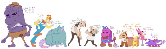
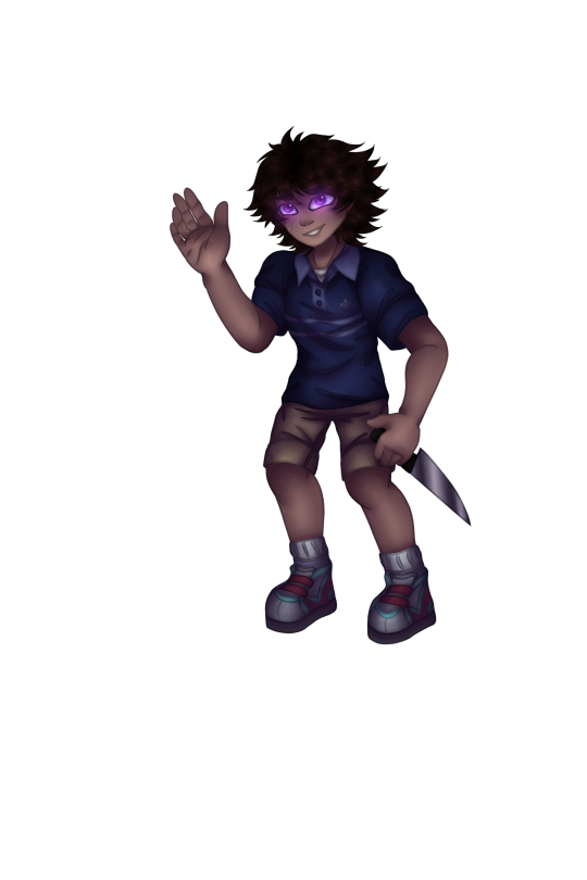
#i did the original design too so it was fun to get to draw them again :D
Text

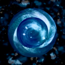
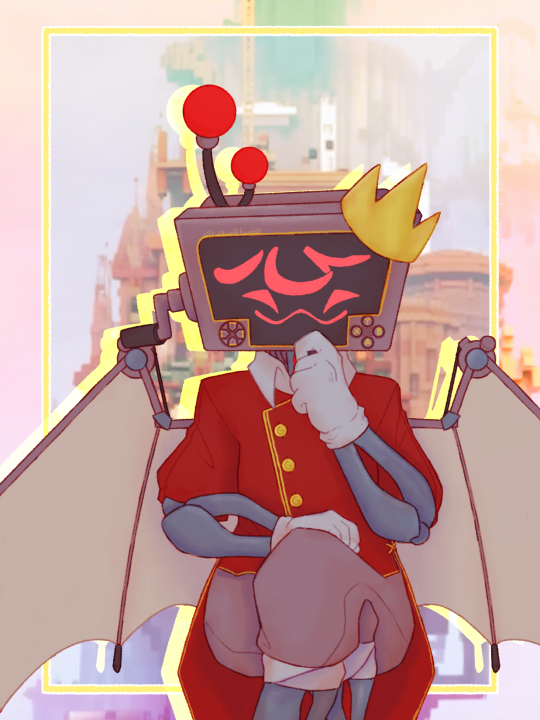
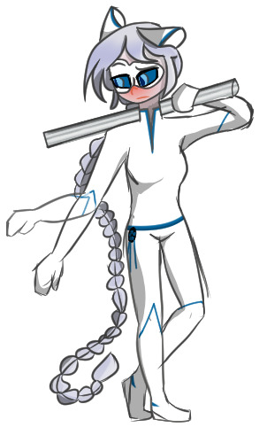
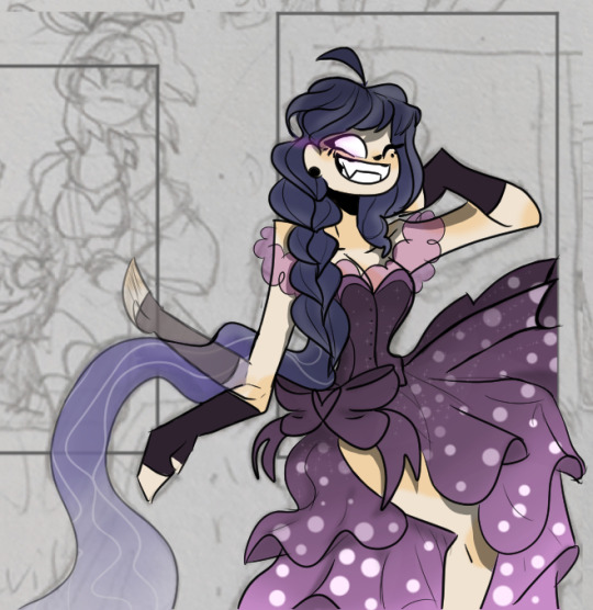
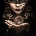
star eater, commission for ghostie
#space#creature art#fantasy creature#space whale#whale#i did the original design too so it was fun to get to draw them again :D
136 notes
·
View notes
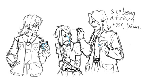
Photo
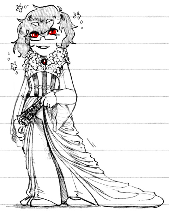
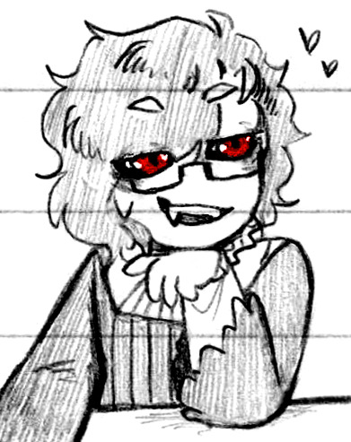
Red Eyes and Evil Time, practically the same thing right (Patreon)
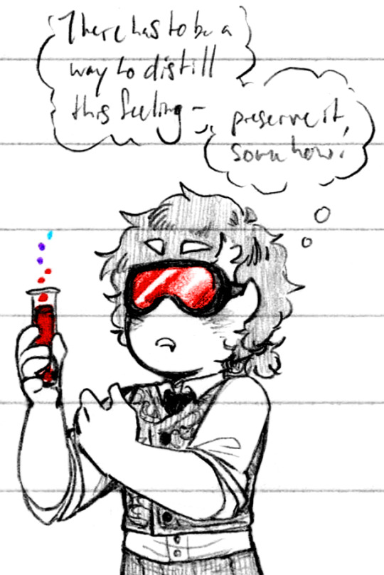
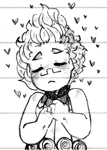
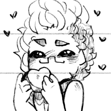
#Doodles#Villainsona#Just Desserts#Sona double feature!#Red Eyes and Evil Time /are/ different for the record lol#There's overlap and they're both eye details but they're different#Mmm Red Eyes feels so niiiice <3 And I've been pacing myself so it's Just Red Eyes!#No red shines :) Which can happen even on Red Eyes#In fact it's probably more common - the red shines on Blue Eyes was something of an oddity#No one knows the lore except me I'll explain someday lol#For now it's just fun to be in Red Eyes! :D And the occasional Evil Time as well lol - all the overlaps!#I somehow accidentally made a like?? Cotton Candied Popcorn themed outfit for Eli for the first one lol that wasn't my intention#I mean it's cute I'm not about to fight it lol I'd love for my sonas to have other clothes inspired by each other haha#Eli's eyes are still quite fun to draw as well haha those bright pops of colour - Red Purple or Blue they're all so stark and shaped#Back to their classic feminine outfit good for them uwu#Silly lad#They're also still a scientist first and foremost - it's all chemicals there's gotta be a way to recreate it externally!#Local vampire scientist creates mood stabilizers more at 7 lol#I'm quite pleased with the three-red two-purple one-blue gradient as well hehe - the decay! :D I like it as a visual#Charm tiiime <3 <3 Happy Charm time in Evil Time! Usually better than bad mood Evil Time lol - at least for those around her#Still chaotic to be in it haha - but happy chaos is happy! Lol#Again more fun with eyes the light bounce in the one where she's holding the melt is so cute and looks so nice on my paper too <3#I had a silly comic idea for her for the next time I get into Red Eyes as well - if I remember lol#Big Love is hearts! It just makes sense#Also I am Really proud of the cleaning job I did on that last one lol - from original to this? Night and day ngl#Guess that goes to show how little cleaning I do on-page lol#For some I do! Others...#Still thinking up outfits - you can probably just make out ''Hero Charm'' in her hair lol trying to think around different themes#Something that could become something else! Add or subtract an element and it changes the ''meaning'' of the outfit#Kinda like her initial caped design that Kaiein rejected hmmm
7 notes
·
View notes
Text
Honestly I’d really like to make some kind of MLP AU or redesign/rewrite or whatever else of the sort because MLP was essentially my first fandom and it’s extremely nostalgic to me, but I’ve seen so many people do it already and have found myself physically incapable of producing something that isn’t blatantly copying what other people have done :/
#and yeah yeah I know that nothing in the world is truly original and everyone’s inspired by something#but I want to make smth that isn’t rehashing what I’ve already seen#and it’s hard bc redesigns and aus are kinda all the rage right now#and no I’m not talking about those infection aus bc while those are really cool and I’m not interested in making my own#I’m a really squeamish person. to the point I even avoid sick fics most of the time#so while I enjoy seeing a lot of those aus because I too had a creepypasta phase and it reminds me of cupcakes and rainbow factory vibe-wise#I’d probably throw up if I had to draw smth like that myself 😅#anyway. what I meant is some kind of rewrite where I’d get to explore themes that interest me more#maybe dig a little deeper than the earlier seasons of the show could afford in certain places#like coming up with a clearer reason for aj’s parents’ deaths. for instance#and also making next gens is basically my modus operandi at this point so while I’m not really interested in making kids for the mane 6#I’d like to redesign them + their families to get to play with genetics a little.#but again. I’ve seen a lot of redesigns over the years and I’m afraid they would influence me too much for my liking#only reason I’m so worried is because last year I did doodle some ideas a little. for the CMCs in particular#and suddenly realised they were basically the grand galloping 20s au designs poorly drawn from memory in my style#and any ideas re: redesigning the actual pony species are essentially ripped off from skyscraper gods#as are some concepts about becoming an alicorn/gaining immortality and all hat#so… yeah. no#idk. I’ll think about it some more and maybe I can come up with some cool ideas that I can string together in some way#it might be really fun and would also give me a chance to let my sotrl hyperfixation rest a little#don’t get me wrong. I love the universe Kat and I created and my OCs and everything. but I’ve been going at it non stop for almost 4 years#sooner or later it’ll burn me out and I won’t be able to come up with anything for it anymore#and I literally don’t draw anything BUT sotrl#so it’d be nice to branch out a little. maybe I’ll finally feel less like I’m screaming into the void with my incredibly niche OCs#again. I don’t know. we’ll see if I’m struck with inspiration or smth#also coming up with ideas is like half of the problem lmao. horses are really hard to draw#even cartoon ones 😭😭 I was hyperfixated on mlp for most of my childhood and still never mastered it#I can barely draw humans lower than shoulder level let alone horses. but I’ll figure it out if I get a concrete au idea#okay I’ve been rambling for like half an hour. rant over I’m done
2 notes
·
View notes
Text
Mannnnn Mocha's design is soooo good actually like damn I rly popped off with them huh
#rat rambles#oc posting#fun fact I actually originally made them to be an adoptable but got too attached FAST#I never did put the other guy I made up for adopt of toyhouse tho msybe I should do that#Id need to redesign them a bit first tho since they turned out kinda ugly#but yeah mocha is like one of the only characters Ive designed that genuinely grew on me that fast#they became a huge comfort like day one idk what I did to make a character that would rewire my brain like mocha did but good job me#and risa is dead to me /j#but I will admit I did struggle with risa design wise#all I had in my head conceptually for them was 'long' and nothing else gkfnfhf#but now Im pretty happy with risa's design even if I struggle to draw them consistantly#but honestly those two have been complimented many times before wheres all the love for my boy courtney /j#I love his design sm too but like every drawing Ive made of him ever has flopped so bad gmfnfjf#is it because he and his friends arent anthros? cant believe yall hate ferals smh /j#but for courtney I had a pretty clear image of what I wanted him to look like before designing him#honestly clear emough that I worried hed be one of those characters I wouldnt be able to design#but I did so all is well#moral of the story I make banging designs but am bad at getting attached to them unless they were already a character before hand#unless its mocha. in which case I get attached immediately and draw them 50 times in a week#anyways its late gn
1 note
·
View note
Text
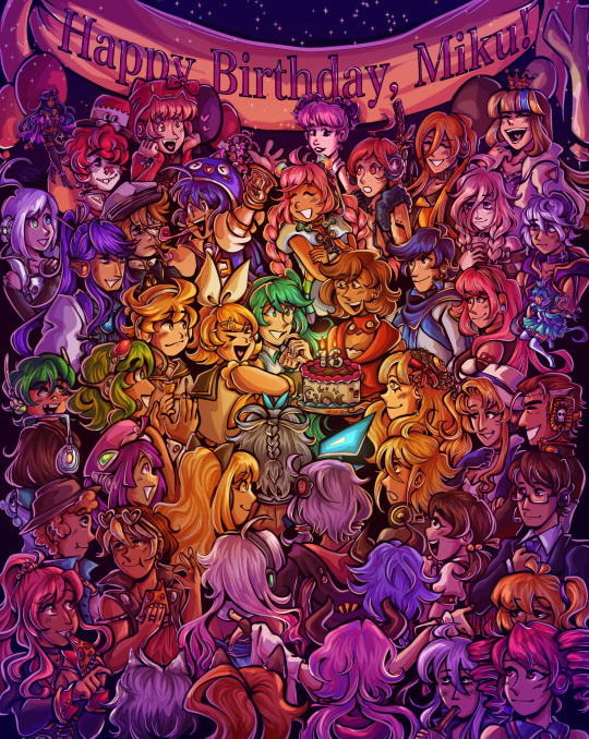
Happy birthday to the number one princess in the world!! 💖
~from her biggest fans :)
ramble of my scattered thoughts on the piece under cut as usual cuz i love talking 😋
This has been an idea I've been cookin for a while, and it was so cluttered and unlike any other ensemble piece I've made... and I decided I oughta do it anyway. I love Miku, I love Vocaloid, and I wanted to do something really ambitious and crazy for her anniversary. Crazy that she's turning her "canon" age this year TwT
I had the idea floating around since like, May...? And then finally started acting on it around June 18. I'm terrible with deadlines, obvious with how I can never make a silly birthday post in time, so I started wayyyy ahead to make sure I have some room to be lazy lol, especially with an idea as ambitious as this.
This was finished on July 12! So I had to sit on this for an annoying amount of time. Very difficult for someone like me who just wants to talk about everything I'm working on to the masses. But at the very least, that gave me the time to work on the draft for this post.
~~~
Here's some ~behind the scenes~ scribbles leading up to the finished piece!
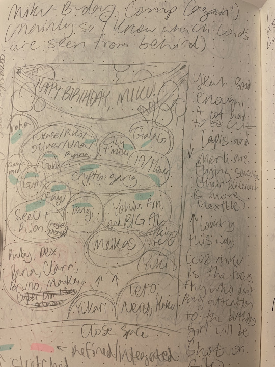
Left is the chicken scratch plan i made in my handy dandy notebook (whenever things are getting real and ambitious, i always made a rough ROUGH plan in there. Usually I'd do a rough pass of the full thing, but this was too complicated for me to do traditionally. I majorly benefited from digital tools to make this possible). CyberDiva and CyberSongman were considered, but I ended up cutting them cuz I just didn't feel like drawing them sorry-- (just pretend they're off to the side. They gave Ruby and Clara the pizza lol).
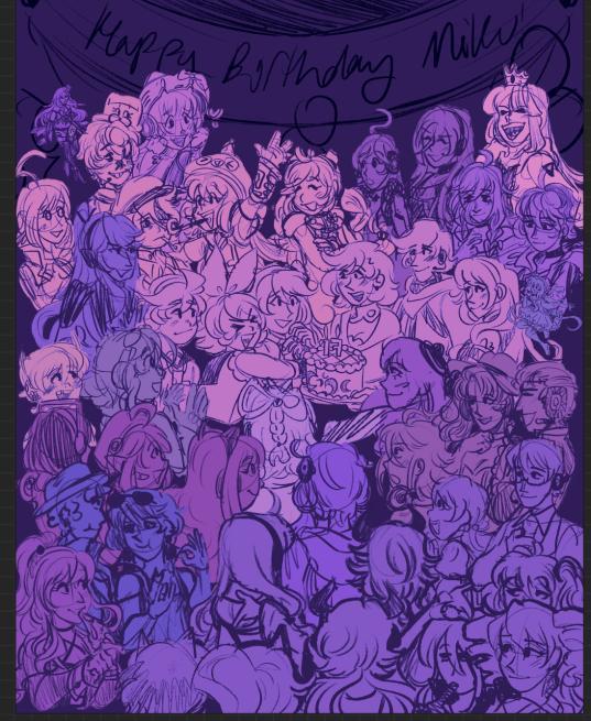
Right is the "final" completed sketch (before I decided to include Chika mid-way through coloring and VY1 and VY2 near the finish line). I started by drawing the main "groups" separated on a different canvas so I can plop them into the main canvas for easy rearranging and transforming. However I got lazy and ended up drawing everyone in the bottom right corner directly on the canvas since I liked seeing the big picture of everyone's positions. Y'know.
Almost excluded Chika! But I like her design so much that I just felt like including her last-minute. You win this time, Chika fans.
VY1 and VY2 were very close to being cut! I added them when I began doing the banner and thought "eh why not". I figured their non-human designs would be pretty easy to include pushed back in the bg. Ik VY1 is more commonly associated with the fan design, but I referenced the hairpin cuz it was simpler and the fan looked very annoying to draw 😭
Sorry to the fans of many Vocaloids I had to cut because this composition was insane enough as is. I promise I wanted to include fellas like CUL, LUMi and Sachiko 😭 I will admit I was a little biased on who I wanted to include over others. Like, I don't normally care for Bruno and Clara, but I wanted to get some more international 'loids in the mix. Also wanted to stick in the realm of official designs and not fan-designs since, as much as I can appreciate those, are just a whole "wait who is that guy supposed to be" situation I didn't wanna deal with.
I also did wanna include even more character references through the balloons, but they ended up being kind of ugly and overcomplicated the BG :,)
(Oh, and while this was originally planned to be a Vocaloid-only piece, I did end up including Teto, Neru, and Haku 'cuz those are Miku's besties dude!!! They may not be Officially in the club but they're her girls and it would be criminal to not invite them to her birthday).
Anyway, this project marks the first time I've drawn a lot of Vocaloids. Lily, Piko, Rana, Yuki, Yukari, Miki, Maika, and many more lol. All of 'em I've heard or seen in passing, but now I actually drew them, and some have really cool and fun designs!! I got into a habit of drawing Merli after this since I just love her design for example. And I'll probably be drawing more lol!!
Oh and the last thing I'll add for now!! The cake is indeed made up of various song references!! I wanted to reference the "big four" producers, just absolute icons in Vocaloid history. The pink/black checkerboard is "World is Mine" (Ryo), the crescents on the side is "Rolling Girl" (Wowaka), the smiley faces is "Matryoshka" (Hachi), and the three hearts on the side is "The Vampire" (DECO*27, which is sort of a symbol of his whole Mannequin album tbh). I know "The Vampire" is a bit modern but I couldn't think of anything else off the top of my head. I'm a fake DECO fan I know 😔 "Matryoshka" was originally going to be referenced in the colors of the candles but believe me it looked like shit so I just went for something else last minute 😭
That's all I have to say!!! Hope you didn't mind the text wall if you made it here. I hope you like it as much as I do!!!! Happy freakin' birthday Miku!!!!
I have to deal with tagging all these characters now for my page,,, in the drafts my tags got cut off after a certain point so I think I'm massively breaching the tag limit 😭 um... I'll figure that out later...
not losing sleep that i can't tag everyone, even for page organization purposes because some characters have pretty generic names and some are a little hard to see in full yknow. If you're one of those people who tag every character in the art piece you reblog... I am very sorry.
#mayor doidles#fanart#vocaloid#hatsune miku#miku#kagamine rin#kagamine len#rin and len#meiko#kaito#megurine luka#gumi#kamui gakupo#ia#vflower#mayu#kaai yuki#oliver#otomachi una#fukase#sf-a2 miki#utatane piko#yohioloid#big al#sweet an#kasane teto#i literally dont think i can tag everyone. um. so you get the idea right#digital art#cell shaded
2K notes
·
View notes
Text


For @orange-artist ‘s ASL god AU DTIYS! (congrats on the milestone!)
This was really fun, I absolutely love drawing ethereal designs
Additional notes 👇
So i adjusted the original designs ... a bit...
To draw in my style means that i have to make everything extra, sorry.
Ace:
I like the base design for Ace a lot! i looked at other posts to get more context to these outfits and i say this draping billowy pants design that i liked a lot more, so I used that instead of the ones he has in the picture.
I love his cute little star crown, i think it looks dope as hell. I wanted to bring it to other parts of him too, so I gave him an arm cuff with it, too! If i had drawn the front of him, you would also see that crown design around his waist as a belt, too.
i originally had him in a pose similar to the one he has in the original, but after i sketched out the other two poses i found he looked a little two flat, so i brought his hand out to the foreground.
I like the choice for his hair to gradient out to look like a comet! I had a lot of trouble trying to make it look Just Right, but i think I nailed it
Luffy:
I didn't change much about his design, I really just made him a little more yellow than he was before. Its hard to improve an already banger design. He's my ethereal silly guy...
I really love the idea of Luffy's scars looking like gold, that's really cool.
I wish I could've added that cold crown he has around his head, but i didn't know how to without it looking sloppy so i had to leave it out.
Sabo:
I changed so much about Sabo's design, i would like to send out a formal apology for it, I admit I went a little too ham. I had already completed the picture before i went back to look at the original post and saw the comments about how Sabo was supposed to look... discreet...... I... Did Not Make Him Discreet. In The Slightest. :DDD ehe
I needed help for Sabo's pose because i was having so much trouble with the hand, i called upon my good website friend JustSketchMe to get it right. I had this idea for the pose because i wanted the claw to look like a crescent moon, I think it looks pretty good.
I would've given him normal snakebite piercings too but i felt that the ring piercings looked more Crescent-like, so i went with that.
Moon belt. i want that moon belt. I have no outfits it would go with. but i still want it.
I love Sabo's whispies that he has in the original design, but when I put them in the art i had, it cluttered up the piece too much and I had to get rid of them. A moment of silence for the fallen whispies...
Noticing now I forgot Sabo's Cane..... oops.
General:
I shaded Luffy to be lighted by the sun, Sabo the moon, but i made Ace be the light for himself. There's some deep meaning to that, but I cant think of one right now.
I had a lot of fun drawing this, i hope i was failthful enough to the original designs even though i changed everything a lot :)
Drinking game: take a shot everytime I used the word "I", take a double shot each time i forgot to capitalize it, too. You will be Dead by the end of the post, though.
#my art#monkey d. luffy#sabo#asl brothers#one piece fan art#portgas d. ace#sabo the revolutionary#OP god au#asl au#@orange-artist#DTIYS
2K notes
·
View notes
Text

a year!!! as of today i have now been drawing these funny little pizza freaks, to the exclusion of almost everything else, for!!! an entire year!!! i wanted to do a nice group shot/lineup of everybody to compare to when i first started trying to draw them because oh boy were they bad. i never even posted most of them anywhere because they were so bad. but im posting them here, now, to see how everything's changed/evolved.
this is probably the hardest time i've ever had trying to figure out how to work with a style, but we got there eventually; i'm pretty happy with the handle i've got on everybody now...dont let ur memes be dreams. lots of unimportant journaling and idle thoughts abt it below.
older pics
the first one is the VERY first time i drew them, before i thought i was going to actually have any interest in drawing them [lmao]; it was just the one isolated image, for my friendserver, to illustrate the funney message, so there was no attempt to make it Good or actually understand anything going on w/ the designs or style.
second is the original run of practices sketches to start trying to figure them out for real; done after i started having ideas for the comics and such and realized oh god maybe i am actually gonna draw fanart for this. [again, lol, and lmao.]
third one is the first pt art thing i posted on here. there were a couple weeks of sprite studies between this one and the previous image. the one on the top right wasn't part of that post i just threw it on as space filler; i'd intended to shift to doing Sprite Redraws But Stylized to explore tings more, but that was the only one i did. ¯\_(ツ)_/¯
individual characters
peppino: by far the hardest dear god. bro what ARE your shapes how DOES your face work. jesus christ. everything i have trouble with this style for, peppino has it in excess. i draw in polygons! i need consistency! and that is the last thing this kind of style is concerned with. they are made of squarshy clay and i do not understand how to mold them. i was really hoping trying to learn this game's style would GIVE me that kind of flexibility for fun exaggerated facial expression but i don't think much came of it in the end 😔. anyway on the bright side all this means once i got peppino figured out a little bit everybody else clicked way easier.
fake peppino: honestly i never did anything with him on purpose except for how his eyes work + the perma-smile thing. i figured ok hes supposed to look weird and off model so whatever happens with him happens. and it did. and it kept happening. it is still, in fact, happening.
noise/ette: somehow, for every bit that peppino was the least natural thing i've ever tried, these two worked pretty much right off the bat. i still don't understand it, seeing as pretty much all the things at play for peppino are also at work for them. i think the new sketches are actually a little worse than older ones but not enough that i care.
gustavo: really funny bc i drew him on model twice and just went 'okay, cool nice, easy, um. he doesn't have any fucking legs?' fortunately he was the only one i had a strong idea for how to stylize him [square] and it worked exactly as i was hoping so wahoo.
brick: is an animal and therefore 5000x easier and more natural for me to draw/stylize than anything else in the cast. that is Just a rat bro. i can draw a rat.
gerome: i think the funniest one here. the most drastic and least necessary change imo. i was gonna have him be really small at first, like smaller than the noises, but then i just... didn't. he's just peppino-sized now. also i gave him like. actual human facial structure, which is funny bc in most cases i'd do anything to avoid, but it works well for his being A Rock to give him some angles and definition like that+ to differentiate his vibe from the rest of the cast who are all very squishy. also since he is essentially Just A Head it's good to emphasize that too ig.
john: i only drew john a couple times but he gets to be here because i like him. and because most of the stuff i applied to gerome was readily applicable to john, though i did try to keep him a little more uncanny because he is a Huge And Lanky Freak. i hate that he is barefoot btw but idk how to make his color balance look right with shoes.
pizzahead: i did not want to put him on here honestly but i Have drawn him a handful of times and more importantly i didn't know what i was gonna do with john's pose if i didn't have him there to be glared at. the only thing that's different with him is giving him wider-bottomed pants, which i got from when i tried to draw these guys in clone high style [i never posted that one either][i will eventually]
snick: he gets to be here because 1. he's like 6 lines 2. i like him and 3. ive scribbled him a few times offhand and it went pretty well
misc
there are some guys missing because those are guys i didn't draw enough [or at all] to have gotten comfortable with them. sorry
i would have Liked to shade these but for the time being i have accepted that my grasp of light/shadow has decayed to the point im not going to be happy with anything i try there, so For Now i am working on my presentation with flats i guess. gerome has a shadow only because he's shaded like that ingame and looks naked without it
anyway if you are still reading [hi?] i get to shamelessly plug now. i'm over the hill of my pizza run now, and while i still have plenty of things i want to make here, most of the bigger more in-depth ones have passed. pizza tower was the first thing in THREE YEARS to get me out of my oc groove to doing fanart, and once i am done with my ideas here i will be going right back to it. if you like my art or how i write characters/interactions you should check out my oc/webcomic blog @jamverse . i can't promise people who like pizza stuff will be terribly into my designs, but i can guarantee i treat my guys with the exact same sort of tone i handle the pt guys with. and hell, i've mentioned it a few times before, but like 70% of my characterization for fake pep is just copied off one of my characters, so if u are going to miss him... he will still be there in spirit >;p
and if you dont care about any of that and are still reading thank you anyway. actually making these comics + seeing how shockingly well-received they've been has done a lot for my confidence, and for seeing that my kind of stuff IS something people enjoy :')
#pizza tower#peppino spaghetti#fake peppino#gustavo and brick#the noise#noisette#pizzahead#arting#pizzaposting
177 notes
·
View notes
Text
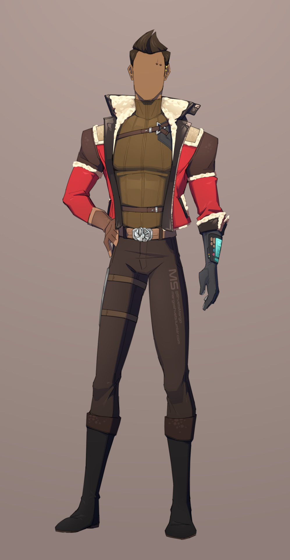
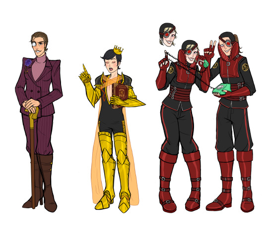
Redesign / Alliance fit for Theron!
I was kinda sad that our husband didn't get a new design like our wife Lana did, so I decided to try to make something nice for him✨
Not that I don't like his original design. I just wanted to try something different.
(I got too tired drawing, so that's why he doesn't have a face XD)
I'll be describing some details of this design below if anyone is interested to read about them!
A little bit of warning. There is some headcanon / fanon stuff here, and, also, the opinion on some stuff is just my opinion, and you don't have to agree with me. Please don't be too harsh to me. I just wanted to have fun UwU
For the lower part of his body, I mostly got rid of a bunch of details, like the blue stripes on his pants, to make it simpler (in contrast with the upper part, which has some interesting stuff going on).
Got rid of those hanging things on his belt cuz they seemed pretty redundant, and I couldn't think of what they could be used for. Belt, in general, is more simplified. As a cherry on top, he now has the alliance symbol on it ✨
I added the metal thing, which I like to call "magnetic plate", on his right leg, and it's basically for carrying stuff like his datapad, keys, Eternal Fleet ashes, etc.
(I do remember seeing a similar thing in imperial designs, but I'm not sure what it's called)
Since he relies on tech a lot, he now has a fancy new toy - the glove on his left hand! Very useful thing for operating stuff and also hacking!
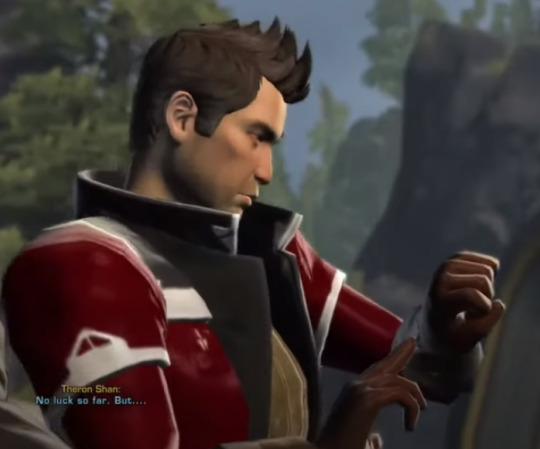
Remember that scene when we get our ship back, and Theron just presses something on his very regular glove? I always found it amusing. Not it will make more sense since he now actually has a suitable glove for this kind of action XD
[the scene in question]
He now hides his blasters inside his jacket (hence the belts on his upper part).
The jacket is a pretty memorable part of his design. It looked really good with a yellow color, but it's hard to imagine him wearing a jacket that isn't red.
I have to admit that a lot of new stuff in that thing was added based only on my headcanons. Mostly because I wanted to add an interesting story to it.
(A little bit of explaining is in order) Theron is a chilly person; he often feels like it's cold even if the room temperature is normal. Tauntauns are also his favourite animals.
This jacked is a gift from a very dear person to him. They knew all that and that's why they gifted Theron a warm jacket made with Tauntaun's fur (no tauntaun was harmed in making this jacket).
That person is no longer alive, but he still holds on to this jacket like it's his second skin; it's very important to him.
Anyway, the white parts of the jacket are now fur. And the fur inside only extends to shoulders (having natural fur already sounds too expensive for a republic soldier salary it was bought with). It's still warm tho. Sleeves have fur only at the ends and have zippers so that they can be easily folded back.
This jacket also can be closed (sounds kinda pointless stating the obvious, but in comparison with his original jacket, to me at least, makes sense cuz I can hardly imagine the original one closing).
Almost forgot.
A turtleneck for Theron. It just makes sense.
168 notes
·
View notes
Text
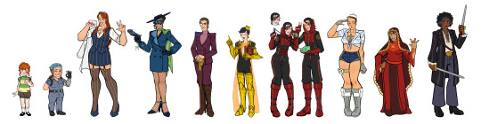


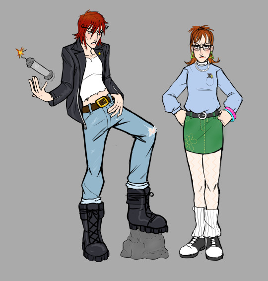
My second batch of venture bros genderbends are finally done! :D [first set here]
PLEASE LOOK UNDER THE CUT!!! I made all these nice drawings and doodles of them and I want people to see them without this post being super long! :') [My thoughts on the designs and doodles will be under the cut as well]


Okay NOW I'm going talk about my thought process on some of these:
Baby Rusty: I love the baby Rusty, the frilly socks and sleeves were a must. I actually drew her with the original set of genderbends but I turned off her layer and forgot about her 💀
Jonas Jr: not much to say about her, I tried to make her like Rosie the Riveter. Her little bandana has the Venture logo on it :)
Jonas Sr: I wanted her to be a hot bitch, her outfit is maybe a little scandalous for the time era they were in but I think it fits, canon Jonas is a whore. I think everybody would want her and that every celebrity, politician, and anybody with any power would chase after her so badly.
Blue Morpho: I made her so incredibly slay. I fucking love her outfit, I found the inspo for the outfit on Pinterest but I changed it up a bit. Also her gun has the bayonetta butterfly wings on it as a charm because I HAD TO.
Colonel Gentleman: Not a lot to say, I wanted to give her like horse riding esque boots and I gave her a purple flower cause she likes the ladies. I know generally WLW flowers are Violets and Lavender but I wanted to draw a rose so, Purple rose compromise <3
Dr.Boyfriend 2: With my last round Dr.Boyfriend was the only one people had complaints with. I think people wished he was more Masculine and I agree but if I switched up the design too much it wouldn't look like Dr.Girlfriend. I hope giving him armor and making him look like a knight helped him look more masc. I made the sheer wings cross over his chest to make it look like it was holding up the shoulder armor. Also his guild book is insanely high quality because I was procrastinating drawing his armor.
Goofy and Goober (Watch and Ward): I think they ended up really cute, I tried to make their hair colors close to Doc and Jacksons since I heard they are supposed to be like their "main" self inserts. With Ward I had a really specific idea for her hair, I kept thinking about this haircut from my sims and had to do it. It might be hard to see but her ponytail holders have skull charms on them. I also purposely gave them both some sort of ponytail hairstyle so they would match but be slightly different :) (They are absolutely prank calling or trolling their clients on that phone btw)
Shoreleave: OH MY GOD I LOVE SHORELEAVE. I kept turning her folder back on just to keep looking at her when I was drawing the other characters. She is so captivating to me, she looks so soft and human. I want to take a bite out of her thigh. My biggest inspo for her was Cammy from Street Fighter, I felt like her dressing a bit skimpy works for her since canon Shoreleave kinda does. The girls out for the girls.
Alchemist: I love her design so much too. I wanted her to look like some kind of nun or priestess. She looks like if a Zelda fire temple was a person. I kinda gave her like a weird little hime cut under the hood. Also I put the Triad logo on all three of their designs (+ Triana).
Jefferson: Had a lot of fun with her, I didnt change her design much from canon though so there's not much to say. I did give her more flared pants though. Drawing her hair was a really fun change of pace, I very rarely get to draw textured hair.
College Rusty and Monarch Drawing: I love this one, Monarch turned out so hot dude. You can tell what character I like more LMFAO. I made rusty very obnoxious 80s while keeping the colors of the original college rusty outfit. Monarch kind of looks like postal dude but its fine because shes slay.
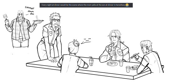
Hereditary Venture Family Dinner Drawing: This was one of the first drawings I started but the second to last one I finished. I wanted to draw the family doing something together but I think I really truly just wanted to draw Dermott again. 😭 Nobody has said anything if they noticed but I did give hatred the shirt from these edits. (I believe the one on the left is from reddit and the one on the right is by SquashFold on Twitter)

Dermott piercing Dean's ears drawing: Even though its messy its in the top 3 favorites I did, It was also the last one I did. I just love the idea of Dermott giving goth Dean at home ear piercings. At first I didn't know if I wanted to make Dermott giving her piercings at the mall where she works or at home but the mall idea was too much work for a last minute sketch. Dermott is so mean older sister who shoplifts and works at the mall.
Drug bathroom drawing: Another one of my favorites, its based off a specific deleted scene from Invisible Hand of Fate where Pete and Rusty talk at the bar but Pete comes out of the bathroom sniffling at the start. I love the way I drew Pete pushing the hair out of her face and both of their expressions.
Bdsm 21 drawing: Okay first of all, The little devil Monarch was so cute I was screaming, crying, and throwing up while drawing her. I fucking love her, shes the smallest part of the image but my favorite. I also am quite fond of the bdsm 21.
Quizgirls Pete and Billy: I tried looking up Vanna White dresses to base Pete's outfit off of but I couldn't find one that Pete would actually wear so I just had to make shit up. Billy's design is really basic but the bow in her hair is actually from one of my rejected main Billy genderbends.
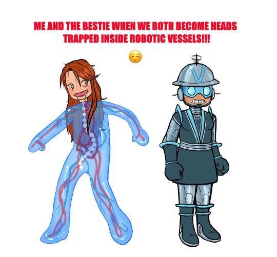
Me and The Bestie: I put a lot of effort into this one for no reason. Literally the moment I saw Jonas in the problem machine I thought he should be made of like blue slime. When I was working on this I kept thinking about Momopatchi's Hatsune Microbe drawing so this Jonas was definitely inspired by that. I gave Jonas makeup because she was having a party movie night on gargantua and I felt like she would still have makeup on thats like completely fucked up and deteriorating on her face after many many years. Vendata's outfit was partially based on Marguerite Chapman's from Flight to Mars, never seen it but I was looking up old sci-fi movie costumes to work with and I thought it would look good :)
#venture bros#the venture bros#my art#rusty venture#jonas venture sr#blue morpho#jefferson twilight#alchemist venture bros#colonel gentleman#shoreleave#jonas venture jr#dr.gf#dr. girlfriend#dr mrs the monarch#watch and ward#watch and ward venture bros#the monarch#henchman 21#gary fischer#pete white venture bros#pete white#billy quizboy#dr girlfriend#vbros#billy whalen#vendata#dermott venture bros#dermott fictel#genderbend#genderswap
295 notes
·
View notes
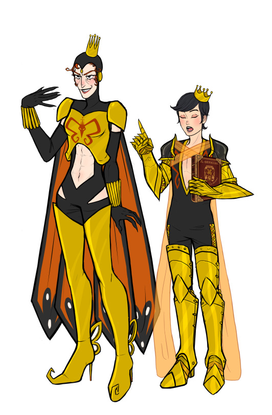
Note
OH GOD THERE'S TWO OF THEM
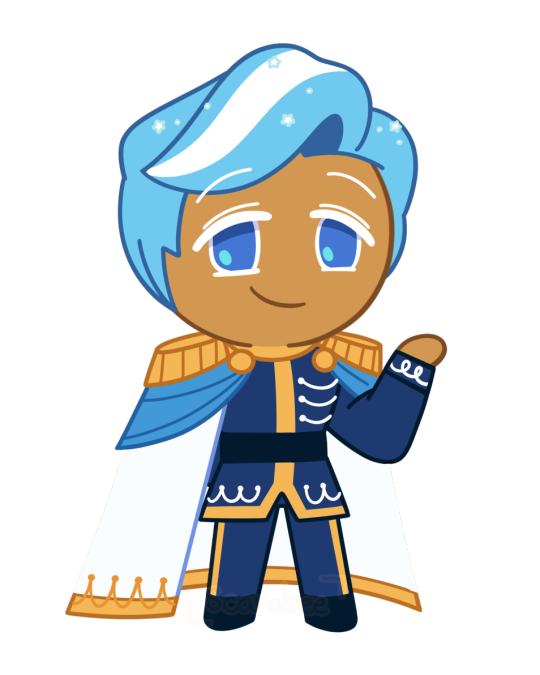
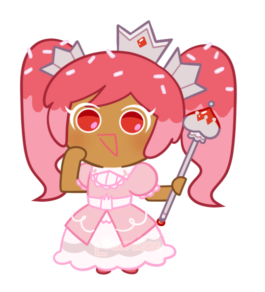
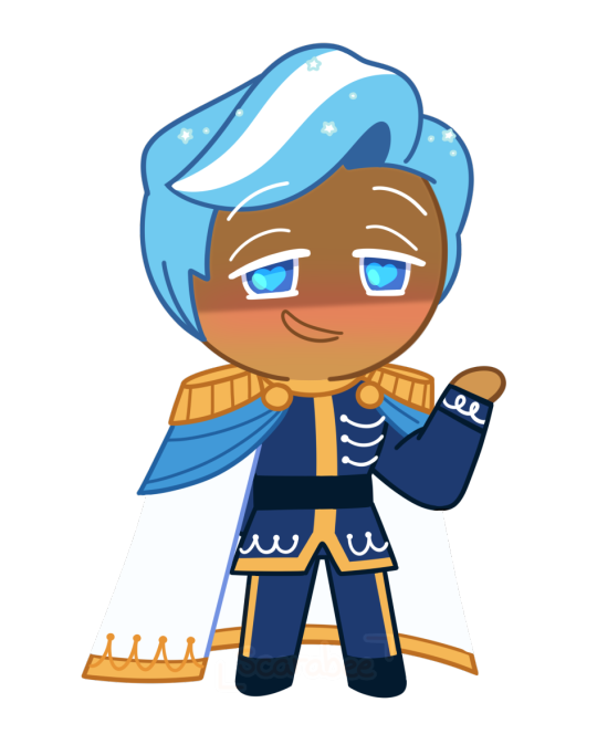
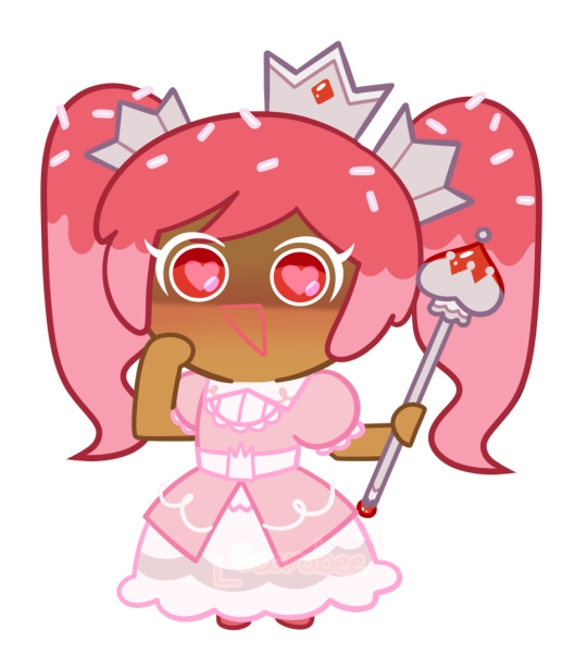
hiiii Brittle, its me, Blue Bird Anon! I come bearing gifts of cookie sprites! Crowned Cupcake Cookie (based on Runebrave's lovely design) and her brother of my own creation, Royal Icing Cookie. I had a lot of fun designing and drawing them so I hope you and everyone enjoy as well! (pssst also my art blog is scarabeeart ;3)
I saw an anon guess that Royal Icing was the pure opposite of his sister, and while that wasn't my original concept for him, I thought the contrast between the two would be a very funny idea hjggffg him being a totally normal, genuinely good guy while his sister is. like that.
But the idea I had for him was a classic prince charming, but with the levels cranked to 11. Brave, chivalrous, humble, generous, rides a white horse, he's got it all! All he wants is to sweep Y/N Cookie off their feet like in a romantic fairy tale and ride into the sunset for their perfect happily ever after together <3 May let the prince charming thing go to his head as he has a secret hero complex and will often put Y/N Cookie into danger purely just so he can heroically swoop in and rescue them. And while his sister is more physical with her use of force to chase away those who get too close to Y/N Cookie, Royal Icing is more manipulative and unhanded. Not above willing to plant fake evidence on other suitors and use it as a way to turn Y/N against them and only trust him. "These Cookies are merely trying to marry you only to claim the throne, they want to usurp you, your adviser is scheming and plotting against you" and all the other fairy tale tropes. Will never fess up to sneaking around because his perfect prince image is incredibly important to him. You trust him, right? He's your fiance! Your prince charming, your knight in shining armor. Of course he wouldn't lie to you <3
(hehe sorry for writing so much! I've been thinking about this for too long hjgfhjgf)
First of all.
That’s some damn incredible work you made here. You are getting a follow from me!
Crowned Cupcake now actually looks like canon compared to my more simple style! She’s even pulling a Cherry Blossom with that triangle mouth there!
Royal Icing too! He looks just as amazing, definitely the charismatic type that no cookie would doubt has a dark side to him! Both of them are just wonderfully done and I really appreciate you taking the time out of your day to do this!
I did think about Icing being exactly like his sister rather than being a kind soul, with him taking the more psychological approach rather then the brute forcing Crowned would do. He’s willing to play any card in his hand to turn it in his favor, even if it meant falsely accusing other cookies if it meant getting them of the picture.
You would trust him more at first. After all, he hadn’t done anything wrong to warrant any kind of suspicion on him! These liars can’t prove anything against your Prince, so you’ll take his side more often then not.
Overall, this is spectacular and I greatly appreciate the work that was done here!
#brittle answers#cookie run x you#cookie run x reader#cr x reader#cookie run oc#cookie oc#oc cookie#royal icing cookie#crowned cupcake cookie#crowned cupcake cookie x reader
131 notes
·
View notes
Text
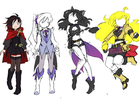
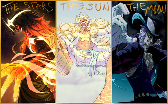
RWBY: Next Steps
This is just a design collection (remember when I used to do those? 'Winter Mission', 'Summer Tour'?? Fun times~)...and it may be my last.
Its only real purpose is to give me something fun to draw for the NeverFell Projects wrap-up series. The recent Adam and Cinder designs are technically part of this collection, too. ^^
These were much harder to do than those two, though...I've spent ~2 months chipping away at this set, trying and retrying to address several different RWBY design criticisms while still making the girls look good. ಥ_ಥ I've finally begun approaching success, though, so I wanted to talk a bit about these ideas.
Ruby
The only one I managed to design in one try. ^^; This was my answer to the question I felt was posed by Ruby's Vol. 7 design: i.e. "how do we do a new Ruby design that feels more 'mature'??" Because I never liked how the V7 design attempted to do that. :/
Between the new hairstyle and the new 'generic adventurer' clothes, it felt less like they were trying to evolve Ruby Rose and more like they didn't like her original design and wanted to get as far away from it as possible. V1-Ruby was such an iconic look (and STILL IS), and yet there's no trace of it in V7-Ruby. None of the goth-lolita style or playful edge that even V4-Ruby managed to preserve...instead they just scrubbed everything out to start from scratch, with a new design that's honestly 'meh' at best.
So what I did was stick closely to V1-Ruby, while adding just a few big changes to make the look distinct. You say a 'combat skirt' is too childish for an older Ruby? Well then we'll make it shorts...but shorts that are just as frilly and cute as the original skirt, with a similar overall shape.
You say her original hairstyle is too boring and 'safe'? Well, then we'll change it...by simply shaving half of it off. It's a much edgier look that simultaneously preserves the original shape of her hair: from every angle except front and back, her silhouette will remain the same.
You say you want to give her new shoes, but don't want the fandom to make fun of you for covering them in dozens of belts again? Here's a wild idea: cowboy boots. ^^ A totally unexpected, unique item that still fits in with the antique-ish vibe of her goth clothes.
Basically, I just wanted to prove that you can do something dramatically different with Ruby without completely abandoning her fashion sense.
Criticisms: The details are still lacking; I think I should work some red accents into her corset and boots. Also, I originally designed this outfit with a white shirt, and I kinda want it back (she had the team colors! R, W, B, and Y! ;_;)...the problem is that it clashes with the sheer thigh-highs. One must go...I'm sure I'll figure it out
Weiss
The toughest of the bunch: I did three different Weiss designs before landing on this one. ^^;;; The big epiphany came when I realized that Weiss looks her best when she mirrors Ruby. The girls' original design concepts share a lot of features; I feel like the characters were designed to look like they belong together, and figured I might as well honor that.
ALSO-- and this was the biggest priority for Weiss' design-- I firmly believe that she should not look like a princess anymore. From a character designers' perspective, it is ludicrous that they gave her the giant Disney ballgown in the same volume where they put classism at the center of the plot and have her send her bourgeoisie father to jail. That right there is the definition of mixed messages...
I thought the whole point of Weiss' character arc was to distance herself from the uber-rich parasites of her family and fellow 'Atlas elites'. I thought we cemented that when she officially lost her "heiress" title in V4. o_O I expected her next look to ditch the crown and visually show that she's past the point of 'rebelling'-- there's no more authority in her life for her to rebel against; she's free now! But alas...
So as usual, I had to do it myself. This Weiss outfit is definitely still fancy, with the coattailed vest and ruffled sleeves, but there's a lot less 'decoration'; fewer jewels, fewer details. The construction is straightforward and simple.
And of course, no more tiara. Instead I decided to give her a li'l snow pea flower and ribbon, which ended up inspiring her new periwinkle purple-y color scheme. Like her original design, it's actually fairly colorful, but does its job and puts the emphasis on the white elements.
Criticisms: ...Not many, this came out pretty good. ^^ I might reconsider the black coattails, but if I do I'll probably just switch it out with the indigo inner vest. I like the idea of her outfit construction mirroring Ruby's, but her color scheme mirroring Blake's, since they have a closer bond in NeverFell.
Blake
Blake designs are notoriously difficult; if you wanna hear some great reasons why, I suggest you check out this old Twiins iink RWBY design ranking video, which always helps guide me when I do redesigns for the main 4.
Anyway, this phenomenon makes it hard to describe what I did...I guess you could say I tried to combine all the best elements of all her outfits, while clinging to the 'fancy action girl' vibe of her original design.
I'm most proud of her new hairstyle-- I dunno why, I just enjoyed working on it and making those decisions. ^^ It's hard to tell, but it IS shorter; now shoulder-length instead of back-length. We make up for this with additional volume, emphasizing the waves in her hair texture by pushing them outward.
And most notably: she keeps the ribbon. She just wears it differently, using it to accentuate her ears instead of hiding them. This way, we keep the point of interest on her head while still showing her character growth.
Criticisms: Infinite, countless. This is a good look, but something is definitely still off. ^^;;; I think some additional detail in certain places (not sure where yet...) might help 'finish' it, so to speak. Maybe some extra yellow accents...?
Also, the bow obviously gets lost in her hair this way. I've tried several color changes and don't like any of them; I think I may just have to texture it differently in the final product. Fingers crossed...
Yang
Another tough one...I only made 2 design drawings, but the colors took several rounds of trial and error. I think my excitement over finally arriving at a good color scheme TODAY was what spurred me to make this post. ^^;
Anyway...there is a specific piece of Yang design criticism I hear fairly often that drives me up the wall: people commonly complain that she doesn't wear enough yellow; that she doesn't represent her character color well because all she wears is a yellow shirt.
And the character designer in me wants to rip my teeth out whenever I hear this, because it blindly ignores the giant fairy-tale-inspired mass of yellow that is her hair, and the purposely attention-grabbing pops of yellow that make up Ember Celica. They're not "clothes", technically, but they're still part of the design!
It's like saying a character with green skin can't represent the color green if all their clothes are black...without realizing that maybe their clothes are black BECAUSE they have green skin, in order to draw your attention to it...!! (╬▔皿▔)╯I just jifjkdsnfksahujknsjnfufh
...Anyway, anyway...the point is, it's difficult to take a character design with so much natural yellow in it and add yellow clothes and still have it read well. But because I like a challenge, I decided to take it on. I think the difference between the mustard leather and neon yellow hair is large enough to make it work, while still feeling casual enough for everyday wear. The champagne off-white she wears in her 'Hunter' outfit (which heavily inspired this) looks great, but it feels too 'classy' to me; like something specifically meant to dazzle the audience with her beauty for one special adventure, not for her to wear often.
On that note, my secondary mission with this design was just to make Yang look cute again, by following the structure of her V1 look, and even adding a little skirt on top of her battle shorts, which looks surprisingly natural considering she almost never wears one.
I don't know what happened in the canon to make the character designer forget the 'Yellow Beauty' part of her character concept; tbh even if her gender presentation gets more masculine she can still look pretty. Designs like Ozma, V7 Qrow and V4 Ren show that they understand this, but choose to cover Yang up in flavorless sheets of beige anyway. :T Making sure she always has a boob window isn't enough; the clothes themselves need to say something too.
Criticisms: ...Honestly, none? I think this might be solid. :> We'll see what happens when I draw it properly. I hope the white socks work out, because then she'll successfully be wearing the RWBY color scheme, which fits her (former, implied...) role as the glue holding the team together.
124 notes
·
View notes
Text
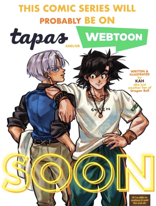
FEW FUN BEHIND-THE-SCENES STUFF I DID FOR “THE UNSPOKEN” WEBCOMIC SERIES (still ongoing, of course)
So I’m migrating some of the (public version of) pre-production stuff I did in 2021-2023 for THE UNSPOKEN webcomic (back when it still had the old name “Trunks and Goten in High School AU”) here, since X/Twitter apparently annihilated the old Moment feature for real. These are mostly research stuff, some warm up doodles and inspiring sountrack playlists I did before a chapter or a story got made. I usually do a lot of research offline before working on any creative project, that’s why sometimes it feels like there’s so many information gets jammed into one chapter: it was mostly to make do for all the time that I didn’t get to, or wouldn’t be able to work on the comics.
Will add in the chapters along side the information paper for clearer understanding ✌️
———————————————
1. The warm-up expression practice sheet (or doodles, in my case) of Son Goten and Trunks in my webcomic series (late 2022 or early 2023):
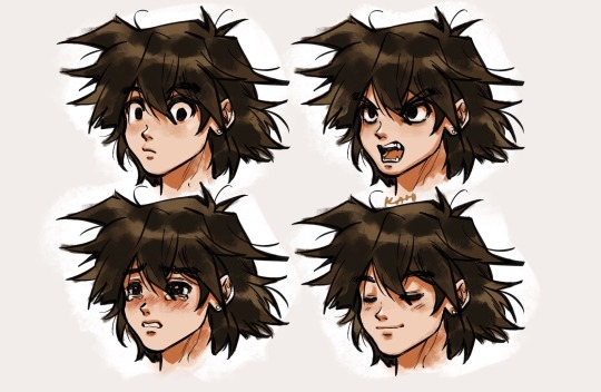
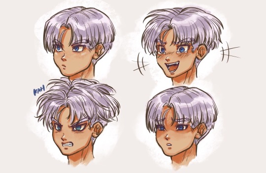
Since the idea in mind for these two in the webcomic was to be more “mature, human-like” than the original manga version to fit with the narrative I want to tell and aim at the older demographic, practices are needed :p
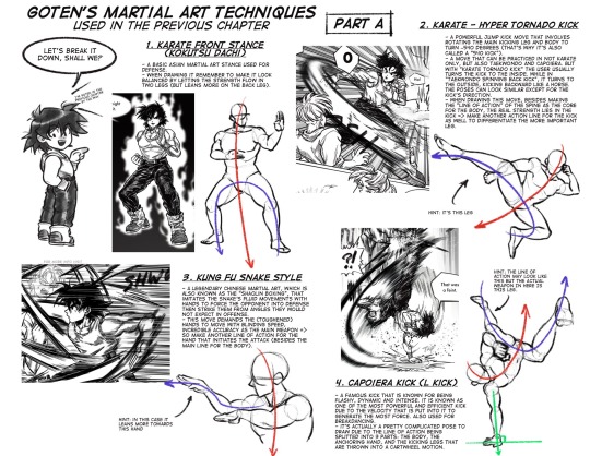
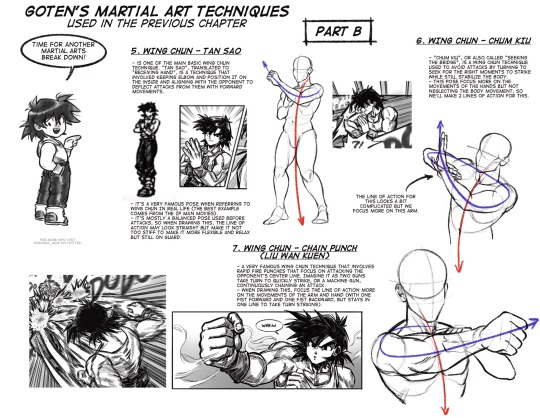
2. The Martial Arts techniques research information papers - Chapter 2 and 3 aka “The Spar” 1 & “The Spar” 2 (2021-2022):
A. Goten’s techniques:
B. Trunks’s techniques:
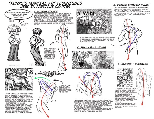
This research about martial arts techniques was actually very fun to do due to martial arts and cultural aspects are being two of the things I enjoy the most in life. That’s probably parts of the reasons why I went back to Dragon Ball in 2020: motorbikes, martial arts and mixed races culture.
Back then I did plan on sharing my research to everyone in the form of little fun art lessons, so there were interesting tweets like this or this. Later I decided to share this somewhere else more private (like my Patreon community) since I realized pre-production researches (or something akin to visual developments) are not that well-liked for most online viewers even though it’s a very much needed process in a creative project 🤔
This martial art concept is one of the actual main themes throughout the whole webcomic series, not really the (super duper gay) b-romance relationship between Son Goten and Trunks, yes I’m very sorryyyyyyy I like them too but I like worldbuilding more lmaoooo :p
3. The brief character design sheet and Chinese-influenced culture research information papers - Chapter 4: “The Iron Woman” and Chapter 5: “Her Resolution, His Origin” (mid-2022 until now and will be continued):
A. Character Design brief sheet:
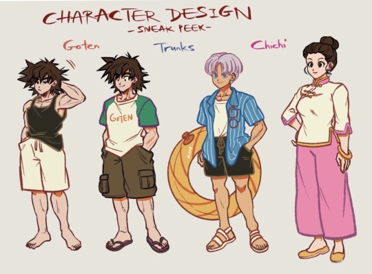
B. Culture research stuff:
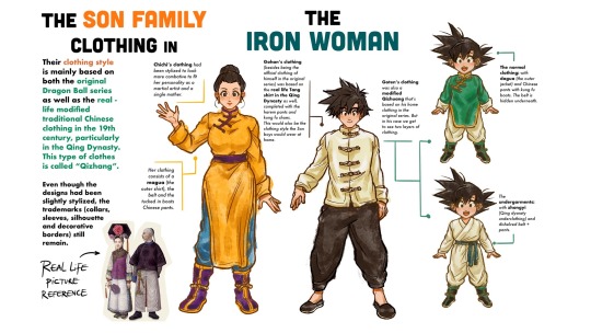
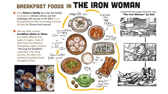
The hilarious thing about researching for these chapters are: Back when “The Iron Woman” was being made, the research limited at reading articles and some books about Chinese cultures, and watching documentaries on Youtube. But when “Her Resolution, His Origin” was being made, the research tuned into a real life trip to China, to take real life reference photos and listening to real legends and stories.
This research for “Her Resolution, His Origin” will be posted to Patreon later, of course ✌️
4. The Original Comic introduction and comeback announcements in mid-2022:
I must have eaten some edibles while drawing this because the boys look so good here. Goten looks so good, I even made him the profile picture for my Patreon account lmao.
5. Soundtrack playlists for inspirations (2021 - now): always the cherry on top. I listen to these playlists everytime I work on the series.
A. Duo playlist for chapters featuring both main characters: link
B. Character playlist for chapters focusing on single character, or anything related to that character: link
———————————————
All in all, posts like this are for people who like to see what’s beneath the surface when working on a creative project. I completely guarantee you, what you’ve seen on this blog are just the tips of the ice berg 🤫
Def not a PR, but my Patreon has lots of this lmao. Half joking half serious, there’s even a “non-posted” comic up there too and many other things. I’m just stating facts.
That aside, I’m just really happy to be able to work on this webcomic. THE UNSPOKEN webcomic series has always been a long-term indie project, not a daily content so I hope the readers who like and follow this series would stay tuned for more ✌️
———————————————
For easier reading, you can either follow the links that are included above, or just read this Tapas updated version.
#the unspoken webcomic#truten in high school au#my art#my comic#dragon ball#goten#son goten#trunks#kid trunks#dbz#dragon ball z#chichi#son gohan#martial arts#researching is fun and is also my hobby#but honestly i’m just happy drawing comics
93 notes
·
View notes
Text
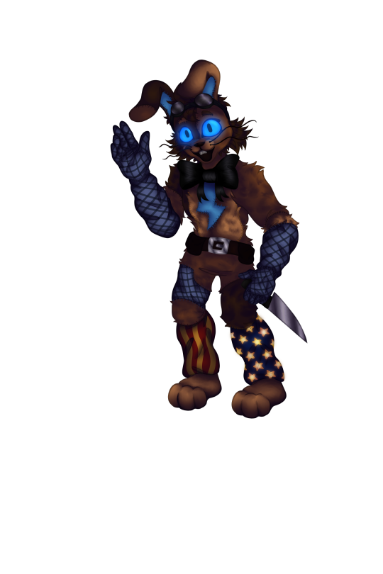
Day 5: Rabbit, Reclaim
AGJGDFJF FINALLY IT'S DAY 5 SO I CAN POST THIS
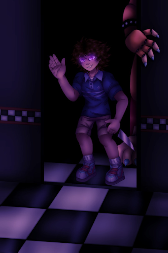
For some reason everytime i draw him he looks so young because i'm accidentally overcorrecting since i'm used to drawing older characters. So unfortunately he looks way younger than i meant him to lol, whoops.
But wait there's more- AHAHAHA
While I did initially plan this for GGY week I eventually got the idea to use this as an excuse to draw other GGY designs, soo..

(Not sure why tumblr formatted it that way with 1 of them big but it doesn't matter lol)
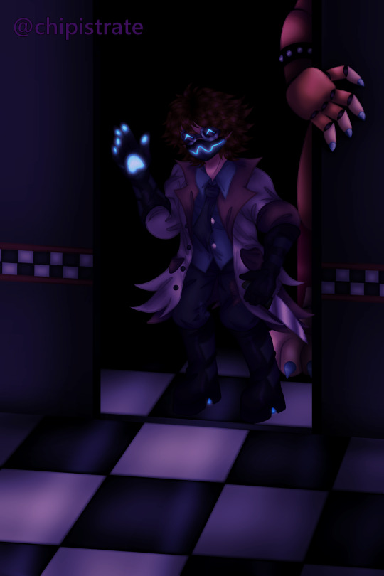
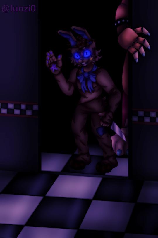
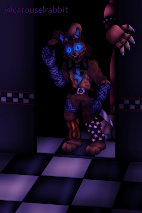
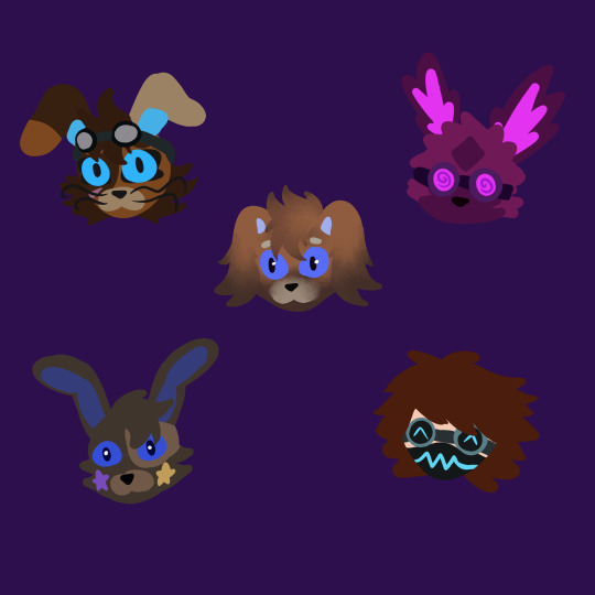
I've been wanting to do this for a while, I put the tags of each person next to their design but ofc I'm still gonna tag them in the post itself so you can see their art for yourself if you haven't already. But I enjoyed each of these in their own ways so if you don't mind I think I'm gonna type a bit of text next to them..
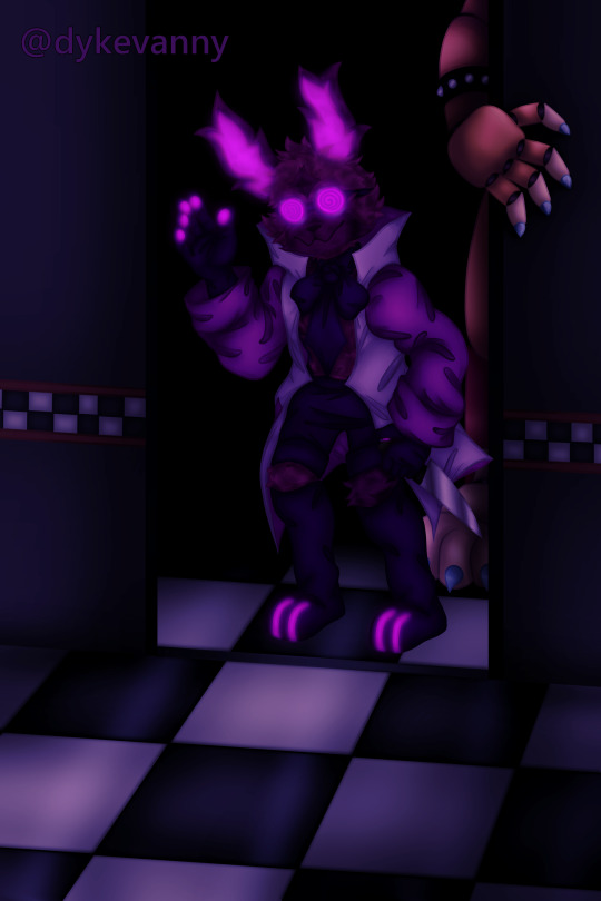
@chipistrate This was one of the first I drew out of these, the design was pretty fun to draw but sorry if I messed up a few details, it was a bit difficult lol. The mask and goggles are really fun to draw and they make for a cool design, along with all the glowing blue. (and yes, I tried to subtly include the heelies lol)
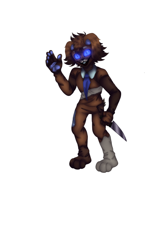
@lunzi0 This was the first fursuit one I did lol. I adore the little stars in the design, they personalize it so well and make it really unique. I wanna try this design again since I feel like the other ones show my improvement a bit better, but I hope you can appreciate the effort I put in on my first attempt <3
@carouselrabbit This one was really fun to draw, I absolutely love the eye shape/lashes, it stands out and I always love drawing eyes with a bit of eyeliner lol, the daycare theme legwarmers is a cool nod to the balloon boy arcade machine being connected to them, and was just a fun addition in general lol, I like the style of legwarmers what can I say, fnaf changed my fashion sense a bit. also the subtle paraells to freddy's design is a nice way to connect a bit to gregory himself.
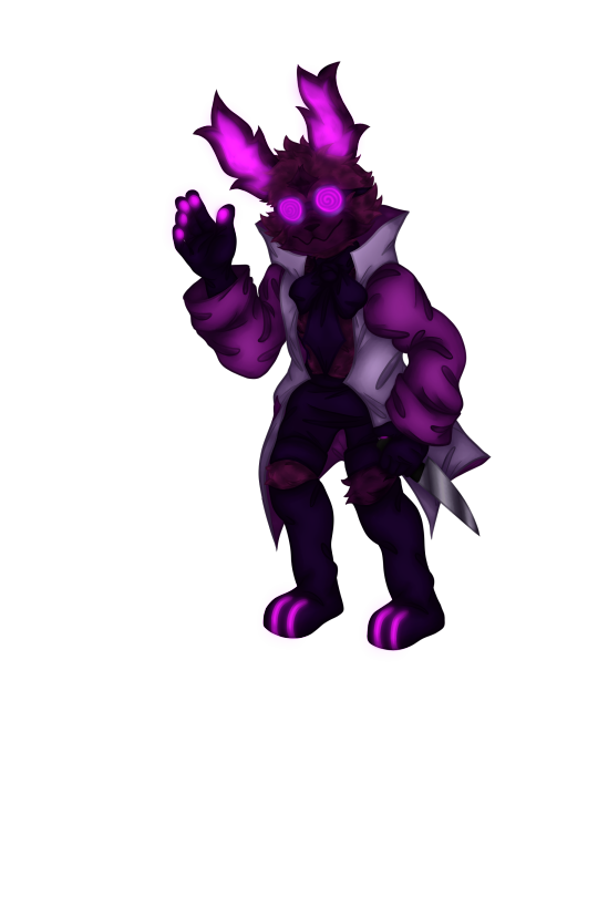
@puhpandas I can't remember if I talked about this design last time I drew it but, overall I'm really happy with how this came out, it's such an indicator of improvement since I started drawing this and I'm glad I was able to draw it better than last time lol. All the patchwork and similarities to Vanny's suit work really well, and the rabbit you chose to base it off of was a good fit, the colors make it a bit more difficult to shade for but i like detail lol, hope you like it too :)
@dykevanny I knew I wanted to do this since I started but I wasn't sure if I'd have time, and I'm glad I did! I hope you don't mind I combined aspects from the first design I saw and the second one you replied to my ask with, I liked the big purple sleeves lol. (I just realized after doing all the shading I forgot to include the oil splatter on his jacket, sorry!) It was definitely a bit difficult due to the head shape being so different but.. fluffy. i love drawing fluff. And the glowing swirl on the goggles, the shape of the ears, I love a lot about this design. :D
I have a hard time with writing compliments but I wanted to get some of those thoughts out, some of the things I like about these designs apply to multiple lol. I adore every one of these designs but I find it hard to put into words what I enjoy about them, hope the original creators are happy with these. <3
I also kept the ggys without as much lighting effects on a separate file, I felt like I should add them since they're a bit brighter lol, makes them look different.
Okay now that I've gotten all that- Sorry this post is so long! I didn't think it'd end up taking up so much space lol. Buut.. working on this drawing and thinking about it and potential context behind it gave me an au idea for it, but I'll put it under the cut since I understand most people probably won't care and just wanna see the drawings lol.
Idk if I'm confident enough to write for it but I'll give a bit of a summary.. I'll keep it under the cut for people who aren't interested and just wanna see the art though lol.
After the main events of SB and Ruin, now that the mimic's been set free, Cassie's taken control of by what's left of Vanny, using her as a new host. But with Cassie being the only human left alive down there, after being reawakened, Dr. Rabbit has nowhere left to go but back to his old host.
Vanessa, Freddy, and Gregory hadn't gone back to the Pizzaplex after ruin, but they were trying to figure out a plan to get Cassie back safely. One night after Freddy and Gregory disappear, Vanessa leaves to go find them. As dangerous as the pizzaplex is, it's her best guess for where they might've gone. She doesn't want to think about what could've happened to them, in denial for the worst case scenario. She tries to keep herself calm by telling herself they probably just left to go back for Cassie, maybe they didn't want her stopping them.. but deep down she knows it can't be that simple. She knows something's off, even if she's not ready to admit it.
When returning to the pizzaplex, she brought along her own V.A.N.N.I. mask, though unlike the one Cassie used, it was clear of the mimic's influence. After all, she was going to need some way to travel through potential blocked routes.
By the time she found Gregory, she'd still been wearing the mask, seeing him down the end of a dark hallway. He looked confused, afraid, his mind was a wreck of conflicting emotions. She started rushing towards him, happy to see him okay, until he finally spoke.
"You need to get out of here."
She stepped back, taking off the mask, only to be faced with the worst case scenario.
It was a wreck, covered in stains and tears, but it was still recognizable. He was wearing that old suit again.
As he waved, she could see Freddy's claws peeking out from the doorway, as the two stepped closer towards her.
So, she did what he told her to do, and started running. She could hear a faint voice coming from the mask, and put it back on before finding somewhere she could hide.
It was his voice again, telling her which way to go.
I guess that was the dramatic way to summarize the main idea behind it, lol. Basically Gregory and Dr. Rabbit work the way Sun and Moon work in Ruin, whichever one is in control in the real world, the other is left behind in the AR world. Or at least that's my interpretation of how they worked, considering Sun was always in mask-on scenes and moon was mask-off. I'm not too sure where the plot might go from there, and maybe I'll consider writing for it, I dunno. I've never wrote fanfic before because I get deadly afraid of writing them out of character lol, but maybe?? I have ideas for scenes and premise and stuff but I don't know if I have the confidence to write it.
But anyway! That was just more of a fun side-idea I came up with while working on this, if you read this far thanks, hope you enjoyed :)
here's some silly little lineless doodles as a reward for making it to the end hehe
now that's what I call an art dump
@ggyweek2024
#WOO finally that block of text is over lol I can focus on tags#initially I wanted to make my own ggy/dr rabbit design to go along with this but.. I didn't have enough time/motivation to#hopefully eventually I'll get to it though!#anywayy..#ggy fanweek 2024#fnaf ggy#ggy#dr rabbit#fnaf dr rabbit#fnaf gregory#fnaf sb#fnaf security breach#fnaf security breach fanart#fnaf sb fanart#ig he's (somewhat lazily) in the background#fnaf glamrock freddy#ok that's all :)#hope you all enjoyed you have no idea how excited i was to post this#and all the energy it took to keep it a secret#i wanted it to be a surprise :D
127 notes
·
View notes
Text

New from RECAP Weekly!!! An Exclusive Interview from Hermitopia's Emperor?!?
for the third week of @shepscapades ’s hermitcraft character design event, i offer grian as an empires smp member!
ok so first off, that head. thats just p03 from inscryption. but grian. it fits! but also! go play inscryption go go its on sale Right Now (until june 30) go play it its so good then go watch this video afterwards join my fandom please please please join us
ok back to hermpires! so i originally was gonna take an empire from s2 and just insert grian into it, but while browsing through the esmp s2 wiki i came across/remembered hermitopia and my brain went yep! this one. so i thought a bit about what grian would do if he was an empires smp member and how hermitopia would happen, and i think grian would crash the economy on purpose. i mean it almost already happened when the hermitpires crossover happened so i dont think im too far off. i think grian originally exported something simple, like maybe sugarcanes or mud, something easy to farm yknow, but then i dunno got bored or something so he made a couple more farms. then kept making more farms. then the hermitopia we all know and love happened!
actually maybe hermitopia isnt grians first empire. i think grian has a separate empire but decided to invite his friends to help him make some farms and then it just kept going. then hermitopia happened. i like the collaboration aspect of hermitopia so i think thats how that happens. hermitopia isnt necessarily grian's but its under his command so it gets called his. (isnt there a word for this? was it vassalage? i think its vassalage)
with that in mind i went with a robot-y grian because grumbot and a snazzy cool suit because business man (sidenote im looking over my pre art notes and one of them is just capitalism man and. yeah! not wrong). i gave him more steampunk-y wings than the usual feathery ones cause that fit better. i gave him a crown not really sure why but it fits since without it the design was more Just A Guy but with it he's more Emperor yknow. the buttons have a g on it because he would and an (attempted) gold trim cause that looked nice and fancy. originally he was gonna have four wings cause fun fact four wings is part of my base grian design but four wings kind of crowded the drawing so i didnt include them (sad) and i also didnt include the tail hes supposed to have because i couldnt find a good way to add it in with the pose. but in my heart he has both four wings and a tail
now why magazine style artwork? i 'unno. i thought itd look cool. and it does!! it looks SO cool!!! im so proud of it. recap magazine!! because of course im gonna make a hermitcraft recap reference are you kidding me recap is practically already a magazine reporting what gossip is happening on the hermitcraft server on any given week. its very specifically volume 9 issue 34 because thats when the crossover happened season 9 week 34 babey we love little esoteric details hell yeah!! i looked up how magazine covers work and its supposed to be like, main article big and smaller supporting side articles just kinda floating around so i did that!! and i made them funney references because of course i did! local bard catches scurvy because you cannot convince me that oli orionsound would not catch scurvy he would. does god is gay is a reference to that does bruno mars is gay nonsense article that makes me laugh everytime specifically in reference about mr smallish bean because he. has so many children. and none of them as far as i know from the lady server members theyre all lovechilds from gay lovers its hysterical and hilarious. quit your job join our sun cult is about the dawn empire because thatse the vibe that empire gives me and i think its funny. also!! thats hermitopia!! in the background!! i got the image off of the empires smp wiki and just Biggen'd it and it makes a bomb ass background hell yeah ^-^!!
also version with no text here lookit it!!
#gamble the queue#reblog#art#my art#digital art#artists on tumblr#drawing#fan art#fanart#hermitcraft#grian hermitcraft#hermitcraft recap#empires smp#hermitcraft empires crossover#fake magazine cover#shepshermitdesign23
246 notes
·
View notes
Text
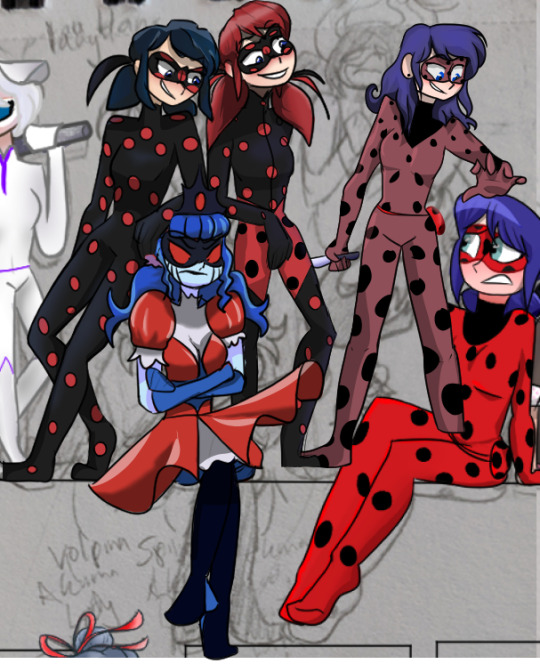
I just remembered a project I worked on for a while in like 2021 (maybe 2020) and it had a LOT of akumatized marinette's
That was the idea behind the whole thing but man I did one by one and found some of the most obscure akumatized marinette au's
Sooooo I'm dragging these drawings up from the ashes and maybe it'll be a nice surprise for some of y'all to see
yall got ✨fanart✨
and possibly reminded of miraculous ladybug HA
usually these were done on different canvas's (that were like 250x250) and then just... copied onto a larger canvas??? Mistakes were made and I was insane
A handful of these akumanette's were actually made by me cause apparently... roughly 18 other marinette's wasn't enough
Click for quality and this is a long post

First of all, shoutouts to my own akuma abominations creations.
First image, the ladybug with the red long hair? yeah the idea was the akuma bug seen in canon in like, s2 (also shown next to her) but updated for the new look in s4. Vry original we'll give it a 6/10
I don't remember too much for the middle one that is slightly dimmer. Though I do remember that was the kind of IDEA behind her. She's also holding a knife cause of course. Why have magical powers to kill people when you can harness the power of K N I F E 7/10
I remember a little more about the jester marinette in the back. She had a whole thing with medieval research, jester research, and she also wanted to stab Lila cause everyone wanted to stab lila at the time. 9/10 cause I had a fun time with her
Then the robinhood poster mari was a robin hood akuma mari. 3/10 not original
NEXT
Slightly canon to downright canon
Ladyblanc was a popular akumanette idea so slightly canon, I didn't base it off of anyone's au
Ladybug and Marinette are there because what's the fun of a crossover if the og doesn't get to panic along with the rest of them????
Last image, not talking about persecuter, we'll get to her in a bit. I just thought it would be funny at the time if I included Chloe and Antibug cause... haha
Antibug is kinda an akumatized lb rip off soooo
OTHER'S AU'S
what you've been waiting for
Thank god I kept track of credit (pats past me on the back)
First of all, at the very front we got @zoe-oneesama 's devil au that made an updated appearance in her scarlet lady au, love to see it
You'll also notice little devil bug on lb's knee in the sketch
Alopeka is to the left of Devil au, by @piearsonist
hi betcha you never would have guessed you got FANARTED HA
This is a post that explains that akumatized marinette, and you'll find more if you go to her page
AAAAAAAAAAAAAAAAAND
Princess justice at the right by @kibouwmlb (also, hello hi, surprise) and honestly it is SUCH a pretty design OMYWORD I love the watercolors
Twiddling her thumbs, minding her business. Remember the release of Descendants 3? Yeah, Queen of Mean baby. And MORE by @shiinaeu hi you are a legend to me
This was so fun to draw at the time and I was experimenting in ways I hadn't before. Peak youtube miraculous ladybug fixation meeting art interest. First one of the characters I did fun fact
@edendaphne betcha you didn't expect fanart of that one scorpion akumanette well THINK AGAIN (also, crazy that this was around when I did your dtiys I just realized, huh)
ANd then slightly more obscure, though the post does have 173 ish notes so, is @skullqueensart 's akumanette right here
Why does akumanette have sunken cheeks here? I have no clue honestly. Take it up with me from 3 years ago and maybe you'll get answers who knows. She's also just... chilling. Looking at nothing. Into the abyss.
Not now chloe's, we are discussing persecutor now.
Love the story idea honestly and the akuma design is so god tier AKUMA that oof @yiprincessart I love it
Oh uh, and chloe will be fine
:)
CAN👏I👏 TALK👏 ABOUT👏 HER
She is the moment, she is beauty, she is grace
@artist-from-outersp-ace I love her. She looks so SO pretty!! At the time I loved your artstyle and I still do!! Too bad at the time I didn't know that Tumblr works by reblogging. I will be amending that.
I also remember being SO frustrated when drawing her that I didn't get a timelapse saved in time to show the drawing process :(
But I did love figuring out folds in the dress and the coloring process! Figuring out how to replicate elements in your art!
srs guys. Look at the RUFFLES
Alright, we are all agreeing to be accomplices and bystanders to Akuma jester marinette's NOT MURDER murder of Lila in the background? Okay good.
@lunian I have fanart for you~
And when I tell you I struggled with her design, I STRUGGLED. I ended up satisfied in the end but the curls bro, we lost the curls
But I do love her concepts and powers and I did back then too
And next to her, Okay, I never fully finished, mostly because I couldn't figure out how to get the hand to work with the tray balance thingie
@ladybub made this Lady Justice design and I WILL BE THERE when the comic updates. Or... if they aren't able to continue the comic that's also fine too <3 Life happens
Still love this au and the unique way for Marinette to get akumatized! Me and my sister bonded over our love over it!
I think this might be the first akumanette that isn't on tumblr to my knowledge. They are on Instagram tho @stivenwithani
Anyway I really liked the concept and the design just, reeked, of akuma that I included her
Okay more that I didn't really finish
We got another Princess/Lady Justice akuma idea at the left. Which I never kept track of the credit DANG IT I WAS DOING SO WELL
I'll update if I find the credit but man the OG did really well with the art.
And I have this akumanette comforting Lacrima from... a very graphic and whump fanfic Longest Night, read the tags
Anyway, Lacrima needs all the love she can get (also, funny enough, is the oldest out of this "gathering" of akumanette's)
It's not finished but hey @p-artsypants I gave angst ridden Lady Lacrima friends and fanart so.... yay...
AND THEN THE LAST ONE
was victim to so much reposting I could never find credit for it- UNTIL NOW
but the artist unfortunately deactivated their blog so that explains why I couldn't find their username all that time ago
It was a cool idea and I always love when creators take inspiration from how similar Marinette's name is to another word for a kind of puppet "Marionette"
But before I forget, I'll end this post on one of my akumanette's that I tried to squeeze in but never got to. But I did make more art for and I remember the story!


I remember having a background planned but I never really got around to it. Basically the story was that marinette got akumatized but managed to take off her earrings in time. I think the reason for her akumatization was connected to figuring out the secrets that Emilie had been hiding with the peacock miraculous (BEFORE we knew that adrien was a sentimonster).
Tikki had to bring the earrings to Chat Noir and he had to find someone that looked ENOUGH like Ladybug that Hawkmoth wouldn't notice as much that Ladybug wasn't actually there. Enter Mireille cause at the time a few people were pointing out how similar she looked to the dupain chengs.
Akumanette's powers had something to do with casting depression? I think? In the form of dragons? Oh, Also she travels by walking on the dragons so thats cool
I don't remember everything but I did have a lot planned for her.
10/10 just because I had a fun time with her
#tw old art#Don't Cringe at Old Art Challenge GO#long post#rambling about art and stories#akumatized!marinette#akumatized marinette#I'll add all the tags for the others ltr#miraculous ladybug#lady justice#princess justice#akumatized ladybug#I put this in my drafts in april and it's time to stop being socially anxious and just post it
383 notes
·
View notes
Note
Can you do the bachelor/ettes with an s/o that is an artist?
-🌙anon
Bachelor/ettes x Artist Farmer
Hi 🌙! Glad to have another emoji anon here! How are things going? Anyways, cute request! Thank you for asking! I think I might have done this before? Maybe. I don't know. Oh well! This mainly focuses on drawing sorry.

Bachelors:
Sam
Sam loves your art! He always looks over your shoulder when he sees you drawing, so you'll definitely have to take it upon yourself to tell him not to do that if it makes you uncomfortable. He's also going to beg you to design an album cover for him and his band.
Elliott
Elliott would also like to use your artistic skills, this time for his newest book. He can't pay you all too much (unless his previous book becomes a bestseller), but he will shout you whatever you want at the saloon whenever you want. He really appreciates your skill, it reminds him of Leah!
Sebastian
I'm pretty sure his job involves making models, so he'd ask you for some references to copy off of. Really likes to admire your work; spends a lot of time just looking through the pages if he can. If you won't let him he'll respect your boundaries, but will still ask every once in a while.
Harvey
He's not really an artist, so he's really amazed at what you can do! He'd ask you to draw his model airplanes for him (if you want to, of course). Despite his lack of drawing/painting skills, he does appreciate good art, and will set aside some money to go to an art show.
Shane
Shane's drawing skills equate to that of a five-year-old's potato head self-portrait. I mean, art is art, so it's not necessarily bad, but he's not getting recognised for it anytime soon. So when he finds out you're and artist, he gets secretly excited and makes note to try and find out what you've made.
Alex
When he was a kid, he'd get the hose and paint a smiley face on the fence with the water, but that's about all he's done. Actually, he did try to impress a girl with his drawing skills once, but she ended up rejecting him, so he stopped. He asks you to teach him how to do some spaghetti sort of art sometime because he looks at you (no matter what art medium you do) and immediately assumes you'd be a master at pasta art. You're welcome, I guess?
Bachelorettes:
Penny
Please tell me you read the same books as her and please tell me you've made art of the characters; she will fall in love. Since she's a teacher (basically), she does have some skills in art related mediums, but nothing beyond what she needs to teach. She likes sketching characters the most, so she sheepishly shows of her work to you and asks for advice.
Leah
Artist duo, baby! Leah loves your art! She's into sculpting and a bit of painting herself, but recognises any art is art and is totally down to do some with you! You have some fun competitions on trying to draw the other worse and worse each time but still have it look like them. That, or you just set up a vase and chill trying to copy it.
Abigail
Abigail's a decent artist. Again, she only really uses pencil or pen on paper, but has dabbled in digital art through the use of an old game console she had as a kid. You two do that competition thing like Leah, except you purposely try to make each other look worse and worse without any semblance of the original subject. Fun times!
Maru
Maru is a great artist, I think. She does a lot of detailed planning for her inventions and puts a lot of effort into the artwork. You know that car show where the guy draws the finished product in coloured pencil before actually making it? Yeah, like that. Except she doesn't use colour. Anyways, she gets what art's all about and can feel with you when you get that art block.
Emily
She can draw clothes, paint abstract art, and make towers out of dry spaghetti sticks. When she finds out you're an artist, she immediately asks to see what you've done. Emily's very much a believer in 'any art is art as long as you put your soul into it', so she'll always say she loves whatever you make. Not the best for constructive criticism, but great for a pick-me-up when you're feeling low.
Haley
Unlike her sister, Haley has no idea what she's doing. I suppose photography is related to other mediums of art, but the most she's done is draw some hearts on some photos and hung them up on the wall. During her mean phase she pretends not to care, but once she comes out of her shell she really takes an interest in it! She tries to copy your art but doesn't do so well.
-~-~-
Hello. Long time no see. I make a second account since I was tired of this one being my main aha. Anyways, I'll be back (hopefully) for a little while now. Bye-bye!
#ieatsmallorphansnamedtom#sdv#stardew valley#sdv headcanons#stardew valley headcanons#sdv hcs#stardew valley hcs#x reader#sdv sam#stardew valley sam#sdv elliott#stardew valley elliott#sdv sebastian#stardew valley sebastian#sdv harvey#stardew valley harvey#sdv shane#stardew valley shane#sdv alex#stardew valley alex#sdv bachelors#stardew valley bachelors#sdv penny#stardew valley penny#sdv leah#stardew valley leah#sdv abigail#stardew valley abigail#sdv maru#stardew valley maru
237 notes
·
View notes
Last Seen Blogs
theoraclewrites
All My Lovely Things
littleghostprince
Welcome to Wonderland
destructionrecollection
525,600 MINUTES
thenightwolf51
Random