ieatsmallorphansnamedtom
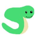
Joe the Snake
She/Her (+ They if you want) | Nameless but my snake is called Joe (call me whatever) | Stardew Valley headcanon blog! | SFW | Requests: closed | Matchups: closed | Art by me | Blog theme: Normal | SDV OC blog: @fawn-wickenshire | SDV ask blog: @ask-sdv
500 posts
Don't wanna be here? Send us removal request.
Last Seen Blogs

theultimatenerdbaby
The Ultimate Nerd Baby
cosmiriec
the eternal cosmos calls

liddellchris-blog1
Not Even Death
geckoparty
Take Her To The Bone Zone Dude

kukya
Kukya
Text
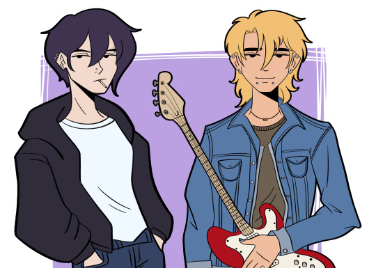
pov they just asked you to join their emo band
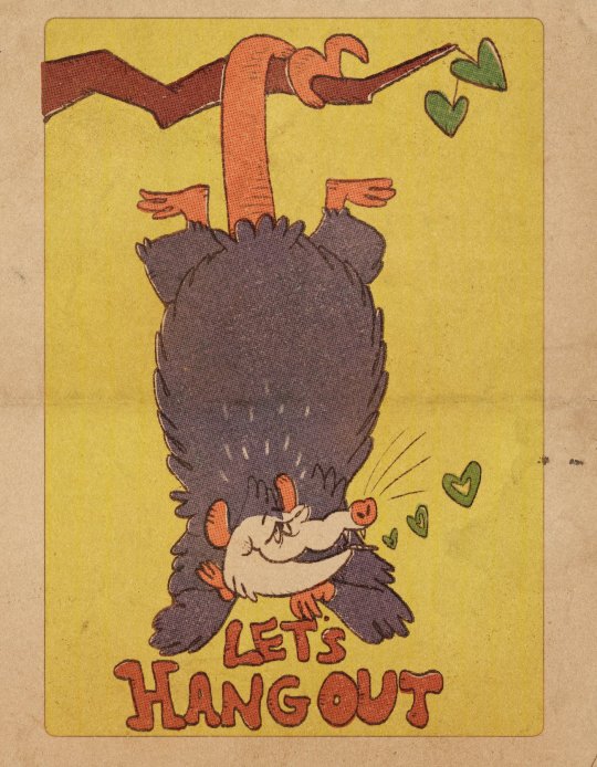
stardew bachelors 2/6
2K notes
·
View notes
Text
God how do I choose.
I like Alex because of his character arc/progress. Yeah he's a bit of a piece of shit at first, but he gets better and ends up a pretty good guy. Also I wanted to hug him after learning about his backstory. But anyways yeah he ends up really sweet and I like that. Wouldn't be the same if he didn't change/have a character arc, though.
Then there's Sam. Honestly not the biggest fan of his hair but his personality is really fun. He's just a goofy guy. Also he's a musician. Like that's so cool.
And then there's Haley. Same thing with Alex; I like seeing her progress from a stuck-up rude person to someone a lot nicer. She gives away her clothes! She likes animals! She likes photography! She tries her best to help her sister with chores (cooking) by the end of it! Again I wouldn't go with her if she didn't change but she does and I'm happy for her.
But the question remains...Who is your favourite and why, Mouse?
Dear mutuals! I'm interested to hear your opinion:
Of the every marriage candidates, who do you love the most and why? This includes both vanilla bachelors/ettes and from SVE/RSV.
#reblog#i haven't been playing sdv at all recently so i havent progressed in sve/rsv#but i'm looking at victor rn#but who knows lol. i'm /very/ early game
50 notes
·
View notes
Text
I think I've blocked at least 15 bots today.
#ieatsmallorphansnamedtom#not sdv related#i hate bots#mouse YOU WEREN'T WRONG!!!!!#they're getting worse :sob:#literally i went in a tag and all when i blocked a bot ANOTHER ONE WAS UNDER IT#three bots in total all under one another#not even 30 seconds would pass before i saw another one#no exaggeration
25 notes
·
View notes
Text
I’m appalled by how many people call Elliot boring Pretentious and creepy

#reblog#yeah that's fair#the other bachelors/bachelorettes shouldn't really be doing that either i don't think#but i don't like that elliott does it#anyways yeah good point
290 notes
·
View notes
Text
What’s happening now in Palestine is unacceptable, but do not despair! That’s what they want! That’s why they cut off communications in Gaza! They want people to give up, they want people to believe wholeheartedly that nothing can be done so that they can continue with impunity and write history as they wish, to paint themselves as victors of a war that was never a war to begin with! Keep sharing and raising their voices, share the stories of the people, keep the story of Palestine alive! They hide behind their bombs and their chemical warfare and their western propaganda but they cannot silence the masses! They can only wish they had an ounce of the bravery the Palestinian people have, standing their ground against such an overwhelming force! May Palestine be free, from the river to the sea. May the eyes of cowards never sleep!
7K notes
·
View notes
Note
*Giving you the "you're amazing" card* ❤️
For my dear mutual 🥹🫰
THANK YOU MY LOVELY MUTUAL!!!!!!!! ILY TOO!!!!!!! AHHHHHHH!!!!!!!
#ieatsmallorphansnamedtom#not sdv#not sdv related#studentinpursuitofclouds#is this a game? either way i want to send these around!#THANK YOU!!!!!!!!!!!!!!!!!!!!!!!!!!!!!!!!!!#you get one too of course!!!!!#caps tw
7 notes
·
View notes
Text
#reblog#not sdv#not sdv related#if we're moots you can say hi#no guarantee you'll have the most riveting conversation ever but y'know#but also i may take a while to respond#and i wont say much about myself lol (privacy)#so i guess secret third thing#either way i like my moots and i think they're cool#:thumbsup:
20K notes
·
View notes
Text
CMYK Explanations
Hey there Kääryleet!
We have heard you. Y'all want to know what is and how to use CMYK. So here's a quick explanation:
1-What is CMYK?
CMYK is a colour setting! It stands for the 4 colours of ink a printer uses: Cyan, Magenta, Yellow and Black. By layering these inks on the paper, we can print pretty much any colour we want! It follows the rules of substractive model of colour, like paint.
2-Isn't that how it is by default?
Anything you do on a screen is by default in RGB (Red, Blue, Green), and that's because your screen uses light and not pigment to show colours. That's the additive colour model. So, unless you selected CMYK or Print in your software, you're working in RGB.
3- What does that mean for me?
All you need to do is to set your file in CMYK. Depending on the software you use, it should be in the "File" or "Edit" menus. It's VERY important that you set the colour mode BEFORE you start your work. Why? Because going to CMYK from RBG means you're re-encoding your colours, and they will look duller/bad once printed, and there's a fairly good chance it will stop looking good on screen too. It's also pretty hard to correct once it's done. Don't forget we will be providing a PSD template, and we'll set it to CMYK.
4-Is there any colour limitations to CMYK?
Short answer? No. Just set your file to CMYK and start drawing. Pick any colour you want, as many as you want. Long answer? Yes, but it's simply because some colours cannot be printed with the normal printing process, as they require special pigments and ink. But that's not important for our project, so no need to worry about it.
And that's about it, folks! I'm leaving you with this short video that explains the colour models a bit better:
youtube
115 notes
·
View notes
Text
Something I try to keep in mind when making art that looks vintage is keeping a limited color pallette. Digital art gives you a very wide, Crisp scope of colors, whereas traditional art-- especially older traditional art-- had a very limited and sometimes dulled use of color.
This is a modern riso ink swatch, but still you find a similar and limited selection of colors to mix with. (Mixing digitally as to emulate the layering of ink riso would be coloring on Multiply, and layering on top of eachother 👉)

If you find some old prints, take a closer look and see if you can tell what colors they used and which ones they layered... a lot of the time you'll find yellow as a base!
Misprints can really reveal what colors were used and where, I love misprints...
Something else I keep in the back of my mind is: how the human eye perceives color on paper vs. a screen. Ink and paint soaks into paper, it bleeds, stains, fades over time, smears, ect... the history of a piece can show in physical wear. What kind of history do you want to emulate? Misprinted? Stained? Kept as clean as possible, but unable to escape the bluing damages of the sun? It's one of my favorite things about making vintage art. Making it imperfect!

You can see the bleed, the wobble of the lines on the rug, the fading, the dirt... beautiful!!
Thinking in terms of traditional-method art while drawing digital can help open avenues to achieving that genuine, vintage look!
45K notes
·
View notes
Text
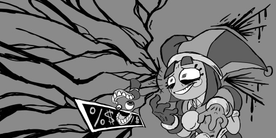
stardew valley x papa's sushiria


with lovely @yahidna
220 notes
·
View notes
Text

the far side (in 3D)
#reblog#not sdv#not sdv related#as always looks amazing#and its Far Side too!#i love seeing 3d be used for still images like this
92K notes
·
View notes
Text

why are they so determined to get rid of the bigger profile pictures.
#ieatsmallorphansnamedtom#not sdv#not sdv related#tumblr#tumblr update#SORRY BUNNY FOR USING UR PFP AS MY VICTIM#not really a complaint just.#why#like i dont see how its improving the website more#like yeah it saves space#but if you wanna save space then stop copying twitter#idk.#there's so much free space on my screen alone#and i dont use a large monitor or anything
17 notes
·
View notes
Text
Playing with a new brush and monochrome tones.
The episode was nice.
#reblog#not sdv#not sdv related#erm...new fixation incoming?#i need to make some art of these guys#ragatha and jax are my favourites so far :]
5K notes
·
View notes
Text
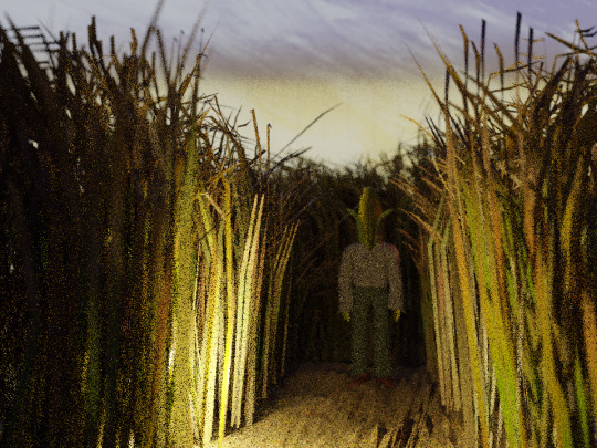

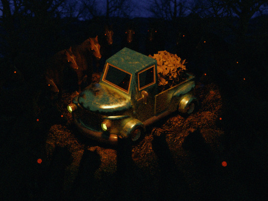

farmer's nightmare
15K notes
·
View notes
Text
I’m appalled by how many people call Elliot boring Pretentious and creepy
#reblog#im pretty sure they call him creepy because of his ten heart event#(aka he kisses the player without their permission and the player starts shaking)#(though you can choose to say you're shaking because of excitement)#(but the only other option is out of fear/whatever. and that's the only way to reject him)#but either way people dont like that he kisses the player without their permission#which honestly? fair.#i dont think there was any malicious intent behind it#but he should've done something different or at least asked#but anyways. yeah he's not boring#he's got lots of character and charm#and other than the ten heart event thing he's not creepy at all#genuinely has a good heart
290 notes
·
View notes
Text
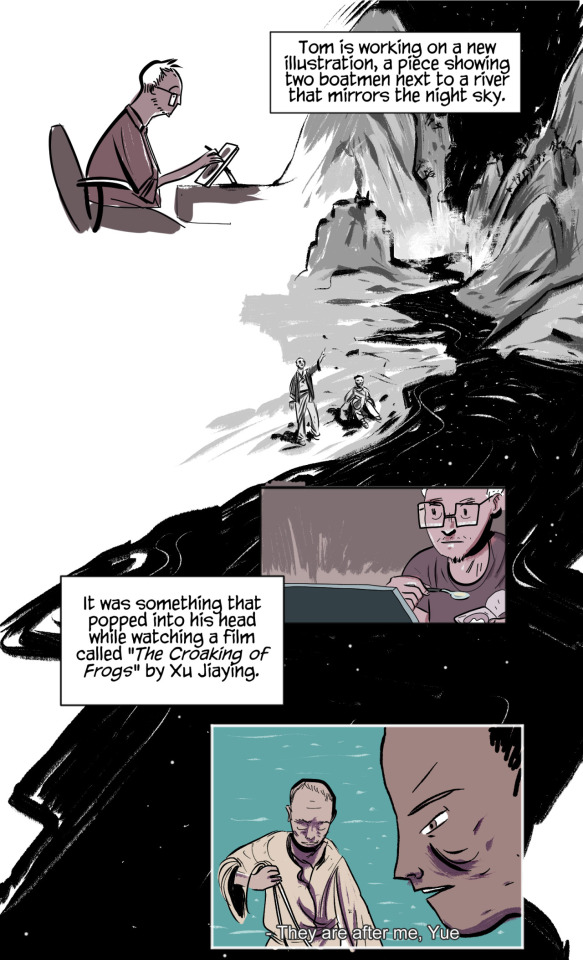
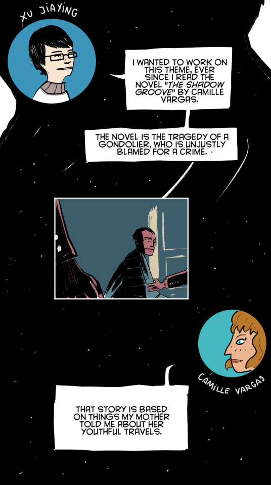
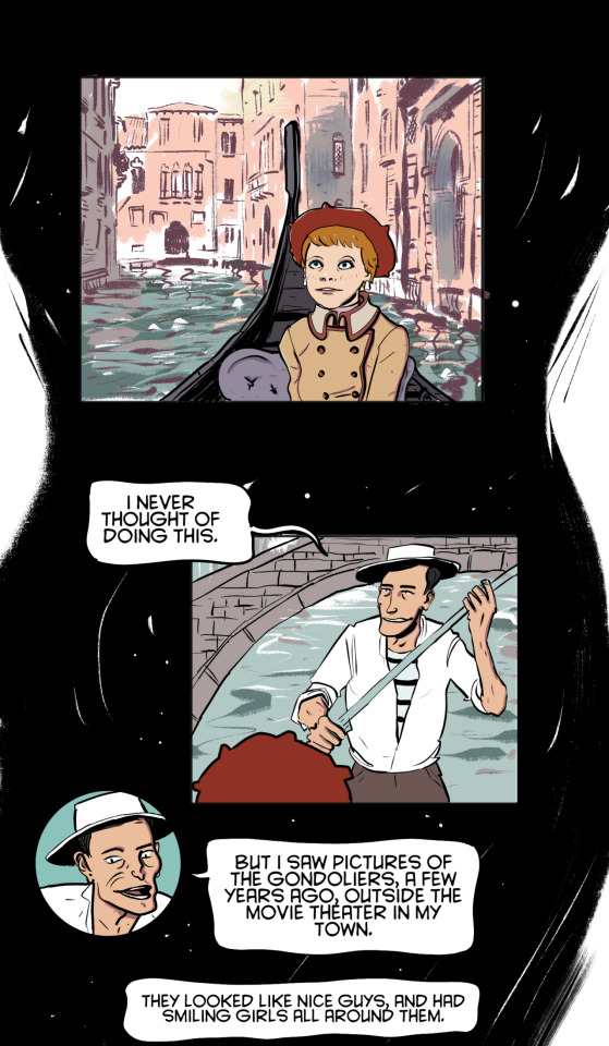
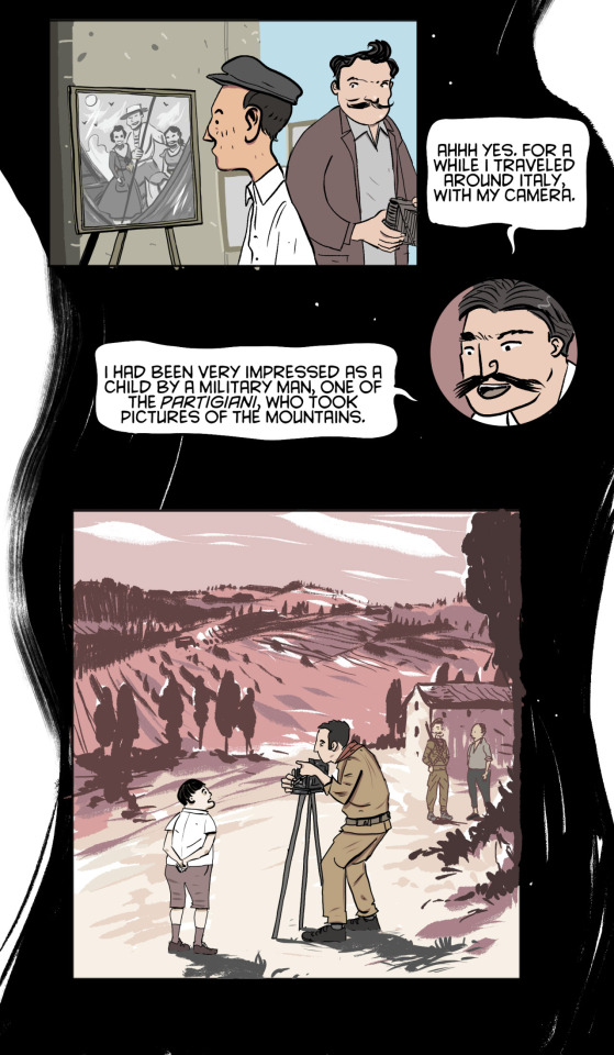
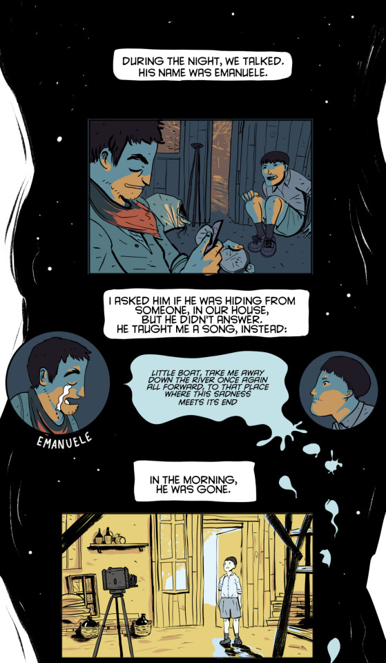

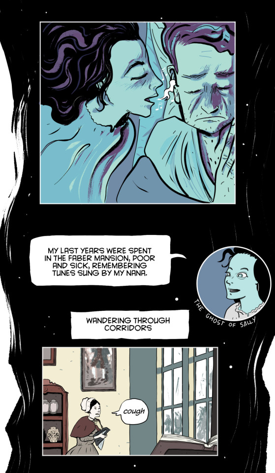
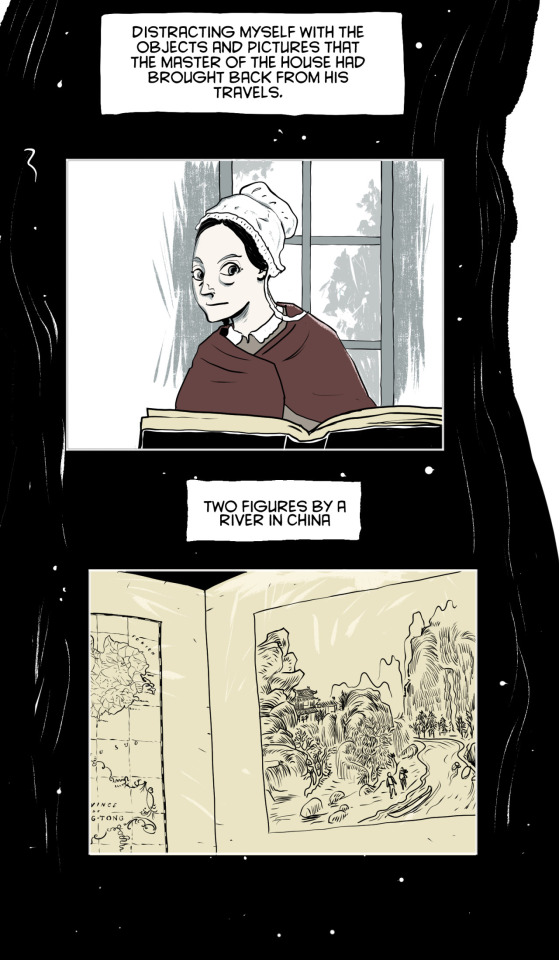
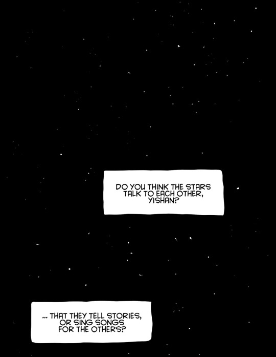
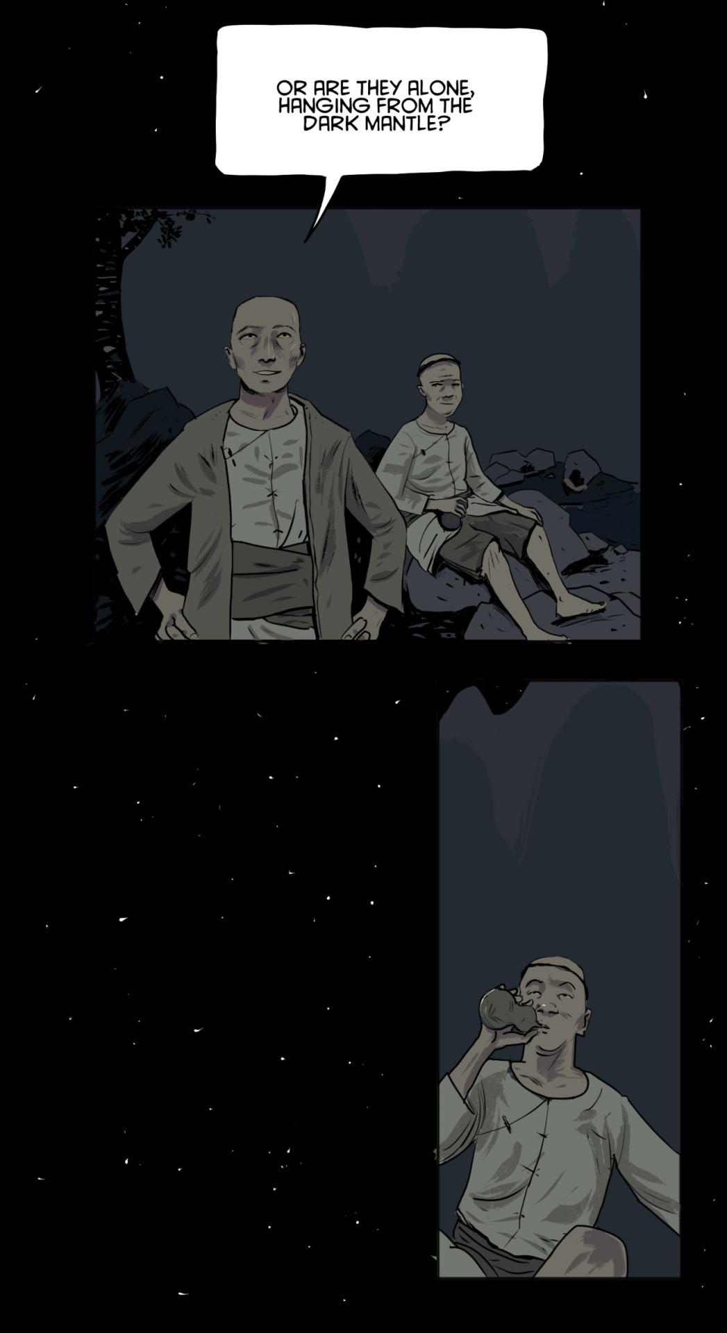
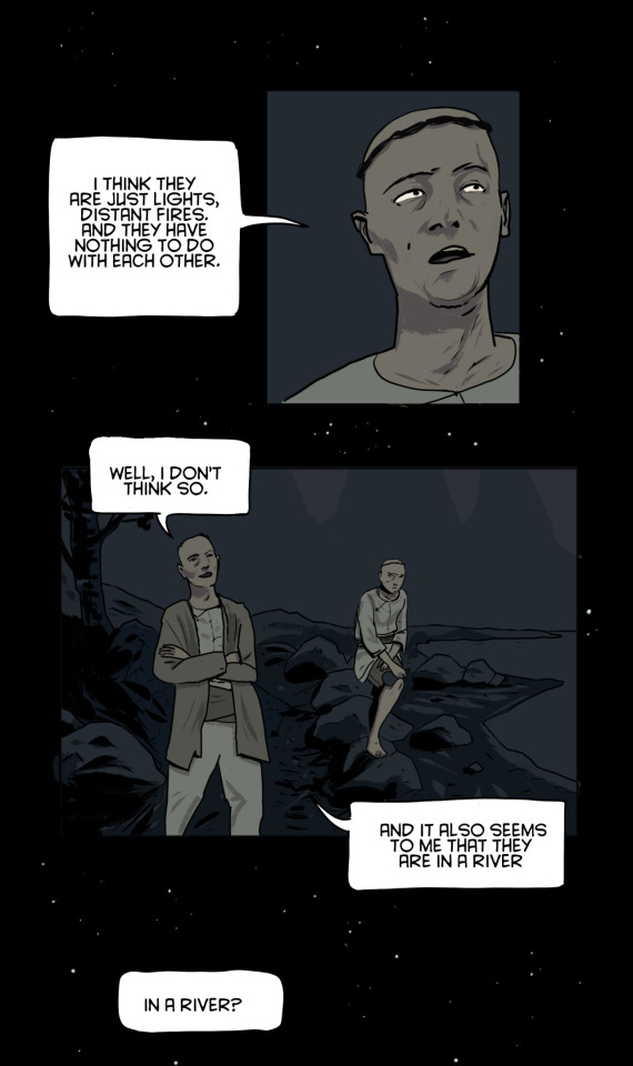
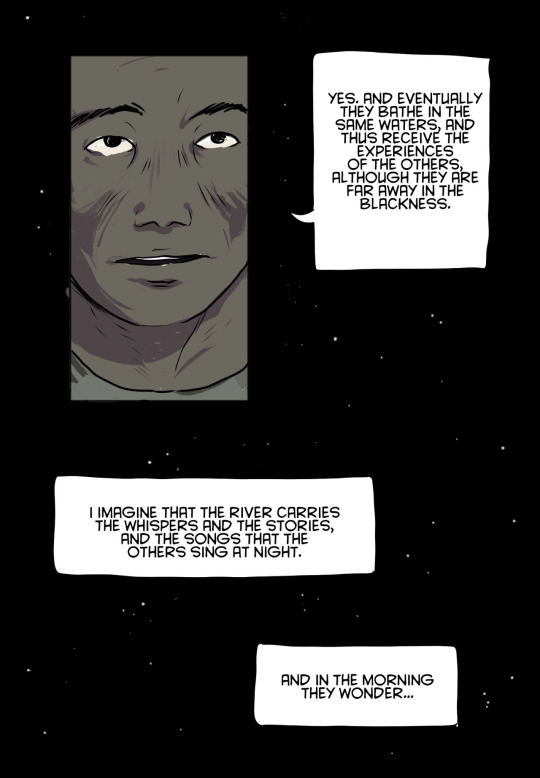
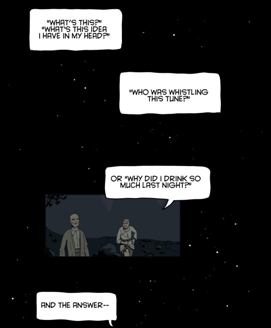

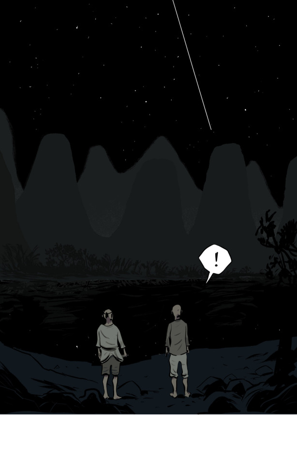
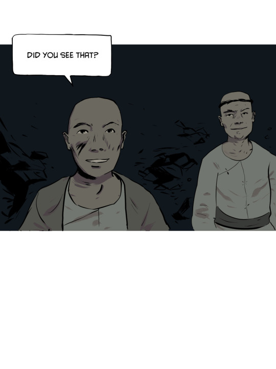
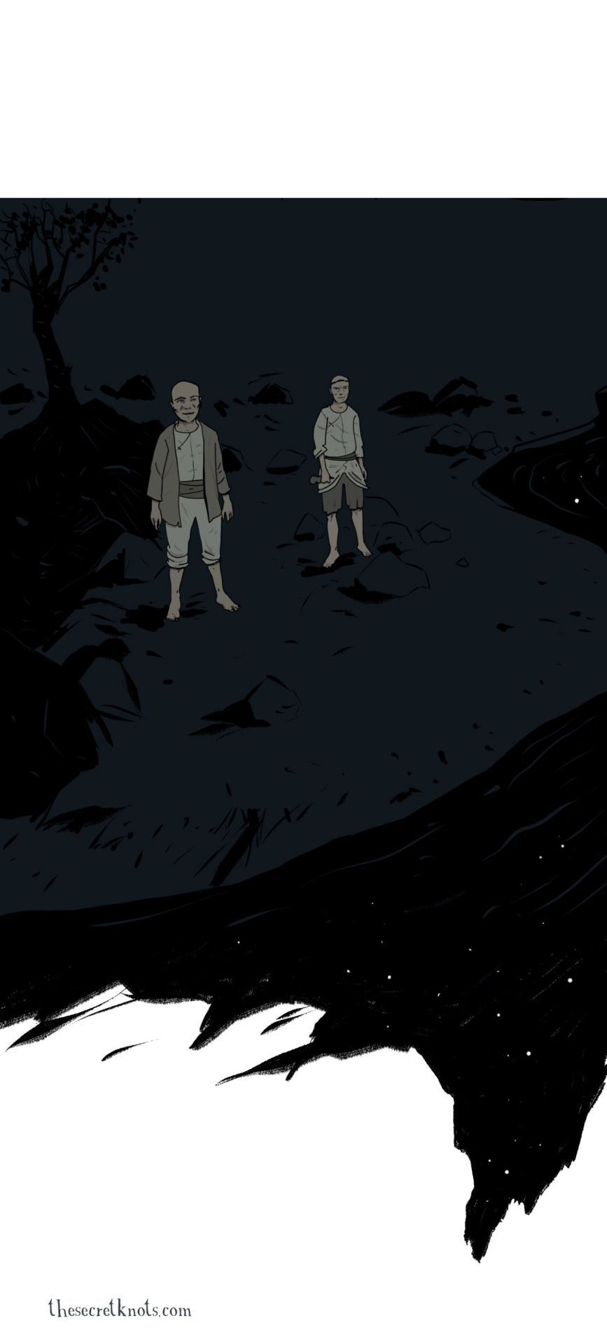
New Secret Knots comic, "The River". I hope you like it!
The Secret Knots comics are made possible by my patrons. Check out my pledge tiers if you'd like to be one of them.
19K notes
·
View notes