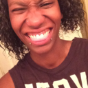
#get lean
Text
Well.... working on a plan to lean out a little.
Shredding for the wedding style, I suppose.
All right:
NO ALCOHOL
If doing CBD, make sure you have an anti-snack or a safe snack plan. 😉
Gummies are candy, use them as dessert.
Tea & Coffee: always have one ready.
Water: 1 oz per pound of bodyweight. If you are bored, do a sparkling water!
If you want something sweet & cold: beverage on ice.
ABM- Always Be Moving
Walk whenever you can
Biking/Elliptical + Movies
Aromatherapy
Distraction methods
You can add ACV to drinks like water n tea
Fiber. Pectin.
Keep food basic, easy to grab n go.
Electrolytes
Greens supplement
Protein powders- I have a ton. Make a pudding or smoothie.

#get lean#healthy lifestyle#getting healthy#losing weight#healthy eating#fitblr#healthy habits#operation lose this gut#weight loss#operationlosethisgut#weight loss journey#shredding for the wedding#shredding#focus on your goals#focus#stay focused#weight loss plan#weight loss goals#weight loss management#weight loss lifestyle
83 notes
·
View notes
Photo
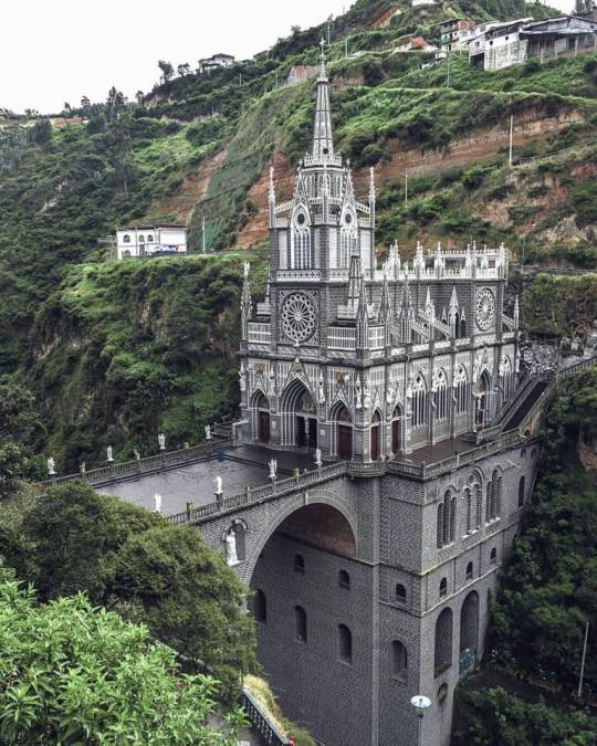
Las Lajas Sanctuary, Colombia | Lost Souls Paradise | Instagram
#lost souls paradise#lost souls#nature#explore#exploring#adventure#get lean#casting notification#colombia#forest#paradise#get lost#mountain#mountain views#historic properties#landscape
24 notes
·
View notes
Text
When I was a kid one of my moms would call her period "moon time" or "her monthlies" or shit like that and my other mom straight up stealthed it, but when I'm a dad I think I'm gonna go straight down the middle and call it Werewolf Week. Like sorry kids, dad can't roughouse right now, it's Werewolf Week
#Plus my sense of smell always goes crazy like a couple days prior#So#I feel like I could really lean into the mythos#They'll get the talk of course but Werewolf Week sounds way cooler than Lady Time or whatever the fuck
59K notes
·
View notes
Text
There is a conversation to be had about the fact that Taylor Swift's album is being played in its entirety across all of iHeartRadio's 868 stations, pushing out the opportunities other artists might have had to get radioplay. That's the literal definition of a monopoly. No wonder she'll hit the top of the radio play charts with this maneuver, because at least 65 minutes (if not the back side of the album, which would take it to nearly twice that length) across EIGHT HUNDRED AND SIXTY EIGHT STATIONS will be dedicated to her, artificially boosting her radio play and decreasing everyone else's. In this essay I will—
#i don't mean to turn into a hater but when you are pulling amazonian billionaire tactics i will turn into a hater#any of y'all that claim to be socialists/left-leaning and get excited about her becoming a billionaire do NOT understand basic theory#or praxis for that matter#she is LITERALLY pushing out other artists ala vanderbilt and the railroads#she's not a tortured poet she's a robber baron#anti taylor swift#anti ttpd
9K notes
·
View notes
Text
Online Checkout Link
Click Link To Sign Up Now For This Coming Wednesday's Kickboxing Class!!!!!
!!!!!HAPPY NEW YEAR!!!!!
#kickboxing#boxing#martial arts#thai boxing#self defense#get fit#cardio#resolution#new years resolution#2024 fitness#muy thai#get lean#lose fat#stay fit
0 notes
Note
*you opening the love letter* what does your damijon look like, pls pls pls pls pls pls pls, i know it would be so cute, i just know it 🙏🙏🙏
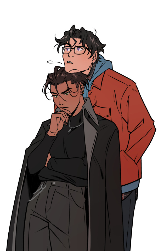
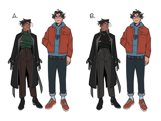
here you go! thank you for the ask, this was a lot of fun to do! they're working on a case together ^^
#ask#super sons#jondami#damian wayne#jon kent#batbabyart#after getting this ask i couldn't stop thinking about older Damian outfits 😭#just based on comic artists throughout the years Damian's got a fairly decent range of style it was hard to choose but v fun!!#Jon's wearing a bunch of layers to cover up bulk while Damian's layering to give off more bulk LOL#i decided to lean a bit into Cizmesija's recent look for him and contrast Jon's more colorful casual wear#didn't want tooo much Batman 666 vibes so i tried giving Damian another color option thru A but i still liked B more lol#also every time i draw older Damian his hair keeps changing sdfgh that one poll apparently did not help me decide haha
9K notes
·
View notes
Text

40 Things You Can Do To Start Losing Weight and Get Leaner
To get leaner, you have to put some effort into training, eat smart and always be aware that burning calories is what matters.. Here are 40 tips to help you get leaner and lose some weight...Read More
1 note
·
View note
Text
Weight Loss | Weight Management
Get Lean with Organic Coffee-berry Extract!

Health Meister understands the importance of achieving a healthy weight and offers a range of products to support weight loss goals.
It provides specially formulated supplements to help individuals manage their weight effectively.
1 note
·
View note
Text

rafayel
#love and deepspace#dewdles#he’s hard to draw TT but he’s rly cute#the game is rly fun but im probably not the exact audience for it LANSOJXJKS#me leaning back whenever they get a little tew close bc why r u all up in my business…….
3K notes
·
View notes
Text
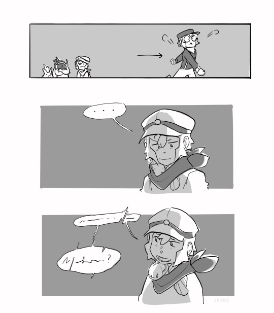
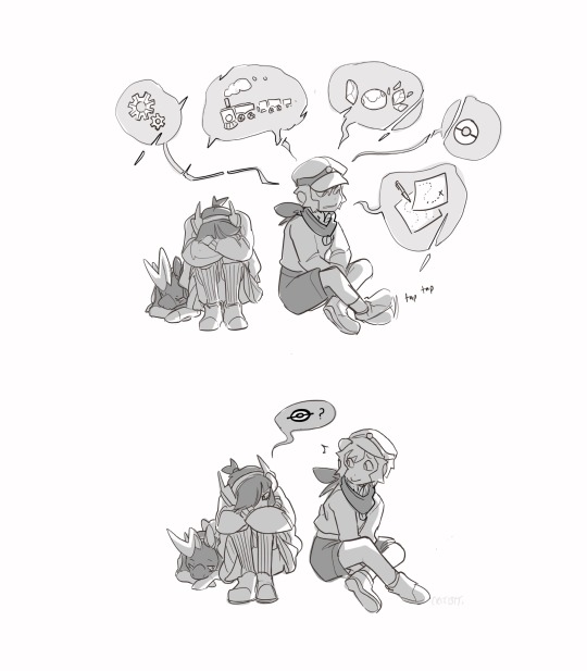
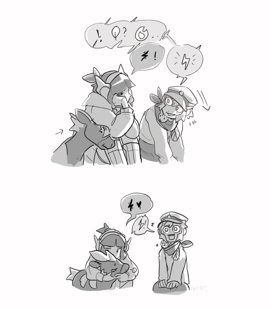
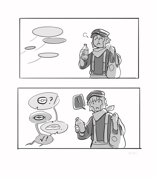
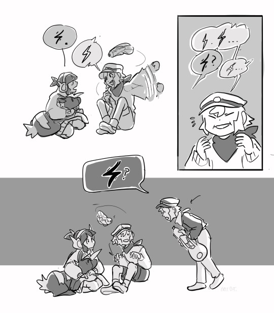
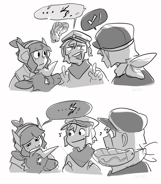
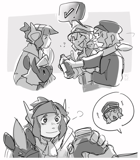
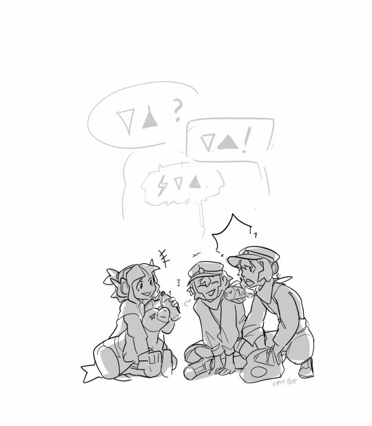
Language divides and building bridges.
Elesa’s feeling homesick. Emmet, bless his heart, tries to help by infodumping while Ingo frantically runs off to find water (crying is a very dehydrating experience).
((Would you look at that! The kids are picking up kantonese and galarian from each other!))
BONUS:
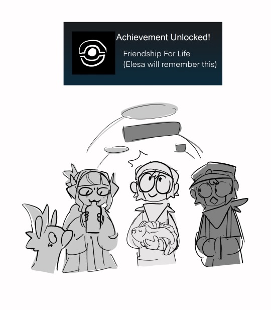
Heh. Callback.
Want to see more? Here’s the masterpost for submas!
#not Emmet trying to say Electric in kantonian and failing miserably#meanwhile Ingo gets it within the first five seconds (what a MOOD)#wow ingo ur so good at languages! hope this doesnt come into play later when you get sent to a foreign island chain far in the past!#(sweats)#anyways LOOK THE PATRATS AND PACHIRISU ARE FINALLY BECOMING FRIEND FRIENDS#I CAN DRAW SHENANIGANS AGAIN WHEEEEEE#BUT also... callback to the library comic where Emmet and Elesa talk about Leaning on Friends for Help... hehehehhough#elesa did in fact get that from somewhere yes#it's this. she got it from this interaction. from two people who decided to care about her for some reason#and so she decides to care back#(little rat dog barking noise) anyways back to tagging!#pokemon#art#sketchbook#submas#myart#fanart#pokemon ingo#subway boss ingo#submas comic#elesa#pokemon leader elesa#kid submas#nimbasa trio#blitzle#tynamo#ingo#emmet#subway master kudari#subway master nobori
3K notes
·
View notes
Text
tag two blondes who do fuckall
#falin touden#marcille donato#farcille#dungeon meshi#fanart#id in alt text#i owed it to falin to draw her w farsighted swag intact#im trying to get everyone i know into dm right now so i figure i should lean into it#will i draw other chars Maybe i do rly want to draw namari actually#and meijack.....
2K notes
·
View notes
Text

cain and abel, reunited
#my art#rainworld#rain world#five pebbles#looks to the moon#going to be experimenting w style + subject matter for a while ^^#spoilers in the next tags!#ik his puppet is shorter than hers but i made him leaning down for the point of “getting on her level”#the rivulet ending is very touching to me. i sincerely hope they had some good years together
2K notes
·
View notes
Text
Bruce, ending a JL meeting: Superman and I will discuss this further
Hal, teasing: lol, are you two going to fuck
Bruce, deadpan: yeah we are, what about it
#hal thought batman couldn't get any worse#then he started dating superman#bruce realized early on that the best way to handle teasing#was to lean into it#can't tease someone about something they're not embarrassed by#batman#bruce wayne#green lantern#hal jordan#superbat#dc#dc comics#mine
2K notes
·
View notes
Text
MakyMak , MakyMakVrchat. My Bodybuilding books helped me in bodybuilding , tips and tricks on how to get ripped in a short amout of time.


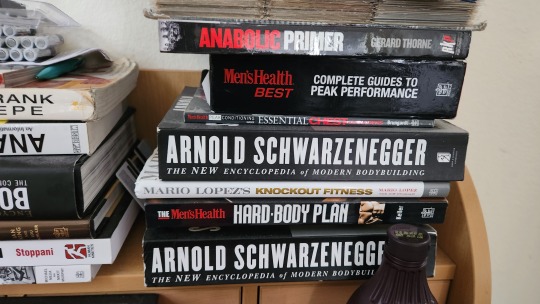

MakyMak , MakyMakVrchat. My Bodybuilding books helped me in bodybuilding , tips and tricks on how to get ripped in a short amout of time.
#Makymak#Maky Mak#MakyMakVrChat#Bodybuilding#Bodybuilder#Muscle#Shredded#Ripped#Physique#Get ripped#Get shredded#Get lean#Build muscle#Shirtless#Flexing#Muscle boy#Muscle men#Muscle flexing#Jock#Hunk#Stud#Shirtless hunk#Shirtless jock#Shirtless stud#Vrchat#Vrchat player
1 note
·
View note
Text
I think 90% of my gripes with how modern anime looks comes down to flat color design/palettes.
Non-cohesive, washed-out color palettes can destroy lineart quality. I see this all the time when comparing an anime's lineart/layout to its colored/post-processed final product and it's heartbreaking. Compare this pre-color vs. final frame from Dungeon Meshi's OP.


So much sharpness and detail and weight gets washed out and flattened by 'meh' color design. I LOVE the flow and thickness and shadows in the fabrics on the left. The white against pastel really brings it out. Check out all the detail in their hair, the highlights in Rin's, the different hues to denote hair color, the blue tint in the clothes' shadows, and how all of that just gets... lost. It works, but it's not particularly good and does a disservice to the line-artist.
I'm using Dungeon Meshi as an example not because it's bad, I'm just especially disappointed because this is Studio Trigger we're talking about. The character animation is fantastic, but the color design is usually much more exciting. We're not seeing Trigger at their full potential, so I'm focusing on them.
Here's a very quick and messy color correct. Not meant to be taken seriously, just to provide comparison to see why colors can feel "washed out." Top is edit, bottom is original.
You can really see how desaturated and "white fluorescent lighting" the original color palettes are.
[Remember: the easiest way to make your colors more lively is to choose a warm or cool tint. From there, you can play around with bringing out complementary colors for a cohesive palette (I warmed Marcille's skintone and hair but made sure to bring out her deep blue clothes). Avoid using too many blend mode layers; hand-picking colors will really help you build your innate color sense and find a color style. Try using saturated colors in unexpected places! If you're coloring a night scene, try using deep blues or greens or magentas. You see these deep colors used all the time in older anime because they couldn't rely on a lightness scale to make colors darker, they had to use darker paints with specific hues. Don't overthink it, simpler is better!]
#not art#dungeon meshi#rant#i'm someone who can get obsessive over colors in my own art#will stare at the screen adjusting hues/saturation for hours#luckily i've gotten faster at color picking#but yeah modern anime's color design is saddening to me. the general trend leans towards white/grey desaturated palettes#simply because they're easier to pick digitally#this is not the colorists fault mind you. the anime industry's problems are also labor problems. artists are severely underpaid#and overworked. colorists literally aren't paid enough to do their best#there isn't a “creative drought” in the anime industry. this trend is widespread across studios purely BECAUSE it's not up to individuals#until work conditions improve anime will unfortunately continue to miss its fullest potential visually#don't even GET ME STARTED ON THE USE OF POST-PROCESSING FILTERS AND LIGHTING IN ANIME THOUGH#SOMEONE HOLD ME BACK. I HATE LENS FLARES I HATE GRADIENT SHADING I HATE CHROMATIC ABBERATION AND BLUR
2K notes
·
View notes
Text
reunion 🌸
#persona 3#persona 3 spoilers#minato arisato#makoto yuki#ryoji mochizuki#aigis#ryomina#lizzy does art#HELLO EVERYONE!!! march 5th is upon us again so i bring... my contribution for this year. my third year drawing for it!#i made the thumbnail for this a few weeks after last year's graduation day#i thought it would be fun to lean into the ryominaigis angle of graduation day (you could read this as minato/aigis if you like-#but i feel like most people would read it as ryoji/minato)#IN ANY CASE working on this made me very emotional over this game :') (specifically minato)#i really enjoy how p3 ends it's such a nice way of wrapping up the narrative's messages and themes#working on this. minato's kindness was at the forefront of my mind throughout the piece#and i really wanted to capture how. ultimately it was his decision to sacrifice himself- to do the great seal#while to an outsider's perspective it is. sad that minato passes. i think becoming the seal is something that minato-#actively welcomes. in the same way that death (ryoji) is a comfort to him because death was housed in him for Ten YearsTM#AND I ALSO GOT REALLY SAD OVER AIGIS TOO. i still get fucked up over how in fes's animated cutscene for 3/5 they portray-#her as human and not drawing the robot parts so i wanted to do something smilar here...#but also i am very sad on aigis's behalf because she discovers her humanity through minato and realizes what she-#wants to do and then. well. minato is like. he's ready to pass on (even if he's scared) and im like. OH MY GOD THIS TRIO GETS ME MESSED UP#this was more coherent in my head LOL BUT ough i like drawing p3 and working through my feelings about it...#anyway! happy (in quotations) march 5th. i love this game to bits. it's so fun to draw for this day every year and see how i've improved#if you've read all this thank you :) lizzy appreciates you all very much. mwah! <3
1K notes
·
View notes
Last Seen Blogs
whiskey-fireworks
too rare to die
jimcrustbastard-blog
Jim Crust Bastard
bunnywithablog
we're gonna get along like a house on fire

fanboy-feminist
Fandoms, Feminism & More!
bpdjournal
Borderline Awesome