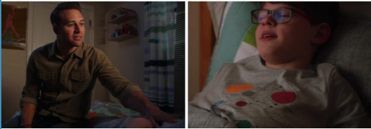
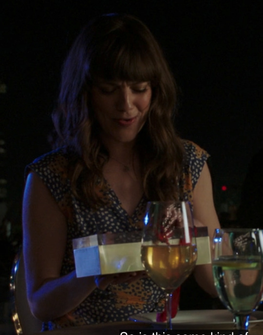
#i hope these tags are right new
Text
more and more I keep needing to question that Batman ‘identity’ the knowledge I have, the stuff I responded to and said while playing, it just doesn’t make sense to me
My friends who’ve watched me play and a few I recently talked about my experiences with said they do fall under something that could be in the fictionkin experience and is fair to find odd; I mean who only has touched Batman 1966 and a tiny bit of the animated version
responds to seeing Kane Industries with as much disdained as if it was Dagger Corp on first meeting without prompting especially when the game itself kept trying to show him as good.
Who expects fear for Alfred in such context when he’s just meeting a friend and is so comfortable while I’m ready to throw down.
Who has noticed and was taking in a symbol the game brought no attention to until half way through that could have been easily considered graffiti just like all the rest
Who knew exactly where a bunch of them were without much effort
Whom had a panic during one point with only seeing the walls of a room and a ‘bed’ couldn’t stop apologizing to Jason and regretting I used him for that mission. Who knew he would be taken but hoped it wasn’t ‘there’ and knew before anything in the game let me knew it was full of fear-based hallucinating gas and movable rooms.
Just so many things. Even more I’m not even listing because it’s so unreal it’s hard to list them
Who or what am I
How did I know all this and are so detailed involved
One might think the person who hid the pages, but that’s impossible. He doesn’t know what I do; he was outside the group. He was too scared to be in the city.
I feel no fear, but hate. I almost yelled out Kane’s name when the Voice first appears on screen but my tongue was tied. I was overwhelmed and exhausted. I wasn’t surprised by the traps but underwhelmed. I don’t know
I keep typing and rambling to finally get these feelings on a page instead of tight in my chest and only vaguely at my friends.
I don’t know what this is but the court of owls and I have a bond I could only guess
I wish I didn’t have to keep this questioning up and just have answers. This isn’t an enjoyable experience
I just wanted to play a game with Todd in it because Todd is a comfort character with how similar we are and plus he’s hot in the game with that nice figure. I wanted just to have fun and play and enjoy myself
And instead I’m on a questioning journey I don’t understand
How does one even walk through this experience to get to a satisfying conclusion to be able to just move on. I don’t need 100% answers, that’s silly to expect we can never be sure, but at least something to grasp ahold of would be nice
#Spoilers for Gotham knight#fictionkin#questioning kintype#i hope these tags are right new#Long post
0 notes
Text


Making Incorrect H:SR Quotes Until I Run Out of (hopefully) Original Ideas - Pt. 2
[Pt. 1] [Pt. 3] [Pt. 4] [Pt. 5] [Pt. 6]
#honkai star rail#hsr#hsr incorrect quotes#honkai star rail memes#hsr memes#honkai star rail meme#hsr meme#boothill#robin#hsr robin#sunday#hsr sunday#aventurine#dr ratio#ratiorine#aventio#acheron#black swan#acherswan#dan heng#march 7th#stelle#hsr trailblazer#what's the ship name for march and stelle. uh#i have no clue. it'd be their names smashed together right. starch??? 😭#whatever it is feel free to tag it if u want! and maybe i'll learn smthn bc surely there's another name for them#omfg i just googled it and apparently it IS starch you learn smthn new every day#anyways. here's hoping none of these have been done before!#i managed to make one (1) image that didn't include Aven or Ratio wow //edit: there's 3 i was just so tired i couldn't count lmao#anyways it's past my bedtime i spent too long making this and i still gotta do my HSR dailies rq so goodbye and goodnite to u all
2K notes
·
View notes
Text

My Lawyer is going to Get Your Ass.
[First] Prev <–-> Next
#poorly drawn mdzs#mdzs#jin guangyao#jiang cheng#nie huaisang#wei wuxian#lan wangji#elle woods#That's right. All this time I was building up towards this punchline.#The pink legal eagle Elle Woods is canonical to the PD-MDZS universe. This will make no sense if you are new around here.#The phone lwj pulls out of his bag of holding has one function. And it's to call Elle Woods. An omniscient and legendary cultivator.#The mandarin is very messy but probably self explanatory. I can only hope it is legible...#Referencing Danganrompa (Sore wa chigau yo!) and Ace Attorney was not on my bingo card for things I would end up doing-#-but it has happened and I am rolling with it. Even if it means a lot is going on in this comic!#the core joke here is that wwx finds himself in a impromptu court and gets a lawyer involved.#A lawyer AU fits these characters so well I am once again blinking long and slow at everyone who’s made an AU for it#Not a single whisper of story analysis in these tags today. It's pure whimsy on the menu.#I am placing a little treat outside of your door. It's a cold world out there and there is so little whimsy to be found.
2K notes
·
View notes
Text
"You know... You didn't have to take that with you."
"But I promised him I'd take him out to see the ocean one day."
#for context uhmm how do i explain this#so around a few weeks after Jd arrives Bruce is like “Hey... where are the others?”#and Jd is like “ooooh 🤪🤪 he doesnt know...”#Since at this time JD believes that the entire tribe is dead. including his brothers and grandma#so Jd has to take Bruce to the now abandoned troll tree and give him the bad news#Bruce doesnt believe it at first. even if the tree is abandoned they cant be dead? right?? they cant be#so he rushes over to their grandma's pod. thinking that theyre just in hiding and waiting for them to return#and all Bruce is able to find in the empty pod is Branch's old stuffed toy Croco#which solidifies to Bruce that everyone is dead. their friends their family. everyone#Bruce is obviously devastated by the news. he doesnt show it a lot but he doesnt take it too well#he ends up bringing Croco with him back to Vacay Island and patches Croco up#since Croco is a bit worn out due to being left in the pod for years#and since then Bruce always keeps Croco hidden in his hair. both as a memoir of his baby brother#and also a reminder of how he failed as an older brother... ouch#ofc the others arent dead. its just that now both Jd AND Bruce believe that the rest of the trolls are dead#also King Trollex is there bc i wanted to put him there. I like Trollex :]#a knee ways more bb au art i promise the next bb au art will be lighthearted#tho now im gonna work on the next violet gijinka batch bc ive been starving my friendlocke audience for too long#sorry friendlocke fans ill feed u next dw#cherris canvas#trolls#trolls band together#trolls john dory#john dory trolls#trolls bruce#bruce trolls#king trollex#beach bros au#sorry for rambling in the tags i hope u dont mind ahaha
499 notes
·
View notes
Text
"Clothing tags, travel cards, hotel room key cards, parcel labels … a whole host of components in supply chains of everything from cars to clothes. What do they have in common? RFID tags.
Every RFID (Radio Frequency Identification) tag contains a microchip and a tiny metal strip of an antenna. A cool 18bn of these are made – and disposed of – each year. And with demands for product traceability increasing, ironically in part because of concerns for the social and environmental health of the supply chain, that’s set to soar.
And guess where most of these tags end up? Yup, landfill – adding to the burgeoning volumes of e-waste polluting our soils, rivers and skies. It’s a sorry tale, but it’s one in which two young graduates of Imperial College London and Royal College of Art are putting a great big green twist. Under the name of PulpaTronics, Chloe So and Barna Soma Biro reckon they’ve hit on a beguilingly simple sounding solution: make the tags out of paper. No plastic, no chips, no metal strips. Just paper, pure and … simple … ? Well, not quite, as we shall see.
The apparent simplicity is achieved by some pretty cutting-edge technical innovation, aimed at stripping away both the metal antennae and the chips. If you can get rid of those, as Biro explains, you solve the e-waste problem at a stroke. But getting rid of things isn’t the typical approach to technical solutions, he adds. “I read a paper in Nature that set out how humans have a bias for solving problems through addition – by adding something new, rather than removing complexity, even if that’s the best approach.”
And adding stuff to a world already stuffed, as it were, can create more problems than it solves. “So that became one of the guiding principles of PulpaTronics”, he says: stripping things down “to the bare minimum, where they are still functional, but have as low an environmental impact as possible”.
...how did they achieve this magical simplification? The answer lies in lasers: these turn the paper into a conductive material, Biro explains, printing a pattern on the surface that can be ‘read’ by a scanner, rather like a QR code. It sounds like frontier technology, but it works, and PulpaTronics have patents pending to protect it.
The resulting tag comes in two forms: in one, there is still a microchip, so that it can be read by existing scanners of the sort common within retailers, for example. The more advanced version does away with the chip altogether. This will need a different kind of scanner, currently in development, which PulpaTronics envisages issuing licences for others to manufacture.
Crucially, the cost of both versions is significantly cheaper than existing RFID kit – making this a highly viable proposition. Then there are the carbon savings: up to 70% for the chipless version – so a no-brainer from a sustainability viewpoint too. All the same, industry interest was slow to start with but when PulpaTronics won a coveted Dezeen magazine award in late 2023, it snowballed, says So. Big brands such as UPS, DHL, Marks & Spencer and Decathlon came calling. “We were just bombarded.” Brands were fascinated by the innovation, she says, but even more by the price point, “because, like any business, they knew that green products can’t come with a premium”."
-via Positive.News, April 29, 2024
--
Note: I know it's still in the very early stages, but this is such a relief to see in the context of the environmental and human rights catastrophes associated with lithium mining and mining for rare earth metals, and the way that EVs and other green infrastructure are massively increasing the demand for those materials.
I'll take a future with paper-based, more humane alternatives for sure! Fingers crossed this keeps developing and develops well (and quickly).
#I do really wish it could be read by regular scanners already though#that's what I thought at first#and that would've been fucking amazing#but this is still pretty cool#electronics#science and technology#green technology#ewaste#landfill#lithium#lithium mining#human rights#environment#climate action#climate hope#rfid#rfid technology#rfid tags#good news#hope
374 notes
·
View notes
Text

His heart belongs to another
And no other heart will do
#no other heart by mac demarco : D#I drew this a couple of days ago because i was feeling crazy and i just love the idea that#these two should be great together!! they should!!! but#theyre not together#theres just . theyre missing something#and thats okay!!! its not meant to be#and theyre friendship is very valuble to both of them!!#their* fuck my baka keyboard#trolls#yall are gonna be mad about this one i feel it ...#i think we all know who jds gonna end up with now right ...#i just gotta .. draw them more 💀#i actully have the perfect ruveal i just have to finish painting it#urrgg i HATE painting#trolls oc#trolls oc cory#trolls movie#trolls john dory#trolls jd#john dory#jd ex husband#oh uhh i imagine this feels like a new years thing. or something#something that happened like right after they reconnected#before floyd and cory started going out#on god one day im gonna put all my tags lore into a post#i just shy 😔 who wants to read all this in a caption#not me brother!! I'm not reblogging that shit!!!#and im not finishing this cause i dont wanna give false hope 😘#although jd dating sim ... is pretty real#i would love to do endings with all his exs
436 notes
·
View notes
Text
why Aurora's art is genius
It's break for me, and I've been meaning to sit down and read the Aurora webcomic (https://comicaurora.com/, @comicaurora on Tumblr) for quite a bit. So I did that over the last few days.
And… y'know. I can't actually say "I should've read this earlier," because otherwise I would've been up at 2:30-3am when I had responsibilities in the morning and I couldn't have properly enjoyed it, but. Holy shit guys THIS COMIC.
I intended to just do a generalized "hello this is all the things I love about this story," and I wrote a paragraph or two about art style. …and then another. And another. And I realized I needed to actually reference things so I would stop being too vague. I was reading the comic on my tablet or phone, because I wanted to stay curled up in my chair, but I type at a big monitor and so I saw more details… aaaaaand it turned into its own giant-ass post.
SO. Enjoy a few thousand words of me nerding out about this insanely cool art style and how fucking gorgeous this comic is? (There are screenshots, I promise it isn't just a wall of text.) In my defense, I just spent two semesters in graphic design classes focusing on the Adobe Suite, so… I get to be a nerd about pretty things…???
All positive feedback btw! No downers here. <3
---
I cannot emphasize enough how much I love the beautiful, simple stylistic method of drawing characters and figures. It is absolutely stunning and effortless and utterly graceful—it is so hard to capture the sheer beauty and fluidity of the human form in such a fashion. Even a simple outline of a character feels dynamic! It's gorgeous!
Though I do have a love-hate relationship with this, because my artistic side looks at that lovely simplicity, goes "I CAN DO THAT!" and then I sit down and go to the paper and realize that no, in fact, I cannot do that yet, because that simplicity is born of a hell of a lot of practice and understanding of bodies and actually is really hard to do. It's a very developed style that only looks simple because the artist knows what they're doing. The human body is hard to pull off, and this comic does so beautifully and makes it look effortless.
Also: line weight line weight line weight. It's especially important in simplified shapes and figures like this, and hoo boy is it used excellently. It's especially apparent the newer the pages get—I love watching that improvement over time—but with simpler figures and lines, you get nice light lines to emphasize both smaller details, like in the draping of clothing and the curls of hair—which, hello, yes—and thicker lines to emphasize bigger and more important details and silhouettes. It's the sort of thing that's essential to most illustrations, but I wanted to make a note of it because it's so vital to this art style.
THE USE OF LAYER BLENDING MODES OH MY GODS. (...uhhh, apologies to the people who don't know what that means, it's a digital art program thing? This article explains it for beginners.)
Bear with me, I just finished my second Photoshop course, I spent months and months working on projects with this shit so I see the genius use of Screen and/or its siblings (of which there are many—if I say "Screen" here, assume I mean the entire umbrella of Screen blending modes and possibly Overlay) and go nuts, but seriously it's so clever and also fucking gorgeous:
Firstly: the use of screened-on sound effect words over an action? A "CRACK" written over a branch and then put on Screen in glowy green so that it's subtle enough that it doesn't disrupt the visual flow, but still sticks out enough to make itself heard? Little "scritches" that are transparent where they're laid on without outlines to emphasize the sound without disrupting the underlying image? FUCK YES. I haven't seen this done literally anywhere else—granted, I haven't read a massive amount of comics, but I've read enough—and it is so clever and I adore it. Examples:


Secondly: The beautiful lighting effects. The curling leaves, all the magic, the various glowing eyes, the fog, the way it's all so vividly colored but doesn't burn your eyeballs out—a balance that's way harder to achieve than you'd think—and the soft glows around them, eeeee it's so pretty so pretty SO PRETTY. Not sure if some of these are Outer/Inner Glow/Shadow layer effects or if it's entirely hand-drawn, but major kudos either way; I can see the beautiful use of blending modes and I SALUTE YOUR GENIUS.
I keep looking at some of this stuff and go "is that a layer effect or is it done by hand?" Because you can make some similar things with the Satin layer effect in Photoshop (I don't know if other programs have this? I'm gonna have to find out since I won't have access to PS for much longer ;-;) that resembles some of the swirly inner bits on some of the lit effects, but I'm not sure if it is that or not. Or you could mask over textures? There's... many ways to do it.
If done by hand: oh my gods the patience, how. If done with layer effects: really clever work that knows how to stop said effects from looking wonky, because ugh those things get temperamental. If done with a layer of texture that's been masked over: very, very good masking work. No matter the method, pretty shimmers and swirly bits inside the bigger pretty swirls!
Next: The way color contrast is used! I will never be over the glowy green-on-black Primordial Life vibes when Alinua gets dropped into that… unconscious space?? with Life, for example, and the sharp contrast of vines and crack and branches and leaves against pitch black is just visually stunning. The way the roots sink into the ground and the three-dimensional sensation of it is particularly badass here:

Friggin. How does this imply depth like that. HOW. IT'S SO FREAKING COOL.
A huge point here is also color language and use! Everybody has their own particular shade, generally matching their eyes, magic, and personality, and I adore how this is used to make it clear who's talking or who's doing an action. That was especially apparent to me with Dainix and Falst in the caves—their colors are both fairly warm, but quite distinct, and I love how this clarifies who's doing what in panels with a lot of action from both of them. There is a particular bit that stuck out to me, so I dug up the panels (see this page and the following one https://comicaurora.com/aurora/1-20-30/):

(Gods it looks even prettier now that I put it against a plain background. Also, appreciation to Falst for managing a bridal-carry midair, damn.)
The way that their colors MERGE here! And the immense attention to detail in doing so—Dainix is higher up than Falst is in the first panel, so Dainix's orange fades into Falst's orange at the base. The next panel has gold up top and orange on bottom; we can't really tell in that panel where each of them are, but that's carried over to the next panel—

—where we now see that Falst's position is raised above Dainix's due to the way he's carrying him. (Points for continuity!) And, of course, we see the little "huffs" flowing from orange to yellow over their heads (where Dainix's head is higher than Falst's) to merge the sound of their breathing, which is absurdly clever because it emphasizes to the viewer how we hear two sets of huffing overlaying each other, not one. Absolutely brilliant.
(A few other notes of appreciation to that panel: beautiful glows around them, the sparks, the jagged silhouette of the spider legs, the lovely colors that have no right to make the area around a spider corpse that pretty, the excellent texturing on the cave walls plus perspective, the way Falst's movements imply Dainix's hefty weight, the natural posing of the characters, their on-point expressions that convey exactly how fuckin terrifying everything is right now, the slight glows to their eyes, and also they're just handsome boys <3)
Next up: Rain!!!! So well done! It's subtle enough that it never ever disrupts the impact of the focal point, but evident enough you can tell! And more importantly: THE MIST OFF THE CHARACTERS. Rain does this irl, it has that little vapor that comes off you and makes that little misty effect that plays with lighting, it's so cool-looking and here it's used to such pretty effect!
One of the panel captions says something about it blurring out all the injuries on the characters but like THAT AIN'T TOO BIG OF A PROBLEM when it gets across the environmental vibes, and also that'd be how it would look in real life too so like… outside viewer's angle is the same as the characters', mostly? my point is: that's the environment!!! that's the vibes, that's the feel! It gets it across and it does so in the most pretty way possible!
And another thing re: rain, the use of it to establish perspective, particularly in panels like this—

—where we can tell we're looking down at Tynan due to the perspective on the rain and where it's pointing. Excellent. (Also, kudos for looking down and emphasizing how Tynan's losing his advantage—lovely use of visual storytelling.)
Additionally, the misting here:

We see it most heavily in the leftmost panel, where it's quite foggy as you would expect in a rainstorm, especially in an environment with a lot of heat, but it's also lightly powdered on in the following two panels and tends to follow light sources, which makes complete sense given how light bounces off particles in the air.
A major point of strength in these too is a thorough understanding of lighting, like rim lighting, the various hues and shades, and an intricate understanding of how light bounces off surfaces even when they're in shadow (we'll see a faint glow in spots where characters are half in shadow, but that's how it would work in real life, because of how light bounces around).
Bringing some of these points together: the fluidity of the lines in magic, and the way simple glowing lines are used to emphasize motion and the magic itself, is deeply clever. I'm basically pulling at random from panels and there's definitely even better examples, but here's one (see this page https://comicaurora.com/aurora/1-16-33/):

First panel, listed in numbers because these build on each other:
The tension of the lines in Tess's magic here. This works on a couple levels: first, the way she's holding her fists, as if she's pulling a rope taut.
The way there's one primary line, emphasizing the rope feeling, accompanied by smaller ones.
The additional lines starbursting around her hands, to indicate the energy crackling in her hands and how she's doing a good bit more than just holding it. (That combined with the fists suggests some tension to the magic, too.) Also the variations in brightness, a feature you'll find in actual lightning. :D Additional kudos for how the lightning sparks and breaks off the metal of the sword.
A handful of miscellaneous notes on the second panel:
The reflection of the flames in Erin's typically dark blue eyes (which bears a remarkable resemblance to Dainix, incidentally—almost a thematic sort of parallel given Erin's using the same magic Dainix specializes in?)
The flowing of fabric in the wind and associated variation in the lineart
The way Erin's tattoos interact with the fire he's pulling to his hand
The way the rain overlays some of the fainter areas of fire (attention! to! detail! hell yeah!)
I could go on. I won't because this is a lot of writing already.
Third panel gets paragraphs, not bullets:
Erin's giant-ass "FWOOM" of fire there, and the way the outline of the word is puffy-edged and gradated to feel almost three-dimensional, plus once again using Screen or a variation on it so that the stars show up in the background. All this against that stunning plume of fire, which ripples and sparks so gorgeously, and the ending "om" of the onomatopoeia is emphasized incredibly brightly against that, adding to the punch of it and making the plume feel even brighter.
Also, once again, rain helping establish perspective, especially in how it's very angular in the left side of the panel and then slowly becomes more like a point to the right to indicate it's falling directly down on the viewer. Add in the bright, beautiful glow effects, fainter but no less important black lines beneath them to emphasize the sky and smoke and the like, and the stunningly beautiful lighting and gradated glows surrounding Erin plus the lightning jagging up at him from below, and you get one hell of an impactful panel right there. (And there is definitely more in there I could break down, this is just a lot already.)
And in general: The colors in this? Incredible. The blues and purples and oranges and golds compliment so well, and it's all so rich.
Like, seriously, just throughout the whole comic, the use of gradients, blending modes, color balance and hues, all the things, all the things, it makes for the most beautiful effects and glows and such a rich environment. There's a very distinct style to this comic in its simplified backgrounds (which I recognize are done partly because it's way easier and also backgrounds are so time-consuming dear gods but lemme say this) and vivid, smoothly drawn characters; the simplicity lets them come to the front and gives room for those beautiful, richly saturated focal points, letting the stylized designs of the magic and characters shine. The use of distinct silhouettes is insanely good. Honestly, complex backgrounds might run the risk of making everything too visually busy in this case. It's just, augh, so GORGEOUS.
Another bit, take a look at this page (https://comicaurora.com/aurora/1-15-28/):

It's not quite as evident here as it is in the next page, but this one does some other fun things so I'm grabbing it. Points:
Once again, using different colors to represent different character actions. The "WHAM" of Kendal hitting the ground is caused by Dainix's force, so it's orange (and kudos for doubling the word over to add a shake effect). But we see blue layered underneath, which could be an environmental choice, but might also be because it's Kendal, whose color is blue.
And speaking off, take a look at the right-most panel on top, where Kendal grabs the spear: his motion is, again, illustrated in bright blue, versus the atmospheric screened-on orange lines that point toward him around the whole panel (I'm sure these have a name, I think they might be more of a manga thing though and the only experience I have in manga is reading a bit of Fullmetal Alchemist). Those lines emphasize the weight of the spear being shoved at him, and their color tells us Dainix is responsible for it.
One of my all-time favorite effects in this comic is the way cracks manifest across Dainix's body to represent when he starts to lose control; it is utterly gorgeous and wonderfully thematic. These are more evident in the page before and after this one, but you get a decent idea here. I love the way they glow softly, the way the fire juuuust flickers through at the start and then becomes more evident over time, and the cracks feel so realistic, like his skin is made of pottery. Additional points for how fire begins to creep into his hair.
A small detail that's generally consistent across the comic, but which I want to make note of here because you can see it pretty well: Kendal's eyes glow about the same as the jewel in his sword, mirroring his connection to said sword and calling back to how the jewel became Vash's eye temporarily and thus was once Kendal's eye. You can always see this connection (though there might be some spots where this also changes in a symbolic manner; I went through it quickly on the first time around, so I'll pay more attention when I inevitably reread this), where Kendal's always got that little shine of blue in his eyes the same as the jewel. It's a beautiful visual parallel that encourages the reader to subconsciously link them together, especially since the lines used to illustrate character movements typically mirror their eye color. It's an extension of Kendal.
Did I mention how ABSOLUTELY BEAUTIFUL the colors in this are?
Also, the mythological/legend-type scenes are illustrated in familiar style often used for that type of story, a simple and heavily symbolic two-dimensional cave-painting-like look. They are absolutely beautiful on many levels, employing simple, lovely gradients, slightly rougher and thicker lineart that is nonetheless smoothly beautiful, and working with clear silhouettes (a major strength of this art style, but also a strength in the comic overall). But in particular, I wanted to call attention to a particular thing (see this page https://comicaurora.com/aurora/1-12-4/):

The flowing symbolic lineart surrounding each character. This is actually quite consistent across characters—see also Life's typical lines and how they curl:

What's particularly interesting here is how these symbols are often similar, but not the same. Vash's lines are always smooth, clean curls, often playing off each other and echoing one another like ripples in a pond. You'd think they'd look too similar to Life's—but they don't. Life's curl like vines, and they remain connected; where one curve might echo another but exist entirely detached from each other in Vash's, Life's lines still remain wound together, because vines are continuous and don't float around. :P
Tahraim's are less continuous, often breaking up with significantly smaller bits and pieces floating around like—of course—sparks, and come to sharper points. These are also constants: we see the vines repeated over and over in Alinua's dreams of Life, and the echoing ripples of Vash are consistent wherever we encounter him. Kendal's dream of the ghost citizens of the city of Vash in the last few chapters is filled with these rippling, echoing patterns, to beautiful effect (https://comicaurora.com/aurora/1-20-14/):

They ripple and spiral, often in long, sinuous curves, with smooth elegance. It reminds me a great deal of images of space and sine waves and the like. This establishes a definite feel to these different characters and their magic. And the thing is, that's not something that had to be done—the colors are good at emphasizing who's who. But it was done, and it adds a whole other dimension to the story. Whenever you're in a deity's domain, you know whose it is no matter the color.
Regarding that shape language, I wanted to make another note, too—Vash is sometimes described as chaotic and doing what he likes, which is interesting to me, because smooth, elegant curves and the color blue aren't generally associated with chaos. So while Vash might behave like that on the surface, I'm guessing he's got a lot more going on underneath; he's probably much more intentional in his actions than you'd think at a glance, and he is certainly quite caring with his city. The other thing is that this suits Kendal perfectly. He's a paragon character; he is kind, virtuous, and self-sacrificing, and often we see him aiming to calm others and keep them safe. Blue is such a good color for him. There is… probably more to this, but I'm not deep enough in yet to say.
And here's the thing: I'm only scratching the surface. There is so much more here I'm not covering (color palettes! outfits! character design! environment! the deities! so much more!) and a lot more I can't cover, because I don't have the experience; this is me as a hobbyist artist who happened to take a couple design classes because I wanted to. The art style to this comic is so clever and creative and beautiful, though, I just had to go off about it. <3
...brownie points for getting all the way down here? Have a cookie.
#aurora comic#aurora webcomic#comicaurora#art analysis#...I hope those are the right tags???#new fandom new tagging practices to learn ig#much thanks for something to read while I try to rest my wrists. carpal tunnel BAD. (ignore that I wrote this I've got braces ok it's fine)#anyway! I HAVE. MANY MORE THOUGHTS. ON THE STORY ITSELF. THIS LOVELY STORY#also a collection of reactions to a chunk of the comic before I hit the point where I was too busy reading to write anything down#idk how to format those tho#...yeet them into one post...???#eh I usually don't go off this much these days but this seems like a smaller tight-knit fandom so... might as well help build it?#and I have a little more time thanks to break so#oh yes also shoutout to my insanely awesome professor for teaching me all the technical stuff from this he is LOVELY#made an incredibly complex program into something comprehensible <3#synapse talks
749 notes
·
View notes
Text
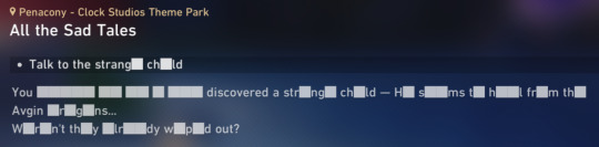
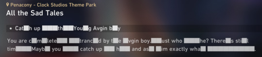
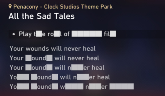


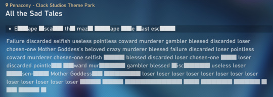

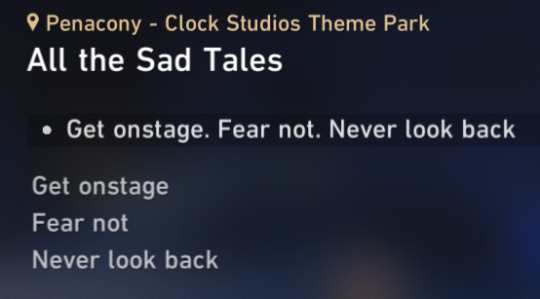
All of the quest menu descriptions for Aventurine's quest "All the Sad Tales".
(... And the one from "A Walk Among the Tombstones.)

#hsr spoilers#honkai star rail spoilers#hsr#honkai star rail#hsr aventurine#penacony spoilers#i really don't look at quest menu text often#but i'm glad i did this time around#i think that's all of them but i could have missed one or two#the text for the next step sometimes changes while keeping the same description so i only captured it once each time#this is was really funky but also goddamn aventurine just had a horrible time the whole patch#delightful for me personally#who loves it when characters suffer#mihoyo pulled 0 punches#i hope i used enough spoiler tags cause that's big fat spoilers right here but it's one of the things i liked the most about the new quest#i love it when games have fun with their medium#ray's records
373 notes
·
View notes
Text

One-hour experimental comm i finished in January! This is my first time drawing a marvel villain and my big-men loving self was overjoyed to get to draw one of my fave depictions of Doc Ock ever, tied with Spiderverse's Liv 💚
#artists on tumblr#doc ock#doctor octopus#alfred molina#spiderman#mcu#marvel#Gabriel's arts#commission#man i hope those are all the right tags for this NJHBGVDBGDV#anywas i am SO insanely proud of this and RBs always appreciated..#ive nevr done a piece like this before and i rlly do love the result!! i never wouldve imagined that i could get THIS much done in#only an hour. i might make a habit to time myself for art to see how much i can accomplish and improve on drawing faster#ALSO hello the whole purpose of this piece was to test#new brushes!! which is why it was dubbed experimental
285 notes
·
View notes
Text
Costume Meta 7x01
Aaaaaaannnnd we're back!!
OMG I cannot tell you how good it feels to be back writing costume meta - I have missed it so very much and this first episode has given me lots and lots to talk about so lets crack on with it shall we!
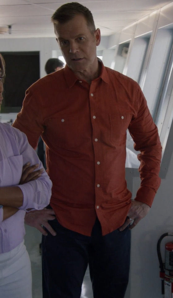
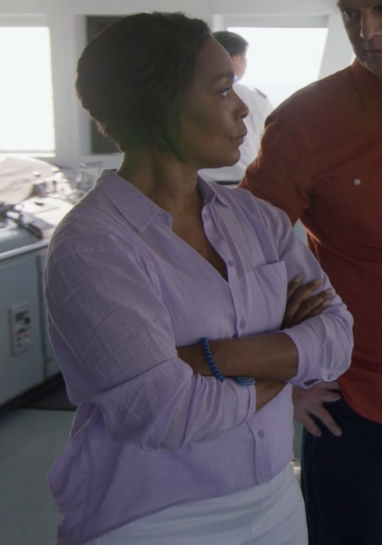
Where to start?! Firstly - Its amazing to have Alayna Bell-Price back in the driving seat and she is a genius because she knows the characters better than anyone and I have to say from my perspective there is a pretty clear difference between this episodes costumes and the ones from season 6 - not that s6's costumes were bad, just that you could see the shift of having a designer who didn't know the characters to the same level. I’m going to go in order of character appearance in a non uniform capacity for this one I think so we’re going to jump around from character to character a bit. There is no Maddie or Hen this week, as we don't see them out of uniform, but every one else is accounted for and I've included Norman and Lola as they've got a multi episode arc and their costumes are interesting and playing into a colour theme!
putting it below the cut as its a long post and I on't want to overtake everyones dashes! Enjoy!
We start off with Athena in this pale pink high neck ribbed sweater with large bell sleeves. I've spoken a fair amount about pale pink over the last couple of seasons of costume metas and how, in clothes its representative of childish and immature behaviours or thoughts. That holds true here - the pale pink is playing into Athena's childhood - when she developed her fear of cruise ships - its creating a connection between her childhood experiences and the woman sitting in Franks office.
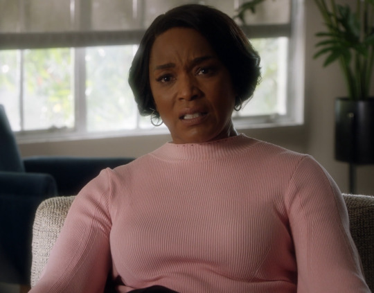
We get a flashback that shows her in yellow and orange - the yellow for communication and the orange for transformation. A literal moment where we see Athena transform from the innocence of youth to her developing anxiety and fear around cruise ships. Its really clever visual storytelling connecting adult with child and shows us her fear is genuine and founded in something that she may not have been able to articualte fully as a child, but she can as an adult, even if she doesn't actually articulate it to Bobby.
Our next non uniform costume is Chimney. The lighting is really low in this scene, so it's kind of hard to be 100% sure of the colouring, but he seems to be wearing either a dark navy or black button up shirt under a dark green and black bomber jacket. The use of really dark green in combination with black, Back is a colour that can be about hiding ones vulnerabilities - concealment and masking, but it is also a colour associated with magic (generally dark magic) as well as pessimism. The green is growth and renewal, and the hope for a better future. to use them in combination i this way is playing on Chimneys insecurites and fears, his desire to keep the 'magic' alive in his relationship with Maddie, but it also speaks to his growth, that he goes home and talks to her about it (even if he does come up with an insane plan to 'date forever').
Eddie in the locker room - aside from being shirtless for much of it and pulling some epically good faces - was a super interesting costume choice. Especially the use of his watch! first though - Denim shirt time! We don't actually see Eddie in a denim shirt all that often and we've seen him in the super washed out one far more than dark denim shirts. I've been laughing a little bit at a few people (on twitter mostly) claiming its the same shirt he was wearing at the hospital during and after Bucks coma and it being a play on bringing Buck back to life. While I like the theory, its actually a very different shirt - the one in the hospital was black with a grey wash out and was made of velveteen - so different colour and fabric.
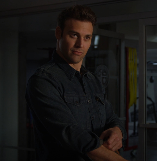
This shirt, is however one we have actually seen Eddie wear before and its far more telling than if it were the hospital shirt. You need to bear in mind that this scene is about Buck and Eddies respective girlfriends (or lack there of) and the fact that Christopher has a girlfriend now as well. This shirt is the same shirt Edie was wearing when he (re)introduced Ana to Chris in 4x08 (breaking point my beloved! the gift that keeps on giving!) and this puts a conversation about Marisol and things going well with her into the same category as Ana - suggesting she is ultimately destined for the same fate as Ana. the other thing that plays into this narrative is the use of the watch.
Eddie does not put the Christopher watch on until after he has found out that Buck has broken up with Natalia - so during the entire conversation about their respective girlfriends, he is only holding the Christopher watch, rather than wearing it.
In the picture below from 4x08 you can see that Eddie is wearing his black 'work' watch rather than the brown strapped 'Christopher' watch. Remember that the first time we see the Christopher watch is when he goes for his first date with Ana in Jinx, so he already has this watch and in theory should be wearing it in this scene. The fact he isn't is pretty telling and I'll go into that a bit more later when we get to Chris's (and Eddies) date scene.
Then we have Buck in his outfit of many colours! The white trainers, continue to play into my theory of Buck wearing them when he is in key points on his journey to discover his self - her it is about showing his growth - that he ended the relationship with Natalia - this is a massive thing when we saw how long it took for him to end things with Taylor - The man who clings is growing and getting out before it drags him down!
The jacket is similar in style to many of the ones we've seen him wearing in season 5 and 6, but this one is much brighter and more colourful. I know I go on about white meaning bad things for Buck, but that isn't relevant here - the white bad things happen to Buck theory is much more about t-shirts, jumpers and shirts rather than jackets - its an under-layer rather than a top layer that = danger. So i'm not thinking of its relevance here for this scene. What I am going to say is that this (according to my spreadsheet!) is the first time we've seen Buck in a white jacket of any description. To me, it's playing into the idea of purity and rebirth which is what white is often associated with. This plays into the comment Eddie makes welcoming Buck back to 'the land of the living' but also implies that Buck is starting a new chapter and making a fresh start - the check patterning suggests it might not all be plain sailing though.
The check pattern is an interesting one, obviously check pattern theory comes into play here, but whether its only in relation to the reveal that he split with Natalia, or if its also foreshadowing Buck getting himself into danger/trouble down the line, remains to be seen.
I'm going to quote myself again because I did predict that this scene may be about his relationship with Natalia when we got the stills dropped - the costume department never let us down!
The only thing I can do is scream into the void about check theory because check does't bode well for people - they always end up in the middle of the drama (see my check theory posts linked on my pinned post for more) and while they come out the other side (99% of the time) Buck in check for that scene in 6x18 pretty much doomed his relationship with Natalia (its specific to her and not C&K's baby as Buck wasn't wearing it when he delivered it!) and as that shirt in the still is very un Buck like, has not only yellow ochre in it, but also its a white base (and we all know buck in white is a bad sign!!) and its check patterned - my theory is that this scene is connected to Natalia in some way - either Buck is not being true to him self in more than one way - that things are going to/have come to a head for their relationship (my kingdom for a reverse of Buck to Eddie about Ana in 5x03!!!) and lead to a pretty big change in some way (fingers crossed for Buck to end it and then finally break down and deal with his trauma!!!)
Some other things about that shirt - the colour combination - the green blue and yellow ochre are giving me call backs to coma Buck (another reason I think it might be connected to Bucks unresolved trauma around his death and Eddies absense in his dream)
In the quote above, I was also referring to the blue and white check pattern shirt he was wearing when he and Natalia got together, but there was also the fact that in the balcony scene at the end of 6x18, we also saw her in one of Bucks white shirts. I wrote in my 6x18 meta about how those two things combined didn't bode well for that relationship going forward, and thats what leaves me unsure about the check pattern on this white jacket being purely about something that has already happened. If I put my Buddie goggles on, I would perhaps suggest that the troubled times ahead may be more connected to Buck and Eddies relationship, and this would fit in with a couple of the things Oliver and Ryan have said. The thing with check theory though, is that generally speaking if it's on one of the mains, they come out the other side of the dram/trauma stronger than before. So if it is connected to Buck and Eddies relationship, then we can expect it to be in an even stronger position on the other side of whatever goes down (and at this point you can't strengthen their relationship any further and keep them as just friends imo!)
Chimneys forever dating proposal to Maddie, connects with his outfit when he's talking to Hen - it's the same jeans and black shirt, so the meanings of black, can be continued on into this scene - the idea of magic and hiding his vulnerabilities. The addition of the jacket with this brickwork pattern in its weave is a fun choice, it's playing into the idea of building something, but also plays into the idea that Chimney has his walls up - again fitting in with the black meaning of hiding his vulnerabilities - because instead of expressing his fears to Maddie ad then them talking it thorough, he comes up with his insane forever dating concept. the fact that much of this scene is a contrasting parallel with the scene from season 1 when he is pretending to be someone else entirely for Tatiana all ties in perfectly with this costume. The fact that he reverts to wearing blue (ran out of picture spaces so I couldn't include one) later on - when he's realised his plan isn't realistic, talks to Maddie and they end up back on the same page is really good to see - the blue being a signature Chimney colour and is indicative of him being true to himself.
Bobbys blue suit and blue check patterned shirt. The brightness of the blue is a really important choice - it's the only time we see him this brightly coloured on the cruise until he ends up in the bright red at the end. This is important because this is the moment when he's still all excited and hopeful for his honeymoon cruise - everything is good in Bobby's world at this moment in time - the check pattern is telling us that it's not going to stay that way for long. From her on out we see the colours of Bobby's costumes slowly beginning to dull and take on a washed out tone, but here in this moment all is good.
Athena's bright yellow dress is all about making her stand out - communicating with the audience, she is the brightest person in the room (in more ways than one!!). The thing with yellow, apart from the communication aspect, is that it can also be a symbol of anxiety and fear, so this dress plays rather nicely into the theme of Athenas fear of being on that ship.
The colour does have other good traits too - its fresh and bright and is a colour of happiness in its more jewel like tones and I think we can see all of these meanings in these scenes - Athena might be anxious about being on the ship, but she is also happy and enjoying herself with Bobby in that moment.
Lola and Norman. Lola is the one we need to focus on in her very bright very check patterned Victoria Beckham dress. Obviously the check pattern plays into check pattern theory, but the red also acts like a neon sign to the audience - highlighting that Lola is in danger - the ga won't pick up on check theory, although they might connect the dots about the fact this check patterning looks very like a cage - foreshadowing her being held captive later on, but also as a nod to the fact she was incarcerated previously.
The red is also a nod towards romance and love - playing into the rekindling of their relationship and romance in the aftermath of the freeway 'see me Norman' incident.
Ok so Christophers date night and by extension Eddies date night! This is where this meta is goingto get a bit messy and I'm goingto jump around a bit becasue I need to talk about the way colour theory is at play in all the scenes in Christophers bedroom, so we're going to talk about Christophers bedroom as one big thing rather than the two separate scenes that it actually is. They are extensions of one another and build on so much of the groundwork we've already seen in previous seasons.
Chris in plaid check yellow and red check plays perfectly into check pattern theory - it’s a signifier that something is about to go down with him - namely that the fact he’s dating multiple girls at the same time.
He’s also wearing a white shirt which is not a colour we see on him all that often - in fact, the only times we’ve seen him in a completely white shirt is with his suit in 5x01 when suit shopping and again in 6x08 for his school dance. He did wear a white vest when dressed as wolverine for halloween So as you can see its not a common colour for him, but the times have seen him wear it as a solid colour have been connected to school/girls and dating (i’m including the suit shopping in this because Ana was there and it was kind of a Eddie and Ana date of sorts - in that it was suppose to be for this Christening - meet the family - date type thing).
The most interesting thing is the plaid hooded shirt though. It was such an interesting choice to go with for a couple of reasons. the colour way is especially loud - we tend to see Chris wearing greens and blues and greys, with the odd other colour thrown in occasionally. So red and yellow are not common colours for him to be wearing.
On the red front we see him in it a couple of times - the adapted skateboarding scene and the scene in 4x10 when he joins Eddie and Ana on the sofa - getting in the way of their date night. We do also see him wear red in Christmas related episodes (so I don’t tend to count them in the same way as the Christmas colour theming will nearly always override any other colour theming intention - the use of stripes or check or other patterning is more important in those episodes!).
On the yellow front things are even more clear cut - the Tsunami arc, the aftermath of him falling off the skateboard, Mays graduation party and 5x03’s Eddie Ana break up! These (apart from the tsunami shirt) were all bright almost neon yellow.
This new plaid shirt is more into the yellow ochre part of the yellow spectrum, therefore tying much more to the tsunami arc, which is actually really fitting if you think about it in a little more detail - its a connection, not only to Buck, but also to loss and grief. Eddie might have been using his secret weapon (Chris) to get Buck out of his moping (read mourning) over not being able to go back to work, but Christopher is also still grieving the loss of his mother at that point as well, so its not just about cheering Buck up, its also about giving Chris a chance to do something fun and distract him from his own grief. That is why the use of yellow then ties in so nicely with its use on Chris now.
The other thing that really grabbed my attention about this shirt though is the fact that the two times we’ve seen Buck have a conversation with Chris in his bedroom, he has sat in the same spot and has been wearing one of those two colours - post shooting in maroon and this episode in the yellow ochre - if you watch those two scenes side by side, you see that they’ve used almost identical camera angles as well to film Buck.
I've spoken a lot about the use of maroon as a colour connected to parenthood - especially fatherhood , which is how its intended to be read on Buck - connecting to Eddie and his being shot, pushing Buck into a parental role in Eddies absence.
That alone is a pretty loud reference to Christophers connection and relationship to Buck, but then we have the yellow ochre of it all.
I feel a little bit insane about how close my prediction was on what the Buck Christopher scene was going to be about - this is from the meta I wrote when t he stills dropped;
Whatever this scene transpires being about, based on what we've seen with Buck wearing yellow ochre, we can assume its going to continue to play into this idea of Buck not being fully truthful with people and fitting into the role he thinks people want him to pay rather than being true to himself.
I do want to add to this theory by looking at Christophers shirt as well. The grey/ yellow combination is a bit reminiscent of Breaking point (the episode that really is the gift that keeps on giving) because we get Chris in grey and Eddie in tan - that is yellowish toned whilst not actually being yellow
There isn't a good screenshot of them together, but the placing of Chris and Buck in the new one has echoes of Eddie and Chris in that scene (one that is interestingly enough playing into the idea of changing family dynamics, but also the moment before and the one that happens afterwards at Bucks loft, directly placing Buck into a parental role (as an aside the idea of Buck being a miracle worker plays into the theme of Eddie looking for magic, just saying!))
Indirectly this scene was about Buck not being true to himself with people and fitting into whatever role he thinks people want him to fit into, only this wasn't an active situation - this was a scene where Buck could draw on his experience of having done that in the past to help Christopher - the line from Eddie 'you didn't end up being like you' is such a call to this and actually shows how valuable Bucks own experiences and learnings are in helping Chris (we've all been joking about Eddie choosing Buck to help him with this Chris's issue, but in actual fact he was the perfect person for the job - not just because of his being a 'reformed player', but also because of his relationship with death and the death of a loved one where you are reliant on others for their memories of a person rather than having your own)
The thing with the Yellow ochre (this meta here that i've already quoted from above is the place to go if you'd like more detail on its use on Buck more widely) isn't just its about it's connection to Buck, his place in Christopher's life and more loosely to the will of it all, (the fact that Buck and Eddie are both wearing the same colour ways as in the hospital bed will reveal scene and are both on the same sides of the screen in both scenes is a stroke of genius and is meant to connect these two scenes together) its also its connection to Shannon.
The first time we meet Shannon, she sits on Christophers bed in more or less the same position as we see Buck and Eddie sit, and looks at where Christopher has been positioned in all these conversations, and she is wearing a burnt orange top thats pretty close to the dark yellow ochre we see Buck wearing. Shannon wears a lot of yellow - as in it there are only a couple of times we don't see her wearing something yellow or with yellow in it and those are key scenes (which I will talk about later on).
Shannons appearance in Christophers room to read the letter she wrote him had her in this black top with a floral patterning on it. She was also wearing green trousers (which can be seen in the still below but aren't actually seen during the scene.
I actually really loved the green trousers and black top as a choice because the top is very Shannon - it sits perfectly with the floral patterns we saw her wearing when she was still alive. The green trousers are a bit of a departure for her, but I think its very intentional for two reasons .
The first is that they are very much in the Eddie trousers wheelhouse, especially in combination with black - he wears green khaki trousers a lot. The inference being that the black and green combination is an echo of Eddie.
The second ties to Christopher. Green is also a colour we've seen on Christopher a lot, it's probably the colour we see him in most. It's being used as a reflection of the fact he is growing and transitioning from child to teenager. But having it here in this scene - on Shannon connects a Christopher growing up without his mom.
Both of these combined really connect into Shannon in this scene, tying the three of them together and on Eddies efforts to keep her alive for Christopher - the underlying implication that his growth into who he is so far is as much to do with Shannon as it is to do with Eddie.
Her necklaces were not identical to the ones we saw her in in season 2, but that's most likely because they don't have them any longer, so they've replicated them as best as they can. The other little nod that I enjoyed is the brown bracelets on her right wrist - the same place Eddie wears his brown strapped Christopher watch!
But the top they have her in plays into a couple of other things - the prominent yellow flowers make an obvious connection to Buck from the previous scene, but they also tie into the 'I want a divorce' scene from 2x17 where she is wearing a dark blue dress with bright yellow ochre flowers all over it. the dress is not especially close to the top in the wider sense - blue dress with white squares v black top with florals in a variety of colours, but the yellow flowers are the prominent aspect of both items of clothing and play into the yellow theme connected to Shannon and then to Buck.
This is espeically relevant when you remember that Eddie is in a black suit in that scene and he's wearing black when he gives the letter to Christopher.
The black for this sequence of scenes is such a poignant choice - its Eddie mourning all over again, not for his loss, but for Christophers loss. I did find it telling that again in this scene, we have the absence of the Christopher watch. Eddie has very rarely not been wearing a watch in his scenes, so the times when we don't see him wearing one are very telling.
For me, in this sequence of scenes, it's about the fact that they are not about Eddies relationship with Christopher, but about Shannons relationship with Christopher. The watch is much more about Eddie and Christopher, so to have it absent from this story arc makes total sense and is symbolic of Eddie being a good father
Then we have Christophers grey shirt - I said when we first got the stills from that scene, how it was likely to be connected to complex family relationships - a la when we’ve seen Buck wearing his grey shirt. And what do you know - the scene was about complex family dynamics/ relationships.
It wasn’t perhaps in the manner I was expecting, but that series of scenes played with the full scope of Chris’s complex family relationships - from the relationship he has with Buck -not only as Christophers friend, but also as more or less Eddies co-parent (the way Eddie asked for Bucks help screamed co-parent rather than friend imo - that whole burnt out car scene was two co-parents discussing their child!) to the relationship he has with his dad - which is a pretty great relationship, but it is a complex one.
The relationship he has with his mom - or the fact he feels he doesn’t have a relationship with her despite Eddies best efforts, because as he grows up she feels further and further away.
Eddies 'date' night with Marisol. Again I ran out of pictures (30 is not enough!) so you're going to have to use your imagination or go back and rewatch the scene for yourselves, but trust me when I say that Eddie is wearing the same shirt he was wearing for this date night as he was in 4x10 - when Christopher interrupts because he can't sleep!
It's also a similar tee to the one Eddie wears when he has his breakdown and trashes his room (that one was more green when this one is much browner). Its slouchy and has cut and stretched raw edges at the sleeves and on the pocket - in the same way his breakdown shirt did. there is an element of being in familiar surroundings and being comfortable at home, but stretched out raw edges and Eddie generally tend to mean not so great things.
Of course there is the element of his parenting skills being tested by Christophers having more than one girlfriend, but if that where the only reason, then it would've made more sense to have him in that shirt when he's listening in to Chris talking to Buck, rather than when he's on a date with a new girlfriend.
This is especially true as the screen time for that tee has more connection with Marisol than it does with Chris. Combined with the fact that once again, like in the locker room scene, he is not wearing his Christopher watch in this scene and that speaks volumes.
If we are to read the scene as being about Christopher soley, he should be wearing his watch because that watch is a physical embodiment of the importance of Christopher in Eddies life - that he puts Christopher first in all things.
Got to say I was a bit shocked to see Marisol in his bright magenta silk spaghetti strap top when you consider the costumes we saw her in last season - mostly dressed down, t-shirts, jumpers and dungarees so this is a complete 180 for her character.
There are a few interesting things connected to her outfit, firstly it low key ties into Natalia - we saw Natalia in a red version of this top for her first proper onscreen date with Buck (when they go to the badge and ladder joint) so there is an interesting low key parallel to draw there. There is also the fact that her bracelet is a chain one - much like we've seen on all of Buck and Eddies previous girlfriends - although those have been necklaces, so I'm undecided if this chain bracelet is paying into the same trope as those.
Then there is the pink of it all.
You see Eddie and Pink on his girlfriends doesn't bode well for Marisol.
Both Shannon and Ana wore pink. Ana wore it a lot - there are two examples below, but generally speaking its her most commonly worn colour - including on her first date with Eddie in Jinx.
The first example below is from the first time we see her in the Diaz house. the shades are different, but the fact that the first time we see both characters in the Diaz house they're both wearing pink, speaks volumes.
The other key use of Pink is when Shannon is at the beach with Eddie and Christopher and she tells Eddie she's pregnant - Eddie takes it as the sign he has been looking for - the chance to effectively start over with their marriage, but this is the beginning of the end for their relationship, even if she hadn't died a short while later. She is wearing pale pink in that scene and it's the only time we see her wear the colour in the show.
The fact we can also contrast the use of pink with when Buck wears it is telling in its own right - we see the relationship between Buck and Eddie strengthening when Buck wears pink - May's graduation party, the tsunami, the Hildy coffee machine - all moments (big and small) that show the development of various aspects of their relationship and its ability to endure.
Essentially all this use of pink on the women he has had previous relationships with, doesn't bode well for Marisol and the longevity of her relationship with Eddie. How quickly it will end I can't say, just that it will end.
I spoke earlier in this post about colour theming for the episode and this is where I talk about it!
Pink - and in particular the very bright pinks we saw scattered across the episode. Marisol above wearing it, isn't just about connecting her to Ana in costume terms (especially as at this point that costume is a departure of her costumes from s6) it also connects her to the other characters we see wearing bright pink in this episode - Lola and Norman.
At this point in time I'm not sure if we're going to see it play out as a theme across the season, but its use in this episode was very loud on characters that are going to be around for more than 1 episode. It suggests that there is some underlying theme that connects them (by this I don't mean that they're gonna meet and hang out I mean that personality traits are going to be similar)
Magenta and bright pink in colour theory means a few different things, and like with all colours, has positive and negative traits. Generally speaking its a loud and brash colour thats designed to stand out and draw attention to it's wearer.
Things that are considered positive traits for this shade of pink are; intensity, acceptance, kindness and it's supportive and uplifting nature. It's connected to naive love (as in lust rather than the passionate and enduring love of red) can also be considered a nurturing colour.
Negative traits are; intensity, volatility, arrogant and impatient, irritability and irritating and frustration. it is also said to be a stress inducing colour and is said to be overly emotional.
Theres a clear and fairly loud connection between Lola and Norman getting into danger - Lola is in magenta trousers when she is kidnaped. Norman also has bright magenta flowers on his shirt at this point as well. My guess at this point is that we're supposed to lean into the stress inducing element, and also the irritating nature of the colour (On Athenas part at the very least!) and we'll see if those are the themes that play out for Marisol as well down the line.
Norman is in bright pink when he's lying and claiming she's unwell from being outside or too long. We also see that he is wearing pink in the ditsy print shirt later on (again I ran out of picture spaces!)
Athena's black top in this scene is much like the use of Chimney in black in his scenes. It's all about power and authority but it's also about her hiding her vulnerabilities. The other thing it does is creates a huge contrast with Bobby and all of the other passengers - she is the only one in black in the scene and it contrasts her with the underlying white of Bobbys shirt - juxtaposing them and visually putting them at odd with one another.
Like I said above about him becoming increasingly pale - here we see Bobby in a sea-foam green shirt - its the palest and washed out colour we've seen him in on this cruise (grey pyjama shirt not being included as its blink and you miss it and a pyjama tee!!!). Sea-foam green doesn't really play into the traditional meanings of green - there is still the element of renewal about it (the sea washes the sand etc)but its mostly a self-conscious and uncertain colour - both things that perfectly sum up how Bobby is feeling in this moment.
The other fun thing about this outfit is the palm tree shorts the patterns Bobby has worn in relation to this cruise, up to this point (and that includes the shirts from season 6) have all been tropical themed but on his shirts, the fact that they've now slipped down onto his shorts is a visual representation of him becoming increasingly dissatisfied with the way his honeymoon is going - that the tropical vacation vibes are slipping away.
Athenas red and white shirt, in my opinion is showing her cross purposes - its the duality of investigating and being on a cruise in a shirt. The bright red ties into the red and blue first responder colour way the show uses (for obvious reasons) while the white and the palm fronds, the lei flowers and the watery theming of the pattern fit into the troipical cruise they're on.
Bobbys red shirt contrasts with the lavender that we see on Athena - its not a colour we see on Bobby all that often and that makes its use all the more important. Especially considering the entire cruise thus far we've seen him in blues and greens - especially pale closer to pastel tones.
This red is bright snd bold and unlike his usual choices. Red is a colour of cross meaning - there is obviously the connection with love and the heart, which is absolutely at play her - his love for Athena is spurring him on and is part of what is pushing him in to investigator Bobby mode - and its representation of love is what is going to be the key player in the up coming episodes on the ship - when he is looking for Athena during the evacuation etc. But the other meaning of red is war, courage and anger and that is very much present here in this episode, and will (i'm assuming) be later on in 7x02 and 3.
The other thing I think its worth pointing out at this point (which is pure conjecture on my part at this moment in time but that I think will become relevant in the next two episodes rather than this one) is the foreshadowed parallel with Buck in season 5 when he broke down Eddies door. The bright red we saw him wearing then was an uncommon colour for him, in the same way it is for Bobby here. It's paralleling the way Buck was prepared to go into battle for Eddie, with the way Bobby is prepared to do so for Athena - going to war for your closest person, your loved one and doing what you need to do to save them.
Putting Athena in lavender the moment she gets to go into cop mode was a choice that had me giggling! Lavender is a colour of relaxation and order so for her to start wearing it the moment she gets to start being a cop again - speaks volumes for her state of being - it shows that her fear of being on the cruise ship and of being alone with bobby, has been overridden by her need to do her job and start investigating things. Its the perfect colour for this moment and for the impeding trouble brewing on the ship - Athena will bring order to things as order has been restored to her inner world.
Hopefully you've enjoyed this little canter through the costumes of 7x01 we're back in business and I can't wait to read your comments in the tags and comments 🥰
Tagging for those who've asked to be tagged - drop me a comment on this post if you'd like to be added to the list for the next meta 😎
@theladyyavilee @mistmarauder @xxfiction-is-my-realityxx @mandzuking17 @spotsandsocks @loveyou2thecore @wanderingwomanwondering @oneawkwardcookie @leothil @copyninjabuckley @nathleigh @shammers86 @crazyfangirlallert @missmagooglie @inandoutoffocus @katyobsesses @radiation-run @gayandbifiremenofmine @lemotmo @bi-moonlight @satvojihusana @crazyaboutotps @princesschez75 @mongreloer @alliaskisthepossibilityoflove @sherlocking-out-loud
#911 abc#I hope you enjoy!#its good to be back#I can't remember my costume tags 😂#911 costume meta#season 7#s7 costumes#7x01#Kym costume meta#Kym colour theory#911 costumes#long post#the costume department never fails#still feeling feral about so much of the stuff I got right and the new stufff I've spotted
176 notes
·
View notes
Text


Doctor Who | 60th Anniversary + Christmas Specials (2023), Russel T. Davies
#doctor who#dw#dwedit#i made this gifs right after watching each episode#wasn't going for a theme or anything#but it's there isn't it?#i have such high hopes for the new season#tv shows i watched in 2023#i made this#i just want a tag for the things i personally put out into the world
180 notes
·
View notes
Text
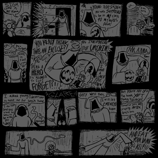
[<==PREV PAGES] [NEXT PAGE==>(not out yet.wait a year.or maybe more.imagine.]
saw alot of comments on prev pages; saying 'i HATE that mean teacher! im gonna FIGHT HIM!!' & i LOVE the energy!! it WOULD be nice. to have that catharsis. but the story of young tidestrider is Not one of catharsis. it is a story of being so small and so special and sucking so bad.
#jrwi fanart#jrwi show#jrwi riptide#gillion tidestrider#GONNA START FORMATTING MY COMICS BETTER. W THE PROPER 'PREV' 'NEXT' LINKS#REALLY DIDNT EXPECT TO CONTINUE THIS SERIES BUT AAAUUUHH MY BRRAAAIN MY BRAIN IS SO IDEASSS. I HAVE 3 OTHER PAGES SKETCHED OUT#NO PROMISES ILL FINISH EM ANY TIME SOON OR EVER. MY WHIMS ARE THEIR OWN BEAST AND I ONLY DRAW ON MY WHIMS#THAT BEING SAID IF U COMMISSIONED ME ILL GEEETT TO YOUUU IM SORRYYYY. ART IS AN EMOTIONAL RELEASE FOR ME N BABY I HAVE EMOTIONS.#ESPECIALLY ABOUT GILLION TIDESTRIDER CHAMPION OF THE UNDERSEA HERO OF THE DEEP.for the desc here i put smth that i typed up in the tags of#another thing i made. i gotta make a proper Baby Gillion tag or smth. eventually.. eventually...I LOVE DRAWIN THIS LIL BABY GUY..#i also LOVE depicting the teachers as just being so fuckin mean. ofc theres variation in that. just like in all things.like the teacher her#idk if itll be mentioned but the octo lady is named Ms Octburn.an octopus pun based off the name of an actual councilor i had#when i was in elementary school i got bullied alot but teachers never did anything. i hated adults and didnt trust them.#but this councilor o mine was so genuinely sweet. i remember spending alot of time w her. she doesnt work there anymore.#but that one school adult that actually earns ur trust and is there for you when they can be.its SO important for a child i think#i hope she knows how much she helped me.youll see in the next page that ms octburn isnt perfect either.but she tries. they all try.somehow.#ALL these comics are gonna be inspired by somesorta experience o mine in the school system. school is so fucked up u ever thing abt that#AND GILLIOOOOONNN IN THE MOST FUCKED UP LITTLE SCHOOL OF ALL. MAINTAINED BY A CULT. CENTERED AROUND HIM. OUR CHOSEN ONE#I IMAGINE ALOT BANKS ON HIS SUCCESS. THIS IS THE WORLD. THE WHOLE WORLD. THE PROPHECY IS GOING TO COME TRUE N UR TELLIN ME#THAT ITS THIS LITTLE IDIOT THATS GONNA BE SAVING US? WHAT IF HE FAILS. IF HE CANT GET THIS RIGHT THEN HE WILL FAIL AND WE WILL DIE#WE NEED TO TRAIN HIM. WE NEED HIM TO LEARN. AND TO SUCCEED. OR ELSE WE'RE DEAD. WE'RE ALL FUCKING DEAD. I IMAGINE THAT MUST BE STRESSFUL#in other news i hope ppl actually giggle when they read these. they ARE intended to be comical. dark humor or whatever. like its also sad#this is intended to be a sad comic series. but a funny one too. does that make sense? god i hope so.saw some1 say they had flashbacks-#-reading this. like YES!! THE INTENDED EFFECT!! YOU GET ME!! i love seeing ppl get upset on this lil baby boys behalf. i LOVE seeing ppl-#-wail n weep n cry in the comments. i LOOOVE seeing ppl RELATE to baby gillion. and i love letting u all know that this wont be a happycomi#gillion gets his happiness arc in the actual show. this series is one of unfortunate events. teehehehe. do u guys remember that show#i keep listening to the lil songs from A Series of Unfortunate Events for inspiration. GOOD STUFF!!#anyway uuhh uhh thats all i got in my brain. for now. feed me ur comments give me ur input i NNEEEEEDD THHEEEMMMM
132 notes
·
View notes
Text
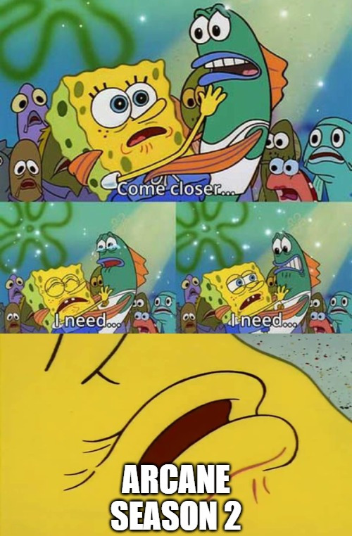
#BRUHHHHHH I NEED ANOTHER TEASER I BEG YOU RIOT#ITS BEEN THREE YEARS I CANT WAIT TO USE NEW CONTENT FOR GIFS LMAO#personal tag#dont look at me im just here to complain about content drought lmao its really not good in fostering a healthy fandom ngl#because ppl will just hyperfixate and consume media for like a month and then the fandom goes poof right after lol#i miss all the people scrutinizing media every week i miss all the essays pumping out when content arrives#these days its just.... nothing lmao i only really still have arcane in my mind because of fanfiction and a lot of fics have been inactive#ik we're getting new stuff in a few months#and ik we're not in canceled shows hell but like#i really hope that if theres season 3 we're gonna get it a bit more regularly#i really miss it when content was like weekly or every 2 weeks because ppl and the fandom are wayyyy more active during those times#binge culture and netflix sort of changed it lol#i miss it when fandoms were huge!!! i miss it when it was so CHAOTIC lmaooooooooo#I MISS WAITING FOR LONG ASS HOURS WAITING FOR CONTENT TO RELEASE EVERY WEEK!!!! I MISS IT!!!! that was like what 12 years ago LOL#I KNOW arcane is special with their 3 year drought because it takes time to make arcane#but like..... idk man i miss content lmao#iirc they took too long to make s2 bc they have no idea if s1 would be even renewed#so i hope s3 will be a bit more regular now#anyways im gonna go bye bye
89 notes
·
View notes
Text
i am wide awake thinking about that post canon jb au again when I should be sleeping …!!! such is the nature of the jbrainrot…
#the whole setting is jb hanging out in the rock post war#and tyrion became lord of the westerlands / the rock is his but he’s off doing stuff in kingslanding and jaime is just filling in for him#atm . but after tyrion comes back his original plan WAS he’ll get married to brienne right away and they can move back to tarth or be#travelling hedge knights together or whatever brienne wants to do he’s down for it. but the important thing is that he wants to stay with#her .. so he’s using the time they have together currently to court her bc she deserves that at least !!#so jaime goes off trying to court and woo brienne but she just thinks they’re hanging out bc they got relatively close in the war#so jaime being touchy feely isn’t anything new. jaime making innuendos and being kinda flirty isn’t anything new either#but this time he means it LOL he’s like I want to kiss you SO badly and brienne will be like lol silly jaime (:#I was also thinking they’d help rebuild lannisport just bc it’s a time for healing now and it would be good for the people to get to know#jaime and the lannisters in general bc of how they would just used to sit high above the rock looking down on everyone#but now jaime is like. actively helping and being known and being with the people rather than just being that absent distant lord#also he’s thinking he might as well try and foster some relationship with the commoners to his house bc it’s for tyrion anyway#so he’s off doing that and brienne is tagging along bc she does not want to go home yet#she wants to stay with him and she’s helping out as an excuse to stay a little longer but she doesn’t exactly want to leave him#but how do you tell someone that and ignore the big glaring part that she’s actually in love with him and the fact that they both survived#the war is getting her hopeful???? u want her to admit that?? like a normal person??? no..!!#so she’s just staying and helping out bc a) it’s the sensible thing to do b) so she can bask on the sun that is Jaime Lannister#for like a few more days. weeks. maybe a month bc the weather is soooo bad in the stormlands rn 🙄😳#anyway jb hanging out! and everything is going well and good but jaime is now getting popular w the people and he’s also looking quite#rugged and handsome post war now that he’s thirty flirty and thriving and he also has a new scar across his lip that makes his#smirks even more ! rogueish … ! and he looks quite nice with the greying hair 👀 so now there’s gossips around him#not to mention he’s single too and I think if you were one of the heroes who helped win the war they’ll forget the kingslaying#man with no honor business so lo and behold brienne eavesdrops a group of ladies bc she’s a chismosa at heart and they’re talking about a#potential marriage for a lord lannister (!!!) and there’s going to be a big tourney held in Kingslanding for it (!!!)#and brienne remembers jaime mentioning the ought to go to Kingslanding in the next few weeks (!!!) and now she’s remembering jaime IS a#lord though not theee lord of the westerlands STILL a lord from one of the seven houses and he’s single and very eligible for marriage rn#and now she’s realising everything is returning back the way it was before the war where society rules matters and she has her own role as#now the evenstar bc rip selwyn and jaime has his own role too and the court is a whole different battlefield#one that she isn’t equipped in and even though she had found some new confidence in herself bc killing a bunch of ice invisible zombies#with your own magic sword will do that for you she doesn’t think (and she’s being objective not negative) she stands a chance in THAT
84 notes
·
View notes
Text
Seven(ish) Sentence Sunday ✍️
Tagged by @diazsdimples @giddyupbuck and @wikiangela. Thank you lovelies mwah 😘
Have a little something from LA Lonely -> this is after the fun and orgasms of Buck and Eddie’s hook up. Still don’t know if I’m going to go full spice 🌶️ or just do a quick little run down of things.
Prev snippet & mood board here
Buck expects him to start pulling his clothes on and to give him the whole “this was fun, but I gotta bounce” speel, but Eddie surprises him by climbing back into bed and nudging Buck to roll onto his side so Eddie can scoot up behind him and hold him.
Buck freezes for a moment because no one does this. They have their fun and then they leave. They don’t stay and they definitely don’t cuddle.
Eddie must feel him go tense because his hold loosens and he moves as if he’s about to pull away. “Is this okay?”
Buck grabs at the arms that are wrapped around him, stopping Eddie’s descent. “Y-yeah. It’s-it’s okay.” He pulls at Eddie’s arms and the man settles back behind him, burrowing his face into the juncture where Buck’s neck meets his shoulder as he shuffles closer.
Soft kisses are pressed into his skin and Buck is helpless but to relax back into Eddie, letting the comfort and warmth of whatever is happening wrap around him.
“Stay?” He whispers, not sure if Eddie can hear him but not being brave enough to say it any louder. He feels like he’s asking too much.
A kiss behind his ear. “Okay.”
No pressure tagging: @hippolotamus @puppyboybuckley @exhuastedpigeon @spotsandsocks @devirnis @wikiangela @hoodie-buck @honestlydarkprincess @homerforsure @monsterrae1 @missmagooglie @mellaithwen @nmcggg @lover-of-mine @ladydorian05 @loserdiaz @bekkachaos @wildlife4life @watchyourbuck @weewootruck @elvensorceress @eddiebabygirldiaz @evanbegins @rewritetheending @rainbow-nerdss @captain-hen @jeeyuns @jesuisici33 @glorious-spoon @fortheloveofbuddie @fiona-fififi @disasterbuckdiaz @thewolvesof1998 @try-set-me-on-fire @theotherbuckley @steadfastsaturnsrings @tizniz @athenagranted @alliaskisthepossibilityoflove @spagheddiediaz @sunshinediaz and as always, anyone else who wants to share something -> consider this your tag ☺️
#daffi writes#wip: la lonely#buddie wip#buddie#besides posting yesterday I’ve been a bit quiet with wip tag games.#There’s some heavy shit going on in part of my extended family which has emotionally sucker punched me and my husband#Creative energy is running on exhaust fumes which makes me sad cos I felt like I’d just gotten my rhythm back.#so when this idea hit me and some words flowed … I ran with it#I’m still tip tap tying away Rivals 🚒. It’s just going slower than I want#even this new wip is going slower than I want#but hey I can’t rush things and my brain is doing its best right now#*kisses brain gently*#I’m trying to look after me and I hope you’re trying to look after you as best you can which can look different day to day#you’re doing amazing and ily ❤️#okay I’ve finished my very long speel in the tags xx#ps. please keep tagging me in things .. I love supporting and cheering on my pocket pals 🥰
120 notes
·
View notes
Text
For @peachshadows because hrmnshm their new empress and sundown aus have a vice grip on me and I can NEVER say no to a good shadowpeach au.
Took some creative liberties with the designs,,, hope you don’t mind! The torn sleeve Wukong has is representative of gay relationships in Chinese culture, and I made Mac’s dress longer because it’s a what Chinese royalty did to flex their wealth! (I just find these two tidbits very slay and cool)
#lmk#lego monkie kid#lmk fanart#lego monkie kid fanart#six eared macaque lmk#lmk macaque#liu er mihou#lego macaque#six eared macaque#lmk sun wukong#lmk swk#lmk wukong#sun wukong#sun wukong x macaque#shadowpeach#shadowpeach but they’re fancy as fuck#the sundown era#new empress au#I hope those are the right tags#I double checked ;(#gift art#fanart#they are in love#i love them#mjnimart#holding these aus to my chest#biting them#hugging them#kicking my legs like a schoolgirl
664 notes
·
View notes
Last Seen Blogs

officialhairburrell
Official Hair Burrell

pcxiiwjwns
pcxiiwjwns

tim-drake-scholar
Totally Normal About Batman

lureofthehorizon
LureOfTheHorizon
neonvalleyheaux
jojo