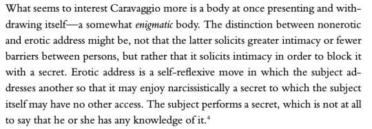
#art analysis
Text
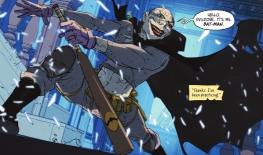
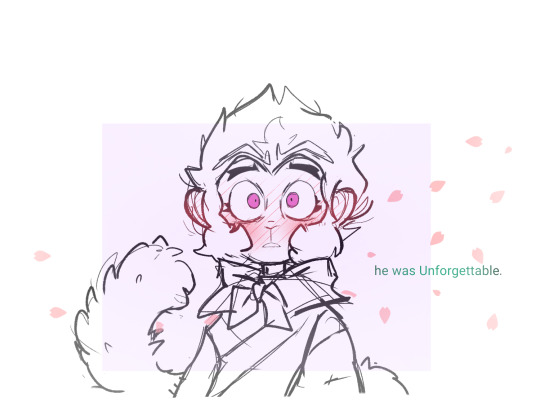
Joker in a batman costume in Jason's dream

Joker actually wearing a batman costume
#dc#dc comics#comics#comic books#task force z#joker the man who stopped laughing#comic pages#comic panels#parallels#matthew rosenberg#media analysis#comic analysis#writing analysis#joker#the joker#batman#the batman#batman rogues#rogues gallery#batman rouges gallery#jason todd#red hood#art analysis#parallelism
38 notes
·
View notes
Text
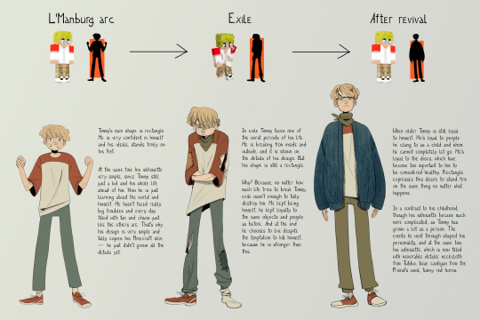
second part of my Dream SMP character design analysis because a lot of people liked that in my animatic. and now it's Tommy's turn!
(you can find first part with Wilbur's design here)
#tommyinnit#tommyinnit fanart#dream smp#dsmp#character design#art analysis#dsmpblr#lmanberg#lmanburg#l'manberg#l'manburg#digital art#digital drawing#fan art#fanart#dsmp fanart#character concept#character creation#character building
2K notes
·
View notes
Text
why Aurora's art is genius
It's break for me, and I've been meaning to sit down and read the Aurora webcomic (https://comicaurora.com/, @comicaurora on Tumblr) for quite a bit. So I did that over the last few days.
And… y'know. I can't actually say "I should've read this earlier," because otherwise I would've been up at 2:30-3am when I had responsibilities in the morning and I couldn't have properly enjoyed it, but. Holy shit guys THIS COMIC.
I intended to just do a generalized "hello this is all the things I love about this story," and I wrote a paragraph or two about art style. …and then another. And another. And I realized I needed to actually reference things so I would stop being too vague. I was reading the comic on my tablet or phone, because I wanted to stay curled up in my chair, but I type at a big monitor and so I saw more details… aaaaaand it turned into its own giant-ass post.
SO. Enjoy a few thousand words of me nerding out about this insanely cool art style and how fucking gorgeous this comic is? (There are screenshots, I promise it isn't just a wall of text.) In my defense, I just spent two semesters in graphic design classes focusing on the Adobe Suite, so… I get to be a nerd about pretty things…???
All positive feedback btw! No downers here. <3
---
I cannot emphasize enough how much I love the beautiful, simple stylistic method of drawing characters and figures. It is absolutely stunning and effortless and utterly graceful—it is so hard to capture the sheer beauty and fluidity of the human form in such a fashion. Even a simple outline of a character feels dynamic! It's gorgeous!
Though I do have a love-hate relationship with this, because my artistic side looks at that lovely simplicity, goes "I CAN DO THAT!" and then I sit down and go to the paper and realize that no, in fact, I cannot do that yet, because that simplicity is born of a hell of a lot of practice and understanding of bodies and actually is really hard to do. It's a very developed style that only looks simple because the artist knows what they're doing. The human body is hard to pull off, and this comic does so beautifully and makes it look effortless.
Also: line weight line weight line weight. It's especially important in simplified shapes and figures like this, and hoo boy is it used excellently. It's especially apparent the newer the pages get—I love watching that improvement over time—but with simpler figures and lines, you get nice light lines to emphasize both smaller details, like in the draping of clothing and the curls of hair—which, hello, yes—and thicker lines to emphasize bigger and more important details and silhouettes. It's the sort of thing that's essential to most illustrations, but I wanted to make a note of it because it's so vital to this art style.
THE USE OF LAYER BLENDING MODES OH MY GODS. (...uhhh, apologies to the people who don't know what that means, it's a digital art program thing? This article explains it for beginners.)
Bear with me, I just finished my second Photoshop course, I spent months and months working on projects with this shit so I see the genius use of Screen and/or its siblings (of which there are many—if I say "Screen" here, assume I mean the entire umbrella of Screen blending modes and possibly Overlay) and go nuts, but seriously it's so clever and also fucking gorgeous:
Firstly: the use of screened-on sound effect words over an action? A "CRACK" written over a branch and then put on Screen in glowy green so that it's subtle enough that it doesn't disrupt the visual flow, but still sticks out enough to make itself heard? Little "scritches" that are transparent where they're laid on without outlines to emphasize the sound without disrupting the underlying image? FUCK YES. I haven't seen this done literally anywhere else—granted, I haven't read a massive amount of comics, but I've read enough—and it is so clever and I adore it. Examples:


Secondly: The beautiful lighting effects. The curling leaves, all the magic, the various glowing eyes, the fog, the way it's all so vividly colored but doesn't burn your eyeballs out—a balance that's way harder to achieve than you'd think—and the soft glows around them, eeeee it's so pretty so pretty SO PRETTY. Not sure if some of these are Outer/Inner Glow/Shadow layer effects or if it's entirely hand-drawn, but major kudos either way; I can see the beautiful use of blending modes and I SALUTE YOUR GENIUS.
I keep looking at some of this stuff and go "is that a layer effect or is it done by hand?" Because you can make some similar things with the Satin layer effect in Photoshop (I don't know if other programs have this? I'm gonna have to find out since I won't have access to PS for much longer ;-;) that resembles some of the swirly inner bits on some of the lit effects, but I'm not sure if it is that or not. Or you could mask over textures? There's... many ways to do it.
If done by hand: oh my gods the patience, how. If done with layer effects: really clever work that knows how to stop said effects from looking wonky, because ugh those things get temperamental. If done with a layer of texture that's been masked over: very, very good masking work. No matter the method, pretty shimmers and swirly bits inside the bigger pretty swirls!
Next: The way color contrast is used! I will never be over the glowy green-on-black Primordial Life vibes when Alinua gets dropped into that… unconscious space?? with Life, for example, and the sharp contrast of vines and crack and branches and leaves against pitch black is just visually stunning. The way the roots sink into the ground and the three-dimensional sensation of it is particularly badass here:

Friggin. How does this imply depth like that. HOW. IT'S SO FREAKING COOL.
A huge point here is also color language and use! Everybody has their own particular shade, generally matching their eyes, magic, and personality, and I adore how this is used to make it clear who's talking or who's doing an action. That was especially apparent to me with Dainix and Falst in the caves—their colors are both fairly warm, but quite distinct, and I love how this clarifies who's doing what in panels with a lot of action from both of them. There is a particular bit that stuck out to me, so I dug up the panels (see this page and the following one https://comicaurora.com/aurora/1-20-30/):

(Gods it looks even prettier now that I put it against a plain background. Also, appreciation to Falst for managing a bridal-carry midair, damn.)
The way that their colors MERGE here! And the immense attention to detail in doing so—Dainix is higher up than Falst is in the first panel, so Dainix's orange fades into Falst's orange at the base. The next panel has gold up top and orange on bottom; we can't really tell in that panel where each of them are, but that's carried over to the next panel—

—where we now see that Falst's position is raised above Dainix's due to the way he's carrying him. (Points for continuity!) And, of course, we see the little "huffs" flowing from orange to yellow over their heads (where Dainix's head is higher than Falst's) to merge the sound of their breathing, which is absurdly clever because it emphasizes to the viewer how we hear two sets of huffing overlaying each other, not one. Absolutely brilliant.
(A few other notes of appreciation to that panel: beautiful glows around them, the sparks, the jagged silhouette of the spider legs, the lovely colors that have no right to make the area around a spider corpse that pretty, the excellent texturing on the cave walls plus perspective, the way Falst's movements imply Dainix's hefty weight, the natural posing of the characters, their on-point expressions that convey exactly how fuckin terrifying everything is right now, the slight glows to their eyes, and also they're just handsome boys <3)
Next up: Rain!!!! So well done! It's subtle enough that it never ever disrupts the impact of the focal point, but evident enough you can tell! And more importantly: THE MIST OFF THE CHARACTERS. Rain does this irl, it has that little vapor that comes off you and makes that little misty effect that plays with lighting, it's so cool-looking and here it's used to such pretty effect!
One of the panel captions says something about it blurring out all the injuries on the characters but like THAT AIN'T TOO BIG OF A PROBLEM when it gets across the environmental vibes, and also that'd be how it would look in real life too so like… outside viewer's angle is the same as the characters', mostly? my point is: that's the environment!!! that's the vibes, that's the feel! It gets it across and it does so in the most pretty way possible!
And another thing re: rain, the use of it to establish perspective, particularly in panels like this—

—where we can tell we're looking down at Tynan due to the perspective on the rain and where it's pointing. Excellent. (Also, kudos for looking down and emphasizing how Tynan's losing his advantage—lovely use of visual storytelling.)
Additionally, the misting here:

We see it most heavily in the leftmost panel, where it's quite foggy as you would expect in a rainstorm, especially in an environment with a lot of heat, but it's also lightly powdered on in the following two panels and tends to follow light sources, which makes complete sense given how light bounces off particles in the air.
A major point of strength in these too is a thorough understanding of lighting, like rim lighting, the various hues and shades, and an intricate understanding of how light bounces off surfaces even when they're in shadow (we'll see a faint glow in spots where characters are half in shadow, but that's how it would work in real life, because of how light bounces around).
Bringing some of these points together: the fluidity of the lines in magic, and the way simple glowing lines are used to emphasize motion and the magic itself, is deeply clever. I'm basically pulling at random from panels and there's definitely even better examples, but here's one (see this page https://comicaurora.com/aurora/1-16-33/):

First panel, listed in numbers because these build on each other:
The tension of the lines in Tess's magic here. This works on a couple levels: first, the way she's holding her fists, as if she's pulling a rope taut.
The way there's one primary line, emphasizing the rope feeling, accompanied by smaller ones.
The additional lines starbursting around her hands, to indicate the energy crackling in her hands and how she's doing a good bit more than just holding it. (That combined with the fists suggests some tension to the magic, too.) Also the variations in brightness, a feature you'll find in actual lightning. :D Additional kudos for how the lightning sparks and breaks off the metal of the sword.
A handful of miscellaneous notes on the second panel:
The reflection of the flames in Erin's typically dark blue eyes (which bears a remarkable resemblance to Dainix, incidentally—almost a thematic sort of parallel given Erin's using the same magic Dainix specializes in?)
The flowing of fabric in the wind and associated variation in the lineart
The way Erin's tattoos interact with the fire he's pulling to his hand
The way the rain overlays some of the fainter areas of fire (attention! to! detail! hell yeah!)
I could go on. I won't because this is a lot of writing already.
Third panel gets paragraphs, not bullets:
Erin's giant-ass "FWOOM" of fire there, and the way the outline of the word is puffy-edged and gradated to feel almost three-dimensional, plus once again using Screen or a variation on it so that the stars show up in the background. All this against that stunning plume of fire, which ripples and sparks so gorgeously, and the ending "om" of the onomatopoeia is emphasized incredibly brightly against that, adding to the punch of it and making the plume feel even brighter.
Also, once again, rain helping establish perspective, especially in how it's very angular in the left side of the panel and then slowly becomes more like a point to the right to indicate it's falling directly down on the viewer. Add in the bright, beautiful glow effects, fainter but no less important black lines beneath them to emphasize the sky and smoke and the like, and the stunningly beautiful lighting and gradated glows surrounding Erin plus the lightning jagging up at him from below, and you get one hell of an impactful panel right there. (And there is definitely more in there I could break down, this is just a lot already.)
And in general: The colors in this? Incredible. The blues and purples and oranges and golds compliment so well, and it's all so rich.
Like, seriously, just throughout the whole comic, the use of gradients, blending modes, color balance and hues, all the things, all the things, it makes for the most beautiful effects and glows and such a rich environment. There's a very distinct style to this comic in its simplified backgrounds (which I recognize are done partly because it's way easier and also backgrounds are so time-consuming dear gods but lemme say this) and vivid, smoothly drawn characters; the simplicity lets them come to the front and gives room for those beautiful, richly saturated focal points, letting the stylized designs of the magic and characters shine. The use of distinct silhouettes is insanely good. Honestly, complex backgrounds might run the risk of making everything too visually busy in this case. It's just, augh, so GORGEOUS.
Another bit, take a look at this page (https://comicaurora.com/aurora/1-15-28/):

It's not quite as evident here as it is in the next page, but this one does some other fun things so I'm grabbing it. Points:
Once again, using different colors to represent different character actions. The "WHAM" of Kendal hitting the ground is caused by Dainix's force, so it's orange (and kudos for doubling the word over to add a shake effect). But we see blue layered underneath, which could be an environmental choice, but might also be because it's Kendal, whose color is blue.
And speaking off, take a look at the right-most panel on top, where Kendal grabs the spear: his motion is, again, illustrated in bright blue, versus the atmospheric screened-on orange lines that point toward him around the whole panel (I'm sure these have a name, I think they might be more of a manga thing though and the only experience I have in manga is reading a bit of Fullmetal Alchemist). Those lines emphasize the weight of the spear being shoved at him, and their color tells us Dainix is responsible for it.
One of my all-time favorite effects in this comic is the way cracks manifest across Dainix's body to represent when he starts to lose control; it is utterly gorgeous and wonderfully thematic. These are more evident in the page before and after this one, but you get a decent idea here. I love the way they glow softly, the way the fire juuuust flickers through at the start and then becomes more evident over time, and the cracks feel so realistic, like his skin is made of pottery. Additional points for how fire begins to creep into his hair.
A small detail that's generally consistent across the comic, but which I want to make note of here because you can see it pretty well: Kendal's eyes glow about the same as the jewel in his sword, mirroring his connection to said sword and calling back to how the jewel became Vash's eye temporarily and thus was once Kendal's eye. You can always see this connection (though there might be some spots where this also changes in a symbolic manner; I went through it quickly on the first time around, so I'll pay more attention when I inevitably reread this), where Kendal's always got that little shine of blue in his eyes the same as the jewel. It's a beautiful visual parallel that encourages the reader to subconsciously link them together, especially since the lines used to illustrate character movements typically mirror their eye color. It's an extension of Kendal.
Did I mention how ABSOLUTELY BEAUTIFUL the colors in this are?
Also, the mythological/legend-type scenes are illustrated in familiar style often used for that type of story, a simple and heavily symbolic two-dimensional cave-painting-like look. They are absolutely beautiful on many levels, employing simple, lovely gradients, slightly rougher and thicker lineart that is nonetheless smoothly beautiful, and working with clear silhouettes (a major strength of this art style, but also a strength in the comic overall). But in particular, I wanted to call attention to a particular thing (see this page https://comicaurora.com/aurora/1-12-4/):

The flowing symbolic lineart surrounding each character. This is actually quite consistent across characters—see also Life's typical lines and how they curl:

What's particularly interesting here is how these symbols are often similar, but not the same. Vash's lines are always smooth, clean curls, often playing off each other and echoing one another like ripples in a pond. You'd think they'd look too similar to Life's—but they don't. Life's curl like vines, and they remain connected; where one curve might echo another but exist entirely detached from each other in Vash's, Life's lines still remain wound together, because vines are continuous and don't float around. :P
Tahraim's are less continuous, often breaking up with significantly smaller bits and pieces floating around like—of course—sparks, and come to sharper points. These are also constants: we see the vines repeated over and over in Alinua's dreams of Life, and the echoing ripples of Vash are consistent wherever we encounter him. Kendal's dream of the ghost citizens of the city of Vash in the last few chapters is filled with these rippling, echoing patterns, to beautiful effect (https://comicaurora.com/aurora/1-20-14/):

They ripple and spiral, often in long, sinuous curves, with smooth elegance. It reminds me a great deal of images of space and sine waves and the like. This establishes a definite feel to these different characters and their magic. And the thing is, that's not something that had to be done—the colors are good at emphasizing who's who. But it was done, and it adds a whole other dimension to the story. Whenever you're in a deity's domain, you know whose it is no matter the color.
Regarding that shape language, I wanted to make another note, too—Vash is sometimes described as chaotic and doing what he likes, which is interesting to me, because smooth, elegant curves and the color blue aren't generally associated with chaos. So while Vash might behave like that on the surface, I'm guessing he's got a lot more going on underneath; he's probably much more intentional in his actions than you'd think at a glance, and he is certainly quite caring with his city. The other thing is that this suits Kendal perfectly. He's a paragon character; he is kind, virtuous, and self-sacrificing, and often we see him aiming to calm others and keep them safe. Blue is such a good color for him. There is… probably more to this, but I'm not deep enough in yet to say.
And here's the thing: I'm only scratching the surface. There is so much more here I'm not covering (color palettes! outfits! character design! environment! the deities! so much more!) and a lot more I can't cover, because I don't have the experience; this is me as a hobbyist artist who happened to take a couple design classes because I wanted to. The art style to this comic is so clever and creative and beautiful, though, I just had to go off about it. <3
...brownie points for getting all the way down here? Have a cookie.
#aurora comic#aurora webcomic#comicaurora#art analysis#...I hope those are the right tags???#new fandom new tagging practices to learn ig#much thanks for something to read while I try to rest my wrists. carpal tunnel BAD. (ignore that I wrote this I've got braces ok it's fine)#anyway! I HAVE. MANY MORE THOUGHTS. ON THE STORY ITSELF. THIS LOVELY STORY#also a collection of reactions to a chunk of the comic before I hit the point where I was too busy reading to write anything down#idk how to format those tho#...yeet them into one post...???#eh I usually don't go off this much these days but this seems like a smaller tight-knit fandom so... might as well help build it?#and I have a little more time thanks to break so#oh yes also shoutout to my insanely awesome professor for teaching me all the technical stuff from this he is LOVELY#made an incredibly complex program into something comprehensible <3#synapse talks
740 notes
·
View notes
Text

Charles Ethan Porter (1847-1923)
"Untitled (Cracked Watermelon)" (c. 1890)
Oil on canvas
Located in the Metropolitan Museum of Art, New York City, New York, United States
Porter was among the first African American artists to exhibit his work nationally and the only one to specialize in still lifes. The painting's subject—originally an African gourd brought to the New World by seventeenth-century Spaniards and cultivated by colonists—is significant. Porter chose to paint a watermelon, an earlier symbol of American abundance—and during the Civil War period one particularly associated with free Blacks—when it was increasingly defined by virulent stereotyping. By reclaiming the subject in artistic terms, Porter challenged a contemporary racist trope.
#paintings#art#artwork#still life painting#watermelon#charles ethan porter#oil on canvas#fine art#the metropolitan museum of art#the met#museum#art gallery#american artist#african amerian artist#black artists#history#art analysis#freedom#fruit#fruits#food#1890s#late 1800s#late 19th century
817 notes
·
View notes
Text
This is hardly a new revelation I'm sure, but realizing that Tolkien's elvish architecture (as designed by John Howe and Alan Lee) was inspired by art nouveau, and the dwarves' architecture was inspired by art deco, made me geek out because it's so clever
Doubtless there are other posts about this but I'll explain for anybody who doesn't know about this because I'm so happy about it:
Art Nouveau is inspired by organic shapes and the natural world. It emerged also from the Arts and Crafts movement, which was a response pushing back against industrialization.

Makes sense for elves because of their relationship to nature and how old they are, right?

Dwarves, on the other hand--their motifs are inspired by art deco. Art deco, in turn, was the replacement for art nouveau, embracing technology and industry and focusing on geometric shapes.

Example from the Hobbit movies:

It works so well because dwarves have such a heavy focus on industry and technology from their very creation by Aulë, and also their history--sleeping until after the elves were made. I'm just screaming over how smart it was to pull artistic inspiration from these two movements!! Like from a design standpoint they work so well, but they also mirror both the culture and history of these civs and I just think that's so neat!!
214 notes
·
View notes
Text
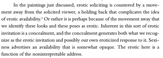
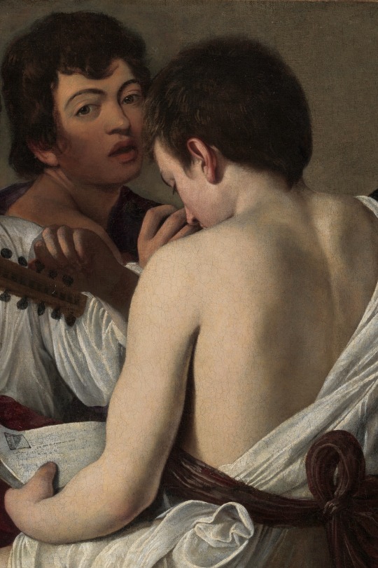
Caravaggio's Secrets by Leo Bersani and Ulysse Dutoit (1998)
#caravaggio#the musicians#the lute player#leo bersani#ulysse dutoit#caravaggio's secrets#art#art detail#art analysis#michelangelo merisi da caravaggio#italian art#baroque art#renaissance art#my edits
359 notes
·
View notes
Text
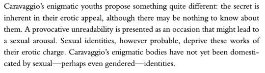
I just wanted to share my thoughts on new official artwork for Indigo Disk...
Kieran – his crystal is shattered, it is loosing it's glow while other crystals shine brightly. His body posture is confident, and somewhat powerful, intimidating even. The facial expressions on the other hand is worried and unsure. It contrast to his in game attitude where he's mad and confident. I also think that the tera symbol behind his crystal in the distance is purple/pink which might indicate poison type.
Is that all a some sort of hint to the theory where Kieran is possessed? We'll find out soon. I think it although might symbolise that he's in fact lost. He tries to act all tough and rough but he's a sensitive and gentle soul (as nintendo said themselves in one of tweets).
Carmine – she is looking at her brother (and he is looking at her). She looks like she's shouting, all worried. In my opinion she still have hopes and believes in her brother, she wants to help him
Briar – She kinda reminds me of a villain who looks at something satisfied of what they have done/achieved but less evil. I don't think she's evil or have bad intentions. Maybe it's her reaction to Terapagos unleashing it's true power/form?? Still, we have to keep an eye on her...
Protagonists – they're just here
Thanks for reading ✨️
#pokemom#pokemon theory#pokemon sv dlc#pokemon sv dlc spoilers#kieran pokemon#pokemon kieran#indigo disk#teal mask#pokemon scarlet and violet#scarlet and violet#pokemon carmine#carmine pokemon#pokemon briar#analysis#art analysis
207 notes
·
View notes
Text
DECONSTRUCTING DAMASCUS #4
here we are again talkin on camp damascus and unwrapping every little secret and hidden layer of this book. think of this time together like an old time ENGLISH CLASS where the dang teacher says 'well by THIS SYMBOLISM the author was actually commenting on how good chocolate milk is' only this time we get to talk on TINGLERS and your teacher is the buckaroo himself, chuck tingle.
as man name of chuck i have a lot of easter eggs in my books, and this post is just ONE OF MANY where we pull apart every layer. if you have a reading club for this book it might be a fun companion to trot through once you are all finished. if that is the case you should start with the first deconstructing damascus post. i will leave links to them all here IN ORDER
DECONSTRUCTING DAMASCUS #1
DECONSTRUCTING DAMASCUS #2
DECONSTRUCTING DAMASCUS #3
HOWEVER these deconstructing damascus posts SHOULD NOT BE READ UNLESS YOU ARE DONE WITH THE BOOK. there are heckin spoilers EVERYWHERE in these posts so do not peek at them until you are ready.
alright below this line the dang spoilers begin. BIG TIME SPOILER WARNING. lets trot
DECONSTRUCTING DAMASCUS #4: BIBLICAL CAPITALISM
we have taken lots of time to discuss the various layers of symbolism in this book, but for FINAL POST of deconstructing damascus i would like to talk about the literal layer, specifically ONE BIG THEME that weaves throughout the story of rose, saul, willow and kingdom of the pine.
that theme is CAPITALISM.
kingdom of the pine, the church in this story, is intentionally NOT THAT STRANGE in their beliefs. it would be very easy for me to write a book where the christian sect are revealed as some twisted monsters performing all kinds of dark rituals in the name of evil itself, but when the big reveal comes it is something much more HORRIFIC and unexpected.
kindgom of the pine members are not snarling, oozing, otherworldly, creatures. the members are just people, and their beliefs are horrifically STANDARD. kingdom of the pine worships CAPITALISM.
these church members believe in the traditional tenants of CHRISTIANITY along with the traditional tenants of BUSINESS. what makes them scary is that they whole heartedly believe that 'the ends justify the means'
lets start with prophet cobel, the founder of the church. his visions came during THE INDUSTREAL REVOLUTION, occuring when he was injured by a manufacturing machine and lost his hand. the coma from prophet cobels accident is where he received his message from god. he realized that, for a church to succeed, it needed to act like a BUSINESS.
many buckaroos have asked 'WHY is the church called kingdom of the pine?' and this is EXACTLY WHY. many churches are named for spiritual aspects. this sect could have easily been 'kingdom of the holy word' 'kingdom of the spirit' 'kingdom of HIS name' EXCEPT prophet cobel knew the importance of MATERIAL and CURRENCY and GOODS. he is not just worshipping JESUS, he is worshipping THE CROSS ITSELF. so 'the pine' in kingdom of the pine is symbolic of worshipping through a PRODUCT, in this case the little wooden cross that you might sell during a fundraiser. not kingdom of the son, the father, or the holy spirit, but kingdom of the PINE. THE WOOD ITSELF. THE PRODUCT.
by combining christianity and capitalism, prophet cobel created a monster, but not one that creeps through a dark swamp with sharp teeth and red eyes. he created something much more existentially dangerous AND not all that unheard of in reality. this isnt an imaginary monster that lurks under your bed. IT IS A MONSTER THAT IS ALREADY HERE.
capitalism is the answer for ANOTHER big question regarding camp damascus: why are the demons wearing red polos?
demons in this story are dressed like minimum wave workers at a big box story because THAT IS EXACTLY WHAT THEY ARE. yes they spend their time torturing unfortunate folks in their dungeon, but NOBODY IS FREE FROM THE CAPITALISTIC SYSTEM NOT EVEN ON OTHER TIMELINES LIKE HECK ITSELF. the demons are AT WORK. some buckaroos do not notice that kingdom of the pine counselors are always in green and white (the pine material GREEN and the holy spirit WHITE, like we talked on earlier). meanwhile demons are in RED because they are contracted out. THEY HAVE BEEN HIRED IN THEIR OWN WAY and when you consider the collars around their necks, THEY ARE NOT TREATED FAIRLY BY THEIR EMPLOYERS. THEY ARE CONTROLLED IN A SYSTEM OF THEIR OWN AND COMPELLED TO WORK.
this is why they have name tags. THEY ARE AT WORK.
this is why they are constantly smiling until the collars come off. THEY HAVE CUSTOMER SERVICE SMILES.
okay buds. thank you for reading the deconstructing damascus series it was very fun for me to go deep on this book for anyone who enjoys this kind of analysis. i hope it puts a little more joy into your trot, and now if someone says 'this part of camp damascus didnt make sense to me' you can said 'LETS TALK BUD'. i am very much looking forward to doing this again when my next horror novel BURY YOUR GAYS comes out. keep a dang eye out for that one.
i will end with one more thing that did not really fit into the other catagories.
question of: is there any meaning behind willow being a big wu tang fan?
you mean besides her being the crocodile (which has ticking clock in mouth in peter pan) so rhythm itself is a very important part of her character? (as shown in her steady clicking camera shutter and the steady beat of her musical preferences?)
WHY YES CHUCK BESIDES THAT.
well now that we've discussed the theme of INFANTILIZATION in deconstructing damascus part one, and how all the young people in kingdom of the pine are kept childlike as long as possible as the FOREVER CHILDREN of never never land, i will point you towards this iconic quote from the wu tang clans ODB at the 1998 grammy awards:
youtube
LOVE IS REAL thank you for reading buckaroos - chuck
#love is real#chuck tingle#tingleverse#camp damascus#horror#queer#actually autistic#art analysis#wu tang clan#Youtube
258 notes
·
View notes
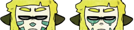
Note
what are the meaning of the face markings in your donuthole video?
Great question! Now there's 16 face markings in total so I'll keep my explanations pretty simple! And if you haven't yet, watch the MV I made that these frames are from here!
OG Agent 3;
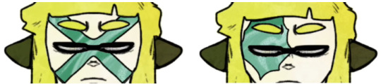
X; I was thinking of both the end of games with the caution tape going across the screen.
Eye Splatter; the sanitized scar people often draw 3 with
Whiskers and Nose; I was thinking of Judd!
Tears; I wanted to give the impressive of eyebags and tears. I was thinking about how often we make Agent 3 such a tired figure.
Neo Agent 3;

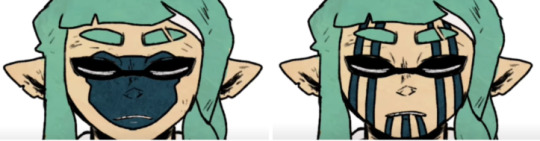
Scales; I was thinking of their connection with salmonids
Eyebags; Its a fusion of OG's X and eyebags markings!
Bear; It's Mr Grizz!
Streaks; I was thinking of cage bars, thinking of bandit stuff
Agent 4;


Blush; I was thinking of dolls and how 4 can be used so flexibly for ocs
Teeth; I was thinking about how they're often portrayed as the funny/dumb type of character, I thought of clowns
Heart; I just wanted to give em a heart ;;; they deserve love;;
Shades; I THINK WE KNOW WHY I PUT SHADES THERE.
Agent 8;

Drip: I was thinking of the sanitized ooze 8 faced in the metros
Stars: I was thinking of both Pearl and Marina's beauty marks and Pearl's eye stars
Mask; I was thinking of the rival octoling goggles
Coral; I was thinking of the bleached coral in side order
201 notes
·
View notes
Text

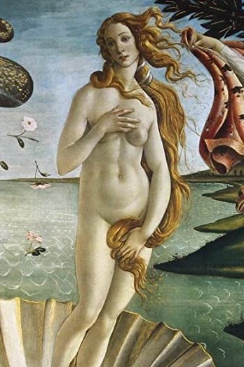
Saint Mary Magdalene by Gregor Erhart (1515-1520) // The Birth of Venus by Sandro Botticelli (1485-1486)
#art history#art#paintings#paintings of women#Aphrodite#venus#mary magdalene#saint mary magdalene#the birth of venus#sculpture#sculptures#15th century#15th century art#16th century#16th century art#art analysis#Tempera#wooden sculpture#Italian Renaissance#renaissance#Sandro Botticeli#Gregor Erhart#gothic sculpture#gothic art
647 notes
·
View notes
Text
Helloo~ I was bored in class one day so I thought "why not do an art study of the artists I like" except it incredibly scuffed and I really just looked at a bunch of art on their page and i tried my best to replicate one of em
So these are the 2 'studies' i did that day
1st:
My ver:
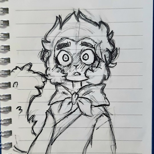
(Art by @izuke-the-zombie )
ref pic:
What I noticed first while sketching is ofc the super gorgeous cute style. Though not long into the sketching phase noticed her lines are quite sharp and pronouced, for most of her works she keeps her sketch lines making it seem more mmm hazy is the right word? Or effortless, but with every sharp line a rounded(?) line contrasts it, giving it that signature fluffiness. I absolutely adore how well this all mixes together, i dunno just sonethin bout her lines bro
I love the expression, really gives off absolutely love sick, I didn't capture the eyes quite well (I blame my chonk pen because all good artists blames their materials/j) Macaque looks more scared than breath taken and I put the eyes too far apart. I basically deprived the eyes of its soul lmao note for next time I do a study.
Ok this part has not much to do with the ref pic but her art in general and that includes her writing. I adore the cute HCs and little stories/AUs she would post, just so much creativity and its always so comforting to read as theyre so wholesome and cute. Im so sure one of my first posts here were a drawing of one of her HCs LIKE SRSLY SO CREATIVE. I was also surprised as I saw in some artworks she's able to draw structures and environments that draws your into the scene, its fits the universe so well, just adding to that little wonderment of awe. Shes amazing at coloring too, real soft, but still makes the characters pop, i'd say more but my brain is short-circuiting from all this analyzing. Shes just all round incredibly talented and creative honestly. Her style is exactly what i wanted to have as a kid and what im striving to have now. So cuteee
So far 11/10 art style, love the chibiness, cuteness, expressions, the pure and pastel feel and colors, and details. Just love her in general<3 check out her page lol
2nd:
My ver:
(Art by @clatteringbats )
ref pic:

Ok so immediately off the bat I knew I was gonna have some trouble here since I've been drawing chibis from the very start.
Just from observing her art I alr saw it has a lot of movement in em, lots of dynamic poses, and LOTS of embraces, really just pouring with that fluff/angst energy. At first I tried the anime body guidelines and boom instant error. Though not all that noticable the heads have sum chonk in em, especially the cheeks, giving that cute factor despite not being a chibi style. Im all for it. The lines are very soft, not a lot of sharp edges and if there are theyre placed in a very subtle way. The expressions are wonderful: from a subtle hopeless smile from an overwhelming roar of grief and anger, she's mastered the the art of slight details that give these effects their magic. Her lines are sketchy but not messy (does that make sense) they clump together neatly, giving the illustration clarity.
AND OMG HAVE YOU SEEN HER ANIMATICS? THE MOVEMENT, THE PACING, THE SMOOTHNESS, THE INTERACTIONS, THE EMOTIONS, THE EVERYTHING. THEYRE SO AAAA ITS LIKE A PROFESSIONAL STORYBOARD FOR A TV SHOW.
The way she uses color too— just o h m y g o d .
Her colors are so bright and clear, so nicely blended together, so bold, but not in the way that burns your eyes, she keeps them neutral in a way, that envokes that sense of harmony; like a sunset. (I legit have one of her colored artworks as my wallpaper) I have lots more to observe, but so far this is all I have to say. The skill of overflowing
Anways, back to the task at hand. I made the heads bigger than i shoulda , cause well chibi artist ehe. Again, I blame my chonk pencil. I didn't get the embrace quite right, but Ion think I could level with the queen of LITERALLY DRAWING TEARJERKING HUGS LIKE? I tried with the hands, I swear. I knew they were a little small but only now am I realizing its that way cause I made the heads too big. I wanna try drawing more in her style as its really just full of movement and flowiness, I wanna try mastering the way she draws perspectives too. I noticed for perspective shots theres this grid for the sky and ground (which is genius) will try that out when I actually pick up digital art again.
Check out her page, theres lots to see shes amazing 11/10 artstyle<3
#lego monkie kid#lmk#monkie kid#macaque#six eared macaque#lego monkie king#liu er mihou#shadowpeach#sun wukong#lmk swk#sketch#art study#art analysis#lmk fanart#fanart#SUPPORT THESE ARTISTS#shadowpeach fluff#monkey king#wukong#doodle#ink
395 notes
·
View notes
Text
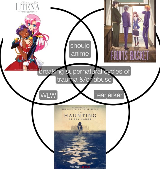
A more polished version of what I tried scribbling on a marker board after my partner asked how my day was…
[Image ID: A 3-circle Venn diagram comparing the TV series Haunting Of Bly Manor, Revolutionary Girl Utena, and Fruits Basket (2019).
The overlap between Revolutionary Girl Utena and Fruits Basket reads “shoujo anime.”
The overlap between Haunting Of Bly Manor and Revolutionary Girl Utena reads, “WLW.”
The overlap between Haunting of Bly Manor and Fruits Basket reads “tearjerker.”
The overlap between all 3 reads “breaking supernatural cycles of trauma &/or abuse.”
End of description.]
#ive connected the dots#haunting of bly manor#revolutionary girl utena#fruits basket#fruits basket 2019#tv#television#tv series#anime#themes#shoujo#wlw#sapphic#comparative analysis#venn diagram#breaking the cycle#tearjerker#media analysis#art analysis#image described
124 notes
·
View notes
Text
i love characters with deep gravelly voices or strong proud noses. i love characters with messy curls, wide-set downturned eyes, and clumsy slow walking gaits. i love characters who’s clothes always seem to be expensive but dirty; who’s skin is marked with sunburn and scars and freckles and acne and windburn. i love characters that are tall and angular or short and round. i love characters that have cupid’s bows, and oval faces and long calloused fingers. i love characters that always wear a good pair of bright red gloves or that one odd patchwork hat. i love characters that have crooked yellow-ish teeth, but who have the best smile. i love it when characters have actual distinct physical traits instead of just being as conventionally attractive as possible.
#asoiaf#got#legion fx#the umbrella academy#preacher amc#character design#media analysis#art analysis#design analysis
192 notes
·
View notes
Text
Thinking about Sunflowers by van Gogh again and yes, the painting is intrinsically full of hope and beauty and, much like its infinitely more famous cousin, Starry Night, it does speak to the way van Gogh saw the world; I won't talk about that here because I'm sure people far better versed on the subject than I am have already done so.
What I want to talk about is that I think it speaks loud volumes about the loneliness he weathered too.

Take a look at that painting. There doesn't seem to be any apparent light source - no apparent sun, so to speak. When sunflowers can't find a sun to reach towards, you know what they do? They turn to each other. They swivel and contort and face each other and become one another's sun. They're a group species to the core.
Yet, despite there being no sun for these sunflowers to reach out to, none of them face each other. In fact, they almost go out of their way to not have to deal with their neighbours.
I truly believe this was one of the more overt markers heralding his eventual end and was definitely one of his most expressive pieces.
Even if he didn't intend any of this - overtly, subconsciously, or otherwise - I think there's a kind of beauty in finding meaning where even the creator didn't see it.
-----
tip jar 💜 || newsletter ☕
#sunflowers#van gogh#vincent van gogh#art#art history#art analysis#sunflowers van gogh#this painting is firmly cemented as my favourite piece of art of all time#writeblr
407 notes
·
View notes
Text
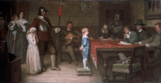
William Frederick Yeames (1835-1918)
"And When Did You Last See Your Father?" (1878)
Oil on canvas
Located in the Walker Art Gallery, Liverpool, England
The oil-on-canvas painting, depicts a scene in an imaginary Royalist household during the English Civil War. The Parliamentarians have taken over the house and question the son about his Royalist father (the man lounging on a chair in the centre of the scene is identifiable as a Roundhead officer by his military attire and his orange sash).
Yeames was inspired to paint the picture to show the crises that could arise from the natural frankness of young children. Here, if the boy tells the truth he will endanger his father, but if he lies he will go against the ideal of honesty undoubtedly instilled in him by his parents.
The boy in the picture is based on Thomas Gainsborough's painting The Blue Boy. It was modelled by Yeames's nephew, James Lambe Yeames. Behind the boy, there is a girl, probably the daughter, waiting her turn to be questioned. The girl was based on Yeames's niece, Mary Yeames. At the back of the hall at left the mother and elder daughter wait anxiously on the boy's reply.
The scene is neutral: while the innocence of the boy is emphasized by his blond hair, open expression and blue suit, the questioners are also treated sympathetically; the main interrogator has a friendly expression, and the sergeant with the little girl has his arm on her shoulder as if comforting her.
#paintings#art#artwork#history painting#english civil war#william frederick yeames#oil on canvas#fine art#walker art gallery#museum#art gallery#english artist#british artist#history#costume#costumes#interior#art analysis#child#children#snitches get stitches#1870s#late 1800s#late 19th century#a queue work of art
170 notes
·
View notes
Text
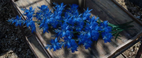
Final Fantasy XV - art history meta
a symbol of romanticism: sylleblossom - the blue flower:
final fantasy xv's sylleblossom has a very special design and meaning. Let's talk about what it stands for and how it can be connected to art history.
More below the cut.
Luna and sylleblossoms
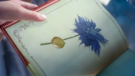
In general, blue sylleblossoms can be seen as a symbol for Luna in ffxv. They grow in Tenebrae and are its national flower, she has a garden full of them. Blue sylleblossoms are her favorite flowers. She gifts Noctis a pressed flower in their notebook and it is a strong visual symbol in her death scene. According to the final fantasy wiki: "Different color variants symbolize different things, but the blue version represents "a heart that does not give up" and "sincerity"." But there might be even more to it.


The blue flower and romanticism
The blue flower is considered an important symbol in art history, and especially of romanticism, an art movement of the 19th Century. It represents the romantic longing for the unattainable and unreachable, the infinite and the unconditional, it is also often interpreted as a connection between man and nature. In addition, the Blue Flower developed into a symbol of wandering, which is also characteristic of the Romantic era (and a main theme in ffxv too :) - the word wanderlust got its meaning in the Romantic Period btw). This motif can be traced back to an old German legend that says that one could find the blue miracle flower at night and would be richly rewarded. Consequently, this miracle flower represents a cause that is difficult to achieve, but longed for by many.
Here's a cornflower as an example. I painted a sylleblossom recently and noticed the similar petal shape and color.

The legend
The symbol goes back to a legend and the poet Novalis. The blue flower embodies the longing for an unattainable thing. In the story, a young man dreams about a blue flower that calls to him and he longs to find it. When he finally sees it, he sees a tender face in the flower. This - as is shown in the course of the story - is that of his later fiancé. In addition, the text teems with symbols typical of romanticism. In romantic works, threshold motifs are often used, i.e. motifs that mark a boundary between reality and the dreamlike, such as twilight, moonlight, or the view into the distance, which is usually carried by an enormous longing of the protagonist.
Noctis and Luna
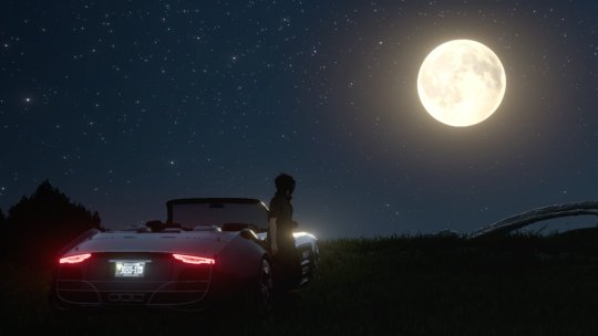
When we look at Noctis and Luna's relationship, we can find a lot of these motifs. The longing, the wandering and looking into the distance. Luna seems always out of reach but they long to be together. We see Noctis looking at the moon in old previews and when Luna says farewell she tells him to "look to the distance, know that I am there". Even their names represent typical romantic symbols (night and moon).

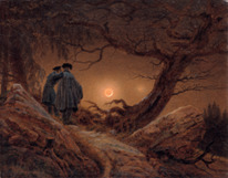
Night and moon are also typical subjects in romanticism. I really like the similarities here between the official artwork of the ffxv piano collection and the painting by C.D. Friedrich.
Luna's death

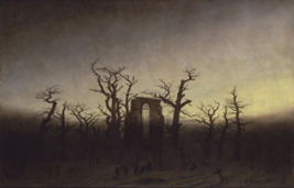
Here's a screenshot of the dreamlike death sequence and another painting by C.D. Friedrich, who is one of the most recognizable Romantic painters.
One more interesting thing I'd like to point out is the topic of death in romantic paintings and Luna's death scene. I think it's interesting that you can see ruins and a gate behind Luna. It looks like Tenebrae or maybe Altissia but the gate behind her stands out. In romantic artworks, ruins can stand for the past and especially gates represent the transition into the afterlife. We can find several threshold motifs in this scene. In ffxv, it might show that Luna and Noct are inbetween the world of the living and the dead in that moment. Luna then goes into the afterlife (in the direction of the gate) while Noctis is pulled back into life.
The flower turns into the ring, which shows us that her calling has been fulfilled.
I'm not sure if the references about the romantic movement in ffxv were intentional or not, but in any case it was fun to think about it :). I hope you enjoyed this short meta analysis and look into some art history :)
#final fantasy xv#final fantasy xv meta#final fantasy xv meta analysis#sylleblossoms#lunafreya nox fleuret#art analysis#my thoughts#flowers#maybe someday I'll also finish my meta analysis of ffxv and Shakespeare :')#ff#ffxv#edit: It refers monstly to German Romanticism
77 notes
·
View notes
Last Seen Blogs
shadowsingerofthenightcourt
Let's go rattle the damn stars

lorrlor44
Veganism
0fbalance
FIND BALANCE
2muchfor2hands
k a b o c h a n