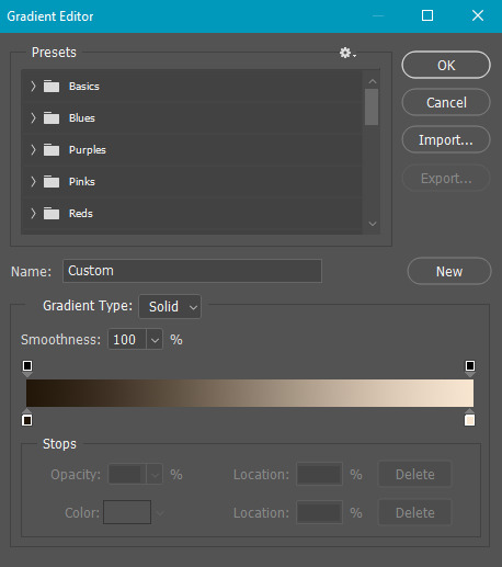
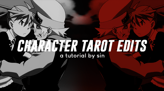
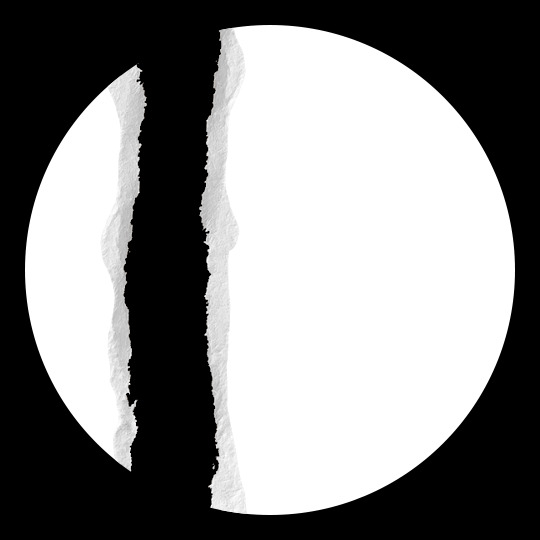
#gradient text stroke
Text

CSS Gradient Text Stroke
#html css#css text stroke#css text effects#css#html#frontend#css3#neduzone#css tutorial#frontenddevelopment#css tricks#html5#css effects#css gradient#css gradients#gradient text stroke
4 notes
·
View notes
Text
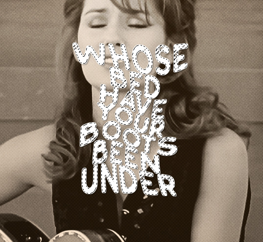
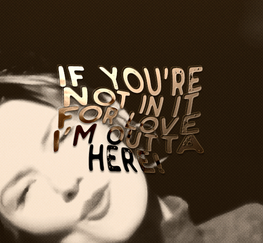
#workskin .rainbowStroke { -webkit-text-fill-color: black; background-image: -webkit-linear-gradient(-45deg,blue,magenta,red,orange,yellow,green,cyan); -webkit-background-clip: text; -webkit-text-stroke: 2px transparent; padding-left: 5px; margin-left: -5px; padding-right: 5px; margin-right: -5px;
}
edit: added four new lines to prevent bg clipping
spokeishere text (black text with rainbow stroke) if anyone wants it
idk if theres already a workskin that works just like/similar to this but i havent checked lol
breakdown of code for anyone too intimidated to play around with it (not an expert tho this is mainly just me listing down my conclusions after playing around with it, also written in a way thats assuming the reader knows fuckall about coding):
#workskin .rainbowStroke { -webkit-text-fill-color: black; background-image: -webkit-linear-gradient(-45deg,blue,magenta,red,orange,yellow,green,cyan); -webkit-background-clip: text; -webkit-text-stroke: 2px transparent; padding-left: 5px; margin-left: -5px; padding-right: 5px; margin-right: -5px;}
code name
> can be changed
> is what you use to define the code aka attach the properties to the actual text using text
text color
> webkit is what supports the existence of stroke hence why it's there and why you cant just use {color: black;}
> fill is what thickens the text, you can delete it but it makes the text harder to read
stroke colors aka the text outline
> deg is the way the colors are rotated, feel free to change the number and to make it positive or negative
what makes the stroke not just a square
> clipping for those of you unfamiliar with it just means it follows the shape of whats underneath it
stroke properties
> the px means pixels and indicates the size of the stroke
> transparent means it'll actually show whats underneath, it can be deleted but doing so will make the text moremuddy/desaturated
background overflow
> there to prevent the colors from being cut too short since nackground normally is almost the exact size of the text
> can be changed but will affect the colors, also having it too small will cause clipping
anything in black/white is code language properties, you cannot make anything without them
#writing#spokeishere#did this cause i wanted to try colorcoding in my fics but realized that spoke has a rainbow gradient thing going on#took me like 2 hours to get through all the technobabble and irrelevant info to find what i was actually looking for#https://stackoverflow.com/questions/61825324/css-gradient-text-with-opacity-and-gradient-text-stroke-outline#<---- shoutout to the guy from this question btw couldnt have done it without ya#https://stackoverflow.com/a/17756378#<------- also shout out this guy
5 notes
·
View notes
Text
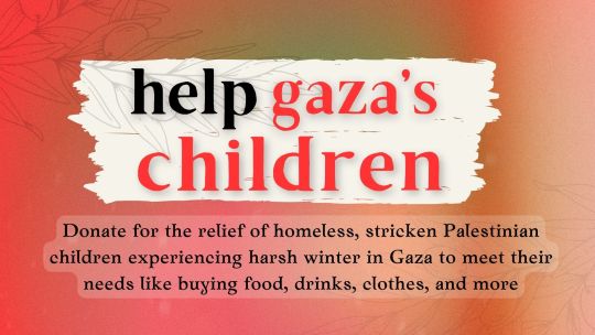
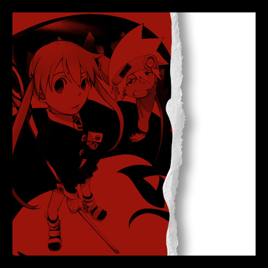
Help Gaza's Children!
Palestinian children experiencing this latest aggression are homeless and in need of food, drinks, clothes, and more during the harsh Gaza Strip winter.
Your donations will help save the lives of these children as they experience these harrowing circumstances, so please consider donating!
Please spread this donation link around. Any amount will go a long way in helping the children of Gaza, no donation amount is too little!
Donate here:
Reblogs are much appreciated!
[Image ID: a 16:9 image that reads in big serif letters "help gaza's children" with a subtitle in serif letters that reads "Donate for the relief of homeless, stricken Palestinian children experiencing harsh winter in Gaza to meet their needs like buying food, drinks, clothes, and more." There are two white paint strokes highlighting the title text with "gaza's children" in red whereas the rest of the text is black. The background of the image has two transparent olive branches in black line art and gradient of red, yellow, and green.]
#palestine#gaza#donation#free palestine#palestina#stand with palestine#end the occupation#end israel's genocide
6K notes
·
View notes
Note
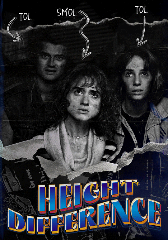
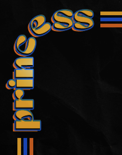
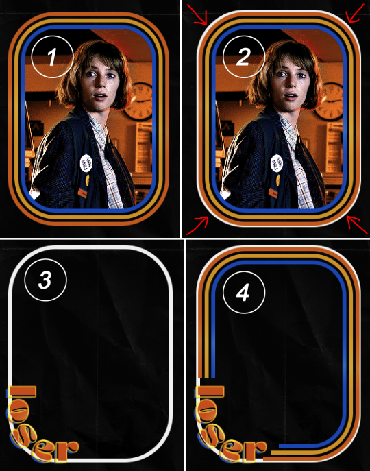
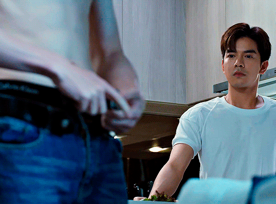
hello! I love your edits and I wanted to know, for the "Steve Robin and Nancy" Gif you posted.. How would I go about doing something like that? More specificly, the bottom two where it says "Height Difference" and where it labels them as "Princess, Jock and Loser"
Thank you! Sorry this took a while to answer. I finally had time to sit down and write this. Link to original post.

Quick notes:
I'm using Photoshop 2021 on Mac and working in video timeline. Must have basic gifmaking skills and know how to use layer masks. This is primarily a gif layout and text tutorial.
Fonts used in first gif:
Pea Wolfe Tracks — link here
King & Queen — link here
Fonts used in second gif:
Kiera — link here
Post — link here
Ellianarelle's Path — link here
Heina's hurry — link here
I used a light leaks/film texture, ripped paper textures, folded paper textures, and transparent pngs (arrows + post-it notes + smiley face).
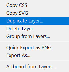
We'll start with this gif.
Make your gif! The gif here is 540x600px. I color and sharpen it to my liking. Go to image > canvas size > change height from 600 to 770px. I left the anchor in the middle, though it doesn't really matter.
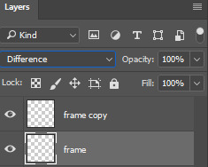
I drag and drop my folded paper texture and change the layer order so it's under my gif. Then I change the blending mode on my gif to Screen so the texture shows through the gif, but I keep the texture at 100% Opacity and Fill.
Now I move my gif around and add my ripped paper textures. I wanted to give it a sort of poster-like feel to it, so I made more room on the bottom for my main text and ended up with something like this. Blending mode is set to Lighten for the ripped paper textures.
I then use layer masks to hide what I don't want shown and add my light leaks/film texture. Blending mode on light leaks/film texture set to Pin Light, Opacity: 50%, Fill: 70%.
I use Levels and Brightness/Contrast adjustment layers to darken the gif up a bit more, then I add a patterned paper texture. Blending mode for patterned paper texture set to Lighten, Opacity: 100%, Fill: 75%. Result:
Now on to the text!
I'm going to be honest here, a lot of this was clicking around until I settled on something I liked. There's three layers to create this text effect. The font used here is King & Queen.
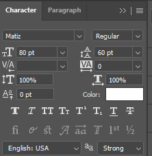
For the first text layer, the font color is set to black (#000000), font size: 87 pt, leading: 80 pt, tracking: 25.
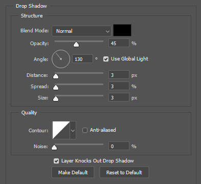
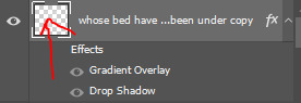
Layer styles used here are stroke and drop shadow.
Text Layer 1
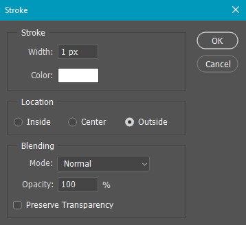
Stroke settings:
Size: 1px
Position: Outside
Blend Mode: Hard Light
Opacity: 40%
Overprint: unchecked
Fill Type: Color
Color: #5911ed
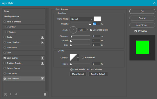
Drop Shadow settings:
Blend Mode: Difference
Color: #2d5ba8
Opacity: 85%
Angle: 70°
Use Global Light: checked
Distance: 7px
Spread: 0%
Size: 6px
Contour: Cone - Inverted
Anti-aliased: unchecked
Noise: 0%
Layer Knocks Out Drop Shadow: checked
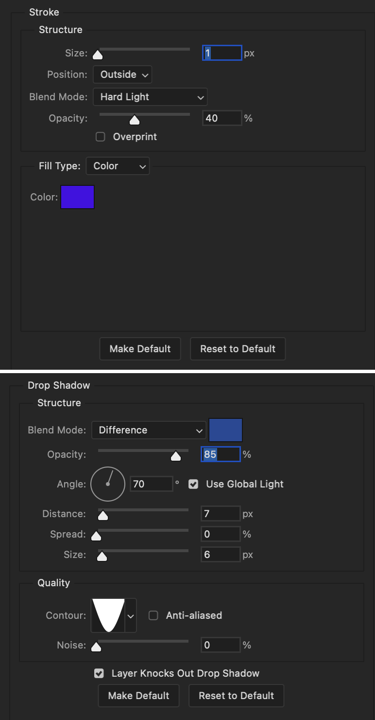
Blending mode for text layer set to Overlay, Opacity: 100%, Fill: 85%.
Warp text settings:
Style: Wave
Horizontal: checked
Bend: +60%
Horizontal Distortion: +10%
Vertical Distortion: 0%
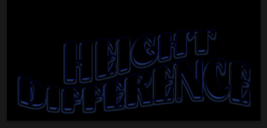
With all those settings applied, the first text layer looks like this:
Duplicate the layer, clear all layer styles, and change the color for the second text layer to white (#ffffff). All other text settings (including warp settings) should stay the same. The only layer style then applied to this text layer is stroke.
Text Layer 2
Stroke settings:
Size: 1px
Position: Outside
Blend Mode: Difference
Opacity: 100%
Overprint: unchecked
Fill Type: Color
Color: #d48f16

Blending mode for the second text layer is set to Difference, Opacity: 90%, Fill: 100%. Nudge the second text layer a bit so the first text layer is a little more visible or move to your liking.
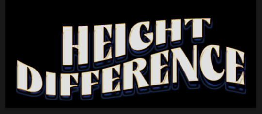
With both those layers active, it looks like this:
Duplicate the second text layer, clear layer styles, and change the color of this third text layer to a dark grey (#1a1919). Again, all other text (and warp) settings should stay the same.
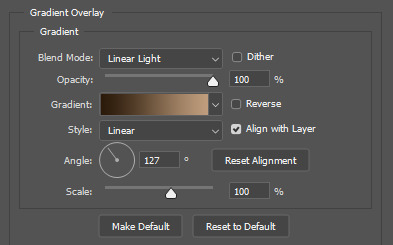
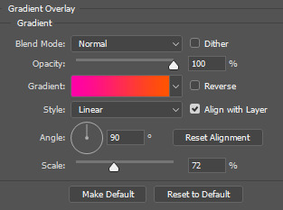
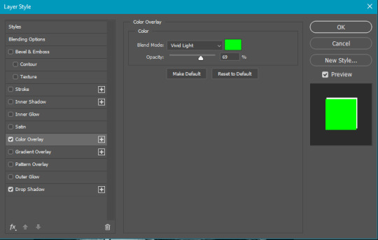
Layer styles applied to this layer are stroke and gradient overlay.
Text Layer 3
Stroke settings:
Size: 1px
Position: Outside
Blend Mode: Difference
Opacity: 100%
Overprint: unchecked
Fill Type: Color
Color: #d48f16
Gradient Overlay settings:
Blend Mode: Difference
Dither: unchecked
Opacity: 100%
Gradient: #cd3f00 > #ffdb5d
Reverse: unchecked
Style: Reflected
Align with Layer: checked
Angle: 90°
Scale: 100%

Blending mode for the third text layer set to Exclusion, Opacity: 100%, Fill: 100%. I also moved the third text layer around, down and to the right a few pixels to give it that 3-D Word Art effect.
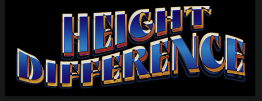
With all three text layers active:
Next are the arrows.
Take your transparent pngs and place them to your liking. Blending mode for these is set to Difference, Opacity: 100%, Fill: 100%.
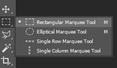
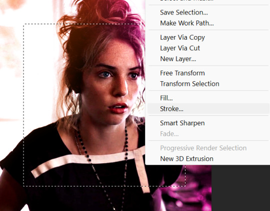
Command + click on an arrow thumbnail to select all the pixels in that layer. This is why the image must be transparent!
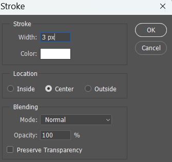
With that selection made and on a new blank layer, right click the selection and click on stroke. Settings for that are width: 2px, color: white, location: center. Move that a couple of pixels over.
Do this for all arrows for a total of 6 layers for arrows. I group them together to keep my workspace clean, then I duplicate my arrows group with no further changes made to the second group to get what you see in the final gif.
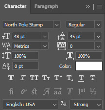
Next is the smaller text. It's three separate text layers for each word, so I can move each of them around to my liking.
Font used is Pea Wolfe Tracks, font color: white (#ffffff), font size: 24 pt, leading: 6 pt, tracking: 25. Bold and italic options checked. I set the blending mode to Difference, Opacity: 100%, Fill: 100%.
And that's it! That concludes the tutorial for this gif!
Now on to this gif.
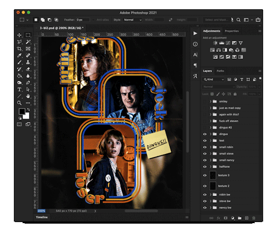
We'll start with the background gif. There are three separate gifs. You could make them one gif, but I wanted the option to order them differently if I needed to.
All gifs in the background are the size of the canvas: 540x770px. Color and sharpen to your liking, but keep them all black and white. To get the blurry effect go to filter > blur > guassian blur. Set radius to 7.0 pixels. Add this to all three gifs.
Then I add two folded paper textures. Blending mode for one set to Lighten, Opacity: 60%, Fill: 100%. The other set to Screen, Opacity: 70%, Fill: 90%.
I found this tutorial a while back for a halftone effect. They include links to the halftone pattern used here as well as textures and gradient maps not used here.
I'm only using the halftone pattern here.
Pattern fill settings:
Angle: 66°
Scale: 8%
Link with Layer: checked
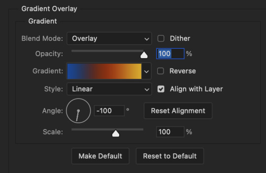
I also added a gradient overlay layer style to the halftone pattern which gives the gifs the color you see above.
Gradient Overlay settings:
Blend Mode: Overlay
Dither: unchecked
Opacity: 100%
Gradient: #0059ac > #a33600 > #e6b801
Reverse: unchecked
Style: Linear
Align with Layer: checked
Angle: -100°
Scale: 100%
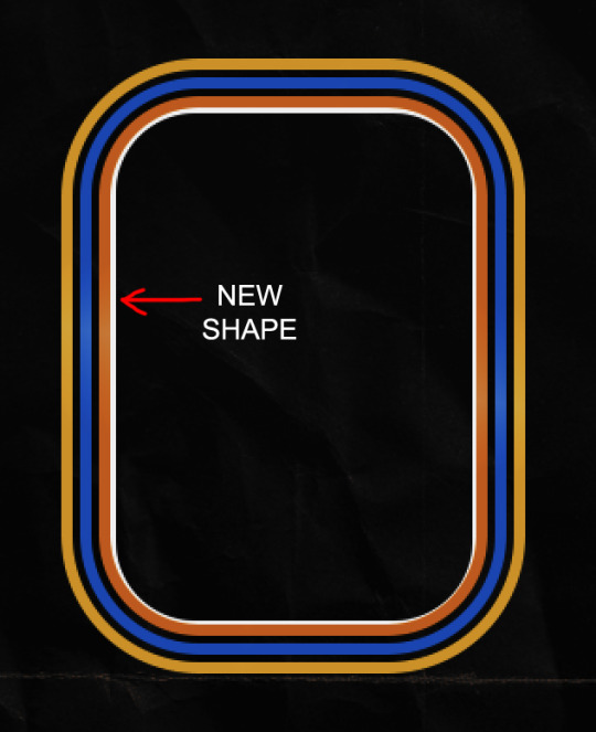
Now on to the square shapes with rounded corners. In the interest of keeping this tutorial short(er), I found this tutorial on youtube that explains how to make squares with rounded corners.
I set my stroke size to 6px, stroke color to white (#ffffff), and fill to no color. I don't use the stroke layer style to make the borders of the shape like in the video! I'm only linking the video to show how to curve corners with square shapes.
Note: Be sure you know how big or small you want these to be and how they're going to fit on your canvas in order to make all the shapes and edit them. It can be tedious to change the settings.
Duplicate and resize to your liking.
In this instance, I wanted to make three squares total, so I had to duplicate twice and resize until I had something I liked.
Settings for the shapes used here are:
Innermost shape: W: 200px, H: 280px, corners: 50px
Middle shape: W: 220px, H: 300px, corners: 60px
Outer shape: W: 240px, H: 320px, corners: 70px
Once I have the size I want for all three shapes, I group them together to make a set and duplicate that group twice, then adjust each set on the canvas for my layout.
What the sets look like all together:
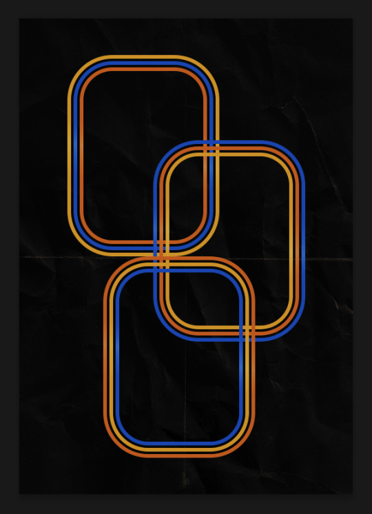
Colors used: orange #e47100, blue #0062d1, yellow #ecac00
To add color to the shapes, either change the color of the shape itself or use layer styles. I used layer styles.
Note: I didn't add the colors until the end after I knew what gifs went where and what color scheme I wanted, but I don't want to add more images than I need to here.
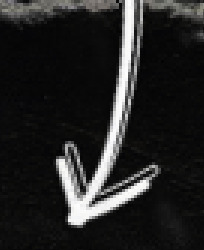
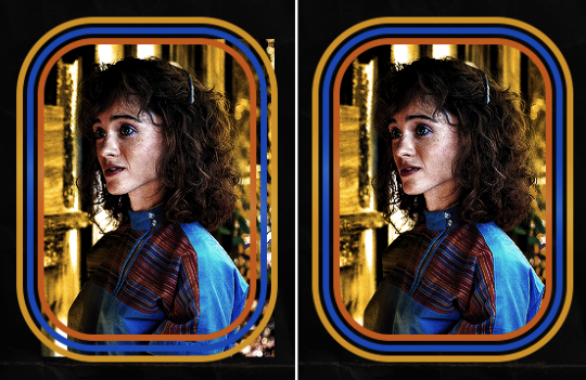
To keep this short, I found this tutorial on youtube that explains how to wrap text around a shape. However, I wanted the text to align on the outside where the white line is and not the green line (left image):
So I created another shape just inside the innermost square and used that as a path for my text (right image). Adjust the text to your liking until you have your text where you want it. Refer to the video tutorial if you need help moving the text along the path!
You don't need the shape path once you have your text where you want it, so use the layer visibility tool to hide it. You can hide your other shapes too so you can work with your text.
Do not delete your shape path!
I duplicate it once I start working with my "jock" text since all the sets are the same size. The "loser" text has to be worked a little differently, but we'll get to that later.
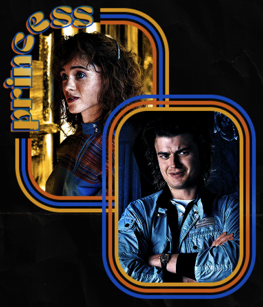
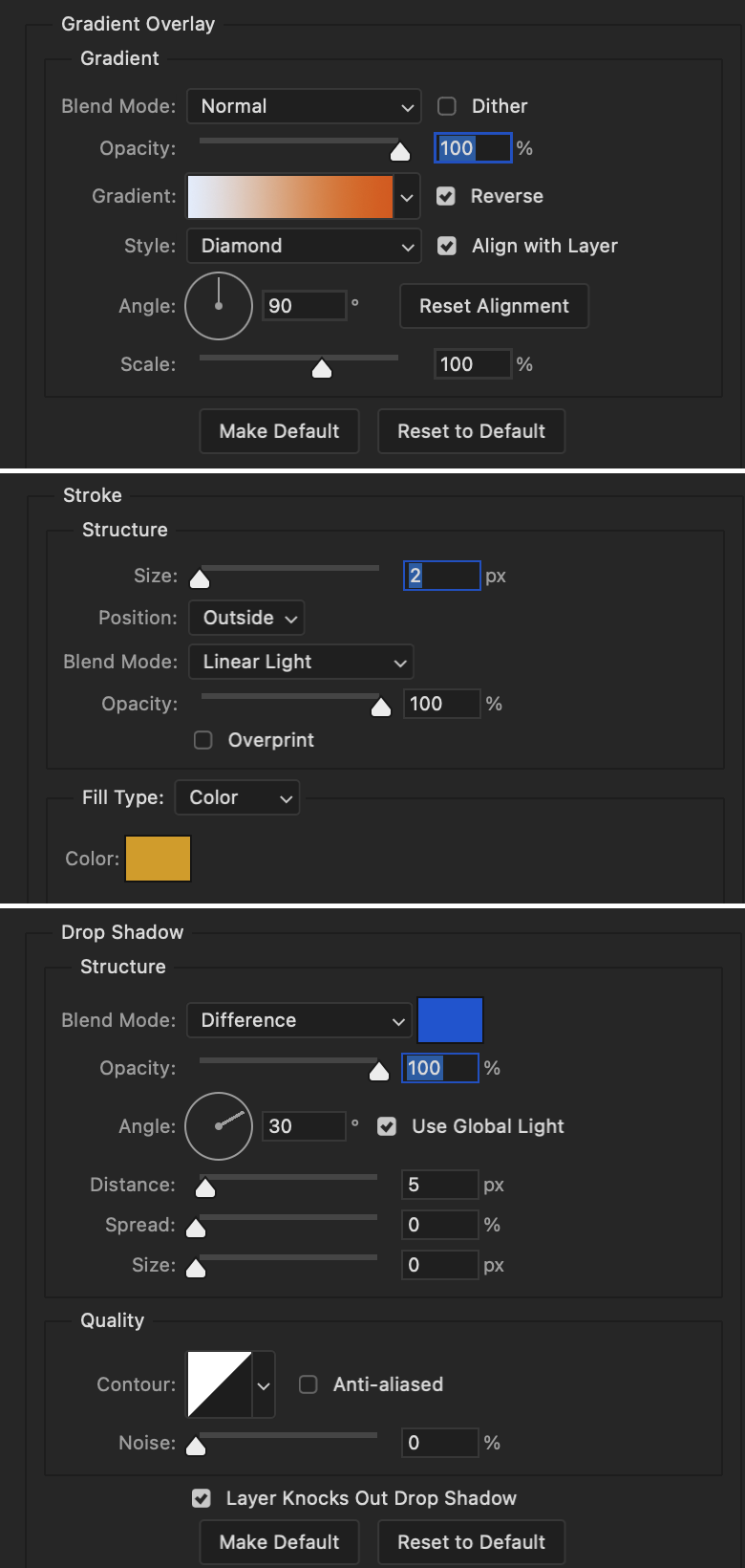
For the princess, jock, and loser text, there are two text layers to create the overall effect. For both layers, font used is Kiera, font color set to white (#ffffff), font size: 60 pt, blending mode set to Normal.
I added a gradient overlay layer style to the first text layer which I'll call the base layer. Opacity for this layer is 100%, Fill: 100%.
Base Layer
Gradient Overlay settings:
Blend Mode: Normal
Dither: unchecked
Opacity: 100%
Gradient: #f0b002 > #e7f0fd
Reverse: checked
Style: Diamond
Align with Layer: checked
Angle: 90°
Scale: 100%
The second text layer is your stroke and drop shadow layer. For this layer, opacity is set to 100%, Fill: 0%.
Stroke and Drop Shadow Layer
Stroke settings:
Size: 2px
Position: Outside
Blend Mode: Linear Light
Opacity: 100%
Overprint: unchecked
Fill Type: Color
Color: #0064cb
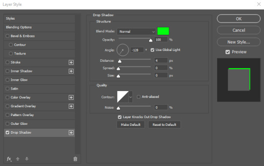
Drop Shadow settings:
Blend Mode: Difference
Color: #fb7c00
Opacity: 100%
Angle: 30°
Use Global Light: checked
Distance: 5px
Spread: 0%
Size: 0px
Contour: Linear
Anti-aliased: unchecked
Noise: 0%
Layer Knocks Out Drop Shadow: checked
End result looks like this:

When I make my shapes visible again (minus the one I used as a path), I get this:
The shapes are clearly in the way of the text, whether they're above my shapes layer or under it. I use layer masks to hide what I want, so the text is legible. It looks cleaner this way and I wanted the text to be a part of the shape itself. I do that for each rounded square.
Now on to my smaller gifs. I like to crop, resize, sharpen, and color separately because my laptop and Photoshop would kill me if I tried to do it all on one canvas. I use the size of the middle shape for my gifs (220x300px), so I can have a little wiggle room when adjusting. I then use a layer mask to hide the parts of the gif that are outside of the shape.
A quick way to do this is to command + click on the thumbnail of the innermost square. With that selection made, I got to my gif layer and add a layer mask. Sometimes you need to invert it. Use command + i with the layer mask selected (not the gif) to invert the layer mask.
I repeat this process with my Steve and Robin gifs. I have to go back and forth with all the layer masks to hide parts of the gif/shapes I don't want for each set. It's kind of a long process, but not all that difficult. I label and group my layers together as I work to keep things clean and it helps me keep track of what I edited and what needs to be edited when it comes to things like this.
The picture below shows where I hid the bottom right corner of Nancy as well as the shapes that make up her set using layer masks. I also did this with the Steve and Robin sets, hiding the bottom left corner of Steve.

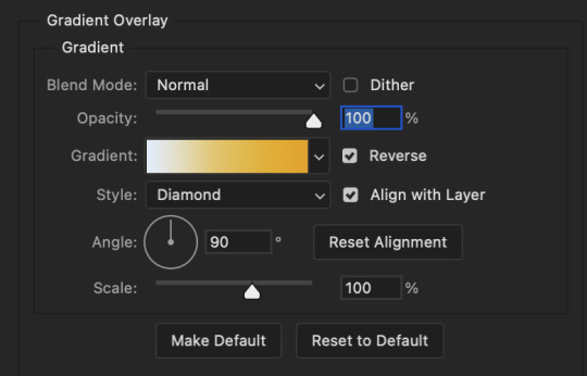
Similar text settings used for jock. The gradient overlay layer style for this base layer is different than that of princess because of the positioning of the text. Again, same as princess, two text layers are used here. Blending mode, opacity, and fill for both are the same as the princess text layers as mentioned before.
Base Layer
Gradient Overlay settings:
Blend Mode: Normal
Dither: unchecked
Opacity: 100%
Gradient: #007aec > move bottom middle dot to 80% > #e7f0fd
Reverse: checked
Style: Diamond
Align with Layer: checked
Angle: -140°
Scale: 100%
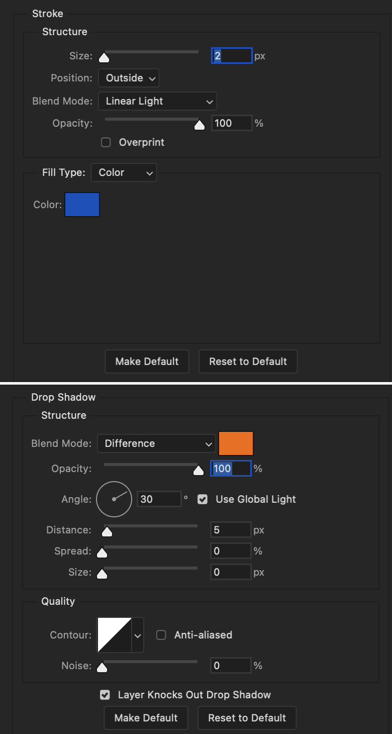
Stroke and Drop Shadow Layer
Stroke settings:
Size: 2px
Position: Outside
Blend Mode: Linear Light
Opacity: 100%
Overprint: unchecked
Fill Type: Color
Color: #a05700
Drop Shadow settings:
Blend Mode: Difference
Color: #ffba00
Opacity: 100%
Angle: 30°
Use Global Light: checked
Distance: 5px
Spread: 0%
Size: 0px
Contour: Linear
Anti-aliased: unchecked
Noise: 0%
Layer Knocks Out Drop Shadow: checked
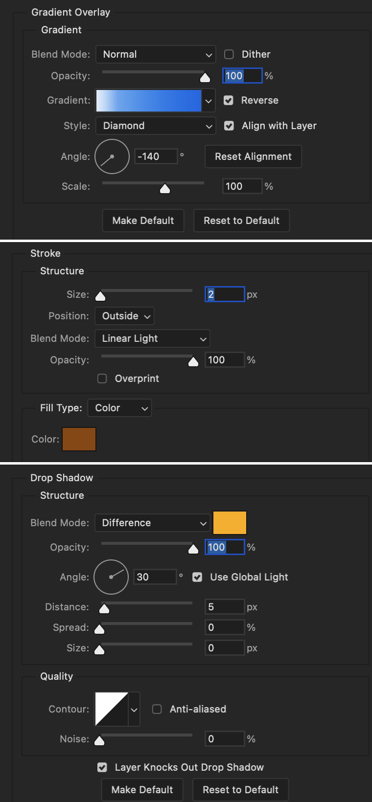
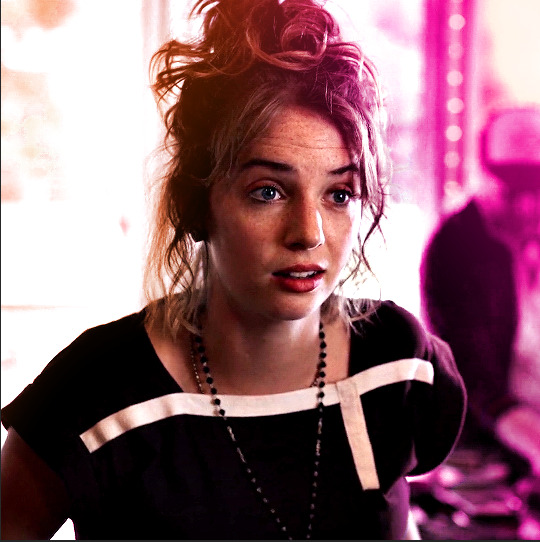
Image 1: We start with Robin.
Image 2: To make the loser text, I had to create a new path.
Image 3: I make it so the text is on the inside of the path instead of the outside. (Hint: Refer to video tutorial if you don't know how to do that.) I then adjusted the tracking between the letters in the word "loser" so they didn't look so squished together.
Image 4: Then I use layer masks to hide the parts of the shape I don't want shown.
You can then hide the path or delete it. You only need it if you want to adjust the placement of the text. I keep it (hidden) just in case.
Text settings for loser are just like those for princess. Blending mode, opacity, and fill are also the same.
Base Layer
Gradient Overlay settings:
Blend Mode: Normal
Dither: unchecked
Opacity: 100%
Gradient: #eb6400 > #e7f0fd
Reverse: checked
Style: Diamond
Align with Layer: checked
Angle: 90°
Scale: 100%
Stroke and Drop Shadow Layer
Stroke settings:
Size: 2px
Position: Outside
Blend Mode: Linear Light
Opacity: 100%
Overprint: unchecked
Fill Type: Color
Color: #e1a900
Drop Shadow settings:
Blend Mode: Difference
Color: #0068de
Opacity: 100%
Angle: 30°
Use Global Light: checked
Distance: 5px
Spread: 0%
Size: 0px
Contour: Linear
Anti-aliased: unchecked
Noise: 0%
Layer Knocks Out Drop Shadow: checked
Next are the post-it notes! This is probably the easiest part of making this gif. You just have to repeat this process for however many post-it notes you're making.
Image 1: To start, place your transparent post-it note where you want it. You can also rotate it if you'd like.
Image 2: Then create a text layer and write what you want. Font used here is Post. I wanted this text underlined to give emphasis, so I click on the underline option. I also adjusted the leading because I wanted more space between the word and the line. Rotate the text so it looks like it's written on the post-it note.
Note: It looks better if you choose a font that looks handwritten.
Image 3: I wanted another line to give emphasis to the "Dingus!!" text and make it seem more handwritten. I use the line tool to create another line.
Image 4: Then I adjust that line to my liking.

Fonts used for notes: Post, Ellianarelle's Path, and Heina's hurry
Repeat this process for all post-it notes!
That finishes the tutorial! (And I hit the 30 image limit lol.) I hope this helps. If you have any further questions, feel free to send an ask or IM and I'll try to answer to the best of my ability.
Happy photoshopping!
#ask#pcocana#photoshop#photoshop tutorial#tutorials#*tutorials#userchibi#userbunneis#uservivaldi#userriel#userabs#usertiny#useralien#useraljoscha#userfanni#userraffa#tusermona#userbess#userrobin#userroza#quicklings#janielook#usernaureen#userrlorelei#tsusermels#tusermimi#userelio#usertj#userbarrow#usernolan
177 notes
·
View notes
Text
gif tutorial
i was asked to make a tutorial for this set i made, so let's get right into it!
first things first, i downloaded the music videos from youtube in 1080p using 4k video downloader. unfortunately, the quality of youtube videos always seems... not great, to put it simply. plus these music videos are from the 90s, so they've been upscaled to 1080p after the fact. all of this works against us, but i've definitely worked with videos of lesser quality than these, so at least there's that!
when i gif, i import video frames to layers rather than screencapping. this comes down to personal preference. after everything has loaded, i group all my layers together and set the frame delay to 0.05. i then cropped my gif to 540x500.
the next step in my process is sharpening. i did play around with my settings a bit given the quality of the footage and the dimensions of the gif. i compared both @hellboys low-quality video gif tutorial to my regular sharpening action and my vivid sharpening action and in this case, i preferred my normal vivid sharpening action. i used this tutorial to create the action for myself, and you can find other sharpening tutorials here. this action converts my frames to video timeline and applies sharpening.
once my gif is sharpened and i'm in timeline, i begin coloring. i wanted to simplify the amount of colors used in these gifs, again because of the video quality -- i knew it wasn't going to have the crispness i would normally like for my gifs. here are my coloring adjustment layers and their settings (not pictured: my first layer is a brightness/contrast layer set to screen) (explanation in alt text):

all of these layers and their settings will vary depending on your footage and its coloring (and obviously, feel free to make the gradient map whatever colors you like if you aren't going for this exact look).
pretty basic coloring, especially with just slapping a gradient map on top (my beloved), but at this point, i still didn't like the quality of the gif, so i added a couple textures/overlays.
i put the left one down first and set the blending mode to soft light and the opacity to 8%. depending on what look you're going for, you could increase or decrease the opacity or play around with different blending modes. i like using this texture with lower quality footage because even when it's sized up a bit, it adds some crispness and makes things feel more defined. for the second texture, i set it to overlay and 75% opacity. we love and respect film grain in this house.
now for the typography! sometimes i really enjoy typography and other times it's the bane of my existence for the sole reason of just how many fonts i have installed. anyway, here are the settings i used for this set:
make sure the color of your font is white and then set the blending mode to either difference or exclusion. i can almost never see a difference between the two, but for this set, i used exclusion. below are the blending options (double click on your text layer to bring up this menu or right click and select blending options).
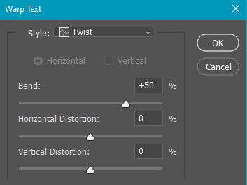
now we have to add the warp effect. with your text tool still selected, click this icon at the top of your screen:

from the dropdown menu, select twist. these were my settings, but feel free to play around with different warp options and their settings. the ones i use most often are flag, fish, and twist.
this last step is completely optional, but it's an effect i use in most of my sets with typography. duplicate your text layer (select the layer and ctrl+j), turn off the layer effects (click the eye icon next to effects), and set the blending mode to normal. right click on the layer and select rasterize type. right click on the layer icon itself and choose select pixels.
at this point, you should see the moving black and white dotted line showing that only your text is selected. then go to edit > stroke. here are the settings i almost exclusively use.
this is what your text should look like now:
using ctrl+T, move the layer off the canvas so you can't see any of the text anymore. you should be left with only your outline. click anywhere on your canvas to de-select the text we just moved. use ctrl+T again as well as your arrow keys to nudge the outline over to the left 2px and up 2px. this is personal preference as far as the positioning, but i almost never move it any other way. you can leave it like this, which i sometimes do, or you can set the blending mode to soft light like i did for a more subtle effect.
and that's it! rinse and repeat for each gif in your set or use a different warp effect on each gif to switch it up! if you have any questions about this tutorial or would like me to make one for anything else, please feel free to ask any time!
#gif tutorial#my tutorials#gifmakerresource#completeresources#dailyresources#chaoticresources#userdavid#coloring tutorial#typography tutorial#tutorial#photoshop tutorial
179 notes
·
View notes
Note
Hello!! First your Tumblr and edits are so gorgeous! Second I was wondering if you were willing to share how you did the second gif of this edit please? Have a great day! (Or night)
https://www.tumblr.com/thereigning-lorelai/713794704750362624/usergif-1-year-celebrationshuffle-challenge?source=share
hi nonny, thanks for the nice words! really appreciated. ♥️ so, you're looking for this grid effect:

you're starting off with two gifs. i'd recommend choosing scenes that are not too close up because otherwise they'll overlap too much and you won't be able to delete enough parts to make the most of this effect.
so, here's my base gif that i just did in black and white with some minor purple brush strokes set to screen:

i then chose my second gif and coloured it with a purple gradient map and a purple colour fill set to multiply. the colouring of the gifs is entirely up to you and what you think looks best. so here's my second gif, still without the grid:
this is where the fun part starts - the grid layout. i created that with a new guide layout. this is a super neat tool in photoshop that helps you align shapes or selections on your image. the guide lines basically float over it and help you set up symmetric shapes or layouts. you can define how many columns and rows you want to have and then photoshop creates the guide layout for you. for this gif i chose 4 columns and 4 rows:

with this set up, i started creating the rectangles to make the purple gif visible on top of the black and white one. this is my final layout for my shapes:
you can move around the shapes to your liking and what works best with your gifs. i didn't want to cover too much of my base gif but also tried to make their faces in the top gif all be in the gif as much as possible.
this step is just a lot of moving around your shapes and seeing what looks good tbh.
i then grouped my shapes and clipped my top gif (including all layers for the colouring) to my shapes group:

looking good so far. the only thing missing are the lines for the grid. this is where your guide layout comes in again. i just reopened it and then traced the guide lines with my line tool to create the white grid overlay:
(for editing purposes i turned all of the line layers into a single smart object at the end. this is why you only see one layer for all the lines in this screenshot.)
finally, i used a gaussian blur (0,5 px radius, 100% fill for the filter, 40% fill for the overall layer) on the smart layer to make the lines a little bit smoother and softer looking. this is totally optional and again, up to what looks best to you.
added some text et voilà:
#asks#kind nonnies#usergif#*tutorial#hope this helps nonny#if you have any further questions just let me know#i'm not the best at explaining especially because i think my way won't be the most efficient or even logical#but that's how i did it and i think it's fairly easy to achieve
309 notes
·
View notes
Note
hi lovely!! do you have any tips on making cool fun and sexy typography?
hey joanna!! this made me giggle haha, i'm not quiiiite sure how to answer that, but here are some tips i keep in my when i do typography, and some examples:
FONTS
don't be afraid to "shop" for fonts and try funky fonts you've never used/seen. i often try so many before settling. i almost always use at least 2 different font for gifsets, even 3 sometimes. i think a good font pairing can do a lot for a gif. it's usually something like:
serif + cursive/funky fonts (example)
sans serif + cursive/funky fonts (example)
serif + sans serif fonts (example)
two different cursive/funky fonts (example)
or even simply the same font but all caps + all lowercase (example)
in case you're unsure where too start or want inspiration, here's a great resource: usergif's font pairing guide and its fonts page
BLEND MODES & LAYER STYLES
i think playing around with different blend modes and layer styles will always elevate your typography game, in my opinion. it's usually a bit more dynamic than just an opaque color. tho this minimalist typography can also be really good.
when you double click on a text layer, you get all the layer style options, as well as the blend modes. a very popular layer style is setting the layer's blending option to difference, paired with a color and/or gradient overlay (often set to multiply/color dodge). a drop shadow is also important so the text is more easily readable. we often see a black soft drop shadow, but don't hesitate to be creative with it, for example a thick, hard line, colorful drop shadow.
i feel like this step often takes the most time for me because the possibilities are endless. definitely play around with layer styles, especially drop shadow, color overlay, gradient overlay, stroke. and also try different blending modes for these settings.
as for the layer's blend mode, also definitely play around with them. and keep in mind that the text's color will also give a different result, it doesn't have to be white + blend mode set to difference, even tho this is a classic that works well.
TEXT WRAPING & POSITION
a great feature on photoshop is definitely the text warping tool. to access it, right click on a text layer and go "warp text". from there you'll get a few different styles and setting sliders. my favorites are flag and wave (example). you can always go back to edit these settings once they're done by right clicking again. and you can even keyframe/animate these settings!
typography doesn't always have to be centered and straight, i often prefer it on a side and rotated a little. you can easily rotate typography by selecting the layer(s) and hitting ctrl + T. you can also play with the skew and pespective after hitting ctrl + T by right clicking the canvas and clicking on either. these will give different ways to move your text.
SIZING
i love playing around with different font sizes, it makes the typography more interesting in my opinion, and it's a way to emphasize some words.
so for that reason i usually put each word on a different layer so i can edit each word separately. sometimes i will also put each letter on a different layer, because it can be interesting to offset/rotate some letters sometimes (example) (another example).
i often pair a quite small serif or sans serif font with a much bigger funky font (example). and often that bigger font will also have different sized words (example). i play around a lot with this!
ADDED EFFECTS
there are some things than can be done to enhance typography:
adding a colorful rectangle block behind the text (example)
using text symbols such as quotation marks or backets (example)
using lines around the text (example) (another example)
these can definitely bring typography to a different level
MORE RESOURCES
great font website
usergif's typography tag
my fonts tag
this is all i can think of right now, i hope it helps :D if you have any question on a specific text effect let me know, i can definitely make a tutorial!
#alie replies#silversmists#typography#photoshop#*ps help#resource#completeresources#allresources#resourcemarket#usercats#userabs#userpjo
176 notes
·
View notes
Text
Okay I keep seeing the sadness of glazing and how you need a strong pc and just lot of you dooming over here. Going "Well I use an Ipad/phone" Okay folks I am gonna teach you all how to do a thing you can do on pc mobile what ever its called
MAKE AN UGLY WATERMARK
Now here is how I do mine when I feel like making water marks and not going through glaze. Now I have mine with my name and my handle, I also have one that is the same and has sample on it (those are for commissions)
Now I made mine as a material and use it on clip studio like this

Now you can also do like insignias, symbols what have you this is just a simple one for my sample!
Now next you make a layer over that and put colors over it use the gradient if you want put the colors in randomly via paint what ever go jackson pollock on it. Now I heard pastels really mess with the thing and also heard using more of a spray pain droplet like brush as well helps. If you want to do that or not up to you
Now here is what I do, so I like to use the distort filters now sometimes I use twirl some times wave what ever your heart desires, I use multiple ones multiple times just to make well this. Again we are hear to make ugly bright annoying watermarks.

If there is a large blob of solid color add anouther later ad some more then merge the colors okay next part, make the layer of pastel vomit as I shall call this into a clipping mask over the letters,
VOILA!
Now you can merge it all down and add like a stroke on it and blur it then you adjust opacity some set it to multiply I dont care do what ever feels right for you looks good and basically do it. And just change it up everytime to add some chaos.
So those of you who don't have glaze due to tech limits, do moblie, etc etc, Here this is a thing you can do, If you got an art program on your phone you can do this, Again doesnt have to be text could be just your signature, doodle of something, just do this, and just make different color layers every time so it screws it up.
Is this 100% protection? Hell no, nothing is lets be honest, but it will cause chaos. If you want some extra ounce of protection here and don't want to deal with Glaze due to what ever.
#anti ai#protect your art#how to make watermarks#watermark making#glaze#fuck ai#fuck ai art#tutorial
64 notes
·
View notes
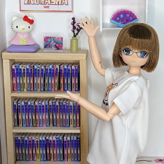
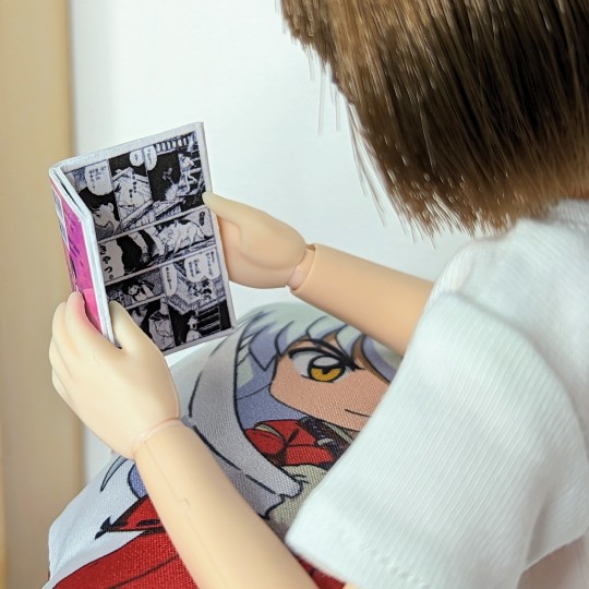
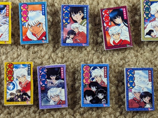
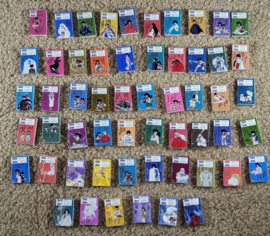
Text
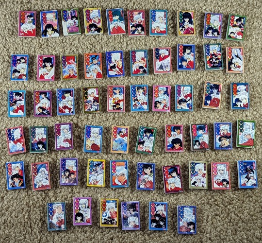
I did a thing... actually, I did several things. :D My ani-ME (anime doll version) needed manga in her house, so of course I had to make mini Inuyasha manga! I've done this before, but this time it's different... I didn't do miniature versions of the Viz BIG volumes. Nope, I did all 56 original Japanese volumes. Because ani-ME is in Japan, so she must have the original volumes!!! :D What a task this was - because the volumes are so old, it's hard to find high resolution pictures of them online. And even if you do, many times it's just the front, not the back and definitely not the spine. I found some, but then the front and back cover colors were completely different, some had text and graphics cut off from what was most likely a scanned image, the colors were inconsistent between various websites, some colors were clashing badly due to low quality resolution, etc.
So I literally made a template in Photoshop of the real size of the original manga (obtained via Amazon) and rebuilt EVERY. SINGLE. ONE. from scratch. I was able to find a site with all the original cover photos, and then I found the most high resolution cover I could find to duplicate the pattern that's on all books (colors vary), recreated the logo for each book (the character symbols and the gradients are all different for each volume), redrew the SS Comics logo that's on all books, and I even replicated each individual barcode. Because I'm nothing if not a consistent perfectionist. :D
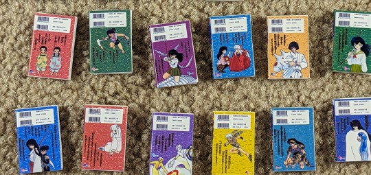
For the backs, I used the images I found and just copied and pasted the characters and Japanese text, and for the teeny tiny characters I used the brush tool to trace over them. Even though I knew you probably wouldn't be able to see them in such a small scale, no way was I leaving them out! Consistency, darn it! :D
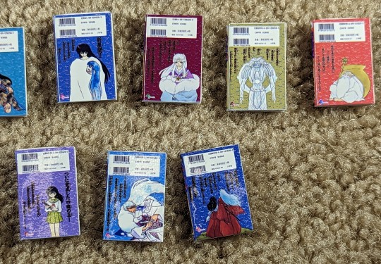
For the spines, I found complete sets on eBay and used a photo of the spines from those auctions as a template. I redid everything on the spine except the character head at the top of each, which is copied and pasted from the eBay files. They're definitely pretty low resolution, but hopefully it's not noticeable at such a small scale.
And the volume numbers? Try as I might, I could NOT find a font that matched them. So I got the most high resolution volumes I could find and made number templates... so each time I needed one of the volume numbers, I'd just use a color overlay on it and plop it where it needed to go on the front and spine.
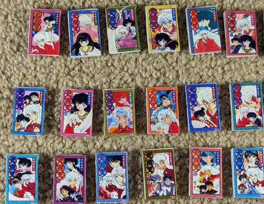
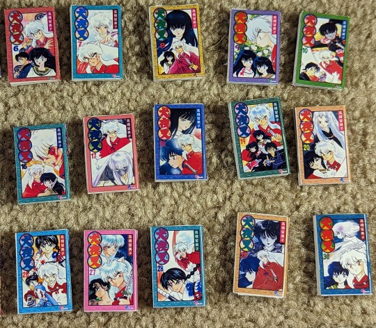
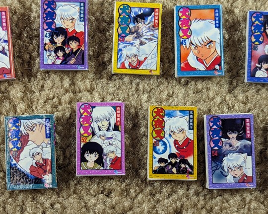
Then the fun part - resizing them all to 1/6 scale. They're a little over an inch tall right now. And because they're not very thick in the spine, wrapping the covers around foam board to mimic pages wasn't working. So I had to make pages... for 56 volumes LOL. I just took my cover template, sized it down, and made it a blank white with a black stroke so I could see where to cut. I could fit 11 mini pages in one row across a regular sized sheet of printer paper (I used cardstock for extra thickness and stability), and I could fit like six rows on a sheet. I was able to fit 11 pages in one volume to allow the spine room, so 56 volumes x 11 mini pages each = 616 total pages I wound up cutting, then stacking and gluing together. But, of course, that wasn't a perfect fit, as the pages, despite being sanded down to be completely straight and smooth, poked out of the covers. So I had to wrap the covers around the pages, mark where they hit, and use an X-acto knife to trim the pages down before gluing them inside the covers.
But finally, I was done! It was time-consuming, but I love how these little books turned out. They don't open, but that's totally okay. That would be way too much work, and every time I make a book that opens, it never closes again. I did, however, manage to find some pages from the original first volume (in Japanese), so I printed a second volume 1 cover and glued those pages inside. So now ani-ME has an open book she can read too!
So there you have it! My mini, 1/6 scale Japanese volumes of Inuyasha - all 56 of them! I made that bookshelf just for them, but I intentionally left more room in case I want to add more manga later. But of course we had to have Inuyasha manga on the shelf - it's the most important! :D And the poster on the wall is totally a tag from one of my shirts LOL.
Showing off her new bookshelf stocked full of all 56 volumes of the Inuyasha manga:

Relaxing in bed, reading from the beginning:

Why yes, she is reading the Inuyasha manga on an Inuyasha pillow :D

All 56 volumes on the bookshelf:

What do you do with an Inuyasha shirt tag? Make an instant doll poster, of course!

Front covers:


Back covers:


Volume 1 pages (glued in order, right to left):

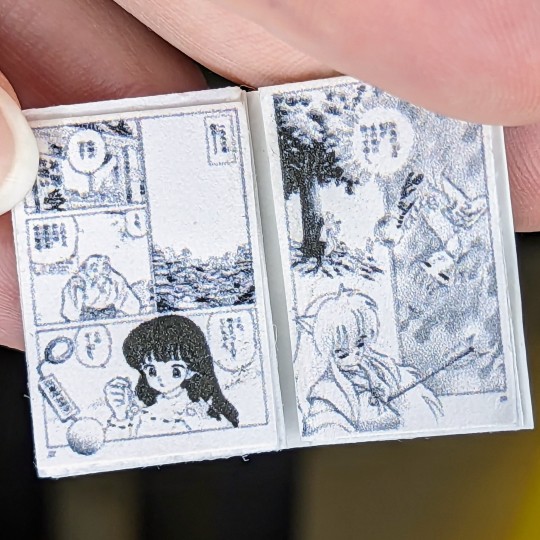
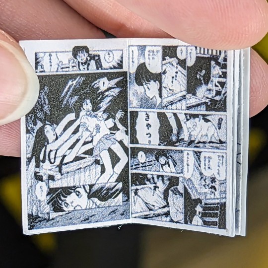
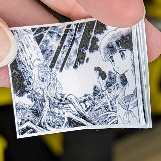
Size reference (shown with American penny):

#my plastic life#doll photography#one sixth scale#azone international#azone pure neemo#azonejp#Kiku Ningyo#Inuyasha#manga#anime#anime doll#tenderwolf#myfroggystufffanpics
131 notes
·
View notes
Text


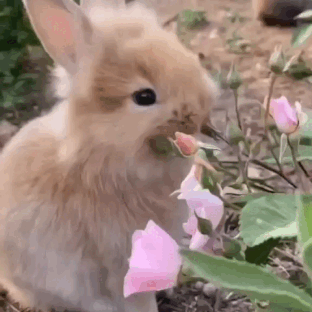


Stimboard request: Miffy stimboard for anon! Hope you likey! ^^
x/x/x/x/o/x/x/x/x
[GIF 1: A person waving with a Miffy handpuppet (END ID)]
[GIF 2: A person putting some yellow frosting on a cupcake (END ID)]
[GIF 3: A person squishing a pink bunny plushie (END ID)]
[GIF 4: A person breaking a chocolate chip cookie (END ID)]
[CENTER IMAGE ID: Miffy, a cartoon bunny (END ID)]
[GIF 5: A person tearing a muffin (END ID)]
[GIF 6: A brown furred bunny eats a flower (END ID)]
[GIF 7: Someone putting colourful star shaped sprinkles on some donuts (END ID)]
[GIF 8: A person stroking a white bunny plushie (END ID)]
[IMAGE: The Kirby character Daroach on a yellow/red gradient background with white text w/ a blue outline reading: “Please read my pinned post/DNI list before interacting! Thank you! with small text in heavily stylized pixel font next to it reading “by boba-foxy on Tumblr!” with a small dark red border around the image (END ID)]
#stim#miffy#baked goods#plushies#hand puppets#bunnies#sfw#sfw agere#agere#agere friendly#brown#white#pink#cute#mod boba#stimboard#board#stim board#request fulfilled#tw:real animals
24 notes
·
View notes
Text
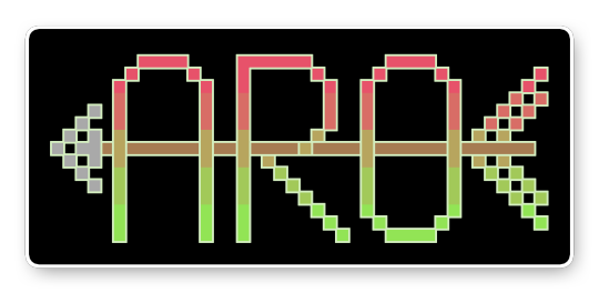
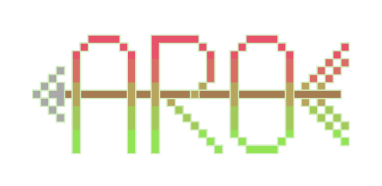

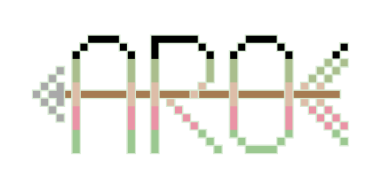


[image description: six elongated pixel-style text reading "aro" striped in the colours of three pride flags. A brown arrow shaft runs across the centre of the letters, forming the horizontal strokes of the letters "A" and "R". A grey arrowhead sits in front of the text; flag-stripe fletching sits behind it. Each image is available in two versions with black or transparent background.
Stripes are coloured in the following pride flags: aroflux (red to green gradient), cassromantic (black/olive/orange/coral-pink/green) and delloromantic (white/green/black with inwards-facing light-grey triangle).
Aro (with Arrow) Pixel Art Stickers
Flags: aroflux, cassromantic and delloromantic.
This design is created from the cross-stitch patch variant of my freehand embroidery motif (originally designed for doll T-shirts). Both patterns--cross-stitch and freehand embroidery--are available on the Aro Worlds website and Patreon.
All banners/stickers are available for free personal or non-commercial use with credit to one of my accounts.
#aroflux#cassromantic#delloromantic#artwork and visual#original artwork#pride#pixel art#pixel art banners#typography#typographic art#aro symbols#aro symbolism#flags and banners#weapons and sharp edges
9 notes
·
View notes
Text
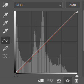
continuation to this tutorial under the cut
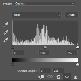
we continue colouring. next, onto the Curves layer! just like with Levels, choose white dropper and pick a light spot. this will be mine:
again, that's far too white, i only want to brighten up the scene a bit, so i will be changing Curves layer's opacity to 15% and this is what i got:


the gif now has a bit of brightness and blueish tone from the Curves, but not too much!
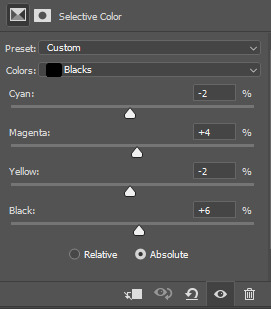
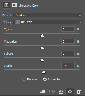
use Selective Colour layer to correct any colours you would like in your gif! i usually use it to bring back the colour of the characters' skin by changing Reds: Black to a higher number. in this case i added +20. i will also move the Selective Colour layer down under the Levels layer because i'd like for it to be more intense.

next, please use the Gradient Map layer from my psd. i cannot remember where i learned it from, but i always use this one in my gifs, while only changing the opacity of it sometimes. it ranges from 20% to 60% on my edits. it adds contrast to the gif.

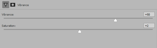
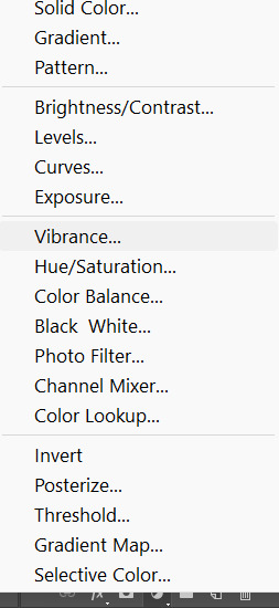
now, the last layer is Vibrance. as you pointed out, i really like to make gifs that are vibrant and colourful. my usual Vibrancy setting is +50 in Vibrance and +2 in Saturation, but you can play around to see what works best for you.
great, if you completed this step, you are done with colouring the way i do it! personally i will be erasing a bit of Levels layers on the left side of the gif cause the character's belly skin looks too light, but you don't need to worry about that for now.
Optional step: Captions
if you want to make a subtitle text layer, click the Type tool. then click on the picture and drag the tool on it.
type your text, choose a colour and a font. then change the font's setting to bold and italic

add a Layer Style by clicking on fx button > Stroke

enter these settings:
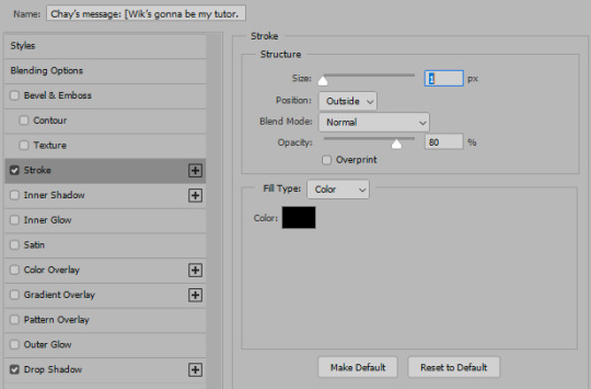
Click on Drop Shadow in this window and enter these settings > Click OK to save


here, we have a caption!
7. Saving the gif
click the Save action. check the end of the timeline to see if you have any blank layers, and delete them if you do.
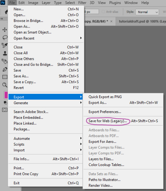
go to File > Export > Save for Web (Legacy)
these are my saving settings. most gifmakers use Diffusion, but i prefer Pattern cause i like the way it looks on the mobile better (especially in cases when my gifs are grainy).

click Save and name your gif. and you are done! hopefully i explained what you asked well, but english in not my first language and etc, i also am a whole damn idiot and not highly competent in the giffing field. sorry if anything in confusing! please send another ask or a message if you have questions darling <3 here is my result
also i collected many cool tumblr photoshop tutorials so i recommend going through my giffing tag too!
17 notes
·
View notes
Text
An analysis of some BL logos
[Adapted from something I wrote in Thai]

Last Twilight
The logo uses an opacity gradient for the characters, the characters would gradually fade, both the Thai and English title, with the word "twilight" being the only word to not fade. The fade probably represents Day's losing vision, with twilight being the only word that is not fading, might be a representation of the Last Twilight (book in the series), where twilight is the last fleeting moments where the body doesn't fade away.
Only Friends
[I think I'm kinda bullshiting this part]
The logo of this series replicates the neon sign of the YOLO pub, the centre of the story, the purple probably symbolises queerness. The size of the word "only" symbolises one of the core ideas of the story, in an attempt the balance sexual desire and friendship, their relationship became so entangled and complicated that they can't be "only" friends anymore.

My School President
The san-serif characters used in the logo is an attempt at replicating children's handwriting, as such the characters have a messy and uneven look, but make no mistake, the characters are expertly done, the space and shape of character fit with each other for the most part, despite the different stroke widths and typographical tradition. The colours used are cyan, greenish yellow and white, all real chalk colours you would find in schools. The finishing touch of the heart in lieu of the negative space in the ธ of the word "president" indicating the love of Gun for Tinn is such a good way to show the series easy going, puppy love and a slight playfulness.

The Eclipse
คาธ "Khat" (The Thai title) means catching or swallowing, used in the context of natural occurrences such as a solar eclipse สุริยคาธ "Suriyakhat" (alternative form of สุริยคราส "Suriyakhrat," the word for solar eclipse), symbolising the story of Rahu swallowing the sun or moon during a eclipse. Therefore it is not surprising that the logo's background is a sun during an eclipse with the title written out in a san-serif font with the terminals being rounded into an angle. The text is made to look like an eclipse as well. The style of the text probably symbolises the authoritarian nature of Thai schools, the fact that they used a modern style of lettering (san-serif) is probably a symbol that authoritarianism still exists in Thai school, even if the edge is dulled a bit with insubstantial reform.

1000 Stars
The thread that links Tian and Phupha is Torfun's diary, the usage of handwritten style of text for the title symbolises this thread well. The show's creators have made a wise decision of not incorporating any stars into the logo as the stars are of lesser importance to the story. The stars counting wish could not make Phupha and Tian's love suddenly appear, their love happened on their own, not by some divine miracle. Using stars for the logo would only be a visual wordplay, rather than emphasising the essence of the story
15 notes
·
View notes
Text
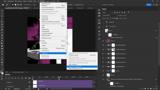
a step-by-step guide on how to make these edits requested by @elyonholic
programs; photoshop
ok ok this is like five tutorials in one so get comfortable. i'm gonna start with the tarot card graphic. create a 540 x 540 black canvas. download this template by @templatepsds. resize to fit your canvas, center it, and change the card number and suit. i used the font butler.
follow the guide in the template and add the photo you want as a clipping mask to the appropriate layer. if you haven't already colored the photo, you can add your adjustment layers as clipping masks on top of it. here's what it should look like;
group these layers and duplicate them twice for a total of three cards. add a black and white gradient map to two of them and change the opacity of the whole group to 80%. keep them behind the colored card and scoot them around to your liking.
go back to the colored card and edit the blending options > drop shadow. i kept the default settings and only changed the angle to 90. here's the final result;
the next one is the circle graphic. create a 540 x 540 black canvas. create a 490 x 490 circle and center it. duplicate this circle and rasterize the layer. you should have two circle layers, one shape and one rasterized. make sure the rasterized layer is on top and hide the shape layer.
create a 100 x 540 rectangle where you'd like the text to be. it should look like this;
add your paper tear textures along the height of the rectangle. you can find a bunch of free ones by searching "paper tear png" or "paper tear transparent".
once you have that aligned, ctrl + click the rectangle layer and delete the section of the rasterized circle. hide or delete the rectangle since we're done with it. here's where we're at;
now for the photo. add the photo you want as a clipping mask to the rasterized circle.
to make these sets more cohesive, i pull a color from the tarot card graphic to use it as a gradient map throughout. in this case it's red. any other adjustment layers can be added as clipping masks on top of the photo. here's what it looks like;
almost done. now we just add the text. again, i used the font butler. once you've got the text, center then duplicate it. keep one solid and edit the blending options > stroke of the duplicated text. i kept the default settings and only changed the size to 1. once you've done that, change the fill to 0% and scoot it down to wherever feels right. make sure it stays behind the solid text layer.
create two lines and center them to the solid text. scoot them so they're not touching the text. rasterize both line layers. ctrl + click the shape circle layer, not the rasterized circle layer! right click + inverse selection and delete the excess lines. here's the final result;
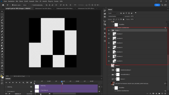
onto the square graphic. create a 540 x 540 black canvas. create a 490 x 490 square.
about a third of the way into your square, align your paper tear. for this one, i edited the blending options > drop shadow. the rest of the settings will depend on how much you want this to cover your text but make sure the angle is 180. it should look something like this;
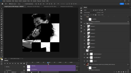
ok ok photos. add the photo you want under your paper tear layer and resize it to fit within two-thirds of the square. ctrl + click the square layer then right click + inverse selection to delete the excess photo. you can add your adjustment layers as clipping masks on top of the photo. here we are;
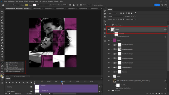
last step is text. once you've got the text, center, and align it with the right side of the square. duplicate the text and edit the blending options > stroke. make sure the fill is 0%. move this so it's closer to the paper tear on the canvas.
duplicate the solid text, not the stroke text! move that once again closer to the paper tear so that it's slightly underneath it. it should look like this;
hide the square layer and, if you're dumb like me, change the text color to something that can actually be read on the black canvas LMAO anyway, here's the final result;
the gif edits are a little more complicated. i'll start with the quote gif. create your gif, crop it to 540 x 300, and color it however you want. i stick to black and white to fit the rest of the set. for gifmaking, i follow this tutorial.
create a 510 x 270 rectangle. set the fill to none and stroke to 2. it should look like this;
add the text and quotation mark. again, i used the font butler. the quotation mark can be made by editing blending options > stroke and changing the fill to 0%. both the text and quotation mark have blending options > drop shadow. i kept the default settings and only changed the angle to 30.
rasterize the rectangle layer. using the rectangular marquee tool, make a box around the text where you need to delete the stroke. make sure to give some space between the stroke and text so they're not running into each other. delete the stroke. here's the final result;

alright i saved the worst for last. ngl this mirror gif has given me multiple headaches. it's not that making it is hard but finding the right kinds of scenes for it actually takes years off my life. anyway, here we go.
create your gif and crop it to 540 x 300. duplicate your gif and edit > transform > flip horizontal.
fair warning this next part will take a lot of trial and error. move the gifs so that they mirror each other. i do this by making one of the gifs 50% opacity and scooting them around the canvas. this looks about right;
now that we've got the placement down we have to blend them. set your gif back to 100% opacity. add a vector mask to whichever gif you have on top. using the brush tool, set the size to 300 and the hardness to 0%. brush until you have something resembling this;

for coloring, i just use gradient maps, one black and white and one red and black to match the rest of the set. here's the same thing with coloring;
and you're p much home free. add the text and center it. surprise, i used butler again lol i edited it to have blending options > drop shadow too. i kept the default settings and only changed the angle to 30. here's the final result;
24 notes
·
View notes
Note
could we get a tutorial of the tinder gifset then? it is soooo good
absolutely! unfortunately tumblr only let's to upload 30 photos per post, so now i'm posting the first gif tutorial since it was the most requested one! pls let me know if anyone wants a tutorial of other gifs <3
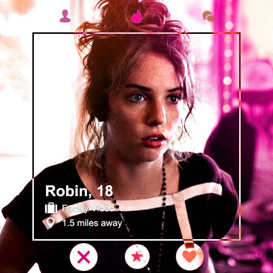
anyways, here's my tinder profile gif tutorial! (can be found here and here)
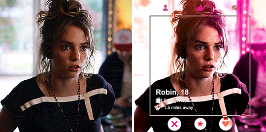
alright, let's start with making the gif. my gif's size is 540x540, after coloring, sharpening, etc. here's what I've got (also let me know if anyone wants a coloring tutorial!):
next, let's make the little square frame inside of it using the rectangular marquee tool:
so, add a new layer and using the tool create a square in the center of the gif. my square's size is 410x410. next up, left click > stroke :
and adjust the settings to your liking. here are mine:
(btw don't worry if it's not perfectly in the center, you can adjust that by pressing ctrl + a while you have selected the layer, then clicking layer on the top of the screen in the menu > align layers to selection > vertical centers and then horizontal centers)
next up, duplicate this layer! right click on the layer > duplicate layer:
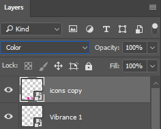
now you should have two layers. for the bottom one, set it to difference setting:
for the top one, right click > blending options > gradient overlay
my settings were something like this, but you can play around until you're happy with how it looks:
now you should have something like this:
now the fun part! right click on that top layer that has the gradient overlay on > convert to smart object
and set the layer to color:

and there we go, we have a sexy gradient border/ frame/ whatever it is!!
next up, adding the text and little icons. so, I used this template for all of that, highly recommend it! all I did was play around with the text, I think I just used arial font and placed the job and location icons next to the text. then I placed the swiping icons onto my gif and centered them, so it here's what I've got now:
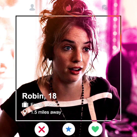
I think it's looking really cute but I wanted the icons to match the whole color scheme, so we're gonna do the same what we did with the frame to make it gradient.
so what we're gonna do first is convert these 2 layers to a smart object to make things easier for us. select both layers > right click > convert to smart object:
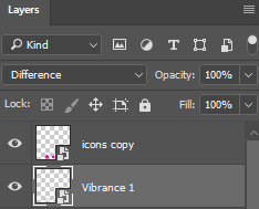
now that we just have to deal with one layer, let's duplicate it (also renamed it to icons, so it's less confusing). right click > duplicate layer. we'll make one layer black and white, because it has some green, blue and red colors and we don't want that if we're sticking to our specific color scheme:
below the layers click on the little circle in the middle:
and select vibrance (you can also do this with black white, but since it's just simple little icons we need to make b&w, it's a little bit quicker):
my settings were these:
now let's select our bottom icons layer and the vibrance layer, right click > convert to smart object:
our icons are b&w now! now let's work with our top layer. select it > right click > blending options > gradient overlay
it's basically just like what we did with the border/ frame thingy, adjust the gradient settings to your liking, click okay and then once again right click on the top layer > convert to smart object > make sure the setting is color:
and now make sure the bottom layer's setting is difference:
and guess what?? we're done with our first gif wooooo!!
as I've mentioned in the beginning, tumblr lets to upload 30 photos per post, so I cannot include tutorials for all 4 gifs, but let me know if you'd like one with some other gif and I can totally do that. I'm pretty bad at explaining stuff, so please let me know if you have any questions!! hope this was helpful and have fun making gifs!! <3
13 notes
·
View notes
Note
Hi, I love your blog and your edits. I was wondering if you could do a tutorial on how you combine multiple gifs into one in the first gif of yours MIKELOGAN’s 5K FOLLOWER CELEBRATION || GET TO KNOW ME MEMEFAVORITE ACTORS [2/10]Colin Firth (September 10, 1960) set? Thank you for reading this and helping me.
thank you so much, that's so kind!! this is the post in question (which was inspired by this gorgeous set) and i'll break down how to do it step by step below the cut!
i ended up saving this gif as a psd because i remember it taking me so long and being really frustrating, i just wasn't sure why. for reference, i posted that set back in september, just over four months ago. looking at the psd, i can see just how far i've grown as a gifmaker bc that thing is a hot mess. i made it about 3x more complicated than it needed to be, so let's do this the right way lol
note: i was still using 0.07 frame rate at this point. i have since switched to 0.05 for smoother, quicker gifs.
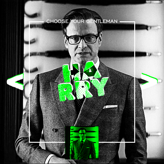
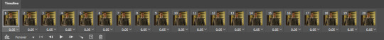
what we're going to do is create all of these gifs separately and put them together at the end. in total, there are 6 individual gifs. let's start with harry.
i gif by importing video frames to layers, but if you prefer to screencap, load those in instead. because this ends up being a pretty large gif, both in size and length, i kept it to 20 frames per clip.
once you're satisfied with the frames you've chosen, crop your canvas to 540px x 540px. this is what i'm left with
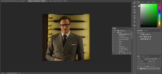
this is when i sharpen my gifs. everyone's process is a little different. i created my own sharpening action, which converts my frames to video timeline and then sharpens.
the next step is to color your gif. if you're going for the overall look in mine, here were my layers:
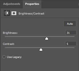
a brightness/contrast layer with brightness set to 31 and contrast to 5. this will depend on the scene you're working with

a levels layer using the black and white eyedroppers. the top one is your black eyedropper. to use it, click it and select the blackest part of your gif. do the same with the white eyedropper and select the lightest part of your gif. you may need to play around with selecting different points depending on your scene and the original coloring
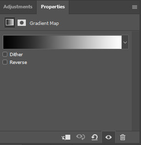
finally, a simple black & white gradient map layer on top
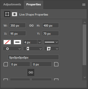
now we're going to add the thin rectangular border in the middle of the gif. i use the rectangle shape tool for this (press U on your keyboard) and these are my settings (x and y coordinates don't matter):

to center it perfectly, i use ctrl+T and drag it until it snaps into place with both the vertical and horizontal guides.
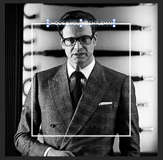
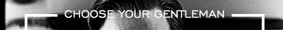
next, let's add the "choose your gentleman" text that goes at the top of the border. here is the font i chose and its settings:

once again, press ctrl+t and drag this to the vertical center of your gif and to the center of the top of the border. you should feel and see it snap into place. this is what we have now:
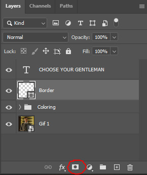
now, we're going to use a layer mask on the border so we can read the text. select the rectangle layer and click the layer mask button
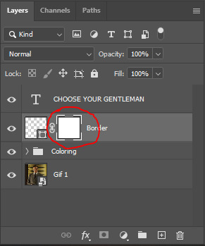
with the layer mask selected (as shown in the second image), use the rectangular marquee tool (M on your keyboard) to draw a rectangle around your text, taking care to keep it just a little larger
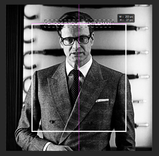
as you can see, you'll know when you're perfectly centered through your text layer and vertically on the entire canvas. select your brush tool without deselecting this rectangle (B on your keyboard) and paint the selection with a black brush. this masks that part of the border!

let's add the small square gif that goes at the bottom of the border now. i think the easiest way of doing this is to use the rectangular shape tool (U) again. the size of this gif is 110x110, so create a black square of that size with no stroke. Use ctrl+T to drag it to the center of the bottom of the border (the x and y coordinates don't matter):
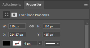
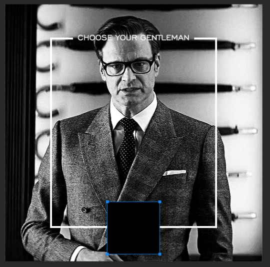
now duplicate your original gif layer (ctrl+J) and drag it to the top of the layer panel. right click on it and create clipping mask. this will make it so the gif only appears within the confines of the square we just created. resize your gif by using ctrl+T and, making sure the proportions are locked, drag the corners to the edges of the square.
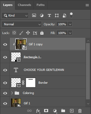
this gif is not colored at all as we only duplicated the gif itself and not the coloring layers. i duplicated those as well and dragged them on top of our small gif, but it's important to make sure those are using the clipping mask as well. you can click this on the properties layer of each adjustment layer to make sure they do.
you'll know you've been successful when you see the small arrow next to each of your coloring layers. this keeps them from affecting the coloring of the larger, main gif.
we're going to change the gradient map adjustment layer from black & white to black & lime green (or the color of your choosing). click on that layer and then on the map. this will bring up the gradient editor. click on the small white color stop at the far right end of the gradient and then on the color picker, choose a new color.

the hex code i used for the lime green is #00ff0c
our last steps are the angle brackets on either side of the gif and harry's name in the center. here are the settings i used for those (angle brackets on the left and harry on the right):
the layer styles for harry's name (double click on the text layer to call up this menu OR right click > blending options):
and for the angle brackets:
by now, you know how to utilize ctrl+T to move these layers where you'd like them. harry's name is centered horizontally and vertically and rotated at a bit of an angle and the angle brackets are centered horizontally and i just eyeballed where to put them in relation to the space between the border and the edge of the gif.
this is the complete first gif. what i would do for your own sanity since you have two more of these two create is 1) save it as a psd just in case something crashes and 2) don't convert it to a smart object until you have all 3 gifs completed and are ready to put them together.
the nice part about having the first one done is you've ultimately done the hard part. create your two other gifs, but you'll be using at least roughly the same coloring and all the same text, just with the colors adjusted, so you can drag those layers from your completed first gif to your others as you work on them.
once you have all 3 gifs completed and still on 3 separate canvases (and saved as psds bc this is adobe friggin photoshop and shit breaks all the time), convert all layers on all the gifs to smart objects. this will simplify the final gif and make things much easier.
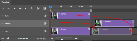
then, bring gif #2 and gif #3 both onto gif #1's canvas. this is what it will look like at first on the timeline and in your layer panel:
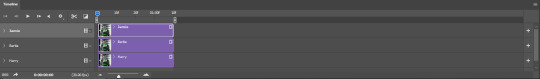
(full disclosure, i'm not making the other two lmao, i'm lazy and i already did it once in a way harder way 😂)
to get the gifs to play after one another rather than simultaneously, you just have to drag them after one another on the timeline!
a little bit hard to show the actual process, but you're just clicking the bertie layer and dragging it down to harry's line after the harry layer. then do the same with the jamie layer, dragging it down to the harry layer after bertie. when you're done, it should look like this:
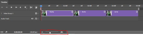
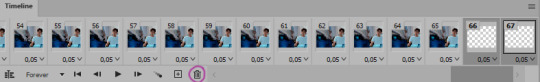
btw, the little slider i circled is what enlarges or shrinks the timeline view, so if you need to see something broken down a bit more/slower, drag it to the right. if you need to zoom out, drag it to the left.
and that's it! export and save your gif!
if you have any questions or anything is at all unclear about this, please let me know! i'm happy to help!
#answered#Anonymous#gif tutorial#my tutorials#gifmakerresource#completeresources#dailyresources#LISTEN. the way i did this 4 months ago was SO FUCKED#i made it SO SO much harder than it needed to be#you know what that is? growth.
94 notes
·
View notes
Last Seen Blogs

diokuda
Damiancho

essaybay-usa-blog
Untitled
studyblrspace
studyblrspace

lykkehl
lykke
the-rpverse
The world of Gloomverse