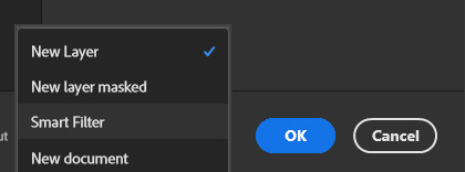
#*ps help
Text

FALLING LETTERS ANIMATION tutorial
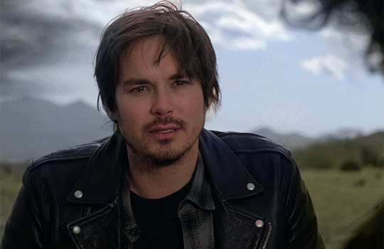
hello! @kimmomi asked for a tutorial on how i made the letters "fall" in this gifset and so i figured i would make it and post here! this effect isn't hard to achieve but it might get a little tedious if you have a lot of letters.
note: you will need photoshop with a timeline!
STEP ONE: create your base gif! be mindful of number of frames in your gif. the number of frames doesn't really matter here, altho the longer the gif the better the effect. i'd say try to limit it to 60-70 frames, depending on how big your final gif will be.
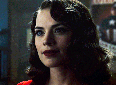
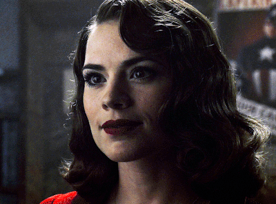
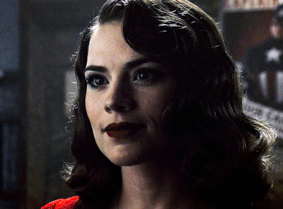
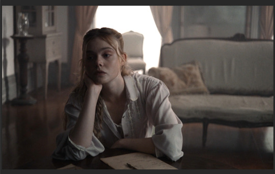
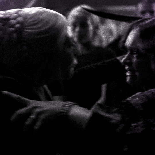
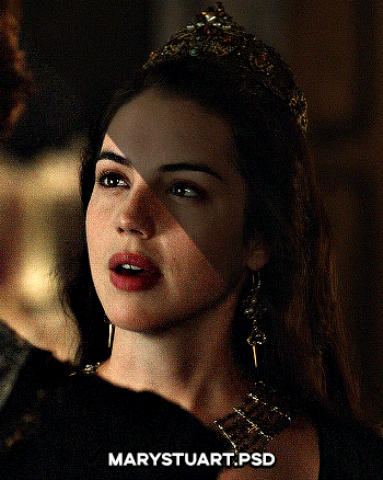
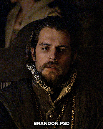
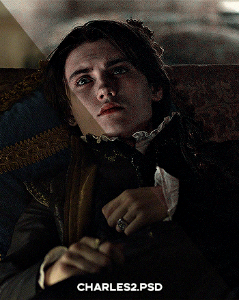
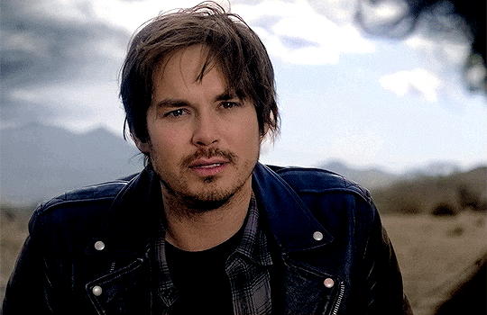
STEP TWO: make your text the way you want it to look. this effect is basically the last step of your gif making process. (i will be using the typography from my set as an example as i already have that psd saved)
this is what my typography looks like now.

STEP THREE: i would recommend that the word at the bottom be the word that "falls". for me that is forever.
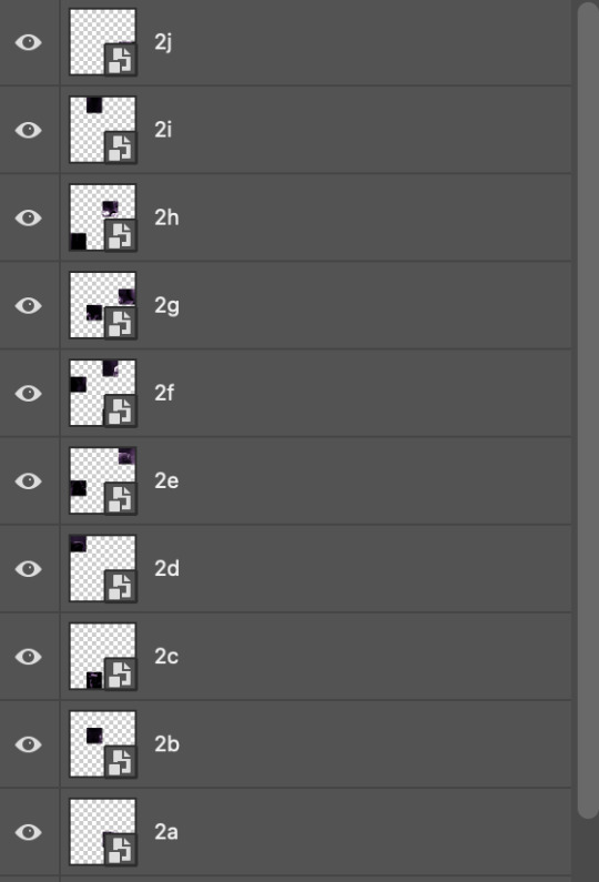
now, you will have to duplicate the "forever" layer and make your non-copy forever invisible.
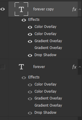
what you will want to do now is delete all the letters but the first one in the duplicated layer. for me that is f. then you just duplicate the f layer and write your second letter instead of it, in my case o. you will have to do this for all letters. also as you do that make sure to move them a bit away from each other.

now, what helps to align those letters where they start off, is making your non-copy layer to be visible again.

after you've aligned your letters, make the non-copy layer invisible again.
STEP FOUR: so now we come to a bit of a tedious part.
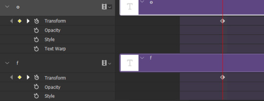
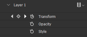
what you will do now is move the playhead (blue timeline arrow) a bit further from the beginning of the gif (this allows for the text to stay still a bit before it starts "falling") and click on the first letter.
next step is to click on the little arrow next to your letter and clicking on the stopwatch next to Transform.

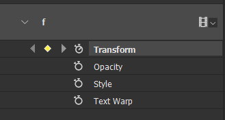
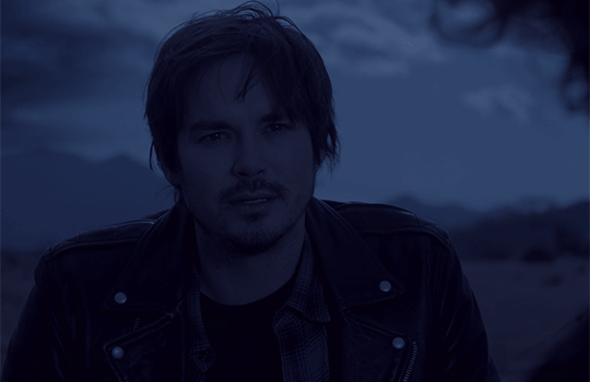
then, you will take the playhead and drag it to the end of the gif where you will start with transforming your letter with Free Transform tool (shortcut ctrl+T on windows). and what you will do is, while in Free Transform mode, drag your letter to the bottom of your gif while also rotating it a bit. when you're happy with your placement of the letter, hit enter. see below gif for how i did it.

you will have to do this for every letter, but make sure to rotate some in the other direction. also make sure that the beginning of the stopwatch mark is the same for every letter.
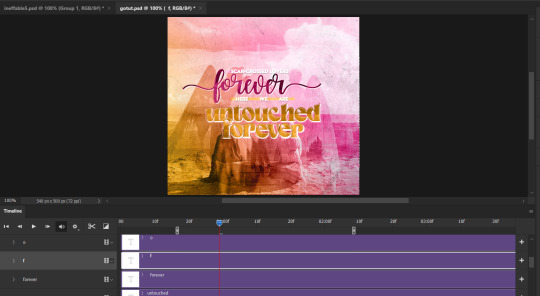
and that is basically it! after you transform every letter, you can go and save your gif.
this is my final result:

for some extra dramatic look, you can duplicate your initial layer with the whole word on it, drag it above all layers, clear layer style and add a stroke and make sure its FIll is at 0% where you will get the outline text that stays behind.

i hope this was helpful and understandable. if you have any questions, feel free to send me an ask or dm me <33
#usergif#completeresources#allresources#gif tutorial#ps help#userkimchi#uservivaldi#userraffa#tusermona#userelio#usercats#tuserheidi#usershreyu#userhallie#userroza#userdean#userisaiah#thingschanged#tusercasey#usertj#userwwz
519 notes
·
View notes
Text

COLORING + SHARPENING TUTORIAL
someone asked for a coloring tutorial and my sharpening settings, so here it is! there are also a few tips to achieve more HQ gifs. :)
tutorial under the cut!
FOR HIGH-QUALITY GIFS
FILE SIZES
it doesn’t matter what your sharpening settings are if the file you’re using to gif is too low quality, so i tend to look for the best that i can get when downloading stuff.
usually, movies (+2h) look better if they’re 5GB or more, while an episode (40 min/1h) can look good with even 1GB. the minimum definition i try to find is 1080p, but i gif with 2160p (4k) when available. unfortunately, not every computer can handle 4k, but don’t worry, you can gif with 1080p files just fine if they are big enough. contrary to popular belief, size does matter! which means sometimes a bigger 1080p file is better than a smaller 2160p one, for example.
SCREENCAPPING METHOD
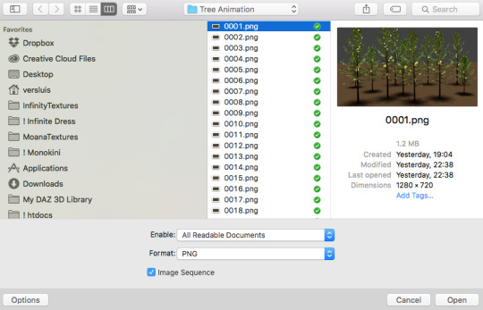
this can too influence the quality of your gifs. as a gifmaker, i’ve tried it all: video frames to layers, directly opening video clips, loading files into stack, and i’ve finally settled down with opening screencaps as an image sequence. with bigger files, it doesn’t matter much what technique you use, but i’ve noticed with smaller files you can do wonders if you screencap (either by loading files into stack or opening as an image sequence) instead of using video clips. for example, this gif’s original video file was only 4GB (so smaller than i’ve usually go for), if you can believe it!
here’s a tutorial for setting up and screencapping with MPV, the media player i use to screencap. again, you can keep using video clips for bigger files, but you’ll find this useful when dealing with dire causes. i don't file loads into stack, though, like the video does. i open as an image sequence (open > screencap folder > select any image > click the image sequence button). just select OK for the speed. this will open your screencaps as a video clip (blue bar) in timeline mode (i'm a timeline gifmaker, i don't know about you). you will need this action pack to convert the clip into frames if you're a frames gifmaker. i suggest you convert them into frames even if you're a timeline gifmaker, just convert them into a timeline again at the end. that way you can delete the screencaps right away, otherwise you will delete the screencaps and get a static image as a "gif".
ATTENTION if you’re a Mac Sonoma user, MPV won’t be an option for you unless you downgrade your system. that is, if you have an Intel chip. if you have M1 Max chip (or even a better one), here’s a fix for MPV you can try while keeping that MacOS, because nowadays MPV is skipping frames in its latest build. or you can use MPlayer instead for less hassle. here are two tutorials for setting and using MPlayer. Windows users are fine, you can use MPV without trouble.
FOR EVEN MORE QUALITY
ADD NOISE
here’s a tutorial for adding noise as a way to achieve more HQ gifs if your original material is too low quality.
REDUCE NOISE WITH CAMERA RAW
instead of adding noise, you can reduce it, especially if your gif is very noisy as it is.
the path is filter > camera raw > detail > nose reduction. i do this before sharpening, but only my video file isn't great to begin with. because it’s a smart filter, you can reduce or increase its opacity by clicking the bars next to its name in the layers panel.
TOPAZ AI
i use Topaz Photo AI to increase the quality of my screencaps when i need to. it’s paid software, but there are… ways to find it for free, usually on t0rrent websites. if someone’s interested, i can make a tutorial solely about it in the future.
SHARPENING SETTINGS
here are my sharpening settings (filter > sharpen > smart sharpen). i sharpen things twice: 500% 0.4px + 10% 10px. here's an action for it, for more convenience. here's a tutorial on how to use Photoshop actions. for animated stuff, i use this action pack.

COLORING
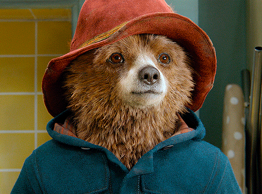
here’s the gif i'm gonna use as a base. it’s already sharpened like the way i always do it.

LIGHTNING THE SHOTS
half of the secret of a good coloring is good lightning. i always useCurves (layers > new adjustment layer > curves) and Brightness & Contrast (layers > new adjustment layer > brightness & contrast). the settings depend on the scene you’re giffing, but i always try make my gifs bright and with high contrast to make the colors pop.
CURVES
besides lighting your scene, the Curves adjustment layer has four automatic options that will color-correct it for you. it’s not always perfect and it doesn’t mean you won’t need to do further coloring, but it’s a great start. it’s a lifesaver for most ridiculously yellow scenes. look at the difference! this gif uses the 3rd automatic option (the screenshot below isn't mine btw so that's why the fourth option is the chosen one), from top to bottom. what automatic option you need to choose depends on the gif.

sometimes i like to tweak my Curves layer. not everybody does that, it’s not that necessary and if you’re not careful, it can screw your gif up. to modify your layer by hand, you will need to click and drag points of that straight line in the position you desire. this is the concept behind it:

basically, the lower part of the line handles the shadows, while the upper part handles the highlights of the image. if you pull a highlight point up, the image’s highlights will be brighter. if you pull it down, it will make them darker. same thing for the shadow points. you should play with it to get a grasp of it, that’s what i did when i first started giffing.
BRIGHTNESS & CONTRAST
then i added a bit of brightness and contrast.

CHANNEL MIXER
the scene looked a bit too yellow, so i used the Channel Mixer (layer > new adjustment layer > channel mixer) adjustment layer. here’s a tutorial of how it works. not every scene needs the Channel Mixer layer though, i mostly use it to remove heavy overall tints. in this particular case, the Curves layer got rid of most of the yellow, but i wanted the gif to be just a bit more blue so the Channel Mixer tweaks are very minimal.

SELECTIVE COLOR
now, this adjustment layer i always use: Selective Color (layer > new adjustment layer > selective color). this is THE adjustment layer to me, alongside the Curves one. this is how it works:

ie, you can separately edit a color this way, giving it tints. for this gif, i wanted to make the colors more vibrant. to achieve that, i edited the selected colors this way:
for the reds, i added even more red in them by moving the first slider to the right, making the color more vibrant. for his hat to have a more warm tint, i added yellow to the reds (third slider, moving it to the right). finally, to make the reds stronger, i moved the last slider to the right (more black).
for the yellows, i made them brighter by adding white to them, thus making the tile wall and Paddington more bright as well.
for the cyans and the blues, i just added the maximum (+100) of black that i could.
i wanted for Paddington's nose to be brighter, so i added more white to the whites.
lastly, i added depth to the blacks by increasing their own blackness.
you should always play with the Selective Colors sliders for a bit, before deciding what you want or need. with time, you will automatically know what to change to correct the color grading. it all takes practice!
HUE/SATURATION
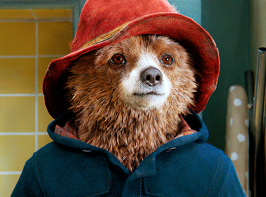
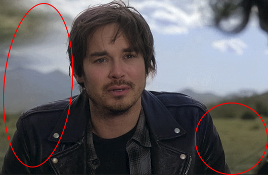
i don’t know if you noticed, but there are some green spots on the blue wall behind Paddington. to correct that, i added a Hue/Saturation adjustment layer (layer > new adjustment layer > hue/saturation) and made the saturation of the greens 0%, making that unwanted green disappear from the background.

while the green spots on the wall are specific for this gif, i use hue/saturation a lot to tweak, well, hue and saturation. sometimes someone’s skin is too yellow, i made it redder by tweaking the reds and the yellows, or vice-versa. the hue bar follows the rainbow bar, so the maximum settings (+100 and -100) give the selected color to change its hue to something more red or pink (the rainbow extremities). changing hue can give pretty whacky results, like turning someone’s skin tone to green, so you will need to play with it to get the hang of it. you can also tweak the opacity of your hue/saturation layer to further improve your gif’s coloring. i didn’t do it in this case, the opacity is still 100%. the reds and the blues had their saturation increased to make them pop just a bit more, without affecting the other colors.
COLOR BALANCE
the highlights of the gif still had a green tint to it due to the automatic correction of the Curves layer, so i used Color Balance. this is how it works: instead of giving specific colors some tints, you can give them to the shadows, highlights, and mid-tones. if your shadows are too blue, you counterbalance them with the opposite color, yellow. same thing with the cyan-red and magenta-green pairings. in my case, i added a bit of magenta.


B&W GRADIENT MAP
now, if this gif was a dish, it’s time for the salt and pepper. i always add a Gradient Map (layer > new adjustment layer > gradient map) (black to white gradient) with the Soft Light blending mode, thus giving my shadows more depth without messing with the mid-tones and highlights. it also doesn’t “deep fry” (you know those memes?) the gif too much by adding even more contrast. usually, the opacity of the layer is between 30% to 70%, it all depends on the gif. it always does wonders, though!
COLOR FILTER
finally, i like to add Color Filters (layer > new adjustment layer > color filter) to my gifs. it’s very handy when giving different scenes for the same minimalistic set because it makes them kind of match despite having completely different colors. in this gif’s case, i added a “deep blue” filter, opacity 50% density 25. you can change the density and the opacity of the layer for further editing, again, it all depends on the gif.

VIBRANCE
if i feel like it, i add a vibrance layer (layer > new adjustment layer > vibrance) to make the colors pop. this can ruin your coloring sometimes, especially when regarding skin color, so be careful. i didn't do it in this gif because i felt i didn't need it.
TA-DA! 🥳
AN OTHER EXAMPLE
the color grading of the original scene it’s pretty good as it is, to be honest. let’s see a worse scenario, a VERY yellow one:
no channel mixer this time because the automatic curves option dealt with the yellowness, but you can see it made the gif too green. i needed to correct that with the following adjustment layers:
curves (automatic option) (gif 2) >> same curves layer (tweaks) (gif 3) >> brightness & contrast (gif 4) >> hue/saturation (tweaked cyan+blue+green) >> selective color >> color balance (gif 5) >> b&w gradient map >> (sepia) filter >> vibrance (gif 6)
i added a hue/saturation layer to remove the blues & greens before my selective color layer because i thought that was more urgent than tweaking the tint of all colors. color balance (gif 4) was the real hero here, though, by removing the green tint. the selective color layer was meant to make the red pop more than anything else, because the rest looked pretty good, especially her skin tone (despite the green tint). you can notice that tweaking the curves layer (small gif 3) also helped A LOT with the green problem.
tl;dr 😵💫😵💫😵💫
here's a list of my go-to's while coloring and lightning gifs. it's not a rule, just a guide. there are gifs in which i don't use all these adjustment layers, or use them in a different order. it all depends!
1. curves (automatic option + tweaks)
2. brightness & contrast
3. channel mixer
4. selective color
5. hue/saturation
6. color balance
7. b&w gradient map
8. color filter
9. vibrance
i'll suggest that you study each adjustment layer listed for more info, either with other Tumblr tutorials or YouTube ones. the YouTube ones focus on images, but you can translate what they teach to gif making very easily. you can ask me to further explain any adjustment layer, too! i was brief to keep this short (which i kinda failed lol).
feel free to ask me for clarification or something else about gifmaking wise, i always like to help. ❤️
#*#*tutorial#gifmaker tag#resources#resource: tutorials#ps help#uservivaldi#tuserjen#userrin#userelio#useralien#userzaynab#userchibi#userbuckleys#usertj#userbess#tuserlucie#useraljoscha#userdavid#usershreyu#usernolan#userhallie#userisaiah#tusergio#tusergeo#userjesslynn
315 notes
·
View notes
Note
Hii! Sorry to bother you, but I just saw your post about that one GoT scene with "camera raw filter" and *have* to ask...what is that?! That looks insanely good. I tried doing a quick google search, and it seems like it's a Photoshop pluggin, maybe? I'm not too sure... Would you mind sharing a bit more about it, pretty please?
the post anon is referring to:
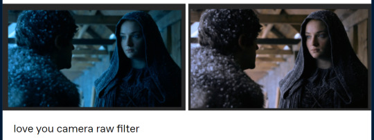
this is by no means an adequate guide or even a comprehensible explanation, but i hope it helps out somewhat.
you are correct, camera raw filter is a photoshop plugin. you can download it from here (works with 🏴☠️d/portable versions too): the installation is pretty straight forward, just do it as you would with any program.
before you do anything, make sure your screencaps are a smart object (it will obviously be faster if you add a camera raw filter after you've resized and added whatever it is you need to add, but you can always just do it with the original sized screencaps). it's easier to edit the properties from a smart object than to go back and try to get it right again from scratch.
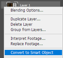
you will find it under filter > camera raw filter… this will bring up a new window:

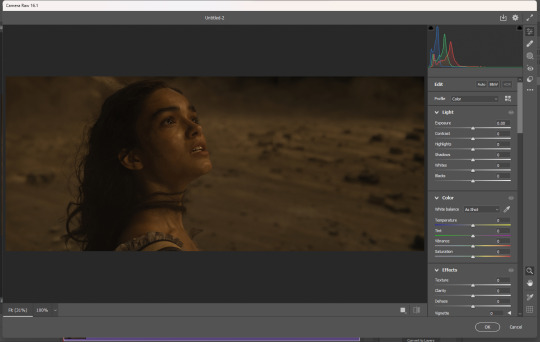
you can add as many of them as you need to. if you want to edit it because you think you've made it too bright or too blue or something, just double click on camera raw filter under your smart object:

if you're editing one scene and you would like for everything to look uniform, you can also just bring over your settings because they're smart objects:

okay enough yapping, back to what you came here for. let's go through all that i use/have used and how they work. you can mix and match them however you want - what works for one scene might not work for another.
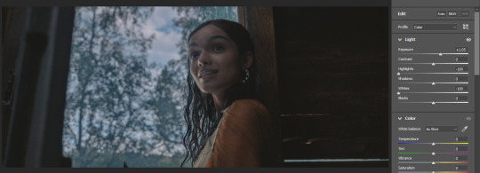
the 'Light' section you can use to fix the light of the scene but i basically only use it if i want to "strengthen"/darken the whites and highlights. if your files are too dark or lack contrast, you can fix that here.


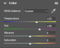
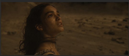
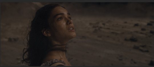
the 'Color' section!!! chef's kiss. this is what i used for the Sansa screencap. first you need to think about whether your screencap is too yellow or too blue, and then slide it towards the opposite direction. after i did that, it was way too green, so i used the tint feature to help out with that.


if you have handled today's media, you know that they haaaate color. so still in 'Color', in vibrance/saturation (i have never worked out the difference and atp i don't really care asdfghjkl) you can adjust that as well but it's for all the colors of the rainbow. you can enhance colors better in 'Caliberation' (see below).

i don't really use 'Effects', but the Vignette feature is a lifesaver if you encounter those. an example:
i have never touched 'Curve' but i image it works just like curves.
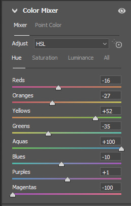
'Color Mixer' is good to manipulate colors. it's basically hue/saturation but lowkey better. if you switch to 'Color' in Adjust, you can edit them more accurately (Capcut has a feature similar to this i think).
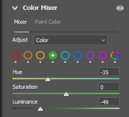
ngl i don't have a good example of this now so enjoy this cartoonish something:

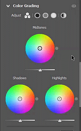
and we have arrived at my favorite!!! with 'Color Grading', you can fix almost anything: Midtones, Shadows and Highlights. it's basically a color wheel and you can try to find the black midtone and white points that will neutralize your screencaps. you can be more accurate with them if you click the circles in Adjust. basically a more freestyle curves i think.
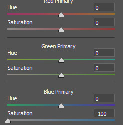
lastly, 'Calibration'. you can also enhance or diminish colors here based on whether they belong in the red, green or blue primary. eg if you have a scene that's way too yellow, you can try and bring down the saturation in Blue Primary and it will help tremendously.


if you have any further questions, feel free to send me another ask!
370 notes
·
View notes
Text
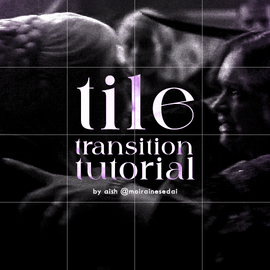
TILE TRANSITION TUTORIAL
a couple of people have asked me for a tutorial on how I did the penultimate gif in this set, so here goes! this is my first tutorial, so please feel free to reach out with further questions if anything's unclear.
note: this tutorial assumes you know the basics of gifmaking, can create the base gifs, and are familiar with timeline mode.
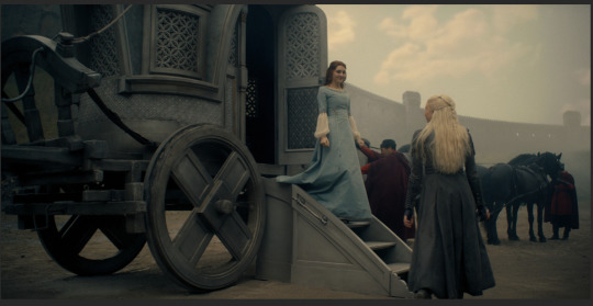
STEP ONE: create the base gifs! I'd recommend staying between 25-40 frames for each gif, since the transitions we'll use later tend to increase gif sizes. these are the ones I'll be using for this tutorial:


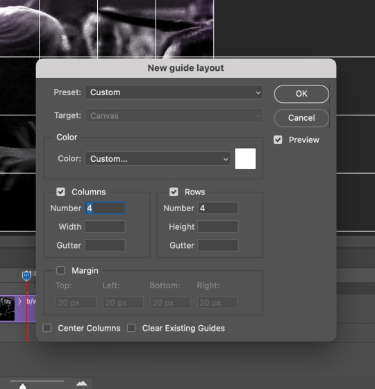
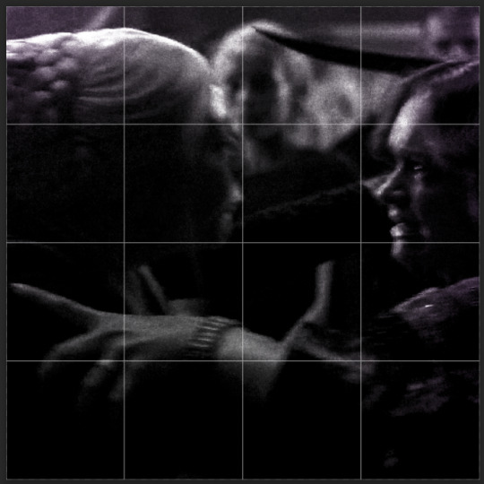
STEP TWO: create the guide layouts for both base gifs. for this panel, I chose a 4x4 grid — I would recommend keeping the number of "tiles" low because it can get tedious, but have a minimum of 9 (3x3 grid).

now your canvas should look like this:
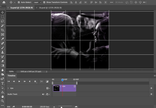
STEP THREE: create the tiles. this is where the going gets rough; there might be easier ways to do this that I couldn't think of 😭 if there are any please send me an ask!
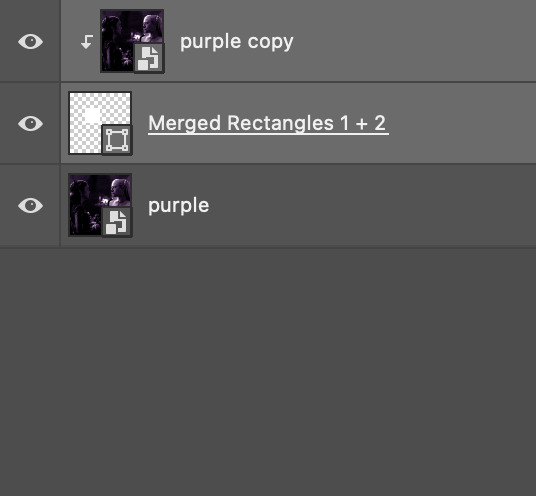
essentially, in this step we'll cut up the base gifs into smaller squares so that each tile can be manipulated separately when we put both gifs together. to do this, first create a square using the rectangle tool and the guides. then duplicate the base gif, move it above the square, apply a clipping mask, and then convert the clipped gif and square (selected in the image below) into one smart object.
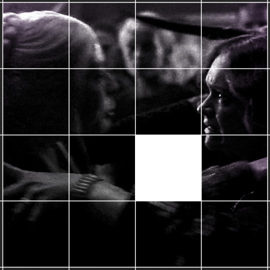

ALTERNATELY: you could duplicate the original base gif and use layer masks to isolate tiles. create a layer mask for the duplicated gif layer and, with the layer mask selected, drag your mouse over a square (using the guide layout) and press delete. then press ctrl/cmd + i to invert the layer mask so that the gif only shows in the square of your choosing.
now repeat until you've got the entire gif in tiles, and do the same for the other gif!
since the transition effect is achieved by staggering the crossfades for each tile of the final gif, you can cheat by having multiple tiles "flip" at a time, ideally no more than four. this means you need to cut the base gif up into fewer pieces. to do this, simply draw multiple squares instead of one and then merge the shapes, before duplicating and clipping the gif onto them.
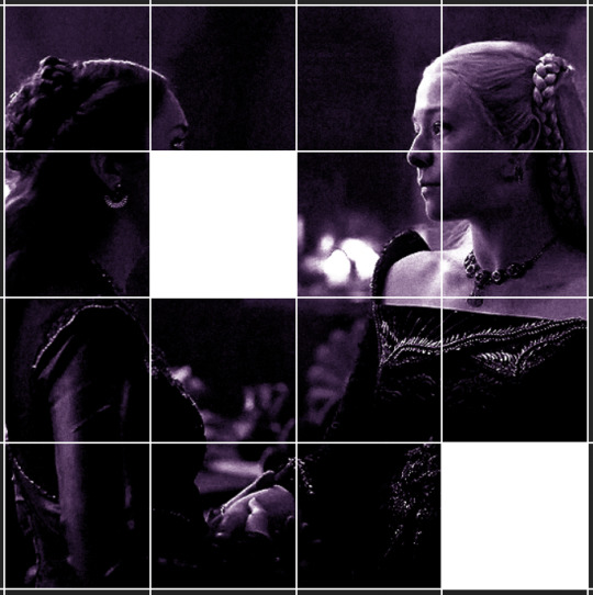
if you do this, it's essential to remember that you have to divide both gifs up in the exact same way. each piece of the b/w gif has to correspond to a piece of the purple gif!
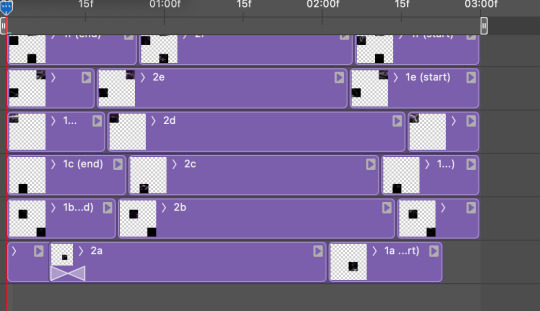
this is what the layers look like for each gif once I'm done:

I have them lettered so that it'll be easier to match them up in the next step.
STEP FOUR: this is the complicated bit that took me two days to figure out. I'll do my best to explain but don't hesitate to reach out if something isn't clear!
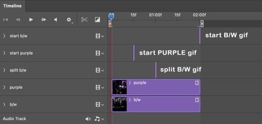
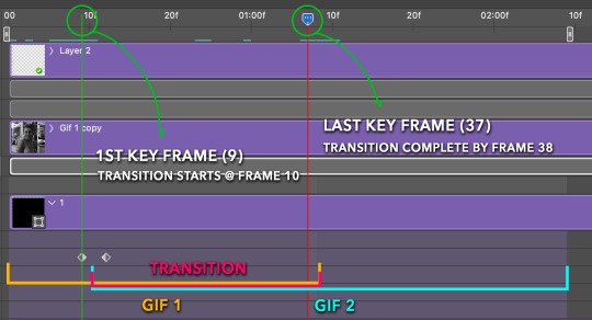
to begin, open up a new psd and import both base gifs into it. (remember to click "create video timeline" and ensure that your gifs are all in order before proceeding.)
now, the trickiest part about this transition is ensuring that all the little tiles sync up so that the larger gif is coherent. so first we'll create some markers (just empty layers) to ensure that everything lines up as it should.
— marker 1: at about halfway through the first gif (b/w in this case)
— marker 2: at about a quarter of the gif length
— marker 3: close to the end of the gifs
at this point we're ready to start bringing in the tiles. I'm going to delete the base gifs from this new psd just to keep things cleaner!
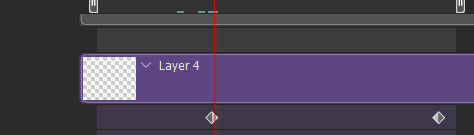
first thing to do is import my b/w tile. move the timeline slider over to marker 1 and split the first gif. (if it helps, rename the split gifs and add (start) and (end) to the two halves.) then, move the (end) half to the beginning of the timeline, and the (start) half to line up with marker 3.
the purple tile is easier to manage. simply import it into the psd and line it up with marker 2.
your timeline should now look like this:
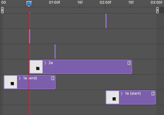
notice the overlap between the gifs at their beginnings and ends — this is where you'll be able to cascade the tiles flipping, so it helps to have a significant amount of overlap.
crop the three gifs for this tile as you see fit! since this is the first tile I want to flip from b/w to purple, I'll crop gif 1a (end) all the way to the current position of the timeline slider (red line with blue tip) and leave the beginning of gif 2a uncropped. for the flip from purple to b/w, I'll crop both gifs a bit.
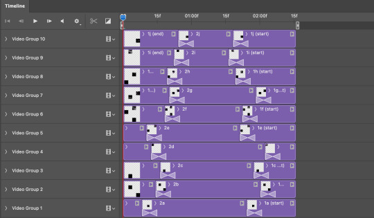
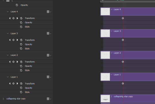
once that's done, drag all three gifs onto the same level in timeline so they form a video group. your timeline should look something like this:

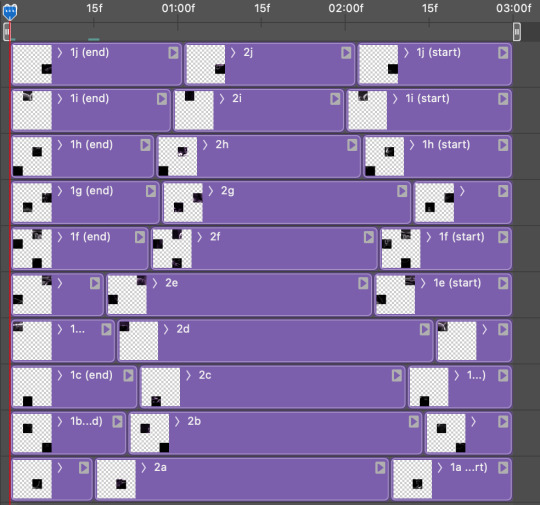
now you just repeat the process for all the other tiles! as long as you made sure that all the tiles in one gif correspond with tiles in the other gif in step three, this should be a fairly painless process. make sure to crop the starts/ends of the gifs separately so that they don't all flip together.
this is what my layers look once I've done all the tiles:
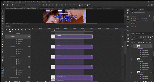
and the gif!
STEP FIVE: transitions! click on the half-white square (top right of the left column in the timeline, beside the scissors) and select the crossfade transition, then drag it between two gifs in a video group. it should create a two-triangle symbol and shorten the overall length of the video group.

apply the transition to all the tile flips, ensuring that the duration of all transitions is constant. this can sometimes be tricky because ps likes to change the duration of each transition, so right click on the transition symbol and manually change all your transition durations to be the same.
your layers should now look something like this:
STEP SIX: draw the grid. bring back the guide layout from step two and using the line tool (I like 2px thickness), trace the grid. adjust opacity as you see fit (50-80% is usually a good idea), so that the canvas looks like this:
STEP SEVEN: export and celebrate! you're done!
I hope this tutorial made sense and was easy to follow, and happy giffing! my inbox is always open for any questions <3
#tutorial#ps help#ps tutorial#userace#alielook#userabs#usercats#userhella#userfaiths#tuserabbie#usershreyu#usertreena#tuserlucie#uservivaldi#usertj#usergiu#userroza
611 notes
·
View notes
Text
Someone asked me how I created the fade transition in this gifset which I’ll try to explain in the most comprehensive way that I can. If you've never done something like this before, I suggest reading through the full tutorial before attempting it so you know what you'll need to plan for.
To follow, you should have:
basic knowledge of how to make gifs in photoshop
some familiarity with the concept of how keyframes work
patience
Difficulty level: Moderate/advanced
Prep + overview
First and foremost, make the two gifs you'll be using. Both will need to have about the same amount of frames.
For ref the gif in my example is 540x540.
I recommend around 60-70 frames max total for a big gif, which can be pushing it if both are in color, then I would aim for 50-60. My gif has a total of 74 frames which I finessed using lossy and this will be explained in Part 4.
⚠️ IMPORTANT: when overlaying two or more gifs and when using key frames, you MUST set your frame delay to 0.03 fps for each gif, which can be changed to 0.05 fps or anything else that you want after converting the combined canvas back into frames. But both gifs have to be set to 0.03 before you convert them to timeline to avoid duplicated frames that don't match up, resulting in an unpleasantly choppy finish.
Part 1: Getting Started
Drag one of your gifs onto the other so they're both on the same canvas.
The gif that your canvas is fading FROM (Gif 1) should be on top of the gif it is fading INTO (Gif 2).
And here's a visual of the order in which your layers should appear by the end of this tutorial, so you know what you're working toward achieving:

Part 2: Creating the grid
Go to: View > Guides > New guide layout
I chose 5 columns and 5 rows to get the result of 25 squares.
The more rows and columns you choose, the more work you'll have to do, and the faster your squares will have to fade out so keep that in mind. I wouldn't recommend any more than 25 squares for this type of transition.

To save time, duplicate the line you've created 3 more times, or as many times as needed (key shortcut: CMD +J) and move each one to align with the guides both horizontally and vertically. You won't need to recreate the lines on the edges of the canvas, only the ones that will show.
After you complete this step, you will no longer need the guides so you can go back in and clear them.

Follow the same duplicating process for the squares with the rectangle tool using the lines you've created.
Align the squares inside the grid lines. The squares should not overlap the lines but fit precisely inside them.
This might take a few tries for each because although to the eye, the squares look all exactly the same size, you'll notice that if you try to use the same duplicated square for every single one without alterations, many of them will be a few pixels off and you'll have to transform the paths to fit.
To do this go to edit > transform path and hold down the command key with the control key as you move one edge to fill the space.
Once you're done, put all the squares in their separate group, which needs to be sandwiched between Gif 1 and Gif 2.

Right click Gif 1 and choose "create clipping mask" from the drop down to mask it to the squares group. This step is super important.
After this point, I also took the opacity of the line groups down to about 40% so the lines wouldn't be so bold. Doing this revealed some squares that needed fixing so even if you aren't going dim the lines, I recommend clicking off the visibility of the lines for a moment to make sure everything is covered properly.

Part 3A: Prep For Key framing
I wanted my squares to fade out in a random-like fashion and if you want the same effect, you will have to decide which squares you want to fade out first, or reversely, which parts of Gif 2 you want to be revealed first.
In order to see what's going on underneath, I made Gif 1 invisible and turned down the opacity of the squares group.

If you want text underneath to be revealed when the squares fade away, I would add that now, and place the text group above Gif 2, but under the squares group.

Make a mental note that where your text is placed and the order in which it will be revealed is also something you will have to plan for.
With the move tool, click on the first square you want to fade out. Every time you click on a square, it will reveal itself in your layers.
I chose A3 to be the first square to fade and I'm gonna move this one to the very top of all the other square layers.
So if I click on D2 next, that layer would need to be moved under the A3 layer and so on. You'll go back and forth between doing this and adding key frames to each one. As you go along, it's crucial that you put them in order from top to bottom and highly suggested that you rename the layers (numerically for example) which will make it easier to see where you've left off as your dragging the layers into place.

Part 3B: Adding the Keyframes
This is where we enter the gates of hell things become tedious.
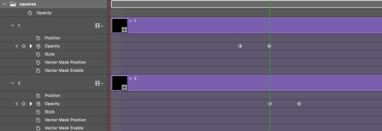
Open up the squares group in the timeline panel so you can see all the clips.
Here is my example of the general pattern that's followed and its corresponding layers of what you want to achieve when you're finished:
So let’s try it!
Expand the control time magnification all the way to the right so you can see every frame per second.

As shown in Part 3A, select your first chosen square.
Where you place the time-indicator on the panel will indicate the placement of the keyframe. Click on the clock next to opacity to place your first keyframe.

Move the time-indicator over 3 frames and place the next key frame.

Things to consider before moving forward:
Where you place your very first keyframe will be detrimental. If you're using a lot of squares like I did, you may have to start the transition sooner than preferred.
If you're doing 25 squares, the key frames will have to be more condensed which means more overlapping because more frames are required to finish the transition, verses if you're only using a 9-squared grid. See Part 4 for more detailed examples of this.
The opacity will remain at 100% for every initial key frame, and the second one will be at 0%.
Instead of creating two keyframes like this and changing the opacities for every single clip, you can copy the keyframes and paste them onto the other clips by click-dragging your mouse over both of them and they'll both turn yellow. Then right click one of the keyframes and hit copy.
Now drop down to your next clip, move your time-indicator if necessary to the spot where the first keyframe will start and click the clock to create one. Then right click it and hit "paste".

Tip: When you have both keyframes selected, you can also move them side to side by click-dragging one of them while both are highlighted.
Your full repetitive process in steps will go as follows:
click on square of choice on the canvas
drag that square layer to the top under the last renamed
in timeline panel: drop down to next clip, move time-indicator tick to your chosen spot for the next keyframe
create new keyframe
right click new keyframe & paste copied keyframes
repeat until you've done this with every square in the group
Now you can change the opacity of your squares layer group back to 100% and turn on the visibility of Gif 1. Then hit play to see the magic happen.
PART 4: Finished examples
Example 1
the transition starts too soon
Cause: initial keyframe was placed at frame 0
the squares fade away too quickly
Cause: overlapping keyframes, seen below.
(this may be the ideal way to go with more squares, but for only 9, it's too fast)
Example 2
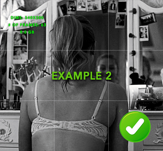
more frame time for first gif
transition wraps up at a good point
Cause: in this instance, the first keyframe was placed 9 frames in, and the keyframes are not overlapping. The sequential pair starts where the last pair ended, creating a slower fade of each square.
Part 5: Final Tips and Saving
You can dl my save action here which will convert everything back into frames, change the frame rate to 0.05 and open the export window so you can see the size of the gif immediately.
If it's over 10gb, one way to finesse this is by use of lossy. By definition, lossy “compresses by removing background data” and therefore quality can be lost when pushed too far. But for most gifs, I have not noticed a deterioration in quality at all when saving with lossy until you start getting into 15-20 or higher, then it will start eating away at your gif so keep it minimal.

If you've done this and your gif is losing a noticeable amount of quality and you still haven’t gotten it below 10gb, you will have no choice but to start deleting frames.
When it comes to transitions like this one, sometimes you can't spare a single frame and if this is the case, you will have to return to the timeline state in your history and condense the key frames to fade out quicker so you can shorten the gif. You should always save a history point before converting so you have a bookmark to go back to in case this happens.
That's pretty much it, free to shoot me an ask on here or on @jugheadjones with any questions.
#gif tutorial#photoshop tutorial#transition tutorial#grid tutorial#usergif#ps help#tutorials#tutorials*#requested
219 notes
·
View notes
Text
☆ UPSCALING LOW QUALITY FOOTAGE
what i used:
• 2021 macbook pro with m1 chip (390/500gb storage used she's hanging in there)
• photoshop 2020
• mpv (for screencaps but this isn't needed!)
• handbrake (available for linux, mac and windows here)
• video source to gif
what is handbrake?
basically its a software that helps you change the format of videos, such as for certain devices or screens, or in the case that we're going to utilise, quality and frame rate!
disclaimer:
handbrake is super easy to use and very beginner friendly for this procedure and it can make a video go from 30fps to 60fps however it does not replace the quality of true 4k/blue/master-pro res files. in the gif below, this is the level of detail in a master pro-res file.

getting started
it's easiest first to note the timestamps of the video you want to encode, and keep in mind that unless your computer is incredibly powerful, i wouldn't try to encode an hour worth of footage in one run! my laptop could handle about 30 seconds in one go before she started toasting.
using handbrake:
once you've downloaded the software, open the software and it will come up with a pop up window asking you to open the video source (that is presumably saved within your folders) and go ahead and do so!
in the range section, use the drop down button to navigate to seconds and enter your timestamp. the duration on the side will show how long of the footage you're gonna encode is!

then go down to the save as, and give your footage 'to be snipped' a name. this isn't necessary but useful because if you're planning to say, encode 3 or 4 small parts of footage in one sitting, each encoding instance will overwrite the previous one. so i just call mine 'cut 1', 'cut 2' and so on.

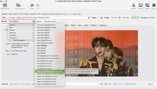
next go to preset, and there you'll see such a wide variety of options that you can play around with, with differing qualities, frame rates, sound options, and so on. for the sake of this tutorial, i'm using 'superhq 2160p60 4k av1 surround' and i've used the drop down menu to select it! then go ahead and press start! the time taken to complete depends on the duration of footage that you sent to encode! you'll find your encoded video as an .mp4 file in your designated folder (which you can change via browse at the bottom)
what next?
• if you prefer to open footage directly into photoshop (my ps can't handle it), then go for it!
• if you screencap as i do, then just use mpv or whatever screencapping program you prefer to make the screencaps and open in ps in your usual manner.
• you can use the timestamps to further process the video through vapoursynth to denoise, but i've yet to try that!
the results
for this first set of example footage, i used footage from the be the sun concert file, which is almost 2 hours in length and 4gb in file size.

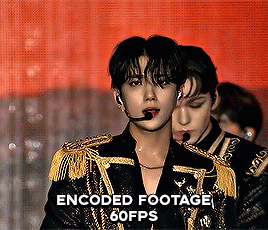

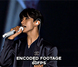
you can see the difference in the smooth frame rate of the footage, as well as the quality of the sharpening!
and to utilise the bane of gifmaking, a gose episode, notorious for dodgy pixelated frames and less hd quality in 1080p on youtube, i ran it through the same settings!
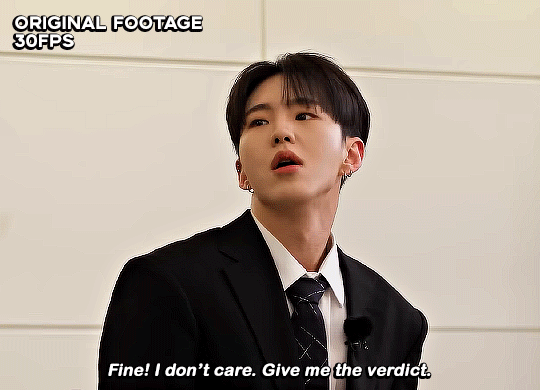
these are the exact same files, downloaded using 4k video downloader and with the same sharpening, but see how on the original file, the sharpening looks a bit more harsh and 'outlined' while it seems to sit softer on the encoded 4k version!
so i mainly use handbrake for dvd files, or not-so-hd 1080p youtube videos or videos that seem a bit clunkier but i had never tried them on a tv/film file so take a look below! i used a 1gb (so not very good quality) of a show (as compared to its 4gb files).
as i said at the start in the disclaimer, handbrake can't replicate true file quality, as you'd expect to see in a proper hd bluray/t*rrent file of a show but there's an interesting difference in the frame rate. personally it's not something i would utilise much there but its all up to individual preference on how someone prefers to have their gifs <3
this is a very basic run-through of how i used handbrake, as i haven't really explored all its features and i use this as a quick process when i'm running through seventeen dvd/dl files but i feel like it would work well on general youtube videos (such as interviews, episodes, behind the scenes) and feel free to send an ask/message for any help/clarification! <33
#ps help#usergif#gif tutorial#kpop gif tutorial#seventeen#completeresources#2605#userace#niniblr#emification#usershreyu#heymax#arieslofi#tusermlee#userbloomingwarrior#uservivaldi#userzil#userfanni#userrozza#usermoonchild#userraffa#tuserjen#usernik
286 notes
·
View notes
Text

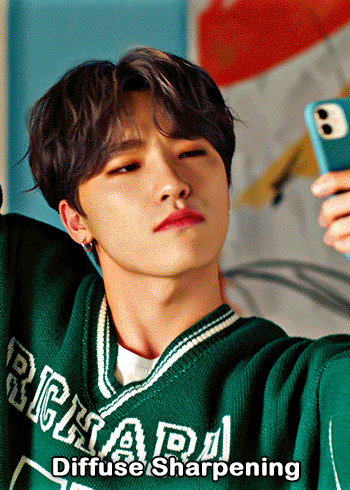
— i've been asked abt sharpening a few times but i thought that i would just share my actual actions i use but with some guidelines because it can really differ between different video sources and no sharpening is always exactly the same

— i've included different examples of video sources that i use for gifs alongside each type of sharpening action because not all actions will work for every gif. while it's always a matter of preference (whether u prefer a softer/more sharpened gif) some sharpenings can whitewash a gif so i added a little question mark as a warning to be mindful of that and make adjustments!
— there are three (technically four) different actions. one is ultra hd sharp and works best on really good quality footage such as master mvs or good film/show footage! the second is a simple sharpening that can be used on all videos and the third is a softer sharpening that utilises the diffuse setting and it has a glowy option w blur as well!
— take a look below at how the sharpenings look on different videos 💙
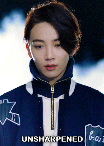
💌 MASTER/BUGS/BLU-RAY VIDEOS
video source: here (gdrive)
file size: 2gb


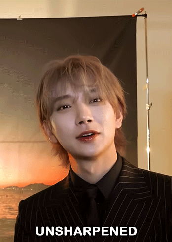
💌 4K YOUTUBE VIDEO
video source: here (yt)
file size: 470mb
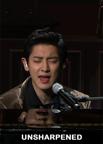
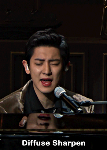
💌 1080HD OR LESS VIDEO
video source: here (yt)
file size: 77mb


💌 TS FILE
video source: here (k24hrs + dm for password!)
file size: 3.21gb
video specifications: qtgmc 60fps preprocesser + bm3d denoise (2)

💌 GOING SEVENTEEN
because it varies so much it requires an example of its own
video source: here (yt)
file size: 606mb


YOU CAN FIND THE SHARPENINGS HERE <3
if you ever need any help or clarification feel free to ask!! no need for credit if you use, but of course please don't claim the actions as your own <3
#allresources#yeahps#photoshop tutorial#gif action#kpop resources#ps help#creations#creations: action#userace#usershreyu#userjoanna#tuserose#useraashna#usernik#useratz#useraurore#usernanda#userkaison#userngocchi
504 notes
·
View notes
Text


PSD PACK #1 — period dramas
in this folder, there's ten psds created for the shows: reign and the tudors but they should work across any period drama with dark or yellow/green lighting <3 just remember to always adjust the curves (and channel mixer if necessary) to suit the lighting of the scene
a lot of these are pretty basic colourings, and some are pretty similar but these are the ones that i use the most often!
#dailypsd#psdresources#completeresources#allresources#psd pack#psd colouring#photoshop resource#gif psd#01#ps help#useratz#usershreyu#userzil#usershri#usermery#userbloomingwarrior#niniblr#usercats#userfaiths#usermare#userbess
287 notes
·
View notes
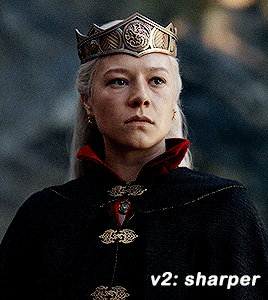
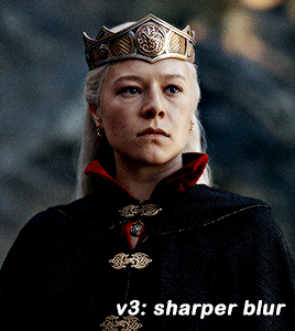
Photo


GIF SHARPENING ACTION 2.0 by @daenerys-stormborn
This is an updated version of my “all in one” gif action I made 5 years ago. It very similar but I added a new sharpening that I now use, v3: sharper blur.
‼️ UPDATED APRIL 2024 ‼️
I used a new sharpening now. I updated the action and it should be in the link. It’s under ‘sharper v2′.
Please read this for a more detailed breakdown of how these actions work and how I make my gifs.
v1: normal - smart sharpen (amount 500%, .3px)
v2: sharper - first smart sharpen (amount 500%, .3px) -> second smart sharpen (amount 10%, 10px)
v3: sharper blur - first smart sharpen (amount 500%, .3px) -> second smart sharpen (amount 20%, 10px) -> gaussian blur (radius 1px; opacity 52%) -> third smart sharpen (amount 500%, 0.2px) -> fourth smart object (amount 5%, 5 pixels) -> second gaussian blur (radius 1, opacity 10%)
sharper v2 (not shown on the gifset) - first smart sharpen (amount 150%, radius 0.4px) -> second sharpen (amount 10% radius 64px)
**v2 looks better in 540 gifs than smaller gifs, its a bit over sharpened here for my taste**
Actions also included:
Load Files Fast - for people using PS CS6 or older, uses “Load Multiple DICOM Files” for faster screencap loading.
Brighten - duplicates the smart object then changes blending mode to screen and converts it back into one single smart object to brighten dark scenes.
Convert to Frame Timeline - converts smart object back into frames, sets frame delay, and changes canvas sizes to -2px (width & height) to take away transparent border around gifs (you can always delete this part if it doesn’t apply, please read detailed breakdown for more info).
Convert to Video Timeline - converts frames in frame timeline into a smart object in video timeline.
DL: action
These actions were inspired by hoechlin's sharpening and trentcrimms' sharpening.
#itsphotoshop#allresources#completeresources#chaoticresources#resources#ps help#ps actions#mine#t*#r*
667 notes
·
View notes
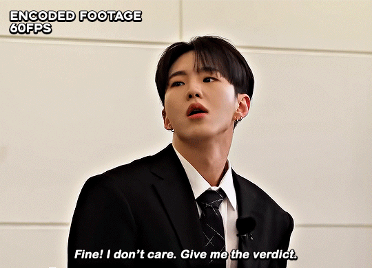
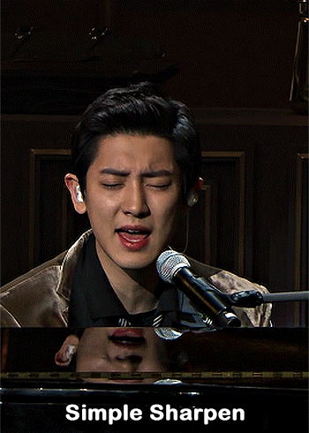
Note
how do you sharpen your gifs???? they're insanely high quality!
Hello, Anon dearest, and thank you so much! ✨ To answer your question properly, I would first have to know which gifset(s) of mine you're referring to because I've made a lot over the years and I often change my sharpening settings, too. It totally depends on what I'm working with at the moment, to be honest. 😅
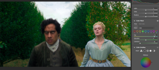
But, as for the last few sets of mine (this, this, and this in particular), I used these settings:
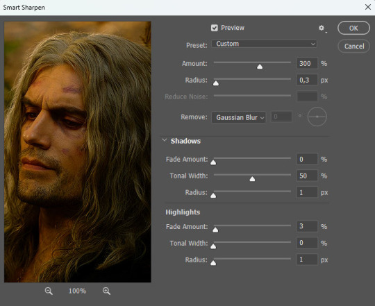
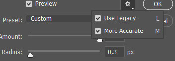
After converting my frames/layers into a smart object, I applied the settings above. Remember to click on the gear icon in the upper right corner and check both 'Use Legacy' and 'More Accurate' as well. This will make your sharpening look more 'natural' and less cakey imo.
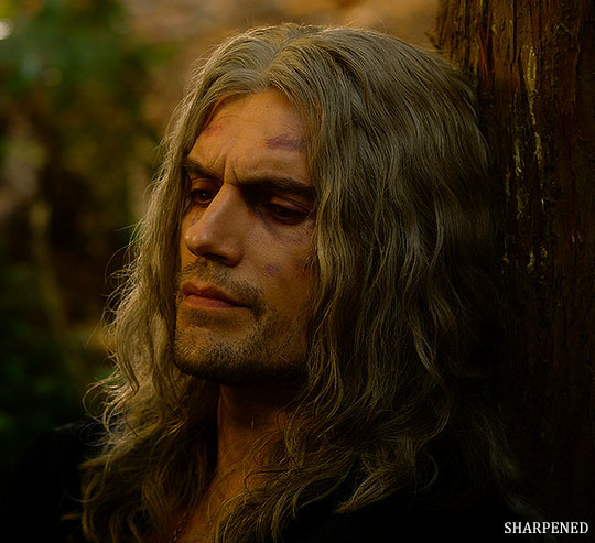
Below is a comparison of before and after:
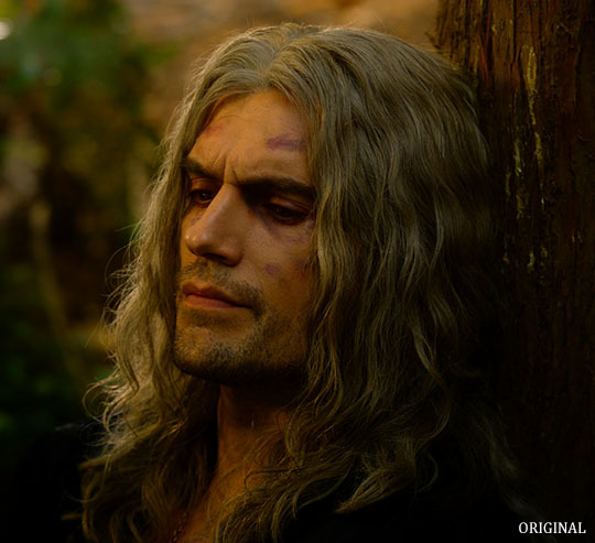
Note: This Geralt screenshot was taken from a 4K (2160p) video. Most videos I work with are at least 1080p or 720p because quality matters.

And here's the final result: colored, brightened, and sharpened.
—
I hope this answers your question. If not, feel free to send me more questions about this kind of stuff. I'm always happy to help out :)
#replies#anon#photoshop#tutorial#resources#ps help#sharpening#gifs#giffing#completeresources#allresources#chaoticresources#my gifs#my tutorials
137 notes
·
View notes
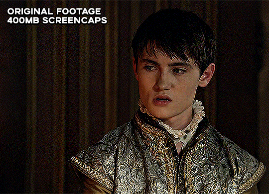
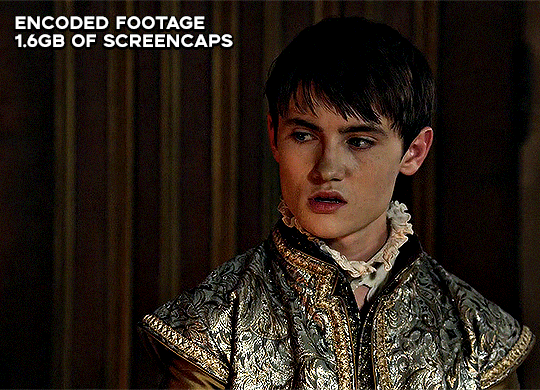
Note
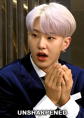
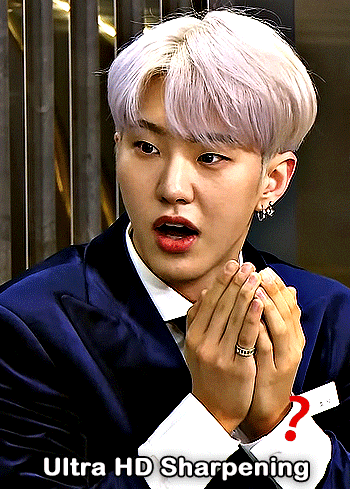
what is good sharpening vs oversharpening? im sorry if i have oversharpened anything i am to new to this
It's a great question! There are a lot of reasons that oversharpening is a problem and just one is that it causes intense colorwashing. Oversharpening introduces excess graininess that skews skin tones and accentuates stray highlights that can wash out a gif.
I want to preface this post with this: I am not here to shame anyone who is oversharpening.
The most important part of this answer is to bring awareness of why these basic steps of gifmaking are so important to the whole process.
Each of these gif pairs are uncolored, unedited, and has the same save settings. The only difference is the sharpening settings that are listed on each gif. The left side has my usual sharpening filters, and the right side has the filters that usually lead to oversharpening.
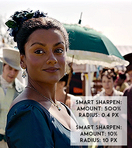
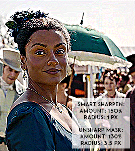
(Kate Sharma, Bridgerton, 2022, 1080p footage live action)
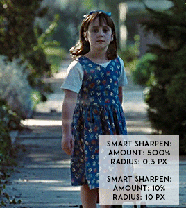
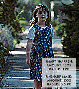
(Matilda, 1996, 1080p footage live action)

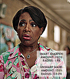
(Barbara Howard, Abbott Elementary, 2022, 1080p footage live action)
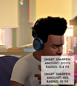

(Miles Morales, Into the Spider-verse, 2018, 1080p footage animated)
It's not a crime to oversharpen your gifs, but it does lead to the slippery slope of colorwashing (even for white people).
Look for the halo: If you look at the oversharpened gif of Barbara, you can see a yellow outline around her hair. That is an obvious indicator of going too far.
Use a layer mask to see what the colors were before sharpening: you can see in most of the oversharpened gifs above that there is a huge difference in the colors shown vs. in the less sharpened gif.
If you're working with older footage: don't try to overcorrect the graininess of the media. It's okay if some of it comes through!
Try to get the highest quality footage you can: I primarily work in 1080p files because my poor laptop starts to sound like a plane taking off when I try to screencap 4K files. If you're like me, look for larger file sizes. That will reduce the graininess of the gif.
Here are some links to different sharpening actions and guides:
daenerys-stormborn action
anyataylorjoy action
anya-chalotra sharpening guide
These are great to use if you are starting out in Photoshop! (psst if you need a hookup lmk) I know some people don't use PS, and for them, I put my sharpening settings on this post. I think both of the action sets I linked above have similar if not the same settings.
Also, one thing I noticed when making the gif pairs is that the less sharpened gif was always a smaller size. Fixing sharpening settings might help people who are trying their best to keep things under the 10mb limit.
I hope this answered your question, anon. If anyone has any questions or would like other resources, let me know!
#resources#allresources#completeresources#chaoticresources#gif help#ps help#photoshop#usernik#usermarsy#usershreyu#uservivaldi#useralison#userannalise#useryoshi#userk8#gif resources#tagged: ps help#nanda answers#userelio
480 notes
·
View notes
Text
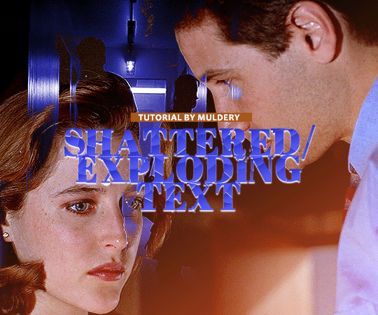
SHATTERED/EXPLODING TEXT tutorial
hiyaa! @krystaljungs asked me for a tutorial on how i made the shattering/exploding animation of the text in this gifset and so i figured i would make it and post it here, like i did with the tutorial for "falling" text.
i must warn you, this one is really tedious and requires a lot of time and patience. honestly maybe there is an easier way to do this but i didn't find any tutorials for when i needed it so i just went off my ps knowledge and did it myself.
note: you will need photoshop with a timeline!
STEP ONE: create your base gif! be mindful of number of frames in your gif. the number of frames doesn’t really matter here, but if your gif is bigger than 10mb and you have to go back to adjust it all again after you have to delete some layers....you might lose the will to live 😂
STEP TWO: make your text the way you want it to look. this effect is basically the last step of your gif making process. (i will be using the typography from my set as an example as i already have that psd saved)
this is what my typography looks like now.
STEP THREE: now, you will create a new file (with background) and transfer the text you want to "shatter" in it.

here is when things get tedious.......
tip: zoom in the document, it will be easier for you.
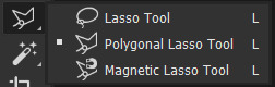
select polygonal lasso tool aka this
STEP FOUR: before you start, you need to rasterize type layer. then you will have to "shatter" every letter into smaller pieces. using polygonal lasso tool, select a smaller part of your first letter.

then you will click on that part with the right click of the mouse and selct layer via cut.
now you need to make sure that your new layer is selected and using the move tool move that part of the letter somewhere away.

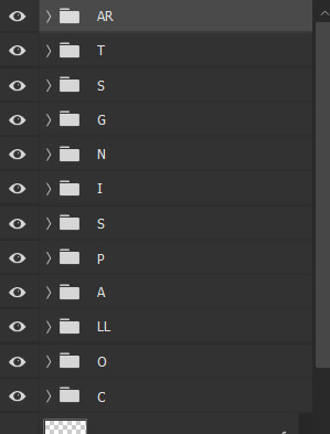
you will have to do this for every part of the letter and every letter. also move every new layer on top of other layers because they will line up better later like that. then create a new folder with every layer of said layers and rename it after the letter you're shattering. see below. (idk why my screenrecord didn't catch me making layers via cut but you should do that after the use of polygonal lasso tool, as stated above)
note: feel free to şelect parts of other letters as you get one letter, for an even better effect.
this is what i have after "shattering" every letter. the lineup doesn't have to be perfect as you will arrange these parts in your main document. (click on images for full view)

STEP FIVE: go back to your main document and make sure the visibility of your text is turned on.

what you will do now is open the shattered text in the new window and transfer letter by letter (letter folders) to your main document. BUT after you transfer every folder, you need to rasterize EVERY layer and convert it to a smart object. i made an action for this part to make it easier. download here.

(okay i really don't know why my screenrecord doesn't show "pop-up" windows but i was moving the C folder from the document where i shattered the text and then used my action on every layer)
after you transfer the folder to your main document and rasterize and convert to smart object, select the folder and use Free Transform to move it so it aligns with the letter from your complete typography. then you will select each layer and align it with the typography. see below. (click on the gif, i made it bigger so you can see better)

i did this one hastily so the recording wouldn't be too long but i'm hoping you can see what i'm doing.
now, do this for every letter.
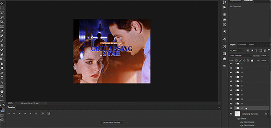
after that is done, make the original typography layer invisible, and you should have something like this

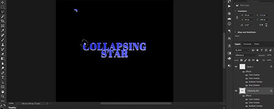
STEP SIX: another really tedious part BUT it's time to animate the text.
make your timeline space bigger so it's easier for you to work with it. then select the first layer and click on the arrow next to it (in timeline) so Transform is revealed to you.
now, you don't want the animation to start from the very beginning of the gif, but a bit later so the text is readable before it shatters.
for example, i did mine like this, but that is your personal preference.
note: make sure that all animations start at the same time.
tip: do this for all layers in one folder before you transform them, as it will go faster.
STEP SEVEN: bring the playhead (blue arrow with the red line) to the end of your gif and select one layer in timeline.
now it's time to transform it. use Free Transform (windows shortcut ctrl+T) and drag the part a bit away and rotate it. press enter.

okay ignore the way my text moved upwards, i used the text i used in my edit and i did that animation in the upper part of the gif and i was too lazy to redo the whole animation lmaoo but i hope you can see what i'm doing with the letter C.
do this for every letter. play around with placing and rotation. then save your gif. when you're done, you should have something like this.

again, i was too lazy to redo the whole thing on this new gif so i'm using the one from my gifset i linked in the beginning.
i hope this was understandable and helpful. if you have ANY questions, don't hesitate to shoot me an ask or dm me! i'm always here to help <33
#usergif#completeresources#allresources#gif tutorial#ps help#userkimchi#uservivaldi#userraffa#tusermona#userelio#usercats#tuserheidi#usershreyu#userhallie#userroza#userdean#userisaiah#thingschanged#tusercasey#usertj#userwwz
253 notes
·
View notes
Text
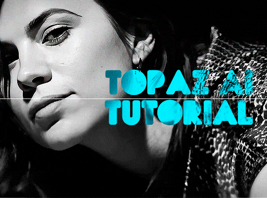
TOPAZ AI TUTORIAL
i was asked to do a tutorial for Topaz AI (a software that enhances screencaps), so here it is! :)
[tutorial under the cut]
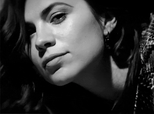
i’m going to gif a 720p YouTube video from 12 years ago as an example. it’s the bottom of the barrel when it comes to image quality, but in the end, you won’t believe it was once so shitty. here’s the gif, without any editing:
THE APPLICATION
Topaz AI is a paid software for image enhancement. you can download it for free, but your images will have watermarks. here's a random link that has nothing to do with this tutorial.
you can use Topaz AI as a Photoshop plugin or use the software separately. i will explain both methods in this tutorial.
USING SEPARATELY
it’s the way i do it because it’s more computer-friendly, the plugin can take a toll on your PC, especially when you’re dealing with a lot of screencaps.
you first take screencaps as you normally would (if you don’t, here’s a tutorial on how to do it). open Topaz AI and select all the images. wait a while for the software to do its thing.

on the left, there is your screencap untouched. on the right, is your edited version. if you click the edited screencap and hold, Topaz will show you the original, that way you can compare the versions even better than just looking at them side by side.
Topaz AI will automatically recognize faces, if any, and enhance them. this can be toggled off, by disabling the “recovering faces” option in the right panel. it’s always on for me, though. you can tweak this feature by clicking on its name, the same thing for the others.
Topaz AI will also automatically upscale your screencaps if they’re too small (less than 4k). it will upscale them to achieve said 4k (in this gif’s case, the original 1280x720 screencaps became 4621x2599). i suggest that you let the app upscale those images, giving you more gif size flexibility. you can change into whatever size you want if you want something less heavy to store. don’t worry though, even these “4k screencaps” are very light megabytes-wise, so you won’t need a supercomputer. it might take a while to render all your screencaps, though, if you’re on a lower-end computer. (the folder with the edited screencaps ended up being 1GB, but that’s because it contains 123 screencaps, which is a lot of screencaps for 4k giffing).
two options won’t be automatically selected, Remove Noise and Sharpening, you will need to enable them to use them. rarely i don’t use Remove Noise, as is the best tool to remove pixelization. the Sharpening option depends on the gif, sometimes your gif will end up too over-sharpened (because of Topaz’s sharpening and later your own). that said, i used the Sharpening option on this gif.
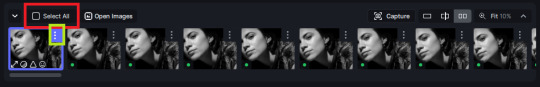
next, select all images by clicking the “select all” button. you will notice that one of the screencaps’s thumbnails (in my case, the first one) will have small icons the others don’t have. this is the screencap you enhanced. you will need to click the dots menu, select “apply”, and then click “apply current settings to selected images”. this way, every screencap will have the same settings. if you don’t do this step, you will end up with one edited screencap and the rest will remain untouched!

all things done, click “save X images”. in the next panel, you can select where to save your new screencaps and how you want to name them. i always choose to add a topaz- prefix so i know what files i’m dealing with while giffing.
just a note: if your way of uploading screencaps to Photoshop is through image sequence, you will need to change the names of your new screencaps so PS can perceive that as a sequence (screencap1, screencap2, etc). you can do that by selecting all the screencaps in your folder, then selecting to rename just one of them and the rest will receive numbers at the end, from first to last. you don’t need to rename them one by one.
here’s the first gif again, without any editing:
without Topaz enhancement but with sharpening:

without sharpening, only the Topaz enhancement:

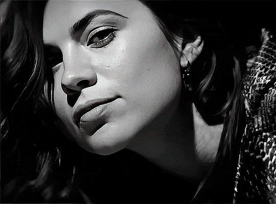
with Topaz enhancement and sharpening:
her skin is so smooth that it is a bit unrealistic. i could have edited that while tweaking the “Recovering Faces” option and/or the “Remove Noise” option, but i prefer to add noise (filter > noise > add noise) when necessary. this way, i don’t risk not enhancing the quality of the screencaps enough.

i added +3 of noise, making the gif look more natural. it’s a subtle difference, but i thought it necessary one in this case. you can continue to edit your gif as your heart desires.
VOILA! 🥳
AS A PHOTOSHOP PLUGIN
if you have Topaz AI installed on your computer, Photoshop will recognize it. you will find it in filter > Topaz Labs > Topaz AI. while in timeline mode, select the filter. the same Topaz AI window will pop up and you can tweak things the same way you do when you use the software separately. by using the plugin, you don’t need to upload your edited screencaps or use screencaps at all, a video clip (turned into a Smart Layer, that is) will suffice. the downside is that for every little thing you do, Topaz AI will recalculate stuff, so you practically can’t do anything without facing a waiting screen. a solution for that is to edit your gif in shitty quality as you would edit an HD one and at the very end, you enable Topaz AI. or just separately edit the screencaps following the first method.
this is it! it's a very simple software to use. the only downside is that it can take a while to render all screencaps, even with a stronger computer, but nothing too ridiculous.
any questions, feel free to contact me! :)
#*#*tutorial#alielook#usershreyu#userlaro#userchibi#tusernath#usersanshou#userbunneis#userzil#tuserlou#jokerous#usersnat#userdavid#userbuckleys#userbarrow#gif tutorial#completeresources#ps help#resources
108 notes
·
View notes
Text
Using Neural Filters to colour correct
i’ve had a couple of people ask about how i’ve coloured the pocket dimension scenes so i thought i’d just do a run-through tutorial kind of thing to show it, rather than going through it with everyone separately.
so this is a tutorial for how i made this:
from this:
follow along under the cut:
so just some things to point out before we move on which are essential and could get in the way of this working for you:
you will need adobe photoshop cc - v.22 or above. any versions older than this won’t work. you can find what version you currently have by opening photoshop, clicking ‘help’ on the top toolbar, and selecting ‘about photoshop’. my current version is 23.2.2.
you should know how to make a gif from frames, use timeline and work with the gif as a smart object. if you don’t know what i mean, i’ve tried to explain it briefly below.
using neural filters is resource heavy so expect photoshop to be slow in processing/exporting/saving anything you use them on. it might be worth having other programs closed while you use it if your computer has a lower or mid-range spec.
and so...
1. make your gif
to do this, import your frames, crop, set frame speed etc however you normally would. if you usually make gifs with the animation bar set to ‘frame animation’, you will need to change this so that you can create a smart object. you will need to press the button with the video timeline symbol on your animation bar:
then you should select all your layers (not frames as you shouldn’t see them anymore) and right-click > convert to smart object:

you should leave your animation in timeline mode, but the purpose of the smart object is so you can add smart filters. this is especially good for things like sharpening, any effects you want to add, and of course... neural filters.
2. brighten the image and convert to black and white
contrary to what we’re trying to achieve here, you should change the image to black and white and brighten it up so that you have as smooth and plain a base for the filters to apply to.
i do this by adding a black and white adjustment layer, and clicking ‘auto’ on the properties tab:

you should then add a ‘levels’ adjustment layer and drag the right tab along until it meets the beginning of the histogram. you should also move the left tab along a little bit for some contrast - how far depends on how you want your gif to look:

following this, select the smart object and two adjustment layers > right-click > convert to smart object. you don’t have to do this but i find it helps and it reduces the number of layers you have to work with.

my gif now looks like this:

3. adding the neural filter
now your image is about to change in a huge way. click on filter on the top toolbar and select ‘neural filters’:

from here, you will see this screen and a bunch of current filters and beta filters on the right-hand side. you may have to download them to get them to work. for this, we’re using ‘colorize’ so at least make sure you have that one downloaded and ready to use:

when you turn the ‘colorize’ filter on, after processing (this can take a few seconds), your image now looks like this:

(note: this gif is an exception in how well it turned out first time - the filter has applied evenly minus a couple of issues i’ll go over below. how successful it will be depends on how much movement is in the clip, or how many colours it will need to find, and it sometimes gets confused with dark and light tones. you’ll find most of the time that the gifs will have patches that aren’t coloured, or will have incorrect colour correction that you’ll need to go in frame-by-frame and patch in by hand. the filter does do a lot of heavy lifting though.)
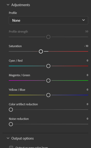
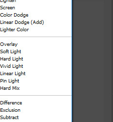
you can then play around with the saturation (i usually reduce it to -10) and the colours similarly to how you would in ‘colour balance’, however it has a more all-over even tone:
the last thing you need to do is select ‘smart filter’ on this drop-down menu:
if you don’t change it to smart filter, the filter will only apply to the frame you can currently see and won’t apply to the whole animation.
my gif now looks like this:

this might be enough for you in which case great news! you get to stop here, apply whatever sharpening and colouring you want, and save as normal!
however, i’m a perfectionist to a fault so i need to do a few more things first...
(note: it’s always worth doing the next step even if you’re happy with the finished product here, just in case you missed a spot)
4. check the filter has applied throughout the whole gif
you’ll see that you now have a much more even base to work from and colour your gif as normal, however neural filters aren’t perfect and do leave funny little glitches throughout your gif sometimes. in order to check this, i usually scrub through to see if there are any issues. in this gif, i spotted two.
in these two areas - on the moving gif - i can see the colouring flickering. the filter hasn’t applied the right colour on every frame, or simply hasn’t coloured it at all:
this gif isn’t the worst offender for this, but if you look closely you’ll see it. so...
5. make a new layer and fill in the flickering areas
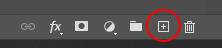
press the ‘new layer’ button:
and now use the ink dropper tool to pick up the colour you want to use, and paint over the area where the colour is flickering - e.g. i used the dropper to pick up the colour from the desert in the background and painted over that area. i also picked up some of the colour from the sky and coloured over the flickering by the storm. i used these brush settings:

when you’ve painted on the colour you want, and as much as you want, set the layer to ‘color’. i also change the opacity to 80% to let some of what’s underneath still come through a little bit, but do what’s best for you and your gif:
my gif now looks like this, with less noticeable flickering:
7. brighten, colour and sharpen however you normally do
idk if you have an existing psd or just experiment with adjustment layers, but your gif is now ready to start colouring however you normally would. the neural filter is basically acting as a reset to give you a blank canvas in which to gif as normal. for this gif i started with a ‘hue and saturation’ adjustment layer to change the green background to a more dirt/sand colour as it’s meant to be the desert, and then just played around with my usual combination of adjustments until i came up with the final product! i then sharpen using filter > sharpen > smart sharpen and it should be done.
8. export (save for web)
you all know how to do this by now, but be aware that these will load slowly. gifs aren’t the fastest things to save on a good day but with the neural filter applied, they’re particularly slow. this is why i said to do work on the gifs one at a time - don’t have photoshop doing more than it needs to do or it might slow down to a halt.
so after all that, this is the final version of my gif:
tips and tricks
avoid making gifs of moments with a lot of movement - this could be the subject of the gif moving, the background, the wind blowing something around etc. while normal colouring can tolerate these changes, the filter isn’t yet clever enough to work it out and it makes the gifs unsalvageable because you can’t paint over the flickering accurately enough - e.g.:

(p.s. if anyone knows how to get the filter to work on this specific scene you have to tell me lmao it’s been driving me mad...)
try and keep the gifs short - i haven’t made one above 55 frames, i think. that is still quite a lot but it is a challenge to ensure the filter can cope with it. shorter gifs would probably mean a cleaner result.
you have to set the gif to black and white first - the colorize filter is designed to bring black and white photos/videos to life. i tried it over the blue filter directly and it was successful but i had more consistent luck when starting in black and white.
make sure you brighten the gif significantly before applying the filter - it really helps to give a cleaner canvas for the filter to apply to, but it’s not essential if you really don’t want to.
if you have any questions, don’t hesitate to ASK. i’m by no means an expert and this is just what i’ve observed from using this feature and the workarounds i’ve found working for me so far, but happy to try and help where i can and happy to take suggestions too! <3
#malex#roswell new mexico#gif tutorial#photoshop tutorial#ps help#allresources#completeresources#itsphotoshop#*laurengifs#*tutorial#this is so long#but i hope it's helpful#i think needing the newer versions of ps is probably what's going to get in the way most but just in case it doesn't... ta-daaa#1k
2K notes
·
View notes
Note
hello! just wondering if you know of a tutorial for the lines going through gifs? and getting them all to match up? like in these sets /post/714978685858496512 and /post/733101286452559872 also are they overlays or how did you make them? thank you in advance!
hey! so, i've attempted to show you with a little tutorial on how i made lines like the ones here and here, i've not seen one around myself and decided to try this out one day and it didn't go too badly so, i hope this makes sense and helps.
so, i'll be explaining and showing you how i did the lines on these gifs:
now, firstly i'm going to assume you know the basics and can create/colour etc a gif, you'll need your base gif ready to go. in this example i've flattened them to frames, but you can do this in timeline as well.
step one: add a new layer on top of the gif/smart object, and set up your brush ready. i personally have used 2px brush, 100px hardness, 100px smoothing and 75% flow;

the flow is the main thing i think that is more down to personal preference, it affects how the line draws/moves and will be down to a little bit of trial and error - i've added below how the lines look at difference levels of flow (no other setting from the above has changed just the flow)

step two: decide where you want your lines to link, i've always done from the centre of the gif but you could want your lines to meet up 100px from the left at the top and exit the gif 100px from the right at the bottom. no matter what, the best thing to do here is to add guides to your gifs. as i'm just going straight from the centre to the centre for every gif i add a guideline at 270px

step three: i recommend testing this all out on a separate canvas first to play around and see how you want your line to look etc, but when you're ready you're good to go. start from when the guideline is and draw your line until where you want it to end, the best way to show you this is on video so i've screen recorded the whole process.
youtube
it's honestly pretty straight forward, so i hope this all makes sense, and just have fun with it, i love messing around and drawing 30 versions of the same line until i'm happy with it!!
ALSO, in case you were wondering about the final gif in the wheel of time set, the moving line, that was simply an overlay from this video that i set to screen so the black background disappeared leaving just the line (i stretched/rotated/moved it around get it to start and end where i wanted it to! i just played around with the line thickness when drawing my lines to match as best i could with the line in the overlay!
#ask#anonymous#ps ask#quirkyresources#usernik#userhella#uservalentina#userrobin#userannalise#userrainbow#usershreyu#alielook#useralison#userives#useryoshi#ps help#ps tutorial#chaoticresources#dailyresources#hisources
217 notes
·
View notes
Text
was anyone gonna tell us that the new header size is 580x326 or
122 notes
·
View notes
Last Seen Blogs
auto-correct-sucks
AutoCorrectSucks
tammys-feed
Tammy
afro-surrealism
Afro Surrealism

chinacustompvcfilmexporters
Heavy Duty Tarpaulin Film Suppliers

thundersnot
IT USES 96 BATTERIES