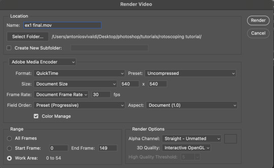
#photoshop tutorial
Text
how to make cool blobby turing patterns in photoshop
i'll preface with i learned the basic loop from skimming a tutorial on youtube, but as someone who prefers written tutorials i'm sure many would appreciate one! also, the second part of this is some of the visual effects i figured out on my own using blending modes and stuff.
i'm using photoshop CS4 on a mac so some buttons and stuff might be in different places on windows and newer photoshop versions but all the actions are the same. my canvas is 1000x1000 pixels.
UPDATES (i'm hoping these'll show up whenever you open the readmore?)
it's possible to do something similar in krita using this plugin, made by the love @arcaedex
it's also possible to do this in photopea, a free browser alternative to photoshop! the results are pretty much identical.
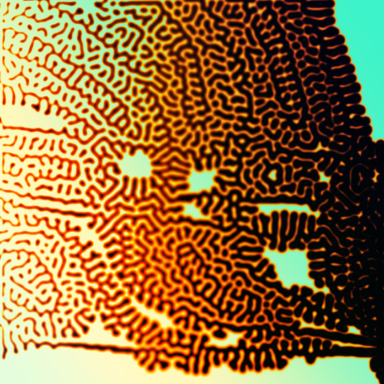
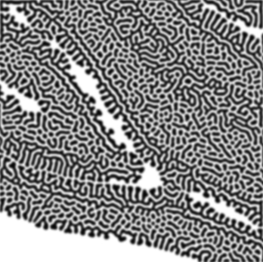
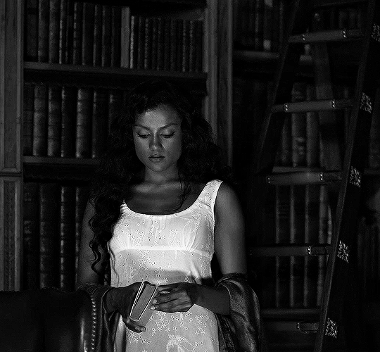
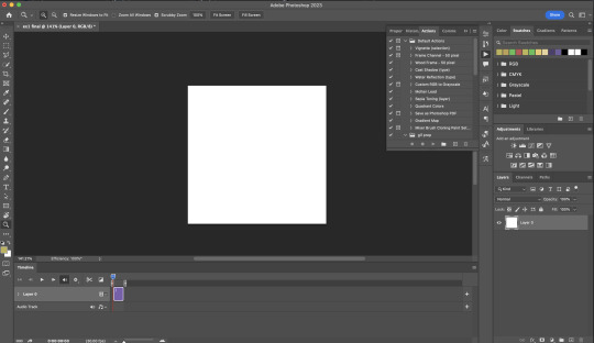
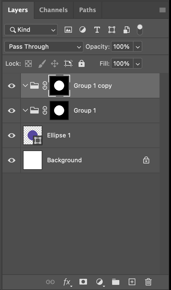
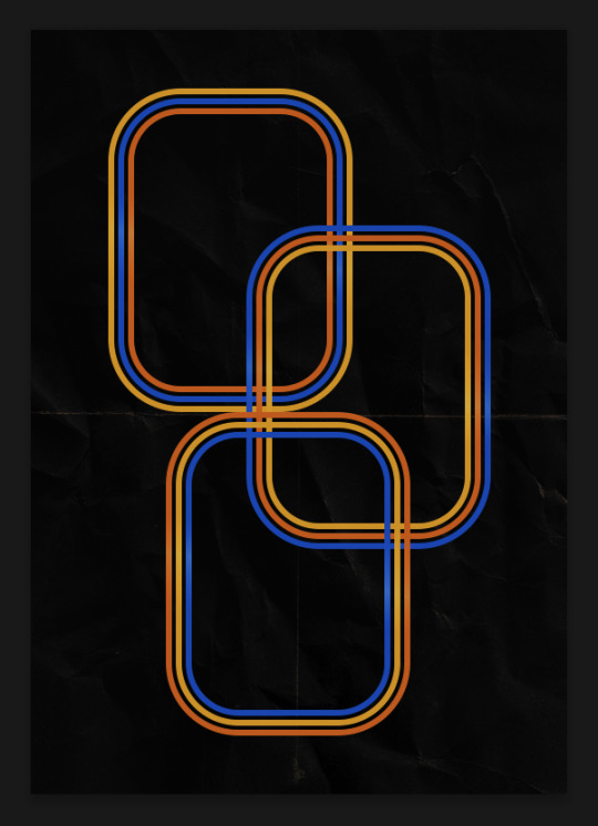
FIRST off you wanna get or make a black and white image of some kind. it has to be one layer. can be noise, a photo, a bunch of lines, whatever. here's mine, just some quick airbrush lines:

now find the actions tab. idk what it looks like in newer versions of photoshop but you probably won't need to dig!
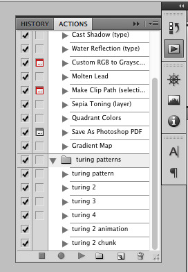
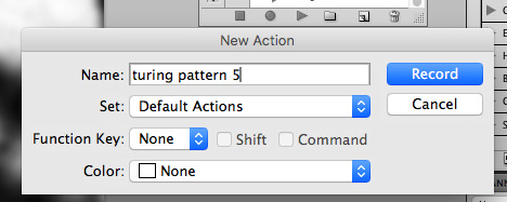
hit the little page thingy to make a new pattern. once you hit 'record', it'll record everything you do. the little square 'stop' icon will end it.
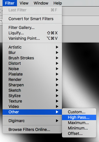
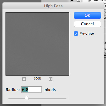
now you want to do a high pass filter. you can mess around with the radius to change the size of your squiggles, but the tutorial had it set to 6. experiment!
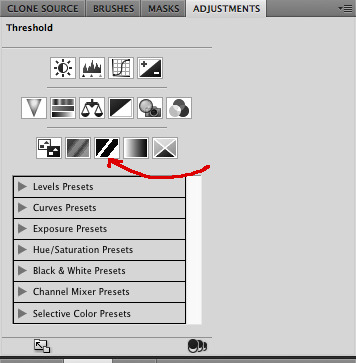
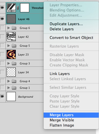
now add the 'threshold' adjustment layer. i use the adjustments tab but i think there's also a dropdown menu somewhere. keep it at the default, 128. merge it down. (control or command + E or you can right click it like some kind of weirdo)
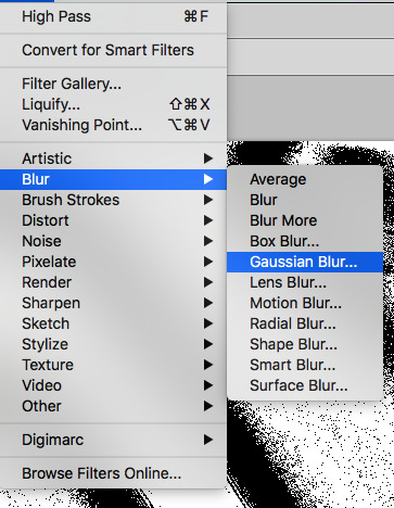
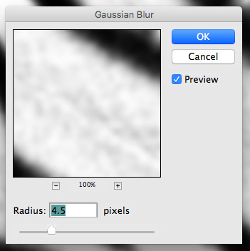
and finally, the gaussian blur! the radius of this affects the shape and size of your squiggles as well. i like to keep it around 4.5 but you can mess around with that too.
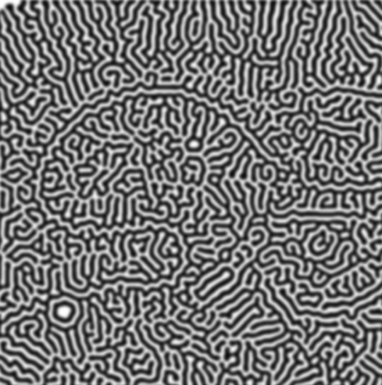
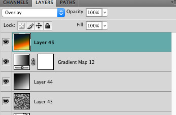
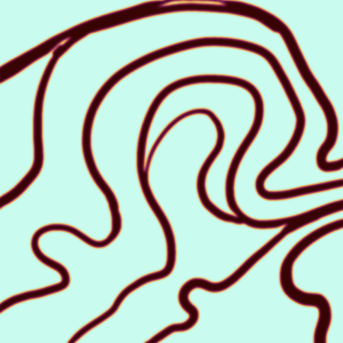
after that, hit 'stop' on the action you're recording, and then repeat it a bunch of times using the 'play' button, until you have something you like, like this:
WOW!! that was fun!! and only a little tedious thanks to the power of macros. anyway, here's some fun layer blending stuff i like to do. it's with a different pattern cause i made this bit first.
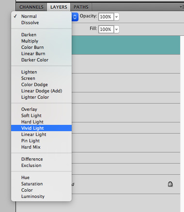
anyway, using a black and white gradient (or a grey base that you do black and white airbrush on), make a layer with the vivid light. this will make the blobs look thicker or thinner.


then, for cool colors, do a gradient map adjustment layer over that:

and finally, my best friend, the overlay layer. just using a gradient here bc i'm lazy, but feel free to experiment with brushes, colors, and blending modes!

NOW GO. MAKE COOL SHIT WITH THE POWER OF MATH. AND SEND IT TO ME
also these are not hard and fast rules PLEASE mess around with them to see what kind of weird shit you can make. here's a gif. as you can see i added some random airblush blobs in the middle of it, for fun.
924 notes
·
View notes
Text
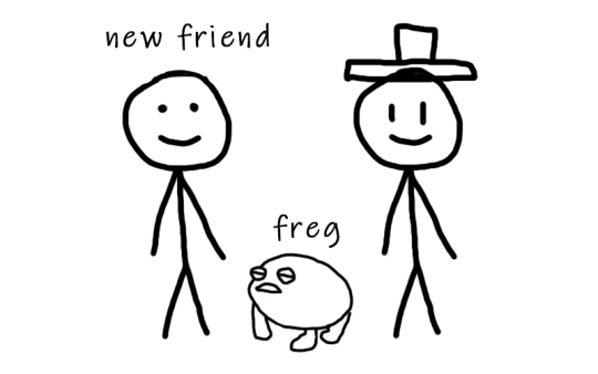
So you just joined Tumblr?
Tumblr basics + Fandoms/Gifmaking
Congratulations, you just landed at Tumblr! This hellsite (affectionate) can seem intimidating and complicated at first, but once you grasp the basics of it it’ll quickly turn into your own personal little hut in the forest. Tumblr is a website where you and only you curate your dashboard, you’ll see the content that you seek on your own. In this post, I’ll explain the basics of Tumblr and the basics of how fandoms function here with the help of Bob. Okay, let’s get started.
1. Blog customization
The first thing you should do as soon as you land on Tumblr is add a profile picture and header before you interact with people. You want to be distinguishable from bots and therefore avoid getting blocked. You can also add anything to your bio, there's no character limit. Some folks add their name and pronouns, but there are no rules about that. There are also no rules about profile pictures. It can be a picture of you, a picture of your dog, a picture of a rock, or a picture of your favorite character. If you plan on staying on the fandom side, you might notice that a lot of fandom blogs have colorful-looking icons (a cutout of a character on a colorful background), for these icons and also headers I suggest checking out source blogs that make those icons. For starters, @iconheadersource is a goldmine where you definitely going to find something that’d suit you and your blog.
Tumblr on mobile and Tumblr on desktop are two different creatures when it comes to customization. On the desktop, you can customize your blog with coding (HTML + JS). Now Bob will demonstrate to us some examples of blogs on desktop.


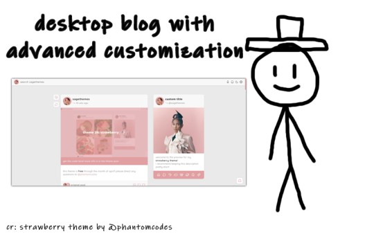
If you want to customize your desktop blog, I suggest checking out @phantomcodes and @glenthemes for the codes.
Tutorial on how to install themes
Using javascript on Tumblr pages
2. Search Engine
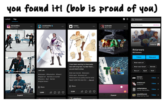
Nice! You've made your blog look pretty! Now, let's shift our focus to the search engine and ways to discover content. As mentioned earlier, you curate your dashboard by looking for things you enjoy and like. Search using hashtags or the names of your interests (TV shows, movies, birds, music, etc.) to find your piece of cake. For instance, folks who create posts about TV shows you like use tags to ensure their posts reach others interested in the same thing. So, let's go ahead and search for something right now.

Once you search for that specific tag, you are redirected to the corresponding tag page. Here, you can see that posts are sorted by "Latest" or "Top" (indicating posts with the most notes). On the right side, you will find related tags and blogs which are frequently using the searched tag. By following the tag, both the tag itself and the posts tagged with it will automatically appear on your dashboard in the "Your tags" section. You have the option to filter tags according to your preferences. In the settings, you can choose to block specific tags if you prefer not to see content related to some particular topics.
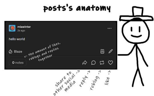
The only method for sharing posts and content on this website is through reblogging. On Tumblr, reposting others' content, including art, gifs, and fics, is not accepted. Reposting means downloading art, gifs, etc., creating your own post, and then sharing it. And that's a big no-no, strongly discouraged. Your likes essentially function as bookmarks, and you have the option to set them to be private. When you save something, it doesn't appear on your friends' dashboards.
We don't censor things here, and I advise you not to do so too. If you need to mention a word that might be potentially triggering or could be flagged on another social media, feel free to say it. Many users have specific topics and tags filtered out, so if you use variations like "K!tKat" instead of "KitKat" in the tags, it can bypass the tag filter, potentially causing more harm as people will see content that triggers them. And remember to always tag posts that have flickering or flashing!!!
If you want to organize your reblogs or make comments on a reblog, use the tags section and not the comments section itself. This is called "#add tags." Feel free to type whatever you want, but keep in mind that the original poster receives notifications when someone reblogs their post and adds tags. Yes, all tags are visible to us.
Okay, so let's quickly recap this information with the help of our dear friend, Bob.
3. Social interactions
So let's move on to one of the crucial topics - how to make friends on Tumblr? Personally, I don't think there's one particular formula for that. Sometimes you just see a funny bloke posting about something as random as desert rain frogs, grab them, and go "You're my friend now" and that's how you become mutuals.
However, there are other, more common ways to become friends with someone. You can start by reblogging someone's post, adding tags to the reblog, and then following the person. Create your own posts, tag them to ensure they reach the folks who are interested in the same things as you, and participate in fandom events and challenges if you're into that. Interact with people you want to befriend, message them, send them asks. You will eventually find your crowd. You'll also find swifties, and fans of supernatural who never moved on from that destiel love confession four years ago, they also can be your friends, at some point, you will become friends and chill with each other. Be open to new interests to make sure your dashboard is not dull and boring.
Tumblr doesn't have the supposed hierarchy, and you don't have to listen to anyone who tells you otherwise, you curate your own experience and blocking is pretty normalized here. Notes and followers (which are private for everyone) don't really matter, stick to your beliefs and your vibe and you'll be fine. We're all equal losers here.
4. Fandom / Gifmaking
Fandoms play a significant role on Tumblr, they're closely tied with gifmaking. As a fellow creature of fandom, I'm adding this part because we don't gatekeep - more gifmakers and fandom enthusiasts mean a better fandom experience. As I mentioned earlier, everything has its tag, making it easy to find your favorite TV show fandom by searching for the tag. This is also how you can connect with people who share an interest in that specific TV show. Upon entering the tag, you'll stumble upon numerous moving pictures – these are GIFs. People create GIFs of everything, from their "blorbo" (the term for favorite character) to beloved ships and favorite moments. There are also plenty of creative GIFs with different coloring and complicated effects. And the best part? You can do it too!
There are a lot of ways to make GIFs. Some people use Photoshop, and some use Photopea which is an excellent accessible option. I'll be linking posts for Photoshop under this text. For Photopea tutorials and guides, please check out @photopeablr.
I've been making GIFs for three years at this point, and those are the tutorials I used when I was just starting out:
how to make a gif:
comprehensive guide 101
basic gif making tutorial + mvp player installation
gifmaking for beginners
how to install MVP player on a PC
film downloading & screen-capping tips
correct photoset dimensions
coloring
how to fix orange-washed characters
how to: coloring east & southeast asian celebs
channel mixer
colored background
color manipulation
vibrant coloring
how to brighten dark scenes
color isolation
effects
glitch effect
blending
crossfade transition
gradient effect in the text
gradient text
red colour accent on the b&w gifs
how to add a gif in a template
blurring gif backgrounds
using templates
text
text tutorial 1
font resources
understanding fonts and typefaces
split text
subtitles
other
icon tutorial
gif headers
For more tutorials, inspirations, and resources - please check out @usergif. It's a good source blog for all gifmakers.
Wait but what's a source blog? These are blogs that center around a specific theme, creating content for a particular topic. They are managed by multiple editors, these blogs track their own tags to reblog content related to the theme. They can be source blogs dedicated to gifmaking (just like @usergif), a TV show, a movie, a character, a celebrity, a sports team, or literally anything else. Typically, these blogs incorporate terms like "network," "source," "central," "creators," "hub," or "daily" in their usernames, making them easily distinguishable from regular personal blogs. Examples of source blogs that come to my mind right now are @dailyanakin, @heartstoppercentral, and @nancywheelercentral.
Let's also talk about tracking tags, which are often included in blogs's bios, whether they're from source blogs or solo gifmakers. You can add these tags to your posts when creating a gifset related to a specific source blog or something you know a particular gifmaker would appreciate. Basically, the gifmaker can search their tracking tag, much like a regular Tumblr tag, and view the most recent sets in which someone used their tag.
The last thing I want to talk about are usernames, and main and side blogs. On Tumblr, we have two types of blogs: the main blog and the side blog. The main blog is the initial blog created when you sign up for your account. This blog has full functionality and all features, allowing you to follow other blogs, like posts, and send asks to other blogs. In addition to the main blog, you can create side blogs on your account. Side blogs lack some of the features of main blogs; you can't like posts, follow other blogs, or send asks from a side blog. They have slightly different functionality – a side blog can be password-protected, have multiple users, and allow you to send direct messages to people. Other users can follow your side blog, and you can receive asks from them.
Many people use side blogs as URL holders. For instance, when a new TV show is announced, someone might be the quickest to save all canonical character names. You can then message that empty side blog to inquire if they're willing to trade that specific URL or if it's available for a giveaway. Canonical URLs are often challenging to obtain, so many people add letters in between or at the end or use symbols like "-", and they also mix names and surnames of different characters.
5. The End
Okay, so we've just covered how Tumblr works, how fandoms operate, and how to get into gifmaking. I hope this guide by me and Bob has been helpful to you. If you have any questions, feel free to send them to my ask box or simply ask Bob. I hope you enjoy your stay here, and that your experience with this website will be a positive one.

#tumblr#welcome to tumblr#tumblr etiquette#how to tumblr#fandom community#fandom culture#photoshop tutorial#gif tutorial#gif resources#kas.txt#mine
481 notes
·
View notes
Text
Hello!! A couple years ago I posted this tutorial for making gifs with a moving overlay effect. In the two and a half years since I made that tutorial, I've learned some new tricks for this gif effect but most importantly I've learned how to explain things better.
For that reason, I've created this new and improved tutorial for my overlay gif effect. The basics are the same but it's simpler, I go into more detail, give better explanations, and have more comprehensive instructions.
The easiest way to do this effect with this method is to use smart objects and work in timeline. For this tutorial, I’m assuming you know the basics of giffing like cropping, resizing, colouring, etc. If you need help with this I’d suggest you look at some other tutorials and guides!!
First, we’re going to start off with three things.
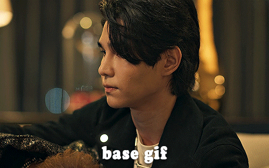
1. A completed gif converted into a smart object that is going to be the base gif. I'm going to call this "gif1". You’ll want this gif to be at least 3 seconds because it needs to last as long as the overlay plus a little bit of extra time in the beginning.
This is the base gif I’ll be using in the example (except I trimmed it so that I could meet the size limit).
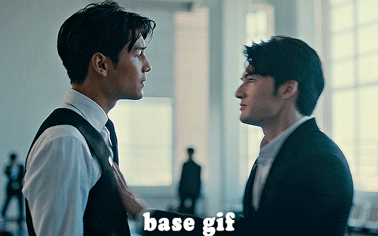
2. A second completed gif converted into a smart object that is going to go over the base gif. We’re going to call this "gif2". This gif should be at least 2 seconds but I’ve made it work with shorter. Gif2 needs to be the same dimensions or bigger than gif1.
This is the gif I'll be using in the example (except I trimmed it so that I could meet the size limit).

3. An overlay in video form. These can be found on tumblr and youtube by search for overlay or transition packs. For this example, I'll be using an ink drop overlay I found on youtube.
Step 1: Turning the overlay video into an overlay gif
Most overlays aren’t going to instantly fit the gif effect you’re trying to achieve right away. This is the overlay I got from youtube and as you can see it’s too slow and needs a crop/resize to be usable.

To fix it, I sped the frame rate up, cropped the overlay, and resized the overlay so it fits over my base gif. I also sharpened the overlay (500% amount, 0.3px radius) so that the edges were smooth. This is the new overlay gif and the one I’ll be using for the gif effect.

A tip: I also like to add a brightness/contrast layer to get rid of the grey on the overlay gif. Because we’re working with blending modes to achieve this effect, any parts of the overlay that are grey will be a blended mix of gif1 and gif2. If you think this will look good for your gif effect then don't worry about it!
Another tip: try to get the entire overlay movement to fit into a 2-3 second window. Anything longer than that will likely be cut off when you have to trim your gif to meet the upload size limit and it would suck to only have half of the overlay.
Step 2: Creating the gif effect
Drag a copy of gif2 and a copy of the overlay gif onto the gif1 canvas. I like to use Ctrl+Shift+V so that the layers are pasted in the same position as they were on the previous canvas. MAKE SURE that both overlay layers are in the same position on the canvas. If one of the overlay layers is higher/lower/etc. than the other then the effect won't work properly.
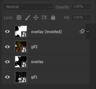
Then, make a second copy of the overlay and invert it (Ctrl+i). These are the layers you should have:

Before you go any further, trim gif2 and both overlay layers so they are all the same length.
Now, we need to rearrange the layers and set blending modes. The top layer should be whichever overlay goes from black to white. This is because when we change the blending modes, the white part of this layer will disappear and look like its being replaced by gif2. In this case, that is the overlay (inverted) layer. Then we want gif2, the other overlay layer, and then gif1.
A tip: this process can be done the other way where the top layer is the overlay that goes from white > black however, you are much more likely to have an error where there is a grey/black line around the overlay effect in your final gif. In order to avoid that, I always use the black > white layer on top.
Next, set the top overlay layer to darken. You should only see the black part from the overlay and gif2 should fill in the white part. Here’s how that looks in my example.
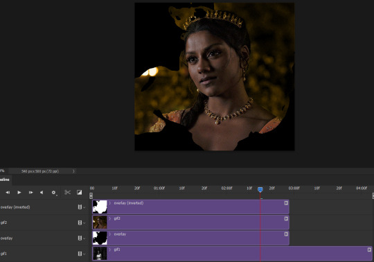
Next, select the top overlay layer and gif2 and convert both layers into one smart object. Your layers tab should look like this now.

Now, set the new layer’s blending mode to lighten and the overlay layer’s blending mode to darken. Once you do this, you should be able to see gif1 as well as the overlay gif.
Step 3: Timeline and exporting
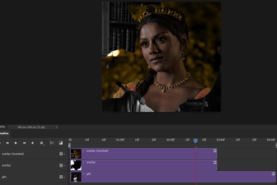
At the moment, gif1 is still significantly longer than the overlay gifs. Since this gif is just over 10 mb (which is pretty small for this effect) I’m going to trim about 1/4 of a second off the end of gif1 and then drag the overlay layers so they all end at the same time.

Now you’re free to export the gif! This is the finished effect for the example gif!

A tip: sometimes, when I convert to from timeline to frames, the gif becomes a little longer and slower. It has to do with different frame rates across the videos and photoshop but I'm not smart enough to understand it. If that happens, just set all the frames with the overlay layers to 0.04 speed instead of 0.05.
And we're finished! I hope that was helpful and made sense. If you have any questions feel free to drop them in my inbox or send me a message!! <3
#gif tutorial#allresources#completeresources#dailyresources#chaoticresources#ps tutorial#photoshop tutorial#usertreena#tuserssam#usernik#tuserabbie#tuserace#userk8#usershreyu#uservalentina#useryoshi#userannalise#userrobin#usersalty#uservivaldi
1K notes
·
View notes
Text
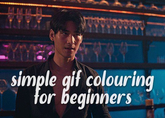
✨ Simple Gif Colouring for Beginners ✨
I wrote up my basic gif colouring process for a friend recently, but a couple of people here mentioned they'd also find it helpful! so, as requested, this is a beginner-friendly walkthrough of the way I colour my gifs :) it's aimed at brand new gif makers with no prior experience with photoshop or photo editing.
when I first started gif making I found colouring and photoshop in general suuuper daunting, so I've tried to simplify everything here as much as possible. hopefully this will be relatively easy to follow and not too intimidating!
a couple of things to begin with:
I'm only talking about colouring here - this is not a full gif making tutorial. I've linked to some of my favourites of those here!
I personally like to make bright, 'clean' looking gifs with vibrant but natural colours, so that is the style of colouring this tutorial is geared towards. most of gif colouring is subjective and about personal taste - the only thing that I'd say is possible to get wrong is skin tones, which I talk about a lot in this guide.
as I mostly gif Thai dramas, most of the advice is geared towards colouring for East Asian/South East Asian skin tones - but the techniques should be fairly universally applicable (and here are some tutorials that talk about gif colouring for other skin tones).
I'm not an expert! I'm not claiming this is the best or the only way to colour gifs - it's just how I do it.
this post is very image-heavy. if the images aren't loading (or the gifs are running slowly or cutting/looping weirdly), then try viewing the post in its own tab (rather than on the your dash or someone's blog) and refreshing the page.
okay, full walkthrough beneath the cut!
contents:
1. intro
a. natural gif colouring goals
b. very very basic colour theory
2. super simple colouring (the essentials)
a. curves
b. selective colour (and skin tone correction)
c. hue/saturation
d. saving and reusing colouring
e. another simple colouring example
3. other adjustment layers
a. brightness/contrast
b. levels
c. vibrance
d. colour balance
e. channel mixer
4. troubleshooting
a. curves
b. saturation
5. fin!
1. intro
the colouring part of gif making can be super overwhelming, especially if (like me when I first started!) you're completely new to photoshop and/or have no experience with colour theory or photo/video editing.
if you're opening photoshop and making gifs for the first time, I highly recommend getting used to making a few basic, uncoloured gifs to begin with. just to practice, rather than post anywhere (though you can always come back and colour them later if you want) - but it'll make the rest of the process much easier if you're already beginning to get used to working in timeline mode of photoshop. give yourself a bit of time to practice and get a feel for things like how many frames you tend to like in a gif, where you like to crop them for the best loop, what kind of aspect ratio you like etc* - so that you're not trying to navigate all of that for the first time on top of everything else!
* frames: for me between 60-90 frames is ideal, but 40-120 frames is the absolute min-max I'd personally use in a normal gifset
loops: for the smoothest loops, try to avoid cutting someone off mid-movement or mid-word if possible.
aspect ratio: for full-size (540px) gifs, I tend to go for either 8:5 (slightly 'skinnier' gifs), 7:5, or 5:4 (particularly big, thick gifs lmao)
✨ natural gif colouring goals
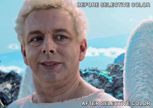
part of what can be so daunting about starting gif making is not knowing where to start or what you want to achieve. this is definitely something that gets easier with practice - the more gifs you make, the more you'll get a feel for what kind of look you like and the more instinctively you'll know how to get there. it also helps to see if any gif makers you like have made "before and after colouring" posts - these can help with getting a sense of the kinds of changes made through gif colouring. here's one I made!
in general, I like to make my gifs bright and 'clean' looking, with vibrant but natural colours. these are the things I'm usually hoping to achieve with colouring:
brighten dark scenes
remove muddy, yellowish lighting or filters
saturate colours
correct any skin lightening filters or overexposure
make lighting and colours as consistent as possible between gifs within a single gifset, especially gifsets featuring gifs from multiple scenes/episodes/videos
this guide is focusing on natural colouring, but of course there are many cool ways to make stylised/unnaturally coloured gifs. imo you'll need to master these basics first, but if you want to learn how to do things like change the background colour of gifs or use gradients or other cool effects, then @usergif's resource directory has loads of super helpful tutorials!
✨ very very basic colour theory
[disclaimer! I don't know shit about fuck. I do not study light or art. this is just an explanation that makes sense to me exclusively for the purposes of gif making.]
the primary colours for light/digital screens are red, blue, and green. having all three colours in equal measures neutralises them (represented by the white section in the middle of the diagram).
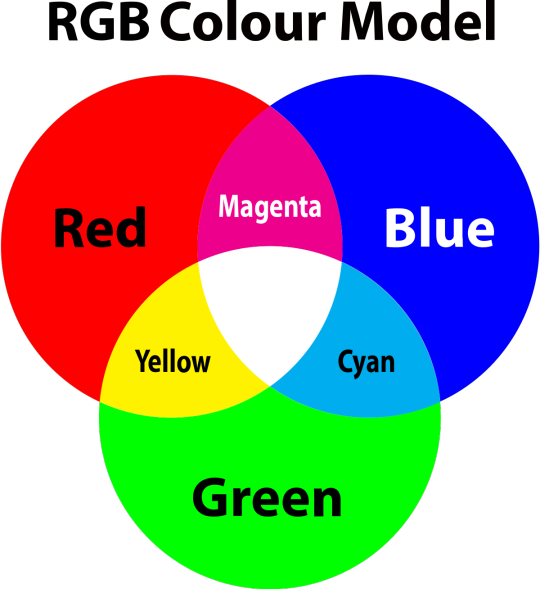
so to neutralise a colour within a gif, you need to add more of the colour(s) that are lacking.
in practice this usually means: the scene you want to gif is very yellow! yellow is made of red and green light, so to neutralise it you need to add more blue into your gif.
it can also mean the reverse: if you desaturate the yellow tones in a gif, it will look much more blue.
looking at the colour balance sliders on photoshop can make it easier to visualise:
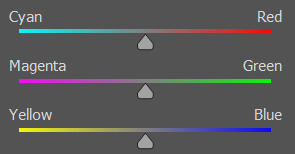
so making a gif more red also means making it less cyan.
removing green from a gif means adding magenta.
taking yellow out of a gif will make it more blue.
tl;dr:
neutralise yellows by adding blue (and vice versa)
neutralise reds by adding cyan (and vice versa)
neutralise green by adding magenta (and vice versa)
2. super simple colouring (the essentials)
starting with a nice sharpened gif in photoshop in timeline mode. (these are the sharpening settings I use!)
some scenes are much harder to colour than others - it helps to start out practising with scenes that are bright/well-lit and that don't have harsh unnaturally coloured lights/filters on. scenes with a lot of brown/orange also tend to be harder.
I usually save a base copy of my gif before I start colouring just in case I end up hating it, or find out later that it doesn't quite fit right into a set and need to redo it etc.
so here is my base gif!

it's an okay gif, but it has a bit of a yellow tint to it that I want to reduce.
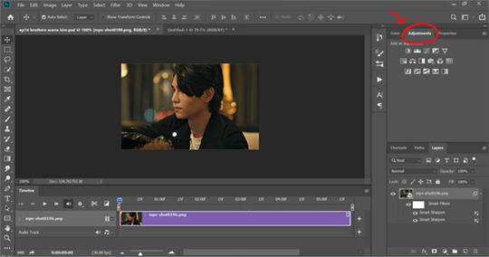
colouring is easiest to do in adjustment layers, which can be found under layer -> new adjustment layer - or for me they are here:
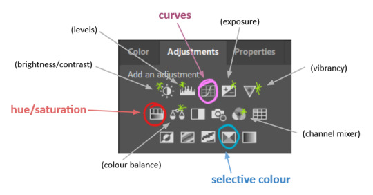
there are lots of different types of adjustment layers that do lots of different things - but for me the absolute essentials for colouring are curves, selective colour, and hue/saturation.
I also use brightness/contrast, levels, exposure, vibrance, colour balance, and channel mixer sometimes, depending on the gif - but I use curves, selective colour, and hue/saturation on every single gif.
✨ curves layer
the first thing I always do is a curves layer. when you first open one it will look like this:
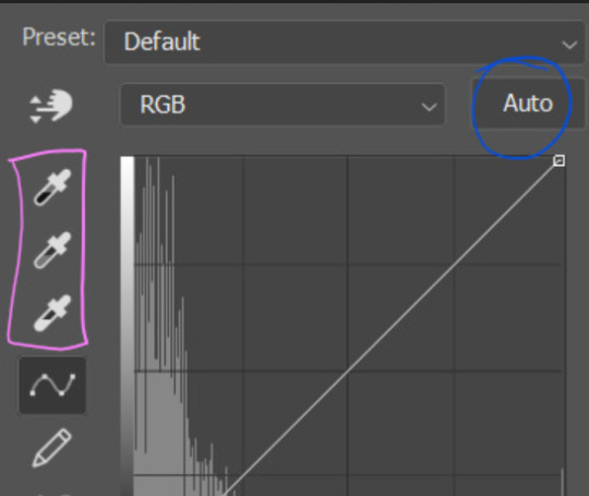
first I usually click the ‘auto’ button, just to see what happens. sometimes it makes a big difference (it usually brightens the gif a lot) - but on this gif it didn’t do much.
if it had made the gif look nicer then I would have kept it and added a second curves layer on top to do the rest of these steps.
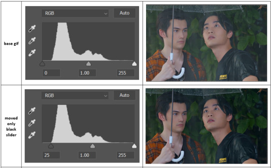
the next step is selecting the white and black points with the little eyedropper tools.
the bottom eyedropper lets you pick a white point for the gif. click somewhere super light on the gif to see what happens - for this gif, I clicked on the lampshade on the left. if it looks weird, I just undo it and try somewhere else - it usually takes a few goes to find something that looks good.
here's what that did to the gif:

then I pick the top eyedropper and use it to pick a black point by clicking somewhere really dark, again playing around until I find a black point that looks good.
here's what the gif looks like after picking the white and black points:

this can take some experimenting, but you can make super easy drastic changes to your gif just with this. in this case, the curves layer took out a lot of that yellowy tint.
and this is what the curves graph looks like now:
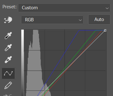
you can click and drag those lines to make further changes if you want - I usually leave them alone though. the colours of the lines indicate which colours have been changed in the gif - for example, you can see from that steep blue line on the graph that blue has been added to neutralise those yellows.
next I usually do another curves layer and just press the ‘auto’ button again to see what happens. usually it brightens the gif a bit more, which I like.
‼️if nothing is working: usually with a bit of fucking about a curves layer works well - but sometimes you can’t find a good white and black point anywhere, and instead your gif turns wacky colours and nothing looks good. this happens more often with very heavily colour tinted scenes :( the troubleshooting section at the end goes over some options, including starting with a levels layer instead.
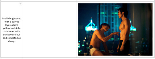
✨ selective colour (and skin tone correction)
skin tones are made up of a mixture of yellow and red.
removing yellow (or adding blue or red) to a gif will make the skin-tones too red - and removing red (or adding cyan or yellow) to a gif will make the skin-tones too yellow.
adding blue to this gif with the curves layer took out the yellowy tint, which I wanted - but it also took the yellows out of Kim's skin tone, which I don’t want. so I need to put yellow back into the skin tones specifically - without putting it back into the rest of the gif.
selective colour layers let you select an individual colour and adjust the levels of other colours within that colour. you can change how yellow the green shades are, or how much cyan is in the blues, for example.
I need to add yellow back into the red tones to correct the skin tones on this gif. this is the case for most gifs in my experience - the vast majority of the time, unless a scene is very heavily tinted in another colour, a curves layer will add blue/remove yellow.
in the 'colors' dropdown, select the 'reds' section and drag the 'yellow' slider higher - this will add more yellow into just the red shades within the gif.

the amount of yellow you need to add back into the reds depends on how much yellow was taken out of the gif initially - I just play around with the slider until it looks right. if you're not sure, it helps to have some neutrally-coloured (not white-washed!) reference photos of the people in your gif to compare to.
here's the result. Kim's skin is a lot less pink toned and much more natural looking:
✨ hue/saturation
this adjustment layer lets you adjust the hue and saturation of the gif as a whole, and also of each colour individually.
I don't use the hue or lightness sliders unless I'm trying to do something more complicated with the colouring.
clicking the dropdown menu that says 'master' lets you edit the saturation of each colour individually. this is useful if your gif is still super tinted in one colour.
I thought the yellows on this gif were still slightly too bright, so I switched to the yellow channel and desaturated them slightly. (remember if you do this then you need to go back to selective colour and add more yellow into the red skin tones to balance out the desaturation!)
then I increased the 'master' saturation of all the colours to +5:
I usually find the right amount of saturation is somewhere between +5 and +12, but it depends on the gif.
‼️if the gif feels undersaturated, but the saturation slider isn't helping/is making the colours worse, try a vibrance layer instead.
done!
✨ saving and reusing colouring
you can copy and paste adjustment layers between gifs to make your colouring even across each of your gifs for one scene - so if you're making a set of multiple gifs of the same scene, or you think you might want to gif the same scene again in the future, you can save it as a psd so you can reuse the colouring again later.
each gif's colouring will then still need tweaking - different cameras/angles/shots of the same scene can still start out with slightly different colouring.
I recommend uploading the gifs as a draft post on tumblr so you can see what they all look like next to each other and catch any inconsistencies.
✨ another one! (speedrun!)
HI KEN!
the white point for the curves layer was in the window behind them.
the curves layer removes the muddy yellow tint, but again it makes their skin tones (especially Ken's) very red toned, which is adjusted by the selective colour layer.
3. other adjustment layers
imo many many gifs can be coloured really nicely with just those three adjustment layers, but some need different adjustments.
✨ brightness/contrast
pretty self explanatory!
I personally usually avoid using the 'brightness' slider because I rarely like the effect - I only tend to use the 'contrast' one.
the 'auto' button is sometimes useful though, especially if you’re struggling with the curves layer.
✨ levels

levels alters the white and black points of the gif, like curves - but unlike curves it doesn't also alter other colours.
use the sliders beneath the graph to alter how dark/light the gif is. you can slide the black slider further to the right to make the blacks darker, and the white slider to the left to make the whites lighter.
levels is a good place to start if your curves layer isn't working.
(I'm going to hit the image limit for this post lol so here are some screenshots of a table I made to demonstrate this rather than actual gifs. sorry!)

on both sides, I dragged the sliders up to where the big jumps are on the graph - this is usually a good place to start!
✨ vibrance
vibrance... makes the colours more vibrant. it's more subtle than saturation.
it's really helpful for gifs that feel grey. sometimes adjusting saturation just makes the greys kind of weirdly tinted, but a vibrance layer can fix that.
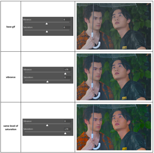
vibrance is much more subtle!
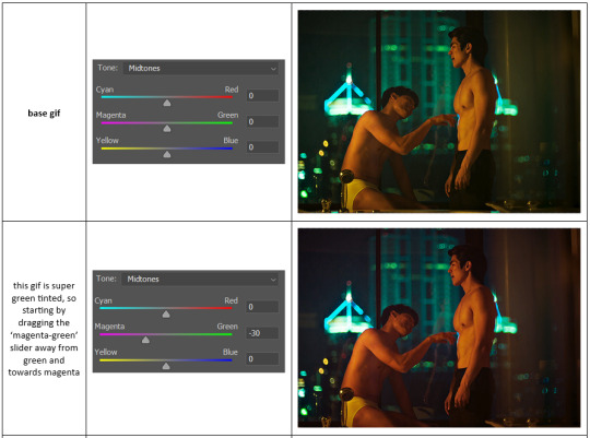
✨ colour balance
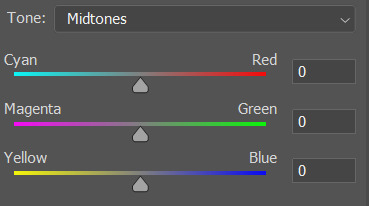
colour balance affects the overall balance of colours within a gif.
it's good for scenes with heavy tints.
I tend to stick to the 'midtones' dropdown, but you can also alter the colour balance within the shadows and highlights if you want.

✨ channel mixer
I avoided channel mixer for such a long time because it scared me. but it's great for scenes that are very heavily tinted in one colour.
basically, it works with the levels of red, green, and blue within a gif. you select an output colour and then play around with the levels of the colour you selected within each other colour.
kind of the reverse of selective colour?
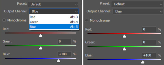
so in the 'blue' channel, the levels of blue are at 100%, and the levels of red and green are at 0% - but you can impact how much blue is in the reds and greens and blues.
this tutorial explains it well - but imo the best way to get to grips with channel mixer is just to play around with it a bit (sorry)
(when I made this guide for my friend, I also made a slightly more complicated gif colouring walk-through that included using channel mixer. there isn't space to include it within this post, but if anyone is interested I could always upload it as an 'intermediate' gif colouring tutorial - lmk!)
4. troubleshooting
‼️curves
usually with a bit of fucking about a curves layer works well - but sometimes you can’t find a good white and black point anywhere, and instead your gif turns wacky colours and nothing looks good. this happens more often with very heavily colour tinted scenes :(
for example, with this base gif:
using many of the brightest points as a white point turn it wacky colours, like this:

yikes :(
some options for these cases:
try brightening the gif first with the 'auto' button on the curves layer or with a levels layer. having a brighter gif to start with can give you better options for picking a white point.
try finding an alternate, whiter/brighter white point. look for places the light reflects - on this gif, using the light on Porsche's cheekbone works well as the white point. it also helps to find places that would be white if the scene wasn't tinted - the lightest part of a white shirt is often a good place to start, for example.
skip the curves layer, and instead use a levels layer to alter your white/black points, and colour balance or channel mixer to balance the colours.
‼️over/undersaturation
if your gif (especially the skintones) is looking a little washed out or lifeless, it might be undersaturated. boost that saturation - or if that's not working, try a vibrance layer.
oversaturation is often easiest to spot in the mouths and ears of any people in a gif. if the mouths are looking unnaturally, vibrantly red, then you've gone too far with the saturation.
5. fin!
and done! I hope this was coherent helpful to somebody.
if there's anything that I've missed or that doesn't make sense pls feel free to shoot me an ask or a message and I'll do my best to help! I've also collated a bunch of additional reading/resources below.
happy gifmaking 🥰
✨ some links!
photoshop basics by @selenapastel
gifmaking for beginners by @hayaosmiyazaki
gifmaking guide for beginners by @saw-x
dreamy's gif tutorial by @scoupsy-remade (includes instructions on how to blur out burned-on subtitles or annoying video graphics)
beginner's guide to channel mixer by @aubrey-plaza
how to fix orange-washed characters by aubrey-plaza
colour correcting and fixing dark scenes by @kylos
does resampling matter? by usergif
how to put multiple gifs on one canvas by @fictionalheroine
watermarking using actions by @wonwooridul
resource directory by @usergif
#i got a couple of asks about this so i figured i'd type it up as a post#it's been sitting in my drafts for a while now though i'm so sorry omg.#i had to replace my laptop and it took me a while to get round to downloading photoshop on the new one#but i hope this is helpful!!#gif making#tutorial#photoshop tutorial#colouring tutorial#coloring tutorial#gif colouring#gif coloring#photoshop resources#gif tutorial#gif resources#userbunn#uservik#darcey.txt#darcey.gif#usergif
323 notes
·
View notes
Photo
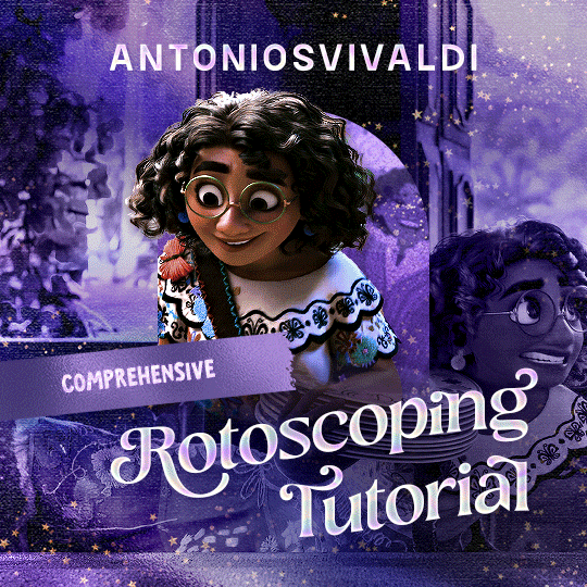

Rotoscoping Tutorial by @antoniosvivaldi
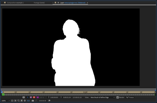
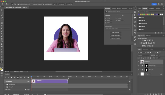
Hi everyone! I’m excited to announce my long-delayed Rotoscoping Tutorial - requested by a number of people over the past calendar year.
In this tutorial, I will show you how to create the cutout gifs like this (and seen in most of my gifsets under this tag) with Rotoscoping on After Effects. I’ll also provide additional examples and a number of things that I do to optimise my giffing / Rotoscoping workflow (e.g. useful shortcuts & other things to be aware of).
This is the structure of the tutorial:
Why Rotoscoping? Photoshop video timeline’s limitations
Photoshop workflow pt 1: Preparing your gif
After Effects workflow: Interface, shortcuts, and Rotoscoping tools
Photoshop workflow pt 2: Assembling your gif; with multiple examples
Bonus content: Rotoscoping tips* & workarounds to common issues
For quick reference, here are example gifsets (and where Rotoscoping is used in the posts) that I will mention in the tutorial:
Example 1: Cutout gif effect | panels 2 + 4
Example 2: Changing a gif’s background colour | all panels
Example 3: Cutout gif effect in a shape | all panels
Example 4: Putting it all together | panels 1, 3, & 5
What you need & need to know:
Software: Photoshop & After Effects (After Effects 2021 or later for Rotobrush 2.0)*
Hardware: 16GB RAM required to run later versions of AE*
Difficulty: Advanced; Knowledge in making gifs, applying layer masks, and using video timeline interface assumed
Key concepts: Rotoscoping (AE) / Video Timeline (AE+ PS) / Layer Masks & Groups (PS)
Supplementary files: tutorial resources
*I’m currently running the latest version of PS & AE on an M2 Mac, but I’ve also used older versions (CC 2015 & 2020) on Intel-based Macs. I’ll outline some known compatibility & performance issues, and workarounds later in this tutorial that could help streamline your giffing workflow.
Tutorial under the cut. Like / Reblog this post if you find this tutorial helpful. Linking this post / the example gifsets in your post caption, will be greatly appreciated if you read this to create effects seen in Examples 3 + 4.
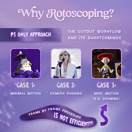
1) Why Rotoscoping?
My Rotoscoping journey is motivated by the shortcomings on Photoshop - namely the limited options to manipulate the Layer Mask keyframes in the video timeline interface, as well my need to gif more efficiently.
Suppose I want to cutout this subject or recolour the background of a gif on Photoshop: I personally classify the gifs that I prepare on PS into 3 types based on the motion of the subject
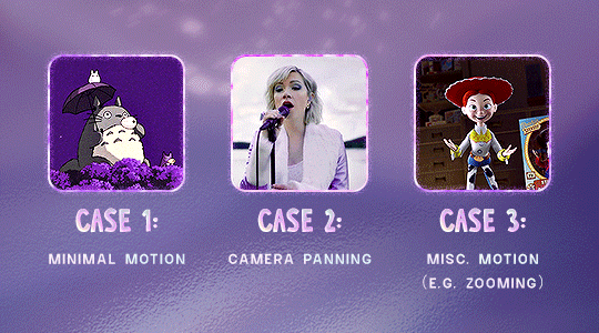
These are the common Photoshop-only approaches when attempting to mask the subject in the gif.
Case 1: minimal motion in the subject → a simple layer mask will do the trick
Case 2: some linear panning of the subject in the gif → using the Layer Mask Position keyframes in the video timeline interface will do the trick
Case 3: subject moves around a lot (e.g. zoom motion) → Unfortunately this is where a Photoshop-only workflow will require frame by frame masking. Layer Mask Position keyframes only apply positional translation (but not transformation / rotation) on the layer mask
Enter Rotoscoping on After Effects: Instead of resigning to frame by frame procedure on Photoshop, I opted to make my life easier by learning to Rotoscope on After Effects. This essentially provides me an opportunity to cutout / recolour a wider range of gifs with relative ease.
2) Photoshop pt. 1: Preparing your gif
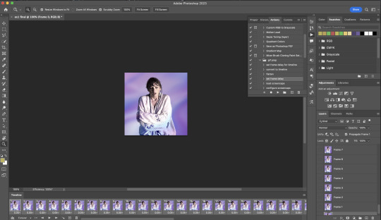
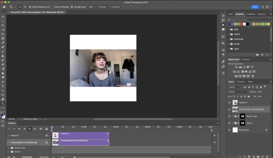
Prepare your gif the usual way - whether you screencap or import frames from video.
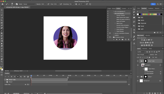
Then your Photoshop should look like this:
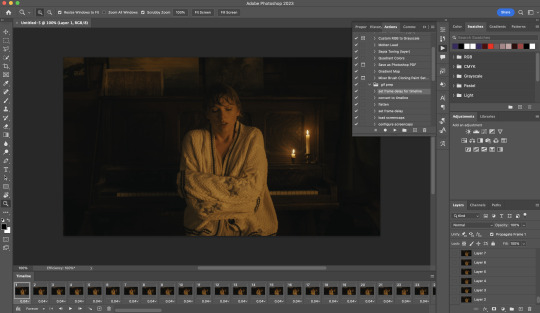
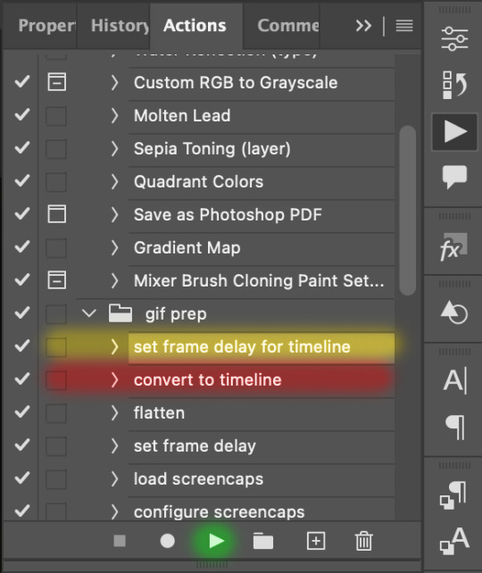
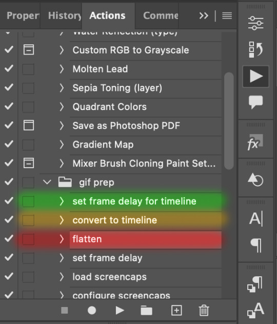
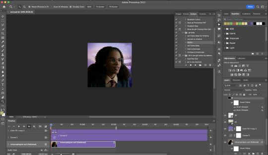
Now, I shall walkthrough & explain my personal giffing workflow (as of 2023) after loading the gif frames. To speed up the process, import my gif prep action file to Photoshop.
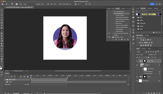
Going to Window > Action, you’ll see a set of actions under the “gif prep” folder.
"set frame delay for timeline” (highlighted in yellow) will set all of your entire gif’s frame delay to 0.03s
“convert to timeline“ (highlighted in red) will take you to the Video Timeline interface
To play an action, press on the Play button (highlighted in green)
i. Set the frame delay of the entire gif to 0.03s. (play “set frame delay for timeline” from my gif prep action pack)
I work with everything in 0.03s frame delay (or equivalently 30fps) at first. It’s always possible to change the frame delay of the final gif to 0.05s before uploading onto Tumblr.
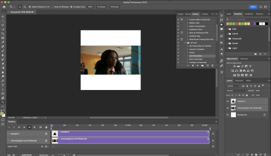
ii) Convert this gif to a Smart Video Layer (play “convert to timeline” from my action pack)
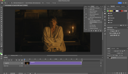
Note: I personally don’t resize the gif just yet. That’s because Rotoscoping in full video resolution will render higher quality details around the edges as well as more flexibilities later on in the editing process.
Performance optimisation: If your computer has 8GB of RAM or less, you might find it helpful to crop / resize your gif to Tumblr dimensions now for a less sluggish performance in After Effects later on.
(I have giffed on a desktop with 8GB of RAM and it’s quite slow at rendering individual frames of a 1080p short clip on AE)
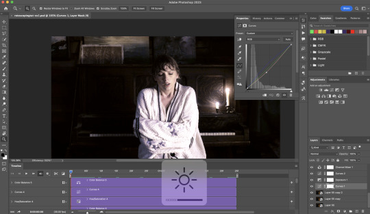
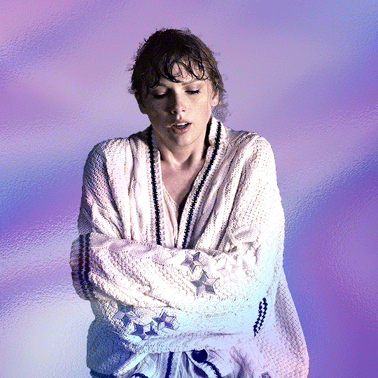
iii) Add colouring adjustments on the gif. This will save you A LOT of time when you Rotoscope gifs that are originally very dark / poorly lit (e.g. the uncoloured Taylor Swift gif shown just above).
If you usually colour your gifs at the very end of your giffing process (i.e. after sharpening), this will be a bit of a change.Nevertheless I still highly recommend adding some base colourings now to at least increase the contrast between the subject and the background.
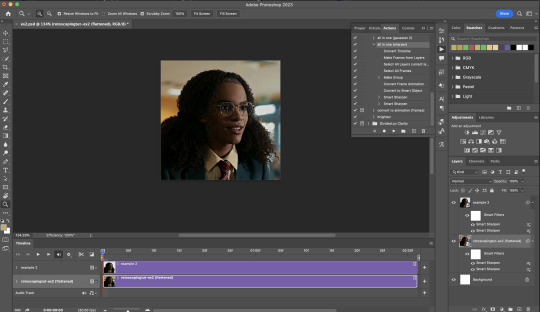
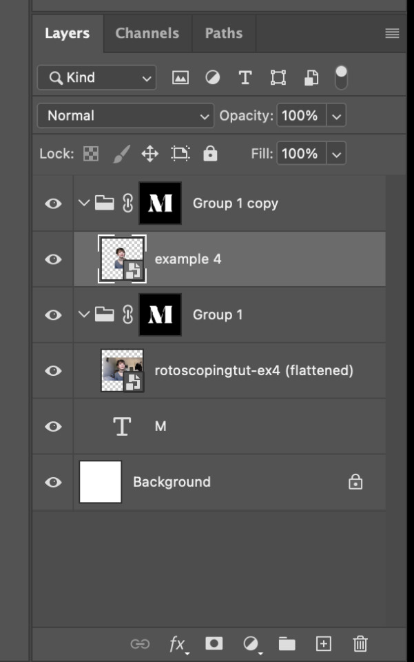
iv) To minimise lagging on After Effects, simplify this gif file as follows:
Flatten / Unsmart this gif file back to frame animation mode: play “flatten” (highlighted in red) from my gif prep action pack
Set the frame delay to 0.03s: play “set frame delay for timeline” (highlighted in green)
Convert the simplified gif file back to the video timeline interface: play “convert to timeline” (highlighted in yellow)
After “unsmarting” and converting back to the video timeline, your interface should look like this

And voila! This gif PSD is now ready to be imported to After Effects for Rotoscoping work!
3) After Effects: Interface and useful shortcuts
Open After Effects and Import (Cmmd / Ctrl + I) your gif PSD that you’ve just prepared.
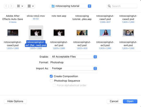
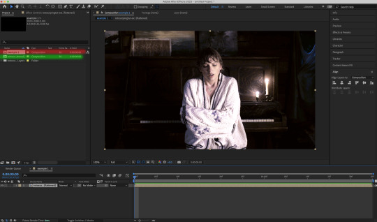
After importing your gif PSD to After Effects, the interface should look like this.
In the screenshot below, there are two compositions: the imported gif (highlighted in green) & another composition file made from selecting the imported gif (highlighted in red)
For the rest of the workflow, we will edit from the clone composition (the one highlighted in red), so select this one.
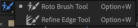
Before we take our plunge into the Rotoscoping, here are a few useful shortcuts to remember. I’ll explain the Roto Brush tool in the next section.
Preview the previous: fn + up arrow
Preview the next frame: fn + down arrow
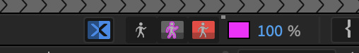
Add to Roto Brush selection: holding Shift while you’re using the Roto Brush Tool
Subtract from Roto Brush selection: holding Alt while you’re using the Roto Brush Tool
Change Roto Brush size: while holding Cmmd / Ctrl, click + drag your mouse left / right
4) After Effects: The Rotoscoping Process
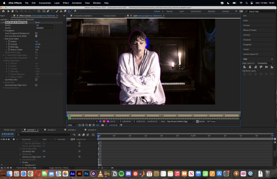
To access the Rotoscoping tools, click on the Roto Brush icon (highlighted in red in the screenshot below)
Then you’ll get the following dropdown options with two Rotoscoping Tools
Roto Brush Tool: This is where you add / subtract your Rotoscoping selection in your composition
Refine Edge Tool: Paint around the edge of your selection for more refined edges. Very helpful for Rotoscoping fuzzy edges / hairs
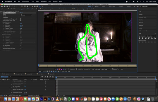
To make some Rotoscoping selection, first grab the Roto Brush Tool and click on the subject you want to cut out from your composition.
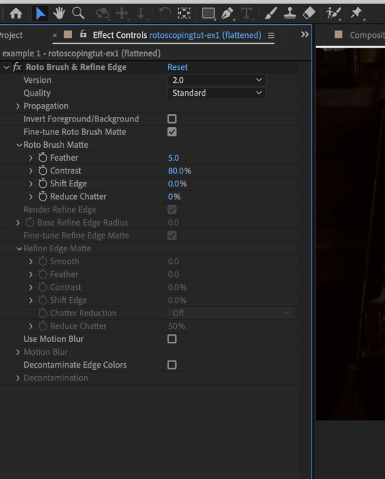
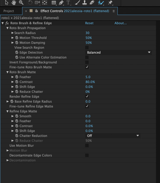
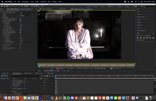
When you’re Rotoscoping you’ll see this in the Effect Controls panel.
There are two versions of Roto Brush:
Version 2.0: The Rotoscoping selection is powered by AI for higher accuracy when you propagate the frames.
Version 1.0 (Classic): This is the legacy Roto Brush Tool that uses a lesser algorithm. Recommended only if Roto Brush 2.0 is unstable on your machine due to RAM issues.
And two quality settings for Roto Brush 2.0:
Standard
Best
Note: I am currently unable to use Roto Brush 2.0 with Best quality model on my machine to compare the differences myself, so I’ll link this page that explains the two quality settings.
Note: if you’re using an older version of After Effects you’ll see this instead. This corresponds to Roto Brush 1.0 / Classic in the newer versions of AE.
When you’ve made a selection using the Roto Brush Tool, you’ll see the pink lines around the subject. This is the region that you’ve selected to Rotoscope!
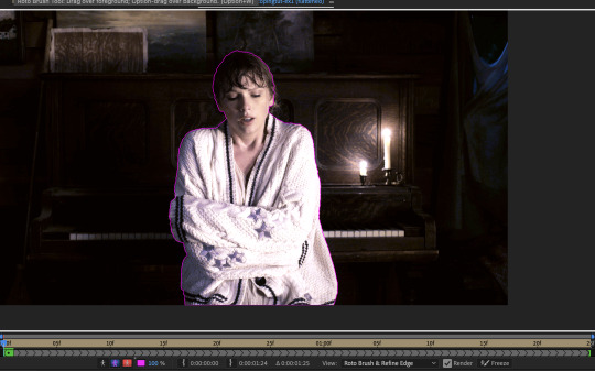
To bring out some details around the edges, grab the Refine Edge Tool and paint around the edges
Then the interface will look like this
To view the Rotoscoping selection that you’ve made more intuitively, you could click on the following buttons.
Personally I like the viewing my selection using Toggle Alpha (the second box from the left) & Toggle Alpha Boundary (the 3rd box from the left)
Toggle Alpha
Toggle Alpha Boundary

Note: If you aren’t happy with the initial Roto Brush selection, you can always add (press Shift while using the Roto Brush Tool) / subtract (press Alt / Option using the Roto Brush Tool) your selection.
After you’re happy with your Rotoscoping selection in the first frame of your composition, press fn + down to view the next frame.
Repeat pressing fn + down and fix the selection along the way (e.g. I subtracted a small area from my Rotoscoping selection with the Roto Brush tool to make the edge look cleaner).

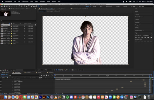
After fixing the selection along the way, go back to the composition file (select the clone composition again) and you will see that a cutout gif is made!
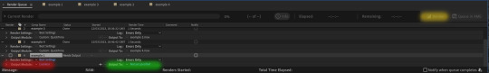
To export this, go to File > Export > Add to Render Queue. You’ll be redirected to the Render Queue panel at the bottom of After Effects.
Highlighted in red: click to change export setings
Highlighted in green: click to change save destination
Highlighted in yellow: click to render video
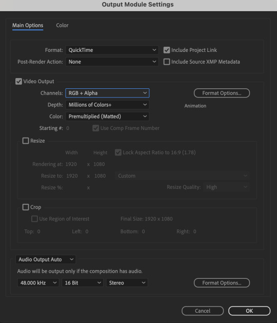
To preserve the transparency of your cutout gif, you need to change your export settings in the Output Module.
Under the Video Output section, change your Channels to RGB + Alpha. Press OK. Then Render the video.
5) Photoshop pt. 2: Assembling your final gif
The essence is to drag the cutout gif (aka the video file that you’ve just rendered on AE) into a new PSD composition file. This will be where you’ll do the rest of your giffing. Your workflow will contain the follow steps:
Make a new blank PSD composition file in Tumblr dimensions
Enable the Video Timeline
Follow the instructions detailed in the individual examples i.e. drag the cutout gif into the PSD & adjust the timeline start / end points
Exporting the final gif. If you’ve worked in 0.03s frame delay all the way up to here, just play the action that I’ve provided in the tutorial in the following order to set the frame delay to 0.05s.
EXAMPLE 1: finalising your cutout gif | sample gifset
After enabling the Video Timeline in your PSD composition file you’ll see something like this
Go to your folder, drag the cutout gif you’ve made on After Effects, resize / reposition, then press Enter.
And also make sure to adjust the Video Timeline’s start / end values.
Add some finishing touches. Because I did the Rotoscoping at full HD resolution, I’ll also need to sharpen my gif in this step.
After you’re happy, you can export this into a gif file and do what you usually do to change the frame delay to 0.05s.
Notes on my “Unsmarting” approach:
To prevent accidentally writing over a PSD composition file that I’ve spent time editing, I personally render this into a short video (File > Export > Render Video) and use the following export settings (to prevent quality loss)
Then I open the rendered clip and play the actions in my gif prep action pack as follows:
flatten: this “Unsmarts” the clip / video
set frame rate: this sets all frames to have 0.05s frame delay
This is the final interface that I get before I pull up the Save For Web window.
EXAMPLE 2: changing your gif’s background colour (for Case 3 gifs) | sample gifset
From your folder, drag BOTH the cutout gif (rendered on AE) and the original gif to your blank composition.
Important: you need to make sure that both layers are properly lined up in the composition file (i.e. selecting both layers when repositioning / resizing)
On Photoshop, press Enter twice and place the cutout gif on top of the original gif from the Layers panel. Then you should get something like this
Select both layers and resize / reposition them in your PSD composition until you’re satisfied with the placements.
The basic idea here is to add some adjustment layers / other things in between the cutout gif and the original gif. To do this, select the original gif layer in the Layers panel.
Then you can start adding.a bunch layers e.g. textures, onto the composition.
And then here’s the exported gif!
6) Fancier Rotoscoping examples
Note: knowledge in using layer masks / groups and making shape / text layers assumed
In the next two examples, I’ll show you how to combine the two previous examples with shape / text layers.
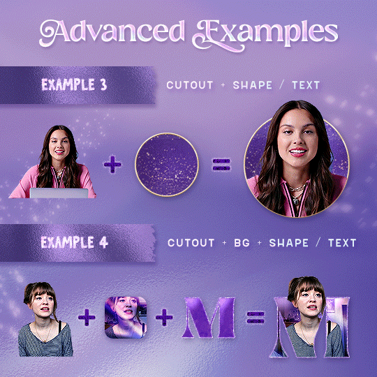
EXAMPLE 3: Placing your cutout gif into a shape / text layer | sample gifset
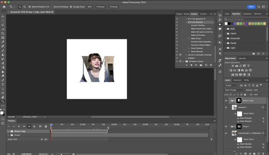
Add a text / shape layer to your blank PSD composition
We want to prepare a masked group so in the Layers panel:
Make selection from layer: Cmmd / Ctrl + Click (highlighted in red)
Make a new group: click on the folder icon (in yellow)
Create layer mask: click on the icon (in green)
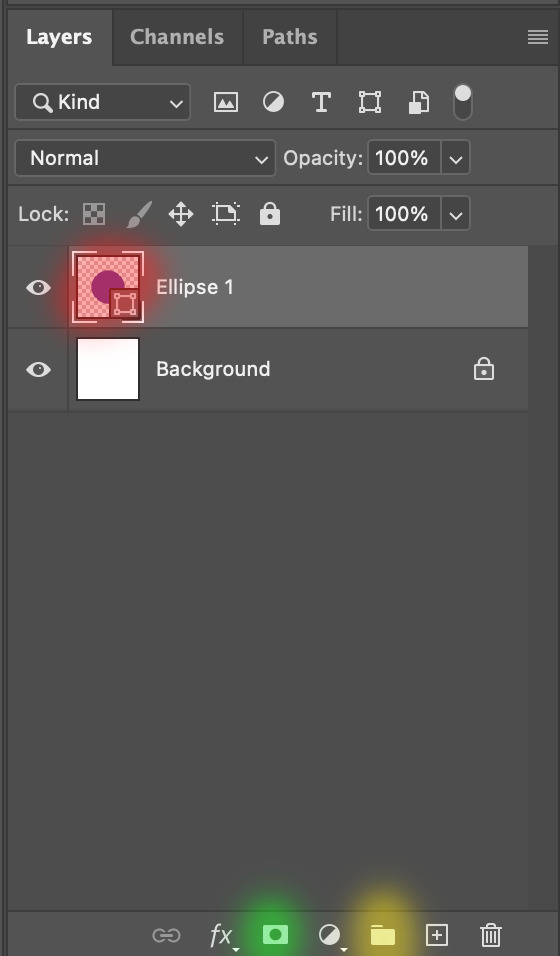
After duplicating the masked group you’ll get something like this in the Layers panel
Drag your cutout gif into the PSD composition
Place the cutout gif into the masked group on top
Select the mask of the top group and paint (in white) over the region you want to reveal for the cutout gif
Add some finishing touches & export the gif!
EXAMPLE 4: Putting it all together | sample gifset
You follow the same approach as in Example 3 to prepare the masked groups, but you need to drag two gif layers in (and resize them using the approach outlined in Example 2)
Place the gif layers as follows
While selecting the mask of the group on top, paint (in white) over the region that you want to reveal in the cutout gif
Now select the original gif (placed within the other group) and add some adjustment layers
After adding some finishing touches & exporting the gif, I get this!
Note: you can do even more overlay effects in the background portion of example 4. There will just be more masked groups + adjustment layers
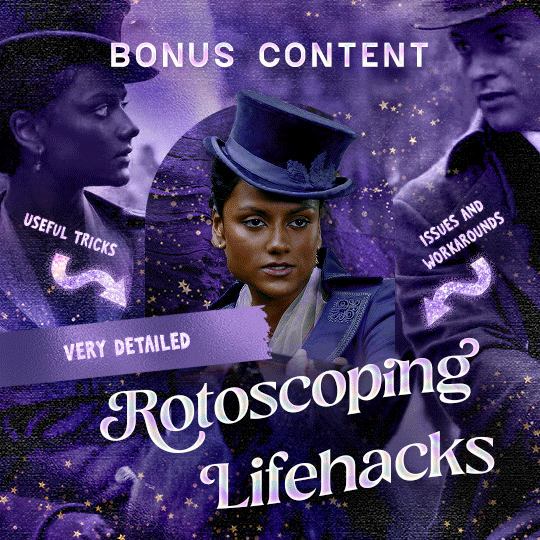
7) Bonus: Some useful Rotoscoping / giffing lifehacks
GIFFING LIFEHACKS:
— Use best quality footage that you could find & Rotoscope in full video resolution, for better details around the edges
— Poorly lit scenes & low contrast edges are harder to Rotoscope (e.g. Toy Story set / TS evermore set).
If you’re new to AE, I would recommend choosing videos with well-lit gifs with simpler backgrounds and high contrast edges (e.g. Maisie Peters Cate’s Brother set)
— Use Rotobrush 2.0 if you’re using After Effects 2021 or later. It’s more difficult to Rotoscope / change background colour for gifs with a lot of movements with the classic Rotobrush tool. If the scene is tricky, you might want to switch to the “Best” quality model.
HARDWARE-RELATED PERFORMANCE OPTIMISATION:
— The recent versions of Photoshop require at least 8GB of RAM. If you have less RAM, it will still work provided you have enough scratch disk space. For better performance, it’s best to close other applications when you’re using Photoshop.
— The recent versions of After Effects require at least 16GB of RAM. If your machine has less RAM than this, there are some workarounds to prevent your machine from hanging:
Essential: close other applications that you’re running on your computer
Resize your gif down to Tumblr dimensions & sharpen it before importing to After Effects.
Install an older version of AE
8) Bonus: Some known software + hardware issues, and workarounds
KNOWN ISSUES ON PHOTOSHOP:
I currently have minimal issues in my giffing workflow, but I’ll nevertheless outline a few common known Photoshop issues for anyone who needs some workarounds.
— Video Timeline interface missing: this affects Apple Silicon Macs (i.e. M1 / M1 Pro / M1 Max / M1 Ultra / M2 / M2 Pro / M2 Max)
Update to newer version of Photoshop (updated 2022 or 2023)
Open Photoshop with Rosetta
— Scratch disk full error: This is a common issue with machines that lack RAM & have nearly used up internal storage. Editing video layers in the timeline interface uses a lot of memory hence will require a lot of scratch disk space.
Make sure that you have enough free storage space while using Photoshop. Alternatively you can use an external hard drive as a scratch disk.
KNOWN ISSUES ON AFTER EFFECTS:
These are a few issues that I have personally ran into over the course of giffing on multiple devices & multiple versions of After Effects.
Note: Inputs from M1 / M2 Mac users with regards to experiences on using the After Effects Rotoscoping tools are welcome!
— Rotobrush 2.0 set to “Best” quality model causes AE to crash: this affects anyone who’s using MacOS Ventura
I’m currently experiencing this issue on my M2 Mac. The workaround right now is to change the Roto Brush 2.0 quality setting to Standard.
This is due to some software compatibility issues on Adobe’s side specifically with MacOS Ventura. Fingers crossed that they will properly fix this bug in the future updates!
— Cannot re-open project files with Rotoscoping: this affects anyone using the initial release of After Effects 2020 (I had installed this on an Intel-based machine and it sucked)
The only option here is to update to a later version of After Effects.
8) More useful Rotoscoping resources
Rotoscoping + Keyframes Tutorial by @jenna--ortega
Rotoscoping + Masking Tutorial by @usergif
Rotoscoping For Beginners in After Effects | Motion Graphics Tutorial
I hope you enjoy reading this! If you have any questions / need any help related to this tutorial, feel free to send me an ask!
#after effects#tutorial#gif tutorial#photoshop tutorial#dearindies#tusermelissa#usernik#useryoshi#usershreyu#usercim#userrobin#useralison#userannalise#userkosmos#userisaiah#usergiu#userives#*#my resources#my tutorials
2K notes
·
View notes
Note
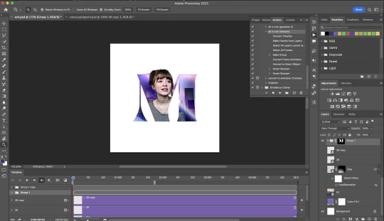
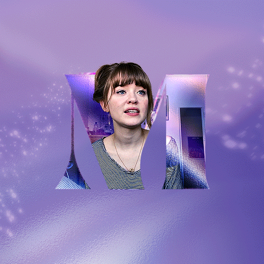
Hi! Would it be possible to post a tutorial of how you created the white text in this set /post/695221752725422080/buckpendragon-911-verse-coc-week-day-1 thank you :)
hiii! you mean the text in the first gif, right? it's actually a pale green so i hope that's what you meant 😅
i somehow still have that psd so i was able to go grab the exact settings for the two text layers used here:
(if you meant the little white text, it's simply the font candara with different values of tracking/letter spacing)
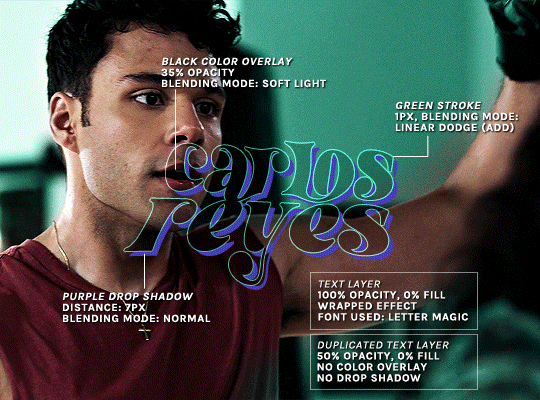
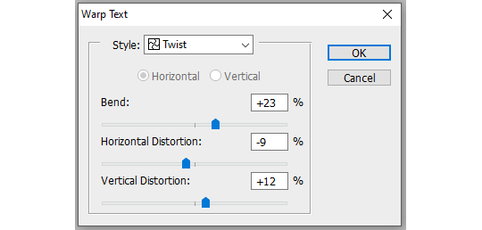
the font i used is called letter magic, and i've given my bare text a bit of warp (right click ont the text layer > warp text > style: twist). by the way, the color of the text doesn't matter, so no need to pick one.
BASE LAYER
first, put the text layer's opacity to 100%, and the fill to 0%. the text will become transparent, it's what we want. then double click on the layer to get to the layer style options. you'll want to add a drop shadow, a color overlay, and a thin stroke:
DUPLICATED LAYER
i found the stroke a bit too thin on my gif, so i duplicated the base layer (right click on the layer > duplicate layer > destination should be the same canvas), put its opacity to 50% and kept to 0% fill. and disable the drop shadow and color overlay by clicking on the little eyes on the layer:
voilà :)
#alie replies#Anonymous#*ps help#photoshop#tutorial#resource#photoshop tutorial#typography#mialook#tuserzee#userabs#usertj#userchibi#userhella#userkarolina#usertina#quicklings#userraffa#usercats
292 notes
·
View notes
Text

Thank you @cobbbvanth for asking me for this; I’ve never been more flattered! ☺️ I’ve only been making gifs for a little more than 2 years, so I’m really still only figuring Photoshop out, and my colouring owes everything to other people’s tutorials (some of which can be found here). To be honest, I was only asked some tips, but I have no clue what to include and what to leave out; so, here’s my complete (if random) colouring process.
NOTE: This is a colouring tutorial, not a gif-making one. The tutorial that taught me everything I know about that (and to which I am eternally grateful) is this one by @hayaosmiyazaki.
I. SHARPENING
My standard sharpening settings are:
One Smart Sharpen filter set to Amount: 500 | Radius: 0,4
A second Smart Sharpen filter set to Amount: 10 | Radius: 10
One Gaussian Blur filter set to Radius: 1,0 and Opacity: 30%
One Add Noise filter set to Amount 0,5 | Distribution: Gaussian
II. BASIC COLOURING
This is the part where I add most of the adjustment layers available and just play around with them. Obviously different settings work for different scenes, but I do have some standard ones.
Brightness/Contrast
I usually up the Brightness to +10-30, and the Contrast to about +10.
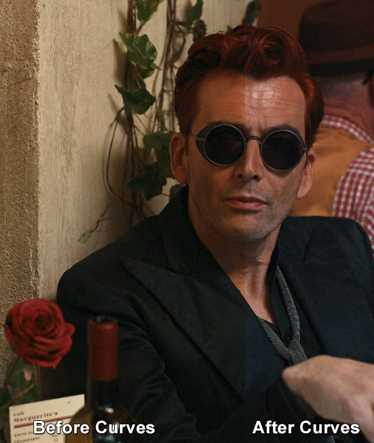
Curves
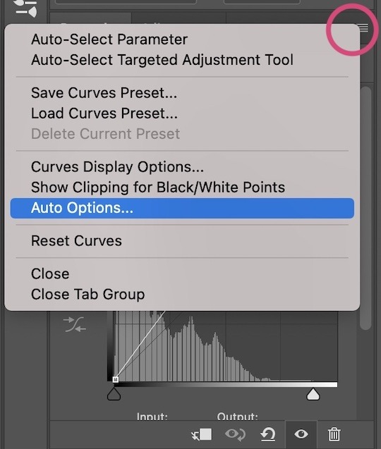
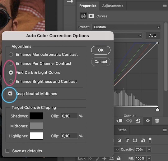
For the first Curves layer I go to Auto Options > Enhance Brightness and Contrast, and then adjust the opacity until I’m happy.
I might repeat the above step if the gif still looks too dark to me.
I add another Curves layer, I go to Auto Options and this time I pick either Find Dark & Light Colors or Enhance Per Channel Contrast, and check or uncheck the Snap Neutral Midtones option, until I see something I like. I will then adjust the opacity.
Levels
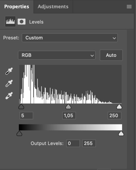
I add a Levels layer that usually looks something like this:
Exposure
I add an Exposure layer, where I usually set the Offset to around -0,0010.
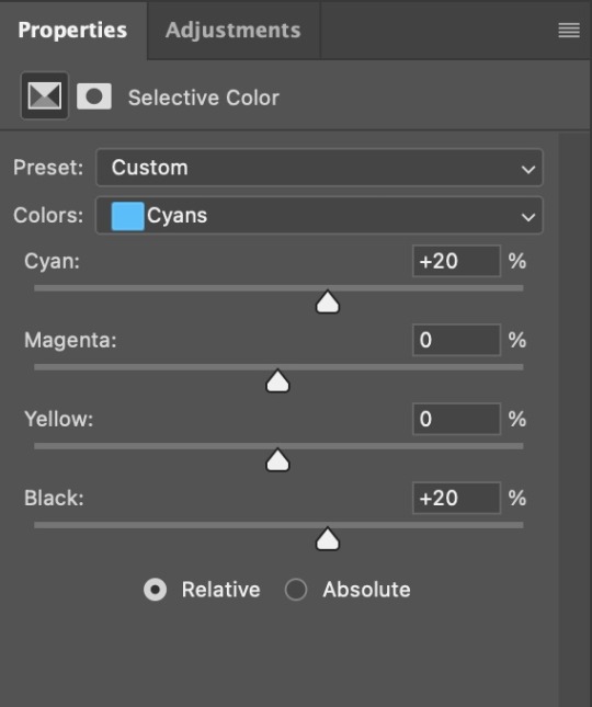
Selective Color
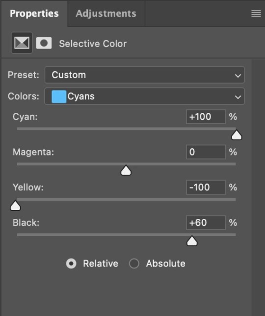
To make the faces look okay, I create a Selective Color layer, select the Reds and usually add some Cyan (+10-20%) and play around a little (±5%) with Magenta and Yellow too. I might also add another layer, select the Yellows and make slight tweaks there too.
III. FUN COLOURING
About colour manipulation: PiXimperfect just uploaded a tutorial that explains everything so much better than I ever could, so I highly recommend you go watch it. It’s made for static images though, and things are more complicated with moving images, so I also recommend @elizascarlets’s tutorial.
The reason I usually go for a softer colouring is that a more vivid one requires a lot of patience and precision, and I honestly can’t be bothered. Instead, I try to tweak the colous only a little, so that the edges can be a little rough without it looking too wrong.
One thing to remember is that each gif is different, and there isn’t one foolproof way to do this, so you will need to use a different technique depending on the gif you’re working with.
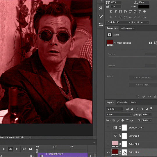
Okay, so, after I’ve decided what colour I want my background to be:
1. I create a Hue/Saturation layer and change the greens, cyans, blues and magentas to that colour. That’s easy enough, since it doesn’t mess with the face colour. I then set the blending mode to Color. If your background doesn’t include any yellow or red, you might be done here, like in the case bellow:
2. To change the yellows and reds, I create a new Hue/Saturation layer, select the yellows/reds, move Saturation to 100 (temporarily) and then play around with the sliders until the face colour isn’t affected. I then change it to whatever I’ve chosen and change the blending mode to Color.
3. If for whatever reason step 3 doesn’t work (the background is white or black for example, or just too red), I might create a Solid Color layer set to whatever colour I want, set the blending mode to Color and then select the layer mask and carefully paint with a soft, black brush over the people’s faces/bodies. I will then lower the Opacity, to whatever looks smooth enough. If there’s a lot of movement in your gif, you might have to use keyframes (see elizascarlets’s tutorial linked above). However, my main goal is to avoid using those; that’s why I try my hardest to tweak around as many Hue/Saturation layers as needed and not have to create a solid color layer.
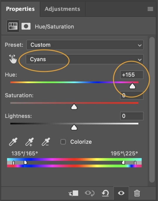
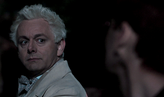
4. Once my background looks the colour I want it, I might add a Selective Color layer that matches my background color and then try to make it look more vibrant. For this Aziraphale gif below for example, I’ve selected the Cyans and then set Cyan to +100%, Yellow to -100% and Black to +60, then created another one, selected the Cyans again and then set Cyan to +20 and Black to +20.
5. If the gif has a white area, I create a Solid Color layer with a colour that matches the rest of the background and then set the Opacity low. I might also create a Selective Color layer, increase the Black and then play around with the colours.
IV. FINISHING TOUCHES
I create a Vibrance layer and set the Vibrance to around +30 and the Saturation to about +5.
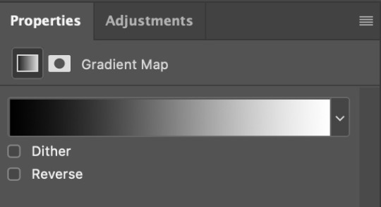
I create a black and white Gradient Map layer (with black on the left end of the spectrum and white on the right), set the blending to Luminosity and the Opacity to about 20-30%.
AAAND that’s about it I think! This ended up way too long and perhaps a little incoherent. I tried to make it as general as possible, so you might have to mix and match for best results. Feel free to ask me for further explanations about any one of these steps, and please tell me if you want me to go through the colouring of a specific gifset (although, as I said, I'm by no means an expert). Happy gifmaking!
#gif tutorial#allresources#completeresources#dailyresources#photoshop tutorial#chaoticresources#uservivaldi#userdanahscott#usersanshou#userfanni#userbuckleys#userrobin#tuserjen#userdavid#userzaynab#tusermimi#thingschanged#tuserju#usertj#userhallie#tutorial#minee
271 notes
·
View notes
Note
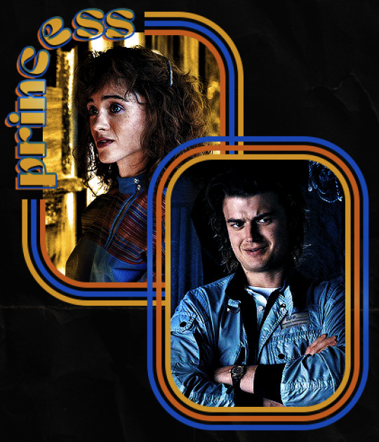
hello! I love your edits and I wanted to know, for the "Steve Robin and Nancy" Gif you posted.. How would I go about doing something like that? More specificly, the bottom two where it says "Height Difference" and where it labels them as "Princess, Jock and Loser"
Thank you! Sorry this took a while to answer. I finally had time to sit down and write this. Link to original post.

Quick notes:
I'm using Photoshop 2021 on Mac and working in video timeline. Must have basic gifmaking skills and know how to use layer masks. This is primarily a gif layout and text tutorial.
Fonts used in first gif:
Pea Wolfe Tracks — link here
King & Queen — link here
Fonts used in second gif:
Kiera — link here
Post — link here
Ellianarelle's Path — link here
Heina's hurry — link here
I used a light leaks/film texture, ripped paper textures, folded paper textures, and transparent pngs (arrows + post-it notes + smiley face).
We'll start with this gif.
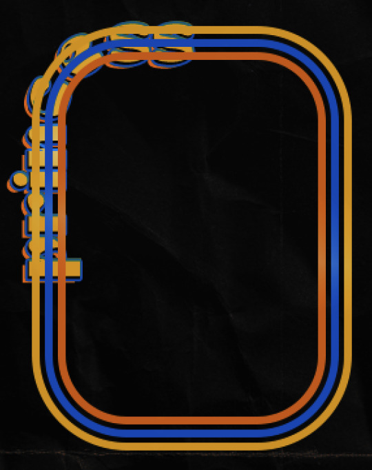
Make your gif! The gif here is 540x600px. I color and sharpen it to my liking. Go to image > canvas size > change height from 600 to 770px. I left the anchor in the middle, though it doesn't really matter.
I drag and drop my folded paper texture and change the layer order so it's under my gif. Then I change the blending mode on my gif to Screen so the texture shows through the gif, but I keep the texture at 100% Opacity and Fill.
Now I move my gif around and add my ripped paper textures. I wanted to give it a sort of poster-like feel to it, so I made more room on the bottom for my main text and ended up with something like this. Blending mode is set to Lighten for the ripped paper textures.
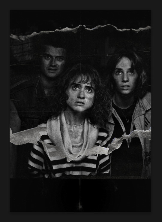
I then use layer masks to hide what I don't want shown and add my light leaks/film texture. Blending mode on light leaks/film texture set to Pin Light, Opacity: 50%, Fill: 70%.
I use Levels and Brightness/Contrast adjustment layers to darken the gif up a bit more, then I add a patterned paper texture. Blending mode for patterned paper texture set to Lighten, Opacity: 100%, Fill: 75%. Result:
Now on to the text!
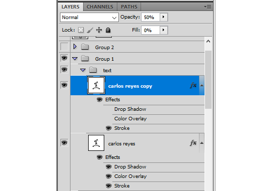
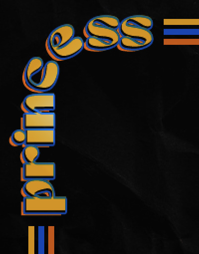
I'm going to be honest here, a lot of this was clicking around until I settled on something I liked. There's three layers to create this text effect. The font used here is King & Queen.
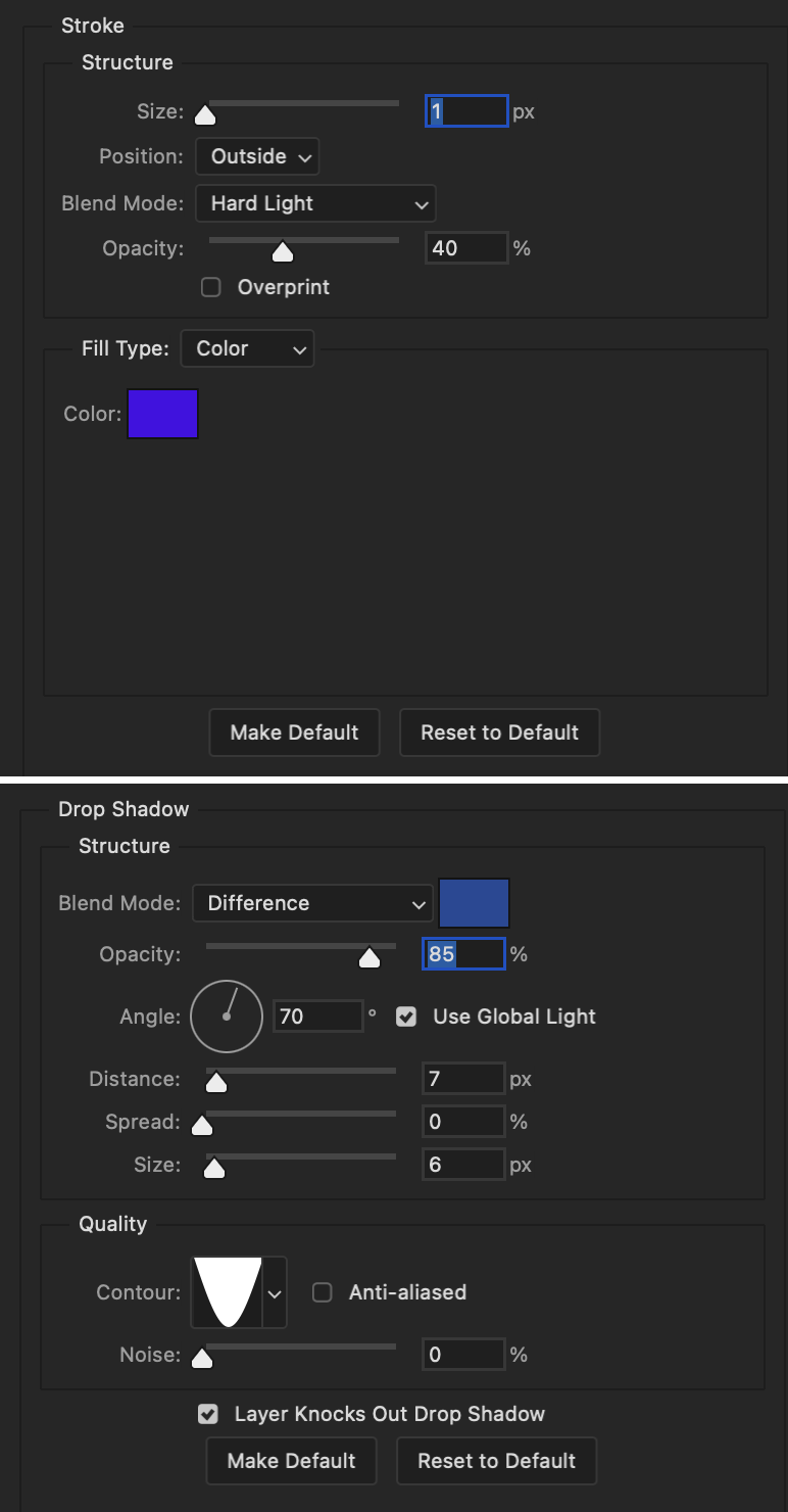
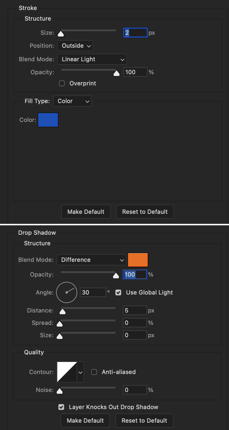
For the first text layer, the font color is set to black (#000000), font size: 87 pt, leading: 80 pt, tracking: 25.
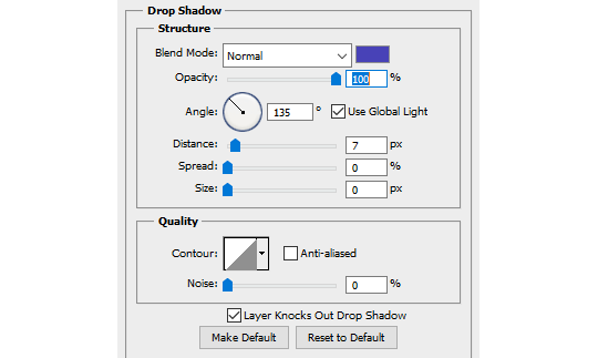
Layer styles used here are stroke and drop shadow.
Text Layer 1
Stroke settings:
Size: 1px
Position: Outside
Blend Mode: Hard Light
Opacity: 40%
Overprint: unchecked
Fill Type: Color
Color: #5911ed
Drop Shadow settings:
Blend Mode: Difference
Color: #2d5ba8
Opacity: 85%
Angle: 70°
Use Global Light: checked
Distance: 7px
Spread: 0%
Size: 6px
Contour: Cone - Inverted
Anti-aliased: unchecked
Noise: 0%
Layer Knocks Out Drop Shadow: checked
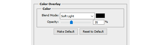
Blending mode for text layer set to Overlay, Opacity: 100%, Fill: 85%.
Warp text settings:
Style: Wave
Horizontal: checked
Bend: +60%
Horizontal Distortion: +10%
Vertical Distortion: 0%
With all those settings applied, the first text layer looks like this:
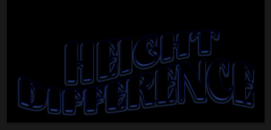
Duplicate the layer, clear all layer styles, and change the color for the second text layer to white (#ffffff). All other text settings (including warp settings) should stay the same. The only layer style then applied to this text layer is stroke.
Text Layer 2
Stroke settings:
Size: 1px
Position: Outside
Blend Mode: Difference
Opacity: 100%
Overprint: unchecked
Fill Type: Color
Color: #d48f16

Blending mode for the second text layer is set to Difference, Opacity: 90%, Fill: 100%. Nudge the second text layer a bit so the first text layer is a little more visible or move to your liking.
With both those layers active, it looks like this:
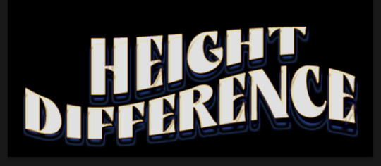
Duplicate the second text layer, clear layer styles, and change the color of this third text layer to a dark grey (#1a1919). Again, all other text (and warp) settings should stay the same.
Layer styles applied to this layer are stroke and gradient overlay.
Text Layer 3
Stroke settings:
Size: 1px
Position: Outside
Blend Mode: Difference
Opacity: 100%
Overprint: unchecked
Fill Type: Color
Color: #d48f16
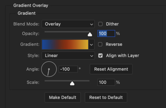
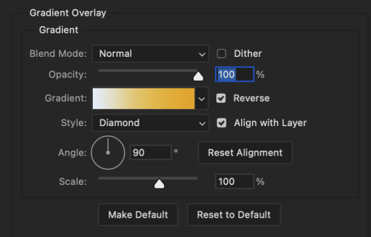
Gradient Overlay settings:
Blend Mode: Difference
Dither: unchecked
Opacity: 100%
Gradient: #cd3f00 > #ffdb5d
Reverse: unchecked
Style: Reflected
Align with Layer: checked
Angle: 90°
Scale: 100%

Blending mode for the third text layer set to Exclusion, Opacity: 100%, Fill: 100%. I also moved the third text layer around, down and to the right a few pixels to give it that 3-D Word Art effect.
With all three text layers active:
Next are the arrows.
Take your transparent pngs and place them to your liking. Blending mode for these is set to Difference, Opacity: 100%, Fill: 100%.
Command + click on an arrow thumbnail to select all the pixels in that layer. This is why the image must be transparent!
With that selection made and on a new blank layer, right click the selection and click on stroke. Settings for that are width: 2px, color: white, location: center. Move that a couple of pixels over.
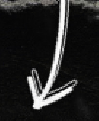
Do this for all arrows for a total of 6 layers for arrows. I group them together to keep my workspace clean, then I duplicate my arrows group with no further changes made to the second group to get what you see in the final gif.
Next is the smaller text. It's three separate text layers for each word, so I can move each of them around to my liking.
Font used is Pea Wolfe Tracks, font color: white (#ffffff), font size: 24 pt, leading: 6 pt, tracking: 25. Bold and italic options checked. I set the blending mode to Difference, Opacity: 100%, Fill: 100%.
And that's it! That concludes the tutorial for this gif!
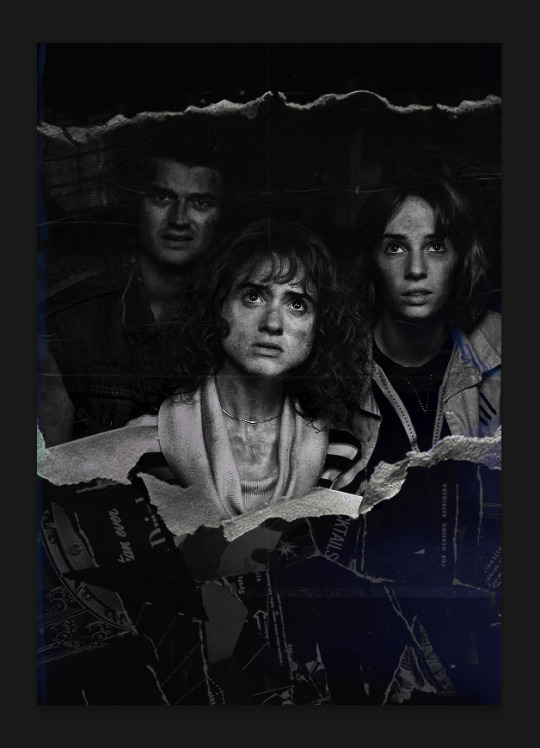
Now on to this gif.
We'll start with the background gif. There are three separate gifs. You could make them one gif, but I wanted the option to order them differently if I needed to.
All gifs in the background are the size of the canvas: 540x770px. Color and sharpen to your liking, but keep them all black and white. To get the blurry effect go to filter > blur > guassian blur. Set radius to 7.0 pixels. Add this to all three gifs.
Then I add two folded paper textures. Blending mode for one set to Lighten, Opacity: 60%, Fill: 100%. The other set to Screen, Opacity: 70%, Fill: 90%.
I found this tutorial a while back for a halftone effect. They include links to the halftone pattern used here as well as textures and gradient maps not used here.
I'm only using the halftone pattern here.
Pattern fill settings:
Angle: 66°
Scale: 8%
Link with Layer: checked
I also added a gradient overlay layer style to the halftone pattern which gives the gifs the color you see above.
Gradient Overlay settings:
Blend Mode: Overlay
Dither: unchecked
Opacity: 100%
Gradient: #0059ac > #a33600 > #e6b801
Reverse: unchecked
Style: Linear
Align with Layer: checked
Angle: -100°
Scale: 100%
Now on to the square shapes with rounded corners. In the interest of keeping this tutorial short(er), I found this tutorial on youtube that explains how to make squares with rounded corners.
I set my stroke size to 6px, stroke color to white (#ffffff), and fill to no color. I don't use the stroke layer style to make the borders of the shape like in the video! I'm only linking the video to show how to curve corners with square shapes.
Note: Be sure you know how big or small you want these to be and how they're going to fit on your canvas in order to make all the shapes and edit them. It can be tedious to change the settings.
Duplicate and resize to your liking.
In this instance, I wanted to make three squares total, so I had to duplicate twice and resize until I had something I liked.
Settings for the shapes used here are:
Innermost shape: W: 200px, H: 280px, corners: 50px
Middle shape: W: 220px, H: 300px, corners: 60px
Outer shape: W: 240px, H: 320px, corners: 70px
Once I have the size I want for all three shapes, I group them together to make a set and duplicate that group twice, then adjust each set on the canvas for my layout.
What the sets look like all together:
Colors used: orange #e47100, blue #0062d1, yellow #ecac00
To add color to the shapes, either change the color of the shape itself or use layer styles. I used layer styles.
Note: I didn't add the colors until the end after I knew what gifs went where and what color scheme I wanted, but I don't want to add more images than I need to here.
To keep this short, I found this tutorial on youtube that explains how to wrap text around a shape. However, I wanted the text to align on the outside where the white line is and not the green line (left image):
So I created another shape just inside the innermost square and used that as a path for my text (right image). Adjust the text to your liking until you have your text where you want it. Refer to the video tutorial if you need help moving the text along the path!
You don't need the shape path once you have your text where you want it, so use the layer visibility tool to hide it. You can hide your other shapes too so you can work with your text.
Do not delete your shape path!
I duplicate it once I start working with my "jock" text since all the sets are the same size. The "loser" text has to be worked a little differently, but we'll get to that later.
For the princess, jock, and loser text, there are two text layers to create the overall effect. For both layers, font used is Kiera, font color set to white (#ffffff), font size: 60 pt, blending mode set to Normal.
I added a gradient overlay layer style to the first text layer which I'll call the base layer. Opacity for this layer is 100%, Fill: 100%.
Base Layer
Gradient Overlay settings:
Blend Mode: Normal
Dither: unchecked
Opacity: 100%
Gradient: #f0b002 > #e7f0fd
Reverse: checked
Style: Diamond
Align with Layer: checked
Angle: 90°
Scale: 100%
The second text layer is your stroke and drop shadow layer. For this layer, opacity is set to 100%, Fill: 0%.
Stroke and Drop Shadow Layer
Stroke settings:
Size: 2px
Position: Outside
Blend Mode: Linear Light
Opacity: 100%
Overprint: unchecked
Fill Type: Color
Color: #0064cb
Drop Shadow settings:
Blend Mode: Difference
Color: #fb7c00
Opacity: 100%
Angle: 30°
Use Global Light: checked
Distance: 5px
Spread: 0%
Size: 0px
Contour: Linear
Anti-aliased: unchecked
Noise: 0%
Layer Knocks Out Drop Shadow: checked
End result looks like this:

When I make my shapes visible again (minus the one I used as a path), I get this:
The shapes are clearly in the way of the text, whether they're above my shapes layer or under it. I use layer masks to hide what I want, so the text is legible. It looks cleaner this way and I wanted the text to be a part of the shape itself. I do that for each rounded square.
Now on to my smaller gifs. I like to crop, resize, sharpen, and color separately because my laptop and Photoshop would kill me if I tried to do it all on one canvas. I use the size of the middle shape for my gifs (220x300px), so I can have a little wiggle room when adjusting. I then use a layer mask to hide the parts of the gif that are outside of the shape.
A quick way to do this is to command + click on the thumbnail of the innermost square. With that selection made, I got to my gif layer and add a layer mask. Sometimes you need to invert it. Use command + i with the layer mask selected (not the gif) to invert the layer mask.
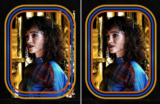
I repeat this process with my Steve and Robin gifs. I have to go back and forth with all the layer masks to hide parts of the gif/shapes I don't want for each set. It's kind of a long process, but not all that difficult. I label and group my layers together as I work to keep things clean and it helps me keep track of what I edited and what needs to be edited when it comes to things like this.
The picture below shows where I hid the bottom right corner of Nancy as well as the shapes that make up her set using layer masks. I also did this with the Steve and Robin sets, hiding the bottom left corner of Steve.

Similar text settings used for jock. The gradient overlay layer style for this base layer is different than that of princess because of the positioning of the text. Again, same as princess, two text layers are used here. Blending mode, opacity, and fill for both are the same as the princess text layers as mentioned before.
Base Layer
Gradient Overlay settings:
Blend Mode: Normal
Dither: unchecked
Opacity: 100%
Gradient: #007aec > move bottom middle dot to 80% > #e7f0fd
Reverse: checked
Style: Diamond
Align with Layer: checked
Angle: -140°
Scale: 100%
Stroke and Drop Shadow Layer
Stroke settings:
Size: 2px
Position: Outside
Blend Mode: Linear Light
Opacity: 100%
Overprint: unchecked
Fill Type: Color
Color: #a05700
Drop Shadow settings:
Blend Mode: Difference
Color: #ffba00
Opacity: 100%
Angle: 30°
Use Global Light: checked
Distance: 5px
Spread: 0%
Size: 0px
Contour: Linear
Anti-aliased: unchecked
Noise: 0%
Layer Knocks Out Drop Shadow: checked
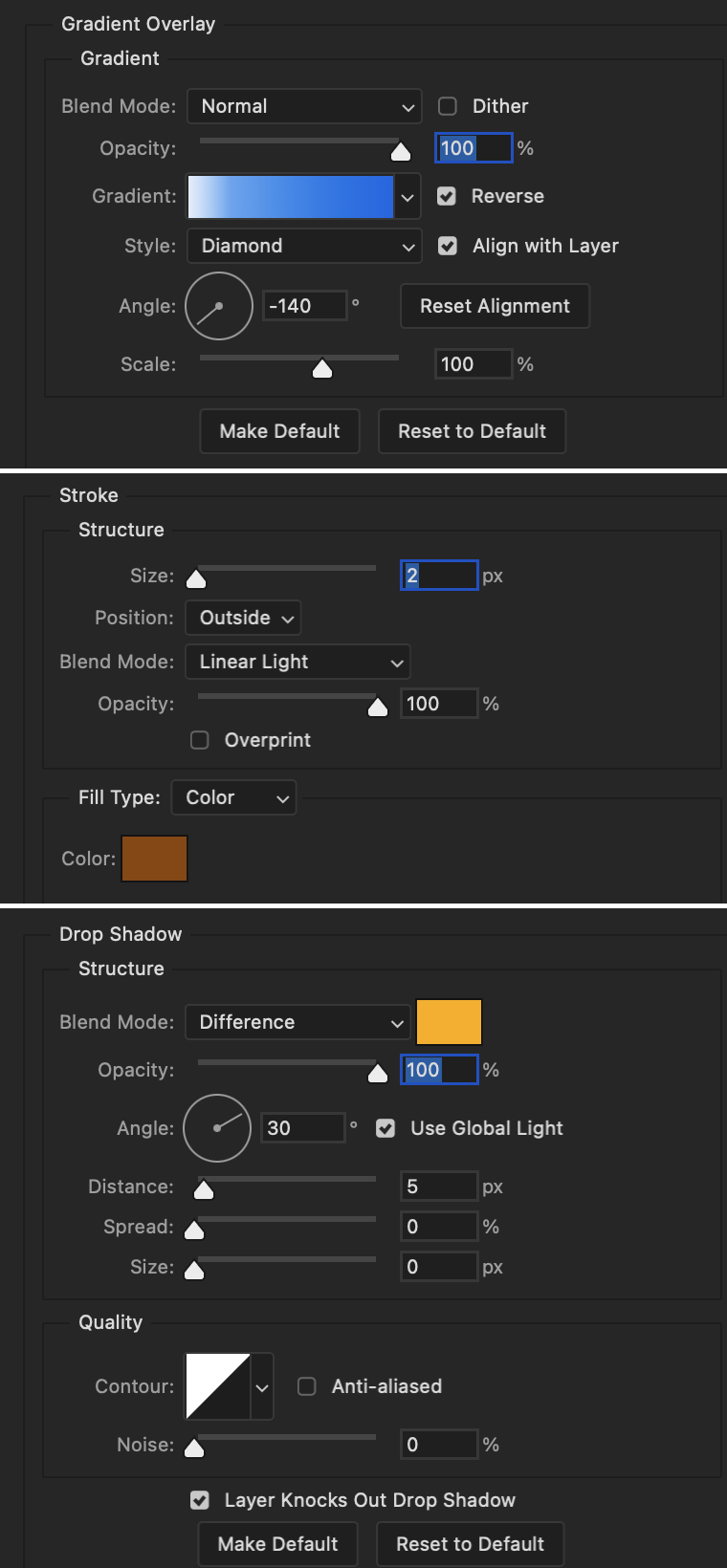
Image 1: We start with Robin.
Image 2: To make the loser text, I had to create a new path.
Image 3: I make it so the text is on the inside of the path instead of the outside. (Hint: Refer to video tutorial if you don't know how to do that.) I then adjusted the tracking between the letters in the word "loser" so they didn't look so squished together.
Image 4: Then I use layer masks to hide the parts of the shape I don't want shown.
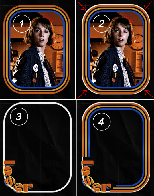
You can then hide the path or delete it. You only need it if you want to adjust the placement of the text. I keep it (hidden) just in case.
Text settings for loser are just like those for princess. Blending mode, opacity, and fill are also the same.
Base Layer
Gradient Overlay settings:
Blend Mode: Normal
Dither: unchecked
Opacity: 100%
Gradient: #eb6400 > #e7f0fd
Reverse: checked
Style: Diamond
Align with Layer: checked
Angle: 90°
Scale: 100%
Stroke and Drop Shadow Layer
Stroke settings:
Size: 2px
Position: Outside
Blend Mode: Linear Light
Opacity: 100%
Overprint: unchecked
Fill Type: Color
Color: #e1a900
Drop Shadow settings:
Blend Mode: Difference
Color: #0068de
Opacity: 100%
Angle: 30°
Use Global Light: checked
Distance: 5px
Spread: 0%
Size: 0px
Contour: Linear
Anti-aliased: unchecked
Noise: 0%
Layer Knocks Out Drop Shadow: checked
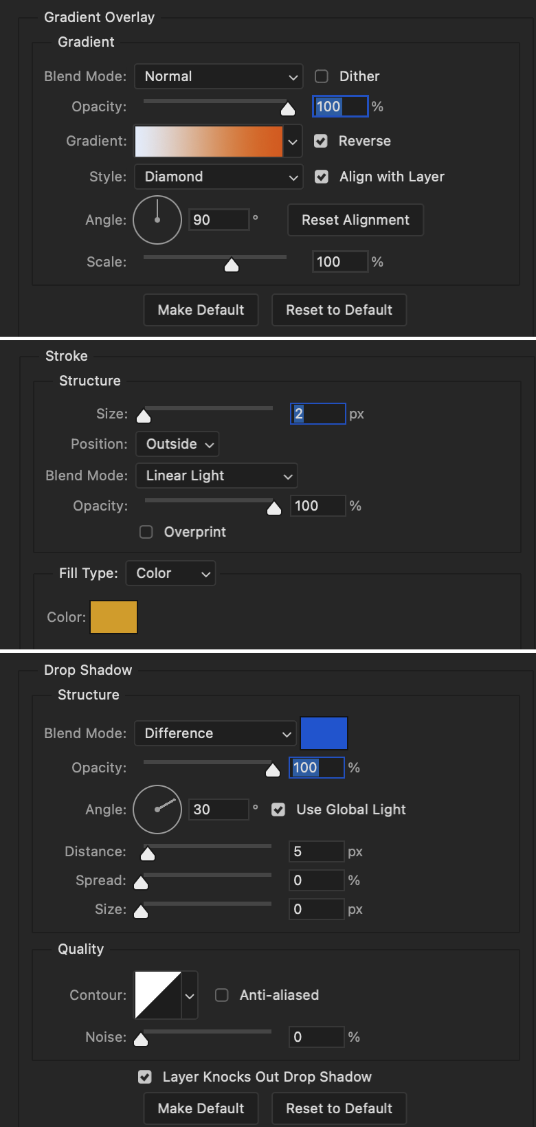
Next are the post-it notes! This is probably the easiest part of making this gif. You just have to repeat this process for however many post-it notes you're making.
Image 1: To start, place your transparent post-it note where you want it. You can also rotate it if you'd like.
Image 2: Then create a text layer and write what you want. Font used here is Post. I wanted this text underlined to give emphasis, so I click on the underline option. I also adjusted the leading because I wanted more space between the word and the line. Rotate the text so it looks like it's written on the post-it note.
Note: It looks better if you choose a font that looks handwritten.
Image 3: I wanted another line to give emphasis to the "Dingus!!" text and make it seem more handwritten. I use the line tool to create another line.
Image 4: Then I adjust that line to my liking.

Fonts used for notes: Post, Ellianarelle's Path, and Heina's hurry
Repeat this process for all post-it notes!
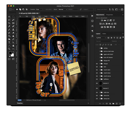
That finishes the tutorial! (And I hit the 30 image limit lol.) I hope this helps. If you have any further questions, feel free to send an ask or IM and I'll try to answer to the best of my ability.
Happy photoshopping!
#ask#pcocana#photoshop#photoshop tutorial#tutorials#*tutorials#userchibi#userbunneis#uservivaldi#userriel#userabs#usertiny#useralien#useraljoscha#userfanni#userraffa#tusermona#userbess#userrobin#userroza#quicklings#janielook#usernaureen#userrlorelei#tsusermels#tusermimi#userelio#usertj#userbarrow#usernolan
150 notes
·
View notes
Text
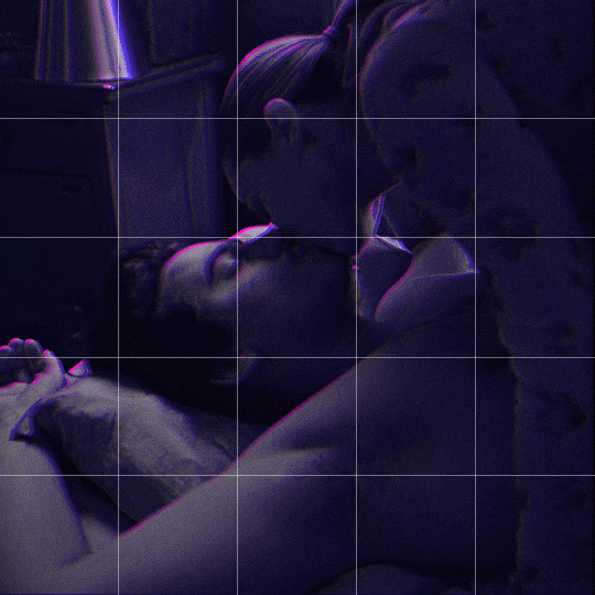
Someone asked me how I created the fade transition in this gifset which I’ll try to explain in the most comprehensive way that I can. If you've never done something like this before, I suggest reading through the full tutorial before attempting it so you know what you'll need to plan for.
To follow, you should have:
basic knowledge of how to make gifs in photoshop
some familiarity with the concept of how keyframes work
patience
Difficulty level: Moderate/advanced
Prep + overview
First and foremost, make the two gifs you'll be using. Both will need to have about the same amount of frames.
For ref the gif in my example is 540x540.
I recommend around 60-70 frames max total for a big gif, which can be pushing it if both are in color, then I would aim for 50-60. My gif has a total of 74 frames which I finessed using lossy and this will be explained in Part 4.
⚠️ IMPORTANT: when overlaying two or more gifs and when using key frames, you MUST set your frame delay to 0.03 fps for each gif, which can be changed to 0.05 fps or anything else that you want after converting the combined canvas back into frames. But both gifs have to be set to 0.03 before you convert them to timeline to avoid duplicated frames that don't match up, resulting in an unpleasantly choppy finish.
Part 1: Getting Started
Drag one of your gifs onto the other so they're both on the same canvas.
The gif that your canvas is fading FROM (Gif 1) should be on top of the gif it is fading INTO (Gif 2).
And here's a visual of the order in which your layers should appear by the end of this tutorial, so you know what you're working toward achieving:

Part 2: Creating the grid
Go to: View > Guides > New guide layout
I chose 5 columns and 5 rows to get the result of 25 squares.
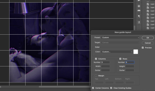
The more rows and columns you choose, the more work you'll have to do, and the faster your squares will have to fade out so keep that in mind. I wouldn't recommend any more than 25 squares for this type of transition.

To save time, duplicate the line you've created 3 more times, or as many times as needed (key shortcut: CMD +J) and move each one to align with the guides both horizontally and vertically. You won't need to recreate the lines on the edges of the canvas, only the ones that will show.
After you complete this step, you will no longer need the guides so you can go back in and clear them.

Follow the same duplicating process for the squares with the rectangle tool using the lines you've created.
Align the squares inside the grid lines. The squares should not overlap the lines but fit precisely inside them.
This might take a few tries for each because although to the eye, the squares look all exactly the same size, you'll notice that if you try to use the same duplicated square for every single one without alterations, many of them will be a few pixels off and you'll have to transform the paths to fit.
To do this go to edit > transform path and hold down the command key with the control key as you move one edge to fill the space.
Once you're done, put all the squares in their separate group, which needs to be sandwiched between Gif 1 and Gif 2.

Right click Gif 1 and choose "create clipping mask" from the drop down to mask it to the squares group. This step is super important.
After this point, I also took the opacity of the line groups down to about 40% so the lines wouldn't be so bold. Doing this revealed some squares that needed fixing so even if you aren't going dim the lines, I recommend clicking off the visibility of the lines for a moment to make sure everything is covered properly.

Part 3A: Prep For Key framing
I wanted my squares to fade out in a random-like fashion and if you want the same effect, you will have to decide which squares you want to fade out first, or reversely, which parts of Gif 2 you want to be revealed first.
In order to see what's going on underneath, I made Gif 1 invisible and turned down the opacity of the squares group.

If you want text underneath to be revealed when the squares fade away, I would add that now, and place the text group above Gif 2, but under the squares group.

Make a mental note that where your text is placed and the order in which it will be revealed is also something you will have to plan for.
With the move tool, click on the first square you want to fade out. Every time you click on a square, it will reveal itself in your layers.
I chose A3 to be the first square to fade and I'm gonna move this one to the very top of all the other square layers.
So if I click on D2 next, that layer would need to be moved under the A3 layer and so on. You'll go back and forth between doing this and adding key frames to each one. As you go along, it's crucial that you put them in order from top to bottom and highly suggested that you rename the layers (numerically for example) which will make it easier to see where you've left off as your dragging the layers into place.

Part 3B: Adding the Keyframes
This is where we enter the gates of hell things become tedious.
Open up the squares group in the timeline panel so you can see all the clips.
Here is my example of the general pattern that's followed and its corresponding layers of what you want to achieve when you're finished:
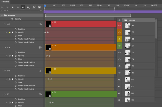
So let’s try it!
Expand the control time magnification all the way to the right so you can see every frame per second.

As shown in Part 3A, select your first chosen square.
Where you place the time-indicator on the panel will indicate the placement of the keyframe. Click on the clock next to opacity to place your first keyframe.

Move the time-indicator over 3 frames and place the next key frame.

Things to consider before moving forward:
Where you place your very first keyframe will be detrimental. If you're using a lot of squares like I did, you may have to start the transition sooner than preferred.
If you're doing 25 squares, the key frames will have to be more condensed which means more overlapping because more frames are required to finish the transition, verses if you're only using a 9-squared grid. See Part 4 for more detailed examples of this.
The opacity will remain at 100% for every initial key frame, and the second one will be at 0%.
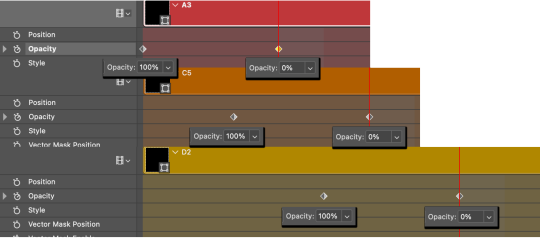
Instead of creating two keyframes like this and changing the opacities for every single clip, you can copy the keyframes and paste them onto the other clips by click-dragging your mouse over both of them and they'll both turn yellow. Then right click one of the keyframes and hit copy.
Now drop down to your next clip, move your time-indicator if necessary to the spot where the first keyframe will start and click the clock to create one. Then right click it and hit "paste".

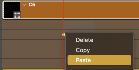
Tip: When you have both keyframes selected, you can also move them side to side by click-dragging one of them while both are highlighted.
Your full repetitive process in steps will go as follows:
click on square of choice on the canvas
drag that square layer to the top under the last renamed
in timeline panel: drop down to next clip, move time-indicator tick to your chosen spot for the next keyframe
create new keyframe
right click new keyframe & paste copied keyframes
repeat until you've done this with every square in the group
Now you can change the opacity of your squares layer group back to 100% and turn on the visibility of Gif 1. Then hit play to see the magic happen.
PART 4: Finished examples
Example 1
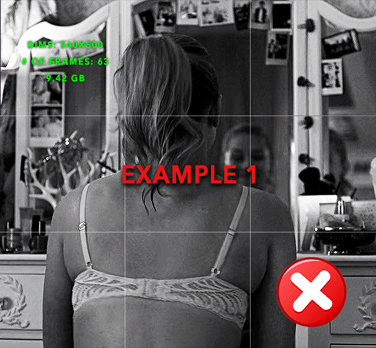
the transition starts too soon
Cause: initial keyframe was placed at frame 0
the squares fade away too quickly
Cause: overlapping keyframes, seen below.
(this may be the ideal way to go with more squares, but for only 9, it's too fast)
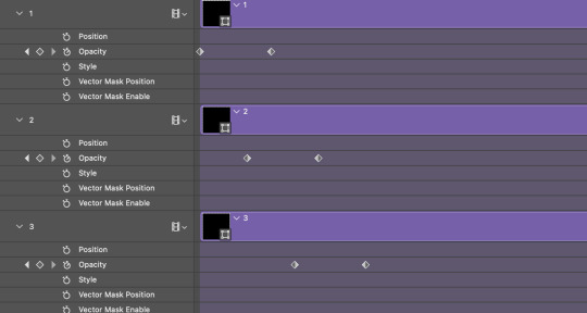
Example 2
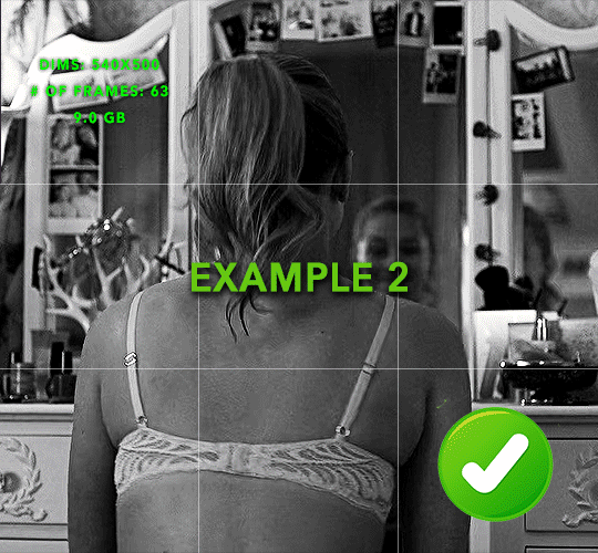
more frame time for first gif
transition wraps up at a good point
Cause: in this instance, the first keyframe was placed 9 frames in, and the keyframes are not overlapping. The sequential pair starts where the last pair ended, creating a slower fade of each square.
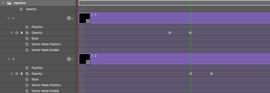
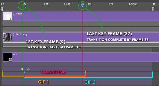
Part 5: Final Tips and Saving
You can dl my save action here which will convert everything back into frames, change the frame rate to 0.05 and open the export window so you can see the size of the gif immediately.
If it's over 10gb, one way to finesse this is by use of lossy. By definition, lossy “compresses by removing background data” and therefore quality can be lost when pushed too far. But for most gifs, I have not noticed a deterioration in quality at all when saving with lossy until you start getting into 15-20 or higher, then it will start eating away at your gif so keep it minimal.

If you've done this and your gif is losing a noticeable amount of quality and you still haven’t gotten it below 10gb, you will have no choice but to start deleting frames.
When it comes to transitions like this one, sometimes you can't spare a single frame and if this is the case, you will have to return to the timeline state in your history and condense the key frames to fade out quicker so you can shorten the gif. You should always save a history point before converting so you have a bookmark to go back to in case this happens.
That's pretty much it, free to shoot me an ask on here or on @jugheadjones with any questions.
#gif tutorial#photoshop tutorial#transition tutorial#grid tutorial#usergif#ps help#tutorials#tutorials*#requested
219 notes
·
View notes
Text
gif tutorial
i was asked to make a tutorial for this set i made, so let's get right into it!
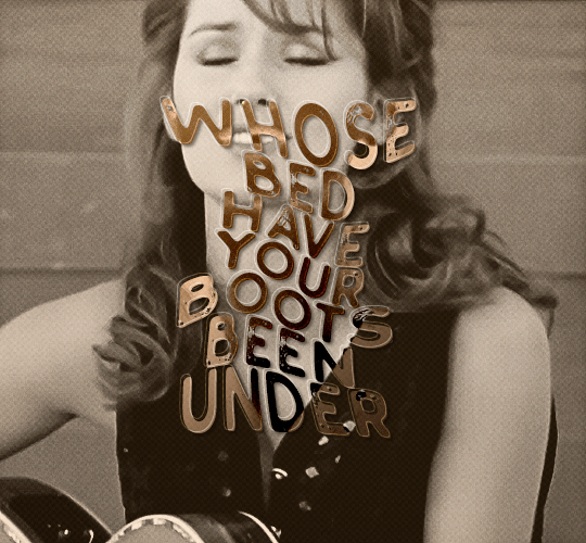
first things first, i downloaded the music videos from youtube in 1080p using 4k video downloader. unfortunately, the quality of youtube videos always seems... not great, to put it simply. plus these music videos are from the 90s, so they've been upscaled to 1080p after the fact. all of this works against us, but i've definitely worked with videos of lesser quality than these, so at least there's that!
when i gif, i import video frames to layers rather than screencapping. this comes down to personal preference. after everything has loaded, i group all my layers together and set the frame delay to 0.05. i then cropped my gif to 540x500.
the next step in my process is sharpening. i did play around with my settings a bit given the quality of the footage and the dimensions of the gif. i compared both @hellboys low-quality video gif tutorial to my regular sharpening action and my vivid sharpening action and in this case, i preferred my normal vivid sharpening action. i used this tutorial to create the action for myself, and you can find other sharpening tutorials here. this action converts my frames to video timeline and applies sharpening.
once my gif is sharpened and i'm in timeline, i begin coloring. i wanted to simplify the amount of colors used in these gifs, again because of the video quality -- i knew it wasn't going to have the crispness i would normally like for my gifs. here are my coloring adjustment layers and their settings (not pictured: my first layer is a brightness/contrast layer set to screen) (explanation in alt text):
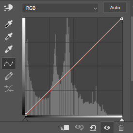

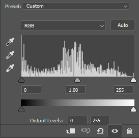
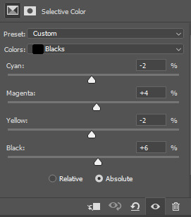
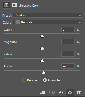
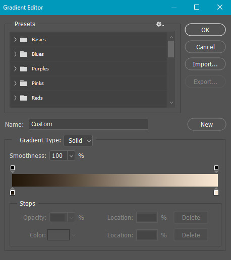
all of these layers and their settings will vary depending on your footage and its coloring (and obviously, feel free to make the gradient map whatever colors you like if you aren't going for this exact look).
pretty basic coloring, especially with just slapping a gradient map on top (my beloved), but at this point, i still didn't like the quality of the gif, so i added a couple textures/overlays.
i put the left one down first and set the blending mode to soft light and the opacity to 8%. depending on what look you're going for, you could increase or decrease the opacity or play around with different blending modes. i like using this texture with lower quality footage because even when it's sized up a bit, it adds some crispness and makes things feel more defined. for the second texture, i set it to overlay and 75% opacity. we love and respect film grain in this house.
now for the typography! sometimes i really enjoy typography and other times it's the bane of my existence for the sole reason of just how many fonts i have installed. anyway, here are the settings i used for this set:
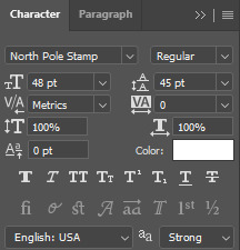
make sure the color of your font is white and then set the blending mode to either difference or exclusion. i can almost never see a difference between the two, but for this set, i used exclusion. below are the blending options (double click on your text layer to bring up this menu or right click and select blending options).
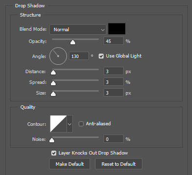
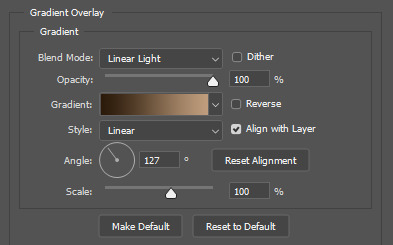
now we have to add the warp effect. with your text tool still selected, click this icon at the top of your screen:

from the dropdown menu, select twist. these were my settings, but feel free to play around with different warp options and their settings. the ones i use most often are flag, fish, and twist.
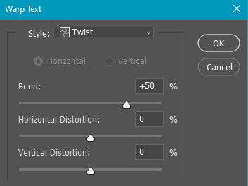
this last step is completely optional, but it's an effect i use in most of my sets with typography. duplicate your text layer (select the layer and ctrl+j), turn off the layer effects (click the eye icon next to effects), and set the blending mode to normal. right click on the layer and select rasterize type. right click on the layer icon itself and choose select pixels.
at this point, you should see the moving black and white dotted line showing that only your text is selected. then go to edit > stroke. here are the settings i almost exclusively use.
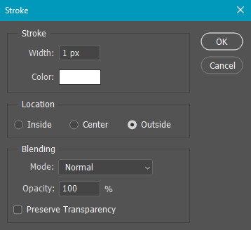
this is what your text should look like now:
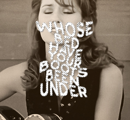
using ctrl+T, move the layer off the canvas so you can't see any of the text anymore. you should be left with only your outline. click anywhere on your canvas to de-select the text we just moved. use ctrl+T again as well as your arrow keys to nudge the outline over to the left 2px and up 2px. this is personal preference as far as the positioning, but i almost never move it any other way. you can leave it like this, which i sometimes do, or you can set the blending mode to soft light like i did for a more subtle effect.
and that's it! rinse and repeat for each gif in your set or use a different warp effect on each gif to switch it up! if you have any questions about this tutorial or would like me to make one for anything else, please feel free to ask any time!
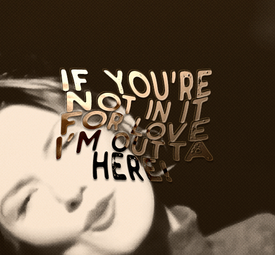
#gif tutorial#my tutorials#gifmakerresource#completeresources#dailyresources#chaoticresources#userdavid#coloring tutorial#typography tutorial#tutorial#photoshop tutorial
172 notes
·
View notes
Text

— i've been asked abt sharpening a few times but i thought that i would just share my actual actions i use but with some guidelines because it can really differ between different video sources and no sharpening is always exactly the same

— i've included different examples of video sources that i use for gifs alongside each type of sharpening action because not all actions will work for every gif. while it's always a matter of preference (whether u prefer a softer/more sharpened gif) some sharpenings can whitewash a gif so i added a little question mark as a warning to be mindful of that and make adjustments!
— there are three (technically four) different actions. one is ultra hd sharp and works best on really good quality footage such as master mvs or good film/show footage! the second is a simple sharpening that can be used on all videos and the third is a softer sharpening that utilises the diffuse setting and it has a glowy option w blur as well!
— take a look below at how the sharpenings look on different videos 💙
💌 MASTER/BUGS/BLU-RAY VIDEOS
video source: here (gdrive)
file size: 2gb


💌 4K YOUTUBE VIDEO
video source: here (yt)
file size: 470mb
💌 1080HD OR LESS VIDEO
video source: here (yt)
file size: 77mb


💌 TS FILE
video source: here (k24hrs + dm for password!)
file size: 3.21gb
video specifications: qtgmc 60fps preprocesser + bm3d denoise (2)

💌 GOING SEVENTEEN
because it varies so much it requires an example of its own
video source: here (yt)
file size: 606mb


YOU CAN FIND THE SHARPENINGS HERE <3
if you ever need any help or clarification feel free to ask!! no need for credit if you use, but of course please don't claim the actions as your own <3
#allresources#yeahps#photoshop tutorial#gif action#kpop resources#ps help#creations#creations: action#userace#usershreyu#userjoanna#tuserose#useraashna#usernik#useratz#useraurore#usernanda#userkaison#userngocchi
503 notes
·
View notes
Photo


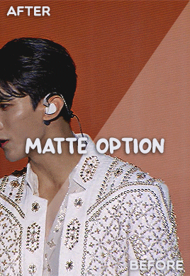
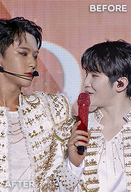
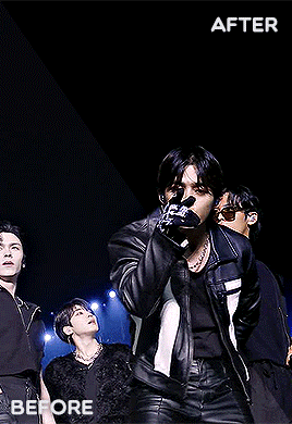
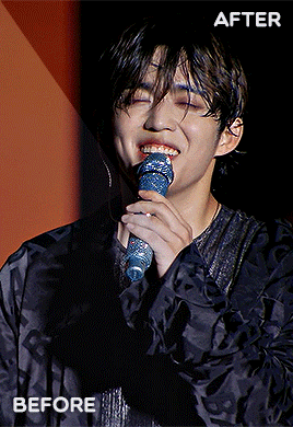

#BE THE SUN.PSD 💎 a base psd file for washed-out lighting in concerts — and more!
☆ a basic psd that i initially made for the really washed out pale footage of seventeen’s be the sun concert but it’s pretty versatile and simple to use anywhere!
☆ contains an optional levels layer for a matte finish! it can be easily tweaked to adjust to the brightness levels (such as under stage lights) 💡
PSD HERE.
#seventeen#yeahps#allresources#photoshop tutorial#ps help#ps resources#kpop resources#gif psd#kpop psd#useraashna#usershreyu#userjoanna#annietrack#shuaria#cheytermelon#uservince#hanatonin#tuserose#isaishi#usersan#creations#rosieblr#useraweks#usernik
449 notes
·
View notes
Text
Using Neural Filters to colour correct
i’ve had a couple of people ask about how i’ve coloured the pocket dimension scenes so i thought i’d just do a run-through tutorial kind of thing to show it, rather than going through it with everyone separately.
so this is a tutorial for how i made this:
from this:
follow along under the cut:
so just some things to point out before we move on which are essential and could get in the way of this working for you:
you will need adobe photoshop cc - v.22 or above. any versions older than this won’t work. you can find what version you currently have by opening photoshop, clicking ‘help’ on the top toolbar, and selecting ‘about photoshop’. my current version is 23.2.2.
you should know how to make a gif from frames, use timeline and work with the gif as a smart object. if you don’t know what i mean, i’ve tried to explain it briefly below.
using neural filters is resource heavy so expect photoshop to be slow in processing/exporting/saving anything you use them on. it might be worth having other programs closed while you use it if your computer has a lower or mid-range spec.
and so...
1. make your gif
to do this, import your frames, crop, set frame speed etc however you normally would. if you usually make gifs with the animation bar set to ‘frame animation’, you will need to change this so that you can create a smart object. you will need to press the button with the video timeline symbol on your animation bar:
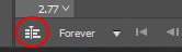
then you should select all your layers (not frames as you shouldn’t see them anymore) and right-click > convert to smart object:

you should leave your animation in timeline mode, but the purpose of the smart object is so you can add smart filters. this is especially good for things like sharpening, any effects you want to add, and of course... neural filters.
2. brighten the image and convert to black and white
contrary to what we’re trying to achieve here, you should change the image to black and white and brighten it up so that you have as smooth and plain a base for the filters to apply to.
i do this by adding a black and white adjustment layer, and clicking ‘auto’ on the properties tab:

you should then add a ‘levels’ adjustment layer and drag the right tab along until it meets the beginning of the histogram. you should also move the left tab along a little bit for some contrast - how far depends on how you want your gif to look:

following this, select the smart object and two adjustment layers > right-click > convert to smart object. you don’t have to do this but i find it helps and it reduces the number of layers you have to work with.

my gif now looks like this:

3. adding the neural filter
now your image is about to change in a huge way. click on filter on the top toolbar and select ‘neural filters’:

from here, you will see this screen and a bunch of current filters and beta filters on the right-hand side. you may have to download them to get them to work. for this, we’re using ‘colorize’ so at least make sure you have that one downloaded and ready to use:

when you turn the ‘colorize’ filter on, after processing (this can take a few seconds), your image now looks like this:

(note: this gif is an exception in how well it turned out first time - the filter has applied evenly minus a couple of issues i’ll go over below. how successful it will be depends on how much movement is in the clip, or how many colours it will need to find, and it sometimes gets confused with dark and light tones. you’ll find most of the time that the gifs will have patches that aren’t coloured, or will have incorrect colour correction that you’ll need to go in frame-by-frame and patch in by hand. the filter does do a lot of heavy lifting though.)
you can then play around with the saturation (i usually reduce it to -10) and the colours similarly to how you would in ‘colour balance’, however it has a more all-over even tone:
the last thing you need to do is select ‘smart filter’ on this drop-down menu:
if you don’t change it to smart filter, the filter will only apply to the frame you can currently see and won’t apply to the whole animation.
my gif now looks like this:

this might be enough for you in which case great news! you get to stop here, apply whatever sharpening and colouring you want, and save as normal!
however, i’m a perfectionist to a fault so i need to do a few more things first...
(note: it’s always worth doing the next step even if you’re happy with the finished product here, just in case you missed a spot)
4. check the filter has applied throughout the whole gif
you’ll see that you now have a much more even base to work from and colour your gif as normal, however neural filters aren’t perfect and do leave funny little glitches throughout your gif sometimes. in order to check this, i usually scrub through to see if there are any issues. in this gif, i spotted two.
in these two areas - on the moving gif - i can see the colouring flickering. the filter hasn’t applied the right colour on every frame, or simply hasn’t coloured it at all:
this gif isn’t the worst offender for this, but if you look closely you’ll see it. so...
5. make a new layer and fill in the flickering areas
press the ‘new layer’ button:
and now use the ink dropper tool to pick up the colour you want to use, and paint over the area where the colour is flickering - e.g. i used the dropper to pick up the colour from the desert in the background and painted over that area. i also picked up some of the colour from the sky and coloured over the flickering by the storm. i used these brush settings:

when you’ve painted on the colour you want, and as much as you want, set the layer to ‘color’. i also change the opacity to 80% to let some of what’s underneath still come through a little bit, but do what’s best for you and your gif:
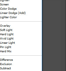
my gif now looks like this, with less noticeable flickering:
7. brighten, colour and sharpen however you normally do
idk if you have an existing psd or just experiment with adjustment layers, but your gif is now ready to start colouring however you normally would. the neural filter is basically acting as a reset to give you a blank canvas in which to gif as normal. for this gif i started with a ‘hue and saturation’ adjustment layer to change the green background to a more dirt/sand colour as it’s meant to be the desert, and then just played around with my usual combination of adjustments until i came up with the final product! i then sharpen using filter > sharpen > smart sharpen and it should be done.
8. export (save for web)
you all know how to do this by now, but be aware that these will load slowly. gifs aren’t the fastest things to save on a good day but with the neural filter applied, they’re particularly slow. this is why i said to do work on the gifs one at a time - don’t have photoshop doing more than it needs to do or it might slow down to a halt.
so after all that, this is the final version of my gif:
tips and tricks
avoid making gifs of moments with a lot of movement - this could be the subject of the gif moving, the background, the wind blowing something around etc. while normal colouring can tolerate these changes, the filter isn’t yet clever enough to work it out and it makes the gifs unsalvageable because you can’t paint over the flickering accurately enough - e.g.:

(p.s. if anyone knows how to get the filter to work on this specific scene you have to tell me lmao it’s been driving me mad...)
try and keep the gifs short - i haven’t made one above 55 frames, i think. that is still quite a lot but it is a challenge to ensure the filter can cope with it. shorter gifs would probably mean a cleaner result.
you have to set the gif to black and white first - the colorize filter is designed to bring black and white photos/videos to life. i tried it over the blue filter directly and it was successful but i had more consistent luck when starting in black and white.
make sure you brighten the gif significantly before applying the filter - it really helps to give a cleaner canvas for the filter to apply to, but it’s not essential if you really don’t want to.
if you have any questions, don’t hesitate to ASK. i’m by no means an expert and this is just what i’ve observed from using this feature and the workarounds i’ve found working for me so far, but happy to try and help where i can and happy to take suggestions too! <3
#malex#roswell new mexico#gif tutorial#photoshop tutorial#ps help#allresources#completeresources#itsphotoshop#*laurengifs#*tutorial#this is so long#but i hope it's helpful#i think needing the newer versions of ps is probably what's going to get in the way most but just in case it doesn't... ta-daaa#1k
2K notes
·
View notes
Photo

hello!!! in response to the colouring tutorial request and a couple of asks i got asking about my psds i have put together this tutorial about my colouring techniques!! if you have any questions please send them my way <3
throughout this tutorial we’ll be using this gif! it was fairly simple to colour and is surprising high quality. it’s already been sharpened but as you can see it’s kind of dark and yellow.

PART ONE: BRIGHTNESS
— i always start my gifs off by fixing the brightness. i do this for two reasons. first i find that it is easier to see the colours in the gif when its properly bright and sometimes i am able to adjust the colouring through my curves levels (guide to curves here)
— first, i add two curves layers. i typically i try and find a part of the gif that’s nearly black and use the black eyedropper there and a part of the gif that’s light and use the white eyedropper there. for this gif i used the figures past her shoulder for the black eyedropper and the lights for the white eyedropper.
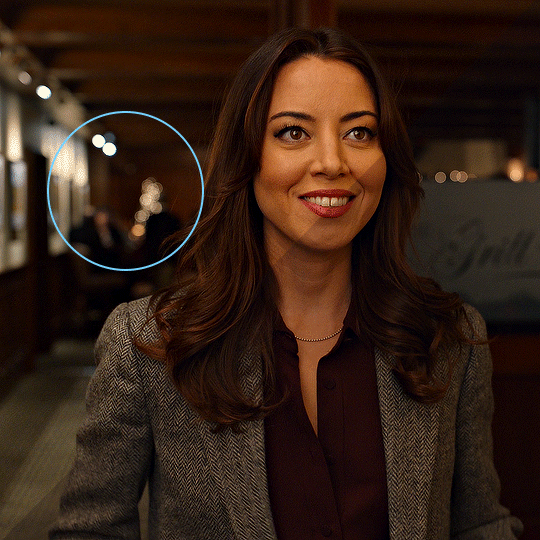
— next i usually add a levels and then exposure layer. these are my last layer before i tackle the colour scenario so i always prioritize brightness and shadows over funky colours. this is the gif with curves, level, and exposure.

here are my level and exposure settings for this gif
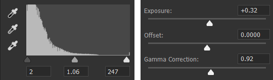
PART TWO: COLOUR
— my first step for colouring is to use channel mixer. i won’t go into how channel mixer works here so you can use this guide to understand it. for this gif i got rid of some of the red and yellow.
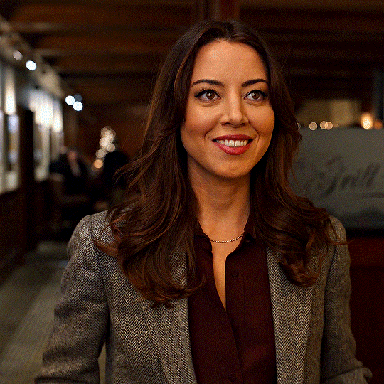
here are my channel mixer settings for this gif

— next i use a selective colour to reduce the amount of red and yellow in the gif. usually i will drag the sliders in the opposite of the direction of the slider (i.e. move red towards cyan, yellow towards blue) in order to make the colours look more natural. i also increased the black on the reds and yellows because i didn’t want to whitewash her.

here are my selective colour settings

— okay last step is a hue/saturation layer!! i always do this one last because my main goal is just to reduce the saturation to look normal. ideally, i won’t have to adjust any colours at this stage. i also usually reduce the saturation of the colours in the background so they don’t draw focus away from the subject of the gif so here i got rid of some cyan, blue, and magenta.
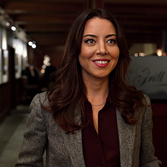
these were my settings for hue/saturation (as well as -60 saturation for the rest of the colours).

— sometimes after i’ve done all the above steps and it seems slightly off i will add a colour balance level and/or increase the black of the neutral part of a selective colour layer.
— while each colour layer seemed subtle there was actually a big difference!!
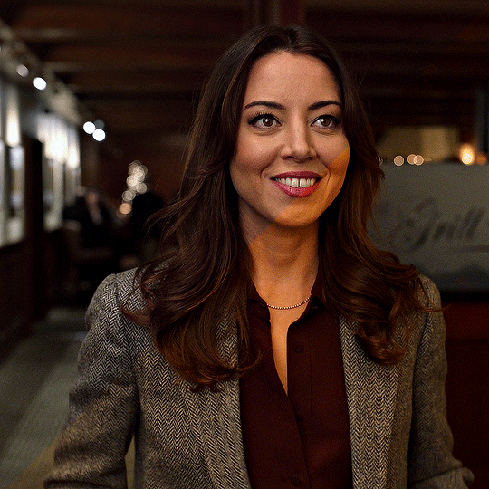
#gif tutorial#usertreena#uservale#userk8#uservalentina#tuserhannah#tuserssam#usernums#userrainbow#userrobin#userannalise#uservivaldi#useryoshi#usershreyu#allresources#completeresources#dailyresources#photoshop tutorial#coloring tutorial#tutorial
937 notes
·
View notes
Note
How do you make your gifs?
Hello hello! I love talking about gifmaking, so thank you for giving me the chance to ramble.
Instead of a detailed step-by-step walkthrough, I will link tutorials and resources written by the wonderful Tumblr creators on here along the way. Everyone has their method and preferences, and there’s no right or wrong way to make gifs. I’m going to share techniques and resources I picked up along the way that work best for me—they may or may not be suited to your preferences, but I hope you’ll find some helpful things here.
(Warning: screenshot/image heavy)
USEFUL TUTORIALS AND RESOURCES
Here are some tutorials and resources that I found very useful when I got back into gifmaking:
Gifmaking tutorial using video timeline by @hope-mikaelson is identical to my own process
Gifmaking and coloring tutorial by @kitty-forman, whose process is very similar to my own
Giffing 101 by @cillianmurphy, an incredibly detailed tutorial that covers everything you need, including a step-by-step guide to using HandBrake
Gifmaking and coloring tutorial with 4K HDR footage by @sith-maul, another incredibly detailed tutorial with many useful tips
Gifmaking tutorial by @jeonwonwoo, incredibly comprehensive and covers so many aspects of gifmaking from basics, sharpening, captioning, and text effects
Gifmaking/PS tips and tricks by @payidaresque
Action pack by @anyataylorjoy, the Save action is especially a true life-saver
@usergif and @clubgif are amazing source blogs with many tutorials on gifmaking, color grading, and gif effects, can’t be thankful enough for the members for their work curating and creating for these blog!
TOOLS
Adobe Photoshop CS6 or higher, any version that supports video timeline. @completeresources has many links to download Photoshop, have a look!
Photopea is a free alternative to Photoshop, but it has a slightly different UI, check out these tutorials for gifmaking with Photopea
HandBrake or any other video encoder, especially if you’re working with .MKV formats
4Kvideodownloader for downloading from YouTube, Vimeo, Instagram, etc.
OBS Studio or any other similar screen capturing software. To prevent duplicate frames in gifs that prevents your gifs from looking smooth, try to match the recording frame rate (FPS) with the source.
IMPORTING FOOTAGE AND WORKING IN VIDEO TIMELINE
I work exclusively in video timeline instead of importing video frames to layers or loading files into stack. For videos that don’t require converting/encoding using HandBrake, especially ones that are already in .MP4 format, I tend to open the video directly on Photoshop, and trim the videos around directly.
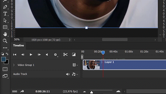
As mentioned above, this gifmaking tutorial using video timeline is exactly how I make gifs. I find it more efficient, especially if you’re making multiple gifs from the same video/the same scene with little to no change in lighting conditions You can simply slide around sections of gifs you want to save, and they will all be the same length.
Another thing also covered in the tutorial linked is the ability to change video speed in video timeline mode. Right click on the video and set the speed before proceeding with cropping/resizing. This is also very useful when you’re making blended gifs where you need the footage to have the same length.
Slowing footage down.
As mentioned in this post, changing the FPS before slowing down the gif results in smoother gifs. Doubling the frame rate before slowing down your gifs usually yields the best result.
Speeding footage up.
I love using this to speed up slow motion B-rolls to make the speed slightly more natural. It will result in nice, smooth gifs:
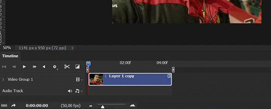

(B-roll footage, normal broadcast speed)
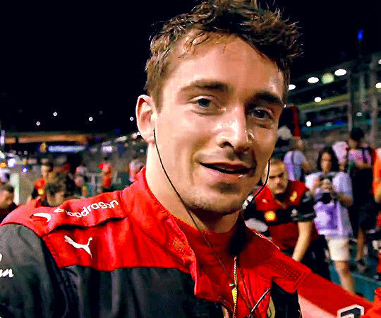
(200% speed)
Subject won’t stay in frame?
Another feature of the video timeline mode. Keyframes are your best friend. This tutorial by @kangyeosaang covers everything you need to know about panning gifs. I use this technique regularly, it’s a life-saver.
COLORING
Here are some coloring tutorials I found very useful:
Coloring tutorial by @brawn-gp beloved, their coloring style is second to none
Mega coloring tutorial by @yenvengerberg, for stylized /vibrant coloring
Understanding Channel Mixer by @zoyanazyalensky
Coloring rainbow gifs by @steveroger, which delves deep into Channel Mixer
I tend to go for neutral-saturated coloring in general, especially for minimalist gifsets with no effects (blending/isolated coloring/overlays etc.), but the possibility is endless for stylized coloring. Here’s what my adjustment layers look like for the example gifs above.
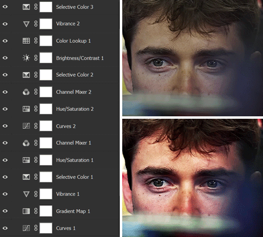
The base footage for this Charles gifset is incredibly desaturated. I started with a Curves layer to bring contrast to the gif, as well as do some color-correcting to bring the base footage to a more neutral tone. To bump contrast, I also like to add a black and white Gradient Map layer with a Soft Light blending mode at 10%-30% opacity:
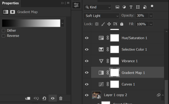
The Vibrance layer is then used to lift the saturation of the base footage, with the Selective Color, Hue/Saturation, and Channel Mixer layers to help remove the green/yellow tint to his skintone.
An underrated adjustment layer/preset in my opinion is the Color Lookup. You can layer in pre-loaded .LUT color grading presets to help speed up your process. For this gif, it’s simply a base preset Soft Warming Look to achieve a warm, pink-tinted tone.
In hindsight I feel like this gifset is too saturated, his skintone is skewing very red/pink, I could’ve bumped down the lightness of the reds with a Selective Color layer or a Hue/Saturation layer. Try to err on the side of neutral for skintones. Experiment with layer orders—there’s no right or wrong! Remember that each layer build up on the one before it.
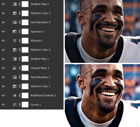
The base footage of the Jalen gif is already quite nicely color-graded, but it’s still muddy and underexposed. As with the Charles gif, I started with a Curves layer to bring the gif to a better baseline contrast. Then I focus on brightening the gif with the Brightness/Contrast and Exposure layers.
The Hue/Saturation and Selective Color layers are to color-correct Jalen’s skin tone—it’s something I spend most of my time coloring gifs and focus a lot on, especially when color grading BIPOC skintones. Putting a Vibrance layer, upping the Vibrance and Saturation, and calling it a day would make his skintone skew very, very yellow/orange.
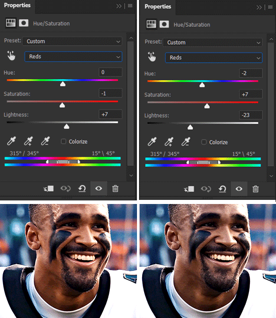
Focus on the reds and yellow for skintone, play around with the Saturation and Lightness sliders, use the Hue slider with caution.
It can be tricky to achieve the right skin tone when working with sports footage vs the higher quality, higher dynamic range footage of films or TV shows, but I try to keep it as close to the subject’s natural skintone as possible.
Here are some of tutorials with tips and tricks on coloring BIPOC:
How to fix orange-washed characters by @zoyanazyalensky
How to prevent pink-washing and yellow-washing by @jeonwonwoo
Coloring tutorial by @captain-hen
Changing lighting conditions?
Fret not—this is why I love working in video timeline. I’ll take this gifset as an example: it’s a deceptively difficult one to color. The footage is 720p and the sunlight shifts throughout the video, so matching across gifs was tricky.
My solution was to split the clips in sections with consistent lighting, and apply adjustment layers to the individual sections before applying general color grading layers on top of everything.
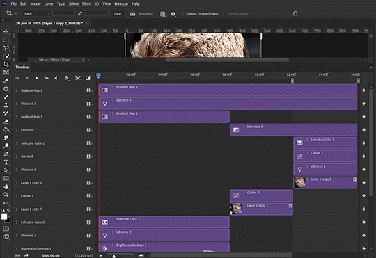
We can make use of the Fade Transition effect for sections where the lighting changes within the gif section we want to color.
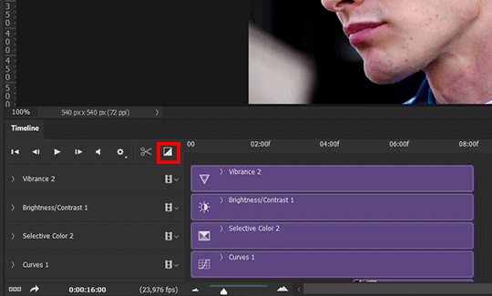
(without vs with Fade on the Brightness/Contrast layer)
The difference is subtle in this example, but the brightness in the right gif is noticeably more consistent throughout. You can also add the Fade Transition effect to the beginning for a fade in, of course.
SHARPENING AND OPTIMIZING GIF QUALITY
This tutorial by @anya-chalotra covers everything you need to know about optimizing gifs for Tumblr.
Sharpening.
Sharpening is essential to making crisp gif images. Here’s another ask I answered re: my own sharpening settings and maximizing gif quality.
(base footage, unsharpened)

(color graded, unsharpened)
(color graded, sharpened)
The final gif is sharpened with Smart Sharpen, 500% at 0.3px and 10% at 10px (my standard sharpening settings).
Here are some tutorials and resources on sharpening:
Sharpening process by @anya-chalotra
Sharpening tutorial with added gaussian blur by @haleths
Sharpening action by @daenerys-stormborn
Size your gifs for Tumblr correctly.
This is essential: full width gifs are 540px wide.Two side-by-side gifs should be 268px wide. Here’s a handy post on gif size guide for Tumblr.
Incorrectly sizing your gifs will take away the quality of your gifs: undersizing your gifs will especially make them grainy, blurry, and /or pixelated, and won’t display correctly on many people’s desktop theme. Oversizing usually isn't as dramatic as undersizing, but it will make the gifset glitch when displayed, and the file size will be unnecessarily bloated.
Work with HD footage if possible.
Media fandoms (films/TV shows) are luckier than us in the sports trenches—we have to work with what we have. Broadcast footage is usually subpar: lacks contrast, pixelated, very desaturated, the list goes on. But it’s possible to still make high quality gifs from subpar footage. Here are a couple of tutorials to mask low source footage quality:
low quality video ➜ “HD” gifs tutorial by @nickoffermen
Sharpening low quality footage by @everglow-ing
(This gifset I made is from a 480p footage with horrendous lighting conditions and colors, and the end result is decent I’d say)
Save for Web (File > Export > Save for Web (Legacy) or Ctrl + Alt + Shift + S) settings.
I default to Adaptive + Diffusion but also use Adaptive + Pattern from time to time. Any combination of Adaptive or Selective + Diffusion or Pattern will give you a good result. In my experience some gifs will need the Selective color table for the colors to display correctly.
Here are my default settings:
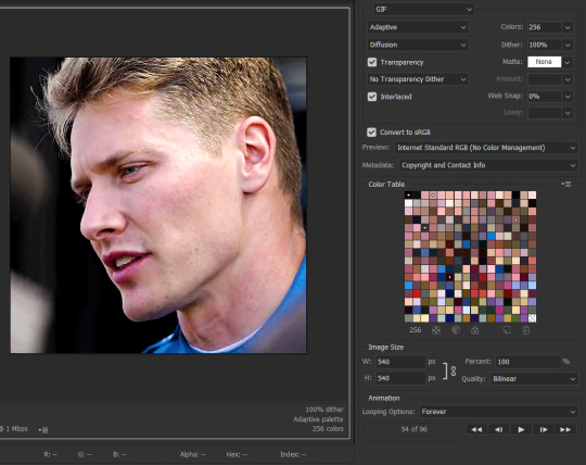
SAVING AND EXPORTING FOR TUMBLR
Converting to frames and adjusting the gif speed.
If possible, avoid exporting your gif and reopening it to adjust the frame speed. I used to do this sometimes when I’m lazy, I have to admit, but this is where this Action as mentioned at the beginning comes in very handy. It converts all visible layer into smart object, then converts it back to frame animation.
Step-by-step:
1. Select all layers
2. Right click > Convert to Smart Object
3. Go to the Timeline menu (≡) > Convert Frames > Flatten Frames into Clips
4. Go to the Timeline menu again (≡) > Convert Frames > Convert to Frame Animation
5. In the same menu (≡), select Make Frames from Layers
6. Delete the first frame (it’s a duplicate) then set your frame speed

Now you can adjust the frame speed before exporting it (Save for Web).
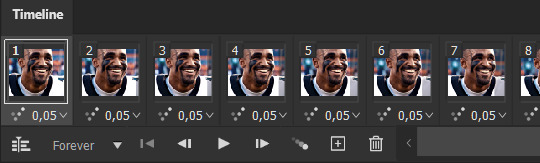
Pay attention to the source framerate.
The frame delay of 0.05 s is usually the default to make gifs for TV shows and films, and it is preferred by most gifmakers. This stems from the fact that most movies and TV shows are 24 or 25 FPS. This may not be the case for all source videos: you might get 30 FPS footage, and sports or gaming footage can be 50 or 60 FPS. Gif speed also depends on the FPS of your original file. Play around with gif speed and see what feels most natural to you.
My rule of thumb is the frame delay Photoshop gives you + 0.01 s. For example, 50 FPS footage will give you 0.02 s frame delay (25 FPS gives you 0.04, 30 FPS gives you 0.03, etc.), so set it to 0.03 s. I usually err on the side of a faster frame delay for smoothness in in-game sports footage, anything else (interviews, press conferences, B-rolls) can get away with being slowed down. Again, experiment and see what you think looks best!
Keep gifs under the Tumblr file size limit (10 MB).
Cut down the number of frames. My gifs are usually around 60-70 frames for 540px full-width gifs, but depending on the coloring, sometimes you can get away with more. 268px gifs can go up to 200+ frames.
Crop your gifs. Remember to keep full-width gifs at 540px wide, but if necessary, you can crop the height. My go-to sizes are 540x540, 540x500, 540x450, and 540x400.
Amp up the contrast of your gifs. Flat colors like black cut down gif size.
The Grain filter or Noise filter, though beautiful for aesthetics or simply necessary sometimes to mask low source footage quality/pixelating, may bloat your gif size.
Play your gifs back before exporting.
Pay attention to duplicate frames or glitches, you might need to get rid of them!
Hope this is helpful! Don’t hesitate to send an Ask or DM if you need any help, I will happily answer all your questions and send over PSDs. (I’m also on Discord—just shoot me a message if you need my tag!) Happy creating :]
#tutorial#PS asks#gif tutorial#Photoshop tutorial#I guess this is more of a resource link dump than tutorial but. Hey. Why reinvent the wheel...#Sorry for the late answer I hope you see this Anon :]#completeresources#allresources#userxoames#userbarbi#usernrzr
1K notes
·
View notes
Text
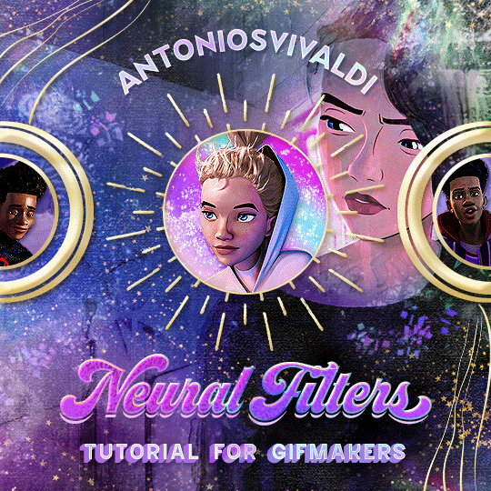


Neural Filters Tutorial for Gifmakers by @antoniosvivaldi
Hi everyone! In light of my blog’s 10th birthday, I’m delighted to reveal my highly anticipated gifmaking tutorial using Neural Filters - a very powerful collection of filters that really broadened my scope in gifmaking over the past 12 months.
Before I get into this tutorial, I want to thank @laurabenanti, @maines , @cobbbvanth, and @cal-kestis for their unconditional support over the course of my journey of investigating the Neural Filters & their valuable inputs on the rendering performance!
In this tutorial, I will outline what the Photoshop Neural Filters do and how I use them in my workflow - multiple examples will be provided for better clarity. Finally, I will talk about some known performance issues with the filters & some feasible workarounds.
Tutorial Structure:
Meet the Neural Filters: What they are and what they do
Why I use Neural Filters? How I use Neural Filters in my giffing workflow
Getting started: The giffing workflow in a nutshell and installing the Neural Filters
Applying Neural Filters onto your gif: Making use of the Neural Filters settings; with multiple examples
Testing your system: recommended if you’re using Neural Filters for the first time
Rendering performance: Common Neural Filters performance issues & workarounds
For quick reference, here are the examples that I will show in this tutorial:
Example 1: Image Enhancement | improving the image quality of gifs prepared from highly compressed video files
Example 2: Facial Enhancement | enhancing an individual's facial features
Example 3: Colour Manipulation | colourising B&W gifs for a colourful gifset
Example 4: Artistic effects | transforming landscapes & adding artistic effects onto your gifs
Example 5: Putting it all together | my usual giffing workflow using Neural Filters
What you need & need to know:
Software: Photoshop 2021 or later (recommended: 2023 or later)*
Hardware: 8GB of RAM; having a supported GPU is highly recommended*
Difficulty: Advanced (requires a lot of patience); knowledge in gifmaking and using video timeline assumed
Key concepts: Smart Layer / Smart Filters
Benchmarking your system: Neural Filters test files**
Supplementary materials: Tutorial Resources / Detailed findings on rendering gifs with Neural Filters + known issues***
*I primarily gif on an M2 Max MacBook Pro that's running Photoshop 2024, but I also have experiences gifmaking on few other Mac models from 2012 ~ 2023.
**Using Neural Filters can be resource intensive, so it’s helpful to run the test files yourself. I’ll outline some known performance issues with Neural Filters and workarounds later in the tutorial.
***This supplementary page contains additional Neural Filters benchmark tests and instructions, as well as more information on the rendering performance (for Apple Silicon-based devices) when subject to heavy Neural Filters gifmaking workflows
Tutorial under the cut. Like / Reblog this post if you find this tutorial helpful. Linking this post as an inspo link will also be greatly appreciated!
1. Meet the Neural Filters!
Neural Filters are powered by Adobe's machine learning engine known as Adobe Sensei. It is a non-destructive method to help streamline workflows that would've been difficult and/or tedious to do manually.
Here are the Neural Filters available in Photoshop 2024:
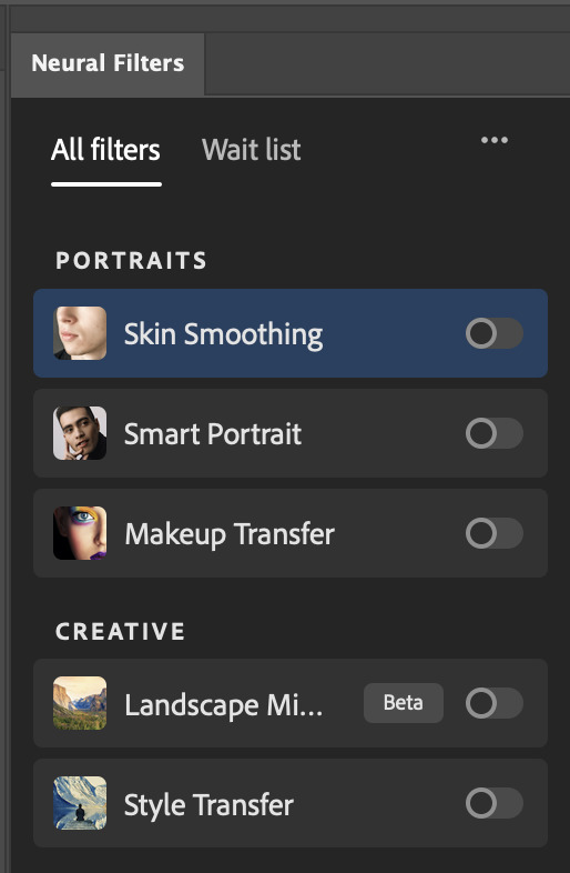

Skin Smoothing: Removes blemishes on the skin
Smart Portrait: This a cloud-based filter that allows you to change the mood, facial age, hair, etc using the sliders+
Makeup Transfer: Applies the makeup (from a reference image) to the eyes & mouth area of your image
Landscape Mixer: Transforms the landscape of your image (e.g. seasons & time of the day, etc), based on the landscape features of a reference image
Style Transfer: Applies artistic styles e.g. texturings (from a reference image) onto your image
Harmonisation: Applies the colour balance of your image based on the lighting of the background image+
Colour Transfer: Applies the colour scheme (of a reference image) onto your image
Colourise: Adds colours onto a B&W image
Super Zoom: Zoom / crop an image without losing resolution+
Depth Blur: Blurs the background of the image
JPEG Artefacts Removal: Removes artefacts caused by JPEG compression
Photo Restoration: Enhances image quality & facial details
+These three filters aren't used in my giffing workflow. The cloud-based nature of Smart Portrait leads to disjointed looking frames. For Harmonisation, applying this on a gif causes Neural Filter timeout error. Finally, Super Zoom does not currently support output as a Smart Filter
If you're running Photoshop 2021 or earlier version of Photoshop 2022, you will see a smaller selection of Neural Filters:

Things to be aware of:
You can apply up to six Neural Filters at the same time
Filters where you can use your own reference images: Makeup Transfer (portraits only), Landscape Mixer, Style Transfer (not available in Photoshop 2021), and Colour Transfer
Later iterations of Photoshop 2023 & newer: The first three default presets for Landscape Mixer and Colour Transfer are currently broken.
2. Why I use Neural Filters?
Here are my four main Neural Filters use cases in my gifmaking process. In each use case I'll list out the filters that I use:
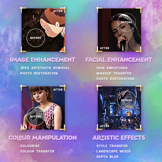
Enhancing Image Quality:
Common wisdom is to find the highest quality video to gif from for a media release & avoid YouTube whenever possible. However for smaller / niche media (e.g. new & upcoming musical artists), prepping gifs from highly compressed YouTube videos is inevitable.
So how do I get around with this? I have found Neural Filters pretty handy when it comes to both correcting issues from video compression & enhancing details in gifs prepared from these highly compressed video files.
Filters used: JPEG Artefacts Removal / Photo Restoration
Facial Enhancement:
When I prepare gifs from highly compressed videos, something I like to do is to enhance the facial features. This is again useful when I make gifsets from compressed videos & want to fill up my final panel with a close-up shot.
Filters used: Skin Smoothing / Makeup Transfer / Photo Restoration (Facial Enhancement slider)
Colour Manipulation:
Neural Filters is a powerful way to do advanced colour manipulation - whether I want to quickly transform the colour scheme of a gif or transform a B&W clip into something colourful.
Filters used: Colourise / Colour Transfer
Artistic Effects:
This is one of my favourite things to do with Neural Filters! I enjoy using the filters to create artistic effects by feeding textures that I've downloaded as reference images. I also enjoy using these filters to transform the overall the atmosphere of my composite gifs. The gifsets where I've leveraged Neural Filters for artistic effects could be found under this tag on usergif.
Filters used: Landscape Mixer / Style Transfer / Depth Blur
How I use Neural Filters over different stages of my gifmaking workflow:
I want to outline how I use different Neural Filters throughout my gifmaking process. This can be roughly divided into two stages:
Stage I: Enhancement and/or Colourising | Takes place early in my gifmaking process. I process a large amount of component gifs by applying Neural Filters for enhancement purposes and adding some base colourings.++
Stage II: Artistic Effects & more Colour Manipulation | Takes place when I'm assembling my component gifs in the big PSD / PSB composition file that will be my final gif panel.
I will walk through this in more detail later in the tutorial.
++I personally like to keep the size of the component gifs in their original resolution (a mixture of 1080p & 4K), to get best possible results from the Neural Filters and have more flexibility later on in my workflow. I resize & sharpen these gifs after they're placed into my final PSD composition files in Tumblr dimensions.
3. Getting started
The essence is to output Neural Filters as a Smart Filter on the smart object when working with the Video Timeline interface. Your workflow will contain the following steps:
Prepare your gif
In the frame animation interface, set the frame delay to 0.03s and convert your gif to the Video Timeline
In the Video Timeline interface, go to Filter > Neural Filters and output to a Smart Filter
Flatten or render your gif (either approach is fine). To flatten your gif, play the "flatten" action from the gif prep action pack. To render your gif as a .mov file, go to File > Export > Render Video & use the following settings.

Setting up:
o.) To get started, prepare your gifs the usual way - whether you screencap or clip videos. You should see your prepared gif in the frame animation interface as follows:

Note: As mentioned earlier, I keep the gifs in their original resolution right now because working with a larger dimension document allows more flexibility later on in my workflow. I have also found that I get higher quality results working with more pixels. I eventually do my final sharpening & resizing when I fit all of my component gifs to a main PSD composition file (that's of Tumblr dimension).
i.) To use Smart Filters, convert your gif to a Smart Video Layer.
As an aside, I like to work with everything in 0.03s until I finish everything (then correct the frame delay to 0.05s when I upload my panels onto Tumblr).
For convenience, I use my own action pack to first set the frame delay to 0.03s (highlighted in yellow) and then convert to timeline (highlighted in red) to access the Video Timeline interface. To play an action, press the play button highlighted in green.

Once you've converted this gif to a Smart Video Layer, you'll see the Video Timeline interface as follows:

ii.) Select your gif (now as a Smart Layer) and go to Filter > Neural Filters
Installing Neural Filters:
Install the individual Neural Filters that you want to use. If the filter isn't installed, it will show a cloud symbol (highlighted in yellow). If the filter is already installed, it will show a toggle button (highlighted in green)
When you toggle this button, the Neural Filters preview window will look like this (where the toggle button next to the filter that you use turns blue)

4. Using Neural Filters
Once you have installed the Neural Filters that you want to use in your gif, you can toggle on a filter and play around with the sliders until you're satisfied. Here I'll walkthrough multiple concrete examples of how I use Neural Filters in my giffing process.
Example 1: Image enhancement | sample gifset
This is my typical Stage I Neural Filters gifmaking workflow. When giffing older or more niche media releases, my main concern is the video compression that leads to a lot of artefacts in the screencapped / video clipped gifs.
To fix the artefacts from compression, I go to Filter > Neural Filters, and toggle JPEG Artefacts Removal filter. Then I choose the strength of the filter (boxed in green), output this as a Smart Filter (boxed in yellow), and press OK (boxed in red).
Note: The filter has to be fully processed before you could press the OK button!
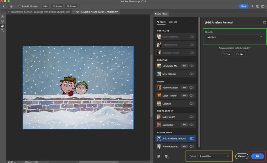
After applying the Neural Filters, you'll see "Neural Filters" under the Smart Filters property of the smart layer

Flatten / render your gif
Example 2: Facial enhancement | sample gifset
This is my routine use case during my Stage I Neural Filters gifmaking workflow. For musical artists (e.g. Maisie Peters), YouTube is often the only place where I'm able to find some videos to prepare gifs from. However even the highest resolution video available on YouTube is highly compressed.
Go to Filter > Neural Filters and toggle on Photo Restoration. If Photoshop recognises faces in the image, there will be a "Facial Enhancement" slider under the filter settings.

Play around with the Photo Enhancement & Facial Enhancement sliders. You can also expand the "Adjustment" menu make additional adjustments e.g. remove noises and reducing different types of artefacts.

Once you're happy with the results, press OK and then flatten / render your gif.
Example 3: Colour Manipulation | sample gifset
Want to make a colourful gifset but the source video is in B&W? This is where Colourise from Neural Filters comes in handy! This same colourising approach is also very helpful for colouring poor-lit scenes as detailed in this tutorial.
Here's a B&W gif that we want to colourise:

Highly recommended: add some adjustment layers onto the B&W gif to improve the contrast & depth. This will give you higher quality results when you colourise your gif.
Go to Filter > Neural Filters and toggle on Colourise.
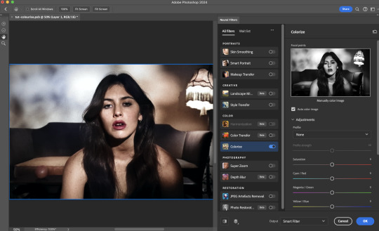
Make sure "Auto colour image" is enabled.
Play around with further adjustments e.g. colour balance, until you're satisfied then press OK.
Important: When you colourise a gif, you need to double check that the resulting skin tone is accurate to real life. I personally go to Google Images and search up photoshoots of the individual / character that I'm giffing for quick reference.
Add additional adjustment layers until you're happy with the colouring of the skin tone.
Once you're happy with the additional adjustments, flatten / render your gif. And voila!

Note: For Colour Manipulation, I use Colourise in my Stage I workflow and Colour Transfer in my Stage II workflow to do other types of colour manipulations (e.g. transforming the colour scheme of the component gifs)
Example 4: Artistic Effects | sample gifset
This is where I use Neural Filters for the bulk of my Stage II workflow: the most enjoyable stage in my editing process!
Normally I would be working with my big composition files with multiple component gifs inside it. To begin the fun, drag a component gif (in PSD file) to the main PSD composition file.
Resize this gif in the composition file until you're happy with the placement

Duplicate this gif. Sharpen the bottom layer (highlighted in yellow), and then select the top layer (highlighted in green) & go to Filter > Neural Filters

I like to use Style Transfer and Landscape Mixer to create artistic effects from Neural Filters. In this particular example, I've chosen Landscape Mixer
Select a preset or feed a custom image to the filter (here I chose a texture that I've on my computer)
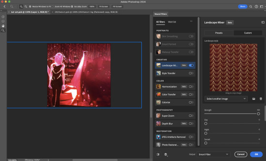
Play around with the different sliders e.g. time of the day / seasons
Important: uncheck "Harmonise Subject" & "Preserve Subject" - these two settings are known to cause performance issues when you render a multiframe smart object (e.g. for a gif)
Once you're happy with the artistic effect, press OK
To ensure you preserve the actual subject you want to gif (bc Preserve Subject is unchecked), add a layer mask onto the top layer (with Neural Filters) and mask out the facial region. You might need to play around with the Layer Mask Position keyframes or Rotoscope your subject in the process.
After you're happy with the masking, flatten / render this composition file and voila!

Example 5: Putting it all together | sample gifset
Let's recap on the Neural Filters gifmaking workflow and where Stage I and Stage II fit in my gifmaking process:
i. Preparing & enhancing the component gifs
Prepare all component gifs and convert them to smart layers
Stage I: Add base colourings & apply Photo Restoration / JPEG Artefacts Removal to enhance the gif's image quality
Flatten all of these component gifs and convert them back to Smart Video Layers (this process can take a lot of time)
Some of these enhanced gifs will be Rotoscoped so this is done before adding the gifs to the big PSD composition file
ii. Setting up the big PSD composition file
Make a separate PSD composition file (Ctrl / Cmmd + N) that's of Tumblr dimension (e.g. 540px in width)
Drag all of the component gifs used into this PSD composition file
Enable Video Timeline and trim the work area
In the composition file, resize / move the component gifs until you're happy with the placement & sharpen these gifs if you haven't already done so
Duplicate the layers that you want to use Neural Filters on
iii. Working with Neural Filters in the PSD composition file
Stage II: Neural Filters to create artistic effects / more colour manipulations!
Mask the smart layers with Neural Filters to both preserve the subject and avoid colouring issues from the filters
Flatten / render the PSD composition file: the more component gifs in your composition file, the longer the exporting will take. (I prefer to render the composition file into a .mov clip to prevent overriding a file that I've spent effort putting together.)
Note: In some of my layout gifsets (where I've heavily used Neural Filters in Stage II), the rendering time for the panel took more than 20 minutes. This is one of the rare instances where I was maxing out my computer's memory.
Useful things to take note of:
Important: If you're using Neural Filters for Colour Manipulation or Artistic Effects, you need to take a lot of care ensuring that the skin tone of nonwhite characters / individuals is accurately coloured
Use the Facial Enhancement slider from Photo Restoration in moderation, if you max out the slider value you risk oversharpening your gif later on in your gifmaking workflow
You will get higher quality results from Neural Filters by working with larger image dimensions: This gives Neural Filters more pixels to work with. You also get better quality results by feeding higher resolution reference images to the Neural Filters.
Makeup Transfer is more stable when the person / character has minimal motion in your gif
You might get unexpected results from Landscape Mixer if you feed a reference image that don't feature a distinctive landscape. This is not always a bad thing: for instance, I have used this texture as a reference image for Landscape Mixer, to create the shimmery effects as seen in this gifset
5. Testing your system
If this is the first time you're applying Neural Filters directly onto a gif, it will be helpful to test out your system yourself. This will help:
Gauge the expected rendering time that you'll need to wait for your gif to export, given specific Neural Filters that you've used
Identify potential performance issues when you render the gif: this is important and will determine whether you will need to fully playback your gif before flattening / rendering the file.
Understand how your system's resources are being utilised: Inputs from Windows PC users & Mac users alike are welcome!
About the Neural Filters test files:
Contains six distinct files, each using different Neural Filters
Two sizes of test files: one copy in full HD (1080p) and another copy downsized to 540px
One folder containing the flattened / rendered test files
How to use the Neural Filters test files:
What you need:
Photoshop 2022 or newer (recommended: 2023 or later)
Install the following Neural Filters: Landscape Mixer / Style Transfer / Colour Transfer / Colourise / Photo Restoration / Depth Blur
Recommended for some Apple Silicon-based MacBook Pro models: Enable High Power Mode
How to use the test files:
For optimal performance, close all background apps
Open a test file
Flatten the test file into frames (load this action pack & play the “flatten” action)
Take note of the time it takes until you’re directed to the frame animation interface
Compare the rendered frames to the expected results in this folder: check that all of the frames look the same. If they don't, you will need to fully playback the test file in full before flattening the file.†
Re-run the test file without the Neural Filters and take note of how long it takes before you're directed to the frame animation interface
Recommended: Take note of how your system is utilised during the rendering process (more info here for MacOS users)
†This is a performance issue known as flickering that I will discuss in the next section. If you come across this, you'll have to playback a gif where you've used Neural Filters (on the video timeline) in full, prior to flattening / rendering it.
Factors that could affect the rendering performance / time (more info):
The number of frames, dimension, and colour bit depth of your gif
If you use Neural Filters with facial recognition features, the rendering time will be affected by the number of characters / individuals in your gif
Most resource intensive filters (powered by largest machine learning models): Landscape Mixer / Photo Restoration (with Facial Enhancement) / and JPEG Artefacts Removal
Least resource intensive filters (smallest machine learning models): Colour Transfer / Colourise
The number of Neural Filters that you apply at once / The number of component gifs with Neural Filters in your PSD file
Your system: system memory, the GPU, and the architecture of the system's CPU+++
+++ Rendering a gif with Neural Filters demands a lot of system memory & GPU horsepower. Rendering will be faster & more reliable on newer computers, as these systems have CPU & GPU with more modern instruction sets that are geared towards machine learning-based tasks.
Additionally, the unified memory architecture of Apple Silicon M-series chips are found to be quite efficient at processing Neural Filters.
6. Performance issues & workarounds
Common Performance issues:
I will discuss several common issues related to rendering or exporting a multi-frame smart object (e.g. your composite gif) that uses Neural Filters below. This is commonly caused by insufficient system memory and/or the GPU.
Flickering frames: in the flattened / rendered file, Neural Filters aren't applied to some of the frames+-+
Scrambled frames: the frames in the flattened / rendered file isn't in order
Neural Filters exceeded the timeout limit error: this is normally a software related issue
Long export / rendering time: long rendering time is expected in heavy workflows
Laggy Photoshop / system interface: having to wait quite a long time to preview the next frame on the timeline
Issues with Landscape Mixer: Using the filter gives ill-defined defined results (Common in older systems)--
Workarounds:
Workarounds that could reduce unreliable rendering performance & long rendering time:
Close other apps running in the background
Work with smaller colour bit depth (i.e. 8-bit rather than 16-bit)
Downsize your gif before converting to the video timeline-+-
Try to keep the number of frames as low as possible
Avoid stacking multiple Neural Filters at once. Try applying & rendering the filters that you want one by one
Specific workarounds for specific issues:
How to resolve flickering frames: If you come across flickering, you will need to playback your gif on the video timeline in full to find the frames where the filter isn't applied. You will need to select all of the frames to allow Photoshop to reprocess these, before you render your gif.+-+
What to do if you come across Neural Filters timeout error? This is caused by several incompatible Neural Filters e.g. Harmonisation (both the filter itself and as a setting in Landscape Mixer), Scratch Reduction in Photo Restoration, and trying to stack multiple Neural Filters with facial recognition features.
If the timeout error is caused by stacking multiple filters, a feasible workaround is to apply the Neural Filters that you want to use one by one over multiple rendering sessions, rather all of them in one go.
+-+This is a very common issue for Apple Silicon-based Macs. Flickering happens when a gif with Neural Filters is rendered without being previously played back in the timeline.
This issue is likely related to the memory bandwidth & the GPU cores of the chips, because not all Apple Silicon-based Macs exhibit this behaviour (i.e. devices equipped with Max / Ultra M-series chips are mostly unaffected).
-- As mentioned in the supplementary page, Landscape Mixer requires a lot of GPU horsepower to be fully rendered. For older systems (pre-2017 builds), there are no workarounds other than to avoid using this filter.
-+- For smaller dimensions, the size of the machine learning models powering the filters play an outsized role in the rendering time (i.e. marginal reduction in rendering time when downsizing 1080p file to Tumblr dimensions). If you use filters powered by larger models e.g. Landscape Mixer and Photo Restoration, you will need to be very patient when exporting your gif.
7. More useful resources on using Neural Filters
Creating animations with Neural Filters effects | Max Novak
Using Neural Filters to colour correct by @edteachs
I hope this is helpful! If you have any questions or need any help related to the tutorial, feel free to send me an ask 💖
#photoshop tutorial#gif tutorial#dearindies#usernik#useryoshi#usershreyu#userisaiah#userroza#userrobin#userraffa#usercats#userriel#useralien#userjoeys#usertj#alielook#swearphil#*#my resources#my tutorials
368 notes
·
View notes
Last Seen Blogs
moarthebear
YNGIXTH.

pemburusendu
Untitled
fairnightmare
Garden of Edeline

dutifullydifferentchild
Never explain anything

gueszstart
Gueszst's Art