#coloring tutorial
Photo
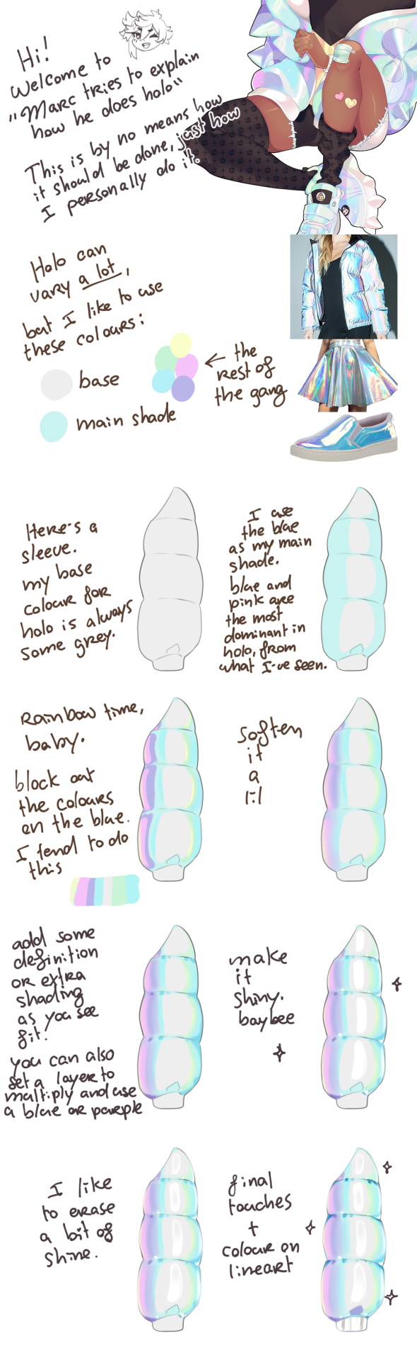
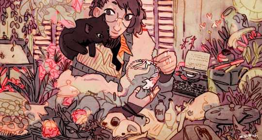
How Marc colours iridescent by Roxoah
#art#art tutorial#coloring tutorial#iridescent tutorial#how to color iridescent#iridescence#art help#holographic#how to color holographic#coloring iridescence#Roxoah
13K notes
·
View notes
Note
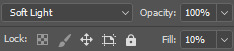
hi i'm sorry to bother you but do you have any tips on giffing dark indoor scenes? yours always look so good!
hi there! not a bother at all :) i can definitely try to explain the steps i usually take under the cut!
this tutorial will assume that you already know the basic steps of gif-making — if you don't, there are lots of great tutorials floating around on this site that can help you out! :)
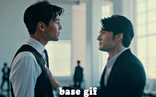
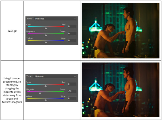
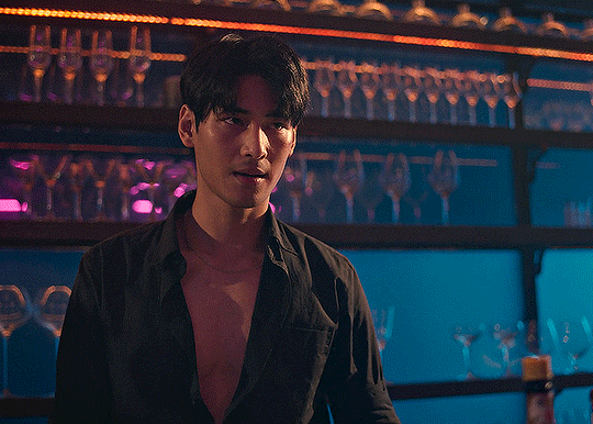
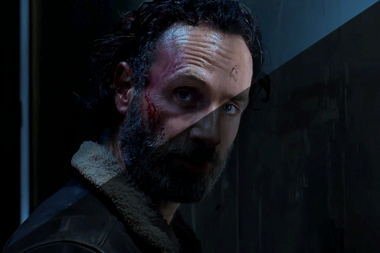
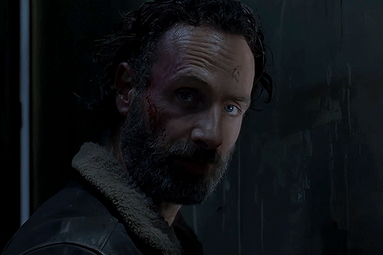
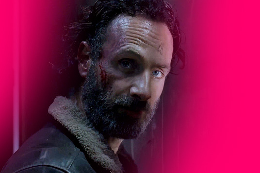
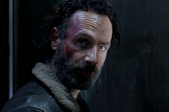
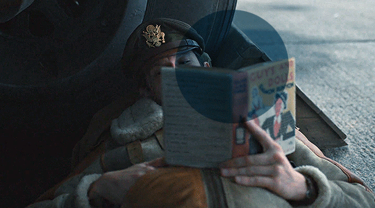
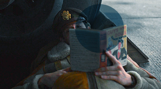
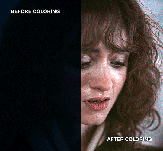
here's the gif i'll work with to explain my steps, the bottom being the original and the top being the coloured/brightened version.
before we start, a general tip i recommend keeping in mind: if you want to brighten a dark scene, you'll want to get your hands on the highest quality download you can find. 1080p is decent, but if your laptop can handle 2160p 4k hdr files* without sounding like it's about to explode, that'll get you even better results!
(*colouring hdr 4k files requires a different set of steps — the scene will appear washed-out on photoshop, so you need to make sure that you don't end up whitewashing anyone if you do choose to work with this type of file.)
since most of my downloads are 1080p, i'll use this type of file in this tutorial.
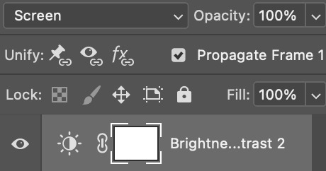
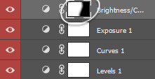
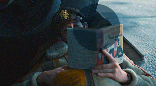
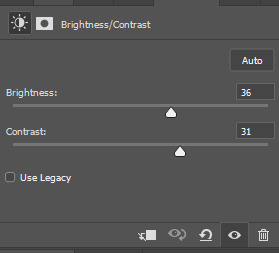
the first step of my gifmaking process with 1080p files is almost always the same no matter what scene i'm giffing. i make a brightness/contrast layer and set the blending mode to screen:
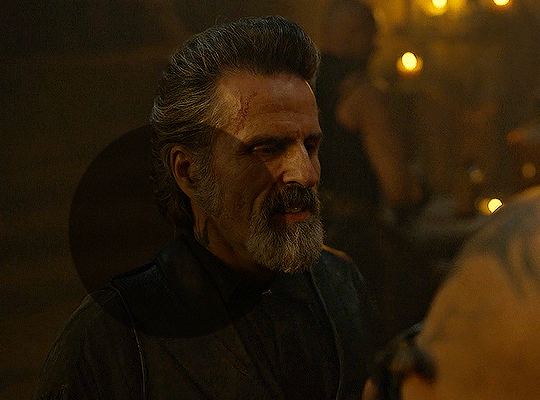
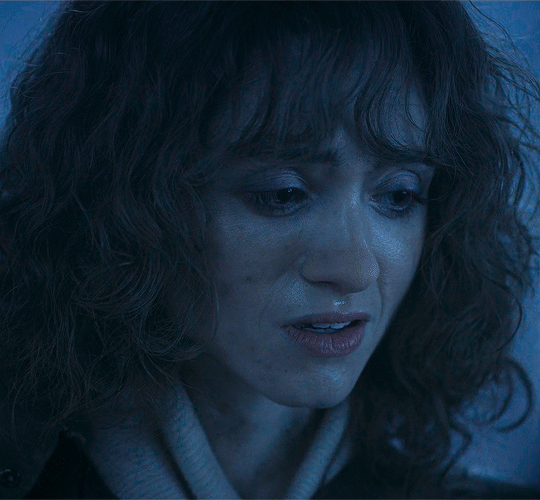
now my gif looks like this:
depending on the scene and how washed out it looks after this layer, i'll play around with the opacity. for this gif, i didn't touch the opacity at all. use your best judgement for this, because every scene is different!
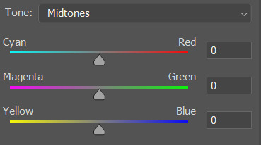
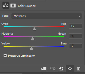
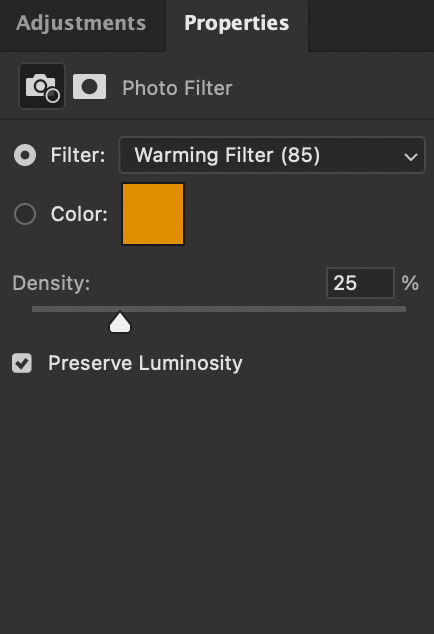
i find that dark indoor scenes are usually tinted in yellow or green. one of my first goals is to try to fix the undertone of this scene before focusing on brightening it any further. i go to colour balance for this, and play around with the midtones, shadows, and highlights.
again, every scene is different, so the amount to which you use colour balance will differ, but for this specific scene, my goal was to neutralize the yellow. i focused particularly on the midtones and shadows of the colour balance layer, moving the scales to the opposite of the reds.
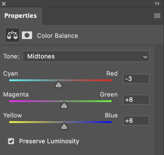
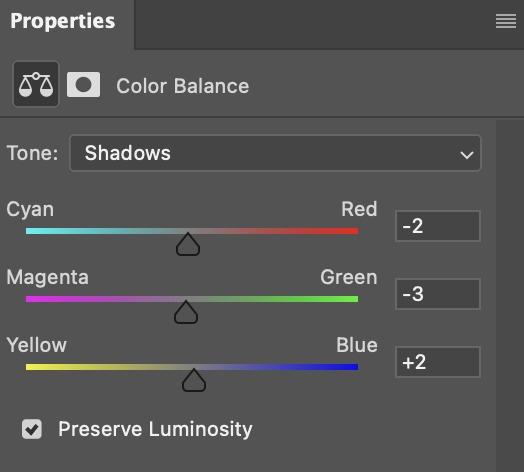
doing so will help with neutralizing the yellow. the only reason i moved the scales towards magenta and blue (therefore making it a bit more red than less) rather than green and yellow in shadows was because i wanted a darker contrast in the blacks. moving them to green and yellow made the overall scene more yellow since there were so many dark spots that shadows affected. (you'll see what i mean when you start experimenting with your own gif — this part of the process really just depends on your preferences!)
our gif might not look that much better yet, but it will soon! our best friend channel mixer is gonna help us out. for an in-depth post about how to use this adjustment layer, i recommend checking out this tutorial.
i'm someone who prefers to make more than one layer for the same adjustment layer for a reason i can't even explain (i just find that it helps me stay more organized). so don't think of this process like i can only use this layer once so i MUST fix it NOW. you can create multiple layers of the same adjustment layer, because every layer on top will affect the ones underneath it.
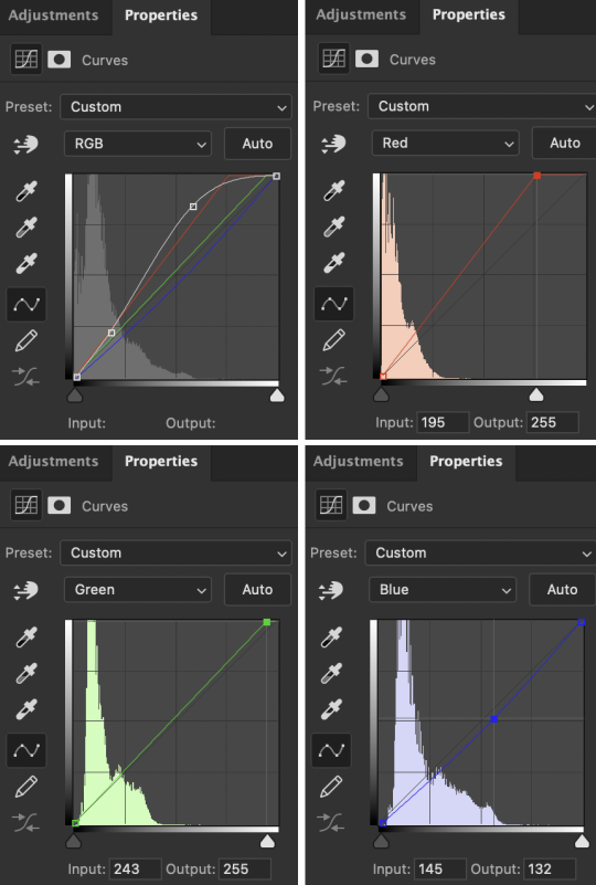
since my priority is getting rid of the yellow tint, i went to the Blue section of the channel mixer and increased it in all of the scales:
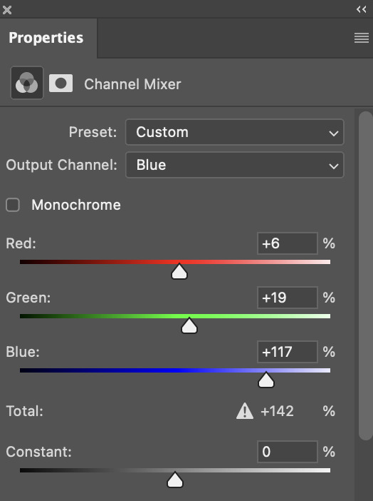
this step alone has helped us out so much, because look at our gif now!
not only does the background look less yellow, but so does izzy's skintone.
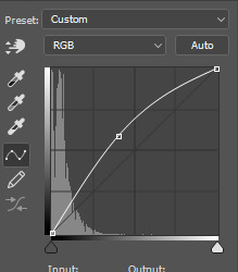
now i'm going to focus on trying to brighten the scene even more without destroying the quality. the levels layer can actually help out a lot with this.
the amount to which i move each toggle differs per scene, and i think experimenting depending on your gif works best for this layer.
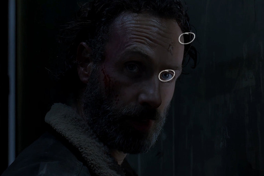
side note: i prefer not to use the ink droppers on the side because the contrast in the result usually ends up feeling too strong for my preferences, but if you find that this works better for you, then go for it! basically, the first dropper with the black ink should be clicked before you select the darkest part of the scene that you can find, and vice versa for the third dropper with the white ink — click it, and then select the brightest part of your scene.
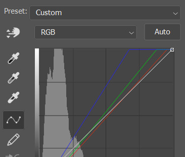
curves is the next layer that does fantastic work! unlike the levels layer, i do actually use the ink droppers for this. it's the same concept, with the first dropper being used on the darkest part of the scene, and the third dropper on the brightest.
try to think of curves as something that not only further brightens your scene, but also helps with the colour neutralizing process.
i grab the first dropper, then click the darkest parts of the gif that i can see. depending on the undertone of the blacks that you're clicking on, the tint of your gif might actually change significantly. this is why i prefer to click once, then undo the action if i don't like what it gives me. izzy's leather jacket was the sweet spot for this gif.
when i'm satisfied, i make another curves layer and use the third dropper to click the bright/white parts of the scene. for this gif in particular, the lights in the background were a good fit because they carried a yellow undertone — this meant that my curves layer actually helped to further neutralize the yellows in the scene as a whole!
(i manually dragged the curves graph upwards for the third dropper to make it brighter. i don't need to do this if the dropper does this for me automatically, but since the lights were pretty bright, it only changed the tone of the scene and didn't increase the brightness — hence the manual step.)
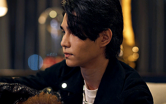
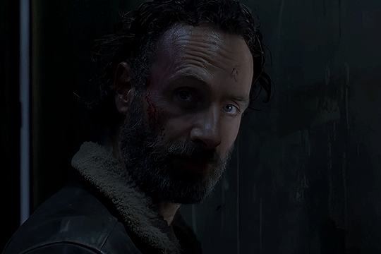
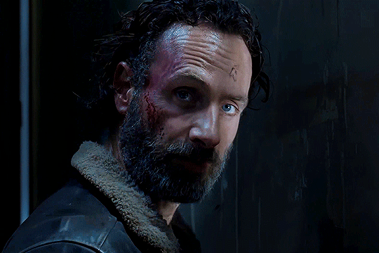
pat yourself on the back, because this is what our gif looks like now!
this is good, but it's not great — there's still just a bit too much yellow in the scene for my liking (sorry, i'm picky! :P)
i created another channel mixer layer and played with the toggles until i was satisfied:
ta-da! the gif as a whole is much less red/yellow now:
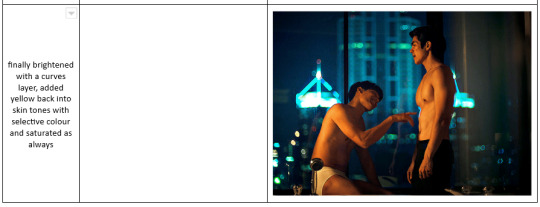
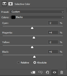
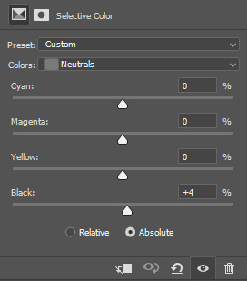
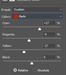
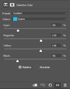
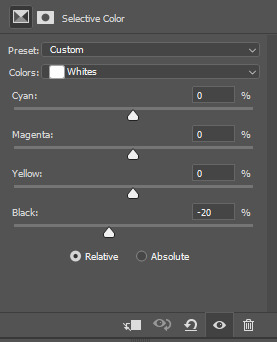
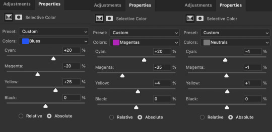
this is when i start fixing the colouring now — namely, his skin tone. selective colour will be your best friend here. i wanted to make his face just a tad brighter and less of a yellow-ish magenta shade, so i focused on the reds and yellows.
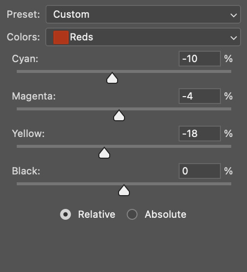
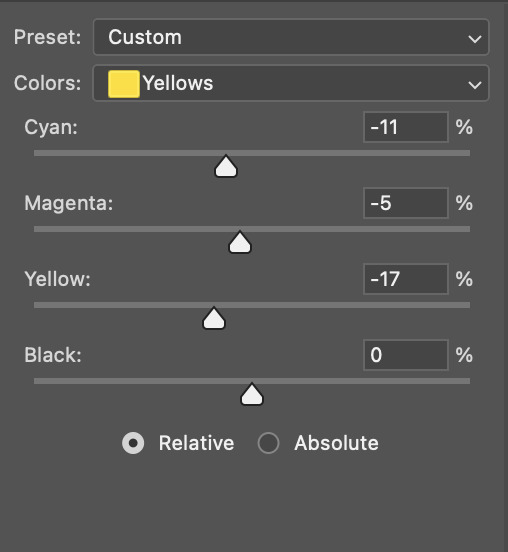
then, out of habit, i created another selective colour layer and took out more of the "yellow" in the whites to make them whiter, and increased the black (just by +1, since the contrast is pretty good enough already).
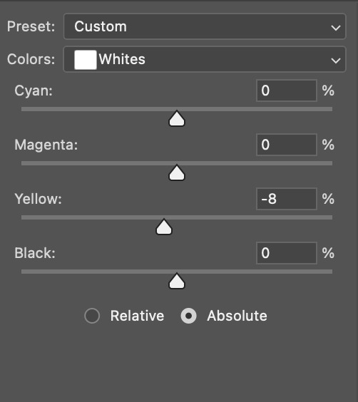
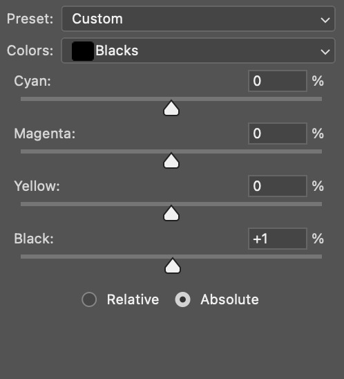
note: i switched to "absolute" for these two colours. basically, relative = less vibrant colour manipulation, and absolute = more vibrant/stronger colour manipulation. i prefer to stick to "relative" for fixing skin-tone since "absolute" can be a bit too strong for that.
our gif looks like this now!

his face looks brighter and much less yellow, so i'm satisfied!
this next step is not mandatory at all — again, i'm just picky and despise yellow-tinted scenes. i personally believe that indoor scenes that are yellow/green tinted make them look more dark than they actually are, so i do my best to get rid of these colours.
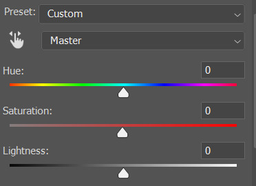
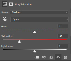
i also don't always do this, but for this gif, i just simply went to hue/saturation, selected the yellows from the drop-down menu and decreased its saturation.
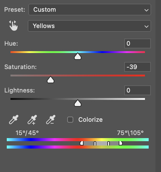
be careful not to do this too much. depending on the quality of your download, this can significantly decrease your gif quality. i tend to worry less about this when i'm working with 2160p files, but again, those files require an entirely different set of steps when it comes to brightening/colouring.
since this was a 1080p file download (and one that was actually less than 1GB, oops, don't do that), i played it safe and decreased it by -39 only.
note: you also want to be cautious of colour-washing skintone when it comes to this step. i find that another selective colour layer can help perfect the skintone in case the yellow drains out of it too much, but skip the hue/saturation step if it's too difficult to work with — better to be safe than sorry.
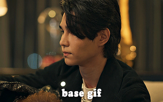
anyway, this is the final gif!
that's usually what i do when it comes to colouring dark indoor scenes! i hope this tutorial makes sense, and if you have any further questions, don't hesitate to reach out! :)
#tutorial#gif tutorial#resources#completeresources#coloring tutorial#allresources#dailyresources#userraffa#userdean#uservivaldi#alielook#usercats#usermoonchild#usernaureen#userbarrow#userabs#useraish#useralison#userisaiah#*mytutorials#i am so sorry if this is incoherent#it’s so hard to explain things coherently 😫
613 notes
·
View notes
Text
✨ Simple Gif Colouring for Beginners ✨
I wrote up my basic gif colouring process for a friend recently, but a couple of people here mentioned they'd also find it helpful! so, as requested, this is a beginner-friendly walkthrough of the way I colour my gifs :) it's aimed at brand new gif makers with no prior experience with photoshop or photo editing.
when I first started gif making I found colouring and photoshop in general suuuper daunting, so I've tried to simplify everything here as much as possible. hopefully this will be relatively easy to follow and not too intimidating!
a couple of things to begin with:
I'm only talking about colouring here - this is not a full gif making tutorial. I've linked to some of my favourites of those here!
I personally like to make bright, 'clean' looking gifs with vibrant but natural colours, so that is the style of colouring this tutorial is geared towards. most of gif colouring is subjective and about personal taste - the only thing that I'd say is possible to get wrong is skin tones, which I talk about a lot in this guide.
as I mostly gif Thai dramas, most of the advice is geared towards colouring for East Asian/South East Asian skin tones - but the techniques should be fairly universally applicable (and here are some tutorials that talk about gif colouring for other skin tones).
I'm not an expert! I'm not claiming this is the best or the only way to colour gifs - it's just how I do it.
this post is very image-heavy. if the images aren't loading (or the gifs are running slowly or cutting/looping weirdly), then try viewing the post in its own tab (rather than on the your dash or someone's blog) and refreshing the page.
okay, full walkthrough beneath the cut!
contents:
1. intro
a. natural gif colouring goals
b. very very basic colour theory
2. super simple colouring (the essentials)
a. curves
b. selective colour (and skin tone correction)
c. hue/saturation
d. saving and reusing colouring
e. another simple colouring example
3. other adjustment layers
a. brightness/contrast
b. levels
c. vibrance
d. colour balance
e. channel mixer
4. troubleshooting
a. curves
b. saturation
5. fin!
1. intro
the colouring part of gif making can be super overwhelming, especially if (like me when I first started!) you're completely new to photoshop and/or have no experience with colour theory or photo/video editing.
if you're opening photoshop and making gifs for the first time, I highly recommend getting used to making a few basic, uncoloured gifs to begin with. just to practice, rather than post anywhere (though you can always come back and colour them later if you want) - but it'll make the rest of the process much easier if you're already beginning to get used to working in timeline mode of photoshop. give yourself a bit of time to practice and get a feel for things like how many frames you tend to like in a gif, where you like to crop them for the best loop, what kind of aspect ratio you like etc* - so that you're not trying to navigate all of that for the first time on top of everything else!
* frames: for me between 60-90 frames is ideal, but 40-120 frames is the absolute min-max I'd personally use in a normal gifset
loops: for the smoothest loops, try to avoid cutting someone off mid-movement or mid-word if possible.
aspect ratio: for full-size (540px) gifs, I tend to go for either 8:5 (slightly 'skinnier' gifs), 7:5, or 5:4 (particularly big, thick gifs lmao)
✨ natural gif colouring goals
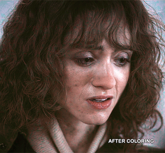
part of what can be so daunting about starting gif making is not knowing where to start or what you want to achieve. this is definitely something that gets easier with practice - the more gifs you make, the more you'll get a feel for what kind of look you like and the more instinctively you'll know how to get there. it also helps to see if any gif makers you like have made "before and after colouring" posts - these can help with getting a sense of the kinds of changes made through gif colouring. here's one I made!
in general, I like to make my gifs bright and 'clean' looking, with vibrant but natural colours. these are the things I'm usually hoping to achieve with colouring:
brighten dark scenes
remove muddy, yellowish lighting or filters
saturate colours
correct any skin lightening filters or overexposure
make lighting and colours as consistent as possible between gifs within a single gifset, especially gifsets featuring gifs from multiple scenes/episodes/videos
this guide is focusing on natural colouring, but of course there are many cool ways to make stylised/unnaturally coloured gifs. imo you'll need to master these basics first, but if you want to learn how to do things like change the background colour of gifs or use gradients or other cool effects, then @usergif's resource directory has loads of super helpful tutorials!
✨ very very basic colour theory
[disclaimer! I don't know shit about fuck. I do not study light or art. this is just an explanation that makes sense to me exclusively for the purposes of gif making.]
the primary colours for light/digital screens are red, blue, and green. having all three colours in equal measures neutralises them (represented by the white section in the middle of the diagram).
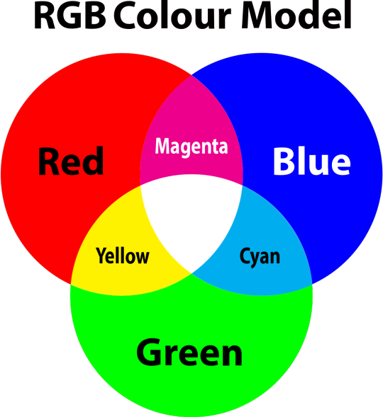
so to neutralise a colour within a gif, you need to add more of the colour(s) that are lacking.
in practice this usually means: the scene you want to gif is very yellow! yellow is made of red and green light, so to neutralise it you need to add more blue into your gif.
it can also mean the reverse: if you desaturate the yellow tones in a gif, it will look much more blue.
looking at the colour balance sliders on photoshop can make it easier to visualise:
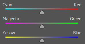
so making a gif more red also means making it less cyan.
removing green from a gif means adding magenta.
taking yellow out of a gif will make it more blue.
tl;dr:
neutralise yellows by adding blue (and vice versa)
neutralise reds by adding cyan (and vice versa)
neutralise green by adding magenta (and vice versa)
2. super simple colouring (the essentials)
starting with a nice sharpened gif in photoshop in timeline mode. (these are the sharpening settings I use!)
some scenes are much harder to colour than others - it helps to start out practising with scenes that are bright/well-lit and that don't have harsh unnaturally coloured lights/filters on. scenes with a lot of brown/orange also tend to be harder.
I usually save a base copy of my gif before I start colouring just in case I end up hating it, or find out later that it doesn't quite fit right into a set and need to redo it etc.
so here is my base gif!

it's an okay gif, but it has a bit of a yellow tint to it that I want to reduce.
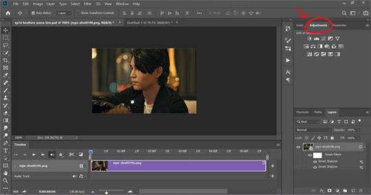
colouring is easiest to do in adjustment layers, which can be found under layer -> new adjustment layer - or for me they are here:
there are lots of different types of adjustment layers that do lots of different things - but for me the absolute essentials for colouring are curves, selective colour, and hue/saturation.
I also use brightness/contrast, levels, exposure, vibrance, colour balance, and channel mixer sometimes, depending on the gif - but I use curves, selective colour, and hue/saturation on every single gif.
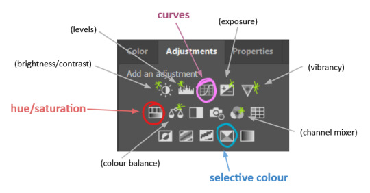
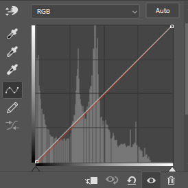
✨ curves layer
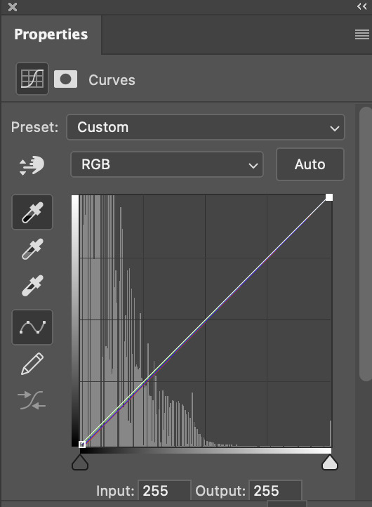
the first thing I always do is a curves layer. when you first open one it will look like this:
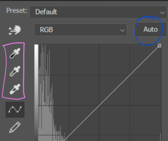
first I usually click the ‘auto’ button, just to see what happens. sometimes it makes a big difference (it usually brightens the gif a lot) - but on this gif it didn’t do much.
if it had made the gif look nicer then I would have kept it and added a second curves layer on top to do the rest of these steps.
the next step is selecting the white and black points with the little eyedropper tools.
the bottom eyedropper lets you pick a white point for the gif. click somewhere super light on the gif to see what happens - for this gif, I clicked on the lampshade on the left. if it looks weird, I just undo it and try somewhere else - it usually takes a few goes to find something that looks good.
here's what that did to the gif:

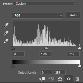
then I pick the top eyedropper and use it to pick a black point by clicking somewhere really dark, again playing around until I find a black point that looks good.
here's what the gif looks like after picking the white and black points:

this can take some experimenting, but you can make super easy drastic changes to your gif just with this. in this case, the curves layer took out a lot of that yellowy tint.
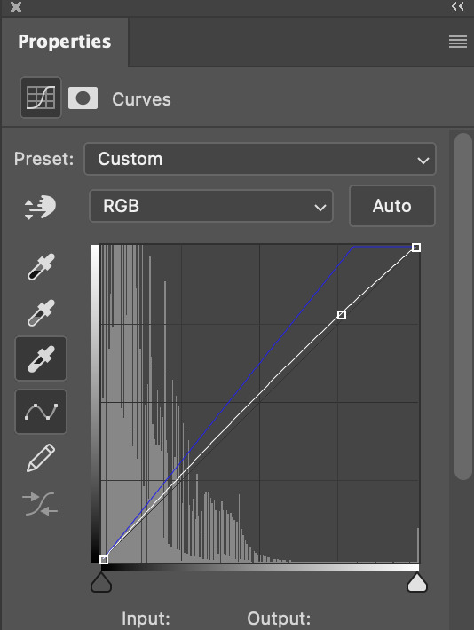
and this is what the curves graph looks like now:
you can click and drag those lines to make further changes if you want - I usually leave them alone though. the colours of the lines indicate which colours have been changed in the gif - for example, you can see from that steep blue line on the graph that blue has been added to neutralise those yellows.
next I usually do another curves layer and just press the ‘auto’ button again to see what happens. usually it brightens the gif a bit more, which I like.
‼️if nothing is working: usually with a bit of fucking about a curves layer works well - but sometimes you can’t find a good white and black point anywhere, and instead your gif turns wacky colours and nothing looks good. this happens more often with very heavily colour tinted scenes :( the troubleshooting section at the end goes over some options, including starting with a levels layer instead.
✨ selective colour (and skin tone correction)
skin tones are made up of a mixture of yellow and red.
removing yellow (or adding blue or red) to a gif will make the skin-tones too red - and removing red (or adding cyan or yellow) to a gif will make the skin-tones too yellow.
adding blue to this gif with the curves layer took out the yellowy tint, which I wanted - but it also took the yellows out of Kim's skin tone, which I don’t want. so I need to put yellow back into the skin tones specifically - without putting it back into the rest of the gif.
selective colour layers let you select an individual colour and adjust the levels of other colours within that colour. you can change how yellow the green shades are, or how much cyan is in the blues, for example.
I need to add yellow back into the red tones to correct the skin tones on this gif. this is the case for most gifs in my experience - the vast majority of the time, unless a scene is very heavily tinted in another colour, a curves layer will add blue/remove yellow.
in the 'colors' dropdown, select the 'reds' section and drag the 'yellow' slider higher - this will add more yellow into just the red shades within the gif.

the amount of yellow you need to add back into the reds depends on how much yellow was taken out of the gif initially - I just play around with the slider until it looks right. if you're not sure, it helps to have some neutrally-coloured (not white-washed!) reference photos of the people in your gif to compare to.
here's the result. Kim's skin is a lot less pink toned and much more natural looking:
✨ hue/saturation
this adjustment layer lets you adjust the hue and saturation of the gif as a whole, and also of each colour individually.
I don't use the hue or lightness sliders unless I'm trying to do something more complicated with the colouring.
clicking the dropdown menu that says 'master' lets you edit the saturation of each colour individually. this is useful if your gif is still super tinted in one colour.
I thought the yellows on this gif were still slightly too bright, so I switched to the yellow channel and desaturated them slightly. (remember if you do this then you need to go back to selective colour and add more yellow into the red skin tones to balance out the desaturation!)
then I increased the 'master' saturation of all the colours to +5:
I usually find the right amount of saturation is somewhere between +5 and +12, but it depends on the gif.
‼️if the gif feels undersaturated, but the saturation slider isn't helping/is making the colours worse, try a vibrance layer instead.
done!
✨ saving and reusing colouring
you can copy and paste adjustment layers between gifs to make your colouring even across each of your gifs for one scene - so if you're making a set of multiple gifs of the same scene, or you think you might want to gif the same scene again in the future, you can save it as a psd so you can reuse the colouring again later.
each gif's colouring will then still need tweaking - different cameras/angles/shots of the same scene can still start out with slightly different colouring.
I recommend uploading the gifs as a draft post on tumblr so you can see what they all look like next to each other and catch any inconsistencies.
✨ another one! (speedrun!)
HI KEN!
the white point for the curves layer was in the window behind them.
the curves layer removes the muddy yellow tint, but again it makes their skin tones (especially Ken's) very red toned, which is adjusted by the selective colour layer.
3. other adjustment layers
imo many many gifs can be coloured really nicely with just those three adjustment layers, but some need different adjustments.
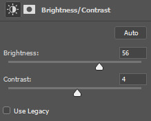
✨ brightness/contrast
pretty self explanatory!
I personally usually avoid using the 'brightness' slider because I rarely like the effect - I only tend to use the 'contrast' one.
the 'auto' button is sometimes useful though, especially if you’re struggling with the curves layer.
✨ levels

levels alters the white and black points of the gif, like curves - but unlike curves it doesn't also alter other colours.
use the sliders beneath the graph to alter how dark/light the gif is. you can slide the black slider further to the right to make the blacks darker, and the white slider to the left to make the whites lighter.
levels is a good place to start if your curves layer isn't working.
(I'm going to hit the image limit for this post lol so here are some screenshots of a table I made to demonstrate this rather than actual gifs. sorry!)
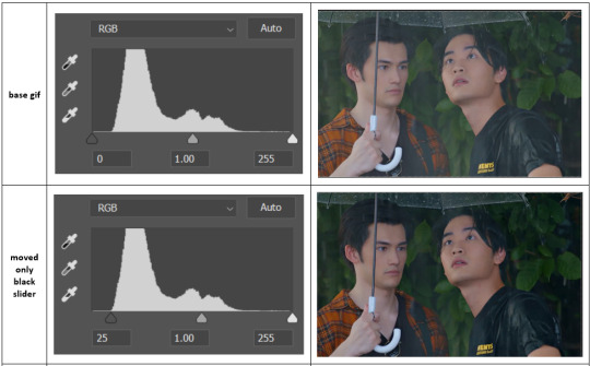

on both sides, I dragged the sliders up to where the big jumps are on the graph - this is usually a good place to start!
✨ vibrance
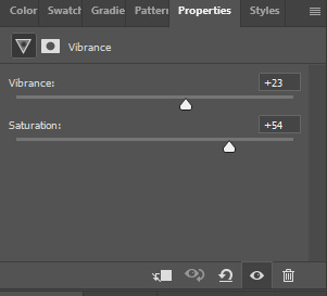
vibrance... makes the colours more vibrant. it's more subtle than saturation.
it's really helpful for gifs that feel grey. sometimes adjusting saturation just makes the greys kind of weirdly tinted, but a vibrance layer can fix that.
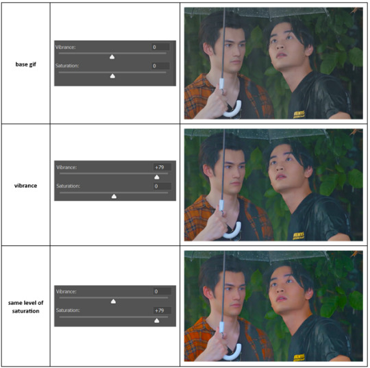
vibrance is much more subtle!
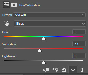
✨ colour balance
colour balance affects the overall balance of colours within a gif.
it's good for scenes with heavy tints.
I tend to stick to the 'midtones' dropdown, but you can also alter the colour balance within the shadows and highlights if you want.

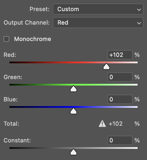
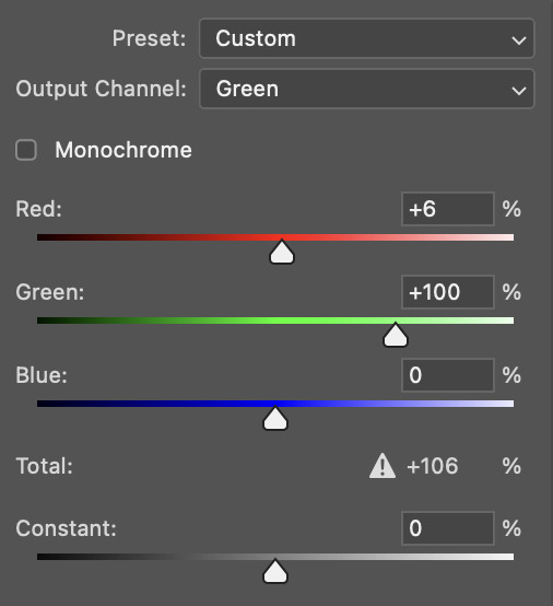
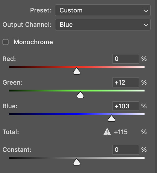
✨ channel mixer
I avoided channel mixer for such a long time because it scared me. but it's great for scenes that are very heavily tinted in one colour.
basically, it works with the levels of red, green, and blue within a gif. you select an output colour and then play around with the levels of the colour you selected within each other colour.
kind of the reverse of selective colour?
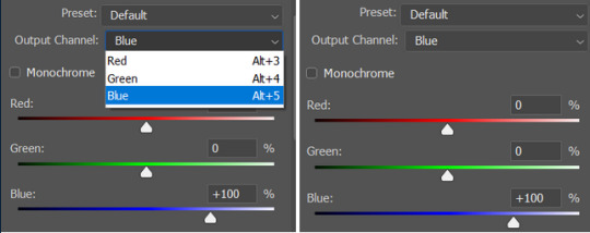
so in the 'blue' channel, the levels of blue are at 100%, and the levels of red and green are at 0% - but you can impact how much blue is in the reds and greens and blues.
this tutorial explains it well - but imo the best way to get to grips with channel mixer is just to play around with it a bit (sorry)
(when I made this guide for my friend, I also made a slightly more complicated gif colouring walk-through that included using channel mixer. there isn't space to include it within this post, but if anyone is interested I could always upload it as an 'intermediate' gif colouring tutorial - lmk!)
4. troubleshooting
‼️curves
usually with a bit of fucking about a curves layer works well - but sometimes you can’t find a good white and black point anywhere, and instead your gif turns wacky colours and nothing looks good. this happens more often with very heavily colour tinted scenes :(
for example, with this base gif:
using many of the brightest points as a white point turn it wacky colours, like this:

yikes :(
some options for these cases:
try brightening the gif first with the 'auto' button on the curves layer or with a levels layer. having a brighter gif to start with can give you better options for picking a white point.
try finding an alternate, whiter/brighter white point. look for places the light reflects - on this gif, using the light on Porsche's cheekbone works well as the white point. it also helps to find places that would be white if the scene wasn't tinted - the lightest part of a white shirt is often a good place to start, for example.
skip the curves layer, and instead use a levels layer to alter your white/black points, and colour balance or channel mixer to balance the colours.
‼️over/undersaturation
if your gif (especially the skintones) is looking a little washed out or lifeless, it might be undersaturated. boost that saturation - or if that's not working, try a vibrance layer.
oversaturation is often easiest to spot in the mouths and ears of any people in a gif. if the mouths are looking unnaturally, vibrantly red, then you've gone too far with the saturation.
5. fin!
and done! I hope this was coherent helpful to somebody.
if there's anything that I've missed or that doesn't make sense pls feel free to shoot me an ask or a message and I'll do my best to help! I've also collated a bunch of additional reading/resources below.
happy gifmaking 🥰
✨ some links!
photoshop basics by @selenapastel
gifmaking for beginners by @hayaosmiyazaki
gifmaking guide for beginners by @saw-x
dreamy's gif tutorial by @scoupsy-remade (includes instructions on how to blur out burned-on subtitles or annoying video graphics)
beginner's guide to channel mixer by @aubrey-plaza
how to fix orange-washed characters by aubrey-plaza
colour correcting and fixing dark scenes by @kylos
does resampling matter? by usergif
how to put multiple gifs on one canvas by @fictionalheroine
watermarking using actions by @wonwooridul
resource directory by @usergif
#i got a couple of asks about this so i figured i'd type it up as a post#it's been sitting in my drafts for a while now though i'm so sorry omg.#i had to replace my laptop and it took me a while to get round to downloading photoshop on the new one#but i hope this is helpful!!#gif making#tutorial#photoshop tutorial#colouring tutorial#coloring tutorial#gif colouring#gif coloring#photoshop resources#gif tutorial#gif resources#userbunn#uservik#darcey.txt#darcey.gif#usergif
323 notes
·
View notes
Text
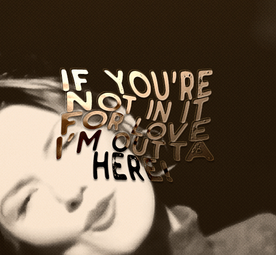
gif tutorial
i was asked to make a tutorial for this set i made, so let's get right into it!
first things first, i downloaded the music videos from youtube in 1080p using 4k video downloader. unfortunately, the quality of youtube videos always seems... not great, to put it simply. plus these music videos are from the 90s, so they've been upscaled to 1080p after the fact. all of this works against us, but i've definitely worked with videos of lesser quality than these, so at least there's that!
when i gif, i import video frames to layers rather than screencapping. this comes down to personal preference. after everything has loaded, i group all my layers together and set the frame delay to 0.05. i then cropped my gif to 540x500.
the next step in my process is sharpening. i did play around with my settings a bit given the quality of the footage and the dimensions of the gif. i compared both @hellboys low-quality video gif tutorial to my regular sharpening action and my vivid sharpening action and in this case, i preferred my normal vivid sharpening action. i used this tutorial to create the action for myself, and you can find other sharpening tutorials here. this action converts my frames to video timeline and applies sharpening.
once my gif is sharpened and i'm in timeline, i begin coloring. i wanted to simplify the amount of colors used in these gifs, again because of the video quality -- i knew it wasn't going to have the crispness i would normally like for my gifs. here are my coloring adjustment layers and their settings (not pictured: my first layer is a brightness/contrast layer set to screen) (explanation in alt text):

all of these layers and their settings will vary depending on your footage and its coloring (and obviously, feel free to make the gradient map whatever colors you like if you aren't going for this exact look).
pretty basic coloring, especially with just slapping a gradient map on top (my beloved), but at this point, i still didn't like the quality of the gif, so i added a couple textures/overlays.
i put the left one down first and set the blending mode to soft light and the opacity to 8%. depending on what look you're going for, you could increase or decrease the opacity or play around with different blending modes. i like using this texture with lower quality footage because even when it's sized up a bit, it adds some crispness and makes things feel more defined. for the second texture, i set it to overlay and 75% opacity. we love and respect film grain in this house.
now for the typography! sometimes i really enjoy typography and other times it's the bane of my existence for the sole reason of just how many fonts i have installed. anyway, here are the settings i used for this set:
make sure the color of your font is white and then set the blending mode to either difference or exclusion. i can almost never see a difference between the two, but for this set, i used exclusion. below are the blending options (double click on your text layer to bring up this menu or right click and select blending options).
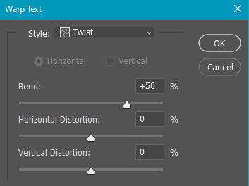
now we have to add the warp effect. with your text tool still selected, click this icon at the top of your screen:

from the dropdown menu, select twist. these were my settings, but feel free to play around with different warp options and their settings. the ones i use most often are flag, fish, and twist.
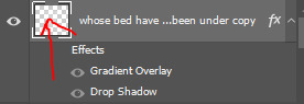
this last step is completely optional, but it's an effect i use in most of my sets with typography. duplicate your text layer (select the layer and ctrl+j), turn off the layer effects (click the eye icon next to effects), and set the blending mode to normal. right click on the layer and select rasterize type. right click on the layer icon itself and choose select pixels.
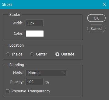
at this point, you should see the moving black and white dotted line showing that only your text is selected. then go to edit > stroke. here are the settings i almost exclusively use.
this is what your text should look like now:
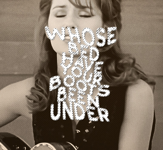
using ctrl+T, move the layer off the canvas so you can't see any of the text anymore. you should be left with only your outline. click anywhere on your canvas to de-select the text we just moved. use ctrl+T again as well as your arrow keys to nudge the outline over to the left 2px and up 2px. this is personal preference as far as the positioning, but i almost never move it any other way. you can leave it like this, which i sometimes do, or you can set the blending mode to soft light like i did for a more subtle effect.
and that's it! rinse and repeat for each gif in your set or use a different warp effect on each gif to switch it up! if you have any questions about this tutorial or would like me to make one for anything else, please feel free to ask any time!
#gif tutorial#my tutorials#gifmakerresource#completeresources#dailyresources#chaoticresources#userdavid#coloring tutorial#typography tutorial#tutorial#photoshop tutorial
172 notes
·
View notes
Note
May I ask on how you choose your colors when you color your art pieces? It is so pretty to look at the colors of your art, and I want to color like that, but color picking is very hard q-q
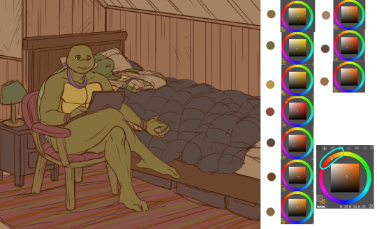
here's!! uh, the general areas in the color wheel where i try to pick depending on the vibe
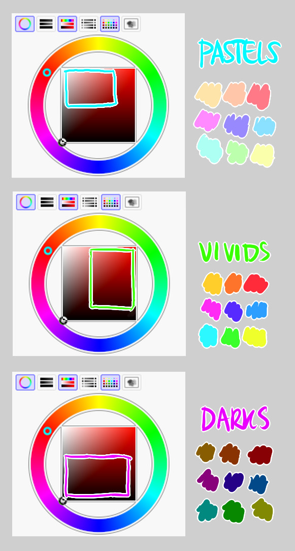
highly inaccurate because tbh i just color pick directly or try to guess the colors from my references and just adjust them to be a little bit more pastel or to the atmosphere
and if i have their colors memorized (such as ink or dream), i just pick by memory or by my modified colors LOL

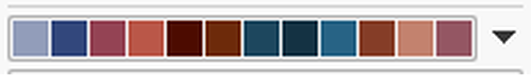
color your scrunkly!
set your line work to multiply and lock opacity
i use warm tones for white ish colors so uhhh idk whatever warm color from here
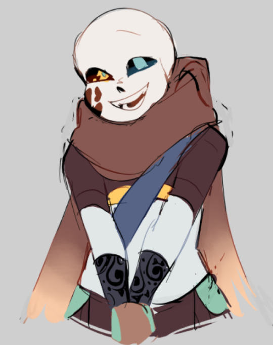
color the line work!!!!! ofc, shift the hue depending on the undertones of the surrounding colors
the skull color is a warm off-white, the undershirt is a blue-ish off-white, scarf is warm brown, so on and so on
the multiply function rly helps just blend things into the palette a little more, but if ur confident enough, you dont have to set it to multiply at all for extra variation
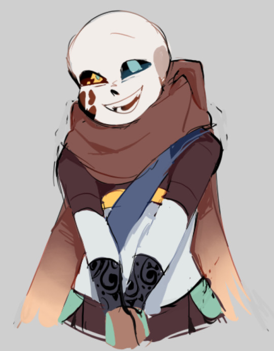
minimal shading by just taking the surrounding colors n adjusting the hue slightly n its value n saturation
gives it a very messy cel shaded look! been into it lately and stuff

and then i add a few overlays using the pin light layer mode!
i usually use these two colors together, it gives the right amount of pastel colors that really appeals to me
if you have access to gradient maps, i recommend using them lots!
it makes the pieces look a little more cohesive
the pin light layer mode imitates it n is very versatile if u cant use them though (like me when im just doodling on sai)
that's it!!! that's the basic rundown of how i color
i'm not very well versed in color theory so i can only do very basic color picking tips, but maybe next time i can offer ways on how to color more atmospherically!
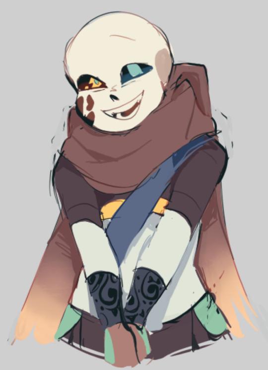
have a nice time coloring your blorbos ✨
#Anonymous#tutorial#ref#ink sans#kia doodles shit#i hope this heeeeeeelps somewhat!!!!!#art tutorial#coloring tutorial#art help#art tips#art advice
371 notes
·
View notes
Note
about the tutorial: just one about dark scenes in general would be great :)
sure :) here's a tutorial on how I work with dark scenes:
before we start, it's important to mention that working with dark scenes is so much easier when your video/ screencaps are high quality. I personally refuse to gif dark scenes unless I have 4k quality footage lol.
my general coloring tutorial is here in case you want check it out!
alright, let's start! after resizing and sharpening my gif, here's what we're working with:

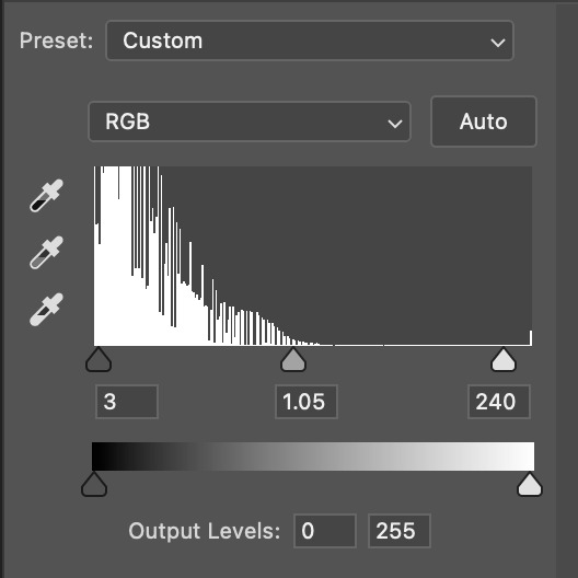
STEP 1: levels. I use the pipette tool to select the lightest and the darkest parts of my gif, it's a great guide that helps to neutralize the overpowering color:
in this case, the lightest part is the little white dot in the corner of his eye and the darkest one is around his hair (if there are many dark shadows in my gif, I just click on a few darkest looking spots and see how it adjusts the coloring and lighting of the gif and just pick the one I think looks the best). basically, this layer is a good guide on how to make the overall look more natural if there is one obvious dominant color and we want to get rid of it (for example, my gif has quite a lot of blues, but it's not too crazy, so I won't need to adjust that much):
and this is what we've got just after using the levels adjustment:
the gif is lighter and the blue was reduced a little bit, the scene now has more green and red undertones. sometimes I mess with the settings myself if I don't like the way it looks, but in this case I'm pretty happy with the automatic adjustments and I didn't even have to do that much!
STEP 2: curves. I do the same thing that I did with the levels, using the pipette tool to select the lightest and the darkest parts and also pull the rgb curve to the middle to brighten my gif even more:
and here's the result after setting the curves layer opacity to 37%:
STEP 3: brightness and exposure layers. next up, I just want to brighten the character a little bit more, but not the background, so I'm adding a brightness/contrast layer and an exposure layer, here are my settings:
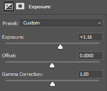
but since it adjusts the whole gif and I don't want that, I select the mask on my brightness layer and pick the eraser tool. I erase the part of my gif that I don't want to be affected by this adjustment, I colored that part bright pink so it's obvious:
and then I do the same with the exposure layer.
in my gif the character is not moving that much, so it looks pretty natural when I brighten just him. here's where we're at:
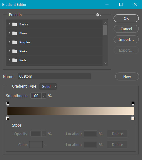
STEP 4: selective color and gradient map. I'm happy with how bright it is, but I do want to deepen the shadows here and just mess with the coloring itself, so next up I'm gonna use a couple more layers.
here are my settings for selective color layer, opacity set to around 40%:
and here are my settings for a gradient map to deepen the shadows:
and here's the result:
ADDITIONAL STEP: I sometimes like to add another layer and just put some soft color gradient to one side of the gif.
in this case I used a soft blue color, set to lighten, 62%:
I'm not very good at tutorials and I put this together pretty quickly, but hopefully this was somewhat helpful, let me know if you have any questions! <3
80 notes
·
View notes
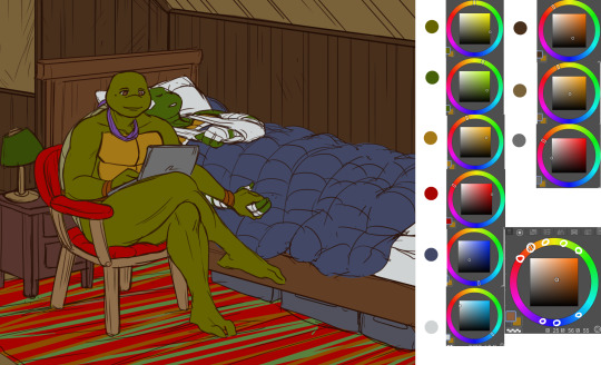
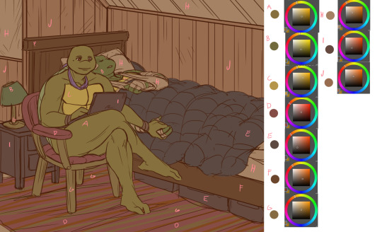
Photo

hello!!! in response to the colouring tutorial request and a couple of asks i got asking about my psds i have put together this tutorial about my colouring techniques!! if you have any questions please send them my way <3
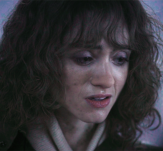
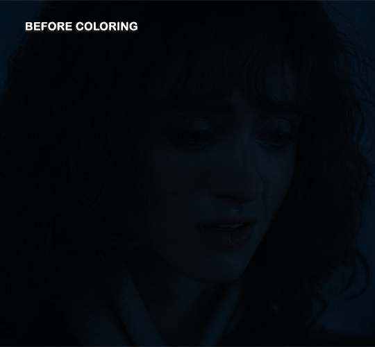
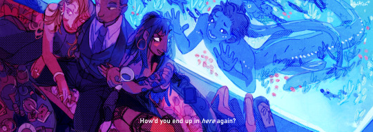
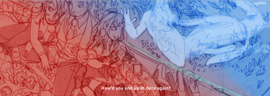
throughout this tutorial we’ll be using this gif! it was fairly simple to colour and is surprising high quality. it’s already been sharpened but as you can see it’s kind of dark and yellow.

PART ONE: BRIGHTNESS
— i always start my gifs off by fixing the brightness. i do this for two reasons. first i find that it is easier to see the colours in the gif when its properly bright and sometimes i am able to adjust the colouring through my curves levels (guide to curves here)
— first, i add two curves layers. i typically i try and find a part of the gif that’s nearly black and use the black eyedropper there and a part of the gif that’s light and use the white eyedropper there. for this gif i used the figures past her shoulder for the black eyedropper and the lights for the white eyedropper.
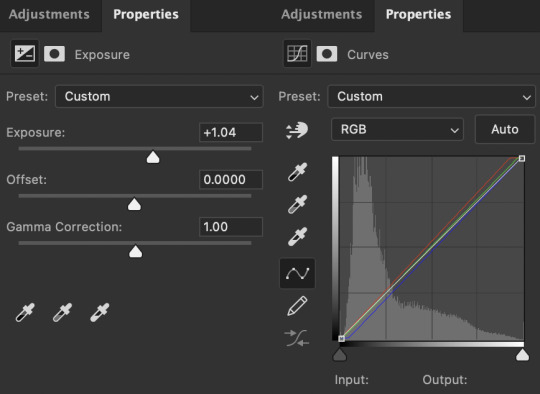
— next i usually add a levels and then exposure layer. these are my last layer before i tackle the colour scenario so i always prioritize brightness and shadows over funky colours. this is the gif with curves, level, and exposure.

here are my level and exposure settings for this gif
PART TWO: COLOUR
— my first step for colouring is to use channel mixer. i won’t go into how channel mixer works here so you can use this guide to understand it. for this gif i got rid of some of the red and yellow.
here are my channel mixer settings for this gif

— next i use a selective colour to reduce the amount of red and yellow in the gif. usually i will drag the sliders in the opposite of the direction of the slider (i.e. move red towards cyan, yellow towards blue) in order to make the colours look more natural. i also increased the black on the reds and yellows because i didn’t want to whitewash her.

here are my selective colour settings

— okay last step is a hue/saturation layer!! i always do this one last because my main goal is just to reduce the saturation to look normal. ideally, i won’t have to adjust any colours at this stage. i also usually reduce the saturation of the colours in the background so they don’t draw focus away from the subject of the gif so here i got rid of some cyan, blue, and magenta.
these were my settings for hue/saturation (as well as -60 saturation for the rest of the colours).

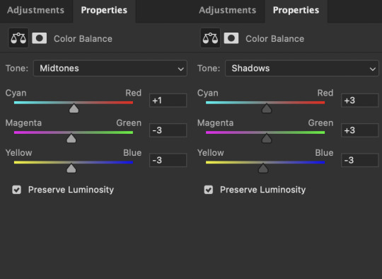
— sometimes after i’ve done all the above steps and it seems slightly off i will add a colour balance level and/or increase the black of the neutral part of a selective colour layer.
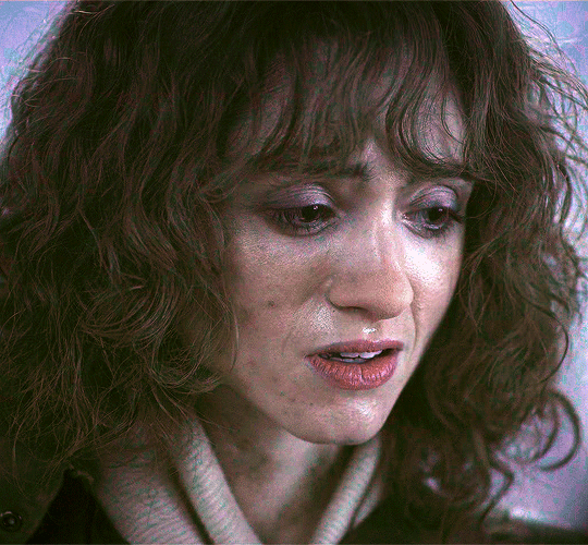
— while each colour layer seemed subtle there was actually a big difference!!
#gif tutorial#usertreena#uservale#userk8#uservalentina#tuserhannah#tuserssam#usernums#userrainbow#userrobin#userannalise#uservivaldi#useryoshi#usershreyu#allresources#completeresources#dailyresources#photoshop tutorial#coloring tutorial#tutorial
937 notes
·
View notes
Photo
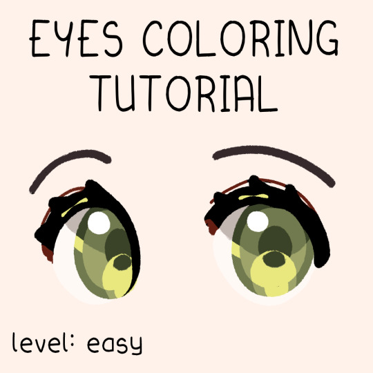
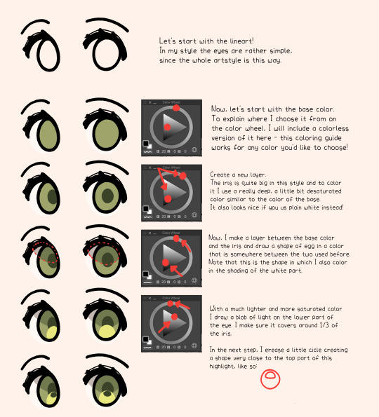

Very simple step by step guide to how I color eyes! 🥰
I hope it helps, sorry if my english in the tutorial is a little off, I’m still learning B)
#tutorial#art guide#how to draw#eyes coloring#coloring tutorial#eyes tutorial#drawing tips#step by step#simple drawing#almakrowantip
635 notes
·
View notes
Note
As a fellow gifmaker (only not quite as skilled as you are) I've been struggling and your gifs always look so amazing and nice and colourful so I was wondering if you could share some tips on how do you colour tinted scenes like in MoTA? thank you Jess you are amazing 🤗
heey there!!!! First of all sorry for taking so long to reply to this, I was so happy with your nice comments that I wanted to give you a proper insight on how I do it, but unfortunately I'm quite HORRIBLE at explaining things?
I'll put it under the cut because it's gonna be a long post! but if you have any doubts my askbox is always open!!!!

So first of all I already gave some tips on how does my process with coloring gifs work so you can check it on my resources and tips tag
As you said you are also a fellow gifmaker so I'll take it from there as I assume you already know gif 101, but if you are new to this you can again check my tag for some beginners tips
Also want to point out this lovely tutorial by @ajusnice that might be even more helpful, since I learned a lot from it
Disclaimer: i'm colorblind, I can see all the hues, just not all the shades and I tend to struggle with greens, oranges and yellows so apologies for any mistakes or if this turns out looking weird!

HOW TO COLOR TINTED SCENES????
So at this point I hope you already have you gif all cut down to the size that you want and used your fav action/sharpening presets ( I use this or this actions to sharpen my gifs
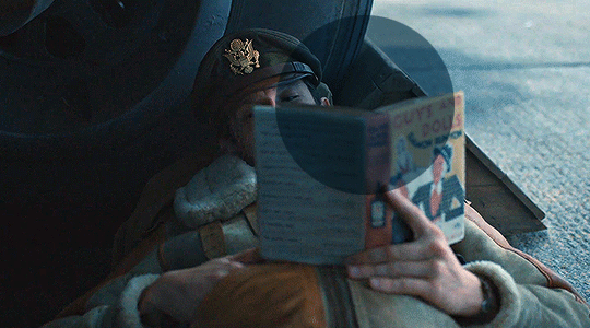
Now I'll use the footage down bellow as it is really blue tinted and I worked with it for this gifset (MoTA SPOILERS AHEAD!!!!!!!!!) so it looks like this
3. So the first thing I do is work with curse as it gives me a better grasp of what I have and how do I want to go with it. I have been using this method where you go to Curves >> Click on the top right menu >> Auto Options
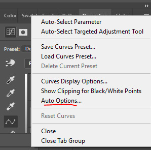
4. Now a new window thing will open up and then I click on the option Find Dark and Light Colors, as you can see my gif already looks a lot brighter and now so tinted
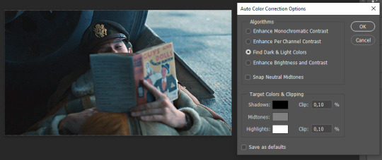
5. this is how my gif looks like I selected that option
6. still does look a little blue-ish doesn't it? Okay so now I'll go to some adjustment layers, the first thing I do is work with hue/saturation. I'll go to the cyans and blues first and I want to remove some of the blue tint of my scene. I prefer to decrease the saturation of those colors so it looks a bit like this
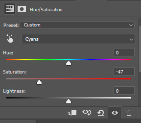
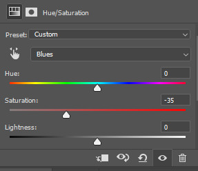
and my gif looks like this
7. So here is our first problem, while I took away the blues my gif now looks a little dull as the scene was delivered to us in such a different color scheme, It wasn't supposed to look like this so now we need to color correct!! For this I work my way around vibrance/saturation so my menu looks like this
And my gif looks like this
8. Problem #2 because now it looks too blue tinted AGAIN! so I just repeat step 6 again so my menus look like this
and my gif looks like this
9. from now on it's only about some details such as correct the brightness/contrast of the scene and I personally like to use the color balance adjustment layer, I'll leave it all here
10. finally one of my fav adjustment layers -> SELECTIVE COLOR i just mess around until it looks nice to me, I'll leave the configs I used down bellow
Finally after all those steps my gif looks like this
#asks#anon#mr*#requests#coloring tutorial#usergif#allresources#chaoticresources#gif tutorials#gif tutorial#psd tutorial#completeresources
138 notes
·
View notes
Note
Good day to you Luna!
Ive always enjoyed how you deaign your characters from the use of shape language to the use of color.
I noticed that many of your designs have around 6-8 (and more on your latest) colors in use at a time. I was always told that you should work with a limited pallete when designing characters, but you somehow designs lovely characters "breaking" that rule.
How do you do it? I always get overwhelmed if i have more than 5 colors in a designs but usually it lacks the contrast and "pop" that your designs have.
Also when you design characters, do you start with a theme, their personality or their role in a story?
COLOR THEORY
This is a great question! So when it comes to color in designs; character/backgrounds/props, generally less is more. You pick 3 colors : 2 right next to each other ( analogous colors ) : 1 on the the otherside of the color wheel ( complementary colors ). From there you want to vary the value/saturation. So there's a dark color - mid tone - highlight (usually the complementary color).
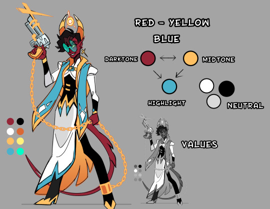
So It might seem like I have a lot of colors, but in actuality it's only 2-3 colors with varied saturation/values to create contrast.

You want a 2/3 ratio split of the analogous colors with the remaining 1/3 being the brighter complementary color to make little details POP. Now sometimes I will use 4 colors in a design, it still works because it's all about balance. I made a little crud pie chart for a general idea. Faye's main color scheme is blue -> green highlighted with red/purple/yellow. Her vibe is poisonous, and poisonous creatures tend to be colorful.
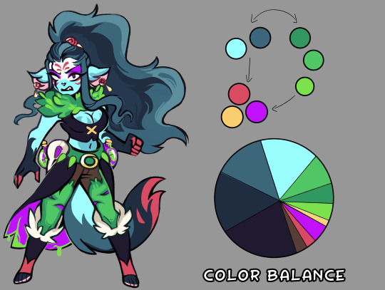
With the right balance you can make any color scheme work, you have to give each color their place, some are more dominate then others. If you make a design with every color 25/25/25/25 equal split, the design will come off as bland and nothing will stand out. But if you make it 40/40/20 suddenly that 20% stands out.

Thinking of palettes in terms of pie-charts will help out seeing the color balance in your design. Give it a shot if you're struggling with making your design pop!
#art reference#advice#coloring tutorial#character design#tips#ref#art#tutorial#coloring reference#color palette
605 notes
·
View notes
Text
Coloring Tutorial Part 2
Part 1
As promised, here's the 2nd part of my color ramblings. This time I'll go a bit into how I pick colors for cohesive and atmospheric looks in my illustrations.
Usually, when working on a piece, I'll think about what kind of mood I'm going for and then choose one color as a base.
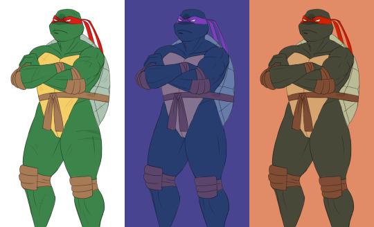
Let's use this pic as an example:
I wanted something warm and cozy, and the feel of an old house. For the base color, I chose brown.
The funny thing about colors is, that they can look veeeery different depending on which shades you put next to each other. For example, you can make a shade that's not actually red, look like it's red by putting greenish tones around it.
Let's look at the shades I picked for this piece. When you look at the color spectrum, you can see that all the colors can be found somewhere within the range of red and yellow. Don and Leo look like their normal shades of green, even though there's not any real green in this picture.
For comparison, I colored this picture as if it was in a neutral light and all the objects showed up in their true colors.
Looks rather jarring, doesn't it? The colors are picked from all around the spectrum and there's no consideration of whether they match or complement each other.
When you pick colors from a more condensed 'area' within the hue spectrum, it's easier to harmonize them. Also, in general, it's wise to stick to a limited palette. It doesn't have to be in the same hue range either. You could pick something like blue and orange as your base colors and then use shades that are close to those two.
Another trick is to repeat your chosen colors in different areas, instead of picking a new tone for everything. This will make the overall look more cohesive. And if you want something to stand out, pick a more unique color for it. (This same rule can apply to character design too.)
A demonstration of how almost all the colors appear in several spots within the picture. Note, how most of the BG is non-obtrusive browns and reds, while Don and Leo become a focal point with their greens and the blue duvet.
So, how do I actually pick out these colors? I'll show you.
Here's Raph in neutral light aka in his true colors. And two different versions where I've used indigo and orange as the base colors.
Now, I'm not sure how comprehensible this is, but I tried to explain my method with this visual guide.
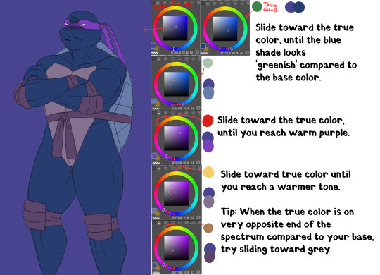
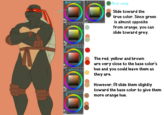
Basically, I'll try to remain close to the base color in the hue range and then fiddle around with how the different shades look together. It does take some practice and using various color adjustments or blending layers is very helpful if picking the colors manually is too hard!
I hope someone got something useful out of this, thanks for reading and sending the ask!
105 notes
·
View notes
Text
Coloring Tutorial
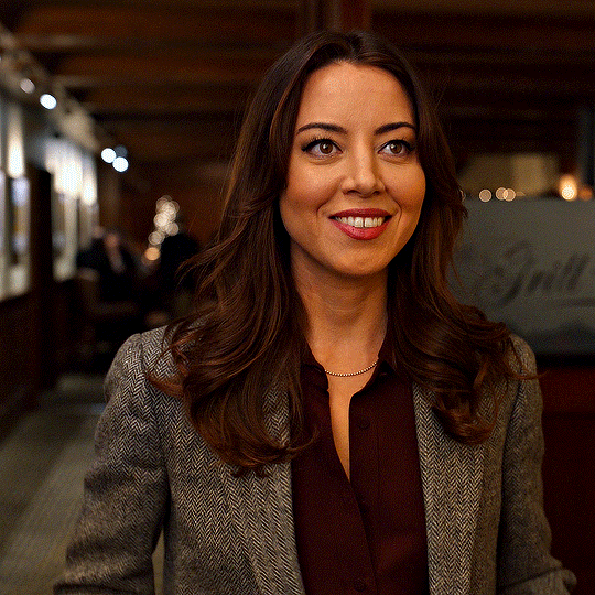
Hello, this tutorial is for the wonderful @djoharrington and those of you wondering how I colored this set. I’m going to be talking about how to color the first gif only to keep this tutorial from getting too long. The other two used the same coloring method with only minor adjustments made to keep them looking similar.
Yes, this scene really is that dark before coloring.
Quick notes on what I’m using:
mpv player for screencapping — not mentioned in tutorial
Photoshop 2021 for editing
I mention mpv player because I’m giffing 4k, and it’s one of the few players I’ve come across that take continuous caps that don’t end up looking washed out. It makes for easier coloring.
This is me coloring literally any Upside Down scene:

Step 1: brighten the hell out of this gif
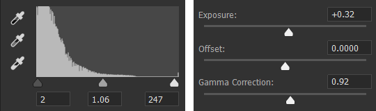
You can use a throwaway layer to get you started. I used an exposure layer (which I eventually kept and adjusted during the original process of coloring this scene) with end settings of: exposure at +5.25, offset and gamma correction at default.


Now we can see all the beautiful details of Nancy’s face. Well, most of them.
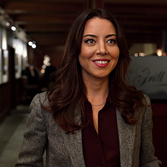
Step 2: photo filter layer 1
The way I offset this horrid blue tint they use for Upside Down scenes is a photo filter layer (several for this particular scene). For now, just the one. Put this below the exposure layer!
This brings a bit of color back to Nancy’s face and warms up the blue tones that are so prevalent in Upside Down scenes.
I don’t change the blending mode, opacity, or fill, just keep as is.
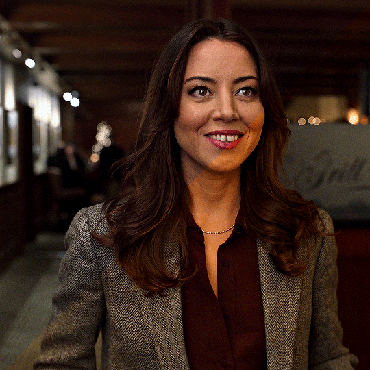
Step 3: curves layer 1
I clicked around a lot with this layer. Mostly in an attempt to get rid of the blue and adding more color to Nancy’s face. Didn’t get the result I was looking for with this layer until I added other layers. But I managed to brighten the gif a little more and add some contrast.

Step 4: hue/saturation layer
Put this layer below the photo filter layer! I used this layer to balance out the colors I pulled from the curves layer. Brought back some warmth/purples by adjusting cyans and blues.


Step 5: selective color layer 1
Ended up a little more purple than I wanted with the hue/sat layer, so I used a selective color layer (set between the hue/saturation layer and the photo filter layer) to get rid of the purple by, again, adjusting cyans and blues.
Make sure to have “Absolute” marked!

This is better! There’s a lot more color that isn’t blue in Nancy’s face now that I can work with and manipulate.
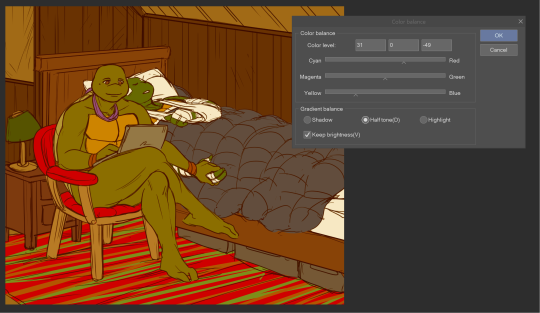
Step 6: color balance layer
This one goes on top of the curves layer (should be the topmost layer at this point). Only adjusted Midtones and Shadows, adding a little more red and yellow in her hair and face.

This looks a lot more natural. Now we just have to brighten it up again.
Step 7: exposure and curves layer 2
I don’t touch the RGB mode on this curves layer. I mostly adjust the Red, Green, and Blue modes by adding a little more red and green while sliding the bottom corner on Blue to add more yellow to the shadows.
Technically, I could stop here if I wanted, but the purple is still pretty prominent in the gif, especially in Nancy’s eyes, and it’s hard to adjust that without adjusting the color of the entire canvas since there’s movement in this gif. If Nancy were more of a still subject here, then layer masks are an option. Alas…

So I adjust the colors and try to get rid of the purple. The gif as a whole kind of looks washed out as well. I want more color here.
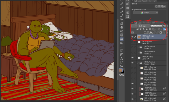
Step 8: photo filter layer 2
I set the opacity to 55%. I want warmth, but not too much.

Step 9: selective color layer 2
This is where I end up seeing the most change. Even small adjustments go a long way here.

It’s mostly the cyans, blues, and magentas which makes sense given how overwhelmingly blue this scene was, then almost overwhelmingly purple as I started making adjustments. Red and yellows are important for anything to do with the face and hair. This is where I add a more “natural” shade to Nancy. Literally anything that isn’t fucking blue is an improvement to me at this point, given how it started out.
Blue is back in the background where it belongs and not in Nancy’s face.
I think this is where I originally stopped. Like this looks pretty good to me, but I also wanted to make sure the other two gifs could be colored similarly, and they were for the most part. But there was only so much adjusting I could do to Nancy’s face in the third gif without adjusting the entirety of the scene (and set), so I had to go back and adjust her here to get a similar coloring.
(A lot of this set was back and forth, adjusting the colorings until they matched. It took so long. Especially with the stupid Upside Down visual effects in the background. I’m a bit of a perfectionist, so there were a lot of minor adjustments and a lot of nitpicking until I ended up with a result I liked.)
So last and final step.
Step 10: selective color layer 3
I ended up adding more red to the face, hair, and shadows to keep the first and third gif similar in coloring. And this is where we get our final product.
And the side-by-side comparison again.
Anyway, here you have it. This is the end of the tutorial. I can in no way guarantee that this method will work on other Upside Down scenes (trust me, I’ve tried), but hopefully you’ve learned something!
And hopefully I’ve explained myself well enough that you can apply this :)
#text#photoshop#tutorials#coloring tutorial#gif tutorial#photoshop tutorial#*tutorials#Stranger Things#djoharrington#requested
864 notes
·
View notes
Note
Hello! I’m very curious of your use of colors and how you go about choosing them for a piece? They all have such a nice vibe and are a treat to the eyes!! I’m also surprised you’re a med student!! How do you juggle making art with your studies?? (from the few things (very very few) I know about medical studies it just seems like a LOT of studying goes on, so I’m very curious!)
Sometimes artists make things look so easy! I want to talk about my artistic process honestly, so I’m going to show you some pieces I struggled on, with my reasoning and references, and also my mistakes and where I asked for help. I’m glad you like my colors, they’re sometimes what I end up spending the most time on.
So hello and welcome to a somewhat long write up.
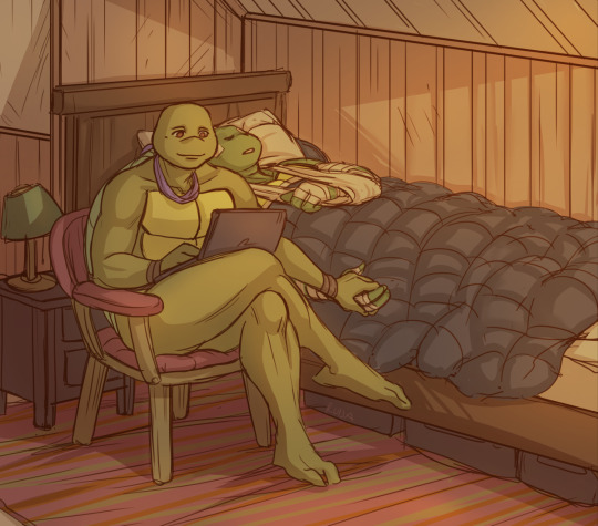
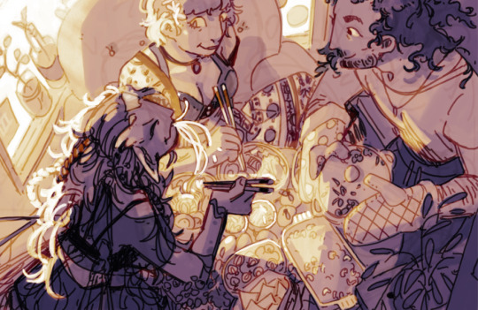
First I want to show this piece, “A friendship between an escort and an eel man,” that I love the finished colors of but was a pain while I was making it:
I start off with two ideas I wanted to combine for the color scheme:
The two halves, the human half and the eel tank half, should be distinct. I thought human side red, eel tank blue.
2. For additional contrast, I wanted human half dark and eel tank bright.

Wasn't entirely clicking, but I decided to just start slapping down colors and adjust later.
A note on shadows and lighting- shift not just the values (light/dark of the color) but the hue as well (the.. color of the color) to give a piece a richer tone. Here I’m making the shadows more red and the lighting more yellow (though in the end the lighting is blue instead).
(Of course, changing value only is a choice used in many color schemes as well. Maybe if you want a piece to look dingy, or monochromatic. You can do anything if you do it intentionally.)
Here I liked the warm human half, but I didn’t like the blue tank so much.
Tried some warm colors. Still wasn’t working. Though bringing the yellow into the tank made the piece more cohesive, having the whole thing be similar colors was not my initial goal. It looked boring, and the eel tank was not separate enough. The yellows and browns on the aquarium side did not look like water, even when I tried suggesting the top of the tank.
I asked a friend (@veritasgloriamart) for help and she sent me this reference:

I adjusted the tank colors to the reference, and added a blue glow instead of yellow to help connect the two sides. It was still not looking cohesive enough to me.

A blue overlay layer added to the human side to make the colors even more aligned with the tank side worked! Overlay layers are magic. They can really help make colors come together. Here the purple on the human side still works to separate it from the tank, but the blue shadows bring them together. It was looking really good now!

Contrast is important, so eel man became darker. Him and the escort are the subjects, so they get to be dark against a light background. Contrast and focal points are important.
After some cleaning up, here is the final piece again! I put some pink in the tank to bring some of human side into the tank side too.

Here is a second piece I struggled with:
Again I start off with some ideas: the scene should look warm and comfortable. I thought I should use a lot of colors, to make the meal look like a colorful feast. But I wasn’t paying enough attention to lighting and contrast, so it was looking flat and disorganized.
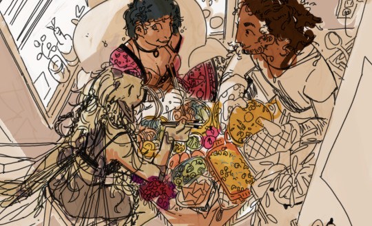
I decided I wanted the colors to look more intentional. Let's do purple and yellow, warm and complementary colors. Green and red because food needs those colors. But the contrast was still not good enough. The piece still lacked clarity and focus.

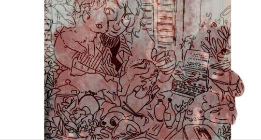
One thing to do when struggling with contrast and clarity: switch to thinking with values. Working in black and white, I made the figure of the fairy on the left darker against a lighter background to make her stand out, and I made the unimportant edges of the piece darker, but it didn’t feel like enough.

My friend (thanks @deoidesign) gave me critique to make the lighting bolder on the hair and table, making the silhouette of the fairy much more clear. After following the advice, it was really working for me now!

I used the gradient map tool to rough out a similar yellow and purple color scheme as my initial idea:

After adding the gradient map it’s pretty much done. Gradient maps are magic.
I lost the idea I started with, making the food colorful, but the food worked better being all yellow instead. Making the food all one color made the lighting more clear, deemphasized it, and let the characters stand out. Things don't always have to be colored the color they actually are.
Minor details added, final piece.
"Eating faerie food gives them power over you, but if fae eat human food, it works the other way around too. These three don’t mind either way."

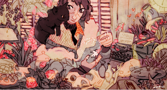
Final example, a piece that wasn’t a struggle: A necromancer and kitty’s latest conquest.
Sometimes, coloring is just vibes.
The starting idea for this one: muted blue and purple/red.
I took some inspiration from this piece by an artist whos work I love love love (the green one under 2021):
That piece inspired me to add the beige, green, and pink from the color scheme. I also nudged the reds more into purple to make them softer.
The plants got to be green, as did the walls. Blue and purple, the cooler colors, for the shadows and darker plants. Pink as a bright color, used sparingly to add warmth. Beige used wherever it fits, to calm everything down. The colors for this piece came naturally so I don’t have a lot of progress shots.
Some things I was considering here: I was blending the colors into each other and reusing them throughout the piece. Nearby colors bleed into each other, unifying them. Things are not held to the colors they would be in the real world, but rather what looks good.
Only very minor changes were made after the color sketch. Final piece:
When I’m not feeling like experimenting so much, sometimes I just fall back on color schemes I’m used to. I know red, green, and yellow look cozy and warm together so a lot of my pieces use that.
On learning colors:
For me, learning means paying attention to the colors in the world around me and to the colors in other people’s art. I note the general idea of color palettes (example: yellow highlights, blue shadows is one I see a lot) and the impressions they give off. I’m slowly building up a library in my head of palettes.
Tips summary:
Having some idea of the mood of the piece or a general palette can be a good starting point
Ask for help
Take inspiration and use references
Value is more important for clarity than colors are. If the colors are not working, it could be because the values are not working
You don’t need to color things the color they actually are. Color them how they look or what looks best for the piece. White things are not necessarily white, skin is not necessarily a shade of brown. The lighting of an environment changes the colors you see.
Iterate on ideas. Critique yourself.
Thinking of a piece as a whole helps the colors look cohesive. Think of palates while considering the whole piece. Intentionally reuse colors throughout.
Consider bleeding nearby colors into each other. In real life, bounce light can give this effect. In art, it’s not necessarily always realistic but can add texture and cohesiveness.
Practice practice practice
The end. I hope it’s useful!
208 notes
·
View notes
Text
Coloring Tutorial is OUT!!
youtube
have you ever wondered how I get that nice crispy texture on my art or how I do highlights??? well BOY do i have the video for you ^^
thank you for being so patient with me on this one!! it's been a really long while in the making, but im really excited that I now get to share my process with people :D pls lmk if this was helpful!!
225 notes
·
View notes
Photo


since over time a few friends and followers asked how i color, here’s the way i’0ve been using the past few years despite having sone a few little jobs as a colorist i still do not define myself as a professional so yeah just have fun
1K notes
·
View notes
Photo


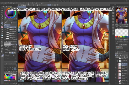
Hi everyone! I just wanted to share my coloring/giffing process for stages because I love making performance sets and I know that giffing kpop stages is a daunting task, not just for new gifmakers, but also more experienced ones. This is in no way saying my way is the best or right way to color, but I hope this will somehow help alleviate some challenges for anyone who is afraid or hesitant to gif stages.
Disclaimer: I am not a professional and although this blog is relatively new, I’ve been giffing for a little bit over 3 years with a lot to learn still. This tutorial is focused on K-Pop stages and doesn’t necessarily apply to other types of gifs. Also, I try my best to explain why I do things the way I do here so this is going to be long (image and word heavy).
With that in mind, let’s get started! I’ll be using our precious Jeonghan in Seventeen’s Super performances for this tutorial :D
BEFORE WE BEGIN
This tutorial is mostly focused on coloring; however, I believe the quality of your video file, sharpening, and timing also factors a lot into whether your gif looks good or not. For reference, I use VapourSynth and Photoshop 2020 cc for making gifs. Vps is not necessary to make good gifs but it does help make my process easier and quicker.
Files: For performance gifs, I only use .ts files because that ensures all of them come out in the highest quality possible. Please refer to this post for more information and where to get them (thank you op <3).
Sharpening: I use Vps for sharpening, denoising, and deinterlacing .ts files. I tend to keep my KNLM settings between 1.2 to 2, depending on how noisy the original video is, and FineSharp between 0.3 to 0.5. Any additional denoising/sharpening is done in PS.
Timing: Because I deinterlace with qtgmc 60 slow, the resulting video import will be 0.2 for the frame delay. Gifs that are too fast or too slow will compromise the quality of your gif. For stages, I like to use 0.3 as the final frame delay for 60 fps files and 0.4 for 30 fps.
Exporting: My export settings are Adaptive Diffusion since I find that to look the best.
BASE LAYER
As you can see even without coloring and just based on the file, sharpening, and timing, I already have a nice gif to work with. I like to start by correcting the original lighting and colors so that I have a nice canvas for coloring. I do this with a levels layer and use the eyedropper tools to designate what I want to be white (bottom eyedropper) and black (top eyedropper). Here, I zoomed in on the highlight of his mic for white and chose the darker area of his mic for black. I also adjust the brightness a little.
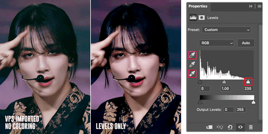
The gif is now much more vibrant and less faded. I think the lighting here looks okay but, sometimes, a curves layer is needed to even out the lighting. Below, I am trying to lower the saturation of the red as well as make his skin even (aka not shiny) so that I can color later.
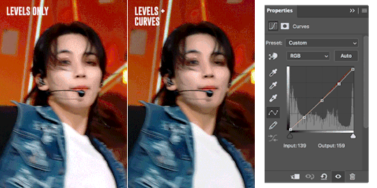
Just an FYI: The curves layer also has the same eyedropper tools found in the levels layer so you can skip the levels step if you prefer to use the curves layer only. I find that using the eyedroppers to designate what is truly white and what is truly black helps significantly in correcting lighting. For example, if your gif’s covered in a purple color and your darkest pixel is a dark purple, when you pick that pixel to be black, PS will correct your gif’s color table and get rid of the purple. The same happens when you designate the brightest pixel to be white.

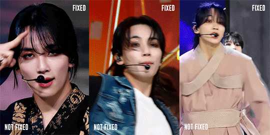
Here is an example. Notice in that in the first gif, it looks faded and is filled with a purple filter and lighting. A single levels adjustment layer using the eyedropper tools to designate a true white (the highlight of his hairpin) and black (his hair) color removed the filter and made the colors of the gif more vivid and saturated.
COLOR LOOKUP/GRADIENT MAP
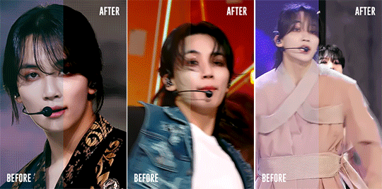
Next is my favorite layer, the color lookup. This adjustment layer takes your gif’s color table and matches to a selection of presets. I generally use this at a lowered opacity to even out or add color to an idol’s skin while also darkening the background. If your PS doesn’t have this option, I find that gradient maps set to the right colors and opacity have the same effect. Here are two examples of the different color lookup layers I used at different fills.


The Fall Colors adjustment gave his skin some life and warmth while the Crisp Warm adjustment darkened and gave the gif more saturation.
CORRECTING BLUE VS. RED BACKGROUNDS
Generally, Kpop stages have backgrounds consisting of cool (blue, purple, green) and warm (yellow, orange, red) colors. I personally prefer a cooler background because it is much easier to manipulate and will not affect the skin tone of the idols (unless there is blue lighting on their skin). Warm colored backgrounds are harder to manipulate because you run the risk of messing with their skin.
Gifs that have too many colors end up looking pixelated so my goal when fixing backgrounds is to turn cyans/greens/purple into blue and manipulate the blue using the hue/saturation and selective color layers. As for warm colored backgrounds, I darken and desaturate as much as I can without affecting the skin. Any sort of magenta can also be treated in the same way.
I like to make my backgrounds into gray/black or at least very desaturated so that the idol can shine and be the main focus of the gif. Having less colors will help improve the quality of the gif so don’t be afraid to play with the hue/saturation sliders. Here are just a few examples of the adjustment layers that I used for the gifs above.

That will usually work if the lighting doesn’t change. If the lighting changes, then you might want to change your approach. For the following gif, there is a flashing light that fills the entire gif with blue light, including his face. In this case, I can’t darken the blues because it will end up giving him a weird gray color when it flashes. Instead, I go the opposite direction and lighten the blue using the hue/saturation layer.

Make sure to pay attention to every frame to see how the hue/saturation layers affect the rest of the gif. Here are the adjustment layers for this gif.

COLORING SKIN
Correcting backgrounds will always end up affecting the color of the idol’s skin so it’s best to minimize the effects as much as you can so that you have an easier time coloring. The layers that I use to color skin are color balance, selective color, and hue/saturation.
I start with color balance, adding in a mixture of yellow, red, and magenta to the midtones. To counteract the warmth, I add cyan and blue to the shadows; I rarely mess with the highlights unless necessary. I use selective color to darken reds and yellows with black. If the yellows/red are too pink, I darken with cyan. If the yellows/reds are too yellow, I darken with magenta and lessen the yellow. If the yellows/reds are too cool, I darken with magenta and yellow.
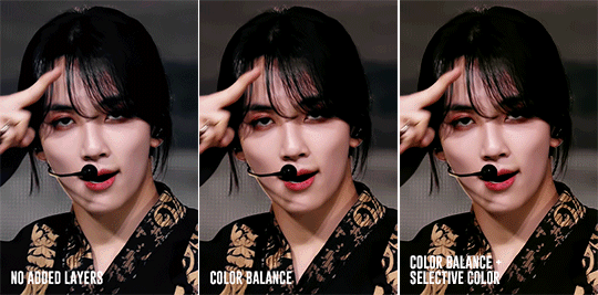
Above, you can see that he’s kind of pale without any added layers. The color balance layer added warmth in yellows and reds and the selective layer added some depth to the shadows. These were all minor adjustments but they had a great impact on how the gif ended up looking.

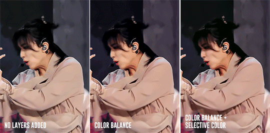
For this gif, I noticed that he was just a bit too pale after the color balance and selective color layers so I added a channel mixer layer to add a tiny bit of pink into his skin.
Here is another example. There are a lot of other skin coloring tutorials out there that do a better job of explaining the do’s and don’ts than I can but as a good rule of thumb, try not to make their skin too yellow or pink and you’re good! :D Refer to this tutorial for more information.
FINISHING TOUCHES
The remaining adjustment layers I use are exposure, brightness/contrast, and vibrance. Everyone has a different preference for these layers and that’s what makes creators’ gifs unique from one another. So, adjust these layers as you’d like! For me, I like increase the exposure and balance it with a decreased offset and gamma correction with the exposure layer. I also like to decrease contrast in the brightness/contrast layer and increase both saturation and vibrance.
It’s best to find a good balance between brightness, exposure, and contrast. If you increase exposure, make sure it’s balanced by something else so that your idol won’t end up looking too white. Gifs that are too bright will end up looking pixelated and grainy. If the noise in your gifs is not an artistic choice, then making sure everything is balanced will help reduce noise and make your gifs look crisp and smooth.
Giffing stages is hard, but it’ll get easier with practice and time/dedication. It takes me a total of 2 to 3.5 hours to make 2x2 performance set from start to finish and 2 days for a 9 pc set like Fear, not to mention that I had to recolor the first Super stage 3 different times. I’ve also had my fair share of bad looking sets. Stages are difficult but they’re doable! If you have any questions, feel free to send me an ask.
Here is the link to the psds I used to make these gifs. Happy giffing~!
#ps tutorial#gif tutorial#coloring tutorial#mymine#flashing tw#eyestrain tw#long post#tagging some mutuals just in case you wanna see it#feel free to ignore <3#isaishi#hanatonin#tuserose#tusersali#userzaynab#userhev#sonafied#emification#shuaria#resources
285 notes
·
View notes
Last Seen Blogs
radarchives
youthful fun 101 approved
slabime
Slami.
dongoverlord
if u look at this tab ur gay
gomesadventures
Pensieri & Parole

rtsprofessionalstudyindia
RTS Professional Studies