#gif tutorials
Text
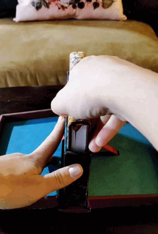
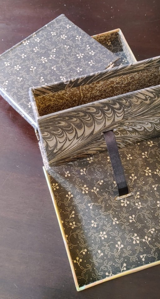
Who wants to make a peller box?
Guess what! I finally gathered my pages of scribbled notes, my camera of haphazard in-progress pictures, and finally compiled a set of instructions for making one of these bad boys!
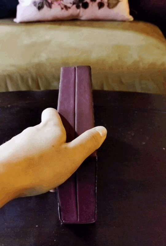
And not only that, but I've got two versions of this baby. I like mixing and matching my unit families because sometimes 1/32 inch sparks joy and sometimes 14 mm is just so convenient, but especially since all of my chipboard comes in english thicknesses, here's a version of the process for my fellow imperial units weirdos:
And here's one for the sensible folks of the world, raised on a base-ten system rather than dividing everything in half and then in half and then in half-- I won't subject you to inches, when there's a workaround, but I was tempted! Have your localized version of the story and have fun with it:
Mad credit of course goes to Hugo Peller, who developed these things in the first place, but also to Jack Fetterer, who preserved a set of notes from a 1990 class, which, as far as I can tell, are the most complete set of instructions available online. But I'm an engineer, I couldn't be satisfied there, I had bludgeon it into a system of equations, sorted by usage and material. And I also go into some of the hiccups I ran into trying to follow those class instructions, like being a green amateur at leatherwork, or not having the equipment to saw plywood boards in my apartment. These instructions still do make some unfair assumptions about the base knowledge level of anyone who wants to give this a try, like using bookcloth rather than plain cloth, but I may try to loop back and adjust that soon.
I can't claim any kind of expertise in this type of work, but I beat my head against an interesting problem, and it's time to share what I got out of it! And, secret goal, I want to help more people make more cool things, and maybe improve on my process in ways I can absorb and chew on in the future. Save my work, change it, I dare anyone who sees this to improve it!! I want it to be better. Credit would be cool, and of course the actual experts I leveraged for this deserve all the credit in the world, but that's not my priority. I want the world to have more exciting things in it, and I want more people to have exciting skills. Go forth and go nuts!!
6K notes
·
View notes
Text
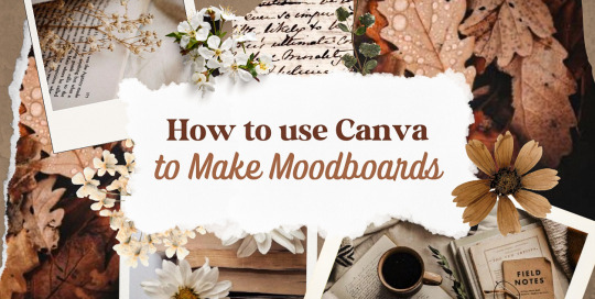
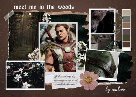
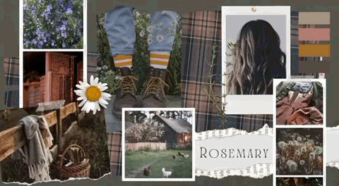
—HOW TO USE CANVA TO MAKE MOODBOARDS

I got a kind message asking how I make moodboards in Canva, so I wanted to do a little tutorial! Canva is a free graphic design app/website, and I use it for everything.
To start - open the app/page and use the search bar at the top to search for a template. I usually use: photo collage, scrapbook, aesthetic moodboard - all of these will pull up pre-made templates for you to use.
[I have a couple linked below that I’ve used and liked, or have bookmarked to try:]
one | two | three | four | five | six | seven | eight
Anything with a crown is for Canva Pro members - you used to be able to use the templates as a free member (just not the paid assets) but that changed recently. The linked templates above are all free ones that you can use right away.
PHOTOS:
Once you’re in the template, you can press the + in the bottom corner to bring up the menus. The Elements tab have items you can add in (more on that later) - for now you want to go to Uploads, and add the photos you want to use. I mostly get mine from Pinterest and Google Images.
[If you are writing an x reader fic and are looking for tips for creating an inclusive moodboard, there are some awesome resources here: one | two !]
After that, go back to your template and click on the different photo frames, and use the Replace button in the toolbar - it will let you replace the template photos with your own. Double tap to move and resize your image within the frame, (and there are also filters you can use if you want!)
When working on moodboards, I like to move things around. You can replace the frames they use by clicking on the item and then clicking the Trashcan. Then go back to the + menu, and then Elements, and scroll down to Frames. You can scroll through them all, but my fave keywords to use in the search bar is: polaroid, torn, and ripped.
Once they’re added, you can move them wherever you want. There’s a button on the toolbar that says Position, and you can shift the object forward/back between the items around it.
DETAILS:
Once you add your photos, then comes the details! You can change the background color and add/change the fonts (or upload your fave font to use!) Try out all the tools on the toolbar to see what you can do, there’s a lot of options.
I love love layering with my moodboard, so I will go back to the + / Elements tab, and then search for things to layer in. My fave searches for Graphics recently are: ripped paper, grunge patterns (to use in the background), star patterns, dried flowers, and dried leaves.
You can use the Position tool on them to fit them in-between or in front of your photos. I usually use them to hide harsh edges or in places that look a little empty.
I also like adding fabric texture to the backgrounds, to fill the space between the photo frames. There isn’t an easy way to do this - the best way I figured out is to find an image of the texture you want, and then to add a photo frame with a torn or jagged edge in the very back (and then use your new texture there). You can duplicate and move it, to cover the space (you can see some examples below - the beige flower pattern in the Din one, the black velvet for Alfred).
Here are some examples of the original templates, and then what my finished ones look like. You can see what I swapped out, moved, and added:
original image | my moodboard

EDITING:
Once I am happy with the design I download it, and then edit. I love this part - pop it into your fave editing app, and play around with the exposure/contrast/hues/sharpness. I will mess with the color balance & vibrancy as well - this can really take a moodboard I like, to one I love.
Here’s some gifs I made showing before /after editing - both are pretty before but I think the after has an oomph that I really appreciate.

[When you finish with one and want to use the same template, you can click Make a Copy, and it will duplicate it. I began with templates but everything I do now are copies of heavily/edited templates or ones I’ve made from scratch. But for starting off, I think a template is the way to go!]
And that’s it!! I would really suggest just opening it up and seeing what you can do. Not all of mine turn out great, but each time I think I get a better handle on all the different options and what my moodboard style is.
I really hope this helps! And feel free to tag me if you post any you make, I’d love to see them (or drop me an ask if you have any questions!) 💖💕
#please give this a reblog if it was helpful! 💖#and just a note the 4th example is an OC x Character fic moodboard#moodboards#graphics#tutorials#aesthetic moodboard#resources#fic moodboard#fan fic meta#fic writing#writing resources
670 notes
·
View notes
Text

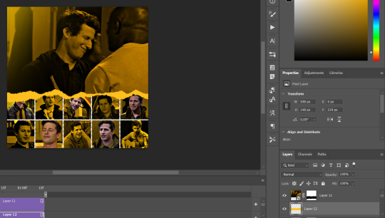
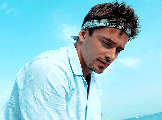
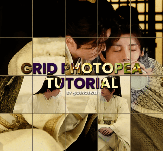
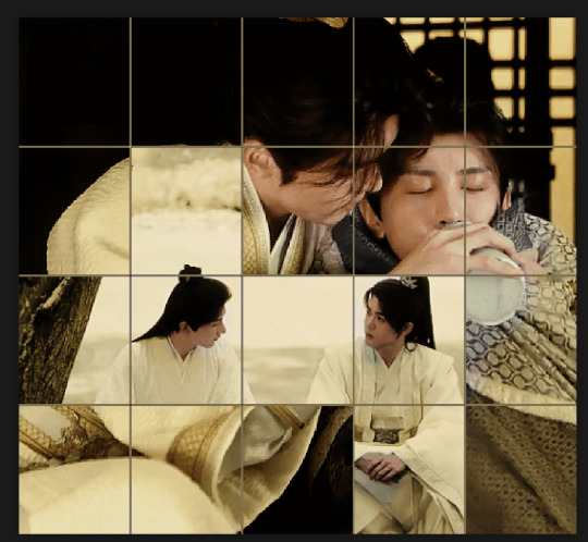
GRID + TORN PAPER + RAINBOW LAYOUT TUTORIAL
(yeah, i'm sorry, but that is the title i came up with)
Hi everyone! This tutorial was requested by an anon, and we're going to make a gifset like this. You need, as usual, basic gifmaking skills and basic photoshop knowledge, but i'll try to explain this as easily as possible!
You'll also need a torn paper brush, which you can download here.
And here are the links to download the fonts used in my gifset: x, x
Okay let's start!
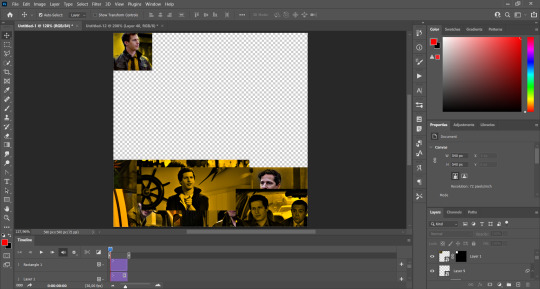
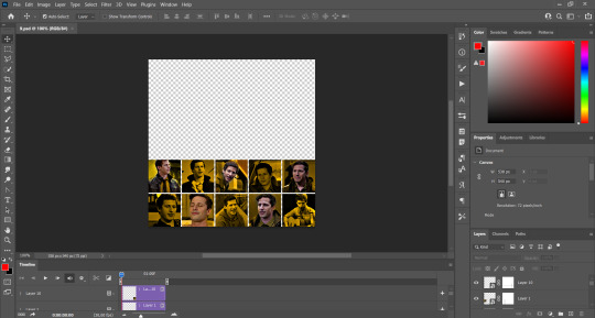
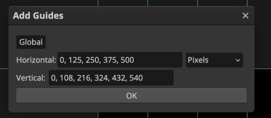
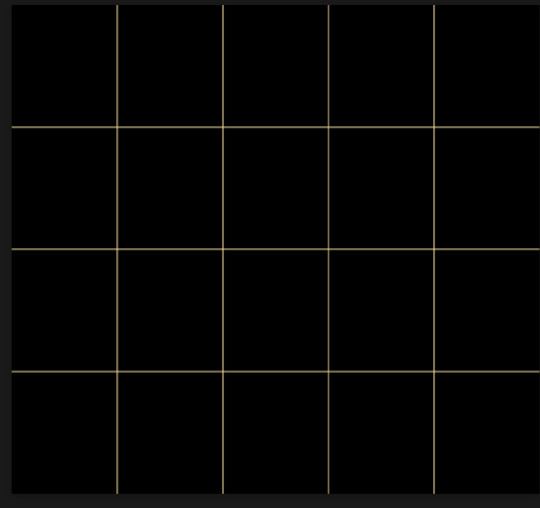
→ First you're going to create a new canvas, and it will be 540x540 px. Make sure to click on create video timeline (if you dont have a timeline, go to window > timeline. We'll leave this canvas there waiting for us :)

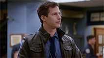
Then, onto our first gif. We're going to make the small square gifs first. All i do is resize the image and make it 120 px high, and you'll see why in a moment.
Make sure to remember the number of frames of this gif!! All the gifs we're going to put in the same canvas should have the same amount of frames.
Okay, so we have our first small gif:
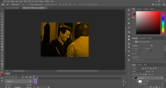
As you can see it's a smart object, and I added some brightness, but so far that's all. You can sharpen it, but i like to sharpen until i've colored it. Now onto the important part:
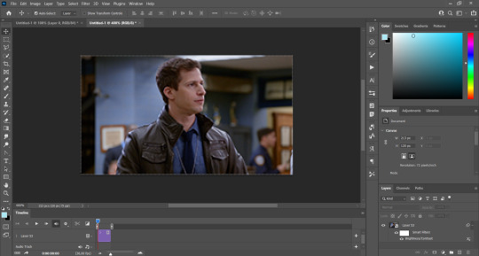
Most of the gifs i worked with were mostly blue (aside from the skin color), which is recommendable, because you can create lots of colors starting from blue, using the hue/saturation adjustment, or camera raw filter. I also recommend you to use a gif that doesn't move a lot, so it'll be easier to color the background:
For the tutorial, we have our predominantly blue gif, but we are going to make it yellow, which is the opposite color, so it's the hardest to get. I hope you can see how i manipulate colors, and do it yourself :)
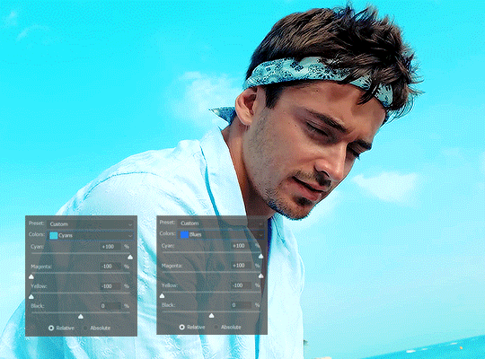
Here, you can use camera raw filter (filter > camera raw filter) to turn the blues and purples greener, like this:
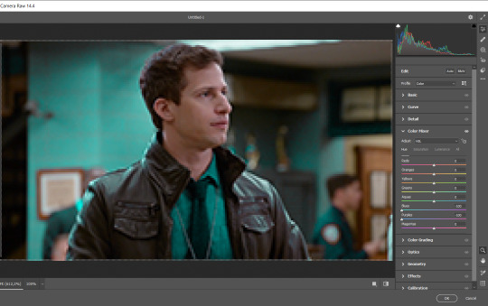
And click ok to exit the camera raw filter. Then, we're going to use hue/saturation (image > adjustments > hue/saturation) to turn it yellow:

Since it was cyan, i changed the cyans, but if you got a much greener result you'll have to use green (duh, right? i dont know i just dont want anyone to get confused akjsdhs)
And you can also add a selective color adjustment to make those yellows more yellow:

The reason i don't directly use hue/saturation is cause it might look ugly and lose quality, or it wont pick up all the colors i want it to but they're also very small gifs so if you wanna do that, do it :)
I sharpen it until this point, but if you already have that's okay.
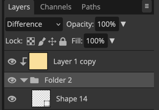
Now we're going to color the background! For that, you just add a new layer, and set the blending mode to color.
Then you'll use your brush, set it to 20px and 0% hardness, and pick the color you're using for this gif, you can use the eyedropper tool. This is why it's important that the gif doesn't move a lot, so you can color the bg like this:
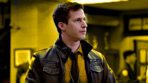
I colored carefully around the edges, and that's the result. In some gifs from my gif set I colored Jake's jacket too because i was too lazy, but this looks cleaner :)
You might want to select the color layer and the gif layer to convert them both to a smart object, just to make everything easier. So, be careful, because after that you won't be able to change anything!
But let's say you have a scene that you want to include, and it moves too much and has no blue and it's going to be a nightmare to color it.
Well, don't worry, you can! Simply, instead of manually coloring everything, you can just choose to add a gradient map to it (image > adjustments > gradient map), like this:
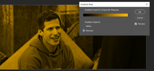
And this is the result:

Just remember, it has to be the same amount of frames as the other ones!
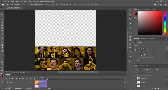
You repeat the process, until you have 10 small gifs. I made around 5 manually colored gifs, and 5 gifs with gradient for each gif. That's a confusing sentence but i hope you get it.
We are going to start pasting the small gifs on our first canvas.
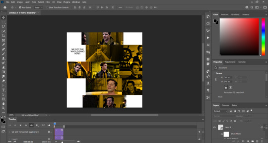
(You can paste them one by one but i did this so you can see my 10 gifs)
You're going to create a square that has to be 108x108 px, using the rectangle tool. You can remove the default white background.

And you may be wondering, why did we not just crop the small gifs into those dimensions? Well, you can do that, but to me it's much easier this way, because sometimes cropping isn't accurate, or it's tedious.
Place the small square on top the gif you're going to crop, right where the face of the character is (or whatever objects you're giffing), and while holding ctrl, click on the square. It will select it:

You're going to create a layer mask:

And then drag that layer mask to the gif:

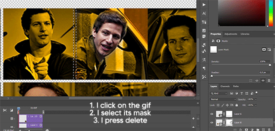
And voila! It's now the same size as the small square. Once that's done, right click on the layer and convert it to a smart object, because we have to remove that mask. Make the square layer invisible, and start placing your gifs where you want them:
You're going to repeat that process with the rest of the gifs, and then place them all together. Don't forget that if you're making the first gif, they will all be at the bottom of the canvas, if it's one of the middle gifs, one row should be at the top and the other one at the bottom, and when you're making the last gif, they should all be at the top. Here we're making the first one, so they will all be at the bottom:
If you forgot to check that all the gifs had the same amount of frames, you can fix it here, just make sure no gif is past this little guy:
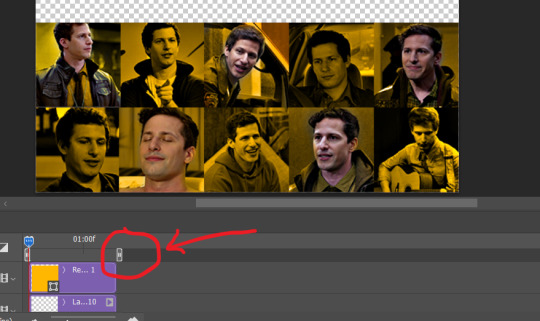
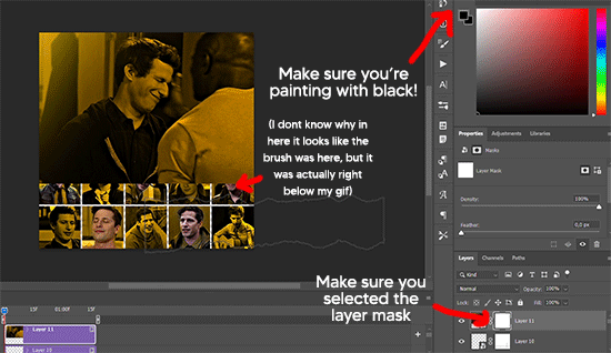
Okay! Now, to create the gutter, we're going to add a layer mask to each small gif, so that we can cut some of it.
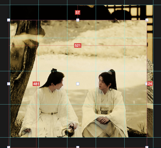
The gutter has to be 4 pixels, (i recommend you to REALLY zoom in). What i do is make sure the width of the gutter takes 2 pixels from the edges of the gifs, since they are all together. As you can see in the image above, there's no a single empty pixel between the gifs.

This is a close-up of what i'm talking about. I select two pixels from each gif, and go all the way down to create the gutter:
(I hope I'm not over or underexplaining)
I usually use this tool when i have to make so many selections:
But that was just an example :)
(Another way you can do this, is by changing the size of the small square from the beginning and make it be 104x104 px, but i don't know why that seems more complicated to me ajsdks)
Anyway, this is what we have so far:
Now we're going to create the big gif. Its normal dimensions are usually around 1920x1080, unless you have different dimensions and have to crop it, but whatever it is, we're going to resize it and crop it to be around 550 px wide, and 400 px high:

We'll do the same thing of adding an adjustment of gradient to it to make it the color we're using. For this, i usually add a brightness layer before, because sometimes the gradient is a bit dark.
And using a 600px brush with 0% hardness, you can add some "light" on a new layer, like this:

Selecting all the layers, right-click on them and convert them to a smart object. Again, be careful, because once its a smart object, you wont be able to change any of it!
Then we paste our big gif on the canvas with small gifs, and add a layer mask to it. Using the torn paper brush at 600px, remove some of the gif to shape it like the torn paper. Make sure you're using black, otherwise it won't work correctly:
To make the effect better, add a layer UNDER the big gif, and using the torn paper brush, with the same size, you can paint under it:
Yeah, I covered some of jake's face, but that's how it supposed to look so the effect works!
And finally for the text! I used Granesta, at 150 px, and at -10.00º to make it a bit askew.
We're going to double click on it and give it a color overlay, set to normal, and give it a solid shadow if you want, then place it right here on the corner:
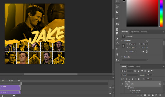
But as you can see, it's too big for the gif. So we're going to add a layer mask to it, and again, shape it the same way that we did with the gif. Make sure they're exactly the same shape, like this:

And that's it! This is our final result:

As always I'm sure there are easier ways to do many of these things, this is just how i do it but if you know an easier way to do it, go ahead. I hope this was at least understandable enough so you can apply the logic of it any way you want :)
If you have any questions you can send me an ask and i'll clarify!
If you found this helpful i'd really appreciate it if you left a tip on my ko-fi!
Happy giffing!
#will i ever learn how to properly explain things 😭#tutorials#uservivaldi#userraffa#userbuckleys#userhallie#tuserheidi#usertina#userfern#usersole#usercera#userzaynab#userisaiah#usernik#userpriyas#usertj
212 notes
·
View notes
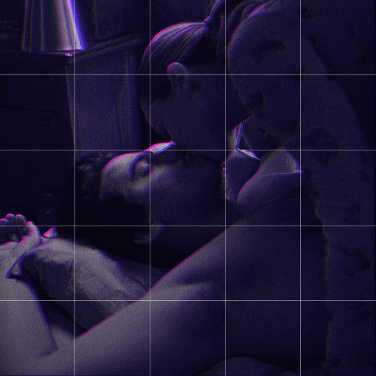
Note
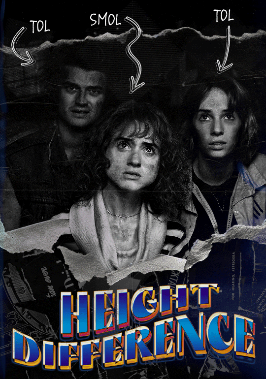
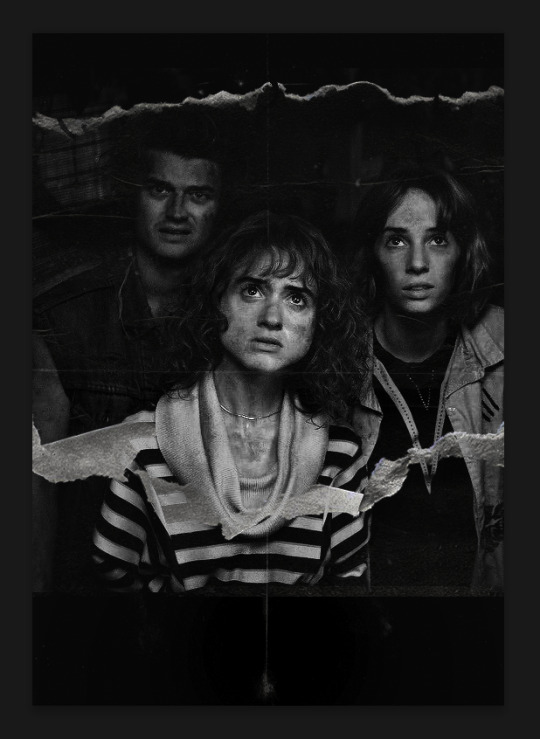
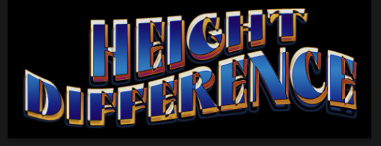
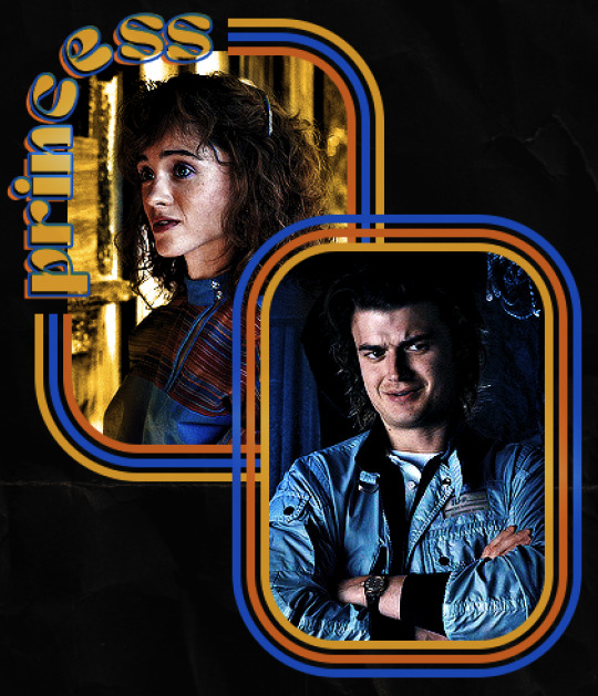
hello! I love your edits and I wanted to know, for the "Steve Robin and Nancy" Gif you posted.. How would I go about doing something like that? More specificly, the bottom two where it says "Height Difference" and where it labels them as "Princess, Jock and Loser"
Thank you! Sorry this took a while to answer. I finally had time to sit down and write this. Link to original post.

Quick notes:
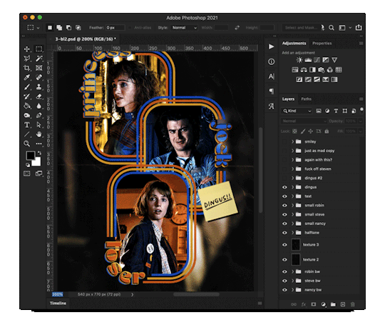
I'm using Photoshop 2021 on Mac and working in video timeline. Must have basic gifmaking skills and know how to use layer masks. This is primarily a gif layout and text tutorial.
Fonts used in first gif:
Pea Wolfe Tracks — link here
King & Queen — link here
Fonts used in second gif:
Kiera — link here
Post — link here
Ellianarelle's Path — link here
Heina's hurry — link here
I used a light leaks/film texture, ripped paper textures, folded paper textures, and transparent pngs (arrows + post-it notes + smiley face).
We'll start with this gif.
Make your gif! The gif here is 540x600px. I color and sharpen it to my liking. Go to image > canvas size > change height from 600 to 770px. I left the anchor in the middle, though it doesn't really matter.
I drag and drop my folded paper texture and change the layer order so it's under my gif. Then I change the blending mode on my gif to Screen so the texture shows through the gif, but I keep the texture at 100% Opacity and Fill.
Now I move my gif around and add my ripped paper textures. I wanted to give it a sort of poster-like feel to it, so I made more room on the bottom for my main text and ended up with something like this. Blending mode is set to Lighten for the ripped paper textures.
I then use layer masks to hide what I don't want shown and add my light leaks/film texture. Blending mode on light leaks/film texture set to Pin Light, Opacity: 50%, Fill: 70%.
I use Levels and Brightness/Contrast adjustment layers to darken the gif up a bit more, then I add a patterned paper texture. Blending mode for patterned paper texture set to Lighten, Opacity: 100%, Fill: 75%. Result:
Now on to the text!
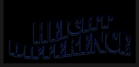
I'm going to be honest here, a lot of this was clicking around until I settled on something I liked. There's three layers to create this text effect. The font used here is King & Queen.
For the first text layer, the font color is set to black (#000000), font size: 87 pt, leading: 80 pt, tracking: 25.
Layer styles used here are stroke and drop shadow.
Text Layer 1
Stroke settings:
Size: 1px
Position: Outside
Blend Mode: Hard Light
Opacity: 40%
Overprint: unchecked
Fill Type: Color
Color: #5911ed
Drop Shadow settings:
Blend Mode: Difference
Color: #2d5ba8
Opacity: 85%
Angle: 70°
Use Global Light: checked
Distance: 7px
Spread: 0%
Size: 6px
Contour: Cone - Inverted
Anti-aliased: unchecked
Noise: 0%
Layer Knocks Out Drop Shadow: checked
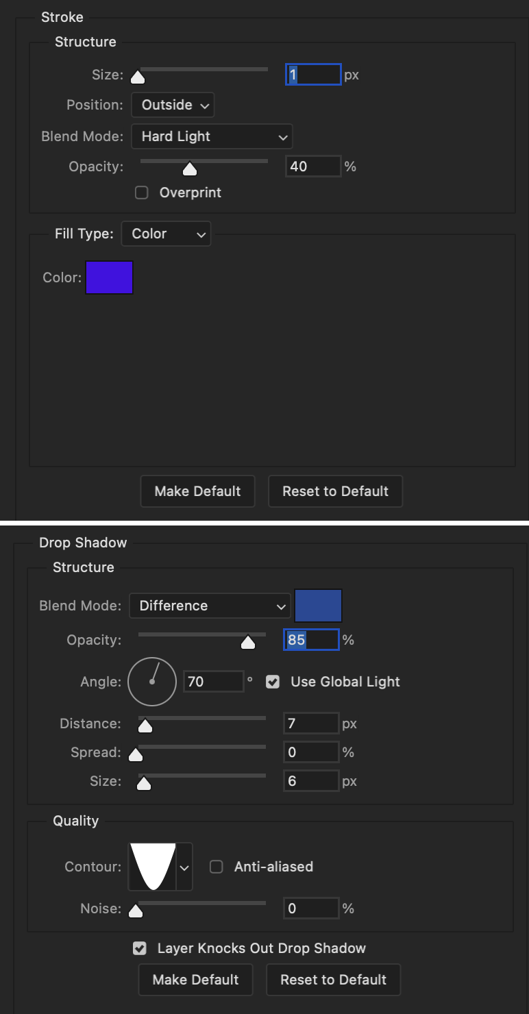
Blending mode for text layer set to Overlay, Opacity: 100%, Fill: 85%.
Warp text settings:
Style: Wave
Horizontal: checked
Bend: +60%
Horizontal Distortion: +10%
Vertical Distortion: 0%
With all those settings applied, the first text layer looks like this:
Duplicate the layer, clear all layer styles, and change the color for the second text layer to white (#ffffff). All other text settings (including warp settings) should stay the same. The only layer style then applied to this text layer is stroke.
Text Layer 2
Stroke settings:
Size: 1px
Position: Outside
Blend Mode: Difference
Opacity: 100%
Overprint: unchecked
Fill Type: Color
Color: #d48f16

Blending mode for the second text layer is set to Difference, Opacity: 90%, Fill: 100%. Nudge the second text layer a bit so the first text layer is a little more visible or move to your liking.
With both those layers active, it looks like this:
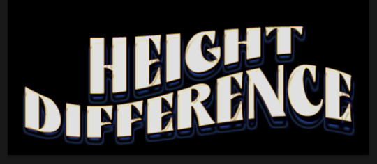
Duplicate the second text layer, clear layer styles, and change the color of this third text layer to a dark grey (#1a1919). Again, all other text (and warp) settings should stay the same.
Layer styles applied to this layer are stroke and gradient overlay.
Text Layer 3
Stroke settings:
Size: 1px
Position: Outside
Blend Mode: Difference
Opacity: 100%
Overprint: unchecked
Fill Type: Color
Color: #d48f16
Gradient Overlay settings:
Blend Mode: Difference
Dither: unchecked
Opacity: 100%
Gradient: #cd3f00 > #ffdb5d
Reverse: unchecked
Style: Reflected
Align with Layer: checked
Angle: 90°
Scale: 100%

Blending mode for the third text layer set to Exclusion, Opacity: 100%, Fill: 100%. I also moved the third text layer around, down and to the right a few pixels to give it that 3-D Word Art effect.
With all three text layers active:
Next are the arrows.
Take your transparent pngs and place them to your liking. Blending mode for these is set to Difference, Opacity: 100%, Fill: 100%.
Command + click on an arrow thumbnail to select all the pixels in that layer. This is why the image must be transparent!
With that selection made and on a new blank layer, right click the selection and click on stroke. Settings for that are width: 2px, color: white, location: center. Move that a couple of pixels over.
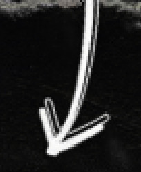
Do this for all arrows for a total of 6 layers for arrows. I group them together to keep my workspace clean, then I duplicate my arrows group with no further changes made to the second group to get what you see in the final gif.
Next is the smaller text. It's three separate text layers for each word, so I can move each of them around to my liking.
Font used is Pea Wolfe Tracks, font color: white (#ffffff), font size: 24 pt, leading: 6 pt, tracking: 25. Bold and italic options checked. I set the blending mode to Difference, Opacity: 100%, Fill: 100%.
And that's it! That concludes the tutorial for this gif!
Now on to this gif.
We'll start with the background gif. There are three separate gifs. You could make them one gif, but I wanted the option to order them differently if I needed to.
All gifs in the background are the size of the canvas: 540x770px. Color and sharpen to your liking, but keep them all black and white. To get the blurry effect go to filter > blur > guassian blur. Set radius to 7.0 pixels. Add this to all three gifs.
Then I add two folded paper textures. Blending mode for one set to Lighten, Opacity: 60%, Fill: 100%. The other set to Screen, Opacity: 70%, Fill: 90%.
I found this tutorial a while back for a halftone effect. They include links to the halftone pattern used here as well as textures and gradient maps not used here.
I'm only using the halftone pattern here.
Pattern fill settings:
Angle: 66°
Scale: 8%
Link with Layer: checked
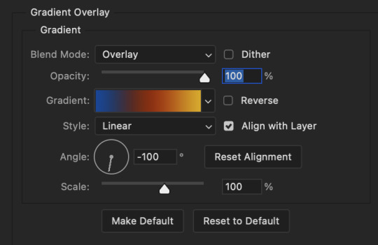
I also added a gradient overlay layer style to the halftone pattern which gives the gifs the color you see above.
Gradient Overlay settings:
Blend Mode: Overlay
Dither: unchecked
Opacity: 100%
Gradient: #0059ac > #a33600 > #e6b801
Reverse: unchecked
Style: Linear
Align with Layer: checked
Angle: -100°
Scale: 100%
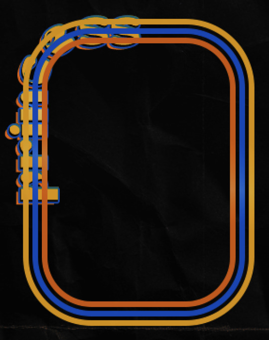
Now on to the square shapes with rounded corners. In the interest of keeping this tutorial short(er), I found this tutorial on youtube that explains how to make squares with rounded corners.
I set my stroke size to 6px, stroke color to white (#ffffff), and fill to no color. I don't use the stroke layer style to make the borders of the shape like in the video! I'm only linking the video to show how to curve corners with square shapes.
Note: Be sure you know how big or small you want these to be and how they're going to fit on your canvas in order to make all the shapes and edit them. It can be tedious to change the settings.
Duplicate and resize to your liking.
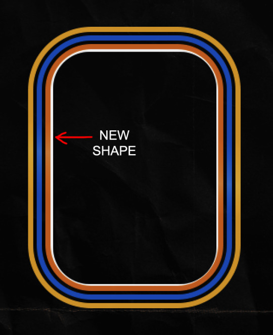
In this instance, I wanted to make three squares total, so I had to duplicate twice and resize until I had something I liked.
Settings for the shapes used here are:
Innermost shape: W: 200px, H: 280px, corners: 50px
Middle shape: W: 220px, H: 300px, corners: 60px
Outer shape: W: 240px, H: 320px, corners: 70px
Once I have the size I want for all three shapes, I group them together to make a set and duplicate that group twice, then adjust each set on the canvas for my layout.
What the sets look like all together:
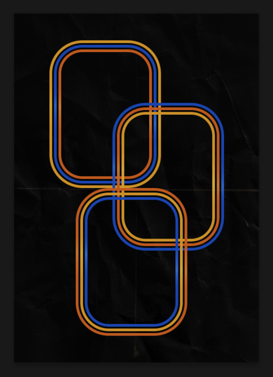
Colors used: orange #e47100, blue #0062d1, yellow #ecac00
To add color to the shapes, either change the color of the shape itself or use layer styles. I used layer styles.
Note: I didn't add the colors until the end after I knew what gifs went where and what color scheme I wanted, but I don't want to add more images than I need to here.
To keep this short, I found this tutorial on youtube that explains how to wrap text around a shape. However, I wanted the text to align on the outside where the white line is and not the green line (left image):
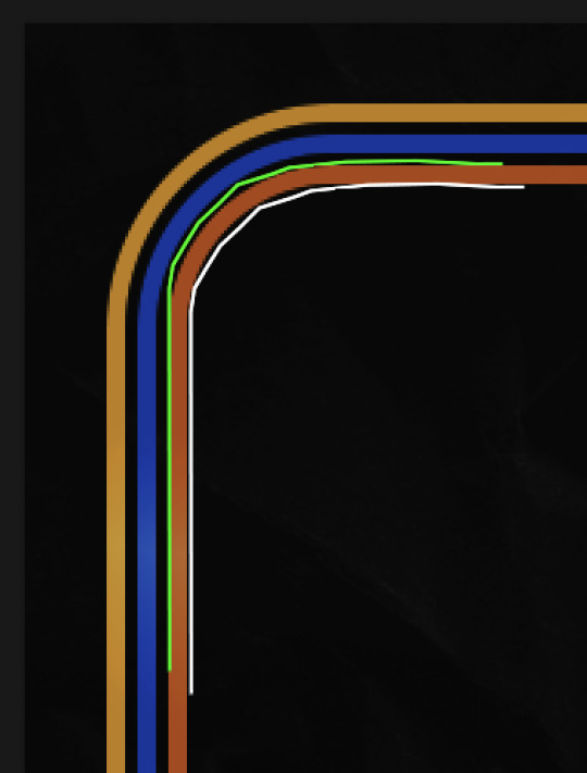
So I created another shape just inside the innermost square and used that as a path for my text (right image). Adjust the text to your liking until you have your text where you want it. Refer to the video tutorial if you need help moving the text along the path!
You don't need the shape path once you have your text where you want it, so use the layer visibility tool to hide it. You can hide your other shapes too so you can work with your text.
Do not delete your shape path!
I duplicate it once I start working with my "jock" text since all the sets are the same size. The "loser" text has to be worked a little differently, but we'll get to that later.
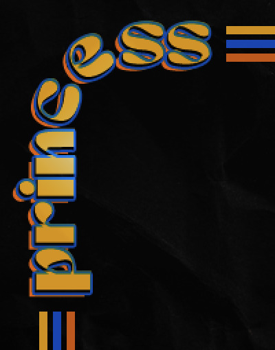
For the princess, jock, and loser text, there are two text layers to create the overall effect. For both layers, font used is Kiera, font color set to white (#ffffff), font size: 60 pt, blending mode set to Normal.
I added a gradient overlay layer style to the first text layer which I'll call the base layer. Opacity for this layer is 100%, Fill: 100%.
Base Layer
Gradient Overlay settings:
Blend Mode: Normal
Dither: unchecked
Opacity: 100%
Gradient: #f0b002 > #e7f0fd
Reverse: checked
Style: Diamond
Align with Layer: checked
Angle: 90°
Scale: 100%
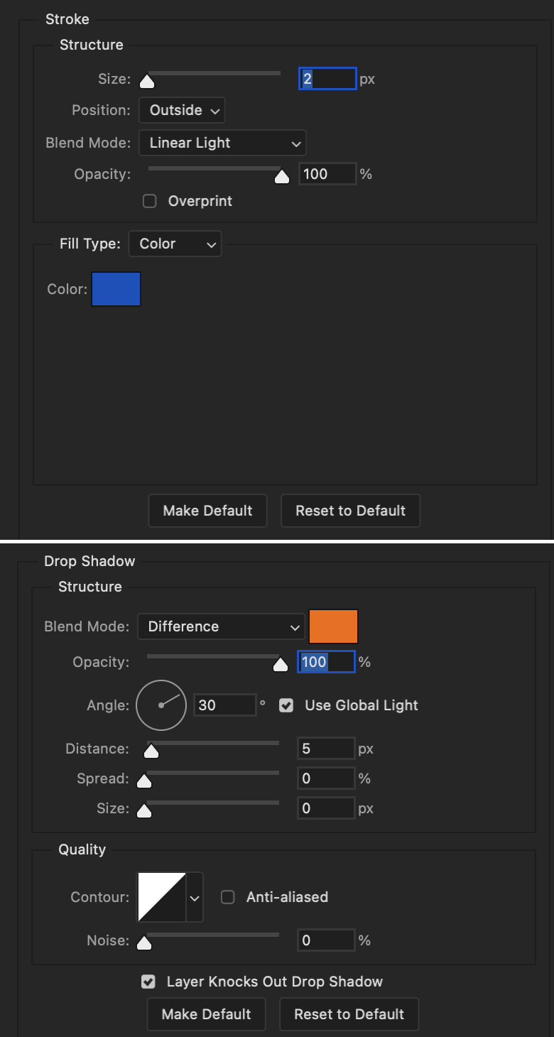
The second text layer is your stroke and drop shadow layer. For this layer, opacity is set to 100%, Fill: 0%.
Stroke and Drop Shadow Layer
Stroke settings:
Size: 2px
Position: Outside
Blend Mode: Linear Light
Opacity: 100%
Overprint: unchecked
Fill Type: Color
Color: #0064cb
Drop Shadow settings:
Blend Mode: Difference
Color: #fb7c00
Opacity: 100%
Angle: 30°
Use Global Light: checked
Distance: 5px
Spread: 0%
Size: 0px
Contour: Linear
Anti-aliased: unchecked
Noise: 0%
Layer Knocks Out Drop Shadow: checked
End result looks like this:

When I make my shapes visible again (minus the one I used as a path), I get this:
The shapes are clearly in the way of the text, whether they're above my shapes layer or under it. I use layer masks to hide what I want, so the text is legible. It looks cleaner this way and I wanted the text to be a part of the shape itself. I do that for each rounded square.
Now on to my smaller gifs. I like to crop, resize, sharpen, and color separately because my laptop and Photoshop would kill me if I tried to do it all on one canvas. I use the size of the middle shape for my gifs (220x300px), so I can have a little wiggle room when adjusting. I then use a layer mask to hide the parts of the gif that are outside of the shape.
A quick way to do this is to command + click on the thumbnail of the innermost square. With that selection made, I got to my gif layer and add a layer mask. Sometimes you need to invert it. Use command + i with the layer mask selected (not the gif) to invert the layer mask.
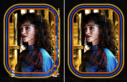
I repeat this process with my Steve and Robin gifs. I have to go back and forth with all the layer masks to hide parts of the gif/shapes I don't want for each set. It's kind of a long process, but not all that difficult. I label and group my layers together as I work to keep things clean and it helps me keep track of what I edited and what needs to be edited when it comes to things like this.
The picture below shows where I hid the bottom right corner of Nancy as well as the shapes that make up her set using layer masks. I also did this with the Steve and Robin sets, hiding the bottom left corner of Steve.

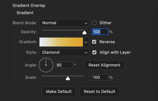
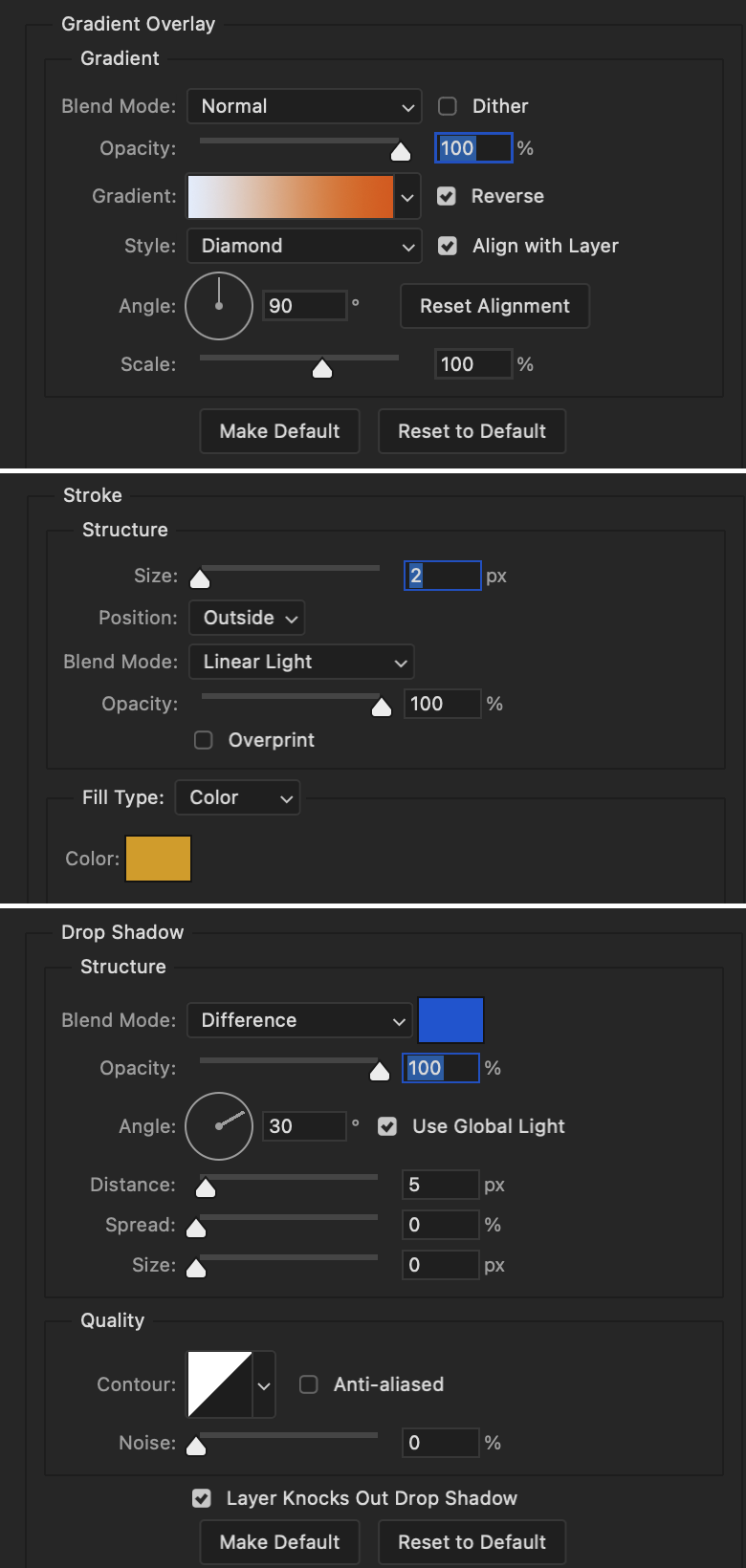
Similar text settings used for jock. The gradient overlay layer style for this base layer is different than that of princess because of the positioning of the text. Again, same as princess, two text layers are used here. Blending mode, opacity, and fill for both are the same as the princess text layers as mentioned before.
Base Layer
Gradient Overlay settings:
Blend Mode: Normal
Dither: unchecked
Opacity: 100%
Gradient: #007aec > move bottom middle dot to 80% > #e7f0fd
Reverse: checked
Style: Diamond
Align with Layer: checked
Angle: -140°
Scale: 100%
Stroke and Drop Shadow Layer
Stroke settings:
Size: 2px
Position: Outside
Blend Mode: Linear Light
Opacity: 100%
Overprint: unchecked
Fill Type: Color
Color: #a05700
Drop Shadow settings:
Blend Mode: Difference
Color: #ffba00
Opacity: 100%
Angle: 30°
Use Global Light: checked
Distance: 5px
Spread: 0%
Size: 0px
Contour: Linear
Anti-aliased: unchecked
Noise: 0%
Layer Knocks Out Drop Shadow: checked
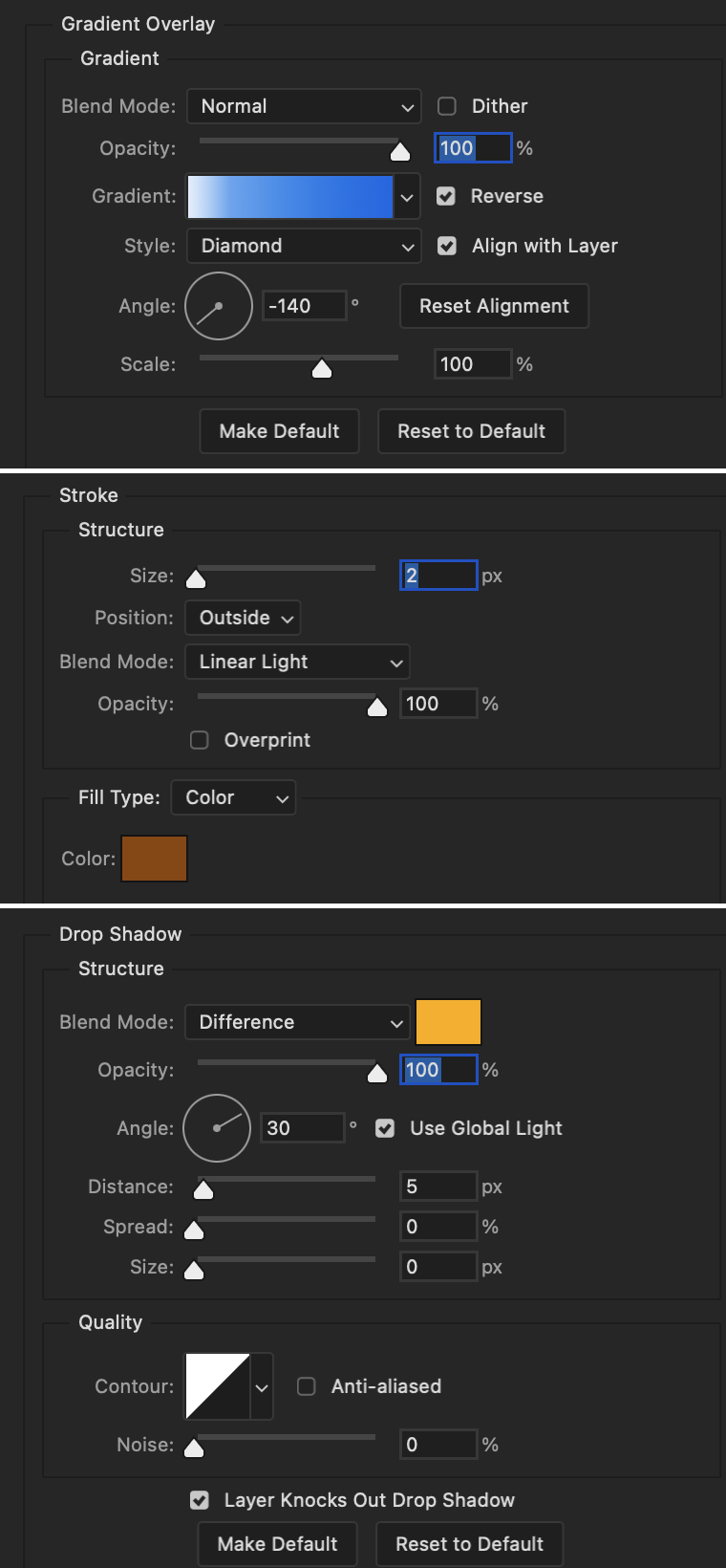
Image 1: We start with Robin.
Image 2: To make the loser text, I had to create a new path.
Image 3: I make it so the text is on the inside of the path instead of the outside. (Hint: Refer to video tutorial if you don't know how to do that.) I then adjusted the tracking between the letters in the word "loser" so they didn't look so squished together.
Image 4: Then I use layer masks to hide the parts of the shape I don't want shown.
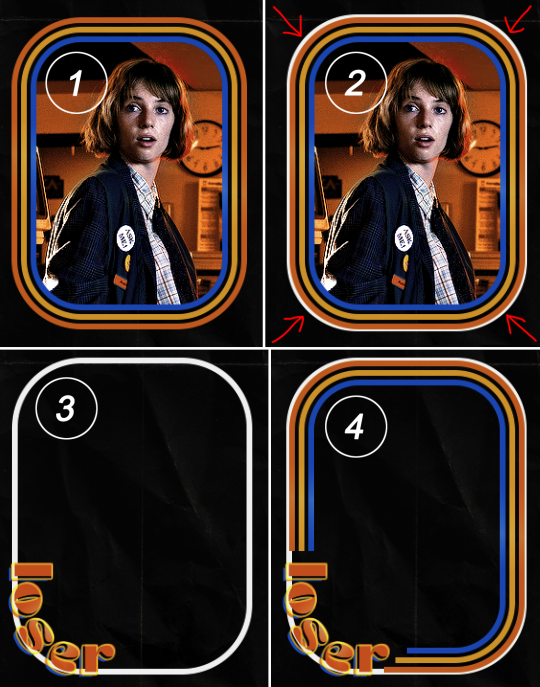
You can then hide the path or delete it. You only need it if you want to adjust the placement of the text. I keep it (hidden) just in case.
Text settings for loser are just like those for princess. Blending mode, opacity, and fill are also the same.
Base Layer
Gradient Overlay settings:
Blend Mode: Normal
Dither: unchecked
Opacity: 100%
Gradient: #eb6400 > #e7f0fd
Reverse: checked
Style: Diamond
Align with Layer: checked
Angle: 90°
Scale: 100%
Stroke and Drop Shadow Layer
Stroke settings:
Size: 2px
Position: Outside
Blend Mode: Linear Light
Opacity: 100%
Overprint: unchecked
Fill Type: Color
Color: #e1a900
Drop Shadow settings:
Blend Mode: Difference
Color: #0068de
Opacity: 100%
Angle: 30°
Use Global Light: checked
Distance: 5px
Spread: 0%
Size: 0px
Contour: Linear
Anti-aliased: unchecked
Noise: 0%
Layer Knocks Out Drop Shadow: checked
Next are the post-it notes! This is probably the easiest part of making this gif. You just have to repeat this process for however many post-it notes you're making.
Image 1: To start, place your transparent post-it note where you want it. You can also rotate it if you'd like.
Image 2: Then create a text layer and write what you want. Font used here is Post. I wanted this text underlined to give emphasis, so I click on the underline option. I also adjusted the leading because I wanted more space between the word and the line. Rotate the text so it looks like it's written on the post-it note.
Note: It looks better if you choose a font that looks handwritten.
Image 3: I wanted another line to give emphasis to the "Dingus!!" text and make it seem more handwritten. I use the line tool to create another line.
Image 4: Then I adjust that line to my liking.

Fonts used for notes: Post, Ellianarelle's Path, and Heina's hurry
Repeat this process for all post-it notes!
That finishes the tutorial! (And I hit the 30 image limit lol.) I hope this helps. If you have any further questions, feel free to send an ask or IM and I'll try to answer to the best of my ability.
Happy photoshopping!
#ask#pcocana#photoshop#photoshop tutorial#tutorials#*tutorials#userchibi#userbunneis#uservivaldi#userriel#userabs#usertiny#useralien#useraljoscha#userfanni#userraffa#tusermona#userbess#userrobin#userroza#quicklings#janielook#usernaureen#userrlorelei#tsusermels#tusermimi#userelio#usertj#userbarrow#usernolan
150 notes
·
View notes
Text
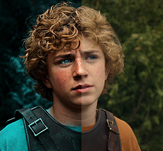
The silent art of gif making
The gif above has 32 layers plus 6 that aren't shown because this is part of a larger edit. I wanted to share it to give everyone a glimpse of the art of gif making and how long it usually takes for me to make something like this. This one took me about an hour and a half but only because I couldn't get the shade of blue right.
I use Adobe Photoshop 2021 and my computer doesn't have a large memory space (I don't know what to call it) so usually most of psds get deleted because I'm too lazy to get a hard drive. It doesn't really bother me that much because I like the art so when it's done, it's done. Off to somewhere else it goes.
Here are the layers:

Everything is neat and organized in folders because I like it that way. I prefer to edit it in timeline but others edit each frame. There's a layer not shown (Layer 4 is not visible) and it's the vector art. Here it is:
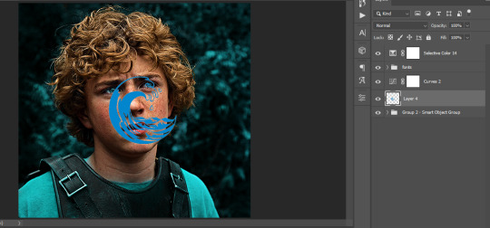
Now it is visible. I don't plan to make this a tutorial, but if you're interested I'd love to share a few tricks about it. I'm pretty new to the colors in gifmaking but the rest is simple to understand. Here, I just want to show how much work it takes to make it.
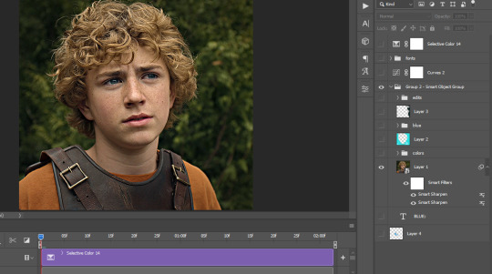
I opened Group 2 and here's the base gif. I already sharpened and sized it correctly but that's about it. Let's open the base coloring next.
Yay! Now it looks pretty! The edits are in Portuguese but it doesn't matter. There's a silent art of adding layers depending on how you want the gif to look but you get used to it. The order matters and you can add multiple layers of the same thing (for eg. multiple layers of levels or curves or exposure).
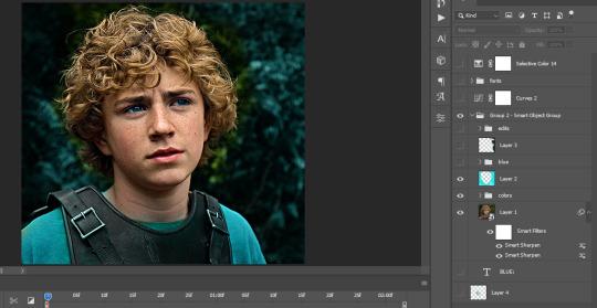
This was pretty much my first experiment with coloring so I don't know what I'm doing (this happens a lot with any art form but gifmaking exceeds in DIYing your way to the finished product) but I didn't want to mess up his hair, that's why the blue color is like that. Blue is easy to work with because there's little on the skin (different from red and yellow but that's color theory). I painted the layers like that and put it on screen, now let's correct how the rest looks.
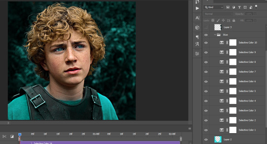
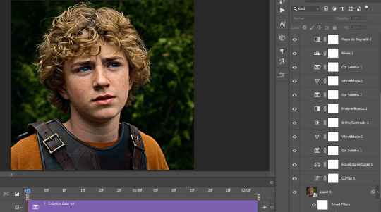
I was stuck trying to get the right teal shade of blue so yes, those are 10 layers of selective color mostly on cyan blue. We fixed his hair (yay!) we could've probably fixed the blue on his neck too but I was lazy. This is close to what I wanted so let's roll with that.
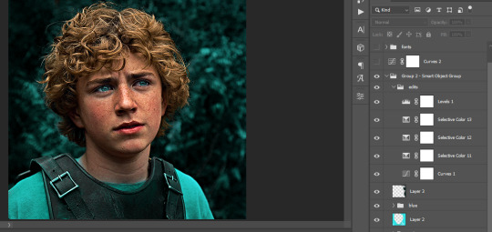
BUT I wanted his freckles to show, so let's edit a little bit more. Now his hair is more vibrant and his skin has red tones, which accentuates the blues and his eyes (exactly what I wanted!). That lost Layer 2 was me trying to fix some shadows in the background but in the end, it didn't make such a difference.
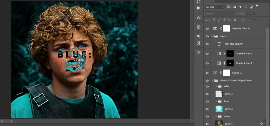
This was part of an edit, so let's add the graphics and also edit them so they're the right shade of blue and the correct size. A few gradient maps and a dozen font tests later, it appears to be done! Here it is:
Please reblog gifsets on tumblr. We gifmakers really enjoy doing what we do (otherwise we wouldn't be here) but it takes so long, you wouldn't imagine. Tumblr is the main website used for gif making and honestly, we have nowhere to go but share our art here. This was only to show how long it takes but if you're new and want to get into the art of gif making, there are a lot of really cool resource blogs in here. And my ask box is always open! Sending gifmakers all my love.
#gif making#gif tutorial#resources#completeresources#y'know what that post yesterday got me into this#i love creativity so i send all my love to gifmakers#this is HARD#my tutorials#tutorials
252 notes
·
View notes
Text
Making dynamic poses/animations that adjust to a sims body with Animation Tools by thepancake1
Made this short guide after talking to thepancake1. I haven't seen many people use this feature yet and felt like it might be worth sharing? There are some limitations to be aware of, but I think it's a useful option (for poses as well as animations) 😊
Many thanks to thepancake1 for the tools and for the helpful explanations he provided for this guide.
1. Background and in-game mechanics
The way TS4 handles different body shapes and clothes in animations (for example, in order to avoid clipping) is basically by putting markers (“slots”) on the surface of a sims body that can be then used as (IK) targets with the in-game IK system.
As you probably know, IK (Inverse Kinematics) – as opposed to the default FK (Forward Kinematics) – is a set-up where bones in a chain are influenced backwards. So, for example, when you move a hand, the arm will follow.
In a similar way, what in-game IK does, is assigning a bone or slot to animate relative to. For example, if your sim is posed with hands on the hips, you can assign the hands to the hips slot and the game will then process the pose/animation and perform IK in real time to change the position of the arms and hands relative to the hips.
Note that there are limitations to this system, though, as only hands, feet and the root bind can procedurally target other bones/slots.
Hereby, feet targets and root target are mainly used in interactions with objects, in particular in sitting animations (where, for example, the root is targeting a chair slot).
Hand targets are mainly used for adjusting a pose/animation to a sims body shape and clothes.
The in-game IK always influences the complete arm/leg (chain: foot-calf-thigh/hand-forearm-upperarm).
You can find an article that provides some background information here: https://simsvip.com/2014/08/20/community-blog-the-sims-4-animations/
2. Using the feature in custom poses/animations
Per default, when you make custom poses/animations with Blender and S4S, the relevant information that the game requires to apply in-game IK is not included. And so, you will notice that while a pose might look good with the base rig in Blender, it might not fit other sims with a different shape in game, in particular causing clipping.
You can use TS4 SimRipper to fine-tune a pose for a certain sim, but this might not be the solution you’re looking for, if you share your poses and/or want them to be compatible with different kinds of sims.
The animation tools now include a feature that makes it possible to use in-game IK with custom poses/animation as described in part 1.
Disclaimer:
The animation tools are in development and subject to change.
Currently TS4 SimRipper sims are not properly supported. (Although, imo for the purpose of the task, it doesn't make much sense to use them as models.)
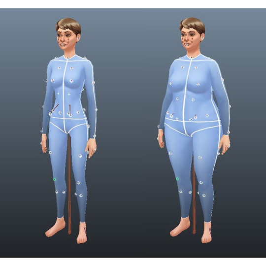
As you can see in the comparison below, there might be some accuracy loss for the flexibility gained. (The position of the arms in the version without IK targets matches exactly the pose I made in Blender but doesn't work at all for the heavier sim causing extreme clipping. At the same time, the version with IK targets deviates a bit from the pose I made, but works for any sim.)
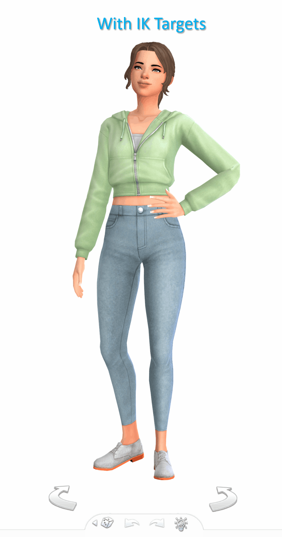

Below a short guide on how to set it up with the example pose I made.
1) You can download the tools HERE. Make sure to check the installation guide and tutorials in the wiki tab for the basics. (Note: The tools were originally made for Blender 3.0 but also support newer versions, in particular Blender 3.3.)
Some additional tips for poses in another post of mine HERE.
After you set up the tools in Blender and have made your pose:
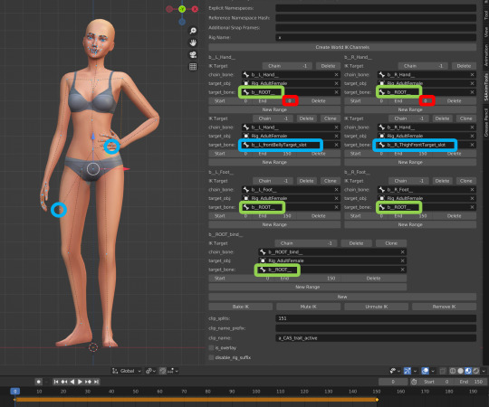
2) Go to the S4AnimTools panel. Fill out rig name, clip splits and clip name as described in the tutorials linked above (also make sure to select “Allow Jaw Animation”).
3) Find & click “Create World IK channels”.

This will create 5 IK channels for the afore mentioned hands, feet and b_ROOT_bind bone. You can also add channels either by cloning the existing ones or clicking “Create World IK channels” again. To get rid of unwanted channels click “Delete”.
4) Set up the targeted bones/slots based on the type of pose you made.
In my example, I created a pose where a sim has the left hand on the hip, and the right hand close to the thigh. Therefore, I added IK channels targeting the “b__L_frontBellyTarget_slot” and “b__R_ThighFrontTarget_slot”.
The slots are marked blue in the picture below. Some notes:
The slots are hidden by default, I made them visible for the picture. You can unhide all bones/slots available by pressing Alt+H. But I recommend doing this on a separate rig/in another blend file or undo it directly afterwards if you don't want all the (unneccessary) bones/slots blocking your view.
The selected slots worked well enough for my example, but you should figure out what is suitable for you. (Fo example, the HandDangle slots seem to be commonly used when the arms are hanging near the body.)
As orientation you can also look up clip files for EA poses/animations via the S4S Game File Cruiser and see what bones/slots are used as targets ("Warehouse" tab -> "SlotAssignments"; IKChainIndex: 0 - left hand / 1 - right hand / 2 - left foot / 3 - right foot /4 - root bind). On that note: The Clip Pack export loses/resets the slot data, but you can use it to find an animation and check its Instance ID to then search for in the Game File Cruiser. (If you know the name of an animation you can also determine its Instance ID by converting the name with the S4S Hash Generator.)
5) To ensure an animation works properly and, in particular, blends with other animations in game, each IK channel should (also) target b_ROOT of the rig.
The bones are marked green in the picture below. This set up was recommened to me by pancake. Another experienced creator mentioned though that it's only necessary to target b_ROOT at the start and end of an animation, in his experience.
Also note that this seems to be a restriction for animations that are made as in-game interactions and might not be necessary for poses or animations used with Andrews Pose player.
6) The start and end frame is set according to the length of the pose/animation (I want to use the pose as a CAS trait pose and set the duration to 150 frames = 5 seconds), except for the b_ROOT target for hands where the end frame is set to 0 in my example, since they are also targeting the slots “b__L_frontBellyTarget_slot” and “b__R_ThighFrontTarget_slot” during the animation.
Note: My example is a static pose. In animations, however, you can also target different slots at different times by setting up multiple IK channels and specifying the start frame and end frame respectively.
7) Bake the animation by pressing “Bake IK”.
8) Export the clip and create a package with your pose/animation as described in the linked tutorials above.
@ts4-poses @thefoxburyinstitute
658 notes
·
View notes
Text
Someone asked me how I created the fade transition in this gifset which I’ll try to explain in the most comprehensive way that I can. If you've never done something like this before, I suggest reading through the full tutorial before attempting it so you know what you'll need to plan for.
To follow, you should have:
basic knowledge of how to make gifs in photoshop
some familiarity with the concept of how keyframes work
patience
Difficulty level: Moderate/advanced
Prep + overview
First and foremost, make the two gifs you'll be using. Both will need to have about the same amount of frames.
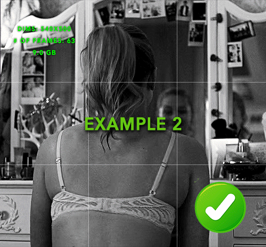
For ref the gif in my example is 540x540.
I recommend around 60-70 frames max total for a big gif, which can be pushing it if both are in color, then I would aim for 50-60. My gif has a total of 74 frames which I finessed using lossy and this will be explained in Part 4.
⚠️ IMPORTANT: when overlaying two or more gifs and when using key frames, you MUST set your frame delay to 0.03 fps for each gif, which can be changed to 0.05 fps or anything else that you want after converting the combined canvas back into frames. But both gifs have to be set to 0.03 before you convert them to timeline to avoid duplicated frames that don't match up, resulting in an unpleasantly choppy finish.
Part 1: Getting Started
Drag one of your gifs onto the other so they're both on the same canvas.
The gif that your canvas is fading FROM (Gif 1) should be on top of the gif it is fading INTO (Gif 2).
And here's a visual of the order in which your layers should appear by the end of this tutorial, so you know what you're working toward achieving:

Part 2: Creating the grid
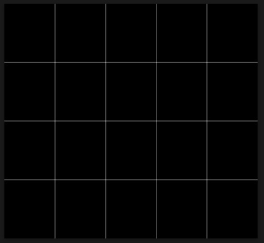
Go to: View > Guides > New guide layout
I chose 5 columns and 5 rows to get the result of 25 squares.
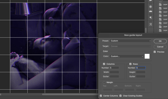
The more rows and columns you choose, the more work you'll have to do, and the faster your squares will have to fade out so keep that in mind. I wouldn't recommend any more than 25 squares for this type of transition.

To save time, duplicate the line you've created 3 more times, or as many times as needed (key shortcut: CMD +J) and move each one to align with the guides both horizontally and vertically. You won't need to recreate the lines on the edges of the canvas, only the ones that will show.
After you complete this step, you will no longer need the guides so you can go back in and clear them.

Follow the same duplicating process for the squares with the rectangle tool using the lines you've created.
Align the squares inside the grid lines. The squares should not overlap the lines but fit precisely inside them.
This might take a few tries for each because although to the eye, the squares look all exactly the same size, you'll notice that if you try to use the same duplicated square for every single one without alterations, many of them will be a few pixels off and you'll have to transform the paths to fit.
To do this go to edit > transform path and hold down the command key with the control key as you move one edge to fill the space.
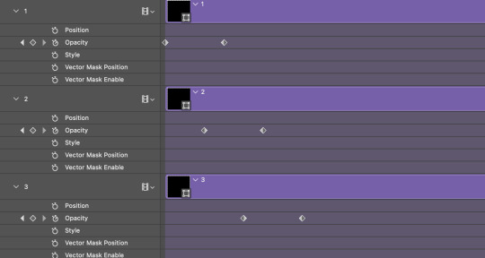
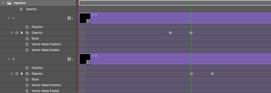
Once you're done, put all the squares in their separate group, which needs to be sandwiched between Gif 1 and Gif 2.

Right click Gif 1 and choose "create clipping mask" from the drop down to mask it to the squares group. This step is super important.
After this point, I also took the opacity of the line groups down to about 40% so the lines wouldn't be so bold. Doing this revealed some squares that needed fixing so even if you aren't going dim the lines, I recommend clicking off the visibility of the lines for a moment to make sure everything is covered properly.

Part 3A: Prep For Key framing
I wanted my squares to fade out in a random-like fashion and if you want the same effect, you will have to decide which squares you want to fade out first, or reversely, which parts of Gif 2 you want to be revealed first.
In order to see what's going on underneath, I made Gif 1 invisible and turned down the opacity of the squares group.

If you want text underneath to be revealed when the squares fade away, I would add that now, and place the text group above Gif 2, but under the squares group.

Make a mental note that where your text is placed and the order in which it will be revealed is also something you will have to plan for.
With the move tool, click on the first square you want to fade out. Every time you click on a square, it will reveal itself in your layers.
I chose A3 to be the first square to fade and I'm gonna move this one to the very top of all the other square layers.
So if I click on D2 next, that layer would need to be moved under the A3 layer and so on. You'll go back and forth between doing this and adding key frames to each one. As you go along, it's crucial that you put them in order from top to bottom and highly suggested that you rename the layers (numerically for example) which will make it easier to see where you've left off as your dragging the layers into place.

Part 3B: Adding the Keyframes
This is where we enter the gates of hell things become tedious.
Open up the squares group in the timeline panel so you can see all the clips.
Here is my example of the general pattern that's followed and its corresponding layers of what you want to achieve when you're finished:
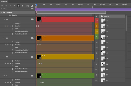
So let’s try it!
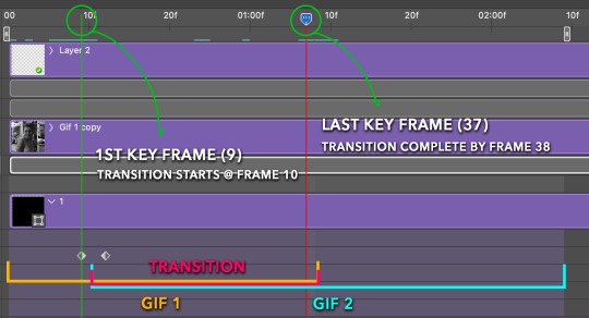
Expand the control time magnification all the way to the right so you can see every frame per second.

As shown in Part 3A, select your first chosen square.
Where you place the time-indicator on the panel will indicate the placement of the keyframe. Click on the clock next to opacity to place your first keyframe.

Move the time-indicator over 3 frames and place the next key frame.

Things to consider before moving forward:
Where you place your very first keyframe will be detrimental. If you're using a lot of squares like I did, you may have to start the transition sooner than preferred.
If you're doing 25 squares, the key frames will have to be more condensed which means more overlapping because more frames are required to finish the transition, verses if you're only using a 9-squared grid. See Part 4 for more detailed examples of this.
The opacity will remain at 100% for every initial key frame, and the second one will be at 0%.
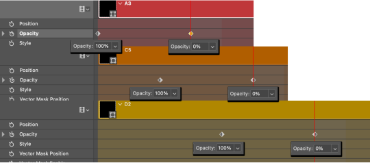
Instead of creating two keyframes like this and changing the opacities for every single clip, you can copy the keyframes and paste them onto the other clips by click-dragging your mouse over both of them and they'll both turn yellow. Then right click one of the keyframes and hit copy.
Now drop down to your next clip, move your time-indicator if necessary to the spot where the first keyframe will start and click the clock to create one. Then right click it and hit "paste".

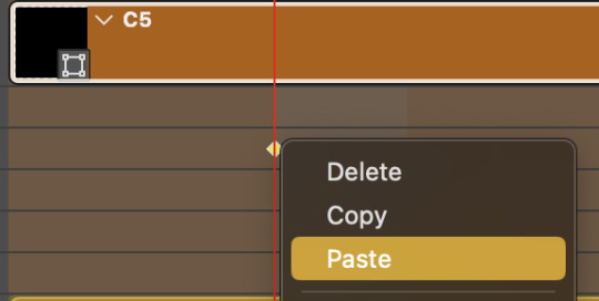
Tip: When you have both keyframes selected, you can also move them side to side by click-dragging one of them while both are highlighted.
Your full repetitive process in steps will go as follows:
click on square of choice on the canvas
drag that square layer to the top under the last renamed
in timeline panel: drop down to next clip, move time-indicator tick to your chosen spot for the next keyframe
create new keyframe
right click new keyframe & paste copied keyframes
repeat until you've done this with every square in the group
Now you can change the opacity of your squares layer group back to 100% and turn on the visibility of Gif 1. Then hit play to see the magic happen.
PART 4: Finished examples
Example 1
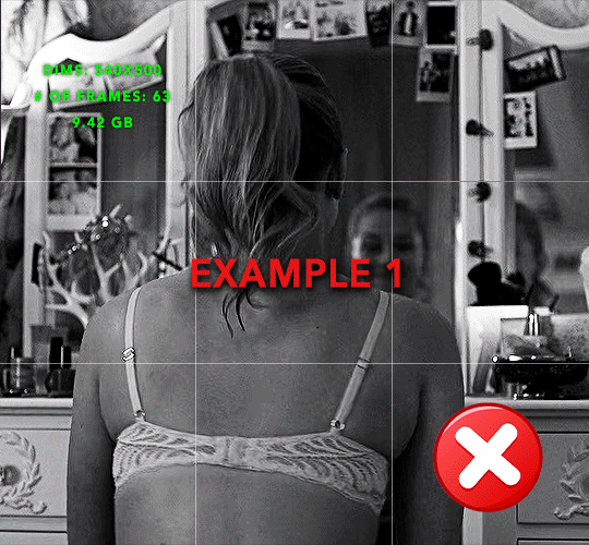
the transition starts too soon
Cause: initial keyframe was placed at frame 0
the squares fade away too quickly
Cause: overlapping keyframes, seen below.
(this may be the ideal way to go with more squares, but for only 9, it's too fast)
Example 2
more frame time for first gif
transition wraps up at a good point
Cause: in this instance, the first keyframe was placed 9 frames in, and the keyframes are not overlapping. The sequential pair starts where the last pair ended, creating a slower fade of each square.
Part 5: Final Tips and Saving
You can dl my save action here which will convert everything back into frames, change the frame rate to 0.05 and open the export window so you can see the size of the gif immediately.
If it's over 10gb, one way to finesse this is by use of lossy. By definition, lossy “compresses by removing background data” and therefore quality can be lost when pushed too far. But for most gifs, I have not noticed a deterioration in quality at all when saving with lossy until you start getting into 15-20 or higher, then it will start eating away at your gif so keep it minimal.

If you've done this and your gif is losing a noticeable amount of quality and you still haven’t gotten it below 10gb, you will have no choice but to start deleting frames.
When it comes to transitions like this one, sometimes you can't spare a single frame and if this is the case, you will have to return to the timeline state in your history and condense the key frames to fade out quicker so you can shorten the gif. You should always save a history point before converting so you have a bookmark to go back to in case this happens.
That's pretty much it, free to shoot me an ask on here or on @jugheadjones with any questions.
#gif tutorial#photoshop tutorial#transition tutorial#grid tutorial#usergif#ps help#tutorials#tutorials*#requested
222 notes
·
View notes
Photo


Get access to my brushes, tutorials and art processes on patreon.com/ramonn90 Join me!
683 notes
·
View notes
Text

alright someone asked me a few weeks ago how i colored my gifs to make them colorful like this so i thought would make a simple tutorial on it! it's a relatively simple process and also assumes you know how to make gifs, including basic coloring.
before we get started, it's important to note that scene selection is the most important thing here and could make or break the way you color your gif. i highly recommend scenes/videos with cyan/blue-ish backgrounds (or even gray bgs with cool tones) as they don't interfere with skin tones and therefore will be much easier to color.
now that you've picked your scene, go ahead and make your gif how you normally would, but limiting the coloring to just the basics (aka lighting and color-correcting). here's how mine turned out:
and then the fun part begins! first, we're gonna make a new selective color layer and crank up the blue & cyan layers to make the colors really pop. i find that doing this first before doing anything else makes the colors more vibrant. here's how mine looked like, but you're free to move the sliders whichever way you want as long as you end up with a pretty even cyan or blue base to work with.
after that we can go ahead and add a hue & saturation layer. go into the cyan or blue tabs (or both depending on which colors show up in your gif, in my case mine is predominantly cyan with some blue shadows) and move the hue sliders to whichever color you prefer! you can play around with the saturation and lightness sliders too, but i was already satisfied with how the color turned out.

you can choose to stop here, but if you think it still needs a bit of color correction (especially if you have a subject whose skin tone needs a bit of fixing), go ahead and do that! here's how mine looks after that:

aaaand that's it! easy peasy. here are a couple more examples using the same process across different media:
i hope this made a bit of sense and is helpful, and if you have any questions don't hesitate to ask! 💗
#tutorials#gif tutorial#completeresources#clubgif#uservivaldi#usermicu#userhekaates#userautie#userraffa#userhallie#tuserheidi#userfern#userkosmos#obligatorytag#usershreyu#*
399 notes
·
View notes
Note
Hii you're so talented!! i wonder if you could explain how you did this gif effect with the squares? and do you have any tips on colouring because yours is always top notch <3333
heyy thank you so much 🥹 and of course! i've never really done a tutorial before but i'll try my best to explain it in a way that makes sense 😅
so i start off with making my two gifs seperatly and colouring them as i normally would, once i've done that i load both gifs into the same project and once i've done all that i started on the grid part:
now go to view -> add guides and this window should pop up:
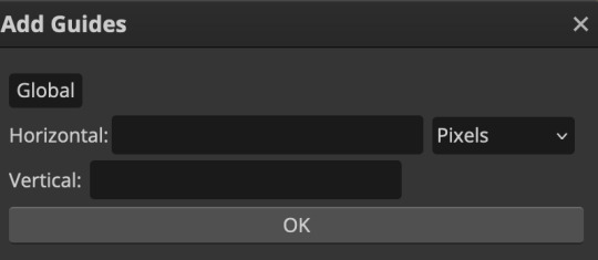
(it's was so daunting at first when i saw this i was like ????? and started putting in random numbers and was like oh that's how this works 🤣)
here's the settings i used for my gif which is 540px x 500px in size with 5 squares x 4 squares: (if you want more or less you just have to play around with it)
once you've done that it should look something like this:

now the next part is really up to preference again: add a vector mask onto the gif that's above the other one like this: (ignore the name of my folder that is irrelevant 🤣)

and then i used the rectangle select tool (this is because the rectangle select should lock onto the grid squares making it easier to erase certain sections) + a black brush tool to erase the squares to show the other gif that's underneath (you can reposition both gifs to your liking which is what i did)
before & after:

so my vector mask looks like this afterwards
(you don't have to do the squares so close together like i did it was just how i liked it & because of the scenes i had chosen that mine turned out this way)
now onto the grid lines: i used the line tool with these settings

just like with the rectangle select tool the line tool should lock onto the grid line you want to redraw, do this for every line that you want/have for your grid & once you're done go to view -> clear guides and it should look something like this: (added a version with just a black background so it can be seen a little easier)

(i'm ngl idk why my lines ended up kinda faded and not white 🤣 i think it might be because i used a white fill instead of white stroke but it doesn't really matter to me because i got my ideal outcome anyway 🤣)
bonus step: you can stop here if you'd like but i wanted my lines to match my colouring & my intended typography so i put all my line layers into a folder and set the mode to difference & added a yellow fill layer with a clipping mask, like this:
and it should look like this:
you can also play around with the opacity of the lines too which is what i tried out but i prefered for my set the lines being at 100% opacity but it's really up to you with what you want to play around with
now once you're happy with everything merge those layers together (make sure they have the same amount of frames first before merging them) and either save as it is or add some typography like i did and you should end up with this:
for tips when it comes to colouring it really depends on what you're colouring, if you want to manipulate the colours as much as i do i recommend choosing a colour within the scene so you're not having to change too much, or finding scenes that have colours that can be manipulated more easy (any colour that aren't skin tones, unless you're working with red or yellow like i did here, i chose yellow because one of the outfits in the gif was yellow toned and it looked better with the gifset being yellow than my original colour which was blue), also looking for scenes were the people in it don't move as much also is a big help!
i hope this helps :) feel free to ask more questions if you didn't understand or want some more tips i honestly don't mind!
#replies#mrmalcolmslist#photopeablr#tutorials#photopea tutorials#completeresources#usergif#mine | tutorials#gif tutorial#photopea#resources#gif resources#gifmakerresource#i hope i didn't forget anything aksjdskds#photopea tutorial#tutorial#gif tutorials
127 notes
·
View notes
Note
about the tutorial: just one about dark scenes in general would be great :)
sure :) here's a tutorial on how I work with dark scenes:
before we start, it's important to mention that working with dark scenes is so much easier when your video/ screencaps are high quality. I personally refuse to gif dark scenes unless I have 4k quality footage lol.
my general coloring tutorial is here in case you want check it out!
alright, let's start! after resizing and sharpening my gif, here's what we're working with:

STEP 1: levels. I use the pipette tool to select the lightest and the darkest parts of my gif, it's a great guide that helps to neutralize the overpowering color:
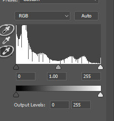
in this case, the lightest part is the little white dot in the corner of his eye and the darkest one is around his hair (if there are many dark shadows in my gif, I just click on a few darkest looking spots and see how it adjusts the coloring and lighting of the gif and just pick the one I think looks the best). basically, this layer is a good guide on how to make the overall look more natural if there is one obvious dominant color and we want to get rid of it (for example, my gif has quite a lot of blues, but it's not too crazy, so I won't need to adjust that much):
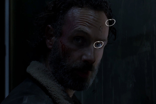
and this is what we've got just after using the levels adjustment:
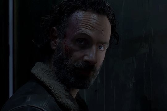
the gif is lighter and the blue was reduced a little bit, the scene now has more green and red undertones. sometimes I mess with the settings myself if I don't like the way it looks, but in this case I'm pretty happy with the automatic adjustments and I didn't even have to do that much!
STEP 2: curves. I do the same thing that I did with the levels, using the pipette tool to select the lightest and the darkest parts and also pull the rgb curve to the middle to brighten my gif even more:
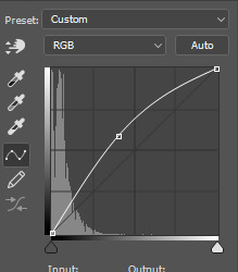
and here's the result after setting the curves layer opacity to 37%:
STEP 3: brightness and exposure layers. next up, I just want to brighten the character a little bit more, but not the background, so I'm adding a brightness/contrast layer and an exposure layer, here are my settings:
but since it adjusts the whole gif and I don't want that, I select the mask on my brightness layer and pick the eraser tool. I erase the part of my gif that I don't want to be affected by this adjustment, I colored that part bright pink so it's obvious:
and then I do the same with the exposure layer.
in my gif the character is not moving that much, so it looks pretty natural when I brighten just him. here's where we're at:
STEP 4: selective color and gradient map. I'm happy with how bright it is, but I do want to deepen the shadows here and just mess with the coloring itself, so next up I'm gonna use a couple more layers.
here are my settings for selective color layer, opacity set to around 40%:
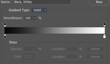
and here are my settings for a gradient map to deepen the shadows:
and here's the result:
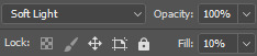
ADDITIONAL STEP: I sometimes like to add another layer and just put some soft color gradient to one side of the gif.
in this case I used a soft blue color, set to lighten, 62%:
I'm not very good at tutorials and I put this together pretty quickly, but hopefully this was somewhat helpful, let me know if you have any questions! <3
81 notes
·
View notes
Text
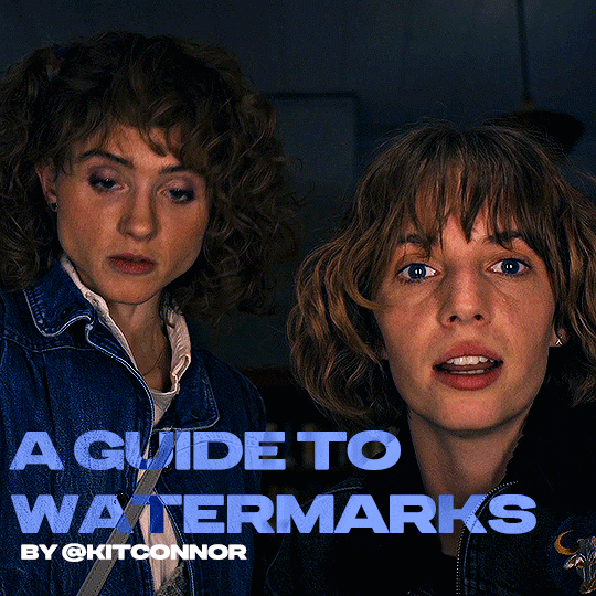
recently, a lot of people have been losing their gifs to reposters, whether that be a whole set stolen or just one gif taken for a textpost. which leads to a lot of us turning towards watermarks to not lose our work. it's not everyone's first choice, particularly because of aesthetics, but it's the best way to keep what you own.
of course, it might seem silly to do a whole "tutorial" on watermarks, but there's a lot of different ways to watermark in a subtle way that still protects your work. i've also seen a lot of people incredibly hesitant to move to watermarks because they believe it marrs their work, which may be true, but there are definitely ways around that. anyway, let's begin !
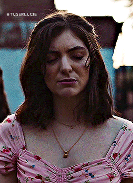
WATERMARK 1: URL/TRACKED TAG
the most common watermark for people is usually 'thisismyurl.tumblr.com', 'thisismyurl | tumblr', 'thisismyurl' - at least, this is assumed for most people as the best way to watermark.
but if you're like me and constantly want to change your url, you know that there's a good chance a watermark on a gif 3 months ago could be completely different to one now. this is why people are turning to tracking tags.
tracked tags change less frequently, if at all. it's smaller, which makes it more subtle. if you want to go the extra mile like me, you can create a blog under your tracked tag (eg. i track tuserlucie) which means you can reblog anything with your watermark to the blog, showing that it is yours.
placement is key though ! here's 3 different ways you can place it.


NOTE: opacity has not been altered on any of these. depending on how it looks with your gif, opacity looks best at 10-30%.
Font settings: Momcake, thin, 10pt, #ededed.
each of these placements have different advantages.
the first placement (top left) is the one i personally use. it's centered right on the middle but not too high up.
the second placement (top right) is probably the most popular. corners mean people can kind of tuck the watermark away where it doesn't seem obvious. the fourth (bottom right) effectively does the same.
the third placement (bottom left) is 100% the most effective. it sits in a point exactly where it's noticeable, making it less desirable for reposters. on the right opacity too, you hardly notice it.
WATERMARK 2: ICONS/SIGILS
this is an idea that i've seen used mostly by nik @cal-kestis , but is a great and creative way to do it !
an icon or sigil makes your gif totally unique to you. and it's something cute on there which is different to having to put text on there.

(i've put it in orange for the purpose of seeing it)
but you can see here, it doesn't need to be anything special. i've just used an oval shape plus the initials of my url and that's it !
but a sigil can be anything. it doesn't need to have text; it could just be an image. it could just be your icon. either way, it's a cute little alternative to using text.
here's the different options that i preference in action.
SIGIL - bottom right corner

URL - bottom middle

TRACKED TAG - face/body

RESOURCES
here's some resources to use if you want to start watermarking !
FONTS:
Momcake (this one was used throughout all the text watermarks !)
Cocogoose
Lemon milk
Bebas
Quicksand
PSD
you can access a psd of editable watermarks here.
#tutorials#ps tutorials#resources#**l.myeditss#mine: resources#photoshop tutorials#idk who to tag so sorry 😭#usersmia#usercats#usernorah#userrsun
219 notes
·
View notes
Text
♡⃞ㅤㅤhow to add a stroke effect to transparent gifs in photopea!
✚𓈒 (explained by an IDIOT that's super duper bad an explaning things)
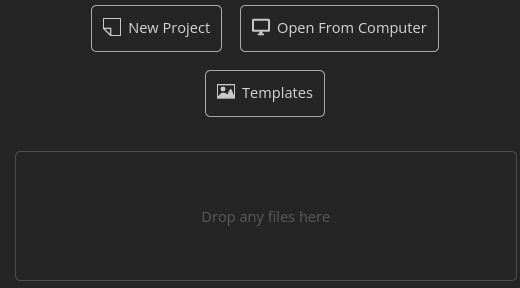
first, open up your gif! you can either open it by clicking the "open from computer" button and or the "drop any files here" button.
For this tutorial, I will be using this gif as an example!

now that you have opened up your gif, look over to the side pannel.

this is what I'm talking about!
now, click the "eff"/"effect" button, its next to the chain button!
after you click the effect button, you will see this pannel!
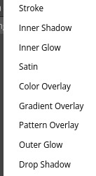
now, click the "stroke" button, after you click the stroke button, you will see this pannel!

you can change the color, size, and blend mode of your stroke! after you play around with your settings, just hit the "OK" button
after you press okay, you should get a little something like this:
if you like your results, then export your gif!
and tada!! your done! here's my result:

#𝒢𝜚 𝐦inty 𓈒✚ ˘ ˘ ⁾#photopea#photopeablr#photopea help#tutorials#photopea tutorial#editing help#editing tutorial
144 notes
·
View notes
Note
Please oh please share with us how you did the effect in your latest Nancy drew set, it is truly so gorgeous I cannot stop looking at it!
hi nonny, sorry this took a while. so you're looking for the effect from this post:
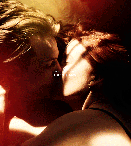
i made it fairly easy on myself for this one because i am lazy and impatient as hell, so hopefully this is a rather short tutorial.
there's a neater and tidier way to do this that would require frames instead of timeline but for the effect i was aiming for, the slightly sloppier and faster way actually worked fine.
preparation: you'll need a gif with the overlay effect that you like and want to use. i'm giving you the one i used for all the gifs in this set (just slightly altered for each individual gif):

then, of course, you need two gifs — one that'll be your base gif (the coloured one in my example) and one that'll "bleed into" the other one (the black and white one here).
base gif: i just did my regular preparation and colouring, added some yellow and red brush strokes here and there to add some colour and that was it.
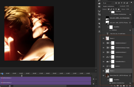
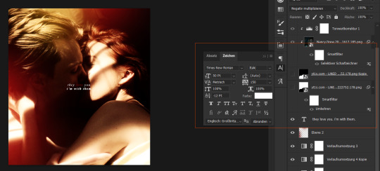
i also added some text at this point and i positioned it on top of my base gif but underneath the overlay layers (because i wanted the text to vanish with the overlay):
second gif: i did a quick and very basic black and white colouring for this one.
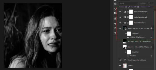
for the overlay effect to work properly, i set the blending mode of this gif to multiply.
overlay: now the fun part. i added my overlay effect gif and changed its size and position to my liking and so that the important parts of my base gif were visible long enough (aka the kiss).
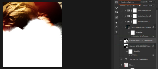
i set this layer to screen and clipped the b/w gif and the adjustment layers to it.
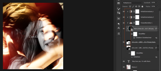
the thing is, as you can see, the overlay part is way too transparent to be efficient. you might get away with this if your base gif is dark enough but for the scene i wanted to use as a base it just didn't look right.
so i duplicated the overlay effect layer, dragged it underneath my original one, inverted it and set it to darken. et voilà, this worked wonders:
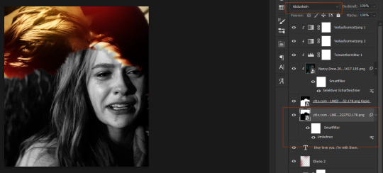
before saving, have a look at your timeline and whether everything lines up. you can change the starting point of your overlay effect (having it come in later or earlier) or your other gifs. whatever looks right to you and also fits into the size limitation.
and that's it. if something didn't make sense or you want to know anything else, just let me know. hope this helped, nonny. ♥️
215 notes
·
View notes
Text
Pira's Pixel Arting Tutoriallll aaaaaaaaaaaaaaaaaa


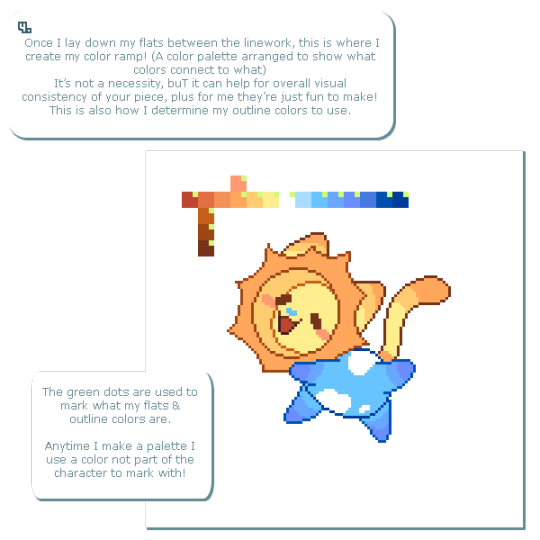
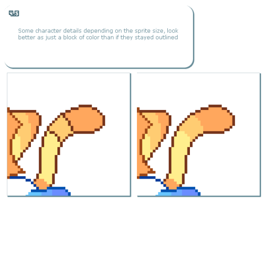
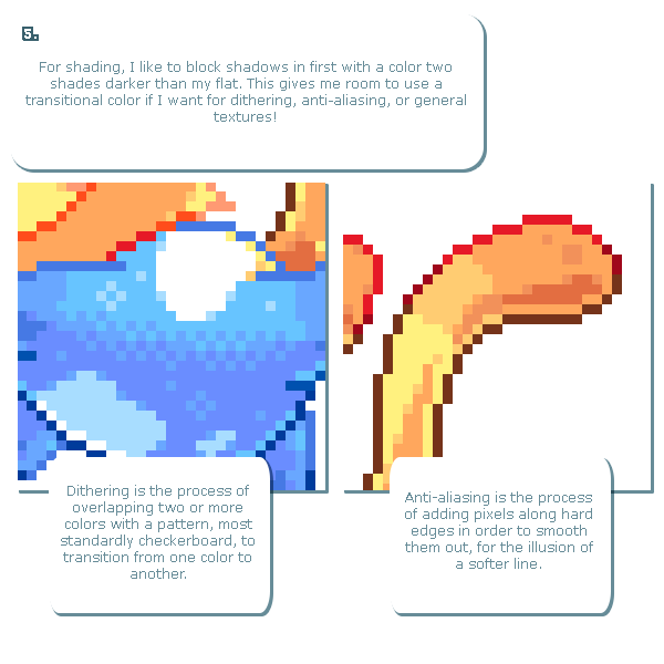

Felt like I could actually turn my process for rendering pixel stuff into a tutorial, since a lot of the ones I remember looking through an learning from myself- the initial sketch/render process I've never seen quite like what I do? In any case I hope it's potentially helpful for some folks out there! :D
Got permission from @r0yalstar to use their goober from my recent Art Fight attack on them as the sample piece! Might in future use a custom piece- but several of my recent personal ones I didn't keep track of the process steps for- so did a little two for one pHFPT
Been a long time since've done a tutorial too, so's more I could've covered but I wanted to keep it simple and like, more of a "hey here's my process" thing versus "hey here's how xyz thing are and shOULD be done"
if you want a super duper in depth resource for pixeling, I'd whole heartedly recommend the Pixel Logic Artbook!
And for free resources, Brandon James Greer's channel on youtube is a super nice resource too for different pixel art challenges and experiments~
#piranhart#artfight#team vampire#art fight 2023#pixelart#pixel art#pixel artist#tutorial#tutorials#art tips
296 notes
·
View notes
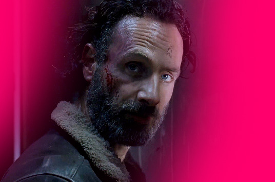
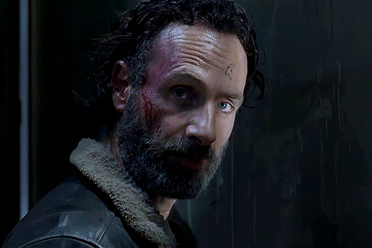
Text
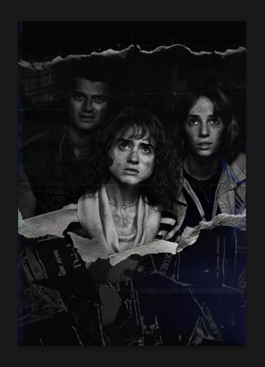
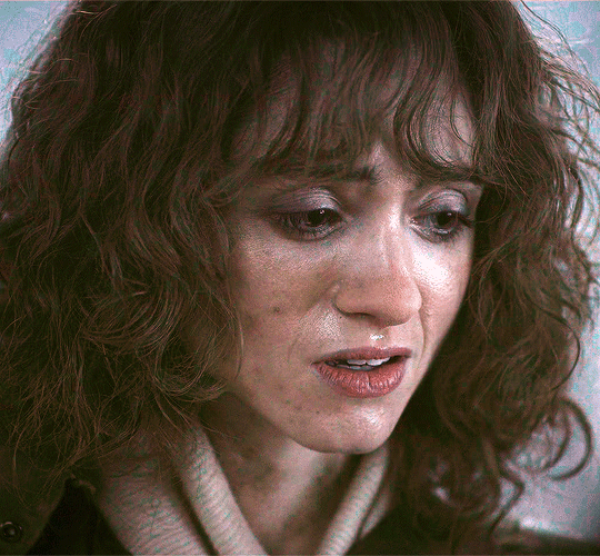
Coloring Tutorial
Hello, this tutorial is for the wonderful @djoharrington and those of you wondering how I colored this set. I’m going to be talking about how to color the first gif only to keep this tutorial from getting too long. The other two used the same coloring method with only minor adjustments made to keep them looking similar.
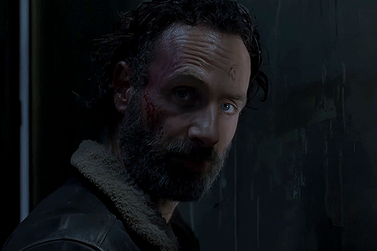
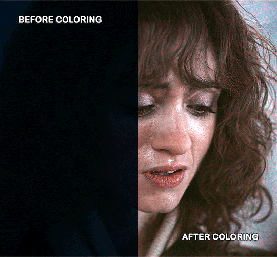
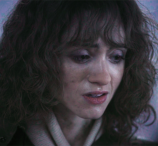
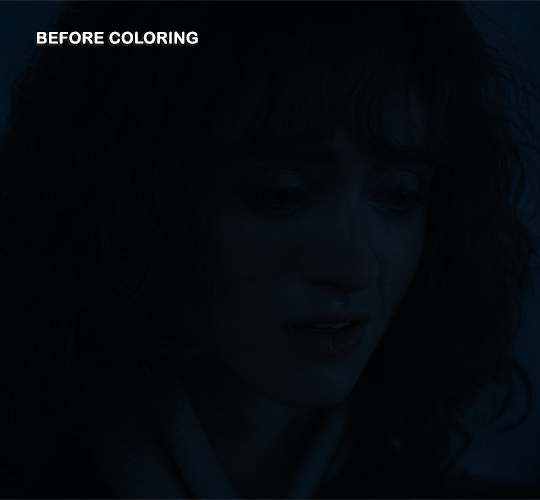
Yes, this scene really is that dark before coloring.
Quick notes on what I’m using:
mpv player for screencapping — not mentioned in tutorial
Photoshop 2021 for editing
I mention mpv player because I’m giffing 4k, and it’s one of the few players I’ve come across that take continuous caps that don’t end up looking washed out. It makes for easier coloring.
This is me coloring literally any Upside Down scene:

Step 1: brighten the hell out of this gif
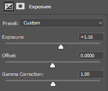
You can use a throwaway layer to get you started. I used an exposure layer (which I eventually kept and adjusted during the original process of coloring this scene) with end settings of: exposure at +5.25, offset and gamma correction at default.


Now we can see all the beautiful details of Nancy’s face. Well, most of them.
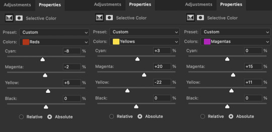
Step 2: photo filter layer 1
The way I offset this horrid blue tint they use for Upside Down scenes is a photo filter layer (several for this particular scene). For now, just the one. Put this below the exposure layer!
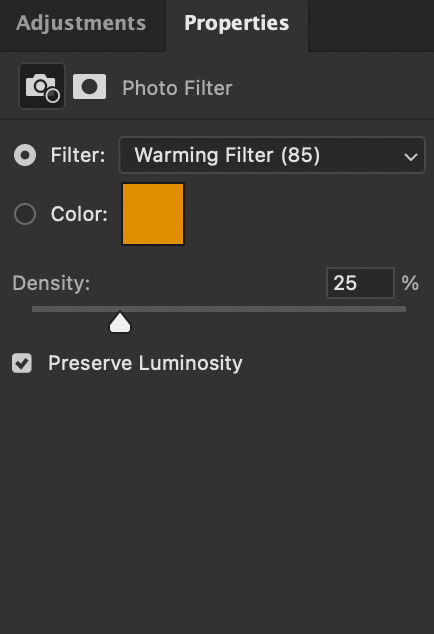
This brings a bit of color back to Nancy’s face and warms up the blue tones that are so prevalent in Upside Down scenes.
I don’t change the blending mode, opacity, or fill, just keep as is.
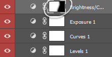
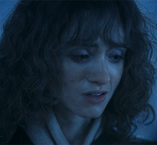
Step 3: curves layer 1
I clicked around a lot with this layer. Mostly in an attempt to get rid of the blue and adding more color to Nancy’s face. Didn’t get the result I was looking for with this layer until I added other layers. But I managed to brighten the gif a little more and add some contrast.

Step 4: hue/saturation layer
Put this layer below the photo filter layer! I used this layer to balance out the colors I pulled from the curves layer. Brought back some warmth/purples by adjusting cyans and blues.


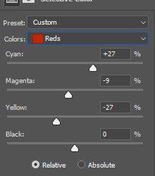
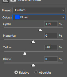
Step 5: selective color layer 1
Ended up a little more purple than I wanted with the hue/sat layer, so I used a selective color layer (set between the hue/saturation layer and the photo filter layer) to get rid of the purple by, again, adjusting cyans and blues.
Make sure to have “Absolute” marked!

This is better! There’s a lot more color that isn’t blue in Nancy’s face now that I can work with and manipulate.
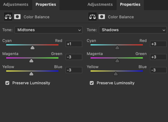
Step 6: color balance layer
This one goes on top of the curves layer (should be the topmost layer at this point). Only adjusted Midtones and Shadows, adding a little more red and yellow in her hair and face.

This looks a lot more natural. Now we just have to brighten it up again.
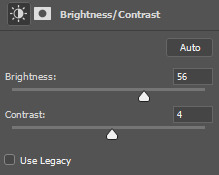
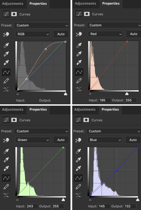
Step 7: exposure and curves layer 2
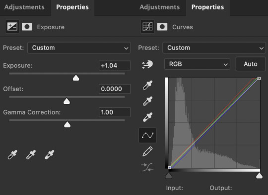
I don’t touch the RGB mode on this curves layer. I mostly adjust the Red, Green, and Blue modes by adding a little more red and green while sliding the bottom corner on Blue to add more yellow to the shadows.
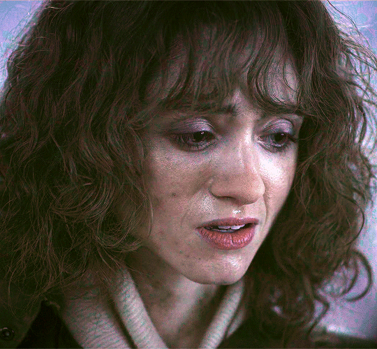
Technically, I could stop here if I wanted, but the purple is still pretty prominent in the gif, especially in Nancy’s eyes, and it’s hard to adjust that without adjusting the color of the entire canvas since there’s movement in this gif. If Nancy were more of a still subject here, then layer masks are an option. Alas…

So I adjust the colors and try to get rid of the purple. The gif as a whole kind of looks washed out as well. I want more color here.
Step 8: photo filter layer 2
I set the opacity to 55%. I want warmth, but not too much.

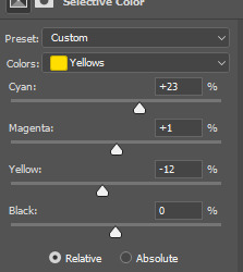
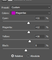
Step 9: selective color layer 2
This is where I end up seeing the most change. Even small adjustments go a long way here.

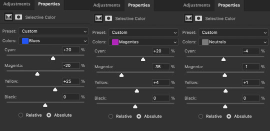
It’s mostly the cyans, blues, and magentas which makes sense given how overwhelmingly blue this scene was, then almost overwhelmingly purple as I started making adjustments. Red and yellows are important for anything to do with the face and hair. This is where I add a more “natural” shade to Nancy. Literally anything that isn’t fucking blue is an improvement to me at this point, given how it started out.
Blue is back in the background where it belongs and not in Nancy’s face.
I think this is where I originally stopped. Like this looks pretty good to me, but I also wanted to make sure the other two gifs could be colored similarly, and they were for the most part. But there was only so much adjusting I could do to Nancy’s face in the third gif without adjusting the entirety of the scene (and set), so I had to go back and adjust her here to get a similar coloring.
(A lot of this set was back and forth, adjusting the colorings until they matched. It took so long. Especially with the stupid Upside Down visual effects in the background. I’m a bit of a perfectionist, so there were a lot of minor adjustments and a lot of nitpicking until I ended up with a result I liked.)
So last and final step.
Step 10: selective color layer 3
I ended up adding more red to the face, hair, and shadows to keep the first and third gif similar in coloring. And this is where we get our final product.
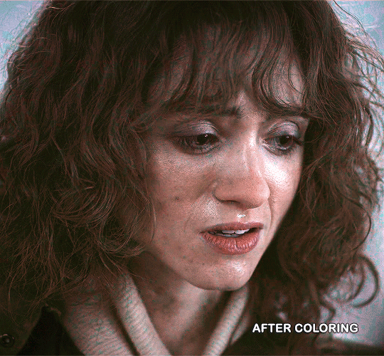
And the side-by-side comparison again.
Anyway, here you have it. This is the end of the tutorial. I can in no way guarantee that this method will work on other Upside Down scenes (trust me, I’ve tried), but hopefully you’ve learned something!
And hopefully I’ve explained myself well enough that you can apply this :)
#text#photoshop#tutorials#coloring tutorial#gif tutorial#photoshop tutorial#*tutorials#Stranger Things#djoharrington#requested
864 notes
·
View notes
Last Seen Blogs