#chaoticresources
Text


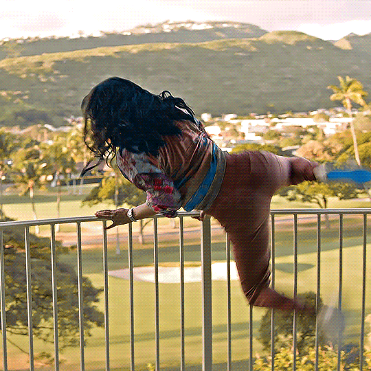

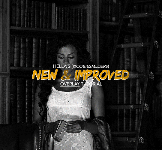
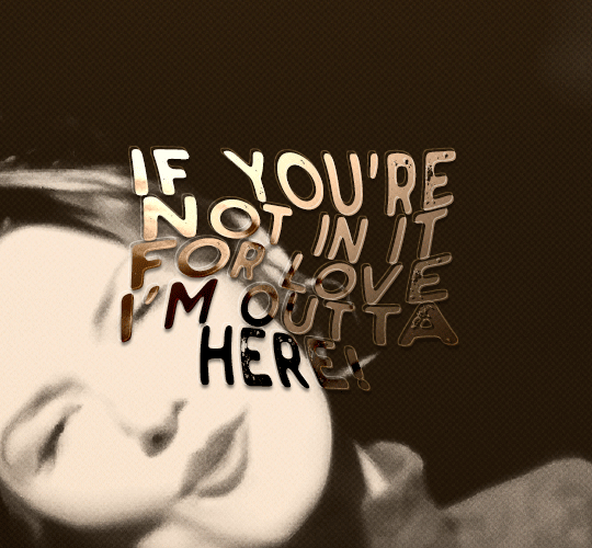
LUCY & KATE | NCIS HAWAI'I 3x04
6 tips to make your (fake) honeymoon extra special by Lucy Tara and Kate Whistler
#kacy#kate x lucy#usergif#wlwsource#lucy x kate#wlwgif#kate whistler#dailylgbtq#lucy tara#filmtvdaily#tori anderson#ncis hawaii#dailytvwomen#yasmine al bustami#usergay#femalegifsource#filmtvtoday#fybadassladies#dailyflicks#userladiesblr#lgbtqgifs#usernati#femaledaily#ChaoticResources#tvarchive#my graphics#imo this fake honeymoon episode was one of the best part of this very short and very kacy deprived season#this set may not be my best work but I enjoyed making it#kacy is still my comfort ship and they're precious to me during the tough time I'm going through.
288 notes
·
View notes
Photo


smalllady's gif overlay pack 1 - because i got tired of people saying "just google it bro" (ノಠ益ಠ)ノ彡┻━┻
seriously...google search results for gif overlays are pitiful. so here's some better quality gif overlays! i made these from free resource videos from youtube.
✧ all gifs are 540x540px, 120 frames, and below 10mb
✧ you can either just save these gifs or you can dowload the psds [here]
✧ i don't care if these get reposted everywhere...i just want stuff like this to be more accessible
#smalllady resources#gif overlays#gif textures#itsphotoshop#completeresources#yeahps#chaoticresources#not that it matters anymore.........
1K notes
·
View notes
Text
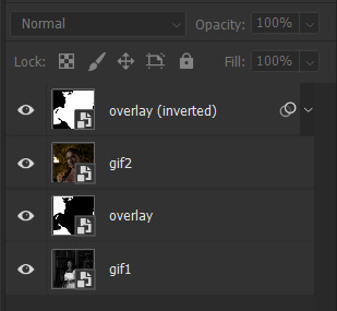
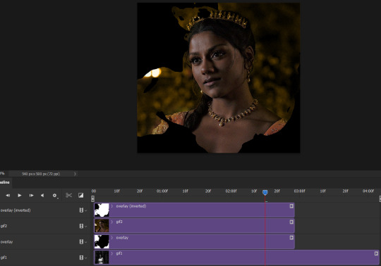
Hello!! A couple years ago I posted this tutorial for making gifs with a moving overlay effect. In the two and a half years since I made that tutorial, I've learned some new tricks for this gif effect but most importantly I've learned how to explain things better.
For that reason, I've created this new and improved tutorial for my overlay gif effect. The basics are the same but it's simpler, I go into more detail, give better explanations, and have more comprehensive instructions.
The easiest way to do this effect with this method is to use smart objects and work in timeline. For this tutorial, I’m assuming you know the basics of giffing like cropping, resizing, colouring, etc. If you need help with this I’d suggest you look at some other tutorials and guides!!
First, we’re going to start off with three things.
1. A completed gif converted into a smart object that is going to be the base gif. I'm going to call this "gif1". You’ll want this gif to be at least 3 seconds because it needs to last as long as the overlay plus a little bit of extra time in the beginning.
This is the base gif I’ll be using in the example (except I trimmed it so that I could meet the size limit).
2. A second completed gif converted into a smart object that is going to go over the base gif. We’re going to call this "gif2". This gif should be at least 2 seconds but I’ve made it work with shorter. Gif2 needs to be the same dimensions or bigger than gif1.
This is the gif I'll be using in the example (except I trimmed it so that I could meet the size limit).

3. An overlay in video form. These can be found on tumblr and youtube by search for overlay or transition packs. For this example, I'll be using an ink drop overlay I found on youtube.
Step 1: Turning the overlay video into an overlay gif
Most overlays aren’t going to instantly fit the gif effect you’re trying to achieve right away. This is the overlay I got from youtube and as you can see it’s too slow and needs a crop/resize to be usable.

To fix it, I sped the frame rate up, cropped the overlay, and resized the overlay so it fits over my base gif. I also sharpened the overlay (500% amount, 0.3px radius) so that the edges were smooth. This is the new overlay gif and the one I’ll be using for the gif effect.

A tip: I also like to add a brightness/contrast layer to get rid of the grey on the overlay gif. Because we’re working with blending modes to achieve this effect, any parts of the overlay that are grey will be a blended mix of gif1 and gif2. If you think this will look good for your gif effect then don't worry about it!
Another tip: try to get the entire overlay movement to fit into a 2-3 second window. Anything longer than that will likely be cut off when you have to trim your gif to meet the upload size limit and it would suck to only have half of the overlay.
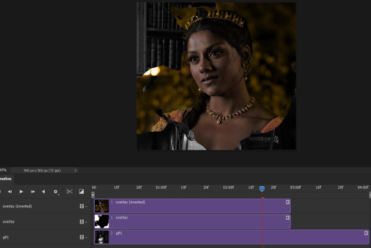
Step 2: Creating the gif effect
Drag a copy of gif2 and a copy of the overlay gif onto the gif1 canvas. I like to use Ctrl+Shift+V so that the layers are pasted in the same position as they were on the previous canvas. MAKE SURE that both overlay layers are in the same position on the canvas. If one of the overlay layers is higher/lower/etc. than the other then the effect won't work properly.
Then, make a second copy of the overlay and invert it (Ctrl+i). These are the layers you should have:

Before you go any further, trim gif2 and both overlay layers so they are all the same length.
Now, we need to rearrange the layers and set blending modes. The top layer should be whichever overlay goes from black to white. This is because when we change the blending modes, the white part of this layer will disappear and look like its being replaced by gif2. In this case, that is the overlay (inverted) layer. Then we want gif2, the other overlay layer, and then gif1.
A tip: this process can be done the other way where the top layer is the overlay that goes from white > black however, you are much more likely to have an error where there is a grey/black line around the overlay effect in your final gif. In order to avoid that, I always use the black > white layer on top.
Next, set the top overlay layer to darken. You should only see the black part from the overlay and gif2 should fill in the white part. Here’s how that looks in my example.
Next, select the top overlay layer and gif2 and convert both layers into one smart object. Your layers tab should look like this now.

Now, set the new layer’s blending mode to lighten and the overlay layer’s blending mode to darken. Once you do this, you should be able to see gif1 as well as the overlay gif.
Step 3: Timeline and exporting
At the moment, gif1 is still significantly longer than the overlay gifs. Since this gif is just over 10 mb (which is pretty small for this effect) I’m going to trim about 1/4 of a second off the end of gif1 and then drag the overlay layers so they all end at the same time.

Now you’re free to export the gif! This is the finished effect for the example gif!

A tip: sometimes, when I convert to from timeline to frames, the gif becomes a little longer and slower. It has to do with different frame rates across the videos and photoshop but I'm not smart enough to understand it. If that happens, just set all the frames with the overlay layers to 0.04 speed instead of 0.05.
And we're finished! I hope that was helpful and made sense. If you have any questions feel free to drop them in my inbox or send me a message!! <3
#gif tutorial#allresources#completeresources#dailyresources#chaoticresources#ps tutorial#photoshop tutorial#usertreena#tuserssam#usernik#tuserabbie#tuserace#userk8#usershreyu#uservalentina#useryoshi#userannalise#userrobin#usersalty#uservivaldi
1K notes
·
View notes
Text
HEY, GRAPHIC MAKERS!
Have you ever wanted to create a graphic but then realized you had to suffer through cutting out a person from the background? Well, I got you covered.
There's a website called remove.bg (there's also a program to download on your pc which is what I have) that does that work for you!
I was kinda sceptical at first but the way they cut the images is super bomb and the images come out great!
Example:
(it would take me forever to cut out dolores and I would quickly lose motivation)

but then i inserted this image into this and voila!
Such a great editing tool and a real timesaver! Hope this helps some people out!
#text post#resources#ivashkovadrian#tusereliza#completeresources#userfarahz#usermich#reference#chaoticresources#mine
278 notes
·
View notes
Text
GIF LAYOUT/TEMPLATE PACK!
i've had my beloved blog for what feels like forever, but today it turns 13, so in celebration and as a little thank you to all of you for following my nonsense and sticking around, i've decided to share some of my favourite layouts that i've created.
PLEASE credit if you use any of these! either link to this post or the original sets linked below!!! (except of course the sharpening actions!)
HEXAGON LAYOUT - this is my favourite kind of set to make so i hope y'all have as much fun with this as i do. there's two folders of the layout, one is just the reverse of the other depending on how you want your gifs to look, just clip your gifs to each hexagon and watch it all take shape!
[first seen here]
PALETTE MOVIE POSTER - this psd has folders for each element, so the text layers are labelled in a group, and then the palette boxes are grouped together too, just fill each layer clipped to a palette square with your chosen colour!
[first seen here]
LETTERBOXD TEMPLATE - i almost didn't share this one because of the labour of love it was to make, but feel like i'm so proud of it, it deserves to be shared. each movie space is split into a group, and within that there's the folders for the star ratings. you can toggle on/off the heart/review/date (as the ratings change you'll just have to shift over these logos to keep things uniform!) and clip your gif over the shape for the movie poster.
[first seen here]
DIAMOND MULTI GIF LAYOUT - the most simple of all the layouts, but it got a really great reaction so i'm throwing that in here too, again like the hexagons, there's two versions. one being the reverse of the others, just clip your gifs to each shape.
[first seen here]
SHARPEN ACTIONS - VERSION #1 & VERSION #2 - have been asked about sharing these recently so thought i'd add this in, i mostly use version one but occasionally it's too sharp for certain media, so i use version two, which is just the same thing without the last extra sharpening!
#quirkyresources#chaoticresources#userk8#userhella#usernik#alielook#userrainbow#uservivaldi#usershreyu#userelio#usermorgan#userrobin#usergiu#usersalty#useryoshi#useral#uservale#tuserabbie#userelm#userfanni
920 notes
·
View notes
Text

Thank you @cobbbvanth for asking me for this; I’ve never been more flattered! ☺️ I’ve only been making gifs for a little more than 2 years, so I’m really still only figuring Photoshop out, and my colouring owes everything to other people’s tutorials (some of which can be found here). To be honest, I was only asked some tips, but I have no clue what to include and what to leave out; so, here’s my complete (if random) colouring process.
NOTE: This is a colouring tutorial, not a gif-making one. The tutorial that taught me everything I know about that (and to which I am eternally grateful) is this one by @hayaosmiyazaki.
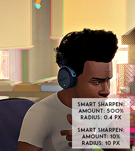
I. SHARPENING
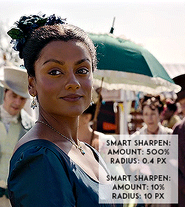
My standard sharpening settings are:
One Smart Sharpen filter set to Amount: 500 | Radius: 0,4
A second Smart Sharpen filter set to Amount: 10 | Radius: 10
One Gaussian Blur filter set to Radius: 1,0 and Opacity: 30%
One Add Noise filter set to Amount 0,5 | Distribution: Gaussian
II. BASIC COLOURING
This is the part where I add most of the adjustment layers available and just play around with them. Obviously different settings work for different scenes, but I do have some standard ones.
Brightness/Contrast
I usually up the Brightness to +10-30, and the Contrast to about +10.
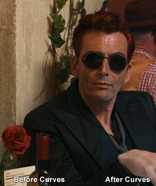
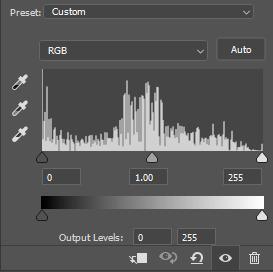
Curves
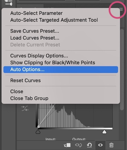
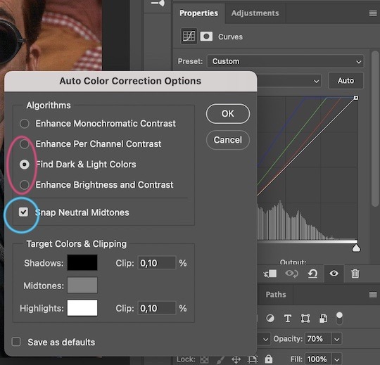
For the first Curves layer I go to Auto Options > Enhance Brightness and Contrast, and then adjust the opacity until I’m happy.
I might repeat the above step if the gif still looks too dark to me.
I add another Curves layer, I go to Auto Options and this time I pick either Find Dark & Light Colors or Enhance Per Channel Contrast, and check or uncheck the Snap Neutral Midtones option, until I see something I like. I will then adjust the opacity.
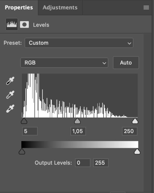
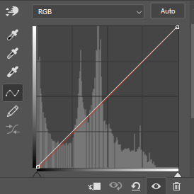
Levels
I add a Levels layer that usually looks something like this:
Exposure
I add an Exposure layer, where I usually set the Offset to around -0,0010.
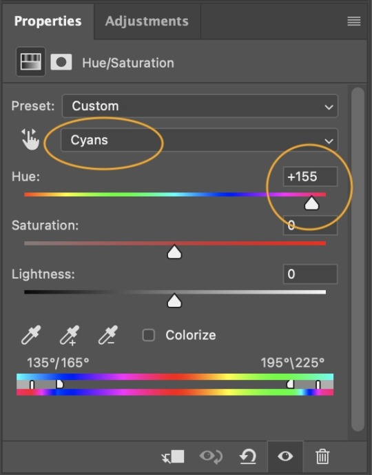
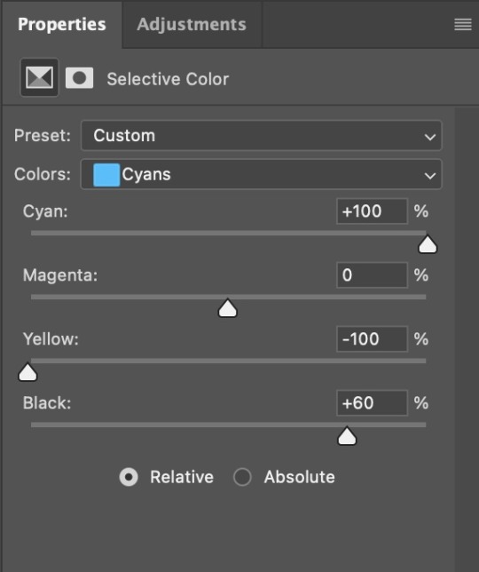
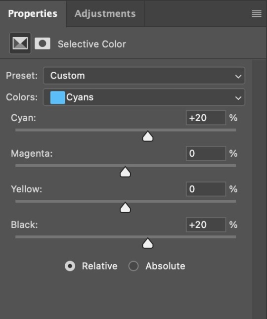
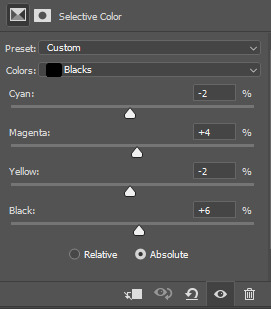
Selective Color
To make the faces look okay, I create a Selective Color layer, select the Reds and usually add some Cyan (+10-20%) and play around a little (±5%) with Magenta and Yellow too. I might also add another layer, select the Yellows and make slight tweaks there too.
III. FUN COLOURING
About colour manipulation: PiXimperfect just uploaded a tutorial that explains everything so much better than I ever could, so I highly recommend you go watch it. It’s made for static images though, and things are more complicated with moving images, so I also recommend @elizascarlets’s tutorial.
The reason I usually go for a softer colouring is that a more vivid one requires a lot of patience and precision, and I honestly can’t be bothered. Instead, I try to tweak the colous only a little, so that the edges can be a little rough without it looking too wrong.
One thing to remember is that each gif is different, and there isn’t one foolproof way to do this, so you will need to use a different technique depending on the gif you’re working with.
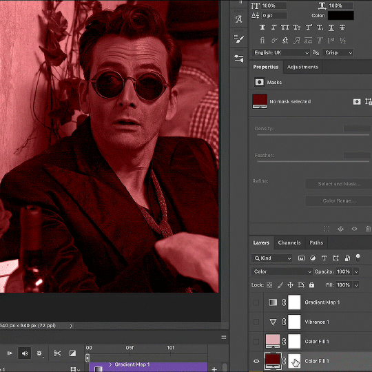
Okay, so, after I’ve decided what colour I want my background to be:
1. I create a Hue/Saturation layer and change the greens, cyans, blues and magentas to that colour. That’s easy enough, since it doesn’t mess with the face colour. I then set the blending mode to Color. If your background doesn’t include any yellow or red, you might be done here, like in the case bellow:
2. To change the yellows and reds, I create a new Hue/Saturation layer, select the yellows/reds, move Saturation to 100 (temporarily) and then play around with the sliders until the face colour isn’t affected. I then change it to whatever I’ve chosen and change the blending mode to Color.
3. If for whatever reason step 3 doesn’t work (the background is white or black for example, or just too red), I might create a Solid Color layer set to whatever colour I want, set the blending mode to Color and then select the layer mask and carefully paint with a soft, black brush over the people’s faces/bodies. I will then lower the Opacity, to whatever looks smooth enough. If there’s a lot of movement in your gif, you might have to use keyframes (see elizascarlets’s tutorial linked above). However, my main goal is to avoid using those; that’s why I try my hardest to tweak around as many Hue/Saturation layers as needed and not have to create a solid color layer.
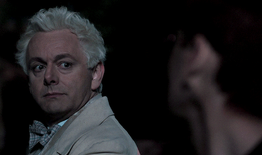
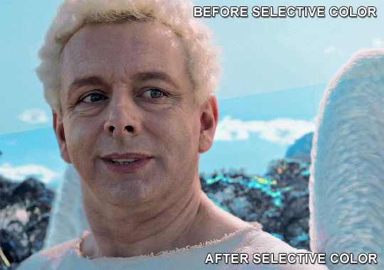
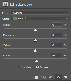
4. Once my background looks the colour I want it, I might add a Selective Color layer that matches my background color and then try to make it look more vibrant. For this Aziraphale gif below for example, I’ve selected the Cyans and then set Cyan to +100%, Yellow to -100% and Black to +60, then created another one, selected the Cyans again and then set Cyan to +20 and Black to +20.
5. If the gif has a white area, I create a Solid Color layer with a colour that matches the rest of the background and then set the Opacity low. I might also create a Selective Color layer, increase the Black and then play around with the colours.
IV. FINISHING TOUCHES
I create a Vibrance layer and set the Vibrance to around +30 and the Saturation to about +5.
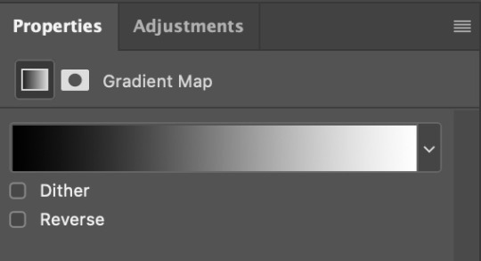
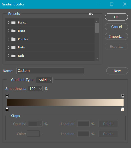
I create a black and white Gradient Map layer (with black on the left end of the spectrum and white on the right), set the blending to Luminosity and the Opacity to about 20-30%.
AAAND that’s about it I think! This ended up way too long and perhaps a little incoherent. I tried to make it as general as possible, so you might have to mix and match for best results. Feel free to ask me for further explanations about any one of these steps, and please tell me if you want me to go through the colouring of a specific gifset (although, as I said, I'm by no means an expert). Happy gifmaking!
#gif tutorial#allresources#completeresources#dailyresources#photoshop tutorial#chaoticresources#uservivaldi#userdanahscott#usersanshou#userfanni#userbuckleys#userrobin#tuserjen#userdavid#userzaynab#tusermimi#thingschanged#tuserju#usertj#userhallie#tutorial#minee
272 notes
·
View notes
Note
how do you sharpen your gifs???? they're insanely high quality!
Hello, Anon dearest, and thank you so much! ✨ To answer your question properly, I would first have to know which gifset(s) of mine you're referring to because I've made a lot over the years and I often change my sharpening settings, too. It totally depends on what I'm working with at the moment, to be honest. 😅
But, as for the last few sets of mine (this, this, and this in particular), I used these settings:
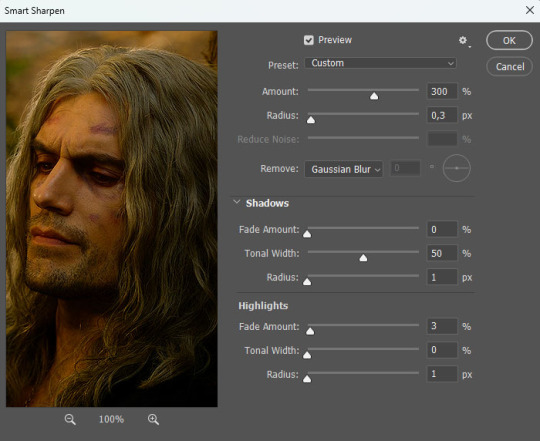
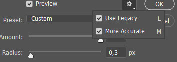
After converting my frames/layers into a smart object, I applied the settings above. Remember to click on the gear icon in the upper right corner and check both 'Use Legacy' and 'More Accurate' as well. This will make your sharpening look more 'natural' and less cakey imo.
Below is a comparison of before and after:
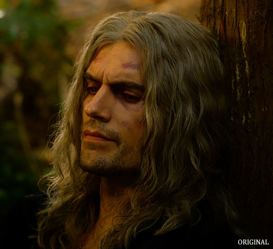
Note: This Geralt screenshot was taken from a 4K (2160p) video. Most videos I work with are at least 1080p or 720p because quality matters.

And here's the final result: colored, brightened, and sharpened.
—
I hope this answers your question. If not, feel free to send me more questions about this kind of stuff. I'm always happy to help out :)
#replies#anon#photoshop#tutorial#resources#ps help#sharpening#gifs#giffing#completeresources#allresources#chaoticresources#my gifs#my tutorials
163 notes
·
View notes
Text
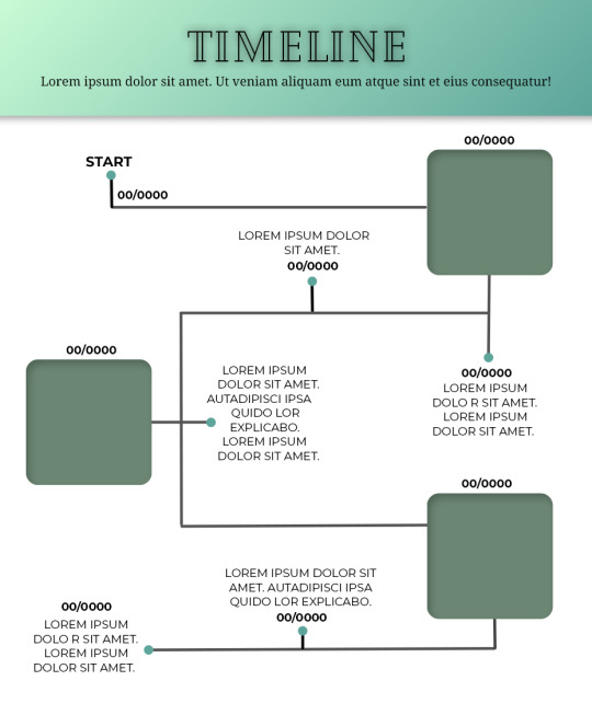
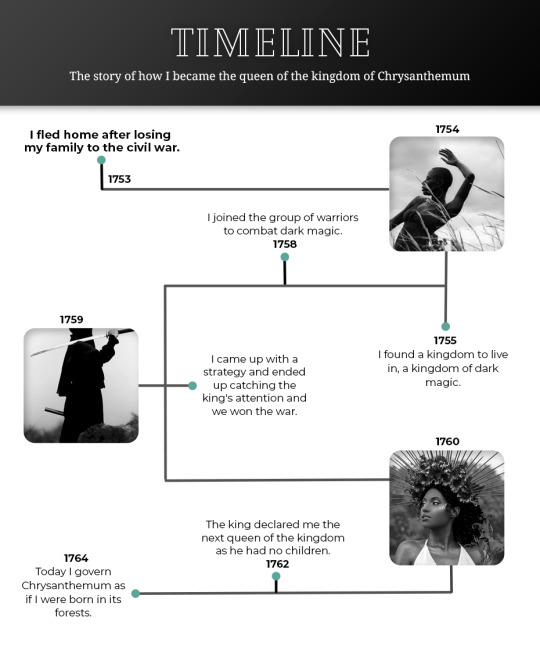
Template #008 by dailyresources
— Timeline Template
Please do not repost / redistribute or claim as your own.
Please, like or reblog if you download.
You may edit as much as you like, it is fully customizable.
This is a free template. PSD File.
Credit is very much appreciated.
Photos by pexels.
Any issues, don’t hesitate to contact me!
Fonts: Cheque, Noto Serif and Montserrat.
Enjoy ❤
Download Link: [mediafire] or [payhip]
Support me on [ko-fi]
#templates#timeline template#timeline#free template#psd template#free resources#graphic template#photoshop template#photoshop resources#evansyhelp#dearindies#chaoticresources#allresources#hisources#yeahps#my creations#*mine#*
210 notes
·
View notes
Text


handwriting font for digital note taking and/or journaling
you can get them @ my ko-fi shop
personal use only
#font#fonts#journaling#journalblr#study#studying#studyblr#resources#yeahps#chaoticresources#journal#handwriting font#mine#mine: fonts
217 notes
·
View notes
Text
gif tutorial
i was asked to make a tutorial for this set i made, so let's get right into it!
first things first, i downloaded the music videos from youtube in 1080p using 4k video downloader. unfortunately, the quality of youtube videos always seems... not great, to put it simply. plus these music videos are from the 90s, so they've been upscaled to 1080p after the fact. all of this works against us, but i've definitely worked with videos of lesser quality than these, so at least there's that!
when i gif, i import video frames to layers rather than screencapping. this comes down to personal preference. after everything has loaded, i group all my layers together and set the frame delay to 0.05. i then cropped my gif to 540x500.
the next step in my process is sharpening. i did play around with my settings a bit given the quality of the footage and the dimensions of the gif. i compared both @hellboys low-quality video gif tutorial to my regular sharpening action and my vivid sharpening action and in this case, i preferred my normal vivid sharpening action. i used this tutorial to create the action for myself, and you can find other sharpening tutorials here. this action converts my frames to video timeline and applies sharpening.
once my gif is sharpened and i'm in timeline, i begin coloring. i wanted to simplify the amount of colors used in these gifs, again because of the video quality -- i knew it wasn't going to have the crispness i would normally like for my gifs. here are my coloring adjustment layers and their settings (not pictured: my first layer is a brightness/contrast layer set to screen) (explanation in alt text):

all of these layers and their settings will vary depending on your footage and its coloring (and obviously, feel free to make the gradient map whatever colors you like if you aren't going for this exact look).
pretty basic coloring, especially with just slapping a gradient map on top (my beloved), but at this point, i still didn't like the quality of the gif, so i added a couple textures/overlays.
i put the left one down first and set the blending mode to soft light and the opacity to 8%. depending on what look you're going for, you could increase or decrease the opacity or play around with different blending modes. i like using this texture with lower quality footage because even when it's sized up a bit, it adds some crispness and makes things feel more defined. for the second texture, i set it to overlay and 75% opacity. we love and respect film grain in this house.
now for the typography! sometimes i really enjoy typography and other times it's the bane of my existence for the sole reason of just how many fonts i have installed. anyway, here are the settings i used for this set:
make sure the color of your font is white and then set the blending mode to either difference or exclusion. i can almost never see a difference between the two, but for this set, i used exclusion. below are the blending options (double click on your text layer to bring up this menu or right click and select blending options).
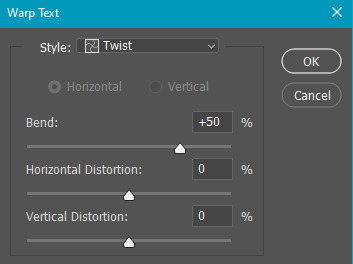
now we have to add the warp effect. with your text tool still selected, click this icon at the top of your screen:

from the dropdown menu, select twist. these were my settings, but feel free to play around with different warp options and their settings. the ones i use most often are flag, fish, and twist.
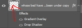
this last step is completely optional, but it's an effect i use in most of my sets with typography. duplicate your text layer (select the layer and ctrl+j), turn off the layer effects (click the eye icon next to effects), and set the blending mode to normal. right click on the layer and select rasterize type. right click on the layer icon itself and choose select pixels.
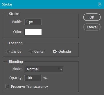
at this point, you should see the moving black and white dotted line showing that only your text is selected. then go to edit > stroke. here are the settings i almost exclusively use.
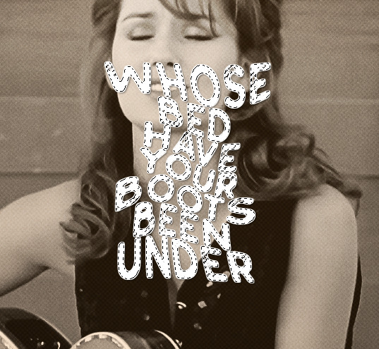
this is what your text should look like now:
using ctrl+T, move the layer off the canvas so you can't see any of the text anymore. you should be left with only your outline. click anywhere on your canvas to de-select the text we just moved. use ctrl+T again as well as your arrow keys to nudge the outline over to the left 2px and up 2px. this is personal preference as far as the positioning, but i almost never move it any other way. you can leave it like this, which i sometimes do, or you can set the blending mode to soft light like i did for a more subtle effect.
and that's it! rinse and repeat for each gif in your set or use a different warp effect on each gif to switch it up! if you have any questions about this tutorial or would like me to make one for anything else, please feel free to ask any time!
#gif tutorial#my tutorials#gifmakerresource#completeresources#dailyresources#chaoticresources#userdavid#coloring tutorial#typography tutorial#tutorial#photoshop tutorial
179 notes
·
View notes
Text
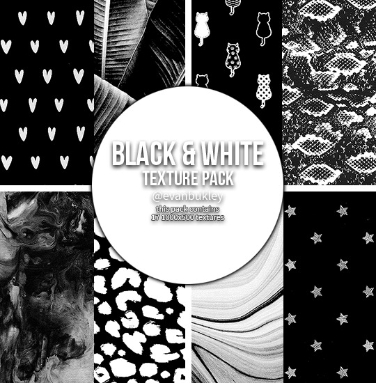
black & white textures
17 large textures // 1000x500
textures in the preview are all from the pack
please do not edit or claim as your own
credit is appreciated, but not required
download // deviant
if you download them please reblog/like!
hope you like them (⊃。•́‿•̀。)⊃
#textures#texture pack#resources#header textures#patterns#photoshop#texture#edit*#textures*#resources*#jddryder#tuserella#tuserandrea#userireland#usermiia#alielook#allresources#kmresources#chaoticresources#hisources
159 notes
·
View notes
Text
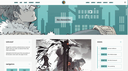
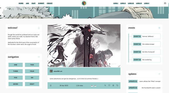
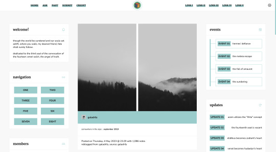
Theme #07: Clio by @pneuma-themes
Where you walk, my dearest friend, fate shall surely follow.
Live Preview (Temporary) / Static Preview: [Index] [Permalink] / Get the code: [pastebin] [github]
This is intended to be a fansite! I am finally happy with how this turned out after a few iterations. This theme features Emet-Selch from Final Fantasy XIV. Be warned going into the live preview as this theme heavily features content that can be found on various points of Shadowbringers and Endwalker, which may or may not be a spoiler!
Features:
Customizable post widths and font sizes. The live preview uses 650px post width and 13px font size. Enter the desired post width on the post width field and the desired font size on the font size field on the Customization page.
One accent color, 7 color options
Option for title alignment (centered/lefthand side/righthand side) to accommodate for the chosen header image.
Option to display or hide the blog title.
Built-in dual sidebar layout. All the boxes on the sidebar (members, events, updates, and site info) and the footer (disclaimer, about, and search box) can be edited from the code directly.
5 custom links at the topbar with additional 8 links on the navigation box.
Customizable photoset gutter. The live preview uses 10px gutter.
A header image. The size of the header (w x h) is the width of your screen x 350px. So if your screen width is 1900px, then the size of your header should be 1900 x 350px.
Notes:
This theme uses @eggdesign's NPF reverse-compatible template. Everything should be working as expected, except for some things noted below.
As we slowly transition into the new editor, posts made by the legacy editor will eventually break. This is particularly evident in a quote post reblogged via the new editor, in which the post will be rendered as a text post with blockquote and cannot be styled similarly to a legacy quote post. This is a Tumblr bug as far as I am concerned and from what other people have told me, so unfortunately there is nothing I can do about it.
I've written a short guide on how to set up this theme here. Everything else is annotated in the code, so do read through them before shooting me an ask!
Credits:
NPF reverse-compatible template: @eggdesign
Header: ユズリコ❂ (yuzuriko_red @ Twitter)
Icon font: Phosphor Icons
Icons (affiliates, members) and toggle tags on click: @alydae
Fonts: Nunito, Merriweather @ Google Fonts
customAudio.js: @annasthms
photoset.css with lightbox: @annasthms and @eggdesign
Search box, minified spotify player: @glenthemes
Toggle-able tumblr controls: @seyche
Shorten note count: @shythemes
Responsive video script: @nouvae
Please like and reblog if you like this theme or are using it!
#themehunter#allresources#chaoticresources#completeresources#*theme: clio#*mine: theme#*mine: all#still ugly crying over emet-selch and hythlodaeus and azem
642 notes
·
View notes
Photo


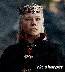
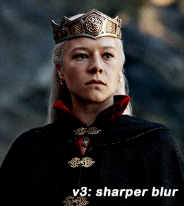
GIF SHARPENING ACTION 2.0 by @daenerys-stormborn
This is an updated version of my “all in one” gif action I made 5 years ago. It very similar but I added a new sharpening that I now use, v3: sharper blur.
‼️ UPDATED APRIL 2024 ‼️
I used a new sharpening now. I updated the action and it should be in the link. It’s under ‘sharper v2′.
Please read this for a more detailed breakdown of how these actions work and how I make my gifs.
v1: normal - smart sharpen (amount 500%, .3px)
v2: sharper - first smart sharpen (amount 500%, .3px) -> second smart sharpen (amount 10%, 10px)
v3: sharper blur - first smart sharpen (amount 500%, .3px) -> second smart sharpen (amount 20%, 10px) -> gaussian blur (radius 1px; opacity 52%) -> third smart sharpen (amount 500%, 0.2px) -> fourth smart object (amount 5%, 5 pixels) -> second gaussian blur (radius 1, opacity 10%)
sharper v2 (not shown on the gifset) - first smart sharpen (amount 150%, radius 0.4px) -> second sharpen (amount 10% radius 64px)
**v2 looks better in 540 gifs than smaller gifs, its a bit over sharpened here for my taste**
Actions also included:
Load Files Fast - for people using PS CS6 or older, uses “Load Multiple DICOM Files” for faster screencap loading.
Brighten - duplicates the smart object then changes blending mode to screen and converts it back into one single smart object to brighten dark scenes.
Convert to Frame Timeline - converts smart object back into frames, sets frame delay, and changes canvas sizes to -2px (width & height) to take away transparent border around gifs (you can always delete this part if it doesn’t apply, please read detailed breakdown for more info).
Convert to Video Timeline - converts frames in frame timeline into a smart object in video timeline.
DL: action
These actions were inspired by hoechlin's sharpening and trentcrimms' sharpening.
#itsphotoshop#allresources#completeresources#chaoticresources#resources#ps help#ps actions#mine#t*#r*
760 notes
·
View notes
Note
what is good sharpening vs oversharpening? im sorry if i have oversharpened anything i am to new to this
It's a great question! There are a lot of reasons that oversharpening is a problem and just one is that it causes intense colorwashing. Oversharpening introduces excess graininess that skews skin tones and accentuates stray highlights that can wash out a gif.
I want to preface this post with this: I am not here to shame anyone who is oversharpening.
The most important part of this answer is to bring awareness of why these basic steps of gifmaking are so important to the whole process.
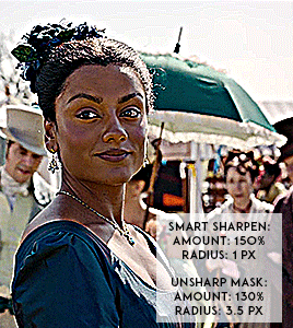
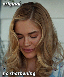
Each of these gif pairs are uncolored, unedited, and has the same save settings. The only difference is the sharpening settings that are listed on each gif. The left side has my usual sharpening filters, and the right side has the filters that usually lead to oversharpening.
(Kate Sharma, Bridgerton, 2022, 1080p footage live action)
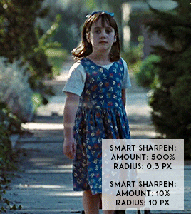
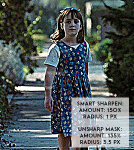
(Matilda, 1996, 1080p footage live action)

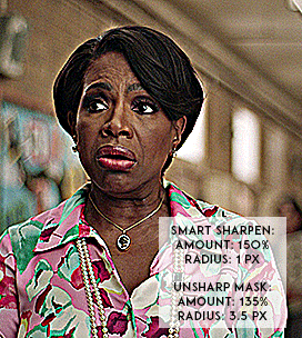
(Barbara Howard, Abbott Elementary, 2022, 1080p footage live action)

(Miles Morales, Into the Spider-verse, 2018, 1080p footage animated)
It's not a crime to oversharpen your gifs, but it does lead to the slippery slope of colorwashing (even for white people).
Look for the halo: If you look at the oversharpened gif of Barbara, you can see a yellow outline around her hair. That is an obvious indicator of going too far.
Use a layer mask to see what the colors were before sharpening: you can see in most of the oversharpened gifs above that there is a huge difference in the colors shown vs. in the less sharpened gif.
If you're working with older footage: don't try to overcorrect the graininess of the media. It's okay if some of it comes through!
Try to get the highest quality footage you can: I primarily work in 1080p files because my poor laptop starts to sound like a plane taking off when I try to screencap 4K files. If you're like me, look for larger file sizes. That will reduce the graininess of the gif.
Here are some links to different sharpening actions and guides:
daenerys-stormborn action
anyataylorjoy action
anya-chalotra sharpening guide
These are great to use if you are starting out in Photoshop! (psst if you need a hookup lmk) I know some people don't use PS, and for them, I put my sharpening settings on this post. I think both of the action sets I linked above have similar if not the same settings.
Also, one thing I noticed when making the gif pairs is that the less sharpened gif was always a smaller size. Fixing sharpening settings might help people who are trying their best to keep things under the 10mb limit.
I hope this answered your question, anon. If anyone has any questions or would like other resources, let me know!
#resources#allresources#completeresources#chaoticresources#gif help#ps help#photoshop#usernik#usermarsy#usershreyu#uservivaldi#useralison#userannalise#useryoshi#userk8#gif resources#tagged: ps help#nanda answers#userelio
487 notes
·
View notes
Note
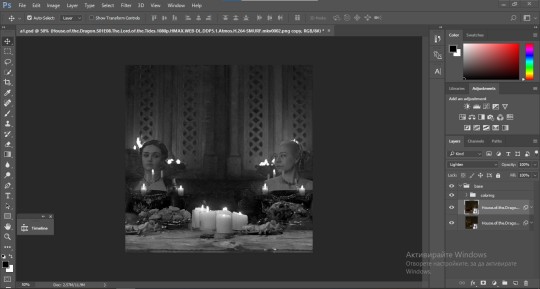
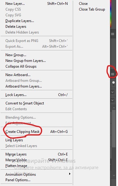
could you please do a tutorial of your game of thrones 'so much for stardust' gifs where it has the ripped paper textures? it's so pretty, and i'd like to learn how to do one with just the texture in the middle and two gifs on either side, like half and half and just having a rip in the middle. it's so cool how you did a gif in the middle though so i wanted to ask as well! all of them are so cool looking. you are extremely talented. if you don't want to though i understand :) thank you
TORN PAPER EFFECT + BLENDING TUTORIAL
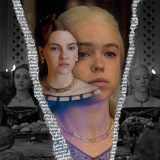
thank you so much for your sweet words, dearest anon and i'm sorry it took so long to answer but it's here now so i'll try my best to explain <3
disclamer: this is the first tutorial i ever made, it's very screenshot heavy and it assumes the basic knowledge of ps and gifmaking. if there's something you don't understand, don't hesitate to ask <3 so, let's get to it!
1. PREPARING THE BASE
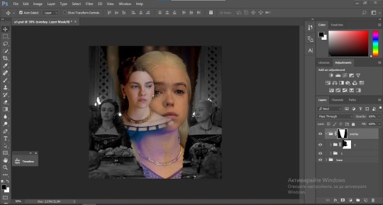
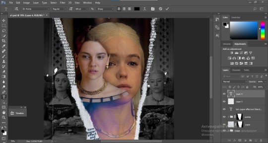
As you can see in this shot there's a lot of space between Rhaenyra and Alicent and that makes it perfect for the ripped paper overlay without hiding much of the base gif. So the first thing i did was to crop it like this:
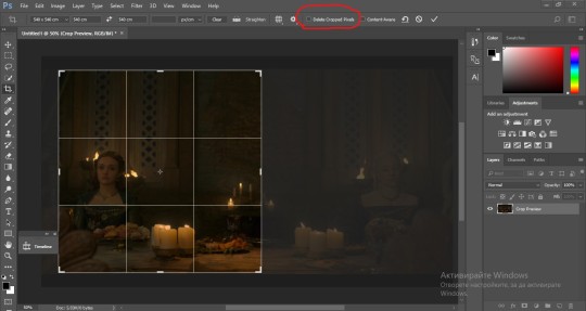
Also you want to make sure that the highlighted box (delete cropped pixels) is unchecked! After taking the usual steps for the animation (creating frames from layers, reversing the frames, setting frame delay) you continue with the video timeline and convert your frames into a smart object.
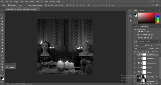
psa: if you don't have the motivation or the time to play around with coloring here are some psds i recommend: 1, 2; as for the sharpening i think this one is the best.
now that you have your smart object sharpened and colored what you want to do next is drag it to the end of the canvas and duplicate it. after that you move the copy on the other end like the original and make sure it's under the coloring layers, like this:
After that you have to create layer masks (the highlighted icon above) for both smart object and the copy and change the blending option of the copy to screen or lighten (whatever looks best!). So this is how it looks now:
pls ignore that there are no layer masks on the smart objects i just added them after changing the blending rip </3
Now, as you see both gifs are like fighting eachother for their rightful place on the canvas. (fgfgfdf) To fix that you have to use a soft round brush to delete the parts you don't want. (feel free to play around with the brush however you want to get the result you want!) Here's my result:
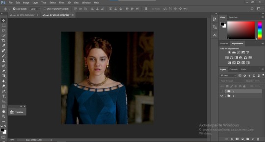
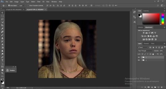
2. THE OVERLAY
Now for the both gifs you want to use for the ripped paper effect you pretty much apply the same steps as the ones you did with the gifs for the base. Here are the two gifs i chose:
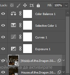
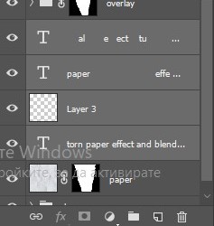
Before blending both gifs however you want to create a clipping mask for each of the smart objects coloring layers, like this:
And now you're ready to blend both gifs together! You choose the group with one of the gifs and change the blending again to screen or lighten and place the said group on top of the other. So this is how it looks now:
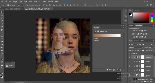
optional: if you feel like the base gif doesn't pop out enough you can always add a gradient map on one of both gifs and play around with the opacity and the color you think fits best.
Then you add a layer mask on the overlay gif group and again play around with the brush to delete what you don't want. So this is the final result:
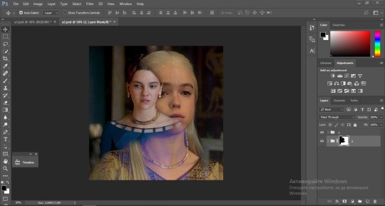
ps - don't repeat my mistake by placing the group with the layer mask under the other group. it should be on top and the blending option should be lighten or screen.
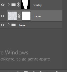
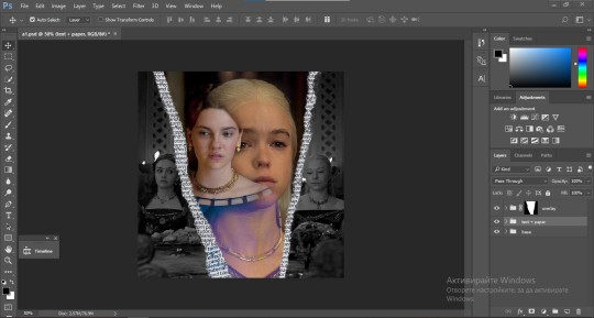
After blending both gifs together, you're ready to place them on the base. So first thing you want to do first is place both groups of each gif in one single group together. Then you duplicate the said group in the psd of the base gif and create a layer mask. This is how it should looks:
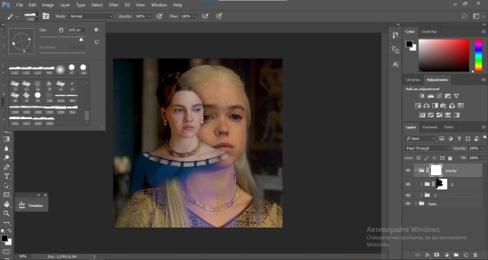
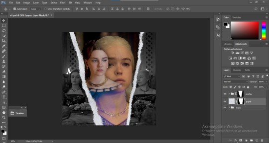
Now, in order to create the ripped paper effect, you'll have to download a ripped paper brush pack. This is the one i use. After loading the brushes in ps (if you don't know how here is explained) you're ready to begin! Change the size and angle however you'd like to make it look how you want. And if you want you can move the overlay gif by choosing both groups in case you aren't happy with the adjustment. This is how it looks like so far:
We're almost done! Now you have to find a paper texture, (i got mine from google) place it between both groups of your gifs and create a layer mask, like so:
What you have to do here is pretty much the same thing you did with the overlay gifs. Still, make sure there's enough space for the text you want to write in. However, if you think that the space isn't enough you can just delete a bit more of the overlay gifs. Here's mine:
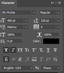
3. THE TEXT
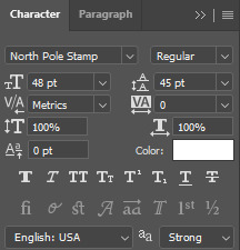
You're finally ready to type out the text you want! If you're having troubles with choosing the right font and size, here are my text settings:
You can always play around with the angle and if your text is too small, zoom in so you can place it just how you like it. And since i'm a bit lazy to deal with it later, i choose to add the highlight color while it's still zoomed. You just have to add an layer above the text and use a soft round brush with opacity from 70-75% and flow from 15-18%.
For the repeated text you want to make sure you create a big space for writing so it can contain the whole space of the torn paper. Also, write where the text will be seen only and use the tab button to skip the space where the gif is. This is how it looks:
Once you're done with writing the repeated text, you want to select all the character layers and the highlight layer and move them under the overlay gif and on top of the paper, like this:
With the layers still selected and in order to contain the text within the paper the last thing you want to do is create a clipping mask. And that's It. You're done! This is the final result:
#allresources#dailyresources#usergif#chaoticresources#gifmakerresource#hisources#onlyresources#alielook#usermaguire#userrobin#usernik#userpat#userbells#gif tutorial#ps help
100 notes
·
View notes
Photo

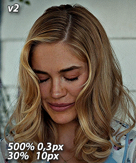
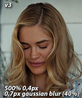
GIF SHARPENING ACTION PACK by @nina-zcnik
I’ve been getting a lot of questions lately about how I sharpen my gifs, so I decided to release an action pack of my 3 most used techniques. This pack only contains the sharpenings, so your gif should already be in timeline mode and converted into a smart object.
V1 - 500% amount 0,3 pixels & 10% amount 10 pixels
/works best on lower quality footage (e.g trailers) and scenes with bad lighting
V2 - 500% amount 0,3 pixels & 30% amount 10 pixels
/works best with high quality footage (1080p and above)
V3 - 500% amount 0,4 pixels & gaussian blur 0,7 pixels opacity on 40%
/works best for grapic gifsets, creates a smooth finish even with a lot of coloring layers
Don’t hesitate to reach out if you have any questions! If you download it, please reblog it as well so it can reach more people <3
[download] - [support me?]
#allresources#chaoticresources#resources#ps resources#completeresources#ps actions#userpjo#tuserrex#userautie#userhallie#myactions
970 notes
·
View notes
Last Seen Blogs
moonlezn
izzy
whywersingle
see this is why we're single
i3mp3
Johnny Appleseed™
i3mp3
Johnny Appleseed™
debeauvoirphotography
De Beauvior Photography