ruija
Ruija Dreampool
Ruija | He/him | Nearing 30s Lover of Vaporwave, Cartoons and Fashion.
496 posts
Don't wanna be here? Send us removal request.
Last Seen Blogs
khotrkuy
โคตรกุย

kingcrowncity
King Crown City

artistfingers
ᕦ(ò_ó)ᕤ

aamir-rather
Amir Rather
gaybigay
Content to Fill Your Sorrows
Note
List 5 things that make you happy, then put this in the askbox for the last 10 people who reblogged something from you! get to know your mutuals and followers ♥
Why, hello💙
1. I am forever glad that I finally got Cintiq pro about a year ago. It has made drawing so much easier and enjoyable for me, after several years of struggling.
2. I feel like lately I've been managing my executive dysfunction better. It mostly boils down to me trying to just follow my brain waves and do the things it wants to do, in the order it wants to do it. I feel like I get a lot more things done that way, compared to when I get stuck when trying to force my uncooperative brain.
3. I'm hopeful that maybe, MAYBE, I'm heading toward getting a stronger foothold in the animation industry. I'm currently working short-term on a mini-series with the same studio that hired me for the Batman movie. I hope they'll consider me for future projects too.
4. I'm really happy I managed to complete the Firefight animatic! During the Cass´s Apocalyptic Series -era people were making so many banger animatics. It was very inspiring and made me wistful, that it'd be nice if I had enough patience and energy to make something myself. And now I have!
5. The days are getting longer and warmer. The sun is shining really pleasantly today and I went for a morning run💙
6 notes
·
View notes
Text
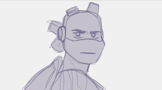
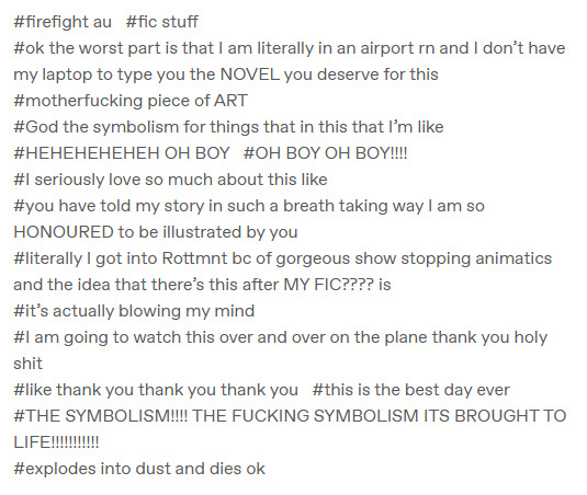
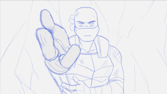
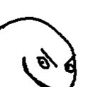
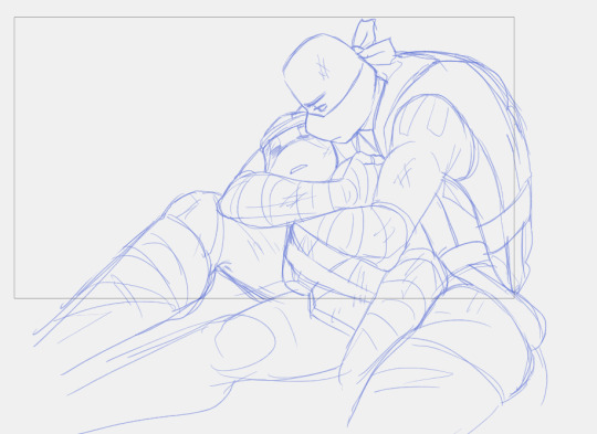
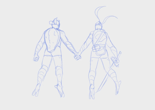
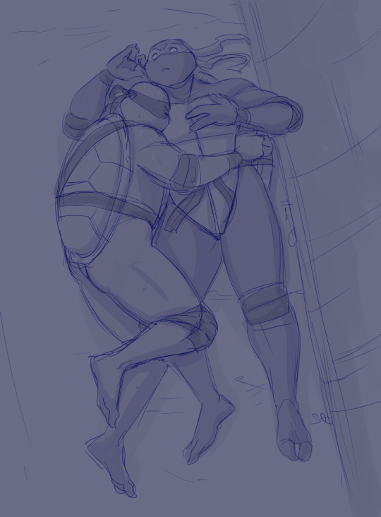
Some of my personal favorite parts and drawings from the Firefight animatic based on @remedyturtles's fic.
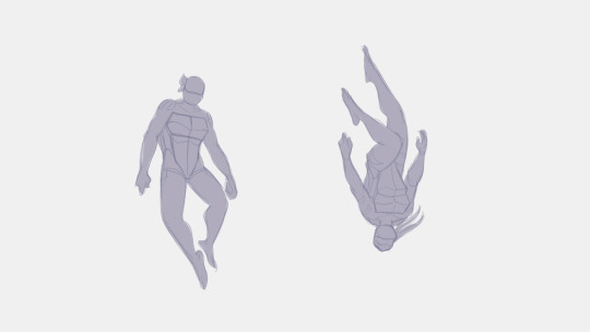
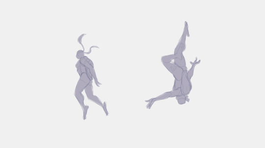
I really like the 'characters rotating anime opening'. And I love the symbolism of the twins starting with reaching for each other, only for Leo to limply keep spinning past and drifting away. Would love to have it animated slow and smooth.

This scene is one of my favorite scenes. I'm very happy how the cuts match the music and especially the last drop to shocked Leo.

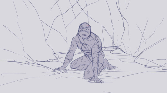
I like his face, very handsome. I'm not as established with how I draw the rise turtles compared to 2k3 boys, so it was fascinating to see how it'd morph over me drawing them like 100 times in a short period of time. They definitely got more elongated facial shapes and Don a sturdier body build compared to canon (I wanted to emphasize him being a bit blockier compared to Leo).
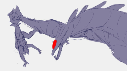
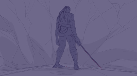
Reeeeally like Don's pose in this and the overall composition and movement of the shot. Very dynamic and dramatic.
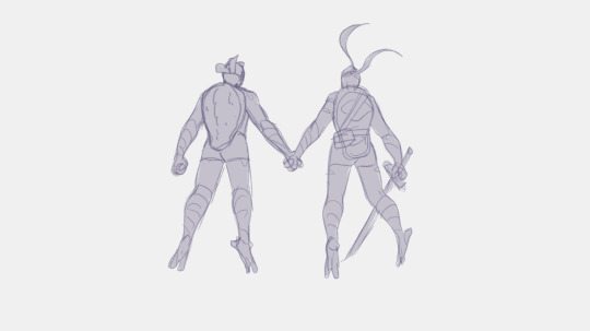
Aaand the money shot #2 All the previews I shared while I was working on the animatic, were ones that I'm very happy with. But this one is very special. I like that someone was able to guess Firefight based only from it, haha.

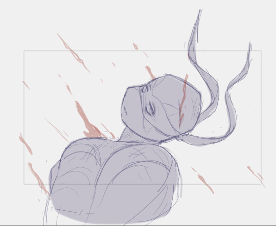
I'm a big fan of the visual trope of characters turning to gaze at each other meaningfully, conveying things without saying anything. So there's a lot of that in this animatic. I really wanted to get Donnie's expression right, his sorrow and determination, and I'm happy with the result.
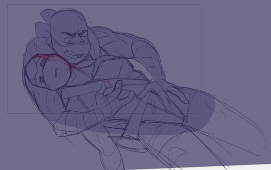
Back shots are fun. They can express a lot of emotion while concealing what the character is truly feeling. The drawing of Don grappling fallen Leo is one of my top favorites from the animatic, I just really like how it looks. Overall I like this whole scene a lot.
And of course, THE money shot #1. The culmination of it all.
I'm very proud of the animated bits too, but I made them their own post.
#tmnt#rottmnt#leonardo#donatello#leonardo tmnt#donatello tmnt#animatic#firefight#remedyturtles#the kraang#kraang prime
167 notes
·
View notes
Text


Made some gifs of the more animated parts in my Rottmnt animatic based on @remedyturtles 's fic Firefight so it's easier to appreciate them ehehehe. (Psst, you should go watch the whole animatic)
#tmnt#rottmnt#leonardo#donatello#the kraang#kraang prime#leonardo tmnt#donatello tmnt#animation#remedyturtles#firefight
1K notes
·
View notes
Text

Eehehehe~ I feel like your fic, alongside the song, provided me with a canvas to paint on. A lot of the visuals and sections came to my mind very naturally. While working on this, I didn't actually go back to read the fic for fact checks etc. except chapter 12 (aka the 'tell me you love me' -fight). For the most part, this animatic is based on the feeling of how I experienced the story when I read it for the first time.
I was very taken by the premise of a harrowing situation and the despair of trying to hold on to someone who wants to save you but not themself. I really wanted to convey that feeling and present it as a whole arching story (and so I did the full song like a madman haha). I
It's really fun to see everyone's reactions and which parts stood out to them, hehe <3
youtube
CONTENT WARNING FLASHING LIGHTS, blood, violence, disaster twins having a bad time.
So, about a month ago I picked up @remedyturtles 's fic Firefight and binge read it late into the night. The next day while listening to my playlist, I love you but I'm Lost by Tears for Fears came on and it just immediately clicked.
Despite feeling inspired, I felt very daunted by the idea of making a whole animatic. Nevertheless, I decided to try how far I'd get, and soon I just became very determined to make a cool thing I could show to people. It served as a great practice for animation stuff too.
Thank you for writing beautiful stories, Rem. I hope you and your readers enjoy my rendition ✨
#Maybe I'll share some details/ behind the scenes / still frames etc later#A lot of thought and art went into it and it would be fun to highlight and gush about it haha#ruija replies#remedyturtles
501 notes
·
View notes
Text
youtube
CONTENT WARNING FLASHING LIGHTS, blood, violence, disaster twins having a bad time.
So, about a month ago I picked up @remedyturtles 's fic Firefight and binge read it late into the night. The next day while listening to my playlist, I love you but I'm Lost by Tears for Fears came on and it just immediately clicked.
Despite feeling inspired, I felt very daunted by the idea of making a whole animatic. Nevertheless, I decided to try how far I'd get, and soon I just became very determined to make a cool thing I could show to people. It served as a great practice for animation stuff too.
Thank you for writing beautiful stories, Rem. I hope you and your readers enjoy my rendition ✨
#rottmnt#tmnt#leonardo#donatello#animatic#animation#firefight#remedyturtles#flashing lights#blood#violence#kraang#rottmnt movie#fan animatic#Youtube
501 notes
·
View notes
Text
Was too busy to work on the animatic for a couple weeks (so tragic when you actually have to work during work, instead of drawing fanart 😔) But now I'm back at it again 🔥🔥
Yall are gonna lose your minds when I finish this animatic I'm working on. It's based on a rottmnt fic, a lot of you probably know.
744 notes
·
View notes
Text
Here, for today's peek you can have something, that's not at all concerning.
Yall are gonna lose your minds when I finish this animatic I'm working on. It's based on a rottmnt fic, a lot of you probably know.
744 notes
·
View notes
Text
He he he he he he
Yall are gonna lose your minds when I finish this animatic I'm working on. It's based on a rottmnt fic, a lot of you probably know.
#I've been waiting in bemused silence whether these would find their way to the author without me pushing it#very satisfying reaction ehehehe
744 notes
·
View notes
Text

Bringing you some wip sneaks again
Yall are gonna lose your minds when I finish this animatic I'm working on. It's based on a rottmnt fic, a lot of you probably know.
#tmnt#rottmnt#wip#leonardo#donatello#this thing is enormous but at least I am making consistent progress ehehe
744 notes
·
View notes
Text
Another sneek, because why not
Yall are gonna lose your minds when I finish this animatic I'm working on. It's based on a rottmnt fic, a lot of you probably know.
744 notes
·
View notes
Text
sneak peek, because I like this shot a lot.
Yall are gonna lose your minds when I finish this animatic I'm working on. It's based on a rottmnt fic, a lot of you probably know.
744 notes
·
View notes
Text
Yall are gonna lose your minds when I finish this animatic I'm working on. It's based on a rottmnt fic, a lot of you probably know.
#making myself accountable that I'll actually finish it#been riding on hyperfixation for the past week#in a surprising twist of events the fic is not written by dear ol plothooksinc
744 notes
·
View notes
Note
Yeah, I love the feral little turtles! 😄
I love your art
Thank you! I've enjoyed a lot of your fics!
17 notes
·
View notes
Note
I love your art
Thank you! I've enjoyed a lot of your fics!
17 notes
·
View notes
Text
Coloring Tutorial Part 2
Part 1
As promised, here's the 2nd part of my color ramblings. This time I'll go a bit into how I pick colors for cohesive and atmospheric looks in my illustrations.
Usually, when working on a piece, I'll think about what kind of mood I'm going for and then choose one color as a base.
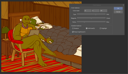
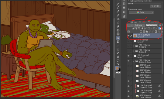
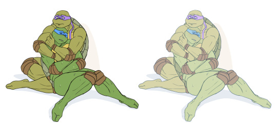
Let's use this pic as an example:
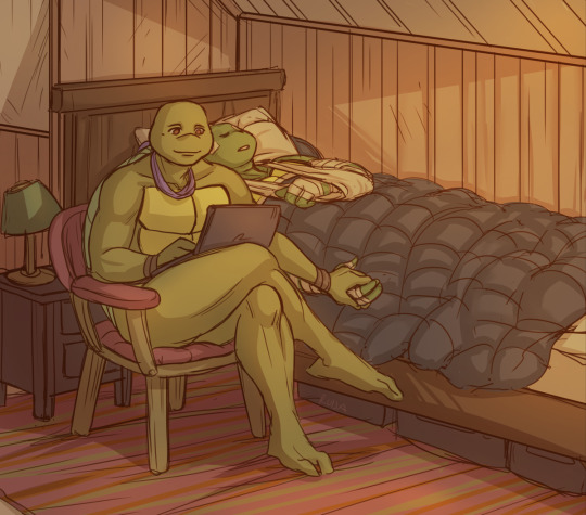
I wanted something warm and cozy, and the feel of an old house. For the base color, I chose brown.
The funny thing about colors is, that they can look veeeery different depending on which shades you put next to each other. For example, you can make a shade that's not actually red, look like it's red by putting greenish tones around it.
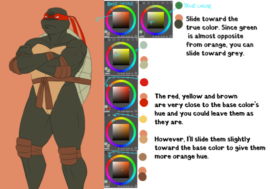
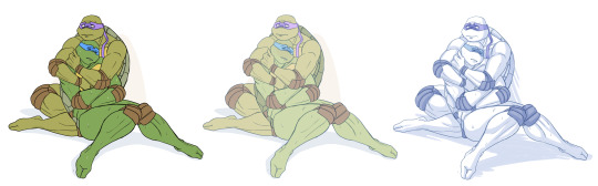
Let's look at the shades I picked for this piece. When you look at the color spectrum, you can see that all the colors can be found somewhere within the range of red and yellow. Don and Leo look like their normal shades of green, even though there's not any real green in this picture.
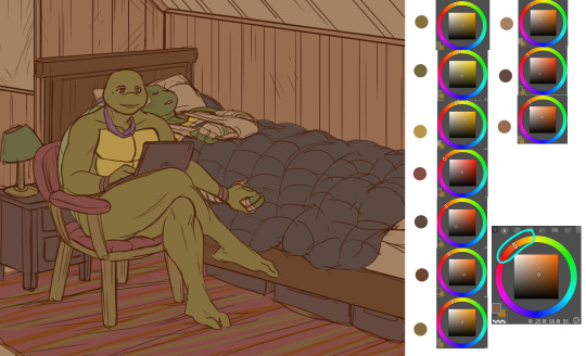
For comparison, I colored this picture as if it was in a neutral light and all the objects showed up in their true colors.
Looks rather jarring, doesn't it? The colors are picked from all around the spectrum and there's no consideration of whether they match or complement each other.
When you pick colors from a more condensed 'area' within the hue spectrum, it's easier to harmonize them. Also, in general, it's wise to stick to a limited palette. It doesn't have to be in the same hue range either. You could pick something like blue and orange as your base colors and then use shades that are close to those two.
Another trick is to repeat your chosen colors in different areas, instead of picking a new tone for everything. This will make the overall look more cohesive. And if you want something to stand out, pick a more unique color for it. (This same rule can apply to character design too.)
A demonstration of how almost all the colors appear in several spots within the picture. Note, how most of the BG is non-obtrusive browns and reds, while Don and Leo become a focal point with their greens and the blue duvet.
So, how do I actually pick out these colors? I'll show you.
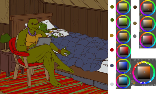
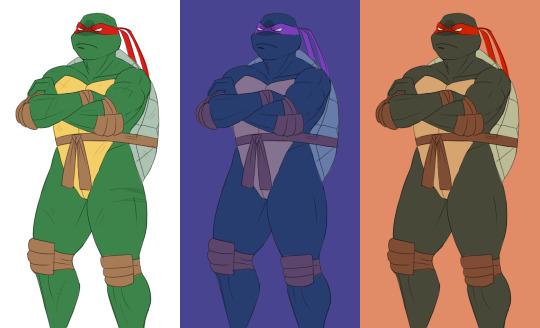
Here's Raph in neutral light aka in his true colors. And two different versions where I've used indigo and orange as the base colors.
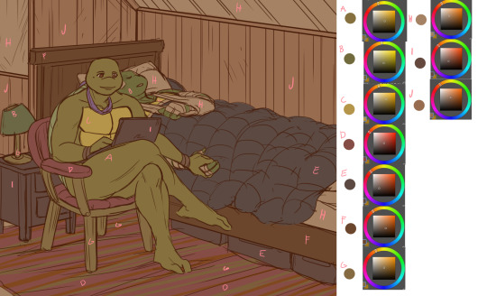
Now, I'm not sure how comprehensible this is, but I tried to explain my method with this visual guide.
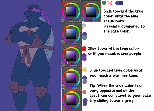
Basically, I'll try to remain close to the base color in the hue range and then fiddle around with how the different shades look together. It does take some practice and using various color adjustments or blending layers is very helpful if picking the colors manually is too hard!
I hope someone got something useful out of this, thanks for reading and sending the ask!
104 notes
·
View notes
Note
Well I really love your art, may I ask how do u color? I struggle with coloring turtles and I wasn't to know how do u do that?
Hi anon! That's a very broad question, so you've given me a great excuse to ramble anything I want about my coloring, eehehehee~!
This will be in two parts and I'll start with talking about my simpler coloring style.
As in, when I color characters on a white background, with a limited or light palette.
The driving force behind this style is me being lazy. My time, energy, and attention span are pretty limited, so if I want to finish anything, I gotta do it fast. And with fanart, I'm usually just doing it for fun and relaxation, so there's no need to push myself to polish it too much.
Despite that, I rarely post just black and white sketches or line arts. I always try to add at least a little bit of toning or shading, because that makes the image easier to read. The characters and their shapes pop out and catch the eye of the viewer better.
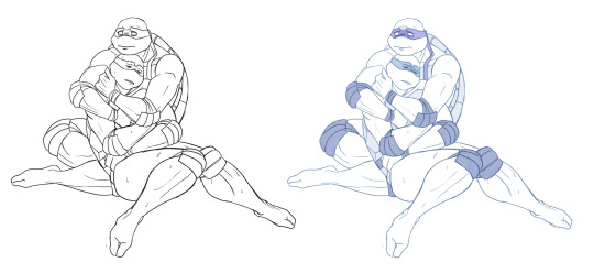
However, in this particular example, just the couple toning colors don't quite do the job. The way Don and Leo are entangled makes the center area of this illustration very busy and hard to read.
As a comparison; this pic has only one tone + mask colors, and it works. This is because all the characters are standing separately and their poses are very stationary and simple.
So for the Don + Leo pic, adding some shadows helps in bringing out shapes and depths. Also in general, if you don't feel like drawing BGs, it's good to at least add a shadow below the characters. It grounds them and makes them feel like they exist within a space.
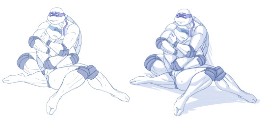
Sometimes if the posing looks too complex and busy, it might just be best to color in the characters fully.
However, even if I do full flat colors, I tend to use a lighter palette. Putting characters in their neutral/default color on a white BG can look a bit jarring as if they're floating in a void. It feels less immersive and like the picture is unfinished.
Using lighter colors makes the image more cohesive, and fits the characters into the white environment a bit more naturally.
If I'm too lazy to draw a BG, I prefer using stylized and limited colors. It feels deliberate and that the whiteness is just part of the palette, whereas the character-accurate colors on white don't match as well, even if they're more pastel.
That being said, there's nothing wrong with just slapping the flat-colored characters on a white background. As you know, I do it too. I'm just exposing my 'fancy coloring style' for what it is; me being lazy, hah!
Limited and monochromatic palettes are a nice shortcut even when you do actual backgrounds. It's faster and you don't have to worry about clashing colors. And you can still convey atmosphere and mood.
Also, on the topic of conserving your time and efforts; I think it's very common among younger/less experienced artists to think that the amount of time you spend on your art piece = how good and well received that piece will be.
Which has some merit to it of course, but it can lead to putting too much effort into areas where it's not necessary. E.g. filling the piece with tons of details and clutter that don't serve an actual purpose, but rather make the image hard to read. Or doing really complicated shading for a meme/comic, where simplicity would deliver the joke better.
So whenever I'm drawing something I intend to publish, whether it's a quick doodle or a more polished piece, I try to follow these two principles:
Make it easily readable and do the bare minimum that needs to be done to convey what I want to convey.
Putting time into practice is important, but if you draw for work, it's also crucial that you know how to prioritize and use your time efficiently!
Anyway, thanks for reading! In the next part I'll go into how I do my fully colored pieces, so stay tuned for that!
142 notes
·
View notes
Text
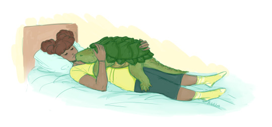
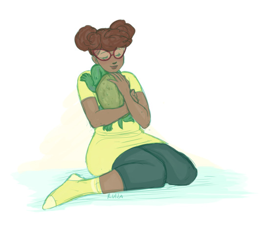
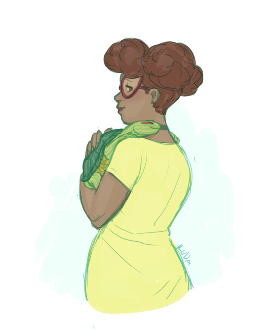
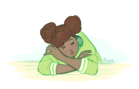
Cuddle and nap time for little turtles 💚💛💚
(Don't cuddle real turtles, ok. They'll bite your face off.)
#tmnt#rottmnt#april o'neil#leonardo#raphael#donatello#michelangelo#leonardo tmnt#donatello tmnt#raphael tmnt#michelanglo tmnt#demutated turtles
2K notes
·
View notes