#colouring tutorial
Text
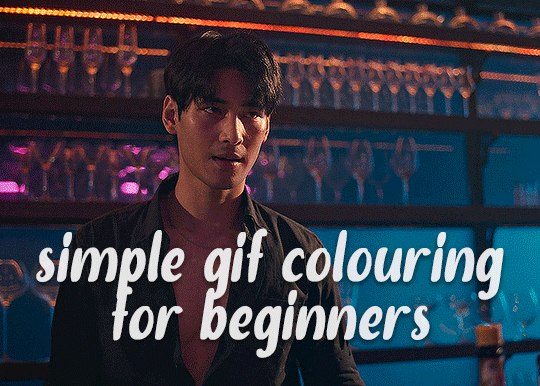
✨ Simple Gif Colouring for Beginners ✨
I wrote up my basic gif colouring process for a friend recently, but a couple of people here mentioned they'd also find it helpful! so, as requested, this is a beginner-friendly walkthrough of the way I colour my gifs :) it's aimed at brand new gif makers with no prior experience with photoshop or photo editing.
when I first started gif making I found colouring and photoshop in general suuuper daunting, so I've tried to simplify everything here as much as possible. hopefully this will be relatively easy to follow and not too intimidating!
a couple of things to begin with:
I'm only talking about colouring here - this is not a full gif making tutorial. I've linked to some of my favourites of those here!
I personally like to make bright, 'clean' looking gifs with vibrant but natural colours, so that is the style of colouring this tutorial is geared towards. most of gif colouring is subjective and about personal taste - the only thing that I'd say is possible to get wrong is skin tones, which I talk about a lot in this guide.
as I mostly gif Thai dramas, most of the advice is geared towards colouring for East Asian/South East Asian skin tones - but the techniques should be fairly universally applicable (and here are some tutorials that talk about gif colouring for other skin tones).
I'm not an expert! I'm not claiming this is the best or the only way to colour gifs - it's just how I do it.
this post is very image-heavy. if the images aren't loading (or the gifs are running slowly or cutting/looping weirdly), then try viewing the post in its own tab (rather than on the your dash or someone's blog) and refreshing the page.
okay, full walkthrough beneath the cut!
contents:
1. intro
a. natural gif colouring goals
b. very very basic colour theory
2. super simple colouring (the essentials)
a. curves
b. selective colour (and skin tone correction)
c. hue/saturation
d. saving and reusing colouring
e. another simple colouring example
3. other adjustment layers
a. brightness/contrast
b. levels
c. vibrance
d. colour balance
e. channel mixer
4. troubleshooting
a. curves
b. saturation
5. fin!
1. intro
the colouring part of gif making can be super overwhelming, especially if (like me when I first started!) you're completely new to photoshop and/or have no experience with colour theory or photo/video editing.
if you're opening photoshop and making gifs for the first time, I highly recommend getting used to making a few basic, uncoloured gifs to begin with. just to practice, rather than post anywhere (though you can always come back and colour them later if you want) - but it'll make the rest of the process much easier if you're already beginning to get used to working in timeline mode of photoshop. give yourself a bit of time to practice and get a feel for things like how many frames you tend to like in a gif, where you like to crop them for the best loop, what kind of aspect ratio you like etc* - so that you're not trying to navigate all of that for the first time on top of everything else!
* frames: for me between 60-90 frames is ideal, but 40-120 frames is the absolute min-max I'd personally use in a normal gifset
loops: for the smoothest loops, try to avoid cutting someone off mid-movement or mid-word if possible.
aspect ratio: for full-size (540px) gifs, I tend to go for either 8:5 (slightly 'skinnier' gifs), 7:5, or 5:4 (particularly big, thick gifs lmao)
✨ natural gif colouring goals
part of what can be so daunting about starting gif making is not knowing where to start or what you want to achieve. this is definitely something that gets easier with practice - the more gifs you make, the more you'll get a feel for what kind of look you like and the more instinctively you'll know how to get there. it also helps to see if any gif makers you like have made "before and after colouring" posts - these can help with getting a sense of the kinds of changes made through gif colouring. here's one I made!
in general, I like to make my gifs bright and 'clean' looking, with vibrant but natural colours. these are the things I'm usually hoping to achieve with colouring:
brighten dark scenes
remove muddy, yellowish lighting or filters
saturate colours
correct any skin lightening filters or overexposure
make lighting and colours as consistent as possible between gifs within a single gifset, especially gifsets featuring gifs from multiple scenes/episodes/videos
this guide is focusing on natural colouring, but of course there are many cool ways to make stylised/unnaturally coloured gifs. imo you'll need to master these basics first, but if you want to learn how to do things like change the background colour of gifs or use gradients or other cool effects, then @usergif's resource directory has loads of super helpful tutorials!
✨ very very basic colour theory
[disclaimer! I don't know shit about fuck. I do not study light or art. this is just an explanation that makes sense to me exclusively for the purposes of gif making.]
the primary colours for light/digital screens are red, blue, and green. having all three colours in equal measures neutralises them (represented by the white section in the middle of the diagram).
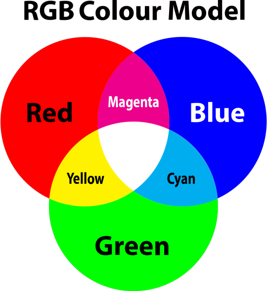
so to neutralise a colour within a gif, you need to add more of the colour(s) that are lacking.
in practice this usually means: the scene you want to gif is very yellow! yellow is made of red and green light, so to neutralise it you need to add more blue into your gif.
it can also mean the reverse: if you desaturate the yellow tones in a gif, it will look much more blue.
looking at the colour balance sliders on photoshop can make it easier to visualise:
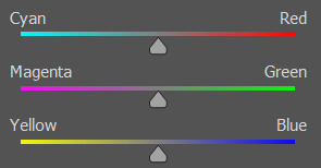
so making a gif more red also means making it less cyan.
removing green from a gif means adding magenta.
taking yellow out of a gif will make it more blue.
tl;dr:
neutralise yellows by adding blue (and vice versa)
neutralise reds by adding cyan (and vice versa)
neutralise green by adding magenta (and vice versa)
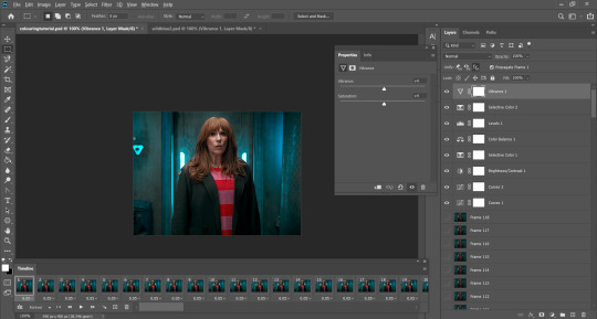
2. super simple colouring (the essentials)
starting with a nice sharpened gif in photoshop in timeline mode. (these are the sharpening settings I use!)
some scenes are much harder to colour than others - it helps to start out practising with scenes that are bright/well-lit and that don't have harsh unnaturally coloured lights/filters on. scenes with a lot of brown/orange also tend to be harder.
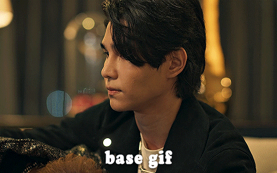
I usually save a base copy of my gif before I start colouring just in case I end up hating it, or find out later that it doesn't quite fit right into a set and need to redo it etc.
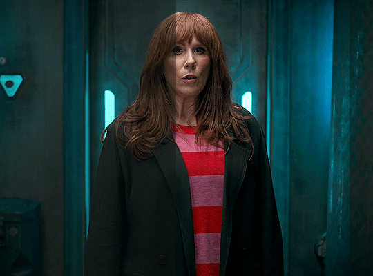
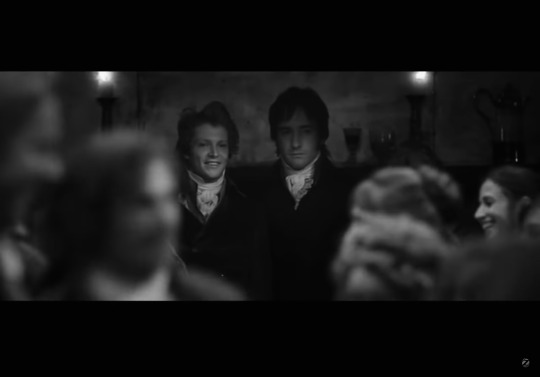
so here is my base gif!

it's an okay gif, but it has a bit of a yellow tint to it that I want to reduce.
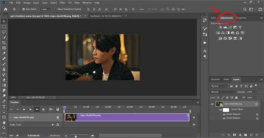
colouring is easiest to do in adjustment layers, which can be found under layer -> new adjustment layer - or for me they are here:
there are lots of different types of adjustment layers that do lots of different things - but for me the absolute essentials for colouring are curves, selective colour, and hue/saturation.
I also use brightness/contrast, levels, exposure, vibrance, colour balance, and channel mixer sometimes, depending on the gif - but I use curves, selective colour, and hue/saturation on every single gif.
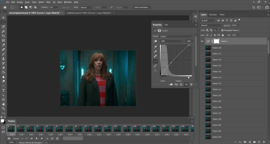
✨ curves layer
the first thing I always do is a curves layer. when you first open one it will look like this:
first I usually click the ‘auto’ button, just to see what happens. sometimes it makes a big difference (it usually brightens the gif a lot) - but on this gif it didn’t do much.
if it had made the gif look nicer then I would have kept it and added a second curves layer on top to do the rest of these steps.
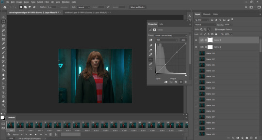
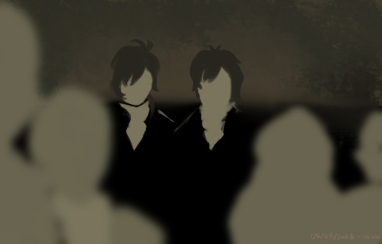
the next step is selecting the white and black points with the little eyedropper tools.
the bottom eyedropper lets you pick a white point for the gif. click somewhere super light on the gif to see what happens - for this gif, I clicked on the lampshade on the left. if it looks weird, I just undo it and try somewhere else - it usually takes a few goes to find something that looks good.
here's what that did to the gif:

then I pick the top eyedropper and use it to pick a black point by clicking somewhere really dark, again playing around until I find a black point that looks good.
here's what the gif looks like after picking the white and black points:

this can take some experimenting, but you can make super easy drastic changes to your gif just with this. in this case, the curves layer took out a lot of that yellowy tint.
and this is what the curves graph looks like now:
you can click and drag those lines to make further changes if you want - I usually leave them alone though. the colours of the lines indicate which colours have been changed in the gif - for example, you can see from that steep blue line on the graph that blue has been added to neutralise those yellows.
next I usually do another curves layer and just press the ‘auto’ button again to see what happens. usually it brightens the gif a bit more, which I like.
‼️if nothing is working: usually with a bit of fucking about a curves layer works well - but sometimes you can’t find a good white and black point anywhere, and instead your gif turns wacky colours and nothing looks good. this happens more often with very heavily colour tinted scenes :( the troubleshooting section at the end goes over some options, including starting with a levels layer instead.
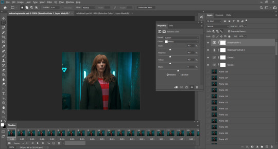
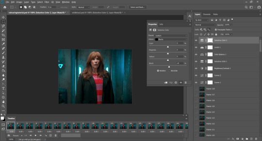
✨ selective colour (and skin tone correction)
skin tones are made up of a mixture of yellow and red.
removing yellow (or adding blue or red) to a gif will make the skin-tones too red - and removing red (or adding cyan or yellow) to a gif will make the skin-tones too yellow.
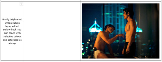
adding blue to this gif with the curves layer took out the yellowy tint, which I wanted - but it also took the yellows out of Kim's skin tone, which I don’t want. so I need to put yellow back into the skin tones specifically - without putting it back into the rest of the gif.
selective colour layers let you select an individual colour and adjust the levels of other colours within that colour. you can change how yellow the green shades are, or how much cyan is in the blues, for example.
I need to add yellow back into the red tones to correct the skin tones on this gif. this is the case for most gifs in my experience - the vast majority of the time, unless a scene is very heavily tinted in another colour, a curves layer will add blue/remove yellow.
in the 'colors' dropdown, select the 'reds' section and drag the 'yellow' slider higher - this will add more yellow into just the red shades within the gif.

the amount of yellow you need to add back into the reds depends on how much yellow was taken out of the gif initially - I just play around with the slider until it looks right. if you're not sure, it helps to have some neutrally-coloured (not white-washed!) reference photos of the people in your gif to compare to.
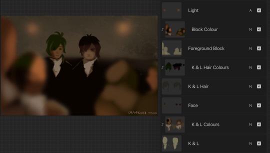
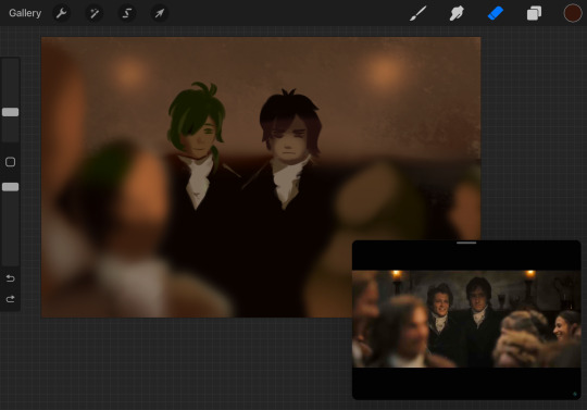
here's the result. Kim's skin is a lot less pink toned and much more natural looking:
✨ hue/saturation
this adjustment layer lets you adjust the hue and saturation of the gif as a whole, and also of each colour individually.
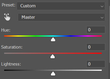
I don't use the hue or lightness sliders unless I'm trying to do something more complicated with the colouring.
clicking the dropdown menu that says 'master' lets you edit the saturation of each colour individually. this is useful if your gif is still super tinted in one colour.
I thought the yellows on this gif were still slightly too bright, so I switched to the yellow channel and desaturated them slightly. (remember if you do this then you need to go back to selective colour and add more yellow into the red skin tones to balance out the desaturation!)
then I increased the 'master' saturation of all the colours to +5:
I usually find the right amount of saturation is somewhere between +5 and +12, but it depends on the gif.
‼️if the gif feels undersaturated, but the saturation slider isn't helping/is making the colours worse, try a vibrance layer instead.
done!
✨ saving and reusing colouring
you can copy and paste adjustment layers between gifs to make your colouring even across each of your gifs for one scene - so if you're making a set of multiple gifs of the same scene, or you think you might want to gif the same scene again in the future, you can save it as a psd so you can reuse the colouring again later.
each gif's colouring will then still need tweaking - different cameras/angles/shots of the same scene can still start out with slightly different colouring.
I recommend uploading the gifs as a draft post on tumblr so you can see what they all look like next to each other and catch any inconsistencies.
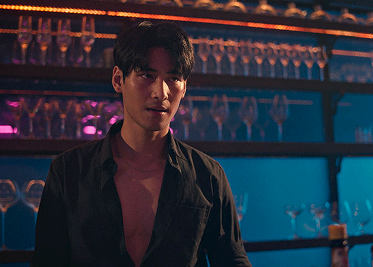
✨ another one! (speedrun!)
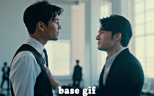
HI KEN!
the white point for the curves layer was in the window behind them.
the curves layer removes the muddy yellow tint, but again it makes their skin tones (especially Ken's) very red toned, which is adjusted by the selective colour layer.
3. other adjustment layers
imo many many gifs can be coloured really nicely with just those three adjustment layers, but some need different adjustments.
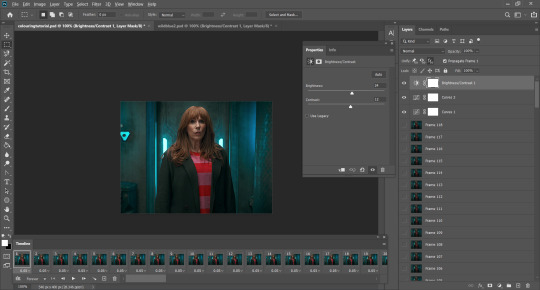
✨ brightness/contrast
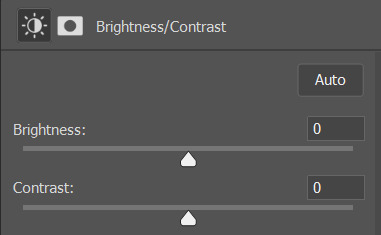
pretty self explanatory!
I personally usually avoid using the 'brightness' slider because I rarely like the effect - I only tend to use the 'contrast' one.
the 'auto' button is sometimes useful though, especially if you’re struggling with the curves layer.
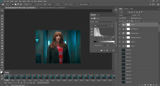
✨ levels

levels alters the white and black points of the gif, like curves - but unlike curves it doesn't also alter other colours.
use the sliders beneath the graph to alter how dark/light the gif is. you can slide the black slider further to the right to make the blacks darker, and the white slider to the left to make the whites lighter.
levels is a good place to start if your curves layer isn't working.
(I'm going to hit the image limit for this post lol so here are some screenshots of a table I made to demonstrate this rather than actual gifs. sorry!)
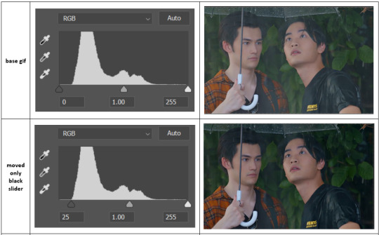

on both sides, I dragged the sliders up to where the big jumps are on the graph - this is usually a good place to start!
✨ vibrance
vibrance... makes the colours more vibrant. it's more subtle than saturation.
it's really helpful for gifs that feel grey. sometimes adjusting saturation just makes the greys kind of weirdly tinted, but a vibrance layer can fix that.
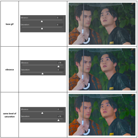
vibrance is much more subtle!
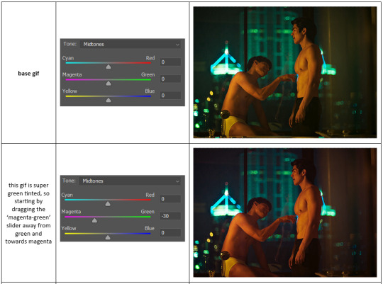
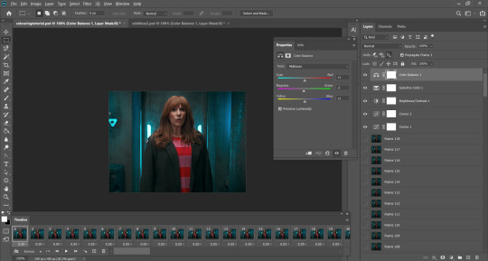
✨ colour balance
colour balance affects the overall balance of colours within a gif.
it's good for scenes with heavy tints.
I tend to stick to the 'midtones' dropdown, but you can also alter the colour balance within the shadows and highlights if you want.

✨ channel mixer
I avoided channel mixer for such a long time because it scared me. but it's great for scenes that are very heavily tinted in one colour.
basically, it works with the levels of red, green, and blue within a gif. you select an output colour and then play around with the levels of the colour you selected within each other colour.
kind of the reverse of selective colour?
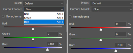
so in the 'blue' channel, the levels of blue are at 100%, and the levels of red and green are at 0% - but you can impact how much blue is in the reds and greens and blues.
this tutorial explains it well - but imo the best way to get to grips with channel mixer is just to play around with it a bit (sorry)
(when I made this guide for my friend, I also made a slightly more complicated gif colouring walk-through that included using channel mixer. there isn't space to include it within this post, but if anyone is interested I could always upload it as an 'intermediate' gif colouring tutorial - lmk!)
4. troubleshooting
‼️curves
usually with a bit of fucking about a curves layer works well - but sometimes you can’t find a good white and black point anywhere, and instead your gif turns wacky colours and nothing looks good. this happens more often with very heavily colour tinted scenes :(
for example, with this base gif:
using many of the brightest points as a white point turn it wacky colours, like this:

yikes :(
some options for these cases:
try brightening the gif first with the 'auto' button on the curves layer or with a levels layer. having a brighter gif to start with can give you better options for picking a white point.
try finding an alternate, whiter/brighter white point. look for places the light reflects - on this gif, using the light on Porsche's cheekbone works well as the white point. it also helps to find places that would be white if the scene wasn't tinted - the lightest part of a white shirt is often a good place to start, for example.
skip the curves layer, and instead use a levels layer to alter your white/black points, and colour balance or channel mixer to balance the colours.
‼️over/undersaturation
if your gif (especially the skintones) is looking a little washed out or lifeless, it might be undersaturated. boost that saturation - or if that's not working, try a vibrance layer.
oversaturation is often easiest to spot in the mouths and ears of any people in a gif. if the mouths are looking unnaturally, vibrantly red, then you've gone too far with the saturation.
5. fin!
and done! I hope this was coherent helpful to somebody.
if there's anything that I've missed or that doesn't make sense pls feel free to shoot me an ask or a message and I'll do my best to help! I've also collated a bunch of additional reading/resources below.
happy gifmaking 🥰
✨ some links!
photoshop basics by @selenapastel
gifmaking for beginners by @hayaosmiyazaki
gifmaking guide for beginners by @saw-x
dreamy's gif tutorial by @scoupsy-remade (includes instructions on how to blur out burned-on subtitles or annoying video graphics)
beginner's guide to channel mixer by @aubrey-plaza
how to fix orange-washed characters by aubrey-plaza
colour correcting and fixing dark scenes by @kylos
does resampling matter? by usergif
how to put multiple gifs on one canvas by @fictionalheroine
watermarking using actions by @wonwooridul
resource directory by @usergif
#i got a couple of asks about this so i figured i'd type it up as a post#it's been sitting in my drafts for a while now though i'm so sorry omg.#i had to replace my laptop and it took me a while to get round to downloading photoshop on the new one#but i hope this is helpful!!#gif making#tutorial#photoshop tutorial#colouring tutorial#coloring tutorial#gif colouring#gif coloring#photoshop resources#gif tutorial#gif resources#userbunn#uservik#darcey.txt#darcey.gif#usergif
322 notes
·
View notes
Note
I love your artstyle please teach me your ways


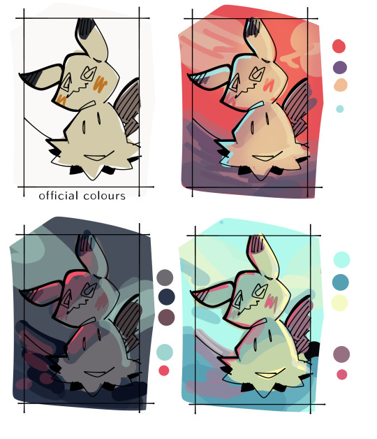
Omg thank you!! 💕 I’m happy you like my art style :3 here’s some colouring tips since I think that’s what stands out most about my style and artworks
Pinterest colour palette tiles
I’m not good at picking colours myself so I heavily rely on colour palettes found on Pinterest (they are just vibrant tiles lol) 🌈
Shading style
When I’m shading my artworks, I pick the colour between the two colours to create a gradient. I don’t use blur, blend, smudge, airbrushes or gradient tools ❌
There are some speedpaint videos on my YouTube and instagram if you wanna watch my art process. I might make a tutorial if more people are interested :]
19 notes
·
View notes
Text
i was asked if i could make a colouring tutorial so here's a quick look at how i created one of my recent gifs! (spoiler: i don't do anything particularly special)
start with a curves layer, either using the lighter preset or auto
2. another curves layer to add linear contrast
3. brightness/contrast - i usually go for between 12 and 24 brightness and typically 12 contrast, but it depends on the scene i'm using
4. this isn't too essential but i usually play around with whites using selective colour
5. colour balance - personally, i only ever use very small values here (between 1 and 4 on either side). all i'm trying to do is stop the scene from looking either too warm or too cool
6. add a levels layer to tweak the dark and bright parts of the image. i usually use similar values to the ones in this screenshot for most gifs
7. i add another selective colour layer to make the blacks even darker (only with values in single digits)
8. a quick vibrance layer to make the gif pop a little - again, only very small values
9. finally, just any small tweaks to finish off. in this case i just wanted to change the reds on donna slightly with selective colour

and that's about it! obviously it's not exactly the same for every gif, but these are the basic steps i always start off with. hope this helps!
#gif tutorial#colouring tutorial#it's actually easy enough because unlike most shows doctor who looks pretty good to begin with#having said that i realised i'm not that happy with the colouring for my last few sets 😔 oh well
34 notes
·
View notes
Text
How to tone down yellow tinted scenes
Hi, so first of all, sorry for the late reply. I'm going to try and explain what I did.
We are basically going to try and cancel out the yellow tint in this scene, I used very few adjustment layers for that and then i just did my usual colouring. Tutorial under the cut!

First thing I did was use Curves, you can try and do it manually but all I did was click Alt + Automatic on my curves panel and then selected Find Dark and Light colours, I then adjusted Shadows and Lights to my liking, you can play with the other settings see which one adjusts the best to the results you want. This will be different for every video/scene so don't try to make it look like mine, adjust as you go.


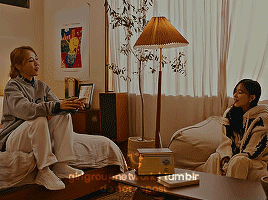
This is what we have after that, left is original gif and right is just after curves.
As you can see, it's still a little yellow but their skin tones look a little more human. Then I went and added a Photo Filter, Cooling filter 82 to be exact and set the opacity down to 30%
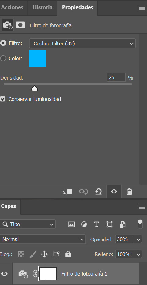

Next i added a gardient map, you can make your own or select one of the presets just remember to stay on the blue/cyan/pruple so you can cancel out the yellow. I then set it to soft light and opacitiy 20%, I wouldn't go over 50%. (left)

Because I thought this was a little too whitewashed, I then went and added a Colour Lookup, selected 3Strip, set it to Darken and lowered the opacity to 20-40%. (on the right)
This is my final gif after my regular colouring. It's masked so you can also see the original. I also did the same steps on another scene with darker lights overall and this was the result.


I hope this helps!
#colouring tutorial#gif tutorial#it's nowhere near perfect but i hope it helps even a little!#resources#kpopccc#by moonbyulys#completeresources#allresources#pshelp#photoshop help
111 notes
·
View notes
Text

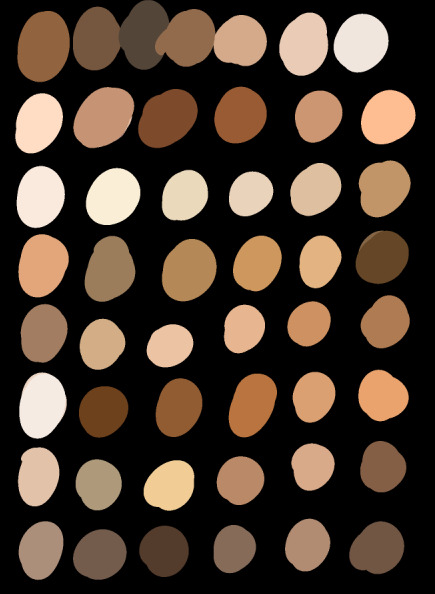
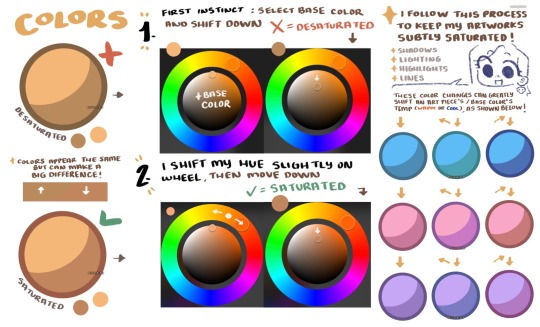
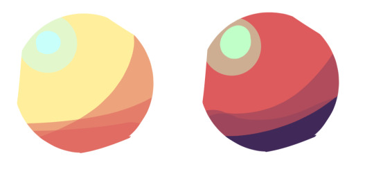
I see a lot of people getting mad at beginner artists for being inexperienced w drawing skin tones or not drawingg them at all and I get the fear some of them have so I went ahead and just laid out some skin tones varrying in saturation and how light or dark they are. Skintones are a wide infinite variety that our dna loves to messs around with so be reminded that there's no wrong way to depict a skintone and designing a character comes down to color theory and detail at the end of the day : ) a simple tip for less saturated tones I have is to keep the whole colour palette the same way else sometimes characters can look ashy with a super saturated hair and clothes but a less saturated skin tone. The same is true in the opposite way with saturated tones. Once again it all comes down to color theory or just basic knowledge of what colors/tones/hues do and dont clash together !
If I have the time soon I'll release some flesh orbs I like doodling for warmups that show what colors I use to shade what when i draw skin tones/colors in general
#skin tones#skin color#tutorial#resource#signed someone who is actually poc and wants to help people instead of yell at them.#art resource#art resources#art tutorial#coloring tutorial#colouring tutorial
94 notes
·
View notes
Text
Illustration processes are always so fun to look at ‘cause I never have the control to just do a rough on Procreate and stop at that (it’s also why I do sketches on GoodNotes now), yet I feel burnt out (?) by seriously rendering stuff even in greyscale…
It seems like a really useful thing to do a rough for composition, and then block in basic shapes, then background, then values/colour flats whichever order you prefer to go in, and then start painting to fine tune stuff & do effects (like how it goes in the one linked)
Typically I either run out of stamina after sketching or I sit and render the thing roughly on GoodNotes with colours. See, GoodNotes has no layer filters and has really limited brushes but it’s vector-based and you can change colours of strokes and it even has an erase highlighter only function, so I could easily test out different colour combinations or layer colours/values like it’s marker. That limit, I quite like, so I can focus more on composition and/or the character
Hahah but I think on Procreate (for paintings without imported sketch), at least for this one I blocked in rough shapes and values from the beginning along with the overall tone of the piece, and then I added more details and colours (pain. I get really nit picky when it comes to ambient lighting and colours especially for a study)

Look at this, man!! Look at it!!! Colouring/lighting is hell! Whole piece took me around 4 hours and probably half or more of those hours are on colours/lighting …GOD but it felt so good chasing for that breakthrough until everything finally looked right

Y’know what…this is actually not that bad, this alternate lighting. I just didn’t realize how the colours looked until I switched to a dark interface. Is this what Albedo means by touching up an old painting and enjoying it again? Oh…

Five months after and it turns out one of the many variations looked nicer?
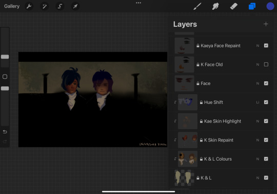
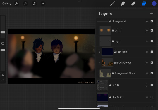
#dusk rambles#art process#‘yet I feel burnt out (?) by seriously rendering stuff even in greyscale…’#that. and drawing in greyscale makes me depressed#though I could just change the BG to cream like the default in GoodNotes#art tips#primordial Albedo#subject two#Dorian#Kaeya#Diluc#Genshin impact#dusk analysis#art tutorial#colouring tutorial
9 notes
·
View notes
Text


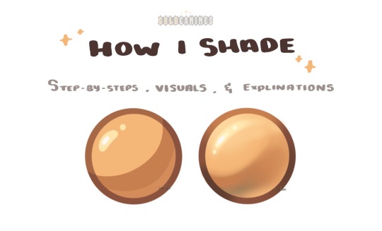
(tap for better quality!!)
disclaimer: This is just how i do my colouring, i have no idea what I'm doing!!
made a lil tutorial on how i colour skin
I usually do my colouring on one layer using some form of a watercolour brush (or any brush that allows for colours to mix)
use reference!!! It really helps you to figure out how skin works and where and what to colour!!
Some of my favorite references!!-> THIS and THIS (by Harteus on insta)
hope u found this helpful in some way peace and love :))
#also my phones colour is a little messed up so if it looks funky IM SORRY SJSJSJ#anyway#hope this helps?#AHAH#artist#art#artists on tumblr#artwork#illustration#digital art#art tutorial#colouring tutorial#shading tutorial
55 notes
·
View notes
Note
love your colouring!! do you have a tutorial?
thank you so much! 🤍
i don't have a tutorial of my own but here's a list of adjustments i typically use and the order i use them in:
levels, auto levels (lower the opacity if it's too harsh)
exposure + gamma correction
levels again (slightly increase the black & midtones using the pointers)
brightness + contrast
colour balance (midtones and shadows only. but usually just midtones)
selective colour for each prominent colour in the gif (i find the cyan and black pointers to be the most important for each colour and i usually never increase or decrease each pointer more than 20-30%)
brighten up the white tones by going back into selective colour, select white and lower the yellow and black tones a little
i usually finish off by adding a little extra contrast if i think it needs it, or i go back into selective colour, select neutrals and ever so slightly increase the black point
there are no rules though, so don't feel like you have to follow this specific order and you can always add your own adjustments.
my colourings are pretty much just a mash up of everything i've learned from other people's tutorials on here over the years, so you can always combine tips from multiple tutorials.
i hope this helps! feel free to message me if you have any questions.
0 notes
Text
Trick or Treat timelapse with some spoooooky music 🎃
youtube
#Digital art#timelapse#art process#illustration#Halloween#Spooky art#furry art#anthro#digital art tutorial#art timelapse#art tutorial#artists on tumblr#Nyatimira#fantasy art#tutorial#colouring tutorial#furry sfw#Youtube
0 notes
Text
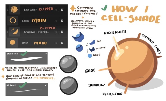
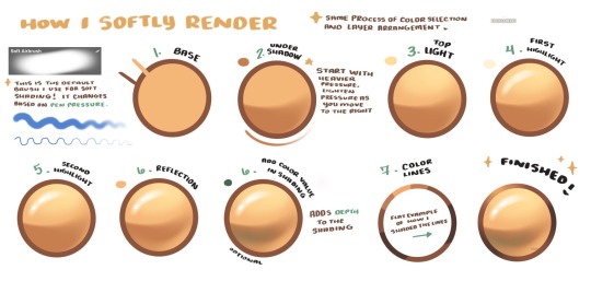
GoldCanines: “I had lots of questions on how I go about my shading ! ✨
Here is how I pick my colors, determine my layers, and lay out my shading !”
Source: GoldCanines on Twitter
#art tutorial#digital art#art reference#tutorial#art tips#illustration#drawing tips#shading#drawing color#drawing colors#color#colour#cell shaded#cell shade#cell shade tutorial
950 notes
·
View notes
Text
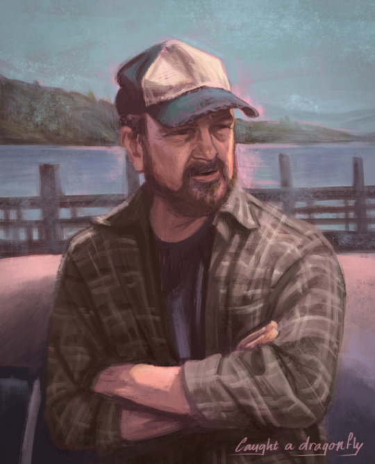
Bobby <3
#bobby singer#jim beaver#spn art#spn fanart#i know i keep drawing portraits but i do love doing them#anyway this is not for the tutorial#but a warm up for one#i want to show how i paint nowadays#like with underpaintings/colours (the pink shining through in this one)#inspired by traditional painting
1K notes
·
View notes
Photo
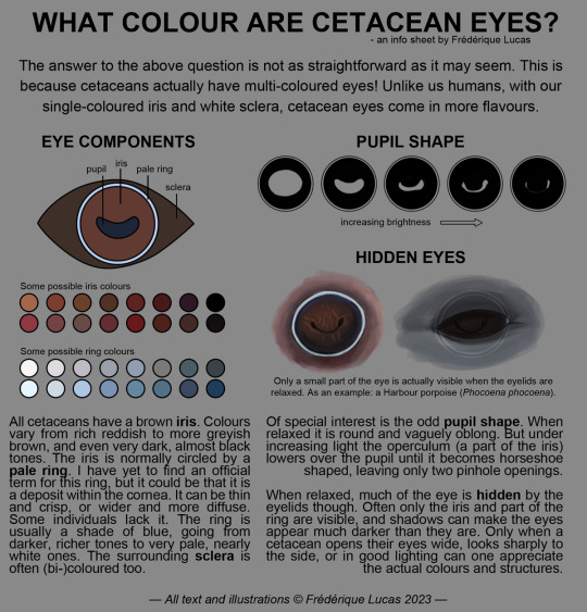


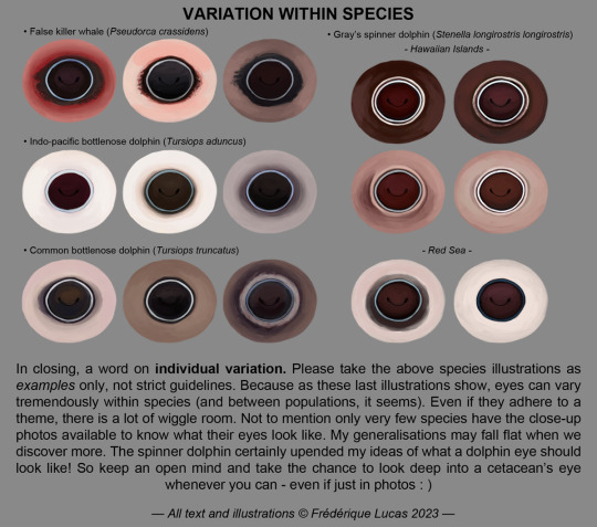
Here it finally is, the full cetacean eye colour info sheet! A long time coming, and an even longer time in the making. I hope that all you cetacean eye curious people will find this one as fascinating as the killer whale eye colour post. It’s a wild world out there!
#illustrations#namtalk#info sheet#infographic#tutorial#cetacean eye colour#eyes#dolphin eye#whale eye#anatomy#bottlenose dolphin#spinner dolphin#humpback whale#killer whale#orca#false killer whale#gray whale#AT LONG LAST#THE CETACEAN EYE THING IS HERE#I really hope you all enjoy!!#and that it was worth the wait#i started this almost 2 years ago rofl
2K notes
·
View notes
Text
Blend Mode Types for Digital Art Drawing (Procreate, Clip Studio Paint, Photoshop, Fresco, MediBang, etc)
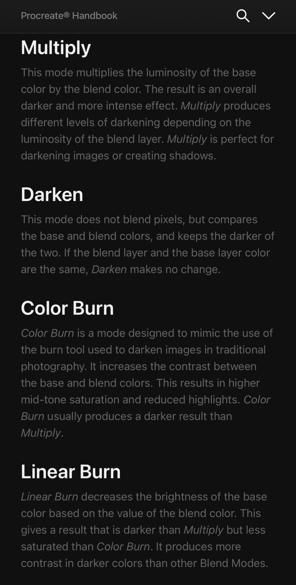
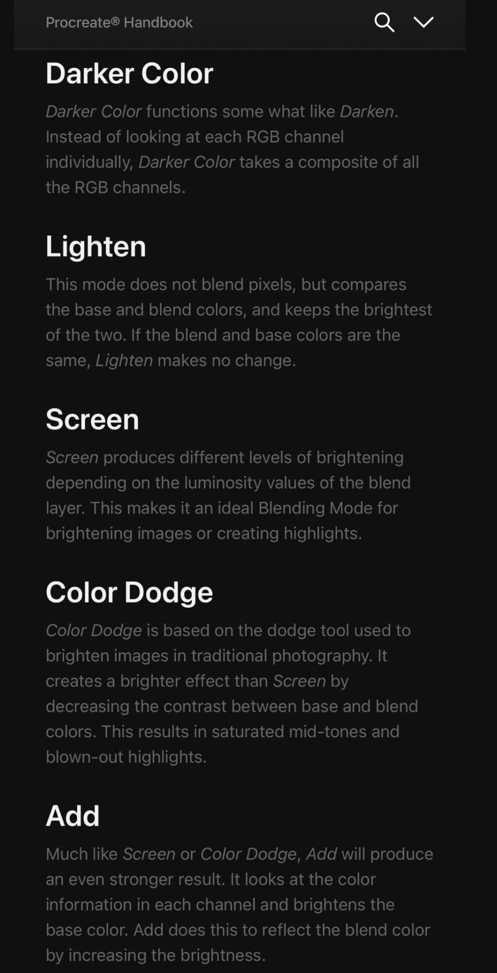
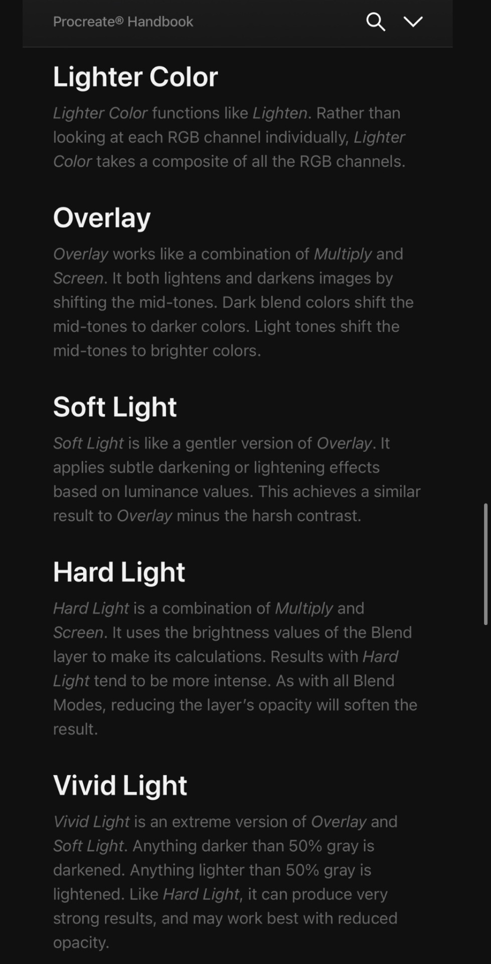
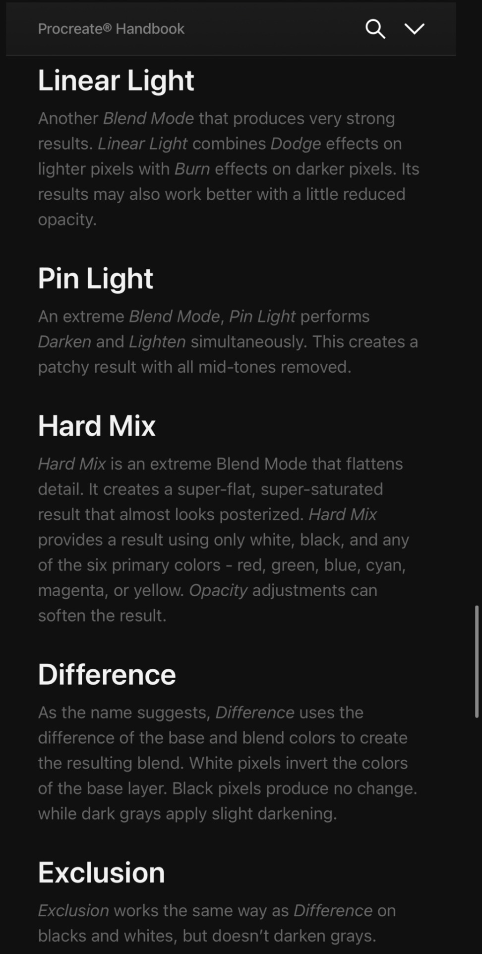


Credit: Procreate Handbook
#random tip#random tips#tip#blend modes#blend mode#shadow#highlight#colour#color#multiply#overlay#screen#art tutorial#drawing tip#art tip#art tips#art tutorials#drawing tips#drawing tutorial#drawing tutorials#art#coloring#colouring#layers#laye#digital#lighting#mood#atmosphere#terminology
1K notes
·
View notes
Text
Digital art tutorials: first I draw a messy sketch, then I do a clean sketch over the top. Next, I shade with greyscale to get the values. After that, I do a thing with colour that I refuse to explain because to me it seems obvious despite that step being what you are desperately searching for help with. Then, add details and it's done!
132 notes
·
View notes
Text
He’s real t me
#i cant colour gold. i cant. i have stares at multiple tutorials. i failed#hades game#hypnos hades#Hypnos my man my guy…#will attempt to draw his new portrait RAHHH#checkadii
100 notes
·
View notes
Note
Hello! Your art has relly nice, soft colors and I wanted to ask how you choose your color palettes if you don't mind.
well it's 4 AM so my thoughts maybe a bit jumbled and I'm totally ass with explaining but anyways- I learned colour by copying other artists and looking at a ton of photography... especially photography! There's a lot to learn about colour from all sorts of places be it people's clothing, small useless trinkets or insects
just be on a lookout most of art is just observational skills anyways
for pieces I actually care about I like doing colour thumbnails before doing anything like so- usually picking 2-3(sometimes more) main colours
my goal is to try and frame the main focus and thats typically done using a very contrasting accent colour, be it a complimentary one, a bright neon one to contrast with pastel or a desaturated colour etc.
In general- I use a ton of compliementary and triad palettes
on a related note, I actually consider the shading and lighting colours to be a significant important part of a pieces colour palette, since to me every single colour effects the piece
sometimes you will see me shade and light using existing colours around a piece, which ends up in weird sorta "unconventional" art decisions like using the colour blue to light yellow and sooo on- since I love experimenting with colour usage
and well it gives out cool results!
really just have fun with colour and don't be afraid to be clumsy and insane with it like me :)
#aecholapis#i use a ton of red blue and yellow jeeeesus fuckihn christ#primary colour fucking sweep i guess#long post#art tutorial
316 notes
·
View notes
Last Seen Blogs

updatesstuff
Updatesstuff
rachelscoffeebreak-blog
Open Eyes

jpccnnews
JPCCN
jack-and-the-spooky-kids
CREEPINITREALHAWT
underwater-ground
I'm keep waiting...