#photoshop help
Note
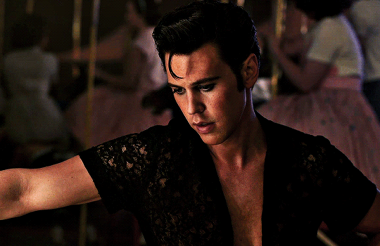
Heya nik! could i request the typography for this anidala set? (love the lightsaber in the battle couple one howww??? )
hi shale!! happy to share <3
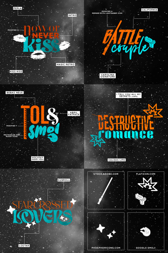
as always, links to the fonts under the cut:
perla
intro
magic retro
kiss kiss
california
carolina signature
bebas neue
abril fatface
holyfat
i tell you all my secrets
caldas life
sunroll
lostar
549 notes
·
View notes
Note
Can I ask what fonts you used in your "anger" set?
And/or... What are some of your favorite fonts in general? Your sets have some of the best typography I've seen! I love the creative fonts you use and you have a real gift for pairing them. 💛
oh my god you're gonna make me cry 🥺
thank you so so so much!! 💖
a few weeks ago i posted this fonts rec of some favorite fonts, and as for this gifset's typography, here are the fonts i used:

240 notes
·
View notes
Text
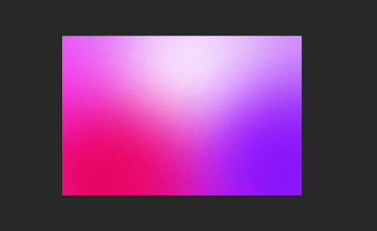
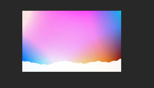
This quick tutorial will go over how to make gradients, from simple gradients to multicolor ones.
give this tutorial a like/reblog if it helped you out
end result & tutorial under the cut
if questions should arise, feel free to send a message!
Chapters:
how to make a basic gradient
adding colors with brushes
softening & adjustments
What you´ll need:
any version of photoshop (I use CS6, mine is in german because I bought it years ago in germany)
very basic photoshop knowledge
i. how to make a basic gradient
Open a new document in your desired size.
There are several ways to make gradients. I always use the new fill layer option, right next to the new layer or new group buttons on the right side.
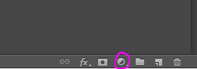
Click on it and select the second option.

Adjust the angle however you wish, and then click on the gradient to bring up the next window
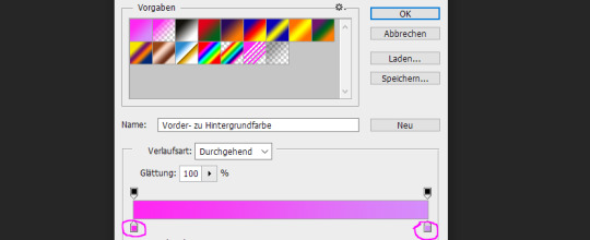
Select any colors you want by clicking on the little droppers highlighted above. I used #ff27f2 on the left and #d58dfa on the right. Once you´re done click OK until your new gradient is on your document.
ii. add colors with brushes
add a new layer & select a big brush with no hardness and low opacity.
select any color to paint with, I´ll be using #e50051 & #770dfa & plain white. Start painting on that new layer in slow strokes. You can add as many colors as you want. Mine now looks like this:
Now we merge our layers by selecting them, then righ click and selecting merge

iii. softening & adjustments
Go to filters -> blur > motion blur
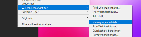
Depending on the gradient you´ll have to select different variables, but for this one I used the numbers below:
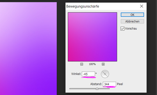
Sometimes I add Gaussian Blur too to blend it even more, but didn´t do that for this gradient.
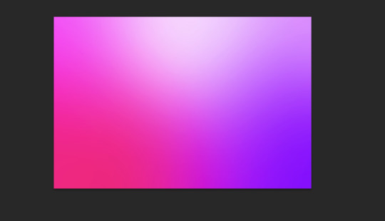
Now for the adjustments I only added a brightness and vibrance layer. This is the finished gradient:
#completeresources#dailyresources#photoshop tutorial#gradient tutorial#photoshop help#usernelly#userireland#ps asks#mine: tutorial#my tutorials#my resources
143 notes
·
View notes
Photo
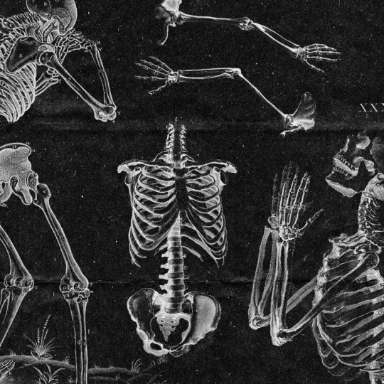

HUMAN ANATOMY THEMED BRUSH PACK.
crediting isn't necessary!
this pack was made using content from the public domain, you are free to use them to your heart's content.
you can download this pack HERE.
have fun and I hope you enjoy it ♡♡♡
#free brushes#brushes#photoshop help#free#photoshop resources#photoshop brushes#brush#texture brush#vintage#ps resources
371 notes
·
View notes
Text

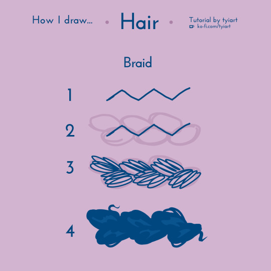
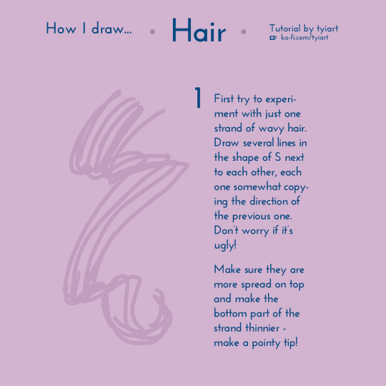

just put up a new art tutorial on how i draw hair in my style! i don't really shade my hair - i only add main highlights, and that removes a lot of stress from drawing perfect hair for me. maybe you can learn something new from my lil tutorial 💜
tutorial link / sign up to fairy
#art tutorial#tutorial#how to#art help#art tips#art advice#drawing tips#drawing tutorial#drawing#art#original#membership#hair tutorial#how to draw#photoshop tutorial#photoshop help#my art#rewards
202 notes
·
View notes
Text
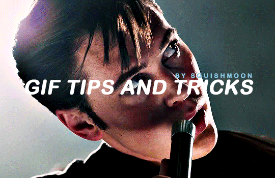
squishmoon gif making tips & tricks 🌙
this is a basic tips & tricks post for how I make my gifs. I am sure there are probably easier and better ways to do things, but this is how I have been doing it and I am lazy so I've basically got it down to a few clicks by setting up actions to do most of the work so if that sounds like something you might like - read on!
I use windows and photoshop cc 2022 for making my gifs. I also use caps (captured using potplayer and in jpg format) so once you have your caps ready, just import them into photoshop as normal.
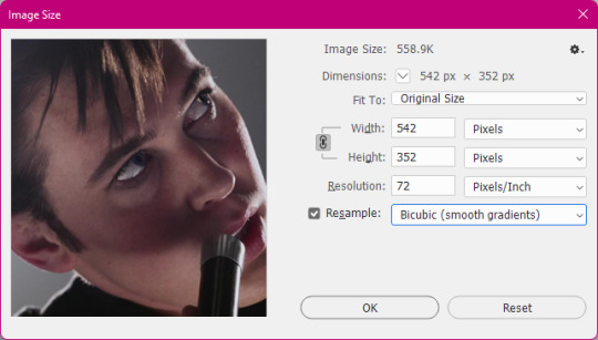
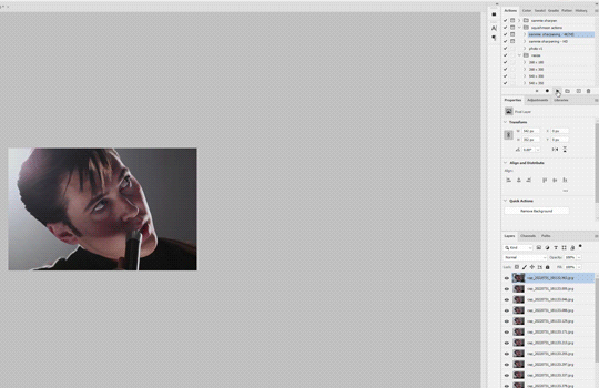
RESIZING YOUR GIFS
the first thing I do when I import my caps is crop it down - and as I said, i'm lazy so I have all of my regular sizes saved so I can just select them. as you can see - they are all +2px larger than the tumblr dimensions and that is because if you ever see that weird little white border you sometimes get when making gifs? if you remove pixels off you won't get that so when cropping it's essential to add some pixels so that you have some to crop off (I hope that makes sense!)
these are my settings for scaling my images down.
MAKING YOUR GIF
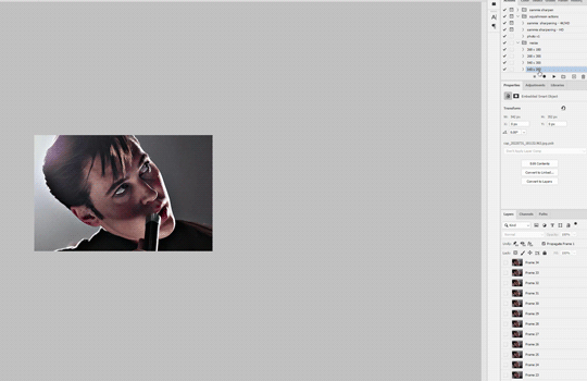
as i said, i'm lazy - so once I have cropped my caps to whatever size I want, all I do is click on my action and let it do it's thing. I have it set where it sharpens and converts back to timeline with the 0.05 time delay so you don't have to reopen your gifs in photoshop again and save them.
the two windows that pop up are to allow you to adjust the settings if you wish - if you like it just click ok and it will continue on.
you can download the action pack here (you can just add more actions for resizing to suit your dimensions or do it manually by going to canvas and -2px when you are done making your gif before saving) there are two settings - one for 4k/HD and the other for HD where the sharpening is a little softer.
obviously, the higher quality the source footage, the better your gif looks. i tend to work with 1080p downloads and I rip my own blurays and save them at around 4GB per 40 minute episodes and 12-15GB for films. sometimes more depending on the length of the film.
external hard drives are your friends. if you are going to be giffing stuff often, keep them saved there. I have a ton of externals (which are in dire need of organisation) but it's so much quicker to have stuff at hand than needing to download each time you want to gif.
as for trailers - you get far higher quality using the trailers posted to the apple trailer site than youtube. so check there if you can get it. i use this site to download them and it does make a difference.
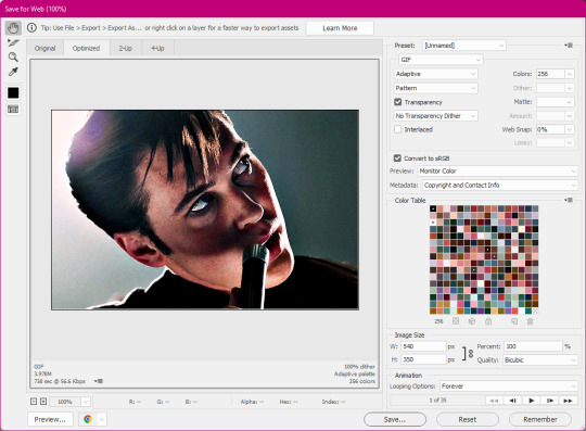
SAVING YOUR GIF
it's all down to personal preference what you like - but I use these settings when saving my gifs. you can play around with diffusion, pattern and noise etc to find what you think looks best for you. just remember that your gif must be under 10MB or else it won't upload to tumblr.
EXAMPLES
here are some examples of more gifs made using the sharpen action.


and this is the above moon knight gif, but using the slightly less sharper setting. sometimes it's best to test out both on footage you haven't used before to see which you prefer.
i hope this helped and if you have any questions my askbox is open! a like if you download the action would also be very appreciated.
#photoshop tutorial#gif tutorial#sharpen action#gif action#completeresources#allresources#photoshop help#onlyresources#mine#tutorial#action
466 notes
·
View notes
Text
Dear amazing graphic makers of Tumblr,
Where the fuck do you find stock or other photos that don't look like shit, I need CHARACTER, I need REAL LIFE, and I am not finding it
Signed, desperate me
#fandom#photo edits#graphic edits#i don't know how to tag this help#photoshop#photoshop help#graphics help
10 notes
·
View notes
Text
How to tone down yellow tinted scenes
Hi, so first of all, sorry for the late reply. I'm going to try and explain what I did.
We are basically going to try and cancel out the yellow tint in this scene, I used very few adjustment layers for that and then i just did my usual colouring. Tutorial under the cut!

First thing I did was use Curves, you can try and do it manually but all I did was click Alt + Automatic on my curves panel and then selected Find Dark and Light colours, I then adjusted Shadows and Lights to my liking, you can play with the other settings see which one adjusts the best to the results you want. This will be different for every video/scene so don't try to make it look like mine, adjust as you go.


This is what we have after that, left is original gif and right is just after curves.
As you can see, it's still a little yellow but their skin tones look a little more human. Then I went and added a Photo Filter, Cooling filter 82 to be exact and set the opacity down to 30%
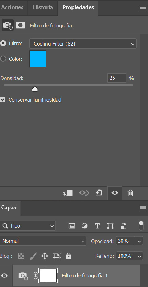

Next i added a gardient map, you can make your own or select one of the presets just remember to stay on the blue/cyan/pruple so you can cancel out the yellow. I then set it to soft light and opacitiy 20%, I wouldn't go over 50%. (left)

Because I thought this was a little too whitewashed, I then went and added a Colour Lookup, selected 3Strip, set it to Darken and lowered the opacity to 20-40%. (on the right)
This is my final gif after my regular colouring. It's masked so you can also see the original. I also did the same steps on another scene with darker lights overall and this was the result.


I hope this helps!
#colouring tutorial#gif tutorial#it's nowhere near perfect but i hope it helps even a little!#resources#kpopccc#by moonbyulys#completeresources#allresources#pshelp#photoshop help
111 notes
·
View notes
Text
okay, when giffing a set how do I use the same psd for all of them??
8 notes
·
View notes
Note
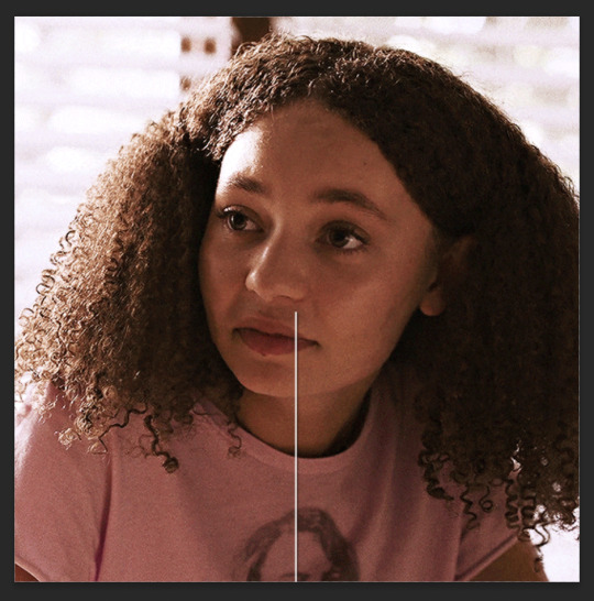
Hi! I love this /post/708273065503653888/paying-attention-to-things-its-how-we-show gifset so much! I was wondering if you could tell me how you achieved that line/text effect or if you maybe have a tutorial or something 🥹 thank you so much 💖
Hi there! It's actually super simple, but I can absolutely show you how!
How to do a through-line effect on gifs
The gifset in question is this one here.
First, start off by making and coloring your gifs. Make sure they're all the same size (I usually go for 540x540). I would go for somewhere between three and four for a continuous effect, and it helps if they're related. I'm going to start off with this one:

Once you have all of them made, save them and reopen the gif you want to be the first in the set and convert it to smart filters. It should look like this:
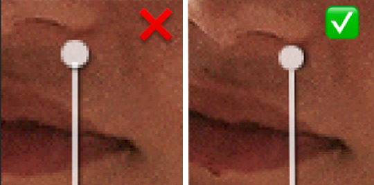
Now add a new layer and using the marquee tool (m), set a fixed size of 2 pixels by 540 or more pixels for the height. I usually make the height a little taller for safety so I don't fall short on the top and bottom of the gif. For the instance of the first gif (as well as the last), you can either go down to half that height or just drag it to the middle of the canvas after the following step. This is because we're eventually going to put a circle marker at the center point.
At the bottom of the layers panel, click the fill/adjustment layer icon and go to solid color. Set the color to white and hit ok. Label your layer as line or something similar that way it's easier for you to find it while making the other gifs for the set.
Drag the line a little under halfway down the canvas, then set the opacity to somewhere around 85% and fill to 100%. You'll have to adjust the opacity as you go based solely on the brightness and coloring of the scenes you use. For this gif of Sarah, I have it at 75%.
Once you've got this settled, the next step is to add a drop shadow. For this, I kept the opacity at 80% and made sure to move the angle so you can actually see it.
Next up is the marker! You're going to make another layer and go back to the marquee tool, this time going to the circle. At this point, I'd highly recommend grouping these layers together for ease of access.
Doing the same as before, go to fixed size and set your parameters as 10x10 pixels, and add a solid fill layer. Make the opacity is the same and change the angle of the drop shadow a little so there isn't a stark overlap, and drag it so it sits at the top of this line.
Keep in mind that since both the line and the circle have lowered opacity, you'll be able to see them overlapping, so make sure you zoom in and adjust their placement.
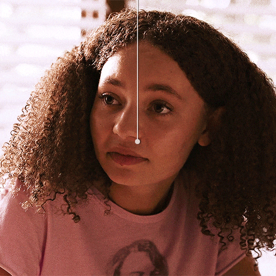
Now your gif should look something like this:

From here, do the same thing for the next gif(s), leaving the circle out until the last gif, where you'll bring it back in and add it to the bottom of the line, with the line coming in from the top like this:
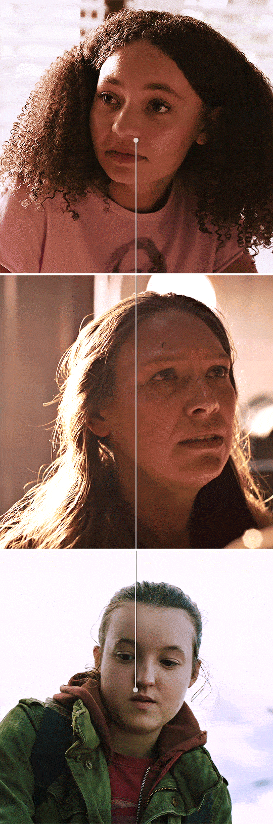
My best advice for this is to keep a canvas with the line and circle layers accessible and drag your remaining gifs onto that canvas so the line stays even through the whole set. That way all you have to do is move it up and down, not left or right. But keep checking as you work.
Once all your gifs are made and your throughline is added, your set should look something like this:
And that's it! I'll usually add words or some sort of text to break up the lines but it works either way.
If you have any questions, feel free to ask!
#anonymous#answered#gif tutorial#usergif#usersteen#userlang#useream#usermorgan#photoshop help#tutorial#photoshop tutorial#*#my edit#tlou hbo#tlouedit
67 notes
·
View notes
Note
do you have any tips for high quality mv gifsets? your gifsets are so clear!
hiii 💜 thanku so much <3 and honestly i think it mostly comes down to file size / sharpening / and a bit of colouring!
i've posted my sharpening settings here! and lately i've really loved stronger sharpening settings but on kpop music videos - a little bit of 1% noise really helps to cover any background dither especially with bright colours!
but for me!! the biggest difference has been file size. i started making gifs by screen-recording (including music videos) but that can cause a reduction in video quality so then i downloaded the individual music videos in the highest resolution from youtube (using 4k video downloader) and screencapping the exact frames to make gifs!
but even then youtube still has a very compressed file format for kpop music videos so the real clear gifs can be made from bugs! file formats or master versions of kpop music videos <3 this is an explanation from reddit below to clear up what bugs! music videos are.

now i don't have a korean citizenship or a bugs account but it's still possible to access these music videos through people who have bought and uploaded the files! you can use sharemania or another good website is kpopjams! i know people use 4sashi and kpop24hrs but kpop24hrs signups are closed so i've never been able to access it and 4sashi just confuses me 😭
overall i've found more bugs! files for kpop girl groups as opposed to boy groups (and i felt like i was literally digging for svt master files from the depths of the internet) but the difference is so satisfying
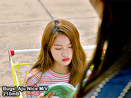
here are some differences between bugs!/master music videos and the regular youtube 4k/hd versions <3
ADORE U - Seventeen (2015)


THANKS - Seventeen (2018)
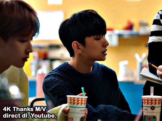

Pretty U - Seventeen (2016)
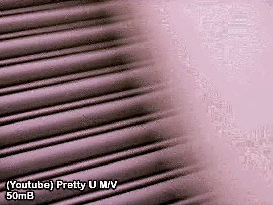
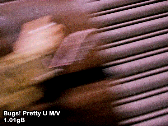
AJU NICE - Seventeen (2016)

#i hope that helps!!!!!#ps help#gif tutorial#kpop gif tutorial#photoshop help#idk if i should tag anyone...#creations#just gonna tag some mutuals...#usermeeseung#isaishi#rosieblr#uservince#userzesty#usershreyu#usersha#usersahyoz
82 notes
·
View notes
Note
would you be open to sharing the fonts used on the wednesday edit you made? theyre so cool
hi!! thank you!! I love typography :') and I'd be happy to share the fonts I used for this set I made for usergif:

links to the fonts under the cut!
from top to bottom, left to right:
Traveling_Typewriter
1942 report
Sacred Bridge
Wednesday Logo (I duplicated the S and made a lil triangle for the apostrophe)
Astigma
Intro
Lust Script
Marola
doctor punk
California sun
IM FELL DW Pica
Shrikhand
Neon Bines
NEON LED Light
Lakestreet
Wild Growth
Vintages
Silvus
Cache
Doky
708 notes
·
View notes
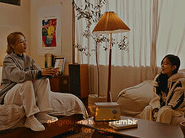
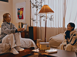
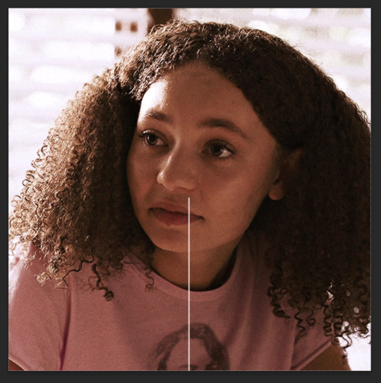
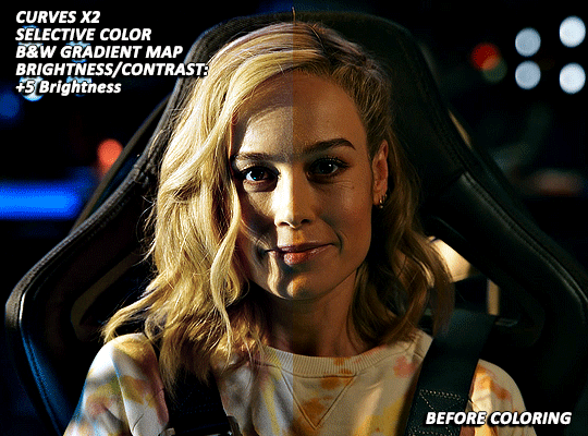
Photo
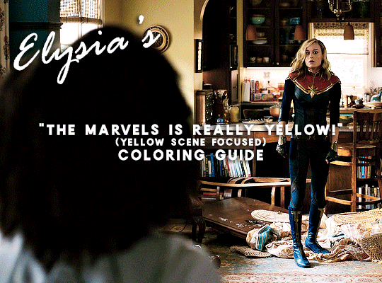
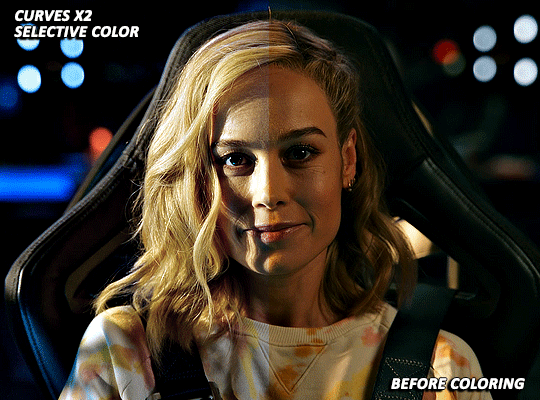
A few days ago (last week actually 🙈) @nikolatexla sent me a lovely message about my Carol in The Marvels set and asked for some guidance about my coloring process for that set. So, what follows is a fairly general guide to how I color, which a special emphasis on how I tried to combat the extreme amounts of yellow in a lot of The Marvels footage.
(And, just as a quick fyi, this not a full gifmaking tutorial--I’m focusing only on coloring and assuming that readers have a working knowledge of Photoshop.)
The Footage: File quality isn’t technically a part of coloring, but I do my best to work with only the highest quality footage options available to me. For trailers, this means that, excepting the stuff I am 100000% out of my mind excited for/simply cannot wait to gif and that I am fine giffing in fairly small dimensions, I wait until a non-YouTube copy is available. The Carol set in question was made using footage from a 1080p iTunes trailer download.
Layer Overview: This can vary slightly from gif to gif, but, when coloring, I pretty much always use: Curves x2, Selective Color, Gradient Map, Brightness/Contrast x2, and Vibrance. For gifs in need of more extensive color correction, I often add a second Selective Color layer and/or a Photo Filter layer.
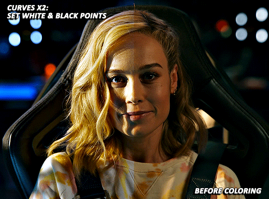
Curves: All my colorings begin with two curves layers. The first, on the left, is used to set the white point. The second, on the right, is used to set the black point.
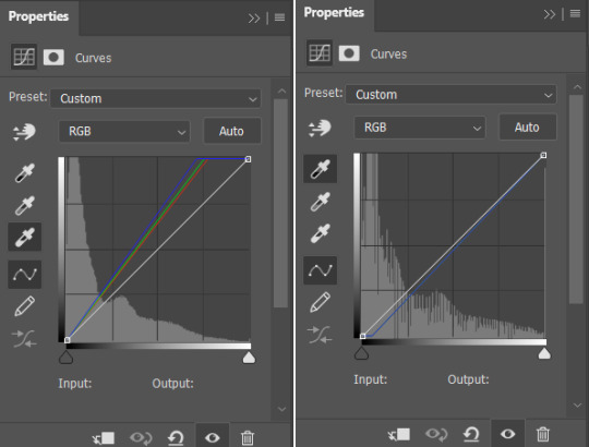
Using the appropriate dropper, I click on the brightest/whitest or darkest/blackest points of my image until I find a point that produces a result I like. For scenes with strong single-color tinting (heavily yellow, heavily blue, etc.), setting the white point can involve a bit of trial and error as heavily tinted white points can sometimes result in very weird or overly extreme results. Setting the black point is less likely to produce such extreme image transformations, but, if I’m struggling to find a point that doesn’t make the image darker than I want, I may lower the opacity of this layer.
As shown below, how much these layers do varies depending on the scene:

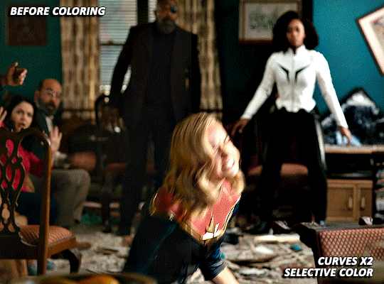
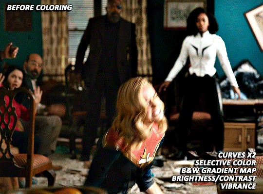
Selective Color: For selective color, I focus on whatever colors are most prominent within my image/whatever colors I want to reduce or enhance. I don’t have any particular formula for this, just dragging things up and down until I start to see changes I like. With super yellow/orange scenes or with scenes where your characters are looking just extra orange for some reason, this means focusing on the reds, yellows, and magentas. I also always increase the blacks: +2 magenta, yellow, and black. (For most Carol in uniform gifs, I also increase the amount of cyan and reduce the amount of yellow in the Cyans and Blues). As reducing reds and yellows in an image can leave white characters looking either pinker or greyer than you’d like as well as lead to the white washing of characters of color, I sometimes click over into another tab or image, wait a few minutes, and then go back to whatever I’m working on to see if I still think the coloring changes I’ve made look good. This is ALSO why I often add a second Selective Color layer after I’ve added all my other coloring layers. (I’ll discuss this more later on).
(Further, specific to Carol, reducing the amounts of reds and yellows in the image can help her face look less orange, but also does make the red parts of her uniform less vibrant. Layer masks can help mitigate that, but it’s harder to pull off on higher movement shots, so less red/orange image vs. less washed-out suit is mostly something that you will have to balance according to your personal preferences.)
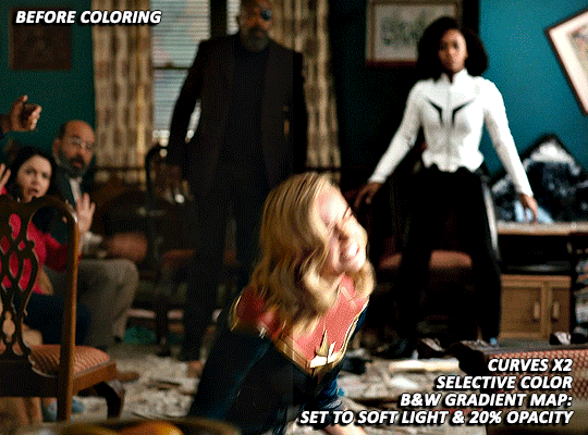
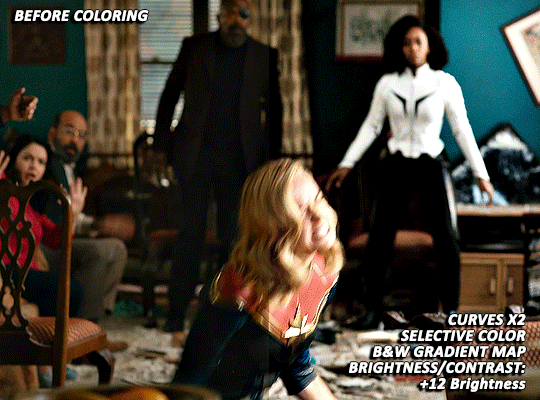
Gradient Map: I add a Black and White gradient map, make sure the method is set to classic and that the layer as a whole is set to soft light and 20% opacity. It’s subtle, but I think this helps given the image some extra depth and contrast.
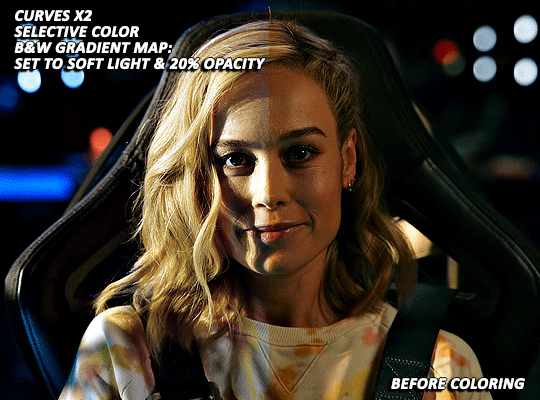
Brightness/Contrast x1: For my first Brightness/Contrast layer, I tend to play things super safe. It’s easy for the light points in your image to start looking completely blown out, which, while sometimes unavoidable in order for the rest of your image to be visible, is something that I prefer to avoid or minimize when possible. (And I like to see what everything looks like before I potentially start more dramatically dragging things around on my second Brightness layer 😅).
Vibrance/Saturation: My standard settings for this layer are +5 Vibrance and +3 Saturation. The only time I really add more is if I’m making a colors focused set. For sets where I’m pulling a lot of yellow/red tones out via selective color, this layer can help make things look a bit more alive (but also is the main reason why I sometimes go back in with a second selective color layer).

Brightness/Contrast x2: Now that I’ve got my coloring 85% done, it’s time for some more brightness!
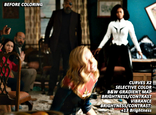
EXTRA TWEAKS: At this point, both gifs are at a point where, depending on the set/my mood/my energy level, I might post them as is. But they’re also not exactly where I’d really love them to be. Both are still a bit more yellow than I’d like and are, I think, good examples of the different ways I try and tackle this sort of thing. For both gifs, I’m going back in with some more selective color to further try and tamp down the yellow/orangey tones in Carol’s skin.
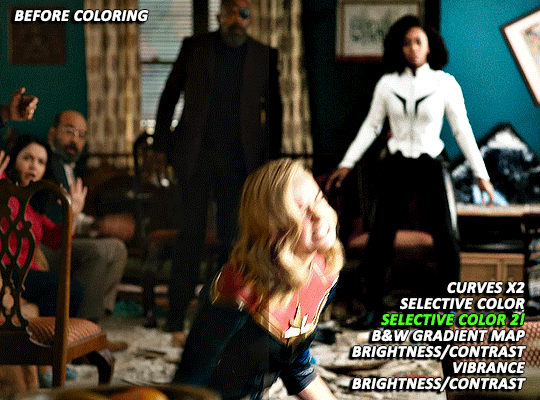
With the first scene, Carol can still skew somewhat orange/pink at times, even after the extra selective color layer, but, due to the red in her suit, there is limit to how far I can take things. And, while a Photo Filter layer could theoretically help things go a bit farther, I found that the cooling/blue filters I tried all tended to push Carol more towards the pink, rather than natural looking, end of things.
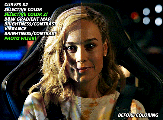
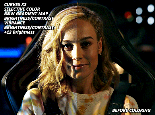
With the second scene, however, I did find a photo filter layer (Cooling Filter 80, with the layer set to 20% opacity) helpful in getting my coloring where I wanted it to be. Carol’s hair and skin doesn’t look as yellow as it did before and the rest of the image still looks fairly natural, rather than venturing into extremely blue or pink territory.
Final Thoughts: I know this has gotten long and is probably a bit more vibes (rather than exact adjustment instructions) heavy than some tutorials, but that is basically just how my coloring process is. I don’t think there’s any exact right way to color, but rather just what you find works for you and appeals most to your specific sensibilities. When we encounter new projects/pieces of media (even within already familiar mega franchises like the MCU), there also tend to be unique quirks that we have to get used to. I don’t think I’ve fully figured out coloring The Marvels at all (it was such a headache that, after three gifsets, I was 10000% done and didn’t open Photoshop for multiple days), but I do think that my experiences with other extreme color grading projects has helped me figure out how to at least start tackling it 🤷🏽♀️😅.
51 notes
·
View notes
Text
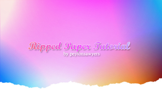
per anon request, this very quick tutorial will go over how to add a ripped paper effect to images
ripped paper resources for this tutorial: (x)
give this tutorial a like/reblog if it helped you out
if questions should arise, feel free to send a message!
more tutorials
Chapters:
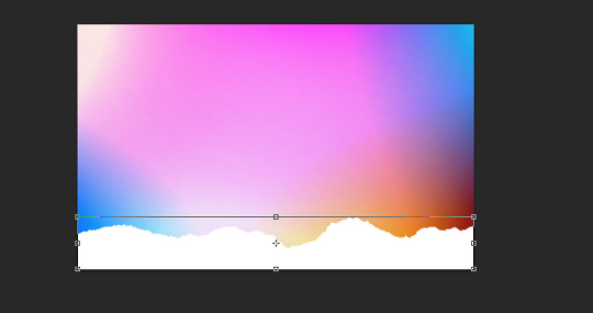
There are a few methods but I´ll be quickly going over only two.
easy png method
brush method
What you´ll need:
any version of photoshop (I use CS6, mine is in german because I bought it years ago in germany)
very basic photoshop knowledge
i. png method
Open the image you want to use and choose a ripped paper png, one of the transparent ones, like these ones I made.
Either drag the png over to the other window, or copy and paste it. Adjust it to the width of your image by pressting ctrl + T or strg + T.
Once you´re done hit enter.
If your blog has any other color than white, you´d have to adjust the paper stripe to the color of your blog so it blends seamlessly
ii. brush method
find brushes you like, like these ones.
load the brushes you want to use into photoshop (as always google is your friend if you don´t know how to do it) Choose the color you want to use for the paper effect (preferably the one you use on your blog)
add a new layer to your document, and use the brush as big as you need it so it fits the whole width of your image.
Click once on the new layer as high or low as you want the paper effect to be. And that´s it!
#completeresources#dailyresources#ps tutorial#photshop tutorial#photoshop help#tutorial#my tutorials#mine: tutorials#I hope this helps anon#my resources
65 notes
·
View notes
Photo

In this pack you'll find 30+ transparent pngs about vintage naturalist illustrations (tw for frogs, snakes and snails).
Reblog or like if using!
This is a free resource, but if you decide to buy it, I thank you from the bottom of my heart for supporting me ♡
DOWNLOAD HERE!
#free#free transparent png#png pack#photoshop resources#png#pngs#vintage#resources#transparent png#photoshop help
247 notes
·
View notes
Note
do you have before and after pics of venessa’s urbz cover?? it looks so amazing 😭😭
heya!!! yes I do, I keep a lot of my psds (just not my gameplay ones)


as you can see I didn't really do much this time!
duplicated image + gaussian blur + screen with lowered opacity
sharpened the image underneath
adjusted curves
and then I added the font :-) !
25 notes
·
View notes
Last Seen Blogs
mylovelookup
Cloudy with a chance of red tears

3dmodelmakers
Architectural Model Maker
hsmp3
we'll be alright.
kee1i4n
keelian
twittytelly
Untitled Document.