#gifmaker tag
Text

COLORING + SHARPENING TUTORIAL
someone asked for a coloring tutorial and my sharpening settings, so here it is! there are also a few tips to achieve more HQ gifs. :)
tutorial under the cut!
FOR HIGH-QUALITY GIFS
FILE SIZES
it doesn’t matter what your sharpening settings are if the file you’re using to gif is too low quality, so i tend to look for the best that i can get when downloading stuff.
usually, movies (+2h) look better if they’re 5GB or more, while an episode (40 min/1h) can look good with even 1GB. the minimum definition i try to find is 1080p, but i gif with 2160p (4k) when available. unfortunately, not every computer can handle 4k, but don’t worry, you can gif with 1080p files just fine if they are big enough. contrary to popular belief, size does matter! which means sometimes a bigger 1080p file is better than a smaller 2160p one, for example.
SCREENCAPPING METHOD
this can too influence the quality of your gifs. as a gifmaker, i’ve tried it all: video frames to layers, directly opening video clips, loading files into stack, and i’ve finally settled down with opening screencaps as an image sequence. with bigger files, it doesn’t matter much what technique you use, but i’ve noticed with smaller files you can do wonders if you screencap (either by loading files into stack or opening as an image sequence) instead of using video clips. for example, this gif’s original video file was only 4GB (so smaller than i’ve usually go for), if you can believe it!
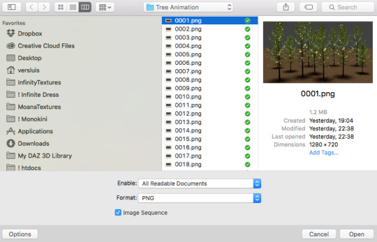
here’s a tutorial for setting up and screencapping with MPV, the media player i use to screencap. again, you can keep using video clips for bigger files, but you’ll find this useful when dealing with dire causes. i don't file loads into stack, though, like the video does. i open as an image sequence (open > screencap folder > select any image > click the image sequence button). just select OK for the speed. this will open your screencaps as a video clip (blue bar) in timeline mode (i'm a timeline gifmaker, i don't know about you). you will need this action pack to convert the clip into frames if you're a frames gifmaker. i suggest you convert them into frames even if you're a timeline gifmaker, just convert them into a timeline again at the end. that way you can delete the screencaps right away, otherwise you will delete the screencaps and get a static image as a "gif".
ATTENTION if you’re a Mac Sonoma user, MPV won’t be an option for you unless you downgrade your system. that is, if you have an Intel chip. if you have M1 Max chip (or even a better one), here’s a fix for MPV you can try while keeping that MacOS, because nowadays MPV is skipping frames in its latest build. or you can use MPlayer instead for less hassle. here are two tutorials for setting and using MPlayer. Windows users are fine, you can use MPV without trouble.
FOR EVEN MORE QUALITY
ADD NOISE
here’s a tutorial for adding noise as a way to achieve more HQ gifs if your original material is too low quality.
REDUCE NOISE WITH CAMERA RAW
instead of adding noise, you can reduce it, especially if your gif is very noisy as it is.
the path is filter > camera raw > detail > nose reduction. i do this before sharpening, but only my video file isn't great to begin with. because it’s a smart filter, you can reduce or increase its opacity by clicking the bars next to its name in the layers panel.
TOPAZ AI
i use Topaz Photo AI to increase the quality of my screencaps when i need to. it’s paid software, but there are… ways to find it for free, usually on t0rrent websites. if someone’s interested, i can make a tutorial solely about it in the future.
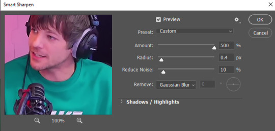
SHARPENING SETTINGS
here are my sharpening settings (filter > sharpen > smart sharpen). i sharpen things twice: 500% 0.4px + 10% 10px. here's an action for it, for more convenience. here's a tutorial on how to use Photoshop actions. for animated stuff, i use this action pack.

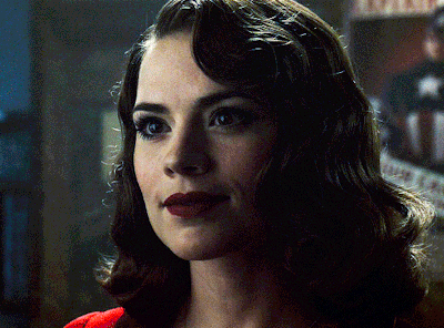
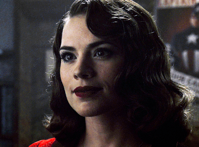
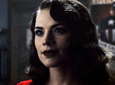
COLORING
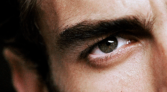
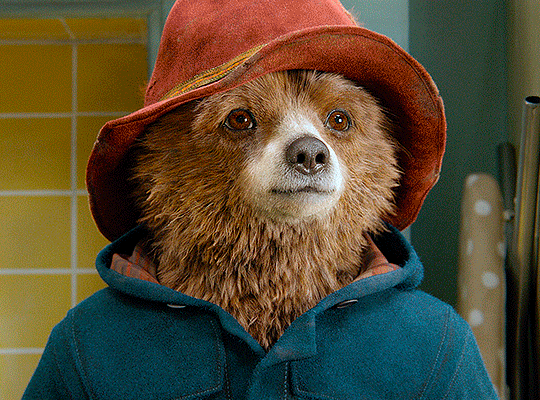
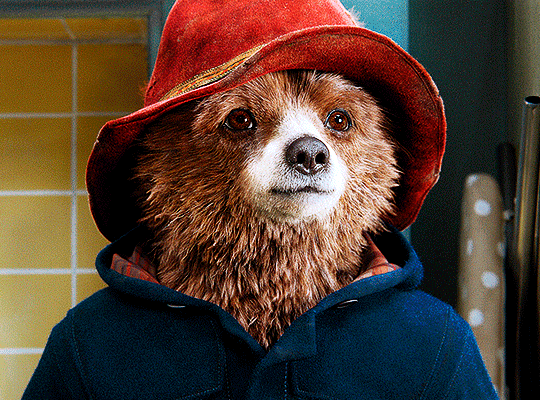
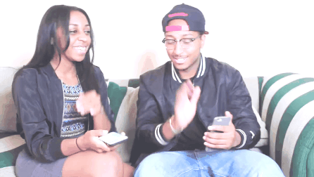
here’s the gif i'm gonna use as a base. it’s already sharpened like the way i always do it.

LIGHTNING THE SHOTS
half of the secret of a good coloring is good lightning. i always useCurves (layers > new adjustment layer > curves) and Brightness & Contrast (layers > new adjustment layer > brightness & contrast). the settings depend on the scene you’re giffing, but i always try make my gifs bright and with high contrast to make the colors pop.
CURVES
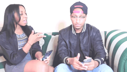
besides lighting your scene, the Curves adjustment layer has four automatic options that will color-correct it for you. it’s not always perfect and it doesn’t mean you won’t need to do further coloring, but it’s a great start. it’s a lifesaver for most ridiculously yellow scenes. look at the difference! this gif uses the 3rd automatic option (the screenshot below isn't mine btw so that's why the fourth option is the chosen one), from top to bottom. what automatic option you need to choose depends on the gif.

sometimes i like to tweak my Curves layer. not everybody does that, it’s not that necessary and if you’re not careful, it can screw your gif up. to modify your layer by hand, you will need to click and drag points of that straight line in the position you desire. this is the concept behind it:

basically, the lower part of the line handles the shadows, while the upper part handles the highlights of the image. if you pull a highlight point up, the image’s highlights will be brighter. if you pull it down, it will make them darker. same thing for the shadow points. you should play with it to get a grasp of it, that’s what i did when i first started giffing.
BRIGHTNESS & CONTRAST
then i added a bit of brightness and contrast.

CHANNEL MIXER
the scene looked a bit too yellow, so i used the Channel Mixer (layer > new adjustment layer > channel mixer) adjustment layer. here’s a tutorial of how it works. not every scene needs the Channel Mixer layer though, i mostly use it to remove heavy overall tints. in this particular case, the Curves layer got rid of most of the yellow, but i wanted the gif to be just a bit more blue so the Channel Mixer tweaks are very minimal.

SELECTIVE COLOR
now, this adjustment layer i always use: Selective Color (layer > new adjustment layer > selective color). this is THE adjustment layer to me, alongside the Curves one. this is how it works:

ie, you can separately edit a color this way, giving it tints. for this gif, i wanted to make the colors more vibrant. to achieve that, i edited the selected colors this way:
for the reds, i added even more red in them by moving the first slider to the right, making the color more vibrant. for his hat to have a more warm tint, i added yellow to the reds (third slider, moving it to the right). finally, to make the reds stronger, i moved the last slider to the right (more black).
for the yellows, i made them brighter by adding white to them, thus making the tile wall and Paddington more bright as well.
for the cyans and the blues, i just added the maximum (+100) of black that i could.
i wanted for Paddington's nose to be brighter, so i added more white to the whites.
lastly, i added depth to the blacks by increasing their own blackness.
you should always play with the Selective Colors sliders for a bit, before deciding what you want or need. with time, you will automatically know what to change to correct the color grading. it all takes practice!
HUE/SATURATION
i don’t know if you noticed, but there are some green spots on the blue wall behind Paddington. to correct that, i added a Hue/Saturation adjustment layer (layer > new adjustment layer > hue/saturation) and made the saturation of the greens 0%, making that unwanted green disappear from the background.

while the green spots on the wall are specific for this gif, i use hue/saturation a lot to tweak, well, hue and saturation. sometimes someone’s skin is too yellow, i made it redder by tweaking the reds and the yellows, or vice-versa. the hue bar follows the rainbow bar, so the maximum settings (+100 and -100) give the selected color to change its hue to something more red or pink (the rainbow extremities). changing hue can give pretty whacky results, like turning someone’s skin tone to green, so you will need to play with it to get the hang of it. you can also tweak the opacity of your hue/saturation layer to further improve your gif’s coloring. i didn’t do it in this case, the opacity is still 100%. the reds and the blues had their saturation increased to make them pop just a bit more, without affecting the other colors.
COLOR BALANCE
the highlights of the gif still had a green tint to it due to the automatic correction of the Curves layer, so i used Color Balance. this is how it works: instead of giving specific colors some tints, you can give them to the shadows, highlights, and mid-tones. if your shadows are too blue, you counterbalance them with the opposite color, yellow. same thing with the cyan-red and magenta-green pairings. in my case, i added a bit of magenta.


B&W GRADIENT MAP
now, if this gif was a dish, it’s time for the salt and pepper. i always add a Gradient Map (layer > new adjustment layer > gradient map) (black to white gradient) with the Soft Light blending mode, thus giving my shadows more depth without messing with the mid-tones and highlights. it also doesn’t “deep fry” (you know those memes?) the gif too much by adding even more contrast. usually, the opacity of the layer is between 30% to 70%, it all depends on the gif. it always does wonders, though!
COLOR FILTER
finally, i like to add Color Filters (layer > new adjustment layer > color filter) to my gifs. it’s very handy when giving different scenes for the same minimalistic set because it makes them kind of match despite having completely different colors. in this gif’s case, i added a “deep blue” filter, opacity 50% density 25. you can change the density and the opacity of the layer for further editing, again, it all depends on the gif.

VIBRANCE
if i feel like it, i add a vibrance layer (layer > new adjustment layer > vibrance) to make the colors pop. this can ruin your coloring sometimes, especially when regarding skin color, so be careful. i didn't do it in this gif because i felt i didn't need it.
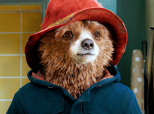
TA-DA! 🥳
AN OTHER EXAMPLE
the color grading of the original scene it’s pretty good as it is, to be honest. let’s see a worse scenario, a VERY yellow one:
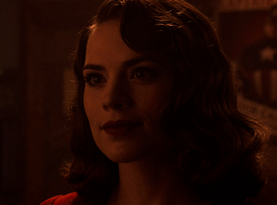
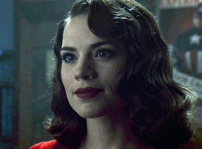
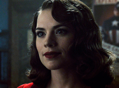
no channel mixer this time because the automatic curves option dealt with the yellowness, but you can see it made the gif too green. i needed to correct that with the following adjustment layers:
curves (automatic option) (gif 2) >> same curves layer (tweaks) (gif 3) >> brightness & contrast (gif 4) >> hue/saturation (tweaked cyan+blue+green) >> selective color >> color balance (gif 5) >> b&w gradient map >> (sepia) filter >> vibrance (gif 6)
i added a hue/saturation layer to remove the blues & greens before my selective color layer because i thought that was more urgent than tweaking the tint of all colors. color balance (gif 4) was the real hero here, though, by removing the green tint. the selective color layer was meant to make the red pop more than anything else, because the rest looked pretty good, especially her skin tone (despite the green tint). you can notice that tweaking the curves layer (small gif 3) also helped A LOT with the green problem.
tl;dr 😵💫😵💫😵💫
here's a list of my go-to's while coloring and lightning gifs. it's not a rule, just a guide. there are gifs in which i don't use all these adjustment layers, or use them in a different order. it all depends!
1. curves (automatic option + tweaks)
2. brightness & contrast
3. channel mixer
4. selective color
5. hue/saturation
6. color balance
7. b&w gradient map
8. color filter
9. vibrance
i'll suggest that you study each adjustment layer listed for more info, either with other Tumblr tutorials or YouTube ones. the YouTube ones focus on images, but you can translate what they teach to gif making very easily. you can ask me to further explain any adjustment layer, too! i was brief to keep this short (which i kinda failed lol).
feel free to ask me for clarification or something else about gifmaking wise, i always like to help. ❤️
#*#*tutorial#gifmaker tag#resources#resource: tutorials#ps help#uservivaldi#tuserjen#userrin#userelio#useralien#userzaynab#userchibi#userbuckleys#usertj#userbess#tuserlucie#useraljoscha#userdavid#usershreyu#usernolan#userhallie#userisaiah#tusergio#tusergeo#userjesslynn
330 notes
·
View notes
Text
The type of insane shit we gifmakers be doing for free
32 notes
·
View notes
Text
i identify as a gifmaker robin hood i learn skills from the large content-rich fandoms and then bring them to smaller fandoms making unnecessarily complex gifsets that nobody asked for free of charge :-)
22 notes
·
View notes
Text
me: i wanna retire
cj: no <3
#let me retire. this is so hard!!!!!#cj tag#mich.txt#gifmaker tag#me and my creative ruts against the world
5 notes
·
View notes
Note
The way you colour your gifs/art is sooo amazing! I always love seeing it! as someone who's still learning the in's and out's of gifmaking/photoshop do you have any advise? 😊😊
Hi!! Thank you so much, it means a lot!! I’m trying to put together a tutorial on how I personally gif, but in the meantime
Truly it all comes down to the quality of the footage you’re working with. Try to find the best quality footage available. The better the quality, the better the gif will look
Looking for footage can be challenging. There’s some places you can try, but sometimes you have to t/orrent. If you do, get yourself a good vpn and antivirus. I use W/indscibe
Not all 1080p look the same. It depends on the size of the footage
YouTube 1080p is not true 1080p. The quality will still look sort of weird. One thing I like to do when working with YouTube videos is add noise, as that will make the gif look better and get rid of some of the blur and weird looking lines. Here’s how I add it. But be careful, noise makes the gif size bigger (tumblr gif size can’t be bigger than 10mb)
Sharpening settings are super important! I add two layers of smart sharpening with these settings:

Familiarize yourself with photoshop. Look through all the adjustment layers, settings, etc. I’ve found new things the more I look through
Curves are your best friend. Always start with it. It will set precedence for how your gif will turn out. I like bringing out the darkest points of the gif so I do a normal curves layer with the black point and white point, and a second one with only a black point
Channel mixer is your second best friend. It can help get rid of any weird coloring and tint that the footage comes with (especially helpful when you’re working with yellow tints). Here’s a tutorial on how it works. It may look complicated but once you get a hang of it it’s pretty easy
To color I use selective coloring. Sometimes I add as many selective coloring layers until I get the result I want
Not every single idea will turn out exactly how you picture it. That’s just something that happens. Maybe the coloring isn’t perfect. Maybe the blending is hard. That’s okay. Try your best, or you can find other ways to do it. For example, I originally wanted to blend these gifs together, but some of them looked weird imo, so I went with the ripped paper effect instead
Don’t be afraid to ask people for help, or search for tutorials
If you can, join creator servers. Those are very helpful. You can find footage, get ideas for gifsets, ask for help and collaborate with others
Experiment!!! Sometimes the best ideas come out of experimenting for hours, but also don’t get stuck on something. If it’s not working and you’ve tried, move on
6 notes
·
View notes
Text
me: i’ve got an idea for a gifset... i think i’m going to do a normal/subtle coloring this time :)
also me: what if everything was pink and orange..... what if i turned all the greens into purple....... okay everything is cyan now and you WILL like it
#personal#ok to reblog#gifmaker tag#old post found in my drafts#i have no idea what this was referring to but yes i agree
1 note
·
View note
Text

「 𝘪 𝘵𝘩𝘪𝘯𝘬 𝘪'𝘥 𝘭𝘪𝘦 𝘧𝘰𝘳 𝘺𝘰𝘶
𝘪 𝘵𝘩𝘪𝘯𝘬 𝘪'𝘥 𝘥𝘪𝘦 𝘧𝘰𝘳 𝘺𝘰𝘶
𝘫𝘰𝘥𝘦𝘤𝘪 "𝘤𝘳𝘺 𝘧𝘰𝘳 𝘺𝘰𝘶" 」
【 𝘥𝘳𝘢𝘬𝘦 × 𝘤𝘰𝘯𝘵𝘳𝘰𝘭𝘭𝘢 — 2016 】
𝘧𝘳𝘦𝘦 𝘵𝘰 𝘶𝘴𝘦 𝘨𝘪𝘧'𝘴 || 𝘯𝘰 𝘯𝘦𝘦𝘥 𝘵𝘰 𝘤𝘳𝘦𝘥𝘪𝘵 𝘮𝘦 ! ||
#dwaynenjazz#jazzyguns#gifmaker tag#dwayne kyng#free to use#gifset#dwayne and jasmine#jasmine's voice was so pretty in this
0 notes
Text
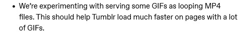
Tumblr and the No Good, Very Bad Idea
So. You might have heard the news that, as of July 12, Tumblr is testing out converting GIFs into looping MP4 videos to help pages load faster:
This is bad. Tumblr is the only mainstream site left where you can post GIFs and they’ll continue to be GIFs - well, sort of, as Tumblr previously tested and implemented turning GIF into GIFV with the same purpose, and it decreases the quality of the original GIF file. Turning them into MP4 videos is even worse.
GIFs are GIFs. They’re not videos. Creators spend hours making a GIF that will look good as a GIF, not as a video.
I hope I don’t need to explain to anyone why continuing to screw over creators is bad for a site like Tumblr, whose continued existence depends on creators not giving up on it, and why gif-making is important to fandom existence.
I for one will not continue to make any more gifsets if I know they’ll just be turned into MP4 files. It’s disappointing to spend my time making something and watch it become ugly once it’s uploaded - and that’s what is already happening without the MP4 conversion.
WHAT CAN WE DO ABOUT IT?
Don’t bother sending a support ticket! They will tell you to do what I’m about to tell you:
Send an ask or submission to @wip - the official “work in progress” blog of Tumblr where people can send in suggestions.
Their ask box is open every Monday from 6AM to 6PM EST.
The conversation isn’t over, guys, but it’s important to be a part of it. If you’re a creator or support creators (and you should), then set an alarm on Monday and go send them a message.
#tumblr#staff#tumblr staff#changes#tumblr changes#usergif#gifmaker#fandom creators#idk how tf to tag this
31K notes
·
View notes
Text
im so fucking tired of the disrespect gifmakers get on the gifmaker website
#kai.txt#negativity tw#(sorry these are gonna be a lot of tags. i have a lot of feelings and i dont know where else to put them)#we make gifs and nobody reblogs them#when they do get reblogged all people want to tell you is that your gifs arent good enough to them and rip it to shreds#'you're missing x' 'why didnt you do y' 'if i made this i would have abc' 'hey op ur wrong and this is why' 'i dont like this op'#reposters dont even reblog your fucking gifset but they'll save your gifs to repost later asking for how to do something#that they could have asked you how to do in the fucking first place#we reblog ourselves constantly because nobody else will and maybe to make our work look like it has more notes than it does#to make ourselves feel better about the lack of interaction we're getting#and then when we TALK about this frustration we have. people who are too afraid to say it to our faces#go on anon in our askboxes and tell us how we're somehow selfish for wanting people to interact with the sets#that we spent time on. hours. days. WEEKS in some cases#or we get anons who tell us the reason we dont have notes are because we arent good at gifmaking in the first place#but this is all on anon. because they're too scared to tell it to our faces#they're too scared for us to see that they ARENT a gifmaker and that they dont know how to do it any better either#they dont see us as people doing something we love as a hobby. they see us as content machines that dance like court jesters#im just so fucking tired of the disrespect#and this sentiment goes for more than just gifmakers. graphicmakers. artists. literally any creative hobby shared on this site#we get treated like shit and for what? literally for fucking what.
2K notes
·
View notes
Text


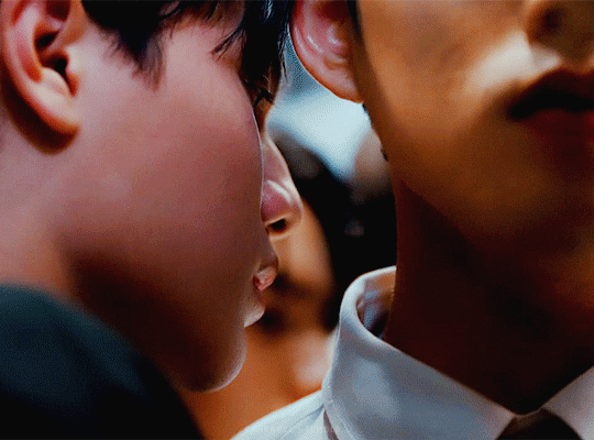
BEOMGYU | TINNITUS @ 2023 MUSIC BANK GLOBAL FESTIVAL
#userhev#ayabestie#0x1zone#usersemily#useryeonbins#kirberries#skyehi#rosieblr#moacentral#usergyukai#userchoisoobin#userzaynab#majatual#userfairy#mine#beomgyu#choi beomgyu#txt#tomorrow x together#ult tag 💖#wow look at her being a gifmaker today
586 notes
·
View notes
Text


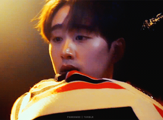
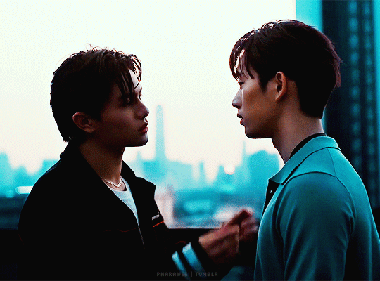

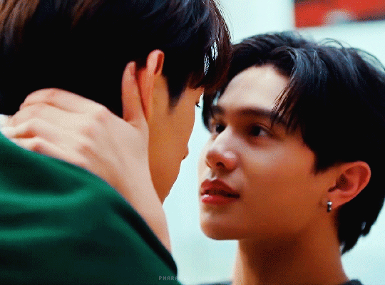

—If you keep stepping closer, how can we maintain the distance?
—What if I don't want to be five meters apart? Because with just five centimeters, I'm already dying.
THAME - PO · เธม-โป้ · HEART THAT SKIPS A BEAT · GMMTV 2024 PART 2
#thamepo#thamepo heart that skips a beat#heart that skips a beat#thame po#thame po the series#est supha#william jakrapatr#williamest#thamepoedit#thai bl#thai drama#bl drama#bl series#my edits.#gmmtv 2024 part 2#i have no idea what to tag this#do we have an official gifmaker tag for this show yet?#someone in my tags (hello! 💜) wrote that this show looks very different from other gmmtv shows#it would explain why i was immediately drawn to this#but i'm also into tpop and idol bl and est so...
330 notes
·
View notes
Text
304 notes
·
View notes
Text
Before / After coloring 🎨
Thanks @guzhu-furen & @maxescheibechlinichacheli for the tag!


I haven't done one of those in a while so here it is, I didn't choose any particularly colorful gifs, I just wanted to show the power washing process that goes on behind the scenes a little when you got a scene that is covered by a filter (whether it's blue, yellow or just plain dirt) which is 99.9% of them tbh, especially for the last one that was just completely yellow, and honestly after 3 years of gifmaking I'm still learning how to take care of those scenes
Tagging (feel free to ignore this) : @thelaziestmotherfucker @forcebook @nick-nellson @firstmix @petrichoraline @kinnsporsche @raypakorn @25shadesoffebruary @pharawee @magnusedom @yohankang @sharona1x2 @difanghua
26 notes
·
View notes
Text
nothing more exciting than coming up with a completely convoluted and needlessly complex gifset idea 👍
#here me out it's only two gifs but one of them will look really cool okay i swear dude just listen to me im not crazy i promise#gifmaker tag
10 notes
·
View notes
Text
the day i return to giffing and i fully can't finish the set bc my plan was to use trailer footage and it's just not a good idea hotd s2 come out right now for me
2 notes
·
View notes
Text
me @ myself: why did you and jake make prompt 3 favorite byler season knowing your favorite season is season 2 which is arguably one of the worst seasons to color?
4 notes
·
View notes
Last Seen Blogs
idgaflyingperidot
Peridot Is Amazing
financialspreadbetting
Financial Spread Betting
idleartisan
HEXA Graphics

massivelyscrumptiouskingdom-blog
Untitled