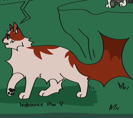
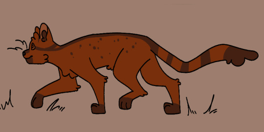
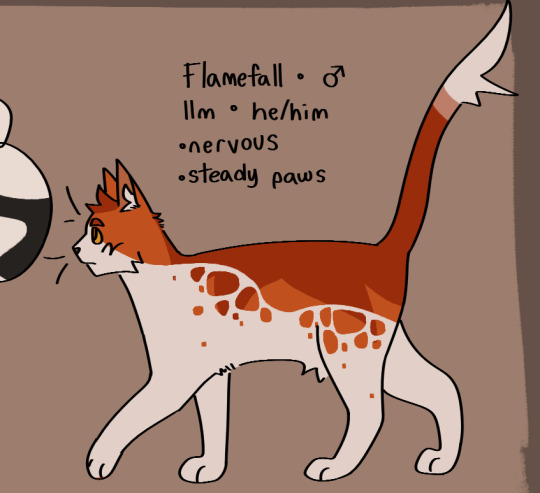
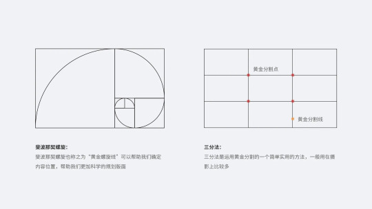
#‘how do I simplify the already simple design’
Text
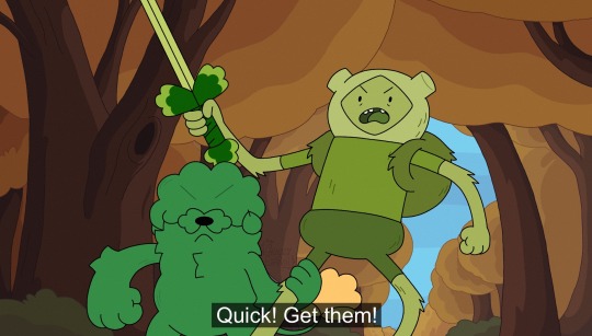

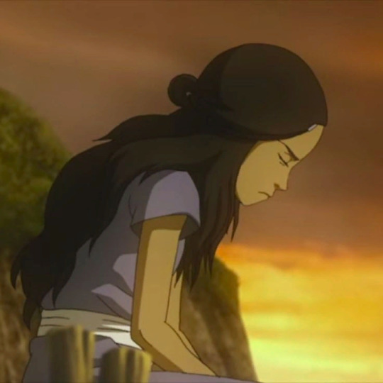
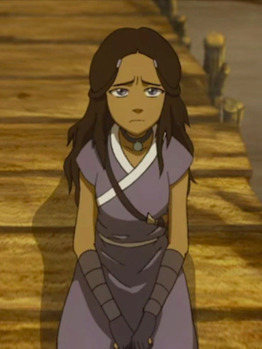
In a fight with the off screen monster
#art#my art#adventure time#adventure time oc#fern the human#fern mertens#poppy the plant dog#took a little longer since I had to change poppy a bit#‘how do I simplify the already simple design’#and once I figured it out I did it 15 more times#for fun of course
322 notes
·
View notes
Text


A set of very conceptual notes I drafted a while back for someone asking for advice on learning to draw humans. I'm entirely self-taught so this is less of a tutorial and more of a very rambling set of general principles I follow and ideas that helped while I was learning. I figured I'd post it in case anyone else could get use out of it!
I also recommend checking out:
Drawing East Asian Faces by Chuwenjie
How to Think When you Draw (lots of good tutorials in this series)
Pose reference sites such as Adorkastock
Transcript and some elaboration under the cut:
Img 1 - Drawing a face
The two most important elements (at least for me) when drawing a face are the outline of the cheek/jaw and the nose*. I often start with a circle to indicate the round part of the skull, then add a straight like and a 'V' to one side [to create the side of the face and the jaw].
The nose creates an easy template for the rest of the face's features to follow (eyebrows at the top of the nose bridge, eyes towards the center of the bridge, ear lines up to eye) and the placement/direction and overlap with other features is a very simple way to indicate dimension.
[A sketch of a face that has been adjusted by moving its parts to create 3 different angles. The following text is underneath:]
-Different 3/4th views can be created just by adjusting the position of and amount of overlap between the facial features.
- The top of the ear usually lines up with the corner of the eye. Think of how glasses are designed [specifically, how the arms run from the eyeline to the ear]
[I go on a tangent in these next few paragraphs]
*One thing I see many artists do - not just beginners - is learn how to draw A Person. As in, one singular person with one set of bodily proportions and one set of facial features. It's an issue that runs a bit deeper than 'same face syndrome' because sometimes these artists can draw more than one face, they're just not very representative of [the diversity present across] real people.
Part of the reason I'm talking more about how to think about approaches to drawing - rather than showing specific how-to's - is because there is no one correct or right way to draw a person. The sooner you allow yourself to explore variety - fat people, old people, people of color, people with [conventionally] 'unattractive' features - the easier it'll be! Artists often draw their own features honestly and without [harmful] caricature, so it's always a good idea to look at art made by the kinds of people you're trying to draw if you're ever unsure about how to handle something.
In general, it's far more important to learn how to interpret a variety of forms than to learn how to replicate the Platonic Ideal of the Human Body.
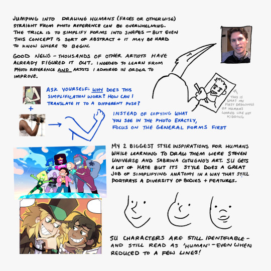
Img 2 - Stuff that helped me
Jumping into drawing humans (faces or otherwise) straight from photo reference can be overwhelming. The trick is to simplify forms into shapes - but even this concept is sort of abstract and it may be hard to know where to begin.
Good news - Thousands of other artists have already figured it out. [When starting out] I needed to learn from photo reference AND artists I admired in order to improve.
[When looking at stylization you are inspired by] ask yourself: WHY does this simplification work? How can I translate it into a different pose? Instead of copying what you see in a photo reference exactly, try to focus on the general forms first.
My two biggest style inspirations for humans while learning to draw them were Steven Universe and Sabrina Cotugno's art. SU gets a lot of hate [in this instance I was specifically referring to a time on tumblr when the art was knocked for 'losing quality'] but its style does a great job of simplifying anatomy in a way that still portrays a diversity of bodies + features.
[Extremely simplified drawings of Lapis, Steven, and Amethyst]
SU characters are still identifiable- and still read as 'human' - even when reduced to just a few lines!
Img 3 - Things I keep in mind while drawing side profiles
- Eyebrows + eyes close to the 'edge' of the face
- Forehead needs enough room for a brain
- Eye is > shaped from the sides
- Mouth kinda halfway [between the nose and the chin] but closer to the nose
- Skin/fat exists under the jaw [and connects to the neck]
- neck is about one half the width of the whole head
- the back of the skull always sticks out a bit further than you might expect
- Sometimes less is more - contours exist on every face, but drawing them in may make your character seem much older than they're supposed to be. However, it's a good idea to use them when you *want* your character to look old!
These are very general notes- every face is different and has different proportions [and playing around with them creates unique and interesting character designs]
#2023#may 2023#i realized this is pretty nonsensical while transcribing it LOL#feel free to send asks if anything is unclear#but again im not any sort of professional
565 notes
·
View notes
Text
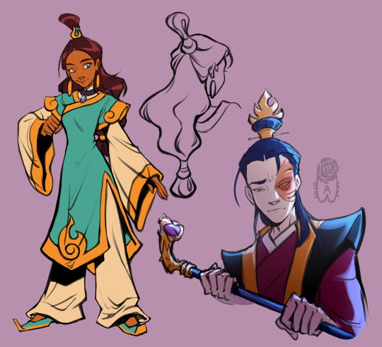
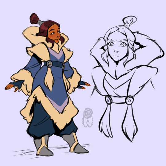
It's impossible to put into words how much I love designing characters, especially for AU.
Yes, I recently had an avatar AU, and I really wanted to draw Katara from there (and also Zuko). I usually draw a static pose in order to display all the details of the clothes. This is such a kind of character sheet that helps me to better imagine the scenes in my head.
If you're interested in reading about the AU itself, then there will be some information about it.
I apologize in advance for mistakes in the text, English is not my native language. But, I hope, this will not interfere with understanding.
In general, my AU concerns the ending of the series, because at some point it seemed unrealistic to me. There is too much positivity with the obvious problems of the post-military space, as well as little logic in some moments (for example, I don't understand what Zuko was doing in Ba Sing Se. Did he abandon his newfound throne to the mercy of fate with the risk of a palace coup? Did he not feel the effects of a lightning strike? The longer I think about it, the surreal it seems to me).
At some point I thought, "this is all like Aang's dream, in which everything is intentionally good. As if this is the ending he wants, but it's unattainable." And then it dawned on me. But it really looks like his fantasy about the future after defeating the root of evil. This explains why Zuko recovered so easily, why everyone is just relaxing and having fun without a drop of post-trauma. Because Aang wants everything to be so naive and simple after defeating the Fire Lord. Because he's dreaming about it.
I know this is a very hackneyed narrative technique. It's pretty easy to say "this is someone's dream" to deny any events. But I found it curious, especially against the background of the episode "Nightmares and Daydreams", where Aang's dreams already simplified the reality around him. For me, it's like a lead-up to the finale, where he actually sleeps.
You ask, "but why is he sleeping?". I also asked this question, and the answer to it killed me. Because during the battle with Ozai, when the stone hit Aang in the wound, he fell into a coma. His body was paralyzed because his brain perceived it as a repeated lightning strike, again fatal. The avatar's state was the only one that did not allow Aang to die, but only to fall into a coma. And instead of an epic battle, we have a little helpless boy spending a huge amount of energy just to maintain his life.
The second Aang collapsed, he disappeared, leaving Ozai alone with the remnants of his temporary power. And no one else saw the avatar…
I'll leave the intrigue for you about this, but for now I'll tell you about the concepts from the art.
Naturally, everyone searched for Aang, and, naturally, they did not find him. Katara and Zuko were the only ones who did not participate in the search, for several reasons:
Zuko was rehabilitated for a very long time after being struck by lightning, and Katara nursed him (I'm sure there are a lot of fics about this topic. The only difference is that there is no romance here. The focus of my AU is not on it, but on the problems of the consequences of the war). He survived, but he had major problems with his heart, digestive system and spine. Who noticed the cane in his hands? Yes, Zuko couldn't walk without it. From now on and forever. He was physically unable to leave the palace, and Katara maintained at least some of his condition.
Even after Zuko's rehabilitation, it was necessary to keep the power in his hands. Imagine what a shock the Fire Nation experienced when not just the former Fire Lord was overthrown, but the country's policy changed dramatically. Now Zuko needed to keep power in his hands and establish a new regime as soon as possible, before his opponents raised armies and people against him. This boy, who recently sat quietly at a military meeting, needed to show unprecedented strength and power to everyone: both officials sought to turn the situation in their favor, and the people who wanted stability and prosperity. But how to do this if Zuko couldn't even breathe normally, and getting out of bed required tremendous effort? It was impossible… Anyone else would have given up, but not Zuko. He has never given up without a fight and has never turned his back on danger, even if he risks dying.
It hurts me a lot for him, too. Fate has never stopped pushing Zuko against obstacles, but this time he couldn't rely on himself. He almost couldn't bend, his body almost didn't obey. He was an easy target and there was nothing he could do about it. This helplessness irritated him, saddened him, oppressed him. The only thing that wasn't broken yet was his spirit, and Zuko was barely able to maintain it in such conditions. If it wasn't for Katara, I don't know if he would have coped in the end. She was now his only support, his only ally in these cold oppressive walls, the only rational grain in his doubts.
You ask, "Where is Iroh? Where is Mai?"
Iroh, along with the White Lotus, took on a mission to liberate the Earth Kingdom from the Fire Army and establish relations with the kingdom. In fact, Iroh now shared power with Zuko: uncle was engaged in foreign policy so that his nephew could focus on domestic policy.
With Mai, everything was much simpler: after getting out of prison, she was completely disappointed in the guy who always left her. She sent him a letter, where she finally ended their relationship, and left with her family somewhere far away. Perhaps she and Zuko will cross paths again and will be able to establish a relationship. But not now.
Katara remained to help Zuko not only with treatment, but also with his policy. As a resident of an almost disappearing tribe, as well as an able leader, she helped him with projects and plans to improve the quality of life of the population and actively participates in them. She performed those missions that Zuko can only entrust to her. After all, she was a friend he could rely on and to whom he could open his feelings.
In her design, I wanted to reflect the combination of two cultures: Fire and Water. I was based on the designs of the "12 Kingdoms" (if you haven't watched this gorgeous anime or haven't read ranobe, I strongly recommend doing it. This universe is no less interesting than the avatar's world, I'm sure you'll like it), because the palace intrigues and the plot with winning the respect of the court reminds me very much of the story from there.
One day Zuko's legs finally gave up, he could not get up. All the stress he was going through was breaking his body so much that at some point the Katara's treatment stopped working.
It was a very difficult moment for both of them. Zuko has just started to promote his ideas and defend his rights to the throne, and Katara sincerely did not know what to do. If the truth about the true state of the Fire Lord had come out, all the ill-wishers would not leave this opportunity and attack, this couldn't be allowed. They urgently needed to create the appearance that everything is in order, but how?
Zuko came up with a very brazen idea. He asked Katara to use bloodbending on him to simulate walking. It was a very difficult request for her, because this skill represented the worst face of the war, it was created to torture people. And the last thing she wanted was to torment Zuko. She hesitated for a long time, he saw it, but he couldn't wait. He couldn't stop, it wasn't a luxury he could afford. Therefore, he went out, trying not to get up and move much.
Naturally, at some point his weakness was noticed at the most inopportune moment. Naturally, at this moment Katara couldn't let Zuko fall. Imperceptibly under her sleeves, she moved her friend's body like a puppet, causing him as much unbearable pain as most would not stand. But Zuko was not like that. He stood it.
It looked like this to me somehow:
They were both very depressed that day. He was suffering physically because of Katara's bending, and she could not believe that she had caused the suffering of a person dear to her. It broke and scared her, she opened the way to the Hama's madness, and was very afraid to fall into it.
Zuko assured her that it was impossible. Hama didn't have people to guide her, while Katara has friends. Maybe Zuko didn't consider himself the best moral mentor, but he promised to be there in the most difficult moments for Katara, and now he won't leave her.
This encouraged her and opened her eyes to her own cowardice. She was afraid of the darkness of Hama, and instead of curbing it, Katara hid it in herself, ignored it. And that's what it led to: the person who needed her help suffered. But she didn't want to run away anymore. She wasn't going to give up without a fight and turn her back on those who needed her.
At the beginning, Katara trained on herself, experiencing the same pain as the victims of bloodbending. Careless movement of blood through the vessels could cause internal bleeding at any time, it was very dangerous. The Hama's voice in her head pressed on her conscience, saying that innocent people felt all this pain, and only Katara was to blame for this.
Later, she learned to control the flow of water on puppets, like Hama. The point was to pass water through the threads without bursting them. Absolute control was required here, and Zuko taught her the techniques of firebending for self-control. This was necessary for Katara, because the Hama's voice in her head did not subside and did not allow her to correctly distribute her forces. It seemed like Katara was about to stumble, but Zuko wouldn't let her do it.
Gradually, Katara mastered this skill and tried to draw blood on Zuko's legs. The effect was unexpected. Her great willpower and desire to help him resulted in healing. Zuko began to feel his legs, and Katara discovered the reverse side of this bending. No, she didn't heal him completely, it's too early for him to get rid of the cane. But maybe one day she will become so strong that she can do it.
Katara realized that there was no evil magic, there was only evil intent. This was her first step towards learning to look inner demons in the face, and not to hide them in herself when it was possible to hurt others.
But what about the other design?
Katara's father sent her a letter asking her to return. Her family needed her help, because she was the last waterbender, a carrier of culture and skills, as well as a healer of a new level, the daughter of a tribal leader.
At home, everything was not the same as before, moreover, everything taked shape as a Northern Tribe. I really like the idea of the comic "North and South" about the problem of assimilation. Only here has Katara accepted all aspects of its culture, even the most unpleasant ones, and she would not give up so easily when this newfound knowledge was in danger of disappearing.
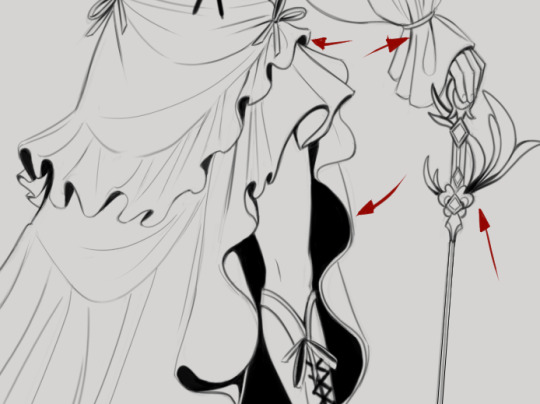
Actually, I wanted to draw her outfit of this arch. I wanted to redesign the costume for myself, because I like to do it. I kept the front strands of Katara, we don't talk much about them.
I would really like to describe the path of the rest of the team and what they do, of Aang and what happens to him. But I'm already tired of typing, and you probably read.
After all, the post is more about designs, and not about the AU itself, so the goal to reveal some of my ideas has been achieved in principle. Maybe sometime later.
Hope you enjoyed reading this :3
482 notes
·
View notes
Note
hi!! I absolutely love your style!! do you have any process vids or tutorials on how you go about shading?? I struggle with not turning mine into a whole ass painting :’)
Unfortunately I don't 😔 I recorded some a while ago but haven't figured out how to speed them up and stitch videos together yet cjjcjckg but when I do I'll post something :')
But about shading, I get what you mean about painting cjcjkc I had the same issue a while ago actually. Here's a couple of things that helped me change that, hopefully they'll help you too:
putting more emphasis on lineart. If you polish your linework and create occlusion shadows with it, it'll do a lot of the heavy lifting when it comes to shading, so you won't need to shade all that much with colors and values. like so:

simplifying things. You get something complex, like a face, and you break it down to bigger, simpler shapes, and then you shade that. There's tools online like the asaro head(I like to use this model in particular), which you can use to help you with simplification, but you can simplify it even more than that. Like if you look at the way I shade faces, I shade them with even less shapes than the asaro head jdjfjf I disregard a lot of the finer details and just portray what I consider to be the bigger or most prominent shadows. I'd say even if you're going for more complex shapes, think about the big ones first, put those down, and gradually go for the smaller ones.


using design principles on shading. I don't know if you know design theory already, but in case you don't, I recommend taking a look at the principle of "big, medium, small". It's pretty simple, but once you understand it you can apply it to literally everything in your art and make it look better. Once I started applying them to the shapes I create when I'm shading, it also became a lot easier to shade in a more simplified style.


That's mostly what helped me I think!! Other than that, it probably goes without saying but I'd highly recommend studying other artists. Like, just grabbing a bunch of pieces you like from a particular artist, throwing it all in a moodboard, observing and taking notes and then trying to mimick their style. That's a type of study that usually helps me improve really fast. But yeah, I hope this helps!!
100 notes
·
View notes
Note
Related to FallenClan designs! All your designs are super amazing, what’s your simplifying process/how do you decide design for cat pelts? Cause I always struggle with simplifying/deciding how they look especially bengals and cats with white patches… thanks if you respond!
I’m ADHD and struggle with consistency and simplifying lol, though more complex designs are pretty, I lean more towards what you do w/ you’re cats as they are simple but still super pretty + it makes it easier to consistently draw them all for stuff like this! (These comic like moon updates :])
(Also hope none of this came off as offensive, it’s all meant positively! I really really admire you and your designs :])
ty for the compliments!!! very sweet ask and I shall do my best to give a good response o7
generally my method with designing characters/drawing is to just wing it. fuck it we ball basically. but i DO take a lot of inspiration from other people's warriors art, taking the time to analyze what i like about their styles and what different sorts of patterns i can use
(i also regularly consult the Clangen Sprite Guide for better looks at white patches/tortie patterns and such, highly recommend)
the first thing i decide when i'm designing a new cat is what fur texture i want them to have. i have four that I pick from (pictured below, in order), wavy, spiky, curly, and square.
i decide the fur pattern based on the cat's personality (a more stoic cat might have square fur, while someone more bubbly might have curly, or someone more excitable have spiky, so on and so on), and also based on their parents/how many cats i've designed with that fur pattern recently.
after that is snout shape, which is probably my favorite part. i love to draw cats with a very pronounced snout, not unlike an oriental shorthair, but i generally slide around between that and a more typical, stubby snout, occasionally veering off into the very square snout of a maine coon. this is also a great spot to determine how sharp you want their jaw to be, which is something that can really help set a design apart! (a couple of snout examples below)
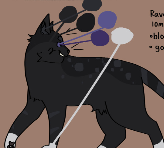
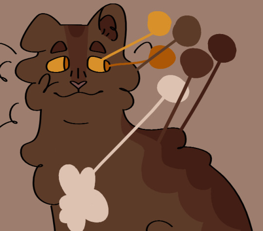
then i usually move onto colors. i like to pick an undertone for the cat first, so i know what sort of pallate to work with. as you can see in the pictures below, ravenstar has a purple/blue undertone, and toadbelly has orange/red undertones
this helps me make all the colors look nicer together, so i don't end up doing something like making a very warm colored cat with blue-toned white patches (which would make the white patches look super cold/too bright), which can be a really cool stylistic choice, but isnt what i tend to go for
once i've drawn out the cats fur shape and picked my colors, i'll move onto the base coat. over my time of having the fallenclan blog i've discovered that having a very simple pattern underneath the normal pattern can add a lot of visual interest to a cat, and make them look less plain.
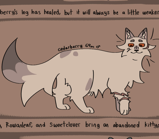
here's a good example! one of the first cats i designed, oaktuft. their pattern was super basic--one base color, plus the inside of the ears, and then the color of their patterns.
and here's another cat that i designed a little more recently--Shiverspots! you can see that even just the small change of adding a bit of a lighter color to her underbelly made a world off difference. plus my style got a lot more defined lol
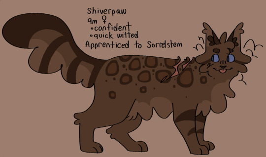
i have a couple of different base patterns that i use. here's a few more examples. i've even started to experiment with more than two colors!
once i've got the base done i move onto patterns. this part can definitely be tricky; trying to make a dozen brown tabbies with short fur be distinct can be . a challenge. i like to follow the steps of what i've already designed--a cat with spiky fur might have very sharp, angular stripes, and a cat with curly fur might have much rounder ones.
i think a good rule of thumb for if your pattern feels a little too basic is just to throw some more colors in there. another shade of orange, a more pale tint to some of them, whatever. and don't be afraid to erase it and start again! sometimes a design just won't work, and thats fine :)
the final thing i do is to add little design quirks. a particularly sharp jawline, downturned eyes, a crooked smile or a gap tooth, whatever! little things can really give your cats character.
i really hope that this helped!!!
#fallenasks#fallenreferences#<new tag i guess???#looking back at this i suppose i lied at the beginning . i do have somewhat of a method
61 notes
·
View notes
Text
simplicity in design is a virtue, you cretins
i'm rereading Avery Alder & Ben Rosenbaum's Dream Askew / Dream Apart in preparation to finally do some serious editing of my game of intimacy, liberation, and faggots at sea Beneath Pirate Flags. among the billion other small things i'm reconsidering as i go over the bob/ndnm fundamentals, i'm really struck by how simple both these games are — elegant in a way i think i really failed to capture in the first public versions of bpf.
i have a theory about this, and it has to do with why i think the sprawling "always another sourcebook" approach taken by a lot of dungeons & drasprawling, commercially successful ttrpgs is fundamentally weak design — but first, here's one of them fancy 'keep reading' buttons you can click on to keep this post from being six and a half miles long.
hey, welcome back. lets get into the details:
bpf makes a critical break from the original ndnm games in the way its environmental playbooks work. mine are things like "the fort" and "the map" (see images) — individual iterations of broader concepts, much like the character playbooks ("legend", "dandy", "monkey" etc) are iterations of common pirate types. there are, almost certainly, multiple "monkeys" in one world — much as there are almost certainly multiple forts.


this contrasts with Askew / Apart's setting books — things like "varied scarcities," "society intact," and "goyishe world." these are intentionally broad environmental pressures. although "society intact" may be encountered different times in different places — with different names and different faces — it is, fundamentally, the same force.
2. this isn't necessarily a thing i want to change (although there are tweaks i'll be making to just about all the playbooks) but it is real interesting to think about how bpf got here, from a design perspective. the story is simple: bpf didn't start from playing either dream. it started with me reading wanderhome, and this design is borrowed (nearly) directly from there.
wanderhome, like bpf, has players create new environmental elements again and again over the course of a campaign — from the smallest kith to the largest citadel, you might be doing generation multiple times in a single session. wanderhome handles this by simplifying, simplifying, simplifying — a trait has one picklist, a nature two, and so the process of generation is quick and nondisruptive, and you're quickly able to create a populated world without losing yourself in any particular moment of generation.
(che, i hear you shouting, you baited us in with an inflammatory claim about d&d's bad design. get to the point already. ok. i will)
one of the things i like most about possum creek games as a whole (ha, got you again) is the way they can become sprawling without ever overwhelming players. this has been talked about a lot in advance of the yazeba's release — but it's true for wanderhome, too.
where both dream askew and dream apart have just six setting elements, wanderhome has (even if you disregard the seasons and holidays) a whopping forty-eight traits and thirty-six natures. it is — despite seeming small in the shadow of yazeba's — a sprawling game, and it's only through a tremendous efficiency and elegance in design that the whole thing doesn't come bursting apart at the seams. some of that is thanks to the ndnm token economy as a whole and some of it is good writing specific to wanderhome, but none of it is possible without an ethic that prioritizes simplicity — cutting the building blocks into their smallest fundamentals, so they can fit into something huge and, more importantly, comprehensible.
this all stands in sharp contrast to what seems to be the tendency in dice- and percentage- based games (told you i'd get there eventually), who — out of a need for a bespoke, simulationist tool for every situation, maybe — have a tendency towards appendices, supplemental books, and a proliferation of minutiae. i am talking about d&d here, although i don't think it's the worst offender — i still have nightmares about the hand-to-hand system from top secret, a game my dad only recently admitted he was "basically only pretending to understand the rules of" when he ran it for my friends and i when we were kids. i'm not saying all crunchy game design is like this — honestly, i think crunchiness is a totally different spectrum from rules-complexity — but i do think that, sometimes, in an effort to feel sprawling and more importantly substantial, games become inefficient and more or less illegible. it is hard to play d&d. it is hard to hold all those rules in your head. by comparison, dream askew, dream apart, and wanderhome can held pretty easily in your head. you could probably even reconstruct some of the playbooks from the design fundamentals (act weak = gain token, act strong = spend token, evocative picklist). the most important thing about these games is that the rules are evocative and they let you stay in the fun part of play for as long as possible, interrupted as little as possible.
let me make this totally clear: the fun part of a game can absolutely be tallying numbers and consulting armor ratings, but i don't think that's the reason some of these games get so big. the real answer is: cutting shit is hard! eliminating systems is hard! saying "this is not helpful, let it go" is really tough, especially when you're left with a design document that was shorter (and by extension, whispers the awful voice in the back of your head, worth less) than you were expecting. still, it's important to remember: 'good system design' is not the same thing as 'filling as many pages as possible.', even if that's hard to accept in an industry that feels like it has to be prices and paid by the page.
how does all this affect beneath pirate flags? well, that's simple — pretty quickly in my recent playtesting, i realized that pausing mid-session to create new maps, forts, ships, and so on sucks ass. it's fun to brainstorm with friends, but the environmental generation throws off the pacing of sessions in a way the wanderhome kith stuff just doesn't. why? there's too much shit in my environmental playbooks! wanderhome has two picklists per nature and one per trait. askew & apart have just one per setting element — and you only have to do it once per campaign. beneath pirate flags has five. five! it sucks! and cutting out that unecessary shit — even if i do want to straddle the middleground between dream askew & dream apart's simplicity and wanderhome's sprawling growth — is going to be the hard first step on the long road to getting this game where it ought to be.
#ttrpg#ttrpg design#wanderhome#dream askew#dream apart#beneath pirate flags#gay pirates#rant aside i am really eager to get back to working on this game#it has such good bones but its gonna be a long road to being done with it#no dice no masters#belonging outside belonging
162 notes
·
View notes
Note
How do you come up with your compositions? They are so cool I wanna know if you have any huge inspirations :-) your art is so lovely
Hiiiiiii! Awww thanks for the appreciation!
I'm actually working on a more comprehensive art tutorial rn (bc someone asked here earlier), that would include composition, but I'll do a shorter answer first for u bc you're asking sth. more specific ?( hope it's okey (❁´◡`❁))
(Oh and also I've seen ur req! don't worry, I'm doing that as well, it's just there's still some before yours( ´・・)ノ(._.`))
Um and when the long tutorial is out, feel free to check that out ~
On Composition:
Goal
For me the goal of my illustration r Storytelling n full on Emotional experience.
(It's something I've been trying to achieve but cannot guarantee I hit it all the time, sometimes bc of my habit I'll lost myself during the process and looking back find out I miss something important, so the following is the best theories I could provide. Most of improvement r still in daily practice(●'◡'●))
To paint with beautiful compostion, you'll first have a solid story in mind, it can be simplified into " who when where n what", writing them down on a note n stick it near by would help.
And as to emotional experience, is something I can't get hold of all the time... music might help I guess? I have headcanon playlists for every chatacter or ship I wanna paint, and extract emotions from them everyday.
But there's some practical methods too.
Methods
I've worked storyboard n director for 2 years in the past, even though I'm not proud of the projects I worked on, some knowledge might still be useful.
It's mostly 2 methods: Silhouette & Movement
Well for silhouettes there's already bunch of books discussing this, one of my favs is Framed Ink, I'm sure u can find a pdf somewhere on the net.
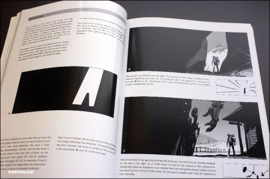
(I find this photo on the internet bc mine is not around)
Basically it's that, think about the objects within your image, by using shadows n their original colors, you can split it into interesting shapes. This will visually elevate the overall feeling of composition.
Also, there's a cheat build in humem's understanding of an image.
basically this, putting important object on the 1/3 points of an image is the fastest cheat.
Also, contrast your silhouette. If you're painting sth that has no background, try giving your silhouette a constrasted design.

(like in this one, the right side is smooth but I'm putting lots of variation on the left.)
For movement, think about your image as a shot taken when your characters r doing sth.
They would each have a direction to move to, and that forms their movement. Your job here is to arrange them into logical or emotional lines.
If it's a series of work, u can plan out the movement toward the same direction.

(the only time you're seeing their car facing left is when they stopped, I was trying to say that their trip kinda ends here)
Also for manga, comic n movie, make sure your important information is within safe area.

(the area within dotted lines is the safe area, u want your character's expression to be mostly within it. if it's like extreme close-up, the certain area u want to emphasize should be within it.)
I have some examples for these two theories.

First let's analyze this screenshot of one of Kurosawa's film, Seven Samurais.

The story here is that these guys r about to fight, possibly some big conflict. There silhouette can be sumed up like this, within the orange line.

We see this guy sticking out from this shape, implying he might be the head of this crowd.

Movement wise, their spears n heads face the same direction, telling u that the enemy will come from that side. Even this is a still frame, the movement is implied perfectly.
Another sample from Synecdoche,NY by Charlie Kauffman
This is a minimalist way of conveying emotion, u only see one main character here, and hardly any movement. Why is it so powerful?

Our main character, Caden, is in the almost center of this shot. He has a clear n simple shape. You don't normally put your main object in the center, so we'd assume he's very important.

Then there's this repeated notes in the background. When something is repeated a lot, it giver u an impression of pressure. Especially when he's surrounded by them, and they take more space within the frame than he does.
Also, this is a down shot, the camera is pointing down and behind him. You'll feel your character being watched or at his lower point of life when u do that.
Inspirations:
Movies mostly, and traditional artists.
Back when I was in film school I watched a bunch of movies n that slowly became a habit, movies r very good sources for ideas.
Even if you're not having enough time, watching reviews n analysis would also help, (but I'd suggest u try to consume the films not listening to critics to get a unique experience.)
Some of my favourite directors are:
Kelly Reichardt (First Cow)
Apichatpong (Tropical Malady, Memoria);
Charlie Kaufman (Synecdoche NY, Adaptaion);
Satoshi Kon (Paprika, Perfect Blue);
Kurosawa Akira (Yume, Kagemusha );
Edgar Wright (Shaun of the Dead, Hot Fuzz );
Kusturica (Black Cat White Cat, Underground 1995);
Carol Reed (The Third Man)
Errrm I hope it's helpful? (❁´◡`❁) The next tutorial is gonna be even longer.
28 notes
·
View notes
Text
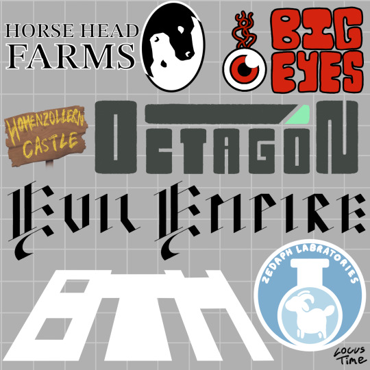
Fake logo designs of various districts/companies in Hermitcraft S8! Something about Hermitcraft brings out the graphic designer in me (*cough* it’s because I love worldbuilding and making tiny details in a world) anyway!
Design notes under cut! (Alongside some headcanons - it is quite long)
Horse Head Farms: this is the logo that started this idea basically. I got such a cool image of an eclipse with a repeated b+w horse head pattern and I really wanted to make it happen. M.C. Esher has done designs like these but as tiles, which I used as inspiration. I think I could have made it look a bit clearer but for my first time drawing something like this I’m pretty happy. The text is from one of the default Procreate fonts and kinda makes HHF look like a law firm (which is the vibe I was going for, soul-stealers and lawyers are often sorta linked in fiction, and supposedly xB and Hypno are their own legal team). xB and Hypno are the only employees other than the people they blackmail into doing stuff for them.
Big Eyes: I wanted a red eyeball as a reference to Tango’s amazing prank on Boatem and I imagine it’s a goofy little mascot for the company. Some big goofy text felt fitting alongside this. I wanted to make a Pass n Gas specific logo too but I wanted to focus on the main “districts” rather than specific shops. I feel like this is kind of obvious but in-universe Big Eyes are VERY unsuccessful and actively losing money.
Hohenzollern Castle: not really a company but Joe and Cleo are cool so I wanted to include them and I had a tiny bit of blank space left on the page so here we are. I actually really love how the sign looks, the wood texture came out nice. They don’t have a logo as much as they do a sign outside their area, created by Joe, with the text written by Joe’s dyes. The “Hohenzollern” is kinda squished because he began to run out of room but was too stubborn to split the word in half. Cleo argues that it isn’t a logo and is just a sign with the castle’s name on it. Joe argues back with a deconstruction of “what is a logo, really?” and something about companies and capitalism and Cleo doesn’t care enough to respond.
Octagon: I am a fool who initially thought it was spelt “Octogon” and had to fix it well after I finished. Oh well. I wanted this to have a very evil look about it. You can instantly tell they’re the evil tech company running experiments on the quantum realm or whatever in a Hollywood movie. Between the unsafe work conditions and the tax fraud, it is a miracle they haven’t been shut down (reason: the government is scared of Doc)
The Evil Empire: the “the” wouldn’t fit so I had to make some sacrifices. Evil Xisuma is dramatic and edgy so he wanted the logo to be in fancy black calligraphic medieval looking text. It fits the evil castle aesthetic the whole area has pretty well too. The Evil Empire is kinda like a Hot Topic store and a Renaissance Fair combined, but it is also involved with Crypto. Despite being so weird it has a perfect niche of marketing to edgy teenagers so it is quite successful. The employees hate it there because their work mandated uniform is to “dress like an evil minion”. Jevin is a slime monster, Wels cosplays a knight and Beef turned into an alien so they thankfully didn’t have to change.
Boatem (BTM): heavily inspired by Grian’s simplified logo he made in Minecraft, where he shortened it to BTM. Despite already having a reference to work off, this was the hardest design. I knew I wanted it to be simple, all-white and leaning back dramatically but I spent ages fiddling with it. Boatem is the most successful company, being perfect for the general public and their shopping district a tourist destination in of itself. It nearly went into bankruptcy when Mumbo was CEO but has been very successful since his Robot took over.
Zedaph Laboratories: my favourite design. Hand writing the text was a nightmare but it came together nicely other than that. Sheep symbol because sheep are his brand. I used the same colour palette as his laboratory. “Laboratory” is misspelled for two reasons: 1) I realised my mistake too late to change it, 2) I think it is completely in character for Zedaph to not know how to spell laboratory and only realise after Tango points it out and be forever haunted by his mistake. Don’t let the sleek corporate design fool you, Zedaph is still wild and is the only person in the “Zedaph Labratories”.
#btw I did this on procreate rather than photoshop#and it was such a pain. Procreate is better for drawing imo but text editing and transformation options are so limited#locus fandom time#locus art time#long post#how the hell am I supposed to tag this lmao#Hermitcraft#hermitcraft s8#hermitblr#Boatem#horse head farms#Zedaph#logo design#graphic design#fanart#hermitcraft fanart
99 notes
·
View notes
Text
Characters with wasted potential : kaminari Denki
I have never seen a series treat it's own electric/thunder user so badly like MHA does with denki kaminari.
Here is the thing kaminari is a pretty cool character; I like his character design and I think his character arc is alright but can use a lot of change.
In all honesty when it comes to kaminari I feel like his arc is literally supposed to be the same as mineta. Both of their arcs focusing on how they treat woman, them being cowards but growing out of it and learning how to be proper heros. However, when it comes to developments kaminari has his speed runned or just has him instantly change.
1) This is controversial but I personally would use have him be contrasted/foiled to mineta just to make his development more impactful.
2) I would have him show more of his cowardice and how he only really wanted to be a hero because its a cool thing to do or to follow in the footsteps of his mother (I would have pro hero Electra or just a simple electrician be his mother)
3) I would build up his friendship with jirou from the beginning and have both of them develop into better people/heroes with that friendship. (Maybe they can become a ship considering I do ship kamijirou 🤷♀️)
4) Emphasise the struggle kaminari has with his quirk (how quick he is to go overboard due to the lack of control) and how he tries to work to overcome it in his own unique way. I would have it so that his mum already helped him a bit by teaching him how to use his quirk in little amounts and big amounts but he struggles to get it into a medium range. I would also have him just experiment with it overall and maybe he could build a little friendship with Izuku or even mei who could introduce ideas like denki being able to act as a circuit, use tasers or even charge phones.
5) As kaminari gets to understand and become a better friend with jirou his views on mineta start to change and his whole views of "I have to go easy one girls" or " it's mean to fight girls like that" (something he said to bakugo during the sports festival) start to change as he grows respectful and becomes more appreciative to woman.
6) this is a 50/50 but I saw this one fic that said it would be cool if kaminari just started using flirting as a fighting tactic to fluster villains and easily take them down. That's something I kind of like and would be interesting to have incorporated into kaminari's character. You could have him work with midnight to build up a skill like that (would make midnight's death more impactful)
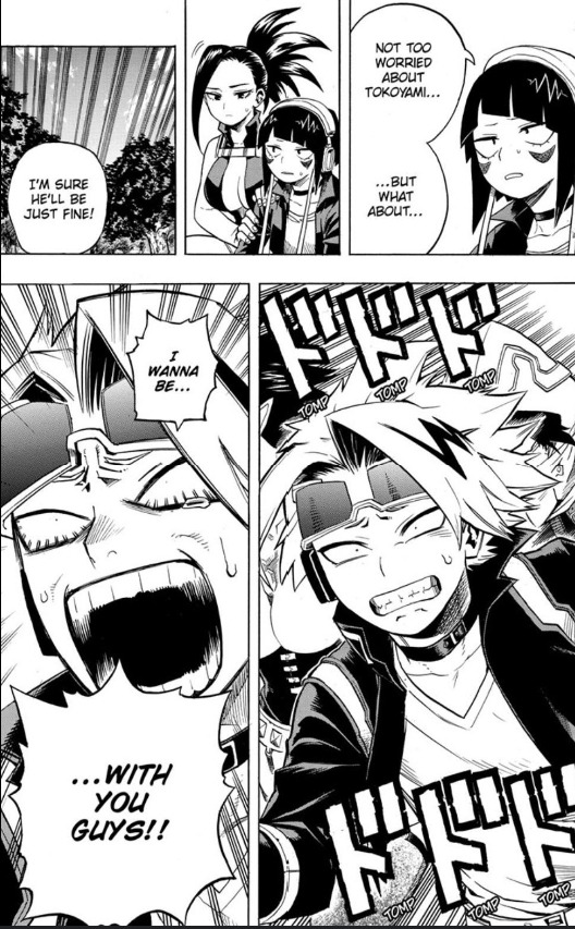
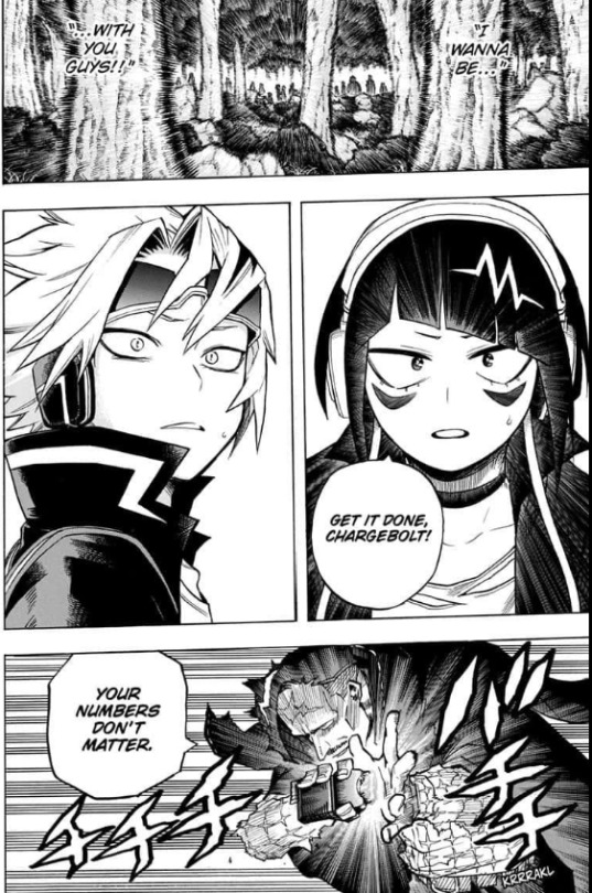
7) I feel like as it comes to the war arc his cowardice should logically still be there but the desire to help protect his friends and reunite with them should be stronger and we would still get the whole epic scene he had in the first war arc
8) have him canonically have ADHD it makes sense. I mean this is a universe just like ours the only thing different is superpowers and idk if I read his character wrong but to me kaminari has always given me the whole idea that he has ADHD or that his character is 'ADHD coded'. In my opinion it would be interesting for him to not really know why he struggles at doing something that everyone can find easy to do so when it comes to his grades he struggles in that aspect and has conflict because of that however, he can go through an arc realising that he has ADHD and find ways to both accept that and adapt to it (I don't know if that sounds rude, Iam sorry if it does)
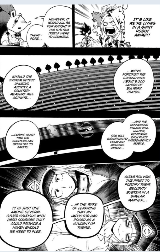
9) I really like denki and jirou bonding over music and him actually respecting and liking her passion. I feel like we should get more of denki making music and exploring his more of his own passions. Like we know denki likes music and manga so why don't we have characters casually talking about that or doing that with him. I also like the idea of denki simplifying everything (like the UA security system) and making it seem like something that would come out of manga so he can understand it better
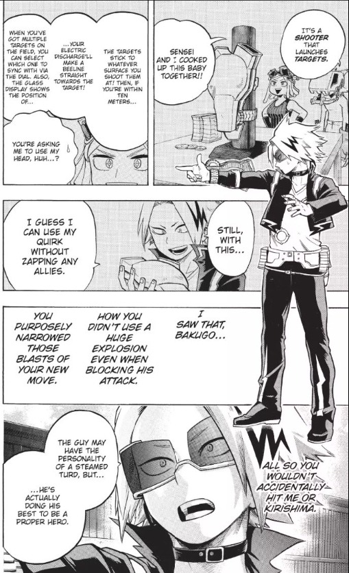
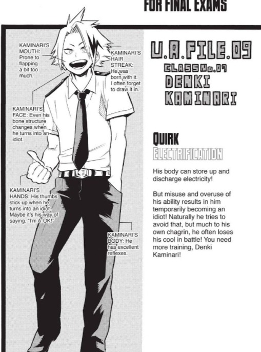
I feel like that kaminari could of been an interesting character with flawed views that end up developing. Ultimately, I feel like the reason I prefer him to mineta (even though they both act in a very disgusting Mannar towards woman) is that he shows chances of change and his character isn't just being a weird, disgusting pervert like mineta's is. To me kaminari could of been a coward kid who found it difficult to really fit in and do the things that everyone does but ultimately ends up overcoming that struggle while expanding his views and becoming a more respectful person.
#mha critical#bnha critical#hori is a bad writer#horikoshi critical#mha#bhna critical#denki kaminari#mha kaminari#bnha kaminari#kaminari x jirou
43 notes
·
View notes
Text
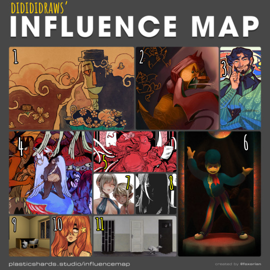
my tablet is currently halfway across the country for repairs (my brother's the most tech-savvy in my family and asking him to take a look at it was cheaper than taking it to a shop) so i haven't been able to draw lately. i've made a bunch of traditional sketches in the meantime, but none of them are presentable enough to post here, so i decided to take a trip down memory lane and fill out one of foxorian's influence maps!
below the cut are the names of the artists featured here, as well as a little bit of director's commentary on how they've influenced me :]
yugo limbo (website, tumblr, twitter) - some time last year, i realized something profoundly unnerving: i actually... don't like the art in smile for me's original release all that much? that's not to say it's bad, just that there isn't a whole lot about it outside of maybe its architecture that stands out to me. which is REALLY WEIRD, considering i wrote a whole retrospective about how much this game means to me. art-wise, however, it was only after smile for me's release that yugo limbo's art evolved in a way that really resonated with me; i love how textured everything is, i love the way they simplify clothing folds and the way that skin wrinkles around the joints, i love their love for puppets; all of those things ended up worming their way into my art style and tastes one way or another, and i couldn't be happier!! it didn't feel right to leave smile for me out of the equation entirely, though, so i chose a piece that was both related to that game and that i felt reflected a lot of what i love about yugo's more recent art.
echobsilly (twitter, tumblr) - oh god, speaking of yugo limbo - god. i fucking love echo's art so much i have no idea how to even do it justice in writing. like many people i first found him through his smile for me/limbolane fanart and animations - and those are some of his best work, don't get me wrong, but i really wanted to include one of his original designs to make a point that he's just fuckin great at art in general. character design, facial expressions, body language, composition, LIGHTING... he makes it all just. so so so gorgeous. i always liked "painterly" art styles for lack of a better word, but i think his art is what first pushed me to embrace that more in my digital art. i also like how he talks about dr. habit like he's his dead wife. i'm very proud to call him a friend these days :]
japhers (tumblr, twitter, instagram) - i first found japhers' art in high school and he very quickly became a HUUUUUGE influence on my taste in character and costume design. one of the big reasons i never fully bought into the idea that men's fashion is inherently harder to design is bc so much of his art is already dedicated to exploring fashion Without the restrictions of a gender binary in place which is to say that he's really good at drawing buff dudes in frilly outfits. i also think he gave me more confidence to draw more intricate costumes without having to worry about super dainty and clean lineart, bc a lot of his art looks like it's kinda been carved/rendered out of sketches, and it is Gorgeous.
moe suppe (website, tumblr, cohost) - another artist i found in high school, albeit originally from a long-gone instagram account. his art is what kickstarted my desire to have some Roughness in my art, some Texture. it may not have stuck to my lineart, but it Definitely stuck to my rendering. it helped that i was going through a pretty big angel/demon phase at the time, which meant i was pretty immediately drawn in by his delightfully weird worldbuilding. i should probably read fear not now that it's an actual serial...
val wise (website, itch.io, twitter, instagram) - a more recent influence, but a pretty significant one nonetheless. i featured the cover of délicatesse here because it was the first thing from him that i had ever read, but in general his grasp on the human body really blows me away given how deceptively simple his style looks at first glance, especially his faces. the way fat and hair sits on her bodies, and how much it varies from character to character... it's beautiful without being So glamorous that it feels untouchable. his costume design is also great. i recommend his comics for low fantasy/ursula k. le guin fans who are Dying to see more fat characters in leading roles. i also just found out that i am of two hearts is free on itch.io, so i'll be treating myself to that over spring break.
partycoffin (tumblr, twitter) - if you have known me for any amount of time at all then this should not come as a surprise to you. i actually wasn't going to include partycoffin in this map at first, because while welcome home has inspired me in Many creative pursuits, i didn't think visual art was one of them? i definitely picked up some of clown's love for dramatic lighting and thinner lines with just a smidge of well-placed hatching subconsciously, though.
ryoko kui - probably the most recent artist featured here? anyways i have a confession to make: i have yet to read dungeon meshi. i just know that when i saw a post compiling a bunch of ryoko kui's sketches from her daydream hour series, i was so overwhelmed with this feeling of, like… "oh, yeah, these capture almost everything i love about women as flesh and blood people. when i draw women this is the kind of beauty that i want people to see in them." of course, ryoko kui is a great character designer in general, but something about her women specifically really speak to me. the earthier color palettes and rendering also do a lot to endear her art to me.
shuzo oshimi - specifically his art in blood on the tracks. something that really stood out to me in that series was whenever the shadows would get really intense, and you'd get these big blocks of black with just the faintest bit of hatching to soften out some of their edges. it was always very effective in creating this sense of claustrophobia. i really want to keep incorporating that in my more intense pieces!
person918x (tumblr, instagram) - i don't work with 3d art often and i don't see myself doing so any time soon, but the composition of person918x's pieces is something i take a lot of inspiration of. i also love his sequential art, as someone who does a lot of dream journaling it's sick to see the exact Vibe of a dream be put to (digital) canvas. i also firmly believe that he's one of the only people out there who knows what he's doing when it comes to using generative AI in art.
oops i made this list too long so now i have to put the last two artists in a new block.
10. meatgiri (twitter, instagram) - definitely the artist i've known about the longest out of this selection. i think i've been following her since…. oh god. since i was in middle school. way before she was meatgiri, even. i think her influence probably shows up the least in my art, but there are definitely some characteristics that stuck with me for a very long time (the lil block of black accompanied by one or two lines for shading on the neck, the looser lineart making it really easy to incorporate soft curves and sharp edges, the Eyes, etc etc.) i chose this drawing of her oc juniper bc i thought it was both reflective of her current art And a good embodiment of a lot of things i wanted to emulate from her art as a young'un.
11. dragan bibin (website, instagram) - specifically his 'deimos' series. much like with person918x, it's his compositions that really stand out to me the most, and you probably know by now that i'm a sucker for high contrast. i find it interesting though that he uses high contrast to obscure more than he does to highlight... helps a lot with giving the deimos paintings that air of Quiet Unease. another thing i want to incorporate in my horror-adjacent art! manmade environments gone wrong!
#not art#influence map#artists on tumblr#yugo limbo#echobsilly#japhers#moe suppe#val wise#partycoffin#ryoko kui#shuzo oshimi#person918x#meatgiri#dragan bibin
20 notes
·
View notes
Text
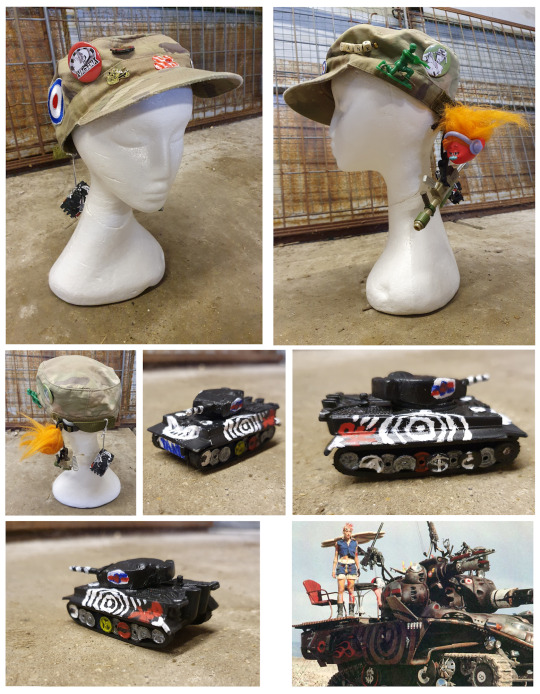
Hey, It’s another of those posts where I jabber on about costume design for a while💬💬. This time I’m focusing on my Tank Girl baseball cap. I didn’t do enough with this for it to need a tutorial ,but there are a few features I want to highlight, because I think they’re pretty cool. Unlike most of my Tank Girl stuff, it isn’t based on anything in the comics or movie. I bought the hat itself because it was going cheap in my local army navy store and decided to customise it because I had a bunch of stuff left over from my Tank Girl helmet project🪖 (see earlier post).
The first improvement I made was to fix a strap and plastic slider to the back. This was partly to make the size adjustable, but mainly because I wanted something to hang stuff from. The process was simple and just took a bit of sewing. Once I’d done that, I sewed on a couple of patches as well – one with a target on, because as any Tank Girl fans will know, that’s kind of her trademark, and a flower, just because I like flowers.
Then I spelt out TANK with letter cubes on a chain and added this. I bought a huge bag of these letter cubes a while back, but annoyingly, there were no Ts, so I had to modify one of the I cubes to make the word I wanted. Next, I pinned on some badges and also attached a few old toys which I picked up in a thrift store.
The final addition was a toy tank. This was another thrift store purchase and was in pretty bad shape when I got it. Parts were messily painted, other parts were worn and the wheels were busted. I was going to hang it on the hat as it was. Then I remembered how sick the tank in the TANK GIRL movie looks and thought it would be cool to make the toy one into a little replica. I stripped it down to bare metal with some nail varnish remover (which I always have plenty of), and fixed the wheels with some trusty super glue (I use Gorilla myself, though as I’m not getting any sponsorship money from them, I’d like to point out that there are other brands available). Next, I sprayed it matt black. Although it’s only small, this took a couple of days, because I had to let one side dry before I could turn it over to do the other one. In the time between, I rewatched the movie to check what the real tank looked like (which I enjoyed immensely as always). The paint job was too complicated for me to have copied exactly on such a small toy, so I drew a simplified design to work from. Then I got to work painting and was surprised by how well it turned out. As I say, the pictures on it aren’t identical to the movie ones, but I definitely think I captured the spirit of it. I just wish it was big enough for me to do a photo shoot with and take out for spin. What can I say… me 💜 tanks.
I’ve already posted a few pics of me wearing the cap and will be posting more soon. See them here or at 👉ko-fi.com/christabelq👈. Tanks for reading this and have a wonderful weekend.
#tankgirl#tank girl#tankgirlcomic#cosplaygirl#cosplayers#ukcosplayer#cosplaygirls#comicbooks#follow for follow#follow back#followback#followforfollow#like for like#likeforlike#costume design#prop design#cosplay tutorial#alan martin#jamie hewlett#baseball cap#hat
27 notes
·
View notes
Note
Ruby this Ruby that you sound like a broken record. She already grieved and she wouldn't hate Jaune because Ruby is a HERO and she forgives
Now gee why would I be annoyed that the show's main character got screwed over from having a proper character arc, interesting character development and having genuinely heartfelt story moments that matter! Why would anyone be mad that a character with volumes of build up got all of that potential and depth stolen?! How unthinkable to be annoyed that a show titled RWBY doesn't have anything to do with R or W or B or Y!
One of the things that anyone that has written anything will say when talking about story structure is that you should never have your characters be completely infallible or have the narrative their personality traits for granted.
The concept of fictional writing since time immemorial has always involved overcoming (or failing to overcome) obstacles, be it literal or figurative.
To put it simply - a choice or an action or a character trait loses all of it's value when it's "an unchanging default outcome". If you take a blank sheet of paper and try to paint something with only white, all you will get is same white.
Conflict, facing obstacles as part of character development, etc helps highlight character traits by via simple contrast.
A character at their highpoint is notable only because there's a contrast with them hitting a low point. Being kind, being forgiving, being heroic, being cruel, being vengeful, being malicious - all of character traits are choices. And them being choices (conscious or subconscious), are what gives them meaning. That's what characterization is if one were to simplify it - taking character traits and exploring them as character reacts to or reflects upon something that is happening or happened and then makes a decision
if a character, Ruby or anyone really, never has to struggle with those choices, then their choices, personality traits and even story themes that surround the character are all worthless.
You don't design a filler dimension of Character Development with the goal of putting your protagonist into situation where she is at her lowest and then offscreen literally anything relevant to that as well as any sort of struggle or conflict.
She might forgive, she might not, but seeing her process that information and seeing that conflict is crucial to her as a character. And not just this specific case - there's plenty of things she experienced that show just completely handwaves away in V9 (like her entire psychological trauma or EVEN HER HAVING FLAWS).
A character being always forgiving and always heroic "because story wants it to be the case" means absolutely nothing and might as well be white noise.
The latest offscreen Incident (one of many offscreen incidents) is just another case where Ruby could have had an important character moment and didn't.
As it stands MilesWBY Ruby is nothing. Entire main cast really. There's been no real progression since end of V3 and whatever interesting consequences of V3 there could have been, have been constantly downplayed or ignored. Ruby Rose has ended the volume a worse and more shallow character than she started it as because all of the potential to salvage her character and make her more complex was robbed. All of the cast did, really.
Ever After was created as the Filler Dimension of Character Development and instead it ended up as merely "The Filler Dimension".
#rwby#rwde#ruby rose#it hurts to even think what could have been#Ruby should be the star of her show and she had every bit of potential to be an intriguing and emotionally relatable character#instead she is nothing
36 notes
·
View notes
Note
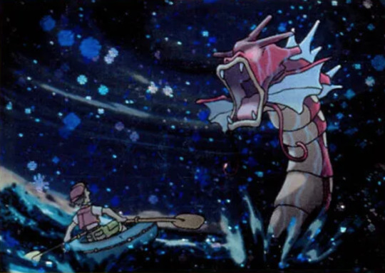
Magikarp/gyarados review? 🐟🎏🐉
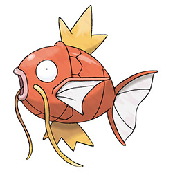
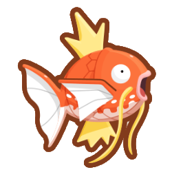
Magikarp is everyone's favorite useless fish, and it does a pretty damn good job at being a Useless Fish. I think the eyes really get this across well—this is a creature that absolutely only has a single brain cell bouncing around in there like a game of Pong, all right.
Visually, the design is pretty simple, but it does what it needs to. Like I said, the expression is spot-on, and the open mouth also adds something to it. The whiskers are nice, both carp-like but also reminiscent of eastern dragons, and the body has a distinctive bony shape that'll become even more prominent when it evolves into Gyarados.
The only thing that bugs me about it is the pink mouth; it looks disturbingly fleshy and adds another color that isn't needed. White or yellow would've worked much better. Also, I don't really think the lines under the bottom of the head were needed, but that's a very minor thing.

(Also, side note: this isn't needed in any capacity, but Magikarp was given some pretty neat patterns in the Magikarp Jump game. Some of them are completely different colors and look a bit too much like shinies, but the more koi-like ones are really cool and I wouldn't mind seeing them in an official game.)

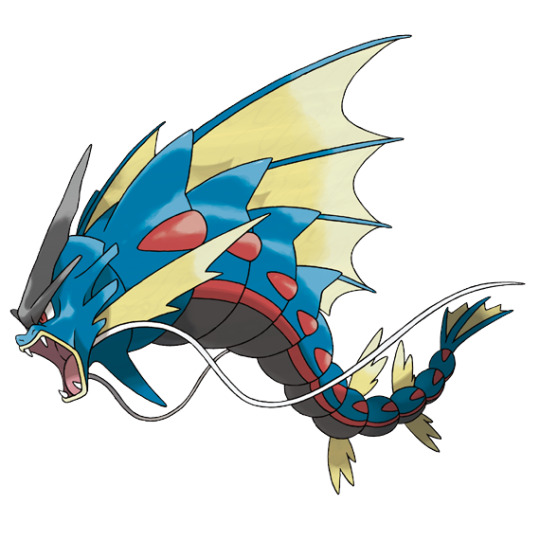
The whole concept of a fundamentally weak and useless Pokemon evolving into something badass and powerful is a great concept, and Gyarados pulls it off very well. It's also a nod to the Chinese legends about how carp that managed to jump over waterfalls would become dragons, so that adds another layer to it. It's also probably based in part off of windsocks, hence the water/flying typing (keep in mind that in Gen 1, the dragon type was still considered to be rare and mythical).
Visually, I think Gyarados does a good job looking more powerful without being completely disassociated from it's pre-evo. Similar to the Dratini line, people seem to think the two stages have nothing in common, which isn't true at all. They both have:
"Lips" and wide open mouths
Whiskers
Three-pronged fin structures on the back
The fins near the head having an edge at the top and the tail having two edges
Segmenting of the body
A bony, rigid body structure
Gyarados changes color and gains a more serpentine body, but the visual elements and overall design remain shockingly similar so you can stop trying to say Gyarados and Dragonite were flipped just because Gyarados is long and blue, seriously if I see that "theory" one more time I am going to go apeshit on someone
Visually, you can definitely tell that this is a powerful Pokemon, and I love the shapes and detailing around the head. The repetition of the body segments helps to create a pattern, simplifying what would otherwise be a complex design.
The only nitpick I have is that it's strange that the whiskers are positioned under the head instead of by the mouth, which isn't a big deal but is hard to unsee once you see it. Also, the three prongs on the head would've worked better in cream or white. Otherwise, I have no complaints.

Gyarados also has a mega for no real reason, though at least with this one you can't argue it would've been better as a regular evo, as that would've defeated the point of the Entire Everything.
I don't think it adds much to the line, but the design itself isn't terrible. I do actually really like the massive back fins, which pop nicely and instantly gives a focus point to the design. Other than that, most of the design is just exaggerating things already on base Gyarados—longer whiskers, longer head ornament, long head fins, extra body fins, etc., which works to make it look more powerful.
However, I do have a few issues with it. Adding two colors to a previously two-color design feels like a bit much, and all three colors are too low contrast. I think the black was added to try to haphazardly justify the dark typing, but all the black areas could easily be cream/red without losing anything. Alternatively, making the red areas cream would've helped with the contrast; I'm not sure why they're there anyway, other than a tenuous connection to Magikarp. Here's a quick edit to show what I mean (original on left):
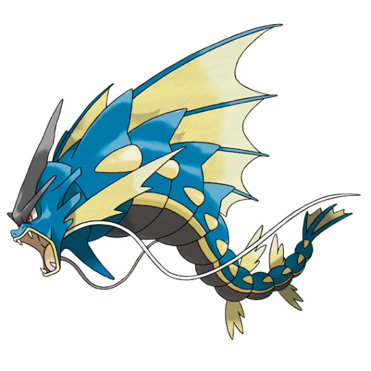
Also, it actually has two giant back fins. When I first saw it I thought it had one, and frankly I think that would look just as good but would've cut down on the clutter a bit. It doesn't look too bad from a side angle, but it's a bit much from the front:
I'm also not big on the two extra tail fins, as the bottom set interrupts the flow a bit (they're also more rounded than the main fins; some consistency would've been nice), and the spike under the chin feels random. Everything else, however, works well enough for what they were going for, and it's at least an interesting albeit pointless take on the original design.
Anyway, overall: the concept of a weak Pokemon suddenly getting super strong upon evolution is a good one, and this line handles it well. Magikarp is endearingly useless, and Gyarados has good contrast with it while still looking like they belong together. The mega isn't quite as good, but it's still a solid enough design as a whole minus some clutter and odd color choices.
58 notes
·
View notes
Note
Hiii! Do you happen to have tips for drawing in the crk artstyle(or at least mimic it)? Cuz I struggle a lot trying to mimic the artstyle so it'd be nice to try and get some tips from someone who is more skilled!
Howdy! Thanks for asking! I surprisingly get this question quite a bit because of how I'm able to make my CRK OCs look like they're official characters you can get in-game. So, I got better at replicating the style by watching a video where an artist goes more into depth on how they draw in the style.
I'm sure I can explain it a bit more: The Cookie Run art style is a relatively simple style, but is more complex than it already is by the character's details in their design! How I managed to master it is simple: take an existing official sprite you like and simplify the body into shapes by sketching over it! That way, you can see the body underneath the clothing, hair, etc. without being overwhelmed.
Once you finished simplifying the sprite, put your sketch in the corner of your canvas and try to replicate it to the best of your ability, then you can add more details once that is complete, too!
If my advice doesn't help all too much, I have some links to some tutorials that I have used before to help me improve!
Here are some links:
youtube
youtube
There are many other tutorials up on YouTube and not just these, so tell me if this helped! (I plan to make a full guide on how to draw in the CRK style soon, as well!)
32 notes
·
View notes
Text
Homebrew Class design For Dummies: Part 1: The Foundation
Hey you~! Have you ever wanted to make a homebrew class for Dungeons and Dragons fifth-edition? Perhaps you wanted to recreate a character from a book or movie you like that can't be represented by any existing class or multi class options, maybe you want to recreate a class from older editions? Or maybe you just have a really strong concept in mind but struggle to put words to document, well have you come to the right place. This blog is meant to serve as a guide for those wishing to make their own class, starting from a simple concept to a finalized product.
This first part of the series will go over the conception of a homebrew class, talking about the concept, role and other relating topics. Over the course of this series you'll also see the live development of a homebrew class "The Avatar" inspired by Hercules and Maui, the avatars are warriors that wield the powers of god, empowered by the legends that surround them.
When making a homebrew class, the first thing you should have in mind is a concept. Maybe you want to play a certain fantasy archetype you want to play that isn't possible with existing content, maybe you have a mechanic in mind that wouldn't fit as a subclass feature, or you want to expand on more forgotten aspects of D&D like tattoo magic. Whatever your starting point may be, make sure to jot down other themes and ideas you want to present. Given the themes of the avatar I can already jot down some ideas
Martial Class
Customizable blessings from their legends
Likely charisma focused
Buffs via dealing damage
I will preface that, when making the concept for your class, keep these things in mind
1: Can you make the same type of character with existing options (Not including reflavoring/reskinning.) Admittedly the avatar class concept could leans into themes touched-on divine soul and oath of glory, however I feel that the herculean folk hero archetype is flexible enough to warrant its own class, given how vast the subjct is.
2: Is my concept flexible enough to make subclasses? For instance, say you want to make a caster that steals its opponents powers, cool...But what do you do for subclasses? In this case the avatars sub classes-their divine exemplar can come from which god empowers them, one subclass for example could be the exemplar of light, the exemplar of war, exemplar of death, etc.
Okay so, got all of that concept stuff down? Good, now is time to get some gameplay details down, nothing concrete just yet, but rather basic ideas of how and where your class is fighting. Now would be the time to bust out a writing program, such as google docs, notes, or anything alike.
Class Role
Your classes role is what they do in combat, do they want to deal damage? Heal? Defend? While this might simplify each type of role I listed some examples bellow:
Brawler: Brawlers want to get up close and personal, dealing high single target damage. Most martial classes fall under this archetype, along with Hexblade Warlocks or College of Swords Bards.
Blaster: Blasters are similar to brawers in that they focus on dealing damage, unlike brawlers they focus their efforts to large groups-rather than a singular target, examples include Evocation Wizard and Light domain Cleric.
Buffers: Buffers focus on provided positive effects to enhance their teams performance, such as better dice rolls or increased damage.. Buffers include most Bards, Clerics and Druids.
Controller: Controllers focus on impeding their enemies, limiting their options or event preventing them from acting at all. Controllers include Druids, Monks (Via stunning strike) and Undead Warlocks.
Debuffer: Similar to controllers, the debuffer focuses on weakening their opponents, making them less effective.. Debuffers include College of Eloquence Bards and Divination Wizards.
Healer: Healers do exactly what their name implies, keeping their party at well healed and removing negative effects. Healers include Life domain Clerics, Celestial Warlocks and Way of Mercy Monks.
Skirmisher: Skirmishers focus on darting in and out of the frontlines, remaning mobile all the way: Skirmisher include Rogues, Monks and any character with the Mobile feat.
Tank: Tanks focus on drawing enemy fire away from their allies and towards themselves. Tanks include Armorer (Guardian) Artificers, Barbarian and Oath of Redemption Paladins.
Keep in mind that some classes can fill multiple of these rolls through subclasses, feats, etc. Cleric immediately comes to mind thanks to their varied spell list and all of the divine domains present to them. For our avatar class I think a mix of striker and buffer could be interesting, where your goal is to deal damage, but also help your allies deal more damage and stay in battle.
Area
Also referred to as a characters "zone" a characters preferred area is where they'll be hanging out in combat, this information is usually indicated by things such as hit die, proficiency, etc. The obvious example is barbarian, who with their d12 hit die and martial weapon proficiency are designed to be up in the thick of things, meanwhile a wizard with their measly d6 hit die and no armor proficiency are best set for the backline, sure there may be ways to alter your zone, but having a concrete "My character is best at this area" can help defining their role in combat.
For the avatar, I will settle on it having a d10 hit die, both cause I imagine a demigod archetype would be rather tanky, but also since I imagine the class largely staying in front lines of combat, with them potentially being able to do range combat similarly to a fighter.
Out of Combat Role
While D&D combat is fun (depending on who you ask) it is equally as important your class to think about your classes role out of combat, will they attempt to persuade the king to aid the party? Will they be lurking in the shadows, setting a deadly ambush? A classes out of combat roll is supported by particular ability scores, proficiency and even class abilities. Going back to barbarian, due to their strength focus and proficiency in athletics are going to be the teams brawn, rogues thanks to expertise and natural affinity for thieves tools are likely to scout out ahead, disarming traps. To give some more concrete examples of roles, the list includes:
Brawn: Brawns use their strength to break doors, push away obstacles and grapple. They use strength and prefer athletics, acrobatics and sometimes intimidation.
Brain: Brains are the thinking men, they use their mind to solve problems and decipher mysteries. Brains use intelligence and wisdom, preferring arcana, investigation, history, nature and religion.
Face: Probably the most infamous DnD archetype, the face uses honeyed words to help their team. Faces use charisma and wisdom and prefer deception, persuasion, performance, intimidation and insight.
Heart: The heart is like the party glue, their job is to keep everyone healed up and ready for the day ahead. Hearts prefer wisdom and charisma, preferring animal handing and medicine.
Scout: Scouts gather information and disarmed traps, laying the path for their team to follow and take advantage on. Scouts use dexterity and either wisdom or intelligence, preferring stealth, sleight of hand, investigation, perception and nature.
Keep in mind that a class can have multiple of these rolls present at once, just cause you're a paladin doesn't mean you always have to do the convincing. In our case the avatar will serve primarily as a brawn and face, it feels like a natural given the concept.
Summary
To summarize all of the points made within this write-up. When you start designing a homebrew class you should:
Start with a strong concept.
Jot down your initial ideas.
Think about your classes role in and out of combat, as well as their area of play.
Get to work.
Final Note
Before closing out this first part, I want to go over some terminology you might hear floating around that I want to clarify before moving on as they'll be referenced going foward.
A martial class refers to a class that doesn't have spellcasting as a core feature, while D&D's official martials are mostly nonmagical-warrior types. A martial class can still be magical in nature, so go nuts with it! They're really fun to make.
Full casters are classes that focus on casing spells (duh) full casters possess a certain number of spell slots to cast increasingly powerful spells. Warlock is the one outlier since they work on their own system (Being pact magic)
Half-Casters are a mix between the two, while they can only cast up to 5th-level spells, they make up for it with martial ability built into their base kit (fighting styles and extra attack) they're great fun I'll tell ya!
I'll also recommend two resources for class design, the first is Indestructoboys homebrew design masterclass series, where I get many of my concepts from, alongside the guide to balancing classes on the Unearthed Arcana subreddit, which provides a good framework for future entries into this. Otherwise if you've made it this far, thank you for reading, and I wish you good luck in your homebrew creation. Tune in next week where we begin to put mechanics to document, but until then, see you around.
D&D Homebrew Class Design Masterclass | Before 1st-Level
Guide to Balancing Classes
#dnd homebrew#dnd5e#5e homebrew#dnd#homebrew 5e#5e#dnd 5e homebrew#dungeons and dragons#dungeons and dragons homebrew#homebrew#homebrew class#writers on tumblr#advice
47 notes
·
View notes
Note
You mentioned that PGR’s story is the only holding it back right now (or something to that effect?) Me and my pgr playing friend were talking about how the story was good enough to make her roll for Plume despite wanting to save for Selena, despite both of us saying before that the story wasn’t as good as AK or FGO.
What do you find particularly weak about PGR’s story and what direction do you think it has to take to bet real good?
Its biggest weakness is that it doesn't tell its story at all.
Now I haven't played PGR in a bit, but something that immediately struck out to me when I first played it was that there wasn't a story being told: shit was just happening. No whys or hows or whats behind anything, shit was just occuring.
Take Camu's chapter for example. Oh Kamui has another, dark self now. Kamui's run off searching for Tenebrion, whatever that is. Lucia catches up with him eventually. Soon the Purifying Force does too. Then they decide to not kill him. And thats it.
There's no building anything up or character development or themes or anything at all. Experiencing Punishing Gray Raven's story is like reading a wikipedia summary. Stuff is happening in chronological order and characters are doing things to keep that plot going, and that's about it.
The whole chapter with Lucia Plume tried to be some big finale to the 'arc' of the first few chapters by bringing in characters from all the past chapters, which, damn I sure wish you made me care about those past chapters first.
That chapter was maybe the first time I saw PGR even attempt at real storytelling by having actual stakes (Lucia's mind is slowly being overwritten by a new copy of her since she's essentially dying by going in this stronger body) and some real emotional arcs with PRESENTATION and FLOWERY PROSE, but the problem with that was it relied on buildup that was completely nonexistent. Why would I care about the Lucia being erased when she was barely a character despite being the protagonist? It didn't even fuckin matter in the end because the new Lucia Plume ended up acting almost exactly the same afterward anyway, and also had the old Lucia's memories as records she could view.
I couldn't shake the feeling that PGR's storytelling was a bunch of people writing down what they thought would look like a really cool anime but actually not having anything to say, not even "look at how cool our robot girl is." That's why there's so much description in certain events, like Lucia hallucinating the ghosts of her other selves walking past her, but the events themselves are so disconnected from each other that they don't really add up to even a simple story.
And then I just stopped playing PGR entirely, because as much as the action gameplay actually kicked ass and as much as I loved the game's various game design choices and creativity with unit skillsets, I ultimately did not care about anyone or anything within the setting, and surprisingly that turned out to be one hell of a dealbreaker for me even when I was having fun.
I lasted about a year though (stopped right when the Nier collab event started), which says a lot about just how solid the combat system feels. I'm hoping Kurogames' Genshin competitor Wuthering Waves ends up with a much better setting, though I'm already kind of concerned at how repetitive the combat looks vs PGR which gets the appeal of a hardcore character action game dead-on despite the simplified, touchscreen control scheme
110 notes
·
View notes
Last Seen Blogs

gayfatpigslob
GayFatPigSlob

kohei0103kusuyama22
楽器の展覧会
imogen-bailey
Untitled
introvertedphantom
Screaming Into The Void
dykegrath
you’re so many things