#btw I did this on procreate rather than photoshop
Text
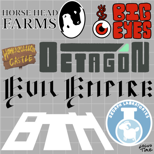
Fake logo designs of various districts/companies in Hermitcraft S8! Something about Hermitcraft brings out the graphic designer in me (*cough* it’s because I love worldbuilding and making tiny details in a world) anyway!
Design notes under cut! (Alongside some headcanons - it is quite long)
Horse Head Farms: this is the logo that started this idea basically. I got such a cool image of an eclipse with a repeated b+w horse head pattern and I really wanted to make it happen. M.C. Esher has done designs like these but as tiles, which I used as inspiration. I think I could have made it look a bit clearer but for my first time drawing something like this I’m pretty happy. The text is from one of the default Procreate fonts and kinda makes HHF look like a law firm (which is the vibe I was going for, soul-stealers and lawyers are often sorta linked in fiction, and supposedly xB and Hypno are their own legal team). xB and Hypno are the only employees other than the people they blackmail into doing stuff for them.
Big Eyes: I wanted a red eyeball as a reference to Tango’s amazing prank on Boatem and I imagine it’s a goofy little mascot for the company. Some big goofy text felt fitting alongside this. I wanted to make a Pass n Gas specific logo too but I wanted to focus on the main “districts” rather than specific shops. I feel like this is kind of obvious but in-universe Big Eyes are VERY unsuccessful and actively losing money.
Hohenzollern Castle: not really a company but Joe and Cleo are cool so I wanted to include them and I had a tiny bit of blank space left on the page so here we are. I actually really love how the sign looks, the wood texture came out nice. They don’t have a logo as much as they do a sign outside their area, created by Joe, with the text written by Joe’s dyes. The “Hohenzollern” is kinda squished because he began to run out of room but was too stubborn to split the word in half. Cleo argues that it isn’t a logo and is just a sign with the castle’s name on it. Joe argues back with a deconstruction of “what is a logo, really?” and something about companies and capitalism and Cleo doesn’t care enough to respond.
Octagon: I am a fool who initially thought it was spelt “Octogon” and had to fix it well after I finished. Oh well. I wanted this to have a very evil look about it. You can instantly tell they’re the evil tech company running experiments on the quantum realm or whatever in a Hollywood movie. Between the unsafe work conditions and the tax fraud, it is a miracle they haven’t been shut down (reason: the government is scared of Doc)
The Evil Empire: the “the” wouldn’t fit so I had to make some sacrifices. Evil Xisuma is dramatic and edgy so he wanted the logo to be in fancy black calligraphic medieval looking text. It fits the evil castle aesthetic the whole area has pretty well too. The Evil Empire is kinda like a Hot Topic store and a Renaissance Fair combined, but it is also involved with Crypto. Despite being so weird it has a perfect niche of marketing to edgy teenagers so it is quite successful. The employees hate it there because their work mandated uniform is to “dress like an evil minion”. Jevin is a slime monster, Wels cosplays a knight and Beef turned into an alien so they thankfully didn’t have to change.
Boatem (BTM): heavily inspired by Grian’s simplified logo he made in Minecraft, where he shortened it to BTM. Despite already having a reference to work off, this was the hardest design. I knew I wanted it to be simple, all-white and leaning back dramatically but I spent ages fiddling with it. Boatem is the most successful company, being perfect for the general public and their shopping district a tourist destination in of itself. It nearly went into bankruptcy when Mumbo was CEO but has been very successful since his Robot took over.
Zedaph Laboratories: my favourite design. Hand writing the text was a nightmare but it came together nicely other than that. Sheep symbol because sheep are his brand. I used the same colour palette as his laboratory. “Laboratory” is misspelled for two reasons: 1) I realised my mistake too late to change it, 2) I think it is completely in character for Zedaph to not know how to spell laboratory and only realise after Tango points it out and be forever haunted by his mistake. Don’t let the sleek corporate design fool you, Zedaph is still wild and is the only person in the “Zedaph Labratories”.
#btw I did this on procreate rather than photoshop#and it was such a pain. Procreate is better for drawing imo but text editing and transformation options are so limited#locus fandom time#locus art time#long post#how the hell am I supposed to tag this lmao#Hermitcraft#hermitcraft s8#hermitblr#Boatem#horse head farms#Zedaph#logo design#graphic design#fanart#hermitcraft fanart
99 notes
·
View notes
Text
It's funny to me, I saw this post at the beginning of highschool and I was like "Omg!! I'm starting highschool so I'll use a pic from begining of Jr. High lol!" And I'm finally a senior in highschool now, officially able to do this correctly and oh boy is there improvement
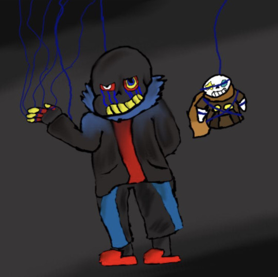
This was the drawing from the middle school one. Done on Paint shop Pro because I was too scared to download an actual art program or spend money on one. I didn't have a tablet at the time and my sister gave me her hold Wacom drawing pad. Btw, the Psp version I used was literally from the 80's. My mom had it installed and told me that it was the Same as photoshop. Shading is horrible, I used the smudge tool but did not blend it out properly lol, and it also smudged the lineart because I couldn't comprehend layers (´°̥̥̥̥̥̥̥̥ω°̥̥̥̥̥̥̥̥`). Hand is like.. huh??? And anatomy is questionable at best lol. I'm actually surprised I used a different sized pen in this though, I used to hell-bent on using only one size of pen, but I went WAYYY to small and the facial details are so pixelated with the small brush. I also didn't know how to draw backgrounds, so it was again, poorly smudged colors next to eachother.
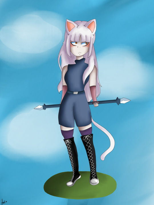
This was the drawing I made my freshman year. Certainly a little better!!! I learned how to draw smooth lines at least lol. Anatomy's a little better too, and I learned how to somewhat draw hands. However, I did not know proper size proportions and the feet are uneven and the hands are so small. No sense of posing, I used to just wing it back then lol, no references, all from my head. I think the eye style here is pretty interesting, they look upside down!!! Meaningless shading, still. And the shading overall just looks bad, I used the eyedropper tool and desaturated the color, then proceeded to use the smudge tool everywhere. I also only used thin lines because I hated how thick lines looked at the time. I heard so many people talk about line weight and depth and I just refused to listen, telling myself that you could only use one size of pen, and all the lines have to stay consistent in size. Oh! I also had a tablet at this point and used Autodesk sketchbook because it was free lol. I actually kind of started grasping backgrounds?? Most of the time it was just clouds but it was better than nothing lol.
And finally, my art now. There's uh.. definitely a huge difference. Learned line depth and absolutely adore using thick lines lol. Switched programs again !! I now use procreate. I actually learned how to draw hands somewhat, sometimes hands just don't wanna hand, but I can at least make them look decent. I know how to pose characters and use references all the time now. I've also started drawing backgrounds and settings rather than just standalone characters with no personality or depth.
#ace attorney#art#digitial art#fanart#improvement#art improvement#omg why was it so bad back then#i mean... I had to start somewhere I guess??#kind of cringy that it was Undertale too#undertale#guess I should probably tag that#middle is an OC#ship child#in fact#from hxh#hxh#hunter x hunter#ugh feels weird to tag that too
1 note
·
View note
Last Seen Blogs

angelminor50
Untitled


kenkaweb4
Karoseri Mobil dan Truck Crane Indonesia

i-am-a-mudkip
UrLocalMudkip

eeminery
Untitled