#the color desaturated...
Note
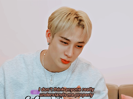
hello. can you please draw soldier eating a burger thank you.
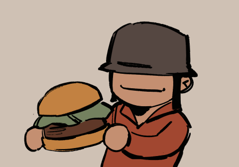
wahhhh 🤤🤤🤤🤤
#the color desaturated...#tf2#tf2 soldier#team fortress 2#chez burger 🤤#BABY FIRST ANIMATION#soldier eating a burger#THANK YOU FOR THE REQ ^_^#tumblr request#9ffairs art
1K notes
·
View notes
Text
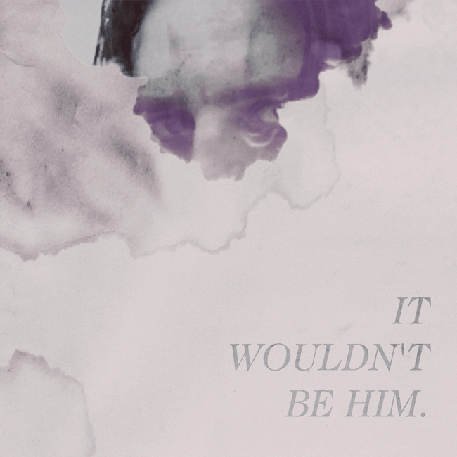
Beware the Mountain's King
#chew toy of a man.#i was!!! trying to replicate ggdg's palettes bc i am obsessed with how they do colors in soulsov#i am Not good at it yet. but hey. i had fun! and i think this turned out alright....#undertale#asgore#myart#TUMBLR STOP DESATURATING MY ART CHALLANGE
2K notes
·
View notes
Text
I think 90% of my gripes with how modern anime looks comes down to flat color design/palettes.
Non-cohesive, washed-out color palettes can destroy lineart quality. I see this all the time when comparing an anime's lineart/layout to its colored/post-processed final product and it's heartbreaking. Compare this pre-color vs. final frame from Dungeon Meshi's OP.


So much sharpness and detail and weight gets washed out and flattened by 'meh' color design. I LOVE the flow and thickness and shadows in the fabrics on the left. The white against pastel really brings it out. Check out all the detail in their hair, the highlights in Rin's, the different hues to denote hair color, the blue tint in the clothes' shadows, and how all of that just gets... lost. It works, but it's not particularly good and does a disservice to the line-artist.
I'm using Dungeon Meshi as an example not because it's bad, I'm just especially disappointed because this is Studio Trigger we're talking about. The character animation is fantastic, but the color design is usually much more exciting. We're not seeing Trigger at their full potential, so I'm focusing on them.
Here's a very quick and messy color correct. Not meant to be taken seriously, just to provide comparison to see why colors can feel "washed out." Top is edit, bottom is original.
You can really see how desaturated and "white fluorescent lighting" the original color palettes are.
[Remember: the easiest way to make your colors more lively is to choose a warm or cool tint. From there, you can play around with bringing out complementary colors for a cohesive palette (I warmed Marcille's skintone and hair but made sure to bring out her deep blue clothes). Avoid using too many blend mode layers; hand-picking colors will really help you build your innate color sense and find a color style. Try using saturated colors in unexpected places! If you're coloring a night scene, try using deep blues or greens or magentas. You see these deep colors used all the time in older anime because they couldn't rely on a lightness scale to make colors darker, they had to use darker paints with specific hues. Don't overthink it, simpler is better!]
#not art#dungeon meshi#rant#i'm someone who can get obsessive over colors in my own art#will stare at the screen adjusting hues/saturation for hours#luckily i've gotten faster at color picking#but yeah modern anime's color design is saddening to me. the general trend leans towards white/grey desaturated palettes#simply because they're easier to pick digitally#this is not the colorists fault mind you. the anime industry's problems are also labor problems. artists are severely underpaid#and overworked. colorists literally aren't paid enough to do their best#there isn't a “creative drought” in the anime industry. this trend is widespread across studios purely BECAUSE it's not up to individuals#until work conditions improve anime will unfortunately continue to miss its fullest potential visually#don't even GET ME STARTED ON THE USE OF POST-PROCESSING FILTERS AND LIGHTING IN ANIME THOUGH#SOMEONE HOLD ME BACK. I HATE LENS FLARES I HATE GRADIENT SHADING I HATE CHROMATIC ABBERATION AND BLUR
2K notes
·
View notes
Text
eeskall….
#my art#iskall85#actually like the sketch i posted b4 better but had fun coloring this X)#having my desaturated green moment#sorry for giving everyone a blank turtleneck. as if it’s my fault
1K notes
·
View notes
Text
late fridays
#chuuya nakahara#dazai osamu#dazaibsd#chuuyabsd#soukoku#bsd#bungo stray dogs fanart#bro idk why my drawings always come out so desaturated this was supposed to have color#i like to think that dazais suggesting chuuya become bald in this
2K notes
·
View notes
Text
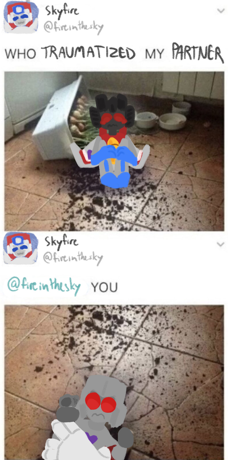
#chrome draws#bruhhh tumblr desaturated the colors#Whatever#I need to draw lineless more it’s fun#Anyways#transformers#maccadam#skyfire#jetfire#starscream#skystar#megatron
2K notes
·
View notes
Text

evil artstyle?
#kirby#king dedede#meta knight#bandana waddle dee#my art#ask to tag#I've got a LOT saying sharper lines and desaturated and contrasting colors
986 notes
·
View notes
Text

Shes so girlypop
#shadow high#rainbow high#i wouldnt say shes my favorite shadow high girl but i just got her cuz i found her at a good deal and i love her so much now#i did restyle her slightly tho lol#my art#social medias are DESTROYING the color on this piece#she is supposed to be Neon Pink!!!!#quit desaturating her!!
669 notes
·
View notes
Note
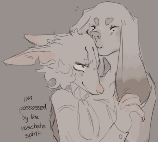
i've returned for 2 seconds to tell you that they're not leaving my head. (sort of unrelated but i've been thinking as well. what if vasco died before machete ? what would go down)
.
#ah this is so terribly cute#makes me feel all warm and fuzzy inside#“possessed by the vaschete spirit” you and me both#their expressions are so sweet#couple of dorks#and I like the dusty desaturated color scheme! with pink and darker brown accents#gift art#insect-shenanigans#own characters#Vasco#Machete#as for what would happen if Vasco died first#and I'm assuming of natural causes like illness or old age#I suppose Machete would try to sneakily sponsor his funeral#throw the fanciest burial possible#and maybe add some kind of anonymous half hidden obscure tragiromantic inscription on the grave#about wishing to see him again one day#and then either go on to do what Vasco did and commission art in his honor#or get a bad case of widowhood effect and go downhill quickly after his passing#oh yeah he might start to financially support Vasco's widow so that there was a little less pressure on her to get remarried#as you may remember she's a lesbian and one lavender marriage was probably enough for her#I can see that being a thing in certain circumstances
513 notes
·
View notes
Text
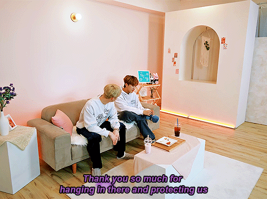
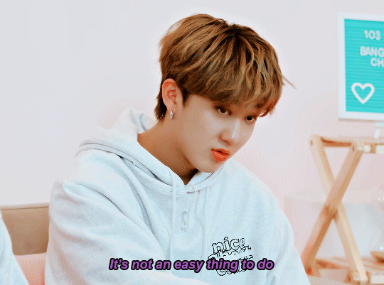


#was in my binchan feelings today#bang chan#seo changbin#stray kids#binchan#stray kids gifs#skz#skz gifs#my gifs#compliment me on this coloring btw do u know how desaturated 2krs are.. very
676 notes
·
View notes
Text


For @catws-anniversary / April 2 - Bucky Barnes / Prompt - ghost story
#bucky barnes#buckybarnesedit#stucky#stuckyedit#mcu#mcuedit#my edit#I really thought I was gonna do something ghost-y and dreary and CONSISTENT with these colors#but it's already late and I'll die before I desaturate that red#please enjoy the most wildy out of context quoting of Practical Magic
411 notes
·
View notes
Text
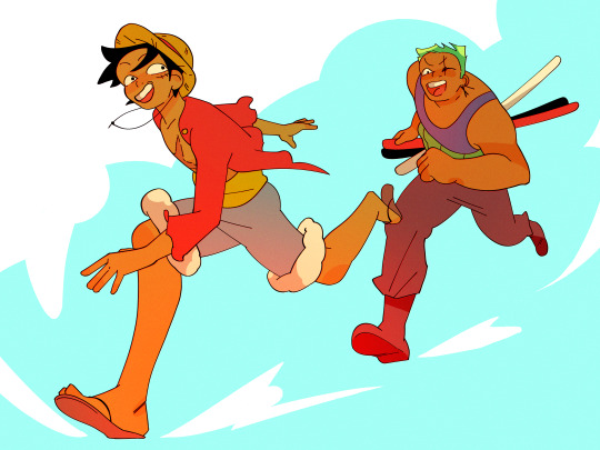
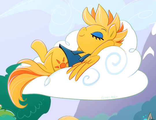
☀️☀️☀️☀️
#one piece#luffy#monkey d. luffy#straw hat luffy#zoro#roronoa zoro#zolu#my art#was drawin on the plane today and just defaulted to drawing them#and in sort of a mashup of designs lol#things i like: luffy post timeskip; zoro without an eye; zoro in a tank top adjgbslkg#also feel like i unlocked something w these colors i like them a lot :O#did pretty desaturated flats (for me) and then messed around w brightness and hard light layers#i <3 layer modes#honestly considering changing my icon to this luffy face bc i rlly like it but im so bad at keeping my own art as an icon :<#maybe..
475 notes
·
View notes
Text

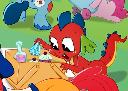

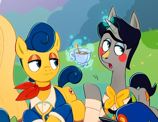


pone pone pone pone pone picknick yeah!!!!!!
#welcome home#fanart#mlp#crossover#i dont feel like tagging each character so EH#in hindsight I should’ve put Home somewhere else bc he’s too similar in color to Eddies tail but I DON’T WANNA EDIT IT im done 😂#my art#huh… the colors on the full screen version is desaturated 🤔 weird!
1K notes
·
View notes
Text

chapter 111 redraw
#desaturated colors cause he make me emo#i kept his injuries from chap 110#as a treat#aoi akane#akane aoi#tbhk#toilet bound hanako kun#jibaku shounen hanako kun
412 notes
·
View notes
Text

final rest
#kh#kingdom hearts#ansem#(the cool one)#ansem sod#kh1#fanart#kh1 is SO pretty....#the colors here are a bit desaturated compared to the game because i liked the concept art vibes more#also uh top 10 guys who are SUPER hard to draw#worlds most elaborate coat design#but his blue hghlights are so cute and stylish
1K notes
·
View notes
Text
Can we talk about how the afterlife gets more and more colorful as Klaus becomes more and more in control of his powers? Cause that’s BRILLIANT filmmaking right there
#tua s3#tua s3 spoilers#tua#The Umbrella Academy#klaus hargreeves#I've been trying to figure out why the afterlife was black & white except for his shirt since I first watched s1#in s1 only his shirt had color#then when he got shot by Stan in s3 it starts out with only his shirt AND the flowers in god's bike's basket had color#his memories[?] had color but that's irrelevant#then when he meets his birth mom his pants are colorful too and the entire scene has some color [though very desaturated]#like the ocean and their skin and a tree in the bg#and the menudo at the very end of that afterlife scene is fully saturated#AND THEN after doing all of the ''training'' with Reggie when he dies and is in the afterlife [now officially called The Void?]#with Luther in ep 10 everything is FULLY saturated color#just super cool
13K notes
·
View notes
Last Seen Blogs

xsuicideleopardx
xsuicideleopardx

dragon86xxlman2
dragon86xxlman2
cheerfire
what a weird couple (affectionate)
monochrome-sunsets
moth 💖

ihopethislasts
Untitled