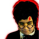
#new photo editor software
Text
how i (try to) make my text readable
so as a lifelong glasses wearer north of 25, i cannot see shit! I love the look of text on screenshots, but also i have spent a nonzero amount of time squinting at pale text on a busy background and thought "i cannot fucking read that."
there are lots of ways to do this. my method is not perfect. I am constantly tweaking things to try and make the text more readable. if you have suggestions about making the text more readable, please share!
Step One: Open the screenshot in your photo editor
I start with a screenshot and a script. I use Gimp, a free and open-source photo editor, and I pretty much only use it to put captions on my screenshots, so please do not ask me how to actually edit pictures, I do not know. also, please do not ask me how to do this in any photo editor, i prefer to use this one because it is free, ad-free one that I can own legally and download safely.
open-source software RULES, btw.
Step One: Add a text layer with your dialogue

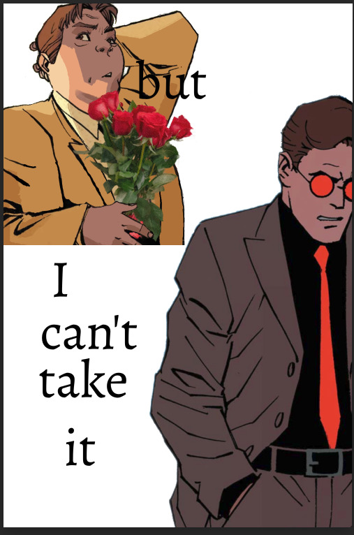
I use the text tool to add the dialogue to the image, copying and pasting from my script. This is not legible. My eyes hurt. I cannot read that, so I can't tell if I've made any typos.
Step Two: Add a black background to the text.
In, Gimp: Right click text layer > "Alpha to Selection." In the top menu, Selection > Grow > 3 pixels. Top menu: Layer > New Layer. (I name the new layer "Text BG ##") Use the bucket tool to fill the selection on the new later.
There's probably a shortcut to doing this in other photo editors (hell, might be a shortcut in Gimp.)
Step Three: Blur the background

In Gimp: Top Menu > Effect > Blur > Gaussian Blur. This may be a step backward in terms of readability, but I like how it looks. Let's try a few other things to help the reader, shall we?
Step Four: Drop Shadow
In Gimp: Top Menu > Light & Shadow > Drop Shadow. Makes the text stand out a bit more. Still not particularly readable, especially the blue on blue on the left side of the image.
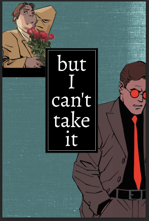
Step Five: Gradient layer
Create a new layer underneath the Text BG, and then add a transparent gradient over the entire image.
This is step is slightly more involved, so I'll just link you to a guide instead of explaining myself: "How to create a gradient transparency in GIMP."
Step Six: Further Tweaks

I still wasn't satisfied with the readability of the text. I duplicated the gradient layer to create a darker background underneath the text. I also repeated the drop shadow step on the Text BG layer. You could also make the text larger or bolder, change font colors, grow the selection by 4 or 5 pixels instead of 3, or skip the blurring step. I change my method frequently to try to get the best look for each individual image, and I don't always do a perfect job.
This is an area where I constantly innovate. I want people to be able to actually read my text, so I try not to let myself be satisfied with "good enough." When I take screenshots, I try to do it with an eye for compositions that give me a nice, blank space on the bottom for text, ex.


130 notes
·
View notes
Note
I'm sorry this may be dumb but... what art artist grants? Are they just like academic grants where you write a proposal and someone pays you to make art?
Most metropolitan areas have an arts council, whose purpose is to encourage artists to create, thrive, and connect. Some councils set up grant programs to provide funding to artists in the area. You can get some money to work on your art.
They require you to say exactly how much you need, and there is a limit to how much you can make from the grant. In the case of the one I'm applying to, the limit is $500 and I have to outline exactly what I would use $500 for. I have to submit an artist's resume, a proposal, a budget, and a portfolio.
The council then looks at your proposal, and decides whether you get the grant. If you get the grant, that money is yours so long as you are using it specifically for your art. I've never gotten one before, so I'm not sure if its a check or if there's an account opened with limited use or what.
So like... in the example I'm doing here- I'm applying for a grant for photography. The amount is not nearly enough for a new camera, so forget it. But $500 would mean that I can:
expand my memory for my camera and for my computer
buy editing software thats more efficient in decrease my turnaround time because my ambitious ass has been doing one photo at a time on freeware and a batch editor would slice that work time into absolute fractions.
Upgrade my website so that I can host video and host more albums for client download.
pay for admission to more festivals for me to cover, since I can't always guarantee that they'll let a press person in for free.
Social media management software, because tagging people to make sure they get to see their own photos is time consuming.
In my artist's statement/proposal, I have to make a case for why my photography is art instead of 'journalism,' because they are the Arts Council and they have to make the distinction. Sucks, but here we are. I know how I want to spin it, I know what I'm about.
An artist's resume outlines all the things you've done as an artist. So if you were an arts student, yes. Did you have an internship- put it in. Have you sold pieces? Is your art hanging somewhere? Have you been in any shows? Stuff like that.
Not every city has opportunities like this, but some bigger cities will extend their jurisdiction to adjacent towns and townships.
Anyways.
The general spirit of the thing is- if you want some money to make art with and you qualify, the worst thing that can happen is they say no.
41 notes
·
View notes
Text
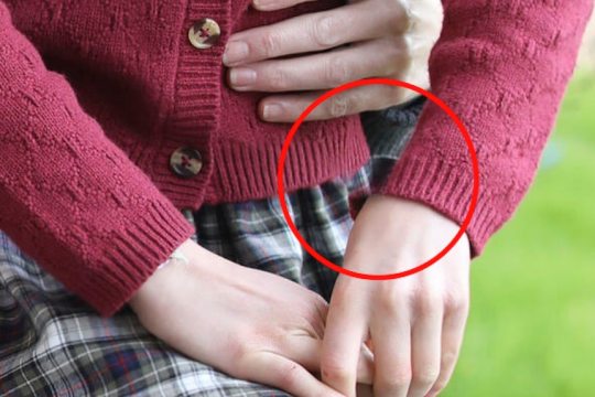
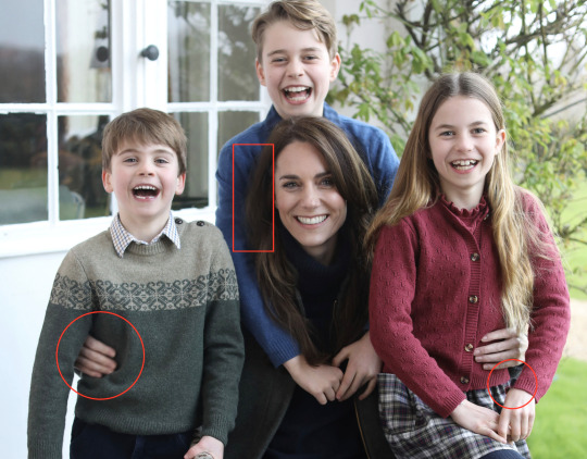
The image was the first official photograph released following the princess' abdominal surgery in January and was circulated by major news and photography agencies.
However, four of the largest agencies issued a "kill notice" for the image, asking those who were using it to remove it.
AP reported the reason for the image recall was: "It appears that the source [Kensington Palace] has manipulated the image in a way that did not meet AP’s photo standards."
"The photo shows an inconsistency in the alignment of Princess Charlotte’s left hand," AP stated.
Reuters later reported it had removed the photo for similar reasons to AP.
"Reuters picture editors said part of the sleeve of Kate's daughter's cardigan did not line up properly, suggesting that the image had been altered," it said.
"Reuters could not immediately establish how, why or by whom the alteration had been made.
"Leading picture agencies distributing news photographs prohibit the publication of images that have been overly edited."
The Reuters Handbook of Journalism states that Photoshop can only be used in limited matters like formatting, cropping, sizing and balancing tone and colour.
"Materially altering a picture in Photoshop or any other image editing software will lead to dismissal," it says.
AFP and Getty Images also issued their own notices and removed the image from their sites.
The photo is still up on the Princess' social media accounts.
Dr TJ Thomson, senior lecturer in visual communication and digital media at RMIT, says the image shows clear evidence of manipulation.
"The most obvious example is around Princess Charlotte’s left sleeve cuff. The left side of Princess Kate’s hair and her right hand also appear to be unnaturally blurred," he says.
Dr Thomson also ran the image through a forensic analysis software called WeVerify.
"That suggests that in addition to the cuff area on Princess Charlotte, the branches in the top-right corner of the image were also manipulated."
#media#australia#kensington palace#PR fail#fail!#british royal family#William The Prince of OWN GOALS#prince william#William The Prince of Wales#William The Terrible#kate middleton#Catherine The Princess of Wales#prince george#princess charlotte#prince louis#scandal!#ESCANDALO!!!
10 notes
·
View notes
Text
Where we are with AI, in March of 2024
We’ve seen the development of photo and video manipulation, from the earliest days of Photoshop up to now. This year, though, things are reaching the level we’ve all been concerned about – we can’t tell if important things we see are real. Soon, not even the experts will be able to tell, and anyone will easily be able to make any fake video they want.
Look at this image. Does it look real? Give the article a read.
When I first glanced at it, I didn’t even notice he had shirt sleeves and no shirt! Because I was focusing on his face and the smoke. That article explains some of the best ways to tell a photo is AI. But most notably, it says, “There are so many obvious signs this is AI, but most would miss them because they’re not part of the focus of the image, and since this is not a case where you think someone would be tricking you, you have no reason to analyze it that closely.”
A colleague who works on visual effects for movies shared this video created by OpenAI Sora.
youtube
He explained, “I work in visual effects. It is my job to make the audience fooled by what they are seeing. Those of us in the industry tend to see a lot of flaws that most people miss. We will soon be at a point where I won't be able to see the flaws.”
Puppies playing in snow is fun, and I’m sure many people look forward to infinite adorable animal videos! But of course, that’s not why you’re reading this. This is about AI videos of any person, place, or thing that your average grade-schooler will potentially be able to create. Month by month the software will get better and easier and cheaper, and AI photos have already started appearing ahead of the election, and supporters on both sides of any politician will be using them.
Could you tell that the two photos are fake? As a video editor, I could. But the first one was harder; I had to look for clues like the McDonalds smoking man photo. The worst part of these photos is what the person who created them said in defense:
“I’m not claiming it is accurate. I’m not saying, ‘Hey, look, Donald Trump was at this party with all of these African American voters. Look how much they love him!’ If anybody’s voting one way or another because of one photo they see on a Facebook page, that’s a problem with that person, not with the post itself.”
It’s bad enough that they didn’t care people were sharing those photos under the impression they were real. It will be worse when people are using this software to purposefully manipulate people’s beliefs and feelings to sway their vote, or worse, to fuel outrage and despair.
So, you know how you’ll go online on April Fool’s Day and your brain will be on ‘suspicious’ mode? Have you heard stories of real things that people didn’t believe because they happened on April 1st? From now on, that is how you need to calibrate your brain for important images and videos.
If a familiar face says something notable, out of character, or outrageous, if you didn’t learn about it from a reliable news source and you plan to tuck it away in your brain’s section of “things I believe,” you will first need to verify it. Viral photos and videos on Twitter and YouTube aren’t reliable, and you’re better off only getting your news directly from trustworthy sources like news channels. If you find something and want to verify it, use your search engine and key words, especially for strange, suspicious, or implausible quotes, and find a news website you can rely on. If it’s gone viral and it’s AI, it’s likely that the top results will be news websites debunking it.
Starting now, remember: Suspicious and outrageous things are false until proven true.
To sum up, here’s the News Literacy Project’s guide for vetting news sources:
Do a quick search: Conducting a simple search for information about a news source is a key first step in evaluating its credibility.
Look for standards: Reputable news organizations aspire to ethical guidelines and standards, including fairness, accuracy, and independence.
Check for transparency: Quality news sources should be transparent, not only about their reporting practices, but also about their ownership and funding.
Examine how errors are handled: Credible news sources are accountable for mistakes and correct them. Do you see evidence that this source corrects or clarifies errors?
Assess news coverage: An important step in vetting sources is taking time to read and assess several news articles from them, not just the one you clicked on.
Also, look for clues that you should avoid a website. They include:
False or untrue content
Clickbait tactics (melodramatic headlines)
Lack of balance (feels like it was written by a person who took a side)
Manipulated images or videos
State-run or state-sponsored propaganda
Dangerous, offensive, and malicious content
Stay aware and attentive, good luck, and let’s hope we can at least keep this dumpster fire in the dumpster.
#ai#artificial intelligence#ai software#fake news#politics#politicians#trump#biden#openai#Gemini#chatgpt#news#skeptic#manipulation#manipulated video#manipulated photo#debunk#clickbait#propaganda#Suspicious and outrageous things are false until proven true#Youtube
10 notes
·
View notes
Text
Useful Online Resources for Creative Students
Tips to controlling your creative chaos.
Studying Creative Writing and Theatre led me to exploring more about myself as an individual as well as an aspiring writer and actress. And in my writing I managed to compile a few more secret helpers to my party so when I am on the verge of a meltdown due to stress and writer’s block, there’s always a helping hand to get me out of a tricky situation.
Every writer has their tools, from their brain to the type of pen they most prefer to make notes with and which software they prefer to work on. In this article I will be going through some of the tools that have best helped me through my time at university.
⊱ ────── The Dictionary and Thesaurus ────── ⊰
I know, I know, not particularly exciting and original but it is imperative for us to have these at the ready, whether through technological means of the internet or in printed editions. We have all been in that place where there is a word on the tip of our tongues but we just can’t find it and that is where these come to our rescue.
⚝──⭒─⭑─⭒──⚝
⊱ ────── YouTube ────── ⊰
YouTube has plenty of channels dedicated to writing, publishing, editing etc. It also has footage of our beloved authors who give plenty of valuable advice from their extensive experience in the job. It is also home to many wonderful playlist channels- no doubt helping me with the flow of my stories a few times or concentrating on studying an essay.
⚝──⭒─⭑─⭒──⚝
⊱ ────── Spotify ───── ⊰

Speaking of music! Music is probably a number one for me personally, it creates the atmosphere internally before you cry, sweat and bleed it out onto the pages yourself with your own words. Spotify is my favourite as with a student discount you can get a premium membership that means no advertisement interruptions. You can also spend time creating different playlists for different works, for characters, settings or a collective emotion.
⚝──⭒─⭑─⭒──⚝
⊱ ────── Pinterest ────── ⊰
Now, if you have not come across the wonders of pinterest I must direct it towards you as some are stimulated by music others are stimulated by photos. Helping to visualise characters, clothing, setting they have many wonderful photos for this, as well as plenty of information that can be shared on history, culture, creative ways to get rid of a body etc. There are also posts specifically tuned for writers, a large amount coming from Tumblr blogs which I would also recommend looking at.
⚝──⭒─⭑─⭒──⚝
⊱ ────── Reedsy ────── ⊰

The next site I recommend is Reedsy. Reedsy is an online blog and website that connects writers, editors, artists and publishers. They have writing software where you can write your book in a publishable format, they have apps and tools that vary from generators and prompts to online classes that you can subscribe to. They also have writing competitions which help to create portfolios for new writers. At Reedsy you can meet other like minded individuals through the marketplace and post for your online portfolio.
⚝──⭒─⭑─⭒──⚝
⊱ ────── Fantasy Name Generators ────── ⊰
Now to some writers, using Generators can seem like a cheat but if you’re stuck then this website is a good place to go, whether you’re struggling with world-building or character creation and need some good names there’s always something you can find and note down. A tip to give would be to take two names and mix them to come up with something new, that way it also feels a little less of a cheat.
⚝──⭒─⭑─⭒──⚝
Finishing here, I hope that any of these tools are useful for you as they have been for me in organising my creative chaos. And my last piece of advice for any unpublished writer or writing student would be not to compare your works in progress with any published works. Who knows which draft number it is so don’t compare it to your first!
⚝──⭒─⭑─⭒──⚝
#creative writing#writing process#writing inspiration#writers on tumblr#writeblr#creative prompts#spotify#writing prompt#journaling#planning#on writing#writing tips#student tips#student learning#university#student life#study tips#creative women#creative works
22 notes
·
View notes
Note
What do you use to make your comic edits? I really like them!! And is there like a process you follow? Like do you storyboard the rough idea first? Sorry if you've answered this somewhere before
Ohhhh man this is going to have to go under a cut due to pictures. Luckily whenever I make an edit I tend to DM my friend process pics while screaming about how horrible they look and how I can't figure out how to fix them. 💀 So some of the record exists!
I use a mix of three different programs. To be honest even though it's free, Photopea.com is my go-to for most functions, especially since they have a large pool of fonts to choose from which means I don't have to go into the font mines and download 500 different ones just to see what's going to look best. I also use Paint Shop Pro, which is the program I learned how to make edits (icons, back in the day) on when I was like 14. I have a newer version now since I finally had to retire the 15-year-old one on my broken laptop, and I still don't really know my way around it that well. It's not the most user-friendly software, but it is a lot better than Photopea at resizing images to make them larger. I also use Clip Studio Paint whenever I need to draw anything for an edit.
When I need resources, I often use dafont.com for fonts. I have a bunch of texture packs from various places on the internet, but my go-to nowadays for new stuff is pexels.com where you can get stuff with a royalty-free license. I also occasionally use my own photos for textures (took a bunch of wall photos in Italy- my dad thought I'd lost my mind). I don't use brushes all that often but there are other free resource spots.
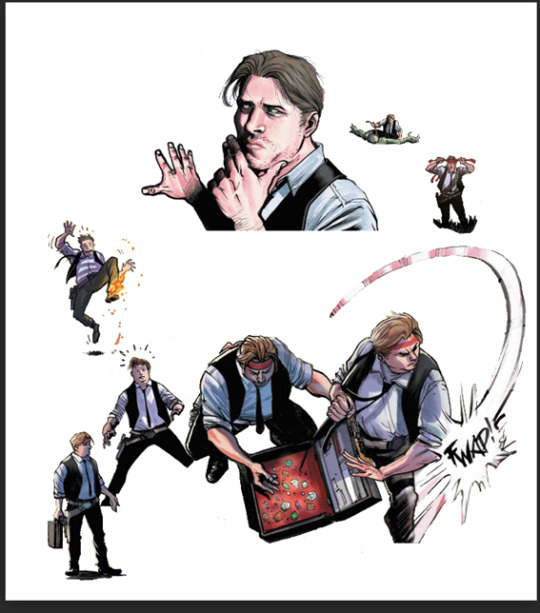
As for process, I usually start with comic panels that I like visually and cut out the characters, then figure out what I want to do with them. For Kill Krew, I knew I wanted to use a bunch of the tiny Foggies, but I didn't know that I wanted to make it a story per se until I finished the first section of the edit where Foggy's holding a bunch of papers and I decided to make it kind of like he was authoring his own memoir. Then I just followed the events in the comic. For my volume 5 edits I did have more of an idea for the story I wanted to tell from the start and looked for comic panels that would fit it. (By the way: never forgiving the volume 5 editors for allowing so many different artists. It pained me to have to use a couple different artists in one edit.)
Anyway though kind of like when I'm writing fic, I just start with pretty much a blank canvas, plop the characters on, and hope they arrange themselves into something that looks cool. This is a very early draft of one of them next to a slightly more advanced draft:
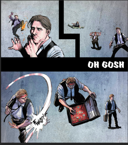
A lot of the work honestly goes into choosing the background and marrying it to other elements such as the text and the cutouts. I use a lot of rectangles for this, as you can see in this Kill Krew one next to a near-final draft below. This is also the phase where elements get resized, whether for story-telling reasons or design reasons.
I also fool around a lot with layers and coloring. An unexpected layering choice can totally make or break an edit. See the original comic coloring (left) versus my coloring change (right):

Or this original panel (left) versus a combination of a picture of a starry sky and a coloring layer (right):

Font is also hugely important to me. I try to find ones that fit thematically AND also look great on the image. Like bad coloring or a bad background, an ugly font can also kill an edit. Choose wisely lmao.
Another thing to watch out for in an edit that's multiple images is to make sure they all look nice together and like they're part of one set. I find this probably the hardest, since different source images (comic panels in this case) often have different coloring requirements, but you want the colors to mesh well between different images. It's tough! And if you make extremely long edits like I do occasionally it's hard to even see what they look like together. Sometimes when I'm looking at them stacked in Photopea it looks like a tiny, tiny photostrip and I have to figure out what's working and what isn't. It's tough out there!
Anyway I think that's all I got! Hope that gave you some insight lol I'm glad I had these process pics because I usually just kind of go into a fugue state while making them and come out covered in blood!
7 notes
·
View notes
Note
hey!!
just gotta say thanks for everything u do for the fandoms! having such a good, clear wiki is so useful when looking for references and so i thouhgt i would try to make my own wiki for a different fandom but theres just one thing i cannot find out how to do. i might be being so stupid right now so forgive me.
above each gallery photo, when you click on it, it says 'added by [user], posted in [production] [character] [actor]'. ive tried so hard to figure out how to do this but to no avail. ive added the pictures to the pages i need them in but they dont have the bit that says 'posted in [___]'. ive added the picutres to category pages thinking that would work, and it does make a category for the picutres but i cant get them to show up on all the pages i want them to. i just want the images to link to all the pages needed, but not as a caption below the gallery, if that makes sense?
im not sure if youre the right person to ask this to, so dont feel obligated to answer but thank you nonetheless! :o)
Hey! Wikis are such a learning curve, ugh there's still stuff I really struggle with - I edited a template successfully and that was a big victory! :P
Are you building your wiki on fandom.com? There's slight differences in how the wiki software works on different sites, and that can trip you up.
I'm not quite sure what's going wrong with your images - are they showing up in the gallery on the page you want them to? Categories are great for finding the images behind the scenes but I don't think that's the problem you're hitting.
The best advice I can give is always use the source editor! It gives you way more control, and for me (I'm dyslexic) the fact it's colour-coded is enormously helpful.
Use a sandbox as a scrap book, you should be able to make a personal one by making a new page (username)/Sandbox. Look at the code on other wikis - go to source editor as if you're editing the page then just don't save :D Just compare what the working one on another wiki looks like to yours. Little things like spaces at the beginning of lines can mess things up! But things that are infobox or template won't always copy across to your wiki - you need to add the templates to your own wiki and that's where I get lost! But the basic code is all standard, and looking at the code itself lets you control what's going where.
Good luck with it... it'll be so satisfying once you crack the problem and get it all exactly right!
5 notes
·
View notes
Text
10 things I've learned as an artist
(Resources below text)
Take a step back - I know we all get a lost in the sauce but if you look at the bigger picture, you can pick up on things that look strange or that you don't like.
You can criticize your art but don't hate it - I've said this before but hating your art is hating your progress. The only way to grow is by learning the things you liked/disliked about your older pieces.
Listening to music helps you more than you think - Every art teacher I've ever had always played music in their classroom. Classical, alt, rock, pop, etc. ever since I've noticed my art had more emotion tied to it and (imo) was sharper.
You're only able to draw anime? That's not a bad thing - Drawing anime can be very helpful when it comes to drawing human profiles and it can also help with proportions. No one can tell you how to make art. That's the whole point of it. It's subjective.
You can totally have multiple art styles - Of course you would hear this come from me. Having multiple art styles can help you find the one you like and it's fun to do. I usually take all the sketches I've done and take bits and pieces i like outta them.
Never be afraid to use a reference - Reference models/artist put their pictures on the internet for people like us! The their whole thing is to help young/inexperienced artist to get a grasp of anatomy, creases, and gestures. Never be scared to use one.
If you're working on the computer, give your eyes a break - This doesn't just go for artist, this goes for everyone. I know I'm gonna sound like a parent here but looking at a screen for hours really can make you tired. It can fuck up your melatonin production because of blue light from the screen.
Don't just give your eyes a break, give your hands a break, too. - For the love of fuck please don't spend 4 hours on a huge piece and not give yourself at least one (1) 30 minute break. Carpal tunnel and Arthritis are artist killers. Rest yourself.
Avoid burnout - (This goes for everyone too) Feeling burnt out can take you out for years if you let it get bad enough. I know your art is important to you but remember to keep an eye on your mental/physical health. Being well rested, having good nutrition, and going on a walk every so often can make you feel amazing.
Show your family and friends your art (if you're comfortable with it) - I like to show my mom and siblings my art sometimes. Even though my mom doesn't get it most of the time, she's always happy to give me pointers and compliments. My brother really likes my art and was super excited when I got confident enough to show him. He thinks the way I draw Kris (Deltarune) is incredibly gender and loves it when I send him my pieces.
Here are some apps and websites I use to help with my art:
Pureref - This is an app I use to keep an eye on references while drawing. You can set it to remain open even when in a different software. It's free but they accept donations.
Krita - This is the art program I use. It's reminiscent to Photoshop (something I'm familiar with) but it's completely free and you can get it through their website (Or Steam... if you wanna pay $15 for it).
Krita-Artist.org - Krita has a forum for their users to help other users and give news/updates. There's hundreds of resources, free brush packs, and tutorials on there to help you out.
CapCut - Video editor that's mostly used for Tiktoks but it's easy to use, free, and has it's own copyright detection system. I use this for animatics.
AdorkaStock - Reference photo website that allows you to choose poses from angles, objects, number for models, and positions. All the models are clothed, it won't jumpscare you. They all also have different body shapes so if you're worried about having to draw a chunky character with a slim model, you're all good on that front.
11 notes
·
View notes
Photo
Getting (Slightly) Better Lineart from CSP’s 3D models--without CSP EX
(Full tutorial below the cut because it’s a looong post.)
If you’re like me, you hate drawing the repetitive, straight lines of background scenes and have wanted to take advantage of CSP’s huge 3d asset library to get some decently detailed backgrounds--only problem is even if you have CSP EX’s lineart extraction, the result is really....gross. I have CSP EX at the moment, so I’ll demonstrate below.
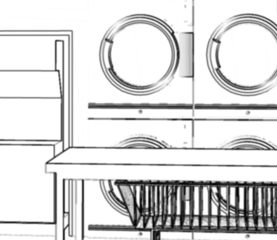
This is the extracted lineart with 5px max width of line, no line texturing, no toning, 80-level line detection accuracy, and 1-level corrections. Taking a closer look, we can see the results look okay-ish from afar, but up close...
The software struggles to convert repeating shapes, like the wire basket, into nice, clean vector lines. And lighter lines struggle to produce anything but strange speckles. Ugh, ok, but how do we fix this? Well, here’s an alterative method.
First, you have to understand that this alternative method won’t give you vector lines. At the end of the day it’s just hard to convert an image--even with clean 3d lines--into nice vector lines. But we can still get nice, reletively clean pixel or raster lineart that can save you some time.
For this method, you will need some kind of photo editing software with the following features:
- Contrast/Brightness
- Edge Detect (this one is really important!)
- Color Invert
I strongly dislike paying continuously for Adobe, so I prefer to use Affinity Photo, but honestly, most photo editors should have these fairly basic features. However--as far as I know, Photoshop and Affinity Photo are the only photo editors that have edge detect, so check you have a software that has that function.
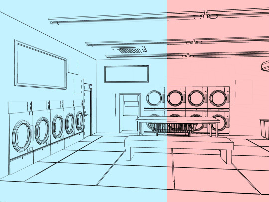
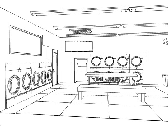
To start, lay out your CSP scene, and be cautious about adjusting the lighting angle so that you have decent contrast with all visible edges to the CSP 3d model.
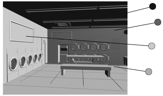
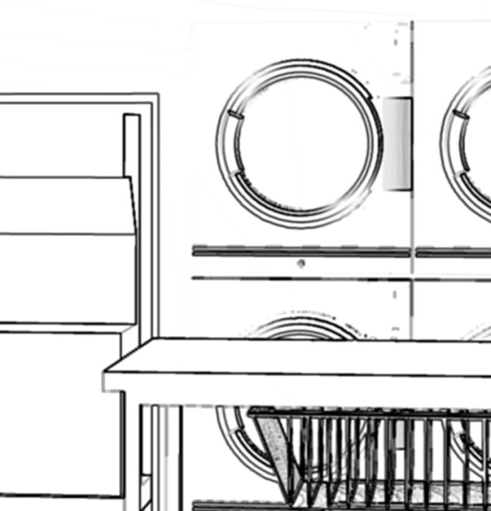
Sadly, you are not going to get every little detail in perfect relief. Some details are going to get lost because they can’t all be in contrast at the same time. Just do your best to make sure that major details, like in this case, the bench, washer doors, and vents on the roof, all have enough tonal difference to mark them apart.
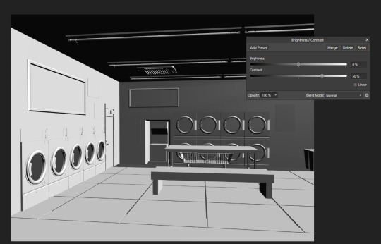
Export the canvas as a .jpg, laid out exactly the way you want the scene to be, and drop it down into your photo editing software of choice. For me, this means Affinity Photo, and you can see our first edit: adjusting the contrast using Layer>New Adjustment Layer>Contrast/Brightness. Good contrast gives the photo editing software the best chance of detecting the edges, so I like to crank it up about 50%.
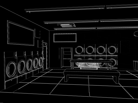
Now, what I’ve done here is used Affinity’s Filters>Detect>Detect Edges. There is no pop-up panel to refine this, so we’ll work on refining it later. Now, I’ll apply a quick Layer>New Adjustment Layer>Invert to the the result below, to get a black and white image.
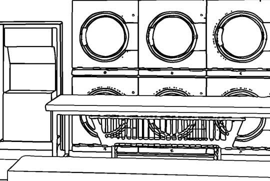
So far, we can see that the edge detect in a photo editor tends to do much, much better than CSP EX line extract with things like subtle lines and curved shapes, like the washing machine doors. Just compare the difference with another closeup:

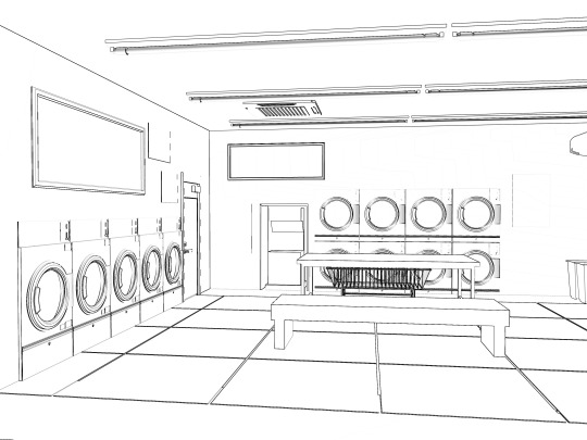
Now we’re going to deal with all those funky little gaps between the lines where the program drew two thin lines close together, instead of one thick line. But dealing with this is actually a bit easier in CSP, so let’s hop back over there. Export the black and white image as a .jpg, and put it into CSP. (Everything we’re doing there is totally available to Pro users, so don’t worry about having EX for this part by the way.)
Once you have your photo in CSP, go to Layer>Rasterize. Importing the photo will put it in an image layer format by default, so to make edits we’ll need it as a pixel or raster later first. Once you have a raster layer, we want to isolate the actual lineart without the white background, so go to Edit>Convert Brightness To Opacity. Now we’re really ready to polish this stuff.
First, apply a very low Gaussian blur. Keep in mind, this should be a very, very minimal effect--we want to apply it just enough to make the pixelated edges a little softer. I prefer about a level 4 Gaussian Blur. You should get something like this.
Now, depending on your preference for how it looks, use either Filter>Sharpen or Filter>Sharpen more. I like sharpen more, since it gets me closer to the level of anti-aliasing that I like without having to use sharpen multiple times, but do what you want. My final version looks like this:
Of course, if you want slightly darker lineart in some areas, like the poster board on the left wall, simply duplicate the lineart layer and erase already dark areas you don’t want darkened, and merge them together to get something like this:

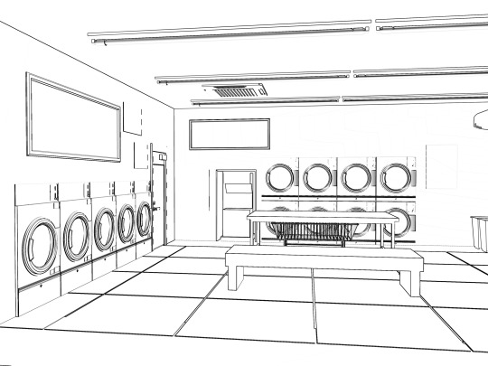
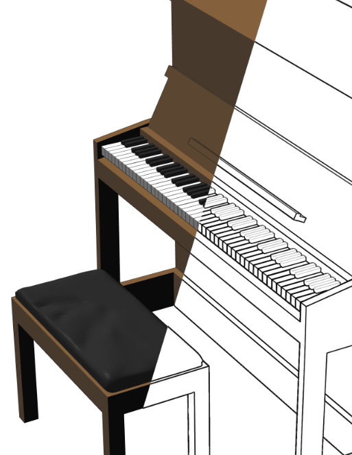
Of course, with complex interiors like this laundromat, there will be limits to what you can extract. Some corrections will have to be made by hand. Overall, you’ll probably get more success with this method using something simpler, like this piano:
Hope this helps, and happy lineart-ing!
#clip studio paint#clip studio assets#clip studio tips#lineart#tutorial#background#affinity photo#affinity
35 notes
·
View notes
Note
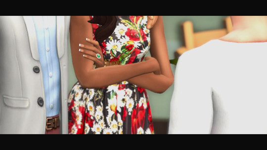
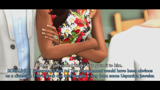
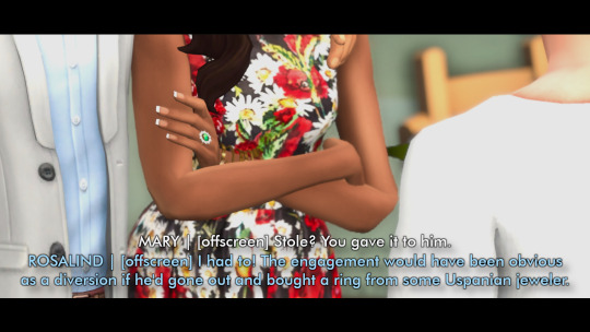
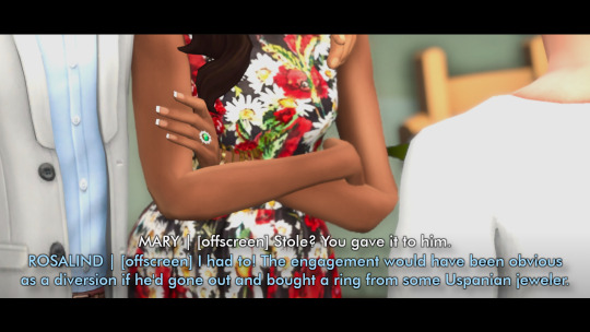
hey there! i dont know if you already explain it or not, but can i know the bridgerton profession/what they currently do in your bridgerton text au? maybe even for upcoming character👀? thank you for answering and i hope you have a splendid day!!!
yes of course! and i truly apologize for taking ages to answer this –
simon was a midfielder for arsenal, and a little while after he retires from the team, he goes on to coach ⚽️
daphne is a school social worker (violet is the head of a huge uk educational non-profit, and daphne initially thought she wanted to follow in those footsteps, but then realized she wanted to work in schools and be more directly involved with helping students who needed support)
kate is a florist! she owns a cozy shop along cobb street called "once and floral" and brings newton into work every day 🥰
anthony is a barrister, specializing in civil liberties & human rights cases (which is exactly what edmund did – he was a guiding force for anthony, who was in his second year of university when edmund passed. edmund was also a relatively high-profile barrister, whose work was often covered in the news, which is part of why the bridgertons are prominent enough as a family to earn mentions in whistledown)
sophie – before she met benedict again, she was waitressing and trying to save enough to go back to school. she eventually attends veterinary school, as she really loves working with animals 🐈
benedict was aimlessly working as a paralegal for several years (while quietly working on his art on the side, though without the intention of showing it to anyone else). inspired by sophie, he also eventually goes back to school so he can focus on his passion 🎨
colin worked with nat geo for a long time, starting out as a freelancer and eventually becoming a full-time photo editor for them. it often kept him out of london for most of the year, but by the time he hits 33, he's gotten bored with what he's doing, and decides he'll find something else so he can come back home
penelope is a junior copy editor at danbury publishing house! though sometimes, if you see her typing at her computer, she's not necessarily working on proofreading manuscripts 🤔
eloise is a software engineer! sometimes, though, when she's writing emails, people think she's just on github 👩💻
pippa crane is a professor of ecology and environmental science at the university of gloucestershire (she's also recently divorced from eloise's cousin, marina, with whom she shares two kids)
francesca is a music supervisor for film! (she started out relatively young, but she got a leg up because her aunt billie is also in the film industry)
michael is an actor! at the time of francesca's wedding to john, he's mostly doing theater, but his agent soon convinces him to start going out for film/tv. he does pretty well for himself, and a little after john dies from a aneurysm, he decides he's going to up and move to los angeles because it'd be better for his career (or so he says that's the reason for the move)
(john, who was very into numbers, was an accountant. he knew he could do that anywhere, and told francesca he’d go wherever she wanted to go).
hyacinth works at danbury publishing house as well, on the marketing side of things! (she's very stumped when it comes time to market a book called miss butterworth and the mad baron). she starts out working there mostly because felicity took an internship at the publishing house while they were in university together, and it was kind of an excuse for them to goof off together a few hours a week
gareth, at the time we meet him, is doing his postgraduate studies at UCL in civil engineering; he comes into danbury publishing offices every once in a while to see his grandmother (which is how he often winds up running into hyacinth)
gregory... doesn't know what he wants to do, but he works as a substitute teacher for secondary school. on the side, he also coaches miles' football team (their team name is the thunderbolts – name pitched by miles ⚡)
lucy happens to work with mary sharma (as does lucy's colleague and best friend hermione). both lucy and hermione are primary school teachers 🍎
that's it for all the main characters! in terms of side characters ~
alice and will were simon's publicist and trainer, respectively. after simon retires, will decides to move on from athletics and opens up his own bar 😎
mary is a primary school headmistress. edwina is shooting for a post doc in philosophy, and a little while after kate and anthony get married, she meets a nice girl named jyoti, who kate and mary both adore.
posy, after reconnecting with sophie, gets inspired by her stepsister and goes on to become a nurse. benedict's friend group is a bunch of people he went to uni with – henry and lucy granville have the same last name because they're adopted siblings. henry manages an art gallery, and lucy is a pottery instructor. genevieve delacroix owns a bridal store, and wetherby is a medical sales rep (which is why he's the only friend benedict couldn't necessarily go to to ask for help for sophie)
philipa, same as daphne, gets married relatively young, and is a stay-at-home mother. prudence works at a jeweler’s, felicity is into graphic design, and portia is a big name in commercial real estate!
thank you for asking, because i have this in my head but not all the details make themselves known via text message exchanges 😆 so this was nice to write out! (to the person who sent this, i'm so sorry it took me so long to sit down and do this, but if you're reading, i hope you have a splendid day as well 💖)
#bridgerton fic#ask#daphne bridgerton#simon basset#kate sharma#anthony bridgerton#sophie beckett#benedict bridgerton#penelope featherington#colin bridgerton#eloise bridgerton#francesca bridgerton#michael stirling#hyacinth bridgerton#gareth st. clair#gregory bridgerton#lucy abernathy#bridgerton family group chats
17 notes
·
View notes
Text

So as some as you have seen my name is now changed, On TSR it's literally Estilo but the name wasn't available on this platform and I've got a feeling a .co.uk domain also wont be available so I'll have to rename that too, I wanted something more professional AND I absolutely adore this name I wanted to own a hair salon when I was younger and it was going to be called Estilo creatives. While I was doing this though I also wanted to talk about CC and CC creating in general.
Now I've being creating CC for nearly a month I cant believe how fast time has gone, BUT since my journey started it has given me so much more admiration for creators and the hard work they do on a daily basis.
FOR THOSE THAT SIT AT HOME judging creators remember they're giving you something they're helping improve your game yes some may have a patreon but do you know how EXPENSIVE the software actually is, the only thing that CC creators get FREE is BLENDER I'm going to run down the costs for you just so you're actually aware of the reasons allot of creators have a patreon yes this is a hobby but its also an expensive one for the maker.
Adobe Substance painter £15 a month - Now this isn't needed but allot of creators have it.
Adobe Photoshop £10 a month. - Another one there are free alternatives this is just what I use and the free ones are nowhere near as good. { IN MY OPINION }
Now if you're a clothing maker you'd also want Marvellous Designer which on a personal Subscription is £30 a month on the cheapest plan now if you add that all up it's £55 a month. and that's just the basic stuff I also have pattern subscription sites and ones for different textures.
Now I'm still new into my journey but the hate I see for the creators who chose to do EA is disgusting what people fail to forget is being a cc creator you're not just making CC you're also a photographer a photo editor a writer you're so many things along side being a cc creator. & you're still getting the content it's not like a permanent EA it's just an early release to those that chose to support the creator so why is it hurting you?
I'm not asking you to agree or disagree but what I will ask is that you think before you speak and be nicer.
-Kenzie.
#sims cc#sims4#cc creator#cc creator patreon#patreon#sims 4 patreon#sims4cc rebrand#EA#early access patreon#early access sims 4#early access cc#ea cc#ea cc patreon
34 notes
·
View notes
Text
Tenderness Uninterrupted
today I met a woman,
today I'm high on you I sang unlike a survivor
but it was just on the radio and a pretender sang
don't get me wrong, she looked exquisite
then later on a little of nothing but painting;
I say rock and roll is overrated, but maybe the beatin'
& the sky drones on @ 7.83hz
where we desire to go higher;
Le Monte Young really knew what he was doing,
Joe Jackson as well, you can get what you want —
things can only get better too, as some Howard claimed
& it's true, but don't turn on the news
because it isn't, usual suspects
being what they are, down here
& still we desire;
around certain paths the doves stop cryin' and
that George knew a lot too but it didn't always get through
such as it goes
a poem pops every three minutes, maybe four
Kerouac's were quicker transcendentalism, American Haiku
in an alt America, Chicago never went gangster,
the Culture Club still sang the war song
but that's changed too,
that's changed too
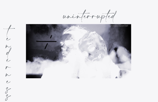
afternoon painting using Corel Painter, additional photograph layered in. I should mention here that Corel has a bundle on Humble, $30usd for the whole deal, painter and brush packs primarily. a great deal, really. I recommend setting up an account with Humble if you've never bought from them before, the books and games are occasionally worthwhile too. (oh, and you can adjust the dollar amounts that go to charity as well)
graphic and words ©spacetree 2023
#spilled thoughts#artists on tumblr#digital art#spilled ink#digital painting#my writing#poetry#spilled poetry#poem#poems on tumblr#spilled words#spilled writing
3 notes
·
View notes
Text
The Top 10 Graphic Design Tools Every Designer Should Know

Adobe Photoshop: Photoshop is a powerful raster graphics editor that's widely used for image editing, photo manipulation, and creating digital artwork.
Adobe Illustrator: Illustrator is a vector graphics software, excellent for creating logos, illustrations, and scalable graphics.
Adobe InDesign: InDesign is a desktop publishing application that's perfect for designing print materials like brochures, magazines, and books.
Adobe XD: XD is Adobe's user experience and user interface design tool, great for web and mobile app design.
Adobe Creative Cloud: The entire Adobe Creative Cloud suite includes tools like Adobe Premiere (video editing), Adobe After Effects (motion graphics), and more, making it a comprehensive solution for many design needs.
CorelDRAW: CorelDRAW is a vector graphics editor and one of the alternatives to Adobe Illustrator, preferred by some designers.
Affinity Designer: Affinity Designer is another vector graphics software that competes with Adobe Illustrator and offers a one-time purchase option, making it cost-effective.
Sketch: Sketch is a vector-based design tool primarily used for web and app design, favored by many UI/UX designers.
Canva: Canva is a user-friendly online design tool that's great for quick and simple graphic design, especially for social media graphics and marketing materials.
GIMP: GIMP (GNU Image Manipulation Program) is a free and open-source raster graphics editor, serving as an alternative to Adobe Photoshop for those on a tight budget.
Remember, the choice of tools depends on your specific design needs, budget, and personal preference. Graphic designers often use a combination of these tools to accomplish different tasks. It's also essential to keep learning and adapting as the field of graphic design continues to evolve, and new tools and software emerge. If you want to learn Graphic Designing course in Yamuna vihar you can visit to Attitude tally academy.
#Graphic Designing course in yamuna vihar#Graphic designing#Graphic designing course in yamuna vihar#Attitudetallyacademy
4 notes
·
View notes
Quote
The Pixel 8 and 8 Pro introduce a lot of AI-forward photo features: Magic Editor uses generative AI to change scenery, remove distractions, and shift people around an image. Audio Magic Eraser will help you separate audio tracks in a video to minimize distracting sounds. Best Take lets you pick the best face for each subject in a photo when you take a series of similar images, letting you merge them into a final perfect picture.
None of these are particularly new photo editing techniques, but as Ben-Yair puts it, they haven’t been accessible to just anyone. “All these features are using AI and ML to do what otherwise would have been very technical and laborious.”
That’s exactly the problem with generative AI, though. Historically, there have been more barriers to convincingly changing out a sky, moving a photo subject, or replacing the face in your photo with another. These were things you could do with expensive software and skill — putting them a few taps away in your photo library raises some questions about what we consider to be just an editing tweak and what’s going too far.
I asked Ben-Yair how she thinks about this line, but her answer was more technical than philosophical. Google is committing to adding metadata to flag images edited with generative AI, so at least people will be able to know when an altered photo gets shared around. You, too, will be reminded that you changed something, if you bother to check.
Google Photos’ new AI tools for Pixel 8 raise messy questions - The Verge
2 notes
·
View notes
Text
Which Software's are Used in Fashion Design Course?
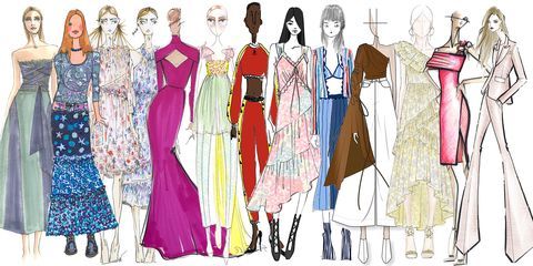
Fashion design courses have become increasingly popular as the fashion industry continues to expand and evolve. With the rise of technology, many fashion design courses now include training on software programs that are commonly used in the industry. Here are some of the most popular software programs used in fashion design courses:
Adobe Photoshop:
Adobe Photoshop is a powerful photo editing software that is used extensively in fashion design courses. It allows designers to create and edit digital images, as well as manipulate and adjust colors, textures, and other visual elements.
Adobe Illustrator:
Adobe Illustrator is a vector graphics editor that is often used in fashion design courses to create technical drawings and vector-based images. It is a popular choice for creating fashion sketches and illustrations.
AutoCAD:
AutoCAD is a computer-aided design (CAD) software that is used in many industries, including fashion design. It allows designers to create detailed 2D and 3D models, as well as create technical drawings and plans.
CLO 3D:
CLO 3D is a 3D fashion design software that allows designers to create virtual garments and simulate the way they will look and move on a model. It is becoming increasingly popular in fashion design courses as it allows designers to create realistic 3D garments without the need for physical prototypes.
Gerber Technology:
Gerber Technology is a software suite designed specifically for the fashion and apparel industry. It includes a variety of tools for design, pattern-making, grading, and marker-making, making it a popular choice for fashion design courses.
These are just a few examples of the software programs used in the fashion design courses. As technology continues to advance, it is likely that new software programs will be developed specifically for the fashion industry, further expanding the options available to aspiring fashion designers.
#fashion designing software#fashion design training#fashion design course#fashion design colleges#fashion styling#career#education#learning
9 notes
·
View notes
Text
Ok so for all my windows using friends. We all know that new windows photos is dreadful and extra slow and bloaty on slower computers. There is a better solution for photo viewing on your PC, and as an added bonus this comes with a photo managing app that does many of the same things as adobe bridge. Oh and it's free.
What is this stunning software you ask?
Great question! Back in 2002, Google created a nifty piece of software known as Picasa Photos. They eventually killed this software in 2016 to focus on the infinitely more spying Google Photos (I'm not kidding about Google photos having privacy issues. They literally got sued over this in my home state of IL for violating our biometric privacy laws. I got paid $500 from Google for this btw). Moving on, Picasa slapped and that's why they killed it. Fortunately I am not the only Picasa Photo Viewer 3 enthusiast on the internet and there are others who saved the installation exe files. That said, I have helpfully found one that works which you can now download from my google drive here. Note that you cannot use the Google Photos/Google Account related options in the software anymore as Google has discontinued support for it.
Picasa has it all for the person who needs a good photo organizer:
finds ALL photos in your documents, downloads, and pictures folders for you.
ability to open and edit camera raw files
ability to add tags to photos, sort into folders, locate in the system etc.
basic photo editing tools with a good histogram. one of the best editing tools they have, which I would argue is almost on par with a tool from the adobe camera raw editor is the "neutral color picker" tool, where you can select an area in the picture to set a custom white balance in the image (easiest, best color correction). Also contains a primitive healing brush tool.
very good at red eye removal. I used that feature a lot back in 2005.
good printing options (easy to print multiple copies of the same photo on the same page in a variety of standard sizes.
ability to create a photo collage with multiple photos or a photo slideshow video
sort by person tool
lots of fun filters to apply to images if that's your thing.
add custom geotags to photos using another dated google product, google earth.
create a gift cd of photos or create poster sized versions of your photos that print over multiple sheets somewhat like the rastrabator.
the image viewer part is slick, lightweight and fast unlike windows photos. It allows you to quickly arrow key through your photos in a very nice way.
Allow me to show you some screenshots of this glorious piece of abandonware.
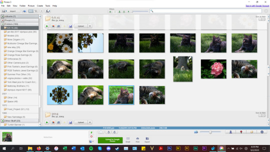


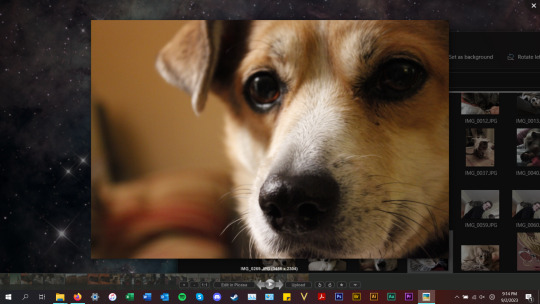
anyways, tldr; this piece of abandonware is the best, most glorious free photo viewer for windows, and as a person who's been using it for the last 18 years I highly recommend it to everyone who does not have adobe PS & Bridge and also anyone with windows who wants a quick way to preview photos in their folders.
2 notes
·
View notes
Last Seen Blogs
karenfordonte
Caring For Donte

pando0006
제목 없음
plants-aesthetics
Plants?!

alejandro40
peludos y con buena verga (hairy and good cock)