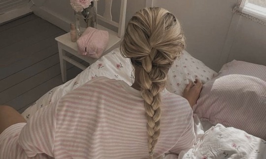
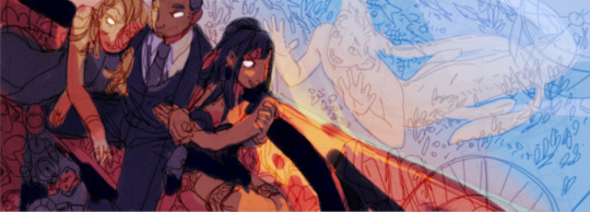
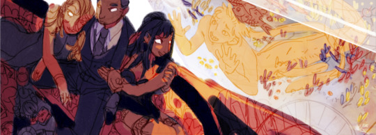
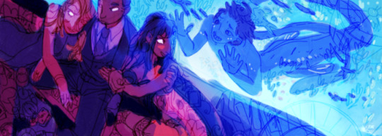
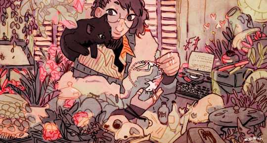
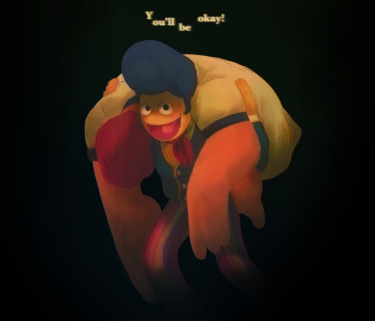
#focus here was GREEN i just wanted to work with lots of green colors
Text
lesbian pride moment 😳🌸
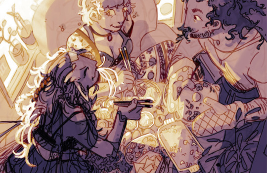
#jolyne cujoh#hermes costello#stone ocean#jjba#jojo's bizzare adventure#deliart#jolymes#i didnt make it in time for pride month. its 3 in the morning#but some for some time zones im just in time<3#focus here was GREEN i just wanted to work with lots of green colors#bc i never do and i need to improve at that#we ended up with neons tho still sorry#also the background was fully rendered so much details n stuff but u cant see it hehe bc i blurred it#that was what most of my time was spent on . btw#anyway. hope u all enjoy the dresses lol#might go back and fix some stuff tho bc i drew this in like 3 days from lineart onward#so i havent been able to rest my eyes inbetween. so ill probably find something i wanna fix later
4K notes
·
View notes
Text
Light On - single mom/neighbors fic
Simon Riley/female reader
🎄 @glitterypirateduck’s December challenge: O Christmas Tree

"What about this one?"
You're standing next to a giant tree, one that's probably double your height. "It's a little big but-"
"I don't know if that will fit in your flat, sweetheart." You huff, hands on your hips, and Emmaline wiggles where she's snuggled against him, tucked up on his chest inside his arms. You've got her in some sort of snow suit, like a baby marshmallow, capped with a red knit hat that ties under chin to keep the ear flaps down, and even though she clearly hates it, and looks a little ridiculous, he knows the whole thing is keeping her warm in tonight's frigid weather.
"Okay. What about this one?" The one you're pointing to now is smaller, but sparse, a little prickly looking. He shakes his head. "You don't like any of them!" You protest, and Emma grunts, babbling some sort of nonsense.
"'m just doing what the boss here is telling me to do." She looks up at him, eyes bright with a little bit of snot beneath her nose, and he wipes it away with his thumb. "There you go, baby girl. I gotcha."
"She's not the boss." You step close with a shiver, close enough that he can see the fog of your breath, peek of your neck beneath your scarf, and he reaches out to pad his fingertips across your chilled cheek.
"Cold?" You shrug.
"A little." You dip forward to give Emma a quick kiss on the cheek, and at the same time, he ducks down, pressing his lips to the crown of your head. He's never going to get used to this. Never. Even now, in this moment, he can't believe he's walking a tree lot with you, debating which one to choose. Him. Simon Ghost Riley, picking out a Yule tree with you and the baby. His family.
There's a bang in the street. A car backfiring, probably, but it's enough that it startles someone else on the lot, and they shout, the combination like a shot of adrenaline to his heart, focus and intensity taking over, his movements shifting to autopilot. His hand covers Emma's head, curling forward at the same as he tugs you into his body with a firm arm around your back, essentially immobilizing you, keeping you close in case- "Simon." You say his name softly, gently, fingers holding onto his forearm. The touch grounds him, reminds him to breathe, and he relaxes slightly. "It's alright. We're okay, we're at the Christmas tree place. You're okay. You're with us." With you. With you and Emmaline. At home. He closes his eyes, repeating it in his mind, twice, three times, for good measure, before he trusts enough to uncover the baby's head and let go of you completely. You smile when he does, bright, beautiful, sweet, still working you touch against his arm, not stepping away.
"I'm sorry." He tries to explain, but you shake it off.
"Don't be. It's okay." You loop your arm through his, sticking close to his side. "Want to keep looking?" You ask, nonchalant, and he's overcome with emotion so strong it could bring him to his knees.
"Yeah, but I... I want..." he stumbles over it, words failing, and you wait, patiently, turning into him so you can look up at his face.
"What is it?" Holiday lights glow behind you, twinkling colors mixed with frosted whites, strung together across trees and posts and big red and green signs, 'O Christmas Tree' playing over the speakers that line the perimeter. He's never been one for holidays, never really cared about any of it, all the excitement lost on him, most of the celebrated days spent alone. But now... with you, with the baby, he feels the magic. He thinks he can even see it, in you, in Emmaline, and he's filled to the brim with the wonder, the anticipation for it all, to experience it all for the first time like this, with his angels.
"I want to kiss you." He says the same words he gave you a week ago, outside on the balcony, and you give you him the same smile, warm and welcoming, lips curling upwards with happiness.
"Please." You beam, and he obliges, your lips parting for his, getting lost in the taste of your mouth, decadent honey dripping across his tongue. You make him dizzy, make him stupid, make him so weak for you, and all he wants is more. He wants it all, wants everything you'd give him, and he has to hold himself back, cognizant of Emma in his arms, pulling away regretfully after five seconds that could last five hours, or days. Years. You clear your throat. "Well, okay, uh- should we?" You motion to another row of trees, and he nods with a laugh.
"We should."
Later, after the tree has been decorated, dinner has been made and cleaned up, fire started in the fireplace, Emmaline has had her bath, and you've changed into your pajamas, he sits on your couch with you curled into his side, both you and the baby asleep. It's late, and the lights are out, and he thinks he probably should have woken you to get you both up into bed, but he can't bring himself to shatter the moment, the silence, the fire, and the sounds of your breathing, face barely illuminated by the glow of the lights. He stays right there, listening to the crackle of the logs, staring at the tree, watching the two of you breathe, heart so full he thinks it could explode. This is it, he thinks. This is the magic.
#light on#peaches writes#codholiday2023#simon ghost riley#simon riley#simon riley x reader#simon ghost riley x reader#soft dad simon riley
2K notes
·
View notes
Text
Glow-up tips that actually work from your favourite beauty girly (me)
Hot girls don't gatekeep, so here are some of my favourite glow-up tips that actually work. <3
Skin
Find a skincare routine that works for you!! It took me years to find mine, but now my skin is literally perfect. <3 (let me know if you guys want a detailed skincare routine!!)
Don't pick your skin, the less you touch your face, the better.
I believe ice rollers are bs…
If you struggle with dark circles, don't try fixing them through skincare. Most likely, the problem comes from your diet or stress.
Dry brushing is a game-changer!!
Use lotion after every shower and apply a body spray before the lotion is fully absorbed into your skin. You'll smell amazing for DAYS.
Don't try homemade skincare if you already struggle with your skin. I learned it the hard way, lol…
WASH YOUR MAKEUP BRUSHES
Hair
The more heat you use, the more damage you'll have.
SILK PILLOWCASES
Never sleep with wet or damp hair.
Stop buying cheap shampoo and conditioner, also make sure to check the ingredients!!
Some ingredients to avoid: Sulfates, Parabens, Polyethene Glycols, Triclosan, Formaldehyde, Synthetic Fragrances and Colors, Dimethicone, Retinyl Palmitate.
I trim my hair every 3 months.
If you have damaged hair, invest in some Olaplex!! my favourites are N4c, N6 and N7. <3
Diet
green juice actually makes you feel better. I make mine at home and LOVE it :)
Balance is key!! I swear by the 80/20 rule.
Drink more water, even if you think you're drinking enough. DRINK MORE
Keto is BS <3
Focus on eating more protein. Usually, low-fat products have more protein, so I just try to buy those, lol.
I eat gluten-free, not by choice… But it did clear my acne, so…
Take supplements, get a blood test done, discuss it with a doctor and start taking whatever they recommend. GAME CHANGER.
EAT MORE VEGETABLES and fruits.
Lifestyle
Focus on being more active, walk more, workout, join a club or sport, dance, whatever works for you!!
I aim for 10K steps, I live in a big city, so I usually walk more than that but still.
Hobbies that don't include screen time. Trust me.
Find your personal style and ALWAYS dress up. <3
TREAT YOURSELF. Buy yourself flowers, and presents, go to your favourite restaurants, vacations!!
Read more. As a classics lover, I can't imagine a life without literature, but even if you don't like classics, any book is better than no book!!
Take more pictures. I've noticed that I have become a lot more present since I've started taking more pictures!! highly recommend :)
I hate to say this, but getting up earlier is lowkey kinda great... been doing it for a few weeks, and unfortunately, I do feel better... they were right...
Get a cat. :)
Mindset
Stop assuming that everyone hates you, they don't, trust me.
Journaling, manifesting, law of attraction, affirmations.
one of my favourite affirmations: "if I weren't capable, the opportunity wouldn't have come my way; I belong here." <3
Stop hanging out with people who drain your energy
stop consuming media that makes you feel bad.
What would the highest version of yourself do?
If you change your mindset, you will change your life.
Romanticise every aspect of your life. <3
As always, please feel free to share your own suggestions and glow-up tips in the comments! <3
✩‧₊*:・love ya ・:*₊‧✩
#aesthetic#coquette#girl blogger#dream girl#it girl#malusokay#pink blog#that girl#pink pilates princess#pinterest#glow up#coquettecore#dollete aesthetic#positive affirmations#loa blog#angelic#girl blogging#girly aesthetic#beautytips#romantize your life
7K notes
·
View notes
Text
Ryoko Kui's Daydream Hour
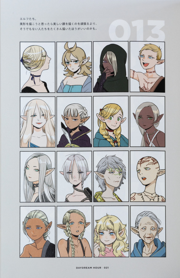
I am moving at a glacial pace with tidying up and editing the images of this art book, so I'm going to take a break and talk about Kui's incredible character design on Delicious In Dungeon, using elves here as an example
So, first of all, race-defining traits. With the elves, it's obviously ears as the first. But, Kui plays around with that far more and in an incredibly natural way. The size of their ears differs, the angle at which they protrude from the side of the head can be different, their rotation in terms of where the opening of the ear faces can change, and even the "pointyness" is unique to each elf.
It creates incredibly varied views and "styles" of elf within the world, and complements a lot more of the physical traits that reflect ethnicity in our world.
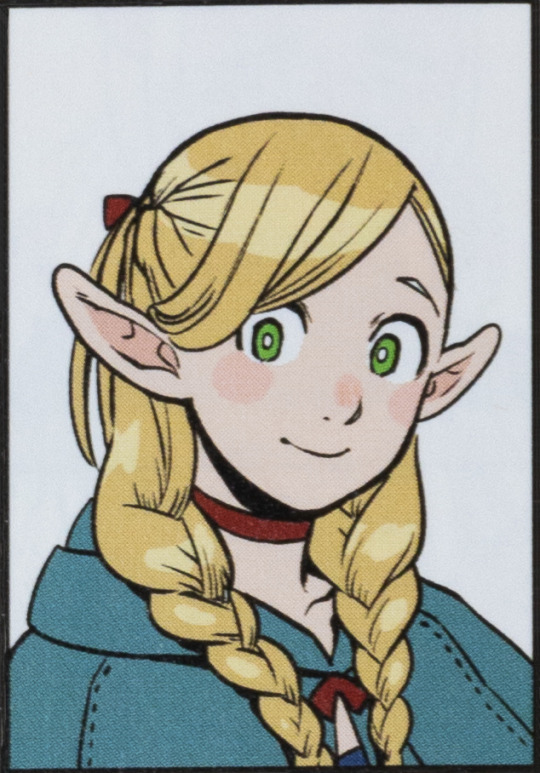
Take, for example, the hair of elves. In the vast majority of cases it remains blonde or silver/white, and is straight. As you can tell with some of the images, it's not always smooth or silky like some exhibit, but in the vast majority of cases, for elves that are pure elves, their hair is straight (potentially with some shape/volume as you can see with the gray-haired elf with green markings on their face).
Similarly, elves are shown to have characteristically blue or green eyes. Which begins to draw your attention towards an outlier.
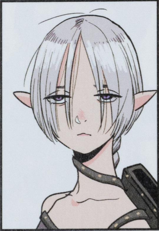
This elf. The one with purple eyes. Immediately, you might think "oh, they must only be part elf", but Ryoko Kui was only laying a trap with that idea. This elf is certainly 100% elf, it's just that they exhibit traits that are heterogenous to how Kui's defined elves as a race.
The biggest outliers being the purple eyes, but then also the ears. Here's the thing though, there's not a race that strongly exhibits purple eyes throughout Ryoko Kui's work on Delicious In Dungeon. It's just that elves exhibit strong homogeneity in regards to eye color. A similar thing can arguably be said about the ears which may make viewers think something's up. They're certainly the smallest of the bunch, and the most rotated, but other elves also see aggressively rotated ears, just not to the degree that this one does.
If you want to talk about how the traits of elves mix with that of other races we actually have two examples. Marcille Donato, obviously, as a half elf and half tall-man, but also this other blonde woman with blue eyes.

We know of Marcille's heritage so let's focus on the woman on the right. The first thing that you notice as a heterogenous is her hair: it's wavy. It's a trait that's very much separate from Kui's depiction of elves. Similarly, the shape of the eyes betrays that much more narrow and sharp style.
Then there's also the ears, which are larger, noticeably shorter, more round, and most noteworthy are thicker.
With that last piece I'm sure many are thinking, "Oh, she has to be half Gnome!". Yes, the shape and size of the ears does very much fit Kui's style of Gnome (as does her height, I'll say more later), but let me show you a (bad and unedited) image of how Kui draws gnomes.
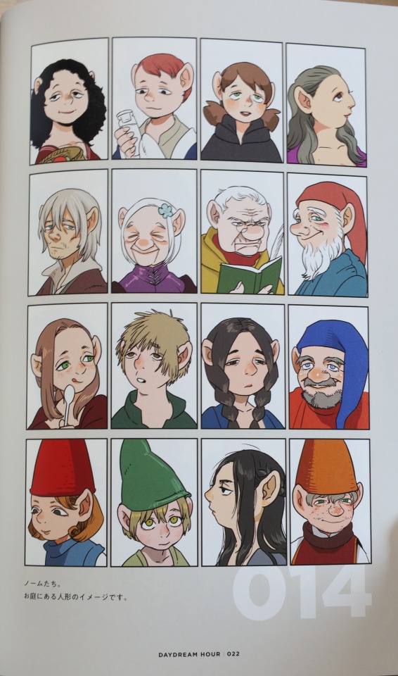
Their eyes are far more slanted and downturned. It's a very strong trait of the Gnomes, alongside their very prominent noses and hair that isn't noticeably curly or wavy.
So no, it's not Gnome, and I wouldn't say it's Dwarf either. My guess is that this woman is part half-foot. The smaller stature (yes, the headshot shows that she's shorter than the other elves), the curly hair, the shorter yet more prominent and thicker ears, the rounder eyes, it all speaks to similarities expressed by Half-Foot characters.
And I think that's really incredible. It's just a wonderful highlight of how thoughtful and creative Kui is with their character design, and how unique they're able to make a race.
At a glance, you can tell who's what, but they don't all look the same by any means.
That's something that's really driven home with Ryoko Kui's Daydream Hour, and something I really want to talk about more. Though, as you can tell, I've got a lot of work ahead of me to get images that are actually good and presentable, so we'll see when I'm able to squeeze out a proper post.
#ryoko kui#daydream hour#delicious in dungeon#dungeon meshi#dunmeshi#marcille dunmeshi#marcille dungeon meshi#marcille donato#delicious in dungeon marcille#anime art book#anime art#manga art book#manga art#anime and manga#anime#manga
153 notes
·
View notes
Text
alright, here it is: ZENO'S COLOR GUIDE 3.0 !
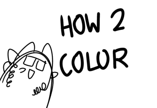
here, i'll have three "chapters" regarding color:
CH1: how i color in illustrations
CH2: color and character design (in zeno's case)
CH3: how zeno makes his colors cooler
CH1: HOW I COLOR IN ILLUSTRATIONS
it must be noted that, as of lately, i heavily use halftones in my art and the way i use them for gradients effects my color choices. of course you don't need to use halftones if you don't want to, as it's just my personal choice, but anything regarding halftones here could (probably) also apply to regular gradients!
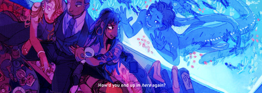
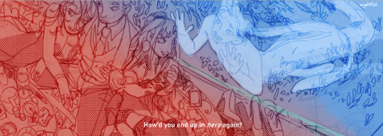
when choosing colors in an illustration, i usually have three things in mind: mood, character, and contrast. we'll be using "gloomy bunny naptime" as an example here.
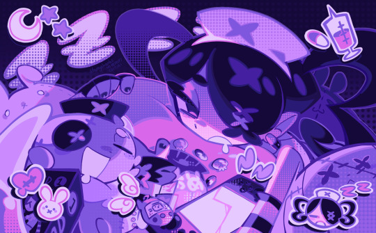
MOOD: what's the vibe of the piece? for example, here in "gloomy bunny naptime", wanted a mellow, sleepy vibe, so purples and pinks seemed like the best choice. these colors also have a dreamy effect due to being common in real-life early mornings/summer nights - basically, i tend to use associative colors in illustrations.
i usually only use a pallete of 3-7 colors, though of course more characters calls for more colors. for multi-character pieces, i would actually make a "rainbow" of colors based on the mood of the piece - essentially, a bank of colors to use for your colorful casts based on the actual rainbow. you can alter this based on the saturation levels you want! hope that makes sense. i'm not the best at this though, so i would heavily recommend looking for guides from artists who are more skilled in that department.
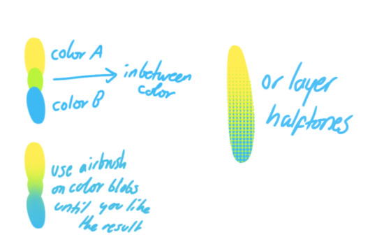
CHARACTER: velvet is the focus of the piece, and as a character her palette is made up of many purples and pinks. of course, it's easier because she and ribbon both have similar designs, but i would still recommend using colors based on/complementary to the focus character's pallete, though this is a rule that can and should be broken if needed. gradients can be used to provide a smooth transition from color-to-color and add depth to the piece, as well as showcase velvet's pallete. when making any gradient, you probably want to have a vibrant middle color. this is difficult to achieve in most art programs, so i'd do it like this:
you can use gradients in lots of cool ways to make stuff pop! (i think this collage shows i use too much purple and pink though.)

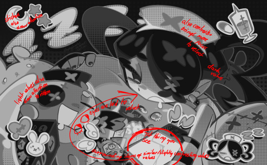
CONTRAST: the context of the piece also aids the color through contrast. (that's a lot of Cs!)- we see that velvet is just waking up, and the light from her switch is glowing brightly. i wanted to convey something like her switch suddenly turning on in the middle of the night, waking her up - so the console emits "light" in the form of illuminating the contrasting color of pink against the purples. it might seem specific to this piece, but what i'm trying to say is that contrasting colors can lead the eye to the focal point of the piece, that being velvet herself. because a great deal of the rest of the piece is dark, we look at the contrasting switch screen - the brightest thing in frame - and our eyes move around and up to take in the focal point character. at least that's how i wanted it to be ;w; i guess you could convey it as something like this?
CH2: COLOR AND CHARACTER DESIGN (IN ZENO'S CASE)
this is where i start to get annoying, so stand back! when deciding on colors for a cast of characters, there are many factors: time period, variety, personality, and more that i can't think of.
TIME PERIOD: this one is simple. for example, a futuristic time period (such as that in x-calibur) calls for colder colors, such as greens and blues. for characters involved in futuristic professions such as space exploration, this works incredibly well. for modern time periods, less focus can be on colors and more on the shapes of the clothes, but this is not a shapes tutorial! i don't have any ancient times oc stories, but i'd probably use earthy and warm tones.
VARIETY: this is also rather simple. i try to be aware of the palletes that i used, and the similarities they might have with other characters. i try to use similar colors for characters who belong to certain organisations or have a uniform, but of course, it's not like catholic school students adhere their entire look to their uniform, so this is a rule that can be broken yet again. art is all about learning things and breaking them, remember that!!!
color can also be used for symbolism. my absolute fav example for this is vivica and octavia - the amount of red in their designs is supposed to represent the amount of freedom/passion/anger/confidence they have or are allowed to express under their different circumstances. as vivica belongs to a strict organisation, she has far less red in her design, showing her emotions are stifled - meanwhile octavia has it as her main complementary color because of her freedom to express her emotions, though those emotions may be destructive because of her circumstances.
PERSONALITY: what colors are associated with your character's personality? i actually usually refer to magical girl groups to see what's commonly associated with different colors. here's the main trend:
red: hot-headed, passionate, firey
orange/yellow: bright, happy-go-lucky, sunshine personality
green: wise, mellow, kind
blue: serene, graceful, elegant
purple: magical, regal, fancy
pink: usually the main character (though this because magical girl anime tends to be marketed towards young girls), sweet, relatable, determined
of course these are only stereotypes from one genre of anime, and different colors have tons of different meanings. color theory is the best way to learn this! these colors can also express different moods, which ties into ch1. i myself constantly ignore these rules - v-con, a bombastic hyper DJ, is purple (though he does have yellow accents) for example. basically, i just take them as a general rule and try to have them in mind while drawing.
CH3: HOW ZENO MAKES HIS COLORS COOLER
this might be the most important part of this guide. once again, there are a few things to consider here: filters, hue, overlays, and more!
FILTERS: for ibispaint, you can use an adjustment layer on your whole piece to use a filter. i usually only use brightness/contrast here - upping the brightness (or darkening it based on the mood of the piece) and upping the contrast. this helps to better express values and intensify the colors if that's what you want. i often use it in all my pieces to some extent.
hue/saturation/lightness is also helpful in moderation. you can alter the hue - though it usually only helps if you bring it back or forward by just a few points, or the entire pallete will change. saturation is what it sounds like, and slightly over/desaturating the piece can help with atmosphere. lightness is what it sounds like - lightens the colors in the piece. i don't use it at all.
posterize and sharpen mask are some that i've used recently. posterize can add some crazy effects to your art, but i'd probably need to edit it slightly after using it because it can mess with certain colors.
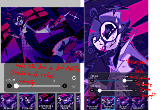
HUE: it's a layer type that can change the overall hue of the piece. i usually use it at a low percentage for atmosphere. kind of like a gradient map but nothing like it? idk
and OVERLAYS: i just use a very saturated blue/purple color over the entire piece at a very low percentage, around 5-10%. it can wash out the piece at too high a percentage.
and that's basically it! sorry it kind of derailed at the end i spent like 2 hours on this and got super tired. goodnight i'm going to sleep please also look at other artists etc etc. bye.
#zeno's art#long post#color tutorial#liar by korn is actually a really catchy song yea the lyrics are weird but its so good tbh#peak drums and bass and guitar and vocals and then the lyrics are hot booty. this is what nu metal's all about people#ask questions if you want#about nu metal or art i dont care
312 notes
·
View notes
Text
Okay, so, this will be a stream-of-consciousness type post, because I am this close to starting to print screenshots and do a full murder board trying to make this make sense to someone who is not in my brain, so I'm gonna type this out, and if you're seeing this that means it worked or I just typed for too long to not post lol.
Buck, Actually. Buck, Bothered, and Bewildered. I am not the only person that desperately wants a callback, and I know I'm not the only one thinking about what this might mean for buddie. Well, I've been saying for a while now that I would try to type out something about how buddie has been planned and the answers are in Buck, Actually, and that's what I'm gonna do now, I guess.
We know Buck gets a lot of his ideas of love from Buck, Actually. Seeing Maddie and Chim in the early stages, his own quest with love while moving on from Abby, notably Mitchell and Thomas and the "you don't find it, son, you make it." Buck's quest with love now is at a point where Buck wants to be seen "I feel like she sees me" but he is still at a point where he doesn't want to actually be seen, he wants someone to see what he wants to show, but that's not what actual love is. But still, we start out Buck, Actually with Buck literally in front of a huge sign that says "See Me" (also just to add into my madness about the blue and green in other elements of the scene, love the clear divide of Eddie against the sky and Buck against the sign, and yes I know they can't change the color of the sky or the sign but shh just go with it) with Eddie right above it. Interesting scene composition I think.
But talking about the actual couple here, we have Lola, who feels like her husband doesn't see her anymore after a situation where she feels like she lost herself, their kid went off to college, she has more time to herself, is struggling, and goes nuclear until Norman proves that he does in fact see her, just not in the way she was looking for, dude just wasn't aware there was a problem that needed to be addressed. I know I make everything about the cemetery scene lately, but come on. The whole thing with being seen, Buck not knowing who he is after dying, the expectation he is putting on himself about being the person he was before but he doesn't know who that is, like, come on, it's there.
Then the robbers and the two employees at the gas station, granted the robbers are a lot about Buck thinking about his own ways when it comes to sex and women considering he just had sex with Taylor in a bathroom, BUT here is when I start to go a little crazy. Because Ruth and Earl have that little moment of a relationship developing (hi blue scrunchie green cap 🫶), which we later see has developed, but Earl with his injured right shoulder is talking about how he's hurt but he was only thinking about her safety.
Does that sound familiar to anyone else? Just a thought. Yes, I know I'm crazy, it's fine, it will get worse.

Because another thing about the episode is the whole "till death do us part" thing, with the newlyweds who crashed their car, Mitchell and Thomas dying together, and maybe even Buck having to hold Lola back so she wouldn't fall. I'll come back to this in a second, but you gotta love a nice little crush injury involving a vehicle and a focus on handholding, huh?


But the thing is, Mitchell and Thomas make an impression on Buck, and Mr Self Destruct for Attention because that was the only way I was shown love as a child definitely takes the way they die together a bit too literally. Taylor being in this episode while being blatantly wrong for Buck makes an interesting point on that and the way bucktaylor evolves, because Buck gets the whole you make it, and decides he needs to kill himself to make it work, and it is what he ultimately does with Taylor, he thinks he loves her, he thinks she loves him, and he thinks that means if he doesn't give up he can move past his very obvious reservations about the relationship as a whole because "love is not supposed to be easy". But the whole thing is that Buck focuses on the wrong thing there because while Michell and Thomas died together, they had a whole life together, the point is not the death, it is the life. Yes, you need to fight to make it work, but the fight is not all you have.
Another thing about the episode is the concept of movement too, like, Lola's call on a freeway, both accidents involving a car crash of some sort, the robbery is a chase, even Buck and Taylor in the news van, Maddie talking about how slow being on the freeway is, and metaphorically too, with Madney starting to move towards something, Athena learning to deal with Michael's boyfriend. And Buck finally allowing himself to move on, and move on not going back to his old habits, sleeping with anyone for connection, but actually talking to his love interest for a change.
And we have relationships in all types of moments there, we have Buck and Taylor doomed to fail, we have Maddie and Chim in that nice early stage where you're falling in love with someone, you have Bobby and Athena and the whole when you know you know and the way Bobby proposes the next episode, we have the newlyweds, we have Ruth and Earl making the change in their relationship, we have Robber Guy and Baby Bear realizing that she's more in it than he is, we have Lola and Norman and the whole relationships take effort no matter how long you've been together, you have Mitchell and Thomas sharing a whole life.
There's also the whole layer of having the couple that shows Buck what he wants out of love be a gay couple, the way when Buck realizes Thomas is unresponsive he calls for Eddie first, because Chim and Hen are at the call, and they're not with Mitchell because Mitchell's body is there too, so like, the choice to make sure Eddie would be right next to Buck to comfort him is something.
Also, something else, the inmate who kidnaps them is also called Mitchell, and I cannot explain how I got here for the life of me. But Mitchell, Mitchell, Charlie, Charlie, Ambulance.

I don't know, something about the repetition of names, the ambulance as a key piece of the scene, the bonding, the comfort, the fear, the way Mitchell and Thomas died together, and Buck and Eddie could have died together in all of those situations. And the way Buck volunteers into the danger in all of those situations, he offers to help Eddie with the grenade, he goes to get Eddie without backup while actively being shot at, he runs toward the gunfire because he thinks Eddie is in danger, so like, it's a pattern of wanting to go together.
But also, the madney of it all, because while they are clearly moving towards something, they are not ready yet, but everything is acknowledged, which honestly is my main hope, because I don't think buddie is ready yet, but I would like some acknowledgment that where they're going, yk? And with the episode title possibly being a play with the song about being in love and not showing it, not knowing what to do with it, and the next episode being called "you don't know me" who could also be referencing a song about being in love with someone who doesn't know, we could be looking at real movement happening between the two of them yk?
I don't know if this makes a lot of sense, but if you read this I love you 🫶
#someone tell me if this makes any sense#i'm still not hitting all the points#but i seriously dont know how#my brain is not braining#but the clown shoes are ON#anyway#911 meta#kinda#911#911 speculation#911 spoilers#buddie thoughts#i think?
134 notes
·
View notes
Text
Alright, folks. It’s time for another little lesson.
Well, lesson’s a biiiit of an odd term, but it’s pretty true here.
Let’s discuss color theory.
So color theory’s a known phenomenon within the brain that subtly influences thoughts based on what color we’re presented with.
Like for example, how almost every food place uses red as their main color?
That’s because red can subtly influence thoughts of hunger within the mind.
It’s how every time you go to eat fast food, there’s that little feeling, that little weakness that wants just a biiiit more food.
That’s color theory working against you.
Now, let’s talk about what would happen if color theory worked in your favor.
Like for example, blue is a color that calls upon thoughts of relaxation and focus.
It’s why you see so many places that focus on relaxation use blue as a highlight color.
You see, the way our brain detects colors and processes them as subtle feelings is something that’s just simply hardwired into our DNA.
There’s not a lot we all know about it yet, but we do know how it influences our brains.
Let’s call back on blue for a moment.
A deep and dark blue can remind you of the ocean.
The relaxing waves, the sounds of the water crashing against your mind.
The depths of the ocean that seem to draw you into their splendor.
That’s what I’m talking about.
And notice how the blues make you feel just a bit more relaxed when you read them?
That’s the power of color theory, dear.
And it gets crazier when we mix in colors.
Like a painter with a canvas, mixing colors creates new results.
Like if I wanted to combine the relaxing warmth of green and the deep focus that only blue can provide.
Because while blue is also relaxing, green is the color of nature.
Of the world around us.
Of the beauty that Mother Earth has blessed us with.
And those little thoughts create a deep warmth within, much like the primal relaxation we feel when we’re out in nature.
And mixing the focus and relaxation of blues together with the warm and deep comfort of green creates this beautifully mixed feeling of belonging and deep relaxation.
Where the two seem to perfectly mesh and perfectly wreck the brain.
Or let’s think about two more colors.
Pink and red.
The dumb ditziness that pink provides, the color of the brain and yet the color of dreams and desires.
Mixing together like the dreamy design of cotton candy, the slow loss of thought once the pink starts up can shut off the mind.
But, there’s also an underlying arousal to pink. How it seems to knock the brain a bit loose and make it a bit happier in the process.
And then there’s red.
The color of passion.
The color of love.
The color of arousal.
Because even if there are other feelings associated with red, we as humans see red as the color behind our deepest desires.
How it seems to etch permanently inside of us feelings of romantic resolve and pleasant passion.
And there’s always a deep desire within red.
A warmth that just won’t go away.
And if we combine red and pink?
Well, you get this ditzy desire.
This underlying, deep feeling of passion and persuasion.
A little arousal starting within the body as the brain gets dumber and the body gets hotter.
And it grows stronger as the colors mix and mix more and more.
Throwing in the deep shades of blue and green to deepen the feelings.
Rising arousal.
Deep relaxation.
All mixing together on the beautiful canvas of the mind.
Don’t hesitate to reblog or comment, either.
I’d love to hear your thoughts.
Until next time, stay cool for me. ‘kay tiger?
#hypnosis#hypnotism#brainwashing#mind conditioning#mind control#brain drain#hypnotized#covert hypnosis#hypnok1nk#color hypnosis#color theory#hypnodom
320 notes
·
View notes
Note
Hello! I’m very curious of your use of colors and how you go about choosing them for a piece? They all have such a nice vibe and are a treat to the eyes!! I’m also surprised you’re a med student!! How do you juggle making art with your studies?? (from the few things (very very few) I know about medical studies it just seems like a LOT of studying goes on, so I’m very curious!)
Sometimes artists make things look so easy! I want to talk about my artistic process honestly, so I’m going to show you some pieces I struggled on, with my reasoning and references, and also my mistakes and where I asked for help. I’m glad you like my colors, they’re sometimes what I end up spending the most time on.
So hello and welcome to a somewhat long write up.
First I want to show this piece, “A friendship between an escort and an eel man,” that I love the finished colors of but was a pain while I was making it:
I start off with two ideas I wanted to combine for the color scheme:
The two halves, the human half and the eel tank half, should be distinct. I thought human side red, eel tank blue.
2. For additional contrast, I wanted human half dark and eel tank bright.

Wasn't entirely clicking, but I decided to just start slapping down colors and adjust later.
A note on shadows and lighting- shift not just the values (light/dark of the color) but the hue as well (the.. color of the color) to give a piece a richer tone. Here I’m making the shadows more red and the lighting more yellow (though in the end the lighting is blue instead).
(Of course, changing value only is a choice used in many color schemes as well. Maybe if you want a piece to look dingy, or monochromatic. You can do anything if you do it intentionally.)
Here I liked the warm human half, but I didn’t like the blue tank so much.
Tried some warm colors. Still wasn’t working. Though bringing the yellow into the tank made the piece more cohesive, having the whole thing be similar colors was not my initial goal. It looked boring, and the eel tank was not separate enough. The yellows and browns on the aquarium side did not look like water, even when I tried suggesting the top of the tank.
I asked a friend (@veritasgloriamart) for help and she sent me this reference:

I adjusted the tank colors to the reference, and added a blue glow instead of yellow to help connect the two sides. It was still not looking cohesive enough to me.

A blue overlay layer added to the human side to make the colors even more aligned with the tank side worked! Overlay layers are magic. They can really help make colors come together. Here the purple on the human side still works to separate it from the tank, but the blue shadows bring them together. It was looking really good now!

Contrast is important, so eel man became darker. Him and the escort are the subjects, so they get to be dark against a light background. Contrast and focal points are important.
After some cleaning up, here is the final piece again! I put some pink in the tank to bring some of human side into the tank side too.

Here is a second piece I struggled with:
Again I start off with some ideas: the scene should look warm and comfortable. I thought I should use a lot of colors, to make the meal look like a colorful feast. But I wasn’t paying enough attention to lighting and contrast, so it was looking flat and disorganized.
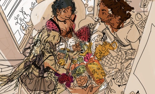
I decided I wanted the colors to look more intentional. Let's do purple and yellow, warm and complementary colors. Green and red because food needs those colors. But the contrast was still not good enough. The piece still lacked clarity and focus.

One thing to do when struggling with contrast and clarity: switch to thinking with values. Working in black and white, I made the figure of the fairy on the left darker against a lighter background to make her stand out, and I made the unimportant edges of the piece darker, but it didn’t feel like enough.

My friend (thanks @deoidesign) gave me critique to make the lighting bolder on the hair and table, making the silhouette of the fairy much more clear. After following the advice, it was really working for me now!

I used the gradient map tool to rough out a similar yellow and purple color scheme as my initial idea:

After adding the gradient map it’s pretty much done. Gradient maps are magic.
I lost the idea I started with, making the food colorful, but the food worked better being all yellow instead. Making the food all one color made the lighting more clear, deemphasized it, and let the characters stand out. Things don't always have to be colored the color they actually are.
Minor details added, final piece.
"Eating faerie food gives them power over you, but if fae eat human food, it works the other way around too. These three don’t mind either way."

Final example, a piece that wasn’t a struggle: A necromancer and kitty’s latest conquest.
Sometimes, coloring is just vibes.
The starting idea for this one: muted blue and purple/red.
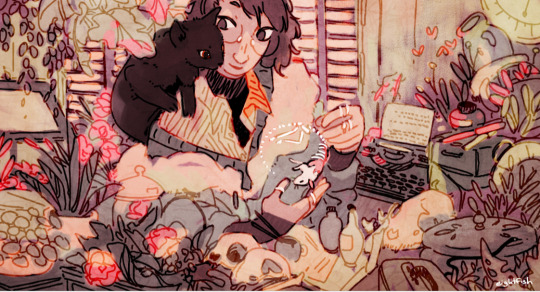
I took some inspiration from this piece by an artist whos work I love love love (the green one under 2021):
That piece inspired me to add the beige, green, and pink from the color scheme. I also nudged the reds more into purple to make them softer.
The plants got to be green, as did the walls. Blue and purple, the cooler colors, for the shadows and darker plants. Pink as a bright color, used sparingly to add warmth. Beige used wherever it fits, to calm everything down. The colors for this piece came naturally so I don’t have a lot of progress shots.
Some things I was considering here: I was blending the colors into each other and reusing them throughout the piece. Nearby colors bleed into each other, unifying them. Things are not held to the colors they would be in the real world, but rather what looks good.
Only very minor changes were made after the color sketch. Final piece:
When I’m not feeling like experimenting so much, sometimes I just fall back on color schemes I’m used to. I know red, green, and yellow look cozy and warm together so a lot of my pieces use that.
On learning colors:
For me, learning means paying attention to the colors in the world around me and to the colors in other people’s art. I note the general idea of color palettes (example: yellow highlights, blue shadows is one I see a lot) and the impressions they give off. I’m slowly building up a library in my head of palettes.
Tips summary:
Having some idea of the mood of the piece or a general palette can be a good starting point
Ask for help
Take inspiration and use references
Value is more important for clarity than colors are. If the colors are not working, it could be because the values are not working
You don’t need to color things the color they actually are. Color them how they look or what looks best for the piece. White things are not necessarily white, skin is not necessarily a shade of brown. The lighting of an environment changes the colors you see.
Iterate on ideas. Critique yourself.
Thinking of a piece as a whole helps the colors look cohesive. Think of palates while considering the whole piece. Intentionally reuse colors throughout.
Consider bleeding nearby colors into each other. In real life, bounce light can give this effect. In art, it’s not necessarily always realistic but can add texture and cohesiveness.
Practice practice practice
The end. I hope it’s useful!
208 notes
·
View notes
Text
I'm going to start teaching my nephews some basic colour theory; they're 9 and 10 and really passionate artists, and I think a little knowledge now will help them push themselves a lot further.
I'm going to start with colour mixing. I really think that color mixing using paint is a valuable metaphor even if you are working digitally 99% of the time. who knows what my nephews will end up focusing on as they get older, but having the metaphor of mixing paint to achieve different colors and understand how colors relate to each other visually should be a really useful ground level structure in any ongoing learning they do with color theory.
so I've put together a watercolor palette using student grade non-toxic paints. we've got two reds, two yellows, two blues, and burnt sienna.

I'm going to include white gouache as well, so we can talk about tinting colors, and how colors appear different when they are diluted versus tinted. also, honestly when I was their age I think watercolor was really punishing, and just bringing in some white gouache gives them a chance to rework areas if they want to. I'm hoping this makes stuff a little less frustrating and helps them feel more empowered to keep fixing and pushing their work instead of just giving up.
I don't currently have a plan to have black paint in there right now, because I want us to focus on color mixing, but I wouldn't on principal prevent them from having a pan of black paint in future for their own time with the paint. I just think it might be distracting or confusing when I'd rather we focus on mixing neutrals with these colorful pigments.
I've got five Windsor and Newton Cotman brand pans - phthalo blue, lemon yellow, cadmium yellow hue, cadmium red medium hue, and burnt sienna; and the other two pans i filled with van Gogh brand tube paint - ultramarine deep and madder lake deep.
This gets me a decent spread of secondaries without confusing anything by introducing the CMY approach.
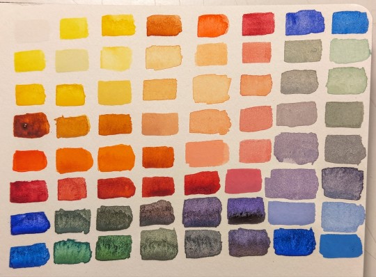
I think learning the CMY palette will be valuable too! but it made sense to me to start with palette that most resembled what they are likely to be learning in school in terms of subtractive color mixing. if they do learn about additive color mixing, they'll be working with the cmy palette with light, so I figure I'll let this be different at the moment.
I've included burnt sienna after weighing my options, because I think it's important for them to learn how to neutralize colors in a few different ways. burnt sienna and ultramarine blue are such a classic neutral formula, and such a great way to mix something that's nearly black, that it felt important to include. the fact that when you mix it with the phthalo blue you get a green instead of a neutral, I think that's a really great example of how color mixing can be surprising as well.
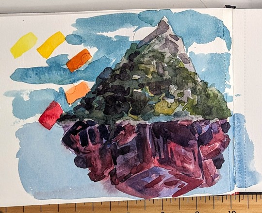
I'm working on a couple little example paintings to help them see the range that is possible with this palette, so here's one with greens and purples; I'll do one in neutrals overall and another maybe in oranges and teals.
I think for exercises we might want to work up to the colour wheel - maybe starting first with the basics of mxing using different rations to get different colours, and go from there.
If anyone has any advice on teaching this to 9 and 10 year olds, I'd love to hear it! I think they'll be excited to try something new and open up more possibilities for themselves as artists right now; beyond that I won't be particularly intense about it.
Also, do you remember when you learned paint mixing and basic colour theory? What were some moments that stood out to you or stuck in your mind forever?
55 notes
·
View notes
Text
"pink is nice"

pairing: Valeria Garza x fem reader
synopsis: some domestic fluff backstory on Valeria's pink nails.
word count: 1.3k
tags: domestic bliss, fluff, silly wlw brainrot
A/N: Have you ever noticed Valeria has pink nails?? I have so many headcanons about her because she's just my little silly goose. Yes, she's 100% an artist and yes she has awful seasonal depression. I also think the y/n I've made for her is a beautician who does her hair and nails. Hashtag Valeria apologist lifestyle.
"Sorry that I don't have any more colors! I thought shades of pink, yellow, green, and blue would be cute for spring." You said while Valeria looked at your relatively empty nail polish organizer. "You could go with your usual picks too."
Her brows furrowed, eyes squinted, and she stood with arms crossed, deep in thought. Never have you seen someone so decisive with nail polish– it's cute, though! The people around Valeria could never see her in such a normal state– thank god you were able to witness this. You spaced out and stared at the organizer until she snapped you out of your trance.
"Pink is nice. I think I'll go with that." She kissed your cheek and handed you the nail polish, base coat, and top coat bottles. You fixed the throw pillows on your shared bed for extra cushion, one for you and one for her. She sat beside you in her spot, putting the polish next to you and handing you a nail file.
"You think you can shape them down? I think they're a little overgrown for work." She laughed while pushing her stray hair out of her face, tucking it behind her ear.
"In your terms, they are. I hate filing them down, though... you have such pretty nail beds."
"I wouldn't be able to do my job properly with anything longer, but thank you for the compliment, amor. Sweet as always."
You jokingly groan at her response, continuing to file down her right hand. You both sat in a comfortable quietness, the occasional dog barking or car driving by being the only interruptions. Valeria darted her eyes around the room before circling her sight back to you, the floor, then to her hands. By now, you were working on her base coat. Her focus returned to you when you broke the silence.
"When we first met, I saw you as a purple gal. It's a very royal color historically– it fits you." You said, observing the bottle of hot pink nail polish beside you.
"Really?"
"Mhm. You usually don't pick bright colors, so it surprised me when you chose this. What's the switch up today?" Valeria bit the inside of her lip and looked to the side, trying to come up with an answer. If she had to be honest, it was just a pretty color– one of her favorites, too. She does understand where you're coming from, though. Her nails usually match her everyday closet, which are neutrals and some hints of blue from her jeans, so she opts for either black or shades of nude. They're colors that don't stand out too much but still make her feel pretty wearing them.
"I felt a little special. Spring is here, so it feels less dead, unlike winter. Plus, our anniversary is coming up! I'm in a good mood," She used her free hand to pet your head, not wanting to mess you up by shifting to kiss you. "I think a bright color fits how I feel right now."
You smiled at her genuine happiness. It was rare for Valeria to come home without stress, walking in carrying her anger from a mistake her employees made or a mistake she made herself. Whenever that happens to be the case (which again, is frequent), she isolates herself immediately. Despite her line of work taking a fair amount of collaboration, she works by herself most of the time. That left a lot of speculation about what 'El Sin Nombre' was truly like, and not who Valeria Garza was under her work mindset. It amazes you that you were able to get to know her with how distant she was with the people around her. You're surprised she even wanted to date you– let alone marry you.
"As long as you're happy, I'm happy, love. Speaking of our anniversary, what do you wanna do?"
"Well... I think we could both benefit from going outside. How does dinner sound? We can still cook breakfast and lunch ourselves. I know you like spending our mornings together." She giggles.
"You know me so well." You laughed, finishing the base coat, and started with the main event; the hot pink nail polish chosen by your wife.
"It really is a nice color. It makes me forget the seasonal depression we both got out of." She said, examining the sheer first layer. She was right about the seasonal depression. You both get tired during December, then exhausted trying to start the new year correctly in January and February. It starts getting better in early March when you're finally caught up with life, and the pace quickens to prepare for spring.
"Now you have me wanting to use pink too. I might go with a lighter shade so we can still match."
After about three coats, you were finishing off Valeria's nails with a glossy top coat. She looked at her other hand which was drying to admire your work.
"Good job as always, amor! When can I not trust you with my nails? Thank you."
"It's nothing! Plus, it's been a while since you've taken some time for yourself." Valeria clicked her tongue and sighed, knowing what you were referring to.
"I know, I know. I missed being home, too." The only con to being married to her; she's rarely able to be home, especially nowadays with her bigger plans. As much as you appreciate the precious texts and phone calls while she's hours away from home, dealing with something work-related, it's hard to cope with life going on without her home. Your co-workers always see you mope around whenever Valeria is long-distance, and she's more serious than usual while operating away from home. You completed each other so perfectly– it was like tearing the sun and moon apart when you weren't together.
Every conversation you and Valeria had brought you closer; it was the reason you both took interest in each other from the start. One of the more hidden interests she had was art. She isn't into doing her own art– at least not often, but she could talk about how it impacts her for hours. You remember you were on a walk with her while admiring the street art of Las Almas after coming home.
"What made you start liking street art so much? You talk about it so passionately."
"Las Almas wouldn't be itself without the street art. I think it shows the community and the will of the people. I like it for that."
"Do you have a favorite piece?"
"Hmm... I don't think I could pick one if I tried. You're always my favorite work of art, though."
It makes you glad that she sometimes treats her trips as art tours, sending you murals in a new town she arrived in. Sometimes you think in another reality, Valeria pursued art and wouldn't be as stressed and overworked as she is now. But as long as she's happy with her life, all is fine.
"Alright, they're dry- ah!" You got pulled into a hug while Valeria laid back on the bed, bringing you down with her. She peppered your face with kisses before deeply kissing your lips and burying her face in your neck.
"Thank you again. I love you." She said, sighing into you. You were on your sides facing each other while her arms were on your waist.
"I love you too. You're welcome, by the way." You giggled, wrapping your arms around her, enjoying her loving embrace. You stayed just like that for a minute, savoring the warmth before Valeria spoke again.
"Do you want to get snacks and watch a movie together? I call it an early anniversary celebration." She said while getting up on her elbows and giving you a wink. "I may have been able to work a little extra last month to be around you more."
"Of course, I want to." She got off your shared bed, helping you up to go pick movie snacks with her.
"Alright, let's go. This week will be just for us, I promise."
#valeria garza#valeria mw2#valeria x reader#valeria garza x reader#cod#cod mw22#domestic bliss#domestic fluff#call of duty#call of duty modern warfare 2
894 notes
·
View notes
Text
i love star trek bc it's actually a high school theater production most of the time. We focus a lot on the over-acting, theatricality of the actors and the directors, and that's all well and amazing, but /I/ want to focus on the /TECH/ bc ASHAijnjsdnbhgaARREghghhuuagjkshdmhbAHJBSSHJHIEJBnkjsdjhbsdhjBmahbsjshsbHkjnswkjshsn yea.
FIRST THE SETS?!? they're so silly and stupid? i know they get a lot of shit but the amount of work (not to mention styrofoam) that went into building individual sets for each planet they went to? like sure about 50% of the away missions take place in the california desert (the arena, *cough cough*, etc) but the rest of them have individually made sets that look PRETTY GOOD MAN. they get the point across, they're FUN, and innovative, and they really don't reuse planet sets all that often as well.
PLUS they used traditionally /theatrical/ cycloramas with painted backgrounds and classical cyc lighting (reminiscent of mariano fortuny's domed cyc! i WILL talk more about lighting) which look really cool and once again get shit for being unrealistic.
it's not supposed to look realistic it's supposed to look cool as shit. and it does. shut up. <3
if you view the sets as being modern TV sets then yeah, they're weird, and they look sorta bad, but THEYRE NOT modern TV sets: they're THEATRICAL SETS FROM THE 60-70S. AND I LOVE THEM.
SECONDLY, THE
lighting
while it's true that some shows in the 60s were developing new lighting styles specifically for TV, remember that in the year 1950 less that 10 percent of US homes had a television. this shit was new. COLOR tv was ESPECIALLY new. nobody knew how to light these things! and actually why would you need a new lighting style, we already KNEW how to light dramatic productions, why would we ever need to reinvent the wheel Stanley Mccandles, Mariano Fortuny, and Gene Rosenthall already invented says Gene Roddenberry and Jerry Finnerman (the head lighting designer). and oh my god i am so ridiculously glad. because the lighting. is so good.
i HAVE seen others talking about how good it is in the super early episodes (Charlie X and the conscious of the King, etc.) and i do agree! but i disagree that the quality goes down. i think it just got a tad bit more subtle as the show went on and it gets less in your face, harder to notice. but i noticed. because I'M the WORST (and also a lighting tech)
the impossibility of listing every example of amazing theater lighting choice they made is absolutely horrific and nasty so i'll just lost some my my favorites:
the cyc! i mentioned before but the cyc they used on away missions was only painted when they needed a specific scene in the background, otherwise? that bitch was LIT. and i LOVE IT.

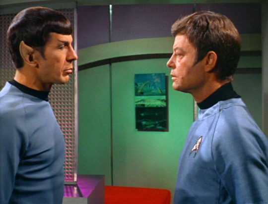
any of the scenes where they light spock's face have green and half pink? or even just washing the walls behind him? i eat that shit UP. the METAPHOR. the CONFLICT. i will acquiesce that green and pink are (and were) pretty goddamn industry standard gels (color-films) to add to lights, for subtle contrast, but this is not subtle. it is LOUD. was it purposefully done from a storytelling perspective? no idea. is it cool as shit and interpret-able as hell? absolutely. also sometimes they do it with just green when they want to emphasize his vulcan-ness and other him a bit. like they do it a lot when he's in his room in amok time. anyway.

whenever they shutter a light so they can emphasize a character's (kirk, we're talking abt kirk here. and *sometimes* spock, and also Charlie in Charlie X but yeah mostly kirk) eyes when they say something #Deep, or just pre-commercial break closure worthy line. it's so SHJSDJBFEJNKN. to add onto this, they'll do a striking half-wash over half of their face sometimes in conjunction and it looks So Good


The GOBOS. sometimes, they'll just throw light through a gobo, or wall screen, or something, for /visual interest/ and it looks so silly i love it sm. does it make sense from a realism pov? nO. but star trek is a theater production actually and they lit everything using mainly naturalistic techniques! amazing!
honorable mentions: the glowing time donut, and the entirely random colors in the hallway.
there are so many other examples but this post is long enough lmao. notice the lights next time you watch tos!!,! please!!! <3
#star trek tos#james t kirk#tos spock#enterprise#star trek#set design#lighting#lighting design#theater tech#techies#leonard mccoy#iatse would love this i think#theater lighting
266 notes
·
View notes
Text

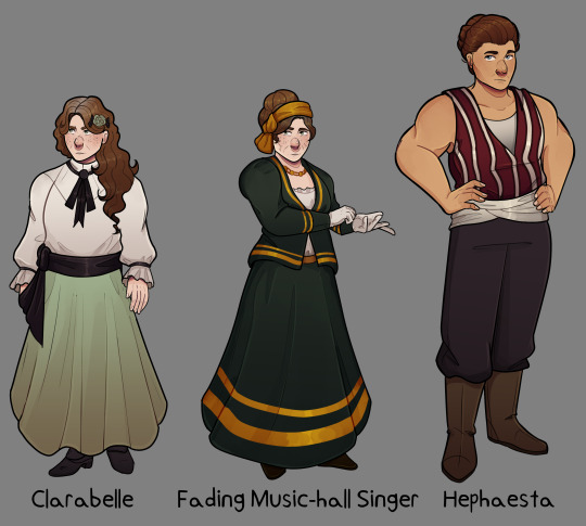

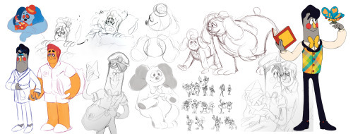
Finished drawing my character designs/ line up of the Light Fingers Crew to formalize my drawing of them
Overview/ Design talk under the cut if anyone is interested in that sort of thing
For all the designs I used the art given for them in the game as a starting point and then went from there. For all but Hephaesta of course that means using a non character specific art. I also wanted all the colors to sort of fit together so where i would have done more vibrant stuff and i strayed away from that.
Clara and Her Sister
Putting the discussion for these two together, as their designs recieved similar thoughts because they are identical twins. ('She is wearing the Fading Music-Hall Singer's face, which seems rude.')
The basic art of the bohemian faction is used to depict the sisters.

So this was my basic starting point for the visual design. I ended up diving further into research into bohemian fashion, which of course lead to me reading up on the history of the term and the connection to the Romani people. According to wikipedia, the word comes from the french term 'bohémien', which was the word for the Romani people.
This of course put a complex spin when i looked into the clothing used in the time, as theres a question between cultural appropriation and cultural appreciation, and one I don't have the full understanding for.
Nevertheless i did take some inspirtation for the clothing here, Clara with having her hair loose and down and looser clothing, the singer with the hair scarf and the necklace among some inspirations.
Inbetween the two I imagine the singers appearance to be more reserved then Clarabelle's. For one, my interpretation of the singer is as someone who uses her singing as a backdrop for sneaking and gathering information (per her role as a 'contact' of the player). The other being that we are told Clara's title is the 'eccentric opera singer' to me implies a grander sense of creatativity and wilder clothing. In less stressful times I imagine her wearing brighter clashing colours and skirts with patterns on them and jewlery (which i intend to draw at a later time when i get better at adding patterns to clothes lol).
We also know the two of them are 'not young' so i attempted to not make them appear so.
Hephaesta
Heph is of course the one character of the group with a personalized art, which i used as the base for my design.

Hephaesta is supposed to be a large figure, as she is a strongwoman, and is described as towering over even jasper and frank. So of course I had to make her tall compared to the others of the group.
And of course i can't go without bringing up Katie Sandwina (again), a real strongwomen of the time who serves as a great inspiration both in body type and height.
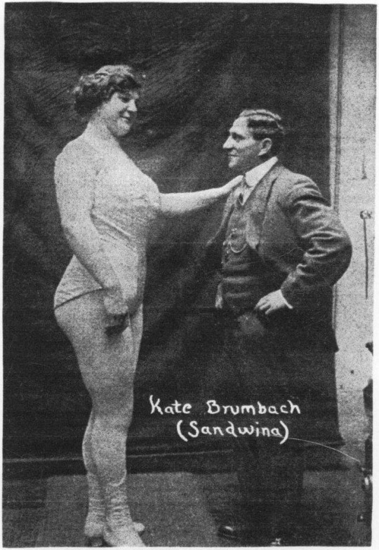
What a woman huh.
Dr Vaughan
The Campaigner template art was the one used to depict her when you first speak to her and was a starting point here.
To me i always pictured her as a fairly older women given her experience and amount of time she's been researching. Clearly someone with a lot of exprience. And also i just vibe with it.
I kept her outfit simple, as i dont figure her as someone to put too much into the latest fashion given her focus on her work. I took the green from the art to use as her skirt to tie in that colour. I also looked up some photos of female doctors of the time and that partially influenced my art direction here.
Obliging Silverer
I debated including him or not given that you only have him as part of the team if you use the light fingers exclusive option to access the parabolan basecamp. But given the fact that he literaly dies defending the camp, I think its only fair that he gets included.
i just had a bit of fun with the design as there wasnt too much to restrict off. I dont draw a lot of characters with mustaches depsite them being a thing of the time, so I figured this was a good excuse as any. I kept with some orange colours within his colour scheme for further callbacks to parabola and his work.
Also hey did you know that people of an ashkenazi background can also have red hair? Fun fact heh.
#hello i hope u all have it in ur hearts for some non event art right now because i just finished this drawing#me starting a piece with 5 full bodies: how much work could it really be#ANYWAY this is all liable for change of course but this gives me somethin to ref for future drawings lol#hope y'all like#fallen london#my art#light fingers#light fingers crew#im not tagging all their names thats too long
154 notes
·
View notes
Text
Welcome Home Hyacinth Theory 🏠🪻🐛
Hello Tumblr! Most Welcome Home theories are just little bits and pieces or “Wally is evil, guys look!”/”Wally is not evil! He is a goober!” etc.
This theory is fully fledged and provides a plot and evidence. I call it the Welcome Home “Hyacinth” theory, after the myth that it is based on. This will be a very long post so here is a TLDR: Julie kills Eddie while they are playing croquette-bowling out of jealousy because he is getting too close to Frank, who is supposed to be her boyfriend/best friend within the show. Either just Eddie or everyone involved gets replaced, except for Wally, who witnessed everything. This is why we have all of those videos of Wally dissociating.
I have been sitting around in my toom rambling to myself about this theory like a madman for over a week so I decided to share it.
Please reference this post from @/partycoffin (the creator of Welcome Home) when discussing Welcome Home and be respectful in the comments and reblogs.
Extra information from @theneighborhoodwatch:
Welcome Home Observation Document
Welcome Home Livestream Trivia
Welcome Home Archive Links + Backup Screenshots
Fanmade Welcome Home Wiki (I don't recommend the Fandom wiki)
Extra information on exploring the website from @angel-lyah:
Welcome Home Website Secrets
Alright, let’s get into it! I have evidence to back up every single one of those claims, and I will include it in this post.
I want to be very thorough with explaining this. I’ll start by establishing that there are three main plots within Welcome Home (that I have noticed, anyways):
The plot of the late 60’s - early 70’s TV show, Welcome Home - only related to published episodes, books, audios, etc. that would have been shown to the public at the time of airing Welcome Home
“Behind the show” - feelings and actions of the puppets outside of the show (such as Frank and Eddie being a couple, or Frank being nonbinary)
The Welcome Home Restoration Project - people working to restore the TV show, Welcome Home, and find any and all information related to it and who made it
Okay so for the rest of this essay, when I mention BtS, it is related to the “behind the show” plot. I will color these things blue. When I write WtS, it is related to the “within the show” plot. I will color these things green. When I write WHRP, it is related to the Welcome Home Restoration Project. I will color these things pink. I will also mention things that have been said either on Clown’s Tumblr blog, Clown’s Twitter, or old streams. I will say CS, meaning “Clown source” to denote these things and color them orange. Clown source and behind the show areas often overlap, so Clown source information is dominant over behind the show information (if it is both I will just color it orange). Good? Good.
Now let’s establish our characters (only the ones related to this theory) and their relationships to one another. We’ll go alphabetically, starting with Eddie, then moving onto Frank, Julie, and Wally.
I’m going to assume that if you are reading this, you have already visited the website (clownillustration.com) and have a basic understanding of who Eddie is. So I will only focus on the elements of his character that will be relevant in this theory.
Eddie (WtS) is clumsy and overworks himself. He is often dragged into Julie’s games. His house (post office) looks like this:
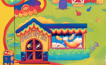
Note the hyacinth flowers and the butterfly. Eddie (BtS) loves Frank. (CS) He is married to Frank in one art on Clown’s Tumblr. BY THE WAY IT TOOK FOREVER TO FIND THIS IMAGE!!!! THEY ARE IN THE BOTTOM LEFT CORNER!!
Frank (WtS) is Julie’s boyfriend as it is implied that they are a couple within the show (I know a lot of us don’t like hearing this, but remember the three plots) (also for everyone that is going to argue with me on this, go look on their little profiles in the neighborhood section of the website and come back to me) and best friend. His house looks like this:
Note the sunflowers. Frank (BtS) loves Eddie.
(CS) As I said before, in one art on Clown’s Tumblr, Eddie and Frank are married (you can tell by the rings on their fingers in that image) . Frank is nonbinary but uses he/him pronouns (Clown refers to Frank on his blog with only he/him pronouns, so that is what I will use. Nonbinary people do not have to use they/them pronouns! Pronouns are not equal to gender!)
(WtS) Julie is a rainbow monster. Her thing is that she likes to make up and play games. She seems to be very strong (perhaps related to her being a rainbow monster), as she can easily lift Wally and is indirectly referenced to [throw a baseball very well] by Barnaby in the Live Interview audio. She also incorporates bowling into a lot of games where it is unnecessary. She seems to be immature, which is usually used to make her a playful character. Her and Frank are a couple. In several arts, her horns are different shapes or even nonexistent, implying that she has some ability to change her form. Her house looks like this:
Note the heart motif throughout the design. (BtS) Julie is best friends with Frank. (CS) She is genderfluid (she is only referred to using she/her pronouns on Clown’s blog, so that is what I will use).
(WtS) Wally is the main character in Welcome Home. His house is alive and is named Home. Home is often considered to be a ninth neighbor. Wally often communicates for Home. (WHRP) Wally signs Home’s name in the guestbook (as Home does not have hands) (please stop with the tentacles I have seen the art please stop for the love of god where did that even come from). (WtS) The other neighbors frequently ignore and talk over Wally, but he doesn’t seem to mind, saying that he loves all of his friends in the live interview audio.
Okay so now that that is established, let’s look at some promotional art. Promotional art is not necessarily canon and may contain outdated designs, but may hint at the plot of Welcome Home.

There is one more artwork that I would like to add, but it is on Clown’s KoFi. Here is a link to it that you can look at if you are subscribed to Clown’s KoFi:
[link to Clown’s KoFi here]
I won’t describe the image because some of you may not be subscribed to Clown’s KoFi. But if you are, you will see that the image supports my theory.
While we are discussing that image, I would also like to say that I believe that the puppets are some kind of biological organisms. I don’t have much evidence for this right now, but I may make a theory in the future.
We will come back to those promotional arts soon. Right now, let’s look at Frank and Eddie’s houses and discuss some symbolism and mythology.
Frank’s house has sunflowers outside of it. Sunflowers are a symbol of Apollo. Eddie has hyacinths outside of his post office, obviously a symbol of Hyacinthus. Hyacinthus and Apollo were lovers, but Hyacinthus tragically died. Let me tell the story so we have context. (I am really into Greek mythology by the way, it’s always been a special interest since middle school but I am also a Hellenic pagan, you should follow my witchcraft and paganism blog, creatively named @maxiswitchcraftandpaganblog)
So Apollo, god of the sun, art, archery, and LOTS of various other things, loved Hyacinthus, who was a mortal Spartan man. And Hyacinthus loved him too, by the way. The god of the (west? don’t feel like googling it) wind, Zephyrus, was jealous of Hyacinthus, because he also loved Apollo.
One day, Apollo and Hyacinthus were playing discus (like frisbee but the frisbee is giant and made of metal, kind of like a shield). Apollo threw the discus to Hyacinthus, but Zephyrus blew the discus off course with the wind, causing it to hit Hyacinthus in the head and kill him. Apollo created the hyacinth flower from Hyacinthus’ blood as he died, but in some myths made him a god. (read more on Apollo and Hyacinthus here)
I’m going to draw some parallels here. Frank = Apollo, Eddie = Hyacinthus, Julie = Zephyrus. Now Frank’s and Eddie’s parallels make sense because of the flowers, but where did I get Julie=Zephyrus from? Recall that (WtS) Julie and Frank are supposed to be a couple. Now, (BtS) Julie may or may not like Frank in that way, but she certainly enjoys being close to him as his best friend. Since she is already established as an immature character, it would make sense that she would be jealous seeing Frank get closer to Eddie.
Pause. So WtS, Frank and Julie are together. BtS, Frank and Eddie are together. If these are separate, then what is Julie jealous about? (WtS) Frank has been seen getting closer to Eddie even in the official material of the show. An example of this is him telling Eddie that he works too hard at the end of the “Eddie’s Big Lift” storybook record. So his BtS love for Eddie is leaking into the WtS canon. That is a problem for Julie, who is supposed to be Frank’s girlfriend WtS. So she comes up with an idea to fix this, much like the jealous god, Zephyrus.
So what does she do? Let’s turn our attention to the “Just So” song demo. This song was never finished with instrumentals, and for a reason. The puppets function as actors in the show, as it is obvious that they have their own free will, and Julie does something that the writers do not expect later in this episode. So the song was never finished because the episode was ruined.
In the “Just So” song demo, Frank and Julie are about to play croquette bowling. It was supposed to be just croquette, as Frank put on his croquette bow tie, but last minute, Julie added bowling to the mix.
Wally knocks on the door and interrupts their song, saying that Home wants to play croquette bowling too. This implies that Julie told someone else that they would be playing croquette bowling after she added bowling. I feel like Wally and Home overheard Julie telling Eddie that they would be playing croquette bowling. This would make sense, as Wally often stands by and listens while the other neighbors talk. It is not unusual for Eddie to participate in Julie’s games, either, as we see from Julie playing “business woman in the big city” with him. [add a photo]
The song recording ends before we see them playing croquette bowling together. But I have a piece of evidence to tell us how it ends. Look at this promotional art again.
You probably assumed that the figure in the back was holding a hammer, but that could actually be a croquette mallet!
It’s covered in some gory-looking stuff, probably from Eddie. Now look at the flower. Whose eyes look like that? Almond-shaped, round pupils. Only one character: Wally. Wally was a witness, which would make sense for him, since he often watches on as the other neighbors do things.
Julie is holding the flower in front of her, looking innocent. This is a stretch, but I think that this might be symbolism for her saying that she didn’t do it on purpose, Wally saw the whole thing, ask him! And Wally doesn’t know what to do. I don’t know what he does from there.
Maybe this image is a clue? I genuinely don’t know. Once again, promotional art is not necessarily canon, but we can use the concepts from it in theories.
This next part is also a bit of a stretch. The neighbors having a memory of something like that happening would ruin their “acting” (I think they are just being recorded as they do what they would naturally do). The show can’t have that. The solution? Replace everyone involved.
Now go back and look in the promotional art section and look at that art of Frank. It looks like Frank is laying among extra puppet parts. They have extras!
And this is why Wally is dissociating in the videos we see when we click on the bugs. They did not replace him, because like the neighbors, they didn’t even notice he was there.
Okay yeah that’s the theory. It was really hard to get this into a coherent Google Doc and gather all the links. I was just rambling to myself about this in my room over and over pacing around for like a week. But yeah here you go, hope it's a good theory, sorry if it's not lol please be nice to me
#welcome home#wally darling#welcome home arg#welcome home update#welcome home secrets#welcome home google doc#welcome home puppet show#welcome home theory#clown illustrations#partycoffin#autism#welcome home wally#wally darling welcome home#welcome home wally darling#welcome home frank#welcome home eddie#welcome home julie#julie joyful#eddie dear#frank frankly#theory#analysis#fan theory#discussion#speculation#theories#maximilliansblogstuff
59 notes
·
View notes
Text
Enhypen August Reading 2023
Note: please take it lightly and have fun
Heeseung
Love: For the moment he isn’t dating anyone but he has been very close to someone, and specially he has been flirting and having dates with this person whenever he can. He does want something serious with them, but for now the person haven’t given their green light. Heeseung likes them a lot and he can’t help but turn into a small kid whenever they are around
Career: Things are going extremely well for him, not only does he has secured self projects that he was able to secure, he is also building his own name and his own idol empire the way he wants. His sponsors and company are being very nice and supportive or all the dreams he wants to get
Self: Heeseung is doing well, he is spending a lot of time alone lately but that solitude has been helping him finding his own self. He is also becoming a lot more independent and not being so much behind his members for things. He is learning to do things by himself
Jay
Love: currently he is single but he is looking for someone that he could love and have a relationship with. Jay really hates not being in a relationship, but his idol life and his schedule also isn’t very convenient to get into a relationship that can be healthy and last long enough.
Career: things are a little bit shaky for him in this area as well, because he has more delays than his peers, however he still has faith that everything is going to go well, now that things changed a little. Jay knows this team will keep by his side to support him
Self: He has been having a very hard time lately, because he cannot deal with the bad mouths. Either it’s people pointing on his flaws, people talking aggressively or bad to him or even mean comments on the internet. He is trying is best to stay deaf to all of it, but it’s hard
Jake
Love: Just like Jay, Jake is also single at the moment, but it was for pure choice. He decided to break up with his last partner (soloist idol) because he didn’t trust them with other people. He believed that his partner would cheat on him if they could so he decided it would be better to end things instead of being potentially humiliated
Career: he is being very resilient about everything that has been happening. He also put his idol carer in the hands of the ones that work with him (company and sponsor) and he is just accepting everything that comes his way
Self: he is probably having some dependance issues here, this could be anything and everything, but it seems Jake has been a little addict to something lately that helps him going through his days
Sunghoon
Love: he is still in a relationship with his non idol partner and everything seem to be going well fo him. He loves them dearly and he as been very kind to them. I believe that Sunghoon has been taking care of them emotionally and financially as well. He wants to be able to provide for them
Career: he is full of creativity and there’s so many projects he has been signing and working on. He wants his name to be known outside Enhypen and he is working very hard for it
Self: honestly his aura is positive lately, a rosy pink color, he is very altruist and tries to help those in need by being generous enough. I believe that Sunghoon is also probably doing donations
Sunoo
Love: he is also single at the moment, and mostly focused on his mental health at the moment rather than on his love life. Sunoo is very close to love lately and he has no patient nor the need to focus on love or on people altogether
Career: at least when it comes to his career, he is very positive and confident that things are goin to work on his favor. He works enough and he believes in himself and on his idol talents. It’s probably the only area of his life where he is stable and happy
Self: i see a lot of anxiety around him, being being always worried about everything and trying to do things way too quickly. His aura is red and very racy, he needs to rest and to stop putting everything on his shoulders
Jungwon
Love: Jungwon is still on his relationship with his idol partner and things are okay as well. They are both stable, in love and working toward a very healthy relationship. Don’t have much to say other than he is okay
Career: he is also very happy with his career situation at the moment, he is learning to let go of things that don’t matter and focusing more on things that can bring him wealth and success. Jungwon is learning a lot lately and just living his life as he should
Self: is aura is yellow lately, he has been very faithful to his partner, to himself his members and his responsibilities. He is also happy and just joyful in general and wants everyone to know about it
Ni-ki
Love: without much surprise he is single and he is also healing because of some disappointment he got lately. There was probably someone he had a crush in that couldn’t give it back in return (and even if they could, he couldn’t) so Niki is frustrated and sad
Career: He is being very brave and tries to fight everything that comes his way. Niki is very well supported when it comes to his career but he also had to make some choices that demanded a lot of him emotionally
Self: he is doing well, his aura is rather on purple tons and also he has been liberating a lot of seductive energy and feminine people are usually being very attracted to him lately
#Enhypen#Enhypen astrology#Enhypen tarot#Enhypen reading#Enhypen headcanons#Enhypen imagines#Enhypen scenarios#Enhypen reactions
135 notes
·
View notes
Note
Can you write a part 2 to your yandere joker fic?
Absolutely! Also I am so insanely flattered, I’ve never had someone ask for a part 2 before eeee
Yandere Platonic Joker x GN! reader!
Warnings: This is a yandere work, and as such contains themes of violence, abuse, manipulation and drugging. As this is the Joker, it will most likely be darker than my usual works!! Enjoy!!
You wake up with a leg that practically burns, and when you glance down, you see that your thigh had been wrapped in white gauze, which had been stained red by your own blood. It was weirdly well done for a madman. You wondered if Joker had made one of his henchmen do it.
Moving your leg makes it hurt, so much so that you gasp when the burning pain arches up your leg. You hadn’t been given any painkillers. Which wasn’t great when you had a stab wound, in an area with already existing nerve damage. You hope there isn’t any long term nerve damage, or damage to the muscles, or tendons.
“Okay. Okay just.. focus. You’ve been kidnapped by a madman who thinks you’re obsessed with him. Things could be worse.” Your voice cracks with hysteria, and you wince, shaking your head. You had to get your act together. You would prefer not to be another of the Joker’s long list of victims.
You glance around, and your stomach drops. The room is.. a room? It had clearly been outfitted from some sort of warehouse, with high ceilings and beams that crisscrossed, which made sense, you guess. Not a lot of people in Gotham would be willing to rent an apartment to the Joker.
The most damning thing, however, is the paintings, everywhere. Piled in the corner, leaned against the wall, some handing crookedly from nails. All with acidic green eyes or pale skin or a suit with the wrong colors. All yours.
You think you’re going to throw up. You don’t.
Your head snaps to the sound of a door handle, and you watch as it’s pushed open, heart racing. The old hinges shriek and groan.
“Hey! So.. what do ya think? Neat, right! Got all your paintings, right here, in a fun little gallery! Isn’t it great?!” Joker’s eyes never leave your face. You aren’t sure what it looks like, with how much pain you were in and your brain struggling to process much of anything but you feel your expression twist.
“Five out of five stars.” Your voice drips with sarcasm, and Joker laughs, a high pitched maniacal giggle that makes the hair on the back of your neck stand on end. You two were playing a game now, you knew, and Joker knew all the rules and could change them as he pleased. “Where are we?”
“Ah, ah, ah! No trying to pry any information out of me, I learned aalll the tricks from Batsy.” He chides, practically skipping to your bedside. You want to jerk away, but moving your leg sends a rush of pain so harsh it makes your vision go white.
“I don’t think I know nearly as many tricks as Batman.” You deadpan.
“It’s okay! You’re interesting in a different way.” Joker snorts, glancing at your damaged leg to the paintings to your face. You aren’t sure what he sees. “Although I don’t know why you would be talking to Batsy.”
He sounds almost.. jealous? Giddy? You can’t place it, and you don’t want to, and you measure your words carefully before you speak. Joker was a time bomb, almost literally, and any little thing could set him off.
“I never actually talked to him. He and the baby bats just stalked me for a while when you broke out of Arkham.”
“Hmph. Wants to keep you all to himself, now that not fair.” He huffs, and he slings an arm around you, pulling you close. The sudden movement jolts your leg, and the ragged gasp it tears from you practically echoes in the air.
You try not to freeze when you see the unhinged light in his eyes. You don’t think you manage.
“Did you ever talk to Batsy?” The sudden change in topic is.. discomforting, and you shake your head. You can’t think of anything to say.
“He showed up in your sketchbook a lot. All heroic poses and big shadows, it was so boring, really. I’m a much better subject to draw, don’t you think?”
His hand lands on the white bandages, and then he presses down.
You howl in pain, going to twist away, but he is deceptively strong, and keeps you there, even as you kick at him and try to pry his hand off your wound.
“Yes! You’re better to draw!” You gasp out, and he stops, grinning. You’d think that the bandage would be redder, or damaged. It isn’t.
“Good! I don’t like sharing my besties.” He laughs, and hums, glancing at your face. You’re shaking, and pale, you know. “It does suck your hurt though. We can’t do anything fun until you’re healed.” He huffs, sprawling back and dragging you with him.
“APPARENTLY we’re going to have postpone the trip to Ace Chemicals.” He huffs. “I was so looking forward to it, too.”
Your heart drops into your stomach, leaden. Ace Chemicals. Birthplace of the Joker, of Harley Quinn. A toxic cesspit of chemical waste and madness.
“I’m sure we can find something to pass the time. Now! Why don’t we get to painting, yeah? You’ve got a whole studio!”
Joker hops up, and when you take the paint brush from him, it’s already dripping with a toxic green. You paint, numbly, not really paying attention.
You would have to escape before your leg healed. Or Joker won his game.
#yandere x reader#platonic yandere x reader#yandere dc#yandere platonic x reader#yandere platonic joker
265 notes
·
View notes
Text
doubling down into this witchcraft-as-RPG thing and I think I have a good point to make so here we go:
This is something I've been trying to speak on for a while and I feel like I've said similar recently but it's still on my mind, so,
the practitioner is a vital ingredient in witchcraft that you cannot remove from the equation,
and,
IMO a huge part of why spells and magic can feel hit-or-miss is because you aren't the same person as the guy who developed the spell,
and what works for them might not work for you at all.
And no, I don't necessarily mean sensory/belief/meaning stuff. Because a lot of the time we see people say stuff like this:
"Spells that call for long periods of focus and attention don't work for me because I can't focus." (valid)
Or for example, someone might say this:
"Due to my upbringing I strongly associate the color green with envy, weakness, and spite, so I can't do a money spell that uses the color green." (valid)
But that kind of thing isn't what I mean.
If you like, envision a witch as being an RPG character that has their own skill tree. (RPG metaphors are so convenient)
So let's take one witch who has heavily invested in spiritual elemental magic. This witch has dedicated time and energy to studying elemental magic. They have initiated under the Elemental Guardians. All of their spells are built around an elemental framework. They maintain offering shrines for elementals. Their spiritual calendar is based around honoring the cycle of elements within the seasons.
Like, this witch min/maxed their spiritual elemental magic. They've unlocked that entire skill tree.
And skills within that skill tree include things like:
Skill Unlocked: [Fire Elementals Appear When Called For]
Achievement Unlocked: [Elemental Fire Favors You]
Achievement Unlocked: [Initiated Under King of Fire]
Achievement Unlocked: [Your Spells Are Welcomed on Roads of Fire]
Skill Unlocked: [Lighting Candles Automatically Increase Spell Power]
Okay, so. This person starts sharing "witch tips" and spells publicly. Like this:
"Hey, guys! This is an incredibly powerful banishing spell that uses nothing but a candle and visualizing fire burning away your problem. When I do it I can make people move across the country!"
Let me ask you this:
How is that spell going to work for someone who's spiritual elemental magic skill tree looks like this?
Skill Locked: [Fire Elementals Appear When Called For]
Achievement Hidden: [...]
Achievement Hidden: [...]
Achievement Hidden: [...]
Skill Hidden: [...]
Recently I was working with some lovely and very naturally talented practitioners who were going through a bit of a spirit problem. As is normal, they began to feel like their spirit problem might be insurmountable - that they were beset by a spirit of immense power that could not be gotten rid of.
What was one reason they felt nothing they did worked?
They followed a valid, authentic spell format written by a very serious, deeply initiated practitioner - and this initiated practitioner said the spell should last for months.
For these naturally talented practitioners who had never before worked with those powers or received any of those initiations...
the spell only lasted for weeks.
So naturally, that means this spirit is not able to be defeated even by the most powerful spells, right?
(wrong)
The practitioner is a vital ingredient in witchcraft that you cannot remove from the equation.
Or, in other words,
Just because you vibe with a spell, you like the correspondences, and you like the technique, doesn't mean you've unlocked the skills necessary to perform that spell!
Which, in my opinion, is some
Goddamn good news
Because if all this is true, then it would imply things like:
Sorcerous talent is something that can be developed and it stays with you (barring sudden class change, of course).
Hey, there's a reason spells feel hit-or-miss, random, or work more poorly than expected - and that reason can be fixed!
When I want to "practice" my path, but I have nothing to cast on, instead I can explore and develop relationships, techniques, and knowledge within my chosen area of interest.
When I gain an understanding about my own character sheet place in my path, it will give me a greater ability to craft and modify spells to specially work for me.
When I examine the techniques and spells given by others, I will gain an understanding not of whether or not I like their work, but whether or not it will work for me.
So the next time you cast a spell and you feel any part of it fall flat, or you didn't feel what you expected to feel, consider that it might be because you didn't unlock all the skills needed to cast that specific spell.
Sure, there are some cool cats out there who can gain miracle-like success in almost any spell all the time and they don't have to work for it.
But that's not me! And chances are, that's not you, either. So treat thaumaturgy as a skill to be improved upon, why not? Explore foundational, supportive, and adjacent magical techniques, why not? After all, everyone likes unlocking achievements.
370 notes
·
View notes
Last Seen Blogs
imperatoralicia
Alicia's Very Serious Business

shouldveplayeditcooler-blog
madam sooky & me

bodytonek-blog
Untitled
c9a0dc
clair de lune