#nitpick
Text
Hermione's canonically been at Grimmauld Place since the beginning of the summer holidays in OotP...
What about her pArEnTS???
She stays at the Burrow during GoF, doesn't go home for Christmas because of the Yule Ball, nor Easter, and then she goes to Grimmauld during the first 4 weeks of the summer hols to help make it more "habitable."
Like what?
I can understand the Weasleys being there, but with Hermione it just makes no sense! Girl, where are your parents?😭
No wonder she was so okay with Obliviating them in Deathly Hallows.
213 notes
·
View notes
Text
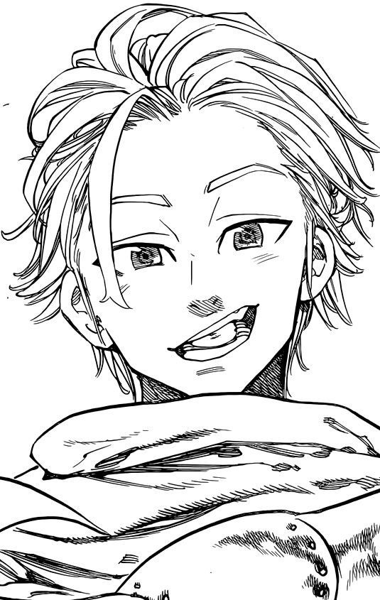
Nitpicky rant about Dungeon meshi e Frieren elves
lately i've been reading Dungeon meshi e Frieren: Beyond Journey's End, and i've noticed a recurring detail, that will now bother me till the end of my existance:
Elf ears. Ears in general to be honest, but in elves is particularly visible.
They all share the mickey mouse ears syndrome, where they can only be seen by profile, only facing their insides, no matter the head's rotation aside from when you're behind them.

It's like these authors can't decide whether the ears are protruding or attached to the sides of the head. it's driving me crazy, because it keeps shifting the design i form in my head of the characters.
Like, i'm no expert in anatomy, let alone ears (they are the bane of my existance when drawing them) but i'm pretty sure Frieren ears should look something like this when you look at her by profile:

As i said, i'm no expert, feel free to correct me if i'm wrong, i'll accept the L.
Now, i've seen that, at least in Dungeon meshi, they are able to freely move their ears, so the quick explanation could be "ears too hard to draw in that view, elves just move them and sometimes protrude, sometimes they do not" and i can kind of live with that, but it's too consistent as a thing to believe uhuh.
Anyway, this does not influence my experience with these stories, my opinions on them lie elsewhere; just an odd detail i noticed (that carried in their animated adaptations strangely enough) that now you too can't unsee! you're welcome.

#tornio#tornioduva#torniod#fantasy#torniotalk#dungeon meshi#delicious in dungeon#frieren: beyond journey's end#fireren#sousou no frieren#elves#elf#ears#elf ears#rant#nitpick#anime and manga
129 notes
·
View notes
Text
So... how many times has Damian moved rooms?
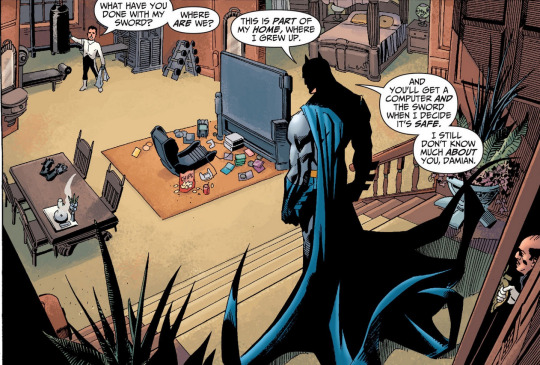


I'm pretty sure it's just inconsistencies (except maybe moving from the first room, which had a padlock, bet u can imagine how well that kept him in). I wish they would design his room from a 3/4 perspective, two views showing all the walls. It would make fan content a lot easier if it was consistent. My favorite is the 3rd one, I think it has the most of his personality in it. It also looks like the second one but more lived in, furniture moved around and replaced. Bed placement is weird though, why live in a mansion only to have a small bed?
I probably sound like such a stereotype of a comic fan, caring about little things like this lol. I'm not asking the artists to read and reference every comic, I just think there should be some art reference document they all share. I was gonna nitpick on Jon's room but really the only glaring inconsistencies are the posters and flooring, other things can be explained by him changing interests or moving. The posters are probably more Easter Eggs/References instead of meant to be character building but I choose to take them as such anyway.
#damian wayne#damian al ghul wayne#super sons#robin son of batman#batman#super sons liveblog#nitpick#also don't say “if it's so hard do it yourself” i literally am an artist and am looking for the comics expressly to find references for art#headcanons#art reference#damian al ghul
99 notes
·
View notes
Text
Here's a small nitpick nobody cares about:
I wouldn't have the Oni magic be purple. I'd have it be blue.
By Ninjago lore rules (that are a disaster if you think about it for too long), Dragons are creation, Oni are destruction. Light and dark.
You know what the balance between light and dark is?
The First Spinjitsu Master.
And Lloyd.
(Do not tell me he's light, Crystalized and the Oni Trilogy is my proof that he's a hybrid. He is a hybrid being of dragon and oni. FSM is a god. Lloyd is a god child.)
What color is Lloyd? He's the Green Ninja.
He's a combo of the two. He's light AND dark. He has the power of BALANCE between the two sides.
And he's wearing green.
What colors mix into green?
Yellow and Blue.
Gold is his creation power, the dragon power's color, and that's a shade of yellow.
So it would make perfect sense if the oni power's color was the other color that mixed into green: BLUE.
"Oh but Jay's color is blue, and he's a good guy, so that can't work-" Then make it a different shade of blue. Make it a dark blue. Make it a navy blue.
Thank you. Rant over.
#ninjago#nitpick#colours#ninjago lloyd#lloyd garmadon#rant#mini rant#ranting about something no one else cares about
133 notes
·
View notes
Text
Random nitpick about Trolls Band Together that I have is when they’re singing BroZone’s Back they don’t change the line from Candy girl to Brandy girl, I just think it would’ve been a cute touch for Bruce
#trolls brozone#trolls band together#dreamworks trolls#trolls 3#trolls bruce#bruce trolls#bruce x brandy#brandy trolls#trolls brandy#brozone#nitpick
23 notes
·
View notes
Text
So I'm gonna do some nitpicking at the wiki when it comes to the transcript of Mammon's Musical Special. Mostly with how they chose to transcribe a certain moment. The scene I'm referring to is specifically this one (from the 25 second mark to 32 seconds):
youtube
So the part where Ozzie is trying to reach out to Fizz but is too big to fit through the door, he mutters "Come on" and his next line of dialogue is "Froggy." The way someone should read those lines is as two entirely separate sentences.
"Come on." *snaps fingers to shrink himself and walks over to Fizz* "Froggy."
This is the way the Wiki chose to transcribe this:

The way it's written here makes it seem like he's speaking to Fizz, but he's not talking to Fizz, let alone looking at him, when he says "Come on."
It's in stark contrast to when he repeats these same words later in the scene at the 1 minute 38 mark.

Here, it actually is meant to be taken as one sentence and he is meant to be directly telling Fizz "Come on." And the wiki actually transcribes this sentence correctly.

I know this isn't really a big deal, but I feel like it's a disconnect to what's actually going on. Not sure if it's just a me issue.
#helluva boss#hazbin hotel wiki#fizzarozzie#fizzmodeus#fizzarolli#helluva asmodeus#helluva fizzarolli#rambles#ramblings#rant#nitpick#Youtube
31 notes
·
View notes
Text
It is so fucking obvious that the people who write this adaptacion (I am not saying they had to) didn't give a damn about Zosan 'cuz Sanji seeing Zoro vs Mihawk fight is so import for this ship and Sanji's character and here he didn't see any of it
#i thought giving arlong park one episode was crime#but this#this offences me personally#I still like the show though#the fight was amazing#one piece#one piece live action#opla#roronoa zoro#sanji#one piece netflix#zosan#nitpick
53 notes
·
View notes
Text
Okay but the best Tumblrs in the world are def @ask-ozai @ask-azula and @ask-fire-princess-ursa bc it just. Doesn’t make sense. How do they have computers?
I checked, it was over 200 years between hot air balloons and tumblr where I’m from.
26 notes
·
View notes
Text
Nitpick November Day 3
I tried to double check to make sure I haven’t posted this yet and I didn’t see anything so I’m running with it lolZ.
How and when do kids pick the weapons they will use? Do they have general classes wherein they fight with different weapons to see what type suits them best? Do they get assessed and told what weapon? Do they just pick one at the start of their schooling and hope for the best?
I just have so many questions because so many weapons are so specialty for lack of better words and unconventional that they had to pick it themselves but how? Why? What lead Flint to a trumpet? Or Yang to gun gauntlets? Or Sub to gun chucks? Their are just so many questions about how weapons are picked and not enough answers. We know Ruby picked hers based off of her Uncle but when? Is this normal? Did she force herself to be good with a scythe or was she inclined towards it skills wise? I need to know but I’ll probably never know and I hate it.
28 notes
·
View notes
Text

I prefer the early version of Arthur then is current design mainly the hair style though.
#Same with diane face now she looks like every other female#my fyp#nitpicking#nitpick#opinions#mas talking#sds#arthur pendragon#nnt#nnt manga
13 notes
·
View notes
Text
After reading 2010 the book is vastly superior, there’s a lot I like in the movie but also a lot to be desired.
Some of it is not the movies fault, as the original sets from the 60s were destroyed so the discovery was going to look jank no matter what. However some of it is just being cheap… for example, they use the same two photos of Frank and Dave for everything and it kills me every time lmao

The thing that’s particularly egregious here is that these are clearly just ripped from the movie of them talking to Hal. When there’s a literal interview in the movie you could use for nice photos- or the actual movie promo photos:
It’s just- it’s just so lazy to not even use these. You know something that looks fitting of a fucking New York Times article.
At least they tried for the other photo but this is like THE photo of Dave so it’s- how much was it trying really?
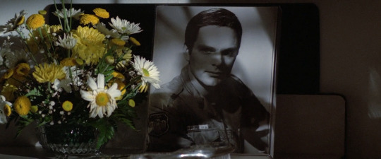
(The daisy’s are going to make me explode actually though- are you kidding me- so you can do really good and meaningful detail but photo wise couldn’t be bothered for ; behind the scenes, promo photos, nice pictures of the actors from that era that could be “them at home/on earth” out of uniform etc)
#2001 a space odyssey#2001 aso#2010 the year we make contact#2010 tywmc#space odyssey series#dave bowman#frank poole#critique#nitpick#symbolism#2001 meta
12 notes
·
View notes
Text
...am i alone in thinking this looks kind of better?
ok, so, i caught myself in an obsessive moment in regard to HADES II designs, i noticed something i saw in the first game too, that being a general desaturated greyness when it came to characters with darker skintones. In particular, i saw odysseus skintone being the same as the parchments on his belt, and it started to bother me uhuh.
Let's be clear, i don't think my quick recolor is "correct", now that i look at it, i probably went to the opposite problem and saturated it too much, but still; the "grey" gods (not to be confused with the chtonic ones) do not feel like people with dark skin to me.
that might be due to me just not having in archive people that look like this, and so i spent the evening looking at people trying to understand where this feeling came from, either from personal bias and expectations or from something missing in these designs.
My conclusions are that AAAAH i don't know, but i think it's because they've been colored as if they were light skin people but with no saturation and shadowier. even darker skin people with cool undertones in cool environments do not seem to match. also, a lack of reflection and shine, which seems to increase with more melanin.
i dunno, they are fine as they are, but it kinda bothers me now that i noticed it.

#tornio#tornioduva#torniod#hades game#hades supergiant#hades#hades 2#hades apollo#apollo#skin tone#nitpick#supergiant games
79 notes
·
View notes
Text
Welcome to things that probably only bother me
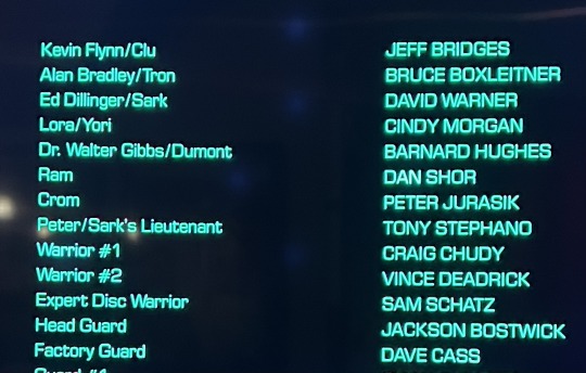
It bothers me that they don’t do “Lora Baines/Yori” as they did full names for both Kevin and Alan, she has a name tag and it’s fully visible within the film.
Additionally- that they know and credit the double role of Dillingers assistant and Sarks lieutenant but don’t do “Popcorn coworker/Ram” - at this point he didn’t have an official name (Roy) yet so that’s understandable but idk
#ignore the fact my Tv screen is super messed up#tron#tronblr#tron 1982#Lora baines#roy kleinberg#ram Tron#movie credits#nitpick
32 notes
·
View notes
Text
i Do Not Trust people who put all their 3DS games on the home menu (especially if they zoom out the icons like THIS)

like, they gave you folders for a reason!!! ORGANIZE YOUR SHIT GRRRRAAAAAAHHH
#i dont CARE if you hacked your 3DS and wanna flex your 1 terabyte SD card.#you're probably never gonna play through all those games#and you are certainly not a games preservationist making a Museum 3DS with every game on it#nitpick#3ds homebrew#personal gripes#weird thoughts#nintendo 3ds#nintendo
35 notes
·
View notes
Text
1) Pretty sure arrows are better suited to puncturing, not slicing. I guess it's not impossible to slice someone like this, but it's an odd choice.
2) WHY AREN'T YOU SHOOTING HER IN THE EYES???
12 notes
·
View notes
Text
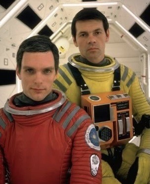
Anyone else notice that the guy from the Rigel VII mission 5 years before was wearing the current SNW uniform when it should have been either the Discovery S2 Enterprise uniform, the old Disco blues or even "The Cage" uniforms (which are used in a background photo in Pike's office)?
33 notes
·
View notes
Last Seen Blogs

unethical-gender
BABY of the undersea MEOW MEOW of the deep

jensoo
crazy over you

valheyrie
Digital Emotions
aplnrodite
hurricane minds
papay0
ro