#more like book coloring illustration
Text

“You're the sun, you've never seen the night
But you hear its song from the morning birds
Well, I'm not the moon, I'm not even a star
But awake at night I'll be singing to the birds.”
THE WAY THAT THEY BOTH SEE EACH OTHER AS THE SUN ARGHHHHHH WAS COLORING THIS PANNEL WHEN THIS SONG CAME UP AND STARTED SOBBING
#when the sillies are making you cry for the fifth time#thinking about a Luo Binghe recently thrown into the abyss wondering why he couldn’t be born human#scumbag self saving system#sssvs#scum villian self saving system#scum villain#scumbag system#scumbag villain#scum villain self saving system#svsss shen qingqiu#shen qingqiu#luo bingmei#luo binghe#bingqiu#book 1#svsss book 1#manga coloring#not really tho#more like book coloring illustration#mxtx svsss#svsss
165 notes
·
View notes
Text
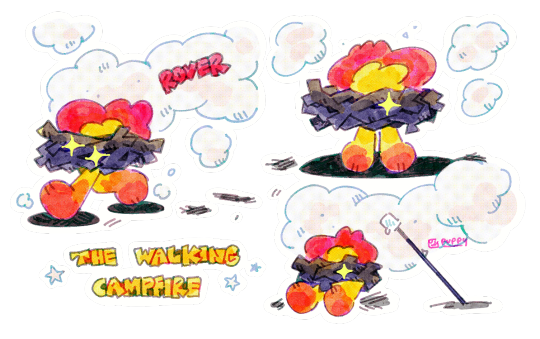
weird dog
#i tried combining watercolor textures with chromic abberation and i think it turned out well!!!! very proud of this#normally i try to color and shade with a different brush so it contrasts a little with my lineart. but in this case it kinda#feels more.. put together?? like smth youd see on a print comic book i think..#i havent drawn this guy in so long.. i dont think he even has much going on hes just fun to draw#campfire monster who cooks your smores and eggs in exchange for sticks and coal ^_^#my art#myart#illustration#my oc#oc#rover#eye strain#eyestrain#bright colors#monsters
228 notes
·
View notes
Text

Eusthenopteron in hats
#simon says#my art#art#artists on tumblr#digital artist#paleoart#digital art#paleontology#prehistoric animals#eusthenopteron#this took so long lmaoooo#but hoooo boy#super fun and good practice in lineless art and drawing fish#i would tag this as theropod but the Eusthenopteron was just a close relative#tristichopteridae#terapodomorph#i have no idea how to tag this lmaooooo#it's a prehistoric animal babey!!#I use an illustration from a dinosaur book I have as the main reference for both color and fins#but I saw that some recreations have the fins look more shark-like#but by the time I saw those recreations I was already too far in lmaooo#get pretty pretty fish fins and colors
169 notes
·
View notes
Note
The art style of Cloud Castle is absolute ass bro why are their eyes so big
Idk man it just looks.... off
I wish they brought back the og art style like Blue Scarab Hunt because that was gorgeous
Well if you’re referring to the book's artstyle as a whole, then calm down buddy the illustrations as a whole are pretty good all things considered (believe me some of the illustrations in the later books are waaaaayyyyy iffier)
But if you are referring to Danilo Barozzi’s illustrations in the book then uhhhhh… yeah I don’t blame you, I didn’t like the big anime irises either, she didn’t cook with this one,,,
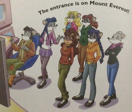
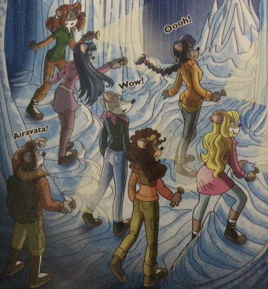
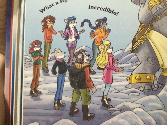
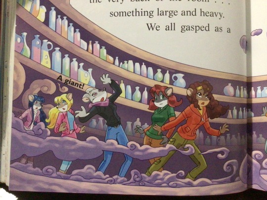
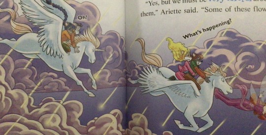
The interesting thing is Barozzi also did pieces for Secret of the Snow and those looked fine (she did well enough that I have to squint to determine which ones were done by her). My guess is either she did a lot of the illustrations for the latter half of SotS and we just got used to it, or it’s because the artstyle of special editions 2 and 3 were more… experimental? Books 4 onwards developed a very specific… look for the artstyle that adhered very closely to the main book illustrations of Spanish Dance Mission onwards, thus the illustrators had to follow suit, resulting in whatever looks off to look especially off.
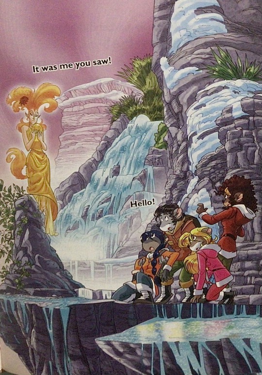
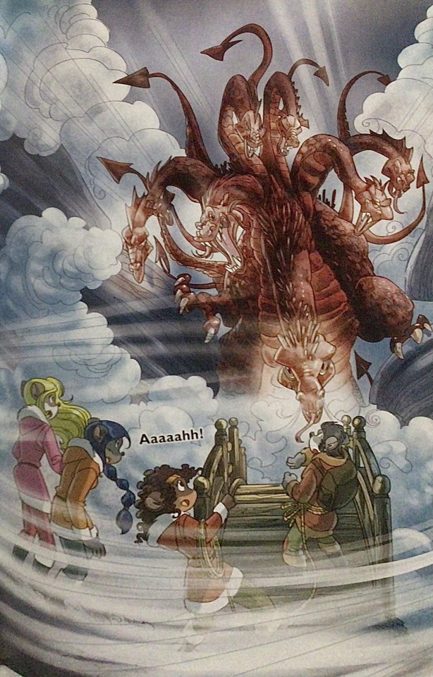
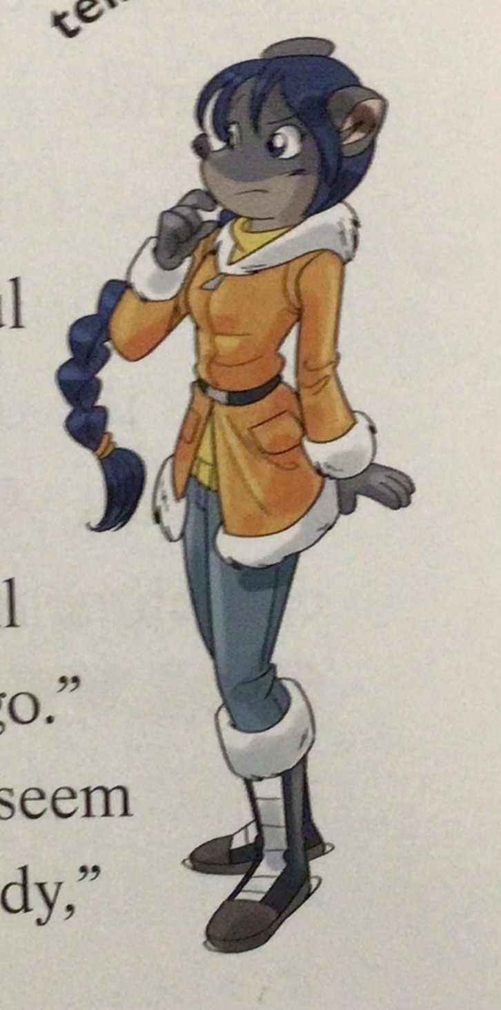
(Even with this set of pictures, I’m only about 70% sure these are Barozzi’s because of how alike yet different the styles are from each other in the book. The first one could be Barozzi’s, but it could also be Giuseppe Facciotto’s, since he also did illustrations for SotS and his stylization means he sometimes puts the eyes really close to each other in a way that’s weird but still makes sense somehow.)
On the contrary, books 2 and 3 (and I would probably even include book 1 there) had a more experimental look to the illustrations, which seems to be based more on (and this is just a theory of mine) Giuseppe Facciotto’s iconic work for the covers of Mouseford Academy books 2-12, 14, 15 and 17 in the English books (he did waaayyy more covers for the Italian Mouseford books— he was basically the cover guy for the Mouseford books for a WHILE) as well as the books from Spanish Dance Mission to Lost Letters. If you’re wondering why those covers go as hard as they do, then now you know why.
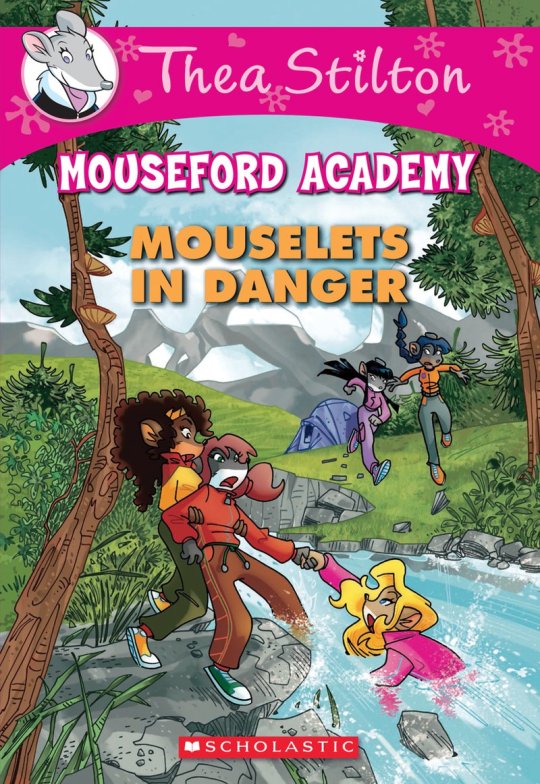
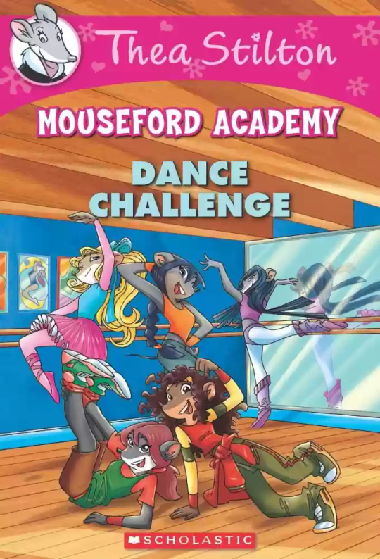
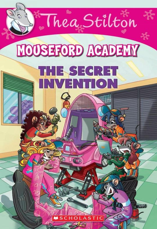
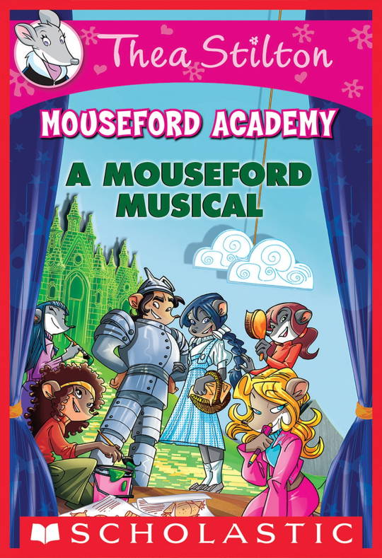
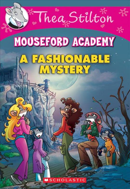
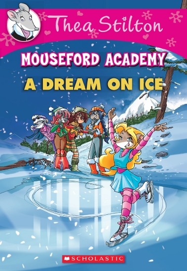
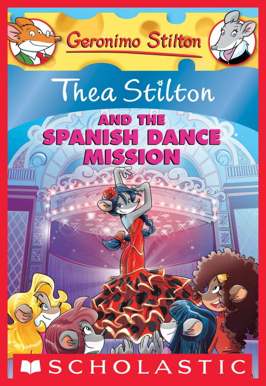
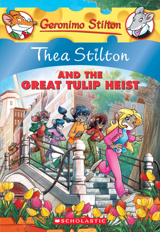
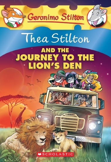
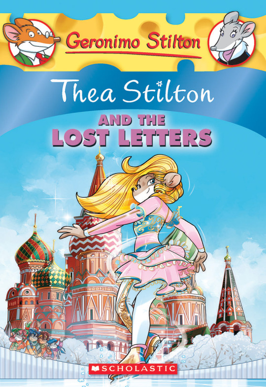
(These aren’t all of Facciotto’s works for the covers we know in English but you can see that he popped off <3)
But yeah as you can see with special editions 2 and 3, the art direction seems to be heavily inspired by Facciotto’s artstyle.
However, when Barbara Pellizzari’s works became the aesthetic poster child of the books’ brand, that was reflected in the illustrations and how their aesthetic changed, as seen in the main books and how they look currently, special editions 4-9, and the Treasure Seekers trilogy.
This new profile thing of the girls? This was done by Pellizzari (coloring was done by Flavio Ferron), and thus it became the main reference for how the girls look in the book’s illustrations.
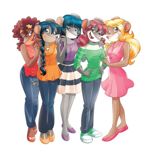
And it’s not just in the general direction to the artists for how to draw the Thea Sisters, but also in the direction given to the colorists. Alessandro Muscillo was the colorist for the special edition books since book 1 and the Treasure Seekers trilogy, and you can see that the direction for the style varied through books 1-3, like maybe direction was experimenting with the mood the illustrations were to convey, beginning with the cartoony and bright colors of book 1, easing into the more grounded and layered palettes of books 2 and 3
Then book 4 was when they transitioned to using digital art /j
I jest, but seriously book 4 was the debut of the coloring style we end up keeping for the rest of the special editions and for all of Treasure Seekers, which is very… bright :D
(I would show more picture examples but I manually took pictures of my physical copies for the Cloud Castle and SotS illustrations and gwuh I’m too lazy to grab my entire collection just to take pictures,,)
Bright as in like… the colors are very defined and saturated. I dunno how to describe it, but when you see it, you get what I mean. It’s very bright and pretty and colorful and it stands out. There are still variations that happen on occasion (Star Fairies in particular uses a good dose of airbrush for the lighting and shadow effects, and Crystal Fairies looks like someone had a bit of fun using sparkle brushes), but other than that, it’s very bright. I don’t hate it, but I do acknowledge that yeah, if I was introduced to the series when it had fully transitioned to the new style, I never would’ve gotten into the series in the first place, because the older books had something that didn’t make it feel specifically catered to girls. The colors were bright, but not too bright. Colorful, but unified. They weren’t that complicated, and they didn’t have to be because the colorists (plural, there were at least 3 per book once upon a time) were popping the hell off with the colors they were given. But y’know, the newer books’ consistent style did give me a good spot to practice drawing mouse furries so I’m not complaining too much about the newer style, haha.
(Tiny baby E’s (it’s literally from 2020 what’re you on about mate) her first mouse Violet drawing using Barbara Pellizzari’s artstyle in Treasure Seekers 1 as an anatomy guide!!)
With that said tho, yeah I miss the old books -m- dunno if it’d fit the aesthetic of the special editions but m a n we could’ve had it and it probably would’ve looked cool
Also the illustrations go way harder in the older books, like Prince's Emerald? I've talked about Prince's Emerald and how it goes hard before, and I still stand by it and say that it does in fact still go hard
Maybe it won't fit the uh splash of color they gave the hardcovers, but imagine they grabbed Giulia Basile's coloring work for the graphic novels and used that as sort've a basis for the coloring style of the hardcovers. Not exactly the same-- would probably still add a touch of whimsical watercolor and/or paint to the very cel-shaded style, but we could've had something pretty dope -m-
Anyway that's my ramble simultaneously defending the hardcovers' artstyle and reminiscing on what could've been haha
#geronimo stilton#thea stilton#thea sisters#questions with e#rambles#the style of the older books is gorgeous but the main thing I'm wondering is can it pull off fantastical whimsy#that's the main thing i dunno if it can do (i would love to be proven wrong tho)#the style is so grounded that i'm wondering if it can pull off what the hardcovers needed it to do#which is convey the otherworldly fantastical thrill of exploring the fantasy worlds (which uh the newer books were able to do but#my main gripe is that fantasy and reality are near indistinguishable in vibes coloring-wise#sure there are sparkles and stuff is more saturated but the girls' dorm in book 4 still has the same-ish feel of the land of clouds#i dunno what it is. the bright colors just feel mundane somehow and don't take a shift when returning to reality)#looked at my books again and i think it might be the fact that the later books have no grounding color?#compare book 3 to book 5 and you'll see it the most distinctly methinks#the newer coloring style doesn't have a color that grounds the illustrations' palettes and thus everything's always bright 100% of the time#the girls' colors are always at their most saturated#like they're always under broad daylight in terms of lighting#it's not eyebleeding or anything but they don't look affected by the lighting in the setting they're currently in#and the result is it looks.... meh?#we get so used to the bright colors that they end up looking meh somehow#i'm not an art expert by any means this is just my observations as someone with a little too much brainrot
33 notes
·
View notes
Text

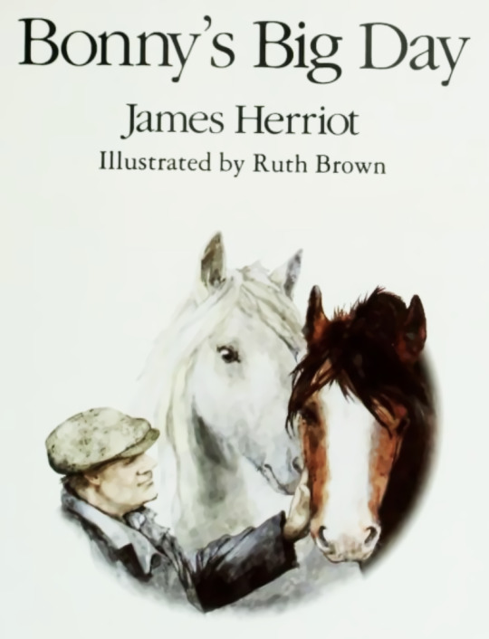
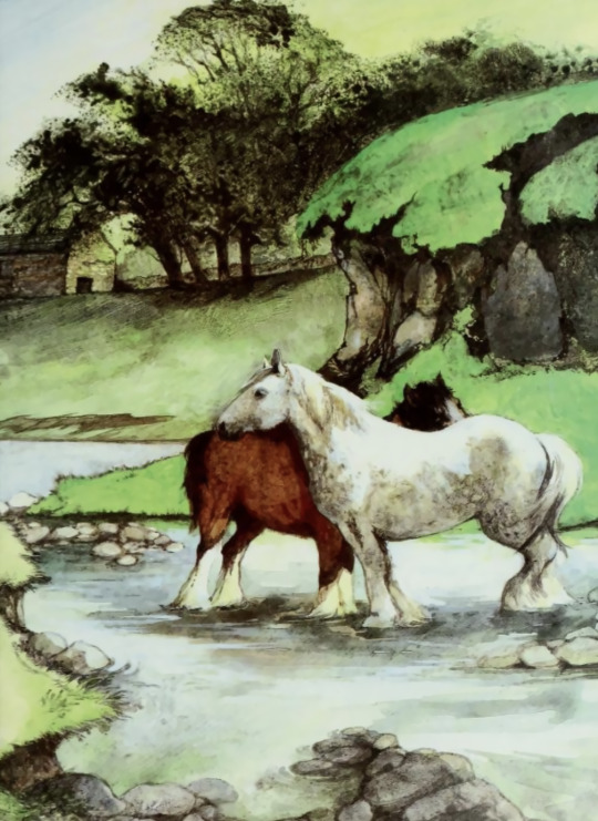


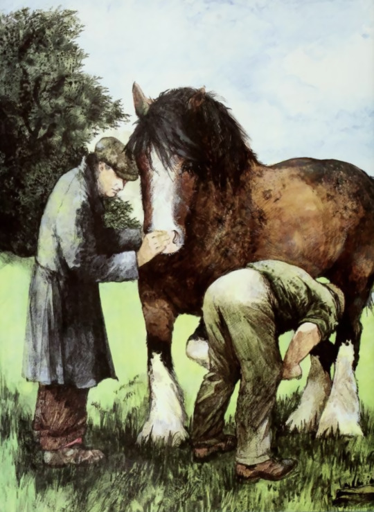


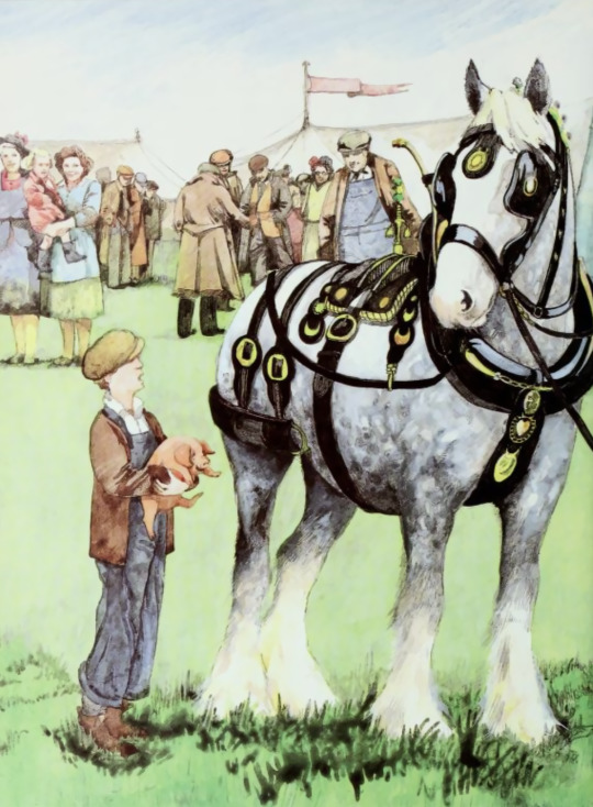
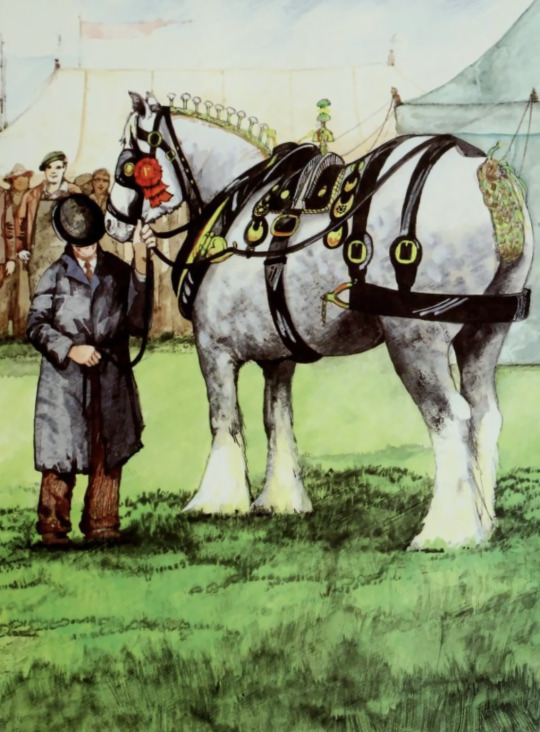
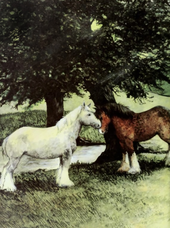

Bonny's Big Day (1987) written by James Herriot, illustrated by Ruth Brown
#i loved this book so much as a child#i got it from a library book sale for like one dollar#and became absolutely obsessed with it#the colors are mesmerizing#and i love the greens so much#finding this on my bookshelf made me do my first physical picture book#and i would like to do more color photoshop#i hope people love bonny as much as I do#she is special in my heart#james herriot#ruth brown#all creatures great and small#childrens illustration#childrens books#childrens literature#childrens classic#ireland#shire horses#clydesdale#1987#1980s#80s#watercolor#illustration#horse#horse art#equids#horses#mr crisp
22 notes
·
View notes
Text
The sudden urge to count just how many panel illustrations you've done and to arrive at the number 599 is both delightful and so annoying.
where's 600!
#still that's nearly 600 full color panels#I say nearly because there's a very rare smattering of a sketch used as an effect panel#which is in chapter 0 lol#the big two page spreads that are a single illustration almost feel like they should count for more#but i decided to count them as one#lots of drawing#could always be More#combines this with all the art I did for the website#design sheets and the concept art/illustrations#mountains of books--I mean art#home made blorbos for rat
22 notes
·
View notes
Text
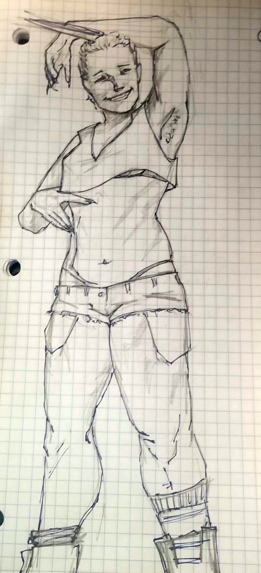
Sketched a very old oc before class.
#oc#traditional media#monochrome#this is a pre-deviantart one and everything. came up with her human design based on a barbie doll and drew her using fashion illustration#bases from a book my parents got me when I was eight or so. she didn't quite look like this then but i always wanted her to be more muscula#i remember spending hours with whiteout and black crayola markers carefully redoing all the biceps to look buff on my stick thin waifish#little coloring bases#i'm considering revamping a lot of them to bring them back into line with what i wanted them to look like but tbh if i go back to my REAL#roots this is a gray and white tabby maine coon mix.#kit#the claws are functional and retractable btw she just likes having them out. they're metal#i should fit kat into this somewhere lol. probably standing there with a camera like No no blue steel me. You know. Like Zeiv's RBF face.
7 notes
·
View notes
Text
When ppl in person realize i can draw, and i mention im writing, theyre like: oh are you making a comic? Then when i say no, it took me 30 days to do a 30 page 1 chapter comic last time I tried at 4-6 hours of work a day and ideally id like a turnaround of like one 30 page chapter per 1-2 weeks if i was going to do it long term so. No. I am not making comics any more.
Then theyre like: are u gonna illustrate ur book???
And while i deeply appreciate the sentiment. Its also like... well my good sir madam elder, do u typically... look for adult novels with illustration pages? I mean yes i love illustrations too but im not sure why id draw extra, when im already gonna probably make my own cover, and i want my books to be enough within confines of expected that ppl idk... give em a chance? Idk. Food for thought. Do i illustrate my book chapters mm
#rant#shdhdh#to be fair the person who asked me expected like a 100 page handwritten poem book with illustrations#not a 300-500 page novel when she asked if i was gonna do illustrations#i also like. for my Own indulgence. Considered a sexy Guide Book for my story universe. which is where yeah ALL my#goddamn character design sketches and map art and faerie illustrations and landscape art could go#since. i drew thousands of pictures when making lore lmao#but like. all that art is on paper. and i know itll take like 30 hours to 100 hours JUST SCANNING#pages individually one at a fucking time and saving tjem and. dear god the picture editing on them all#even withiut additional digital coloring is at least 5 minutes per picture. then who knows how many hours formatting a combined book with#all art. and thats before ANY text written. which is why i havent even made an art book. like of just art#hell its why i havent even backed up my 9 sketchbooks of traditional art from the past decade#its so much work its like 2000 pages of art. im just gonna let my family ancestors find iy if i get luxky#and its not desyroyed by the elements (like all my older art was ToT)#tldr my point is: i love love love art and i love the momentary joy it brings ppl i share it with#but as far as like Big output i prefer writing. its easier#art is fine wjen its like im paid to make 1 poster 1 flier 1 card one book cover etc#but ive never been commissioned to do like 20 illustrations ( i would tho! sounds like more money)#so like. on my own time for free as far as high scale takes days of work? id prefer to not do more art
2 notes
·
View notes
Note
Why is your art so good- like bro-
ASJKSHSKDJKSJ


THANK YOU SO MUCH FOR SAYING THAT <33333 :DDDDD!!!!!
#disco speaks!#ask#thanks for the ask!#nice things!!!#but also like I have spent the past six or eight years working on my art#I’ve taken numerous art classes in middle school and high schooll#*school#practice constantly (both from imagination and from references) watch a bunch of tutorials I am on like my third sketchbook of this year#last year I filled eight sketchbooks#i got into an art program at a university and have taken like ten or more classes from there over the last year#i try to learn and work in a lot of different mediums#i read books look at comics and other artists to learn their techniques#it helps to learn about different periods of art history so that past knowledge can help you presently#yeah#i am alright in most mediums like clay; wire; plaster; pastels; acrylic paint; gouache; watercolor (I need to work on this more tbh);#charcoal; colored pencil; graphite pencil; markers; paint markers#digital illustration and animation#i try to experiment with things often#i am definitely a beginner in sewing. learning about forms and how they work in 3D really helps a lot#it helps that I like geometry and physics because those two things help with forms and learning how motion and forces affect the subject#matter. plus I’ve drawn a fuck ton of robots which are 3D forms applied to a 2D medium#i might do a master post of tutorials and stuff that I’ve picked up or saved over the years if anyone wants it
16 notes
·
View notes
Text
Hate it when I simultaneously feel like I've been working myself to hell and back and also feel like I have absolutely nothing to show for it. Like I am so tired but if I do not get Products ready to Sell I am going to chew my limbs off bc I hate that I need money to live but I do!!!! And the things I do aren't even that hard my body just sucks and hates me doing anything at all ever!!!
#just like. I've been working on those glitter keychains for a WHILE now and i still can't sell them bc I'm waiting for my samples to come in#i have been making a frankly unreasonable amount of soap but i don't feel like i should list them until i have at least 1 of every scent#which is time consuming bc i have like 33 scents and the constant back and forth between the stove and the molds is hell on my joints#and I've been trying to design plushies and pins which is really hard BUT that's my BREAK from the HARDER project I'm ALSO working on#which is a full 20 page fully colored n illustrated pinup zine + a fuck ton of merch#and someday i want to release an artbook of my sketches and also do professional animation and also write comics#AND make an entire homebrew DnD campaign setting book#i have so many ideas and thoughts and no time or energy to do them!!!!!#and when I'm not doing them i feel like shit bc that's time i could be working and trying to make money!!!#i hate needing money to live I'm in hell!!!!!!!!!!!!!!!!!!!!!!!!!!!!!!#vent#only a little bit I'm just kinda tired and exasperated bc i feel like I've been working a ton and have nothing to show for it yet#that's all#man i used way more words than i needed to but oh well
1 note
·
View note
Text
One of my most baffling reading memory is from this book I read when I was about 9 years old. It was from some romance from a big 00's chick lit collection and it was the point of view of a woman veterinarian.
It started as this pretty standard 00's fun romance with the classic set of kooky friends and slightly dysfunctional family members and then she met fell in love with a photograph who had a bunch of scars on his hands, which became relevant when she realise that he's was a survivor of that one time she litterally send a homemade bomb to his father's house (said father was a scientistic known to do some animal testing and at this point of her life she was in some sort of radical animal right group).
I don't really remember anything else about the plot except that she owned a rescue dachshaund and that the photographer does learn about her being responsible for the bombing at some point. They still ended up together btw.
#my child self was like hmmm i feel like that would cause more problems than that but what do i know#once again i want to make it clear that it was not some sort of dark novel exploring deep and complex themes#just a fun romance with a very 00's colorful illustration on the cover that happened to feature litteral terrorism as a plot point#i absolutely loved this book btw#it was one of my favorite at this point of my life#another of my fave was rachel's holiday which is all about this fun loving irish girl who move to new york get addicted to heroine#and then has to move back to ireland and go to rehab#also virginia c andrews#maybe there's a reason my test in medias are so fucked up now that i'm an adult lmao
0 notes
Text
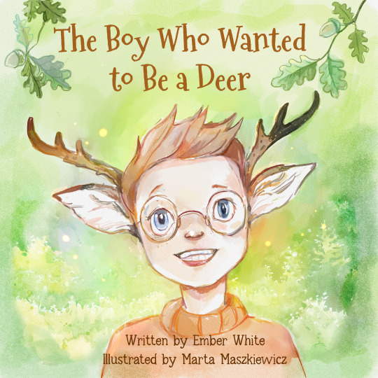
I spent the last 11 months working with my illustrator, Marta, to make the children's book of my dreams. We were able to get every detail just the way I wanted, and I'm very happy with the final result. She is the best person I have ever worked with, and I mean, just look at those colors!
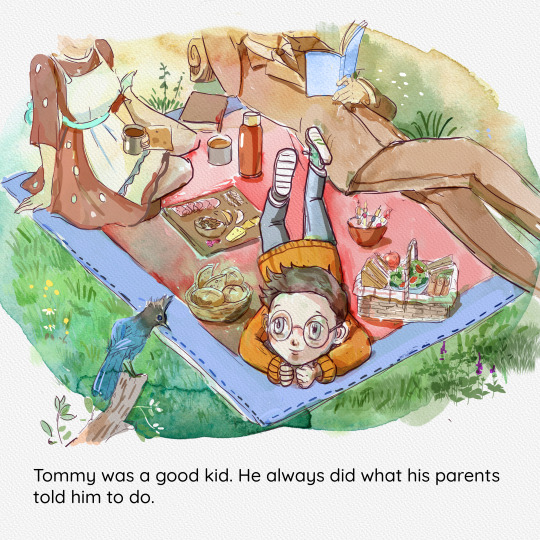
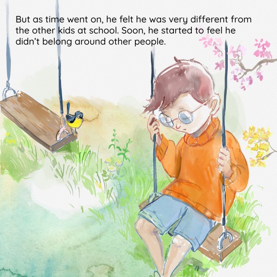
I wanted to tell that story of anyone's who ever felt that they didn't belong anywhere. Whether you are a nerd, autistic, queer, trans, a furry, or some combination of the above, it makes for a sad and difficult life. This isn't just my story. This is our story.
I also want to say the month following the book's launch has been very stressful. I have never done this kind of book before, and I didn't know how to get the word out about it. I do have a small publishing business and a full-time job, so I figured let's put my some money into advertising this time. Indie writers will tell you great success stories they've had using Facebook ads, so I started a page and boosting my posts.
Within a first few days, I got a lot of likes and shares and even a few people who requested the book and left great reviews for me. There were also people memeing on how the boy turns into a delicious venison steak at the end of the book. It was all in good fun, though. It honestly made made laugh. Things were great, so I made more posts and increased spending.
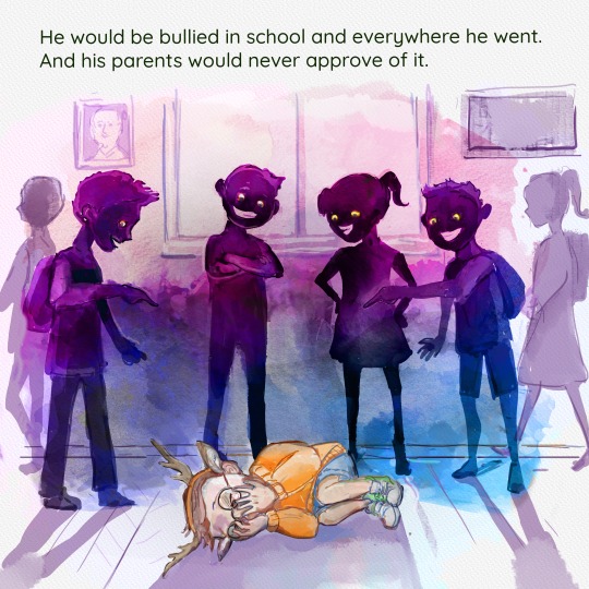
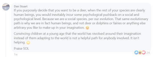
But somehow, someway these new posts ended up on the wrong side of the platform. Soon, we saw claims of how the book was perpetuating mental illness, of how this book goes against all of basic biology and logic, and how the lgbtq agenda was corrupting our kids.

This brought out even more people to support the book, so I just let them at it and enjoyed my time reading comments after work. A few days later, then conversation moved from politics to encouraging bullying, accusing others of abusing children, and a competition to who could post the most cruel image. They were just comments, however, and after all, people were still supporting the book.


But then the trolls started organizing. Over night, I got hit with 3 one-star reviews on Amazon. My heart stopped. If your book ever falls below a certain rating, it can be removed, and blocked, and you can receive a strike on your publishing account. All that hard work was about to be deleted, and it was all my fault for posting it in the wrong place.
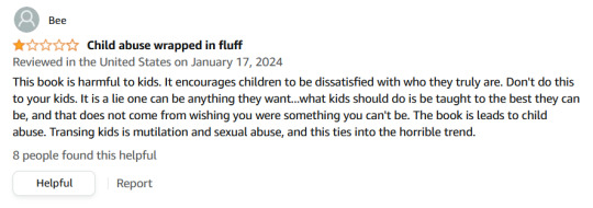
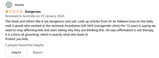
I panicked, pulled all my posts, and went into hiding, hoping things would die down. I reported the reviews and so did many others, but here's the thing you might have noticed across platforms like Google and Amazon. There are community guidelines that I referenced in my email, but unless people are doing something highly illegal, things are rarely ever taken down on these massive platforms. So those reviews are still there to this day. Once again, it's my fault, and I should have seen it coming.
Luckily, the harassment stopped, and the book is doing better now, at least in the US. The overall rating is still rickety in Europe, Canada, and Australia, so any reviews there help me out quite a lot.
I'm currently looking for a new home to post about the book and talk about everything that went into it. I also love to talk about all things books if you ever want to chat. Maybe I'll post a selfie one day, too. Otherwise, the book is still on Amazon, and the full story and illustrations are on YouTube as well if you want to read it for free.
#books#reading#childrens books#lgbtq#lgbtqia#autism#transgender#furry#therian#art#deer#queer#artists on tumblr#creativity#illustration
3K notes
·
View notes
Text

Robyn (@obsob)
Tumblr's Artist Alley is thrilled to feature @obsob during Pride:
hello! my name is robyn or 'obsob.' i am a freelance illustrator in the uk. i am currently working towards being a picture book illustrator, but i absolutely love to draw cats in love! i like using bright colors and drawing quilts. i currently sell multiple sizes of prints on my etsy store, and plan on branching out to stickers and cards soon! peace and love!!
More of @obsob's purrfect art can be found here on @artistalley, on their Tumblr, or in their store.
This month, Tumblr's Artist Alley is highlighting some of Tumblr's amazing LGBTQIA+ artists for #june on tumblr.
Are you an artist with a store or open commissions? Want more eyes on your work? Submit your art to Artist Alley for the chance to be featured across Tumblr.
10K notes
·
View notes
Text
The Magnus Archives (Season One) Production Design Project
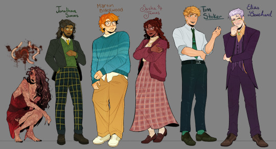

Hello everyone! Let me introduce myself- I'm Tilda (or Tilde), and I'm want to be a production designer.
Production designers create the overall look of a piece of media. From costumes, lighting, environments, props, etc., these designers make sure that everything looks cohesive and sets the mood.
So, I thought it would be fun to put my skills to the test by designing season one of The Magnus Archives. My winter break started as soon as I became interested in the show. Needless to say, a new obsession and an abundance of free time go well together.
You may have seen these illustrations posted separately, this is a master post of the whole project. My thoughts, processes, and critiques are all included under the cut. If you read them, I hope you enjoy! If, not, thank you for supporting my work regardless.
The Characters
When designing these characters, I tried to avoid being influenced by fan interpretations. Though, that was a challenge (especially with Jon and Sasha). I found that I looked to my friends for inspiration. Certain elements (Jon's glasses) were based off of what they wore.
Pinterest was also useful for finding clothing and pose references. Some looks were based off of different actors- in particular, Tim was inspired by Nicholas Galitzine and Elias inspired by Matthew Lillard.
Jane was the most fun to design! I believe in making terrifying characters actually terrifying.
Elias's design needs the most work. Having now finished the show, I see that it doesn't fit him. The purple is overly saturated, especially compared to the set. He looks out of place! I'd reverse the color palette to mostly green/yellow with purple accents instead. Although, I will forever defend the purple tint in his gray hair.
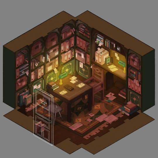
The Set
Jonathan's office was a treat to design! Balancing the color and clutter was especially important. This room is meant to be claustrophobic and uncomfortable, but not overbearingly so.
The wood looks to be full of splinters, but not so worn that it can be thrown out. The chairs offer no back support, and the shelves make the room smaller. The goal was to represented Jon's mind. Intricate, messy, and suffocating (Note: that is more of a season two description).
One goal was to capture the look of an actual archive. Valuable times was spent researching the different kinds of storage, files, paper, etc. The texture and color had to be accurate.
A split-complementary color palette of blue-green, yellow-green, and red was used. Of course, I had to get green in there, and the varying hues and desaturated reds worked well for the wood and filing supplies.
Jane's ashes and the Web lighter on the desk place this set at the end of season one. I find details like this to be important, it's one of my favorite parts of design. There is much needed abundance of eye imagery as well. Most obviously in the carpet, but eyes are carved into the table and watch from the shelves.
My main critique is the lighting- the filters used could be adjusted as to not distort the colors of the boxes. They look inconsistent. The Web lighter could also be more obvious, yet it is small and pixelated.
The Props
I designed these as I re-listened to season one, and it is the most recent piece I finished. Combining the details described in the show with what the objects would have realistically looked like was interesting. That was most useful for the clown, the Ming vase, and Ex Altiora.
Each of these objects came from a specific time with a specific look. Ex Altiora was bound in calf leather from the 1800s, so those books were referenced. Same with the frills on the clown's outfit.
The Ming vase was especially interesting, as it is from the Jiajing period. When looking at photographs of Jiajing vases, I found that many of them lacked handles and had an hourglass shape. That was fascinating to me, as many artists depict a standard oval-shaped vase. Also, the vase's design is described as straight lines that create distorted patterns when looking at it. That effect was achieved using chromatic aberration and the liquify tool (chromatic aberration was used to create a vertigo effect on Ex Altiora).
My critiques are... nitpicky. minimal. The shading on top of the garbage bag is unnatural. The thickness of the gold engraving on Ex Altiora is uneven. The "I" in "Immediate Consideration" is not capitalized. Other than that, I'm happy with how the props look.
Conclusion
First off, if you read everything, thank you!! It is a lot, I know.
My greatest takeaways are that 1) ask for critique, always 2) research skills are necessary for design 3) references are your friend! Seriously guys, use your references.
I hope you enjoyed this project and I'm excited to share more of my work in the future!
#and before anyone asks#i am not doing this for any other season#feel free to ask any questions about this project!#tma#the magnus archives#tma season one#production design#tildexart#tilda rambles
3K notes
·
View notes
Note
Hot take, but I feel like the star / supersister artstyle has a much better taste in fashion compare to the rest. Idk something about the way they style the clothes for the sisters just hit right to me and I even dare to say it is a bit better compare to the older artstyles (including the 1 - 4 comics artstyle). Like, don't get me wrong the old artsyles has good fashion, but for me personally, the star artstyle fashion choice for the girls felt like something they would actually wear u know?
It is a hot take in the fandom, but I do agree with said take :D
You can hate on the snouts and the lips, sure
But the girls’ fashion sense?
Let’s be real the girls’ fashion sense in the previous artstyle was very general white person fashion sense, enough so that you can swap the color palettes of one of their outfits and you’d think it was for one of the other girls. Which isn’t a good thing when you think about it :D
Like seriously their fashion sense can be summarized thusly:
For all of them in general: if they’re not in a tropical climate, they can and will have sleeves. Usually long sleeves.
Colette: roll a d20. If the result is under 15, then she wears a skirt or a dress. Ironically she’s the one with the most hit-or-miss outfits of the five, either through color palette or just skirts being used when they shouldn’t be.
Nicky: if it doesn’t fulfill any of the given conditions: a variant of her old standard outfit, has a collar, is a green shirt paired with brown pants/shorts, is a jacket, is a jacket/coat with upturned collars, has green in it somewhere or everywhere, has orange in a strange spot meant to emulate the old outfit; then who the hell are you talking to that’s not Nicky
Pam: either it’s a shadow of her original red and olive palette, or it has the most heinous shade of lime green paired with her usual red or just have green where it legally shouldn’t be. If it can sweater, it will sweater. She’s been gaining drip lately in the Italian books tho I’ll give her that—
Paulina: she does go for a bit of cozy retro vibes in her fashion style, but I think 60% of them at least have some sort of scarf variant. I dunno, she’s doing fine but her fashion sense is nothing to write home about. If it can sweater, it will sweater.
Violet: Violet, I love you, you’re my blorbo but I’m sorry, you wear so much purple that sometimes I think your wardrobe just looks like Robin’s wardrobe in Teen Titans with the hundred copies of the exact same color palette. Bit classy, fluctuates from sweater child to absolute queen on a dime /pos. If she’s in a temperamental climate, roll a d20; any score below 15 means she wears long sleeves. Flip a coin; if you win, skirt, and if you lose, no skirt. IF IT CAN SWEATER, IT WILL SWEATER. Tho I will say I don’t think I’ve seen a single wardrobe L from Vi that wasn’t out of pure personal taste or the artstyle being weird (i.e. frills and/or lace), so that’s a dub for her :D also in-character but also good on Vi’s sense of judgment because apparently according to some extra Italian content, Vi’s the most experimental with her wardrobe. Minus the purple. God woman has so much purple—
With the newer style, at least the girls have more drip :D drip that actually looks like something they’d wear as opposed to being restrained to color palettes :D
THEY GAVE PAULINA GLASSES AND NICKY MULTIPLE EAR PIERCINGS LIKE WHEN DID THIS HAPPEN WHY IS IT SO THEM AND HOW CAN I GET MO—
#geronimo stilton#thea stilton#thea sisters#questions with e#i remember looking at a preview illustration from this book about the girls going to a blue island and saw a thing of them at dinner#and vi was wearing a cute red blouse#and i thought “ooo what’s the occasion :3c”#context: red in chinese culture is reserved for special occasions like parties or chinese holidays#i will forever stan paulina and pam getting outfits that lean more into their cultural heritages#their earrings are so <3#anyway ye their outfits got buffed and i love it#they started doing it actually when they started with the watercolor-ish coloring style kinda#but most of them are. say it with me now#not translated to english yet.#what the hell scholastic
10 notes
·
View notes
Text
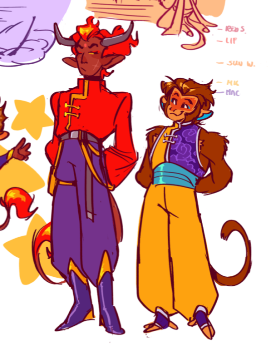
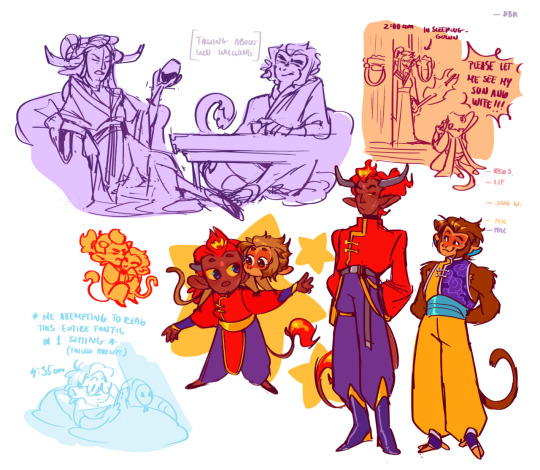
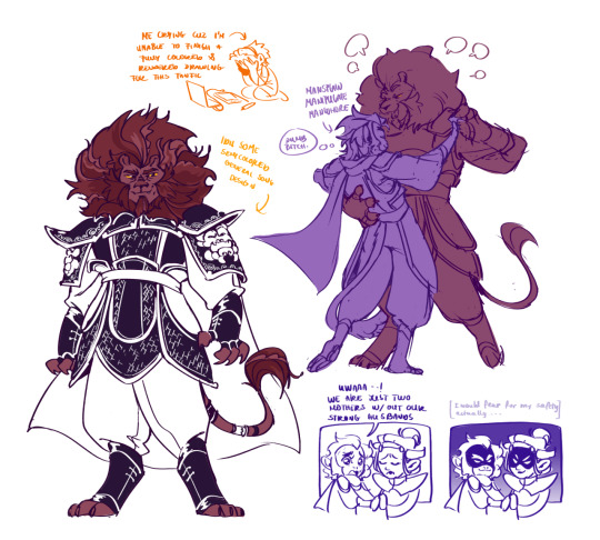
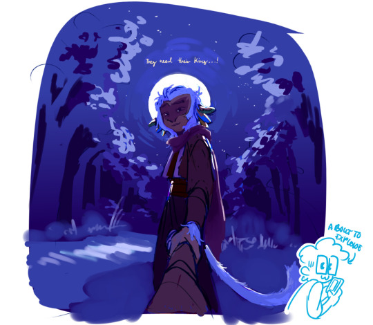
Hahaha okay rant about this amazing fanfic (you probably heard of this one already but still)
So whenever it comes to explaining and writing under my posts I just get lazy but I need to push through this cuz I need to talk
So the fanarts were made for the lmk fanfiction sunbreak, that a lot of you (probably mostly shadowpeach shippers) had read, and it is amazing, I read trough it as fast as my brain let me and as you can see it has pleasantly scratched my brain so much so that I even (attempted) to make fanart for it
Ngl if I wasn't a major pussy I would try to illustrate the whole thing or make covers for each chapter but Im unable to work on something more than 2 hours and I would want those to look good, but good looking art (if I don't mess up) takes 6 hours ughh--- annoying much---
Anyways I'm not good with literature but man is this fix a masterpiece *chefs kiss* its everything its amazing, I was unable to put it down once I started it
Okay i dont think I have the brain capacity to explain how much I worship the writer of this masterpiece @ladygreenfrisbee , so i'm just going to talk about the drawings a tad
So first picture with Red Son and MK its sort of like an au in the fic where the whole lbd plot is somehow nonexistent and after Macaque gets to his sisters domain they settle down and raise the kids together without much of an issue aside from assassinations keep happening and trying not to get in trouble with the heavens
Id like to think that Gongzhu still wouldn't let the court tailors to put any form of red or gold on MKs outfits and only allowed the yellow after when MK was old enough to declare that yellow was his favorite color, but even now she would insist on some form of purple and shadow motives to let others know who the mother is
We also got baby MK and toddler Red Son and sassy LIF and Mac
Third pic with the lion: I don't know what it was or why but I just love general Song so much--- he's a major dickhead but sgvshshsevkdididhr (actually I kinda love all the original characters in this one, from the generals to the old lady in the beginning of the book, (gosh I also wanna draw some scenes from those chapters I loved how Mac and she interacted hshsjsj))
so chapter 34 was probably my favorite so far I re read it about two more times cuz it was amazing to see Macaque being the schemer he is and try to piss of Song lol
Last picture: its a sketch/a wip or whatever (probably not going to finish it but im still putting it there cuz its somewhat decent looking)
Its the part where Wukong remembered of Macaque finally finding him and asking for him to come back to flower fruit mountain.
I tried to make Macaque look more unhinged on this one but since I didn't finish it I dont think its that noticable so fuck that but I also gave him a halo like the saints to symbolise his suffering and what not (thought it looked cool and fitting think whatever you want about it lol)
And that all ((((hollly mother))))
If you read this trough, thank you and congrats👏👏
#clown does art#lego monkey kid#lmk sunbreak#sunbreak#shadowpeach#lmk macaque#six eared macaque#lmk mk#lmk red son#fanfiction#lmk#lmk pif#princess iron fan
2K notes
·
View notes