#i don't read or write them
Text
at some point it's just like. do they even fucking like the thing they're asking AI to make? "oh we'll just use AI for all the scripts" "we'll just use AI for art" "no worries AI can write this book" "oh, AI could easily design this"
like... it's so clear they've never stood in the middle of an art museum and felt like crying, looking at a piece that somehow cuts into your marrow even though the artist and you are separated by space and time. they've never looked at a poem - once, twice, three times - just because the words feel like a fired gun, something too-close, clanging behind your eyes. they've never gotten to the end of the movie and had to arrive, blinking, back into their body, laughing a little because they were holding their breath without realizing.
"oh AI can mimic style" "AI can mimic emotion" "AI can mimic you and your job is almost gone, kid."
... how do i explain to you - you can make AI that does a perfect job of imitating me. you could disseminate it through the entire world and make so much money, using my works and my ideas and my everything.
and i'd still keep writing.
i don't know there's a word for it. in high school, we become aware that the way we feel about our artform is a cliche - it's like breathing. over and over, artists all feel the same thing. "i write because i need to" and "my music is how i speak" and "i make art because it's either that or i stop existing." it is such a common experience, the violence and immediacy we mean behind it is like breathing to me - comes out like a useless understatement. it's a cliche because we all feel it, not because the experience isn't actually persistent. so many of us have this ... fluttering urgency behind our ribs.
i'm not doing it for the money. for a star on the ground in some city i've never visited. i am doing it because when i was seven i started taking notebooks with me on walks. i am doing it because in second grade i wrote a poem and stood up in front of my whole class to read it out while i shook with nerves. i am doing it because i spent high school scribbling all my feelings down. i am doing it for the 16 year old me and the 18 year old me and the today-me, how we can never put the pen down. you can take me down to a subatomic layer, eviscerate me - and never find the source of it; it is of me. when i was 19 i named this blog inkskinned because i was dramatic and lonely and it felt like the only thing that was actually permanently-true about me was that this is what is inside of me, that the words come up over everything, coat everything, bloom their little twilight arias into every nook and corner and alley
"we're gonna replace you". that is okay. you think that i am writing to fill a space. that someone said JOB OPENING: Writer Needed, and i wrote to answer. you think one raindrop replaces another, and i think they're both just falling. you think art has a place, that is simply arrives on walls when it is needed, that is only ever on demand, perfect, easily requested. you see "audience spending" and "marketability" and "multi-line merch opportunity"
and i see a kid drowning. i am writing to make her a boat. i am writing because what used to be a river raft has long become a fully-rigged ship. i am writing because you can fucking rip this out of my cold dead clammy hands and i will still come back as a ghost and i will still be penning poems about it.
it isn't even love. the word we use the most i think is "passion". devotion, obsession, necessity. my favorite little fact about the magic of artists - "abracadabra" means i create as i speak. we make because it sluices out of us. because we look down and our hands are somehow already busy. because it was the first thing we knew and it is our backbone and heartbreak and everything. because we have given up well-paying jobs and a "real life" and the approval of our parents. we create because - the cliche again. it's like breathing. we create because we must.
you create because you're greedy.
#every time someones like ''AI will replace u" im like. u will have to fucking KILL ME#there is no replacement here bc i am not filling a position. i am just writing#and the writing is what i need to be doing#writeblr#this probably doesn't make sense bc its sooo frustrating i rarely speak it the way i want to#edited for the typo wrote it and then was late to a meeting lol#i love u people who mention my typos genuinely bc i don't always catch them!!!! :) it is doing me a genuine favor!!!#my friend says i should tell you ''thank you beta editors'' but i don't know what that means#i made her promise it isn't a wolf fanfiction thing. so if it IS a wolf thing she is DEAD to me (just kidding i love her)#hey PS PS PS ??? if ur reading this thinking what it's saying is ''i am financially capable of losing this'' ur reading it wrong#i write for free. i always have. i have worked 5-7 jobs at once to make ends meet.#i did not grow up with access or money. i did not grow up with connections or like some kind of excuse#i grew up and worked my fucking ASS OFF. and i STILL!!! wrote!!! on the side!!! because i didn't know how not to!!!#i do not write for money!!!! i write because i fuckken NEED TO#i could be in the fucking desert i could be in the fuckken tundra i could be in total darkness#and i would still be writing pretentious angsty poetry about it#im not in any way saying it's a good thing. i'm not in any way implying that they're NOT tryna kill us#i'm saying. you could take away our jobs and we could go hungry and we could suffer#and from that suffering (if i know us) we'd still fuckin make art.#i would LOVE to be able to make money doing this! i never have been able to. but i don't NEED to. i will find a way to make my life work#even if it means being miserable#but i will not give up this thing. for the whole world.
18K notes
·
View notes
Text
Pt2 to this post
'Is something wrong?' Nancy asks, not long after the two of them have taken their familiar spots on the hood of Steve's car. They're basking in what might be the last warm sunlight of the year, looking out over the quarry, at a safe distance from the edge.
It's become a tradition the two of them share, ever since they reconnected back in March. It calms them both, to just sit here and take in the view, no one around but each other. Nancy is one of the few people Steve can share a comfortable silence with: sometimes they sit here quietly for what feels like hours, side by side, listening to music or to nothing but the birds singing around them. But they also have their best conversations here: it's the place where Nancy entrusted him she wanted to break up with Jonathan; it's the place where they talked about their shared past and decided they would always love each other as friends; it's the place where they finally talked about Barbara in a way they couldn't when they were younger. It's where Nancy talked about the ghosts still haunting her and Steve talked about how lonely he sometimes felt.
Steve huffs. 'How did you guess?'
'When you frown, you always do it with your whole face,' Nancy notes. 'So it's hard to miss, really.'
Steve glances at her side profile. There's a serenity to her features that's still relatively new. It means she's healing, slowly learning how to be happy again. It means she stopped waiting for the end of the world and started believing in a real future again. It makes Steve proud of how far they both have come.
'I had a fight with Eddie,' he confesses. 'And with Dustin, I guess.'
'What happened?'
He sighs. 'It's complicated.'
'Wanna tell me about it?'
The look in her eyes is kind and inviting. Steve hesitates. He wants to, but he doesn't know if he can. It's a risk. It's scary.
But he can't imagine Nancy Wheeler ever being careless with his secrets. He can't imagine her judging him, can't imagine her being as small-minded as most people in this town.
He was planning on telling her anyway, because things had been going so well with Eddie lately and – no, he shouldn't think about that right now. But maybe it would actually be nice to talk about it with Nancy.
'So, um...' His throat feels tight and his hands are sweaty. 'I recently discovered some things about myself. I-' The words get stuck somewhere on the way to his mouth, and he clears his throat.
Nancy doesn't push, but only gives him an encouraging nod, waiting for him to find his voice again.
'I found out I like boys,' he finally manages to confess. 'And I need you to know that – that that doesn't mean that what I felt for you wasn't real. It was. I loved you, and now I fell in love with a boy. And-'
'Steve.' Nancy's hand suddenly covers his, causing him to finally jerk his head away from the view over the quarry, to focus on her face again instead.
Her eyes are wide, and she squeezes his hand.
'You don't have to explain yourself to me,' she tells him. 'We're good. But thank you for telling me. For trusting me with this.'
Steve heaves out a relieved sigh, and Nancy smiles; it's that genuine kind of smile which reveals all kinds of dimples and soft lines across her face.
'We might be more similar than you thought,' she tells him, a faint blush spreading over her cheeks.
'Really?' Her words make his breath catch in his throat. He squints at her, trying to see her in this new light. 'Are you saying what I think you're saying?'
She shrugs. 'I don't know. I'm not sure yet,' she admits. 'Still figuring things out.'
'Take your time, there's no rush,' he tells her. 'But...' He bumps his shoulder against hers. 'When you're done figuring it out, talk to me, okay?'
She nods. 'Okay.'
For a while, it's quiet between the two of them. Some kind of raptor circles high above them in the sky. They both follow it with their eyes until it disappears among the tree tops west of the quarry.
'Is it Eddie?'
Steve blinks dumbly a couple of times.
'Wha- what?'
'The guy you were talking about. The one you fell in love with. It's Eddie, isn't it?'
'Jesus, Wheeler, what kind of sorceress are you?' Steve exclaims.
Nancy laughs again. 'You're not being as subtle as you think,' she tells him. 'The two of you have been hooking up for a while now, haven't you?'
Steve huffs dramatically. 'This is unfair. You know everything; I can't even tell you my own secrets anymore!'
'So what happened?' Nancy asks. 'You said you had a fight with him?'
'It's fucking stupid,' he sighs. 'Dustin was getting way too excited about the fact that I was gonna be hanging out with you, so I told him I was seeing someone. Next thing I knew, he was telling Eddie all about how I was seeing a girl.' He waves his hands around to make annoyed air quotations. 'I wanted to tell Eddie it was a misunderstanding, but Dustin was there, so I couldn't out us just like that, and he looked so betrayed and heartbroken... He didn't wanna listen to me.'
Steve sighs; he still can't manage to forget that look in Eddie's eyes when Dustin delivered the big news. 'I wish I would've talked about what I felt for him earlier. I should've been honest when I had the chance, y'know. But I was afraid he wouldn't wanna label what we had, that he wouldn't feel the same way – and now we're in this whole mess. God, he must hate me right now, Nance.'
To his surprise, Nancy gives him an unexpected slap against his arm.
'Ouch, what the hell was that for?!'
'What are you even doing here with me, Steve? You should've gone after him, tell him how you feel!'
'I tried, obviously, but he didn't wanna listen to me!'
'So make him listen! You're in love with him, he obviously feels the same way about you, and you let him leave to wallow in a broken heart he doesn't even need to have!' She rolls her eyes and slides off the car, adding something under her breath that sounds suspiciously like an exasperated 'Boys!' before she pulls Steve off the car as well. 'C'mon, time to get your ass over to the trailer park. Right. Now,' she says through gritted teeth. And, well, Steve knows better than to argue with a determined - and truthfully quite terrifying - Nancy Wheeler.
Read the last part here
Taglist: @withacapitalp @ultimatedreamer104 @irregular-child @jcmadgirl @estrellami-1 @myguiltyartpleasure @hallucinatedjosten @jaybren @thew1ldblueyonder @melodymeddler @alycatavatar @zoeweee @lolawonsstuff @fairy-princette @saramelaniemoon @phirex22 @krazyperson @xxsky-shockxx
(I only put people on this list who explicitly asked to be tagged. That's really no problem, I love to do that so dw about asking, but I got a lot of relatively vague reactions to the previous post that i'm not gonna dissect and interpret, bc I don't wanna clog anyone's notes unwanted. So just to be clear: i consider it a huge compliment if anyone asks for a tag but please do it clearly if you do!)
#look i can and i will exploit the miscommunication trope until yall are sick and tired of it#bc steddie is actually the perfect couple for keeping that trope believable#they're idiots with terrible communication skills it's canon#they WOULD#“can't you just talk to him?” “wait what i can????” IT'S SO THEM OKAY#nancy is the only sane person here i don't make the rules#don't mind me rambling about stranger things#steddie#steve harrington#eddie munson#nancy wheeler#platonic stancy#(i love platonic stancy they mean the world to me)#(i truly didn't mean to trick anyone into reading about them this just kinda. happened. idk)#this is making me wanna write more about their friendship actually they deserve their own fic#stranger things#fruity ficlet
1K notes
·
View notes
Text
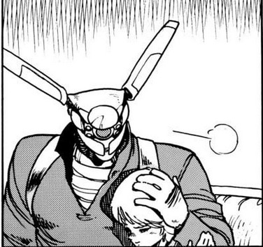
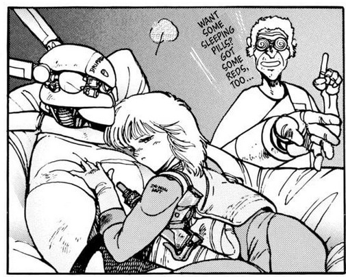
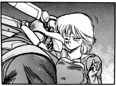
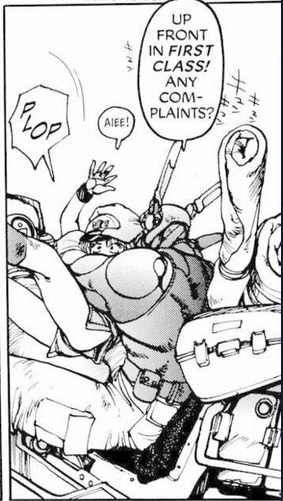
Appleseed PDA montage to save you from reading endless pages of unimportant politics that don't amount to anything
also because I have nothing better to do, I'm bored, I'm moody, my gaming laptop is still broken so no BG3, and it's too late at night to start drawing after doing animation clean-up all day.

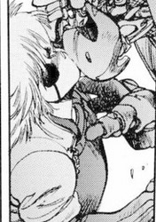
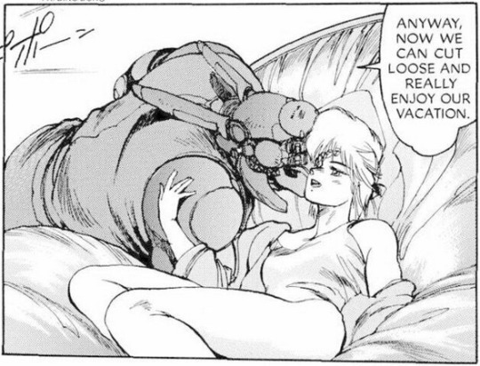
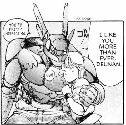
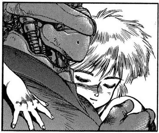
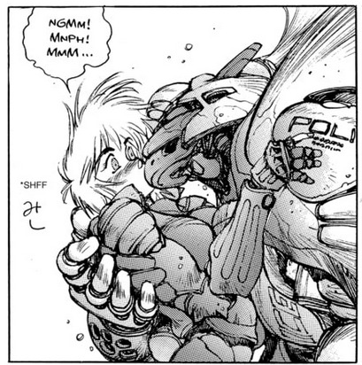
#Manga#Appleseed#Shirow Masamune#80s#This is literally every single one of these moments in the entirety of the manga's run#including bonus material#There's some great character writing hidden among all the infodumping and technobabble as well#But like I said before all it accomplishes is to make you frustrated#Because despite being written so well#Masamune was more interested in waxing philosophical than actually giving his characters the attention they deserve#Despite them displaying an insane amount of depth and complexity whenever they are able to#it's a very rare case where the characters are EXTREMELY well written and almost every moment they are on screen is amazingly well done#But the manga keeps demanding you listen to completely different side characters talk about politics for endless pages#while at the same time none of these politics have any consequence or relevance to the actual stories that happen on screen.#So it ends up with the majority of the manga is like listening to some guy you don't know on the bus reading the headlines of a newspaper#at you about political tension between two countries you have never heard of and will never feature in your life again#How do you write such great and well written characters and then be completely disinterested in actually putting them on screen?????
487 notes
·
View notes
Text
Ok but I’m still gagged by the choice of the white dress covered in her spilled ink for the TTPD set.
The way it’s almost certainly meant to reference a wedding gown just like the music video and how that ties into the narrative of TTPD in general.
The way so many of these songs are about how she’s been wronged and how she’s angry.
The striking image of her floating around on stage unleashing her anger in Who’s Afraid of Little Old Me, or her collapsed on the platform in Down Bad begging to be beamed back up to the space ship. Very much giving dying on the altar waiting for the proof (in both meanings). She’s the jilted lover and the runaway bride. She’s the old widow who goes to the stone everyday and she’s the girl heading towards a shotgun wedding if she keeps this up. She's the unhappily married woman whose life is turned upside down by a man beyond her reach, with the chasm between them widening the longer the set goes on. And then!!! she's taken away (held back?) by the nurses at the asylum -- the crazy wife being committed for hysteria!!! (Actually I don't know what order that comes in in the set -- I'm going to have to find better videos.)
She said that the TTPD set is Female Rage: The Musical, and a lot of that is "I'm pissed off you let me give you all that youth for free." She sacrificed her youth to her demons and to people who never had her best interest at heart. She sacrificed her youth to bad actors who wanted to ruin her. She sacrificed her youth to men who traded promises of commitment for their own safety.
So to see that all symbolized in the white gown, saying "I love you, it's ruining my life," is so powerful. By the time we get to "The Smallest Man," she's covered up in the band (or army dress?) uniform, those dreams finally dead and buried, marching to her own memorial service. They all finally kill her, and her dreams of her future.
IT'S A LOT. A LOT A LOT A LOT.
#don't even get me started on the white gown and the religious/traditional take on it asdfghjkl i'll be here all night#eras tour#the tortured poets department#she said these men promised to marry me and bailed and I am going to read them for filth THANK YOU FOR COMING TO MY TED TALK#writing letters addressed to the fire
454 notes
·
View notes
Text
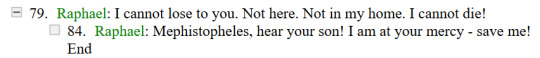
#raphael bg3#raphael#bg3#baldur's gate 3#bg3 voice lines#you do NOT understand. how these lines have lived in my head rent free like a mindflayer tadpole since i saw them#i still don't even know if he can actually say this or if it's just a dead/untriggerable dialogue but. my god. actually hearing it finally#the desperation in his voice... AUGH#like i'm just saying.. if i could write... this line has got So Many Ideas rattling around in my head jkdsnhdlkfhjgwrfjhg#please imagine me as that prozd video where he reads that set of tags#you have no idea YOU HAVE NO IDEA im crazy im crazy im crazy etc#mine
1K notes
·
View notes
Text


…..I genuinely can’t remember the exact size difference between Rodimus and Thunderclash hahaha. And I’m too lazy to search for a panel with them standing next to each other👍
Anyway.
@lush-specimen and their Over My Dead Body fic made me love this giant metal teddy bear. I couldn’t help but draw him:>
#I searched for other Thunderrod fic#*fics#and turns out#I don’t like Thunderrod in general#I love Thunderrod written by this one specific person#they’re g o o d#transformers#maccadam#mtmte#lost light#mtmte rodimus#rodimus#thunderclash#thunderrod#I don't know#the way Lush specimen writes them#they have this extremely nice flavor other fics doesn't have#or at least I can't find another ones#yet#we'll see#Lush if you happen to be reading that I hope it’s okay to tag you#you did such an amazing job writing those lovely idiots#I wanna throw something nice at you back#lmao#fic fanart
1K notes
·
View notes
Text
why Aurora's art is genius
It's break for me, and I've been meaning to sit down and read the Aurora webcomic (https://comicaurora.com/, @comicaurora on Tumblr) for quite a bit. So I did that over the last few days.
And… y'know. I can't actually say "I should've read this earlier," because otherwise I would've been up at 2:30-3am when I had responsibilities in the morning and I couldn't have properly enjoyed it, but. Holy shit guys THIS COMIC.
I intended to just do a generalized "hello this is all the things I love about this story," and I wrote a paragraph or two about art style. …and then another. And another. And I realized I needed to actually reference things so I would stop being too vague. I was reading the comic on my tablet or phone, because I wanted to stay curled up in my chair, but I type at a big monitor and so I saw more details… aaaaaand it turned into its own giant-ass post.
SO. Enjoy a few thousand words of me nerding out about this insanely cool art style and how fucking gorgeous this comic is? (There are screenshots, I promise it isn't just a wall of text.) In my defense, I just spent two semesters in graphic design classes focusing on the Adobe Suite, so… I get to be a nerd about pretty things…???
All positive feedback btw! No downers here. <3
---
I cannot emphasize enough how much I love the beautiful, simple stylistic method of drawing characters and figures. It is absolutely stunning and effortless and utterly graceful—it is so hard to capture the sheer beauty and fluidity of the human form in such a fashion. Even a simple outline of a character feels dynamic! It's gorgeous!
Though I do have a love-hate relationship with this, because my artistic side looks at that lovely simplicity, goes "I CAN DO THAT!" and then I sit down and go to the paper and realize that no, in fact, I cannot do that yet, because that simplicity is born of a hell of a lot of practice and understanding of bodies and actually is really hard to do. It's a very developed style that only looks simple because the artist knows what they're doing. The human body is hard to pull off, and this comic does so beautifully and makes it look effortless.
Also: line weight line weight line weight. It's especially important in simplified shapes and figures like this, and hoo boy is it used excellently. It's especially apparent the newer the pages get—I love watching that improvement over time—but with simpler figures and lines, you get nice light lines to emphasize both smaller details, like in the draping of clothing and the curls of hair—which, hello, yes—and thicker lines to emphasize bigger and more important details and silhouettes. It's the sort of thing that's essential to most illustrations, but I wanted to make a note of it because it's so vital to this art style.
THE USE OF LAYER BLENDING MODES OH MY GODS. (...uhhh, apologies to the people who don't know what that means, it's a digital art program thing? This article explains it for beginners.)
Bear with me, I just finished my second Photoshop course, I spent months and months working on projects with this shit so I see the genius use of Screen and/or its siblings (of which there are many—if I say "Screen" here, assume I mean the entire umbrella of Screen blending modes and possibly Overlay) and go nuts, but seriously it's so clever and also fucking gorgeous:
Firstly: the use of screened-on sound effect words over an action? A "CRACK" written over a branch and then put on Screen in glowy green so that it's subtle enough that it doesn't disrupt the visual flow, but still sticks out enough to make itself heard? Little "scritches" that are transparent where they're laid on without outlines to emphasize the sound without disrupting the underlying image? FUCK YES. I haven't seen this done literally anywhere else—granted, I haven't read a massive amount of comics, but I've read enough—and it is so clever and I adore it. Examples:


Secondly: The beautiful lighting effects. The curling leaves, all the magic, the various glowing eyes, the fog, the way it's all so vividly colored but doesn't burn your eyeballs out—a balance that's way harder to achieve than you'd think—and the soft glows around them, eeeee it's so pretty so pretty SO PRETTY. Not sure if some of these are Outer/Inner Glow/Shadow layer effects or if it's entirely hand-drawn, but major kudos either way; I can see the beautiful use of blending modes and I SALUTE YOUR GENIUS.
I keep looking at some of this stuff and go "is that a layer effect or is it done by hand?" Because you can make some similar things with the Satin layer effect in Photoshop (I don't know if other programs have this? I'm gonna have to find out since I won't have access to PS for much longer ;-;) that resembles some of the swirly inner bits on some of the lit effects, but I'm not sure if it is that or not. Or you could mask over textures? There's... many ways to do it.
If done by hand: oh my gods the patience, how. If done with layer effects: really clever work that knows how to stop said effects from looking wonky, because ugh those things get temperamental. If done with a layer of texture that's been masked over: very, very good masking work. No matter the method, pretty shimmers and swirly bits inside the bigger pretty swirls!
Next: The way color contrast is used! I will never be over the glowy green-on-black Primordial Life vibes when Alinua gets dropped into that… unconscious space?? with Life, for example, and the sharp contrast of vines and crack and branches and leaves against pitch black is just visually stunning. The way the roots sink into the ground and the three-dimensional sensation of it is particularly badass here:

Friggin. How does this imply depth like that. HOW. IT'S SO FREAKING COOL.
A huge point here is also color language and use! Everybody has their own particular shade, generally matching their eyes, magic, and personality, and I adore how this is used to make it clear who's talking or who's doing an action. That was especially apparent to me with Dainix and Falst in the caves—their colors are both fairly warm, but quite distinct, and I love how this clarifies who's doing what in panels with a lot of action from both of them. There is a particular bit that stuck out to me, so I dug up the panels (see this page and the following one https://comicaurora.com/aurora/1-20-30/):

(Gods it looks even prettier now that I put it against a plain background. Also, appreciation to Falst for managing a bridal-carry midair, damn.)
The way that their colors MERGE here! And the immense attention to detail in doing so—Dainix is higher up than Falst is in the first panel, so Dainix's orange fades into Falst's orange at the base. The next panel has gold up top and orange on bottom; we can't really tell in that panel where each of them are, but that's carried over to the next panel—

—where we now see that Falst's position is raised above Dainix's due to the way he's carrying him. (Points for continuity!) And, of course, we see the little "huffs" flowing from orange to yellow over their heads (where Dainix's head is higher than Falst's) to merge the sound of their breathing, which is absurdly clever because it emphasizes to the viewer how we hear two sets of huffing overlaying each other, not one. Absolutely brilliant.
(A few other notes of appreciation to that panel: beautiful glows around them, the sparks, the jagged silhouette of the spider legs, the lovely colors that have no right to make the area around a spider corpse that pretty, the excellent texturing on the cave walls plus perspective, the way Falst's movements imply Dainix's hefty weight, the natural posing of the characters, their on-point expressions that convey exactly how fuckin terrifying everything is right now, the slight glows to their eyes, and also they're just handsome boys <3)
Next up: Rain!!!! So well done! It's subtle enough that it never ever disrupts the impact of the focal point, but evident enough you can tell! And more importantly: THE MIST OFF THE CHARACTERS. Rain does this irl, it has that little vapor that comes off you and makes that little misty effect that plays with lighting, it's so cool-looking and here it's used to such pretty effect!
One of the panel captions says something about it blurring out all the injuries on the characters but like THAT AIN'T TOO BIG OF A PROBLEM when it gets across the environmental vibes, and also that'd be how it would look in real life too so like… outside viewer's angle is the same as the characters', mostly? my point is: that's the environment!!! that's the vibes, that's the feel! It gets it across and it does so in the most pretty way possible!
And another thing re: rain, the use of it to establish perspective, particularly in panels like this—

—where we can tell we're looking down at Tynan due to the perspective on the rain and where it's pointing. Excellent. (Also, kudos for looking down and emphasizing how Tynan's losing his advantage—lovely use of visual storytelling.)
Additionally, the misting here:

We see it most heavily in the leftmost panel, where it's quite foggy as you would expect in a rainstorm, especially in an environment with a lot of heat, but it's also lightly powdered on in the following two panels and tends to follow light sources, which makes complete sense given how light bounces off particles in the air.
A major point of strength in these too is a thorough understanding of lighting, like rim lighting, the various hues and shades, and an intricate understanding of how light bounces off surfaces even when they're in shadow (we'll see a faint glow in spots where characters are half in shadow, but that's how it would work in real life, because of how light bounces around).
Bringing some of these points together: the fluidity of the lines in magic, and the way simple glowing lines are used to emphasize motion and the magic itself, is deeply clever. I'm basically pulling at random from panels and there's definitely even better examples, but here's one (see this page https://comicaurora.com/aurora/1-16-33/):

First panel, listed in numbers because these build on each other:
The tension of the lines in Tess's magic here. This works on a couple levels: first, the way she's holding her fists, as if she's pulling a rope taut.
The way there's one primary line, emphasizing the rope feeling, accompanied by smaller ones.
The additional lines starbursting around her hands, to indicate the energy crackling in her hands and how she's doing a good bit more than just holding it. (That combined with the fists suggests some tension to the magic, too.) Also the variations in brightness, a feature you'll find in actual lightning. :D Additional kudos for how the lightning sparks and breaks off the metal of the sword.
A handful of miscellaneous notes on the second panel:
The reflection of the flames in Erin's typically dark blue eyes (which bears a remarkable resemblance to Dainix, incidentally—almost a thematic sort of parallel given Erin's using the same magic Dainix specializes in?)
The flowing of fabric in the wind and associated variation in the lineart
The way Erin's tattoos interact with the fire he's pulling to his hand
The way the rain overlays some of the fainter areas of fire (attention! to! detail! hell yeah!)
I could go on. I won't because this is a lot of writing already.
Third panel gets paragraphs, not bullets:
Erin's giant-ass "FWOOM" of fire there, and the way the outline of the word is puffy-edged and gradated to feel almost three-dimensional, plus once again using Screen or a variation on it so that the stars show up in the background. All this against that stunning plume of fire, which ripples and sparks so gorgeously, and the ending "om" of the onomatopoeia is emphasized incredibly brightly against that, adding to the punch of it and making the plume feel even brighter.
Also, once again, rain helping establish perspective, especially in how it's very angular in the left side of the panel and then slowly becomes more like a point to the right to indicate it's falling directly down on the viewer. Add in the bright, beautiful glow effects, fainter but no less important black lines beneath them to emphasize the sky and smoke and the like, and the stunningly beautiful lighting and gradated glows surrounding Erin plus the lightning jagging up at him from below, and you get one hell of an impactful panel right there. (And there is definitely more in there I could break down, this is just a lot already.)
And in general: The colors in this? Incredible. The blues and purples and oranges and golds compliment so well, and it's all so rich.
Like, seriously, just throughout the whole comic, the use of gradients, blending modes, color balance and hues, all the things, all the things, it makes for the most beautiful effects and glows and such a rich environment. There's a very distinct style to this comic in its simplified backgrounds (which I recognize are done partly because it's way easier and also backgrounds are so time-consuming dear gods but lemme say this) and vivid, smoothly drawn characters; the simplicity lets them come to the front and gives room for those beautiful, richly saturated focal points, letting the stylized designs of the magic and characters shine. The use of distinct silhouettes is insanely good. Honestly, complex backgrounds might run the risk of making everything too visually busy in this case. It's just, augh, so GORGEOUS.
Another bit, take a look at this page (https://comicaurora.com/aurora/1-15-28/):

It's not quite as evident here as it is in the next page, but this one does some other fun things so I'm grabbing it. Points:
Once again, using different colors to represent different character actions. The "WHAM" of Kendal hitting the ground is caused by Dainix's force, so it's orange (and kudos for doubling the word over to add a shake effect). But we see blue layered underneath, which could be an environmental choice, but might also be because it's Kendal, whose color is blue.
And speaking off, take a look at the right-most panel on top, where Kendal grabs the spear: his motion is, again, illustrated in bright blue, versus the atmospheric screened-on orange lines that point toward him around the whole panel (I'm sure these have a name, I think they might be more of a manga thing though and the only experience I have in manga is reading a bit of Fullmetal Alchemist). Those lines emphasize the weight of the spear being shoved at him, and their color tells us Dainix is responsible for it.
One of my all-time favorite effects in this comic is the way cracks manifest across Dainix's body to represent when he starts to lose control; it is utterly gorgeous and wonderfully thematic. These are more evident in the page before and after this one, but you get a decent idea here. I love the way they glow softly, the way the fire juuuust flickers through at the start and then becomes more evident over time, and the cracks feel so realistic, like his skin is made of pottery. Additional points for how fire begins to creep into his hair.
A small detail that's generally consistent across the comic, but which I want to make note of here because you can see it pretty well: Kendal's eyes glow about the same as the jewel in his sword, mirroring his connection to said sword and calling back to how the jewel became Vash's eye temporarily and thus was once Kendal's eye. You can always see this connection (though there might be some spots where this also changes in a symbolic manner; I went through it quickly on the first time around, so I'll pay more attention when I inevitably reread this), where Kendal's always got that little shine of blue in his eyes the same as the jewel. It's a beautiful visual parallel that encourages the reader to subconsciously link them together, especially since the lines used to illustrate character movements typically mirror their eye color. It's an extension of Kendal.
Did I mention how ABSOLUTELY BEAUTIFUL the colors in this are?
Also, the mythological/legend-type scenes are illustrated in familiar style often used for that type of story, a simple and heavily symbolic two-dimensional cave-painting-like look. They are absolutely beautiful on many levels, employing simple, lovely gradients, slightly rougher and thicker lineart that is nonetheless smoothly beautiful, and working with clear silhouettes (a major strength of this art style, but also a strength in the comic overall). But in particular, I wanted to call attention to a particular thing (see this page https://comicaurora.com/aurora/1-12-4/):

The flowing symbolic lineart surrounding each character. This is actually quite consistent across characters—see also Life's typical lines and how they curl:

What's particularly interesting here is how these symbols are often similar, but not the same. Vash's lines are always smooth, clean curls, often playing off each other and echoing one another like ripples in a pond. You'd think they'd look too similar to Life's—but they don't. Life's curl like vines, and they remain connected; where one curve might echo another but exist entirely detached from each other in Vash's, Life's lines still remain wound together, because vines are continuous and don't float around. :P
Tahraim's are less continuous, often breaking up with significantly smaller bits and pieces floating around like—of course—sparks, and come to sharper points. These are also constants: we see the vines repeated over and over in Alinua's dreams of Life, and the echoing ripples of Vash are consistent wherever we encounter him. Kendal's dream of the ghost citizens of the city of Vash in the last few chapters is filled with these rippling, echoing patterns, to beautiful effect (https://comicaurora.com/aurora/1-20-14/):

They ripple and spiral, often in long, sinuous curves, with smooth elegance. It reminds me a great deal of images of space and sine waves and the like. This establishes a definite feel to these different characters and their magic. And the thing is, that's not something that had to be done—the colors are good at emphasizing who's who. But it was done, and it adds a whole other dimension to the story. Whenever you're in a deity's domain, you know whose it is no matter the color.
Regarding that shape language, I wanted to make another note, too—Vash is sometimes described as chaotic and doing what he likes, which is interesting to me, because smooth, elegant curves and the color blue aren't generally associated with chaos. So while Vash might behave like that on the surface, I'm guessing he's got a lot more going on underneath; he's probably much more intentional in his actions than you'd think at a glance, and he is certainly quite caring with his city. The other thing is that this suits Kendal perfectly. He's a paragon character; he is kind, virtuous, and self-sacrificing, and often we see him aiming to calm others and keep them safe. Blue is such a good color for him. There is… probably more to this, but I'm not deep enough in yet to say.
And here's the thing: I'm only scratching the surface. There is so much more here I'm not covering (color palettes! outfits! character design! environment! the deities! so much more!) and a lot more I can't cover, because I don't have the experience; this is me as a hobbyist artist who happened to take a couple design classes because I wanted to. The art style to this comic is so clever and creative and beautiful, though, I just had to go off about it. <3
...brownie points for getting all the way down here? Have a cookie.
#aurora comic#aurora webcomic#comicaurora#art analysis#...I hope those are the right tags???#new fandom new tagging practices to learn ig#much thanks for something to read while I try to rest my wrists. carpal tunnel BAD. (ignore that I wrote this I've got braces ok it's fine)#anyway! I HAVE. MANY MORE THOUGHTS. ON THE STORY ITSELF. THIS LOVELY STORY#also a collection of reactions to a chunk of the comic before I hit the point where I was too busy reading to write anything down#idk how to format those tho#...yeet them into one post...???#eh I usually don't go off this much these days but this seems like a smaller tight-knit fandom so... might as well help build it?#and I have a little more time thanks to break so#oh yes also shoutout to my insanely awesome professor for teaching me all the technical stuff from this he is LOVELY#made an incredibly complex program into something comprehensible <3#synapse talks
751 notes
·
View notes
Text
NGL I have STRONG opinions about digital releases omitting the letters to the editor section of older comics. I feel like the letters are a part of comic history and should be aggressively preserved.
#look i was a weirdo and loved the letters so much#so much#so fucking damn much#i still to this day mourn that we don't have them#sometimes the editors would publish blatant aggressive criticism and promise to do better on some things#it was rare but it did happen in a handful of things involving stereotypes#also there is queer history in them such as in superboy and the ravers where people wrote in about hero#asking WHY he was not interested in women and this editor had to so professionally explain that he was GAY and where they stood on it#you also got to read queer readers writing in about these queer characters and the JOY in their words is priceless#also sorry but geoff's letters are fun and stupid at the same time and are a huge insight to what his hcs were#he LOVED tiny krypto so much it likely inspired him making dex starr bc he loved the idea of a small overly powered animal#not saying that was the main reason why ofc but it is interesting that he created dex after praising that mean little mutt#i say with the most love#my venting#my rambles
1K notes
·
View notes
Text
since i've seen others talking about this, as someone who writes predominately lengthy fics (5k+ words), what annoys me the most is that i've seen so many people on tumblr & tiktok specifically say "i hate when writers have too much build-up and don't get straight to the smut, i just skip to it." ???? writers spend HOURS on pieces like that, and to find out you don't really care is very disheartening & is quite literally going to kill not only writing on these platforms but literature as a whole
#ppl on booktok getting upset when there's no smut in a book or it doesn't compare to the fics they've read ://#personally i don't like smut unless i care DEEPLY about the characters and to see that those are the most widely recommended books rn#pains me a little bit#and i write long pieces bc i enjoy them but#to know that people might just skip straight to the smut is upsetting#fics longer than 2k words rarely get many notes on this platform which is so sad bc that is where people get the most opportunity#to showcase their skills
498 notes
·
View notes
Text

Smell Check [Easy: Failure]
MDZS Disco Elysium AU part 1 (part 2 - part 3)
#poorly drawn mdzs#mdzs#wei wuxian#lan wangji#disco elysium#MDZS Disco Elysium AU#So sad I didn't manage to get this comic out on the 15th (pd-mdzs's 8 month anniversary and DE's 4th year anniversary) but I'm here *now*#I have a very extensive and detailed MDZS Disco Elysium AU that I am Not Normal About.#I've seen a few other people point out the potential in a crossover (true) but they make the mistake in having it be set in 51!#A true crossover would take place closer to The Antecentennial Revolution!#Disco Elysium did not go that hard on its cool lore for people to only make surface level crossovers!!!#One day I'll write the fic or post my notes. I don't know who would read it but it tickles *my* brain and that's enough.#No spoilers for DE (here or in comments (please)) but please consider....Magpie Wei Wuxian B*) On his way to be an innocent.#I do think there is a good chance a chunk of the MDZS readership would enjoy DE but...it's also not a game I easily recommend#It's more of an experience you have to marinate over. It's dark in ways that are off putting to some people.#It makes you feel like a very bad person all the time. It gets extremely personal if you allow yourself to be honest in your answers#and it's also the game that saved my life. My life was truly forever changed after playing disco elysium.#If I recommend it to people it's a badge of the trust I have in you to appreciate something dear to me B'*)#If you decide to play: PLEASE go in as blind as possible. You will regret spoiling yourself.#edit: this is based on real disco elysium dialogue. HDB has many canon kinks but this is not one of them
563 notes
·
View notes
Text
it is all chaos and entropy. the thing is that the chaos and entropy make it beautiful and lovely.
yes, it's true that nature and the universe are uncaring and unspecific, and that is terrifying. i have lived through some of the unfairness - i got born like this, with my body caving into itself, with this ironic love of dance when i sometimes can't stand up for longer than 15 minutes. i am a poet with hands that are slowly shutting down - i can't hold a pen some days. recently i found a dead bird on our front porch. she had no visible injuries. she had just died, the way things die sometimes.
it is also true that nature and the universe are uncaring and unspecific, and that is wonderful. the sheer happenstance that makes rain turn into a rainbow. the impossible coincidence of finding your best friend. i have made so many mistakes and i have let myself down and i have harmed other people by accident. nature moves anyway. on the worst day of my life she delivers me an orange juice sunset, as if she is saying try again tomorrow.
how vast and unknowing the universe! how small we are! isn't that lovely. the universe has given us flowers and harp strings and the shape of clouds. how massive our lives are in comparison to a grasshopper. the world so bright, still undiscovered. even after 30 years of being on this earth, i learned about a new type of animal today: the dhole.
chance echoing in my life like a harmony between two people talking. do you think you and i, living in different worlds but connected through the internet - do you think we've ever seen the same butterfly? they migrate thousands of miles. it's possible, right?
how beautiful the ways we fill the vastness of space. i love that when large amounts of people are applauding in a room, they all start clapping at the same time. i love that the ocean reminds us of our mother's heartbeat. i love that out of all the colors, chlorophyll chose green. i love the coincidences. i love the places where science says i don't know, but it just happens.
"the universe doesn't care about you!" oh, i know. that's okay. i care about the universe. i will put my big stupid heart out into it and watch the universe feast on it. it is not painful. it is strange - the more love you pour into the unfeeling world, the more it feels the world loves you in return. i know it's confirmation bias. i think i'm okay if my proof of kindness is just my own body and my own spirit.
i buried the bird from our porch deep in the woods. that same day, an old friend reaches out to me and says i miss you. wherever you go, no matter how bad it gets - you try to do good.
#writeblr#warm up#i can't write rn but i have SO much words in here bc im reading the chorus of dragons books#(just started book 4)#and this woman's writing is just LIVING in my brain. let me out!!!#(i read roughly like 2-4 books a week usually bc i go on long walks with my dog but when a book is REALLY good like. it eats my life. )#anyway ...... so like here's a story that idk i've tried to explain to other people as being wild#but maybe im the only one who thinks it is wild???#so i play pokemon go (i just started in jan) bc i love pokemon and as i have mentioned i walk goblin for like an hour in the morning#and i don't like a lot of fitness trackers due to the fact it makes me .sad. but i also wanted the little digital rewards. enter pokemon go#anyway so they make you make friends to complete quests. so i used a reddit thread. i do not usually use reddit. i don't have an acct#i lurked. i just googled like ''pokemon go reddit '' and randomly added a bunch of numbers#i was on that page for all of 15 minutes. there are THOUSANDS of responses on that page.#here's what's wild: in that group of people. even though i am not on reddit and it was one random event once#it turns out one of those people lives in the town i live in. or at least very close. i only know this because#when we send each other gifts. it's from the same freaking area.#i can't ask them to meet up bc pokemon go doesn't have a messaging app lol but like . what are the fucking chances that#a random person posts in a random reddit thread and HAPPENS to get added by someone ELSE from their SAME TOWN#who by pure fucking CHANCE is ALSO playing pokemon go and looking for friends#i googled it there's only 42000 people in my broad region. the .......... smallness ! of the world!!!
1K notes
·
View notes
Text
Ed said "What would you have me do, Captain, to restore my reputation?"
Everyone on Ao3:
#AND DON'T YOU STOP WRITING THEM I AM READING THEM ALL YOU HEATHENS#absolutely feral about that scene#ofmd ao3#ofmd#ofmd s2 spoilers#gentlebeard
482 notes
·
View notes
Text
I have a request for batfam/Jason Todd fanfic writers:
I love the "Jason Todd is a bookworm/theatre nerd" fics as much as the next person, don't get me wrong, but can we please diversify his interests?
90% of the time when I open a fic with that tag, we see Jason reading Jane Eyre or Pride and Prejudice or quoting Shakespeare. And not to say that there's anything wrong with any of those being his favourite but even if he loves to read "classical" books, come on!
You're telling me Jason raised-in-crime-alley-spent-his-formative-years-between-an-eccentric-billionaire-and-an-assassin-cult Todd only reads books by dead white people?!
I refuse! Give me a man who takes to books more than ever after his return to Gotham. Jason, who reads books like I am Woman, A Really Good Brown Girl and White Tears/Brown Scars, then recommends them to the working girls as he establishes his territory. Who reads in multiple languages, and who loves Arabic poetry.
Give me a little "Robin is Magic!" Jason scouring Bruce's library and picking up a copy of The Mahabharata after he's done The Iliad, and spends weeks obsessed with Journey to the West.
Give me a Jason who's read Things Fall Apart, and One Hundred Years of Solitude! The number of quotes and references he could pull that would further support his dramatic tendencies? It would make him so happy!
#I could say something bitter about diversity/inclusion in fandoms in general#And how the lack of diversity in people's personal bookshelves is clearly reflected in how they write a bookworm character#who travels the world regularly but for some reason only considers literature written by Europeans to be “classics”#but i won't#ive just given examples of more diverse books that are considered “classics” but don't feel like you have to go that route#the point is to make him a diverse reader!#AGAIN no one come for me! I'm not saying those books aren't classics and he can't enjoy them!#I'm just saying#stop making it the only thing he reads!#batfam#bookworm jason todd#batfamily#ao3#batfam fanfic#jason todd#nerd jason todd#jason todd fanfiction#red hood#dc#dc comics
158 notes
·
View notes
Text
So... I'm doing research for a piece of creative non-fiction (a personal essay) I'm writing for one of my uni assignments about the fact that I'm asexual and demiromantic and think that we, as a wider society, have gotten the concepts of love and attraction all wrong, and I've been researching more into the split attraction model because, well, I see it as something that's important and relevant, and this came up in my Google search:

The initial red flag of this article is the fact that it's on BetterHelp. I didn't see this at first, and did a double take.
Anyway, the first thing I would like to ask is: what are these 'cons'? As far as I'm concerned, there are none. I understand that, for many people, romantic and sexual attraction are intrinsically linked, but, for many, they're not, and the split attraction model existing doesn't harm the former - it helps the latter. The latter includes people who are on the asexual and/or aromantic spectrums, as well as people who are, for example, heteromantic and bisexual, panromantic and homosexual, biromantic and heterosexual, etc. - basically anyone whose experiences differ between their romantic and sexual attraction.
I do find it a bit annoying that, when many people talk about both of these kinds of attraction, they lump them into one 'label', which is mostly [something]sexual (e.g. heterosexual, homosexual, etc.). But, for them, the two are linked, so referring to themselves as [something]sexual to cover both seems fine and dandy. Which... it is. However, I find it wild that people don't realise that, despite the fact that the two may seem linked to them, they are actually two different experiences. People who are both alloromantic and allosexual should be able to see this, right? They can think someone is sexually attractive yet not be romantically attracted to or want to date them. That is a thing that can happen.
Anyway, I decided to read through the article. It isn't bad, per se - much of the information is useful, and it seemed to be quite positive. Until I got to the 'cons':
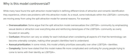
Now, I'm not really into the discourse surrounding the split attraction model - in fact, I didn't realise there was discourse surrounding it. This is because I tend to, either accidently or on purpose, avoid discourse in general. But... 'oversexualisation'? In what context? If anything, not using the split attraction model would be considered 'oversexualisation' (even though I don't think that that is, either - I honestly don't know why this word has been brought up here) due to the fact that many people focus on sexual attraction over any kind of attraction and use it to cover romantic attraction, too, when they talk about it. I genuinely have no idea what they are referring to here.
In regard to the second point: what? Attraction is complex. That's the whole thing. The split attraction model makes it less complex for many people. It allows people to figure out who they are and have the terminology to be able to voice it. Attraction is a spectrum and so is gender. Of course both of them are going to be complex. Society made both of them rigid in the first place, so breaking out of those rigidities is going to be confusing for everyone. The split attraction model helps people understand themselves, and I would like to think it helps them understand others. Everyone benefits.
I don't know if I can speak much on the third point, as I'm not familiar with the discourse, as I previously mentioned, and don't really know what it entails. Though, in saying this... what do they mean? When has asexuality - or aromanticism, for that matter - ever been prioritised over other queer identities? There's a severe lack of discussion and education surrounding both of them. That's just a fact. People who are asexual and/or aromantic are oftentimes even shunned by the wider queer community they are a part of. I don't really have much more to add on this point because I'm so confused by it. By the way, this article barely talks about aromanticism, despite the fact that it's an important part of this model, too.
The last point is just a rehash of the second point. If I was told about any of this stuff growing up, I would have realised I was ace and demiromantic from the start. Instead, I realised I was ace a few years ago after watching Jaiden Animations' video about the fact that she's aroace (I don't want to use the term 'coming out' here because, frankly, I hate it - I'll save that rant for another time). I only realised I was demiromantic in the past month after... realising that people getting romantic crushes on and/or falling in love with someone when they barely know them is actually a thing that happens and isn't fake. These two terms fit me best at the moment, and explain everything. If I had've known these terms as a teenager, that would have been great. The split attraction model helped me so much in breaking down myself and my identity, and offered me the foundation I needed to ask myself questions. Yeah, attraction and gender are confusing - I said it before, and I'll say it again. But why would you cast something so helpful aside? That will only hinder people - both those who are struggling with their own identity and those who are trying to understand the identities of others. Education surrounding the complexities and spectrums of attraction and gender are so important, and this model will help people teach other people about attraction.
I also read a bunch of hate comments, as one does whenever they go on Reddit or Twitter or literally any social media platform ever, regarding the split attraction model. This didn't surprise me. These specific people seem to hate this model because... well, I don't really know. They were mostly spewing aphobia. I don't think a single one had a constructive point. Also, most of the search results for 'split attraction model' on Google are actually critiques of it, or articles talking about critiques of it and being on the fence. Come on, people. Do better.
Anyway, the split attraction model is important. Education is important. Allowing people to figure out who they are and express it is important. This should all go without saying.
That is all.
#my ramblings#my writing#i want this out there somewhere so i'm actually tagging multiple things for once in my life#asexual#aromantic#aroace#ace#aro#lgbtqia+#split attraction#split attraction model#uhhhhhh#i don't know what else to tag#if you've read this far... hi#edited because some of the sentences didn't flow as well as i wanted them to lmao
179 notes
·
View notes
Text
idk who needs to hear this but if you're a writer looking for a webcomic artist and the best offer you can come up with is a 50/50 split "after gaining revenue", then that's literally asking for free work just with extra steps.
like first of all (and i'm sure people are gonna fight me on this) writing a webcomic and drawing a webcomic is not a 50/50 split, a scene that took you a half hour to write will take them hours to draw so it's literally more like 30/70
but also even IF your comic gains revenue, it's still not gonna pay for that labor, there are comic projects out there that have been going on for upwards of 10 years and beyond who are still maybe only making like $30/month on their patreon... and you only wanna pay them $15 of that?
please just consider writing a novel or short stories, or doing tabletop campaigns, or pitching scripts to comic publishers, or learning to draw yourself (even if you're bad at it! webcomics are allowed to grow and evolve in their art!), or doing RP, or doing anything that will get your ideas and stories out there without being at the expense of a whole ass other human being doing the brunt of the labor for free
no matter how dedicated you are to an idea or how convinced you are that it's truly a unique one that's worth working on, none of that will pay for the labor and time and efforts of people who you're asking to work for free to make your dream a reality. They have their own dreams that they're working on too.
#sorry i know this is very curt but i see this all the time#pls just be aware of what you're asking for if you're looking for a webcomic artist#i know you prolly really like reading webcomics but there's so much that goes into them that a lot of ppl don't realize#you're asking a LOT for someone to just love your own idea enough to work on it for free#sorry but most of us already have our own babies that we love and care for#self post#rant post#artist tips#writer tips#writing tips#hot take
427 notes
·
View notes
Text
bsd fic authors i understand yalls pain SO well right now why is it so fucking HARD to write dazai. like i have a whole fucking spreadsheet dedicated to tireless analysis i have done on my part so i can accurately characterize him but he is such an unpredictable and morally gray character that it's hard knowing his limits and boundaries and where he draws the line for himself.
#i hate when ppl make him out to be a sadistic villain with no remorse. like did we read the same manga 💀#but at the same time he is NOT crying abt all the ppl he sent to the grave. he sleeps just fine at night knowing he committed atrocities#yes he feels remorse? but he isn't like kunikida to weep at someone's grave for failing to save them#and then we have his emotions themselves#dazai isn't emotionless. far from it. he has difficulty expressing affection but yk he finds someone endearing when he trusts them#trust is very important to dazai and is one of the aspects of human emotion that he can fully grasp#but like everything else is in a hazy gray area that he does not feel like exploring. he feels alienated from his humanity bc of this#AUUUGHH can someone help me with character analysis PLEASE#I WASNT PAYING ATTENTION TO THIS MF UNTIL RECENTLY SO I MISSED OUT ON A LOT OF IMPORTANT DETAILS#see i would go and reread a few light novels but like i don't have time for that#and this is for dazai specifically. i am very well versed on his relationships w other charcaters#but just like asigiri himself said: it's very difficult to write dazai and write him WELL#so yeaaa i have a lot of smart ppl following me pls help#bsd#ALSO MY FRIEND STILL HAS NO LONGER HUMAN UUUUGHHHHHH I NEED THAT BACK BC I TABBED IT A SHIT TON#FOR LIKE CONNECTIONS TO YOZO AND BSD DAZAI AND WHERE ASIGIRI DREW INSPIRATION FROM YOZOS CHARACTER FOR DAZAI#THAT WOULD BE SUCH A VALUABLE FUCKING RESOURCE BC I DID SOME ANNOTATIONS IN THEM TOO BUT MY BOOK IS ANOTHER FUCKING STATE#I HATE IT HERE FML
300 notes
·
View notes
Last Seen Blogs

thecreativelyrashwedding
The Creatively Rash Wedding

growing-into-bloom
Growing into a better Me
frogthatatetheclover
memes for my sister

das-gelelenk
das-gelelenk

akusangapnkmain
PEMPUAN OR JANDA NAK DUIT PM AKU OK AKU NAK KORANG