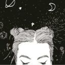
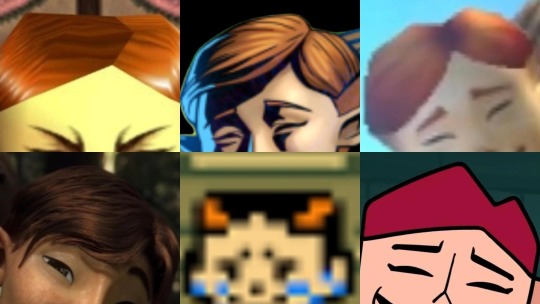
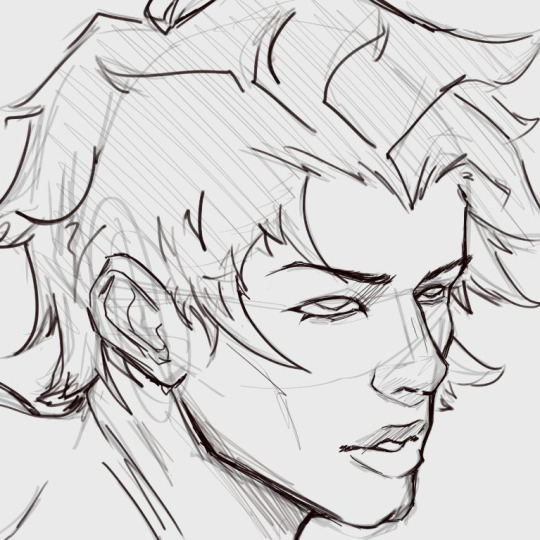
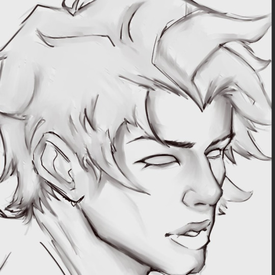
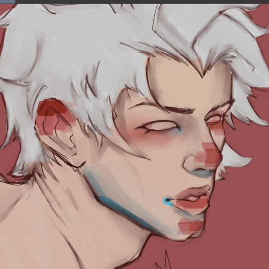
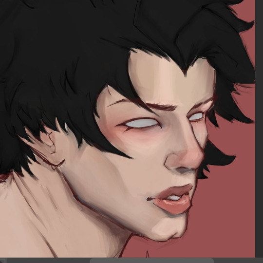
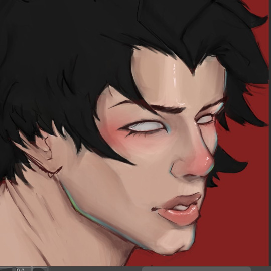
#the color transition to add depth
Text
They be saying,
"I love you!"
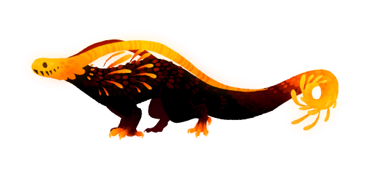
#rain world#rainworld#rain world lizard#orange lizard#rain world orange lizard#my art#i was real proud of this one#i think i found a new style i adore#also#fun fact!!!#This lad's antennae#spell#I love you!#in morse code!!!#i just thought that'd be super cute#the color transition to add depth#i love drawing these happy lizards :)
2K notes
·
View notes
Text
alright, here it is: ZENO'S COLOR GUIDE 3.0 !
here, i'll have three "chapters" regarding color:
CH1: how i color in illustrations
CH2: color and character design (in zeno's case)
CH3: how zeno makes his colors cooler
CH1: HOW I COLOR IN ILLUSTRATIONS
it must be noted that, as of lately, i heavily use halftones in my art and the way i use them for gradients effects my color choices. of course you don't need to use halftones if you don't want to, as it's just my personal choice, but anything regarding halftones here could (probably) also apply to regular gradients!
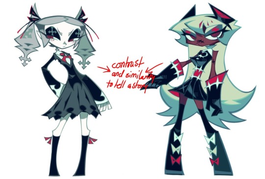
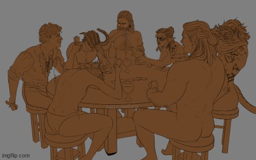
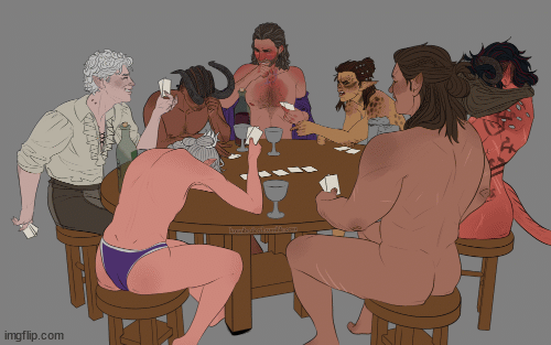
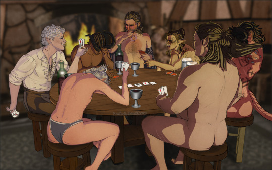
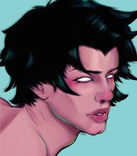
when choosing colors in an illustration, i usually have three things in mind: mood, character, and contrast. we'll be using "gloomy bunny naptime" as an example here.
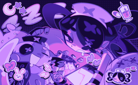
MOOD: what's the vibe of the piece? for example, here in "gloomy bunny naptime", wanted a mellow, sleepy vibe, so purples and pinks seemed like the best choice. these colors also have a dreamy effect due to being common in real-life early mornings/summer nights - basically, i tend to use associative colors in illustrations.
i usually only use a pallete of 3-7 colors, though of course more characters calls for more colors. for multi-character pieces, i would actually make a "rainbow" of colors based on the mood of the piece - essentially, a bank of colors to use for your colorful casts based on the actual rainbow. you can alter this based on the saturation levels you want! hope that makes sense. i'm not the best at this though, so i would heavily recommend looking for guides from artists who are more skilled in that department.
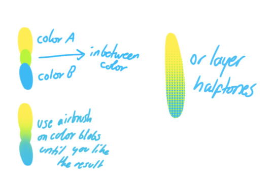
CHARACTER: velvet is the focus of the piece, and as a character her palette is made up of many purples and pinks. of course, it's easier because she and ribbon both have similar designs, but i would still recommend using colors based on/complementary to the focus character's pallete, though this is a rule that can and should be broken if needed. gradients can be used to provide a smooth transition from color-to-color and add depth to the piece, as well as showcase velvet's pallete. when making any gradient, you probably want to have a vibrant middle color. this is difficult to achieve in most art programs, so i'd do it like this:
you can use gradients in lots of cool ways to make stuff pop! (i think this collage shows i use too much purple and pink though.)

CONTRAST: the context of the piece also aids the color through contrast. (that's a lot of Cs!)- we see that velvet is just waking up, and the light from her switch is glowing brightly. i wanted to convey something like her switch suddenly turning on in the middle of the night, waking her up - so the console emits "light" in the form of illuminating the contrasting color of pink against the purples. it might seem specific to this piece, but what i'm trying to say is that contrasting colors can lead the eye to the focal point of the piece, that being velvet herself. because a great deal of the rest of the piece is dark, we look at the contrasting switch screen - the brightest thing in frame - and our eyes move around and up to take in the focal point character. at least that's how i wanted it to be ;w; i guess you could convey it as something like this?
CH2: COLOR AND CHARACTER DESIGN (IN ZENO'S CASE)
this is where i start to get annoying, so stand back! when deciding on colors for a cast of characters, there are many factors: time period, variety, personality, and more that i can't think of.
TIME PERIOD: this one is simple. for example, a futuristic time period (such as that in x-calibur) calls for colder colors, such as greens and blues. for characters involved in futuristic professions such as space exploration, this works incredibly well. for modern time periods, less focus can be on colors and more on the shapes of the clothes, but this is not a shapes tutorial! i don't have any ancient times oc stories, but i'd probably use earthy and warm tones.
VARIETY: this is also rather simple. i try to be aware of the palletes that i used, and the similarities they might have with other characters. i try to use similar colors for characters who belong to certain organisations or have a uniform, but of course, it's not like catholic school students adhere their entire look to their uniform, so this is a rule that can be broken yet again. art is all about learning things and breaking them, remember that!!!
color can also be used for symbolism. my absolute fav example for this is vivica and octavia - the amount of red in their designs is supposed to represent the amount of freedom/passion/anger/confidence they have or are allowed to express under their different circumstances. as vivica belongs to a strict organisation, she has far less red in her design, showing her emotions are stifled - meanwhile octavia has it as her main complementary color because of her freedom to express her emotions, though those emotions may be destructive because of her circumstances.
PERSONALITY: what colors are associated with your character's personality? i actually usually refer to magical girl groups to see what's commonly associated with different colors. here's the main trend:
red: hot-headed, passionate, firey
orange/yellow: bright, happy-go-lucky, sunshine personality
green: wise, mellow, kind
blue: serene, graceful, elegant
purple: magical, regal, fancy
pink: usually the main character (though this because magical girl anime tends to be marketed towards young girls), sweet, relatable, determined
of course these are only stereotypes from one genre of anime, and different colors have tons of different meanings. color theory is the best way to learn this! these colors can also express different moods, which ties into ch1. i myself constantly ignore these rules - v-con, a bombastic hyper DJ, is purple (though he does have yellow accents) for example. basically, i just take them as a general rule and try to have them in mind while drawing.
CH3: HOW ZENO MAKES HIS COLORS COOLER
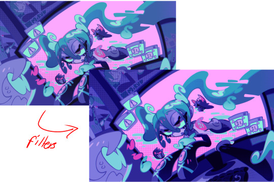
this might be the most important part of this guide. once again, there are a few things to consider here: filters, hue, overlays, and more!
FILTERS: for ibispaint, you can use an adjustment layer on your whole piece to use a filter. i usually only use brightness/contrast here - upping the brightness (or darkening it based on the mood of the piece) and upping the contrast. this helps to better express values and intensify the colors if that's what you want. i often use it in all my pieces to some extent.
hue/saturation/lightness is also helpful in moderation. you can alter the hue - though it usually only helps if you bring it back or forward by just a few points, or the entire pallete will change. saturation is what it sounds like, and slightly over/desaturating the piece can help with atmosphere. lightness is what it sounds like - lightens the colors in the piece. i don't use it at all.
posterize and sharpen mask are some that i've used recently. posterize can add some crazy effects to your art, but i'd probably need to edit it slightly after using it because it can mess with certain colors.
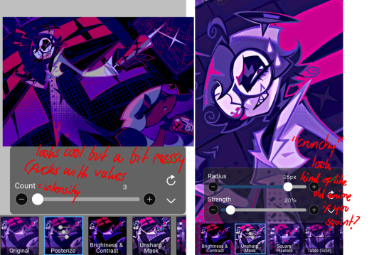
HUE: it's a layer type that can change the overall hue of the piece. i usually use it at a low percentage for atmosphere. kind of like a gradient map but nothing like it? idk
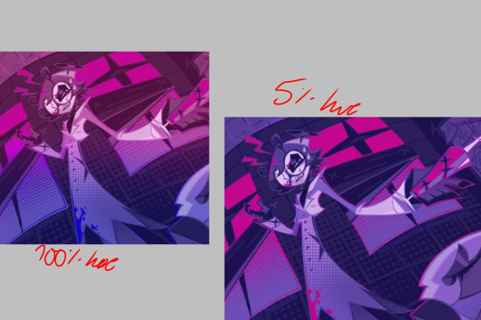
and OVERLAYS: i just use a very saturated blue/purple color over the entire piece at a very low percentage, around 5-10%. it can wash out the piece at too high a percentage.
and that's basically it! sorry it kind of derailed at the end i spent like 2 hours on this and got super tired. goodnight i'm going to sleep please also look at other artists etc etc. bye.
#zeno's art#long post#color tutorial#liar by korn is actually a really catchy song yea the lyrics are weird but its so good tbh#peak drums and bass and guitar and vocals and then the lyrics are hot booty. this is what nu metal's all about people#ask questions if you want#about nu metal or art i dont care
312 notes
·
View notes
Text
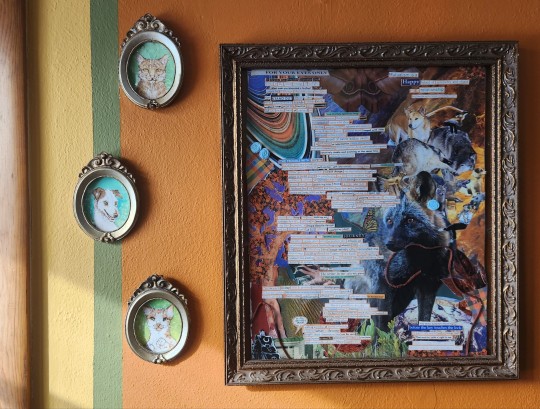

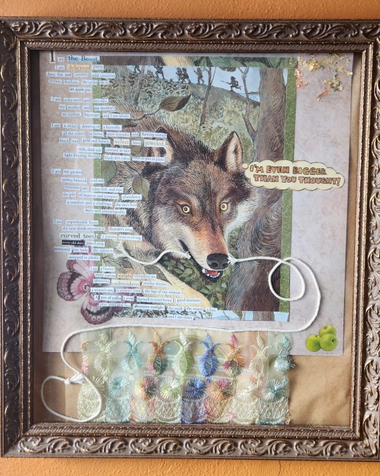
"Don't just play—do something!", Jack Abele, 01.21.24.
This is a companion piece to the collage I made about moving into the first place that felt like my home back in '21 (shown below). They have matching frames and are displayed together above our dining table! This second piece is a reflection on how my relationship to "home" has evolved since then, especially after proposing to my now fiancé last month. I'm really proud of it!
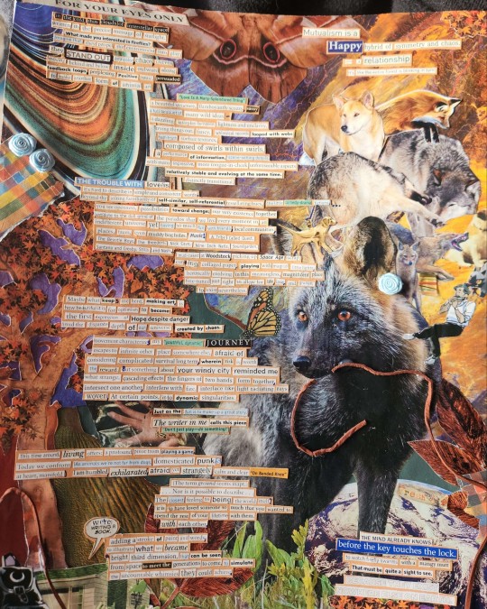
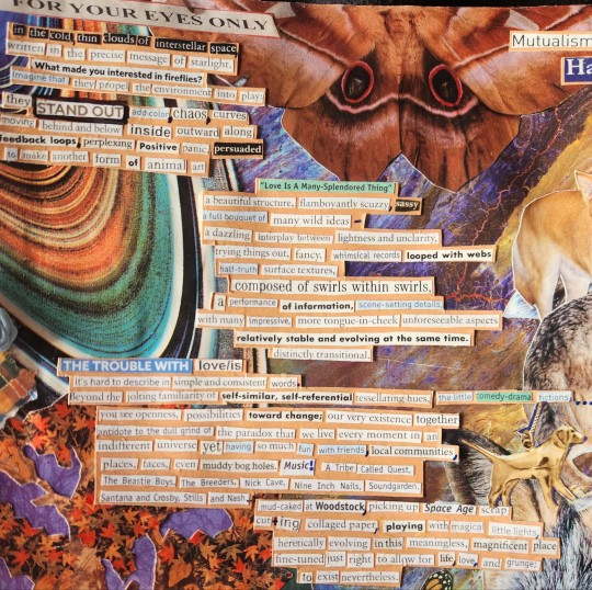
Text transcript:
FOR YOUR EYES ONLY
In the cold, thin clouds of interstellar space, written in the precise message of starlight:
What made you so interested in fireflies?
Imagine that they propel the environment into play: they STAND OUT, add color, chaos, curves moving behind and below, inside, outward along feedback loops, perplexing positive panic persuaded to make another form of animal art.
Love is a Many-Splendored Thing, a beautiful structure, flamboyantly scuzzy, sassy, a full bouquet of many wild ideas — a dazzling interplay between lightness and unclarity, trying things out, fancy, whimsical records looped with webs, half-truth surface textures composed of swirls within swirls, a performance of information, scene-setting details with many impressive, more tongue-in-cheek, unforeseeable aspects relatively stable and evolving at the same time.
Distinctly transitional.
The trouble with love is it's hard to describe in simple and consistent words. Beyond the jolting familiarity of self-similar, self-referential tessellating hues, the little comedy-drama fictions... you see openness, possibilities toward change; our very existence together antidote to the dull grind of the paradox that we live every moment in an indifferent universe yet having so much fun with friends, local communities, places, faces, even muddy bog holes.
Music! A Tribe Called Quest, The Beastie Boys, The Breeders, Nick Cave, Nine Inch Nails, Soundgarden, Santana and Crosby, Stills, and Nash, mud-caked at Woodstock, picking up Space Age scrap, cutting collaged paper, playing with magical little lights, heretically evolving in this meaningless, magnificent place fine-tuned just right to allow for life, love, and grunge to exist nevertheless.
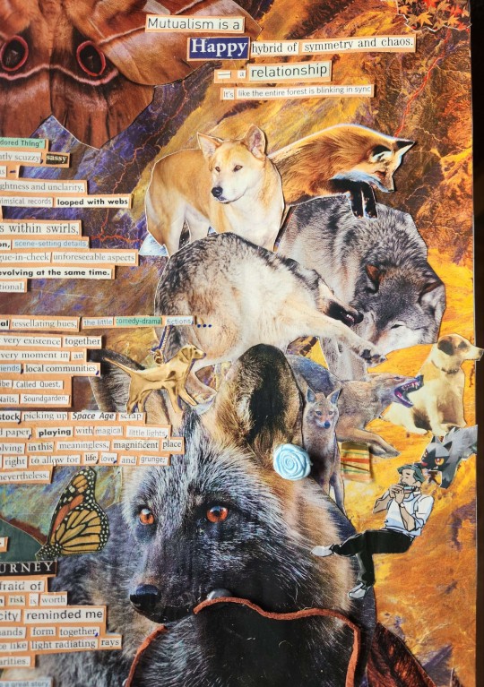
Maybe what keeps me here, making art, is how beautiful it is for optimism to become the first expression of hope despite danger amid the disparate depth of our universe created by chaos.
Movement characterizes my "youthful, dynamic" journey, escapes to infinite other places somewhere else, afraid of considering complicated survival long-term, wherein risk is worth the reward. But something about your windy city reminded me what strange, cascading effects the fingers of two hands form together, intersect one another, interfere with fate, interlace like light radiating rays woven, at certain points, into dynamic singularities.
Mutualism is a happy hybrid of symmetry and chaos — a relationship, it's like the entire forest is blinking in sync.
Just as the fun is to make up a great story, the writer in me calls this piece, "Don't just play— do something!"
This time around, living offers a profound pivot from playing a game. Today we confront as animals, we're not far from dogs, domesticated punks at heart, manifold.
I am humbled, exhilarated, afraid yet strangely calm and clear "On Bended Knee"
(The term ground seems inapt.)
...Nor is it possible to describe...
The closest feeling to being the world itself? It is to have loved someone so much that you wanted to spend the rest of your lifetime with them, with each other.
We're writing a book. Adding a stroke of paint and words to illustrate what we became, a bright third dimension that can be seen from space to meet the generations to come, to simulate the uncountable whimsies they could achieve.
The mind already knows before the key touches the lock.
To watch firefly swarms with a mangy mutt.
That must be quite a sight to see.
BECAUSE THEY EXIST
NOWHERE ELSE ON EARTH.
84 notes
·
View notes
Text
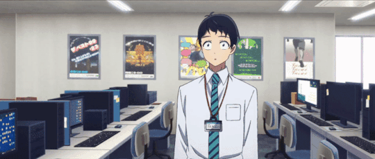
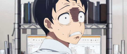
alright, the other day i loosely implied that i would make a behind the scenes/tutorial type of thing. momma didn't raise no liar, so here goes nothing i guess!
step 1) rough sketch
honestly i skip this entirely if have a really concrete idea of what i want to do. sometimes compositions are just beamed into my brain from On High and a sketch is unnecessary.
step 2) 3d ref

this is where i refine the composition, lighting, camera angles, props, etc. i use DAZ studio for model posing and blender for almost everything else (props, horns, lighting, rendering).
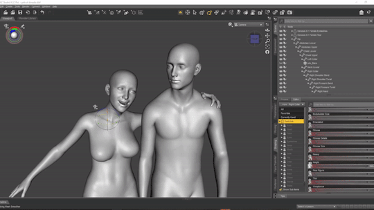
here's a 10 minute video on how to pose models in DAZ if you're interested in doing something like this! it's not very hard! basic posing requires almost no technical know-how.
i've heard magicposer and virt-a-mate are also good for model posing, but i don't have any experience with either program.

after i'm done posing, i transfer the models to blender so i can work on props, environment, and lighting because doing it in DAZ is ass. you can see that i went overboard on the ref for the paladin i worked on last year by modelling armor.
step 3) lineart

at this stage i'm synthesizing my 3d models, reference images, and style choices into lines.
the 3d likeness of my models is poor because I don't have time for that shit, so this is where my humongous folder full of bg3 screenshots comes into play.
for example: looking at my screenshots, astarion's forehead tilts back towards the back of his skull, much more so than my reference model. his chin and jaw are sharper and longer, and the transition between his brow ridge and nose is almost a straight line. if i combine the information from my 3d model and astarion's face, i get something like this:

3d models aren't fleshy (ie, tummy rolls, wrinkles, muscle deformations, butt squish) unless one puts in A LOT of effort like absolute madman chris jones.
you guys know bernini, right? he has a couple great examples of this. see how hades' hands press in on persephone's leg?
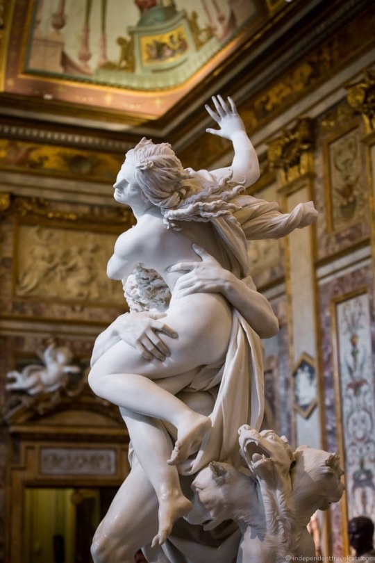

this is what we want to add in the lineart because it's too much effort for 3d. laziness is king.
i guess i draw clothes at this stage too, but for some reason there aren't many in this image. ( ͡° ͜ʖ ͡°)
step 4) base color
i have a little color picked palette that i use for everybody so i get their skintones right before i start messing with colored lighting. i'll use overlay and hard/soft light layers clipped to the base layer during the shading step later.
step 5) shading
if you thought we were done with the 3d part, guess again! i posterize my 3d reference so i can see the shapes of the shadows and highlights better. if i'm not feeling it, i can go back to 3d and change the lighting really easily.
could I make a cel shader for this? yes. am I going to? No. custom shaders are for people with intelligence and I am fresh out. posterization it is.

from there, i do a pretty standard cel shading deal that i usually blur and set to low opacity. (for this image i stuck to no blur because i had been looking at a lot of morebird's art and was really feeling the hard edges)
photoshop is what i use for final rendering because it has bangin tools. the brush customization alone make ps worth it, but i also particularly abuse puppet warp, noise generation, the camera raw filter, and layer styles.

step 6) background
i put the least effort possible into a background and then i blur it into oblivion so you can't fathom the depths of my ineptitude.
and then i have a finished image! ᕕ( ᐛ )ᕗ
#art tutorial#this got long!! the rest is under the cut#i encourage everyone to try out DAZ and blender! theyre both free!!#i love goofing around in 3d
71 notes
·
View notes
Note
the main complaint I hear about magic's game design is mana screw/flood. what if you could play a card facedown as a basic land that's types correlates to it’s color, if it’s 3 or more types it would entered tapped, every turn you make a chrome mox esque choice that adds depth to gameplay, and you could still play lands so players could transition at their own time but they would gradually transition to swapping them out for optimal gameplay.
I have friends who have designed other trading card games. Heck, I’ve designed other trading card games. Everyone who tried to fix the mana system (again, myself included) has come to the realization how important the mana system is.
It’s not a flaw in the system, it’s one of the three genius ideas Richard Garfield created when he designed Magic (what I call the Golden Trifecta). I have a whole podcast in the topic.
115 notes
·
View notes
Text
@hprecfest 2023, Day 4 ❄️
HP Rec Fest daily prompts running through Dec 31. Goal is to find lesser-known or underrated works, even by well-known authors, to feature here.
*
Day 4: Fic with Art 🎨
A Soulmate Like You by @chiocchi (T, 3 parts, complete)
Summary: A soulmate AU where Harry's not supposed to see color until he meets his soulmate, but he can see the color red. Even before learning about Horcruxes, Harry knows something is very wrong.
Why I rec it for this prompt: This is a perfect type of fic to be told in a visual medium. Seeing the world bloom with color from Harry's eyes when he meets Tom for the first time is an absolutely stunning transition, and adds so much depth to just seeing the words on the page.
*
Running list of recs:
Day 1: Favorite under 5k | Such a Noble Villain
Day 2: Comfort Fic | In Somno Veritas | Ouroboros
Day 3: Podfic | a taste so good (i'd die for it)
Day 4: Fic with Art | A Soulmate Like You
61 notes
·
View notes
Text
The Happy Mask Salesman's design makes me wonderfully crazy, and I have to talk about the way my brain processes it because it's a big part of why I love him so much.
[Analysis is under the cut]
——————————————————————–——
The first detail I'd like to point out would be the color theory.
He has the bluer purple on both his tunic and trousers, or the whole piece if you consider it a jumpsuit (I personally don't draw it as a jumpsuit, but I do admit that it might be the most game-accurate interpretation), and it gives him a very direct foundation and center for the outfit's base.
The vest and shoes are a darker magenta, however, which adds hue variation while staying analogous with his tradmeark purple shades, and the light grey is a value used to balance the more saturated purples as an accent.
The golden accessories are a complimentary (opposite) color to purple, which Nintendo seems to be very adept at in general (cough, Splatoon, cough).
Of course, we can't forget his hair. Whichever specific shade you see it, it's always agreed that the color is at least somewhere along the ginger spectrum. The red, orange, auburn, etc. hues are analogous between the contrasting gold and purple, adding a transitional color to link them.
His skin serves the same purpose with the varied addition of having a lowered saturation and a lighter tone to aid the grey in balancing the depth of the color of his clothes and hair.

Though we unfortunately have no canon answer to what his eye color is, Ember Lab's creative decision to make them green may have been the best choice from a design standpoint because it balances out the purple in his clothing and makes his face stand out more.
The distribution of color in this design as a whole is pretty genius to me, as well.

His hair, being the only part of him that's that ginger color, directs the eyes upward to his face, while the main, deep purple is focused on the direct center.
The gold is arranged widthwise across the center, most heavily on the neck once again to direct the eyes upward while also distributing down to both of his wrists for balance on either side, almost like a scale.
The magenta and grey both run lengthwise down (and wrap around) the center and sit in mostly horizontal detailing at the bottom of his legs like the base of a pillar.
It's not something I added to the example image or spoke about before, but his white teeth in his smile are another aspect that is, of course, very eye-catching for his face and important for his design.
There's also the topic of the geometry.
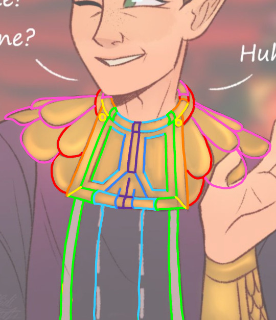

I'm using my own art as an example because this is the way I interpret it, but the first image is just a breakup of how the edges of each section line up with one another in a way that fans out from the center, and the second image is the addition of marks measuring the estimated centers of each section.
Looking closely, you quickly realize how his gorget makes everything line up geometrically, and as a whole, the design is entirely symmetrical apart from the way his hair is parted, which adds all the asymmetry needed to make him feel natural, albeit incredibly well-groomed and organized.
The color of the inner edge of his vest and the the soles of his shoes is the same as the two rows of stitches running down the front of his torso, which gives the otherwise separately-coloured pieces of the outfit a common detail to link them as a set.
(At one point, I think I had an exact estimation for the number of stitches in each row, but I think I started ignoring it in my art to save my sanity. I know it's on my cosplay, though.)
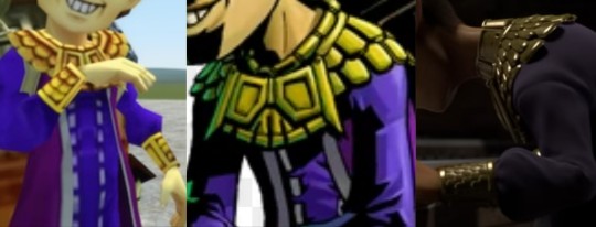
His gorget and bracers also have a matching scallop pattern (though it seems to be debated on whether the scallops of the bracers face up or down), which adds an additional sense of uniformity.
The majority of details follow the lengthwise median, and everything suggests an overall polished feel and a balanced center of gravity. All in all, it's a fantastic design. I've seen so many wonderful takes and artistic adjustments on it, and I've even made my own, but the character designers at Nintendo really popped off with this one.
#happy mask salesman#loz happy mask salesman#the happy mask salesman#legend of zelda#loz#legend of zelda majoras mask#majora's mask#majoras mask#zelda majora's mask#loz majoras mask#the happy mask salesman headcanons#the legend of zelda majora's mask#loz majora's mask#loz ocarina of time#legend of zelda ocarina of time#oot#zelda oot#zelda ocarina of time
46 notes
·
View notes
Photo
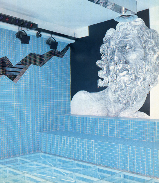


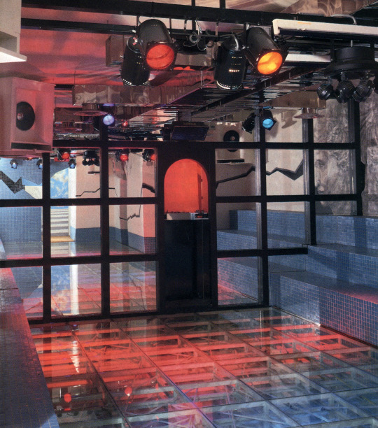

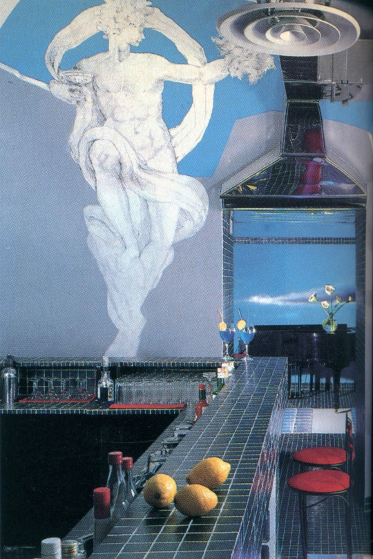
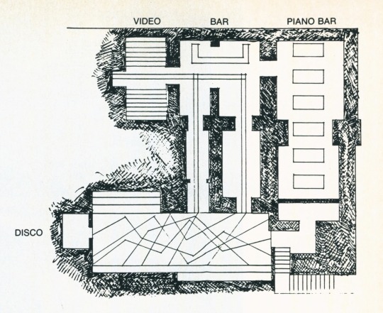
Subterranean Discotheque ‘Olimpo’ - Rome, IT (1987)
Designed by Pino Piantanida
“Mt. Olympus, so legend tells us, was the lofty habitat of the Greek gods, from which the deities ruled over the earthlings. Olimpo, by contrast, is a subterranean complex situated deep in the heart of Rome: a combined discotheque and piano bar, and the current favorite among the nocturnal haunts of the jeuness dorée. As for the reality, the site on which Olimpo stands (or, more explicitly, was sunk into) near the Pantheon was, in the days of Imperial Rome, the site of a complex of Roman baths, a fact whose authenticity was proved during excavations in that area. The boundary walls of the disco area are actually those of the baths. So much for history.
Pino Piantanida, the architect who envisioned and designed Olimpo, found his inspiration in both the myths of antiquity and the historic facts that were revealed to him. Giving his imagination free rein, he has created a dream-like atmosphere: one in which the gods and goddesses appear amid the evanescent clouds of a sky that is sometimes blue, sometimes flame-colored—an effect he has achieved through lighting and mirrors. Should the ancient Romans return to their old haunt, they would doubtless find the whole picture confusing. The young Romans of today. however, take it all in stride, and evidently feel completely at home with it.
For starters, the existing interior divisions of the area (3,800 sq. ft.) were demolished, and all traces of its former incarnations were erased. The space was then divided into three main rooms and one small bar. all interconnected by a labyrinthine system of corridors designed to effect a transition from one room to another and back again, returning by a different route, all of which may mystify the first-time visitor, as the designer doubtless intended it should.
Piantanida likes to think of the descent from the sidewalk into the depths of the disco as a descent into the Roman baths, and so he has used deep turquoise as the basic color here. Distant skies are painted in tempera by Piantanida and Leonardo Tonioni, his assistant, in varying pinks deepening into flame. Thus the three basic elements, earth, fire and water, are portrayed.
The floor of the disco room is made of structural glass and is lighted from beneath with blue, pink and flame-colored tubes that give to the floor a sensation of movement. The upper reaches are lighted only with spots at rare intervals, preserving the mysterious atmosphere. The ceilings and walls, above the "water line," are pure white, except for a simulated black crack, and for the finely drawn greater-than-life-size heads and figures of mythological figures. In the first room the head of Laocoon floats in clouds above the dancers; on another wall Diana fixes a victim with her arrow. Above the bar, Bacchus (after Bronzino) hovers, and in yet another room, the horses of Castor and Pollux assume the same pose as that in which they are seen in the famous sculpture group in the Piazza Quirinale. Structural glass, illuminated from beneath, in the same color combination as that used in the dance floor, is also used for the center paths of the corridors leading from room to room, leaving the walls and ceilings in near-darkness. The piano bar is simply furnished with comfortable chairs, sofas and small tables, and is dimly lit, except for the farthest wall, which has a trompe l'oeil mural of a fiery sunset. Piantanida has achieved his dramatic effects with contrasting lights and darks, and with brilliant hues against black and white. His original injection of mythological figures, finely drawn and of heroic proportions, adds wit to the whole harmonious scheme.”
See Neoclassical PoMo, Pomo Faux Ruins, and Pacific Punk Wave
Scanned from an April 1987 issue of Interior Design Magazine
296 notes
·
View notes
Text
Starting Yet Another creative project to put together my own oracle deck since the one I have is... I mean, it's alright. But I don't really vibe with the art or the card meanings as well as I'd like to. So obviously,,,, I gotta make my own huh.
Details under the cut for length because I'm rambling to myself as I flesh this idea out
I'm using this pad of smallish scrapbooking paper to make the cards since it's a thicker cardstock (and it has nice colors). I figure I'll sketch out my designs and then paint over them since this paper can handle paint without being destroyed. Perhaps a junk journal theme using my large collection of stickers.............
Undecided if I want to cut the papers own in size at all, since one of my main problems is that the oracle deck I have now is hard to shuffle due to card size. Which is... also my problem with most oracle decks, tbh. Scraps would be used for other projects and things. Smaller pages would also be easier to fill, using less materials and encouraging overlapping things for a fuller look.
The other issue with oracle decks is that they just don't vibe. The imagery is usually nice and all, but the cards themselves don't depict things that actually matter to me and my practice. Even if the theme matters or I like the art, there's always That One Card I just don't care for.
Oracle decks, to me, are meant to provide guidance rather than answers. Advice for next steps, inner strengths to draw on, or energetic focuses to improve or deal with a situation. They add color, context, and flavor to readings done with other cards. This deck will be no different. My goal is to create an oracle deck that specializes in general guidance and actionable advice in a broad sense.
As for theme... I mean, it makes sense to center it around The Lady, right? The ideals and imagery I associate with Her would be a good starting place, at least. Maybe a combination of symbols I look for in nature (transitory signals between seasons and parts of seasons) and the Lady's direct symbols.
A list of meanings......
The Lady - Fate as a force, the larger whole, direct message coming through
Yarn - Connections, weaving
Knots - Tying, making connections, fixed moments
Crossroads - Choices, split paths
Death - Change, endings
Mushrooms - Decay, afterlife, resilience
Bread - Creation, rising, hearth
Pen - Writing, creativity, keeping records
Book - History, learning, stories
Paint - Art, inspiration
Key - Opening doors, opportunity, answers
Lock - Secrets, blocked path, challenge, questions
Door - Passage, transition
Sea - Depth, tides, deep knowledge, mystery, movement (eternal)
River - Movement (fast), travel, change
Butterfly - Transformation, transition, trust, day
Moth - Transformation, transition, faith, night
Stars - Dreams, hope, wishes, stories
Void - Space, nothingness, in-between
Moon - Phases, visions, seeing in the dark
Clover - Luck, good fortune
Broken mirror - Bad luck, poor chances, mistakes
Dice - Chance, gambling, games
Playing cards (poker?) - Games, deception, skill
Spider/webs - Trap, sticky, pattern, weaving
Tarot - Divination, the future, advice
Seeds - Potential, sowing
Flowers - Growth, beauty, production, fleeting
Grave/headstone - Death, grief, memory
Candle - Ritual, altar
Lighthouse - Beacon, signs, lookout
Eyes - Knowing, seeing
Ghosts - Afterlife, spirits
Bees - Industry, teamwork
Sunrise/sunset - Beginnings, endings (the only reversible card?)
Leaves (different colors) - Changing seasons, time passing
......and probably more as I start putting these dang things together. Once they're finished, these cards will replace the ones I currently use for add-ons in paid readings. I'm looking forward to making these!!
#aese speaks#divination#oracle cards#diy divination tools#fun fact: i stood up to make coffee & breakfast before writing under the read more#and just wrote 'gottem'#but forgot between doing it and getting the coffee. so i did indeed. get myself#also. i think kofi supporters will get a look at individual cards as i make them#so. yeah#hello fellow tag readers
13 notes
·
View notes
Photo

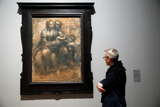
Scientists Identify Secret Ingredient in Leonardo da Vinci Paintings
"Old Masters" such as Leonardo da Vinci, Sandro Botticelli and Rembrandt may have used proteins, especially egg yolk, in their oil paintings, according to a new study.
Trace quantities of protein residue have long been detected in classic oil paintings, though they were often ascribed to contamination. A new study published Tuesday in the journal Nature Communications found the inclusion was likely intentional — and sheds light on the technical knowledge of the Old Masters, the most skilled European painters of the 16th, 17th, or early 18th century, and the way they prepared their paints.
Scientists confirm long held theory about what inspired Monet
"There are very few written sources about this and no scientific work has been done before to investigate the subject in such depth," said study author Ophélie Ranquet of the Institute of Mechanical Process Engineering and Mechanics at the Karlsruhe Institute of Technology in Germany, in a phone interview. "Our results show that even with a very small amount of egg yolk, you can achieve an amazing change of properties in the oil paint, demonstrating how it might have been beneficial for the artists."
Simply adding some egg yolk to their works, it turns out, could have long-lasting effects that went beyond just aesthetics.

Eggs vs. oil
Compared with the medium formulated by ancient Egyptians called tempera — which combines egg yolk with powdered pigments and water — oil paint creates more intense colors, allows for very smooth color transitions and dries far less quickly, so it can be used for several days after its preparation. However, oil paint, which uses linseed or safflower oil instead of water, also has drawbacks, including being more susceptible to color darkening and damage caused by exposure to light.
Because making paint was an artisanal and experimental process, it is possible that the Old Masters might have added egg yolk, a familiar ingredient, to the newer type of paint, which first showed up in the seventh century in Central Asia before spreading to Northern Europe in the Middle Ages and Italy during the Renaissance. In the study, the researchers recreated the process of paint-making by using four ingredients — egg yolk, distilled water, linseed oil and pigment — to mix two historically popular and significant colors, lead white and ultramarine blue.
"The addition of egg yolk is beneficial because it can tune the properties of these paints in a drastic way," Ranquet said, "For example by showing aging differently: It takes a longer time for the paint to oxidize, because of the antioxidants contained in the yolk."
The chemical reactions between the oil, the pigment and the proteins in the yolk directly affect the paint's behavior and viscosity. "For example, the lead white pigment is quite sensitive to humidity, but if you coat it with a protein layer, it makes it a lot more resistant to it, making the paint quite easy to apply," Ranquet said.
"On the other hand, if you wanted something stiffer without having to add a lot of pigment, with a bit of egg yolk you can create a high impasto paint," she added, referring to a painting technique where the paint is laid out in a stroke thick enough that the brushstrokes are still visible. Using less pigment would have been desirable centuries ago, when certain pigments — such as lapis lazuli, which was used to make ultramarine blue — were more expensive than gold, according to Ranquet.
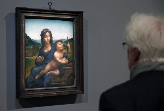
A direct evidence of the effect of egg yolk in oil paint, or lack thereof, can be seen in Leonardo da Vinci's "Madonna of the Carnation," one of the paintings observed during the study. Currently on display at the Alte Pinakothek in Munich, Germany, the work shows evident wrinkling on the face of Mary and the child.
"Oil paint starts to dry from the surface down, which is why it wrinkles," Ranquet said.
One reason for wrinkling may be an insufficient quantity of pigments in the paint, and the study has shown that this effect could be avoided with the addition of egg yolk: "That's quite amazing because you have the same quantity of pigment in your paint, but the presence of the egg yolk changes everything."
Because wrinkling occurs within days, it's likely that Leonardo and other Old Masters might have caught onto this particular effect, as well as additional beneficial properties of egg yolk in oil paint, including resistance to humidity. The "Madonna of Carnation" is one of Leonardo's earliest paintings, created at a time when he might have been still trying to master the then newly popular medium of oil paint.


New understanding of the classics
Another painting observed during the study was "The Lamentation Over the Dead Christ," by Botticelli, also on display at the Alte Pinakothek. The work is mostly made with tempera, but oil paint has been used for the background and some secondary elements.
"We knew that some parts of the paintings show brushstrokes that are typical for what we call an oil painting, and yet we detected the presence of proteins," Ranquet said. "Because it's a very small quantity and they are difficult to detect, this might be dismissed as contamination: In workshops, artists used many different things, and maybe the eggs were just from the tempera."
However, because adding egg yolk had such desirable effects on oil paint, the presence of proteins in the work might be an indication of deliberate use instead, the study suggested. Ranquet hopes that these preliminary findings might attract more curiosity toward this understudied topic.
Maria Perla Colombini, a professor of analytical chemistry at the University of Pisa in Italy, who was not involved in the study, agreed. "This exciting paper provides a new scenario for the understanding of old painting techniques," she said in an email.
"The research group, reporting results from molecular level up to a macroscopic scale, contributes to a new knowledge in the use of egg yolk and oil binders. They are not more looking at simply identifying the materials used by Old Masters but explain how they could produce wonderful and glittering effects by employing and mixing the few available natural materials. They try to discover the secrets of old recipes of which little or nothing is written," she added.
"This new knowledge contributes not only to a better conservation and preservation of artworks but also to a better comprehension of art history."

By Jacopo Prisco.
#Leonardo da Vinci#Scientists Identify Secret Ingredient in Leonardo da Vinci Paintings#italian artist#painter#painting#egg yolks#egg yolk in paintings#art#artist#art work#art world#art news#old masters
63 notes
·
View notes
Text
INTERVIEWS - ADULT FAME DR
REMINDER! I haven’t shifted yet, so all these is just my imagination 🤍
masterlist - main mastelist
Interviews, a dynamic form of communication, serve as a gateway to understanding individuals, their experiences, and their perspectives. Whether conducted for journalistic purposes, research, or casual conversation, interviews unravel stories, insights, and the diverse tapestry of human narratives. Through questions and answers, interviews facilitate connection, exploration, and the exchange of knowledge, offering a platform to explore the depth and richness of the human experience.
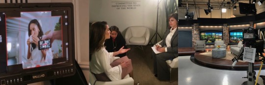
THE TONIGHT SHOW - JIMMY FALLON
2019
Appearing on "The Tonight Show" with Jimmy Fallon was an absolute blast. We sat down to discuss my upcoming film, "Knives Out," diving into the intriguing details of the project. The conversation seamlessly flowed from the movie to my recent photoshoot, which evidently left everyone with their mouths agape. Jimmy, true to his playful style, explored various facets of my life, including my marriage with Penn, a topic we hadn't openly discussed before. The atmosphere was light and enjoyable as we delved into a range of topics, spiced up by games that had us both laughing. The entire experience was a perfect blend of fun, genuine conversation, and a touch of Jimmy's signature humor, making it a memorable night on "The Tonight Show."
HOT ONES - SEAN EVANS

2021
Appearing on "Hot Ones" was an exhilarating experience that blended spice, humor, and insightful conversations. While I might not have aced the wing challenge, the intense flavors added a unique element to the interview. Adorned with plenty of jewelry, devouring wings proved to be a slight challenge, adding an amusing twist to the fiery ordeal. Sean Evans skillfully steered the conversation through my future projects, providing a platform to discuss everything from quarantine experiences to the unexpected hobbies I explored in my free time. The entire encounter was a flavorful journey, where the heat of the wings mirrored the warmth of engaging discussions on "Hot Ones."
WIRED AUTOCOMPLETE INTERVIEW
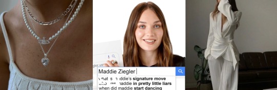
2021
The Wired Autocomplete Interview was a solo adventure filled with fun, especially after just wrapping up filming for the new sequel "Top Gun: Maverick." As I navigated through the most searched questions about me on the internet, the queries ranged from the infamous kiss between Andrew Garfield and Ryan Reynolds at the Golden Globes (an event I attended) to unraveling the story behind a song I wrote five years ago. Exploring topics like my transition from medicine school to acting, the interview provided a platform to address lingering curiosities. The experience was not only informative but incredibly enjoyable, and I left with the feeling that I'd gladly dive into it again.
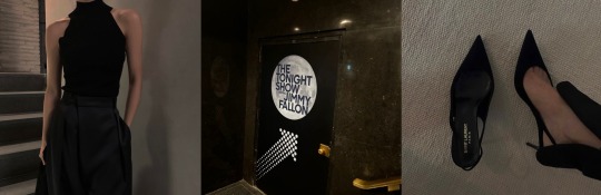
SPILL YOUR GUTS - JAMES CORDEN
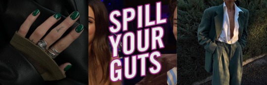
2022
Stepping into the "Spill Your Guts" segment with James Corden alongside Miles Teller was quite the adventure, especially as we discussed our latest film, "Top Gun: Maverick." Rocking a green suit and a white T-shirt, topped off with green nails, I brought a colorful vibe to the interview. Things got personal when they probed about my marriage with Penn, a topic we had kept private since our separation. The questions delved into the reasons behind our divorce, shedding light on a part of my life rarely discussed in the press. To add a twist, there was even a question about revisiting a relationship reminiscent of our (miles and I) teenage years. The segment blended humor, revelation, and a touch of nostalgia, giving viewers a unique peek into the unexpected turns of celebrity interviews.
73 QUESTIONS - VOUGE

2022
Vogue's 73 Questions interviews not only offer a rapid-fire insight into the lives of celebrities but also grant fans an unprecedented peek into their homes. As I navigated through the questions, my fans got to explore various corners of my house, creating a more intimate connection. The inquiries ranged from my hobbies to a tour of my extensive library, where I shared books I've read, those waiting to be explored, and even recommended some favorites. Responding to the curiosity about my culinary skills, I discussed what I enjoy eating and whether I possess any culinary prowess. To add a musical note, they asked me to play the piano, a personal touch that added an extra layer to the interview. Vogue's 73 Questions not only captures the essence of celebrities' lives but also establishes a direct and engaging connection with the audience.
VANITY FAIR LIE DETECTOR

2023
Participating in Vanity Fair's Lie Detector interview alongside Ryan Reynolds and Blake Lively was an absolute riot, made even more memorable by the fact that I wore an entire pink outfit that drew compliments. The atmosphere was lively and playful throughout, and we had an incredible amount of fun. In a particularly memorable moment, Ryan turned the tables on me, asking about a quirky incident during quarantine when his beloved Canadian maple syrup mysteriously disappeared. Despite my denial, the lie detector hilariously exposed the truth, and Ryan, who has a deep love for that syrup, was genuinely offended. The revelation left us all in fits of laughter, and Ryan playfully expressed his dismay, sharing that he had to wait a whopping two years to go back to Canada and buy his cherished maple syrup again. The Lie Detector interview, with its blend of humor, fashion flair, and unexpected revelations, became a delightful and beautiful experience.
THE TONIGHT SHOW - JIMMY FALLON
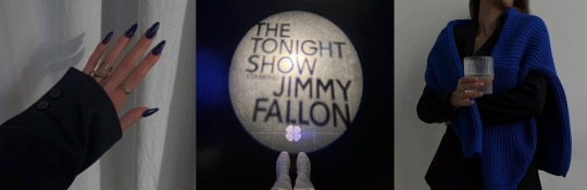
2023
During my recent appearance on "The Tonight Show" with Jimmy Fallon, we delved into the exciting details of my upcoming film, "The Seven Husbands of Evelyn Hugo." Jimmy expressed his admiration for the character and my performance, playfully saying "I think the academy is calling Winter!" Our conversation extended to the source material, the book, where we shared our favorite scenes and discussed the nuanced differences between the film adaptation and the literary masterpiece. I revealed that I was already a devoted fan of the book before the film was announced, and my audition was fueled by a genuine love for the character of Evelyn Hugo. Expressing how the role had elevated my craft, I shared with Jimmy that stepping into Evelyn's shoes was not just acting; it was a transformative experience. At the premiere, I found myself feeling more like Evelyn Hugo than Winter Jackman, a testament to the immersive joy that this role brought to my journey as an actress.
#jimmy fallon#the tonight show#shifting realities#desire reality#shifting#adult fame dr#fame dr#fame dr shifting#actress#actress dr#actress shifting#ryan reynolds#blake lively#taron egerton
12 notes
·
View notes
Note
What are some of your favorite ways to add personality to an interior room/space in your builds?
Hello, @ellemant!
This is such a neat question thank you for sending! I will try to explain without sounding too much like a nonsense columnist, lol.
I've sat and pondered this for a while, and I think the way I approach a build is what translates as personality for those who enjoy my stuff. I think for me, my process always first involves understanding what the home or space is supposed to convey. Lately, that has been an exploration of transitional and timeless luxury. Every time I build and decorate, I do so with myself mentally standing within the room, waiting to interact with the space.
First I start with the structure, and I place a ton of emphasis on designing rooms that make use of light (because in real life, there is nothing more calming to me than being able to bask in a room bathed in the golden hour) and that alone can bring so much majesty and presence to a space. A good structure should be it's own living entity, while objects and fixtures enhance it, if the building itself doesn't speak or invoke an emotion, then I feel it lacks personality. Adding in some beams, or crown molding or paying a lot of attention to balanced proportions are good tips to improve physical builds.
Lastly, in terms of actual furnishing, I used to subscribe to the color palette everything must match theory. I've since moved on to treating each room as it's own space, and focusing on variation that compliments but doesn't match. I feel this has given a lot more maturity and depth to my most recent builds and I'm really enjoying exploring textures, patterns, and styles I wouldn't normally select. I hated checkered floors, for example, and now, I have fallen in love with them. Mustard wasn't a color I would consider to be nice, and yet, an injection of it in luxurious textures like velvet feels exciting and decedent in a room.
Sorry this was super long, and probably didn't answer the actual question because TLDR, I'm not sure what outside of obvious things like, placing sims personal in game photographs or adding clutter makes a space seem different.
19 notes
·
View notes
Note
Do you have any advice for drawing with markers? I'm trying to improve and wondering how you do it so well
alright yes i do. okay so markers are all about LAYERS of color. so here's some WIP's of a work i did recently we'll walk through some tips.
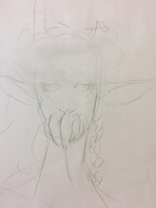
so step one here is the sketch. you'll want to get either a kneaded eraser or just be careful, and lightly erase over the entire image. this picks up loose graphite, and keeps your markers from smearing gray across the entire thing.
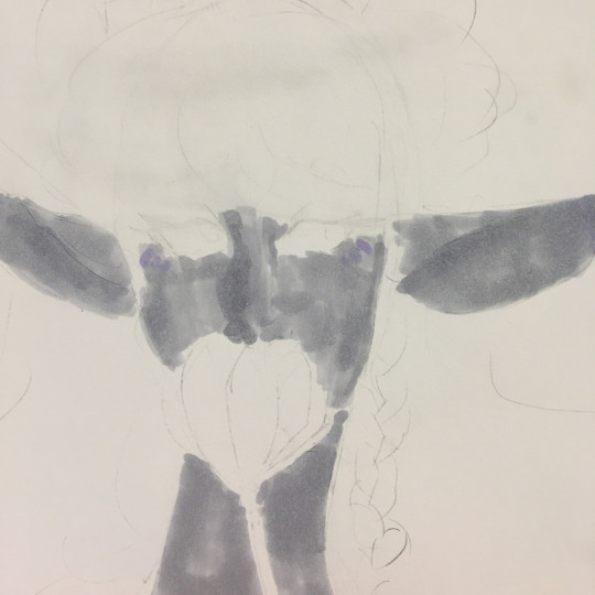
so i lay down a base layer. this isnt actually one marker though, its three. using the lightest marker, block out everywhere youre going to color. use circular motions or a brushtip if you can to avoid streaking like what's in this shot. then, if you have markers of very similar hues, begin darkening the picture where you need to. in this case, it was the ears and side of the nose.
remember: YOU CAN ALWAYS GO DARKER, YOU CANNOT GO LIGHTER.
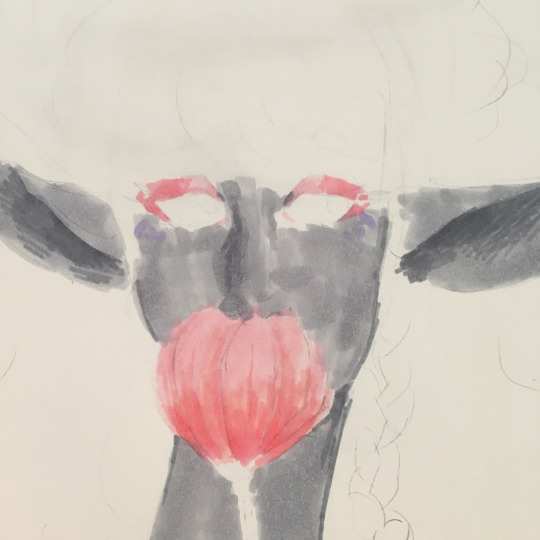
i then went in to block in her makeup, the tulip, and darken some of the shadows. you can see specifically in the ears and neck that ive used the smaller tip of my chisel markers to slowly transition it from one marker to another. blending doesnt exist in markers. you just need to IMPLY a gradient. the flower is a good example as well. use multiple markers, and slowly make your way from one half of the gradient to the other.
a lot of what i can do is due to the fact i have so many markers. if you need large marker packs and cannot afford copics, try arrtx. that's what i used for the flower in this.
when i draw hair- something i know people want to know about a lot- i start with my lightest color, and sketch in the directions the hair is flowing. for stelle here, her bangs swoop down and to the right, so thats the direction i will lay down those colors. its like painting.
also in this, you can see how deep ive made the insides of her ears, and how ive used a dark gray to line her face and give it shape.
this shot is also a good example to show how i fucked up on her earrings, and since i cannot go lighter, theyre going to be tinted gray now. just something i forgot to keep in mind.
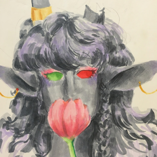
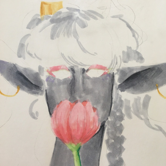
alright theres a lot to talk about in this one. firstly, let's talk about UNDERTONES. to give your piece more depth and life, you can go in with other colors besides your main shading color- in my case, gray- to make the piece pop. ive switched to a light purple, and have added it as a highlight to her cheeks, tips of her ears, and hair. it brings out her hair, and makes it seem fuller. less flat.
a lot of how i use markers is with curved strokes and many colors to sculpt out an image, rather than just filling in the lines. this is why i add line art last.
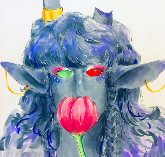
okay one step at a time with the finished picture.
first step here is line art. youll notice how i dont harshly outline every single part of the piece. instead, i lightly go around areas i think need defining. i outline her horn cuff, i outline her ears, her eyes, and then i loosely go around her hair with similar strokes to when i sketched it in the first place.
second step is a white gel pen. it can be a simple jelly roller theyre really cheap. just make sure it works. if your pen isnt rolling smoothly, try warming it up in your hands by rubbing it quickly between them. if not, try multiple pens before buying them. bring a piece of paper to your local michaels or hobby lobby or other craft store, and see if it rolls smoothly on YOUR paper. then, go around anywhere that needs a highlight. i did this over her eye markings, her makeup, tiny dots over her earrings, and over her hair to once again round it out.
my final tip is to adjust your pictures in some kind of editor once you are finished. i went in just using the basic iphone settings, and messed around with it until it matched what i wanted the pic to look like. in this case, i turn the highlights to the left, and played around with the temperature and tint settings, and messed around with their basic filters. honestly, just play with it until you think it looks good.
those are my tips for coloring! i hope this is comprehensible!!
108 notes
·
View notes
Note
hi!!!! so ik your focus is on audios (which are absolutely amazing btw) but i was wondering if you could maybe explain how you color/render your artwork? i’m new to digital art and have been struggling a bit. if not that’s totally okay!! i understand <3
Hi! I totally can, though this is gonna get long lol. I tried going in depth? I'm not too great at explaining things so I'm 100% cool with clarifying things if needed. This isn't TLOU art, I was re watching Devilman Crybaby and sketched this out last night. I saw this ask right as I was about to start so the timing was perfect lol
I'm gonna try to go step by step? I haven't rendered digitally in a while, mostly just sketching. Also, this is kinds rushed, it's late, but it explains everything (I hope?)
1.After I do my sketch, I do a fuck ton of blending. It helps me build shadows/depth and I also just like the way it looks. (I also duplicated my sketch in case I mess up and can't go all the way back)
2. Ok, a lot happened, I zoned out, but I swear it's not a lot. I use a grey base on one layer. I clipped color layer to the grey base so that I wouldn't go out of the lines
I changed the line art color to a reddish-brown (which helps me with blending into the skin later) and I added the base color and certain tones.
This character is on the paler side, so a lot of the colors I'm gonna use are cool (blues, greens). And I'm gonna use a ton of red(bc blood flow, and a ton of blush is a stylistic choice for me).

Note: Instead of going straight in with a blending brush, I use transition colors. Blending brushes are good too, I used one for blending the initial sketch, but transitional colors just make everything flow a bit better than just blending two completely different colors. (Color pick between different shades/colors to blend, its tedious but it's what I do)

3. I created a multiply layer and deepened the shadows a bit using the same color as the base skin color, and I made a highlight layer as well (the opacity is pretty low on both the highlight and the shadow layer, you gotta mess around with it)
Has it felt like I've been rendering this entire time?? Absolutely. Have I? No.
I make the initial stages of my drawing all annoying so that when I get to the *checks notes* 8th layer, I can just do the fun stuff. I'm not done at all, but the rendering layer itself is pretty simple, I just add all the stuff that makes the drawing look less dull. Adding more pinkish color on the lips, nose and cheeks. Bringing back a lot of green and blue (that's just a style thing, also there is a 9th layer but thats just the little white highlights)
This definitely isn't the "correct" way to do this (there is no right way), but it's how I do it. I would show how I render hair but:
1.I have no clue what I'm doing when I do it, I just fuck around until it looks decent (even more so than I do with the skin)
and
2.My chair is hurting my butt
All in all, you just gotta practice a bunch and figure out what you like. Using pinterest and Youtube helps me a lot when I'm stuck or need a refresher💕
Again, please let me know if I need to explain something better, I'm not great at teaching stuff like this😅
I might finish this, I probably won't, but if I do, I'll post the full thing.
Update: I finished
23 notes
·
View notes
Text
Zom 100 - Bucket List of The Dead Episode 1: Akira of The Dead

I'll lay my cards on the table right from the start: I haven't read Zom 100, and at this current moment I have no real intention or interest in doing so. Why might I be watching the anime then? Well because it's BUGS FILMS first anime, that's why. They've done production assistance on series like Komi (due to staff overlap at the time), and have parted themselves out for key animation here and there, but this is their very first lead and solo production. Of course I'm going to see how it is. And how is it? Well, it's a grab bag of insanity handpicked from the minds of the creative team behind this adaptation, crafted with surprising expertise, and delivered in a very polished package to the eyes of viewers. So yeah, very good, and very much plenty to talk about!
I think one of the most interesting things off the bat is how strong the direction is through this first episode. Kawagoe Kazuki (who's first direction credits were for Komi) brings the heat through this first episode as the lead and episode director, as well as storyboarder. Back to why the direction is interesting though, initially you might think "oh, widescreen because it's a movie, and it just has a more muted color palette", but that's not the case. It's a bit of a two in one, where the widescreen indicates that we're looking through Akira's eyes, and the lack of color is a reflection of their outlook. It's well done, but I also think they could do a bit more to really explore the idea, but in its current state it's still really solid.
While not as important as the widescreen effect and use of color, the transitions boarded by Kazuki themself are very creative and blend incredibly well with the episode. Just one of those things that adds some real nice flair and style that can help tie the bleaker/more plain moments together with the more showy ones through the latter half of the episode.
What you can (sort of) see through these gifs though is another important piece that I think is well done through the episode: the "zombification" of Akira himself. More sluggish and unresponsive, coupled with heavy and off balance movements. The entire concept of the gradient and Akira's descent into depression and exhaustion is very well depicted. Towards the end of his backstory though is arguably the best pieces for his despair, just really well done animation and direction that sells that zombie side of his character.
Also, just a little side piece. Following this scene we return with Akira to his room where we see on the news the beginnings of the zombie outbreak. But actually, the episode spoils the fun a few seconds in advance with the ambulance that passes by Akira's apartment. Just a really neat little detail to show that the outbreak isn't just a single point that's currently starting, but rather it's already expanded to a network that continues to grow.
Anyways, the next topic of the post: depth!. I mean, you can see it in the above still as well, a lot of scenes are well layered with their content. Not all of them will have detailed parts that are all moving, but they will provide the context that there is a greater world that exists outside of Akira's vision (though this does fade as his exhaustion and depression grow).

Also, people aren't explicitly required to provide depth or layers to a scene, it's just that they're the easiest examples to provide. These solo shots manage the same effect, for example.


Coincidentally, this is also where the episode picks up! Flashes of color appear, Akira regains his energy, and a horde of zombies claw at his heels. I was very surprised with this latter half, and I mean very. They use some really sneaky tactics to make the best of the moment. Have a zombie that's going to make a lunge for Akira? They're in 2D. Have a zombie in the background that's going to just zombie about? Make em 3D. The heavy visuals effects coupled with the more "rough" art style allow them to blend in really well unless you're looking right at them.
For example (though it may be hard to tell because of compression and size, so best to open the image in a new tab), take a look at this still and see if you notice anything. That's correct! The first two zombies in the row are 2D (because they lunge at Akira), while the rest in the line are 3D. Really smart workflow that's further bolstered by direction that does its best to mask the 3D zombies.
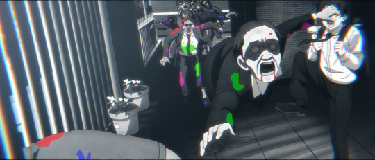
For a purely 2D affair though, this incredible short cut from Akira fleeing up the stairs. I'm endlessly impressed with how solid BUGS' work is through this first episode.

As you can tell, this second half/latter third brings an insane amount of energy to make up for how devoid of it Akira was through his backstory. It's really great work, and the flow of the action through Akira's chase sequence is really impressive. They do a great job with interacting with the environment while providing a cramped feel through the apartment complex alongside some "right behind you" tension. All of which leads to this moment, essentially the perfect personification of this half of the episode.
Just completely out there and ridiculous work that's strung together by loose threads to create a bigger picture that completely captivates viewers. Does it have to make sense? Definitely not. Does it have to look cool? Absolutely.
I could share a lot more about the episode past this point, but I'll limit myself to this last piece: the tone changes. It's not longer Akira's life or death situation that feels very tight and narrow, it's his escape towards freedom that gives him plenty of space (which is shown in these shots). It's a somewhat subtle difference, but provides a massive gap in feel for viewers.
Well, when you extract it from the chase sequence at large, it's pretty obvious: there's hardly any zombies in frame with Akira.


And so we cruise into the end of the episode with a fight sequence here, and a chase sequence there, leaving off with Akira on his own and making his bucket list of things to do. There's lots more to chat about in regards to direction with things like the first person views and the really impressive blending of 2D and static/3D environments, but I think the point has gotten across that Kazuki's direction, and BUGS FILMS work as a studio, is incredibly expressive, dynamic, and punchy, leaving viewers with quite the promise for this season at large.
My only real concern is if the source material for Zom 100 can continue to deliver ridiculous ideas in spades for BUGS to convert on. I'm rather confident in their ability as a studio since they've worked as a third part/assistant on a number of series, so I'm just really hoping that the creative vision can hold the momentum given to it through this first episode.
#zom 100: zombie ni naru made ni shitai 100 no koto#zom 100: bucket list of the dead#bugs films#zombie anime#anime recommendation#anime review#anime and manga#ゾン100~ゾンビになるまでにしたい100のこと~#anime#horror anime#comedy anime
22 notes
·
View notes
Text
The Wonderful Story of Henry Sugar (2023) Review
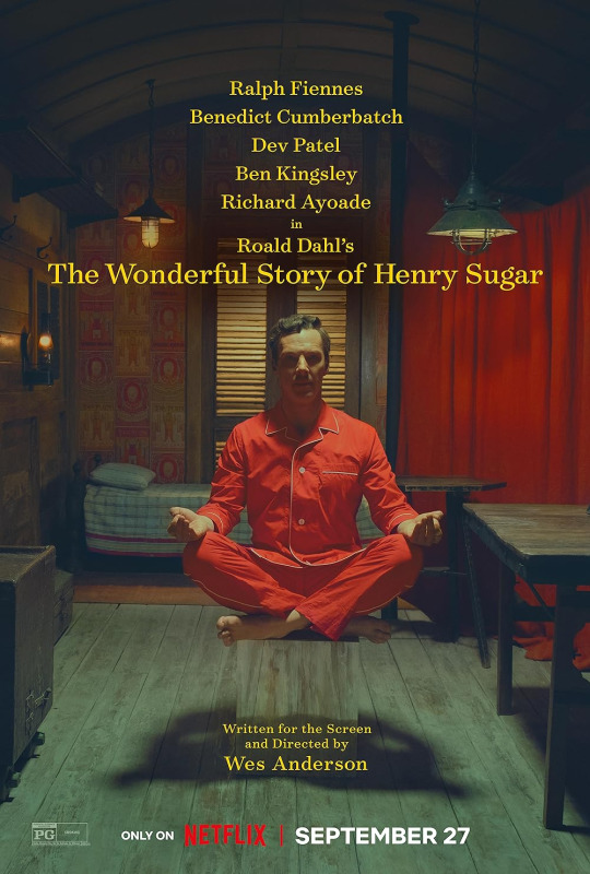
As the new dawn broke, my eyes fell upon the streaming interface of my Netflix account, and at that moment it was that I noticed it. "What's this?" I cried. "Another Wes Anderson film already?" I drank my cup of water to catch my breath. "But it's only been a month or two since his last one!" I thought. I stood up and slowly applauded Mr Anderson for his dedication to his busy schedule. "Right then, let's get to it." And with that, I sat back down and happily sighed in preparation for the unorthodox piece of storytelling whimsy that awaited me in the next 38 minutes.
Plot: Henry Sugar, a wealthy man, decides to take on an extraordinary challenge - he wants to master an extraordinary skill in order to cheat at gambling games.
I'm in the minority when it comes to my opinion of Wes Anderson's most recent film release - Asteroid City. Even though I enjoy Anderson's uniquely symmetrical and colorfully vibrant directing style, I did find that movie came off a bit too obnoxious and pretentious for my liking. That has not swayed me away from the talented director though, as The Grand Budapest Hotel is still one of my favourite indies to come out this century (if you're a collector such as myself seek out the superb Criterion release of this) and by the way managed to make the colour pink look cool before the Barbie blockbuster came about, and Moonrise Kingdom is an innocent coming-of-age comedy that used humour to deliver its internal message about 'the end of childhood', but presented not as a loss, but more-so a compromise. Wes Anderson is a tour-de-force with his own distinct vision, so individuals such as him should be cherished in modern-day cinema that is saturated with unoriginal mediocrity. So for Asteroid City, I forgive you, kind sir.
With The Wonderful Story of Henry Sugar Wes Anderson returns to adapting Roald Dahl's works, and seeing as how in the past he so fantastically brought to life in stop-motion Fantastic Mr. Fox, it seemed like the return is a welcome one. And indeed Henry Sugar is a most delightful little Netflix short film, that very much reinstates the fact that Anderson and Dahl are a match made in heaven. This starts right with the title, as with The Wonderful Story of Henry Sugar Anderson sets out to tell a story literally. In the film, all the characters also narrate everything they do and say, as such at times you feel like you're listening to an audiobook. You can literally watch this movie with your eyes closed and you'd still know exactly what happens. Ironically, seeing with your eyes closed is a primary theme of this short. But also you would be doing yourself a disservice keeping your eyes shut. The production design is impeccable with the entire thing feeling almost like a live theatre performance. With the set design and scene transitions, Henry Sugar exudes a distinct theatrical vibe, adding a layer of whimsical charm. And the moving sets are wonderful to look at, with the colors and detail nothing short of superb. The entire thing is simply overflowing with creative charm.
This is Benedict Cumberbatch's first entry into the Wes Anderson verse, yet it is shocking that it took this long to happen, as the Sherlock alumni is known for his fast-talking swift line delivery, and with the amount of dialogue Anderson always gets his actors to churn out in every scene naturally makes Cumberbatch appear right at home. Even at this short's rapid 38-minute runtime, Cumberbatch manages to add layers of depth to the peculiar Henry Sugar, from the small facial expressions as his character processes certain revelations. The rest of the ensemble does their part to add to the whimsy of the whole piece, with Dev Patel shining especially with his delivery of the fourth-wall-breaking narration, fast-talking his lines of dialogue with brisk elegance, and in the same breath managing to throw in the "I said" and the "he cried out loud".
All in all A Wonderful Story is a mesmerizing dance of wit, wonder, and whimsy that is aesthetically pleasing, and the story itself is an enjoyable little bedtime tale that, though not particularly deep. Look, cynically speaking it's a story about a man who reads a book and then learns a technique that allows him to easily make money. That's about it, however, it's the overall presentation and Anderson' touch that makes this the delightful piece of tapestry that it is. If you're a Dahl and Anderson enthusiast, I mean, there's really no excuse then for you to miss this.
Overall score: 7/10
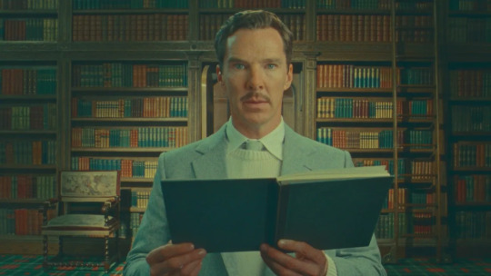
#wes anderson#roald dahl#the wonderful story of henry sugar#netflix#short film#comedy#adventure#drama#theatrical#benedict cumberbatch#dev patel#ben kingsley#ralph fiennes#richard ayoade#henry sugar#the wonderful story of henry sugar review#2023#2023 in film#2023 films#streaming#the man who sees without using his eyes#movie#film#movie reviews#film reviews
13 notes
·
View notes
Last Seen Blogs