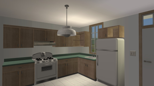
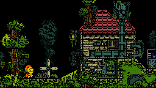
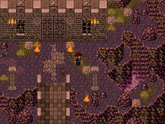
#really enjoying this style + color palette combo
Text
here's my ranking of some of the playline eugene dolls because the lack of top tier eugene dolls is so sick and twisted...
#1: disney store 2020
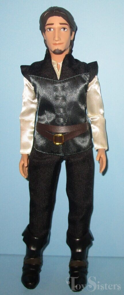
i really like this face mold and screening! the best eugene doll the bar is in hell. there's still something missing but i'm not going to be fussy. though they're significantly better than some, i'm not sure if i'm enjoying the clothes 100%. i like the pattern they used for his doublet to make it movie accurate, but i believe they could've gotten different fabrics for it and the belt. though we should thank god day and night that the details aren't printed on a paper like fabric. this is five stars for modern doll standards... there should be a classic doll like him. a shame that we've never seen this doll again... he gets a reluctant 10/10 from me.
#2: mattel (old)
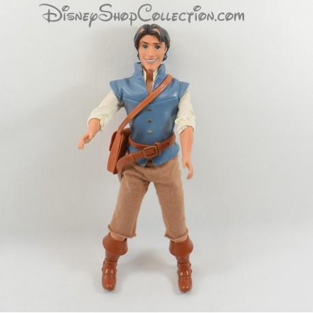
hate hate hate hateee that face mold + screening, fucking nasty. though he looks like he's gonna scam the fuck out of you so accurate for flynn rider i guess. why is he so high then if you hate him so fucking much you might ask. it's the clothes and his accessories. i really like that his doublet is movie accurate and (fake) leather. his belt is very detailed!! so is his satchel. like the boots, though it's kinda hard to fuck up the boots so not giving him any points for his boots. my only gripe is that his pants' aren't very great. should've been velcro or snaps instead of that elastic.. he's destined to give justin biebs circa 2010 but it's ok. can be fixed if you have trust in your sewing. also don't like that he has elastic hips.. he has GOLDEN ELASTICS tho. monster high ghouls.. eat your hearts out. 8/10. solely for how much i like his doublet and belt.
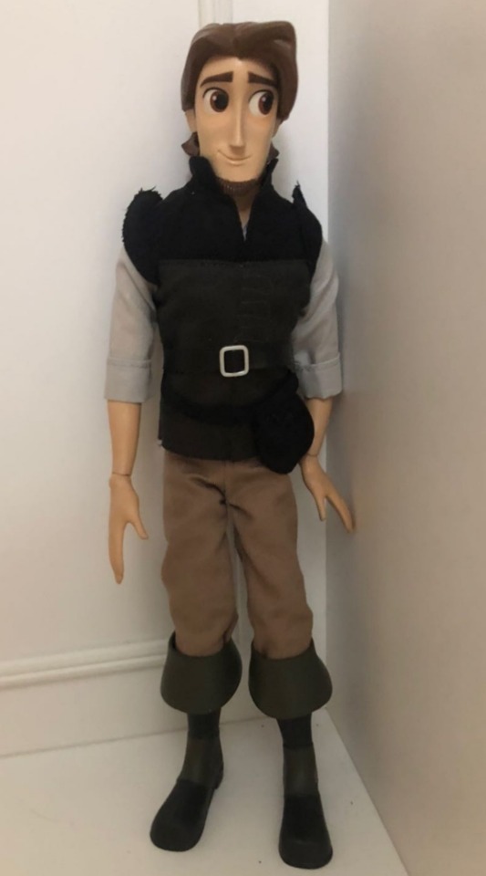
#3: older disney store variants
that hair naurrrr they didn't even bother with like carving some details. they couldn't get my man's visage right. his goatee is evil. the mold itself is fine, it's just the screening i don't like. clothes are mid :/ i don't hate them but i don't particularly like them. i definitely know at least 3 men that look like these dolls. not great but serviceable. 7/10.
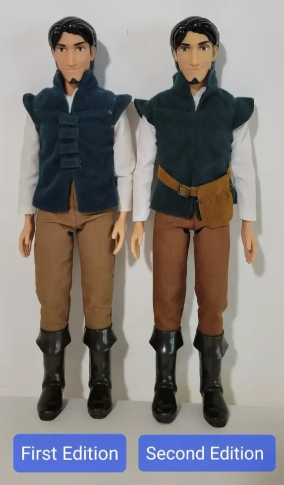
4: mattel (new)

THEEEE QUALITY DROP! CLAP FOR THE QUALITY DROP! the printed on details?? the painted on pants????? with a bad face mold & screening combo? JAILLLLLLLLLLLLL!! i like the hair, the belt with the pouch and the boots though. old mattel slays hard and this one def can't hold a candle to him... but i prefer this color palette i guess.. he looks marginally cuter than his stock image irl tho. 5.5/10
#5: simba toys

he's just a little boyyyy !! wandering around the cityyyyy :3 his proportions are... interesting. but he's cute enough so he can get away with it. his clothes are ok. at least it's not printed on details. i only want this doll because i want to display him with my simba toys rapunzel. she looks so fucked up (affectionate) i love her. this eugene gets a 5/10. though he's also a 10 if you get it you get it sorryyyyy
#6: disney collection/disney store tangled the series
he is show accurate, no doubt. but the show's art style doesn't always work for eugene and in the doll form.. he's just not it 💔 i like the clothes tho. he looks like a parrot (affectionate). i also have personal history with this doll. this set with rapunzel is my bleeding wound. 3/10!
#7: hasbro tangled the series
not enough words in the english language to describe my hatred for him -100/10... boooooo!!!! tomato tomato tomato
16 notes
·
View notes
Text
2023 wrapped: webtoon edition!
my final 2023 wrapped post for the year! unlike previous ones, this list is every series i read this year vs. ones that started this year. previous lists for this year:
cdrama edition
kdrama edition
ranked from least favorite to most favorite, which doesn't mean objectively best, just ones that hit me more. ones that are completed series will have a * after the title
15 my deepest secret*. omfg i hated this webtoon. the twist was asinine and frankly ignorant. none of the characters were likeable by the end. hate quit this one with like 5 chapters left to go i just couldnt
14 my second husband. seemed promising at first! i was hooked for the first 40 chapters or so but then it just started getting weirdly paced, had big plot holes, and nothing ever felt like it was getting resolved. the ML had like 0 charisma as well. dropped.
13 to love your enemy. this one was REALLY fun until the cult arc hit and then it was the biggest wtf is happening. dropped it shortly after
12 i dont hate us*. i liked this one until the timeskip ending, where then everyone and everything just felt really off. the second female lead gets a special mention because i HATED her at first but by the end she was my favorite character <3
11 romance 101.* this was okay. the art style was really cute and i loved the FL. but there never seemed to be any chemistry with the main ship to me, and the plot became really focused on the app/programming club which bored the hell out of me. dropped this one around chap 100
10 shadow bride. nothing bad but nothing particularly noteworthy for me. fluff read.
9 high spirits neoma. im not very far into this webtoon yet, or it'd be higher up the list im sure. im around ch 5 and finding it really charming and i love the color palette for it
8 dreaming freedom/freedom in dreams. although the art style isnt my cup of tea, i really enjoyed this fucked up high school revenge/romance webtoon but where im currently at (ch. 111ish) it's starting to feel a little circular. hoping it goes back to what it does best which is Unsettling Shit
7 my reason to die*. man this would've been in my top 3 but the ending arc is just. really boring??? like i dont want to watch them search for a pot farm for 10 chapters. i havent finished this one yet, but ive been putsing getting back into it ever since post reveal. the drama is very pretty though and the reveal chapters hit me like a truck in a good way
6 operation true love. i borderline hated this webtoon when i first started, but the reviews had me wanting to stick it out and im so glad i did!! around ep 10ish it really finds its footing and just keeps going for it! very kdrama in flavor and endearing FL.
5 unholy blood*. a fun, dark, and nostalgic webtoon about vampires and vampire hunting that brought me back to my tween years in the best way. the character designs are really awesome. it's a little lower on the list because the ending felt a bit rushed, but it's a really solid horror/action comic with a lil romance
4 surviving romance*. this one's complete but i got about 10 chapters left. it's a really fun horror comic (NOT romance, dont be fooled by the title) that reminds me of extraordinary you but if the plot was focused on the metaphysical horror of it a little more. fun characters and relationships. a little lower just because the second "return" arc feels tedious/unneeded so far. we'll see. TEAM RINA.
3 maybe meant to be/fate found by chance. ive found that i tend to gravitate toward darker webtoons, so this is my c-c-combo breaker! cute, funny, quirky, and really endearing. standard contract marriage plot but between two delightful weirdos
2 purple hyacinth. this series is everything. the art is gorgeous, it has its own OST built into the reading. the characters are nuanced and complicated and omg it's a ride and a half so far.
1 olgami/trapped*. INCREDIBLE characters and such an intense look at enemies-to-lovers. the drama starts as a psycho-thriller about gravedigging for a vampire and ends up about two leads who have never learned how to love willing to try it with one another in their fucked-up way. dysfunctional. hot. SO GOOD. the art evolution for this series was great as well
19 notes
·
View notes
Note
I feel like you must get asked this often and I'm sorry, but how is everyone you draw always so well-dressed? Do you have a source/sources of fashion inspiration or is it more of an innately incredible sense of style that I can only envy from afar? (I love your art!!)
i do NOT get asked this actually!!! HOLD ONTO UR BUTTS.. IM GONNA FUCKIN RAMBLE!!!! u have unleashed the fucking BEAST im sorry.
FIRST i will confess to u smth.. all of my Fashion and Design Aesthetics were formed in my TENDER YOUTH watching eureka 7 and reading like, really fashionable shoujo manga + IMMORTAL RAIN in PARTICULAR. one of my most substantial influences is 70s mod fashion (the combo result of e7 and I Watched Austin Powers Probably Too Much As A Child) which isnt always apparent in the actual outfits but is usually p apparent in like.. HOW i draw them (clean/concise silhouettes, a lot of straight lines and curve combos accentuating each other). more than fashion fit design itself i rely LARGELY on breaking the body up into shapes and sections and then mold clothes to fit however i want to section those shapes. I HAVE NO IDEA IF THAT MAKES SENSE but THIS oc thing i did the other day kind of showcases what i focus on in terms of visual appeal when i do outfits.
i also like to think about personality when it comes to designing fits- like, what does the character enjoy, what is their GOAL w their clothing?? the ones i drew there are all a Specific Look that oc cultivates, which is WEAPONIZED SEXUALITY so her sexy fits are revealing but not TOO revealing bc its a tease not an invitation. her ultimate goal is to throw ppl off their guard and have them underestimate her, which is why her OTHER aesthetic is like, CHASTE INNOCENT SUNDAY SCHOOL ATTIRE. everything i draw her in is designed w her Goals in mind, if that is making any sense at all. ig what i am trying to say is that i always think in terms of like WHY would the character wear this, WHAT purpose do they utilize their clothes for? if i can narrow that down then i usually can visualize smth OR narrow down to a Clothes Genre and work from there

HERE are some brief annotations for my thought process on designing these outfits. i based them all off cape coats and pea coats so those were my references once i got it down to a GENRE. SIMILARLY i thought abt some of ninos canon aesthetics in THIS draw for the color palette (THE BUBBLER, SPECIFICALLY, OBVIOUSLY), BUT this is one of those cases where i just went w MY preferences for what i want to see chars in, same w marinettes fit. you can really see my 70s influence w ninos little booty shorts tbh
OTHERWISE YEAH. i just pull stuff outta my cavernous little noggin and call it good!! every set of pjs ive drawn marinette in are just things i think are cute and want to draw her in, not necessarily smth i think shed wear in the show. i dont look up fashion insp stuff v often but i used to spend soooo much time on lookbook back in the day (is lookbook still a thing??????). overall i just mix n match shit i KNOW i like, which usually means a lot of croptops if i am being honest here
IDK IF ANY OF THIS WAS ANY LEVEL OF COHERENT. THANK U FOR ENDURING. THANK U FOR GIVING ME THIS OPPORTUNITY TO RAMBLE!!!!!
PS i love ur art and i was literally just thinking abt confessions right before u sent this (STILL NOT OVER MARINETTES FUCKING AIRQUOTES “”FALLING IN LOVE”” comedy GOLD)
#i love to play dress up i am constantly struggling w feeling Obligated to draw canon fits vs fucking HATING CANON FITS#i just like to draw marinette as cute little fashion girl!!! also imo adult adrien lives in joggers and hoodies hes here for COMFORT#literally only dresses up for or because of marinette#anyway if u ever need fit ideas................... hit me the fuck UP i love dressing up the blorbos they are my sweet little barbie dolls#kels talks
115 notes
·
View notes
Note
Do you have a favorite color combo? Any art styles that particularly inspire you?
Hmmm idk if i have any fave color combos or color palettes, pink is my fav color so ones with it are maybe more likely to catch my eye, but i like all color palettes id say :]
As for art styles, i absolutely have some that inspire me a lot! Ive got a pinterest board of pieces I've collected that I think have some really nice things about their various styles
https://pin.it/4KlUb96
Things like thin lines, interesting face proportions, fun uses of shape n anatomy, color, and shading, can all really make me enjoy the art style
Heres some of my fave artists on tumblr n why ^^
@pedromirfilho lovely fun and wacky animations with great use of shapes and colors! Plus i like the absurd themes
@anticmiscellaney simply wonderful style, anaptomy, color, everything is so on point and cohesive, i just love it
@vivtanner just! So good! The pastels and amazing lineart with the soft and lovely themes, just so amazing and relaxing, and amazing and pure art style
@jmfenner91 god so coooool! Such popping colors immediately grab your attention, and the composition and themes of the pieces are just so interesting, i spend i long time looking at them, theyre so cool
@ozomilk lOVE! their art! So good! Anatomy is spot on, the poses are always so dynamic, their OCs are interesting l, and most catching to me i think is incredible and fun use of shading and highlights! Just so damn good ive followed them probably the longest
@notmusa UGH! YEAS! LoVE the way they play with anatomy and poses, and the faces of the people they draw, i aspire for their art style its so skrungy and yet so well put together i love it a lot
@namelyjamie does such a good comic-book-esque style with the use of dots for shading, it amazes me every time i see their art bc like wow i dont think i could ever do that! Its so good, and they capture peoples faces really well (they often make fanart of tua, and the actors are very recognizable in their style)
@sumpfbold love their style and use of anatomy and line, plus the colors are just *mwah!* Lol the themes they go with too i love, trans art and angelic beings, absolutely splendid things!
@vanessagillings so soft and sweet and lovely and relaxing, in theme, color, and use of lines. Absolutely beautiful artwork that makes me happy, and such a beautifully simple style that still includes great amounts of detail and texture
@k-eke so fun! Lovvve the colors and the pixel art and especially the animation, their animal animations never fail to make me smile
@kailysander love their art with their use of shapely anatomy, especially in the faces, and their use of color and line, just ugh so so good!
#answered asks#asks#my ask box is open#art#art styles#my inspiration#people i follow#beautiful art styles#people you should follow#artists you should follow
8 notes
·
View notes
Note
hi! i just found your blog a few days ago, and i just wanted to say that i love your art style so much!!! your colors are so vibrant and everything looks so crisp! i especially like the color palette you use for magolor: the blue-yellow-magenta combo you have going on in a lot of your pieces is just... so nice to look at. anyway that's all i just wanted to say how much i like your art.
hey thanks so much !!! i'm really happy you enjoy it <33
24 notes
·
View notes
Text
saw the outfit board @barbabetos made for her mc and CAVED and threw together one for lydia as well.
they're a very simple bitch insofar as they default almost exclusively to neutrals and layers -- she's not super interesting LMFAO. they operate on a spectrum from like, vaguely grungy and casual to... idk schlubby office chic??
brother's thoughts under the cut hehe
lucifer: when they dress up they're very... same hat. the black + layers combo is a favorite for both of them. there have been times where they’ve walked downstairs for breakfast wearing almost identical outfits (albeit with lucifer looking significantly more well put together)) and both of them get clowned on hard. RAD newspaper club has an ongoing “who wore it better” segment for them bc i think its funny. when they dress down he's like "please try harder. you do realize you’re representing both mine and diavolo’s judgement in acting as a representative for the human realm etc., etc." and they bite him
mammon: prefers louder patterns/styles in general so he doesnt quite "get" her fashion sense but tends to prefer her more casual/grungy styles overall ((he feels weirdly out of place around her when they approach the 'lucifer' end of their fashion spectrum.)) thinks their tattoos are neat!
leviathan: generally has the same opinions as mammon + also is one of the brother's she's more likely to dress down with since they're usually hanging out in his room. he likens their all black palette to his favorite anime villains and she hits him even though she's secretly flattered.
satan: has mixed feelings -- he finds that their clothes suit them well and thinks they look nice in them, but on days where they’re walking around looking like lucifer jr... he’s ever so slightly perturbed LMFAO. he does get over it eventually tho. votes for her every time when the newspaper club runs a “who wore it better” segment on principle alone.
asmo: the one who suggested the segment to mephistopheles. generally doesn’t find anything wrong with her fashion sense, but finds it a little boring. constantly trying to drag them out shopping and push them out of their comfort zone. if you see lydia wearing something that doesn’t look like them, chances are it’s asmo’s doing.
beel: truly does not care either way. he thinks she looks nice! but if you were to ask him to describe anything they wear beyond basic colors, i don’t think he’d be able to. always comments on it when they wear a non-neutral color -- not in a passive aggressive/weird condescending way of course -- it’s just generally the only time he actually takes note of what she’s wearing. sometimes he slips a compliment in there (e.g., you don’t wear yellow often. i think it suits you, though) and accidentally flusters her. other times he just says some shit like “you’re wearing orange today” and they’re like “??? yeah?”
belphegor: also on team “does not care” but generally has similar fashion sense. on the off chance that belphie is dressed up for the day (slim to none) his clothes are relatively similar to lydia’s on a “dress down” kind of day. i’d say the one main difference being that belphegor seems to have a preference for colors over neutrals -- but in terms of form/function they’re pretty similar.
bonus solomon: probably has the most similar fashion sense out of anyone in the cast, so it’s not at all uncommon to see them walking around together in very similar outfits. (this pisses lucifer off because he feels like solomon should be the one getting blasted in the newspaper every few weeks for dressing like her, because it really happens to him more than it does to lucifer. mephisto knows this and that’s why the segment is never going to change.) once they start dating lydia is constantly stealing his clothes, which he openly encourages and enjoys.
#SORRY i feel like this is boring fkkjhdjkfhdsakj#yes i dress like this no i do not have a particularly adventurous style no i will not change#literally rocking the grey slacks + turtleneck combo as i write this#obey me mc#lydia#didnt include the rest of the datables/newbies just bc i dont feel like they have any particular thoughts#also to clarify the ways in which their fashion sense overlaps with the three respective people mentioned:#'business casual' for lucifer = unusually dressy for lydia#'semi-formal' for belphie = casual/relaxed for lydia#and she and solomon just dress the fucking same
8 notes
·
View notes
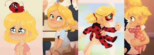
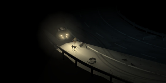
Photo
oh jonathan we’re really in it now
#art#artists on tumblr#dracula daily#dracula#jonathan harker#really enjoying this style + color palette combo#for the curious the corner text says#''I know now the span of my life. God help me''#in pitman shorthand#or at least it does if the translator i used is accurate
9K notes
·
View notes
Text
— karasuno’s starbucks orders

❤ boys !! daichi, sugawara, asahi, tanaka, nishinoya, ennoshita, kageyama, hinata, tsukishima, yamaguchi
❤ genre !! character study
❤ author notes !! somehow a pileup of work projects means i have more hc ideas? catch me making a habit of writing one of these after work every day.
❤ daichi !! daichi’s favorite coffee is smooth and rich, maybe just a little sweet. he orders a caramel macchiato with one less pump of caramel than on the recipe, no whipped cream. he says he wants to taste the coffee, but he also knows that he definitely wouldn’t enjoy coffee without a little sweetness.
❤ sugawara !! he’s a mocha man! he has a big sweet tooth, but also likes the style himself as an “adult” (yeah okay suga), so he’s one to order a hot mocha and say something idiotic about how the chocolate enhances the flavor of the coffee. no one believes him. they also make fun of him whenever he gives himself a whipped cream mustache. this happens often.
❤ asahi !! asahi likes orders that are easy to remember and don’t vary much in flavor or texture depending on who’s making it. we’ve all been victim to a burnt shot of espresso, and the one time that happened to him scared him off of espresso forever. instead, asahi is the kind of guy who orders a regular black coffee and adds his own milk so he can control how light it is!
❤ tanaka !! passion tea lemonade!! you can’t fight me on this!! i think tanaka loves fruity, refreshing things, even in winter (though he might get a hot chocolate or a mocha to warm up when it’s very cold). he thinks it’s cool that it’s bright red.
❤ nishinoya !! king of the starbucks secret menu. shows up with the recipe for something wild memorized, maybe like, the sour patch kids drink or the strawberry cheesecake frap. he orders it, slams it down on the table, and makes whoever came with him try it to experience the magic for themselves. this man can make a drink that tastes like anything. probably has thousands of tiktok followers because of it. specializes in videos where he makes tanaka try weird drinks.
❤ ennoshita !! ennoshita drinks tea more than coffee, and ordered a london fog one time because he thought that sounds really cool. then he got hooked, so that’s his regular order, though he’s known to mix it up with a chai latte every now and again. tea is warm and feels herbal, spicy, and complex -- but the milk makes it sweet. he could drink like four tea lattes a day. minimum.
❤ kageyama !! he doesn’t really like starbucks at all (i think he’s a big bubble tea guy, but i digress), so i think he’d get something simple that’s mostly milk. honestly? i think he would get a white hot chocolate if he was by himself, but he’d get something with as little coffee in it as possible if he’s with the rest of the boys so no one bullies him for his “immature palette”. maybe a white chocolate mocha!
❤ hinata !! strawberry frap. no it doesn’t have caffeine. yes i stand by this. also really enjoys the colorful refresher + coconut milk combos like the pink drink, dragon drink, etc. he also would try out any secret menu concoctions nishinoya tells him about, but never gets the recipe right.
❤ tsukishima !! tsukishima hasn’t developed the taste for coffee just yet, but when he does, i think he’s an iced latte kind of guy. he enjoys the bitter bite of espresso on his tongue, but he also likes a very large cup of coffee with a ton of milk and ice. maybe that’s just to water it down a little (a lot), but he’ll never tell.
❤ yamaguchi !! his first ever coffee experience was a cup of black coffee because he didn’t know what to order, and he hasn’t gotten over how god-awful it was. now, he’s more of a matcha latte sort of guy (i feel like he also really likes barley tea, maybe chamomile too). also known to dabble in green tea lemonade when it’s hot out. yams is just, such a tea guy.
#haikyuu headcanons#haikyuu hcs#haikyuu x reader#haikyuu fluff#daichi x reader#sugawara x reader#asahi x reader#tanaka x reader#nishinoya x reader#ennoshita x reader#kageyama x reader#hinata x reader#tsukishima x reader#yamaguchi x reader#haikyuu#karasuno#karasuno hcs#maria writes
122 notes
·
View notes
Photo
ADA: 2019 Simblreen | Public Release
This CC set is a collab between myself, @ayoshi, and @dogsill. Go check out their CC and posts if you aren't familiar with them already. Both are really close friends of mine and it is always a great experience to work with them on these CAS packs. We hope you enjoy this one <3 There is an item index for this collab same as AxA 2019 and the BxA collab last month. More info under the cut or over on the Patreon Post
Download | Follow Ayoshi | Follow Dogsill
Basic info
All items are BGC and do not require other meshes/packages
All hairs come in 24 EA Colors
The clothes come in 1 out of 2 palettes
► 25 colorful solids | palette link
► 20 denim swatches | palette link
► 25 varying patterns
Report any issues to me through Tumblr DM with images.
Follow my TOU for all items
Carrie Hair Snaps
Credit to Simpliciaty for allowing me to use his hair clip mesh to make these
Brooklyn Ombre Accessories in Tropical Punch Palette
Credit to @qwertysims for allowing me to recolor their twists Ombre Accessory in my Tropical Punch Palette. I highly recommend their EA Swatches Version, as you can stack the accessories and get some really nice ombre color combos (blue + pink is my fav one).
Preview Style
The previews for this collab are heavily inspired by Luumia & SynthSims' Teen Style Stuffpack from a few years back.
Other CC used in the previews:
► lace choker | stud earrings | nails
► The blonde/pink ombre hair used in the middle pic for Piper Shorts/Bat Earrings is a WIP of mine (not the grace hair, the other pink/blonde hair)
#s4mm#ts4mm#ts4cc#s4cc#thesims4#sims4cc#sims4#thesims4mm#ts4#thesims4cc#sims4mm#simblreen#simblreen 2019#ts4custom content
19K notes
·
View notes
Text
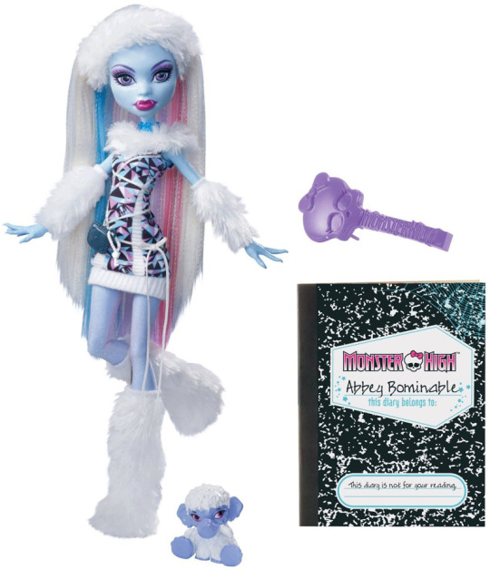
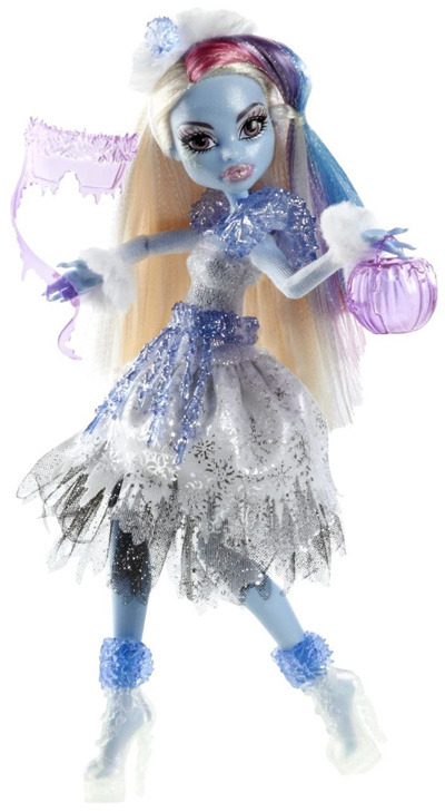
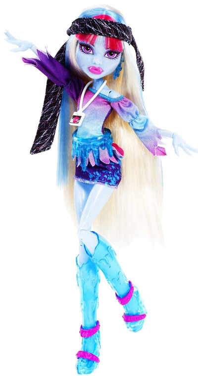
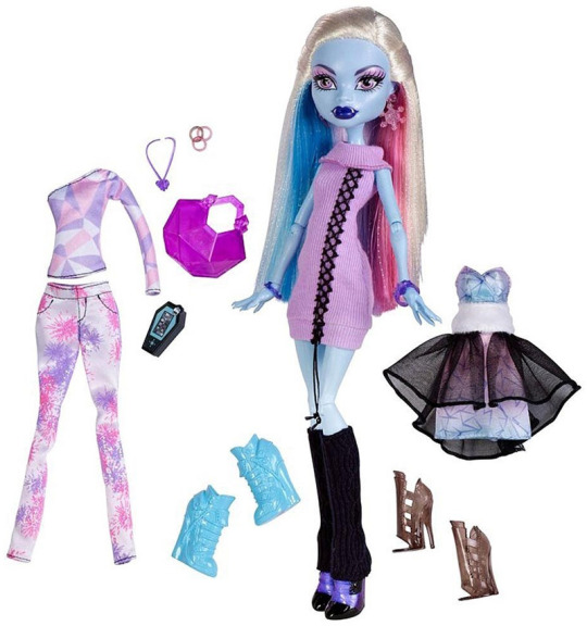
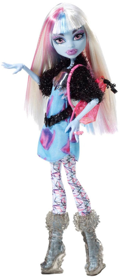
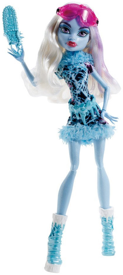
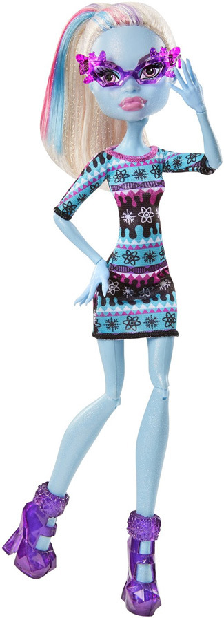
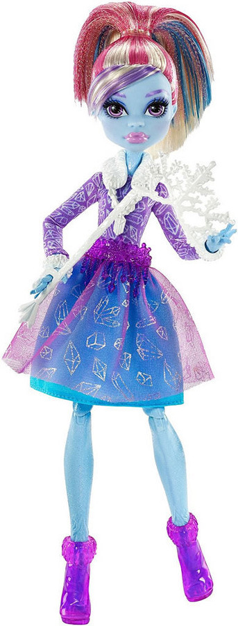
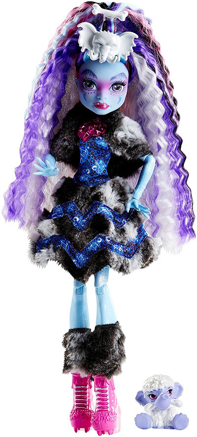
Ranking all the Monster High Abbey Bominable dolls!
i was feeling bored so thought i'd rank them all !! (everything past #1 under the cut!)
1. Wave 2
I feel like this is quite obvious, seeing as this is her basic doll, but still. I REALLY wish i had this one, i think they needed to incorporate more white into the clothes of her dolls, makes her look much more icy.
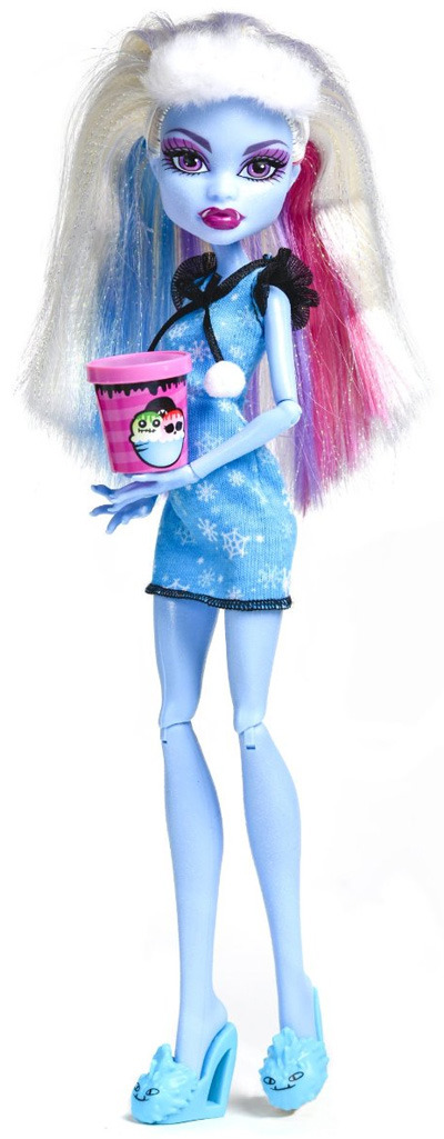
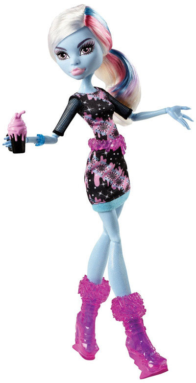
2. Ghouls Rule
I really like this line in general, lots of detailed designs, but this doll SPECIFICALLY is just so pretty imo. The snowflakes on her dress!!! I actually plan on buying her eventually on ebay.
3. Music Festival
While this one is much much more basic than the last 2, i just find her very nice. Probably one of the few colorful Abbey dolls i like.
4. I Love Fashion
This one is so simple, but i think it really works somehow? The dress is super cute and so are her boots. And the additional outfits are really nice, I like the shirt and pants a lot.
5. Picture Day
I actually own this doll!! so in that way i'm probably quite biased. Nevertheless, she's really well made. I was able to buy her off ebay in the box, but this was years ago, and i took her out of it.... I was so stupid back then.
6. Dead Tired
I love all of the dead tired line, honestly, its one of my favorites. Theyre very simple dolls... and yet they're just so cute!! They're little slippers are one of my favorite details. The tiny little ice cream too oh my god.
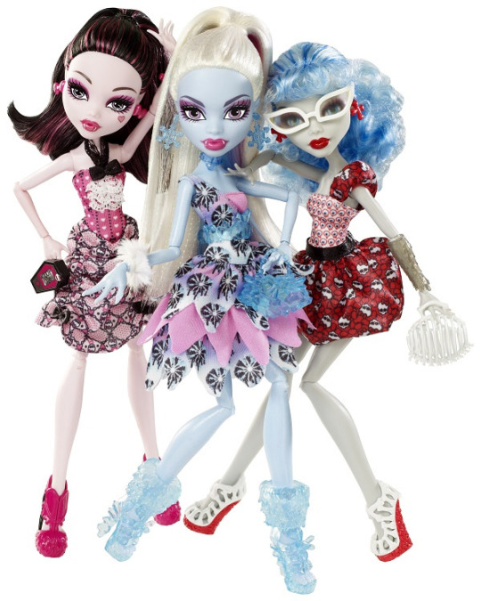
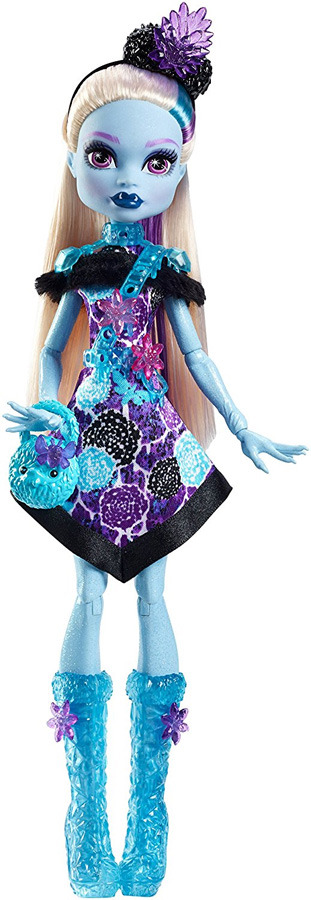
7. Dot Dead Gorgeous
This one actually comes in a 3-pack set with draculaura and ghoulia, and honestly all three are very nice. Abbey in particular though looks so good! Again, i really like it when they'd put more light colors on her dolls.
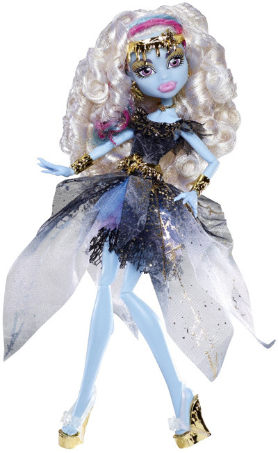
8. 13 Wishes
Honestly, if her dress was white, she would be way higher. So well made though!! I love the curly hair and gold accents.
9. Art Class
While this doll is very simple, i find that it actually manages to really work. I enjoy that pink is an accent color rather than a main one, and that theres something fluffy on her outfit! (one of my favorite details about her dolls)
10. Classroom
And this is where things start getting a bit less nice. While i think this doll is pretty, she's just missing something, not quite as complex in design as she has the potential to be. On the plus side, however, her hair is really cute!
11. Skull Shores
I don't have much commentary for this one, other than theres a bit too much purple. She could do with another hat, but the base-doll is beautiful (as always).
12. Scaris: City of Frights
Although she’s quite low on the list, I actually really like this doll. While Scaris isn’t exactly the most complicated line out there, I find that she makes quite a nice basic doll.
13. Skultimate Roller Maze
Honestly, nothing against this doll... she's honestly quite nice, but, overall... very in-cohesive color wise. I mean, green...? Roller Skates cool as hell though.

14. Geek Shriek
All I really have to say about this doll is that I basically like none of this line. the glasses are just a bit cheesy imo, and i wish the outfits were more than these simple dresses.
15. Coffin Bean
Cute face and hair, but so boring otherwise. Hasn’t she had these same style of shoes like 2 times already? I’m pretty sure the only cute coffin bean dolls were clawdeen and draculaura.
16. Sweet Screams
Ugh.... I feel bad for putting such a complex doll so low on this list, but god everything about her is just too much. She’s got that same ugly over saturated color palette as the reboot dolls, despite being made in 2014. maybe i’ll change my mind, but right now all i have to say is that black, deep purple, and bright teal is not a very nice color combo when overdone.
17. Party Ghouls
As with most fans of Monster High, I’m not a huge fan of the reboot. Thankfully though, all of the reboot Abbey dolls are fully articulated! While I don’t really like this particular doll, i must give credit for giving her actual fuzzy material on that dress.
18. Welcome to Monster High
This design is not my taste. Cheesy outfit and cheap plastic fur + those huge eyes don’t make for something all that desirable.
19. 2017 Collector Doll
And finally, we reach the end. This whole outfit + accessories are so garish i don’t even know where to begin. Those eyebrows... That hair... The bright pink shoes out of nowhere. Too much to unpack, why did they do this to her </3
Well, that’s it! I doubt anyone actually read this, but it was very fun to put together, if you’re reading this right now, i hope you enjoyed reading, and i’d love to discuss if others have different opinions!! :)
#monster high#dolls#doll collector#abbey bominable#monster high abbey#mh#mh dolls#ghouls rule abbey my beloved <3#i will have her one day#i hope#my posts
68 notes
·
View notes
Text

My thoughts on the 1.7 update
(Spoilers! And my own opinion, you are free to disagree!!)
Overall I am absolutely thrilled!! I can’t wait for this update, Inazuma looks SO gorgeous!! Getting to meet the new characters and see all of the new landscapes/enemies/puzzles will be so fun!!
I’m glad that the Inazuma release is in 2 parts. Not only that, but the Sacred Sakura prevents us from exploring everything at one time. This way we can take our time and not really have to worry about speed runners spoiling everything the second the islands are released!!
The areas I’m most excited about are the shrine at the Sacred Sakura cause oh my gosh it’s gorgeous!! I also can’t wait to meet the Shiba inu running the tea house, I can’t remember the name of the tea house but it looks so pretty!! Lastly, the big building in Inazuma City, the shogun’s palace? Is that what it is? Idk, it’s where Baal lives(maybe??) and it looks like it’ll be so cool to explore!
I cant complain about any part of the map yet since I haven’t seen it. Right now, I only have positive opinions on Inazuma as a region
Moving onto the characters so far:


I yoinked these images off of Google so idk the source, sorry!
Gouru: I think his design is interesting, I enjoy his color palette! He’s nice to look at. I like the fact that he’s a Geo bow user but…Im disappointment that there are so many bow characters being released at once :( They’re just so hard to use on mobile and though I’ve forced myself to suck it up for Venti and Childe, I wish we’d get more catalysts and claymores instead of archers UGH lmao
Tohma: I am SO looking forward to Tohma’s release!! He seems like a fun guy! I don’t know much about him other than the fact that he’s Ayaka’s fiancé but hey!! Apparently we’re gonna meet him sooner than I thought we would!!
Yae: I absolutely adore her design. She breaks the ���Hydro = blue clothes” “Electro = purple clothes” color palette trend. While there are exceptions like Beidou and Kazuha right now, most characters share color schemes with their vision. So seeing Yae with her pretty pink hair and red clothes while wielding an electro vision just makes me happy!! I’ll definitely be pulling for her
Sara: As much as I want to like her, I just can’t. At least not yet, maybe I’ll change my mind once we get to meet her and learn about her personality! There’s just too much about her that I don’t like. First off, I think she is bland. Mihoyo low key does a not so good job of designing women. Amber, Eula and Jean all suffer from bland outfit syndrome. Sara suffers from bland hair and face syndrome. Even her outfit could have been more detailed. And in addition to that, she’s another archer. So yeah…If she’s a 4 star, I know I’ll get her at some point but if she’s a 5 star, she’ll be a banner I skip
Shogun/Baal: Oh miss electro archon….Mihoyo did you so dirty. I’m sorry, she’s the goddess of electro and she looks like any other civilian. I was expecting something more grand for our first female archon release. I was hoping she would have more detail in her clothes, maybe extra hair accessories or thigh highs that aren’t one solid color? I don’t know, I just had high expectations! Am I being too judgmental? Possibly. But looking at characters we already have or have met, she doesn’t give the ‘wow’ factor I thought she would. Will I pull for her though anyway? Of course
Kokomi: She WAS going to be Mimi I think! This is Mimi’s model in a different outfit! Names aside, she’s very pretty! I was iffy on her design when I saw the leaks but when I saw her on screen in the livestream today? I was sold on her!! However…She will be our third, you heard me THIRD hydro catalyst which is a HUUUGE bummer. Of course, we never saw her fight so her weapon could maybe change (please Mihoyo please please give her a polearm) but I doubt that will happen. So for that reason, I won’t be pulling for her. But I will admire her from afar *sigh*
Kazuha: He wasn’t included in the update since he’s…out right now but i thought I’d talk about him too. I think his character is super interesting!! But sadly I will be skipping his banner. I did one ten pull and got Keqing so I’m going to save my guaranteed for miss Yoimiya!!! I am looking forward to a Kazuha story quest for sure! I think his design is cool, I don’t have much to comment on other than….why did he get the same face as Aether…dude…
Yoimiya: My Queen. My love. I have 20 wishes saved for her already and now a guaranteed on the event banner. I am not a fan of archers but she is an exception for sure! Her design, her ult animation, her idle animation…She’s so cute and I NEED her!!! I can see it now, my built team with Yoimiya, Eula, Bennett and Keqing all together fighting samurai in Inazuma! Wowwww :’) I am biased because she’s my favorite of the confirmed characters but…We’re all allowed to be a little biased sometimes :)
Ayaka: Everyone is hyping her up!! I am not really on that train! I’m excited for her cause she’s an interesting character! Her animations look cool and her design is beautiful, I’ve thought that since the eaaaaaarly leaks!! I just personally don’t enjoy her play style enough to go wild and pull for her. Sorry!! But I am loyal to Kaeya. He’s the only cryo sword user for me 💕 that’s a joke
Sayu: Eh, I’m pretty neutral on her. I’m glad to have an Anemo claymore combo but I just don’t enjoy playing as kid characters, they’re too small!! I bet she’ll be great and I hope everyone who wants her will get her!! I just won’t be jumping for joy when I inevitable pull her from Yoimiya’s banner
One more gripe, notice how we still don’t have Dendro characters?? I am desperate for Baizhu. Where is he? :( I need him >:)
In addition to my thoughts on the characters I might have an unpopular opinion reguarding the standard banner. It’s time for an update. Here’s who I think should be on the standard banner reboot if we get one:
- Albedo (takes Keqing’s place)
- Qiqi (stays since she’s a healer)
- Kokomi (takes Mona’s place)
- Eula (takes Diluc’s place) or Ayaka(?)
- Jean (stays unless Sara is a 5 star)
And I have my reasons too. Albedo is popular and would make people pull from the standard banner. Qiqi’s gotta stay since she’s a healer and we need character model diversity in the standard lineup. Kokomi is another hydro catalyst so she can easily replace Mona I guess. Eula wasn’t that popular and could be redeemed by being on the standard banner so people can get her cons, Ayaka could also go on this banner due to her popularity? So after her banner, she can just be plopped on the standard to draw people in. And I can’t think of a replacement for Jean UNLESS Sara is a 5 star, which I doubt she will be. Sara screams ‘standard banner character’.
Finally, I’m stoked about the PlayStation thingy!! We can login on PlayStation now!! Yay!! Exclusive wings, here I come >:)
22 notes
·
View notes
Note
hi!!! i really really love your art style!!! i love it so much and it's something i haven't really seen before, especially with your color-pairing choices in the both lining and filling the art in. i was wondering if you have any tutorials vids or posts wherein you discuss your creative process? or where you learned to do what you do? i'm only starting out and i found that i would like to learn from you :) (also, english isn't my first language so im sorry for the incoherent rambling)
Aww thanks so much!! I’m really happy you like my style and I wish you well in your own art journey! ☺️ In short, my drawing style just took a lot of trial and error to develop. I don’t have any tutorials at the moment, but I can share some of my art journey if that’s helpful!
The first thing I did to develop this style was to look at other artists I really enjoyed. I wrote down everything I liked about their styles, and then I wrote down the specific things they did that I did not do in my work. In the end, I had a list that looked like: line variation, texture, and a clear color palette.
Then I just practiced and practiced on improving the things on that list. A super easy way to get a nice color palette is to use Adobe’s palette site; you can search for key words and find some good color combos to get you started.
The lineart in my work also became super important to show light/shadow, so I made some rules for myself when coloring the lines. Here is a break-down of my general rules:
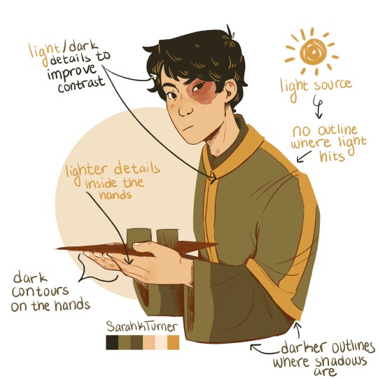
I hope that was helpful! This is just one way to find your style — you may approach it completely differently and get different results, and that’s good too! Drawing styles grow and change all the time so don’t feel discouraged if you’re not at a level that you want to be at right now; it just takes some time and patience ☺️💗
#good question! sorry for the long answer haha#also earlier this year i was really self conscious about how poor my style was#so i tried lots of different things for a couple months to try to improve#it means a lot that you guys like what i have now!!! :’’’)#ask
173 notes
·
View notes
Text
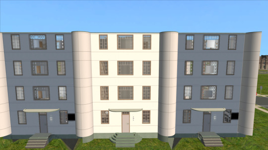
Row homes
So I’ve decided to build a whole ‘hood from scratch. I want a unified look, with a limited color palette. I want that unified look to be vintage-ish, preferably 1950′s and before. These restrictions make building a real challenge, which I am enjoying.
While looking at vintage floor plans and such, I have come to find that I really like Art Deco (c. 1910-1939) as an architectural style, and especially Art Moderne/Streamline Moderne (1930s-1940s). I had previously built rowhomes in a different style, but after deciding on a basic look for the ‘hood, I had to redo them.
They look really good.
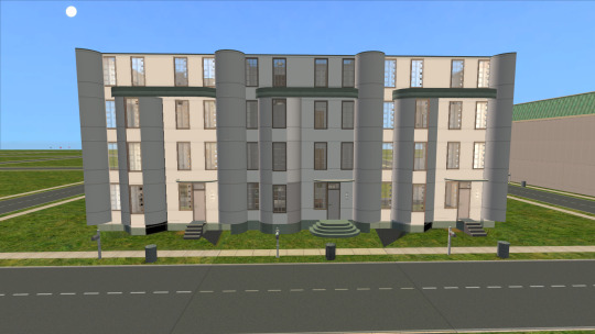
Here is a picture from on the center lot. You can see that even on the lot, the other two houses flow into this one seamlessly. Click the picture to enlarge it if you don’t believe me!
More pictures below the cut, because I like showing off. Click on pictures for a closer look. Sorry, couldn’t get captions to work.
The row houses look pretty darn good from ‘hood view, too!
I do eventually want to default replace the mailbox and trash can, but finding a good default replacement for the mailbox is hard. I’d like something that looks more urban, perhaps even like a mail slot or a box that hangs on the wall by the door. Maybe I’ll find one someday.
Or even learn to make my own. I’ve finally got copy/paste recolors figured out after just 15 years, after all!
Here is the top (fourth) floor. Two bedrooms (requiring Inaccessable Beds if you want a double bed in there), a Jack-and-Jill bathroom, and a small room that could be for sewing, or storage, or laundry, or whatever. Probably not another bathroom because it has two windows in it, but you never know.
Here is the third floor. There are three bedrooms, two of which can hold double beds. Or at least, there are three rooms. They could be for painting, or music lessons, or whatever, I guess.
Here is the second floor. Two rooms and a half bath. The room across the front of the house would be a weird shaped bedroom, but maybe for kids or something?
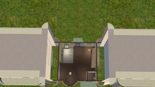
Here is the first/ground floor. The game thinks it’s the second floor because of how it’s coded to read basements, and technically it isn’t on the ground, because of the basement.
There’s a kitchen, an “airlock” of sorts for entering the house (is that called a vestibule?), and a ladder to the basement. The stairs are open underneath, so any of the under-the-stairs items could fit in there. The ladder is still usable even with an under-the-stairs item there, so I can pretend there’s a trapdoor in the closet floor, or a door in the back of the shelf, or something like that. (Looks weird, but it works.)
The ladder may be usable with other under-the-stairs options, but I haven’t tried.
There is a full basement. I am building this as a functional basement which is also intended as a bomb shelter because it is for an apocalypse game. There’s room for up to two bunk beds and a card table with two chairs (not placed). Note that the usable area of each floor is 8x8 or less and the house is raised off the ground, making it apoca-legal. I don’t know if basements are apocalegal, but I don’t care. It’s easier to take away the ladder and fill in one floor tile to make the basement inaccessable than it is to build a basement on an already-existing lot.
There’s a chemical toilet, in case you need to pee while hiding from bombs. There’s a (decorative) washer and dryer. I fully intend to recolor this functional laundry detergent at some point in the next decade so I can have a working laundry room. (All the functional machines out there are too modern for my taste.)
The little square of swimming pool hidden in the foundation is so the water overhaul mod works. This particular lot is not in view of any water, but this is intended to be cloned for row houses to go in multiple spots, some of which might be in view of water. It’s just easier to put it in right from the start.
This is what the back of the house looks like. I intend to fence in the backyard, but not yet, since I want to shrink a copy of the lot. Then I can fit a 1x3 version backed up against a 1x2 version and perfectly fill a [whatever]x5 space.
I will be building (or rather, adapting) corner and side lots to match, so that I can go around the whole block with fairly small lots. I prefer to play small lots.
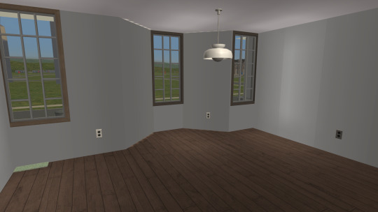
Here is a picture of the front room. You can see how I have thoughtfully placed outlets that do exactly nothing, but they look nice and are in places where they might logically be handy. There are a minimum of two outlets in all rooms except the bathrooms.
The green part in the corner is the outside curved step poking in. I can’t move it without making the front look awful. Flooring and rugs won’t cover it, either. Fortunately, furniture does, so this is a great spot for a piano, bookcase, refrigerator, or anything else that hides the floor anyway.
I am proud of the overall look of the place. I am especially proud of the attention to detail with the light switches. See how the switch by the door “controls” two lights? (It’s really just decorative.) One is the kitchen light, and one is the back porch light! I am so clever!
I’ve got them at the bottom of the staircases too. It is completely ridiculous how proud I am of this.
This table and lamp combo is not a permanent fixture. It deliberately doesn’t go with anything and doesn’t fit the personality of any of the sims who might live here. It’s just here to remind me to put a lamp at the top of the stairs on the fourth floor so you can turn off the stair light and still find your way in to whatever room you want. I even put an outlet on the wall, which you can only just barely see. I am proud of that, too.
So there you have it -- what’s been keeping me amused lately. I have been having such fun with this. Seriously, I spent probably 30-45 very happy minutes getting the light switches and outlets juuuust right.
10 notes
·
View notes
Text
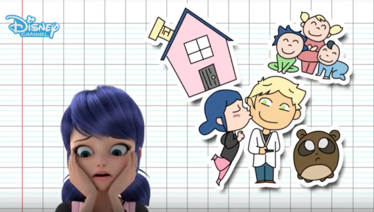
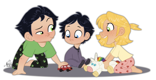
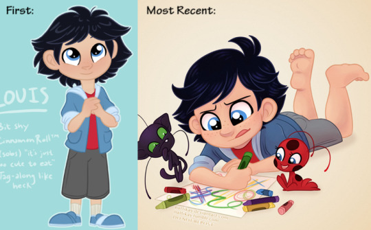
Sooooo I’m not sure if anyone would be interested in actually reading something like this, but I was looking through some of my older Miraculous art and seeing how the designs of my future AU characters have subtly evolved over time, so I wanted to make a post about designing these characters and how/why I made the decisions that I did!
So first off, the birth order! I was originally intending to have the kids born in the order that they’re listed in the Stormy Weather episode:
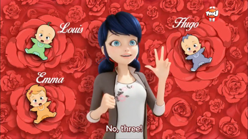
...unfortunately, instead of actually looking at the episode to be sure, I just went off memory; I remembered Emma being the second but accidentally mixed up Hugo and Louis. By the time I realized this, the characters were already too cemented in my head to switch them back. ^^” Oh well.
In addition to the above, in my ~10 years of experience with next gen fics/art/OCs (I know, I have a problem), I’ve noticed that a pretty large fraction of the time folks opt for their OTP’s firstborn to be a daughter over a son. Nothing wrong with this, of course (heck, I’m a firstborn daughter myself haha), it’s just so disproportionately common that I thought making Hugo the firstborn instead of Emma might make my version stand out a bit more. ^^
Now with the siblings’ order decided, on to the designs! Starting with our oldest,
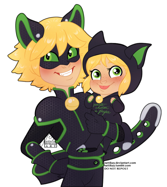
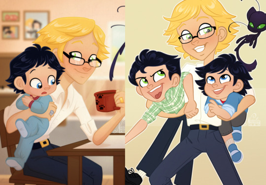
Hugo!
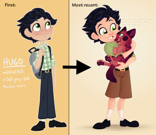
Black hair and green eyes seems to be the most popular design for an Adrienette kid, and for good reason! It’s an appealing combo on its own in addition to using traits from both parents for the most notable genetic features in characters: hair and eyes.
I also wanted to give Hugo some of his own flair though. I think the best next gen characters are recognizable as their parents’ offspring BUT can still stand on their own as unique individuals. One way to help do this is, when available, to draw on extended family rather than only their parents.
Hugo’s strongest example of this (at least as a kid) is his slicked-back hairstyle, which was somewhat inspired by Gabriel’s. The slicked-back style seemed to fit his nerdy personality, but because he is a child and not nearly as uptight as his grandfather, Hugo’s hair is much messier than Gabriel’s, and he often has pieces falling out in the front.
Admittedly I’m not super great at conveying the slicked idea from the front view, but you can see it a bit better in profile:
Hugo more than either of his siblings also takes after the Dupain side of the family, which isn’t super noticeable as a kid but becomes much more so as he grows up and develops the broad shoulders and strong upper body of Tom and Rolland. He’s not quite as enormous as Tom but is easily the strongest sibling (Louis, meanwhile, is a lanky little noodle like Adrien and Gabriel).
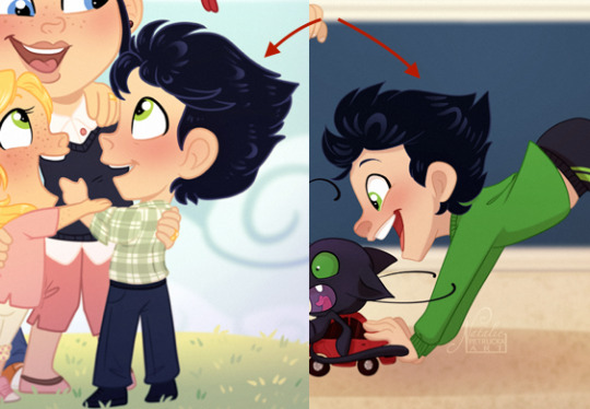
Going along with that, Hugo’s personality has loosened up a bit over time. While I do still draw him in his tucked-in button-up, I’ve also started drawing him in looser styles a bit more, because after all, he is just a goofy kid! This has included anything from using shorts instead of long pants to sometimes wearing just regular ol’ t-shirts instead of his nice button up (on which I rarely actually draw the plaid pattern I initially designed him with because wow it takes forever).
Funnily enough, this is a bit of the opposite of what happened to Adrien. My first sketches of adult!Adrien from this AU all have his shirt untucked, even whilst teaching, but now I almost always draw it neatly tucked in:
...interesting, interesting.
Anyways, while Hugo is still very much a little nerd who does quite well in school and LOVES learning about space and astronomy, he’s also a little more goofy and active than he was when I first created him. He’s probably the most athletic of his siblings (though really none of them are exactly jocks) and while he’s not particularly interested in organized competitive sports, he loves a good game of catch or tag. :)
While people in real life obvious wear any color they want, with my OCs I tend to pick a general palette and stick to it though all (or at least most) outfits, for consistency and easy recognizability. Hugo’s palette is mostly greens (for Chat Noir of course! ;) ), dark blues, and warm browns.
Now, onwards to
Emma!
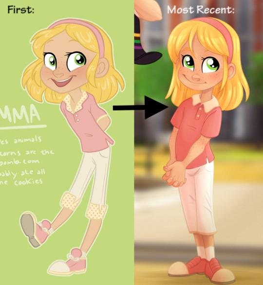
I decided to make my version of Emma blonde for two reasons: one, it appears to be so in the screencap shown at the beginning of the post, and while Marinette’s imaginations do not necessarily have to dictate how you design your versions of the kiddos, I liked having the consistency.
...plus then some years later Frozer rolled around and showed a blonde (imaginary) Emma again, so like
...validation ;)
(by complete coincidence they’re even accurate to the color schemes I use kashdfgjsddsafjdf)
And the second is just that, again, most (not all, of course, but a lot) of the other Emmas I’ve seen in the fandom have been dark-haired, so again I thought it’d help mine stand out a bit.
So now with hair color established, it’s time for eye color. Most of the blond-haired Adrienette kids you see have blue eyes, for the same reason that a lot of dark-haired ones have green. Which, as said with Hugo, makes sense, since it’s the hair color of one parent and the eye color of the other. So why didn’t I make Emma’s eyes blue, then?
Well, it’s a bit of a silly reason tbh, but the blond-hair-blue-eyes combo reminded me a little too much of Chloe. ^^” Not that it would cause any parentage concerns, of course, since obviously Marinette is the one who gave birth to her, but the visual similarities still made me go like...eh ^^”
So green eyes it was! Which, of course, made her look a heck of a whole lot like her father.
But of course, it’s fine to favor one side of the family, but she’s gotta have SOMETHING from Marinette, right? So what other visual could she inherit to show at least some of her mother’s genes?
✧・゚:* F R E C K L E S ! *:・゚✧
And since Marinette’s freckles are so subtle, I decided to make Emma’s a bit more prominent and easily visible.
Actually her freckles have multiplied quite a bit over the years. She’s always had more than Marinette but it used to be confined to just a few on her cheeks and shoulders. Now drawing her is more like DOTS! DOTS EVERYWHERE! with freckles all over her face, down her neck and arms, and even a few on her legs! It is very much her Thing at this point haha
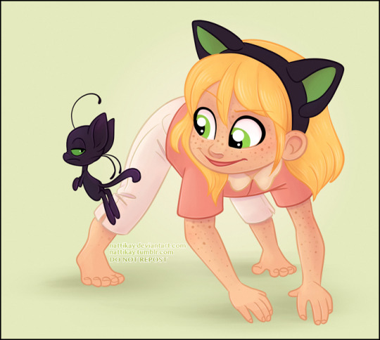
Freckles everywhere!
As for her hairstyle, the default is a simple headband, but she also sometimes wears it just plain down with no accessories at all (usually when in PJs), or up in pigtails like Marinette’s!
Those are just the main ones though...really she can do pretty much whatever ^^
Emma’s outfit palette took a bit more consideration than her brothers’, since I needed it to match the yellow hair (whereas black, as a neutral, can go with just about anything. So I took a minute looking at her established colors--bright green eyes and golden-blonde hair--trying to think of what theme I could used.
The grassy green and sunshine yellow ended up reminding me of warm weather, like a spring or summer morning. The easiest color for that would’ve been green, but I was already using greens for Hugo and didn’t want their schemes to look too similar. Ultimately I decided on pinks, because the pink outfit with the yellow hair reminded me of some nice fresh lemonade! Some bright whites and warm creams/off-whites then added to the cheery, springy theme. ^^
Her original outfit design included some small dots on her collar and pant cuffs, not unlike the inside of Marinette’s jacket, but I don’t really include that detail much anymore for the same reason I rarely draw Hugo in his original plaid.
Lastly but not leastly, onwards to
Louis!
Thus far we’ve had Hugo, who’s a pretty good visual mix of his parents, and Emma, who takes more after her dad. As such, I figured that it’d only be fair if the third and final kid took more after his mom!
So in many ways Louis looks a lot like a mini male Marinette, right down to the subtle freckles. If Hugo has the most Dupain genes and Emma has the most Agreste genes, Louis probably has the most Cheng genes and has the easiest time convincing people that yes, he is actually 1/4 Chinese (absolutely no one believes Emma when she says this lol...she has to show pictures of her family haha).
We can’t completely ignore the Agreste side of the family though, and in Louis’s case is manifests mostly in his hairstyle which is very similar to Adrien’s, as well as his lean and lanky body type as an adult, very similar to Adrien’s and Gabriel’s (unlike Hugo who, again, is stockier like a less-extreme Tom).
His outfit color scheme is light blues and grays with splashes of red. The blues and grays work well for his shyer, more reserved demeanor, while the splashes of red like the t-shirt hidden under his sweater are like his big imagination! (Like his mother and grandfather, Louis is very much into art and design, though his interest tends to be geared more towards characters and stories than fashion).
Not as much to say about him tbh...he’s “evolved” the least from his original concept and is mostly just the cute baby brother ^^”
So yeah, there you have it! That was roughly my thought process for creating/designing my little kiddos ^^
Hopefully some of you found this interesting; I enjoy talking about my ideas and stuff so if you ever want to know more or about something else that I do/make, feel free to ask! ^^
#miraculous#future au#agreste family#hugo thomas agreste#emma adele agreste#louis felix agreste#my art#back in college I knew this one girl like Emma who was 1/4 asian but didn't look it a t a l l#and was lowkey salty about it#(salty about not *looking* part asian I mean)#people would never believe her and she'd have to pull up pictures like#''LOOK here is me with my 100% JAPANESE GRANDMA who literally LIVES in JAPAN and speaks mostly JAPANESE''#and I feel like Emma most definitely has the same conversations haha#anyways#yeah here's this post#that wound up being very long sorry ^^''#....yeah
534 notes
·
View notes
Photo


ADA: 2019 Simblreen | Public Release
This CC set is a collab between myself, @ayoshi, and @dogsill. Go check out their CC and posts if you aren’t familiar with them already. Both are really close friends of mine and it is always a great experience to work with them on these CAS packs. We hope you enjoy this one <3 There is an item index for this collab same as AxA 2019 and the BxA collab last month. More info under the cut or over on the Patreon Post
Download | Follow Ayoshi | Follow Dogsill
Basic info
All items are BGC and do not require other meshes/packages
All hairs come in 18 EA Colors
The clothes come in 1 out of 2 palettes
► 25 colorful solids | palette link
► 20 denim swatches | palette link
► 25 varying patterns
Report any issues to me through Tumblr DM with images.
Follow my TOU for all items
Carrie Hair Snaps
Credit to Simpliciaty for allowing me to use his hair clip mesh to make these
Brooklyn Ombre Accessories in Tropical Punch Palette
Credit to @qwertysims for allowing me to recolor their twists Ombre Accessory in my Tropical Punch Palette. I highly recommend their EA Swatches Version, as you can stack the accessories and get some really nice ombre color combos (blue + pink is my fav one).
Preview Style
The previews for this collab are heavily inspired by Luumia & SynthSims’ Teen Style Stuffpack from a few years back.
Other CC used in the previews:
► lace choker | stud earrings | nails
► The blonde/pink ombre hair used in the middle pic for Piper Shorts/Bat Earrings is a WIP of mine (not the grace hair, the other pink/blonde hair)
by aharris00britney
#sims#sims4#sims4cc#sims 4 mods#sims 4 custom content#cchair#cc clothes#custom content#cc#mod#thesims4#s4mm#sims 4 ccmm#maxis match#pack
3 notes
·
View notes
Text
Top 10 upcoming games
Another year is nearing its end. It frightens me, but looking back, many things has changed between now and when I was writing this list last year. It’s time for another update. There are 10 games on this list (8 of them new) and there are many other upcoming releases I’ve been keeping a track of, but most of them aren’t as important as the first two. Only the last act of Kentucky Route Zero and unity’s latest RPG Maker epic are games I can’t imagine sitting out or stopped being hyped about. 2020 ought to see both of them released and I will be afk for months only playing them at the end of the year. I think many other changes await me and I might not be back for another round next December.
There quite a few interesting upcoming games I couldn’t or didn’t want to fit on the list. They get their spotlight in individual posts just to show you how pretty some of them are.
10. Renaine
Maybe I should just play Shovel Knight or Celeste, because Renaine probably targets the same audience and I would like to play both of the eventually (on Switch ofc), but there’s something I really like about the upcoming game. Firstly, there’s barely any hype surrounding it. Secondly, it looks retro but in a original way with its architecture being overfilled with various pipes and other mechanical details. It’s fantasy with industrial tones but these feel more related to it being a computer game than its setting. Te color palette is so vibrant, it always warms my heart looking at the game’s screenshots.
9. the machine that BREATHES
I’m not a big fan of horror games and this probably wouldn’t make the cut for this list if it weren’t a shweep’s creation. the machine that BREATHES probably is his best looking game up to date and promising a serious experience inspired by Radio The Universe among others. It’s a smaller project, so it’s also interesting to follow for its scope and frequent updates, which can provide interesting takes on individual decisions. Read this one to explore the world of retro gaming resolutions.
8. Lunark
I can’t express enough how much I enjoy the look and feel of this game without sharing some of it again. Cinematic platformers are a niche genre, which is niche, because it’s not ver good. The few examples the genre has all look great and I love them for it, but they’re also usually terrible to control. I guess this one’s more about the hype and screenshots too. It looks like a forerunner for the next PICO machine with it’s great use of pink and bright green. The pixel art is lo-rez yet the quality of it far surpasses most true sixteen bit retro games. And the setting? It’s Prey 2, isn’t it?
7. Welcome to Elk
Putting most games next to Lunark feels weird. In case of Welcome to Elk, it’s because their visual styles clash. They’re both good but there’s a huge gap between old school pixel art and classic illustration combined with other techniques. This game hits me like a rock with its combination of charming graphics, which make characters likable without knowing them and melancholic storytelling, which is based on true stories. I wonder how this combo will work out and I’m definitely on board with whatever the result is.
6. Exile’s Journey
This one’s getting released really early in 2020, on 1st January. I’m hyped about it because it’s a master class in mapping and probably the most atmospheric RPG Maker game I have seen since Paradise Blue. In terms of gameplay or story I don’t expect much, but I can already see myself drooling over its maps and beautiful vistas.
5. Signs of the Soujourner
I wouldn’t expect this one to stick. But reading a mention here and there and watching the great trailer multiple times (Echodog managed to keep it short and sweet) hooked me up and now I’m excited for a card game about chatting. That said the world somewhere between Pokemon and tramp America attracts me too. It’s the combination of juicy mechanics, immediately captivating environments, mysterious characters and wonderful chill tunes what puts this one on my shortlist of games to play in 2021.
youtube
4. Unto the End
I don’t really care about combat, what I dig is the atmosphere. Some six or seven games or on this list because they either look or move or sound great. Unto the End does the former two excellently and even in its screenshots and trailer it managed to capture me and transport me in its dark world. Despite it not being a metroidvania, it’s this high on my list.
3. Samurai Gunn 2
Yes, this is mandatory. I get my pants wet every time I see a screenshot. I love the swag of Doesone and Beau Blyth. I love the theme it reminds me of Wu-Tang and The Man with Iron Fists in particular. There’s nowhere to hurry with this one and I can’t wait to try it out on my future switch one day. There should be a singleplayer story to play through and that makes me very happy as local multiplayer is difficult to organize for me. The problem is I usually prefer to talk with my friends when I see them
2. Weird and Unfortunate Things are Happening
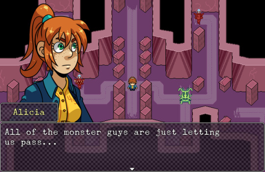
Over the years, this has become a super expected project, a labour of love full of great dialogues and characters with battles, which are fun. I expect so much from unity on this one and I know that she’s capable of delivering it. For those who tripped over this post by an accident, Weird and Unfortunate Things are Happening is a free RPG Maker game about saving one town from hands of otherworldly creatures. You play as Alicia and Miriam and let me tell you, there’s something in the air between the two. I just love it and can’t wait for the full release.
1. Kentucky Route Zero: Act V
I could cop paste the last year’s comment. Not much has changed. I don’t know anything new about it and it still is one of my favourite games of all times. I’m really looking forward to the conclusion of it and because it will have been so long since playing Act IV, I probably will close myself at my room for a weekend and play all five parts, when Act V gets released.
#renaine#The Machine That BREATHES#shweep#wishlist#lunark#welcome to elk#exile's journey#signs of the soljourner#signs of the soujourner#Unto the End#Kentucky Route Zero#weird and unfortunate things are happening#samurai gunn#samurai gunn 2
2 notes
·
View notes
Last Seen Blogs

carlphilip13
fan page for Prince Carl Philip
mistwraiths
i have nothing to prove to you

aoba-johcry
haikyuu hell
carlphilip13
fan page for Prince Carl Philip

faitingspells
the garden