#oh yes i will tag this as
Note
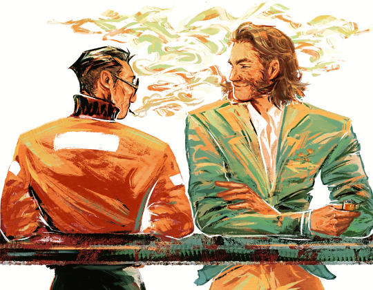
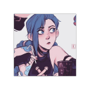
Okay okay listen Tim would never understand Jason’s need to provide but he recognizes the devotion of it all and when he finally gets it… he’s never letting go. A different kind of devotion. That’s something they can both understand
yessss. YES. they initially have completely different views on it! Tim hates the part of himself that Jason craves to feed - he sees it as parasitic, a reason for shame, and the possibility that he could go too far one day and kill what he loves. For Tim, it's something to hate; for Jason, it's something to love.
But Tim understands devotion. He understands wanting to be claimed, wanting to belong wholly and utterly to someone, and he starts to see Jason's obsession with it as akin to that feeling. He wants it too, he feels it too OwO
Because what makes me insane about it is just...their problems are the same. Jason hates the wolf; Tim loves the wolf, because the wolf is Jason. Tim hates his thirst; Jason loves his thirst, because the thirst is Tim. It's so... if we have to hurt to live, then let me bear it with you. i'm not normal about it
#screaming crying throwing up#anon i love you#jaytim#anon#asked and answered#anon do u want an emoji#if you don't want to pick one i might assign one to you#this is a THREAT /affectionate#oh yes i will tag this as#vampire tim#werewolf jason#its kind of important lol#🐺🦇
71 notes
·
View notes
Text
#my art#harry du bois#kim kitsuragi#disco elysium#disco elysium fanart#harrykim#kimharry#or whatever they're called#let this man have happiness or so help me#im a firm believer in harry getting a slow post-recovery glow up alright. it's the least i can do for the guy.#man i was listening to so many banger songs while making this#im still getting back in the flow of painting so most of my stuff is kinda messy still#but i suspect ill find a middle ground between this and my last piece style-wise#gearing up to drawing kim in all his glory too now that ive finished two different side profiles of him. only a matter of time now#also fun little fact. i drew over half of this (~4 ? hours) using just my finger on the trackpad of my laptop lol#sometimes it helps me to just put shapes and colors down. when ive got a pen i get too nitpicky about being perfect/using fancy techniques#sometimes all you need is. finger 🫶#OH!! i forgot to mention someone spotted it in the tags—yes this is based on that one leyendecker piece!!
4K notes
·
View notes
Text
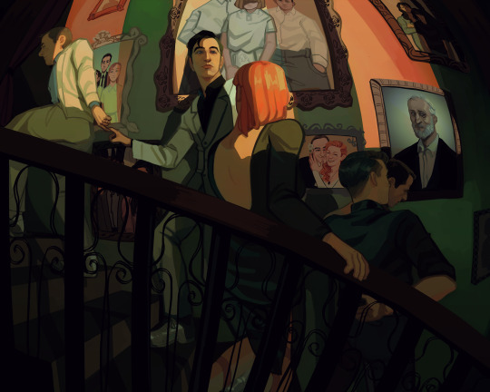
One wedding and three funerals
Background paintings under the cut
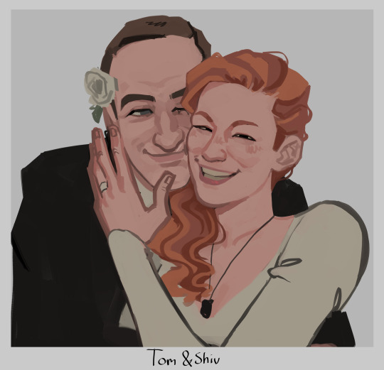
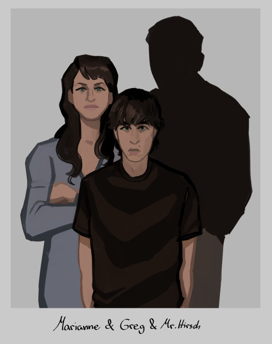
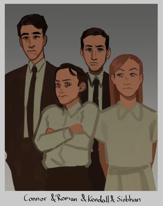
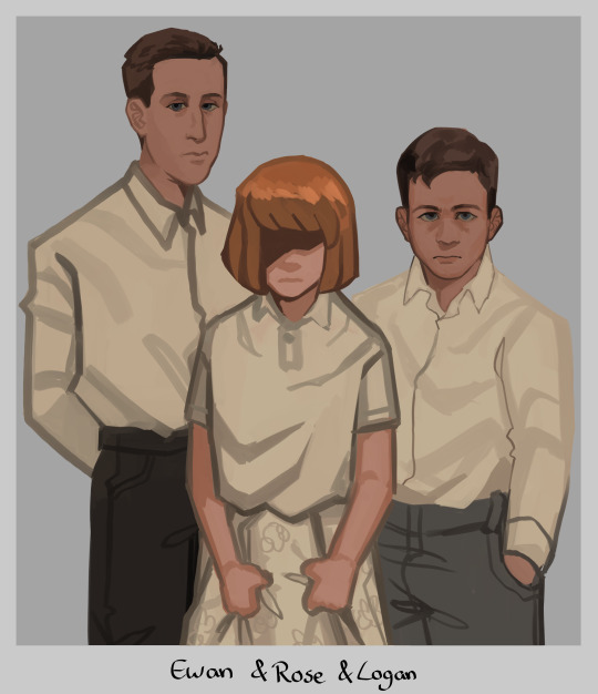
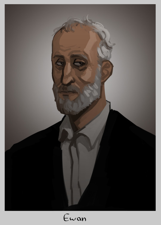
#tomgreg#succession#tom wambsgans#greg hirsch#shiv roy#roman roy#kendall roy#yeah no im not tagging everyone thats too much#this is me going 'how much implications themes and symbolism can i fit in one painting'#yes i gave rose shivs haircolor. if we ever find out how she looks like and its not like this im just gonna pass away i guess#but yeah i hope yall connect the dots#i put waaay too much thought and work into this. i was googling pictures of all the actors as kids just for reference (sigh)#honestly kinda wanted to make tom and greg link pinkies as like. a pinkie promise. but that was too hard to draw in this angle#at least not without obstructing the view of the ring which is important to see so ya#my fave is actually the tomshiv wedding pic i went off with that. i love them... they should have run away to become sheep farmers fr fr#anyway im so glad im done with this UGH!! finally i can draw smth else without being like oh noooo i need to finish this#i see a lot of you wondering why there is no portrait of logan but one of ewan#it's bc the placement of the painting represent their standing. logans portray would not hang next to the stairs#his present portrait hangs at the end of it. all the way up at the top. alone and withering away#basically the picture you see underneath ewan to the right? its where toms parents would be. the right side of the wall is tom and gregs#and the left one is the roy siblings theirs. since they grew up rich rich. and tom and greg didn't#but ya thats why ewan hangs here and logan does not :)
14K notes
·
View notes
Text
stardew valley marriage candidates
#stardew valley#oh dear god character tagging. ok here we go#sdv alex#sdv elliot#sdv harvey#sdv sam#sdv sebastian#sdv shane#sdv abigail#sdv emily#sdv haley#sdv leah#sdv maru#sdv penny#it's like memorising an entire homeroom class#I JUST WANTED TO SEE HOW THEY'D TRANSLATE INTO MY STYLE#bros the concept of this town full of bisexuals that could want you is so funny#like I have mostly just been farming but it makes me laugh when I remember#ah yes. bisexual town#obv that's an umbrella term in this context and you're free to HC them whatever you wish#I just think bisexual town has so much potential for shenanigans
4K notes
·
View notes
Text
Danny ends up a doctor like his parents, just not the type of doctor they were expecting.
Danny becomes an archeologist.
He couldn't help it! Most of his friends were dead people, some from as far back as ancient Mesopotamia! He automatically knew every dead language by virtue of being a ghost! The way his friends talked, he wanted to know more about their lives. So he goes looking and makes a name for himself.
He becomes a well known archeologist. As a grad student, he works for the Drakes, even babysitting their son, Tim. He goes to Janet's, and later Jack's, funeral, offering to take Tim in, which the boy is grateful for but declines in favor of a bio-uncle. Eventually, Danny discovers the remains of an ancient cult in the Middle East.
Ra's learns that the remains of the original League of Shadows has been uncovered by a group of archeologists. Originally visiting the dig site to ensure the group doesn't discover any traces of the modern-day League, he finds himself intrigued by the young Dr. Fenton leading the dig. He's smart and bright and the first person in 400 years that can speak Ra's birth language. He becomes fond of the good doctor, even more so when he discovers that Danny's a conservationist and is skilled with a Xiphos (all Pandora's doing). How strange that their spars often end up with them retreating to Danny's tent to be alone...
And then Danny invites Tim Drake to visit, worried about the boy being a teen CEO with no breaks. Tim agrees.
#dc x dp#dpxdc#dp x dc#dcxdp#adult danny fenton#doctored halves#but i don't like that name so i'm tagging#deadly decisions#c: danny fenton#c: ra's al ghul#c: tim drake#Tim: Oh Boy i can't wait to visit with a friend of my parents and enjoy a relaxing vacat--YOU!!#Ra's: Oh hello Timothy.#Danny frantically hiding hickies: y-yes hello tim! so good to see you!
3K notes
·
View notes
Text
This was supposed to be a shitpost but painting this was so genuinely healing for me that I decided not to add the bottom text
Original meme it's based on + closeups shots under the cut:


#sonic#sonic the hedgehog#sth#silver the hedgehog#sonic fanart#silver the hedgehog fanart#pond#artists on tumblr#I love how this turned out so you bet your ass I'm gonna put alot of tags here-#my art#oh to be a guy in a pond#no lush green ponds in the future so he's making the most of it#he is THRIVING he is MOISTURIZED he is having a WONDERFUL bath time#yes the rubber duckies are there for him too
5K notes
·
View notes
Text
nonbinary robot call that androidgynous
(this post was made by @silly-solar-robot!!! please check reblogs for a version of this post without the credit, just thought at 14000+ notes I should mention it on the original post. no clue why they used my account, maybe cause I have more followers but please check his account out!! he’s wonderful)
#sunny takeover#hiya!! I thought of a punny tumblr post I hope you find it funny (^:#robot#android#droid#animatronic#hrmm what to tag this as#oh!!#fnaf#funny#pun#androgynous#nonbinary#enby#and yes I’m aware that nonbinary people can be things other than androgynous!!#I myself am agender and very masculine and feminine (^:
17K notes
·
View notes
Text
#cecilsweep and Welcome to Night Vale trending #1 in 2023

#welcome to night vale#wtnv#ive said it before but people not knowing wtnv makes me feel old#i remember the days before cecil had a canonical last name#so tumblr just gave him the jonathan sims treatment#aka called him cecil baldwin (the voice actor's name)#wtnv will always have a special place in my heart as my first fiction podcast#cecil palmer#cecilsweep#oh to be young and queer and stumble upon a funky little gay podcast about a horiffic and absurd little town#yes i am just reusing my tags from my last post#added a description#glad yall are enjoying my shitty meme#i made it while half-awake and unable to sleep because my tummy hurt :(#follow me for more shitty podcast memes#im currently going feral for malevolent#important note: girlies is gender neutral#tumblr sexyman poll
9K notes
·
View notes
Text
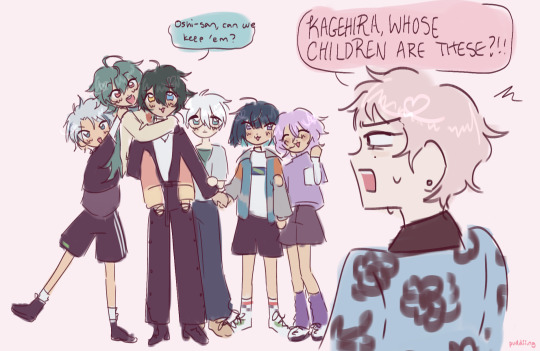
big fan of the new kids,,
#enstars#my art#fanart#ensemble stars#shu itsuki#mika kagehira#shumika#taki ibuki#ibuki taki#sagiri esu#esu sagiri#fuyume hanamura#hanamura fuyume#natsu kanna#kanna natsu#raika hojo#hojo raika#is that everyone?#4piece#i think#little doodle tag#anyway#i think it would be really cute if mika got along with all the new kids cause they remind him of the orphanage kids#that would be adorable#nice come collect your kids#before shumika swipe them up hashtag parenting#anyhow#i love the new kids theyre so cute oh my god#i have so many fun little drawing ideas for them#"oshisan can we keep em?' PLEASE SAY YES
788 notes
·
View notes
Text
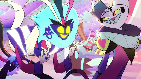

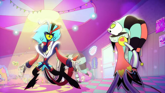


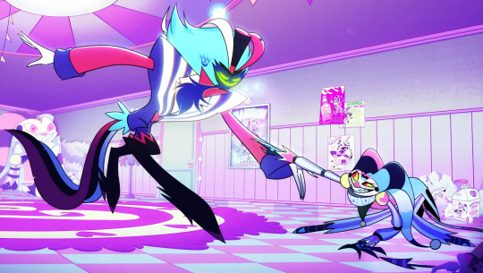
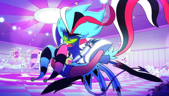
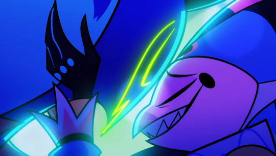
THE WAY THAT THEY INVENTED ROMANCE WITH THIS SONG???? HELLO?????
#'i don't know why you waste your time on me' 'baby; all i got is time!' OH MY *GOD*#WHY IS THAT THE MOST ROMANTIC THING THATS EVER HAPPENED#im screaming and crying knowing no one else will ever have what they do#like i am so serious ive never REALLY cried at this show before but this song got me so bad#theyre so fucking cute. im going to lay on the floor and be overwhelmed by yearning#mine#fave#<- yes im tagging my own posts w this#helluva boss#helluva boss spoilers#fizzarolli#asmodeus#fizzmodeus#helluva boss fizzarolli#fizzarolli helluva boss#asmodeus helluva boss#helluva boss asmodeus#e: mammon's magnificent musical mid-season special
3K notes
·
View notes
Text

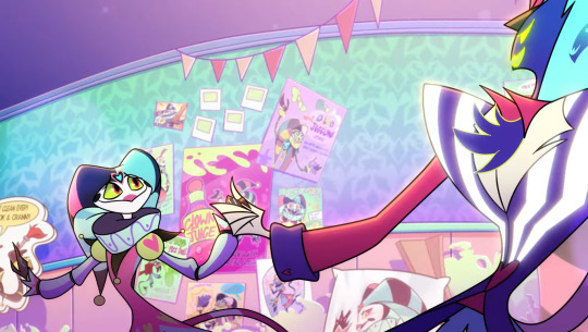
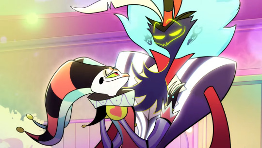
wont you dance with me?
#more dancing yuri ft.caine#hes just there for moral support#caine number 1 yuri supporter#and yes i spent a long time thinking about caine owning a gramophone. why do you ask#(its a flower based one :3 it has a round base#like a terracotta pot!#i like to think im smart#also realizing everytime i draw them i draw them differently ..#oh well!!!!#this is fine (my house is full of yuri)#anyway#real tags time#the amazing digital circus#tadc caine#tadc pomni#tadc ragatha#pomni x ragatha#ragapom#buttonblossom
2K notes
·
View notes
Text
until i recently read posts on here about how there is an inherent queerness to the doctor and rose's relationship in how it's unspoken and filled with yearning that i'd never really considered that element, despite knowing for ages that RTD is gay but. man. it's just reframed a lot of the series for me, like the idea that you have this lonely man who's just watched his people die and is self-destructive and misanthropic and traumatised and he can love again and he wants to but it has so many risks.
but especially S3 and how it adds even more weight to the doctor's grieving widower status. how he tells martha that he and rose were together but martha refers to rose as a friend to tallulah; the fact that he can only say they were together once she is gone; how the only other person that both can feel how he feels but also understands the depth of his feelings is jack, a queer man himself. and I've been thinking to myself lately oh, it's ok, the doctor and rose probably accidentally got married on at least one planet or something but also the point is that there was no official title that could convey to people the extent that they meant to each other, that the doctor can really only tell donna that rose was his friend even though it is so wholly inadequate and she comes to see that by the end of the episode (and martha too of course). how people who saw the doctor and rose together assumed they were a couple, like on krop tor, but once there's no more physical evidence of the relationship it becomes more vague (and simultaneously clearer).
anyway something about how christopher eccleston said he based his portrayal of nine on RTD and something about RTD saying that his husband is "in every good man i write now" and how the doctor and ruby seeing each other in the club mimics his first meeting with his husband aka the one moment he would use a time machine to go back to hmmm
#doctor who is fundamentally about grief and then i watch rtd era 1 and it's about grief like :0 oh my godddd#sidenote grieving widower ten needs its own tag on ao3#it's about the grief and the loss and the mourning and the loneliness#also this is not martha slander there are a million reasons to refer to rose as a friend#both real world and canonical and she was never directly told anything#but him not actually telling her what happened to rose and their exact relationship is kinda the point#doctor who#timepetals#meta#also yes rtd's husband was alive when he wrote end of time but. ten seeing rose at his end but their beginning...#yay queer readings of dw nay rtd as a person btw#dw meta
534 notes
·
View notes
Text
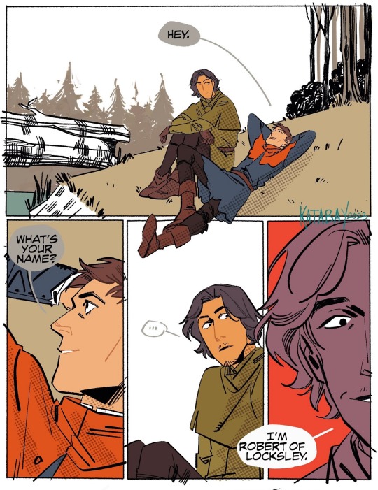
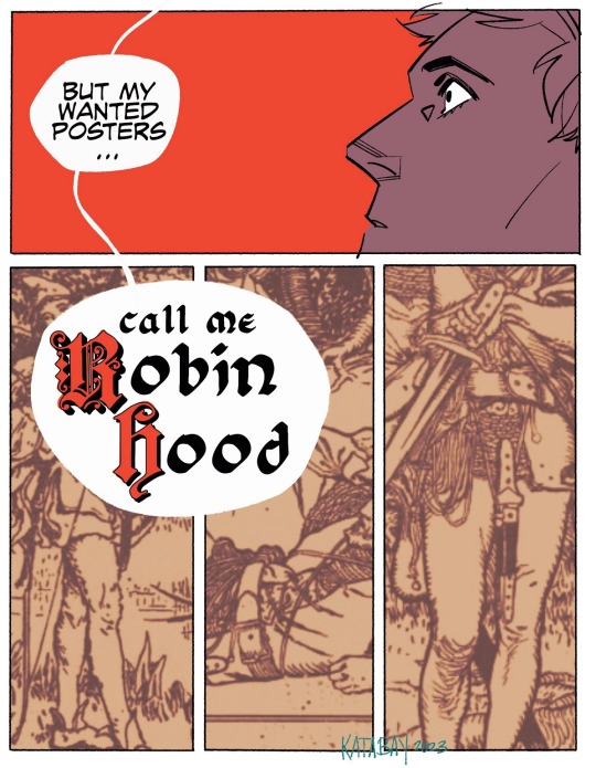
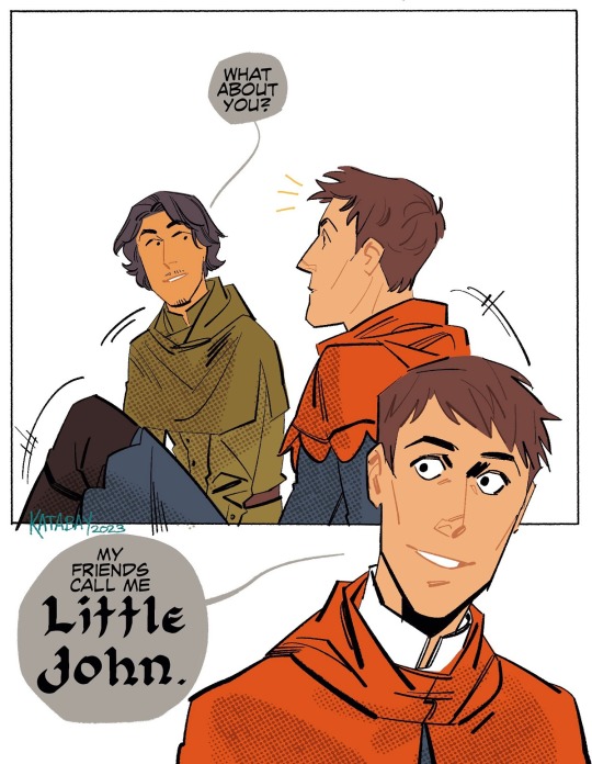
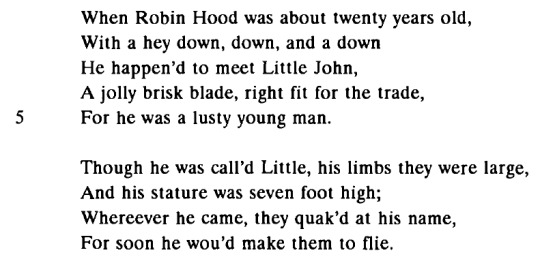
Robin Hood and Little John walkin' through the forest--
alright! so! early robin hood ballads and narratives don't have an origin story for little john, but a later ballad (robin hood and little john) does. they fight on a bridge in it, but I like looking at illustrations, so I've swapped out the bridge for that tree peaking out of the panel in the first panel bc I enjoy louis rhead's illustrations a lot.
this is some kind of introduction scene after they fight and climb out of the river!
Robin Hood & Little John (edited by Stephen Knight & Thomas Ohlgren)
#read something that compared robin hood and little john to gilgamesh and enkidu and oh my god. christ. fuck!!! okay then#robin hood#little john#outlaws in the woods tag#komiks tag#some other text was like 'ah yes robin hood was young and blond' i am choosing to ignore that. he's young and filipino and has dark hair#its my comic and nothing i do will be as objectively terrible as that fucking 2018 movie#or honestly a lot of the movies that decide they want to have an opinion on the crusade#'katabay why did you draw little john like cassius' tbqh i forgot how i was previously drawing john's hair#it'll happen again 😔 but maybe not. i want to draw robin hood more ngl.
2K notes
·
View notes
Text


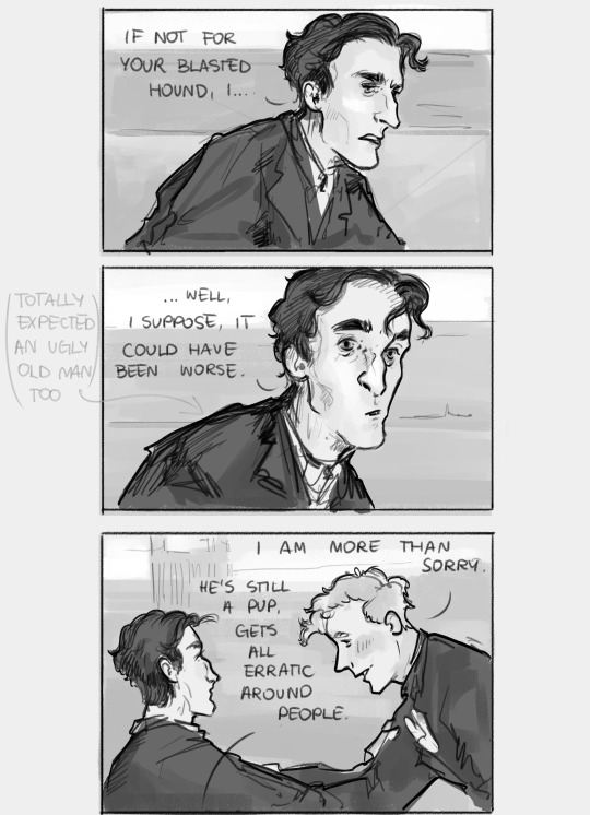
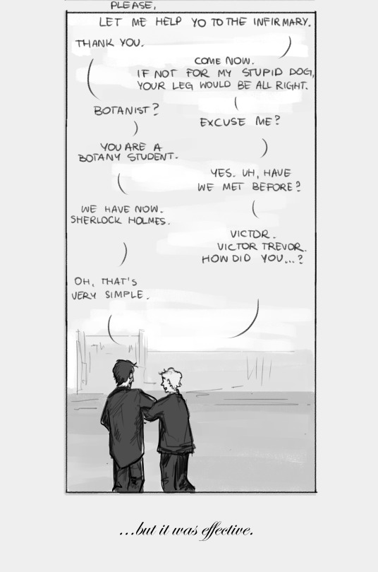
I have had a lot of thoughts on the original story after listening to the Sherlock&Co "Gloria Scott" and a new headcanon just dropped.
Chapter 1: part 1 - part 2 - part 3 - part 4 - part 5 - part 6
Masterpost (Index)
AO3
thoughts, if you're curious:
As far as gay Victor Trevor absolutely got me, I don't think there was anything serious between him and Holmes. This all comes down to my reading of Holmes, who is (to me) too aroace-spec to get involved in a regular relationship (althouuuughh about Holmes, his sexual and romantic orientation and him discovering it I have had so many thoughts I could write a whole essay). He likes to have a default person though, someone who will take him as he is, and maybe even admire a little - now that's Watson, earlier it was Trevor.
And yea I think Victor got a crush straight away after their first meeting, maybe they even talked about this at some point. Maybe Holmes said that he won't be able to reciprocate this affection but if Victor is fine with keeping things as they are, then he is too. I like to think they stayed pen friends even after Trevor's leave.
I feel like I should emphasize this? My intention in the comic was to make Trevor visibly flustered because he didn't expect a young attractive boy (he's hopeless in my head), while Holmes simply didn't expect to see someone his age and so sincerely sorry.
#i feel like i lost the ability to write meta for my drawings you know#the irrational feeling that i'll get misinterpreted if i don't explain everything thoroughly is taking over#truly horrible#also my imposter syndrome is full on lately in terms of my art so ughh it's so hard to share anything#at least i don't think anyone even sees my sh art so i may ramble in the tags here an noone notices :3#my art#sherlock holmes#victor trevor#acd holmes#acd canon#sherlock holmes fanart#i am rotating young holmes in my mind lately#oh yes and i made victor a botanist and named his dog dante for no apparent reasons#holmes collage adventures
477 notes
·
View notes
Text
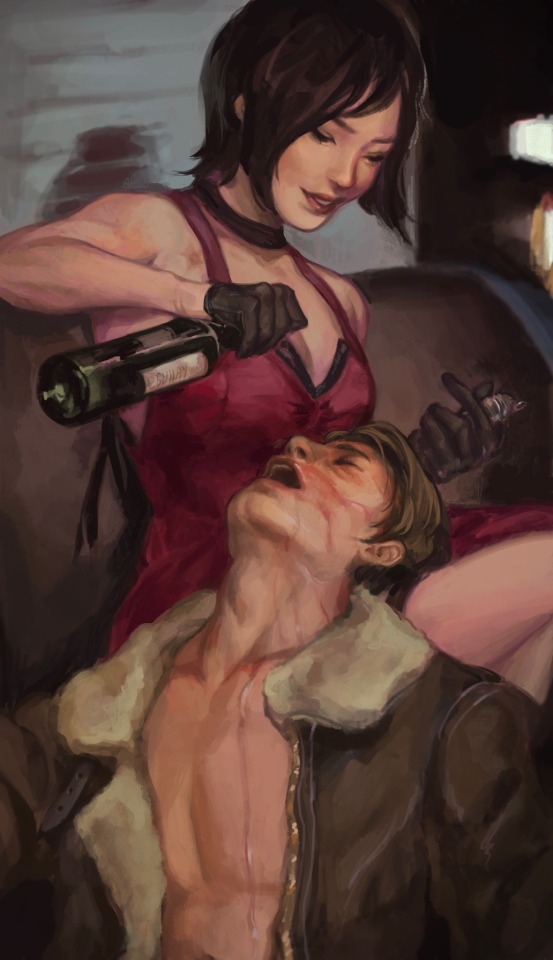
post-mission shenanigans
#caused quite a stir on twitter so figured I should post here too :0#happy to announce i am extremely annoying about resident evil <3 yes i love the sexies <3#i hope i make more painterly pieces soon ahh 🥹#art tag#resident evil#resident evil 4#re4make#re4#ada wong#leon kennedy#aeon#ada wong x leon kennedy#leon kennedy x ada wong#nya that should be all#oh also this whole thing i hc was leon’s idea#both needed a lil time to be silly off work teehee
1K notes
·
View notes
Text
why Aurora's art is genius
It's break for me, and I've been meaning to sit down and read the Aurora webcomic (https://comicaurora.com/, @comicaurora on Tumblr) for quite a bit. So I did that over the last few days.
And… y'know. I can't actually say "I should've read this earlier," because otherwise I would've been up at 2:30-3am when I had responsibilities in the morning and I couldn't have properly enjoyed it, but. Holy shit guys THIS COMIC.
I intended to just do a generalized "hello this is all the things I love about this story," and I wrote a paragraph or two about art style. …and then another. And another. And I realized I needed to actually reference things so I would stop being too vague. I was reading the comic on my tablet or phone, because I wanted to stay curled up in my chair, but I type at a big monitor and so I saw more details… aaaaaand it turned into its own giant-ass post.
SO. Enjoy a few thousand words of me nerding out about this insanely cool art style and how fucking gorgeous this comic is? (There are screenshots, I promise it isn't just a wall of text.) In my defense, I just spent two semesters in graphic design classes focusing on the Adobe Suite, so… I get to be a nerd about pretty things…???
All positive feedback btw! No downers here. <3
---
I cannot emphasize enough how much I love the beautiful, simple stylistic method of drawing characters and figures. It is absolutely stunning and effortless and utterly graceful—it is so hard to capture the sheer beauty and fluidity of the human form in such a fashion. Even a simple outline of a character feels dynamic! It's gorgeous!
Though I do have a love-hate relationship with this, because my artistic side looks at that lovely simplicity, goes "I CAN DO THAT!" and then I sit down and go to the paper and realize that no, in fact, I cannot do that yet, because that simplicity is born of a hell of a lot of practice and understanding of bodies and actually is really hard to do. It's a very developed style that only looks simple because the artist knows what they're doing. The human body is hard to pull off, and this comic does so beautifully and makes it look effortless.
Also: line weight line weight line weight. It's especially important in simplified shapes and figures like this, and hoo boy is it used excellently. It's especially apparent the newer the pages get—I love watching that improvement over time—but with simpler figures and lines, you get nice light lines to emphasize both smaller details, like in the draping of clothing and the curls of hair—which, hello, yes—and thicker lines to emphasize bigger and more important details and silhouettes. It's the sort of thing that's essential to most illustrations, but I wanted to make a note of it because it's so vital to this art style.
THE USE OF LAYER BLENDING MODES OH MY GODS. (...uhhh, apologies to the people who don't know what that means, it's a digital art program thing? This article explains it for beginners.)
Bear with me, I just finished my second Photoshop course, I spent months and months working on projects with this shit so I see the genius use of Screen and/or its siblings (of which there are many—if I say "Screen" here, assume I mean the entire umbrella of Screen blending modes and possibly Overlay) and go nuts, but seriously it's so clever and also fucking gorgeous:
Firstly: the use of screened-on sound effect words over an action? A "CRACK" written over a branch and then put on Screen in glowy green so that it's subtle enough that it doesn't disrupt the visual flow, but still sticks out enough to make itself heard? Little "scritches" that are transparent where they're laid on without outlines to emphasize the sound without disrupting the underlying image? FUCK YES. I haven't seen this done literally anywhere else—granted, I haven't read a massive amount of comics, but I've read enough—and it is so clever and I adore it. Examples:


Secondly: The beautiful lighting effects. The curling leaves, all the magic, the various glowing eyes, the fog, the way it's all so vividly colored but doesn't burn your eyeballs out—a balance that's way harder to achieve than you'd think—and the soft glows around them, eeeee it's so pretty so pretty SO PRETTY. Not sure if some of these are Outer/Inner Glow/Shadow layer effects or if it's entirely hand-drawn, but major kudos either way; I can see the beautiful use of blending modes and I SALUTE YOUR GENIUS.
I keep looking at some of this stuff and go "is that a layer effect or is it done by hand?" Because you can make some similar things with the Satin layer effect in Photoshop (I don't know if other programs have this? I'm gonna have to find out since I won't have access to PS for much longer ;-;) that resembles some of the swirly inner bits on some of the lit effects, but I'm not sure if it is that or not. Or you could mask over textures? There's... many ways to do it.
If done by hand: oh my gods the patience, how. If done with layer effects: really clever work that knows how to stop said effects from looking wonky, because ugh those things get temperamental. If done with a layer of texture that's been masked over: very, very good masking work. No matter the method, pretty shimmers and swirly bits inside the bigger pretty swirls!
Next: The way color contrast is used! I will never be over the glowy green-on-black Primordial Life vibes when Alinua gets dropped into that… unconscious space?? with Life, for example, and the sharp contrast of vines and crack and branches and leaves against pitch black is just visually stunning. The way the roots sink into the ground and the three-dimensional sensation of it is particularly badass here:

Friggin. How does this imply depth like that. HOW. IT'S SO FREAKING COOL.
A huge point here is also color language and use! Everybody has their own particular shade, generally matching their eyes, magic, and personality, and I adore how this is used to make it clear who's talking or who's doing an action. That was especially apparent to me with Dainix and Falst in the caves—their colors are both fairly warm, but quite distinct, and I love how this clarifies who's doing what in panels with a lot of action from both of them. There is a particular bit that stuck out to me, so I dug up the panels (see this page and the following one https://comicaurora.com/aurora/1-20-30/):

(Gods it looks even prettier now that I put it against a plain background. Also, appreciation to Falst for managing a bridal-carry midair, damn.)
The way that their colors MERGE here! And the immense attention to detail in doing so—Dainix is higher up than Falst is in the first panel, so Dainix's orange fades into Falst's orange at the base. The next panel has gold up top and orange on bottom; we can't really tell in that panel where each of them are, but that's carried over to the next panel—

—where we now see that Falst's position is raised above Dainix's due to the way he's carrying him. (Points for continuity!) And, of course, we see the little "huffs" flowing from orange to yellow over their heads (where Dainix's head is higher than Falst's) to merge the sound of their breathing, which is absurdly clever because it emphasizes to the viewer how we hear two sets of huffing overlaying each other, not one. Absolutely brilliant.
(A few other notes of appreciation to that panel: beautiful glows around them, the sparks, the jagged silhouette of the spider legs, the lovely colors that have no right to make the area around a spider corpse that pretty, the excellent texturing on the cave walls plus perspective, the way Falst's movements imply Dainix's hefty weight, the natural posing of the characters, their on-point expressions that convey exactly how fuckin terrifying everything is right now, the slight glows to their eyes, and also they're just handsome boys <3)
Next up: Rain!!!! So well done! It's subtle enough that it never ever disrupts the impact of the focal point, but evident enough you can tell! And more importantly: THE MIST OFF THE CHARACTERS. Rain does this irl, it has that little vapor that comes off you and makes that little misty effect that plays with lighting, it's so cool-looking and here it's used to such pretty effect!
One of the panel captions says something about it blurring out all the injuries on the characters but like THAT AIN'T TOO BIG OF A PROBLEM when it gets across the environmental vibes, and also that'd be how it would look in real life too so like… outside viewer's angle is the same as the characters', mostly? my point is: that's the environment!!! that's the vibes, that's the feel! It gets it across and it does so in the most pretty way possible!
And another thing re: rain, the use of it to establish perspective, particularly in panels like this—

—where we can tell we're looking down at Tynan due to the perspective on the rain and where it's pointing. Excellent. (Also, kudos for looking down and emphasizing how Tynan's losing his advantage—lovely use of visual storytelling.)
Additionally, the misting here:

We see it most heavily in the leftmost panel, where it's quite foggy as you would expect in a rainstorm, especially in an environment with a lot of heat, but it's also lightly powdered on in the following two panels and tends to follow light sources, which makes complete sense given how light bounces off particles in the air.
A major point of strength in these too is a thorough understanding of lighting, like rim lighting, the various hues and shades, and an intricate understanding of how light bounces off surfaces even when they're in shadow (we'll see a faint glow in spots where characters are half in shadow, but that's how it would work in real life, because of how light bounces around).
Bringing some of these points together: the fluidity of the lines in magic, and the way simple glowing lines are used to emphasize motion and the magic itself, is deeply clever. I'm basically pulling at random from panels and there's definitely even better examples, but here's one (see this page https://comicaurora.com/aurora/1-16-33/):

First panel, listed in numbers because these build on each other:
The tension of the lines in Tess's magic here. This works on a couple levels: first, the way she's holding her fists, as if she's pulling a rope taut.
The way there's one primary line, emphasizing the rope feeling, accompanied by smaller ones.
The additional lines starbursting around her hands, to indicate the energy crackling in her hands and how she's doing a good bit more than just holding it. (That combined with the fists suggests some tension to the magic, too.) Also the variations in brightness, a feature you'll find in actual lightning. :D Additional kudos for how the lightning sparks and breaks off the metal of the sword.
A handful of miscellaneous notes on the second panel:
The reflection of the flames in Erin's typically dark blue eyes (which bears a remarkable resemblance to Dainix, incidentally—almost a thematic sort of parallel given Erin's using the same magic Dainix specializes in?)
The flowing of fabric in the wind and associated variation in the lineart
The way Erin's tattoos interact with the fire he's pulling to his hand
The way the rain overlays some of the fainter areas of fire (attention! to! detail! hell yeah!)
I could go on. I won't because this is a lot of writing already.
Third panel gets paragraphs, not bullets:
Erin's giant-ass "FWOOM" of fire there, and the way the outline of the word is puffy-edged and gradated to feel almost three-dimensional, plus once again using Screen or a variation on it so that the stars show up in the background. All this against that stunning plume of fire, which ripples and sparks so gorgeously, and the ending "om" of the onomatopoeia is emphasized incredibly brightly against that, adding to the punch of it and making the plume feel even brighter.
Also, once again, rain helping establish perspective, especially in how it's very angular in the left side of the panel and then slowly becomes more like a point to the right to indicate it's falling directly down on the viewer. Add in the bright, beautiful glow effects, fainter but no less important black lines beneath them to emphasize the sky and smoke and the like, and the stunningly beautiful lighting and gradated glows surrounding Erin plus the lightning jagging up at him from below, and you get one hell of an impactful panel right there. (And there is definitely more in there I could break down, this is just a lot already.)
And in general: The colors in this? Incredible. The blues and purples and oranges and golds compliment so well, and it's all so rich.
Like, seriously, just throughout the whole comic, the use of gradients, blending modes, color balance and hues, all the things, all the things, it makes for the most beautiful effects and glows and such a rich environment. There's a very distinct style to this comic in its simplified backgrounds (which I recognize are done partly because it's way easier and also backgrounds are so time-consuming dear gods but lemme say this) and vivid, smoothly drawn characters; the simplicity lets them come to the front and gives room for those beautiful, richly saturated focal points, letting the stylized designs of the magic and characters shine. The use of distinct silhouettes is insanely good. Honestly, complex backgrounds might run the risk of making everything too visually busy in this case. It's just, augh, so GORGEOUS.
Another bit, take a look at this page (https://comicaurora.com/aurora/1-15-28/):

It's not quite as evident here as it is in the next page, but this one does some other fun things so I'm grabbing it. Points:
Once again, using different colors to represent different character actions. The "WHAM" of Kendal hitting the ground is caused by Dainix's force, so it's orange (and kudos for doubling the word over to add a shake effect). But we see blue layered underneath, which could be an environmental choice, but might also be because it's Kendal, whose color is blue.
And speaking off, take a look at the right-most panel on top, where Kendal grabs the spear: his motion is, again, illustrated in bright blue, versus the atmospheric screened-on orange lines that point toward him around the whole panel (I'm sure these have a name, I think they might be more of a manga thing though and the only experience I have in manga is reading a bit of Fullmetal Alchemist). Those lines emphasize the weight of the spear being shoved at him, and their color tells us Dainix is responsible for it.
One of my all-time favorite effects in this comic is the way cracks manifest across Dainix's body to represent when he starts to lose control; it is utterly gorgeous and wonderfully thematic. These are more evident in the page before and after this one, but you get a decent idea here. I love the way they glow softly, the way the fire juuuust flickers through at the start and then becomes more evident over time, and the cracks feel so realistic, like his skin is made of pottery. Additional points for how fire begins to creep into his hair.
A small detail that's generally consistent across the comic, but which I want to make note of here because you can see it pretty well: Kendal's eyes glow about the same as the jewel in his sword, mirroring his connection to said sword and calling back to how the jewel became Vash's eye temporarily and thus was once Kendal's eye. You can always see this connection (though there might be some spots where this also changes in a symbolic manner; I went through it quickly on the first time around, so I'll pay more attention when I inevitably reread this), where Kendal's always got that little shine of blue in his eyes the same as the jewel. It's a beautiful visual parallel that encourages the reader to subconsciously link them together, especially since the lines used to illustrate character movements typically mirror their eye color. It's an extension of Kendal.
Did I mention how ABSOLUTELY BEAUTIFUL the colors in this are?
Also, the mythological/legend-type scenes are illustrated in familiar style often used for that type of story, a simple and heavily symbolic two-dimensional cave-painting-like look. They are absolutely beautiful on many levels, employing simple, lovely gradients, slightly rougher and thicker lineart that is nonetheless smoothly beautiful, and working with clear silhouettes (a major strength of this art style, but also a strength in the comic overall). But in particular, I wanted to call attention to a particular thing (see this page https://comicaurora.com/aurora/1-12-4/):

The flowing symbolic lineart surrounding each character. This is actually quite consistent across characters—see also Life's typical lines and how they curl:

What's particularly interesting here is how these symbols are often similar, but not the same. Vash's lines are always smooth, clean curls, often playing off each other and echoing one another like ripples in a pond. You'd think they'd look too similar to Life's—but they don't. Life's curl like vines, and they remain connected; where one curve might echo another but exist entirely detached from each other in Vash's, Life's lines still remain wound together, because vines are continuous and don't float around. :P
Tahraim's are less continuous, often breaking up with significantly smaller bits and pieces floating around like—of course—sparks, and come to sharper points. These are also constants: we see the vines repeated over and over in Alinua's dreams of Life, and the echoing ripples of Vash are consistent wherever we encounter him. Kendal's dream of the ghost citizens of the city of Vash in the last few chapters is filled with these rippling, echoing patterns, to beautiful effect (https://comicaurora.com/aurora/1-20-14/):

They ripple and spiral, often in long, sinuous curves, with smooth elegance. It reminds me a great deal of images of space and sine waves and the like. This establishes a definite feel to these different characters and their magic. And the thing is, that's not something that had to be done—the colors are good at emphasizing who's who. But it was done, and it adds a whole other dimension to the story. Whenever you're in a deity's domain, you know whose it is no matter the color.
Regarding that shape language, I wanted to make another note, too—Vash is sometimes described as chaotic and doing what he likes, which is interesting to me, because smooth, elegant curves and the color blue aren't generally associated with chaos. So while Vash might behave like that on the surface, I'm guessing he's got a lot more going on underneath; he's probably much more intentional in his actions than you'd think at a glance, and he is certainly quite caring with his city. The other thing is that this suits Kendal perfectly. He's a paragon character; he is kind, virtuous, and self-sacrificing, and often we see him aiming to calm others and keep them safe. Blue is such a good color for him. There is… probably more to this, but I'm not deep enough in yet to say.
And here's the thing: I'm only scratching the surface. There is so much more here I'm not covering (color palettes! outfits! character design! environment! the deities! so much more!) and a lot more I can't cover, because I don't have the experience; this is me as a hobbyist artist who happened to take a couple design classes because I wanted to. The art style to this comic is so clever and creative and beautiful, though, I just had to go off about it. <3
...brownie points for getting all the way down here? Have a cookie.
#aurora comic#aurora webcomic#comicaurora#art analysis#...I hope those are the right tags???#new fandom new tagging practices to learn ig#much thanks for something to read while I try to rest my wrists. carpal tunnel BAD. (ignore that I wrote this I've got braces ok it's fine)#anyway! I HAVE. MANY MORE THOUGHTS. ON THE STORY ITSELF. THIS LOVELY STORY#also a collection of reactions to a chunk of the comic before I hit the point where I was too busy reading to write anything down#idk how to format those tho#...yeet them into one post...???#eh I usually don't go off this much these days but this seems like a smaller tight-knit fandom so... might as well help build it?#and I have a little more time thanks to break so#oh yes also shoutout to my insanely awesome professor for teaching me all the technical stuff from this he is LOVELY#made an incredibly complex program into something comprehensible <3#synapse talks
744 notes
·
View notes
Last Seen Blogs
take-my-wicked-heart-blog
The Sea Calls Back To You
im-jinxs-trinket
🖕 Amari 🖕

vsbuilders
Untitled

wmjs-3d
wmjs-3d
melanchoise
gremlin in hell