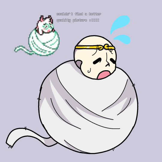
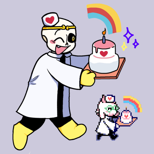
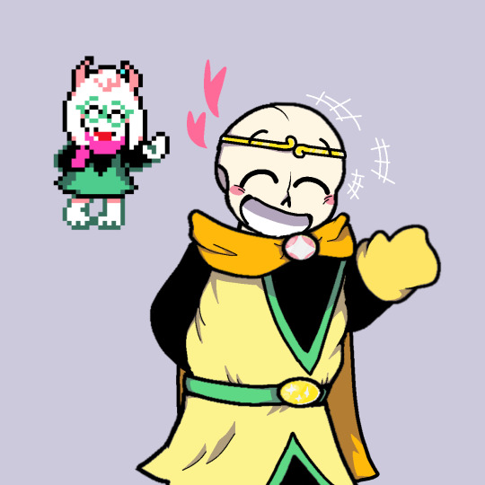
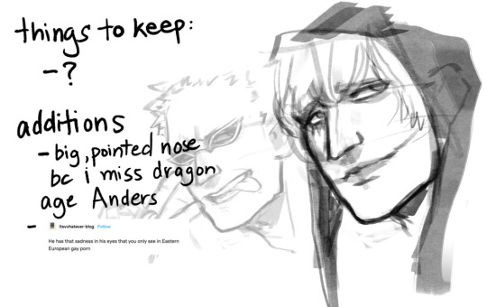
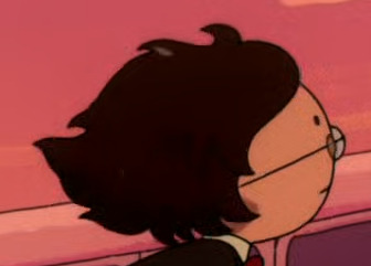
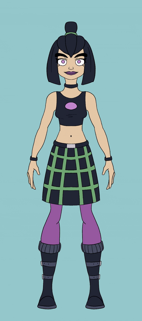
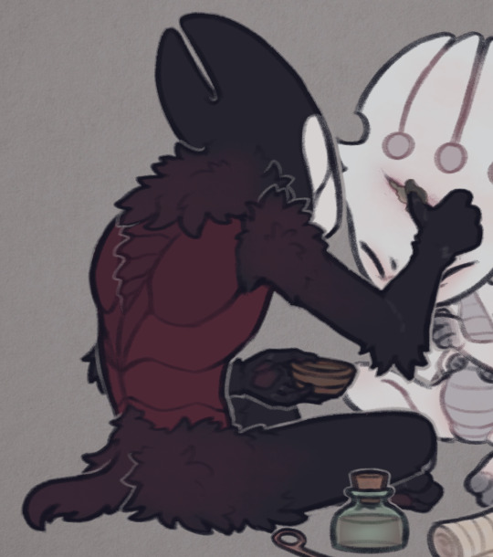
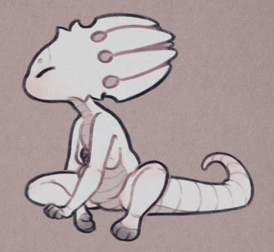
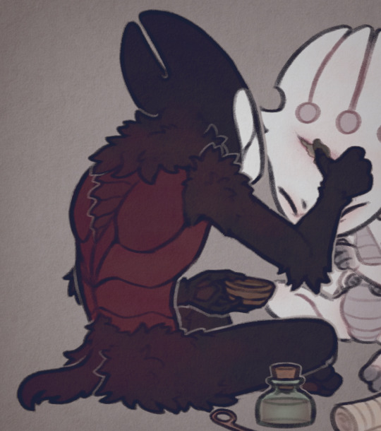
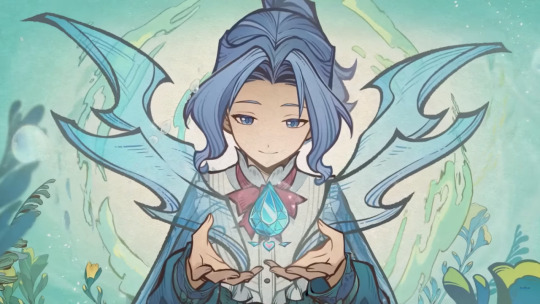
#no artstyle consistency as you can see
Text
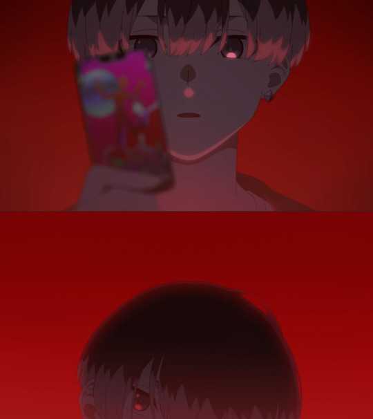
pov you’re scrolling on magicam stories during the orientation ceremony
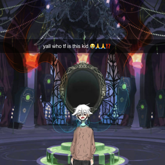
and the aftermath
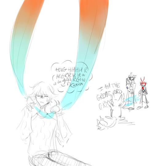

#repost 😨😨😨#no artstyle consistency as you can see#twisted wonderland#twst#artists on tumblr#twst yuu#twst x yuu#twst x reader#twst fanart#yuusona#riddle rosehearts#azul ashengrotto#my art#twst oc#????#well not really#oc#original character#dire crowley#<- fuckass#hate that bird#crowley slander#twst grim#i cant draw hands for the life of me spare my soul#oc: yukari 🦋
59 notes
·
View notes
Text
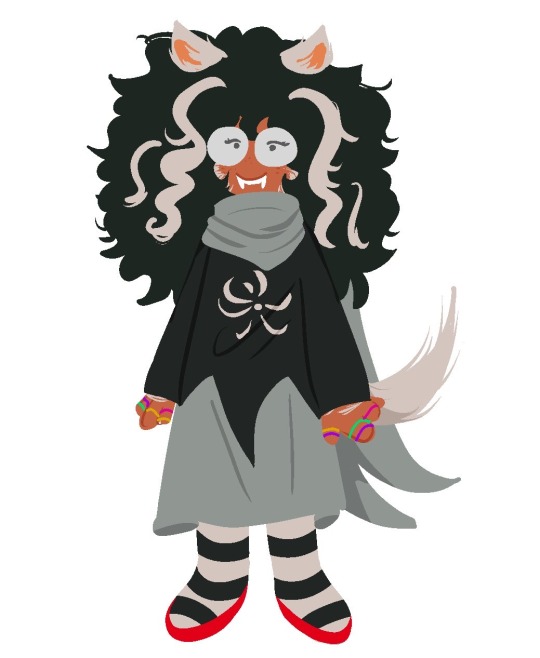


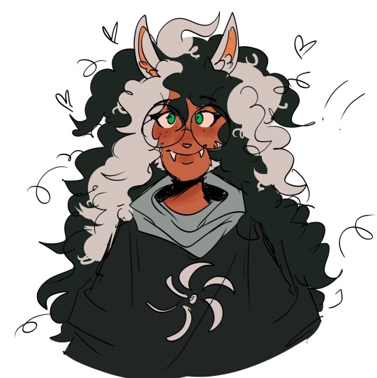
More jades yay
This is my design of her >:]
#jade harley#homestuck#hom3stuck#homestuck art#my art#i love her sm#shes one of the best characters istg#as you can see i dont have a consistent artstyle#i apologiz#angonidas art#doobles
598 notes
·
View notes
Text


ralsei sprite redraw but with dream :}}}}
#I was kind of experimenting with each you can see the artstyle isn't consistent hihi#I just wanted to draw dream being goofy and silly and happy cuz he deserves to be goofy and silly and happy#he's just a little guy :]#dream sans#undertale au#sans au#myart
12 notes
·
View notes
Text
cross posting yesterday's rambling thread for posterity and because tumblr lets me edit things. anyway this is a sorta long thing and i might add things i forgot to mention in the twt thread
i tend to draw on-model canon because im a coward + just personal preferences. but the way i convert the canon designs into my artstyle is that i take the distinct features oda gives them and then combine it with personal headcanons to complete what should look like a unique human.
Starting with Trafalgar Law, who is unfortunately a bland-ass conventionally pretty boy
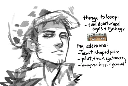
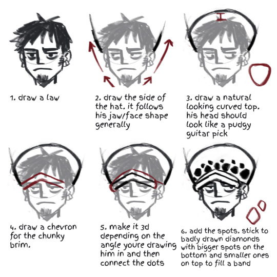
someone commented a while ago the law hat drawing tutorial i made a while ago didn't make much sense and i realize its bc of the specific way i draw law's face: heart shaped (ba-dum-tss). That meaning, a narrow chin widening into a mild defined jaw, wide cheekbones, and up to his know-it-all brain dome.
given that, the pudgy guitar pick shape of his head i mentioned here should make a lot more sense.
i don't think this design point is unique to me, as most conventional pretty anime boy gets given jaws like this. a lot of law artists tend to veer into this head shape. just how life be sometimes.
other points: flat, thick eyebrows is bc im a hairy gal and i need to feel better about myself.
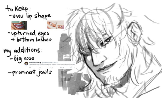
Killer gets to be more interesting, because he shouldn't be considered conventionally attractive. my idea behind killer's is that those individual features is smth he would be insecure with enough to hide himself in a helmet but i draw him with all the love in the world actually. i'd like to think its how kid sees him or yknow, law, bc he's my kin assigned blorbo and maybe you ship lawkill as a guilty pleasure too
i mentioned before (and ruined people's days) when i said whenever i draw killer he looks like griffith before i put on his goatee. the upper half of his face is distinctly feminine, with the lower half kinda over compensating. other than that uhh...idk. stan killer
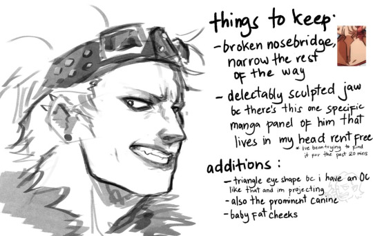
Kidd is the bane of my existence, i feel like i can never draw his face consistently. yet at the same time he's so damn fun to draw everyone gotta try it.
my problem with kidd is that this mf does have eyelids. most kidd painters out there interpret this as him having deep set eyes (think Matt Smith or jeffrey star) . and yeh skill issue on me i should practice that.
other notes, i try to make him younger than canon makes him look. he is my babygirl and he deserves to look cuddly. my band au kidd version has the honor of being allowed some chubs. he's just tries to look older and more menacing with edgy makeup. also i try to give him dimples when i can because, well i can.
Rosinante last bc i lost steam after kidd. the thing abt cora is that aside from not having eyebrows, everything is structured with the generic one piece man template. which means i gotta do everything myself
doffy is there bc the way to figure out how to draw these two is to give them minor differences from each other, that being doffy gets slightly sharper features. in canon, these two are also rly wide boys (more of an oda style feat tbh) but i make them long. though bigger brained donquixote artists know that of these two brothers, doffy should be the wiry-er built.
anyway that's it. in conclusion, i need to draw more girls actually i feel like im becoming misogynistic by osmosis from oda's style and now i draw girls all looking the same too.
#one piece#trafalgar law#eustass kid#eustass kidd#op killer#massacre soldier killer#donquixote rosinante#donquixote corazon#donquixote doflamingo#was gonna do robin and perona too at least but like...i have a job and stuff
332 notes
·
View notes
Note
Would you recommend the SSSS comic? I know little of it beside the very beautiful artstyle and premise
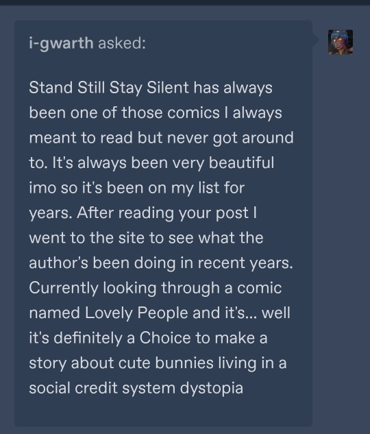
to answer the question of if i would recommend SSSS as a comic: yes, yes i would.
a description for those who don't know: Stand Still Stay Silent is a post-apocalyptic horror + adventure webcomic set in the nordics (norway, sweden, denmark, finland, iceland) that have been isolated from the rest of the world and gone back to their old gods. the the world outside of safe zones is full of trolls and beasts - humans and mammals that got infected by a horrible virus and turned into monsters. the story follows a ragtag crew that ventures into the old world (derelict denmark) on an expedition to collect books.
the comic updated every workday until it concluded in 2022, and consists of two Adventures. the creator had plans for many adventures with these characters in this world, but ended it after two when she wanted to take a new direction with her life.
what i love about it:
- the art is GORGEOUS. it's been a huge source of inspiration for me. open any page and it's a masterpiece, and you will ask yourself "how the FUCK did she update this FIVE DAYS A WEEK"
- the characters are wonderful and endearing. i just, i love them so much. i am so thankful lalli hotakainen exists he is one of my #1 blorbos forever
- the world is so cool. the blend of chunky sci-fi and norse mythology fantasy magic slaps. it goes so hard. i fell so hard for this comic when i got to the big ferry ship with a viking style dragon head prow added to it. it's everything
- it really really gets nordic cultures. it's difficult to explain all the dynamics and nuances but it just gets it. it brings me as a scandinavian a lot of joy to read a story that speaks to my heart this way. the attitudes, the language barriers, the cultural differences... it was so refreshing to me in a media landscape dominated by american stories. when the pandemic hit, i decided to reread the comic because i found such an odd comfort in seeing how it depicted the scandinavian countries reacting to, well, a pandemic.
- there's kittycats
what i don't like about it:
- the most glaring and obvious flaw is that everyone in the comic is white. there's not a single character of color anywhere, not even i background shots or the prologue. there's no mention of the saami people (the indigenous people of northern europe), either. i believe this was done in ignorance more than malicious intent, but the implications are Extremely Bad and it's been bothering me (AND MANY OTHERS) since day 1. that is the number one caveat i will give to anyone wanting to check this comic out. i've been in the discourse trenches and i am not going to excuse this. it's just bad!
- you can tell in the middle of adventure 2 that the creator has kind of lost interest in the work, around the time when she found jesus i guess. like, very few people can keep up work on the same creative project for years and years and years and i think it's fine that she wanted to drop it, but it's a bit sad to see the comic dragged to its end like a limp corpse, and feeling like the creator no longer really cares about the characters.
- minna sundberg has said and done some questionable things, presumably gotten somewhat radicalised over time, and has also converted to hardcore christianity which is what her new works are about. there's nothing about this in SSSS - there is a moment of christianity represented in the story in a sort of mythological sense, just like the other religions, but this was written before minna's conversion. her new works... are a Choice. i have much to say about them, and i have, and im not gonna rehash it now.
SO YEAH hopefully this will help you take an Informed Choice! i got into this comic in 2015 and was deep in the fandom and it's for better or for worse part of my soul foundation now.
i also recommend A Redtail's Dream, minna's "practice comic" before SSSS, based on finnish mythology and the kalevala.
125 notes
·
View notes
Text
Okay, you know what, let's talk a little bit more about Simon Petrikov's ears
I already made a silly little post pointing out how the Winter King is drawn with visible ears, while Mainverse Simon is always drawn without them.
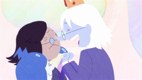
And I've gotten a few replies on that post saying that it's probably just a difference in hairstyle. Y'know, the Winter King tacks his hair behind his ears, Simon doesn't. But... I don't think that works if you look at Simon's design. I mean, it does seem to be the case if you look at this one screenshot I here - but usually....
Simon Petrikov's little glasses are very helpful here, because they literally form a line with where his ears should be, and you can see that his hair typically ends just above that point and no matter how much he turns his head there are no ears.
In a back shot you can even see where his glasses handle end, and there's no ears anywhere to actually hold them.
(this is also true when he's Ice King btw)

It's kind of a Whole Thing. The Adventure Time artstyle has some general guidelines of how to draw humanoids' face, but it's fully willing to break them to make someone more goofy and distinctive. Like, some characters having noses or more detailed eyes or even lips. And ears are already kind of a Weird Subject considering how many AT characters wear hair/hats in a way that hides their ears anyways.
Princess Bubblegum is another earless characters, but it's actually pretty hard to notice because most of her hairstyle obscure her Perfectly Spherical Head.
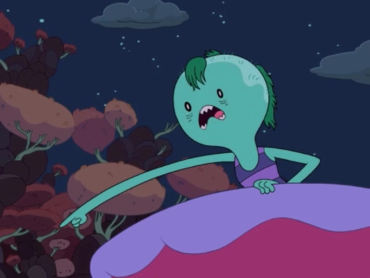
But she's like, Made of Gum, so it's less Weird for her to be earless compared to Simon Petrikov who's meant to be a Perfectly Normal Human Man.
(although Prince Gumball somehow does have ears. Even when he IS in his Magic Candy Form)
(Which is like... lowkey Weird. But still, Magic Candy People's physiologically can be whatever)
Meanwhile, ears IS something pretty consistently drawn for human Adventure Time characters. So it is pretty weird Simon doesn't seem to have them. It's probably a matter of, like, Simon being one of the first not-Finn Human characters added to Adventure Time and with the aforementioned matter of most characters not having their ears/lack of ears visible either way they weren't really sure of how Humans should look in the AT style at that point.
Or maybe they wanted to keep it consistent with Ice King's "Loyalty to the King" look and decided that a Magic Evil Crown that makes your ears fall off is a step too far. Or maybe having his ears hidden by his hair is what was originally intended in his design, but was misinterpreted as being straight-up earless so consistently by the shortboarders and animators it eventually just became his canon look.
But I think also... characters having certain non-typical facial features on Adventure Time is generally an indication that they're particularly prominent. So characters who are drawn with noses generally have large noses. The smaller a facial feature is, the more likely it is to get simplified into nothing.
Therefore, looking at it from an in-universe perspective, I think the most logical conclusion is that Simon Petrikov is not straight-up literally earless - he just has weird freakishly-small ears
And the Winter King was so insecure about them he literally enlarged them with magic.
#('The Winter King' has a lot more shots where it DOES seem like Simon's ears are just hidden behind his hair than normal but I think#that it's probably just because putting him next to WK all the time really made the storyboarders and animators notice#how Weird and Earless Simon looks)#adventure time#atimers#fionna and cake#at#fac#f&c#adventure time fionna and cake#adventure time simon#fionna and cake simon#fionna and cake series#fionna and cake show#simon petrikov#simon adventure time#the winter king#winter king#ice king#the ice king#at simon
367 notes
·
View notes
Text
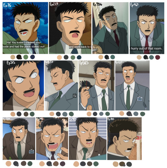


JOIN ME, IN HELL
I always had this impression that Nakamori's color palette has changed the most dramatically in all of his appearances and I've always wanted to see if that's actually true, because I'm sick in the head and apparently didn't have anything better to do. So here are the results! While this isn't EVERY appearance, it's most of them, and ones I consider important as far as color palettes go.
Quality is a factor on a bunch of these, and so is the lighting of the shots, especially the OVAs which maybe I shouldn't've included since they throw things off a bit. I tried to find decent quality images of Naka in bright indoor lighting, but it wasn't always possible.
So to my eye, you can separate Naka's 'main' color palettes (and artstyle shifts) based on his suit colors, kinda like Lupin ironically:
Green suit (Ep. 76-515)
Gray/Brown Suit (515-983)
Black suit (1105-onward + all movies from 14 onward)
My other takeaways are:
No one can decide if his hair is black or brown, huh
His skin color's been pretty consistent actually, until recently when they made it darker.
Dunno what was going on with the first Magic Kaito TV special. The art style for the rest of them is nothing like it.
I probably should've ordered these chronologically to get a better idea of how the colors shifted over time. It is interesting to me how Nakamori's color palette for the movies has been consistent since Movie 14, but they didn't change his palette in DetCo to match it until super recently. And then Magic Kaito 1412 is just off doing entirely its own thing.
I most associate Nakamori with wearing green since I think that's what he wears straight through Magic Kaito 1412. If you count every episode he's in as a separate appearance, I think green might technically be the most common, but if you don't then I think brown wins.
Honestly these color palette shifts are probably true for Every character. I don't know why it feels so drastic for Nakamori. Probably because it's not like Rachel's hair randomly turns black for a few hundred episodes.
#ginzo nakamori#nakamori ginzo#dcmk#detective conan#magic kaito#magic kaito 1412#Me writing out this entire post before realizing this is Extremely Embarrassing#But I've already come this far so. have it
65 notes
·
View notes
Note
how draw in the cs style im taking notes
OOOOOO i've been waiting for someone to ask me this!!
this will be pretty long so bear with me :'D
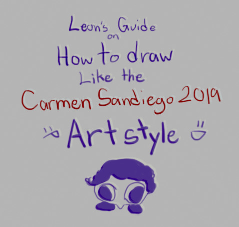
Firstly, The Sketch (ft. sleep deprived looking sketch)
personally i chicken scratch my sketch when it comes to base layers, but when it comes to more detailed parts, i still chicken scratch it but i tend to clean up the sketch more (to make it more refined and make sense)

secondly, The Base Colors
Stick to simple colors that are easy to be read by the eyes before adding any eye catching designs! the CS style is pretty simplified (for example, carmen sandiego's eye catching Red fedora and Coat)
Less is More in the CS style! so use more simple and refined shapes!
i noticed that in the CS style, the characters in the show are drawn with easy to identify shapes, there are points in the style that are sharp, sometimes rounded, it's always sharp, simplified and kinda cartoony.
the way you design and assign colors in your art is IMPORTANT!
for example: my oc here Blank! i stuck with a bold and easy to identify color on Blank's attire to take attention away from the face (because he's a master of disguise, the way people would interpret him is through what he was wearing. making him harder to find when he's in disguise)
in short, assign your colors well to fit your character's design and how the viewers would see them!

Third, Catchy Details :D
Like i said before, LESS IS MORE
on my oc here, i put a few details on his upper clothing to also attract abit of attention.
USE CONSISTENT YET SIMPLE DESIGNS
(either rounder or sharper details)
AVOID ADDING TOO MANY DETAILS
adding too many details can be hard to process to the viewer's eyes. and in the CS style, you'll notice that most designs on characters are always simplified.

Fourth, Shadows
i noticed that in the CS style, most of their shadows are blocky instead of faded/blurred like an air brush's effect.
the shadows bit are a little hard to explain by Word so i'll give you a visual example
This is how i draw CS styles use shadows.
even if it does have a faded effect, the shadows always have a sharper look to it.
These 2 types of shadows you can use in the CS style, Hard shadows and Slightly Faded shadows (and rarely any faded shadows)
i added a personal detail that i think i can sometimes see in the show's artstyle, specifically when looking at the lower portion of the characters.

idk if it's just me but i personally like adding this. it looks more interesting :'D
LASTLY, DON'T LIMIT YOURSELF TO MY METHOD OF DRAWING THE CS STYLE!!
everyone has different methods and styles of drawing this kind of artstyle, limiting yourself to only my method keeps you from experimenting with easier ways for you to draw in this style.
so that's how i draw in the CS artstyle! if you have more questions, don't be afraid to ask!!
#carmen sandiego#carmen sandiego netflix#carmen sandeigo 2019#10leon13#self insert oc#blank#carmen sandiego 2019#carmen sandiego art style#art style#artstyle#how to draw in CS artstyle#tutorial
142 notes
·
View notes
Text
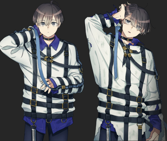
Road to 3D- Sam Manson (Part 1):
Model sheet
Part 2: Character Modeling
Hi! On my recent posts of my 3d models I got many asking questions about how I made them. I'm currently working on a 3d Sam model from scratch and so I thought I can document my process here and add some thoughts through my process.
Before I can model anything in 3d I need a reference and a plan. For characters this means I need to create a model sheet, so here we are.
Some disclaimer first before I continue:
I'm just a self-taught hobby artist not a professional or proper art student. The infos I write here down are just the things I do and can be completly wrong or different in a professional setting.
This is not a tutorial or a step-by-step-guide for character design or how to make character sheets in general. Just additional things that I pay attention to when I make a model sheet for my 3d models.
As someone who just does 3d modeling in my freetime for 2 1/2 years I see myself still as a beginner. I'm still in a experimenting with different techniques and artstyle. This and the following posts describes just stuff I do for this model, it could be some other method next if I feel this didn't work out that well. Nothing is set in stone.
I do the 3d models just for myself for practice and for fun, you cannot download them anywhere. I just post screenshots and do sometime animations to archive my progress.
Under the cut are my thoughts of how I approach a model sheet for a 3d character:
First things first I search for references and make some rough sketches to decide how I want the character to look like. I found this image of a character on pinterest ( anyone knows who the artist is? I cannot find the original source) and use this as a reference for my Sam model.
After the inital phase I first draw the front side of the character. For a 3d model I need a symmetrical neutral character in a T-pose, an A-pose or a standing pose in which the arms doesn't obscure the body. This makes it easier to model and rig them late on.
Speaking of obscuring the body it's also better to have a character without their clothes on and in multiple angles. It is easier to model the character's full body first and then model the clothes around it as an anchor point.
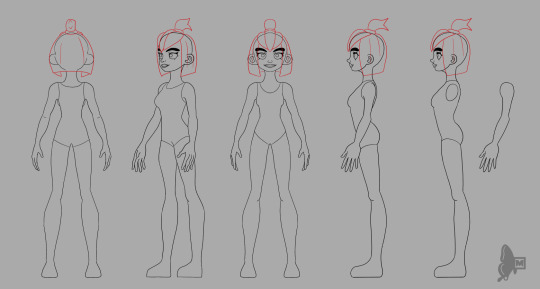
The most import angles for me are the front and side view. The other angles are more for the details to get the likeness right. I try to model the front view most accurately and the sideview is more for the proportions. I don't often see people only from the side view so whatever I draw from the side cannot 100% be accurately be modeled like that. I also made a different side view on the right with the arm seperated from the body, this makes it easier block in the form of the body and it's easier to model the arm and hand seperatly because hands are not only difficult to draw but also difficult to model.
For the different angles I use a mannequin model in blender as a guide and reference. Clip studio paint (the painting program I use) has also 3d mannequins but I personally find them difficult to move around so I prefer to use blender for this.
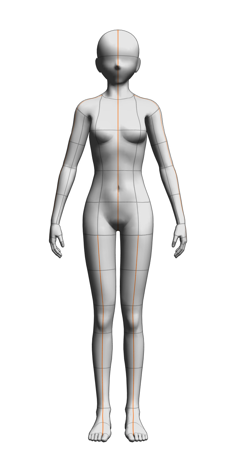
When I'm finished with the model sheet I also make a quick turnaround animation to see if anything looks consistent enough.
Yeah that's it. Now onto the modelling process!
36 notes
·
View notes
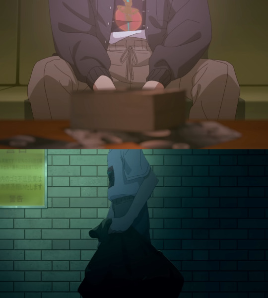
Note
hey so im not trippin right? chronologically, the events in meme take place after the events in double, at least from what i can gather. if thats the case then what the hell happened for mikoto to go from 'giant eyebags and grey hairs at age 20 whatever' to perfectly fine? its probably just that the artstyle wasnt fully finished baking but idk it could be something too.
Oh boy howdy anon you're going to love this. You're right the events on the train do happen before MeMe. However, that's at the start we actually see the events of MeMe play out in the middle of Double. Plus we see the events of Double play out in MeMe as well.
We're just viewing it from a different side like Deco said when Double released.
Also John totally appears in MeMe. So, let's get into this.
So first yeah, the murder repeats in Double. Like we see, the murders occur again during each of the prisoner's trial two songs. I believe the murder is re-illustrated in Double during these scenes.
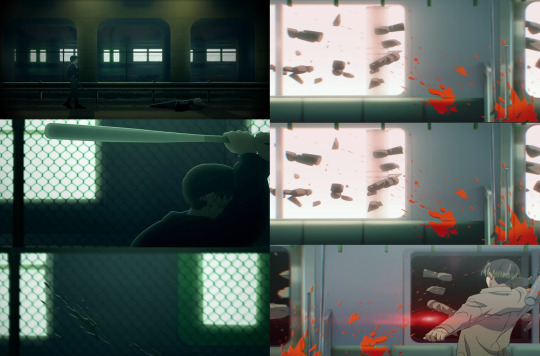
As you'll be able to see during these scenes the blood splatters inside the train, but the broken doll pieces are outside of it. Mirroring how the murders actually occurred outside in MeMe.
As you can see in MeMe the train that Double takes place within is actually passing through when the murder is committed. We're also shown in MeMe that all of Mikoto's attacks just canonically happen outside the train.

Hence the theme being a dialogue between the front and back. MeMe is the front Double is the back. We also see Mikoto with bags in MeMe but they're less pronounced this is seemingly done purposely to make it more difficult to distinguish between the two of them.
He can be seen with bags under his eyes when they're looking at each other in the mirror, and when he's waking up in the tub. The scene of them looking in the mirror basically mirrored at the beginning of Double.
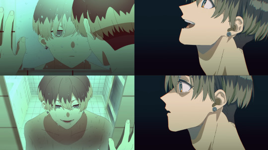
It's also shown that Mikoto doesn't have bags beneath his eyes when being brought to Milgram. Yet, as soon as it's implied that Mikoto (John) has been fronting the most suddenly guess what's back.
Yep, the bags under his eyes. This is why the line,
"Take a good look at me."
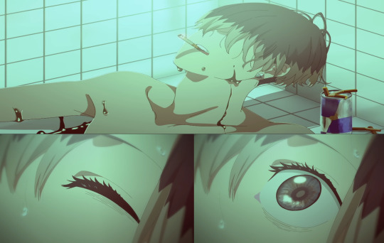
Is repeated through MeMe and why Mikoto's first voice drama emphasizes looking him in the eye as much as it does. Also, why when he does draw a blank and is shown disposing of evidence his eyes are conveniently omitted.
Yet even then before that scene when he does get up lines can be seen drawn under his eyes.
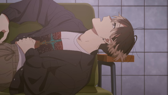
And they can definitely be seen here as well,
And here too!

Mikoto the one Milgram has recognized as a prisoner is the only one not to have bags under his eyes throughout their music videos. Something Milgram does nothing to hide.
In fact it's like the staff has been doing their best to highlight this.
Like if it was just a matter of art style that wouldn't explain how he went from no eyebags to eyebags at the beginning of double and from the beginning of Milgram to now. Or why he went back and forth between them in MeMe.
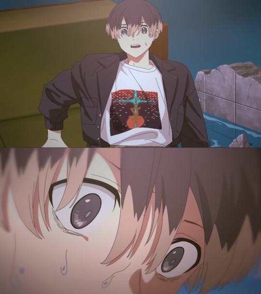
At that point this is something being done out of intent. Intent that is confirmed in Double when Mikoto (John) goes-
"Aghhh- I'VE GOT YOU, LEAVE IT TO ME!"
After Mikoto's facial expression changes from happy well rested no bags ultimately ending on this expression-
I lovingly call, "Shut the hell up I heard you the first time okay I'll do something about it."
But yeah Mikoto consistently switches between alert, attentive well rested and please, please god let it end i don't remember what a bed looks like let alone feels like please I can't take it anymore. Instead of illustrating this through eye bags in Double it's illustrated through body language more so but the focus on the eyes is still there.
Even with the eye bags. In the first shot Mikoto's eyes are downcast while in the second he's alert and looking at something ahead of him. Similar to how he is in MeMe
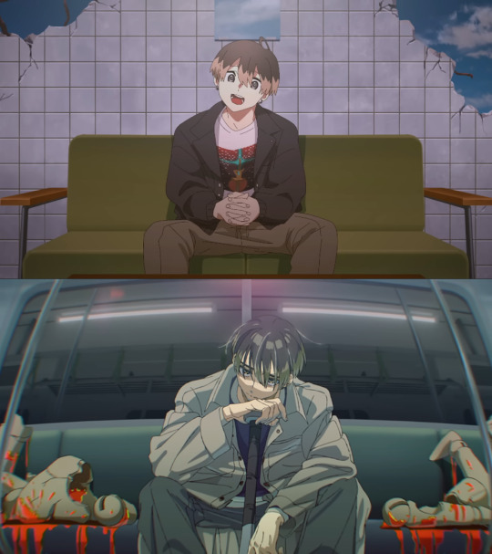
So, yeah chances are it could be nothing. Or the one we see with bags under their eyes and seemingly tired throughout both songs is Mikoto (John). Whereas, the one who is energetic and doesn't have as prominent or any bags under his eyes is just Mikoto.
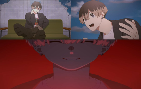
Overall it's an interesting tidbit about Double and MeMe. Simply because it's so easy to miss. I personally think it's there to differentiate between the two but it could be nothing. This retroactively makes this scene funny because there's no bags to be seen so it's more than likely just Mikoto.
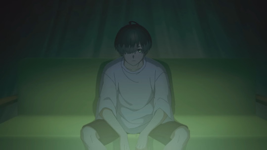
And this one because also no bags
Which again by this logic means that is just simply Mikoto. Also calls into question why we never see the face of the Mikoto hunting the other down in Double just their back. Along with all the times they deliberately decide not to show his face. Like he didn't even commit murder in the clothes he's on the train in.
Because the anniversary art is literally all of the prisoners after their crimes. So like it's kind of funny he's been getting away with this so easily.
52 notes
·
View notes
Note
Hi Eva,
I have a fee questions regarding your wonderful work. I'm currently working on my visdev portfolio, but going a bit insane thinking about keeping my artstyle consistent if i'd ever be hired. I just looked through your background paintings and wondered how you keep your backgrounds in a consistent style. I love your nature studies too, and they look so different from your work pieces... More free and explorational. Is it difficult to keep up the habit of learning new techniques and exploring styles once you're on a job? I'm so full of ideas and feel like sometimes the idea would require a certain style/technique to be pulled off in the best way. Do you feel that too sometimes and is it restricting in a way to then keep the style of the paintings the same.
Would love to hear your thoughts on that!! :)
Hi Eekonis!
First off: don't worry! I don't think consistency is an issue... I feel like any artist no matter the level, feels like their work is all over the place. I think of consistency more like per project, rather than overall my work.
If you're interested in vis dev, a good way to showcase your work in a portfolio and not feel overwhelmed and all over the place, is to create just one project. I saw in your portfolio the bat story exploration, that's great! Just pick one of the ideas you have. Truth is we never feel ready to do something and we postpone and ruminate, but you have to start somewhere. My friend always says, "vain tee se" (just do it) and that's really all there is. Imagine your story as a film/TV (or game, or comic, but you have to choose one), and make designs and paintings of how you imagine it. You can try searching for visual development portfolios and see what other professional artists have included in theirs, there's so many ways to go about it. From the top of my head I'm thinking Aurelien Predal, Marie Thorhauge, Scott Watanabe, Kevin Roualland, Sylvain Marc. Also art books of movies or shows you like are really useful. There's a lot of art of movies and artists, tutorials etc collected in character design references website, from all around the world.
If your own idea feels too vague or the story is not set and you get stuck on it, you could also choose an existing story like a fairytale or a novel. Try to be intentional with your pictures - you want to be clear and tell a story after all, you want people to feel like they get to know the characters and the world from just one picture, and they really want to know the full story. In your portfolio, I like your bat story explorations and it seems cool, but it's currently missing some characterization and story. It would be a good idea to illustrate story moments or character design that really shows the personality, gesture, acting. And when you create environments, make them feel lived and inhabited, give them just as strong mood and character as you would to characters.
Consistency within a project is just about setting rules and limitations, some of them come from the ability and skill. Others are more like, what brushes to use, what are the visual goals, influences and references. You can go pretty far in breaking down how pictures are made and what makes a style. For example, why do Ghibli movies look like Ghibli? What kind of color palettes, compositions, camera angles, tools were used? How realistic/cartoony is it? There’s internal logic to everything designed, and with practise it becomes more visible.
I don't know if I intentionally try to learn new styles all the time. I'm generally just motivated by doing what I think is fun or what I want some piece to say about story, character or my own feelings and trying to do it best I can. It sounds simple but... if the goal is to do something really well, then I just do my best to learn it. There are some styles that I really love and think are amazing, but would probably take decades to pull off and I just accept that I don't really want to go that way, and I focus on things that I really want to keep at. It's always possible to switch directions, but to get good at something you have to commit to one thing at a time.
So yes, I face my limitations all the time. I'm very familiar with feeling like, so and so would do better job, someone is always better than me for sure. Sometimes it is painful to not be able to draw or paint in a way I want. I think this probably never changes, it's just human nature. But I dunno, some people get satisfaction from making AI do their project in the style they want, but if I was able to do something in a snap of fingers, like just get the perfect style for my project, it wouldn't feel good to me. I guess I want the full experience of suffering and joy of figuring things out myself. Sometimes it will suck and hurt, but you learn more about yourself and it'll get easier to recognize what you really want to make. Then, you can always do a little bit better next time.
95 notes
·
View notes
Note
Goodness, when you said about the ai art in the marauders fandom, I was like, I literally was thinking about that !!!! And no one calls them out ??? And if they do, it's a very weird time-lapse vdo or something like that to prove they're not tracing. BUT AN ACTUAL ARTIST WOULD NEVER DO THAT??? like the struggles we go through???? Our time-lapse vdos are crazy and I would simply just take a video of me drawing (show my hand at least if Im not comfortable showing my face sjdjdjdd ) also artists know when there's ai involved you're only fooling everyone else djdjdjkd
yeaaahhhh. i just blocked this person because i was so sick of seeing their art in my tags. you can tell usually with the lineart imo — lacks weight and many tangents or useless lines. or in this case, they mostly forgo lineart…
i try and post my process and tips often and i suggest other artists do the same. i feel proud of what i have learned and my process :]
as for those who are in the fandom passing this stuff off as their own, i hope someone has the balls to call them out. and i hope all of us can use our critical eye.
another tip is: design consistency. everybody will change their designs subtly and it is def hard to draw the same characters consistently without a lot of practice. but these artists change how they draw a characters hair or features every single drawing. and that is because the ai they are using is referencing many diff artstyles, and cannot reproduce the same face, especially of characters that do not have actors attached — regulus, any of the slytherins, marlene, etc etc
and i hate this! when inconsistencies become the halmark of ai or tracing it leaves less room for us artists to experiment. i find myself nervous that my art style is not copy and paste all the time!
anywayss
43 notes
·
View notes
Note
the way you color stuff is AMAZING!!! I MEAN IT!
mind explaining how you make colors look so good?? its ok if you dont want to :)
Hi, thank you so much!!! <3
Generally, I try to go for softer, more pastel like palettes, and that helps make the drawings seem more "consistent" and pleasing to the eye.
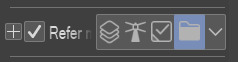
First tip: if you use Clip Studio Paint, definitely get this tool. It saves so much time on filling out lineart, and it's crazy accurate. If you're having trouble figuring out how it works, here's how I do it: I put the lineart layer in a group, add another layer below it (still in that group), and then use the tool on that new layer. Make sure the tool is set to refer to layers in a group though. Then I erase some areas that were "enclosed" by the lineart.
As for the actual coloring process. First of all, I use the mechanical pencil brush from Clip Studio Paint, the same one I use for the lineart, except this one has random color jitter per stroke. It adds slight variety to the base colors, which helps making them look less flat.
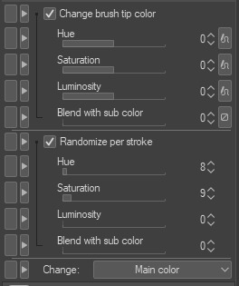
Here are the settings I use, but I recommend playing around with them if you want less subtle results.
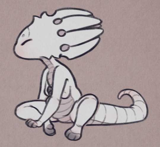
For a comparison, here is one of my drawings with regular flat colors vs one colored with the brush I mentioned:

A pretty important part of the process isn't actually related to the coloring itself, but the layer effects I add to the finished drawing, as well as the paper texture (which you can see in the background; I add it twice, to the background and on top of all the layers).
Here are the layers I usually go with, I'll explain each of them below.
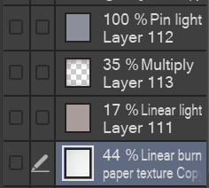
I'll start from the bottom. The paper texture is almost white with some very subtle warm tones, and it's set to linear burn, which works the best for this kind of texture. Like I mentioned, I use this overlay twice, but both use the same layer mode.
Next is the brown-ish linear light mode layer. This is to give the drawing more subtle contrast while also tinting it with a sepia-like tone. You can use any color for this, but I find this light brown color to work the best for my artstyle, since it makes the drawing look softer and gives it the old photograph kind of look which I tend to go for.
The multiply layer is mostly transparent aside from the edges. This is for the vignette effect, not much aside from that. It's definitely a personal preference thing.
Lastly, there is the pin light layer. This one is a bit weird, but I really like the effect. It's hard to explain it, but I use it to tint the dark tones of the drawing with a slight blue color. You'll see what I mean in the examples below. Occasionally, I'll add another layer with a darker base color, since pin light kind of works in reverse: if you use a light color, it will target the dark shades on your drawing, but if you use a dark color, it will instead only go for the light shades. Note that it's pretty strong in this drawing in particular, I usually make it a bit more subtle. If you look at my recent drawings you'll see it.
Here is the same drawing, with each of the layers applied in the order I listed (left to right order):
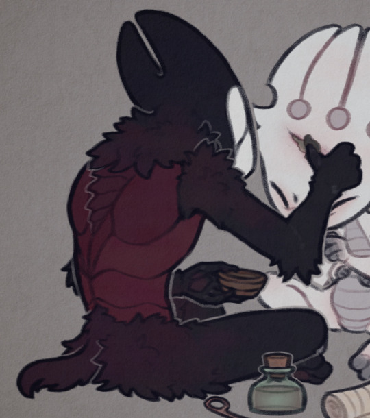


I'd also like to mention the lineart, which actually plays a big role in making my drawings look softer. I color the lines on the "inside" with a darker shade of the base color, though I often make it more saturated to really bring them out.
For example, here are the colors I use for FPK's lines. Not including his eye colors or the tips of his fingers/feet, since I don't color the lineart there. And a comparison of what he looks like with and without those lines colors, just to show how big of a difference it makes.

And to go back to the previous drawing, here is a similar comparison.
One thing to note is the additional white lines on the darker areas of Grimm's arms, the lines blend with the base color so I like to make them slightly lighter to help them pop out.
And lastly, I'll mention the light outlines you probably noticed by now. I add them as the final touch, they're the same color as the background though I sometimes lower the opacity if I feel like they're too much. They're meant to help with colors that blend together too much, and to highlight the silhouettes of the characters, as well as adding more dimension to the drawing. I think you'll see what I mean when I hide them in this final comparison:

Hope this is helpful! Sorry if you didn't expect that long of a post, I wanted to go through each step in my process so that I can explain it the best I can haha
40 notes
·
View notes
Text
image spoilers for furina's story quest cutscene (and lyney's, if you haven't done it yet)
Fontaine's story teaser artstyle is actually so gorgeous T_T it also bears great resemblance to woodcuts and I think that's very cool—seems like that's the irl inspiration that Fontaine's artstyle is based off of (like how Mondstadt pvs resemble stained glass, Inazuma's draw from ukiyo-e, etc).
out of the 3 fontaine pvs (lyney's sq, oceanid cutscene from 4.1, furina's sq) they're all really consistent with the art direction and god it looks like fairy tale illustrations
notice the use of lines (eg in the clouds, in the water) to represent shadows and convey texture


it's easier to see in environment shots (the above are from 4.1 waterborne poetry, and furina's story quest teaser, la vaguelette), but you can see it on characters too (the additional hatching on the characters' hair, hats, and clothes)

vs these woodcuts

it's also neat how all 3 story pvs we've seen have animated some element of water or flowing liquid—fitting for the hydro nation and also extremely pretty to watch. the style looks super nice and even possibly hand drawn
tumblr not letting me add 4 separate videos meant I had to stitch all of them together into one so here you go. a compilation of water in fontaine story teasers. the art is so gorgeous I'm in love
#id in alts#everything except the video... sorry ..#just some small observations i noticed! the story teasers for fontaine are literally. so good. so good#waterborne poetry#fontaine#meta#?? if i dare#teyvat thoughts#furina#lyney#lynette#callirhoe#story teaser#furina story quest spoilers#genshin spoilers#genshin impact#genshin fontaine#genshin
35 notes
·
View notes
Note
I love your art! Do you jave any tips ondrawing in the EENE artstyle?
Thank you!! The best advice I have is to study, study, and then study some more lol. Look at something, try to replicate it, trace over the original to see the underlying shapes, draw the shapes on your own page and replicate it like that, freehand it w/o reference, just see what works! i know it sounds like general advice, but the EENE style, especially once you get to later seasons,is very stylistically and technically complex! You're gonna have to see which aspects of it are intuitive to you, and which ones you'll have to sit down and make yourself learn. I primarily use Raven Molisee's art (lots of stuff on Deviantart and Poshmark more recently) since with his sketches you can see a lot of the underlying shapes and processes! But it would be a good idea to also check out stuff from the rest of the art department, such as Scott Underwood, Jim Miller, and Cory Toomey (you can find a list of em here: https://ed.fandom.com/wiki/The_Creators). Instagram account dawn_of_the_eds has a lot of good references!
You can also study screenshots of the show, especially if you're trying to replicate the colors/linework/movement/etc… I would recommend @ededdneddy-artrefs, as they have a nice tagging system for finding anything specific, but its also a good idea to just look at your favorite EENE clips on YouTube and go thru them frame-by-frame! It helps with understanding how the characters move, talk, express, etc… and you can really nail down the stuff you'd only get a vague idea of from watching the show at a normal speed.
For me, it took me months (minus some breaks) to get to where i am now with drawing the Eds. Someone more studious and hardworking could easily do it faster, but the point is, it takes practice! Practice combined with active, intentional learning! My progress with drawing the Eds has several phases marked by a sudden jump in skill (usually caused by me finally going out and studying some more art, and internalizing what i learned), followed by healthy stagnation, where i get comfortable with the new knowledge and just do the same stuff for a while. If you really wanna get good at drawing them, you can study much more than i do, or have shorter stagnation periods! It's ok to calm down and get comfortable with the characters, have some nice, easy, art making time, its important to not get too stressed or burnt out! But when you're feeling motivated, absolutely take advantage of that!
Some things to remember:
While the characters do have consistent design elements and basic underlying shapes, these are NOT hard rules. REMEMBER AND INTERNALIZE SQUASH N STRETCH! I've tried assigning hard rules to how I draw the eds, and it's VERY difficult. It's definitely important to write down/point out as many design quirks and reoccurring themes/shapes as possible, but just remember that the Ed Edd n Eddy style is extremely fluid and dynamic - and the guidelines you may have thought were 100% true can be shattered at any point. Basically: all rules are optional! Don't draw something because the "rules" say so, draw something because it looks good! Sometimes one rule looks good, sometimes something else looks better! I'll use the teeth as a visual example:

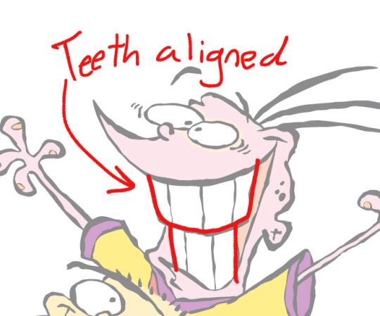

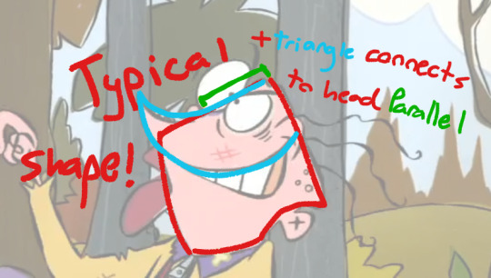
(art in 1st image by Raven Molisee)
Sort of a continuation of the last point - Before EENE, I had a tendency (and still kinda do) to use more symbolic drawing process, the kind of design language you'd use for logos or graffiti, or the kind of style you see in shows like Dexter's lab or Total Drama Island or something - where you get good at drawing the same shapes/lines over and over. The EENE style, especially in later seasons, does not follow the same process as these sorts of styles. For example, I used to look at Edd and say "ok, His head is THESE TWO SHAPES!" And then there would be another, I'd say "okay, 3" and then another, and another and this will keep going on and on and on. Sometimes his ears are at the corners of whatever quadrilateral his head is (like in Molisse's art), sometimes theyre on an edge (like ive seen in Underwood's art), and sometimes you just can't see em! You have to accept that the characters are a lot of things at once, and different things at different times! Like Eddys head is usually a sort of bent pentagon - but is his mouth is enough he's more like a tin-can - but from a more top view he's almost a triangle - you can do this cycle forever.
you can think about it like this: the eds designs (especially their faces) are sort of a collection of features, and the shapes holding them together than be molded and distorted as you please!


Remember that the eds often exist with 3D underlying shapes, not just flat ones! I would highly recommend studying 3d shapes in extreme perspectives specifically. Draw bent cylinders, twisted stretched out cubes, any sort of shape at the most extreme fish-eye perspective you can manage, just absolutely take advantage of them. Bend and distort and break those shapes, dig your foot into their backs and and pull at their corners like you're ripping the arms out of their sockets. Extreme visualization, I know, but Ed Edd n Eddy is a slapstick comedy - there is immense force and stretching and distortion present, you really have to get that energy into your art to replicate the style (even if I'm not great at it yet, it's something I know I must learn).
Specific tidbit that's important & I sometimes forget: The characters limbs can be as long as the pose calls for! They will be fine! If they're holding something above their head, their arms are going to stretch out much longer than normal and it's ok! You can always sacrifice the "accuracy" to the model to get a strong pose/silhouette. Though one thing I've noticed is that their clothes often don't stretch the same way their bodies do! If you stretch double D's arms out 3 yards, his sleeves are gonna be about the same length as always! Except for when it looks better to break this rule, of course :3 basically imagine their bodies are like stretchy rubber, while their clothes are not
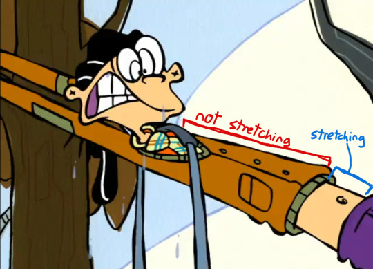
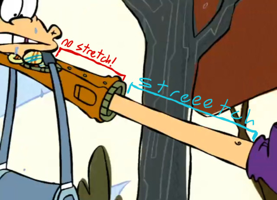

(note how his arms are stretched reeeal long in the gif, the look of the action holds higher priority than "correct" body proportions)
Apologies on my lack of notes on Ed specifically, I've drawn him good a total of One time and haven't been able to do it again lol.... Sometimes his head is an upside down triangle, but its bent in a way that i cant find a good pattern to remember it by... though sometimes his head is a square but the bottom stretches downward to become his neck. He's weird as hell, one day ill figure it out!
That's all my advice for now :3 If i think of any more i will add it!
16 notes
·
View notes
Note
hi ash sorry to bother u but i was wondering, do you have any tips with forming a more consistent artstyle? like your artstyle is godlike and its super pretty and i wanna get better but im having trouble with forming my own, if that makes sense, thank you so much! - 🍓
i mean this so genuinely get obsessed with a weird little dude and draw them 204746248492937 times and your art style will grow naturally like a well watered plant
on an also genuine note get a big folder of art you like and try to copy that, pick your favorite artists’ styles apart to find out what YOU like so much about them and see how you can recreate that on your own, your unique style will grow naturally Also from the big frankenstein creechur or inspiration and practice
(obligatory annoying note but i feel like it’s relevant bc of Things I’ve Seen, this is a very personal opinion but PLEASE also be mindful of trying to not copy an artists style 1:1, for personal practice it’s ok of course just,,, idk, keep that in mind? you can copy big franchise artstyle all you want tho it’s always morally correct)
#ash replies#EDIT THANK YOU SM FOR THE SWEET COMPLIMENTS ALSO!!!!! KISSA U MANY MANY TIMES!!!!#extra edit consistent art styles are overrated embrace chaos and constant change#even my own art style has changed 2947373 times in the past years it’s cool don’t stress it
62 notes
·
View notes
Last Seen Blogs
fallenwhumpee
My muse is my whumper

arisingdependent-blog
asstr
multifandomcentral
A Larry Larrie
denadeea
Din El, prin El si despre El sunt toate lucrurile