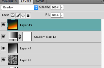
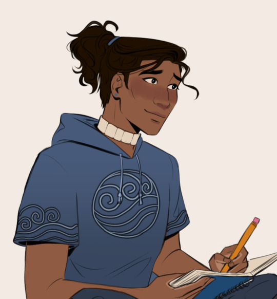
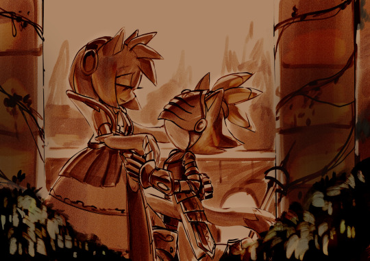
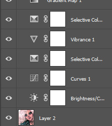
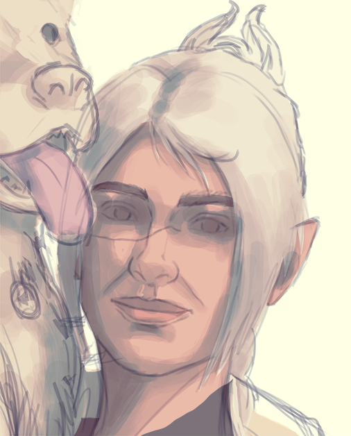
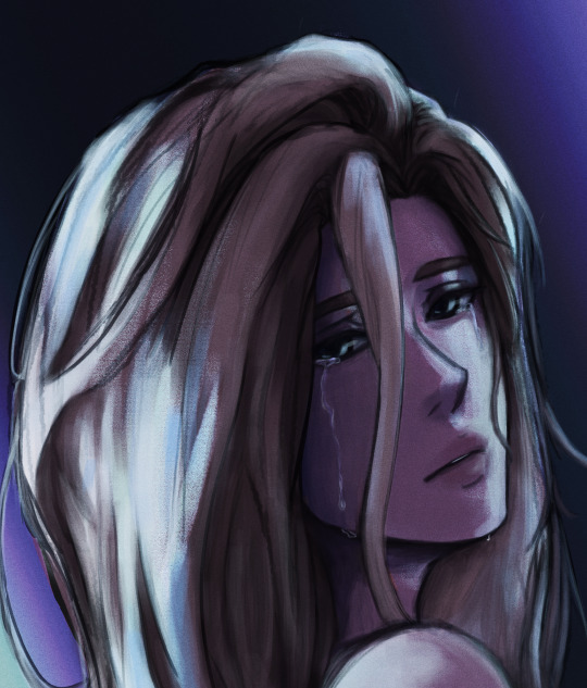
#might change the gradient map too…..
Text
Wip check…. Will edit tmrw…

#envelop wips#envelop art#im so doomed i did this in one layer and i need to edit SO much#might change the gradient map too…..#forgot her stitching too#rune of death overlaps with her hair#stars arent evenly put down on the cirlce#shadow on her sleeve overlapping with the leg#no shadows put on her top scale armor#TOO MUCH GOING ON WITH THE BACKGROUND HOLY SHIT#put a lightth thingamabop to seperate the skirt from the pants
11 notes
·
View notes
Text
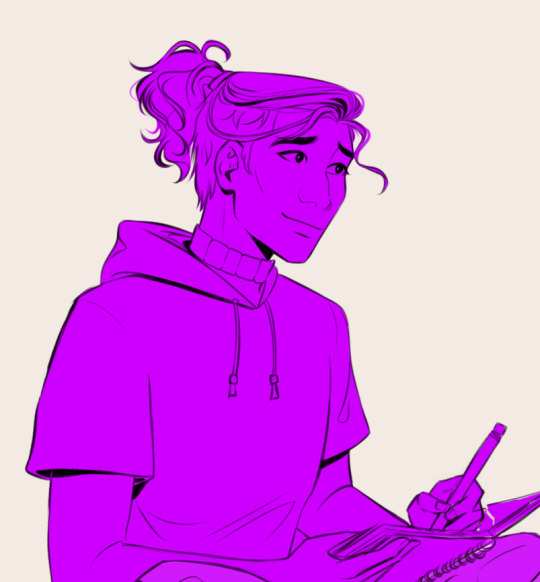
how to make cool blobby turing patterns in photoshop
i'll preface with i learned the basic loop from skimming a tutorial on youtube, but as someone who prefers written tutorials i'm sure many would appreciate one! also, the second part of this is some of the visual effects i figured out on my own using blending modes and stuff.
i'm using photoshop CS4 on a mac so some buttons and stuff might be in different places on windows and newer photoshop versions but all the actions are the same. my canvas is 1000x1000 pixels.
UPDATES (i'm hoping these'll show up whenever you open the readmore?)
it's possible to do something similar in krita using this plugin, made by the love @arcaedex
it's also possible to do this in photopea, a free browser alternative to photoshop! the results are pretty much identical.
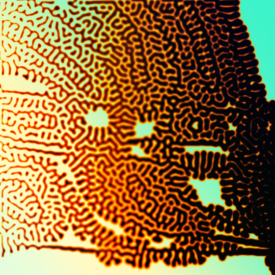
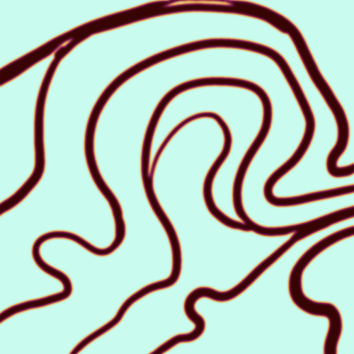
FIRST off you wanna get or make a black and white image of some kind. it has to be one layer. can be noise, a photo, a bunch of lines, whatever. here's mine, just some quick airbrush lines:

now find the actions tab. idk what it looks like in newer versions of photoshop but you probably won't need to dig!
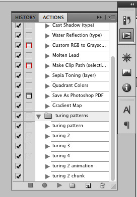
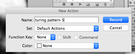
hit the little page thingy to make a new pattern. once you hit 'record', it'll record everything you do. the little square 'stop' icon will end it.
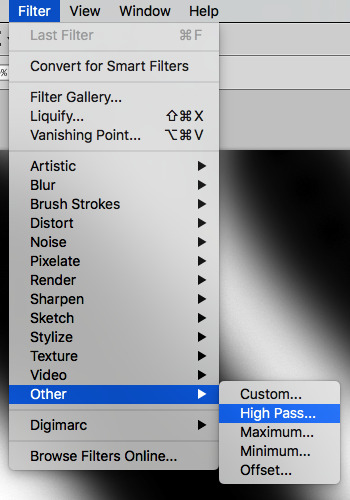
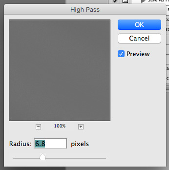
now you want to do a high pass filter. you can mess around with the radius to change the size of your squiggles, but the tutorial had it set to 6. experiment!
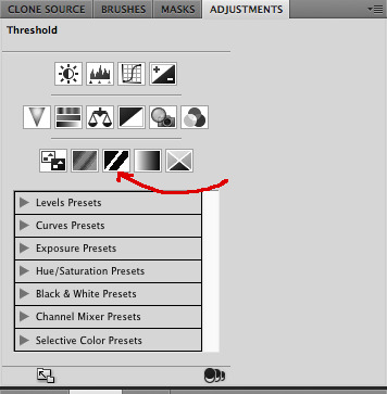
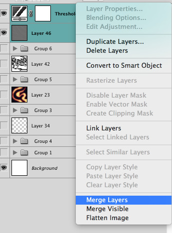
now add the 'threshold' adjustment layer. i use the adjustments tab but i think there's also a dropdown menu somewhere. keep it at the default, 128. merge it down. (control or command + E or you can right click it like some kind of weirdo)
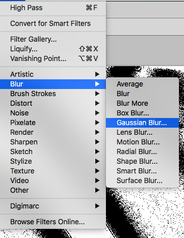
and finally, the gaussian blur! the radius of this affects the shape and size of your squiggles as well. i like to keep it around 4.5 but you can mess around with that too.
after that, hit 'stop' on the action you're recording, and then repeat it a bunch of times using the 'play' button, until you have something you like, like this:
WOW!! that was fun!! and only a little tedious thanks to the power of macros. anyway, here's some fun layer blending stuff i like to do. it's with a different pattern cause i made this bit first.
anyway, using a black and white gradient (or a grey base that you do black and white airbrush on), make a layer with the vivid light. this will make the blobs look thicker or thinner.


then, for cool colors, do a gradient map adjustment layer over that:

and finally, my best friend, the overlay layer. just using a gradient here bc i'm lazy, but feel free to experiment with brushes, colors, and blending modes!

NOW GO. MAKE COOL SHIT WITH THE POWER OF MATH. AND SEND IT TO ME
also these are not hard and fast rules PLEASE mess around with them to see what kind of weird shit you can make. here's a gif. as you can see i added some random airblush blobs in the middle of it, for fun.
926 notes
·
View notes
Text

GRID + TORN PAPER + RAINBOW LAYOUT TUTORIAL
(yeah, i'm sorry, but that is the title i came up with)
Hi everyone! This tutorial was requested by an anon, and we're going to make a gifset like this. You need, as usual, basic gifmaking skills and basic photoshop knowledge, but i'll try to explain this as easily as possible!
You'll also need a torn paper brush, which you can download here.
And here are the links to download the fonts used in my gifset: x, x
Okay let's start!
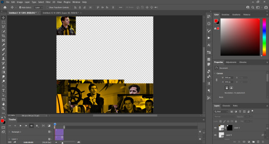
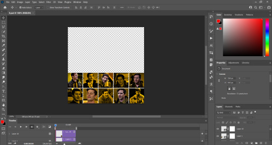
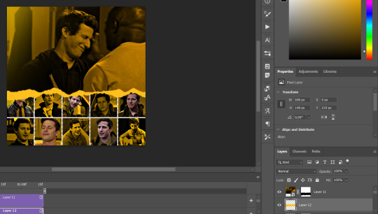
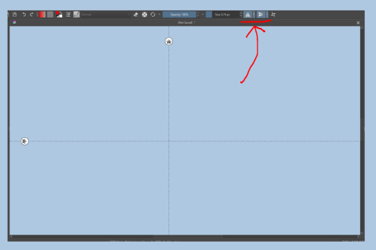
→ First you're going to create a new canvas, and it will be 540x540 px. Make sure to click on create video timeline (if you dont have a timeline, go to window > timeline. We'll leave this canvas there waiting for us :)

Then, onto our first gif. We're going to make the small square gifs first. All i do is resize the image and make it 120 px high, and you'll see why in a moment.
Make sure to remember the number of frames of this gif!! All the gifs we're going to put in the same canvas should have the same amount of frames.
Okay, so we have our first small gif:
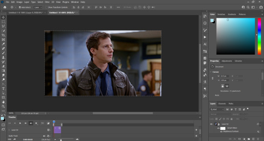
As you can see it's a smart object, and I added some brightness, but so far that's all. You can sharpen it, but i like to sharpen until i've colored it. Now onto the important part:
Most of the gifs i worked with were mostly blue (aside from the skin color), which is recommendable, because you can create lots of colors starting from blue, using the hue/saturation adjustment, or camera raw filter. I also recommend you to use a gif that doesn't move a lot, so it'll be easier to color the background:
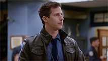
For the tutorial, we have our predominantly blue gif, but we are going to make it yellow, which is the opposite color, so it's the hardest to get. I hope you can see how i manipulate colors, and do it yourself :)
Here, you can use camera raw filter (filter > camera raw filter) to turn the blues and purples greener, like this:
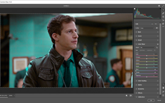
And click ok to exit the camera raw filter. Then, we're going to use hue/saturation (image > adjustments > hue/saturation) to turn it yellow:

Since it was cyan, i changed the cyans, but if you got a much greener result you'll have to use green (duh, right? i dont know i just dont want anyone to get confused akjsdhs)
And you can also add a selective color adjustment to make those yellows more yellow:

The reason i don't directly use hue/saturation is cause it might look ugly and lose quality, or it wont pick up all the colors i want it to but they're also very small gifs so if you wanna do that, do it :)
I sharpen it until this point, but if you already have that's okay.
Now we're going to color the background! For that, you just add a new layer, and set the blending mode to color.
Then you'll use your brush, set it to 20px and 0% hardness, and pick the color you're using for this gif, you can use the eyedropper tool. This is why it's important that the gif doesn't move a lot, so you can color the bg like this:
I colored carefully around the edges, and that's the result. In some gifs from my gif set I colored Jake's jacket too because i was too lazy, but this looks cleaner :)
You might want to select the color layer and the gif layer to convert them both to a smart object, just to make everything easier. So, be careful, because after that you won't be able to change anything!
But let's say you have a scene that you want to include, and it moves too much and has no blue and it's going to be a nightmare to color it.
Well, don't worry, you can! Simply, instead of manually coloring everything, you can just choose to add a gradient map to it (image > adjustments > gradient map), like this:
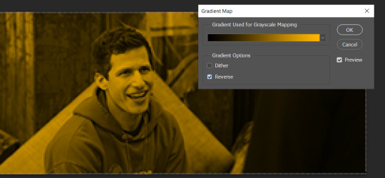
And this is the result:

Just remember, it has to be the same amount of frames as the other ones!
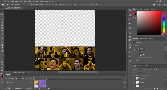
You repeat the process, until you have 10 small gifs. I made around 5 manually colored gifs, and 5 gifs with gradient for each gif. That's a confusing sentence but i hope you get it.
We are going to start pasting the small gifs on our first canvas.
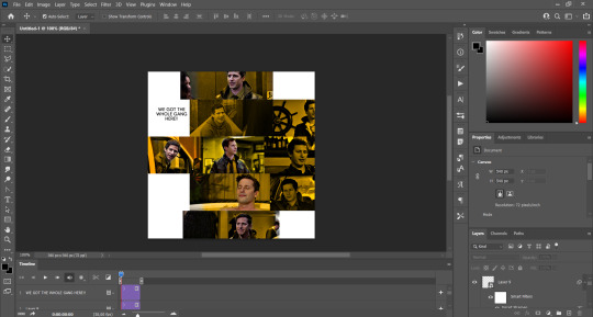
(You can paste them one by one but i did this so you can see my 10 gifs)
You're going to create a square that has to be 108x108 px, using the rectangle tool. You can remove the default white background.

And you may be wondering, why did we not just crop the small gifs into those dimensions? Well, you can do that, but to me it's much easier this way, because sometimes cropping isn't accurate, or it's tedious.
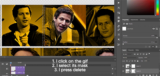
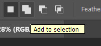
Place the small square on top the gif you're going to crop, right where the face of the character is (or whatever objects you're giffing), and while holding ctrl, click on the square. It will select it:

You're going to create a layer mask:

And then drag that layer mask to the gif:

And voila! It's now the same size as the small square. Once that's done, right click on the layer and convert it to a smart object, because we have to remove that mask. Make the square layer invisible, and start placing your gifs where you want them:
You're going to repeat that process with the rest of the gifs, and then place them all together. Don't forget that if you're making the first gif, they will all be at the bottom of the canvas, if it's one of the middle gifs, one row should be at the top and the other one at the bottom, and when you're making the last gif, they should all be at the top. Here we're making the first one, so they will all be at the bottom:
If you forgot to check that all the gifs had the same amount of frames, you can fix it here, just make sure no gif is past this little guy:
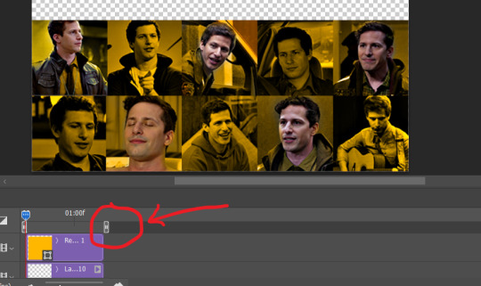
Okay! Now, to create the gutter, we're going to add a layer mask to each small gif, so that we can cut some of it.
The gutter has to be 4 pixels, (i recommend you to REALLY zoom in). What i do is make sure the width of the gutter takes 2 pixels from the edges of the gifs, since they are all together. As you can see in the image above, there's no a single empty pixel between the gifs.

This is a close-up of what i'm talking about. I select two pixels from each gif, and go all the way down to create the gutter:
(I hope I'm not over or underexplaining)
I usually use this tool when i have to make so many selections:
But that was just an example :)
(Another way you can do this, is by changing the size of the small square from the beginning and make it be 104x104 px, but i don't know why that seems more complicated to me ajsdks)
Anyway, this is what we have so far:
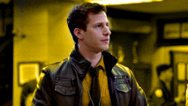
Now we're going to create the big gif. Its normal dimensions are usually around 1920x1080, unless you have different dimensions and have to crop it, but whatever it is, we're going to resize it and crop it to be around 550 px wide, and 400 px high:

We'll do the same thing of adding an adjustment of gradient to it to make it the color we're using. For this, i usually add a brightness layer before, because sometimes the gradient is a bit dark.
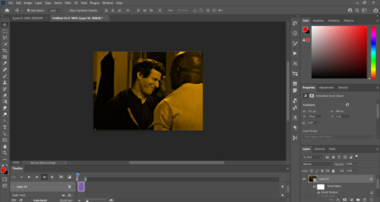
And using a 600px brush with 0% hardness, you can add some "light" on a new layer, like this:

Selecting all the layers, right-click on them and convert them to a smart object. Again, be careful, because once its a smart object, you wont be able to change any of it!
Then we paste our big gif on the canvas with small gifs, and add a layer mask to it. Using the torn paper brush at 600px, remove some of the gif to shape it like the torn paper. Make sure you're using black, otherwise it won't work correctly:
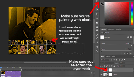
To make the effect better, add a layer UNDER the big gif, and using the torn paper brush, with the same size, you can paint under it:
Yeah, I covered some of jake's face, but that's how it supposed to look so the effect works!
And finally for the text! I used Granesta, at 150 px, and at -10.00º to make it a bit askew.
We're going to double click on it and give it a color overlay, set to normal, and give it a solid shadow if you want, then place it right here on the corner:
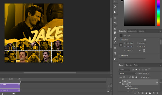
But as you can see, it's too big for the gif. So we're going to add a layer mask to it, and again, shape it the same way that we did with the gif. Make sure they're exactly the same shape, like this:

And that's it! This is our final result:

As always I'm sure there are easier ways to do many of these things, this is just how i do it but if you know an easier way to do it, go ahead. I hope this was at least understandable enough so you can apply the logic of it any way you want :)
If you have any questions you can send me an ask and i'll clarify!
If you found this helpful i'd really appreciate it if you left a tip on my ko-fi!
Happy giffing!
#will i ever learn how to properly explain things 😭#tutorials#uservivaldi#userraffa#userbuckleys#userhallie#tuserheidi#usertina#userfern#usersole#usercera#userzaynab#userisaiah#usernik#userpriyas#usertj
259 notes
·
View notes
Text
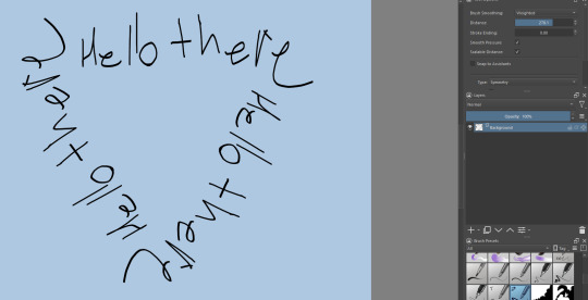
Krita tutorial the way I know it.
Basics: What is where.
Gimmicks.
Specific advice on specific tools.
Basics: What is where.

Upon opening the program this is what you're met with. First of all, must comment: The layout is HEAVILY editable so you can just drag menus anywhere you want, even leave them floating amidst the sheet you're drawing on.
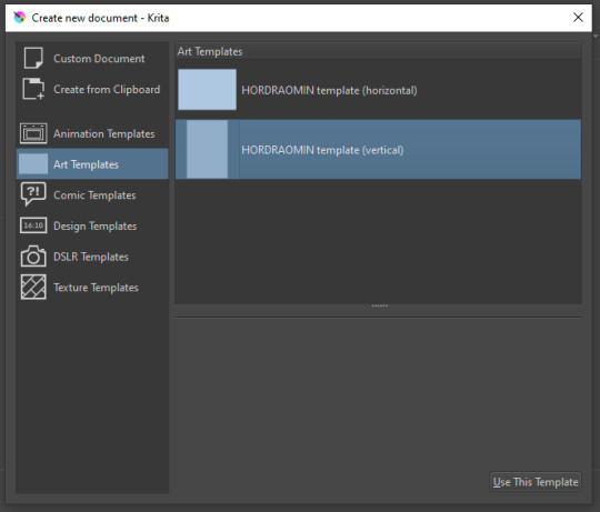
You can create custom art templates, I have two o'mine here as both have my signature background color.
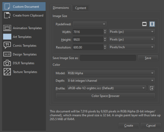
As well, you can edit the custom document settings, as in what size you want it, what resolution, even the initial content of the image. As well you can create from clipboard: Just copy some image from your browser and Krita will recognize it (useful for making meme edits lol).

Now, once you have your file, I will show you what is where.
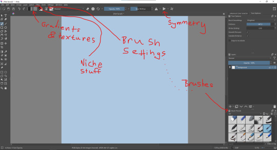
Brushes:
Brushes are easy to edit and there are tons of free bundles to download online. I myself only got one bundle, Jackpack (bit hard to find now due to original source being lost, it is still available but bit tricky to come by).
There. Are. Tons.

Some of these are my custom brushes for calligraphy in neography, you might even guess which ones. You can edit existing brushes, make new ones from the ones you've edited without changing the original, and all sorts of stuff (more below in the third chapter).
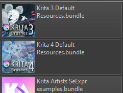
There are numerous packages of brushes once you enter Krita, but only one/two are available when you first open it. To unlock them all, click here:
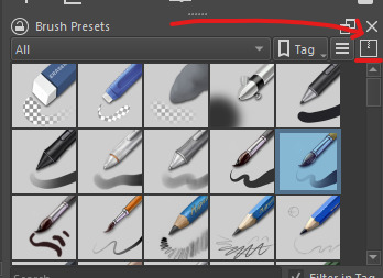
And make sure all bundles are dark gray in color (example of both dark and light below).
Now Tools Options: those will pop up depending on what tool you're using.
Symmetry: Fun stuff. You can drag the lines depending on how you need them and then center them back to the center of the screen if needed.
Gradients and Textures also have their tools options, you can play with those to get the feeling what they can do (more in third chapter).

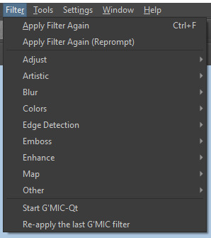
The Filters tab is useful too. Blurring, motion blurring, color mapping, artistic filters and all that: Quite fun.
Gimmicks.
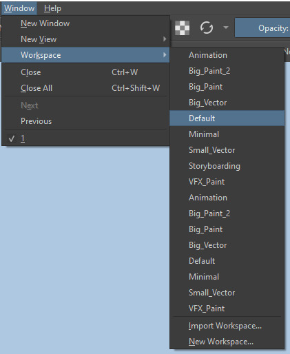
Krita allows you to customize your workspace freely. Floating menus, tabs, anything you want. It has quite many drivers at that-
To access the workspace templates, go to Window and choose Workspace.
Krita allows for copy-pasting any image onto the sheet. Though, for me it sometimes crashes if I accidentally copy-paste text into it without choosing the Text tool first.
The software allows for both raster and vector work. It is basically Photoshop sharpened to be used by artists primarily.
There are some interesting mechanics regarding the Eraser (default bind E).

You can use it with any brush, allowing for textured erasure/quick work. Good for sketching.
You can use it on gradients (given there's a transparent point on the gradient preset).
There's a Multibrush tool:

People say Krita is good for animation but my brain can't wrap around it yet honestly @~@.
The keybinds:
B - Brush tool.
E - Erase tool option.
M - Mirror (useful for checking accuracy from a new angle).
Ctrl - Color pick (when used with brush or other color-using tools).
Shift+L.Mouse+drag - Changes the size of the brush by dragging left and right.
Ctrl+E - Merge layer with the one below.
Ctrl+G - Group selected layers.
Ctrl+A - Select whole sheet.
Ctrl+Shift+A - Deselect everything.
F - Bucket tool.
G - Gradient tool.
Ctrl+S - Save document.
Ctrl+Shift+S - Save As document.
Ctrl+N - New document.
Ctrl+O - Open document (will be seen in a new tab on top of the sheet).
Ctrl+C - Copy selected layer or selection.
Ctrl+X - Cut selected layer or selection.
Ctrl+V - Paste copied/cut layer or selection.
Q - Multibrush tool.
R.Mouse - Interesting thing: Opens up a quick selector for brushes and colors you've already used in the piece.
1 - Zoom 100%.
2 - Zoom to fit the piece vertically.
3 - Zoom to fit the piece horizontally.
4, 5, 6 - Turn 15 degrees (4 and 6) or undo the turning whatsoever (5).
Ctrl+I - Negative filter applied to layer.
Ctrl+U - Color editing on the layer.
Ctrl+Y - Soft proofing mode (for color mistakes and stuff like that, mostly annoying for me tbh).
Ctrl+T - Transform selection/layer.
Ctrl+R - Square select tool.
Ctrl+J - Lasso select tool.
Honestly you can just hover your mouse over tools and see their shortcut binds, as well. Or edit them in Settings.
Specific advice on specific tools.
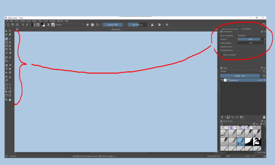
Brush:
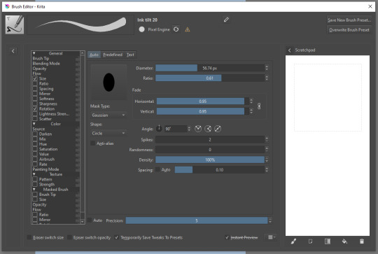
Brush editor is a great tool for making custom brushes, and it even has a sratchpad to test them out. Lots of settings, but no need to be afraid; Most of them you might never use on purpose.
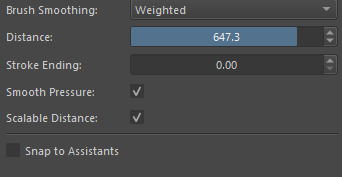
Use Brush Smoothing for great and pretty lines in lining pieces or making calligraphy.
Gradient:
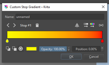
The four icons to the right top are:
Mirror gradient.
Arrange by lightness value.
Arrange by color value.
Space the stops evenly.
Click the gradient to add a new stop. The three things to the left are:
Make the stop use Primary Color.
Make the stop use Secondary Color.
Make the stop use a fixed color.
241 notes
·
View notes
Text
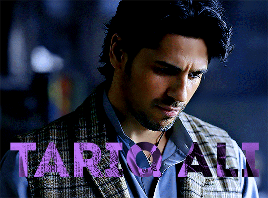
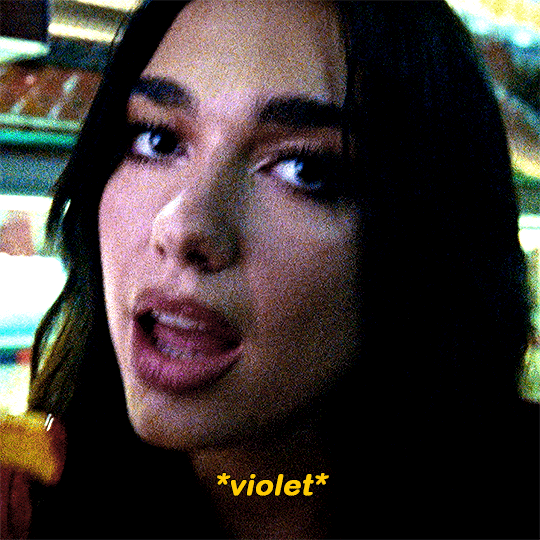
gradient text tutorial
This tutorial is for @ladynephthyss but y’all can have it too xD
We’ll be adding text so the final gif looks like this:
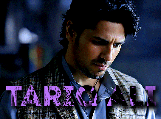
This tutorial assumes basic knowledge of gif-making, Photoshop, and coloring. I’ve only described the text tutorial in this.
Tutorial under the cut:
Couple things to note beforehand:
There is a lot of trial and error involved when doing any sort of text, and this is no exception! You might have to play around with the colors and the settings before you find something that looks good and readable!
This tutorial is inspired by the difference text effect in these tutorials: one and two by @anya-chalotra (highly recommend checking those out!), just done a different way.
This text effect works better on big gifs (540px width) that have quite a bit of movement below the text so you get that effect.
Find fonts that have bold shapes or some width to them, so you can see the movement.
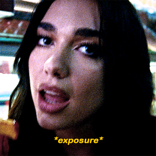
This is my starting gif, after sharpening and coloring.

First, I position my text where I want it. (this can be moved around later, I just like to get an idea). Remember what I said about fonts? Try to use ones that are thick for this effect so you can see the gradient/movement underneath the letters. I’m using Intro.
It doesn’t matter what color the text is at this stage, I just do white text so I can see it:
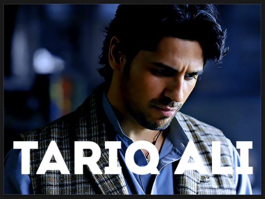
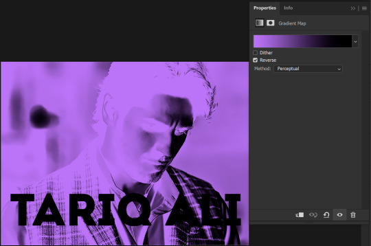
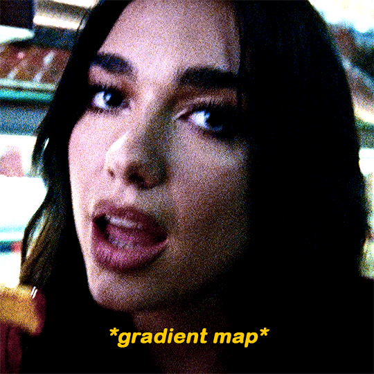
Then, add a gradient map in the color you want your text to be. For this one, I chose black and purple. The more contrast there is in your colors, the better it looks. You’ll be able to change this later though, if you don’t like the way it looks.
This is how it looks with the gradient map:
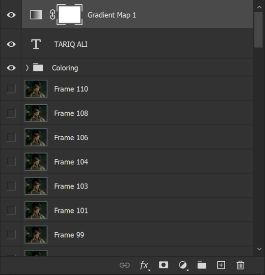
Now, we’re going to go over into our layers panel, and where we have the white box (the layer box), we’re going to select and delete that...
...so it looks like this:
Then, while pressing Ctrl, we’re going to hover our mouse over the T in our text layer. Your cursor should show a white box with a dotted border. Press the T in the text with the specialized cursor, and you should get a dotted line all around the letters, like so:
(I’m not able to get a screenshot of the cursor for some reason but I hope the instruction made it clear!)
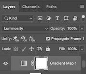
Then, make sure you have your gradient map layer selected, and press the layer mask button (shown by a white arrow in the below image - it looks like a white rectangle with a black circle in the middle.)
This is what it should look like:
Right now, it’ll look like some solid color (which depends on your gradient). This is because we still have the text layer visible. Once we press the eye icon next to the actual text layer to hide it, you can see that this is what it looks like:

(You can also delete the text layer, but I don’t, just because if I decide to put these two words on two lines, or change their spacing or whatever, I don’t want to have to make a new layer. I can just edit that one before re-masking.)
As you play your gif, you’ll see that this is what the whole movement looks like:
You can see that the movement of him lifting the glass to drink his tea shows through the text, too. Almost like a weird color X-ray type thing, where the lighter color shows on darker shades of the gif, and the darker color shows on the lighter part of the gif.
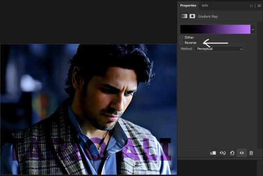
Note: sometimes, depending on the way your gradient is made, you might get text that looks like the picture below. Just hit the reverse button (shown with a white arrow), and you should get the text looking like it does above.
This is the basic way to do it. Now, we can easily edit this, if we feel like there’s too much purple and not enough black. To do that, we go into the gradient, and change the slider positions of the colors. This is purely an aesthetic preference, but I’ll show you how to do it below:
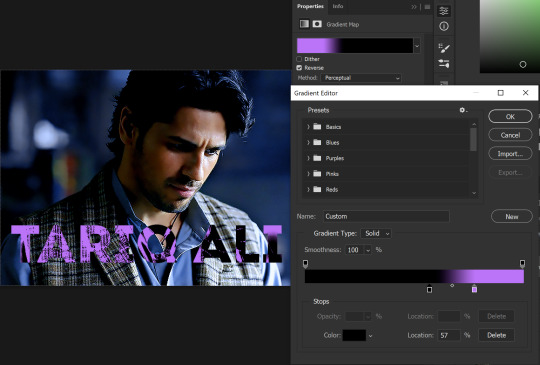
For example, I moved those sliders so there’s more black and less purple, and the gradient feels more like two colors only, instead of all the various hues of dark purple/gray-purple.
This is what the gif looks like:
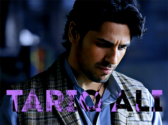
In the gif before this one, the black was more of a muted gray. In the one directly above, you can see that it looks much more striking. So play around with that until you find something you like.
It still doesn’t look very visible to me, so I’m going to add a drop shadow underneath (again, this is a preference thing). You’d do it just like you would with a regular text layer. Right click the Gradient Map layer and select Blending Options. Add a drop shadow.
This is what mine looks like:
And that’s it! You can keep playing around with the whole thing until you’re happy with it. You can even keep changing the color, and the great thing about that is you’ll be able to preview it as you change it to see what works with your scene. For example, I tried white and black text here:
And that’s it! Feel free to drop me an ask if anything’s confusing! Happy giffing!
#zee's tutorials#tutorials#gif tutorial#typography#gradient text#photoshop tutorial#resources#ps help#dailyresources#completeresources#itsphotoshop#allresources#dailypsd#userisha#userdahlias#alielook
425 notes
·
View notes
Text

ngl im not like, lineless art specialist, honestly i went lineless fairly recently (like lets say may 2023 when i started drawing art for homestuck), before that i was making art with lineart only, so take my process with a grain of salt lmfao but i hope it clears out some things!
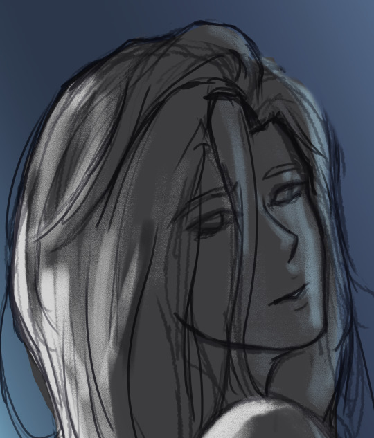
lets dissect the recent dirkkri art ive made:
i start out with sketch, as you usually do. depending on how im feeling or how complex the pose/background is, i make it more or less detailed. for more basic poses i might even stick to a simple gesture drawing and go straight into laying out the colors, it really varies a lot. it might even change in the further process, like how i moved dirks shades from his head to be sticking out slightly from behind his arm, clipped to his shirt, because i didnt like how busy the area around the faces looked
one advice i can give is to not spend too much time on the sketch. its job is to guide the laying out of flat colors and thats it! dont make it too fancy, dont get lost in the details - you can add those later on when youre doing the flats. its fine if the sketch is messy, youll fix it in later stages of the process!
next i do the flat colors! i tackle it one thing at a time - for example with dirks head i started on separate layers with the general shape of his face, then added his facial features, then i drew the hair, then added his neck, the crown, and lastly his piercings. i then merged them all together - you dont need to leave it all separate, best way is to group things together and merge so you dont get lost with all the layers (like how kankris arm on the front is one layer including his sweater sleeve and his hand).
i highly recommend naming your layers - im a little on and off with it myself, but seriously it makes your life easier later on when you spot a mistake and have to shuffle through bazilion layers to find it lmfao, especially when your drawing includes multiple things that overlay on top of each other like in this example. dont be like me and take a second to name them asksks
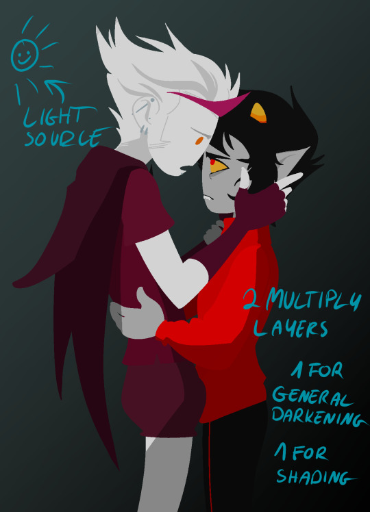
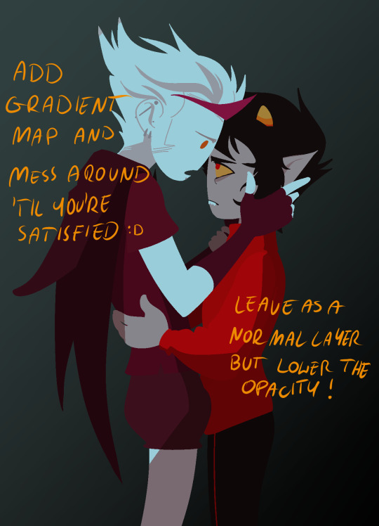
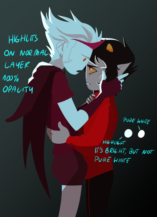
next to the rendering! i sometimes completely ditch this one, just leaving the flats as they are, but when i want a drawing to have more oomph i have some more steps to the process. its pretty simple - shadow, gradient map and highlight layer on clipping masks connected to the flats. in this one i used light gray for shadows (first layer to generally darken the drawing, second for defining shadows). same with highlights - one color.
the real star of the show is the gradient map, seriously, its a goddamn miracle worker. in krita you can add one by clicking on the plus sign to add a new layer and choose "add filter layer", then in the menu open the "map" category and here should be the option of adding gradient map. you can do it on your flats, but its destructive, and on a separate layer you can always change it if you dont like it later on. mess with the colors and tadah! it now looks fancy as shit and makes people think you know color theory!
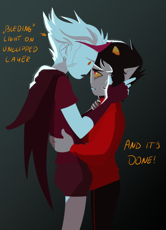

last but not least you can add some bleeding light on a separate layer that isnt clipped to the flats to give it more dreamy appearence! i also added an example of how my layers looked in a group at the end of the drawing process.
and thats it! hope it helps, and have fun drawing!
#ask#drawing process#lineless art#art tips#art process#digital art#hope its at least somehow understandable im really sleepy rn#god i hope i didnt make any spelling mistakes LMFAO#artists on tumblr
62 notes
·
View notes
Note
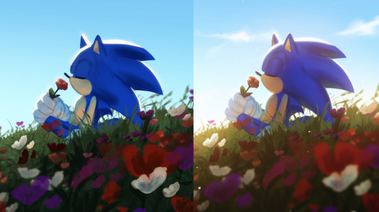
hi it’s snaildroid!!! Just wanted to say that I love your art so fricken much! Your comics make my day every time I see them I swear. I wanna know how you do your lighting, it’s always so pretty and soft <3
ahhh thank you! it makes my day that you like them :')
to be honest, my lighting style is pretty quick and dirty, and it's certainly nothing super original or groundbreaking, but here's the process under the cut:
So, the first picture is flats. I do those all on one layer (or putting them all into a folder) under the lineart.
Then, I use a clipping layer and fill bucket all one color. This color depends on the mood lighting, and it unifies the flats. If it's night, I tend to use a darker purple. If it's nostalgic, I use orange, etc etc.
Then I set the layer to multiply and lower the opacity for what works for the time of day. This is a low ~19%
Then, I'll add lighting, again on a clipping layer. I'll usually pick an orange/yellow color and do vague rim lighting with an opacity sensitive brush. I tend to be too lazy to render, and I like having it blend in some places but be hard, like cell shading, in others. I also do sort of "fake rim lighting" where it's rim lighting wherever the heck I want it instead of logically where light might go, but it depends on how realistic the piece is.

Recently, I've started to copy and paste that clipped layer and change the effect to Glow Dodge, and lower the opacity depending on how vibrant I want to be. This adds a little more vibrancy and color variation without a lot of extra work, like lining with pink across the edge boundaries like a lot of artists do. (Which I love, but I am. lazy.)
and viola! Quick and dirty lighting. Sometimes, I'll adjust the colors with tonal correction or add gradient maps (aka the "make colors good" button) but for the most part, this is how i shade for comics! I hope it helps. Let me know if you want anything more specific or to explain something else :)
#tutorial#asks#with sokka :)#honestly im still learning and trying to improve my lighting#but im glad you like it!
140 notes
·
View notes
Text
Today is the day I unleash my Mr. Bonzo fanart upon this webbed site.
This post is relatively safe up until the cut.
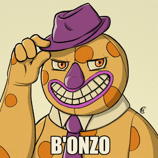
Is the *tips fedora* meme over a decade old? Yes. Do I care? No, absolutely not.
~
Now this is where I recommend "getting off" this post to anyone bothered by graphic depictions of body horror, blood, violence, or Mr. Bonzo (monster, not mascot like above).
I know the first image is silly, but I cannot stress enough how serious I am when I say:
Proceed at your own risk.
Now that you have chosen to continue, I have arranged the images in order of least to most vile and disturbing (though that might be slightly subjective on my part).
Remember that you can click off this post at any time.
Final warning: split tongue Bonzo.
I tried channeling Julia Drawfee with the lineart a little bit. Didn't feel like shading that one, so it's a bit flat.
Where did I lose my colours? Plot twist: the first image in this post is actually the last I've made, so technically I gained the colours. I wanted it to have more of a cheery vibe, unlike the ones under the cut, which I wanted to be kinda dreary and I feel like adding too much colour can mess that up.
Alright, I'll address the tongue. Remember how his head splits in tmagp 12? Yeah, it's a nod to that and also I asked myself "how do I make his design worse than it already is?" and that's the only answer I could come up with. I debated adding stitches connesting the two halves of the tongue but couldn't figure out how, so you're welcome. It will be present in all the upcoming drawings as well.
~
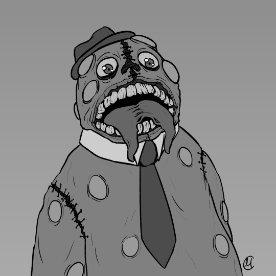
The next one is bloody, but it's not that much worse than the previous one overall.
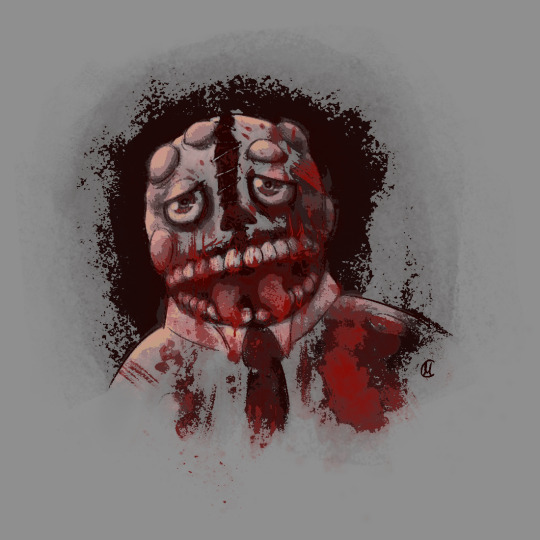
I was playing with filters after I was done with this piece, because I felt like it lacked something, but didn't know what. Really liked this one, I think it's some sort of a gradient map. It pixelised the image and adjusted the colours a bit, it also really made the blood pop out, though it covered up some of the details.
Why did he lose his hat? It's stupid and hard to draw.
You may have noticed the artstyle change a little, the previous images having neat lineart and little to no shading. That's because I am using different tools, sketchy and soft brushes, that allow me to experiment with lighting and textures more (plus the aforementioned filter altering the image even further).
~
Alright, I feel like this last image deserves a separate warning. It references episode 12 (spoiler ahead), specifically the moment before the bartender loses a hand, though it's not entirely accurate. It's rendered in more detail than any of the previous images, so keep that in mind before scrolling down.
Basically it's pov: Bonzo licks your hand.
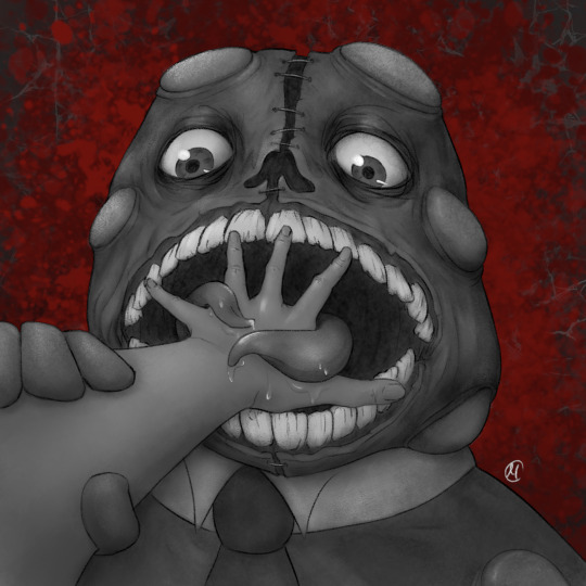
I feel like I could've made his tongue bigger in this one, it seems kinda small compared to his mouth. I really like how the skin on his face ended up looking. It took a lot of work.
The spit makes it look weirdly sexual, doesn't it? Listen, that was not my intention, but I'm not erasing it. I set out to make the worst thing I could and, though not without cost, I have achieved it.
I tried splattering Bonzo in blood, but it wasn't really working for me and it covered up a lot of the detail I liked, so I just put it in the background.
The human hand is drawn from reference, which I found by googling "hand reaching out away from the viewer". And let me tell you: google is shit at looking for drawing references, but I figured it was just going to be a sketch to explore an idea, so I didn't bother trying to get a better one. And then I fixated on it for a couple hours, you know, like a normal person.
I literally (and I mean no exaggeration) dusted off my drawing tablet after a few months of no use to spend the entire weekend, after tmagp 12 came out, glued to the screen making those images, except for the b'onzo one, which I made this evening.
Just to clarify: I drew all of those by myself. No filthy AI image generation is allowed in this house. I am capable of committing far greater sins than an artificial intelligence ever will.
The only thing left here is to extend my sincere congratulations/condolences to whoever got this far. It's up to you to either think you're brave or realise that you're foolish for doing so, but be comforted by the fact that at least you didn't make this post, which I cannot say for myself.
#this might be my worst post yet#i was so preoccupied with whether or not i could i didn't stop to think if i should (make bonzo worse)#do i regret it?#no#here's the sewage stew i promised/threatened you with a few weeks ago#the magnus protocol#tmagp#tmagp shitpost#long post#fanart#tmagp fanart#bonzo#mr bonzo#content warning#body horror#blood#violence#get bonzed#posts that would send me straight to a psychiatric ward were anyone i know irl to find out i made
14 notes
·
View notes
Note
Hello! I’m an aspiring artist, I saw your art and it’s amazing!! and I was wondering- how do you color T——T !?
hi ! thank you :D
first of all when coloring a piece is to know what kind of lighting you have, is it day ? night ? natural lighting ? artificial ? where is it coming from, is it a hard light or soft etc etc
there's a lot of tutorials online that can explain the different kinds of lighting better than i could ever, i also recommend to take a reference while painting !
if you have trouble using colours or you're not too sure about your lightning and what ambience you want, i recommend learning greyscale and using gradient map since it's easier to manipulate if you change your mind during the process ^^
now how i do it is very simple, put your base color, then find a lighter and darker color, this works in both cel and soft shading


if you have a particular lighting, then it might get more complex


so yeah i usually have 3-5 main colours to shade
jumping between hard and soft shadows can be troublesome but it all depends on your artstyle, i like my direct shadows to be hard and the rest softer to bring a bit of contrast between the two but that's just me :>
i hope this somehow helps, if you want a more in depth tutorial of how i render i can do that too ^^
42 notes
·
View notes
Note
Hello! Do you have any advice with painting? Every time I start I end up just doing lineart with colours underneath, and when I do kindles art it looks kind of like plastic. Am I supposed to merge the two layers and then start shading? What would you recommend?
Hey anon!! I actually do have some advice for that!! I'll shove it under a cut because it got way longer than I thought it would, sorry for the infodump everyone _(:3 」∠)_
quick tl;dr: painting process should consider both personal taste & the desired aesthetic of a painting, & to avoid plastic-y colours, make sure your hues vary within your values (and layer modes are ur friend) ♥
there's a million ways to start paintings & its all down to personal preference -- the end goal for the illustration can often influence the approach you take; a crisp digital painting might call for meticulous layering & sharp edged flats, but if you want something to look like an oil painting, you should try and mimic that process as close as you can! here's some examples:
this is the sketch for my FYR zine piece from last year; i intentionally approached it in a way that looks like traditional underpaintings so that when I worked directly on top, those orange tones would peek through like this:

after doing that undersketch, i manually painted everything -- no fancy layer modes, just me, one layer, and screaming ಥ_ಥ it was hard but it worked for the vibe i wanted!!
now v.s something like this:
simple shapes, roughly blocked in shading that just gets merged and painted over, as well as lots of layer modes on top for those colour changes! this is by far the easier one & the one i'd probably recommend, solely because it lets you keep more control. i go more in depth here on that -- but to quickly answer, i personally block everything (including shading) in before I merge & render!
for the other thing you mentioned, a lot of the times that 'plastic' feeling can come from either a lack of transitional shades or only using white/black for your value tones. this tweet thread (direct image links 1, 2 & 3) by frozensoba demonstrates it incredibly well -- by adding certain colour shifts in your values, it can create extra depth which is what makes stuff look more alive!! don't be afraid to really push it and get wacky
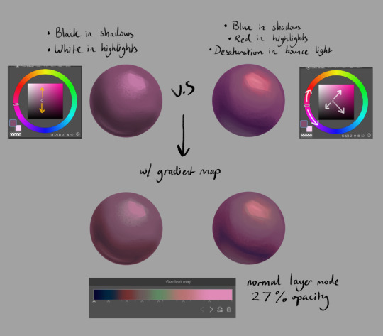
an easy way to add it while you're learning is using gradient maps to add richness in your midtones. It's not perfect since different surfaces & materials diffuse light differently, but adding one at the end of a drawing can help tie everything together. If you can do both at once though it always looks best; here's some very quick 2 minute orbs as an example:
ok I'm almost done (and im so sorry for how long this got... special interest moment TM) -- one last thing is to try varying your brush strokes & adding textures if you want. using only an airbrush or heavily relying on blurring brushes can make things look plastic too; sometimes you want that, but for the times you don't, adding some texture & leaving brush marks in can do a lot!!
lastly, since this is just me rambling, here are some artists that are incredibly talented & i highly recommend looking at for their advice & processes because it will be much more coherent than this:
Marco Bucci -- amazing educational content. if you check out any of these artists, he's the one to look at first imo. his 10 minutes to better painting series is a great place to start
Sinix Design has some amazing tutorials on anatomy & the mechanics of painting! This video & the intermediate part 2 are super
Dao Trong Le -- a veritable goldmine of speedpaints
Bo Chen & any of the riot splash artists. If that's the vibe you're after, you can't go wrong with the LoL splashes as reference
i hope that helps!!!
#tutorial#any time i have the opportunity to barf out art talk i will do it#tysm for the question too ♥#not art#asks
92 notes
·
View notes
Note
hiiii i absolutely love your edits!! your colouring is amazing!! can you show a tutorial how you colour? thanks xx hope u have a good day xx
Hi there! thank you so much that means a lot!! I'm assuming you mean my comic coloring but if you mean gif coloring just come back and let me know!!
I don't remember what psd I found on here that was my insp. so I can't link a similar one, sorry about that!! but I'll just finally release mine. I basically use this psd for all my comic edits with minor changes.
made from scratch by me, you can edit it, play around with it and use it as you please, just don't claim and don't whitewash!!
Download link to psd!
Under the cut explains a bit more about the psd, what the layers do, and how to edit them if needed!
starting from the bottom:
the bottom 2 layers (brightness/contrast & curves) brighten the image,
selective color 1 darkens blacks and greys,
vibrance adds... vibrance,
selective color 2 lightens all blues and makes them brighter (optional; things might be too bright)
gradient map 1 adds a blue hue and brightens everything but especially blues. kinda hard to explain all it does but you'll see
gradient map 2 adds a yellow hue (to balance out the previous layer) and brightens everything but especially yellows. again kinda hard to explain but it adds a cool effect
the gradient map layers brighten up all colors which includes blacks/greys/dark colors, so the next 2 layers (exposure & selective color 3) is to darken those back down to an appropriate level making the image cohesive and not blinding, but keeps the hues and brightness of the rest of the colors, adding this cool effect to almost every color and making them vibrant/saturated and very colorful. without these 2 layers (again the exposure & selective color 3) the image would be so over exposed you wouldn't be able to tell what's going on
selective color 4 is optional, but it makes yellows (mostly yellow and orange) lighter and softer, so they're less saturated
and finally curves 2 is to darken blacks/greys/dark colors even more so that black colors in the original image stay black. to get things even blacker/darker, I would recommend adding another selective color layer on top of everything, and going to blacks and greys and setting everything to be blacker (for help with that look at the 1st selective color layer and just duplicate it. play around with it and see what you get)
some tips:
if the image is too saturated/over colored/just too much going on, you can take off gradient map 1 and maybe the exposure or selective color 3 to get a more appropriate coloring for your style!
this psd could probably be simplified by some ps wiz but that's not me so this is the way it was made. just play around with layers and see what you get.
DON'T WHITEWASH (redwash/orangewash/etc...) if the persons skin tone (or anything else) looks washed out/wrong, just use a layer mask and bush tool set to black to erase that layer from whatever you want it off of. if it's more than that layer, use the layer mask on the group itself and again brush tool set to black to erase it off of whatever.
lastly;
play around and have fun! see what you come up with (tag me in your creations!!) and see what fits you/your style.
if anyone needs any help with the psd or ps stuff in general, just ask! I'll be glad to help!
#hope this helps!#usersmelina#ps#photoshop#ps help#tutorial#coloring#coloring tutorial#comics#comic psd#colorful psd#psd
20 notes
·
View notes
Text
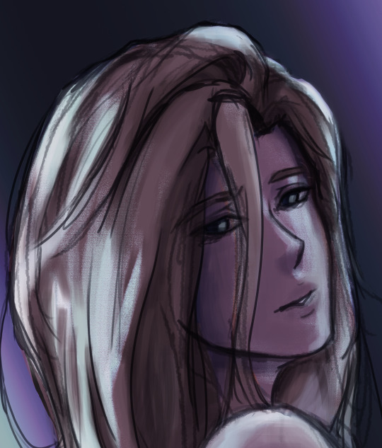
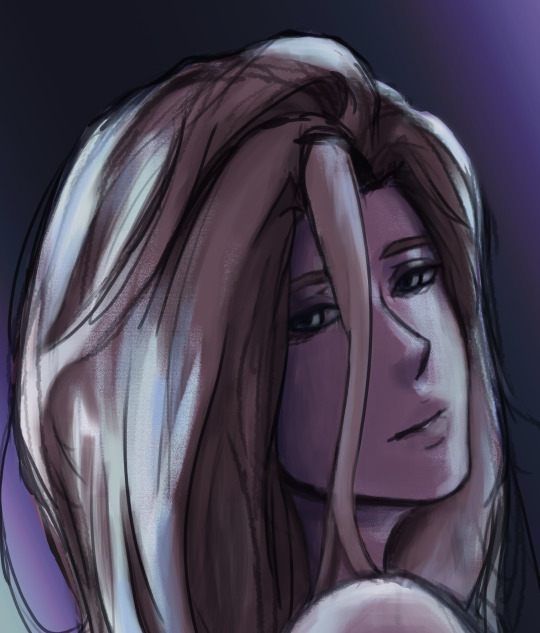
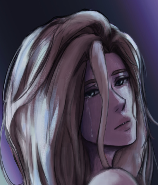
// ayo it's been a minute but uhhh follow up to this piece i did because i wanted to and also i'm still always thinking about starchild casey <3 as always this au belongs to @ashwii i am merely writing bc i'm obsessed with the au!
"Careful, Raph," Donnie's voice filtered through the darkness that weighed Leo's eyes closed and muffled everything around him. "I think he's a little numb right now, he might not feel it if you burn him."
"But he's so cold," Raph's voice rumbled against Leo's cheek where he was curled up against Raph's chest.
A hand touched Leo's arm, the weight barely there against the detached awareness Leo currently possessed. He wasn't sure if the hand was testing the temperature of his skin or trying to wake him, but he couldn't seem to summon the energy to care. Everything felt syrupy slow, and his body was far too heavy for the task of lifting his head.
Leo was used to pain. He grit his teeth through it every time a star died, and breathed in tune with the sting of new stars blazing to life. Pain was constant, ever-present, and (unfortunately) reliable.
But this? The numbing detachment, the rattling chill, the press of constant fatigue, and hollow absence of a connection lost? Somehow the emptiness hurt more than the pain.
Leo was prone to wandering the cosmos, but ever since the attack, he hadn't left his brothers - both for lack of want and lack of energy. Raph kept him close because Leo thought maybe the heat would find a way through the paralyzing chill, but it had yet to do so. Still, Leo kept trying. There was nothing else he could do. This had never happened before, and he didn't know where to even begin in terms of bringing his stars back.
Part of him knew they were still out there, but his connection to them was gone. They didn't decorate his arms and legs anymore, not since the Kraang. Worse yet, there was no sign of them returning any time soon, either. He finally forced himself to uncurl from Raph's hold and blink blearily up at his brothers.
"It's been days," Leo murmured, drawing their attention. Donnie moved closer and placed a hand on Leo's starless knee as Raph gave him a careful squeeze of a hug. Leo flipped his palms up and stared down at where his hands trembled in his lap. They looked so lifeless, so dull and starless. The inky gradient still spilled up Leo's forearms, but the endless map of glittering stars remained mostly absent. Leo had hoped they would start flickering to life relatively quickly on their own, given the average rate of creation, but nothing changed.
Without his connection, he couldn't even tell if stars were being created or dying anymore - just that ever present numbness that permeated his limbs like static. He never thought he would miss the pain.
"What should I do?" Leo choked out, looking up at Donnie and Raph again. They both looked to be fighting back emotion, knowing well enough that Leo didn't want their pity. He wanted answers - something none of them had.
Leo wanted to scream, the sound aching and straining for freedom at the back of his throat.
"Master Leo?" A tiny voice piped up, shaky with fright. Distracted from his misery, Leo looked up on instinct and found Mikey nearby with little Casey in his arms. Casey's eyes were bright pools of nebulous starlight, wide with concern for their primary caretaker. "Are you okay?"
"Hey Case," Leo managed, voice strained and smile forced. He held out his numb arms with clumsy coordination and nodded at Mikey. He passed Casey over to Leo carefully, and Leo clung to his little starchild, curling around Casey protectively. Raph pulled Leo closer, creating a cosmic matryoshka doll of vigilant embraces.
"Are you okay?" Casey repeated, placing gentle, tiny hands against Leo's jaw. "You aren't sparkling."
Leo swallowed a sob and choked it up as a laugh instead. He gave Casey what he hoped translated as a light squeeze of a hug and nodded jerkily.
"I'm not feeling too great, bud," Leo confessed, because he knew better than to lie to Casey. His little starchild was far too perceptive for their age. "But I'll be okay soon, promise."
Casey frowned up at him before looking down at their sparkling fingertips. Their skin was a swirling collection of cosmic dust interspersed with the flickering, fitful bursts of new stars. The more developed a star was against their skin, the closer the light moved to their fingertips or settled on the bridge of their nose. Eventually, the light would disperse and make way for yet more starlight, but Leo loved seeing the freckled patterns traipsing across his starchild's skin like a dance.
"I can share until you feel better!" Casey cried out abruptly, startling Leo and his brothers. Leo looked down at Casey with confusion as they wiggled around in Leo's hold.
"What--?" Leo started to ask as Casey wrapped their tiny hands around Leo's forearm. Their brow furrowed, tongue poking out from Casey's lips as they concentrated on pressing their palms against Leo's arm.
The return of sensation to Leo's limbs was a sudden, unpleasant rush of prickling heat. He gasped and fought the instinct to yank his arm away from Casey, not wanting to hurt them. His brothers moved forward but stopped just as quickly, their eyes wide and fixed on Casey.
Where their hands were wrapped around Leo's arm, starlight spilled from Casey's fingertips and melted into Leo's inky skin in a puddle of silver. From the mass of light, pinpricks broke free and rushed off to various positions, rebuilding constellations that Leo had lost to the Kraang.
With Casey's shared starlight, came the familiar call of the universe. Leo could feel his stars calling out to him, joyful and worried and clinging to his presence. They had never lost connection with him before, and now that they could reach him again, they wouldn't let him go so easily. Leo reveled in their presence, choked by relief and joy and a thousand emotions he couldn't begin to put a name to.
Sweeping Casey up into a tight embrace, Leo tumbled out of Raph's arms to spin Casey in circles and laughed as starlight tears dripped down his cheeks. Casey squealed with joy and wrapped stubby arms around Leo's neck as they spun.
With the return of his connection came the ever present pain, but Leo embraced it with a joy he did not know he possessed. He would take feeling anything over the emptiness.
Nuzzling his face into Casey's faintly starlit hair, Leo huffed a watery laugh and squeezed his starchild a little tighter.
"Thank you, Casey," Leo said through tears. His brothers pressed in around them, hugging and speaking over each other in wondrous excitement.
Casey grinned a sweet, gap-toothed smile up at Leo and squeezed him back. "You're welcome!"
Leo's limbs burned as stars were born and died while his brothers hugged him. In that moment, it didn't even hurt.
#rottmnt#rottmnt celestial au#writing#my writing#leo hamato#raph hamato#mikey hamato#donnie hamato#casey jr#i just got off spring break where i slept through most of it so have this <3#this wasn't beta read pls don't yell at me#also still on my star!leo has chronic pain shit
23 notes
·
View notes
Note
Artists when artists are copying & distributing art from companies for their own use and profit without paying them: 'Lol, theft removes the original, this doesn't. Copying art is not a crime! yo-ho yo-ho!' Artists when companies are copying & distribuying art from artists for their own use and profit: 'What! Collage is a crime! You wouldn't download a car!' Good to see that the God of Irony still has a job!
I was going to write something about this subject too, but I got hung up on that gofundme thing.
Up front, I think there is some legitimate complaints about artists not wanting their shit scraped and fed into an algorithm. That's not an unreasonable demand. Datamining is out of control on the internet. There needs to be way less of it.
But also... All this bitching and moaning about ethics and morality is hollow as fuck. The piracy thing right up front. How many scanlated manga or fan-subbed shows you think the average seething artist has read/watched? How many movies did they pirate? How many ads have they blocked? How many streaming service passwords shared? How many second-hand things have they purchased? How many college textbooks downloaded? How many programs have they cracked and used for years without ever paying a sub fee? How many little things have they shoplifted? How many immoral and unethical things they've done without ever making up for it?
Short version is blatant "rules for thee, but not for me!!" bullshit. It is an ethical nightmare that some programmers have in some way appropriated raw data from something made by someone else because they, the artists, deserve payment and royalties for their art being viewed in any way they don't approve of, even if it's just some ephemeral fragment of something they made once, did not license, did not copyright, did not commercialize in any way.
Every other artist and employee who worked on and produces all the shows and products and services doesn't deserve payment because... uhh.. because late stage capitalism or whatever!!
It's a double standard that doesn't hold up to a moment of scrutiny. Some of this hysterical bullshit would even be forgivable if it were just about not being happy about having their work used in a way they don't approve of. Instead, they had to go with this moronic, exaggerated ethics angle, they had to pool their money to try and get the US Government involved. All this constant wailing and gnashing about losing jobs and work when nothing has actually changed and no one is making 6 figures yearly on an AI Art patreon. No one is losing commissions to some now world famous prompt expert who charges even more money.
We've long accepted piracy as an unavoidable aspect of the digital age, but suddenly that's not okay because it might (but not actually) impact some freelancer/indie artist's ability to get work that they either aren't losing because of AI (remember that the global economy is falling apart), or they might lose jobs that they don't have, they aren't trained for and/or aren't pursuing anyways.
But you know what else is kinda fucked about all of it? Most of these artists wouldn't be where they are today without technology and software advancements. Do you have any idea how many artists would be fucking hopeless without all the custom photoshop and CSP brushes they downloaded for free (and never credited the creator)? Do you know how fucked these people would be without all the built in color correction settings and filters and gradient maps? They can't even imagine drawing in procreate without all the built-in tools for correcting their sloppy-ass linework. There's SO MANY successful and highly paid webtoon comics out there that wouldn't be where they are today without the CSP asset store allowing them to drop in 3d background assets and pre-set pose and hand guides.
These whiny fucks are up to their eyeballs in technology that props up their entire profession/hobby, but they are screaming at the top of their lungs because someone downloaded a booru or scraped pinterest to feed into an AI Training algorithm.
tl;dr - They're a bunch of immoral hypocrites who badly want to dress up their impotent outrage as some kind of meaningful, ethical catastrophe.
30 notes
·
View notes
Note
Hiii can u pls do a face tut pls I’m begging you
heya! sorry this took some time, i just moved and it's been really hectic @@
and thank you for the question! i'll use stuff for bela and shadowheart as an example for ya for the two styles i usually do
warning, i am not a teacher and i'm still experimenting and learning so uhh some of this might be scuffed but is how i do it :>
also noting that i use csp or photoshop depending on my mood and what brushes i want to use but the same technique works for either and i use 2 brushes for the main bits and additional brushes if i want to add texture
--
1 - so after i have the sketch roughed, i usually put it on a multiply layer and add a background layer under it (i leave it white or almost white if i'm just doing a doodle or sketch) and i start to figure out the lighting and shading under the outline layer
the lighting is usually pretty rough and i'll start to understand what i'm going for as it starts to shape up but i try not to reduce the brush size too much so i don't get too muddled
(at this point i'm going thru my mantra of "trust the process" and breathing into a paper bag and kicking and screaming about how i want to quit)
--
2 - once i have the lighting somewhat how i want it, i start tweaking the color and i do it by using adjustment layers and manually painting. this part is kinda like cooking and tasting as you go, if i feel i want the image to feel colder/warmer i'll adjust accordingly but i will tell you how i did it for both examples below:
for bela, i actually painting above the shading/lighting layer and used "soft light" and "hard light" blending modes for the hair and skin to fit more with how i wanted it to look. i used color balance and curves for the background to get it to more of a purple/blue and darker
for shadowheart, i actually put the color below the shading/lighting layer and left the color as is and swapped the blending mode for the shading/lighting layer to "multiply" and then did adjustments using curves and gradient maps using "hard light" and "soft light" too and i think i had a "color burn" just for fun
this is my fav part of the process bc i just experiment and mess around with different layers. i usually have a vision for how i want the color and lighting to look but there's always room for new ideas! so i just mess around for a while here till i'm happy!
--
3 - rendering time! um i don't really have much advice here except i just start going in and rendering in closer detail. and remember references are your friend!!!
bela render progression:
shadowheart render progression:


i sometimes end up changing the drawing quite a bit during rendering but that's okay bc as you go into detail, you will notice discrepancies from the pre-render stages
for the style i used with shadowheart i just paint over the outline pretty much with some bits of it left it and i blend more to smooth it out more. for the style i used with bela, i add back in any outlines i painted over that i wanted to keep
--
and at the end of the day it's your art and how you express it is what's always gonna be the best so trust your gut (and references) but also it's okay to take creative liberties and go with the "cool rule" :3
and keep practicing!!!! i def feel i've gotten better with drawing faces compared to a year ago
i hope this helps and if it didn't ":3 i hope you had fun reading
#i hope this makes sense#i had to go back into my files and disable layers to get these screenshots Dx and i have a LOT of layers but for you anon i did it#i didn't know if u just wanted a broad tut of how i draw the face or if you wanted smth specific but i hope this helps anyways#i didn't promise this would help#pretty long post#asks#anonymous#my art
5 notes
·
View notes
Note
hey!! i wanted to ask what coloring do you use in your gifs, it looks so pretty and you’re so talented… if you don’t want to share it’s ok too. hope you’re doing good <3
hey! thank you so much for asking, this is really sweet.
it took me a little while to figure out how to answer this because i don't typically save my psds (or use other people's). i'll try to give you an idea of the steps i use under the cut. you might need a basic understanding of ps for this to make sense but for the most part my process is relatively easy and beginner friendly :)
this is kinda gonna be what i’m going for:

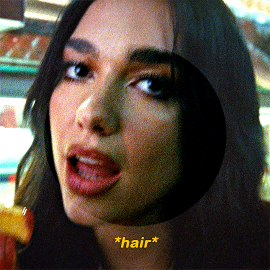
so starting with this gif of dua that's almost completely untouched, all i've done is sharpen it.
curves layer
this is usually my first step in brightening the image to my liking. it also helps me neutralize the colour. i make it easy on myself by letting photoshop do the work for me.

i start by white balancing using the white eyedropper tool. you can do this by selecting the tool and then clicking on a white point on the image. for this gif you can use the whites of her eyes, her teeth, the lights in the background, the highlights on her nails, etc. it might look vastly different depending on what you pick, so it's really up to personal preference. i'll give you an example of a few:
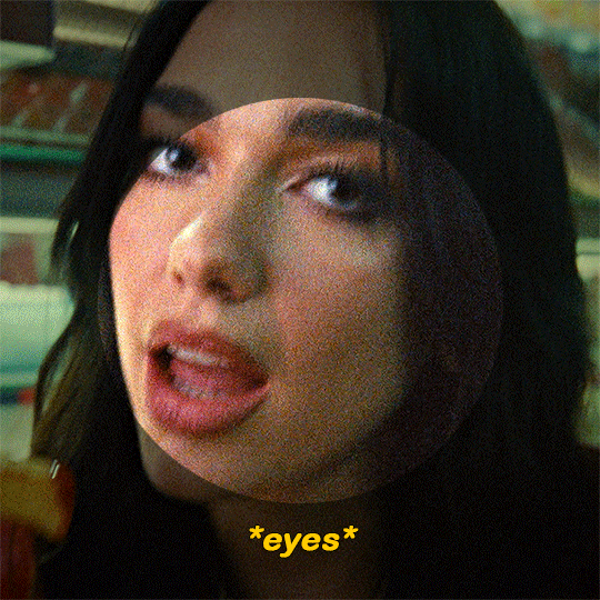


(i went with the teeth option)

at this point i usually add second curves layer to essentially do the opposite. for the black point you can use her eyes (like the iris/pupil), her hair, her eyebrows, etc etc. select the darkest eyedropper tool and click your black point on the image. here are some examples:


(i went with the eyebrows option)
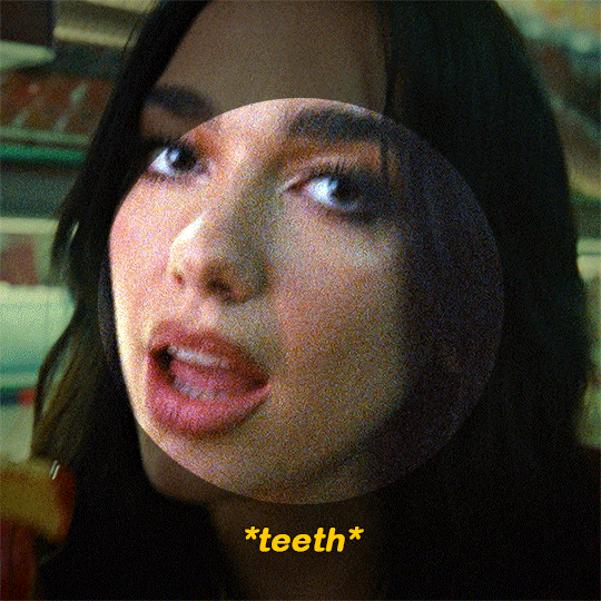
hue/saturation layer
as you can see, her skin looks really red. i’m going to tone it down a little bit. i usually use this layer to subdue any colours in the gif that i feel are overpowering. you can also use it to do the opposite, which i normally do towards the end.

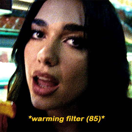
photo filter layer
now that the gif is pretty well neutralized, i like to use photo filter to basically set the temperature of the image. here’s what a warming filter looked like at 65% density:
blue filter at 50% density:

magenta at 35% density:

green at 45% density:

violet at 40% density:
(i went with the violet option)
exposure layer
i added an exposure layer to brighten the gif up a little bit. these are my settings:

gradient map layer
i added a gradient map layer at this point. the change here is really subtle, so i don’t know if you’ll be able to see it. but these are essential if you want to add some depth to the image. here are my settings:
colour balance and selective colour
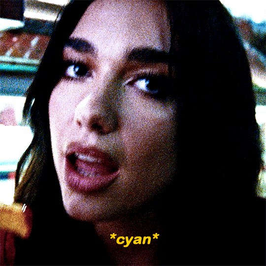
made some small adjustments with a colour balance layer and a selective colour layer. i usually focus on darkening up the shadows and lightening the highlights
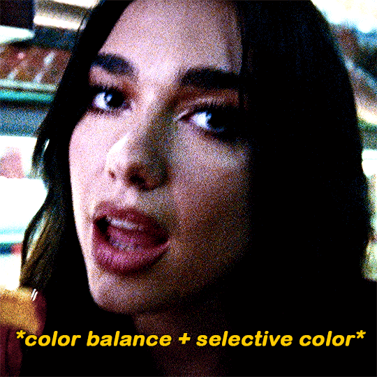
i added a cyan photo filter at 40% density
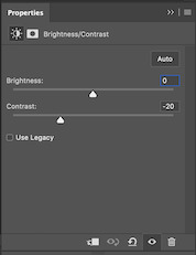
i’ll add a brightness layer to reduce the contrast, here are my settings:

another hue/saturation layer:

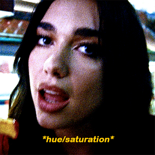
i added one more gradient map at 40% opacity and this was the final product:

i never share/post my psds because every gif i make is coloured individually. this ended being a lot more long winded than i expected but i wanted to be as thorough as possible. lmk if you have any other questions 🥰
62 notes
·
View notes
Note
Hey, I love how you did the B/W strip + the text effect on your margaret atwood set, would you be willing to do a tutorial? 🙈
Hey Nonnie, thank you! Sorry this is a little late, but I did manage to hang onto this PSD for you.
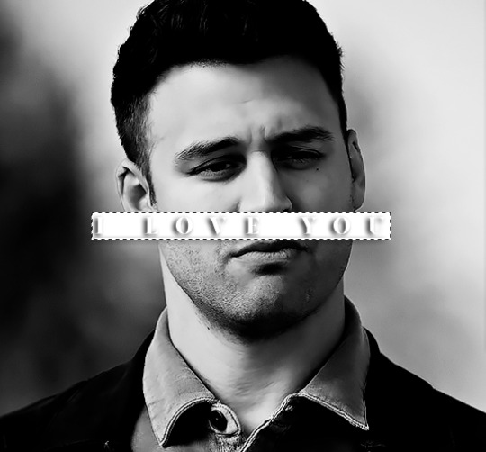
We'll be making this gif:

This tutorial assumes basic knowledge of gif-making, Photoshop, and coloring. I’ve only described the text tutorial in this, but you can reach out if you have any questions.
(This is a different version of my gradient text tutorial, but the same principle applies!)
Tutorial under the cut:
Couple things to note beforehand:
There is a lot of trial and error involved when doing any sort of effect, and this is no exception! You might have to play around with the colors and the settings before you find something that looks good and readable and that fits your set!
This text effect works better on big gifs (540px width) that have quite a bit of movement below the shape so you get that effect.
For this effect, I find that a simple font works better than a cursive one, but play around with what you like.
We're going to start with this gif:
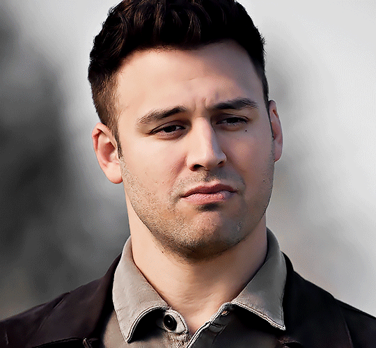
First, I'm going to add my text and center it. For this text, I used the font, Solar vesta Serif, with these settings:
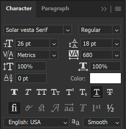
Note: when you do letter spacing + underline, sometimes, the space after the last letter can lead the underline to stretch a little too far past the letter, making it look like the underline isn't centered properly.
To get past this, I just select the last letter separately, and put the VA setting to 0-10, depending on the font/letter.
We're also going to add a drop shadow here itself, and this is fully up to preference, but I used this:

All of that should give us this (yeah, it's the simplest thing because I'm lazy and I like easy things xD nothing too fancy)

Next, we're going to draw our rectangle around the letters. I like to keep even spacing around all the letters on all sides (in this gif, it's 4px on all sides) but just eyeball it initially, and then adjust accordingly.
I changed the fill to white (this color isn't important, I just used white because it's easier to show) and moved the layer in the back so the text is on top. It should all look like this:

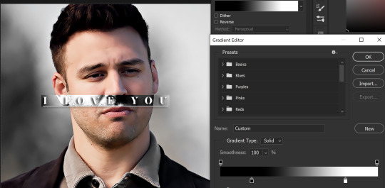
Next, we're going to add a gradient map between the rectangle and the text later. I simply used a black and white gradient, and my gif now looks like this:

Here are the settings:
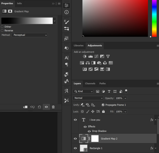
Next, we're going to delete that white box - the layer mask - next to the gradient map. Just click that and press delete (or right-click > delete layer mask). Your layers should look like this:
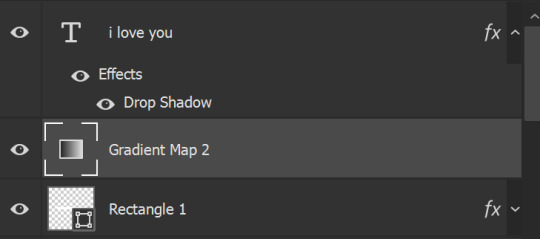
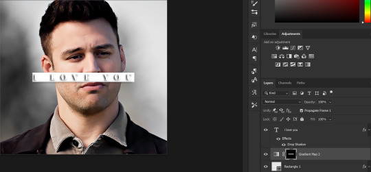
Now, we're going to add the rectangle as a layer mask. While pressing Ctrl, we’re going to hover our mouse over the square box next to Rectangle 1. Your cursor should show a white box with a dotted border. Click the square box with that dotted cursor and you should get a dotted selection line all around the box, like so:
Next, we're going to select our gradient map layer, and then create a new layer mask. At the bottom of the layers panel, you should see a box with a circle in it (denoted with a red arrow). Click that - make sure you have your gradient map layer selected, or you'll end up putting the mask on the wrong layer.

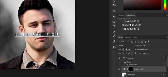
The black and white will disappear, leaving you with just the box again. It'll look like this:
Now, just hide the rectangle layer so it looks like this;
And you're done! This is my final gif:
Once you get this basic thing down, you can play around with it all. For example, I like to adjust my gradient sliders so they emphasize the colors:
You can also just change the colors;
Unlike my previous text effect, we're not going for inverse X-ray effect, so for this, I like to make sure the lighter shade of the gradient is on the lighter parts of the gif, and same with the dark shade.
(If that's confusing, here's a side by side comparison of what the "X-ray" effect vs normal color effect looks like)
Anyway - it's fully up to you!
Because of the effect I was going for, I didn't add a drop shadow underneath the rectangle itself, but you always can if you want to make that a little bit more 3D.
You can also do this with any other shapes, too, with the same procedure.
Hope this helps, Nonnie! Let me know if you have any questions.
#zee's tutorials#tutorials#gif tutorial#photoshop tutorial#resources#dailyresources#completeresources#itsphotoshop#allresources#dailypsd#userisha#userdahlias#alielook#userabs#tuserheidi#userelio#userjaelyn#userisaiah#usermorgan#usergert
169 notes
·
View notes
Last Seen Blogs

fatima-maldonad3-blog
Fatima Maldonado
mytuitionhub
Untitled

ratsbanes
The Sewers Under Your House
aidoddark
AIDODDark