#icon removal test
Text
PLEASE send in actual feedback to staff!
once again begging people to realize staff don't give one single iota of a shit about you reblogging a complaint post then immediately installing an add-on and "going back to normal" like nothing happened, you need to ACTUALLY SUBMIT A FEEDBACK TICKET (or more than one) for them to even lodge that anyone cares about them fucking over basic accessibility by removing icons or screwing artists out of credit on their own posts!
no one looks at the @'s for official accounts. they get pinged like five million times a day stop @ing staff and expecting it to do anything and actually go submit a ticket because otherwise they can just go "well no one complained that we removed avatars from posts so we're keeping it uwu go screw yourself"
it literally takes like twenty seconds. click feedback in the dropdown and either write your own couple lines or just copy paste the message I've written below idfc. ANYTHING is better than doing the equivalent of literally nothing!
the removal of icons from posts makes it impossible to tell who friends or mutuals are to those with reading disabilities, and it's aggressively anti-accessible. please revert this change! the text blends together instead of feeling like separate posts and is extremely distressing because it feels like you've been forcibly booted from the friendship and community that tumblr has fostered for over a decade. not only is this change inaccessible for many disabled persons, it is actively ANTI-accessible and is both extremely alarming and distressing to see even *get* to this stage of testing!
PLEASE. PLEASE SUBMIT FEEDBACK AND DON'T LET THEM SKATE BY BECAUSE "NO ONE CARES" ABOUT THIS
#dashboard unfucker#dashboard changes#tumblr update#tumblr changes#tampermonkey#icon removal test#PFP removal test
766 notes
·
View notes
Text
can you imagine working for tumblr support and consistently getting emails about bug reports that you have to reply to with "not a bug, youve been selected to test out one of our new improvements to the site :)"
#they removed peoples icons from reblogged posts lol#looks awful and sad. apparently this is still being tested so i hope they listen to feedback
6 notes
·
View notes
Text
actually dont go on my blog my themes a mess. im working on it
#this blog is from when i was 16 and taught myself CSS and i thought a dashed border was the shit#instead it makes things sort of look like everything is a draft#currently reediting the base tunglr theme on my test blog#current struggle: cant remove border from icon after changing icon shape#txt
1 note
·
View note
Text
here's your fucking feedback @staff
list of problems the removal of icons causes:
i cant see my friends
ruins the sense of community
can't tell at a glance who's online right now and what they're interested in
literally cannot tell without scrolling back up who put a post on my dash if it has a single addition attached to it. or like. 2 paragraphs in the op.
i cant click my own icon at the top of the dash to quickly view my own blog
can't tell who someone used to be if they change their username
squashes the margins between the menu and posts, making the whole dash feel more cramped
ruins the quick visual cue of how long each post is and where it ends when you're trying to scroll past ones youve seen before
people put a lot of creativity and individuality into icons, and now i never see them
makes people who primarily reblog instead of make their own posts all but completely disappear
list of problems solved by removing icons:
?????
who the fuck was asking for this
ive never in my life seen a website or app that has profile pics forcibly HIDE them, so i guess you did it you made the dash unique again in the worst way
here's some more feedback: maybe when you run an a/b test you should, idk, actually have a feedback form people can fill out about it somewhere
#tumblr#tumblr changes#tumblr updates#i hate this and honestly the difficulty in finding a place to give feedback#makes me really sympathize with the people who just cuss staff out all the time
65K notes
·
View notes
Text
I created a Userstyle for the Chrome/Firefox Stylus Extension that reverts the new dashboard to the old format. This took a lot of tweaking and it's not perfect at all, but if anyone wants it I'll be uploading it soonish now!
You need to have Stylus installed. So if you don't have it:
Install the Stylus Firefox Addon or the Chrome Extension (You can install Chrome Extensions on Edge as well)
Once it's installed into Firefox/Chrome/Edge you can proceed with adding this style or any other.
To add the style, follow the instructions:
Go to this link: https://userstyles.world/style/11286/old-tumblr-dashboard-july-2023
Click on "install".
Style will open a tag with it and in the left side you'll have a button that says "install style", click there.
(Step-by-step copied from the lovely dorothyoz39 who wrote this in a reply!)
If you don't want the sticky header you can remove the labelled script at the top of the css below /* Sticky Header*/
Be sure to check for updates regularly, I'm fixing things as I go! And because everyone keeps asking here's how to support me on Ko-Fi https://ko-fi.com/pixiel !
To update click the Manage button on Stylus and click the check for update button below then click again to install! If you experience any bugs let me know - feel free to edit it yourself as well!
P.S. This userstyle works just fine alongside Xkit!
NEW UPDATE: 27/04/24, 2:15AM BST v11.6
v9.6: Moved the Following | For you | Your Tags to below the create a post panel. Fixed the Accounts Menu! + Bugfixes
V10.3: Patio compatibility. Added a way to hide the Patio button & "patio feedback?" button, just search for patio in the code and follow the instructions!
v11.0: Temporary Chat feature fix after Tumblr broke it, fixed some positioning issues and j/k scrolling!
UPDATE (12/04/2024): YOU CAN NOW UPDATE YOUR OLD TUMBLE DASHBOARD AGAIN!! After letting the server rest everything is now fixed. I will be leaving the Tampermonkey Backup still up but it will have less-frequent updates to remain a backup so please use the Stylus version!
If anyone wants to help test out a new feature (Post width, dashboard positioning, etc) it would be super helpful! Read more about it here and shoot me a message!
THE CREATOR OF THIS USERSTYLE SUPPORTS THEIR TRANS SISTERS. WE'RE ALL IN THIS TOGETHER!
Thank you dragongirlsnout for all your work on Dashboard Unfucker it was amazing working towards the same goal of fixing this website with you! As a Trans person (Agender, They/Them) I am saddened by the issues trans women have been facing on this site and the women who have been bullied into leaving Tumblr for good. I wish the best for you in all that you do next!
Check the readmore for the changelog, custom code & known issues!
-----
Known issues:
Only two columns in Masonry view. Unfixable, Tumblr creates columns based on monitor size, if I try adding another column (because it doesn't exist) it just perpetually loads on screen.
Tempfix: Zoom out in chrome/firefox and it adds more columns
Search bar doesn't appear on some pages (like viewing a post), this is because Tumblr removed the search bar on those pages completely. Unfixable!
Tumblr has ONCE AGAIN CHANGED THE ACCOUNTS MENU. The menus are now shorter and have less information on them. This is unfortunately permanent. I do not see any way to fix this. Unfixable.
If you want people's icons to stay fixed in place, instead of scrolling with the dashboard add;
.FtjPK .AD_w7 .JZ10N, .RYkKH > .nZ9l5 {
top: 0px !important;
position: relative !important;
}
to the top of the code! You can also create a second userstyle by clicking the 'tumblr.com' part of the link in 'Write new Style' and adding the code in there! That way you don't have to worry about re-adding it when you update.
Solved issues: (Update)
Menus need to be manually closed SOLVED! in V.4 and updated in V.5! The menu & icon WILL scroll with you if you have removed the sticky header CSS, however, clicking anywhere on screen will make the Menu disappear still.
Masonry view in searches is now fixed!
Resized Messenger Chat Box!
NEW UPDATE 16/08/23, 23:55 BST v6.5: Figured out how to reorganise the icons in the header. Let me know if you have any problems with it and make sure to update your Userstyle! Some icons are hidden with Display: Block; you can hide more icons with this method!

Solved issues p2
Brought back SOME of the icons for Tumblrs latest update - Unfortunately, this does not bring back user icons for Reblogged posts! Make sure to yell at Tumblr for removing the icons as well as the horrible dashboard update here!
v7.5 Fixed icons for all posts and put them back where they came from!
v6.9.6.9 (I promise this is the last funny number): Fuck Off Buggy The Clown Update + All languages support for the old header design!
v7.0: Fixed the search bar for tumblrs new collections feature, so it looks like the original search bar!
v8.0: Fixed masonry view icons, hidden the reblog icon on dashboard icons, fixed icons in blog viewport
V8.1: Fixed issue with icons not working on soft-refresh & with endless scrolling disabled - be sure to complain to staff!
v9.3: Changed a few things with the search feature, I also made the posts less round.
UPDATE2 11/04/2024: SO We mighhtttt have overrun their servers. 😅 I'm getting a 500 Internal Server Error every time I try to fix it or upload it as a new style - the massive influx of people downloading the userstyle was probably too much. The Tampermonkey backup on Greasyfork works just fine though! Probably easier for a lot of people migrating anyway!
UPDATE 11/04/2024:: My code has broken on Userstyles.world, (it is now fixed as of 12/04/24) until this is fixed I have created a Tampermonkey Backup Version of the Userstyle so feel free to use this version if you've broken yours!
https://greasyfork.org/en/scripts/492279-old-tumblr-dasboard-backup
22K notes
·
View notes
Text
@championselect sent: [ DURING ]
“𝙄 𝙇𝙊𝙑𝙀 𝙔𝙊𝙐” 𝙋𝙍𝙊𝙈𝙋𝙏𝙎. (NSFW 𝙑𝙀𝙍𝙎𝙄𝙊𝙉.) // accepting
[ DURING ]: while having sex with the receiver, the sender tells them that they love them.
Fuuka had been wanting this for a while. While she had hoped for weeks that Minato would talk to her, to show her more than just kisses on the neck and playing with her breasts underneath her uniform (only when they were alone), about wanting to advance their relationship to something more, Minato pulled Fuuka into his bedroom and began to show his love for her all over again.
Their clothes were off of each other immediately and Fuuka felt hot to the touch. Of course, so did Minato, but she didn’t care--she was in love and wanted him to touch every single part of her body. When Fuuka got on top of Minato, and before sliding down onto Minato’s penis, Minato held her hips and looked up at her. She was positively glowing and he was in love that his lips spoke the three words she had been waiting to hear for months.
“I love you.”
She looked down at him, her heart skipping a beat, and Fuuka took her small hand down to cup his cheek and smiled. “I love you too, Minato. I love you so much!” Fuuka repeated twice, before moving her vagina onto his penis and began to slowly move up and down. Her cheeks turned a bright red, letting out small mewls as Minato held onto her tighter. He didn’t want her to stop or to let go. Minato would be sure to leave marks on her body tonight.
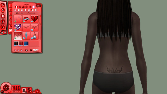
#fuuka.ask#pairing;; blueberry pie#championselect#drabble#(i am testing icons in this one! and if it doesn't show...then i'll fix it up and remove icons lol#it's short and to the point? XD)#.nsfw.#just let me turn down the lights {nsfw}
1 note
·
View note
Text

Howdy, Simmers! I'm thrilled to present the Ultimate 4T2 Clay Hair Default Replacement Collection, designed to give your Sims a fresh and fabulous new look effortlessly! 💇♀️💇♂️✨
It's time to redefine Sim style – one fabulous hairstyle at a time. Get ready for a hair revolution with The Ultimate 4T2 Clay Hair DR Collection! 💖🌟
🍡Download - LC | MF 🍡
Updates folder - SFS | MF
updated 9 Apr 2024
The nitty gritty details and disclaimers:
This is an entire collection that is interwoven with each other. Hair is repositoried to different ages, genders, defaults, and even hidden toddler hair. It's highly recommended that the collection stay intact and that you have the Ultimate Collection or all EP/SP. Recategorizers do not work with this collection
Not all hair works with each sims' faces and not all sims' faces work with each hair. So keep in mind foreheads, cheeks and ears may poke out. Previews are available at LordCrumps.com
The collection includes add ons that may require the defaults and are flagged as "Store Edition" hair. TS4 hairs range from base game to the most recent Stuff Pack (Home Chef Hustle). More hair may be included as add ons in the future.
Enable Store Edition icon
I wouldn't convert some hair without their outfit counterparts. Please make sure to remove conflicts. The outfits include:
ubodymascotknight_EP7
mbodysuperninja
pubodybadger_badger
pubodybadger_brown
ubodycommercialmascot_buns
ubodysocialbunny
servo
ubodycowmascot (a brighter/whiter version courtesy of tvickiesims)
Most of these hairs exist already in the realm of the community as custom hairstyles. Any of my hair previously converted (shrink, servo, santa hat, etc) should be removed; they'll be included in this collection.
TOU: Please feel free to use these as a template for your defaults and recolor the hair as you'd prefer for download purposes. I only ask that you do not reupload these original files (breaking down to packs, gender, etc) as they are intertwined and may not work without their exclusive counterparts. Please do not make these hairs as customs for reupload.
There are a few hair/items that use cc: credit: nolansims, sforzinda, arethabee
This took about... 8 months to complete. I've (re)converted all of these myself to my current expectations of my conversion content. This was play tested thoroughly over the course of that time. If there are any issues, please don't hesitate to send an ask. The file size is massive even compressed, but to be honest it's pretty decent for 500+ hair.
Under the cut are some personal sappy thank you notes that I want to share publicly:
Thank you to the defaulters at sims2defaults database for all your work! Just be kind if/when you tear into it lol
A humongous thank you to those whom have followed and been a part of my journey as a cc creator/converter. This inadvertently marks a huge follower milestone as well and I'm so happy that you all have been a part of this with me for the past (almost) 3 years!
I don't think I would have done this without meeting @lordcrumps over a year ago and joining in his journey for the ultimate 4t2 default collection. He's a true gentleman and scholar 🧐Thank you for play testing, collaborating, and above all, being one of my bestest of friends and confidant.
And, I would never ever had completed this without @tvickiesims. To think she raised me from a terrible toddler right into an angsty teen within that 8 months and still remained a true and close friend through all of it. Thank you for your extensive and detailed play testing, your companionship when I fall apart, and for being my twin flame 🤗
#4t2#s2cc#sims 2 cc#sims 2 download#ts2cc#4t2cc#ts2 download#the sims 2 cc#4t2 conversion#sims 4t2#4t2 hair#4t2 clothes#sims 2 clothes#ts2 defaults#sims 2 defaults#download#dl:def#dl:h#dl:fh#dl:mh
1K notes
·
View notes
Text
ONLINE THINGS THAT HELP ME ON UNIVERSITY, because someone may need it
resoomer.com –> summarizes the text (you can set your native language)
wordcount.com –> counts words in document
speechinminutes.com –> counts how long it will take to read the prepared text (you can also set whether you speak slowly, quickly or normally)
essaytopicgenerator.com –> generates the topic of the essay based on keywords (the field or type of essay can also be included)
researchgate.net –> free texts that can be referred to in the essay
academia.edu –> free texts that can be referred to in the essay
Google Drive / Microsoft OneDrive and Office365 –> free cloud with tools to make slides, documents etc.
sites.google.com –> make free, simple website without any skills
carrd.co –> make free, simple and pretty website without any skills (max. 100 elements)
Online converters –> change file type to different file type
icons8.com –> free icons (for slides, sites etc.)
remove.bg –> remove background from photo
loader.to –> download YouTube video or playlist as video or sound files
forms.google.com –> make simple form/poll/quiz/etc.
quizlet.com –> make flashcards and test yourself (some things are only in pro version now)
Streaming services –> documentary films, educational podcasts etc.
artsandculture.google.com –> explore art, online museum tours etc.
plantsnap.com –> recognizes plants and mushrooms
ecosia.org –> web browser, but they plant trees when you use it
tunemymusic.com –> transfers music playlist (or text song list) to another service
shazam.com –> recognizes songs
slidesgo.com –> slides templates
Darkling Dark Mode –> dark mode for Google Chrome
Darkling Dark Mode –> dark mode for Microsoft Edge
thesaurus.com –> finds synonyms (you can easily find similar websites in your native language)
Apple reminders, google calendar etc. –> help organize
Online libraries –> free books
html-online.com –> write html, css and javascript online
supercook.com –> shows recipes with things you have at home
edx.org –> free courses
academicearth.org –> free courses
#university#school#learning#learning tips#learning hacks#study#study tips#studying#website#useful#websites#tools#learning tools#apps#help#helps#back to school#back to universty#high school#elementary school#middle school#dark academia#academia#light academia#romanticisation#romanticise your life#ideas#essay#writing#essayhelp
4K notes
·
View notes
Text
Arthur’s Love Confession
The word choice for Arthur’s confession is really… interesting. As many people have pointed out, if you remove the pronouns from the conversation, everything Arthur says can be true for Merlin as much as Gwen.

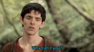
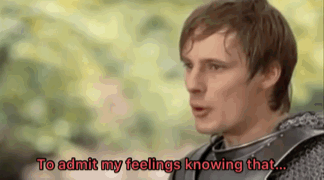
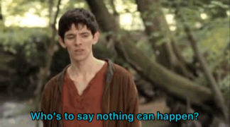


Here’s the thing: I’m a writer. I’ve said this before, and I’ll keep saying it when it comes to posts like this.
If I was writing a love confession from one of my characters, I wouldn’t have what they say be so vague that it would be unclear who they were referring to when taken out of context.
If you showed this conversation to someone who had no idea who these characters were other than a knight and a servant, it would be completely believable that the knight is talking about the servant he’s with.
Hell, Merlin’s reaction to Arthur being unable to say he’s in love and how certain he is that nothing could happen seems a bit strong considering the conversation is about Gwen, not him. He’s her friend and would understandably try to convince Arthur that they could be together, but the dialogue does it in such a round about, vague way before they get to the point. There’s no reason for them to be vague. They both know full well who they’re talking about.
I suppose I have to say this is an opinion of the writing because I can’t claim that the writers did anything with underlying intentions. It’s just seems strange to me how perfectly the description aligns. Even the lines not here could easily have the pronouns swapped and still make sense.
“How can I admit that I think about her (him/you) all the time? Or that I care about her (him/you) more than anyone? How can I admit that I don’t know what I’ll do if any harm comes to her (him/you)?”
It still works. We can’t prove that Arthur thinks about Merlin all the time, but there’s a damn huge amount of evidence that he cares for him deeply and can’t handle him being hurt. Anyone wanting to argue with me on this, go watch The Poisoned Chalice again, which is the FOURTH EPISODE by the way.
Other than that iconic episode, there’s plenty of other things. He doesn’t let Merlin drink the “poison” during the test at the labyrinth. He denies any accusations of him having magic whenever they come up, which is because he genuinely doesn’t believe he has any, but it also has to do with the fact that he would be executed. He always protects him in dangerous situations and tells him to run when things get too dicey. We all know how he acted when Merlin was believed to be dead.
Like I said, it’s weird how well the lines match up. And Arthur looks at him like this before the conversation:
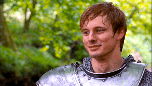
And like this after this conversation:
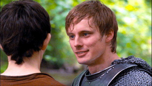
Maybe I’ve just never had a “true bestie” because I have never looked at someone or had someone look at me like that. Arthur looks so flirtatious in that second gif man.
But anyway! That’s just some thoughts I was having about the love confession!
#merlin#merlin bbc#bbc merlin#merlin thoughts#merlin emrys#arthur pendragon#merthur#medieval husbands#two sides of the same coin#merlin 2x04#lancelot and guinevere#the once and future fandom
1K notes
·
View notes
Text
Live Now
Pairing: Camboy!Bucky x Camgirl!Reader
Warnings: 18+ MINORS DNI (Use of Toys, Masturbation)
Authors Note: Smut has been on the mind, and well what better way to test the waters? Happy Reading BUNS! (Any and all writing mistakes are my own)

He jerks his cock lazily with one calloused hand, the other guiding the cursor down the list of potential cam girl links waiting to be clicked and watched. Many of his favorites have bumped their way to the top, his search defined already to what he likes, the profiles he views often after a night of work. Tonight, he scrolls past them, despite his aching cock beginning for something other than the lazy stroke he provides.
Your name had been dropped in his comments for weeks now, many of his loyal viewers asking, no begging him to give you a view. They had promised the long-haired brunette he wouldn’t regret it, apparently you put on quite the show if the frequent drop of your site name was any indication. So he scrolls, continues his lazy stroke as he seeks you out. He finds your link two pages in, the live now icon flashing before his eyes, your profile gives little away, nothing like the other cam girls he’s favorited. He leans back into his chair, body sliding down as he spreads his legs, he gives you your chance.
He presses your link, his screen going black before the loading screen comes on. He removes his hand from the mouse to guide his grey joggers lower around his muscled thighs. He wouldn’t remove them yet; not till he was sure your show would deliver.
Bucky waits, fist still lightly wrapped around his hardened cock, his stroke a constant motion now, giving himself something to look forward to. When the video finally loads Bucky is floored, a curse leaving the man's lips, his fist tightening around his cock as he takes all of you in.
You were sin on legs.
You were kneeled before the camera, your breasts bouncing from where your rode the black dildo that was buried inside of you. The noises the toy pulled from you were blocked by the silicon cock fisted in your hands that you pressed past your lips. Bucky didn’t think it was possible for him to get harder, but the way you push yourself to swallow more of the silicon down has him aching, he had never wanted to be a toy more.
And like Bucky, your followers are eating it up. The soft pings of comments and coins being dropped for you. He chuckles huskily, his fist moving quicker over his cock as he watches you eat the attention right up, your hands pressing more of the toy into your mouth till your gagging. He watches you pull back from the toy, a thin line of spit connecting you to the silicon, a noise he’d pay to hear repeatedly leaving your lips as you grind down onto the toy below you.
Bucky can see you need more, can hear it in the breathy pleas that spill from those lips he aches to have around his cock. “It feels so good,” he hears you say, and he swears he’s never heard a sound so euphoric than your wrecked voice gracing his ears. “s’fucking my pussy so good.” You moan your fingers drifting down your body to split through your folds showing your viewers just how well the black toy was fucking you, how wet you were.
Bucky’s thinking with his cock when he leans forward to type a comment into the chat box. His fist moving over his erect member in fast succession as he watches you get yourself off. The ping catches your eye, your gaze sifting through all the comments that have accumulated but ultimately landing on his.
“You think you could fill me out better than my toy,” you purr as you lean forward, your breasts pressed and pushed together to offer a view as you ride the toy in tandem now. Yeah, he thinks, he could have you cock drunk before he even sheathed himself inside of you of that he was certain. “You think you could fuck my pussy till I’m creaming all over your cock?”
He chokes on a groan, his lips parting as the pleasure courses through his veins. Fuck you were a dirty girl, a dirty girl he couldn’t wait to get his hands on and defile further. He’s moving forward again, the pleasure continuing to build up in his groin as he tried to type something significantly coherent in your chat box.
Your laugh is breathless, lips parted in an ‘o’, he’s certain this is what you look like when you’re pushing to topple over the edge. “Fuck I would love nothing more than to have your cock in my pussy right now, have you fill me up.” You moan as you push back onto your knees, hands clasped around your breasts as you ride the black silicon toy vigorously. A means to your end.
The chat box has gone quiet, the only sounds filling Bucky’s room is that of his lube slicked fist rubbing over his weeping cock, the pleasure pleas spilling from those sinful lips as you drive yourself closer, and the soft ping of your viewers dropping more coins for you. He imagines they must all look like him right now; speechless, fists wrapped around their cocks as they race to meet their end with you.
Why hadn’t he searched you up sooner?
He has no time to think on that thought, your scream of pleasure meeting his ears, your orgasm seared into his memory. Its enough to push him on, his own orgasm spilling over his fist landing on his stomach.
‘Holy Shit’, he chuckles, a groan following as he rides the aftershocks.
A few breaths later and he finds himself cleaning up alongside you. Your movements lax on the other side of the screen as you shift through some of the comments your viewers are leaving. He had typed plenty already, so he sat this part out content enough to watch through the comments with you. Plenty were calling you their ‘good girl’ and he couldn’t help but think of how far from the truth that statement was. You may put on the good girl visage for your Loyals but Bucky knew a brat waiting to be tamed when he saw one.
He wondered when he might get the chance. If he ever got the chance.
You wrap up your live with a kiss and a thank you promising to return soon with a special surprise.
Bucky was certain that after today he would be returning, and with a final praise from you his screen goes black alongside yours. He closes out of the tab, landing on your original link, the live now notification gone like you. He goes to close that tab, but notification pings from the speakers alerting him to a new message.
His brows furrow as he guides the cursor to the message notification, his heart races, a message from you, Siren, sits in his inbox. He moves to the message clicking it, intrigued, his insides twist.
“I’ll be damned, buckmeup is a fan?”
He falls back into his chair, shit.
547 notes
·
View notes
Text
I've been wanting to write a description of the Watermill Theatre's Lord of the Rings musical for these who were unable to see it, so I'll mention some of the things that stood out to me.
Also first of all, I saw that @emeraldskulblaka was kind enough to compile a masterpost about the musical, sharing the available videos and audios here
Now to the Watermill production:
The audience was encouraged to come 30min before the start of the show to celebrate Bilbo's 111 birthday.
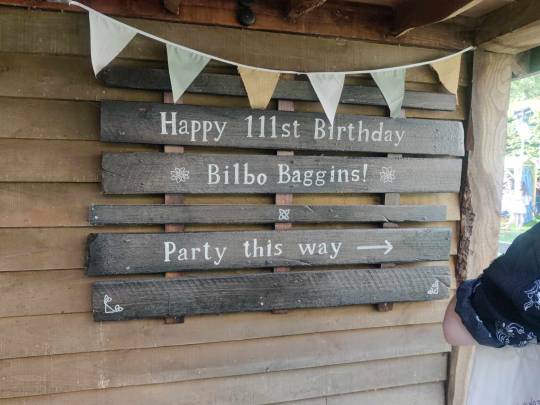
During that time the actors were playing music, talking with the audience, playing games with the audience, I almost got hit in the face as Gimli in front of me failed to catch a ring that was thrown at him : D I saw there are some recordings of this part around, eg:
youtube
While still outdoors, the play started seemlessly with Bilbo's iconic birthday speech. After his disappearing act (in a puff of smoke), we moved indoors and while the audience was settling down, Frodo sat on stage all sad perusing letters

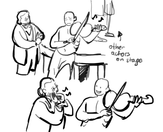
This stage is very tiny but they used it in a clever way; eg. there were moments when, to show the distance, the actors would say their lines behind the audience on the upper ring. They would also utilise the doors at the center stage or the ladders on the sides to climb on. The lighting also gave each scene a lot of character:


Also each actor doubled as a musician, often playing on the edges of the stage but still in full view, giving this interesting illusion of environment.
I think my favourite moment of using actors as parts of the environment was during Sam and Frodo's Now and for Always duet: once they started singing, Bilbo came to sit on the edge, in the shadow, just looking at them, and with each verse a new hobbit/musician came behind, hanging out in the shadows and giving this dreamy idea of Shire. And when Sam fell asleep, there was Rosie coming a bit forward to caress him.
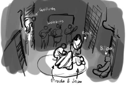
Another such wonderful moment was near the end, when Frodo could go no longer and Sam helped him. The earlier situation when Sam fought off Shelob with Eärendil's light reminded the viewer of Galadriel's - and the elves - indirect help. And when Sam put his arms around Frodo to guide him, quietly, in the shadows around them illusions of elves appeared to show them the way and to catch them when they stumbled.
Speaking about the plot point - act 1 encompassed the first of the trilogy while the second act the other two. To achieve this condensation in the second act, most characters that were not directly related to the fellowship were either removed or merged with other, eg. Denethor and Theoden were combined into one, with the Rohan/Gondor politics removed altogether. But honestly, I thought it was the smarter choice, as we get the time to get attached to the main cast.
One more thing I'd like to mention were the practical effects. While ents were just an off-stage voice, when they were talking there were leafs falling down from the ceiling. But the most impressive was Shelob, which was a giant puppet with real-like leg movement, mostly in shadow except for the reflective eyes. I saw that there's an early test for Shelob posted on Instagram:

Also, I talked about Gollum in an earlier post, but I just wanted to make a quick illustration of the adorable moment between Gollum and Bilbo that I saw in the epilogue:
#lord of the rings#gosh I want to watch it again so bad#I didn’t want to write every single thing but it turned out long anyway hdhdjd sorry
339 notes
·
View notes
Text
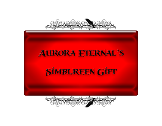
And last but not least simblreen gift will give you absolutely unique and gothique experience for your sims 3 games. I'm proudly presents you...
BLOODSUCKER UI


This would be a long-read, sorry for that!

I can consider myself one of the quickest creator of the most complete default UI for TS3 😅 But it would be impossible without help of @mookymilksims ❤ I used her BGM UI as a base, also for some reason regular method of creating DRs of loading screen doesn't work for me, so I used @justmiha97 Clean UI Loading Screen as a reference, what files Ii need to replace. And of course dino_rex with this thread on MTS. I also want to give a huge thanks for the testing and taking screenshots of the mod to @sagasimsworld and Mary_WW (she isn't on tumblr), because without them I couldn't find and fix most critical bugs in time. Also, even if most of the UI is replaced and it's fully playable, It's still need polishing and testing, so if you see any bug or some of the parts of UI that looks bad (e.g buttons that are near each other having different shades or smth like that), send me PM or ask with screenshots. Also this mod needs testing with different reshade presets, because I worry that some of them may enhance red colors of the UI and that may cause eyestrain. All screenshots are taken without reshade.
More info and screenshots:
Recolored most of the CAS, CASt, CAP, CAB (plumbots editor), Live mode, Build & Buy mode and Town mode (except map tags):


Loading Screen is compatible with any language (but has only translated in english and russian in main file and ukrainian translation in separated package (AE_BloodsuckerUI_LoadingScreen_UA), that contains translated files only for english and russian version. For working ukrainian translation in english game you need font replacement (Montserrat).
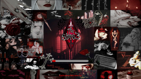
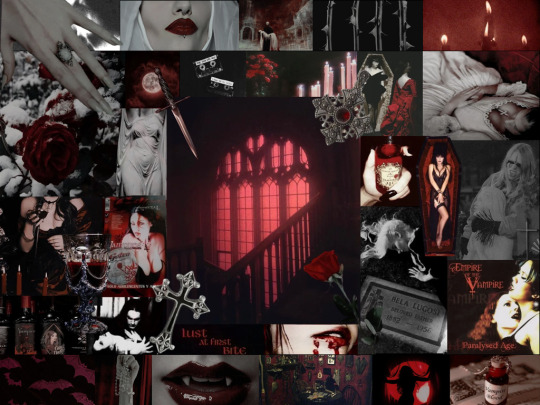
Yeah, image that I used on loading screen is different from that one I showed you on this post (it's my desktop wallpaper now lol). It's because required image for ts3 loading screens is 1024x768, and when I resize original collage it became squished, so I added more images:
In main file of the UI are added this mods, so if you have them, you need to remove it from your game: @fanaskhe-r update of More slots for topical details mod, cmar_nyc's Skintone Panel, Recolored version of Menaceman's Pets Relationships Icons (other relationship headlines recolored as well!).
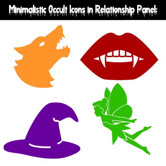
I created my own replacement for occults in relationship panel, so @sweetdevil-sims icons or removing of halos isn't needed anymore.
For opportunities tab I used recolored correct Shang Simla Forbidden city icon by @thebleedingwoodland, and I definitely recommend installing the whole mod, just delete with S3PE opp_generic_china image so they wouldn't conflict.

Icons are from Freepik. You are allowed to use them for creating "Minimalistic occult relationship panel" with vanilla UI or other UI default.
Also I created compatible and recolored versions for some popular mods, that replaces parts of UI, you can download them in ADDONS archive:
Recolored version of Expanded Tattoo module of Nraas MasterController (installation in Overrides, and don't forget about CmarNYC Tattoos File):
Recolored and compatible version of @lazyduchess Catalog Search Mod (installation in Overrides):


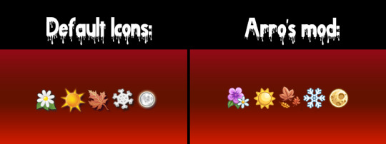
Compatible version of Arro's 4t3 Replacements of Seasons and Lunar Cycle Icons (3 versions, install only one in Overrides folder):
Compatible and/or recolored versions of Gamefreak130 World Loading Screens Overhaul (Choose only one):


Recolored @xiasimla HD icons (both regular and medieval). Totally optional.

Not an actual mod, but desktop icons (.ico format) for TS3 with logo (2 ver.) and plumbob that I created for this UI.


TOU
DOWNLOAD MAIN FILES | ALT
DOWNLOAD ADDONS | ALT
SIMBLR.CC DOWNLOAD
Credits: @mookymilksims, Fanaskher, cmar_nyc, Menaceman44, @thebleedingwoodland, Nraas team, @lazyduchess, Arro, Gamefreak130, @xiasimla for their mods; EA/Maxis, Freepik, Tumblr, Pinterest and Landing for images.
Used programs: Adobe Photoshop, Landing, S3PE, Notepad++, EasySTBL.
Fully compatible and recommended UI mods:
4t3 Cursors by Arro (I don't want make my own custom cursors).
Arro's No mod info.
Nraas Portrait Panel.
Ingredients Thumbnails fix by @tasteslikefridge.
Equestrian Centre map tag replacements by Menacemen.
Rabbitholes Map Tags Visibility Changes.
Font defaults: Font replacement by @simstate and Bigger size font.
Defaults by @alverdinesims: Build Grid, Objects placement, Skill and progress meters.
CC Icons Defaults: Replacement or Completely Remove.
CAS & Stylist Room Defaults: Monotone by @agnelid, Different by @cherdawn66, Empty CAS/Stylist, Gothic by @bast-sims.
Moodlets Icons Defaults: 2t3, 4t3.
Traits Icons Defaults (except Social Groups): 2t3, 4t3, Medieval, Medieval LTR by @aprilrainsimblr.

@pis3update @wanderingsimsfinds @bloodys-s3ccfinds @sssvitlanz @nightoccfinds @ninthcirclets3cc @kpccfinds
#my cc#simblreen#the sims 3#sims 3#ts3#s3cc#ts3cc#sims 3 simblr#sims 3 mods#sims 3 cc#ts3 simblr#ts3 mods#sims 3 cc finds#sims3cc#ts3 cc#ts3 download#sims 3 download#Spotify
189 notes
·
View notes
Text
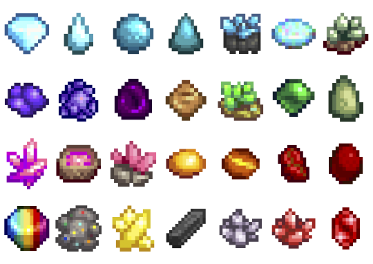
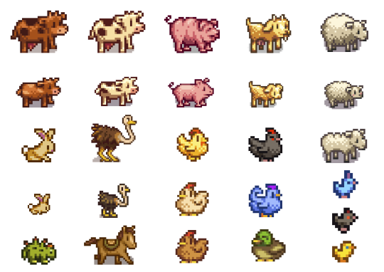
SIMDEW VALLEY SET
🍄👩🏿🌾🐷🐴🐄🧙🏿♂️🌻🌽
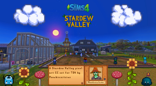
Stardew Valley Pixel Art Floors/Walls/Deco (TS4)
Download Below
Aside from a couple most of these pics are just the demo pics showing what's included, more CC in game pics can be seen here
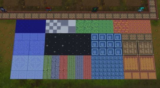
🍄Misc Large Decals


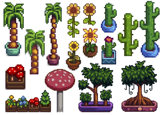
In order: Junimo huts + large Junimos, Holdiay Decor and "sky decor", furniture items, rarecrows, plants.
🍄Wall Decals Paintings and Banners:
🍄Wall Decals Misc small:
Adventure stuff and boots, small junimos, random furniture items slime monsters different expressions

🍄Wall decals Gems and Minerals:
I didn't do them all, just some that I liked.
🍄Wall decals farm animals
🍄Wall decals Fishing
Again just the fish I wanted to do, not all:

🍄Wall decals Harvestables, Crops, Products:

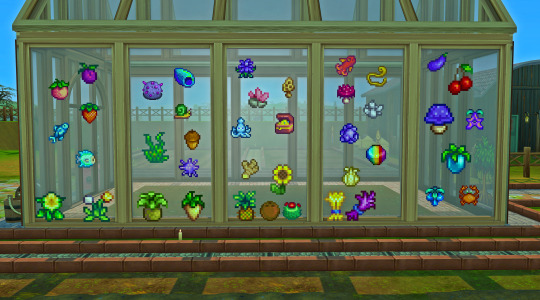
Here's a random in game pic (see more in links provided at top or bottom of post), all decals show through glass too!
🍄Stardew Valley Villagers (yes the bear is a villager I refuse to accept otherwise) portraits
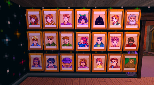
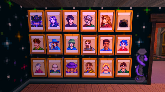
The portraits are the only item with actual dimension, I recoloured a base game framed painting, so these are not flat like the rest of decals. (they look a bit orange but that's just my mood lighting)
🍄Walls and Flooring (indoor and outdoor flooring)
I did all the ones you see here:

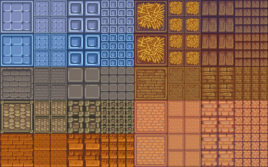

For the floors I made a large and small version of all:
🍄You can see more CC in game pics in my wip post here
Are you sick and tired of those smooth graphics from Sims 4? Do you wish you could replace those pesky curves and detailed HQ textures with nothing but square pixel heaven and flat colours? To be finally rid of all those 3D bump/light effects and replace them with volume-less cardboard cut-out illusion and imagination? Do you want your build/game to look just like Stardew Valley? Or do you simply think that if the sims team are gonna give us low poly and low quality meshes and textures might as well do it properly? Fear not! The solution is here!
I made a new Stardew Valley save (why I need yet another save that I'll never have time to complete I don't know) and tried my first build, the recreation of my current (and only) farm. It was ok but I got frustrated at how "Sims 4" everything looked, and checked for stardew valley cc conversions, art, decor but only find people making it using sims 4 stuff, which is probably the most logical thing but not for me!
So I made this as there are plenty of game assets from Stardew Valley available online and however tedious and time-consuming resizing the tiniest of pixel art images is to fit Sims 4, it is fairly easy and doable, so I did it.
I did skip some items in each category as there are way too many and just did the ones I like, sorry if there was one I didn't include. Also there are some floors in the game or icons that I couldn't find. Some Junimos were taken from the internet but most are individually resized game assets.
INFO: all decals in wall deco, all are zero simoleons, and the portraits are 10. You can find my stuff typing "moonbiscuitsims" or "stardew". All have correct colour filter tags and removed "talk to object (insane)" and "can be struck by lightning" (these things annoy me or could cause more distractions for my sims, sorry if you like this though I'm sure there are plenty of objects to talk to/ lightning strikable objects). I don't know if this has an effect. All the portraits are just tagged as brown. All are resizable to your liking.
REQUIREMENTS:
Nada, nothing. Just base game. (though I did accidentally make one item from a get to work decal by mistake, I remade it to fix it and I've play tested everything, but let me know if something doesn't show up.
PLEASE READ AND RESPECT MY TOU AND DO NOT ❌❌❌:
- ❌ Reupload
- ❌ Include in sim downloads
- ❌ Put behind paywall of any kind no matter what.
- ❌ Claim as yours.
If you wanna use the texture files to make other different original content that is fine as long as it is different from mine and NO PAYWALLS and no reuploading my stuff.
The images are from Stardew Valley, but I spent ages editing every single one to fit the sims, and this took me days to do. All my stuff is free. I don't care about conversions to ts2 or ts3 but NO PAYWALLS and please tag and credit me. If used for screenshots please tag me too, I'd love to see <3
🍄DOWNLOAD (including a pick and choose or a merged file with everything, don't get both)
Enjoy! Happy Simming/Farming
Stardew Valley fav music playlist 🎵🎵🎵
#moonbiscuitsims#moonbiscuitsims4#moonbiscuitsimsstardew#moonbiscuitsimscc#moonbiscuitsimsphotos#stardew valley#sims 4#the sims 4#ts4#sims cc#sims 4 cc#ts4 cc#stardew valley sims 4#sims 4 stardew valley#sdv#sdv fanart#stardew fanart#stardew#stardew valley fanart#sdv farmer#ts4cc#sims4#sims 4 custom content#the sims 4 custom content
62 notes
·
View notes
Text
✨ HTML for pretty colors tutorial ✨
Hello silly hamsters in my phone 🫶 I'm lowkey shocked to see blogs gatekeeping this knowledge but yeah. Make your blog pretty! Match your text to dividers or just have it as colorful as you'd like!
First of all, you can not do this on the mobile app! You need to either use a laptop or your phone / tablet's internet browser (in my case safari)
You start by logging into your account and either you make a post or you edit a post. I recommend making the post on the app first because editing is certainly faster & easier!
This is our starting point! For the fancy fonts you can use messletters


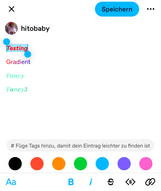
I will now log into tumblr on my web browser and click on edit this post.
You then have to click on the little gear icon in the top right corner to change the settings on your post.
There you have to click on "rich text" to change it to "HTML"
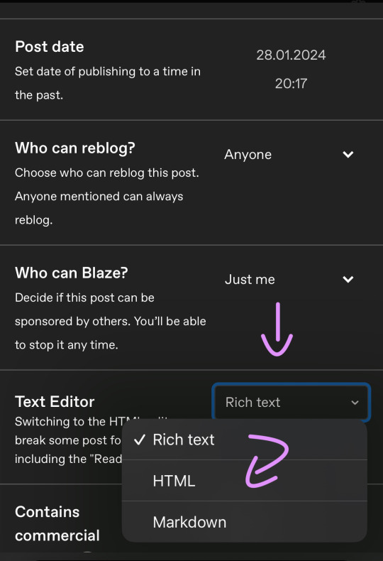
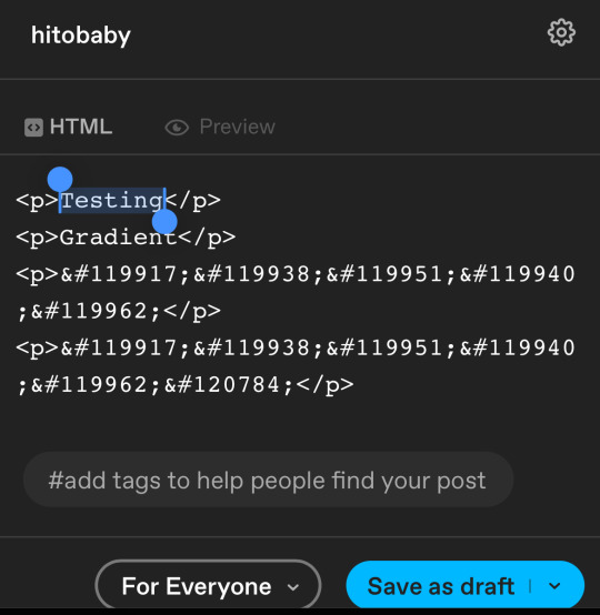
Your post should now look like this:

A quick rundown on html.
You always start with a letter or code in brackets. to end what you're doing it's </>. The slash signals the end.
P= paragraph <p> and to end </p>
I= italics <i> and to end </i>
b= bold <b> and to end </b>
Now tumblr will automatically do this for you if you made a text bold/in italics on your mobile post but to keep this tutorial simple i left that out here. You can always edit your text in the app after! Just not the color.
And as you see, the fancy text is now in coding. But we get to that later!
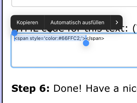
To colorize your text it's easiest to just use this website as it gives you lots of options!
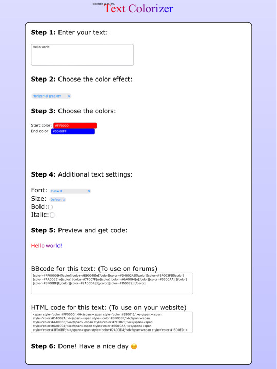

First i will be choosing the option of "solid color" and you can then put in the hex code of your desired color into the color box.
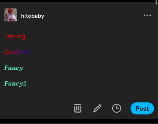
In the top box you will have to put the text you will color - for this tutorial it's "Testing"
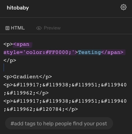
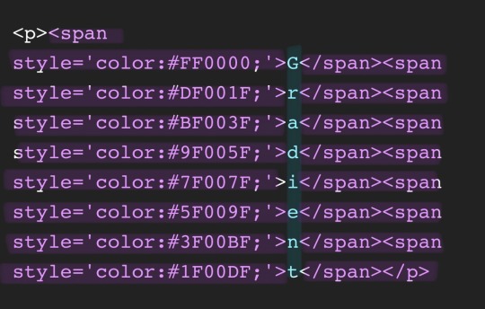
Then you copy the box HTML code and paste it into tumblr where your word(s) are. Do not remove the in front and after your word/sentence !
For the sake of this tutorial marked the html code for colors in pink and the words in blue
Your code will now look like this!
For the gradient you can simply choose horizontal gradient or three colored gradient on the website above and copy/paste the html text.
Mind you that every single letter will get its own color code now so the word gradient suddenly looks very long in html.
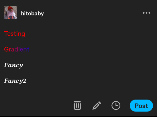
If you save the post it will now look like this!
Important to know is that you can color the fancy text only solid as the website can not color it as it is and putting the letter codes in the box above does not work either.
To color the fancy letters you simply copy the color code instead of the whole text - which looks like this:
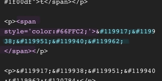
Don't forget to add </span> behind the word/the codes you're coloring to signal that this is where the color stops! If you forget to add it, nothing will be colored.
If you decide you still want to have the fancy lettering in multiple colors you have to color letter code by letter code manually like this:
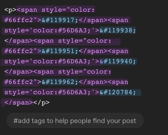
(I made a very poor choice on 2 different greens but oh well)
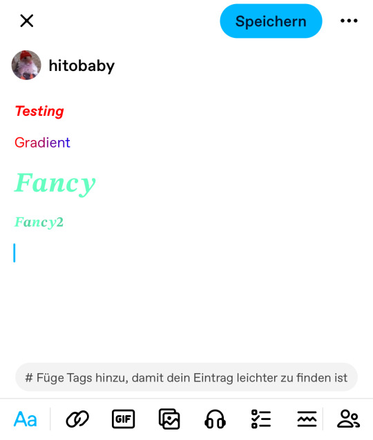
If you'd like to change your text, you can always do that on the mobile app like you usually would. You just can't change the color unless it's into a default color. But you can still change the size or make it bold for example.
Anyhoot, this is the whole magic behind html. It's a lot and might be very complicated at first but you will eventually get the hang of it! Took me weeks and hours until someone sat me down and went through it step by step.
If you have any questions or something doesn't work as you thought it would please don't hesitate to reach out - I'm always happy to help!
#rhy speaks ♡#html template#html tutorial#make tumblr pretty 2024#tumblr tutorial#divider tutorial#writing resources#resources
128 notes
·
View notes
Text


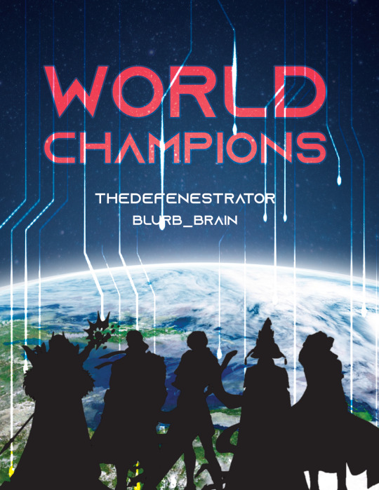
World Champions | Artwork for World Champions by TheDefenestrator by TheDefenestrator, art by Blurb_brain
Fandom: The King's Avatar | 全职高手
Rating: Teen And Up Audiences
Category: Gen
Words: 71 944
At the end of season 4 of the Glory Pro Alliance, the government finally receives the information it has been waiting for: The other players have caught up. Or, In which Glory has been a government recruitment ploy for remote-piloted mecha operators all along.
About the Book
FONTS: Mundo Serif, Azonix [dafont], Segoe UI Symbol
IMAGES: Illustration by Blurb_brain [AO3]; cover image by NASA ID: 440611 [Rawpixel]; Planet Earth background ID: 6331593 [Rawpixel]; Circuit lines background ID: 3117935 [Rawpixel]; endpapers' image by Eric Eastman [Unsplash]; Swoksaar, Desert Dust, Lord Grim, Vaccaria, and Cloud Piercer [The King's Avatar Wikia]
MATERIALS: regular printer paper (8.5"x11", 96 bright, 20lb), 80pt bookboard, Iris Bookcloth (colour: Black Pearl), Neenah cardstock (8.5"x11", bright white, 65lb), waxed linen thread (white, 30/3 size), embroidery floss (shades 3750, 350, 3845, 370), leather cording (1.9mm diameter), Reeves’ acrylic paint (Mars Black, Phthalo Blue, Titanum White), Americana acrylic paint (glow in the dark), ph neutral pva glue (Books by Hand)
PROGRAMS USED: Typeset in Affinity Publisher, cover/title page/endpapers designed in Affinity Designer/Photo, QR codes generated with LibreOffice Writer, PDF arranged for printing with Bookbinder-JS
BINDING STYLE: quarto, case bound (slightly rounded, with oxford hollow, forgot to use tapes)
.
Fenes' "Glory's tech isn't handwaved" AU. This was great! Funny and creative, and I'm both amazed and full of admiration for Fenes' ability to juggle so many characters.
I was feeling excited and ambitious with this one. Tried some new fun things (double core endbands, painted edges) and used some new equipment (a lying press).
The Text
TITLE/HEADINGS FONT: Azonix says 'SciFi' to me, it's a bold, non-serif, sleek font.
BODY FONT: Mundo Serif, it's a decent serif body font I haven't used before. Felt like it worked with Azonix.
SCENE BREAKS: a special character in Segoe UI Symbol of a black & white icon of Earth, the globe showing Asia.
TYPESETTING: Finished typesetting the fic, left document open on my laptop, laptop's battery failed, file now crashes immediately upon reopening, issue persists with copied versions of file (; ̄Д ̄) . Thankfully I had a backup file for the typeset with the barebones of the text, so I didn't have to restart from scratch...
Title Page
My thinking: it takes place in space, the world's at stake, and it's the dawn of a new horizon for Earth. Glory and the titular champions are represented by Swoksaar, Desert Dust, Lord Grim, Vaccaria, and Cloud Piercer – the captains of what I'd call the 'big 5' teams. A circuitry board background element hints at the tech/mecha nature of the story's competition. It may not match Blurb's art, but I hope I was able to convey some of what the story is about.
The circuitry image is used as decoration throughout the book.
I only used the avatars of the top five teams' captains because too many silhouettes would lessen their impact and readability. (Removing the backgrounds was tedious, but worth it.)
Here's what it should have looked like. The test prints for this and the BB art were fine, but I think my inkjet started running out of ink just when I printed the final copies and I didn't reprint them. (Too impatient, really wanted to finish up and read the book)
The Cover
World Champions is another Big Bang fic, and once again I based some of my design choices off of the accompanying artwork. The dominant colours of Blurb_brain's illustration are red and blue-green.
COVER PAPER: For the decorative cover material I used NASA's ASTER image of Poyang Lake. NASA has some really interesting photography some of which remind me of marbled paper, thought it could be interesting. I chose this image of Poyang Lake because 1) it's in China, 2) the colours were similar to Blurb's awesome illustration (fate strikes again, dropping matching images and artwork into my lap!), and 3) NASA is tangentially relevant to the fic, which takes place in space.
BOOKCLOTH: Verona bookcloth in the shade Black Pearl, a lovely dark navy blue colour. Thought it suited the cover paper and title page. (Bought it for this fic specifically, but the colour goes well with almost all of my decorative papers so it should see a lot of use in the future!)
Endpapers
The final decision that held this project at a standstill for two months.
In the end I drew inspiration from the matchups against the final opponent in the story. The image I used is a little chaotic and a little too unrelated to identify why I picked it without an explanation, but this book is for me and I know why, so there. (Note that I played around with the colours and cropped the photo.)
Endpaper inspiration: the maps for the matches against the Infilhites
"a long bridge through an enormous tube-like hall, where light seem to come from every side through stained glass windows. It was visually confusing, limited lateral motion"
"a warehouse, crates stacked on and beside metal racks that went all the way to the ceiling."
"a house of mirrors, fully enclosed to be sure the Infhillte couldn’t fly out of it."
"like a volcano, rivers of lava moving sluggishly down a slope, occasional vents of overheated air nearby."
"a series of overlapping bridges between halls and stairways, level after level layered over an open abyss."
Trimming & Painting the Edges
Going all out, a 2-for1 deal: the opportunity to use my lying press for the first time and learn a new technique!
TRIMMING: Used a paring chisel and lying press.
CHISEL: The 1.25" wide paring chisel I used was form a modern manufacturer. (Vintage paring chisels are very thin, enough so that you can bend/flex the blade. But don't do that.) It's long and wide blade made it easier to register against the surface of the press for consistent cuts. Looks like this one below from Lee Valley.
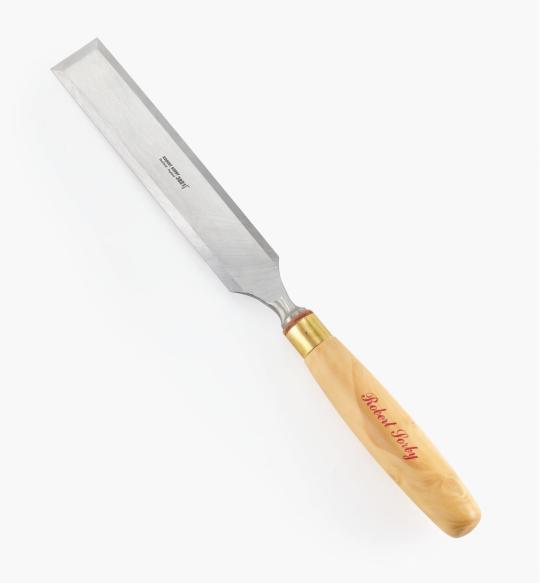
LYING PRESS: My dad's project. Solid black walnut, hand carved screws and internal threads — he even made the tools to make the threads too! The jaws of the press are each 3 7/8" wide. It's big and heavy (though much smaller than full-sized professional ones omg), but there's enough of a flat surface to register the chisel against. A thicc boi, much like this one below from Bookbinding Supplies.

PAINTED EDGES: The idea was to have dark navy edges, speckled with white stars. I used acrylic from a tube to paint the edges — tutorials recommended it over liquid bottled acrylic, and I had an old set hanging around. Had to water it down because otherwise the paint just flaked off.
My test of trimming and painting went well. Then the trimmed book itself came out slightly crooked, the paint required significantly more watering-down than before, and the white paint did not want to be both opaque and speckle-able. Unfortunate, but still book-shaped! And now I have an idea of what to do differently next time.
Also, did not like the glow-in-the-dark paint. Looked too translucent in the light when compared to the white acrylic, and needed a thicker coat to be visible in the dark. (The thickness combined with the translucence and base colour kinda reminded me of boogers... Ended up scrapping most of it off, so there's not much left to glow.)
Endbands
Still in the mood to have fun and go all-out, I attempted double-core endbands for the first time.
TUTORIAL: YouTube @ BookbindersChronicle: Bookbinding 101 Sewing Headbands Session 2. Also watched @ DAS Bookbinding's Double-Core Endband // Adventures in Bookbinding, but I personally found Chronicle's closeup video easier to follow.
I used embroidery floss from a 100pk of assorted colours off Amazon, wrapped around a core of 1.9mm leather cording from Michaels. I drew from Blurb_brain's art for the general colours, choosing a dark base, with red, blue-green, and gold. The specific shades were picked to go with the cover.
#World Champions#TheDefenestrator#Blurb_brain#qzgs#tka#the king's avatar#fanfiction#bookbinding#fanbinding
89 notes
·
View notes
Note
your icons are soooooo so cute honestly!!! i wanted to ask if there's any way you can make a tutorial on how to make them? of course if you want, if you don't want to, that's okay :)
Hi! I really appreciate that you like my icons, thank you so much! 💖💖💖🥹
It's been a long time since I've done a tutorial so I hope I can explain it well haha
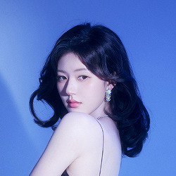
So I will explain how i go from the original picture and the final icon below:
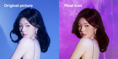
I'm using Adobe Photoshop 2024 but you can use other versions too!
First, I create a 250x250px document and apply a random color fill layer to be the background color of the icon, you can do it by going on Layer > New Layer Fill > Solid color (the color in this moment doesn't matter because I change them later according to the picture I choose to edit).
Then I place the picture I want, adjust the size to make the subject on the center and apply some smart sharpen:
I apply some adjustments to try to color correct if the original picture using Levels, Selective Color and Color Balance to get something like this:
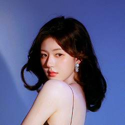
If you want to know the exact adjustments settings I used on this picture you can download the psd here.
To remove the background, I do the hack where I go to the Properties panel (Window > Properties) and click on the "Remove background" option. It's not always that I will get a perfect result but I think it makes easier for me to adjust the little details such as hair and accessories, etc. And I do that using the Lasso tool (shortcut L).
Now, with the background removed I pick a color that I think will match the icon in the Color Fill layer that I created before. To make the background more "fun" I like to add a Gradient Fill layer (Layer > New Layer Fill > Gradient) with a color that might go well with the one I picked earlier to make a smooth and light gradient.
My result until now:
Now it comes the fun: adding textures! I like to add some textures to make the icon more lively and I usually download them on deviantart or on resources websites. You can download some cool textures here, here and here. On this part I really test a lot of textures with different Layer blending. There are a lot of different blending options so you can try as much as you want.
Other thing I like to do is add a clipping mask above the subject layer when I want to color something specific in my picture such as the hair, the clothes or even applying some "fake" blush on the cheeks. I do this adding a new layer, then using the shortcut option (or alt) + command (or ctrl) + g to make it a clipping mask and then using the Brush layer to color what I want. For the blending mode I usually use Soft Light and sometimes Color if I want the color to really stand out.
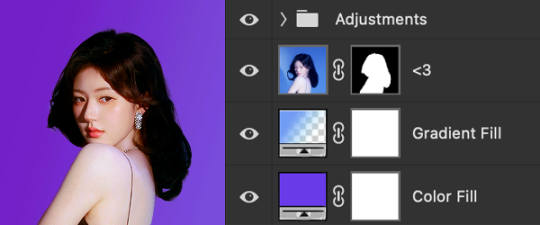
And in the end I will have something like this:
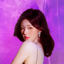
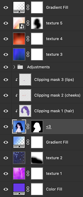
And my layer tab will be like this:
For using on the dashboard I usually resize it to 100x100 to make it look more sharper and defined but it's really a choice, you can already start making your icon using the size you want, I just prefer doing on 250x250px because i'm used to.
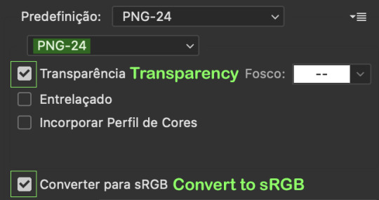
To save it I use the shortcut shift + option (alt) + command (ctrl) + s to save it for web with these settings:
And that's it! Sorry for not going to deep in each step but I guess you can get the feeling when you try making your own icons! Is really about trying different methods and things until you became satisfied with your result.
58 notes
·
View notes
Last Seen Blogs