#and its a animation??? in color???
Text
Good thing it was a short spin
#thank u haunting heroes discord server for giving me ideas#again#so soon#and its a animation??? in color???#i saw the prompt and did it in 3h#you could say i was like... possesed#danny phantom#phandom#dp#ater art#lbm dp#little baby man#i love you you noodle boy#ater babbling at 2 am#animation#no lbm was harmed in making this post
4K notes
·
View notes
Text
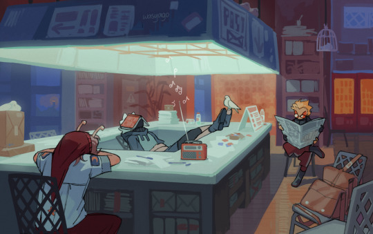
quiet hours
closeups under the cut :]
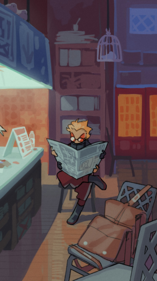

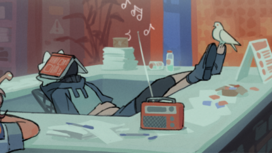
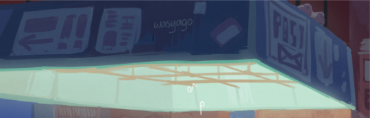
i really like these
#was possessed by a random urge to draw an interior. so post office it is#very happy with how it turned out. the colors the details its so fun uwu a bit messy in places but i do NOT want to render this#also looks a bit like an anime screenshot bc only the characters have line. and i think it's cool#hermitcraft#pearlescentmoon#ethoslab#tangotek#my art#yago but better
10K notes
·
View notes
Text

silly
#the studio that covered this episodes animation really did it justice.. its my favourite out of the bunch#the off model#or the color pallete#the strech and bounce of the movement#everything was so niceys !!#dungeon meshi#laios touden#falin touden#arts
7K notes
·
View notes
Text

touched up and colored some old dunmeshi doodles from earlier in the year ^_^
#dungeon meshi#delicious in dungeon#marcille donato#kabru#laios touden#usually i hate coloring but occasionally it can be therapeutic 😌#dont get it twisted im still deep in trigun (wolfwood) brainrot but MAN I AM SOOO READY FOR THE ANIME#ive had the opening song on repeat since its dropped. bc im a normal person (also bc i like bump of chicken)#will probably switch over to dunmeshi brainrot come january 4 who knows! (very likely)
6K notes
·
View notes
Text
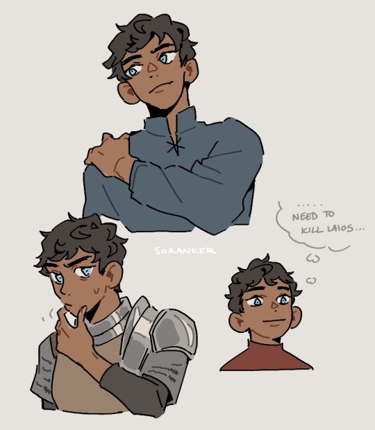
just thinking about hair and faces

#art#twisted wonderland#twisted wonderland spoilers#twisted wonderland episode 7 spoilers#twisted wonderland book 7 spoilers#i don't THINK this counts as face horror but just in case#face horror#for your daily dose of me losing my mind over anime characters#i don't know why the hair thing surprised me so much. i think because i thought it was funny that lilia named silver after his hair color.#like ha ha lilia is hilariously bad at names how cute and silly!#oh. oh it's kind of a Thing.#anyway i am excited to see where the heck all of this stuff with silver's various dads ends up!#we still don't actually know who killed meleanor!#we still don't know literally anything about dad draconia! (dadconia? dradconia?)#we don't know what happened to the macguffin gem with its magical dad-saving powers!#(surely this will not come back to save a certain dad at a later point. of course not.)#man i was not expecting episode 7 to be all dads all the time#i mean i'm here for it but#hey remember when the highest stakes were who was gonna win the big talent show#then robots started kidnapping people and now we've just escalated from there#episode 8 our cat is going to turn into a drippy ink kaiju and we're going to have to mecha battle him to save the world or something#each member of diasomnia pilots a limb and we gattai into a giant robot dragon and hold on i gotta submit this spec script to aniplex brb
4K notes
·
View notes
Text
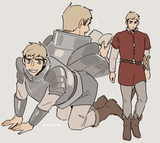
SLEUTH JESTERS
I read sleuth jesters while I was away from home and i ended up adoring it and then going "im gonna make a simple fanart" and ended up learning how to tween LMAOOO
Anyways this is a gift for @sunnys-aesthetic, creator of the Detective Au and @naffeclipse, the amazing writer behind Sleuth Jester on AO3!
Still image
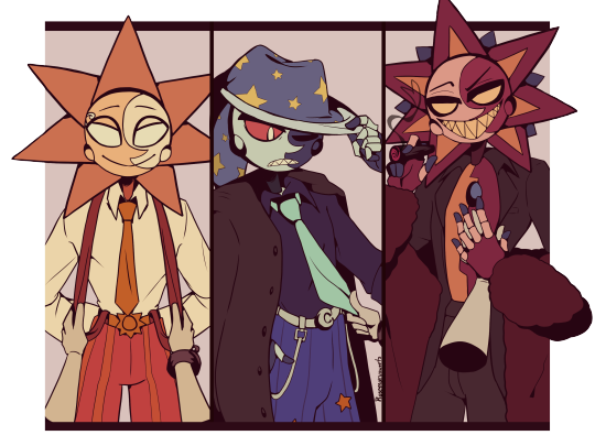
#also this is my interpretation of mafia eclipse inspired by everyones elses interpretation#i struggled so hard with his color choices#AS WELL AS I STRUGGLED WITH MOON FOR THE TWEENING BECAUSE OF THE LAYERINGq#slightly suggestive#mostly cause of clip i think#its clip what do u expect#fnaf daycare attendant#fnaf daycare au#sleuth jesters#fnaf moon#fnaf sun#fnaf eclipse#imma go change my pfp cause this is a fnaf dca blog#but i chose sanrio out of me rushing lol#my art#my animation
5K notes
·
View notes
Text
I think 90% of my gripes with how modern anime looks comes down to flat color design/palettes.
Non-cohesive, washed-out color palettes can destroy lineart quality. I see this all the time when comparing an anime's lineart/layout to its colored/post-processed final product and it's heartbreaking. Compare this pre-color vs. final frame from Dungeon Meshi's OP.


So much sharpness and detail and weight gets washed out and flattened by 'meh' color design. I LOVE the flow and thickness and shadows in the fabrics on the left. The white against pastel really brings it out. Check out all the detail in their hair, the highlights in Rin's, the different hues to denote hair color, the blue tint in the clothes' shadows, and how all of that just gets... lost. It works, but it's not particularly good and does a disservice to the line-artist.
I'm using Dungeon Meshi as an example not because it's bad, I'm just especially disappointed because this is Studio Trigger we're talking about. The character animation is fantastic, but the color design is usually much more exciting. We're not seeing Trigger at their full potential, so I'm focusing on them.
Here's a very quick and messy color correct. Not meant to be taken seriously, just to provide comparison to see why colors can feel "washed out." Top is edit, bottom is original.
You can really see how desaturated and "white fluorescent lighting" the original color palettes are.
[Remember: the easiest way to make your colors more lively is to choose a warm or cool tint. From there, you can play around with bringing out complementary colors for a cohesive palette (I warmed Marcille's skintone and hair but made sure to bring out her deep blue clothes). Avoid using too many blend mode layers; hand-picking colors will really help you build your innate color sense and find a color style. Try using saturated colors in unexpected places! If you're coloring a night scene, try using deep blues or greens or magentas. You see these deep colors used all the time in older anime because they couldn't rely on a lightness scale to make colors darker, they had to use darker paints with specific hues. Don't overthink it, simpler is better!]
#not art#dungeon meshi#rant#i'm someone who can get obsessive over colors in my own art#will stare at the screen adjusting hues/saturation for hours#luckily i've gotten faster at color picking#but yeah modern anime's color design is saddening to me. the general trend leans towards white/grey desaturated palettes#simply because they're easier to pick digitally#this is not the colorists fault mind you. the anime industry's problems are also labor problems. artists are severely underpaid#and overworked. colorists literally aren't paid enough to do their best#there isn't a “creative drought” in the anime industry. this trend is widespread across studios purely BECAUSE it's not up to individuals#until work conditions improve anime will unfortunately continue to miss its fullest potential visually#don't even GET ME STARTED ON THE USE OF POST-PROCESSING FILTERS AND LIGHTING IN ANIME THOUGH#SOMEONE HOLD ME BACK. I HATE LENS FLARES I HATE GRADIENT SHADING I HATE CHROMATIC ABBERATION AND BLUR
2K notes
·
View notes
Text
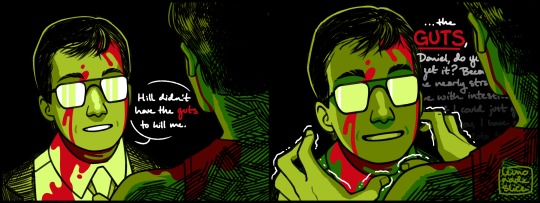
he’s not actually gonna do it he just likes holding the syringe. i think
#he probably won’t do it maybe#he just likes holding the goop syringe#for fun#reanimator#re-animator#reanimator fanart#danbert#dan cain#herbert west#danbert fanart#herbert west fanart#re-animator fanart#idk whats going on with the colors but its Fine#its Okay
3K notes
·
View notes
Text
[Day 102 - Day 7: Fall]
Ofc he chose falling out of everything
#dddaily4sherin#hermittober#grian#goodtimeswithscar#desert duo#double life#double life smp#traffic smp#traffciblr#my art#didnt like the colors tdy its so hard ACK#i honestly just suddenly remembered this specific convo for no reason (engrained in the brain bc of maruus animation)#comic
2K notes
·
View notes
Text
"And it is this moment of not just release, but relief."
- Oliver Stark
HAPPY ONE WEEK OF CANON BI BUCK!!!
#911 abc#its so funny and stupid me making this then immediately seeing the amount of crazy going on in today's ep#oliver stark#evan buck buckely#evan buckley#buck buckley#911 fox#buddie#buck x tommy#bucktommy#bisexual#i tried with the bi colors#i really did#art#digital art#fanart#my art#artists on tumblr#animation#2d animation#i love him your honor
567 notes
·
View notes
Text
the cat is outta the kiln! 🔥 🦁
#overfired and burnt out some of the more subtle colors but ITS FINE....i still like him :)#documenting this week and going up in my shop around next friday!#ceramics#clay#sculpture#animal art#finished work#lion#cat#feline#pottery
708 notes
·
View notes
Text
Transcript:
In the stripped club.
Straight up.
Jorking it.
and by "it", hah.
Well. let's justr say. My peanits.
Audio Source
#gabriel ultrakill#ultrakill#i trust that you all know what this is a reference to#BEFORE ANYONE ASKS......... i've already posted the full pic on here before. scroll for it. you animal.#its less cursed in color#suggestive#<- adding that just cause of the pic more than the audio#* when i say i edited the music#basically i take it out as best i can#do the effects n basic shit like cutting out silence and as many sound effects as i can#then edit it back in
418 notes
·
View notes
Text
Disney, releasing Wish: "so it's all about legacy--the new generation surpassing the old, overcoming the evils perpetuated by them, relinquishing singular power... and there's an old man in a tower, uh... animal sidekick, i guess..., ah... magic...?
Miyazaki, just out of frame, sledgehammer raised:
#the boy and the heron#not tagging wish 'cause i'm being a little acidic#this isn't to be negative in the slightest--I really respect both films--but it's interesting to see how visceral boy+H gets with its story#what evils have to be rejected and what they represent--and how characters and the world suffer from those evils--as well as how the whole#'rejecting' part goes. in terms of animation powerhouses discussing their legacies - disney and miyazaki both - I find it interesting that#one makes a pretty safe and nostalgic movie about imagination and dreams; the other is a long trudge through the land of the dead.#b+h is a hard watch - and a look at the legacy of a man questioning his whole purpose in the world - after his cultural touchstones#have long passed by. Mahito needs to understand his grief to keep living--but if he drowns in it he'll just continue the cannibalistic and#violent world of his granduncle. how the hell do you make art when the trauma of your entire life has colored it forever? How can anyone?#maybe after a while... it's time to detonate that damn tower and keep living.#this is to say#if you have enough money to make whatever you want#Make It Fucking Count
647 notes
·
View notes
Text
once you notice how few characters in media have brown eyes it really becomes impossible to not pay attention to it and its been bothering me ever since
#ganondoodles talks#i now its not that there are literally zero#but it almost is#and i get giving fictional characters non natural eye colors is fun#but blue and green is still everywhere evne tho those are also real#like sometimes it feels like brown is actively avoided#going for red or yellow instead#and i know in anime especialyl theres this idea i think that similar to hair color its bcs the majority of japanese people have those#so it feels 'more special' if its anything but that#idk how much of that is true#also its not just anime#feels weird#brown is such a diverse and beautiful color#makes me sad
444 notes
·
View notes
Photo
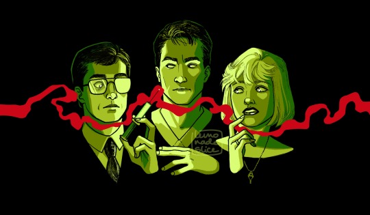


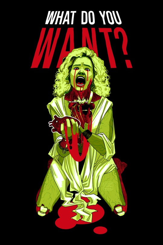
hello lgbt community. i have a new favorite movie(s).
#working with NASTY colors that HATE each other 💚💖💚💖💚#re-animator#reanimator#bride of re-animator#so i'm. OBSESSED with this movie and its singular sequel. i just threw it on in the background while i was drawing a couple weeks ago.#and it LATCHED onto my brain with TEETH. with BARBS. it's IN there. blood and guts and stage actors and accidental gay subtext YES baby YES.#it obliterated my momentum on that oc challenge. my brain turned into green glow stick goo and it was all i could think about.#anyway. using her 37th anniversary to dump a bunch of sketches!!! this is not all of them!!! it is horror movie seasonnn!! let's go girls!!!#sorry if you followed me two years ago bc i drew baby yoda and now i'm drawing screaming women ripping out their own hearts. my bad.
5K notes
·
View notes
Text
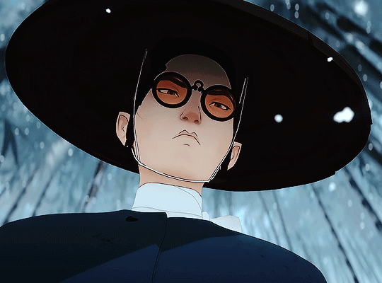

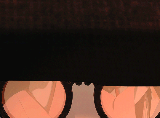


BLUE EYE SAMURAI: 1x01 - "Hammerscale"
↳ Mizu x Glasses
#blue eye samurai#mizu#mizu blue eye samurai#blueeyesamuraiedit#besedit#netflixedit#animationedit#animationsdaily#tvedit#animationsource#netflix#netflix animation#my gifs#mine#LISTEN...... I JUST LOVE HER IN GLASSES SO THATS WHAT I MADE LMAO#this is the first time since arcane that i actually got up and made gifs#please watch the show its so damnnnnn goooddddddddd#MIZU IS SO HANDSOME...... UGH#lol i think i should work on a new coloring if ever i wanna make more bes gifs instead of my old psds
623 notes
·
View notes
Last Seen Blogs
alunimoon
Alunimoon

mattadrawing
Matta Drawing
iizuumi
A Silence Of A Different Kind
lilith-clawthornes-blog
"I am a witch. UNHINGED!"
uglychristmassweatermusical-blog
Ugly Christmas Sweater, The Musical