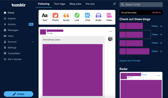
#what the fuck is up with this new desktop layout
Text
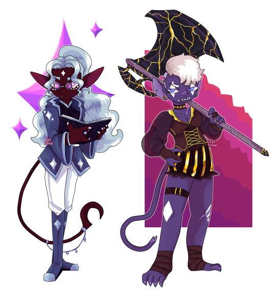
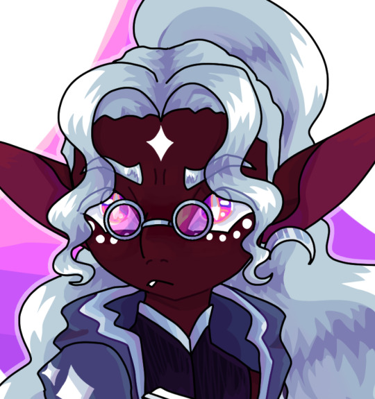

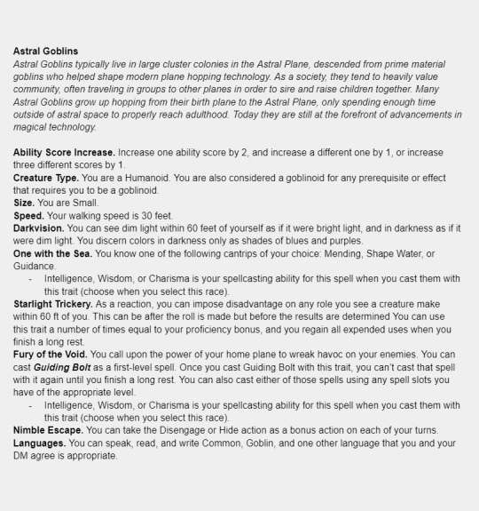
made a homebrew space goblin species for Spelljammer! stats under the cut :D
#fey's art#character design#dnd 5e character#dnd character#dnd homebrew#dnd art#dungeons and dragons#character art#what the fuck is up with this new desktop layout#why is it like this#why is adding things to a post so convoluted and so easy to do accidently
4 notes
·
View notes
Text
#my art#ttcc#toontown corporate clash#idk what to even caption this#fake sticker except its kinda fucked up and evil#oc: bingo#the new desktop tumblr layout is making me want to not post stuff sry for inactivity
19 notes
·
View notes
Text

this is a few months old but whatevs.
here we got Damoi Velour, a circus ringleader whose shows involve torturing humans with extremely brutal methods and feeding on the anguish of her victims <3
#Vio's Art Tag#Damoi Velour#Vio's OC tag#jester#ok to reblog#fucking atrocity against god#this is like. three months old but whatever i'm posting it here#tumblr wont let me upload more than one image at a time for some reason :( im not used to the new posting layout on desktop#or well. laptop. i guess.#anyhow it's 6:17 and i was woken up an hour ago by my dog barking to go outside and take a wizz#dont have work till 4 pm so idk what to do lmao#might snooze till 11 maybe.....#gonna go back to bed now actually GOODNIGHT#or morning. i guess
13 notes
·
View notes
Text
Reasons Discord's New Mobile Layout Update is Bad
The reply function is redundant, as most people are used to just holding down and tapping the reply option at the top. If they're going to change it, they shouldn't have gotten rid of the member list for this functionally bad option. It also doesnt line up with any other platform in terms of swipe direction.
The member list is gone from easy viewing
It doesnt auto open your last group chat/DM making multiple simultaneous conversations far more difficult and longer
It's already broken my app once (Locked all channels including other servers' to one channel. I could not access anything except that and my DMs.)
You can not see images that have been pinned in the pins tab.
The search function was fine before. Where did your before, during and after date search go??
All of Discord's individuality is disappearing.
Getting used to a mobile format actually impedes usage of the desktop format and likely discourages people from multiplatforming discord because theyre so used to the "intuitiveness" of the new "tailored for mobile" experience
There is no way to CHANGE IT BACK. This is like Tumblr rolling out Tumblr Live without any Disable button At All.
Why are they marketing midnight mode as Something fucking ENTIRELY new??? It has always been a feature on Android as the AMOLED theme???????
DARK MODE IS NO LONGER LOW CONTRAST AND DISCORD IS DEVOLVING INTO AN ACCESSIBILITY NIGHTMARE
Disable swipe-to-reply by activating full-screen Launchpad in Advanced Settings
Discord’s new layout is apparently permanent. Keep sending feedback and rating it one star on all appstores; if you get redirected to the advice article, double tap gove feedback.
If you, too, dislike the theme, head to settings (you can double tap your account picture) and go to Appearance, scroll to New Layout and Send Feedback.
Overall, what they've done is disorientate every single current user on discord, and you cannot avoid it unless you've not updated to the latest discord because this is not an update. It is a feature that has already been on the latest update and is being slowly rolled out, like Tumblr Polls.
Good Luck, and may we send as much feedback as possible and have them make it optional or at the least, revert it. I've already sent in at least seven complaints to discord, commented on their instagram post about the layout and I'm about one star review it on google play and app store.
This isnt just the appearance and vibes being off like the new (ish) app icon, this is a matter of functionality.
11K notes
·
View notes
Text
the cockles masterlist, part 6
now split in SIX parts for link limit reasons
WARNING: this post glitches and crashes on mobile. it’s recommended you view this on your desktop, or at least on your mobile browser rather than the app. if my desktop theme is hard on your eyes, try an extension such as Just Read or Reader View to customize the layout and colors.
if you’re still having trouble viewing, or if you don’t want to have to switch between the five posts, here’s all of the links compiled into a google doc.
welcome to the cockles masterpost, a labor of love/insomniac hyperfixation.
i recently wrote this cockles manifesto, but after it got a lot of notes and i kept adding more links to it, i decided i should just go through my 8 years of archives and compile all the cockles posts in a much more accessible and navigable way. after everything with the series finale and destielgate, i figured we could use some happiness, and it turns out there are a lot of people who’ve never heard the cockles gospel.
important disclaimer: yes, i do think that jensen and misha have a private romantic/sexual relationship, but no i do not, in any way, think that they have ever cheated on their wives. we think they are polyamorous, which is a real and valid thing, and misha is openly poly. some people love more than one person, and that’s okay. their families are close and we love and support all of them.
second important disclaimer: despite the amount of innuendo below, this is not about fantasizing about two hot guys fucking. cockles is about the joy of witnessing two people who love each other and make each other happy and are disgustingly cute together. we’re not fetishizing, we’re just appreciating what they publicly share with us.
third important disclaimer: because some of y’all don’t know, the cardinal rule of cockles is that we don’t talk to cockles about cockles. DO NOT leave any comments on their social media accounts implying anything. not even green and blue hearts. they know that we know, but it’s on us not to make it weird. if we’re too obvious and say too much, they might start sharing less. don’t say anything.
for the sake of my sanity, these are in no particular order.
last updated: 3/8/23
🐚 denotes new content
part 1 (That’s Suspicious, mishananigans)
part 2 (#pray4jensen, gag reel hijinks, some posts i’ve written about cockles and rps)
part 3 (know your cockles history, the intimacy)
part 4 (the glory of jibcon)
part 5 (just for cute)
the glory of jibcon continued:
jib11 opening ceremony whispers and giggles
jensen turning his back as misha walks up to hug him | more gifs | video
"just swallow it" "he's always giving that advice" | video
"[danneel] does refer to misha as her boyfriend. which is funny, because so do i." | more gifs | video | fan discussion of this moment
misha sitting on the floor to watch jensen sing, jensen getting shy
jensen serenading misha with "angeles" | video angle 1 | video angle 2 | video of jensen looking at misha, getting flustered, and stopping suddenly | more gifs | photo | misha sitting on the floor watching | another misha photo | the significance of ‘angeles’
"i think you look nice and dapper" ... "then [jensen] went in for a kiss and i was like, whoa!" "hey, when in rome!"
the destiel song they improvised together | video | gifs minus lyrics
big dad angry machine
"i've been haunted by those bear underwear for some time"
jensen "woo!"ing when misha mentions gotham knights
jensen's face going soft when he looks from jared to misha | video
after misha says a unicorn toy is vibrating "for her pleasure", jensen pretends to sit on it | gif
misha moves his chair further away, jensen scoots his closer | video | “what are we doing? am i coming over?”
jensen spinning the wheel then staring at misha for ten seconds straight | video | photos
jensen tells everyone to stop cheering for misha to sing after misha makes it clear he doesn't want to | gifs + bonus “there goes jared with his job security” 👀
jensen winking at misha
jensen saying he's going to plan a big birthday party for misha's 50th, which is more than a year away | video
"you're my canary" | video
whispers and laughing (feat. misha's missing tooth) | photos
"i love those dishes" "you love those bitches??"
misha hyping jensen's new album | video
"my caretaker tells me i had a very nice birthday."
jensen staring at misha’s ass when he bends over
"this is our song"
roasting jared for bragging sam is tougher than dean | gifs
jensen staring at misha before making a birthday wish
riffing on “the european version of spn”: one, two, three, four
chatting about taking their families to amusement parks, jensen refers to misha as ‘daddy’
jensen’s nickname kink in full swing at jib11
12 years of jibcon secrets
head-leaning selfie with briana buckmaster | edit
2023 jibcon11 tag
just for cute (continued):
adorable photo ops: 70 71 72 73 74 75 76 77 78 79 80 81 82 83 84 85 86 87 88 89 90 91 92 93 94
2012 spn wrap party photo
300th episode red carpet flirting
"misha decided jensen was the gift" photo op
hand measuring photo op
336 notes
·
View notes
Text
how to install dashboard unfucker (for desktop)
hi i use desktop and i use the dashboard unfucker extension by dragongirlsnout and you should too because it's awesome. i don't know much about computers so it was intimidating to set up but ended up being really easy.
but first:
what is dashboard unfucker?
dashboard unfucker is an extention that makes being on tumblr bearable again.
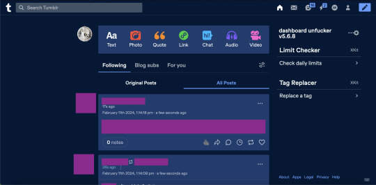
(ID: 2 screenshots of tumblr with urls/posts etc censored. the first is with the new layout, with labels on the left, the ad-free button, "check out these blogs," "explore all of tumblr," the radar, and no easy way to access your own blog. the second is with the extension enabled, the left hand side of the screen is empty, posts are wider, navigation icons are back at the top right, and the only thing on the right-hand side of the dash is the dashbaord unfucker and limit checker and tag replacer from xkit. end ID)
i got it for layout changes like these- the first is cramped and ugly and i feel like i'm on twitter. the second is warm and comfy and i can make my posts wider (i dont like all the empty space). (limit checker, tag replacer, and post color were done on xkit and palettes respectively, not unfucker, btw)
with the dashboard unfucker you can:
hide the following/blog subs/for you etc tabs
get rid of the changes/staff picks/etc carousel
hide recommended blogs and tags
add profile pics back to posts
hide the radar
hide the explore page
hide tumblr shop
hide user badges
highlight bots in ur activity feed
show who follows u in the activity feed
make posts wider/slimmer and move the dash posts position to the left/right
revert messages design (and make the messages box bigger)
revert activity feed to the old design
display vote counts on polls
show poll results without clicking (no more skewing polls or "see results"!!)
disable tumblr domains
add polls to reblogs
disable "post without tags?"
show ns.fw posts
and other things that i probably missed copying this from the settings!!
so how do you do it? it seems scary but it's easy actually. take my hand
(note: i did this on firefox and tested it on chrome, i'm not familiar with other browsers, also use firefox if at all possible fuck chrome)
how to install dashboard unfucker
step 1: install either tampermonkey, tampermonkey beta, greasemonkey, or violentmonkey (if you don't already have it)
note: im using tampermonkey as an example because it's what i use
step 2a: go to firefox extensions/chrome web store/your browser's equivalent
step 2b: look up "tampermonkey" and click "add to firefox/chrome/whatever" and confirm
step 2c: you're done! yayyy
step 2: click this link. look under "installation" where it says "Click on unfucker.user.js to install or update". and click that
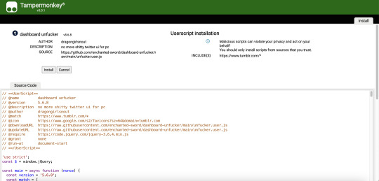
(ID: a screenshot of the tampermonkey install page, showing dashboard unfucker v5.7.8 installation information, the source code, and the install/cancel button. end ID)
(it should open in a new tab and look like this)
step 3: click install! (when i did this it didn't look like much happened and i got scared. dont get scared take my hand)
step 4: go to www.tumblr.com and to the right of the dash it'll have the dashboard unfucker label to the right!
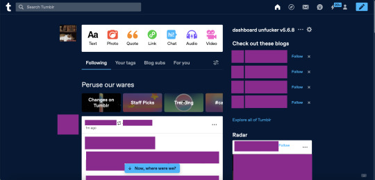
(ID: the default dash again, but with the dashboard unfucker title at the top right of the right-hand side of the dash. end ID)
step 5: click the little gear icon and all the options will pop up! u can fuck around with em to ur heart's content. i recommend exporting after ur done and saving it somewhere in case u have to uninstall/reinstall to troubleshoot or smth
you're done! now u can see the results of polls without clicking them and other such things
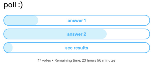
(ID: a poll i have not voted on. it has 17 votes and 23h 56m remaining. the title is "poll :)" and the answers are "answer 1" "answer 2" and "see results". there are no percentage labels, but the amount each answer has is indicated by light blue bars in each result, as they would be if i had voted. end ID)
note: i'm not sure how/if this aspect of the extension is indicated for screenreaders
THIS POST IS TRANSGENDER BTW!
88 notes
·
View notes
Text
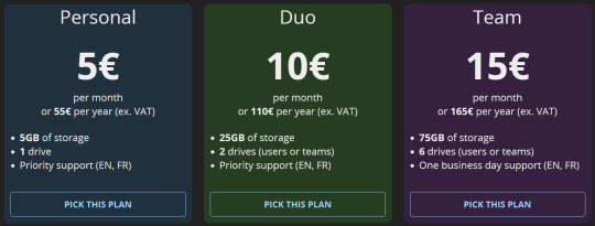
cryptpad review !
in depth review of cryptpad as someone who is using it as a replacement for google docs because i don't trust google and i dipped the moment i heard "fully integrated ai" 🤭
we're scoring cryptpad on a scale of 1-10 based on its interface, features, accessibility, ease of access, and storage.
scoring criteria:
usability 10/10 : has a lot of formatting options, while also being easy on the eyes. offers features that allow the software to be easily customizable to each user's needs and preferences, or features that make writing easier, without being overwhelming.
accessibility 10/10 : includes accessibility options for eye strain/dyslexia/etc like a proper dark mode and dyslexia friendly fonts, while also having an easy-to-navigate layout, and a mobile app that is equally easy to use without losing its features. doesn't take a long time to load, and is easy to adapt to as a new user.
storage 10/10 : provides a free account with very high or unlimited storage. the documents and files you create don't take up a ton of space, and you have options for upgrading storage if applicable.
what is cryptpad?
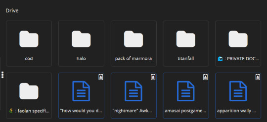
similar to how docs operates on desktop, cryptpad is a website-based file drive and software. it's free to create an account, and offers a selection of different kinds of files you can make. here's a list of features i think are notable, first:
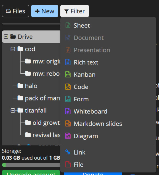
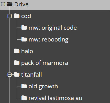
there's 10 different of kinds of files you can create, including even code documents! cryptpad also allows you to create as many folders as you like, upload pre-existing files or folders, and even allows you to add links to your drive if you have links you want to save.
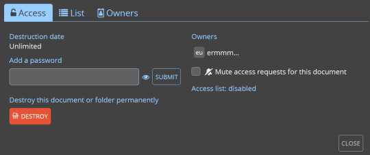
cryptpad always will open a new document or a pre-existing one in a new tab! when making a new document it automatically gives you the options to name it, password-lock it, set a destruction date.

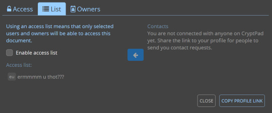
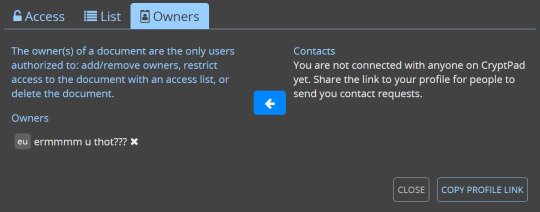
there's diversity in your sharing options: you can toggle and change the rules for the kinds of access people get to your shared documents!
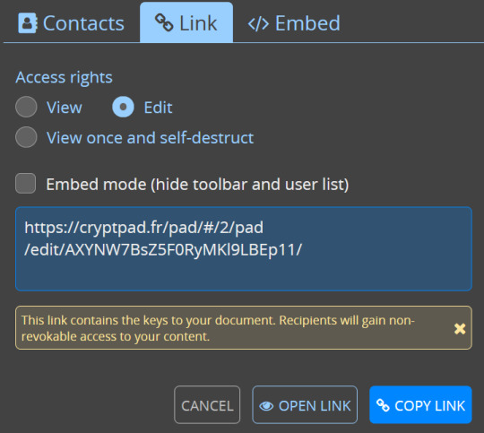

somewhat on the same topic, there's access settings and details you can review and tweak at any time.
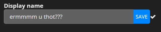
also you can change your account's display name in your settings LMAO
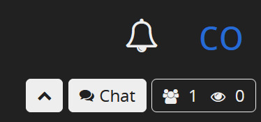
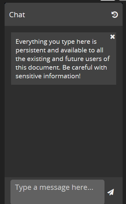
there's a chat option on documents for when you're working on something with other people in the upper right corner of your screen!
the actual scoring:
usability: 7/10
formatting your documents isn't terribly versatile on cryptpad, but it offers to you that you can make as many folders and nest as many of them as you want, while also making its layout and navigation simple. there isn't a ton of super fancy features in the rich text documents, but i enjoy that, to be honest! keeps it simple.
accessibility: 7.5/10
tragically, you cannot change the background of cryptpad files, and there's no mobile app :( if i could i would. they do, at least, offer a light or dark mode? i have dark mode selected of course, but it um... yeah the background is always just that white 😬 unfortunately. they do have basic font options, but personally, my love for cryptpad's accessibility lies in the fact you can make as many folders and nested folders as you damn well please, and the drive screen is SO easy to navigate.
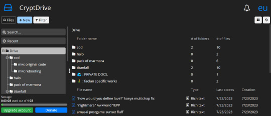

storage: 10/10
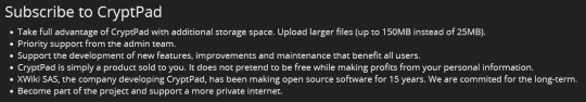
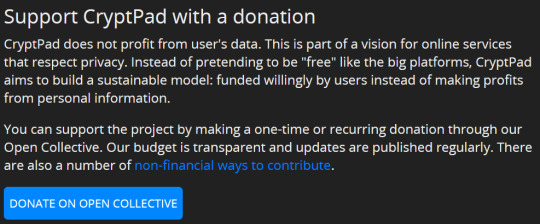
1GB for free, to start with? sir, i have 52 files in this drive (all rich text) and i have used 0.03 of that !! which, if i did my math correctly (debatable), that means i'll need over 5 thousand files to fill up that 1GB. AND it's upgradable, without the upgrade price being my soul? you can even donate just for funsies!
overall rating: 8/10
personally, i love cryptpad! i do wish you could change the document background color, and i wish that i had more formatting option like line spacing, but it's a good iteration of what i want in a writing program! i'd definitely recommend if you like supporting freelance guys doin their own thing while also not struggling to figure out how the fuck a writing software works.
42 notes
·
View notes
Text
got into bed and checked out my new site index on my phone, just to see what the situation is like now that i’ve fixed it up.
it’s wide compared to a phone screen, so it doesn’t work beautifully on a phone by any means, like it’s clearly still a desktop site. but because the sizing and layout got that bit of overhaul, it’s still usable on mobile if you don’t mind scrolling side to side, and it looks exactly the same as on desktop! so for now, i’m calling it a success.
in the future i’d like to have some kind of setup that works a bit better for mobile, but developing my site for mobile is not a priority of mine. as long as it kinda works that’s good enough for me. in that respect it’s actually significantly better than it used to be, not just compared to the previous iteration of my current layout but compared to my initial layout that built from the sadgrl template. i managed to fuck that layout for mobile Forever by trying to add a navigation menu iframe. but i am way better at this now.
2 notes
·
View notes
Text
Stupid Website
Summary: Donatello explains the notions of social media to his brothers, of course, they already know everything about it, he just shows them a better site for their kin.
But Tumblrs always had a way of fucking over it's users, and everything he loved about how the site was laid out is thrown out the day after he introduces them.
Warnings: Light swearing
Authors Note: so i'm fucking pissed about tumblrs brand new look, heres a crack fic about it starring Donatello, if you sat through it, maybe consider a reblog, or if thats not your thing, maybe drop a kudos on the Ao3 port!
"Social Media," Donatello began confidently, standing in front of his three brothers, he had a cue pointing at a slide.
"What about it?" Raphael asked, sliding through his phone.
"I'm not the only that has an account right?" Donatello asked, everybody shook their head, "Good, what do you use?"
"Twitter," Leonardo said.
"Instagram," Michelangelo said.
Raphael shrugged, "MySpace."
"MySpace is dead, Twitter is dying, Instagram is shit," Donatello stated boldly, he got an assortment of glares. He clicked to the next slide, "Now, allow me to show you a good site."
"Not much can top Twitter," Leonardo chided.
Donatello scoffed, "Wrong, Tumblr can."
"How so?" Raphael asked, clicking his phone shut.
"For starters, we don't have to show our face unlike Insta, there's active communities unlike MySpace," Donatello explained, flicking through slides to show off Tumblrs good side, "And unlike Twitter, our ship isn't sinking."
"How long have you been using it for Donnie?" Michelangelo asked, Donatello shrugged.
"Years, doesn't matter, you all need to trash your accounts now, cause each of those things you listed off leaks an ungodly amount of personal data, you're putting all of us at risk," Donatello explained, his brothers did nothing, "That means now."
"And why should I?" Leonardo asked.
"Try Tumblr, delete Twitter, your life will be better," Donatello ranted, he probably sounded like a lunatic, "Just try, we have a really good desktop layout and everything, lot's of color options too."
"Really?" Raphael asked, Donatello nodded.
"Really, just try it out," Donatello was practically begging at this point his brothers shared glances.
"I'll try it out," Michelangelo offered, thumb hovering over the delete account option, "People keep bugging me for a face reveal anyways."
"Shit like that doesn't happen much on Tumblr," Donatello said, he turned to face Raphael.
"I will admit, it is lonely on MySpace lately," Raphael said, swiftly swiping through options till he got to the right one, he clicked it, "Show me the ropes."
"Gladly, but first," Donatello changed his gaze to rest on the blue banded terrapin, "Are you in or out Leo?"
Leonardo sighed, "Fine, I'm in."
"Perfect! Now, you're gonna click on sign up," Donatello instructed, going over each step with his brothers.

Donatello woke with a yawn, he rolled over, grabbed his laptop, and opened up Tumblr.
Sheer horror filled the pit of his stomach, "What the fuck?" His words barely came out above a whisper, they massacred his website.
It looked just like Twitter, they ruined his one link to the outside world, the one place he could be himself.
And they fucking ruined it, turned it into a Twitter clone. His precious layout, his beloved top bar, having room to breath without a full screen, gone. If he weren't a turtle mutant he would go and personally slap photomatt in the face, but he is a turtle mutant.
Instead he shuts down Tumblr and starts drafting a very strongly worded complaint.
#tmnt#teenage mutant ninja turtles#tmnt 2012#donatello#tmnt donatello#leonardo#leonardo tmnt#raphael#raphael tmnt#michelangelo#michelangelo tmnt#writing#fanfic#fanfiction#fan fic#fan fiction
9 notes
·
View notes
Text
I really thought yesterday was a fever dream but sadly no. Tumblr did really change their layout in this ugly piece of sh.... in this stupid thing that nobody wanted because I didn´t see a single tiny user who said: "Oh tumblrs layout is shit, I´m only used to twitter, so I demand that tumblr is like that."
Why? Just why? There are so many other things you can works on. F.e. your support. XDD After five mails I don´t have my energy to explain again and again what my problem is only to get the same answer: "Restart your router, delete your cash from the app (uhm yeah nice but I use tumblr mostly on my desktop)"
Oh it´s so annoying. Also don´t do this stupid games. What´s up with these "Following, mutal..." buttons on my followers, following people or in general users. Didn´t you think that it can pressure people? I can only speak for myself but I´m a person who sometimes unfollows people quiet and do not wanna talk about it but now people can see it and this is so unpleasant. Because it supports drama. Give us a possibility to deactivate it.
Also, I already said it to you in mails: Work on this stupid tag bug. You have a specific name for it, SO YOU KNOW THE PROBLEM!!! It can´t be that people who are years and years on this site have this tag problem over and over again where they post something and you can´t see it for hours in the tags.
Then there are these ask bugs. When I started with tumblr it was a funny joke that sometimes an ask was eaten, but after these many years (it´s a decade) we can demand that you have finally fixed it. But you didn´t, instead we get so many playful things ... for what?
Oh another thing: it´s so nice that you tried to explain why the new editor is better but it is clumsy. At one point it is really hooky, so I don´t know what you have tested all these months but this editor has serious problem and is way worse than the old editor. In the old one I could upload 4 and more gifs at once and easily move them around, now I feel like I am wasting my time when I upload every single gif for itself and move it. Also, I don´t wanna ignore the fact that the quality on every gif is downgraded but people already explained that in long and very good texts.
Then there is the thing that you always try to explain to us that all these new feature are good for us. Like... are you not seeing the opinions of all the users on this site? I can totally understand when people say, that they are feel ignored because it´s true. You have a feature and you play with your words and say: "Oh you wanted to have it, here look this is amazing." Because you are so proud of your ideas that you forget that people were happy with the old tumblr. Nobody asked for live streams (i don´t have it because silly me lives in europe but I´m scared that i will get it at one point and i feel so sorry for all the ones who have it).
Yesterday I saw a little snippet of a text in which you explained that tumblr is too difficult to use? Like the fuck? Tumblr is so easy you have literally a whole tutorial in which you explain the basics, did you forget that? Or are you suggesting that people do not read anymore?
My head is empty now but I know that there are a lot more problems I didn´t name. (@staff)
Oh btw if you don´t know what I wanted to say with this post, then I´ll just say it in simple words now: start listening to your users.
8 notes
·
View notes
Text
I recently bought a new desktop because the old one was showing signs of aging--chugging when trying to complete basic tasks, things like that.
I was looking at pre-built rigs because I didn't want to spend an arm and a leg, this isn't intended to be mega beefy... maybe someday in the future I'll be able to afford to build a custom rig, but not today.
Unfortunately, they all came in one flavor--Windows 11.
I was hoping to avoid this, because from what I've seen... it's... not great.
My experience so far is... it's not great.
Sure there are certain little details they've adjusted that are nice, but it's not enough to make me enjoy the experience overall.
The biggest gripe I have is that the Start Menu is fucking terrible.
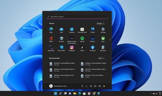
Look at this atrocious nightmare.
Sure, you can adjust the settings to move it over to the left, but that doesn't fix most of the problem. This is just... awful. I hate it. And it doesn't give you the option to use a legacy layout, like from 10 or earlier.
Why? Why do they do this? Why does Microsoft keep insisting on making broad, sweeping changes to the UI that nobody fucking asked for, and nobody wants, and nobody likes.
Literally everyone I have asked who has tried this--HAAAAAAAAATES the new start menu.
There are third party apps you can install that REPLACE this eyesore... but that's just it... I SHOULD NOT NEED TO DOWNLOAD A SEPARATE PROGRAM TO FIX YOUR SHIT, WINDOWS.
Honestly... I wouldn't mind if Microsoft was trying this stuff out just to see what sticks... but actually let us pick and choose what layout we want. Like periodically, they come up with a new layout and it comes with the latest update. You can try it if you want, and if you don't like it, you can go back to what you had before. No big deal.
They could even carry a whole package of legacy layouts so you can simulate the start menu from previous version of Windows... but they will never do that. It would be too useful and desirable a feature.
I just... do not understand why companies decide to force these unnecessary and obnoxious UI changes on us. This isn't even the first time Windows has done this. I'm old enough to remember the debacle that Windows 8 caused with the hardcore push to unify the PC and Mobile experience... 'cause that's what we all need... christ almighty.
I'm old enough to remember people bitching about the jump from Windows XP to Windows Vista. Granted, Vista got complaints because of the hardware requirements and how much slower everything seemed to run, not the UI... but all things being equal... Vista's UI isn't my favorite.
It's like the company just... doesn't learn from its mistakes.
Oh right, duh, forgot... it's all about the money. They only care about the money. If they can make it look shiny and new, then some folks will jump on it because shiny and new, and that's big bucks for Microsoft.
Once again, like so many of life's problems, this too is caused by capitalism.
3 notes
·
View notes
Note
What really got me fucked up this morning was the new tumblr layout. Like bruh imagine moking and spitting on another website for so long and making it kind of your brand, just to steal/copy so many of their functions like... wtf tumblr, you are a big 🤡. I dont know if you've been upgraded yet, but i only use on my laptop and it's just not right. Thanks, I hate it.
hey anon! I had to wait until I got onto desktop to see what you meant and yea it's really giving Twitter Wannabe with the new layout. ALSO THEY SIGNED ME OUT! I had to sign back in!
3 notes
·
View notes
Text
Feedback and Suggestions to Tumblr Changes
Rant that has been coming for a week or two now, extremely expedited by the recent change they made to literally make it look like Twitter. I’m assuming the change stems from this statement they put in their latest Staff post:
"The underlying problem is that Tumblr is not easy to use."
The thing is - nothing is easy to use, the first time. If you've never been on a website, if you've never used a program, a game, an app - the chances are, you are not going to know how to use it easily if you haven't encountered it before. Does that intrinsically make the service you're using bad? No! So what could Tumblr do to help instead? Well. Huge feedback and suggestion dump under the cut, with the LEAST rant-driven comparisons I can muster. I'll be sending this post as feedback myself, but I want it public too.
I'm going to break these down into bullet points with explanations, but keep in mind that I'm just one person, and I'm bound to miss out on plenty of things others might have thought of; this is not the blog to send in feedback or suggestions or other thoughts, it's a one-off long as all fuck post because I'm opinionated. Take the list and run with it, add to it, use it - whatever, but please don't come to me for more takes about this. That being said:
Section 1: Layout
Feedback: New layout
I won’t be the first or the last person to say this: the new layout is basically Twitter. You know this, I know this, the staff knows this. Tumblr…is not Twitter. The obvious pro to this change is that everyone that’s ever used Twitter in their life is going to know where things are, because it looks like a worse version of their (already bad) platform. The cons are…everything else. From this point onward I’m referring to the 19/7 layout as the Twitter layout because it’s simpler, and it’s true. Also I don’t like it.
I don’t want to spend my time here when it looks like this, and frankly, people don’t want to use any social media platforms that are an obvious rip-off of others in looks and function; they are going to use Twitter regardless until it dies. This is why few people have gone to Mastodon and kept using it even if it IS a better alternative to Twitter, and quite similar. It’s the same with games. You want more people to use Tumblr? Make it unique. Keep the old layout, or do adjustments that actually benefit the interface, and double down on the uniqueness of what it can do different, and better, not what it can do the same. Tumblr is a blogging platform; lean in on it. I digress. The Twitter layout dissection below.
Suggestion: Layout (desktop) and interface
I have a wide screen, and my personal experiences are written from that point of view; however, everything I mention here should be tested for ALL screen sizes, to optimize placement and user experience. I’ve gone through the tags to gather some opinions and mellow out my initial reaction of “oof, change bad”, but also I’ve always hated the Twitter layout which is the reason I don’t have one. Shocker.
The layout is cramped to me. It feels squished. Opening one thing overlaps on the other, having to scroll down for basic account functions feels insane to me because that’s where the likes, the drafts, the posts are. It makes me less likely to go through any of the website actual functions because I just can’t see them, and I have to put in extra effort of scrolling around to find them. The general upside of Tumblr for me was the ability to have sideblogs and easily access and edit them, and see posts, and likes, and other blog-specific things.
The Messages, Activity, and TumblrMart tabs still open as pop-up like features. For messages- no issue, there’s no need for it to take up further space. It was like this beforehand, and I didn’t mind it then either. I think that’s fine. Activity and TumblrMart, to me, feel spammy to look at. Personally, opening Activity in a half-tab like the one you get where you report blogs would be ok, because you can actually look through it with less fear of clicking off, but also, I don’t get a lot of notifications so I don’t have a strong opinion one way or the other. I have seen that it covers the dashboard which you might want to be looking at, so frankly, it’s probably best to not have it pop-up there at the very least. TumblrMart…please let it lead to its own site segment. No wonder people aren’t using it. It doesn’t have a clear overview, or options, nor do you feel like you can peacefully look around.
The fact that everything is on the left side sucks from an user standpoint as well because going swiftly from reblogging/liking/refreshing to account/messages/settings is not friendly user interface. This, to me at least, essentially discourages the interaction wanted. I digress. I think it’s a decent idea to separate left and right side and make things in part more accessible, but not like this.
My personal subjective opinion for a new (“more intuitive” interface) and suggestion:
Keep what is currently the account tab on the right, permanently open (likes, following, what’s new, help, shortcuts, log out) OR toggleable, with a toggleable (separate) “blogs” tab under it for privacy on the dashboard lest someone walk by and sneak a glance. Opening the blogs drop-down would by default make your main blog interface open, and side blogs closed; leave the toggleability and options as-is on the Twitter layout, that is fine.
Above this, put back the Home, Explore, Activity, TumblrMart, Domain, and Ad-Free icons. Home, Explore and Activity for usage, make TumblrMart lead to its own distinctive site instead of being a pop-up, and the rest people will eventually click on and know what they are. Potentially you could merge Ad-Free and Domain into one site you can just scroll through instead. Bind this with the search tab in the middle the way that it was, so things don’t stick cramped to the top of the page.
Leave Messages, Inbox and Settings on the left, and instead of “t” write “tumblr.” because there’s lots of empty space up top there otherwise, and it would look less awkward. Drop-down settings especially is a good thing to me because the settings interface was amongst the least intuitive things for new users, and it’s important because it shapes the entire usage of the site, and is one of the first things people go to for customization of their experience. Under this, stick “Check out these blogs” and “Radar”. Or only “Radar”. Workshop it or ask for user opinions.
That’s just one opinion of possibilities of one user, and no one has to agree with me whatsoever, but I’m not going to sit and pretend that things will never change ever even if I don’t want them to. There’s plenty of ground to cover here, but I really shouldn’t be doing the job of the Tumblr board of 200 people who already work there. Regardless, I’m upset, and I don’t want to use Tumblr anymore because of the changes you’re making, and I want to fix the leaks in the roof of my only house, because honestly? I don’t use social media besides Tumblr. I digress.
Feedback: Blogs (layout-adjacent)
I’ve been on this platform for over 10 years and I want to be absolutely clear on something; I hate the simplification of everything with a burning passion. I don’t want to spread misinformation and say that blogs not having their own immediate domain and theme on sign-up saves money, or space, or what-have-you, because I don’t know, but if it’s true then I understand the reasoning for the change. However, I do know that the slow erasure of personal themes makes the entire website bland as all fuck to me. I’m going to separate this in chunks because it’s important to me and I think Tumblr should use this function (as well as chronological non-algorithmical feed) to attract new users instead of trying to be something it isn’t. Is it realistic? Not my job to figure out, nor how to make it work! I’m already making a whole itemized list for a lot of things.
Feedback: Regarding mobile blog layouts:
A good change! I like that it’s simple and sleek and still customizable in a way where you can hide your likes and followings. I also don’t mind that the same settings are retained on the desktop version of your blog to keep consistency. It’s neat! However, I’m not the biggest fan of the desktop version of blogs, and so, regarding desktop layouts:
Suggestion: Make blogs that have a theme open in a new tab when clicked on.
In all honesty, I scroll less on blogs when I’m not on their personalized theme. It’s simply not inviting. It’s fine for one post; sometimes I just want to take a link from the source to pass it on, but when I further click on the blog icon to get to the main page of the blog itself, I wish it led to the actual theme as opposed to the dashboard version. I love looking through others’ posts and blog on their own personalized page, and frankly, it’s the reason I joined and spent so much time on Tumblr. If the theme is Godawful, or difficult to see, there’s always a button in the top right which literally leads to the dashboard version of the blog, on any blog with any theme. When I scroll through the dashboard version of a blog, I last maybe 5 posts at most, don’t like/reblog much, don’t follow, which further just stops the chain of engagement in this platform.
I can agree this isn’t for everyone, and people might not care too much about it. However, it’s like…a few lines of code to implement, and put in settings as a toggleable function. It would keep everyone happy. And make it known to new users.
Section 2: Retaining new users
Now that we’ve determined how nobody wants a rip-off website, and how changes are possible and have potential and don’t have to be bad, and how, certain layout functions are out there that little people know about, we’re going to move on to the statement that Tumblr staff made about not being able to attract and retain new users. I’m going to make a separate post completely that goes in on the topic of engagement (important for a website!), but here I want to focus on the differences in old and new user experiences.
Feedback: User experience for new accounts
I feel like lots of old users aren’t aware that this is what the new sign-up for Tumblr looks like, with all the steps. To Tumblr staff: no wonder people don’t understand anything or stay on the platform, and you think that algorithms are the way to go. Changing the interface to “please” or “attract” new users won’t do much if they still can’t understand and use the core functions of the site. The functions that are actually not badly described on the help page. The functions that make the site worthwhile visiting and being on for what it is.
The steps given after signing up force people to mindlessly click on things, without any understanding, and the interface looks…spammy. There’s no indication on making someone unfamiliar with the culture or layout actually familiar and understanding of it, there’s no explanation, nothing. It’s not inviting and it looks like a hassle, and if people don’t understand this, they will click things randomly, then go to their dashboard and be cranky because they don’t get what’s going on.
Suggestion: Signup and post-signup interface changes, tutorials
On the “What are you into?” page, elaborate on what following “tags and topics you want to see” means; will this show up on the dashboard, will it give you notifications, what? Let people know that they will see everything in a tag from all users, where it will be located, how if they tag an original post it will also be found in the tags, but that tagging reblogs won’t. People don’t know. Teach them as they go along.
Leave a few suggested (popular) tags, potentially a list of currently trending tags. Introduce a search function next to it that allows a quick scroll through whatever tag people might think of, with a sentence or two about how to use search/tags: this both familiarizes people with the difference between the “tagged” and “searched” terms on their dashboard (you could explain this, too!), and gives people the incentive to write whatever they want and follow that instead of one of 20 randomly generated tags that they then have to unfollow. Naturally, add a button saying “no thank you” to this step so that people that know how to use Tumblr don’t have to do any of that while making a new account.
On the “find your people” page, you should straight up explain what following people means and how to find people to follow, given that it’s the core function of the website, no matter how much you try to force the algorithm. The issue with following random people for new users is that they don’t know how to find them after this step, and there is only so far that the “check out these blogs” tab will get you. This ties into engagement, and so, I’ll go into a little more detail later.
Likewise, managing of the “For you”, “Following” etc. is not customizable and removable for new users. Please make this customizable the same way that the old users have it, wherein you can turn off certain tabs. In all genuine honesty, I find all that unnecessary, but I know some newer users might use it (whether it’s because they like it, or they don’t know any better, I can’t say). I think the choice of what the “primary” tab is should be given to the user though.
Regarding the rest of the website functions: You know when you download an app or a game and you have a darkened screen with highlighted points that let you know where is what and point at it, sometimes including pictures? And you read it to get familiar with the interface/controls, and skip it if you just don’t care? Brainstorm on how to make one of those. This solves 99% of your issues with people that want to use the platform and also read. Make it simple, to the point, cover the raw basics, and include an easily accessible link to the other tutorials with screenshots on the help page that I know exist but are horribly hard to find. Which brings me to my next issue…
Suggestion: Make the help and feedback sites easy to access and use.
It’s as simple as putting the words “Help” and “Feedback/support” on the right side under whatever text there was, or under the “suggested blogs” batch, or something. This is literally THE easiest change to make on the old layout and would undoubtedly help a lot of people that don’t understand the platform. Likewise, honestly, the help page with actual tutorials is kinda bad (the tutorials seem ok from what I’ve skimmed though). It’s big and bulky and stretched out and it makes getting to the actual tutorial you might need a little bit of a hassle. I’d suggest to rework that layout over the dashboard layout any day.
And regarding the people that don’t read? Well, first of all, that’s their issue. Secondly, the way new account making works on Tumblr needs to be reworked in a way where doing whatever is necessary while making the account before getting to use the platform needs to be optimized and clearer, with better instructions. The issue isn’t the layout, as much as a fundamental misunderstanding of the platform, which I’ve written about 6 paragraphs of just above.
Section 3: Engagement
With all of that out of the way, let’s get to the meat of the problem. One of the key issues Tumblr seems to have is this:
“To guarantee Tumblr’s continued success, we’ve got to prioritize fostering that seamless connection between people and content. This involves attracting and retaining new users and creators, nurturing their growth, and encouraging frequent engagement with the platform.”
I’d like to go in on this because to me this is the most important facet of why Tumblr is changing things. I urge you, staff specifically, to read this carefully and clearly.
Feedback: Engagement with the platform
A lot of reasoning for changes comes from a lack of engagement with the platform and its contents, and the want to get more users and as a consequence earn more money to keep the site running. I’ve already written about introducing new users to the website interface and culture better, so I’m going to write the following with the assumption that all site features are understood. Platform engagement and features are intertwined, and so this will include both feedback on current features and suggestions for future ones that I think would hopefully help engagement. Because this is about Tumblr changes, it’s only fair we start with the obvious.
Feedback: Make blogs and polls related to changes easier to access.
I’ve gone through a few blogs such as @/changes, @/wip, @/labs and @/staff. First off, most of these aren’t interlinked with each other, and it’s very very annoying. It costs 5 minutes to make a pinned post on each of those blogs that links to the others so people know what to turn to regarding which update/change. Likewise, please stop silencing/refusing blaze/putting mature setting on posts that discuss and complain about changes. This has never gone over well with anyone. You’re alienating your userbase.
Regarding polls about changes that you apparently do on one of your changes blogs: I’ve never seen them, and I’ve never seen any notices about them. If you care about retaining any user base you might still have, you might want to have these more often, and facilitate and encourage discussion and open suggestions. Mostly, just make a notice about the poll last until it is over just like you make the notices about “ask X from Y show!” things. I’d be more than happy to contribute if I actually knew there was a poll happening.
With that out of the way, let’s get to the rest of them.
Feedback: Algorithm and the “for you” page.
Plenty of people have said this before me, and better than me. I want to stress the fact that the “for you” page discourages reblogs, discourages interaction, and above all, discourages new content creators. The new algorithm functions use popular posts (without reblogs, no less!), which further pushes good and popular creators or bloggers, and leaves others in the dust. Making this the default dashboard and search results not only stagnates content, but also alienates creators you oh-so-dearly want to see bloom. I think having it as an option is inevitable in this day and age, but also, I would much rather see emphasis on the chronological, following and self-curating experience, than a trend-chasing one. You need to give people the space to grow if you want to encourage their growth. This space is hard to find when only popular things are pushed upwards.
Feedback: Search and tagged.
We all know the search function is broken in unspeakable ways. Unfortunately most new users a) don’t know that and b) don’t understand the difference between the search and the tags. For the latter, I’ve already suggested things. For the former: fix the search function. And maybe let people pick whether they want to default to search or tag they’re looking for when pressing enter in the search bar? I’m tired of double clicking because I tend to prefer going to tags.
Feedback: Issues with the Tumblr Live function.
Remove it. Few people use it, I doubt that it’s highly moderated, and I’m absolutely certain it’s costing you money more than it should. The fact that a recent Staff Q&A livestream was on it was a slap in the face given that at least a third of the userbase cannot access it given that they are in the EU. If your website function is banned in the EU, you might want to reconsider implementing it. If people want livestreams, they will go to Twitch, or less likely to Instagram. Tumblr doesn’t need this. It won’t make new users come. Market it as a blogging platform that it is, not a livestreaming platform.
Feedback: Issues with spam and bots.
There’s so many porn pots in all tags spamming everything and messaging users, and we all know it’s an issue. Work on removing them from the site more than you work on removing actual real live users that post porn on the site. At least the live users aren’t likely to give you viruses and scam. Related, make new users aware of this issue and urge them to change their icon or at least make an introductory post. If they get blocked for the assumption that they’re a bot, they see less on Tumblr, there is less engagement.
Suggestion: Following, specifically regarding new users.
The reason why “most users see only 25 posts a day” isn’t that they are lacking an algorithm, it’s that they’re lacking people they follow, and the fact that most suggested blogs to follow are ones that create content as opposed to reblogging it, and because creation takes time, well…people don’t get posts on their dashboard. The simplest way I can think to fix this would be to also suggest blogs that reblog based on source content tags they reblog. And because I know some people would rather have their little private corner: make this toggleable based on if their blog is searchable or such.
Alternatively, coin a known tag such as “New user follows” or something, wherein both new users can post asking for people to like if they post about XYZ fandom/topics so they can check the blogs out, and the old users can post a list of topics they talk about, and new users can just follow that way. “Like if you post X” in fandom tags used to be such a common thing, but I don’t think encouraging spam in said tags is a good idea, and so: new highly specific tag, which can also be noted and explained in the sign-up process!
New users don’t know this, but I (for one) find people that reblog things either by going up a chain of reblogs, or just visiting random blogs through reblogged posts of posts I like and content I enjoy. I’m sure every other user out there has their own method of finding new blogs. For this to work though, you need to have people that reblog, which leads to my next point.
Suggestion: Reblogging regarding new users only.
For the new users, it’s confusing to differentiate between a reblog and an original post, especially considering you can tag both. This kind of ties into tutorials that I suggested beforehand, but it should at least be mentioned somewhere, preferably during (or right after) the sign-up process. Granted, this might be mentioned in the help page somewhere, but after this entire manifesto, I don’t have it in me to check.
Suggestion: Encouraging reblogs for both new and old users.
I’m running out of singular brain cell power to one-man brainstorm things for the staff here, and I’m certain people have their own ideas to boot. The only thing I can think of is to give people a boon for a 1-minute crab run or 24-hour badge choice per, like, 1000 posts reblogged, 4 times a month to avoid spam. Either it will be funny or it will be ignored. I don’t have it in me to think about this because the moment I had started reblogging a decent chunk of things on my own blog, Tumblr made the layout change, and now I simply don’t want to.
Suggestion: Change replies to posts.
If there’s any one thing I ever actually wanted on Tumblr that Twitter has, it’s the fact that replies to an original post are threaded. I know this has been asked for plenty of times, but keeps getting delayed. You want to encourage connection and communication? Thread the replies. Please.
Feedback/suggestion: Reblog chains.
Bring back the ability to look at singular reblogs by going through a reblog chain. You're killing the culture of "previous tags". Also this just sucks. And it's harder to find blogs through a reblog chain that way. This suggestion is not eloquent because I'm adding it in as an edit since my brain is literally fried from writing the rest of this.
Likewise, don't condense reblogs. People have said it better than me as well, but that kills the culture of the site, it kills engagement in the way the site is made, and frankly seeing a punchline before the joke isn't going to make anyone reblog anything.
Feedback/suggestion: Advertise the option to have custom themes.
This is primarily meant to attract new users, and is bound to my suggestion of letting blogs open in new tabs. People love custom things and self-expression, and most new users don’t even know that this is an option. I know that the theme shop wasn’t profitable since the themes weren’t all that good; fine. But you can still use this function of the site to attract and keep people. Yes, the dashboard is the same for everyone, but each personalized blog can look however you want it to, and that’s the joy in it.
Suggestion: Accessibility
This goes without saying, and given that I luckily don't have many things that hinder me in using the site, I am not the best person to speak on this. Make gifs toggleable. Let people zoom in on images. Listen to those that need these features to happily use your site if you want them to stay.
Suggestion: More items in shop.
I imagine the reason most people don’t outright buy merch is that items with the name of any kind of internet site aren’t usually “cool”. I understand Tumblr needs money, and there’s only so many silly trends that are always going to be popular to buy. I also understand that a decent chunk of users probably don’t want crabs. The items in the shop are not my job to workshop, but honestly you could ask for userbase suggestions for it to get a feeling for what people want.
A few things that come to mind for me would be: more critters (just change the crab to something else!), more badges that are really just emojis, icon frames for you on the dashboard, self-picker for dashboard colors beyond the basic 12 offered, etc. Cash in on the customization. That being said: listen to your userbase regarding changes, features and functionality of the site, so that they in any way shape or form want to spend money on you in the first place, and so that they’re even there to do so. People won’t want to buy things if you’re actively working against them. There was a post about trust in website changes somewhere which explained it well; if I find the term I will edit it in here. I find it important.
Suggestion: Introduce a function to spoiler text and/or images.
This speaks for itself. The function to put text under a spoiler bar (think: Discord or Reddit) is to me, less necessary on Tumblr than the function to spoiler images. This leads back to the fact that Tumblr is a blogging platform, and you don’t censor things on blogs like that. However, spoilering images would be a good addition, especially given that some people might want to post leaks and/or content they don’t want people to see outright. This also introduces the option to have more suggestive content under a filter if people so choose. But I’ll be straightforward here: we all know what my next (and last) suggestion is going to be.
Suggestion: Bring back porn/mature/explicit content.
I want to preface this with the fact that I frankly don’t care about consuming porn, but I do care about content creators, fandom, and seeing art. And I do understand that Tumblr staff, for every request they have had to bring back porn, said that the issue is with apps and Apple etc. But this also needs pointing out, explicitly:
You want to attract and retain users? Bring back porn. Everyone and their mother knows that some porn is still alive and well on Tumblr, if you know where to look. Everyone but new (and non-) users. It’s a bit of an open secret, but if new users don’t engage with the old users because they don’t know how (issues and resolution suggestions mentioned beforehand), they are never ever going to find out. Let me be absolutely clear: People are not on Twitter because of the layout, or the algorithm. People are on Twitter and other popular platforms because they allow mature content, and so, a lot of content creators they care about are there.
And the issue here is, is that the mature content remaining on Tumblr is either live porn, comes from porn bots, or absolutely censored in like 3 posted art pieces. You want to encourage content creators and retain users? Stop alienating half of them from your platform. A lot of adults enjoy and engage in mature content. I repeat: the issue isn’t in the interface, or the function of the website; the issue is the content, or lack thereof, and fundamental introduction to the functions of the site.
I considered making Twitter JUST for the fact that certain artists were alienated on Tumblr and (shadow)banned for posting suggestive art, or porn art, and moved to Twitter to put their mature content there. It’s not about the layout.
It’s not my job to figure out how to do this. Frankly, I think a step in the right direction would be to enable and un-shadow mature content on desktop first and foremost, while still censoring it on app, especially for people who in their settings do have mature content enabled. Why can I still not see mature posts in the tags and search even though I’ve enabled it? Go from there. Figure it out. But you’re lying to yourself if you think the lack of engagement only stems from the layout and certain functions.
Allow mature content outright. I can guarantee you that this will help with the userbase, considering a majority of it left after mature content was removed, and some tried to “come back” after the false (recent-ish) assumption of it being once again allowed. We all know they went back out the moment it turned out mature content was still banned.
That's it! If you read this far as an user, thanks! I've surely missed out on a lot of things and barely scratched the surface, but this helped get things out of my head, and will hopefully stay in the thoughts of staff. If you're staff: you should have read all of it.
#Tumblr#Tumblr changes#Long post#VERY long post#Feedback#Tumblr feedback#Lots and lots and lots of thoughts
3 notes
·
View notes
Note
So, for some reason when I click on the screenshots to zoom in and read the text better the resolution is all fucked. The size of the image is squished into a phone layout which is even more unreadable (opening the image in a new tab works fine). Any idea what is up with that? I don't think I've ever seem tumblr do that before.
sorry! i don't know what's up with that. i think if you're viewing from my blog on desktop there might be something up with the theme that's messing with the images (i have been using the same blog theme since like 2013 and a lot of how tumblr works has changed massively since then). looking at it now i'm seeing the problem but i'm not sure of the exact cause. since i'm guessing it's an html/css thing i think it is probably fixable if you know what you're doing.
#anonymous#gonna try tweaking things but if anyone more well versed in this stuff has any idea please let me know!
7 notes
·
View notes
Text
First off since this is my first time back on the desktop site in ages I feel the need to say how much I hate the changes that were made. If I wanted to see a website that's like Twitter, it will always be Twitter for me not this fucking X bullshit, I'd log onto my Twitter! Which I never do because I hate the fucking layout!
Also since I'm going to be on here a bit more often, in theory at least, I will not take sides in anything or be involved with drama. I will interact with anyone I connect with or can deal with my slow as fuck ass :P
I also want to thank the two people who have been there for me to talk to about this but I will not tag them because, again, not taking sides. You both know who you are and I appreciate you both more than you'll ever realize <3
Now it's time for an explanation as to why I've been in a shit head space since the end of July which I will put under a read more for those that aren't interested.
On July 30th I was at work and got pulled into the office to talk with my Store Manager, she had a few papers in hand and asked me to sit down. The day before she'd received an email about corporate restructuring and I was being told my full time position with the company was eliminated. I was completely thrown for a loop since I had been working at another store for a few days a week as of the week of July 9th and had only spoken to my district manager a few days prior about what needed to be fixed at the store I was helping. Everything had seemed good when we spoke so I was pretty shaken up by this news.
I was told I could continue on doing my job as part time making $9.75 an hour or take a severance deal and collect unemployment. I of course said I needed to think about it since it was a big decision going from 36-40 hours a week at $16.85/hr down to god knows how many hours at a shit wage. My SM, who was bawling like a baby along with me at this news btw, said she understood but FUCKING CORPORATE wanted an answer by Friday July 28th. The date this conversation was happening? Wednesday July 26th.
Yes, you read that right, Two whole days to make a huge decision and if I didn't give them one in time I was forfeiting my severance and it would be considered voluntary job abandonment so no unemployment for me! Also if I chose the deal I couldn't take any time off, use any of my PTO or sick time, or even call off because it would be considered voluntary job abandonment and I wouldn't get unemployment or my severance.
This happened company wide with even some assistant managers losing their jobs and being offered a similar deal. I will gladly send links to the Reddit subs talking about this if anyone wants to see exactly the fuckery this company is putting its loyal people through. I had almost three weeks of paid vacation and about two days of sick time built up that I lost.
I would have also been with the company for ten years in November and I worked through the worst of Covid being treated like shit by the customers for trying to enforce the company's and CDC's rules. I was also a manager for 7 or so of those almost ten years.
Then on August 1st I had a surgery consultation for a health issue only to be told it's worse that they thought and I would need a procedure that would land me in the hospital for a week with a TWO month recovery time. Thankfully my health insurance, as crappy as it is, is independent from my job so I'm not losing it but whose going to hire someone whose going to have to go out on medical leave in a couple of months? This wouldn't have been a problem before, you know sick time and PTO for the win, but now it is. I know my boss would gladly hire me back after I recovered but it's going to be at a shitty wage with shitty hours.
So do I put my health aside and risk my issue getting worse and try to find another job right away or hope my former company doesn't screw me over anymore and lets me collect until I'm fully recovered?
Thankfully, I won't be homeless but that's another issue for another day.
I'm not looking for sympathy, monetary help, or anything like that. I just felt like I owed the wonderful people I interact with here a proper explanation of to why I've been more out of it than normal.
Thanks for taking the time to read this.
Love,
Barb
2 notes
·
View notes
Text
looked at desktop for the first time and yea this is fucking unusable lol. had to add about 10 new ublock filters just to figure out what the fuck i was looking atAND LITERALLY AS I WAS TYPING THAT. SNIPED THAT STUPID “601 posts” POP-UP WITH ELEMENT ZAPPER. has anyone rolled out like. a meaningful dashboard layout fix yet? and where do i find it??
3 notes
·
View notes
Last Seen Blogs

shaktipeethdigitalme
Untitled

paraparaconnection
Para Para Connection


bananalovin
scag's prized snail

darkishasian
Weeb n' Weep