#they're still so important to how much I've improved
Text
Mm because I've been feeling kinda sucky about my art for the last week nice little self-improvement post over the past ehh 5 months or so?
Under a cut because it's literally just some art I've already posted from the last 5 months (literally the first finished drawing of LMK I did far back. It's literally only been 5 months why does it feel like a year. Geeze.) so I can see tasty improvement but uhh yeah

#all of my like in the last couple weeks stuff has been OCs#which I haven't been drawing for as long so didn't wanna include#mostly stuff to Macaque + Wukong because they were def the hardest things for me to draw walking into LMK#but now I can at least sketch them digitally pretty easily even if their scarves still throw me without a reference#and I'm pretty proud of myself#this is literally just me being self-indulgent because I needed a bit of a boost ignore this#side note look at me!!! not cringing away from my old art at the first sight of it!!!!#actually able to like it and acknowledge how it's helped me grow!!! look at that!!!#honestly I have so many scrapped sketches I may post someday because even though they were scrapped because of how bad they were#they're still so important to how much I've improved#letting myself make bad art is honestly the best thing I've ever done for myself#and it turns out when all is done and finished I'm still proud of the effort and love?? and it doesn't feel that bad anymore??#that 19 hour comic I'm so proud of? I was never gonna do it because I thought the sketch looked bad#but a friend saw it and went 'yes finish it'#and I'm so glad I did#whoof it is. 5 AM.#emotions tonight#wow
2 notes
·
View notes
Text
Hey, so we don't talk enough about A Christmas Carol as being at least a little bit about not continuing a cycle of abuse and neglect, both against others and yourself.
In the book little Scrooge is left languishing over the holidays in a boarding school for some never-explained reason, but it is made very clear that this is miserable and unfair, and that his father is doing this on purpose. His sister specifically comes to tell him that "father is so much kinder now than he used to be, that home's like heaven." This also reflects a bit of Dickens's own childhood when his father went into debtor's prison and little Charlie was forced to support his family working full time in a shoe-blacking factory at the age of 12 (which is also why so many of his books seem to have a moral of "hey, kids are people too and maybe we shouldn't make them work in the mines.")
Whatever family reunion happened after didn't work out, because Scrooge continues believing that no one is coming to save him and pulling himself up by his bootstraps at the detriment of all other social relationships is the only way forward. And the more he lives by that philosophy, the more miserable he gets, because obviously he pushes away anyone who has that hope that he lost. They threaten to break down the walls he's built and teach him that a big pile of money doesn't have to be the only thing that he can rely on, if he'd just let himself be vulnerable and have a relationship with people who care about him, because they're out there even if he's ignoring them.
There is a certain type of person still very much out there who thinks this way. "I've never been happy in my life, so no one else has a right to be either. I was abused in my childhood so it's only fair that everyone else suffer as well." We see this in parents who still try to use corporal punishment, and in wealthy people who ignore the social factors keeping others down and scream that everyone else is just entitled, that only those who suffer and scrape deserve happiness. And they especially hate the people like Fred who represent the past that could have been, who have maintained hope for the future, and seem to be rubbing their optimism in your face, when in reality they're just maintaining hope because it's the only way you can survive.
It's so important for Scrooge to actually see the impact this thinking has on both himself and multiple generations. Rich people have this weird hangup about this story because they think Scrooge is bad because he's rich. He's not, he's bad because he's a horrible person and a miser - he doesn't use his money to better anything, including himself. Salting the earth, everyone suffers here, including him. And he learns that he's going to die old and alone without ever having spent or enjoyed his money, and that his family feels sorry for him, and that the nameless masses of poor people out there that he decries so much are in fact living, breathing people, including tiny disabled kids who don't deserve to suffer just because you decided life isn't fair.
In the end he takes responsibility for actually uplifting the people in the next generation who are trying to make the world a better place and no longer punching down, because it doesn't have to be this way. So many people out there just give up hope because things are hard and they think trying to improve things is a pointless exercise that makes them look dumb. How dare you grow a year older and not an hour richer! How dare you marry for love! That's the only thing more ridiculous than a Merry Christmas! When in reality, there are plenty of people who would love to see them happy if they just had a chance.
It's really sad that, while the language used to describe it has changed, these problems still persist. That people feel so wronged and isolated that they spend their days ensuring everyone else will be as well. That they fail to see their fellow humans as fellow humans who are just as deserving of love and kindness and a roof over their heads. I don't care what time of year it is, we should all be lifting each other up rather than tearing each other down.
#long post#rant#a christmas carol#charles dickens#history#books#literature#christmas#who hurt elon musk
755 notes
·
View notes
Text
why Aurora's art is genius
It's break for me, and I've been meaning to sit down and read the Aurora webcomic (https://comicaurora.com/, @comicaurora on Tumblr) for quite a bit. So I did that over the last few days.
And… y'know. I can't actually say "I should've read this earlier," because otherwise I would've been up at 2:30-3am when I had responsibilities in the morning and I couldn't have properly enjoyed it, but. Holy shit guys THIS COMIC.
I intended to just do a generalized "hello this is all the things I love about this story," and I wrote a paragraph or two about art style. …and then another. And another. And I realized I needed to actually reference things so I would stop being too vague. I was reading the comic on my tablet or phone, because I wanted to stay curled up in my chair, but I type at a big monitor and so I saw more details… aaaaaand it turned into its own giant-ass post.
SO. Enjoy a few thousand words of me nerding out about this insanely cool art style and how fucking gorgeous this comic is? (There are screenshots, I promise it isn't just a wall of text.) In my defense, I just spent two semesters in graphic design classes focusing on the Adobe Suite, so… I get to be a nerd about pretty things…???
All positive feedback btw! No downers here. <3
---
I cannot emphasize enough how much I love the beautiful, simple stylistic method of drawing characters and figures. It is absolutely stunning and effortless and utterly graceful—it is so hard to capture the sheer beauty and fluidity of the human form in such a fashion. Even a simple outline of a character feels dynamic! It's gorgeous!
Though I do have a love-hate relationship with this, because my artistic side looks at that lovely simplicity, goes "I CAN DO THAT!" and then I sit down and go to the paper and realize that no, in fact, I cannot do that yet, because that simplicity is born of a hell of a lot of practice and understanding of bodies and actually is really hard to do. It's a very developed style that only looks simple because the artist knows what they're doing. The human body is hard to pull off, and this comic does so beautifully and makes it look effortless.
Also: line weight line weight line weight. It's especially important in simplified shapes and figures like this, and hoo boy is it used excellently. It's especially apparent the newer the pages get—I love watching that improvement over time—but with simpler figures and lines, you get nice light lines to emphasize both smaller details, like in the draping of clothing and the curls of hair—which, hello, yes—and thicker lines to emphasize bigger and more important details and silhouettes. It's the sort of thing that's essential to most illustrations, but I wanted to make a note of it because it's so vital to this art style.
THE USE OF LAYER BLENDING MODES OH MY GODS. (...uhhh, apologies to the people who don't know what that means, it's a digital art program thing? This article explains it for beginners.)
Bear with me, I just finished my second Photoshop course, I spent months and months working on projects with this shit so I see the genius use of Screen and/or its siblings (of which there are many—if I say "Screen" here, assume I mean the entire umbrella of Screen blending modes and possibly Overlay) and go nuts, but seriously it's so clever and also fucking gorgeous:
Firstly: the use of screened-on sound effect words over an action? A "CRACK" written over a branch and then put on Screen in glowy green so that it's subtle enough that it doesn't disrupt the visual flow, but still sticks out enough to make itself heard? Little "scritches" that are transparent where they're laid on without outlines to emphasize the sound without disrupting the underlying image? FUCK YES. I haven't seen this done literally anywhere else—granted, I haven't read a massive amount of comics, but I've read enough—and it is so clever and I adore it. Examples:


Secondly: The beautiful lighting effects. The curling leaves, all the magic, the various glowing eyes, the fog, the way it's all so vividly colored but doesn't burn your eyeballs out—a balance that's way harder to achieve than you'd think—and the soft glows around them, eeeee it's so pretty so pretty SO PRETTY. Not sure if some of these are Outer/Inner Glow/Shadow layer effects or if it's entirely hand-drawn, but major kudos either way; I can see the beautiful use of blending modes and I SALUTE YOUR GENIUS.
I keep looking at some of this stuff and go "is that a layer effect or is it done by hand?" Because you can make some similar things with the Satin layer effect in Photoshop (I don't know if other programs have this? I'm gonna have to find out since I won't have access to PS for much longer ;-;) that resembles some of the swirly inner bits on some of the lit effects, but I'm not sure if it is that or not. Or you could mask over textures? There's... many ways to do it.
If done by hand: oh my gods the patience, how. If done with layer effects: really clever work that knows how to stop said effects from looking wonky, because ugh those things get temperamental. If done with a layer of texture that's been masked over: very, very good masking work. No matter the method, pretty shimmers and swirly bits inside the bigger pretty swirls!
Next: The way color contrast is used! I will never be over the glowy green-on-black Primordial Life vibes when Alinua gets dropped into that… unconscious space?? with Life, for example, and the sharp contrast of vines and crack and branches and leaves against pitch black is just visually stunning. The way the roots sink into the ground and the three-dimensional sensation of it is particularly badass here:

Friggin. How does this imply depth like that. HOW. IT'S SO FREAKING COOL.
A huge point here is also color language and use! Everybody has their own particular shade, generally matching their eyes, magic, and personality, and I adore how this is used to make it clear who's talking or who's doing an action. That was especially apparent to me with Dainix and Falst in the caves—their colors are both fairly warm, but quite distinct, and I love how this clarifies who's doing what in panels with a lot of action from both of them. There is a particular bit that stuck out to me, so I dug up the panels (see this page and the following one https://comicaurora.com/aurora/1-20-30/):

(Gods it looks even prettier now that I put it against a plain background. Also, appreciation to Falst for managing a bridal-carry midair, damn.)
The way that their colors MERGE here! And the immense attention to detail in doing so—Dainix is higher up than Falst is in the first panel, so Dainix's orange fades into Falst's orange at the base. The next panel has gold up top and orange on bottom; we can't really tell in that panel where each of them are, but that's carried over to the next panel—

—where we now see that Falst's position is raised above Dainix's due to the way he's carrying him. (Points for continuity!) And, of course, we see the little "huffs" flowing from orange to yellow over their heads (where Dainix's head is higher than Falst's) to merge the sound of their breathing, which is absurdly clever because it emphasizes to the viewer how we hear two sets of huffing overlaying each other, not one. Absolutely brilliant.
(A few other notes of appreciation to that panel: beautiful glows around them, the sparks, the jagged silhouette of the spider legs, the lovely colors that have no right to make the area around a spider corpse that pretty, the excellent texturing on the cave walls plus perspective, the way Falst's movements imply Dainix's hefty weight, the natural posing of the characters, their on-point expressions that convey exactly how fuckin terrifying everything is right now, the slight glows to their eyes, and also they're just handsome boys <3)
Next up: Rain!!!! So well done! It's subtle enough that it never ever disrupts the impact of the focal point, but evident enough you can tell! And more importantly: THE MIST OFF THE CHARACTERS. Rain does this irl, it has that little vapor that comes off you and makes that little misty effect that plays with lighting, it's so cool-looking and here it's used to such pretty effect!
One of the panel captions says something about it blurring out all the injuries on the characters but like THAT AIN'T TOO BIG OF A PROBLEM when it gets across the environmental vibes, and also that'd be how it would look in real life too so like… outside viewer's angle is the same as the characters', mostly? my point is: that's the environment!!! that's the vibes, that's the feel! It gets it across and it does so in the most pretty way possible!
And another thing re: rain, the use of it to establish perspective, particularly in panels like this—

—where we can tell we're looking down at Tynan due to the perspective on the rain and where it's pointing. Excellent. (Also, kudos for looking down and emphasizing how Tynan's losing his advantage—lovely use of visual storytelling.)
Additionally, the misting here:

We see it most heavily in the leftmost panel, where it's quite foggy as you would expect in a rainstorm, especially in an environment with a lot of heat, but it's also lightly powdered on in the following two panels and tends to follow light sources, which makes complete sense given how light bounces off particles in the air.
A major point of strength in these too is a thorough understanding of lighting, like rim lighting, the various hues and shades, and an intricate understanding of how light bounces off surfaces even when they're in shadow (we'll see a faint glow in spots where characters are half in shadow, but that's how it would work in real life, because of how light bounces around).
Bringing some of these points together: the fluidity of the lines in magic, and the way simple glowing lines are used to emphasize motion and the magic itself, is deeply clever. I'm basically pulling at random from panels and there's definitely even better examples, but here's one (see this page https://comicaurora.com/aurora/1-16-33/):

First panel, listed in numbers because these build on each other:
The tension of the lines in Tess's magic here. This works on a couple levels: first, the way she's holding her fists, as if she's pulling a rope taut.
The way there's one primary line, emphasizing the rope feeling, accompanied by smaller ones.
The additional lines starbursting around her hands, to indicate the energy crackling in her hands and how she's doing a good bit more than just holding it. (That combined with the fists suggests some tension to the magic, too.) Also the variations in brightness, a feature you'll find in actual lightning. :D Additional kudos for how the lightning sparks and breaks off the metal of the sword.
A handful of miscellaneous notes on the second panel:
The reflection of the flames in Erin's typically dark blue eyes (which bears a remarkable resemblance to Dainix, incidentally—almost a thematic sort of parallel given Erin's using the same magic Dainix specializes in?)
The flowing of fabric in the wind and associated variation in the lineart
The way Erin's tattoos interact with the fire he's pulling to his hand
The way the rain overlays some of the fainter areas of fire (attention! to! detail! hell yeah!)
I could go on. I won't because this is a lot of writing already.
Third panel gets paragraphs, not bullets:
Erin's giant-ass "FWOOM" of fire there, and the way the outline of the word is puffy-edged and gradated to feel almost three-dimensional, plus once again using Screen or a variation on it so that the stars show up in the background. All this against that stunning plume of fire, which ripples and sparks so gorgeously, and the ending "om" of the onomatopoeia is emphasized incredibly brightly against that, adding to the punch of it and making the plume feel even brighter.
Also, once again, rain helping establish perspective, especially in how it's very angular in the left side of the panel and then slowly becomes more like a point to the right to indicate it's falling directly down on the viewer. Add in the bright, beautiful glow effects, fainter but no less important black lines beneath them to emphasize the sky and smoke and the like, and the stunningly beautiful lighting and gradated glows surrounding Erin plus the lightning jagging up at him from below, and you get one hell of an impactful panel right there. (And there is definitely more in there I could break down, this is just a lot already.)
And in general: The colors in this? Incredible. The blues and purples and oranges and golds compliment so well, and it's all so rich.
Like, seriously, just throughout the whole comic, the use of gradients, blending modes, color balance and hues, all the things, all the things, it makes for the most beautiful effects and glows and such a rich environment. There's a very distinct style to this comic in its simplified backgrounds (which I recognize are done partly because it's way easier and also backgrounds are so time-consuming dear gods but lemme say this) and vivid, smoothly drawn characters; the simplicity lets them come to the front and gives room for those beautiful, richly saturated focal points, letting the stylized designs of the magic and characters shine. The use of distinct silhouettes is insanely good. Honestly, complex backgrounds might run the risk of making everything too visually busy in this case. It's just, augh, so GORGEOUS.
Another bit, take a look at this page (https://comicaurora.com/aurora/1-15-28/):

It's not quite as evident here as it is in the next page, but this one does some other fun things so I'm grabbing it. Points:
Once again, using different colors to represent different character actions. The "WHAM" of Kendal hitting the ground is caused by Dainix's force, so it's orange (and kudos for doubling the word over to add a shake effect). But we see blue layered underneath, which could be an environmental choice, but might also be because it's Kendal, whose color is blue.
And speaking off, take a look at the right-most panel on top, where Kendal grabs the spear: his motion is, again, illustrated in bright blue, versus the atmospheric screened-on orange lines that point toward him around the whole panel (I'm sure these have a name, I think they might be more of a manga thing though and the only experience I have in manga is reading a bit of Fullmetal Alchemist). Those lines emphasize the weight of the spear being shoved at him, and their color tells us Dainix is responsible for it.
One of my all-time favorite effects in this comic is the way cracks manifest across Dainix's body to represent when he starts to lose control; it is utterly gorgeous and wonderfully thematic. These are more evident in the page before and after this one, but you get a decent idea here. I love the way they glow softly, the way the fire juuuust flickers through at the start and then becomes more evident over time, and the cracks feel so realistic, like his skin is made of pottery. Additional points for how fire begins to creep into his hair.
A small detail that's generally consistent across the comic, but which I want to make note of here because you can see it pretty well: Kendal's eyes glow about the same as the jewel in his sword, mirroring his connection to said sword and calling back to how the jewel became Vash's eye temporarily and thus was once Kendal's eye. You can always see this connection (though there might be some spots where this also changes in a symbolic manner; I went through it quickly on the first time around, so I'll pay more attention when I inevitably reread this), where Kendal's always got that little shine of blue in his eyes the same as the jewel. It's a beautiful visual parallel that encourages the reader to subconsciously link them together, especially since the lines used to illustrate character movements typically mirror their eye color. It's an extension of Kendal.
Did I mention how ABSOLUTELY BEAUTIFUL the colors in this are?
Also, the mythological/legend-type scenes are illustrated in familiar style often used for that type of story, a simple and heavily symbolic two-dimensional cave-painting-like look. They are absolutely beautiful on many levels, employing simple, lovely gradients, slightly rougher and thicker lineart that is nonetheless smoothly beautiful, and working with clear silhouettes (a major strength of this art style, but also a strength in the comic overall). But in particular, I wanted to call attention to a particular thing (see this page https://comicaurora.com/aurora/1-12-4/):

The flowing symbolic lineart surrounding each character. This is actually quite consistent across characters—see also Life's typical lines and how they curl:

What's particularly interesting here is how these symbols are often similar, but not the same. Vash's lines are always smooth, clean curls, often playing off each other and echoing one another like ripples in a pond. You'd think they'd look too similar to Life's—but they don't. Life's curl like vines, and they remain connected; where one curve might echo another but exist entirely detached from each other in Vash's, Life's lines still remain wound together, because vines are continuous and don't float around. :P
Tahraim's are less continuous, often breaking up with significantly smaller bits and pieces floating around like—of course—sparks, and come to sharper points. These are also constants: we see the vines repeated over and over in Alinua's dreams of Life, and the echoing ripples of Vash are consistent wherever we encounter him. Kendal's dream of the ghost citizens of the city of Vash in the last few chapters is filled with these rippling, echoing patterns, to beautiful effect (https://comicaurora.com/aurora/1-20-14/):

They ripple and spiral, often in long, sinuous curves, with smooth elegance. It reminds me a great deal of images of space and sine waves and the like. This establishes a definite feel to these different characters and their magic. And the thing is, that's not something that had to be done—the colors are good at emphasizing who's who. But it was done, and it adds a whole other dimension to the story. Whenever you're in a deity's domain, you know whose it is no matter the color.
Regarding that shape language, I wanted to make another note, too—Vash is sometimes described as chaotic and doing what he likes, which is interesting to me, because smooth, elegant curves and the color blue aren't generally associated with chaos. So while Vash might behave like that on the surface, I'm guessing he's got a lot more going on underneath; he's probably much more intentional in his actions than you'd think at a glance, and he is certainly quite caring with his city. The other thing is that this suits Kendal perfectly. He's a paragon character; he is kind, virtuous, and self-sacrificing, and often we see him aiming to calm others and keep them safe. Blue is such a good color for him. There is… probably more to this, but I'm not deep enough in yet to say.
And here's the thing: I'm only scratching the surface. There is so much more here I'm not covering (color palettes! outfits! character design! environment! the deities! so much more!) and a lot more I can't cover, because I don't have the experience; this is me as a hobbyist artist who happened to take a couple design classes because I wanted to. The art style to this comic is so clever and creative and beautiful, though, I just had to go off about it. <3
...brownie points for getting all the way down here? Have a cookie.
#aurora comic#aurora webcomic#comicaurora#art analysis#...I hope those are the right tags???#new fandom new tagging practices to learn ig#much thanks for something to read while I try to rest my wrists. carpal tunnel BAD. (ignore that I wrote this I've got braces ok it's fine)#anyway! I HAVE. MANY MORE THOUGHTS. ON THE STORY ITSELF. THIS LOVELY STORY#also a collection of reactions to a chunk of the comic before I hit the point where I was too busy reading to write anything down#idk how to format those tho#...yeet them into one post...???#eh I usually don't go off this much these days but this seems like a smaller tight-knit fandom so... might as well help build it?#and I have a little more time thanks to break so#oh yes also shoutout to my insanely awesome professor for teaching me all the technical stuff from this he is LOVELY#made an incredibly complex program into something comprehensible <3#synapse talks
743 notes
·
View notes
Text
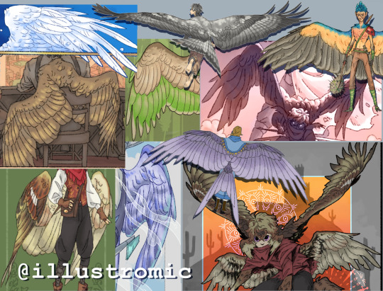
My thoughts on drawing wings (an unofficial tutorial)
Do you want to get better at drawing your favorite winged character? Do you have winged OCs? Just want to learn something new? I can't promise this post will help, but maybe it'll give you some helpful tips.
I know, I knowww, wing tutorials have been done to death. I don't care. This was initially inspired by a conversation on twitter, but actually I've wanted to write down my notes on the topic for a long time lol. Basically wings are one of my special interests so it's very important, for me, to draw them both nicely and also realistically.
On that note, let me first show you my resume *distant sound of floodgates opening*
Like what you see? Read on!
(Oh, and I will only be covering feathered/avian wings bc those are the type I know best.)
Now, I'm not here to give you a step-by-step guide on wing anatomy and aerodynamics, because there are plenty of other resources that cover this already, and I'll list my faves at the end of the post. Right now, I'm going to give you some easy guidelines and tricks that I wish more artists knew.
1: Wings do, in fact, have bones (crazy, I know) and are actually very rigid because they have to support the weight of a living creature. There are some positions you cannot physically force a wing into irl.
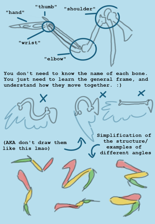
2: Flight feathers are not placed willy-nilly on the wing, because then they wouldn't catch the air properly. Again, like the bones, they are rigid and strong, so don't draw them like fur or ribbons. All wings have the same pattern of feather placement, with slight variation depending on species. If you learn the feather sections, it will automatically improve your drawings a lot.
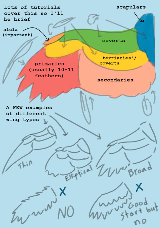
2.5: Feathers overlap each other like a handful of playing cards, and this looks different depending on which side of the wing you're drawing. They always do this unless they're extremely untidy.

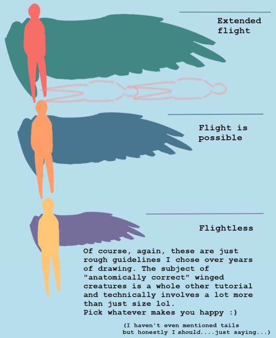
3: The size of the wingspan is important if you're going for a more realistic design. There is no "scientifically accurate" measurement when it comes to fictional creatures, but my general rule is when in doubt, you probably need to make them bigger. Personally, for my original winged human species, I give them wings that can be up to 12 feet long each (the artistic sacrifice is that it's really hard to fit the wings on the dang page lmao, so make your own call).
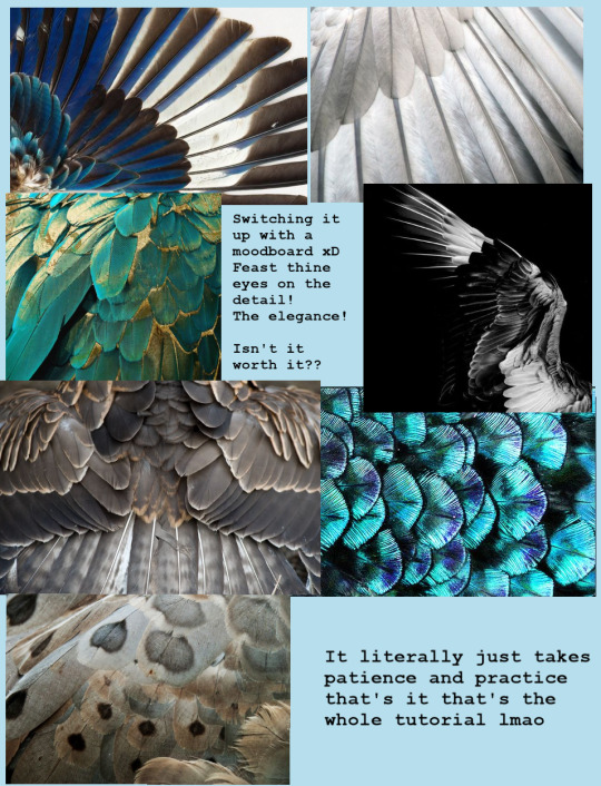
4: Get used to drawing folded wings. Most of the time, birds keep their wings folded because it prevents them from getting damaged and it conserves energy. The trick is to get good at visualizing how the joints bend and overlap (look at plenty of photos!) In general, they can fold much tighter than you think.

5: Wings and feathers take a lot of patience to draw, but the results are worth it. I've seen so so many incredibly beautiful and skillful artworks that are---well, maybe not ruined, but still negatively affected by a pair of wings that look like an afterthought, or not even like wings at all. You have no idea how much a little extra time and practice will add to your work until you see for yourself.
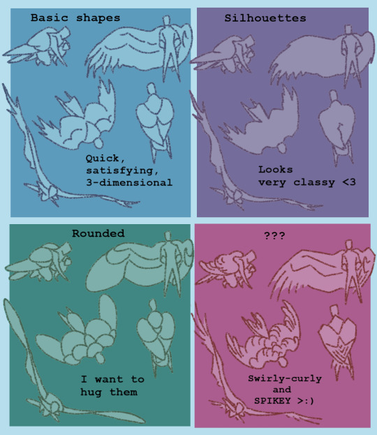
Finally, some notes on "stylized" wings: Of course it's perfectly ok to draw more simplified/cartoony wings if that's your preference!! BUT there is a difference between a stylistic choice and a lack of effort/poor understanding of the subject matter. Even cartoonists have to learn the fundamentals of realism so they know how to make their designs logical and appealing. Here are some examples of more stylized wings that I feel retain the core principles of anatomy/aesthetics:
And last but not least: A list of helpful links I use personally for reference and inspiration!
I made this pinterest board for general artsy inspo, and this board to curate my very favorite tutorials/refs/information, focusing on the scientific aspect of wings and flight in general. Feel free to use both! (I also suggest pinterest in general for pose refs and such, but try to only practice using photos at first and not other drawings.)
I highly recommend this blog and this blog if you want examples of artists who draw more realism-based winged creatures!! They are both huge inspirations for me and I think you should totally follow them even if you don't plan to draw wings lol <3
If you're REALLY serious about it, my favorite ref books are: Winged Fantasy, a lovely drawing book by Brenda Lyons; Proctor & Lynch's Manual of Ornithology; and Angelus vincens by R. Spano, which is essentially an artbook by someone who (I believe) designed biologically plausible "angels" for their senior thesis.
Ok, idk how to end this lol but I hope it helped! I know it's not my normal kind of post but I'm super busy with college stuff rn and this was all I had time for. If you guys have any questions or feedback, please let me know!!!
-Aloe <3
#my art#wings#drawing#tutorial#the way I could've talked for so much longer haha#but it's 3 am for me and I am fading fast so GOODNIGHT
2K notes
·
View notes
Text
"their entire dynamic was izzy trying to make ed happy"
"izzy was always just trying to make ed happy"
"everything izzy did was for ed's happiness"
LMAO WHEN??
I've seen variations of the above repeated over and over again by izzy stans and what i want to know is - when??? when did izzy "try to make ed happy" in season 1??? Because there's example after example after example of Izzy acting against Ed's explictly stated wishes and desires, in other words, acting in ways that izzy knows will not make Ed happy.
Ed wanted to meet the guy traveling with a brigade of imbeciles who nevertheless managed to best izzy at swordplay. Meeting the Gentleman Pirate was Ed's explicitly stated wish. In fact he tasked Izzy with the invite because it was important to Ed and he didn't want someone less competent to fuck it up. If Izzy was just trying to make Ed happy, then why did izzy lie to ed about telling stede that 'blackbeard' desired stede's company? How was this deliberate attempt to poison Ed against Stede meant to make Ed happy?
Once they're on the Revenge, Ed tries to get Izzy to play along with identifying the cloud shapes as frankfurters. Izzy is completely humorless about it. "It's like pulling teeth with you, man." Ed is visibly delighted by Stede's ragtag crew. Ed is fascinated by Stede's trinkets, by the model of the ship. He shows it off to Izzy! Ed is plainly showing interest and joy at Stede's crew and possessions. Izzy shuts him down. Yes, Izzy is worried about the Spanish catching up to them. But if Izzy really was "all about" making Ed happy, why doesn't he play along, even a little, with something that is clearly making Ed happy in this moment??
Izzy admits in the s1e6 opening voiceover that Ed appears to be "seduced" by Stede. We see the montage of Ed and Stede talking and Ed is having a great time! He's smiling, he's laughing! As Ivan (or Fang?) says, "this is the most open and available i've ever seen him. look at him, he's telling ghost stories!" Ed is HAPPY. Yet Izzy hates this. He refuses to engage with the crew. He pushes Ed to kill Stede even though Ed is clearly reluctant to do it, even though Izzy himself knows that Ed feels fondness ("seduced by") for Stede. How can this possibly interpreted as Izzy "just trying to make Ed happy"???
When Izzy challenges Stede to a duel, Ed flat out says "We're not doing this, Iz!" and Izzy couldn't care less. "No. You're not doing this. So I must." Must? Must??? Why "must" you, Izzy?? Why MUST Izzy duel Stede in an attempt to either kill him or banish him from the ship - the end result being to separate him from Ed - if Izzy's driving motivation is ensuring Ed's happiness? Taking away the person who has made Ed smile and laugh, who has improved Ed's mood and behavior so noticeably that Ivan comments on it?? How will this "make Ed happy"???
And then when Izzy is himself banished from the ship instead, he tells Ed "You will rue the day and you will rue it hard." If Izzy just wants to make Ed happy, wouldn't a better response be for Izzy to say "sorry, boss, i didn't realize how much this fop meant to you." Even if he's still banished from the ship, he didn't have to depart in anger. If he really cared about Ed's happiness, he would have been fine leaving Ed with the person who he knows has been making Ed happy lately. Instead he goes and teams up with the British in order to KILL Stede. Because that will make Ed happy??? That makes no sense!!!
Of course Izzy doesn't do any of this for Ed's """happiness."""
At BEST, he knows this will make Ed unhappy but he assumes Ed will get over it eventually and things will go back to how they used to be. At WORST, he does this out of anger, spite, and jealousy, and he doesn't give a single shit about how he knows killing Stede will make Ed unhappy.
So where did this belief that Izzy was only trying to make Ed happy come from? Why do people repeat it as if it were established fact? As if it were the obvious interpretation of Izzy's behavior in season 1?
Because to me, it looks like fanon run amok. It looks like a blatant headcannon rewrite of the show. It looks like a complete lack of visual and auditory comprehension and the inability to follow a story at the most basic level.
267 notes
·
View notes
Text
Light & Framing in WWDITS: Nandermo Edition
I really have to give props to whoever does the lighting and cinematography for What We Do In The Shadows. They took what could easily have been an excuse to cheap out on those things--the show's format as a half-hour comedy mockumentary--and said a resounding fuck that.
Every frame of this show is gorgeously and thoughtfully lit and shot and colored, and not just the big pivotal moments. Truly every shot. The sets and the costumes also do a lot of heavy lifting here, but still everything is framed so carefully and intentionally. And considering this show is at least 55% fucking improv? That is seriously impressive. I've seen big budget network cornerstone series take less care with their most pivotal moments than this show takes with like...any random moment (I know, I know, it's okay, I can say Game of Thrones).
Take this shot for example (thanks to @indashadows!):

Now bear in mind, this is ONE shot in ONE scene in an episode. An important scene, but not a long one. And yet in this scene, every single detail--from the actors' body language to the framing to the lighting to their fucking outfits--reinforces the underpinning context and subtext of the scene.
Look at Nandor. His posture is so open and vulnerable. He's facing directly toward Guillermo, looking slightly up at him actually instead of down at him like he usually would be. They're almost eye level but not quite. His face is fully lit, and his body is more in light than shadow, with the parts facing Guillermo lit and the parts facing away from him in deep shadow.
Nandor is being very open, honest, and vulnerable with Guillermo in this scene, probably more so than he's ever been before! All the pretense, the aloofness he usually hides behind is now shoved to the back. They're also on nearly equal footing compared to their usual situation, with Guillermo possibly having a slight upper hand due to how thrown everyone, including Nandor, is by the revelation that he's a vampire slayer.
(I know Nandor knew he killed Carol and the Baron, but given those were both accidents I think it's reasonable to say Nandor was still surprised about the slayer from a long line of notorious slayers aspect of the revelation.)
Another way to read this is that Nandor is at a disadvantage because of what he doesn't know in this scene, i.e. that Guillermo can leave any time he wants, that Guillermo has been listening to their conversations, and that Guillermo is using that information now to manipulate him. It's left somewhat up to interpretation whether Nandor actually knows any of this or not, so YMMV there. But the point stands that in either interpretation, Nandor is on his back foot here a bit and the framing and lighting of the scene reflects that.
Now contrast that with Guillermo. His posture is closed off, he's hunched in on himself. He's leaning toward Nandor, but he's not facing him or looking at him directly. His eyes are downcast. He's positioned a little above Nandor, but he's not acknowledging or reveling in that change of position in any way; in fact, he seems to be minimizing it with the way he's standing. Almost his entire body including his face is in shadow, with only the parts facing away from Nandor receiving any light.
Guillermo is not being vulnerable, open, or honest with Nandor in this moment. Whether Nandor knows everything or not, Guillermo thinks he's playing Nandor here. He thinks he has information Nandor isn't privy to (the hole in the cage and the hidden cameras) and knows things Nandor doesn't know he knows (the conversations he's overheard). Guillermo is normally much more open and vulnerable with Nandor, which often results in him getting his feelings (at the very least) hurt. But this is one time when he's consciously choosing to push his care for Nandor to the backburner in order to take care of himself for once.
(I also have FEELINGS about light representing emotional honesty and vulnerability between these two characters in the show about vampires and what they do in the shadows. Maybe I'll scream about them later.)
And here's the real kicker: they are so in odds with their approach here, their usual roles in the relationship are being reversed in ways neither is fully comfortable with...and yet they're still on the same damn page.
They both have the same ultimate goal in this scene: to get Guillermo out of the cage and have the other vampires in the house accept him and stop insisting on killing him. They are both trying to take care of Guillermo in their own ways. And as the show often does, it underscores this in part via the similarities in their outfits (but that is a WHOLE other fucking massive meta-post currently sitting in my drafts).
93 notes
·
View notes
Note
Personally I think they're both huffing a bit of copium about one another (Vox and Alastor) but Alastor is better at hiding it/maintaing his cool. We know that at least Valentino feels confident enough to goad Vox into taking the bait, that Alastor "almost" beat him last time. It's an interesting attitude compared to Vox's. Even Velvette doesn't seem all that concerned with Alastor, both her and Valentino are confident in the Vees current status and it's only Vox's personal insecurities that prevent him from sharing that mindset.
Vox's medium IS the victor in the grand scheme of things, he (along with the other Vees) ARE more relevant than Alastor/radio. And Vox is also capable of upgrading/improving himself over time in a way Alastor (from what we've seen) is not. It's so interesting seeing Vox unable to fully realize his strength/power - he can say it all he wants, but I don't think he really believes it. We the audience, however, know that visual media is king... case in point we are watching this series as a show on screens. Vox's hypnotism and electric powers are also pretty OP, he's got a good deck of cards (even though we haven't seen the full extent of how he can really leverage these yet).
And let's not forget Alasor BOOKED IT across town to get back at Vox during Stayed Gone. I think Alasor is (and should be) somewhat nervous (maybe "cautiously aware" is a better term) about the influence Vox and the Vees have regarding the future of media. He doesn't crack easily, as we've seen, but he cares enough to engage with Vox which he doesn't bother doing with outright "lessers".
In this way the dynamic is more even (in my opinion) than many give it credit for, which I personally prefer, but to each their own... for me, if it's not more equally matched, I struggle to see how the Vees will be worthwhile antagonists in the next season and that would be such a shame for characters that have so much potential. I just love the Vees!
(prev ask)
ehh I mean I do feel that they are on more equal level than some of the fandom may make them out to be but I still don't feel like they're exactly on the same level. like every time I see takes about mutual stuff between them I still can't fully agree cause to me, it's still on some level imbalanced. I do think they are of roughly equal power yes, but I think alastor being able to keep his cool is in fact a point towards him having the upperhand. it's the fact that vox is literally incapable of keeping his cool when it comes to alastor that spells more of his weakness when it comes to him I think. but yeah I mean how the vees, or rather vox will be a proper antagonist when he's so easily defeated by alastor is what I've been asking for a while LMAO.
and the thing is, we've seen instances like alastor being somewhat scared when zestial pops up, his mask slipping when starting stupid beef with lucifer (his eye is literally twitching the moment lucifer steps into the hotel LMAO), and of course with his fight with adam. we don't see any of that when it comes to the vees/vox, alastor waves them off as "nobody important" when niffty asks, easily tramples vox in stayed gone (and yes, he did immediately go back to his radio tower to bite back, but I don't think that's necessarily out of fear, could've easily just been he saw he was being insulted on live tv and HAD to bite back because he's a petty bitch), and gloated to him about having to "try harder than that" after failing to spy on him.
in my view, he doesn't see the vees or vox as a serious threat. HOWEVER, I do think that could easily be a point against alastor. his cockiness and not taking them seriously could very well come bite him in the back (JUUUUST like with adam!)
but when it comes to his current season 1 dynamic with vox, I do think he has the upperhand because of their different attitudes. if vox was able to keep his cool like alastor he wouldn't have caused a city-wide blackout over stayed gone LMAO. they're definitely more leveled power-wise though I think, the difference comes in their attitudes. if vox won the idgaf war a bit more they'd be more leveled, but he has chosen to obsess over him 24/7 so here we are.
#ask#osrs.txt#radiostatic#staticradio#onewaybroadcast#hazbin vox#hazbin hotel vox#vox#hazbin alastor#hazbin hotel alastor#alastor#every time I make a post like this I feel like I'll get vagued but whatever#just know I scroll the maintags sometimes so I very well could see it 😭😭#it's just a matter of opinion and different readings atp I guess#considering we don't have a ton of info
60 notes
·
View notes
Note
Hey it's the anon who wants to play BOTW but is egregious bad at video games again. I took your advice and I've shocked myself at how much progress i've made, I got to the goron village, korok forest, and rito village. One current issue is that I am still. SO bad at the combat. Like SO bad. I panic immediately and lose all coordination (which I already had very little of). I managed to get myself killed before I could even get to the point where Sidon GIVES YOU the quest to get to Zora's domain. I completely fumbled through a minor test of strength.
Any tips for improving general combat capabilities. HELP
hi! first of all, i'm gonna go over the basics of combat and how/when you should use them. the game does technically tell you these things, but they come up early game and are pretty easy to miss imo. you might know some of them already tho!
the first thing that's probably going to be really helpful to you if you don't already know about it is enemy targeting. this locks the camera in place on a specific enemy, even within a horde of them, giving you free reign to abandon the right stick and focus on button pressing. to target an enemy, get close and press the left trigger (ZL.) this will also equip your shield if you're using a one-handed weapon, but the targeting is the most important. Once you're locked in on one enemy, so long as you keep the trigger pressed, the camera will auto-lock into a straight line from link's back to the enemy, so there's no need for you to worry about camera controls. if you DO touch the right stick while targeting, the target camera will jump to the next closest enemy to link and auto-lock again. in general, when fighting, your left pointer should be pressing the trigger to target at all times, your left thumb should be on the stick moving link around, and your right thumb should be pressing Y and shouldn't move from that button. that's the basic combat configuration and there aren't a lot of scenarios where you're going to have to do much more than that (except maybe the right trigger for your bow.)
next is weapon classes. there are 3 different melee weapon classes in botw--swords, greatswords, and polearms. each weapon class has a different attack pattern and speed, and each class has its own strengths and weaknesses.
swords are any weapon link swings one-handed. (examples include the master sword, broadswords, tree branches, boomerangs, small boko clubs, etc.) they have a decently fast attack pattern and when they're equipped link can also use a shield in his left hand with ZL. this is my favorite weapon class, as it's pretty middle-of-the road, usually they have mid-range attack points, as previously mentioned their attack speed isn't too slow, and they come with the added bonus of being able to use a shield. if you're fighting something like a guardian where shielding is necessary, you should always aim to be using a sword-class weapon as it's the only weapon class that link can also hold a shield with.
greatswords are heavy two-handed weapons (examples include claymores and bigger boko clubs.) they usually have very large attack stats, often in the 50s or above, which makes them tempting, especially early game. however, they have several noticeable drawbacks that make them my least favorite weapon class. because of their weight, their attack speed is very low, and because they're two-handed link can't shield when he has one equipped. I personally stay away from this weapon class early-game--imo they're only worth it if you have both hearts and stamina to spare. I only ever use them for hard-hitting charged attacks after stunning an enemy, and will almost always switch back to a sword-class weapon for regular combat.
polearms are long, light two-handed weapons that link holds like a spear (examples include spears, halberds, and tridents.) these have the fastest attack speed in the game, but because they're two-handed link still can't shield with one equipped. these weapons also usually have a longer reach than swords and greatswords, so they can be useful if you don't want to get too close to what you're fighting (however you forfeit the more reliable protection of a shield in order to get that benefit.) these are useful in a pinch, and personally i won't actively discard them like i tend to do with greatswords, but they definitely don't have the same versatility and ease of use as a sword-class weapon.
for early-game, i'd try to stick to sword-class weapons as much as possible, and ALWAYS have your shield up with the left trigger/ZL when you're in combat. this alone will make you harder to hit and let you last a lot longer. with the limited weapon slots you have early-game, i'd focus on collecting weapons that are easy for you to use rather than the ones with the highest attack stats, especially since they're going to break anyway. be willing to sacrifice a high-attack greatsword for a lower-attack one-handed sword in a pinch.
as for the actual mechanics of combat, there are plenty of fancy things you CAN do, but very few of them are actually necessary to beat the game. you can get through 90% of all combat in botw by just targeting with ZL and mashing Y, maybe occasionally sprinting with B to avoid enemy attacks. there are shrines and npcs that will teach you fancy things like backflips and perfect-dodges, which are useful if you can reliably perform them, but if you're someone who gets easily confused when you have to perform a lot of button presses in quick succession, it'll probably be more useful for you to just stick to Y attacks.
the one special combo attack you ARE going to need to learn in order to get through the game is a perfect shield parry, which is going to sound scary and difficult when i explain it but i promise it becomes like second nature after a while. this combo is the easiest way to combat anything that has a laser-beam attack, like guardians and certain late-game bosses. you hold your shield up with ZL, (this combo can ONLY be performed if you're holding a one-handed weapon, and make sure you're targeting the enemy attacking you and not just holding your shield up at nothing) wait for the laser to lock onto you, (the target line will blink rapidly and then disappear just before the laser fires) and then, right when the laser hits your shield, hit the A button to redirect the beam back towards the enemy. there is some level of danger here, because if you press A too early the beam may hit you, but most of the time if you fail to perform a perfect parry the beam will still just bounce off your shield and not do any damage to you. there are plenty of stationary guardians on the map you can use to practice this skill until the timing is ingrained into you, and i would highly recommend practicing it as it's super useful late-game.
as a final note, remember that botw is a game designed for versatility. it seems like you're doing everything very by-the-book--fighting whenever the game tells you to fight, regardless of whether you really WANT to fight. and there's nothing wrong with that, but it's also by no means the only way to get through the game. if you find yourself struggling with melee combat, there's nothing stopping you from buying a bunch of bomb arrows and just firing them off at enemies from afar, or even just eating a shit ton of stealth food and sneaking around them. certain combat scenarios are going to be unavoidable, but botw is a game that prioritizes player innovation, meaning that very rarely is there going to only be one way out of a situation. if you're struggling with melee combat, try something else! try your bow, or a rune, or avoiding combat altogether, until you find something that sticks and makes the game fun for you. there's no wrong way to play!
#also worth noting--if you get scared by the quick weapon-switch mechanics mid battle you can literally just pause and open your inventory#to manually switch if your weapon breaks. you don't NEED to use the D-pad for anything except runes if you don't want to#asks
95 notes
·
View notes
Note
I really agree w/ all your Hades opinions! I played that one first and then went back to all the other SG games, and was surprised at how much better the storytelling was in Transistor and Pyre. Hades is really fun and clearly high quality, but its world and characters feel so much shallower compared to its predecessors, and I really despise Hades himself, so the "reconciliation" stuff falls flat for me. Since you like Pyre, I wondered if you would maybe want to talk about your general feelings on it a little bit--what you like about it, what you don't? It's the least popular of SG's portfolio, which is so sad to me because I think it's the weirdest and most interesting one of the bunch, both story-wise and gameplay-wise (even though my personal fave is Transistor, which is still excellent, I think Pyre does more things I admire).
pyre is one of my favourite games of all time so i would love to talk about it! i mean. where to begin. i love its world. i love the very clever decision to make all the proper nouns and fantasy stuff hoverable hyperlinks so that you, the player, can be filled in on important background information about the world without the need for stilted expository dialogue:
i love the world of pyre. it's genuinely beautiful, it's my favourite of any of supergiant's worlds: the downside looks genuinely unique, it looks at once forbidding and electrically pretty.

like god damn. but what i love most about pyre is the story and characters, and how they're both not just communicated to you through the traditional methods this game employs (dialogue, flavour text) but in a way that's woven into the gameplay.
like, pyre isn't a game about fighting, it's a game about sports. it's a very high-stakes sport, but it's a sport -- for those who haven't played it, the plot of pyre is that you and your band of wacky misfits have been banished to a secret underground world. from time to time, the stars align and one person can escape this exile by winning a game of fantasy baskebtall -- and because it's a sport, the game's happy to let you lose. you can lose and that can just be part of the story. on two different occasions, i chose to throw plot-critical matches in pyre--once because an NPC on my team asked me to and once because i felt like the other guys deserved to win more than the protagonists did. and the game treats that as a valid choice, a valid thing to happen in the story! it lets the game explore opportunities and feelings and situations that a more traditional game where the player 'has' to win in the 'canonical' ending isn't capable of and it does it really well
and similarly there's something very very clever done with the character writing. getting to know characters better -- finding out why they were exiled, what's at home that they want to return to, why they want to get back to the surface -- is the same process as improving that character's stats and skills in the basketball games. the result of this is that the characters you know best, the ones you're most emotionally invested in getting to escape exile, are also the ones who you've been relying on to win your basketball games! it's by far the best iteration of the 'switch up your playstyle or else' mechanic that supergiant obsessively puts in their games because it ties directly into the emotional stakes of the story and can make it a genuinely difficult choice to liberate someone who's an essential part of your team but you've just learned has a desperate need to escape before something terrible happens to their loved ones outside.
also its got the best romance route of any supergiant game. i dont give a shit about meg or thanatos when i've got sandra the unseeing
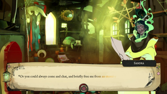
<3
189 notes
·
View notes
Note
i wanna get better at art but dont know how to start ^^' whats a good way to get into studying anatomy and improving as an artist? tysm 💗 love your art soso much
more art converts 😼 yay!!
i think these asks were sent by different people but they're pretty related + a lot of my advice is the same! so i'll answer these together under the cut (it's so long oh gosh)
ok first of all i'm very flattered that people are asking me for art advice but i'm really not the most equipped person to ask TTOTT I've never been deliberately studious with my art so I feel bad offering advice when I've mostly gotten by with just drawing fanart and ocs a lot... my rate of improvement has therefore been slow, but I've still had an enjoyable learning experience so perhaps from that angle my input may help! i'll mainly refer you to external resources that have helped me
For anatomy + drawing humans:
1) I know I'm not diligent enough to sit down and study muscles, so instead I make it more enjoyable by drawing my favorite characters in a pose that targets the muscles I want to practice! (i default to drawing ppl naked because of this lol) This isn't the most efficient, but it serves as good motivation to get practice in. (honestly a lot of my general art advice has the undercurrent of becoming so obsessed with characters to drive your motivation to draw even when artblocked/ struggling with doubts!)
2) I want to refer you to Sinix's Anatomy playlist! Although Sinix focuses more on digital painting, he gives simplified anatomy breakdowns that include how muscles change shape under different movements/poses, which is crucial for natural human posing. the static anatomy diagrams from Google don't really help for that
3) What's just as important as anatomy is gestures! (especially important if you're used to drawing non-human objects I think!) Making figures look like they have flow to them will sell the "naturalness"(?) to your anatomy. If you have in person life drawing sessions accessible near you I'd recommend trying those out, or if you prefer trying it digitally there's this website!
This helps you not only get a sense of human proportions, but also natural posing! I'd limit the time taken to draw the poses from like 10 seconds to 1 minute(?) for quick gestures, and maybe 1 minute to 5mins(for now!! typically they go much longer) to study human proportions. I'd say don't spend a lot of time on them, repetition is more important!
4) I've also picked up on useful anatomy tidbits from artists online! Looking at how practiced/ professional artists stylize a body helps me focus on what the essential details are to convey a particular form (looking up "human muscles" and being hit with anatomy diagrams full of all the smallest details can be overwhelming! what do you even focus on?! so these educated simplifications really help me) Like Emilio Dekure's work! Look how simplified these figures are, and yet contain all the essential information to convey the sense of accurate form (even though it's highly exaggerated!)
(shamefully admits I've never studied from actual anatomy books so I can't recommend anything in that sense TTOTT)
For general improvement:
1) I highly recommend Sinix's Design Theory playlist and Paintover Pals! (+ his channel in general) You don't have to put them immediately into practice, but I think these are good fundamental lessons to just listen to and have them in the back of your mind to revisit another day. Plus these videos are just fun and very approachable! Design theory fundamentals are essential to creating appeal and directing a viewer's attention, and critiquing others' work/ seeing his suggestions are a good way to practice noticing areas of improvement+ solutions yourself!
2) If you prefer a more formal teaching resource, the Drawabox YouTube course covers all the basic fundamentals of drawing in short lessons. But honestly if I were starting out, this would be a little intimidating for me (and even now it still is! I haven't done all of them) But even if you don't watch them, the titles should give you an idea of the basic concepts that are valuable to pick up. I think it would be nice to keep in mind and revisit once in a while as you learn!
(One lesson I do encourage you to watch is the line control one! A confident continuous line conveys motion and flow much better compared to discontinuous frayed lines which I think is good to practice early by drawing from the wrist and shoulder)
3) As a universal piece of advice: Please please please use references! Use a reference for literally everything, observing is how we learn! You'll find that a lot of things you thought you knew what they looked like are inaccurate by memory alone. Also, trace! This is solely for your practice, tracing then freehanding has helped me grasp proportions when I was struggling! (of course don't post these online if you traced from art)
I've found that being able to compile references into easy to access boards has been very helpful in encouraging me to use references more. For PC, I think they use PureRef (free/pay what you want), and for iPad I use VizRef. VizRef is a one time purchase (which was definitely worth the $3.99 USD price imo)
4) On that note, try building up the habit to observe from media + real life and make purposeful comments about what you see! Like hey, when I bend my knee, the muscles/fat in my thighs and calves bulge outwards, I should draw that next time. Purposeful observation carries over to your overall visual library, and it's a little thing that adds up over time
5) For motivation, get into media you really enjoy, or make your own characters! The way I started art more seriously was by drawing fanart + OCs from anime that I liked ^^ For OCs it really encourages you to draw more because you're the primary creator of their art! Also you gotta see a lot of good art to make good art! Watching visually appealing media (like animation with appealing stylization/simplification) can passively help you learn just by observation.
ok wow I could go on but this is already a lot of information TTOTT my main aim for this reply is basically: don't let anything discourage you from learning to draw!! drawing is so fun and brings me a lot of joy ^^ practicing often will of course help you improve, and the way to incentivize that is by having fun with it! i hope this could help!💞
#my asks#art resources#trying to be concise n failing#i'm mainly worried that like. my art tips make me sound more skilled than my art actually is
55 notes
·
View notes
Note
so what do you think of the newly minted game and its community who are speedrunning the development of ICBMs to save... Hyrule? I dunno at this point.
Ohh, that's honestly a tough question! I've been a Zelda fan for about a decade now, so I've seen the series go through a lot of changes. In my opinion, ToTK is a happy marriage between Skyward Sword (which was my favorite Zelda game until ToTK) and Breath of the Wild (which I... really did not enjoy because it was such a staunch departure from the Zelda formula).
But Tears of the Kingdom addressed every single qualm I had with BoTW, really! The first major improvement I noticed was the music, which is also very important to me. There are some tracks from ToTK that I CANNOT stop listening to:
youtube
youtube
youtube
And the story was much improved, both in how impactful it was and how it was delivered.
I still wish they made Link a little bit more expressive and gave him more character, though. Wind Waker and Skyward Sword have so much charm due largely in part to how we see Link react to things, and it was really jarring to see him just kind of... neutral about everything, constantly. It does give the player a lot of room to project, which I obviously do via the comics I create, but I think it's something I'd like to see them change moving forward.
I'm mid about the building mechanics. They're cool, but I think the game would've been just as much fun without them (for me personally). Fuse, on the other hand? Love it! Definitely made combat more rewarding and fun.
I'm worried about where the series will go from here, though. I think a lot of fans who didn't enjoy Zelda before (or didn't pay the franchise much mind) got into the series because of Tears of the Kingdom and Breath of the Wild. How are those fans going to react when we move away from this reincarnation of Link? Will Nintendo decide to play it safe and stay in the same timeline? Are we going to keep moving the series into the "future" with this technology?
All that aside, the game's a 10/10 and I ugly cried at the end!
165 notes
·
View notes
Note
how was the process of getting a dumbphone!
oh my god this is something i'm so excited to talk about, sorry it took me so many months to respond!
getting a dumbphone improved my quality of life so so much. i knew my screentime was high, but didn't realise it was a genuine psychological addiction until i quit. the first few days were extremely rough. time seemed to pass about ten times slower, and i was forced to fill the hours with various hobbies and activities. i know we all love to tell people to touch grass, but i really did have to connect with nature and it did wonders for my mental health.
i think for the first three days i was constantly restless and horribly irritable, looked around for my phone every few minutes, felt intense boredom and even cried a few times lol. your addiction may not be as extreme as mine was and this varies from person to person. however, after about a week i realised i remembered everything i'd done each day, because it was filled with intentional activities and little moments of peace rather than a blur of scrolling. i also wasn't on adhd meds yet, which is something i'll talk about in another post.
not having everything at your fingertips is uncomfortable, but (and it's a cliche) you really start to appreciate the world around you more. i looked forward to spending time with my family, because it filled time and i wasn't half-involved in my phone the entire time. i use an mp3 player to listen to music, and uploading music to it is a meaningful and interesting activity, rather than just shuffling a playlist. i listen to whole albums instead of being flooded with dopamine from spotify firing recommended songs at me. i appreciate music more, i make CDs for friends, i have to be intentional in discovering new artists and music. if i'm having an interesting conversation online, i look forward to going home and logging onto my laptop to continue it. i don't spend my commute, time in class, or time with friends texting somebody else. everything feels more intentional, spaced out, and interesting, even the things i do online.
i also found i stopped performing in every activity i did. i stopped thinking about whether i could post it to instagram or instantly send a picture in a discord server. i started picking up new hobbies for myself, not for an online audience, and living in the moment more. this is really important in the modern age, although again uncomfortable.
the best part was how my connections with others increased through having a dumbphone. i started calling friends rather than messaging on five platforms at once, and they started reciprocating. my message threads are continuous, coherent conversations, rather than sending memes. people realised they have to intentionally reach out to me, and i lost relationships with people who weren't interested in that, but strengthened connections with people who did put in the effort (many of whom i barely talked to in the past). i give people my phone number, not my social media handle, and they actually start conversations with me rather than hitting follow. i get to hear my friends' voices when they have drama to share and realise it takes me forever to type on my flip phone keyboard. again, everything is intentional, takes time, and richer than when i had a smartphone.
i genuinely would recommend it to absolutely everyone (i've kind of become like a crossfit guy in telling people to get a dumbphone lol). i won't pretend it's easy, and most people make excuses - for the first few months of having a dumbphone, i was bedbound or in hospital, and truly relied on online connections to pass time and communicate. it still hugely improved my life. however, no matter your situation there are always, always better options than scrolling an app, and you deserve to pass your time in a memorable way. i think most people don't realise they're addicted/reliant on smartphones, and the idea of quitting is horribly uncomfortable, but at least for me, the benefits were worth it.
i'm happy to answer any questions, i literally could talk about this topic for hours (even if it's stuff like "how would i use x app" "how would i replace x smartphone function").
ditch your smartphone babe, u deserve better <33
55 notes
·
View notes
Note
Hi!! Your art is so fucking cool! Can I ask what the process looks like for form line? Ex. What do your sketches look like when they are really rough? How do you go from idea -> final product. 💕
Hadih, thanks so much for your question!
Honestly, it's sort of hard to explain? I do have some sketches to sort of give an idea though.
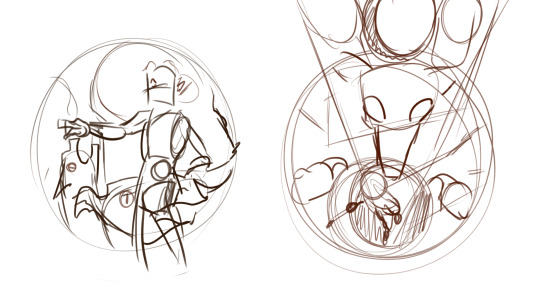
This sketch I posted a couple days ago is a pretty good example of what my initial concept sketches sometimes look like.. As you can see, they're pretty chaotic and very rough, and usually these sketches are more about getting the idea down then actually making the formline itself. There aren't formline shapes just yet, although I do sometimes sketch out elements or shapes like eyes or bodies or paws/hands that will usually have an ovoid in it, because those elements tend to be a focus or centerpiece. The sketch is obviously not final, and things can change along the way to account for space and balance as well as what I'm trying to convey. (These sketches aren't entirely accurate of course because they're for pieces that are meant to be fusions of character illustrations and formline art, but they're the best thing I can find on my pc at the moment)
The rough sketch helps me figure out the flow of the piece, and once I'm satisfied with it I try and get to putting down the shapes and silhouette, and it's here where I try to find the balance with my rough sketch and how the shapes can fit and behave in the piece to the best of their limits while also still conveying the message I want to send. The most common shape I start with is the focus shapes, which are usually ovoids.
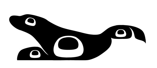
This rough of my harbor seal formline which I sent to my aunt for review sort of gives a better Idea of what I mean when I say I try and focus on where the centerpoints will be. Ovoids are usually a focus, so you can see them pop up a lot; in the body, the head, the eyes, the tail, etc. Ovoids are so important and probably the most common shape in formline art, and one of the most common feedback I get from my aunt is to adjust how the ovoid looks in any one of my pieces; she often compared them to a loaf of bread! You don't want your ovoids to look like a loaf of bread! (Her words, not mine). I feel like I've gotten better at drawing ovoids though, because she gives it as feedback less and less nowadays. Ovoids usually also have to have a bit of weight/perspective to them; it's hard to describe but essentially the top of the ovoid should usually be bigger/thicker/have more weight then the bottom.
From ovoids, the next shapes are usually circles, u-shapes and crescents, then usually y-shapes/trigons. It can be difficult, because the key is to make sure the shapes flow together and feel cohesive, as well as to make sure the negative/positive space balance feels right. Also a fun tidbit, trigons are most typically used to essentially fill space; it's always important to make sure that they are binding bigger shapes like u-shapes and ovoids and not stealing all the space and attention.
The lines in this stage tend to be very rough and messy, and I always try to go over the next rough draft with a smoother and cleaner pen.
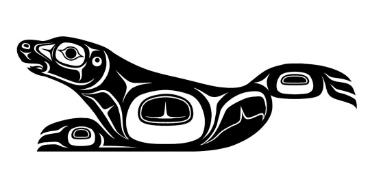
Once the initial shapes are done, I'll usually send the piece to my aunt (sometimes I send them earlier on, when I'm in the middle of working out the shapes) for feedback! I am still a student in formline work after all; basically all of my teachings come from my aunt, who has a lot more years of work in formline art then me. She'll give me feedback and tips of what she thinks I should fix or experiment with. I adjust and fix and sometimes even completely delete and redo parts of the piece with her guidance. The list of things she tells me to change decreases with each piece, so I like to take that as a sign that I'm improving!
Once the black and white version of the design is done, I move onto coloring. Usually I already have a color scheme in mind when I go into a piece, so I'll mess around and put down colors and see how well they contrast before I color it. Typically, a piece will have about 3 colors; one for the background, one primary color, and one secondary color. I use a clipping layer to color the entire formline piece with the primary color, and then go in with the pen tool and bucket tool to use the secondary color. Adding in the secondary color is tricky but important because it once again falls into balancing positive and negative space/colors and the transitions between the two.
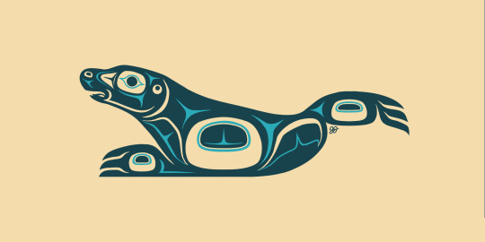
Once coloring is done, the project is basically finished! Unless there are some other plans I have for it, ie using it for an overlay in a bigger piece, colouring is usually the final stage.
And that's about it! I hope this helps you understand a bit; this isn't a perfect explanation as this is just from my own artistic POV and other nations and artists have their own process, but I hope it helps nonetheless!!
Edit: I forgot I posted other WIP formlines here before 😭 here and here!! You can sort of see me figure out the flow and balance of the designs in between the WIP and the finished piece!
#indigenous art#formline art#indigenous culture#the process of balancing shapes is a lot harder and more complex then I can describe in a tumblr post#it really is a balancing act that can take a long time to learn and i think i still have a way's to go to perfect my abilities#In that way it's sort of hard to describe and put down how exactly I do formline art I think? Bc of how close and thoughtful the process is#there's something very personal and honestly almost spiritual about finding that balance and figuring out how to convey the message you're-#trying to convey even if the piece doesn't seem that way (the amogus one lol). that's the most clear way I can describe it.#i am rambling a lot oops.
78 notes
·
View notes
Note
Question, how do you draw body hair? All my attempts look dumb- and your like, the only person im brave enough to ask-
First things first! A piece of advice because it's something I struggled to unlearn and still try and cut out of the way I talk. It's helpful to not self deprecate out loud as it is both counterproductive to your own learning and sense of self and it can be a pretty awkward way to interact with others, especially folks you're still very new to. You're still learning. And it's okay that your art isn't where you imagine yet. That's the great thing about art. That you get to learn both what you want for your own work and how to achieve that! Points of frustration tend to emerge when you actually know More about art than your ability to draw can actually replicate, but the good news about those frustration periods is they're usually right before big improvements especially if you can channel the frustration into motivation for practicing and learning! Basically! Don't beat yourself up it's actually good to be challenged by your own craft. You'll get there.
Anyway! Body hair time! The best thing you can do for learning to draw...anything from life really is reference and practice. But! Here are some tips from how I draw it in my work to help you get started.
There's plenty of different patterns body hair grows in. Different people will have more body hair in some areas than others, more or less body hair overall, and different textures to their body hair. I know most of the men in my family tend to have their chest hair especially grow straight and lie pretty flat but I've known plenty of folks who's chest hair grows in pretty curly too. So references will be your best buddy in capturing a wider range of different types of body hair!
But here's a couple basic things I keep in mind for placement generally.
Most folks chest hair grows from the center outwards pretty much. <- | -> like that. Armpit hair especially tends to get pretty thick. And hair on the forearms and calves is extremely common for most people in general.


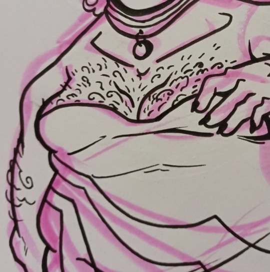
As for how I stylize it, I actually do relatively few strokes for it. Enough to imply hairy though it varies on how hairy I want the figure to look. And I tend not to overlap my strokes because it tends to read a bit more clear in a cartoony style if I don't. For pit hair I tend to darken the whole hairy area since it's thicker and add texture to the edge of that shape to show it's a bunch of hair. Straight strokes for straighter body hair. Wavier or curly strokes for more wavy or curly body hair.
I can't stress enough that references are important and absolute look into if other artists have shared their body hair drawing tutorials! Especially artists with differing backgrounds than me! The wider range of reference and advice is helpful!
Hope this helps!
42 notes
·
View notes
Note
This is going to seem like a dumb question lol but you are just such an incredible artist. The fact that you do this comic on your own blows my mind. But I was wondering, do you ever still struggle with your art? In terms of self confidence or skill? Or do you ever still need reference for things? You just seem so experienced and established lol
Thank you so much! The good news is I don't do it entirely on my own all the time, the pages I've been working on lately were thumbnailed for me by @elanorpam , who also made some of the frequently used 3d assets (aether vials, a couple of locis, etc.!)
Ofc I'd still kill for full assistant style work for some things (flats, lettering, applying the final touch details from my asset sheets lol), but for now I do those.
anywho, I think every single person will struggle from time to time, even someone who looks like an art god. If they say they never struggle, they're lying lol. There's always going to be bad art days, things you don't know how to draw yet, or a difficult angle you're having trouble composing. The good news is that when you accept that as the truth, you stop caring beyond a healthy stride for improvement, and you carry on knowing this is simply a fact of art.
I'm confident in the sense of knowing I draw and paint because I both have to and because I want to. As long as I make something I either had fun doing, was proud of, or taught me something, then I'm pleased and the next comic page or illustration is taken on with a goal of repeating that or bettering it.
With comics especially there's always going to be some mistakes and wonk since there's not time to obsess over correcting it. Due to this I only ever bother correcting major mistakes or mistakes that don't convey the point (expression is way off, body language way off, important detail missing. That kind of things.)
Accepting those things and having fun with the act of doing it and the goal of improving leaves me confident in my work. It isn't perfect, but things don't have to be perfect to feel confidence in yourself. Flaws and strengths make us who we are, and it definitely applies to art.
I've been posting my artwork on the internet since the late 90s, though, so I've had a while to build up a healthy mindset around it. That's not a requirement though, so just go have fun with your art! and thank you again.
21 notes
·
View notes
Text
Def a controversial take on Voltron but I don't like Alluras character in later seasons.
Not because of ship wars and everything else, Lance and Allura were ADORABLE together-
What I don't like about her character was how it felt like she was pretty much reduces to Lance's love interest and how she seemed to get younger over the span of the last few seasons.
Allura is such a strong, powerful female protagonist and I wish they elaborated more on that rather than just making her do reckless things to further the plot.
On the flip side I understand why she made the decisions she did such as letting the entity in and traveling into Honervas mind. They were all desperate and trying to win but weren't making any progress and it was time sensitive.
I really love Allura but more of the Fandom version of her, strong independent woman. It felt like they were trying to make her rely on a male character, but in the same thought it was nice seeing those relationships blooming between them.
The only problems I really have with Allura and Lance getting together is how little we actually see of their relationship and how quickly they got close after Lotor.
I do genuinely think they're so sweet together and it was such an important thing for Allura to give Lance Altean marks. I want to emphasize the fact that me being a klance shipper has NOTHING to do with the fact of not liking Alluras character- it was just the way the creaters decided to push her character in the end.
She showed so much improvement throughout the show and grew just like the rest of the characters and I really wish they did more with her than just a love interest and sacrifice.
Also it didn't really make sense to me on why she had to die if someone could help explain that please? I've been hyperfixated on this show for YEARS but I still can't really understand why she had to.
I would've loved to see more of her after the war and I think Allura out of ANYONE deserved to live.
Thanks for coming to my TED talk 👍
22 notes
·
View notes
Last Seen Blogs