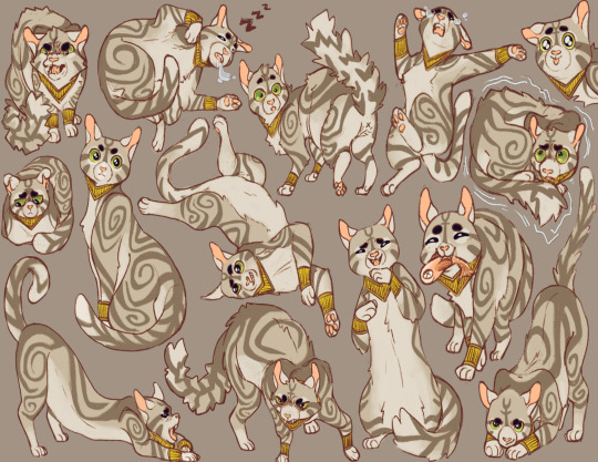
#so many projects so many comics so much character design so many illustrations
Text

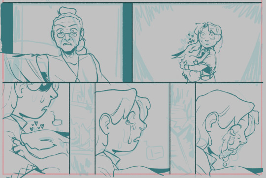
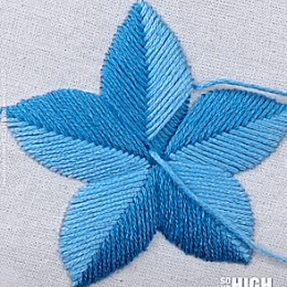
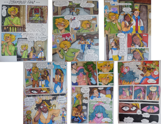
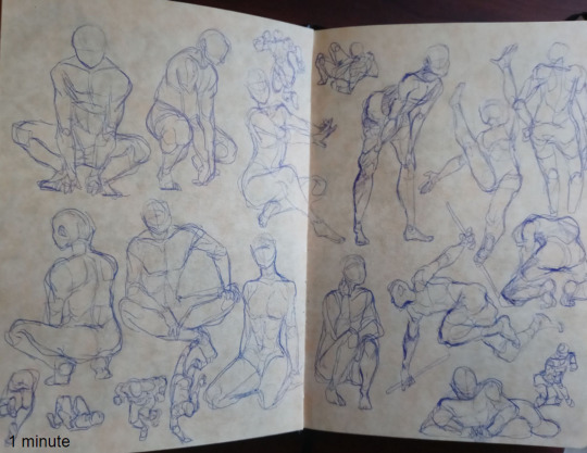
Do people like wips? idk, i like my wips. have some wips <3
they're all for class but it's an excuse to work on my oc stories <333
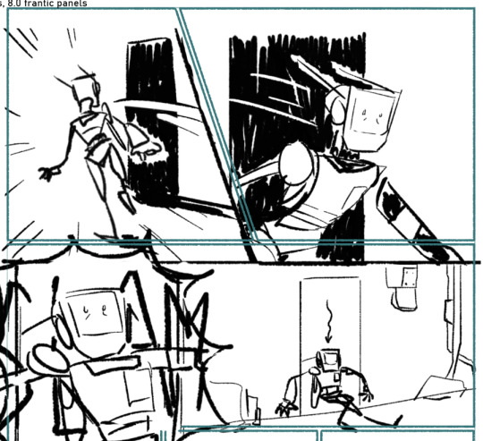
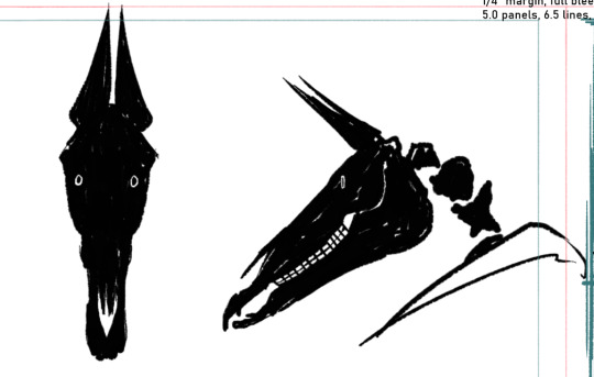
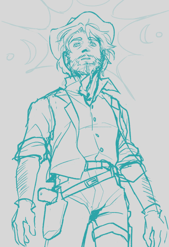
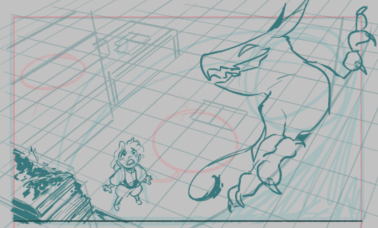
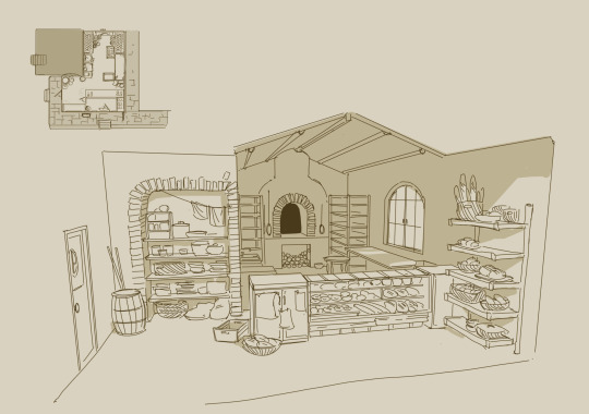
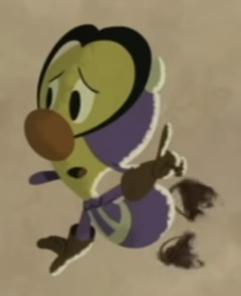
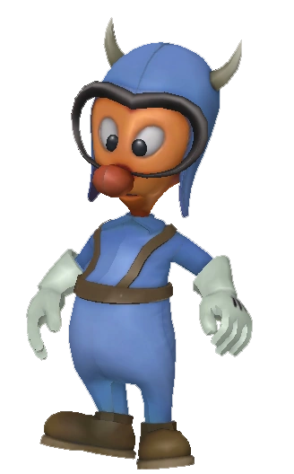
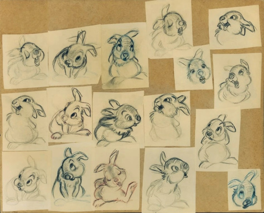
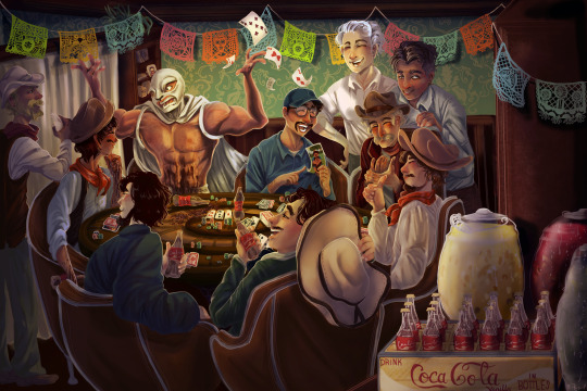
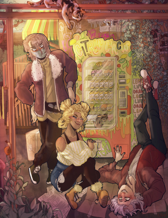
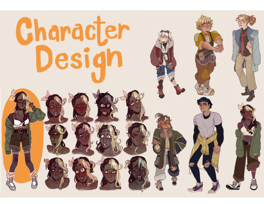
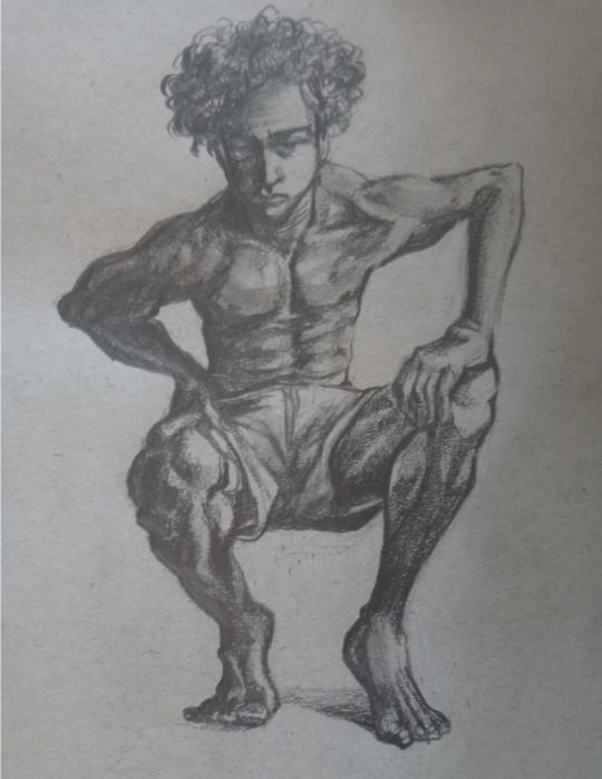
#wip#my art#wips#so many projects so many comics so much character design so many illustrations#all of these are for class#and im going to lose my mind over it all#the first set of 3 is for a 16 page comic#mr cowboy man is just going to be illustration#im gonna add vultures and blinding light and it'll be very fun i hope#last two are for a 2 page comic#and then i also have a 3 page comic im working on but uhhh i don't have any sketches so you can't see any sketches sorry#Jack Argyle Cassidy#wizard and apprentice#Barnes#Andromedus#robots story#The Robot#robot story#The Calamity#skull#horse skull#creepy#< cw tags#the Calamity is one creepy guy#and just to think!! there's technically more of them out there!!#Jack Cassidy#OCs#my ocs
86 notes
·
View notes
Text
why Aurora's art is genius
It's break for me, and I've been meaning to sit down and read the Aurora webcomic (https://comicaurora.com/, @comicaurora on Tumblr) for quite a bit. So I did that over the last few days.
And… y'know. I can't actually say "I should've read this earlier," because otherwise I would've been up at 2:30-3am when I had responsibilities in the morning and I couldn't have properly enjoyed it, but. Holy shit guys THIS COMIC.
I intended to just do a generalized "hello this is all the things I love about this story," and I wrote a paragraph or two about art style. …and then another. And another. And I realized I needed to actually reference things so I would stop being too vague. I was reading the comic on my tablet or phone, because I wanted to stay curled up in my chair, but I type at a big monitor and so I saw more details… aaaaaand it turned into its own giant-ass post.
SO. Enjoy a few thousand words of me nerding out about this insanely cool art style and how fucking gorgeous this comic is? (There are screenshots, I promise it isn't just a wall of text.) In my defense, I just spent two semesters in graphic design classes focusing on the Adobe Suite, so… I get to be a nerd about pretty things…???
All positive feedback btw! No downers here. <3
---
I cannot emphasize enough how much I love the beautiful, simple stylistic method of drawing characters and figures. It is absolutely stunning and effortless and utterly graceful—it is so hard to capture the sheer beauty and fluidity of the human form in such a fashion. Even a simple outline of a character feels dynamic! It's gorgeous!
Though I do have a love-hate relationship with this, because my artistic side looks at that lovely simplicity, goes "I CAN DO THAT!" and then I sit down and go to the paper and realize that no, in fact, I cannot do that yet, because that simplicity is born of a hell of a lot of practice and understanding of bodies and actually is really hard to do. It's a very developed style that only looks simple because the artist knows what they're doing. The human body is hard to pull off, and this comic does so beautifully and makes it look effortless.
Also: line weight line weight line weight. It's especially important in simplified shapes and figures like this, and hoo boy is it used excellently. It's especially apparent the newer the pages get—I love watching that improvement over time—but with simpler figures and lines, you get nice light lines to emphasize both smaller details, like in the draping of clothing and the curls of hair—which, hello, yes—and thicker lines to emphasize bigger and more important details and silhouettes. It's the sort of thing that's essential to most illustrations, but I wanted to make a note of it because it's so vital to this art style.
THE USE OF LAYER BLENDING MODES OH MY GODS. (...uhhh, apologies to the people who don't know what that means, it's a digital art program thing? This article explains it for beginners.)
Bear with me, I just finished my second Photoshop course, I spent months and months working on projects with this shit so I see the genius use of Screen and/or its siblings (of which there are many—if I say "Screen" here, assume I mean the entire umbrella of Screen blending modes and possibly Overlay) and go nuts, but seriously it's so clever and also fucking gorgeous:
Firstly: the use of screened-on sound effect words over an action? A "CRACK" written over a branch and then put on Screen in glowy green so that it's subtle enough that it doesn't disrupt the visual flow, but still sticks out enough to make itself heard? Little "scritches" that are transparent where they're laid on without outlines to emphasize the sound without disrupting the underlying image? FUCK YES. I haven't seen this done literally anywhere else—granted, I haven't read a massive amount of comics, but I've read enough—and it is so clever and I adore it. Examples:


Secondly: The beautiful lighting effects. The curling leaves, all the magic, the various glowing eyes, the fog, the way it's all so vividly colored but doesn't burn your eyeballs out—a balance that's way harder to achieve than you'd think—and the soft glows around them, eeeee it's so pretty so pretty SO PRETTY. Not sure if some of these are Outer/Inner Glow/Shadow layer effects or if it's entirely hand-drawn, but major kudos either way; I can see the beautiful use of blending modes and I SALUTE YOUR GENIUS.
I keep looking at some of this stuff and go "is that a layer effect or is it done by hand?" Because you can make some similar things with the Satin layer effect in Photoshop (I don't know if other programs have this? I'm gonna have to find out since I won't have access to PS for much longer ;-;) that resembles some of the swirly inner bits on some of the lit effects, but I'm not sure if it is that or not. Or you could mask over textures? There's... many ways to do it.
If done by hand: oh my gods the patience, how. If done with layer effects: really clever work that knows how to stop said effects from looking wonky, because ugh those things get temperamental. If done with a layer of texture that's been masked over: very, very good masking work. No matter the method, pretty shimmers and swirly bits inside the bigger pretty swirls!
Next: The way color contrast is used! I will never be over the glowy green-on-black Primordial Life vibes when Alinua gets dropped into that… unconscious space?? with Life, for example, and the sharp contrast of vines and crack and branches and leaves against pitch black is just visually stunning. The way the roots sink into the ground and the three-dimensional sensation of it is particularly badass here:

Friggin. How does this imply depth like that. HOW. IT'S SO FREAKING COOL.
A huge point here is also color language and use! Everybody has their own particular shade, generally matching their eyes, magic, and personality, and I adore how this is used to make it clear who's talking or who's doing an action. That was especially apparent to me with Dainix and Falst in the caves—their colors are both fairly warm, but quite distinct, and I love how this clarifies who's doing what in panels with a lot of action from both of them. There is a particular bit that stuck out to me, so I dug up the panels (see this page and the following one https://comicaurora.com/aurora/1-20-30/):

(Gods it looks even prettier now that I put it against a plain background. Also, appreciation to Falst for managing a bridal-carry midair, damn.)
The way that their colors MERGE here! And the immense attention to detail in doing so—Dainix is higher up than Falst is in the first panel, so Dainix's orange fades into Falst's orange at the base. The next panel has gold up top and orange on bottom; we can't really tell in that panel where each of them are, but that's carried over to the next panel—

—where we now see that Falst's position is raised above Dainix's due to the way he's carrying him. (Points for continuity!) And, of course, we see the little "huffs" flowing from orange to yellow over their heads (where Dainix's head is higher than Falst's) to merge the sound of their breathing, which is absurdly clever because it emphasizes to the viewer how we hear two sets of huffing overlaying each other, not one. Absolutely brilliant.
(A few other notes of appreciation to that panel: beautiful glows around them, the sparks, the jagged silhouette of the spider legs, the lovely colors that have no right to make the area around a spider corpse that pretty, the excellent texturing on the cave walls plus perspective, the way Falst's movements imply Dainix's hefty weight, the natural posing of the characters, their on-point expressions that convey exactly how fuckin terrifying everything is right now, the slight glows to their eyes, and also they're just handsome boys <3)
Next up: Rain!!!! So well done! It's subtle enough that it never ever disrupts the impact of the focal point, but evident enough you can tell! And more importantly: THE MIST OFF THE CHARACTERS. Rain does this irl, it has that little vapor that comes off you and makes that little misty effect that plays with lighting, it's so cool-looking and here it's used to such pretty effect!
One of the panel captions says something about it blurring out all the injuries on the characters but like THAT AIN'T TOO BIG OF A PROBLEM when it gets across the environmental vibes, and also that'd be how it would look in real life too so like… outside viewer's angle is the same as the characters', mostly? my point is: that's the environment!!! that's the vibes, that's the feel! It gets it across and it does so in the most pretty way possible!
And another thing re: rain, the use of it to establish perspective, particularly in panels like this—

—where we can tell we're looking down at Tynan due to the perspective on the rain and where it's pointing. Excellent. (Also, kudos for looking down and emphasizing how Tynan's losing his advantage—lovely use of visual storytelling.)
Additionally, the misting here:

We see it most heavily in the leftmost panel, where it's quite foggy as you would expect in a rainstorm, especially in an environment with a lot of heat, but it's also lightly powdered on in the following two panels and tends to follow light sources, which makes complete sense given how light bounces off particles in the air.
A major point of strength in these too is a thorough understanding of lighting, like rim lighting, the various hues and shades, and an intricate understanding of how light bounces off surfaces even when they're in shadow (we'll see a faint glow in spots where characters are half in shadow, but that's how it would work in real life, because of how light bounces around).
Bringing some of these points together: the fluidity of the lines in magic, and the way simple glowing lines are used to emphasize motion and the magic itself, is deeply clever. I'm basically pulling at random from panels and there's definitely even better examples, but here's one (see this page https://comicaurora.com/aurora/1-16-33/):

First panel, listed in numbers because these build on each other:
The tension of the lines in Tess's magic here. This works on a couple levels: first, the way she's holding her fists, as if she's pulling a rope taut.
The way there's one primary line, emphasizing the rope feeling, accompanied by smaller ones.
The additional lines starbursting around her hands, to indicate the energy crackling in her hands and how she's doing a good bit more than just holding it. (That combined with the fists suggests some tension to the magic, too.) Also the variations in brightness, a feature you'll find in actual lightning. :D Additional kudos for how the lightning sparks and breaks off the metal of the sword.
A handful of miscellaneous notes on the second panel:
The reflection of the flames in Erin's typically dark blue eyes (which bears a remarkable resemblance to Dainix, incidentally—almost a thematic sort of parallel given Erin's using the same magic Dainix specializes in?)
The flowing of fabric in the wind and associated variation in the lineart
The way Erin's tattoos interact with the fire he's pulling to his hand
The way the rain overlays some of the fainter areas of fire (attention! to! detail! hell yeah!)
I could go on. I won't because this is a lot of writing already.
Third panel gets paragraphs, not bullets:
Erin's giant-ass "FWOOM" of fire there, and the way the outline of the word is puffy-edged and gradated to feel almost three-dimensional, plus once again using Screen or a variation on it so that the stars show up in the background. All this against that stunning plume of fire, which ripples and sparks so gorgeously, and the ending "om" of the onomatopoeia is emphasized incredibly brightly against that, adding to the punch of it and making the plume feel even brighter.
Also, once again, rain helping establish perspective, especially in how it's very angular in the left side of the panel and then slowly becomes more like a point to the right to indicate it's falling directly down on the viewer. Add in the bright, beautiful glow effects, fainter but no less important black lines beneath them to emphasize the sky and smoke and the like, and the stunningly beautiful lighting and gradated glows surrounding Erin plus the lightning jagging up at him from below, and you get one hell of an impactful panel right there. (And there is definitely more in there I could break down, this is just a lot already.)
And in general: The colors in this? Incredible. The blues and purples and oranges and golds compliment so well, and it's all so rich.
Like, seriously, just throughout the whole comic, the use of gradients, blending modes, color balance and hues, all the things, all the things, it makes for the most beautiful effects and glows and such a rich environment. There's a very distinct style to this comic in its simplified backgrounds (which I recognize are done partly because it's way easier and also backgrounds are so time-consuming dear gods but lemme say this) and vivid, smoothly drawn characters; the simplicity lets them come to the front and gives room for those beautiful, richly saturated focal points, letting the stylized designs of the magic and characters shine. The use of distinct silhouettes is insanely good. Honestly, complex backgrounds might run the risk of making everything too visually busy in this case. It's just, augh, so GORGEOUS.
Another bit, take a look at this page (https://comicaurora.com/aurora/1-15-28/):

It's not quite as evident here as it is in the next page, but this one does some other fun things so I'm grabbing it. Points:
Once again, using different colors to represent different character actions. The "WHAM" of Kendal hitting the ground is caused by Dainix's force, so it's orange (and kudos for doubling the word over to add a shake effect). But we see blue layered underneath, which could be an environmental choice, but might also be because it's Kendal, whose color is blue.
And speaking off, take a look at the right-most panel on top, where Kendal grabs the spear: his motion is, again, illustrated in bright blue, versus the atmospheric screened-on orange lines that point toward him around the whole panel (I'm sure these have a name, I think they might be more of a manga thing though and the only experience I have in manga is reading a bit of Fullmetal Alchemist). Those lines emphasize the weight of the spear being shoved at him, and their color tells us Dainix is responsible for it.
One of my all-time favorite effects in this comic is the way cracks manifest across Dainix's body to represent when he starts to lose control; it is utterly gorgeous and wonderfully thematic. These are more evident in the page before and after this one, but you get a decent idea here. I love the way they glow softly, the way the fire juuuust flickers through at the start and then becomes more evident over time, and the cracks feel so realistic, like his skin is made of pottery. Additional points for how fire begins to creep into his hair.
A small detail that's generally consistent across the comic, but which I want to make note of here because you can see it pretty well: Kendal's eyes glow about the same as the jewel in his sword, mirroring his connection to said sword and calling back to how the jewel became Vash's eye temporarily and thus was once Kendal's eye. You can always see this connection (though there might be some spots where this also changes in a symbolic manner; I went through it quickly on the first time around, so I'll pay more attention when I inevitably reread this), where Kendal's always got that little shine of blue in his eyes the same as the jewel. It's a beautiful visual parallel that encourages the reader to subconsciously link them together, especially since the lines used to illustrate character movements typically mirror their eye color. It's an extension of Kendal.
Did I mention how ABSOLUTELY BEAUTIFUL the colors in this are?
Also, the mythological/legend-type scenes are illustrated in familiar style often used for that type of story, a simple and heavily symbolic two-dimensional cave-painting-like look. They are absolutely beautiful on many levels, employing simple, lovely gradients, slightly rougher and thicker lineart that is nonetheless smoothly beautiful, and working with clear silhouettes (a major strength of this art style, but also a strength in the comic overall). But in particular, I wanted to call attention to a particular thing (see this page https://comicaurora.com/aurora/1-12-4/):

The flowing symbolic lineart surrounding each character. This is actually quite consistent across characters—see also Life's typical lines and how they curl:

What's particularly interesting here is how these symbols are often similar, but not the same. Vash's lines are always smooth, clean curls, often playing off each other and echoing one another like ripples in a pond. You'd think they'd look too similar to Life's—but they don't. Life's curl like vines, and they remain connected; where one curve might echo another but exist entirely detached from each other in Vash's, Life's lines still remain wound together, because vines are continuous and don't float around. :P
Tahraim's are less continuous, often breaking up with significantly smaller bits and pieces floating around like—of course—sparks, and come to sharper points. These are also constants: we see the vines repeated over and over in Alinua's dreams of Life, and the echoing ripples of Vash are consistent wherever we encounter him. Kendal's dream of the ghost citizens of the city of Vash in the last few chapters is filled with these rippling, echoing patterns, to beautiful effect (https://comicaurora.com/aurora/1-20-14/):

They ripple and spiral, often in long, sinuous curves, with smooth elegance. It reminds me a great deal of images of space and sine waves and the like. This establishes a definite feel to these different characters and their magic. And the thing is, that's not something that had to be done—the colors are good at emphasizing who's who. But it was done, and it adds a whole other dimension to the story. Whenever you're in a deity's domain, you know whose it is no matter the color.
Regarding that shape language, I wanted to make another note, too—Vash is sometimes described as chaotic and doing what he likes, which is interesting to me, because smooth, elegant curves and the color blue aren't generally associated with chaos. So while Vash might behave like that on the surface, I'm guessing he's got a lot more going on underneath; he's probably much more intentional in his actions than you'd think at a glance, and he is certainly quite caring with his city. The other thing is that this suits Kendal perfectly. He's a paragon character; he is kind, virtuous, and self-sacrificing, and often we see him aiming to calm others and keep them safe. Blue is such a good color for him. There is… probably more to this, but I'm not deep enough in yet to say.
And here's the thing: I'm only scratching the surface. There is so much more here I'm not covering (color palettes! outfits! character design! environment! the deities! so much more!) and a lot more I can't cover, because I don't have the experience; this is me as a hobbyist artist who happened to take a couple design classes because I wanted to. The art style to this comic is so clever and creative and beautiful, though, I just had to go off about it. <3
...brownie points for getting all the way down here? Have a cookie.
#aurora comic#aurora webcomic#comicaurora#art analysis#...I hope those are the right tags???#new fandom new tagging practices to learn ig#much thanks for something to read while I try to rest my wrists. carpal tunnel BAD. (ignore that I wrote this I've got braces ok it's fine)#anyway! I HAVE. MANY MORE THOUGHTS. ON THE STORY ITSELF. THIS LOVELY STORY#also a collection of reactions to a chunk of the comic before I hit the point where I was too busy reading to write anything down#idk how to format those tho#...yeet them into one post...???#eh I usually don't go off this much these days but this seems like a smaller tight-knit fandom so... might as well help build it?#and I have a little more time thanks to break so#oh yes also shoutout to my insanely awesome professor for teaching me all the technical stuff from this he is LOVELY#made an incredibly complex program into something comprehensible <3#synapse talks
743 notes
·
View notes
Note
Congratulations on your author debut, I'm so excited for your book!! 😇💕
Would you consider talking about the whole process of becoming a book illustrator /children's book author?
Thank you so much, I really appreciate it!! And I'd be happy to share the process!
It all started for me with my 3dTotal artbook. 3dTotal is a small publisher in the UK, and they mainly focus on collections of artists' work. They use Kickstarter to fund each book, and my agent (the amazing Seth Fishman at Gernert) discovered me through the Kickstarter for my artbook Windows to Worlds!
He asked if I had any interest in working on graphic novels or picture books, and I had already been thinking about picture books! He found me my first picture book project with Penguin Workshop, Mother of Sharks, written by the awesome Melissa Cristina Márquez, which came out last year!
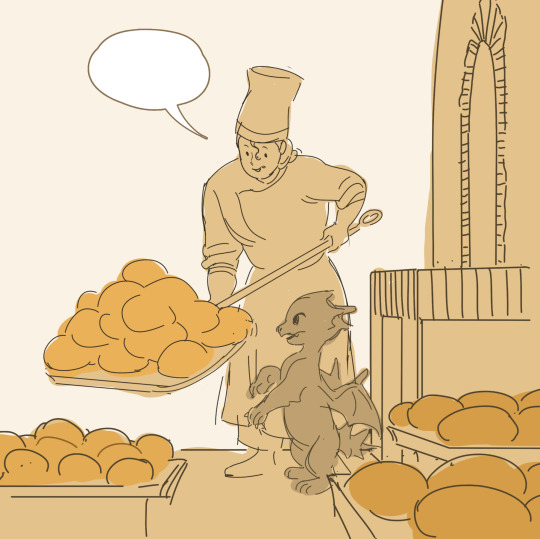
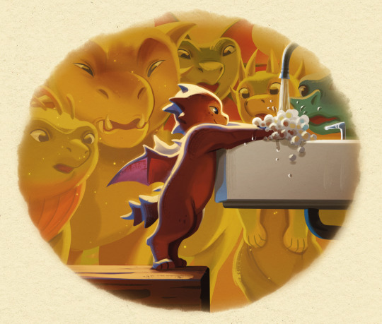
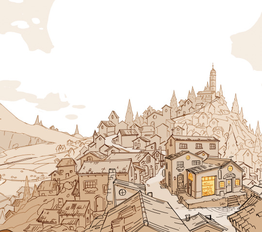
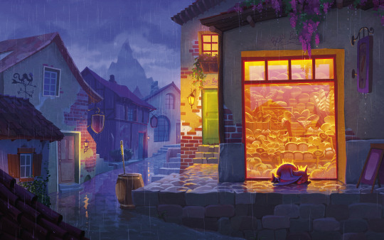
While I was working on Mother of Sharks, I was also talking with him about developing The Bakery Dragon, based of course on this painting, which was (and is) one of my proudest artistic moments.
For a little background on the painting, I painted it right after a really challenging couple of months medically - I was dealing with medical complications from my chronic illness for about 6 months, and I wasn't able to finish a single painting the whole time, I was just too exhausted from hospital visits and being in pain. That painting was the first piece I was able to actually complete (both emotionally and literally) in about half a year. So it always held a really special place in my heart, and I really wanted to keep living in that little world. I think there's something in it that is very special to me, about being outside in the cold, seeing warmth and love through a glass barrier, and wanting desperately to reach it.
With Seth's guidance, over a couple months, I developed a pitch for it. The script developed slowly alongside the designs for characters, locations, etc.
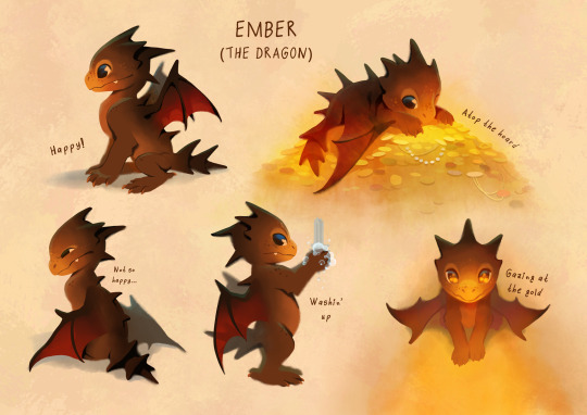
(Early version of Ember above! He has changed a bit!)
I thought I had already read a lot of picture books, I've always loved them, but I read hundreds and hundreds during this process. There is something uniquely fun and challenging about telling a complete narrative in 48 pages (which is already a long picture book, many are 32!) My book also pulls some elements from comics, such as speech bubbles, which I found to be incredible assets for humor and character development.
My pitch included designs, some early example spreads, and a rough script with story beats and jokes! My agent took it out into the world, and the publisher we ended up going forward with was Knopf, an imprint of Penguin Random House! I absolutely love the Knopf team and the beautiful books they put out! My editor, Katherine Harrison, really understood what I wanted to accomplish and has been so incredibly helpful in her guidance!
And from there... through rewrites, dialog adjustments, and lots and lots of drawings, it became a book! I'm happy to answer questions about the process! I'll leave you guys with a little preview from the interior of the book! (And of course you can pre-order it here, gotta learn the author skill of always including that link haha!)
451 notes
·
View notes
Text
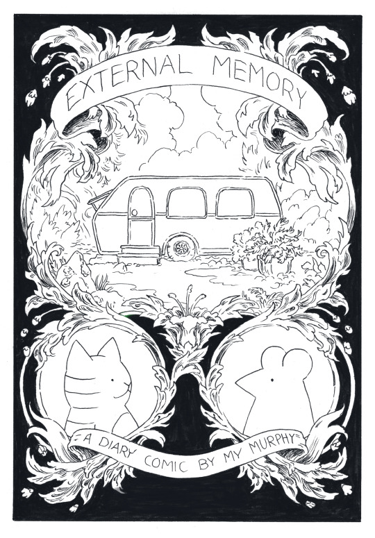
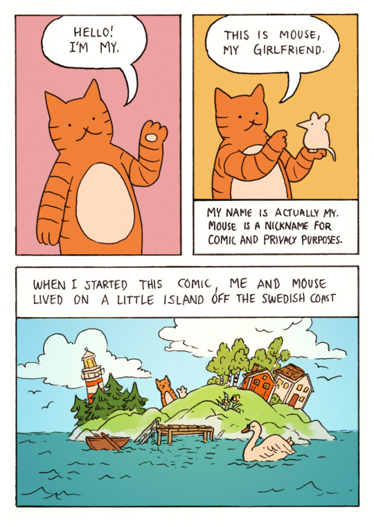
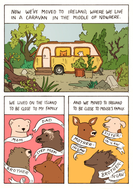
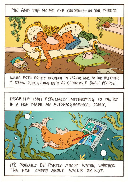
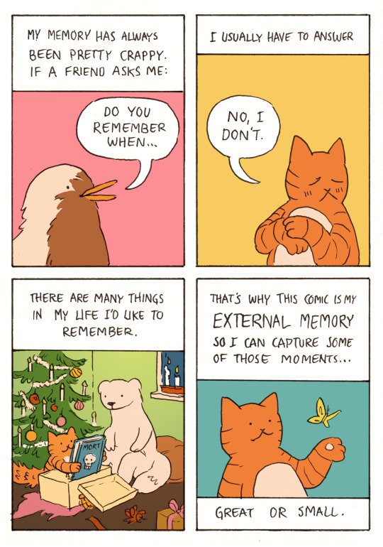
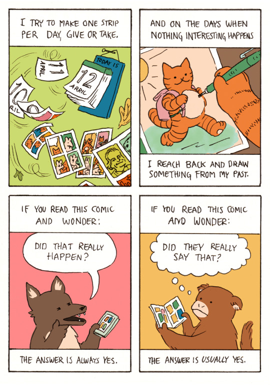
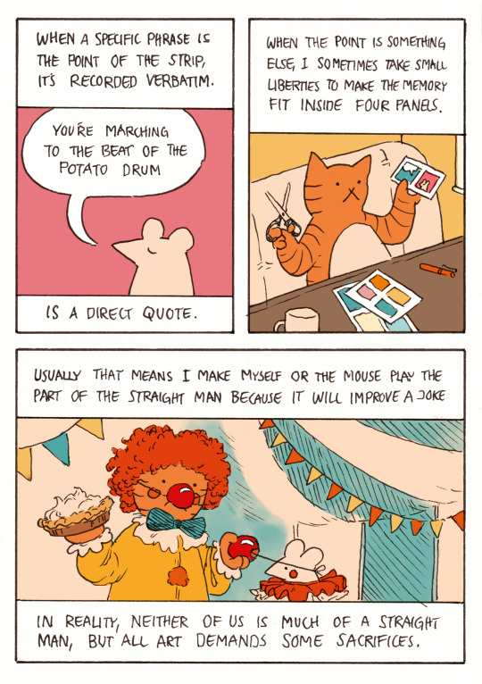
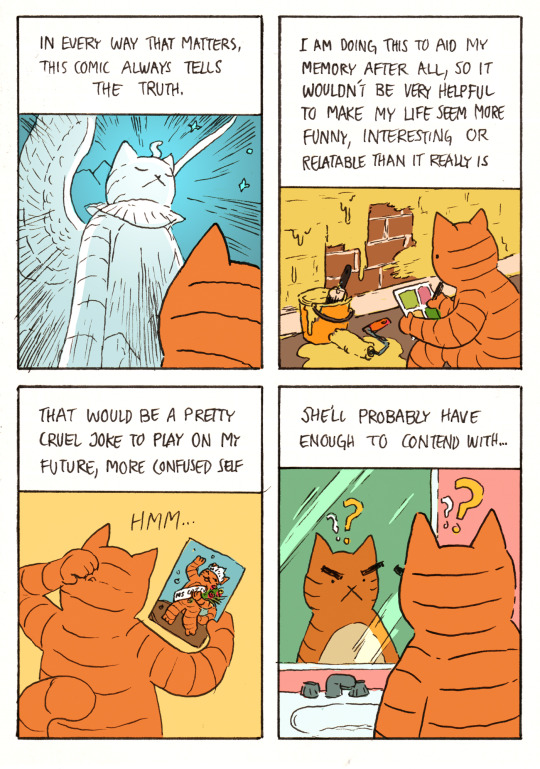
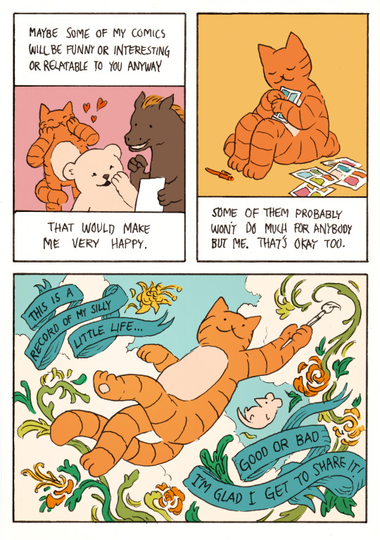
Image description:
A black and white illustration, designed to look like a book cover. On a decorative ribbon, the title at the top reads “External Memory”.
A scroll work border of leaves and flowers divides the illustration into three rounded panels. The largest panel is in the center and shows a caravan surrounded by greenery, puddles and potted plants. The two smaller panels beneath it show a cartoon cat and mouse respectively, facing each other.
At the bottom is another decorative ribbon with the text “a diary comic by My Murphy”.
After the cover follows an 8 page comic. The style is cartoonish and the colours are soft pastels.
Page one:
An orange cat waves and says “Hello! I’m My.”
The cat holds up a white mouse and says “This is Mouse, my girlfriend.”
Caption: My name is actually My, but Mouse is a nickname for comic and privacy purposes.
Caption: When I started this project, me and Mouse lived on a little island off the Swedish coast.
The panel shows a stylised, tiny island with a lighthouse, spruce and birch trees, leaning houses and a little dock with a row boat tied to it. The cat and mouse are standing on the cliffs and a swan floats on the water in the foreground.
Page two:
Caption: Now we’ve moved to Ireland where we live in a caravan in the middle of nowhere.
A small caravan, surrounded by greenery, overgrown trees, rocks, puddles and potted plants. The caravan has two windows and the cat and the mouse are looking out of one window each.
Caption: We lived on the island to be close to my family.
A ribbon with writing on it separates and labels four characters: “mom”, an ermine, “dad”, a wolverine, “brother”, a marmot and “step mom”, a squirrel. The ribbon has been torn in between “mom” and “dad”.
Caption: and we moved to Ireland to be close to Mouse’s family.
Three characters are shown, each with their own ribbon label. “mother-in-law”, a deer, “sister-in-law”, a jack russell terrier and “brother-in-law”, a hedgehog.
Page three:
Caption: Me and the mouse are currently in our thirties.
The cat lounges on an antique fainting couch and the mouse sleeps on a cushion on the floor. On the floor is an open bag of “let’s” crisps and a laptop.
Caption: We’re both pretty decrepit in various ways, so for this comic I draw couches and beds as often as I draw people.
Caption: Disability isn’t especially interesting to me, but if a fish made an autobiographical comic…
A fish under water paints a four panel comic with a brush held in its mouth. The panels the fish has painted show bubbles, waves and splashing water.
Caption: …it’d probably be partly about water, whether the fish cared about water or not.
Page four:
Caption: My memory has always been pretty crappy. If a friend asks me:
“do you remember when...” The question is shown asked by a red robin
Caption: I usually have to answer: “no, I don’t.”
The panel shows the cat giving this answer while looking away and blushing.
Caption: There are many things in my life I’d like to remember.
Mom the ermine watches as the cat opens a Christmas gift in front of a Christmas tree. The cat is much smaller than usual, its tail is bushy with excitement and it holds up a big book, “Mort”, with a skull on the cover.
Caption: This comic is my EXTERNAL MEMORY so I can capture some of those
moments…
The cat admires a butterfly hovering above its outstretched paw
Caption: …great or small.
Page five:
Caption: I try to make one strip per day, give or take.
Pages with dates written on them blow off of a daily wall calendar by a strong breeze. As they turn over, comic pages are revealed to be drawn on the back. One comic shows the mouse with long fangs, biting the face of the cat and then hissing behind a bat wing. One comic is a pastiche of Tim Buckley’s “Loss” comic and one features a portrait of Frasier Crane and the Seattle skyline.
Caption: and on the days when nothing interesting happens
A close up shows the cat’s paw drawing a comic panel. In this panel a smaller, rounder version of the cat runs happily in the sunshine carrying a backpack.
Caption: I reach back and draw something from my past.
Caption: If you read this comic and wonder:
A coyote looks at the comic on its phone, strokes its chin suspiciously and asks “did that really happen?”
Caption: the answer is always yes.
Caption: If you read this comic and wonder:
A monkey reads the comic in zine form and think “did they really say that?”
Caption: the answer is usually yes.
Page six:
Caption: When a specific phrase is the point of the strip, it’s recorded verbatim.
The mouse says “you’re marching to the beat of the potato drum.”
Caption: is a direct quote.
Caption: When the point is something else, I sometimes take small liberties to make the memory fit well inside four panels.
The cat sits at its drawing table, holding a pair of scissors in one hand and a paper with two comic panels in the other.
Caption: Usually that means I make myself or the mouse play the part of the straight man because it will improve a joke.
The cat and the mouse, dressed as clowns, stand in a circus tent. The cat pulls the clown nose from the mouse’s face and holds up a pie, ready to strike.
Caption: In reality, neither of us is much of a straight man, but all art demands some sacrifices.
Caption: In every way that matters, this comic always tells the truth.
The cat looks up at a large, glowing, winged sphinx statue version of itself. The statue and framing is a reference to the all knowing Southern Oracle from the film adaptation of “The Neverending Story”.
Caption: I am doing this to aid my memory after all, so it wouldn’t be very helpful to make my life seem more funny, interesting or relatable than it really is.
The cat draws a comic while watching paint dry on the wall.
Caption: That would be a pretty cruel joke to play on my future, more confused self.
The cat scratches its head at a drawing of themselves as the winner of a beauty contest, wearing a sash and crown, waving to the crowd and holding flowers.
Caption: She’ll probably have enough to contend with…
The cat looks suspiciously at its own reflection in the mirror, not recognising it. The drawing is a pastiche of a panel from the webcomic “Gunshow” by KC Green.
Caption: Maybe some of my comics will be funny or interesting or relatable to you anyway. That would make me very happy.
The cat smiles and presses its paws to its face in joy, seeing that a bear and a horse are reading the comic together and laughing. Cartoon hearts float over the cat.
Caption: Some of the comics probably won’t do much for anybody but me, but that’s okay too.
The cat presses a page of the comic to its chest, looking contented and protective.
In the last panel, the cat and the mouse are floating on air with a blue sky and white clouds behind them. The cat is smiling and twirling around, holding a paint brush out like a wand. From the brush flows paint that swirls around the two figures and making shapes of green leaves and orange and yellow flowers.
On two looping blue ribbons appear the last captions:
This is a record of my silly little life. Good or bad, I’m glad I get to share it.
End ID.
Here’s a little introduction to External Memory! It was fun to make a proper neat and full colour comic - it’s been a while ^^
(If you like this project, please reblog this post! You can also subscribe to my patreon where I post one comic every day ^^)
#comic#comics#original comic#web comic#webcomic#diary comic#slice of life#autobiographical comics#journal comics#comic artists on tumblr#external memory comic#slice of life comic#apologies for the long post tumblr does that any time I put in tags for some reason#described#long post
2K notes
·
View notes
Text
Thoughts on giving critiques to comics artists.
Seeing lots of discussion from students about sour experiences with an unhelpful art teacher, so here's a long, long post about giving critiques.
NB: I have no formal training as a teacher, but I was a student, and I've spent decades giving artists feedback on their work.
When someone brings me a portfolio, I like to establish my limitations & clarify my perspective. My work is firmly rooted in traditional US comics storytelling (i.e., not manga or art-comics.) I can give feedback on other approaches but they should know where I’m coming from.
“We've only got a little time for this, so I'm going to spend that time focusing on things to correct. That doesn't mean you're doing everything wrong, or that there’s nothing good here, but it’ll be more helpful if I identify some problems and show you how to fix them.”
Why? Because for many young artists their entire sense of self worth is wrapped up in being good at what they do. (It was for me!) In school they were probably the best artist in their peer group. But now if they're hoping to turn pro, they’re at the bottom.
Sometimes you know what’s up when you see page 1, but try to keep an open mind. Some build their portfolios by sticking new pages at the back & don’t weed out the old stuff up front, so the work gets better as you go. When it’s like that I ask: “Show me your best 8 pages.”
I ask questions: "What's the goal? Do you want to be hired to work on someone else's project, or to get the story you're showing me here published?"
If 1, I steer towards a portfolio that'll showcase hirable skills.
If 2, I look for what tweaks will make that particular story more effective.
"Do you have teachers giving you regular feedback? What are they telling you?" Sometimes a student is getting bad advice. In cases like that, I'll do my best to be extra clear WHY I'm giving them advice that's 180 degrees from what they've been hearing.
“What artists are you looking at? Is there someone you admire or try to emulate?” This often helps me understand choices they're making, and I can sometimes incorporate things those artists do into my suggestions.
I ask myself questions about what I’m seeing. First: Is there a narrative? If not, I make it 100% clear I'm not speaking as any sort of expert. I'm good at critiquing storytelling, but don't have anywhere near as much to offer illustrators or designers.
Can I follow the story? Or am I confused about what's going on? Are the characters and settings drawn consistently?
If not, is the artist at least making use of tags (distinctive clothing, hair etc.) to keep the characters recognizable?
Does the artist demonstrate a good command of basic academic drawing? If not, Do I think they need it? Do I focus on "how to draw" or on "what to do when you can't draw?"
Is the artist putting the viewer’s eye where it needs to be to tell the story effectively?
(At this point I’m usually doing little doodles to go with my instructions. I scribble out ugly little 5 second diagrams that I hope will clarify what I’m talking about. Or they might make me seem demented. Hard to say!)
Is the artist making choices that are creating more work than necessary? Is there a particular weakness? I once spoke to an artist with a portfolio full of great work when he was drawing animals and monsters, but his humans were amateurish in comparison. I spent that critique talking about drawing people.
A crit can be a grab bag. In addition to big-picture advice, I'll point out tangencies, violations of the 180-degree rule, wonky anatomy, weird perspective, places where the artist neglected to do important research, odd choices in how they spotted black, whatever catches my eye.
I also try to make a point of defining the terms, so that jargon like “tangency,” “180-degree rule,” and “spotting black” don't go over their heads. Find simple, concrete ways to talk about these things, & clarify why it's a problem when they aren't done correctly. Draw diagrams!
Recognize that even a perfectly phrased explanation might not sink in. Some lessons can only be learned when a student is ready, and it might take a year or two of work before they can understand what you were saying. It's good to plant seeds.
Are there other artists who are particularly good at solving the problems the student is trying to solve? I steer them towards that artist's work. And I always recommend life drawing & the use of reference to give work variety and authority.
Despite what I said earlier about focusing on what's wrong, I try at the end to find something encouraging to say. And if I’ve really piled on the criticism, I emphasize that I only spent the time and energy to do so because I take their efforts seriously.
If I've done my job right, they'll leave my table with tools to make their work better. And maybe in a few years they'll be looking at some younger artist's work, surprised to discover just how much you can learn when you're asked to teach.
496 notes
·
View notes
Text
SoC Comic Adaptation and General FAQ
General
Who are you?
Hi, I'm Claire (she/they)! I'm currently studying to become a professional comic creator. I love drawing fashion, expressive characters, and anti-hero action.
Where else can I find your work?
You can find all my work on my website! I'm also on Instagram, Twitter, Tumblr, and Tiktok (sometimes...). You can find my fan art under the handle jccatstudios, and my original art under jcscottart (only on Instagram and Twitter).
How can I support your work?
Besides supporting my work through your lovely comments and reblogs, you can help monetarily support me on Ko-Fi. Your support helps fund my college education.
Six of Crows: A Comic Adaptation
Why are you doing this?
Ever since I read the duology, I always thought it would make a great graphic novel series. When my professor encouraged me to start a webcomic, I took the opportunity to make the comic I imagined into reality. I want to see the whole series illustrated through comics one day. If I got the chance to make the official adaptation, that would be one of my biggest dream projects. I'm also using this project as an opportunity to improve my skills before I graduate.
Will you post it on (insert webcomic platform)?
Probably not. Most online comic platforms are meant for scroll format, and I'm making a traditional format comic. Plus, I post on so many sites already, so I think adding another would take too much time out of actually creating the comic.
Will you draw the whole book/series?
I wish I could! Since I'm not doing this full-time or professionally, that's quite unlikely. It would take years to complete it full-time, who knows how long as a hobby. I'd love to add a six-volume SoC graphic novel series to my shelf, but that of course can't be done without some serious backing. I'm currently working on adapting Chapter 3.
Where's Chapter 1: Joost?
I never drew it! I started with Chapter 2: Inej because I wanted to draw the main characters first. The first chapter of the comic is the second chapter of the book. I name the comic chapters after the book chapters just to make it clear which part of the book they correspond to.
Can I repost your art, use your art for layouts/edits, etc?
Yes, you may with visible credit. If you use it for your profile layout, put my handle in your bio. If you're reposting it or using my art for edits/collages, put my handle in the description. As long as it's for personal use, you can use my art. Do not sell copies of my art, use it in merch, or use it for any sort of monetary gain. Do not use my art for prompting or generating images.
Can I use your character designs and headcanons in fanart, fanfic, etc?
Absolutely! Please tag me if you do. I don't need credit since I didn't create any of these characters, but I definitely want to see what you create. :D
How do you make the comic?
The comic is made with mostly traditional methods with some digital editing. I pencil and ink all of the pages on bristol board. I mainly use the G-pen nib for characters and technical pens for the backgrounds. Once I scan the pages, I do light adjustments to the line art and correct any mistakes. The gray tones come from a single sheet of ink wash adjusted to be lighter or darker. The bubbles and lettering are all digital.
If anything else comes up, I'll add it here! Feel free to send me an ask if you have a question that isn't on this post.
96 notes
·
View notes
Text
Disney's The Gremlins Over the Years
Chapter 1: Gremlins (Part 2)
This is Part 2 to Chapter 1. If you want to read Part 1 first, it's in the link below.
Due to the recent events with Epic Mickey Rebrushed, I thought of making a series of posts dedicated to Disney's infamous characters from the canceled WWII movie The Gremlins. The character designs of these guys have changed many times during the concept art process and over the years. Today, this is a collection of male Gremlin designs. The female Gremlins were called the Fifinellas, which I will get to them in the next post. For those discovering this, in summary, Disney was making WWII movies and shorts for the war effort. They were going to adapt Roald Dahl's first book about these guys, and several things like people getting tired of war movies and figuring out how to make the movie, which was canceled. I'm making these posts for fun and to help give artists ideas for their OCs and fanart. I would post some sample pictures and a minor breakdown in each post. I might miss some because there is so much, so this is just a handful of pictures and photos I collected over the years. We really need to make a Disney Gremlin's Wiki.
Anyways, let's jump into THE FUTURE!
Canceled Live Action/Animated Project (1992): Jumping forward into the future, Jerry Rees, director of The Brave Little Toaster, and Steve Leiva were trying to make a feature based on the original story with live action with animated gremlins like Who Framed Roger Rabbit. The illustrators for the project were Steve Moore and Frans Vischer. Again, GLAD they didn't we didn't get this style of the characters since they're far from the original designs. Here are two samples by Steve Moore.


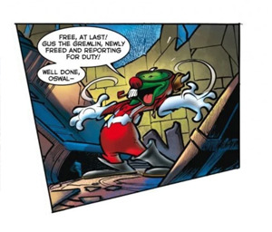
Return of the Gremlins (2008): When Disney made those terrible DVD sequels, Dark Horse and Disney made a deal to reprint the original book, make merchandise, and release a three-part comic sequel in 2008. The first cartoonist was Dean Yeagle, but he could not finish, so DreamWorks artist Fabio Laguna came in to do the final issue. In this story, Old Pilot Gus's grandson, Young Gus, goes to Old Gus's home in Brittan to handle the property sale. But SURPRISE! It's inhabited by the Gremlins that Old Gus befriended during WWII. Chaos ensues...

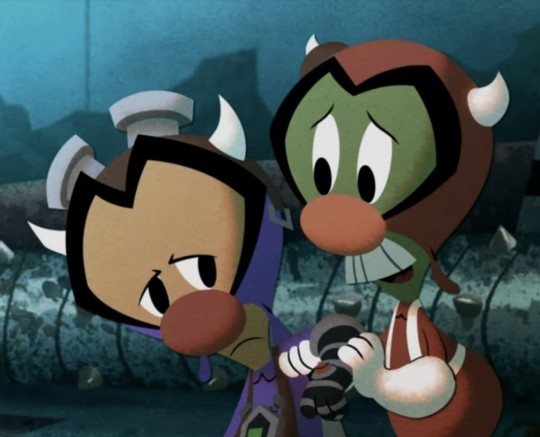
Epic Mickey (2010): Now, the moment you've all been waiting for, the game that introduced most of us to Disney’s Gremlins. Here are the variants we remember split into two groups: 3D Gameplay and 2D Cutscenes. Going forward, some of these pictures are from the Epic Mickey Wiki.
3D Gameplay


2D Cutscenes


Epic Mickey Comic (2010): In the 64 page-long graphic novel, the only Gremlin character who appeared in the comic was Gremlin Gus.
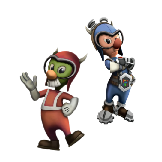
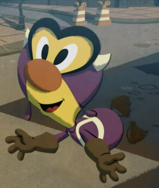
Epic Mickey (2012): In the sequel, we get more variants of the Gremlins and a Gremlin Prescott redesign.
3D Gameplay


2D Cutscenes
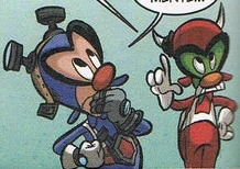
Epic Mickey Comic (2012): Gremlin Gus was joined by Gremlin Prescott and Gremlin Jamface.

Donald Duck #18 Comic (2015 IDW): This is the crossover we have wanted since the Comic Cover. In a translated European Swedish comic of 'Rue Brittania!', Donald and Fethry get a new assignment: travel back in time to WWII and face the Gremlins to de-gremlin the airfield. Artists: Pencils and Ink by Flemming Andersen and Colors by Digikore Studios.


There's a lot more I could add, but we would be here all day. If this post gets popular enough, I will do more on the side before the game comes out. If there are changes to the Gremlins in the Reboot, I'll make a Part 3. Hope this post is a helpful source for old and new Gremlin and Epic Mickey fans alike!
#disney the gremlins#disney gremlins#epic mickey gremlins#gremlin gus#gremlin jamface#gremlin prescott#epic mickey#epic mickey 2#fifinella#widget#part 2
11 notes
·
View notes
Text
2023 Art Summary

Okay, so this year has been... interesting. While I still have no home, no job and a long etc., I've been ridiculously productive. And not only in drawing but mostly writing. There's a lot coming on and I can't wait to share it with you!
January: I got some news at the beginning of the year: I'm autistic! While I was shocked at first, then everything started making sense. Like, everything. I started taking my time with two Gingaria illustrations and I think this one shows how much my art has improved. It's still one of my favorites.
February: I got on board on a behemoth of a project: doing my own magazine special for my next book. It has comics, character sheets and a lot of information. It was exhausting but I'm so happy about the final result and I'm going to do some prints.
March: My heart has been extremely soft this year and I've surprised myself drawing a lot of couples and writing a lot of fluff. One of them was our Jlaire, of course.
April: I finally watched Wednesday and drew a t-shirt design with the whole family.
May: Another big project! I made my own version of the Goose Game, called Dragon Game and with the characters of Zem. It was so funny having to create all those small drawings and the dragon character.
June: Hyped with Nimona, which ended up being quite good. I enjoyed drawing this version of the characters, even though there weren't many references back on those days (it reminded me of my HTTYD2 era).
July: More couple fluff! I can't share this one yet, but it's Zemry. Painting all those flowers took me days.
August: Another one I can't share yet. I also did a lot of concept art for my next books and this is one of them. I can't say much about this character yet, but they were such a delight to write.
September: Finally watched Over the Garden Wall and loved it. It had been a while since I had to adapt characters to my style but it was so fun! I made a comic too.
October: Back on the Jimtober bandwagon! I wasn't sure if I was going to do it or not but found some free time and here we are.
November: I find it interesting that I've been making new comics after all these years. I did two of Gingaria, this one about Kylkos.
December: And ending again with Gingaria. I wanted to do something with Vitha in her Winter Ball dress and I think it ended up looking great (does this means next year is Kylkos' turn?, huh...).
So overall, maybe it wasn't the best year (we've been having some really bad years in a row), we still don't know where we are going to live and now I have yet another problem to take care of, but... I've kept on creating. And that's enough for me.
Thanks for being there and keep on shining!
#art#tales of arcadia#trollhunters#jim lake jr#claire nuñez#gingaria#legends of gingaria#gotxinka#gertold#vitha#king aurus#aury#aurkandra#troll jim#wednesday series#wednesday addams#nimona#ballister blackheart#zem#zemry#over the garden wall#otgw wirt#otgw greg#otgw beatrice#kylkos#jimtober2023#christmas#me
16 notes
·
View notes
Text

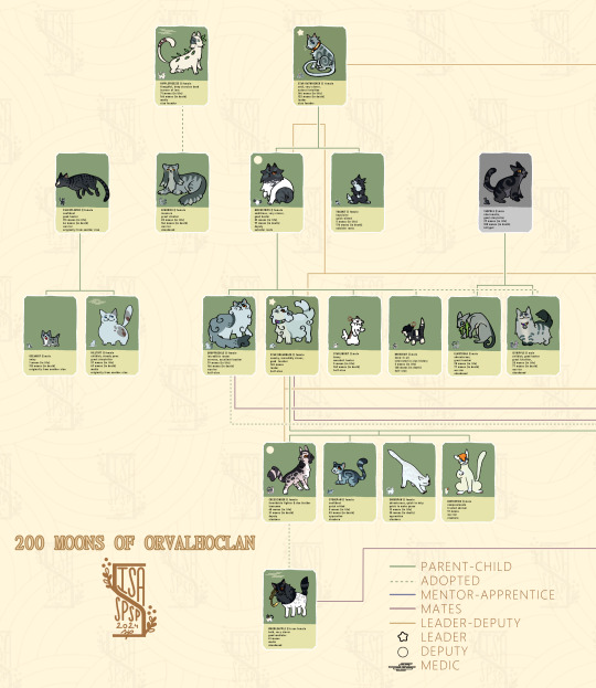
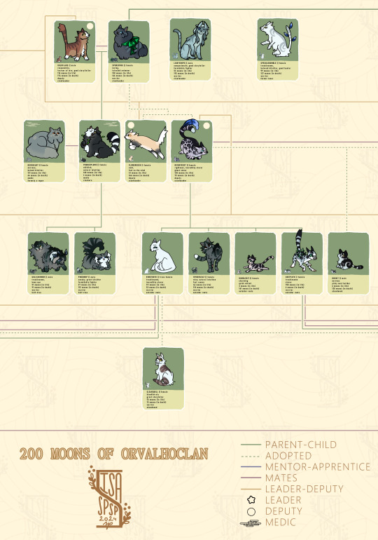
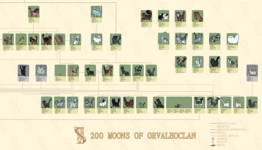
Wanted to join in the clan gen blogs BUT, see, I'm bad at comics, so I am not gonna even ATTEMPT to commit to that. But what can I commit to? A gigantic illustration that will take me weeks? Uh, sign me up!
So, I opened clan gen and created a clan, played two hundred moons on it and drew out the final family tree! I'll probs reblog this later with like, doodles of memorable moments the clan had, my fav relationships n stuff, but this is the main project heheh.
Idk, if you are curious about the lives of any given cats, feel free to ask ^_^
Download to see the full gigantic thing!
More info under the cut!
It's so many cats y'all. so many. 84 I think? God, and I was trimming the clan too! Kits and joiners that I killed as soon as they joined were not added here. Mostly kits tho.
Mapping out the characters was the hardest part. While clangen offers a pretty comprehensive family tree by looking up each cat, it's harder to have them all mapped out (which is why clangen doesn't DO that, they arent stupid like me) I started by mapping it all out on a site called Family Echo, with which I could map out the greatest majority of the tree~
I then did a rough sketch on my canvas laying out where the characters would be. And looking back, I hilariously underestimated how much space I would need, lollll. The original canvas was already pretty big, about 5000x1200, but that was before I decided to do, you know, a nice organized layout. Here's that original tree layout:
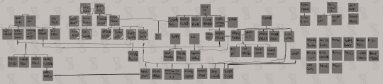
So umm, a whole ass mess. The final canvas is... 11480x3513. The biggest canvas I've ever had to have. golly.
Would I recommend this to anyone? Well, if you start your clan and do this immediately and go updating bit by bit as the moons go by, then yeah! I really enjoy visuals like these, it's like seeing statistics, heheh. Otherwise, unless you seek suffering? NO.
Fun fact, originally the clan was named DewClan, but while I was playing, @moons-of-dewclan started their blog (yes, I've been working on this for that long (also, go check themout, it's really really ggod!) and I was like oop, so I just used orvalho, which is,,, dew in Portuguese heheh.
There probably are mistakes here and there, for example I just saw that BirtchSpike is named as BirthSpike... OH FUCKING WELL.
My fav cats were (No order): Star Ratwhisker, RiverFrost, PoucePlume, GullShimmer, GustPath, CressCinder, StormDance, BiteWhisker, MouseSpot, BirtchSpike
My fav designs were (No order): PaleSplinter, DropStreak, GoldFlare, PoucePlume, GullShimmer, SpiderLeaf, OceanLight, Rufus, DropStreak, MouseSpot, MistyShade~
#my art#art 2024#clan gen#clangen#wc#warrior cats#warriors oc#clan generator#clan gen game#clan gen challenge
15 notes
·
View notes
Text
Syllabus: Line Mileage

(source)
If you google Line Mileage you'll see relatively few search results. Why this term has come to be so obscure to the public is everybody's guess. Regardless; it is an incredibly important concept for artists working with visual storytelling to understand, as it informs them of how labour-intensive a design or composition can be.
"Line Mileage is a term that means how much line you have to draw. if you were to take a traditional drawing and stretch out the lines end to end, you would see what your Line Mileage is. Every millimeter more of pencil or digital line takes more time to draw. Intricate character designs may look good as still images, but the reality of animating such a character is time consuming. A long, curly headed character wearing a wrinkly overcoat, multiple ammo straps over his shoulders, and a striped shirt has extra Line Mileage. It is difficult to keep so many lines moving well without them seeming to crawl, pop or distract from the animation"
Tina O'Hailey: Hybrid Animation: integrating 2D and 3D assets
As O'Hailey mentions in her book: Hybrid Animation: Integrating 2D and 3D assets, Line Mileage is the total amount of time it takes for an artist to draw a character (and by that extension prop, background, etc). Animators have used this term to deduce whether or not a design is adequately balanced in its amount of details in terms of artists being able to reach their deadline by drawing it the amount of times necessary.
Line Mileage is most commonly used in the world of 2D animation. The use of the term has fallen somewhat out of favour now that the entertainment industry has skewed heavier towards 3D animation, but it's still a concept well worth grasping if you work in 2D, particularly in disciplines such as comics, animation or serial illustration where the volume of drawings you need to produce exceeds more than just a handful of images.
It sounds simple enough to consider whether or not your character design is too complex to draw multiple times. But you will find, especially if you're just getting started, that your stamina drawing your character will drastically dwindle once you've been through with it a few times. If you've committed to a comic project, the first 3-4-5 times of drawing your character might be perfectly easy and motivating in enough of itself. But when you get to frame 10, 20, 40 - your design will most likely have lost a good bit of its excitement to you. Now you're in for the long haul of gruelling work, and if you have not made the design suitable for that kind of long-term labour, it is going to be absolute hell to pull through. Moreover your lack of motivation will surely come to show in the final product.
There's not one 'correct' amount of detail or Line Mileage for anyone or anything. But is understood that the average artist can undertake a certain amount of Line Mileage without overworking themselves or even worse, causing themselves long-term injuries. Yours will never be like anyone elses, so never rely on what other artists might be able to manage, you'll end up hurting yourself (I've been there and that injury still sometimes keeps me from working for days on end).
How to account for good Mileage
Milt's rough animation drawings from Thumper's famous scene: "If you can't say something nice..."
Check your medium
Accounting for your Line Mileage in a sustainable way comes down to researching and making conscious decisions about the complexity of your design. This decision should be made based on your own speed rather than anyone else's, as you will be the one drawing your character again and again. So forget what industry professionals or other hobbyists can do. You're the illustrator/animator/storyteller, you make the decision (unless you're working as lead of a team; naturally you'd want to get a feel for your teams capacity first before making any decisions in that case). Your design's complexity should also be based on how many times you're supposed to draw the character. It's logical to assume that a character that you're supposed to draw once or a handful of times can be a lot more complex than a character that needs drawing dozens or hundreds of times.
Be honest with yourself when making a decision on how high your Line Mileage should be. Always give yourself a little less work ( in this context: a little less detail) than you think you can manage.
Trust me; you will thank yourself later!
The following examples are based on my capacity as an artist and is not indicative of yours or any other industry professionals.
Pay attention to the difference in detailing between them and notice how their complexity lessen significantly the more frequency the character is supposed to be drawn.
Illustrations
Drawings: 1-5

When it comes to designs that I'm not supposed to draw a million times over ( say, a random character or creature that will pop up in the occassional leisure piece ) I don't hold that much back on the detailing for the sake of Line Mileage. Though, compared to other artists, I'm still somewhat conservative to details. Though this has all to do with my own personal stylistic preferences rather than Mileage.
In this design, meant only to be drawn very occassionally; The ribcage takes up a majority of the total Mileage. Drawing exposed bone structures is incredibly time-consuming, as it does not only take time to apply lineart to, but the construction of it and the sketch phases take a long time too, as every rib has to be lined up properly as to not break with perspective. I personally try to include as little structure that would require a lot of respective, when it comes to designs that are supposed to have low Mileage. Perhaps also a by-product of my less than stellar grip on perspective. I would recommend it for anyone who's not 100% comfortable with drawing perspective too. It's just really time-consuming from the onset.
You'll also notice that every single leaf in the mane of the creature has been drawn in pretty meticulously. I would never do this for a design that would only need drawing occasionally. You can definitely simplify the likes of the mane down to a more uniform green mass though to lower your Mileage.
Storybook
Drawings: 5-12
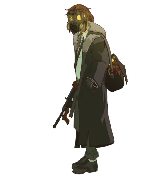
When we get into storybook (and later comic book and animation) territory, I will personally start scaling back on details majorly. Instead, I'll focus heavily on incorporating large, dominant, and interesting shapes into the design. Seen here with the tall, lanky anatomy, the big trench coat and the furry collar. The bag was added to pad out the silhouette and give a secondary shape as well. This bag and the gasmask are the only elements that require somewhat thorough construction in the sketch phases. The machinegun is drawn using a hybrid method of 3D and 2D assets, more on that in a later essay) Therefore, the majority of the design can be freehanded pretty easily with little need for reference.
Comic
Drawings: 15+

Now we're getting to the more scarce designs in terms of detail. Once we reach comic level, I personally like to scale back the designs almost to the bone. Keeping only the most major shapes intact and generally simplifying the design down to its core ideas. In this particular example, that meant scaling the details down to a simple robe and overcoat/vest, along with a relatively simplified version of a sword. The character has a few details in the form of facial stubble and two scars, but aside from that, he is pretty simple when compared to the designs above. Just like the gun from above, the sword is worked into the illustrations by applying 3D and 2D assets in order to expedite the process. Therefore it isn't considered an integral part of the design itself from a Line Mileage standpoint.
Animation
Frames-
2D animation is among the most laborious disciplines of 2D visuals and storytelling that you can do. This makes it incredibly expensive to produce as well. Many newer shows tackle this incredible amount of labour by simplifying their designs ( see Steven Universe, Adventure time, etc ). If you're a single artist working on something, I highly recommend you think about the economy of your details through a very conservative lens. At least if you want to animate long-form sequences. Disney and Dreamworks had success in animating relatively complex 2D characters back in the 2000s by organising in teams of up to 30 working on characters alone (in the case of The Little Mermaid) working full time to produce over one million drawings before release. If you're not Disney, you don't have 29 other people with you and enough money to pay yourself full-time along with your other animators, then you need to think very critically about how you spend your time. Granted, you can absolutely go as detailed as you want as long as you plan your animations legnth and your time-frame for making it accordingly.
Anyway: Above is a very basic idea of what a design for an animation could look like. Many indie-artists currently lean towards these highly simplified by effective designs. though, we are seeing a resurgence of semi-realism in adult cartooning ( See Netflix' Castlevania. The Boondocks, The Legend of Voc Machina. Technology is allowing artist to draw more complex designs more efficiently ). You'll see that many of the structural details of the character's anatomy ( facial features, toes, etc) has been removed completely or simplified down to very minor shapes and volumes. The majority of the character is covered in one shape (the cape) and the texturing on the leaves and flowers is random splatters of a brush. This design is almost as simple as it gets, but still clearly conveys a few ideas. I'm by no means saying that you have to go this scarce with your detailing for animation, I would personally maybe shoot a little above it as well if i was to make an animated project, but from a pure Mileage point of view, this design would be very optimized for animation.
Take breaks: even with good Mileage
No matter how low your Line Mileage is, taking care of yourself should be at the forefront of your mind when drawing characters multiple times. Drawing takes a huge toll on your hands, your elbows, your posture and your overall health. I'm not going to preach too much in this particular post (though expect it in a future essay) But being conscious of your Line Mileage is not only going to save you time, but spare your body from excessive repetitive work, which can cause RSI's (Repititive Strain Injury). These can completely mess with your scheduling and in worst case scenario become chronic.
So don't even try it. I can personally attest that giving your projects a little more runtime is going to suck a lot less than being unable to draw for long periods of time. Certainly suck less than dealing with chronic pain and deformities because of being too ambitious with your Line Mileage.
Mod Wackart ( ko-fi )
Follow my work!
59 notes
·
View notes
Text
thinking out loud about some anime an illustrator i like worked on
so, one of my favorite illustrators (at least, I think that's the right term for him) is yoshitoshi ABe. recently i made the decision to look through a bunch of projects he had a hand in, mostly because i wanted to see what kind of stuff he'd attached himself to over the decades. prior to this i'd only seen Serial Experiments Lain, but i feel like basically everyone's seen that so that's not saying much lol. this was partially spurred on by a friend of mine telling me Texhnolyze was among their favorites. at time of writing, i've finished Texhnolyze and NieA_7, and i'm watching Haibane Renmei on-and-off and loving it. the world is bizarre and beautiful, and the character designs are lovely and have so much personality in my eyes. so that's where i started. so below is a series of rambles and thoughts i've had on this little journey of mine up to this point. i've still got a ways to go.
misc. spoilers for Texhnolyze in the next section
texhnolyze was a show i really enjoyed, but falls into the same pit as serial experiments lain in my brain. i struggle to understand what it's trying to say below the immediate surface and i end up primarily enjoying it as a surface-level product. not to say that i didn't make some connections in my head along the ride, i have so many questions about the world that i want answered, and some really fun observations I made. ichise's conversation with the voice in the chair was something that i had a lot of fun picking apart because it tickled that little goblin in my brain that loves social science. with the whole idea that height relates to authority, the pile of stones bringing images of gods on mountains in myth, but the chair tying all that powerful imagery up in this idea of boredom. apathy of the gods and all that. the entire trip to the surface is something that had me on the edge of the seat, and kinda tied into my greater sci-fi brainrot. that whole idea that one a society stagnates and rots people seek "better times", and this is how you end up with so many space prussians/germans being bad guys in older sci-fi anime like classic gundam and legend of the galactic heroes. it's people clinging to an idea of a """better time""" to larp that they're better than they are. this is what was going through my head during the arc of the story on the surface, whenever i saw that outdated technology that lives only in old b&w movies and period pieces. despite these obversations, i feel like i can't formulate a big picture, this is by no means bad, but i can't help but feel like i'm "missing something". though, this might be rectified in lain's case when i get around to it, it's been close to 10 years since i last watched it.
misc. spoilers for NieA_7
this is one that i don't think i ever heard someone talk about prior to me just plucking it off of ABe's wikipedia page. it's this weird slice-of-life comedy about living in poverty but there's also humanoid aliens that are kinda just around and comically failing to integrate into society. that whole second point, with the aliens, i feel it kinda detracts from a lot from the show's actually really simple and touching heart about just trying to escape being poor. the whole thing is kinda tainted with this mild xenophobia for the sake of "comedy" and the vast majority of the recurring aliens are these really mean-spirited racist stereotypes. eventually i came to ignore the vast majority of that aspect of the show, besides the titular NieA, and focus on the part of it that really spoke to me. the main character, Mayuko, is a young adult working 3 jobs on top of going to cram school in a desperate attempt to get into a good college and escape poverty by getting a """real job""" and a """future""". the reason why i use quotations is the same reason why her character really spoke to me. she was so focused on the mere act of survival and vaguely working towards the future that she never found the time to really think about the future. no plans, no dreams, inching towards a success she has no idea how to capitalize upon. something similar happened to me, personally. i spent the vast majority of highschool and college fighting for good grades and accolades with no other plan than to just get away from a very toxic family situation. and i succeeded. i gave up a social life for the sake of advancing and was rewarded by getting poached right out of college into a fairly comfortable. i moved out 6 months later and subsequently broke down. without that constant pressure of ESCAPE ESCAPE ESCAPE i had this sort of psychological explosive decompression and became incredibly depressed, and almost made some very poor and very permanent decisions. i saw a character that was flying towards the same mistakes i made and i was wondering all along if the show would propose some kind of "solution" that i'd failed to see. it didn't offer anything concrete, but something much simpler that i nontheless really appreciated. a loving promise that things will be okay somewhere, someday. the same sentiment helped me when i needed it. i get that that's corny as hell, but i'm a stupid mushy man-thing. it's a show i really recommend people look at, because while the lows are INCREDIBLY low and mean, the heart is there and beautiful.
4 notes
·
View notes
Text
2023 review stuff
Here we go again. Gotta keep up with the tradition because it's always interesting to go back and reflect on a whole year. While things have improved ever so slightly, my life isn't good yet. But hey, I'm doing my best to keep on fighting until I get there.
2020, 2021, 2022
Health (mixed)

I started out this year with a surprise: I'm autistic! And while it's not a bad nor good surprise, it has changed completely the way I treat myself. I used to feel useless and an idiot but now there's an explanation for most of my quirks and I can use my newly discovered "superpowers" to make me feel better. But hey, it's still a secret. I'd like to get a formal diagnosis (I mean on paper) before talking to my parents and family.
That being said, I've used this new knowledge to fight the many bumps I've encountered this year. There's still a long way to go, but I feel like I know myself way better now.
2. Writing (freaking good)
I started the year finishing a book, then I wrote another one, translated three, wrote four short stories, a full comic strip and lots of stuff more. I've created a whole new continent for Gingaria and new places for the next books. I had a great presentation for my book Kylkos and lots of people have praised Legends of Gingaria, which makes me so happy! It all gives me the strength to go on the days I feel bad. And I can't wait to show you what's in store! Also, shout-out to all my AO3 readers.
3. Art (quite good)

I'm getting the hang of Clip Studio Paint and I think you can see the leveling up. I'm trying to improve with more character, creatures and places designs. I've drawn more comics and some illustrations I'm really proud of. While I sometimes have bad days when nothing seems to work, I can just go back when I feel better.
4. Cosplay (eh...)
Believe it of not, I've managed to keep on sewing some new stuff. I can't share it for now, but hopefully next year. I've done some clean-up and while I'll use most of my time to fix stuff next year (once I can get it out of the boxes), I'm planning to do more photoshoots.
Now I'm going to talk about the stuff that has helped me go through this year. But first...
I'm sure nobody cares, but this year has been worse because we've had some problems regarding the documents so they can demolish our house and pay us. The thing is some... baddies have been meddling with the process and we were in the middle, so that's why our case is getting longer to resolve. Hopefully, now that we've got the papers we need, things will start going on more smoothly.
Movies & series
I've watched a lot of stuff this year. Spider-Man: Across the Spider-verse was so good, I loved Suzume and The Boy and the Heron and, about series, Over the Garden Wall and The Blue Eyed Samurai.
2. Gingaria
While writing is not always easy, I've had so much fun making this world even bigger. And I made a doll maker! There's a lot to come and I hope it keeps on growing.
3. Webtoons & reading

I still struggle with reading but my mind is calmer this year. I've read some books from a public place where you put one and get one (left one of my Zem copies just because). I'm currently following some Webtoons and my favorites are The Blind Prince and Your Smile is a Trap.
4. Side projects

I was commissioned to make 35 fabric cubes and a replica of Gladys from F.R.I.E.N.D.S. Also made some props for cosplay and fixed other stuff.
5. Therapy
I'm so lucky to have found someone who gets me and understands what I'm going through. Sometimes is hard because she makes me rethink everything but I've improved so much this year thanks to her.
Someone asked me recently about my New Year's resolutions and turns out I don't want to have any, I'm going to rely on my projects. I've had an interesting idea recently and I'm going to search for someone to make it come true, I have more stories to tell (currently writing yet another book) and more surprises along the way.
Thank you so much for being there. I hope you all have a happy New Year. Keep on shining!
2 notes
·
View notes
Text

G is for Giraffe
I almost completely rearranged my alphabet because I wanted to make a lava lamp character. I might still make more lava lamps, but at least I found a way to get it out of my system. I was originally thinking about doing some sort of broken glass to imitate the spots on the giraffe, and I’m glad I didn’t. I’m not ready for something that complicated and my motivation for this project has really tanked. You can see it in my… avant garde description last week, where I was so tired I forgot to tease this week’s illustration. I didn’t have a strong 60s reference this time. It was really just, “make a lava lamp giraffe.” According to the internet, lava lamps were invented in 1963, so at least I’ve got that going for me.
I’m finding it hard to come up with designs for this project lately. I don’t want the characters to resemble their animals too much, but it’s so much easier to put a turtleneck on a frog and call it good. I like the sea slugs because they don’t have a face that humans will recognize, so I can make them humanoid and put in hints to their biology through the clothing and accessory shapes. One thing I wish I could change about this project is having all of the characters cut off at the chest in order to imitate the face cards of a typical deck. For example, I would have loved to have given Lottie a full translucent dress with a solid shift underneath. She would have been so cute! If I do cards again (which I probably will), I’ll do full body illustrations instead.
On an unrelated note, I’ve been thinking about making a webcomic lately. I saw an artist I love (Ver) post about the online-only ShortBox Comics Fair, where a ton of artists are selling their comics during October (ending in 3 days! Get them while you can!) and I thought it was so exciting. It’s like running a table at a comic con without having to travel and you get to see work from artists all around the world. I wanted to sign up right away (the deadline is November 9th), but I don’t have anything to prove that I could finish a quality comic in time. I’ve never done it before. Heck, I’ve arguably only finished as many pieces as I’ve posted here, which is… seven. I would absolutely not be approved. I can’t create a working portfolio in two weeks, but what this means is that I have an entire year to build up a portfolio before the 2025 deadline. I haven’t decided what I’ll work on yet, but expect a variety of character designs and worldbuilding as I sort through my endless well of story ideas.
Next Week’s Sneak Peek:
Hammerhead shark
#alphabetsuperset#1960s fashion#frutiger aero#inkscape#vector art#character design#robot oc#playing cards#giraffe#lava lamp
1 note
·
View note
Text
2023 🎉🎉🎉
Ok new year and I thought since this blog is basically an archive of my fandom art, I'd also archive some "milestone" art and archive my reflection for the last year. Basically, I love art and I've always wanted to one day publish my own original comic/graphic novel and I've had this dream art school that I've always wanted to go to and then senior year rolled around and... I didnt submit my portfolio. Partially due to financial reasons, but mostly because I just hated my art (like most artist) and so I decided to take a "gap year" to take online courses and "fix" my art, but then I just didnt have enough money to even finish the courses so i just really gave up yk. I got very demoralized about school in general and thought art would just be a hobby and I should consider getting a "real job" as many of my family members would say, it didnt help that all of my friends were leaving for college and I was stuck at home. And so in my loneliness, I then created this blog because I still wanted someway to do art and be creative and share stupid ideas about my favorite characters and honestly I really really really enjoyed making fandom art. And after getting out of my slump and getting much encouragement from my friends/dad and lots of nights staying up with my anxiety as company, I decided I really should just do it and submit the portfolio and if I get in I get in and I should not be afraid to get loans and not let my financial problems get in the way of my happiness and wants. So I talked to the admission counselor and finally submitted my Illustration (Entertainment Arts Track) portfolio to ✨Art Center: College of Design✨ and a couple months later I actually got accepted woooo
So I'm sharing my accepted ACCD portfolio to by no means flex my art, I mean the anatomy and perspective still needs a lot of work and my traditional art in general isnt the cleanest, but when talking to the admission counselor, she definitely did see my faults but she also pointed out how even if my technical work isn't as polished, thats exactly what school is for: to learn and get better! And to be surrounded by likeminded people who also have a passion for art (and make those industry connections!) And something more eye opening I learned from her was that art isnt suppose to be perfect and "realistic," especially in the entertainment arts industry, what matters more is telling the story and making compelling characters. While knowing every muscle of the human anatomy is useful, as long as you get the message and purpose across, its good! (I mean look at the origins of one punch man).
Corny message aside, for as much as I was stressed during the beginning of this year, I ended up really enjoying it after all. I'm still improving my art and I still have to worry about my financial issues and college, but overall I spent these last couple days with family/friends and doing personal art projects and I'm relatively happy with my art and my OCs. My SumRec comic will probably be postponed by like a week maybe cause I've been busy with family and friends and obviously I haven't been posting a lot of my fandom art due to RL stuff, but when I actually have alone time to work on it and im satisfied, then it will be posted !! So for anyone who read through this post, I hope you maybe get some enjoyment from my art portfolio and also enjoyed last year and I hope this new year will be even better !! (And if your an artist, keep going and creating !!) 🎉


Bonus: Not part of my portfolio, but during my junior year of high school, I wanted to actually complete an animation instead of a bunch of animatics, so I did! Its incredibly rushed and my old art is cringe, but it was my first completed animation of some very old OCs and their potential intro sequence if they had a TV showヽ(✿゚▽゚)ノ:
#new years#accd#art center college of design#art center#accepted art portfolio#animation#thank you guys btw for the art support#you guys actually make tumblr quite comfy#have a good year!!
3 notes
·
View notes
Note
6, 8, 16, 19, 20, 25, 28, and 30!
YAY thank u !!
6. Anything that might inspire you subconsciously (i.e. this horse wasn’t supposed to look like the Last Unicorn but I see it)
this is tricky for me to answer! i feel like my artistic inspirations are things that i know (im curious what other ppl think they are...) for the most part... so i guess i dont know if i have an answer for this ! maybe other ppl do?? one time i drew a portrait of myself that looked like a wikihow illustration skdfjskfjskdjf but that was an accident
8. What’s an old project idea that you’ve lost interest in
so i started to answer this but then realized im still interested in that project skdjfksj ... ooh i know ! i used to draw this character (unnamed) with a computer monitor for a head and a human body -- because at the time i felt like people understood me to be a machine or robot-like when in fact i had a lot of feelings... so it was going to be a comic about them navigating through life with this huge disconnect... thankfully i have friends now who dont make me feel like that, so i dont feel the need to revisit it :')
(also side note i feel like ive seen comics / manga (or something?) with a design just like this since ???)
16. Something you are good at but don’t really have fun doing
this is making me realize that i like most of the things im good at, which makes me wonder if maybe i shy away from doing things im NOT good at (even if i dont like them)? i will have to ponder... i mean i guess i am passably good at drawing Mechanically Complex(ish) Things (e.g. bicycles or w/e) but find them really boring. im not interested in things that are symmetrical or engineered... (computers dont count; they are just lil boxes visually)
19. Favorite inanimate objects to draw (food, nature, etc.)
OOH so many things... i love drawing botanical stuff. i dont actually post much of it on here i guess? but i do a LOT of plant studies / drawings for people :) not to sound like a jock but i also really like drawing sports equipment?? it's fun in general and also when i draw it on people it helps with posing etc. skateboards, hockey sticks, that sort of thing. i do also enjoy drawing computers. and like... i guess they arent Objects but i like drawing interiors in general... trying to make spaces lived in etc. oh furniture is kinda fun to do... but yeah plants / botanicals are at the top of the list :)
20. Something everyone else finds hard to draw but you enjoy
people often remark that they find it hard to hatch/crosshatch the way i do? but it's just how i shade, and i like it; it's fun to do... people in motion ? hands? (dont get me wrong i also find them hard to draw but i do enjoy them.)
25. Something your art has been compared to that you were NOT inspired by
AHA well one time i posted a fanart piece of kakashi that i had done in acrylics as my fb profile picture (LOL... like we are talking 10-min study, not an actual polished piece) and someone said it looked like van gogh which ... was very funny to me? especially bc i dont feel like my style is similar to van gogh's otherwise. (and we are talking like - family friend commenting on fb. so.) ive also had ppl say that my art reminds them of alison bechdel's (which i consider to be a compliment; i love her comic style), but i had already pretty much solidified my style before reading dtwof so...
28. Any art events you have participated in the past (like zines)
i have never participated in a zine! i used to do inktober before the creator of it revealed himself 2 be super shitty. honestly the main reason i dont do zines is that i do exclusively traditional art and im lazy and dont feel like going 2 the effort of scanning / editing / etc... but also i would really like to? ive also thought about making my own zines, but thats not really an Event. i did in fact make one abt vampires... anyway
30. What piece of yours do you think is underrated
one of the orufrey pieces i did where theyre like abt to kiss after hours in the atelier... LISTEN. i used to dislike doing backgrounds but i put a lot of work into that one! i literally referenced how the couch looks based on the handful of manga chapters where it shows up!!!!!! i will live tho. honestly i have been pleasantly surprised with how much some of my art has been shared on here :')
art asks
7 notes
·
View notes
Text
UPDATE 5/10/22
Been a while since a gave a breakdown update. While it sometimes doesn’t seem like it for myself, REOD has come a long way and is much closer to becoming an official webcomic and physical book as I type this. In high school back in 2006 ish, I knew one of my major goals as an artist is to do a comic. One about good vs evil, one with a huge focus on character development and flashbacks, one whose characters are diverse in more than one way, and one about a girl with powers and a dragon because that’s how I always wanted to envision myself in a fantasy setting. I tried to start this comic and got three pages in until I realized how I had no real plan or drawing skills to tackle it yet. Scrapped and tossed it.
Fast forward to college and spending every walk to class and back daydreaming and talking into the wide open sky and the quiet of the smaller more remote campus. I spent this time brainstorming the general storyline getting inspired by my dreams too. Finally in 2016, I wrote my first rough story excerpt, than sketched my first character design image (Eldoron), and wrote out summaries of each major event in Part 1 (this eventually evolving into the full script). Writing took up the majority of my focus from 2017 to 2020. During COVID I was able to split that focus between that and concept art. For the past year I have been more art driven. Finalizing character and setting designs now.
General Story: 100%
Script (Outline of Events and Dialogue): 90% (Book 1) and 20-80% (for Book 2-8)
Storyboarding (Rough Page Sketches): 50% for Book 1 only
Concept Art: Character design (80%) and Setting design (20%) for Book 1 only
Miscellaneous: Logo~FINALIZED, Teaser Poster~FINALIZED, Cover Art~FINALIZED, Rough animated teaser~DONE
Website…***
*** The official website will be a WIP as it gets updated info with each new Book release so that the supplemental information remains up to date. Though working on the final foundational website which will include basic information (characters, story, updates, release dates). I want to try for Webtoons or a similar platform for the initial upload. Looking for one with high chance of submission acceptance and support for emerging not well known artists. Otherwise I will try for Patreon and/or my personal website (eventually the pages will get archived on my main website). The series will also be available in eBook and physical form if I can find a great publisher or can manage to self publish with crowd funding help.
Anyway, right now I am working on finishing up my general character design sheets for the main 6, Brimebet villagers, and the GenCRYPT team. Once these are done it is off to settings and props for Brimebet, parts of Rajin, and GenCRYPT. Than finalizing my script for Book 1 and my storyboards. Finally I should be able to sit down and start on the official page illustration process. I want to avoid gaps in page uploads, streamline the planning processes for the rest of the books so that part goes by a lot faster, and work on the next book while uploading pages for the finished one. The ultimate goal is to retain enough time and energy for this project, my art business in general, and a possible part time gig or schooling in my other career goals whether they are still art related or in science or both! I have been blessed with a bit of time now where I can just focus on this so trying to take advantage of that so that maybe this will get off the ground by early next year.
It will take me a couple of years at minimum to complete Book 1. I am going to consider many short cuts and resources as well as hiring other artists to help speed this help for future installments especially with the art and world getting a whole lot bigger and more complicated after the first book. I want to get some 3D models that can be quickly painted over for faster backgrounds just to name one example if said short cuts.
#reod#webcomic#graphic novel#rajin edge of darkness#rajinedgeofdarkness#graphicnovel#update#progress report#teaser#poster
2 notes
·
View notes
Last Seen Blogs

leapingtitan
SymphonicSuite[AoT]

thegospelhymnbox
Untitled
ka0milaya
coll
foxfire-official
Foxfire-official
bukanmanusiasebenar
pecinta wanita