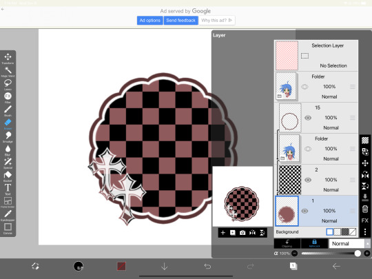
#layer mask to erase overlap
Photo

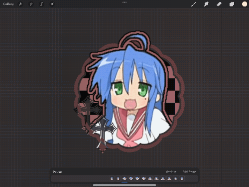
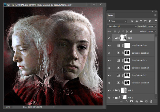
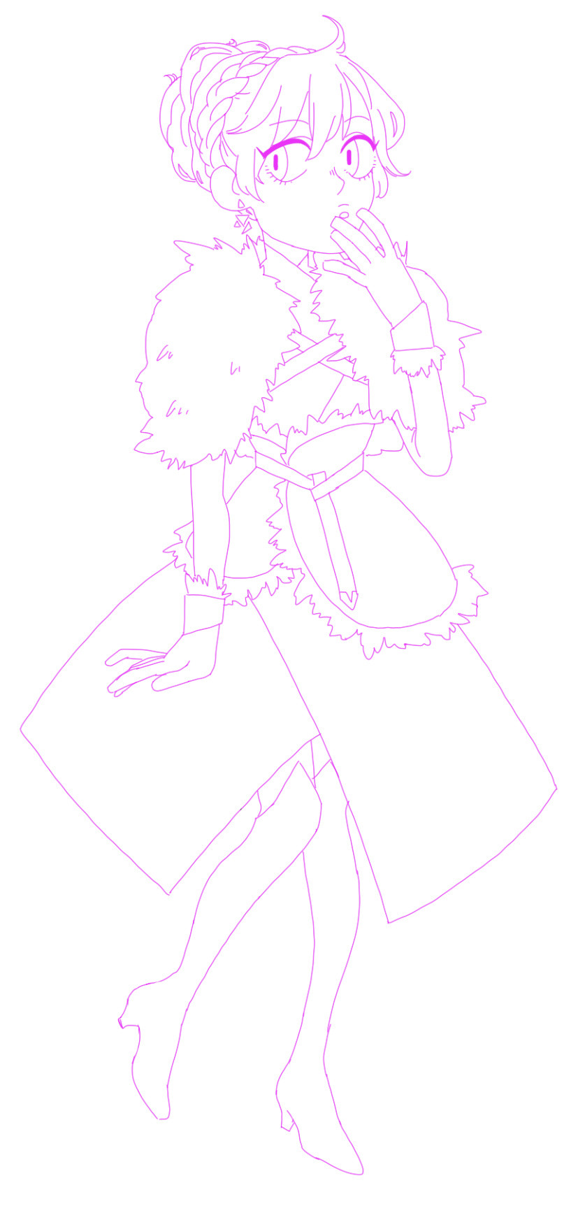
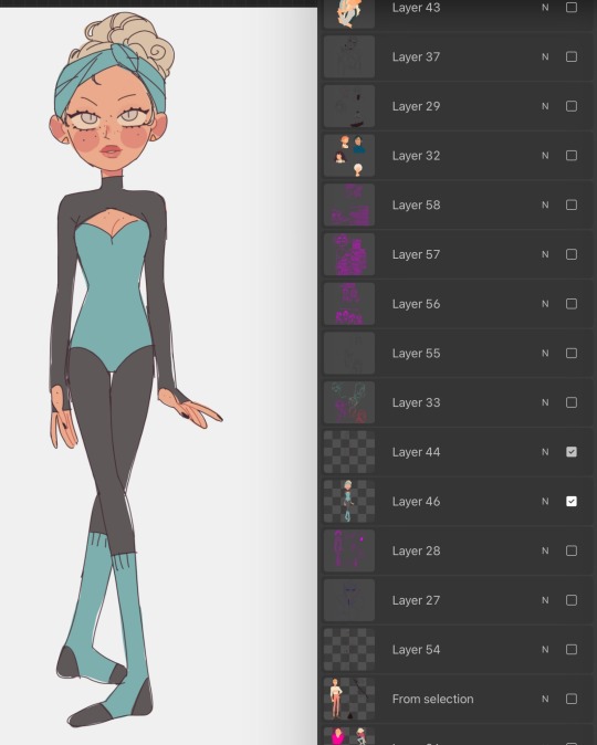
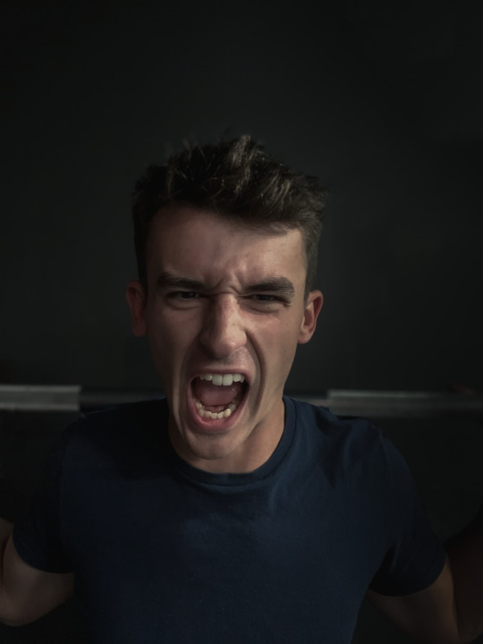
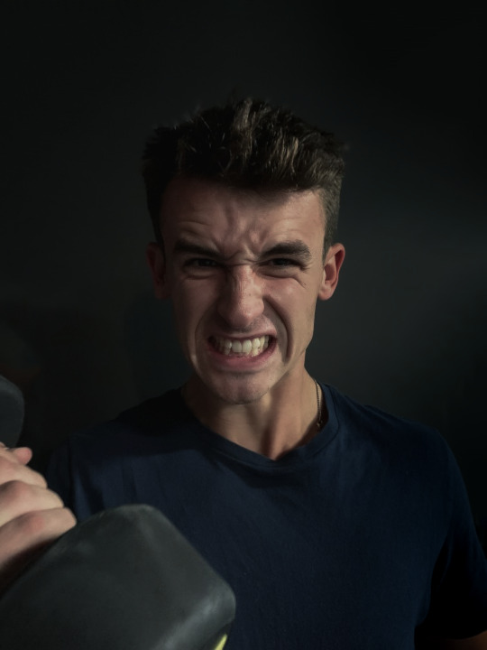
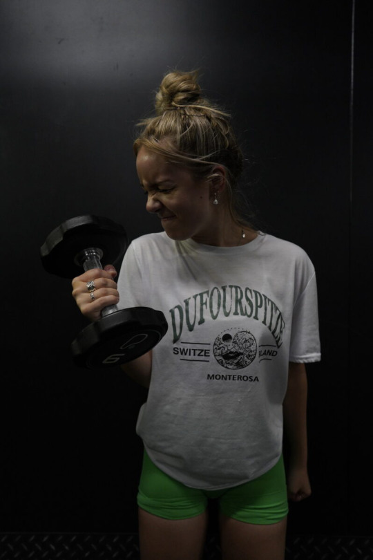
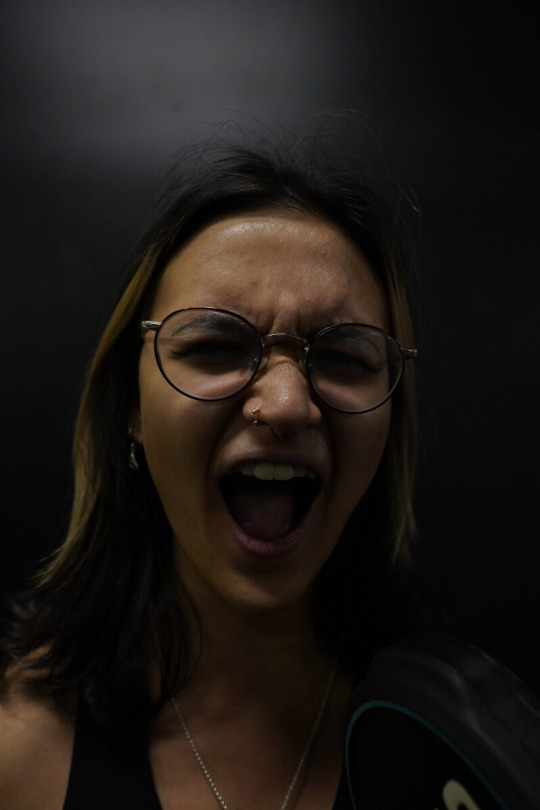
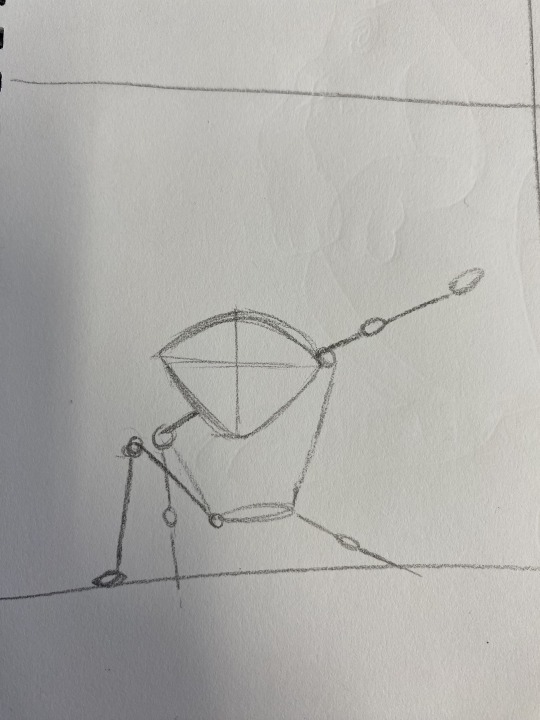
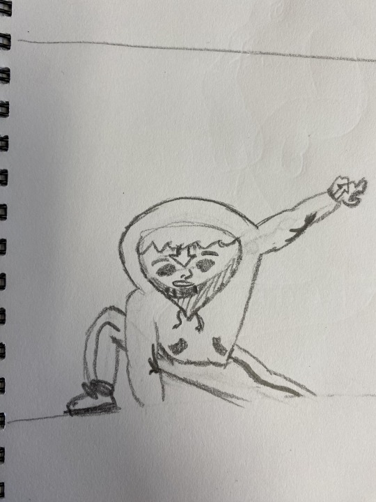
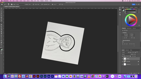
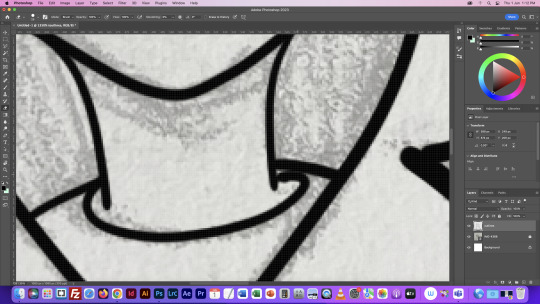
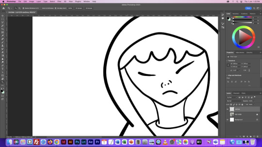
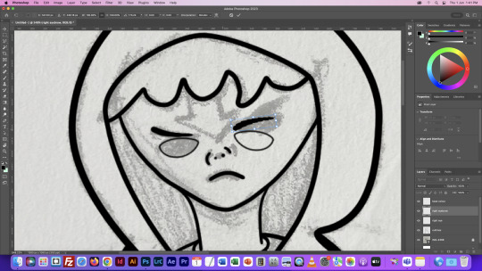
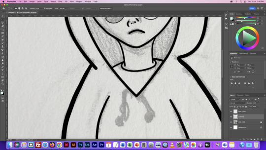
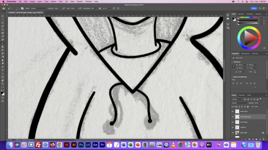
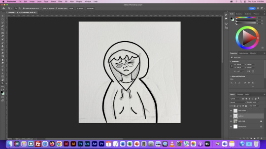
playing with savanaclaw manga style
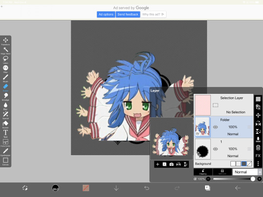
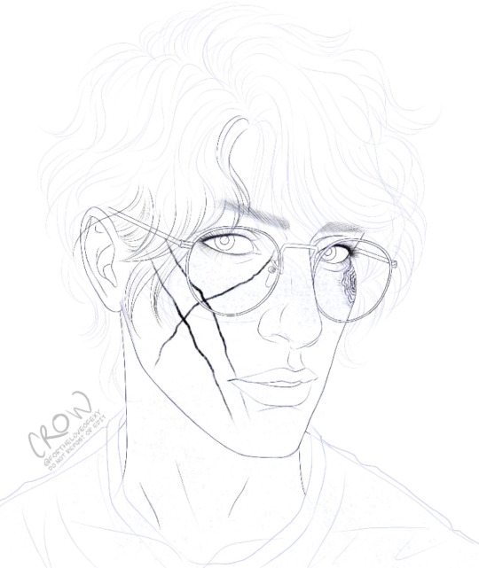
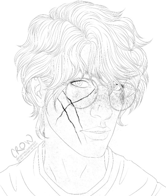
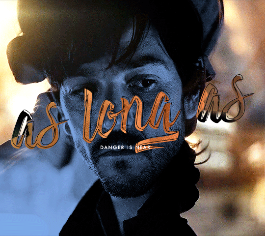
#jack howl#savanaclaw#twst#twisted wonderland#episode of savanaclaw#savanaclaw npc#fave npc chara design so far#based on style by oda suzuka#i left some of my guidelines in honestly because if it makes people realize how easy it is to draw this npc and jack#then i'd love to see people draw them more#its not necessary but i like drawing the head shape#putting head and ears and hair on different layers#so i can place and move the ears around#layer mask to erase overlap#twitter crosspost
599 notes
·
View notes
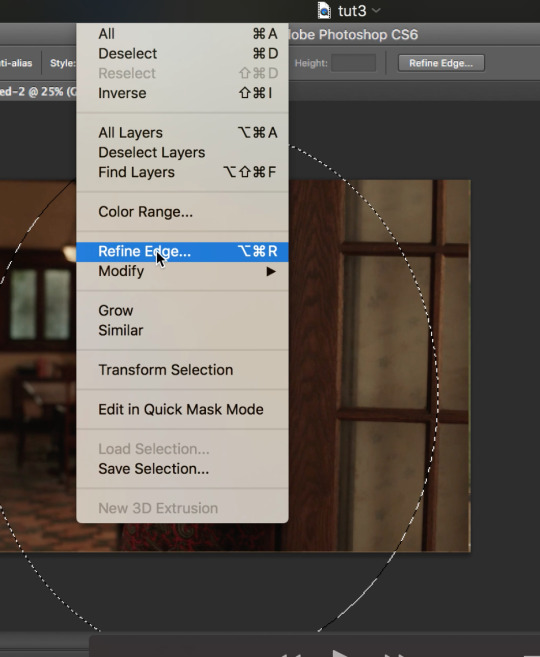
Note
hi ^-^! Can you do a tutorial on how to make this icon? I would like to learn :3
https://64.media.tumblr.com/64eb5472b1d49fc941ccefbae558846e/cb2b70c34ebba0a7-b4/s1280x1920/d9e44a125324b309a533a1e56be842355046d740.gifv
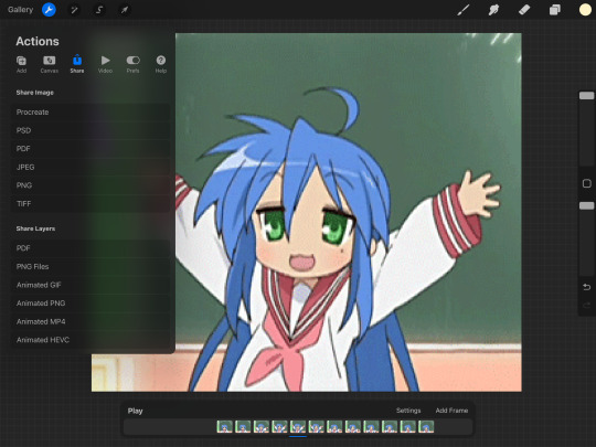
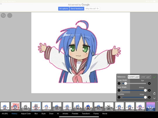
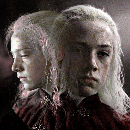
Hello! I apologize in advance for my poor explanation skills, and also for how convoluted this process can get 😭 But I saw this as a worthy challenge, so here’s how you too can make a gif icon where the character comes out of the frame like this and this:
This is going to be very long so the full tutorial is under this cut!
Programs I use: IbisPaintX and Procreate*
*full disclosure, procreate is exclusively for iPad and costs 10 USD. however every thing I do in procreate you should also be able to do in Photopea
1. First things first, after finding the gif you’ll want to use, you’ll need to download each individual frame. By importing it into either procreate, photopea, or any program that’ll allow you to view individual frames, you’ll be able to save each frame
A note about gifs: The best gifs to use are ones with less frames due to the fact you’ll be editing the individual frames. Not to say you can’t use gifs with higher frame counts, however it is much more time consuming the more frames there are
2. Next you’ll have to remove the background from each frame. You can remove the background by hand, but I like to use this website to help make things a bit easier. Just pop your frames into it and download each one

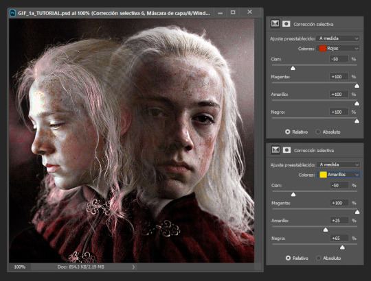
It is unfortunately not always accurate and often misses things on images where the background isn’t clearly defined or is lower quality, and you most definitely will have to do touch ups on your frames For example here, for some reason, the first two frames (on the left) were left with a semi transparent gray background and in the image in the middle, you can see sizable areas where the website missed. And also as of recently there as been practically invisible dots it leaves where the background once was that stroke filter picks up some how. You’ll need to hit each frame with the magic wand tool or similar to remove these dots if you plan on adding strokes

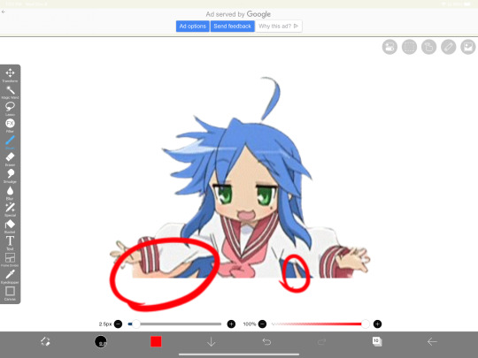
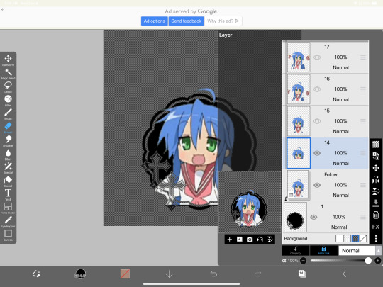
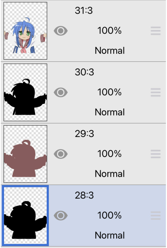
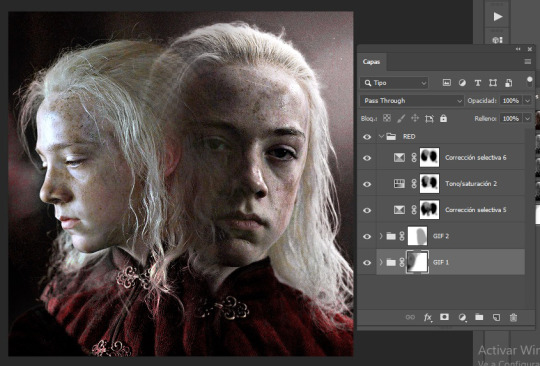
3. Now add all your frames into your program and stick them in a folder. Then, reposition the frames on top of the image mask you are using (in ibis, make sure all frames are visible and select the folder before repositioning the frames, in other programs, you should just be able to select multiple layers and move them that way). Once you’ve repositioned them, duplicate the folder then select clipping on the bottom folder like shown in the right image (I know I forgot to duplicate the folder then 💀)

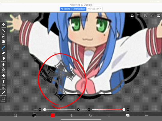
4. Now here’s where the tedious stuff comes in. Make sure you number your frames, because it’ll help you out a lot. In the top folder, erase the bottom part of your gif that you want to be in the frame (I’ll call this the clipping layer) but keep the top where you want to be coming out of the frame intact (this’ll be the overlapping layer). Repeat this process for all of the frames
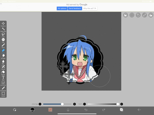
Note: Try to use a simple shaped frame for these kinds of icons. However, if you choose to use something with a more complex shape, be weary of where you erase! You will need to be more precise with shapes like these depending on where you want things to go
And if you haven’t edited the frame itself, you should do so now
5.5. After that, you can leave things off there and skip this step if that’s what you’re going for! However, if you want to add things like strokes, it’ll get a lil more complicated
Firstly, I duplicate my clipping layer and then select stroke (both). You can also use stoke (outer) or whatever your program has, but this is my personal preference. I then duplicate that layer and keep applying stroke till I get what I want (if you use stroke (outer) duplicating your layer isn’t necessary). I think merge my stroke layers together, but I keep it separate from my main frame
That way I can duplicate my stroke layer and add it to my overlapping layer. Then I erase the unnecessary parts shown on the left. You may need to clean up the stroke on certain frames or reapply it depending on the position of things and what you’ve erased and what not. It takes a lot of trial and error. You can also apply the stroke before you make your overlapping layers, however when I was making this graphic I fucked it up in the process of making this tut and had to remake it so that’s what I did the second time around 💀 if you were wondering why I didn’t just do that in the first place, now you know


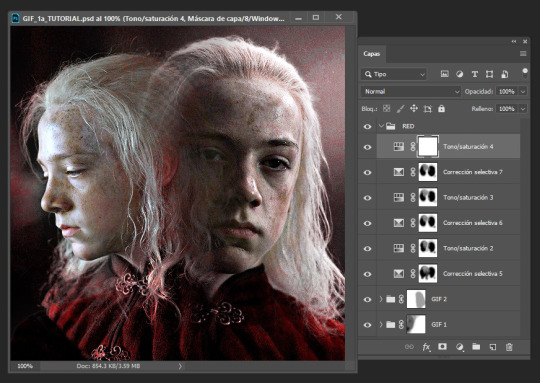
6. Now it’s time to export your layers as a psd and import it into procreate/photopea! You’ll now have to merge your clipping layer into your image mask then merge your overlapping layer on top of it to create one layer. Repeat this for all the frames and you’ll be finished!
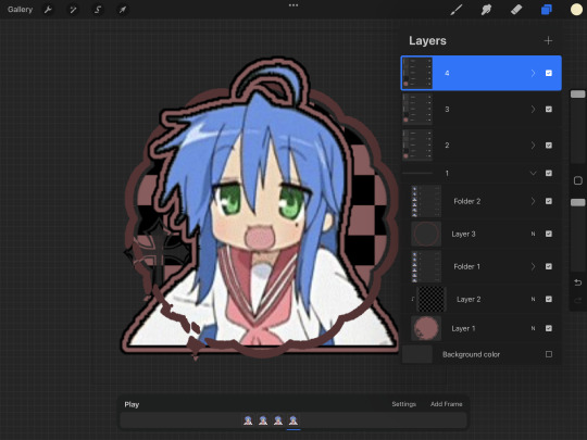

Tada! Now you can add filters and whatever else if so desired. And that’s my process for making these kinds of graphics! There’s definitely an easier way of doing this but that’s just what I’ve got figured out for now. Don’t hesitate to ask any questions for the things that make zero sense lol
257 notes
·
View notes
Text
Excerpt from the above link:
First thing’s first. If the phrasing in the title feels unfamiliar, it has a purpose: We are eliminating the passive voice from the pandemic. Right now.
Someone INFECTED Neil Gaiman with COVID-19.
And many someones in overlapping layers of responsibility ENABLED this infection.
This linguistic shift from the passive to active voice might seem irrelevant but, instead of just echoing the framing we see in the headlines — that Neil Gaiman got COVID-19— it’s time to own that somebody has infected Neil.
The passive voice has served a macabre purpose in this pandemic. The passive voice, by erasing the subject of the sentence, neatly obscures accountability, and with it our own role in unmitigated infections. Moreover, it has prevented us from identifying the layers of responsibility in enabling infections on a mass scale. This mental block is the first obstacle to advocating for effective mitigations and constructive solutions. It stops us from preventing infections. But that is changing now.
It is time to own the damage that we are causing by infecting others with COVID-19. I believe that we all know, deep inside, that we are causing harm. And many of us are suffering from the cognitive dissonance of pretending that we aren’t. Because, in a pandemic, this is serious and large-scale harm.
This harm that, according to estimates, has killed over 25 million people and disabled at least 65 million and counting. The sooner we face the harm we are causing by infecting other people, the less damage we will cause to ourselves, to our loved ones, to our community, to strangers on the other side of the world. And to people who entertain and inspire us, like speculative fiction author and TV creator Neil Gaiman. And inspiration is necessary when we are facing so many challenges. It’s that simple.
COVID-19 is a serious, multi-system vascular disease that creates severe and cumulative damage.
Reinfections tend to be more severe and Long COVID occurs in 1/10–1/3 infections.
Up to 60% of infections are spread asymptomatically… Wait, let me rephrase that. People, who are asymptomatic, or presymptomatic, are infecting others with COVID-19 in up to 60% of cases.
A person who is presymptomatic can transmit a COVID-19 infection up to two days before symptoms arise.
People infect other people with SARS-CoV-2 through aerosols. An infected person expels them just by exhaling. The aerosols accumulate in the air, and spread across large spaces like cigarette smoke. They also remain in the air for hours, so even if a room is empty, if a symptomatic person was there earlier, the aerosols will still be there. Crowded, indoor spaces are high-risk for transmission.
We are currently in a wave caused by a new variant for which a vaccine has yet to be developed. In a crowd of 100, statistically 1-2 people will have active infections.
If we put all of this together, we see that live events in crowded, indoor spaces are particularly dangerous, and that masking only when someone is symptomatic is woefully inadequate to prevent infecting others. So, in order to not infect other people, we need to individually mask at these events, and to collectively apply pressure to venues that are enabling these infections, as well as to lawmakers who have removed protections.
That’s the tl;dr. Now, if you have some time, and feel motivated to prevent further infections, let’s look more systematically at the problem of people infecting other people, especially at live events, and how to constructively address it.
Neil Gaiman requested masking at his events, from both venues and audience members
It’s fucked-up that, three days after Neil Gaiman requested that attendees voluntarily mask at his tour events — because the venues themselves refused to enforce audience masking — Neil announced on social media that he has another COVID-19 infection and “this time it means business.”
This infection — and any COVID-19 infection — is terrible, but unfortunately not surprising. We are in a wave caused by multiple variants, and lawmakers worldwide dropped most COVID-19 public health mitigations earlier this year. So people who are appearing at live events now are at an incredibly high risk of being infected. The risk is also increased due to a swarm of new variants — so many versions of the virus are circulating now, you can get a case in August and another in September
As a fan of Neil Gaiman, I guess I wished that somehow it would miss him. COVID-19 infects the brain, and his brain has created my favorite TV series, Good Omens, a queer love story between an angel and a demon. This series has helped me, and countless others, heal from religious trauma. It also rekindled my appreciation for David Tennant in his role as the demon Crowley, who witnesses everything from Old Testament atrocities to a modern-day armageddon, and seems to be the only one suggesting that God might be a tyrant. With so many of us experiencing a dark night of the soul in the pandemic, it’s much-needed validation.
What also worries, but not surprises, me about Neil’s infection is that, if his statement that “this time it means business” is anything to go by, (especially for someone who can be quite understated), this infection is more severe than any previous ones. This unfortunately is also not surprising, as reinfections tend to be more severe. The damage from these infections is cumulative, and SARS-CoV-2 attacks the immune system, in many cases after a person has recovered from an initial infection. Viral reservoirs continually attacking the body are believed to be the mechanism of Long COVID. However, his more severe course reminds me of other performers who are currently touring, almost without exception at massive, indoor, unmasked events.
Actually, it’s more accurate to say that it scares the hell out of me.
Actors from another TV series beloved by queer fans, Our Flag Means Death, including Rhys Darby, Vico Ortiz and Samson Kayo, will appear at London Comic Con on October 27–29th. The event will have more than 100,000 attendees and does not require masks. And David Tennant, who sparked my motivation to advocate for safer venues, will appear at New York Comic Con October 12-15th. NYCC will have over 200,000 attendees and also does not require masks. I checked.
The math on the likely damage is pretty fucking grim.
It’s estimated that in a crowd of 100, 1–2 people have a COVID-19 infection. So that’s at least 2,000 attendees spreading the virus.
Each person infects 2–3 other people. This is total, so they may not infect people at this event. But because the venue is extremely high risk: indoors, crowded, no mitigations, they may infect more people than averge.
So, from 2,000 people who go to Comic Con with infections, that’s at least 4,000 people that they will infect.
Between ⅓–1/10 infections result in Long COVID, so at least 400 people statistically may develop Long COVID. From one event.
tl;dr 200,000 attendees/100=
2,000 infections x 2=
4,000 newly infected/10
=400 Long COVID cases
And that’s the conservative estimate. The upper-end estimate, based on data, is up to 2%.
You can bet that I’m well-aware that David Tennant has a .2%-2% chance of developing Long COVID from this one event, especially because he’s due to play MacBeth in London this winter. The luckiest person who ever existed would statistically develop Long COVID after their 50th event.
It’s not just headlining performers who need to worry about infections. Any attendee has a .2% chance of developing Long COVID from this one event, and that’s a tragedy in the fan community, but also for people working on staff who don’t choose to be there. I wonder what would happen if the damage were immediately visible, like setting fire to 400 guests, fans, and staff people at the door. What then?
If you have read my first article sounding the alarm on unprecedented numbers of performers becoming seriously ill and dying in the pandemic, you will know that my own fannish devotion to David Tennant inspired me to advocate for COVID-19 mitigations at venues and nourishes me with the love and compassion to do this work. With Neil Gaiman’s infection, it hits home that everyone who is currently doing live events, particularly large ones with no mitigations, are quite likely going to be infected. And in the fourth year of the pandemic, that means reinfected, which means that, like in Neil’s case, it will probably be more severe.
Performers are just my own corner of advocacy, but we all breathe the same air, so these new infections will affect everyone. And people with disabilities, who work in service and customer-facing jobs, or who have inadequate access to medical care, will be the most vulnerable. But most people now have had at least one infection, so we’re all facing danger here.
This is why I want to prevent people from infecting people at events, and by doing so to raise awareness in the wider public that this is an escalating emergency. And I think it’s achievable.
The first step is identifying the causes, both individual and structural. Then to come up with workable interventions at each point of responsbility.
Individual responsibility: someone infected Neil Gaiman with COVID-19
Preventing infections begins at the individual level. As the founder of #FansMASKUP, which is dedicated to raising awareness in the fan community about masking at live events, my first feeling was rage at the person who infected Neil. The incubation period for COVID-19 varies widely, from 2–14 days, though on average 5–6. So, if Neil developed symptoms on October 5th, it’s possible that someone in the audience on the October 2nd event infected him. And if that person is such a fan of Neil that they paid to see him live, I ask: why didn’t they just wear a mask? But even this is not so simple.
From my conversations with other fans who have been diligent about masking, they sometimes experience harassment, and fear for their safety and mental health. And since so many of us are LGBTQIA+, neurodivergent, BIPOC and/or disabled, we are statistically more vulnerable to people harassing us, or even assaulting us, if we are the only ones masking. So as much as I’d like to judge this person for infecting someone who they admire, I have to admit that safety is too often a real concern for our community.
What can we do on an individual level to promote safer venues?
If we feel sufficient safety to mask at live events, then we should do so.
If we are going with friends, we can encourage them to mask too.
We can connect on social media and find other fans who are attending and mask together.
Heck, if we have a spare $20 (which not all of us do), we can even give out masks at the event so that we’re not the only one.
Aside from fear and social pressure, people may have stopped masking due to exhaustion, despair and misinformation — we MUST start again. Every masked person can break a chain of transmission and save many, many lives. Maybe even Neil Gaiman’s life, and certainly the lives of your loved ones, including fellow fans.
Institutional responsibility: venues are enabling people to infect other people with COVID-19
It would be a mistake to lay all of the responsibility on the person who infected Neil. There has been systemic neglect, and even malfeasance, at every level of responsibility, and the people who are making these decisions are enabling people to infect others. Though this reaches into the level of policy, let’s begin with the most direct enabler in this instance: the venues.
Remember, Neil said on social media that he requested audience masking at venues, but they refused. Then after his first tour date, he announced that someone had infected with with SARS-CoV-2. We can’t know whether someone infected him at this particular event, though the timing is consistent with the virus’s incubation period. Regardless, the venue has approximately 1,700 seats, and if Neil’s event was sold-out, as most are, that’s: 17 active infections, 51 new infections, 5 cases of Long COVID. So wherever someone infected Neil with COVID, it is worthwhile to advocate for venues to use mitigations.
The mitigations required to significantly reduce people infecting other people at live events are relatively simple and have been proven time-and-again to reduce the the transmission of SARS-CoV-2:
Audience masking and vaccination
Making use of HEPA air purification/filtration.
This is achievable, and venues should have been doing this since 2020. Some venues do it, and it is certainly possible, and not terribly complicated, for more venues to adopt these simple precautions.
Now, the more complex question is: if it’s so simple, why are venues refusing to use mitigations? Some of it is simply greed. It costs money, though not a lot of money, between £300–600 ($370–740) to purchase a HEPA air filter. And for truly cash-strapped venues, vendors likes Smart Air UK are renting out HEPA air filters for events. So there really is no excuse. For those who are unfamiliar with HEPA, here’s a primer from outreach coordinator (and fan herself) for Smart Air UK, Guilia Villanucci.
I’m quoting at length, but tl;dr: HEPA purifiers can remove more than 99.97% of virus particles from the air, and protecting Neil at one of his events would only have cost between $400-$700. And you can’t put a price on his brain, so…
HEPA stands for “high-efficiency particulate air.” HEPA air purifiers are nothing else than a box with a filter and a fan inside. Researchers agree that, based on their efficiency, air purifiers can remove more than 99.97% of virus particles from the air when used continuously.
Now, does this extra layer of protection have to be very expensive? It can be, especially if you look only at brand names without paying attention to the technical specifications. I recommend Smart Air products, partly because I work for Smart Air UK, but mostly because these air purifiers are cheaper than most on the market, are highly efficient, and are pretty quiet.
NOTE: If you are a performer based in Chicago, USA, you should check out Clean Air Club, they loan air purifiers at no extra cost to artists and touring musicians. If you are a venue or a performer based in the UK, you can rent air purifiers from us, or purchase them to take them on tour with you, just like singer and songwriter The Anchoress does. An investment of between £300 to £600 will probably be enough to keep performers safer in a venue if you purchase from Smart Air UK.
Again, HEPA air purifiers are effective and affordable and I can only think a noxious mix of greed, inertia and denial are preventing most venues from using this basic precaution.
There may be other financial considerations. Requiring masks could lead to lost revenue as people who refuse to mask will not attend. And, as of yet, venues face no financial liability for enabling infections. Though with lawsuits winding their way through courts regarding liability for COVID-19 infections, this may change.
However, like fans, venues may also have legitimate concerns for safety, The far-right has so politicized masking that the people responsible for venues are likely afraid of repercussions, ranging from the awkwardness of barring an unmasked person from attending an event, to someone throwing a brick through the window, or even assaulting a person on staff. These fears are not entirely unreasonable. But we need to make clear that these venues are enabling people to infect their headliners, Neil Gaiman or David Tennent or Taylor Swift. Additionally, lack of mitigations endangers attendees and people on staff, and lawsuits against employers who have exposed employees to COVID-19 infection have had more success. This changes the risk calculation.
What can we do to encourage venues to create safer event spaces?
We can contact the venues themselves, beginning with the ones who likely are not using basic mitigations. These can be any venue where you or one of your favorites will be in attendance.
We can also start with the venues where Neil was scheduled to appear. Here is a list of these venues with the ways to contact them.
Emerson Colonial Theatre
(888) 616–0272
[email protected]
Twitter-X/IG: @BroadwayBoston
The Westport Library
(203) 291–4800
Twitter-X/IG: @WestportLibrary
Cooper Union
[email protected]
(212) 353–4100
Twitter-X/IG: @cooperunion
Peter J Sharp Theatre
(212) 864–5400
[email protected]
Twitter-X/IG: @SymphonySpace
Dr. Phillips Center for the Performing Arts
[email protected]
407.839.0119
@DrPhillipsCtr
Venice Performing Arts Center
[email protected]
(941) 218–3779
Zoellner Arts Center at Lehigh University
610–758–2787
[email protected]
@LehighU @ZoellnerArts
Frikirkjan i Reykvavik+353 552 [email protected]
@iclandnoir
Piggott Theatre (British Library)
+44 (0)1937 546060
[email protected]
Twitter-X/IG: @BritishLibrary
New Jersey Performing Arts Center
1973–642–8989
[email protected]
@NJPAC
If, like me, cold-calling gives you anxiety, here’s a script that you could follow:
“Hello,
I am calling to ask what COVID-19 mitigations you use.
[If they require audience masking and use HEPA air purification, consider thanking them for their conscientiousness. If they do not, you could say:]
Neil Gaiman requested COVID mitigations at venues, but now someone has infected him. To prevent infections at your venue, I am requesting that you require audience masking and purchase a HEPA air purification unit. These are proven to significantly reduce COVID transmissions.”
I know, it’s a bit wooden, so feel free to improvise. But remember: please don’t harass these people, because most likely you will be talking to a staff person and not the person who has made the decision not to use mitigations. And if the person answering the phone is on your side, this has a better chance of success.
You can also request mitigations through social media and e-mails, although phone calls bring the most attention. But do what’s at your comfort level. Most of us who are aware of the ongoing pandemic are burnt-out and need to conserve our energy.
To sum-up, we need to hold ourselves and other fans accountable, but they face real risks and cannot be held wholly responsible. Same for venues. We need to apply pressure for them to adopt COVID-19 mitigations, but they are not wholly responsible. This brings us to the final level of accountability for people infecting other people with COVID-19.
Structural responsibility: governments are enabling infections by eliminating COVID-19 protections
The highest level of responsibility falls to governments, generally, and public health authorities specifically. It’s alarming how quickly people have reverted to using little-to-no precautions. But, remember, for many places lawmakers only eliminated public health protections within the past few months.
The state of affairs in which we find ourselves is not normal, and I think it is a brief interlude in which politicians and the very wealthy are encouraging us to continue with business-as-usual, but as those around us become sicker and sicker, we know that this is not sustainable. If 10%-30% of COVID-19 infections lead to Long COVID, and we conservatively assume that most people are infected once per year, what will that look like in ten years?
The most wide-reaching change required to stop people from infecting other people is on the level of policy. There is a basic social contract for governments to ensure public health because, in a complex society, individuals cannot carry that entire burden themselves.
In a simpler example: governments are responsible for putting stop signs at intersections. If a government legislated that there should be no more stop signs, people would get seriously injured or die in more car accidents. And we could blame the individuals who cruise their cars through the intersections and t-bone other people in their cars, or the city whose employees removed the stop signs — but the lion’s share of responsibility falls onto the government who legislated that there should be no more stop signs.
In the widest frame, we also need to advocate to our city, county, state, provincial and national lawmakers for a return of COVID-19 protections.
We also need to advocate for improved public health communication. It’s alarming how many people lack the basic facts of how not to infect themselves and each other with COVID-19.
In a nutshell: If you have learned anything new about COVID-19 from this article, that’s a problem.
**A concerned David Tennant fan should not be doing science communication that is the rightful job of public health officials.**
We need to pressure public health authorities to improve communication, and meanwhile to educate ourselves and each other about COVID.
What can we do to bring back COVID-19 protections on a societal level?
1. Call or write to your representative.
By mail, if you can. I know, it’s a pain and an archaic throwback to pre-digital times, but this is most likely to be heard. But if it’s not possible, call or e-mail as it does make a difference.
Find your representative:
US: https://www.house.gov/representatives/find-your-representative
UK: https://members.parliament.uk/FindYourMP
2. Educate yourself and your community
The Pandemic Accountability Index maintains a large repository of research on COVID-19 and its effects on the body here:
https://www.panaccindex.info/p/what-covid-does-to-the-body
and here: What SARS-CoV-2 Does to the Body (2nd Edition, July 2023)
3. Stay updated on COVID news. Folks on social media have been sounding the alarm on the pandemic, like @1goodtern and performers specifically, like @MeetJess and me, @WaltzTales.
A twitter user has also kindly provided this list of scientists and concerned people worth following:
@kprather88 (full credit to efforts to educate about all things covid) @jimrosenthal4 (C-R box, ’nuff said) @linseymarr (MacArthur genius grant https://forbes.com/sites/michaeltnietzel/2023/10/04/macarthur-foundation-names-the-winners-of-its-2023-genius-grants/?sh=6c3c96af4379… ) @joeyfox85 (mitigating airborne spread) @c19vaccinefacts (safe & effective) @scienceupfirst (not just covid!)
The final level of responsibility: the universe
This may sound a bit woo-woo, but if you read my first piece, which started with a loving-kindness meditation, you’ll have clocked that I think attending to ourselves emotionally is necessary for facing this emergency.
I honestly don’t know if there’s anything like a God who has an overview of the situation. And even though my Theology professor said the question of theodicy (“why is there evil in the world?”) isn’t a particularly interesting question, my answer is:
But *gestures broadly at everything.*
If there is a God they have a lot to answer for. But I do think that a real emotional crisis we’re facing is black-pilled misanthropy where we want to let the world burn, and all humans in it. But Neil Gaiman is a human. Whoever inspires us is a human. The feeling of being inspired in this particular way is your human experience. We humans aren’t more special than other animals. We only have the experiences that are unique to us in the landscape of all things, including high-concept science fiction from dynamic minds like Neil Gaiman’s.
I don’t think we should deny or suppress our feelings of despair and rage, or even hate, but to acknowledge and take care of them, and at the same time to nourish those aspects in us which support our joy and thriving.
It is possible to suffer and thrive at the same time. Perhaps if we could come up for a word for it, it would capture an essential strategy for moving forward with this pandemic. What do you think: Suffriving? Thrivering?
Let’s try leaning into some “Thrivering” together by advocating for safer venues, so that people like Neil Gaiman can continue inspiring us.
Special thanks to:
Giulia Villanucci, Smart Air UK, Outreach Coordinator
Nerdcake78 for the scoop. And for the slow-burn Aziraphale cuddlefic that is keeping me sane.
And everyone who is providing information, amplifying posts, and offering support. I would not be able to do this without the people who are helping out of simple kindness and solidarity.
#should have been more explicitly clear about this but too late to edit as it's been reblogged: this is an excerpt of someone else's article#this is not my own writing I am just quoting the link here#neil gaiman#david tennent#covid is not over#covid is airborne#covid is ongoing#pandemic#mask up#sars-cov-2#long covid#masks#covid#covid-19#long post
33 notes
·
View notes
Text
hi! thank you so much, i really appreciate your words 😌❤ and yeah the set did take me some time to make like around two days asdfghjkl but i love how it turned out especially the green gif, and sorry for deleting the ask! i answered it but got anxiety of it not being the answer you expected so i decided to make a tutorial instead on how i did that set (blending and color manipulation), but first i’ll leave some links to some great blending and coloring tutorials down below :)
- blending tutorials
becca’s, soph’s (which taught me how to blend) and alie’s
- coloring tutorials
becca’s, hella’s and sam’s
(personally i use becca’s tutorials bc we work in a similar way and they’re super amazing and were a huge inspiration and help me out on how to make this tutorial)
okay so lil blending and color manipulation tutorial under the cut
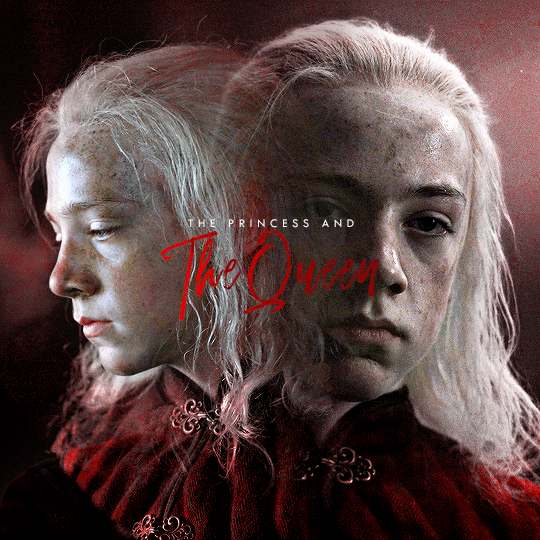
i’ll be using the first gif of the set you mentioned because it’s the one that needed the most color adjustments to get the red, other gifs didn’t need that much work and were fairly easy to get the color i wanted, so i’ll be going from this
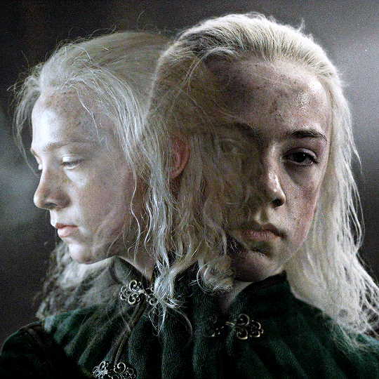
to this
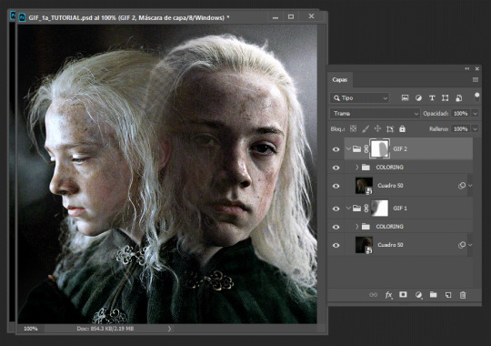
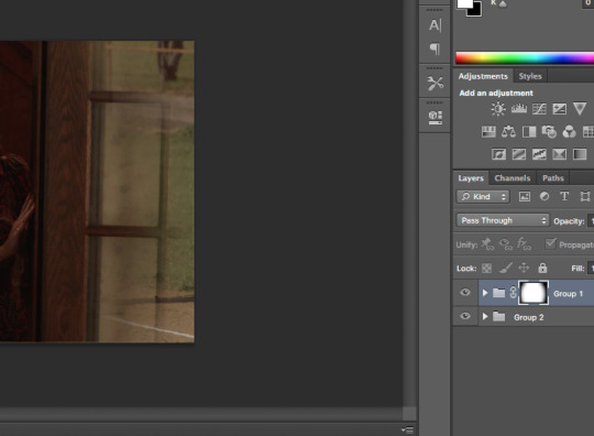
so starting, i work on each gif separately (crop, resize and color). the base gif will be the one where young aemond is looking to the front, tho honestly it doesn’t matter which gif you use as your base. once we’re satisfied with both of their colorings we go to the second gif which is the one of young aemond looking to the side, select both gif and coloring and click on the little folder on the bottom right corner highlighted with the red circle or just press ctrl+g on pc (cmd+g on mac i think)
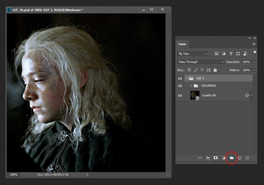
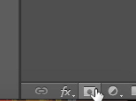
we name it as ‘gif 2′ to know which gif is it and to not get confused. then we add a vector mask by clicking the little figure highlighted again with a red circle. do these steps for all the gifs you’re planning to blend, as it will group them all separately without their individual colorings overlapping each other
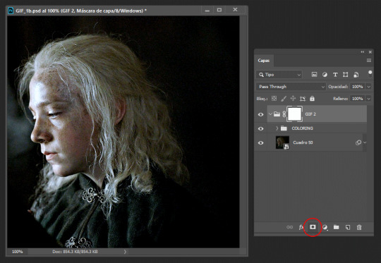
then we duplicate it and send it to the base gif and set the second gif to ‘screen’, though sometimes setting it to ‘lighten’ works too, it all depends on the gif so play with both to see which one looks better (trama = screen)
now is time to blend! for this i use a big brush like 200px, set to 0% hardness and 50% opacity, the bigger the brush and the lower the hardness, the softer the blending it’ll be, while using a smaller brush with an increased hardness, the blending will be sharper. we’re going to click on the base gif’s vector mask and with the brush set to black we’ll start to erase the left side of it, if we mess up then we set the brush to white by pressing ‘x’ and paint on it to correct anything. it should look like this
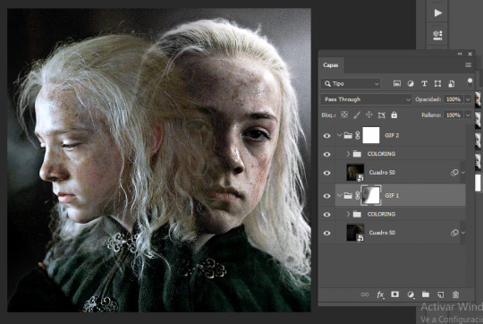
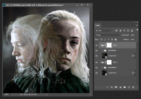
then we do the same with the second gif by erasing the right side and a little over aemond’s eye. personally i like to leave traces of both gifs so the blending looks smooth and nice. the end result should look like this
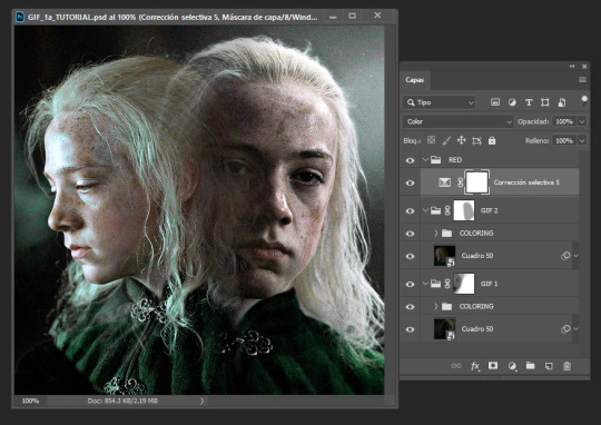
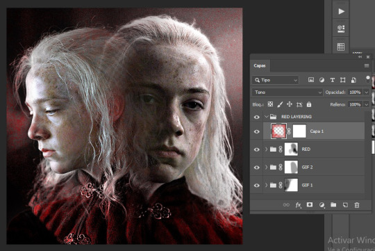
now is time to change aemond’s clothes to red! there are several ways to do this which is by using selective colors, hue/saturation, a gradient map or a new layer and paint over the gif, you can use one of these methods or several or all of them depending on your gif and the result you want to achieve. so we create a new folder atop our gifs and name it ‘red’ and create a selective colors layer, though the color isn’t that bright or strong i can see some green and maybe some cyan/blue tones on lil aemond’s clothes, so we adjust those colors to make the green pop up and set the selective colors layer to ‘color’, it should look like this
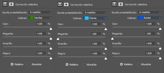
don’t worry too much if aemond’s face gets green and then red, we’ll fixed this later. now we create a hue/saturation layer, on the drop down menu we change the color to ‘green’ and drag the hue bar until the green changes to red or as close as possible to it, we do this for cyan and blues too (verde = green, cianes = cyan, azules = blue, sorry for ps being on spanish tho)
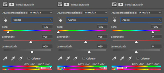
and voila! the green and cyan/blues had turned red
because the red looks dull and sad and needs to be brigthen up, we’re going to create a new selective colors layer and adjust the reds and yellows, like so:
you’ll notice that lil aemond’s face and hair has turned red, to get rid of that we’re going to pick up our brush, set it to black and start erasing those parts on the vector mask on our latest selective color layer. once you’re done duplicate twice that layer and drag one of its vector masks to our first selective color layer and the second one to our hue/saturation layer and delete the duplicates without vector masks, that way you don’t have to erase on each one of the vector masks again, just tweak each one to your liking, repeat this step for future layers
because i can see some yellow on left aemond’s hair and i want for it to be red so it blends with the rest of the color we then create a new hue/saturation layer, change the color to ‘yellow’ and set the hue to -65 and the lightness to +30. then we add a new selective colors layer and only work on the reds, we set everything to +100 though the cyan to -50. and lastly we add a new hue/saturation layer, change the color to ‘red’ and increase the saturation to +25. this will be the result. i’ve already done the step mentioned above about duplicating the vector masks
because there’s still some red on his hair and face and i’m lazy i select the folder named ‘red’, add a vector mask to it and just erased on it because i didn’t want to go and erase on each vector mask, too much work lol
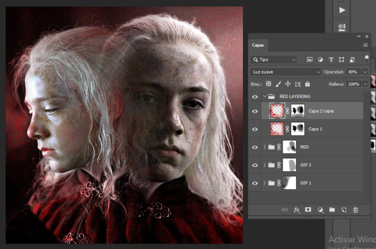
i could very much leave the gif as it is but i felt it needed like a pop of color around it because the background is kinda dull and not that vibrant, so we create a new folder and name it ‘red layering’ (i need to name things or else i get confused), create a new layer, choose a vibrant yet deep shade of red (i’m using #b80505), pick up our brush (200px, 0% hardness, 50% opacity) and paint the background and a little over aemond’s clothes, set the layer to ‘tone’ and add a vector mask, like so:
i like how setting the layer to ‘tone’ gives his hair a soft red outline on places that didn’t change to red, like around the top of his hair. so next we duplicate the layer, set it to ‘soft light’ and the opacity to 40%, and with our brush set to black erase any parts we don’t want, like a little on his hair, his face and over his clothes, and apply the step i mentioned about duplicated vector masks and tweak to your liking
for this type of gifs i like to set the speed to 0.06, and voila! the gif is done! you can add in some typography if you want to c:
worth mentioning that other gifs won’t need that many adjustment layers, like the purple and green ones for example they only needed two selective colors layers and a little bit of painting on a new layer to achieve those colors. hope this tutorial was of any help :3c
#usergif#completeresources#allresources#userwolfkissed#usernik#userbecca#tusercora#userelio#coloring tutorial#gif tutorial#tutorials#mytutorials#ps help
176 notes
·
View notes
Note
Hi! So, I really, REALLY love your art. Specifically, the way you draw hair is beautiful. Can you explain how you draw it, how you think about it?
Hello! I’m happy to explain my process!
To help illustrate it better, I’m going to use this portrait of Neil as an example of how I draw hair. There are loads of different ways to draw hair btw, and the technique will vary based on the texture and type of hair you’re attempting to draw, but I’m just going to explain how I draw Neil’s hair right now for simplicity’s sake.
1. Starting with a rough sketch, I draw the face and body first. Then, on a new layer, I begin drawing the hair. This allows me to erase the hair and make corrections without messing with any of my other lines. I keep the initial sketch loose - it’s more about defining the overall shape and form of the hair, rather than getting specific strands drawn correctly since we can always define those later. I use a pencil texture brush for this, but you can use any that you like, since these lines will be gone by the time we’re done. For this drawing, I used the Pencil Sketch brush from the Vicente brush set.
2. Once I’m happy with the initial rough sketch, I start the actual line art. As with the rough sketch, the hair will be drawn last, and on a separate layer. This is so I can easily erase anything the hair covers without messing up my lines. I try to go more carefully here, making sure my lines are neater, defining the hair into chunks and sections as I go. It helps to look at references of hair - you don’t have to draw each individual strand, but instead pay attention to how hair naturally falls into sections and clumps, depending on its texture and environmental conditions. For this, you can either use a smooth brush texture or a pencil texture brush, depending on which look you prefer. For this drawing, I used Clean Sketch brush from the Jingsketch Basics brush set.
3. Once I’m happy with my lines and how the hair is coming together, it’s time to move on to flat colors. Same as before, the hair color will go on it’s own layer. I start by outlining the shape of the hair with the base hair color I’ve chosen, then fill it in. I use the Painting Flats brush from the Westwood set, but you can use whatever you prefer.

4. Now that we’re done with flats, it’s time to move on to rendering! This is where the magic happens. First, create a clipping mask over the hair color layer, then set it to multiply. Then, taking either a light grey-blue or light grey-purple color, start drawing in shadows around the chunks of hair. This will help create depth and give the hair more dimension and shape. I use the same brush as for flats, but if you have a different brush you prefer to render with, feel free to do so!
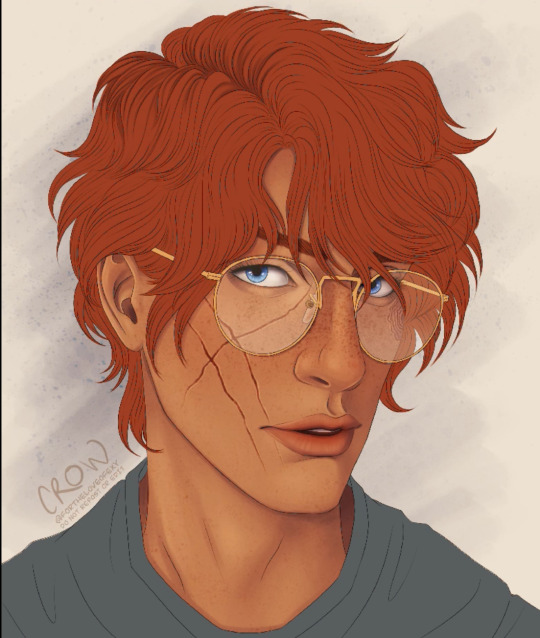
5. Once the sections have been defined, create a second clipping mask and set it to multiply as well. Now we’re going to add more shadows and depth to the hair - you’ll want to concentrate on shading more heavily in the sections of hair that will be least exposed to light, such as in the part, behind the ear and face, and under the bangs.

6. Next, create another clipping mask on top of your multiply layers, and set it to Soft Light. Grab your base hair color, and make it about 70% lighter and 50% less saturated (I usually just eyeball this). Taking this color, we’re going to go back in with a small rendering brush and define the high points of the hair (this would be any part of the hair that would get the most light - such as the “crest” of hair waves)

7. Once that’s done, I make another clipping mask and set it to “Soft Light”, grab an off-white color and select the pencil texture brush. With the smallest available brush size, I go back in and draw little white strands all over the hair, focusing on the highlighted parts especially. I try not to overlap these lines with the original line art. These white lines help give the hair more texture, creating an illusion of there being individual strands of hair there without you having to do all that work.

And voila! Neil has hair!
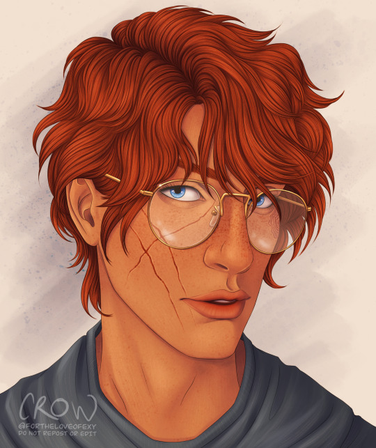
Sorry for the long, rambling answer. I hope this helps explain my process a little :)
#aftg#neil josten#aftg fanart#asks#ask crow#art tutorial#hair tutorial#drawing tutorial#drawing help#drawing hair#digital art#procreate
49 notes
·
View notes
Note
Hi, first of all, I love your art. I really admire your sense of posing and simple but great colour schemes.
I would love to get some advice from you. The light source in your recent Despair Sisters posts is directly above, do you have any tips or advice on shadowing in this light source? I love such impressive lighting, but it's hard to imagine what the shadow will look like. Any advice would be greatly appreciated!
Thanks ❤❤
I don't usually get asked for tips, so I am sorry if my explanations are confusing
the most easiest (for me) way of shading is to do it before doing base colour.
I usually do two layers of shading with the same colour (dark purple) but different opacity (depending on how the result)
and if you are asking specifically on my recent post, I just Fill everything with purple, since it is more shade

then just erased the part that light should go, starting from the top or where the light source shine. then adjust/erased/add more details


some people use the mask tool for this. I usually use it if I want a more blend effect, but for this one, I don't use it because I am lazy
then add another layer above this shade layer with the same colour and more or less the same opacity with the first one , and add in where shadow can be darker usually where something overlap like skin below hair, or somewhere lower

the layer panels look like this for me (2 different layers of shade inside a layer folder), and set the folder mode to multiply. I am just lazy to name my layers

I don't know why my Junko one had a folder inside a folder, but usually it will look like this

then, hide your shade folder and proceed to do the base colour


For context, I used a white colour to colour Junko first as a guide to clip my other layer so it won't fill outside the guide white colour. and screen is for me to adjust how the colour will look like (sometimes different screen like phone or monitor have different effect on the result, depending on the mode your monitor is in : cool or warm or etc) notice that the shade folder is hidden,
I am so lazy that I don't name my layers which will make it hard to find a specific layer with errors
then unhide the shade folder.

Then just add in a bit of light details depending on your taste
I hope this help you (not to confusing since this is how I find myself comfortable with)
6 notes
·
View notes
Text
so a friend asked me if I could give some tips on how I blend gifs like these:
and LOL let me tell you I mainly recommend following tutorials like these (one, two, three) and honestly I owe so much of what little I know to @anya-chalotra especially the text lol I learned how to do that text line thingy from her. but I just wanted to give some pointers and maybe help explain why some scenes work and some don’t. it’s all trial and error.
setting a layer to screen in photoshop makes dark spots in the layer see through so I try to line up the parts of a scene that I want to highlight with those darker spots. I found a scene that had jyn backlit so that I could just turn up the contrast and make her silhouette darker (after I had finished the basic coloring I do for gifs). then I took the scene with cassian and put a gradient map over it, but I made sure to brighten the shit out of the scene so that it wasn’t just a dark blue blob, that there was a decent amount of contrast in his face.
now if you imagine the gif as having four quadrants, and I’m sorry I’m lazy so you’ll just have to imagine it for yourself, look at the top right quadrant. what I could have done was put a clipping mask on a new layer above the scene with cassian and drawn a bit of black with a big, diffuse brush (set to normal) in order to erase the bit of blue from cassian’s scene that is near jyn’s nose (I actually did that underneath but idk I guess I liked the look of it lol) and that is a good way to hide parts of a scene that you don’t want showing through the other scene. why black? because with a clipping mask layer it will only show up for the layer that is it is clipped to, and since black/dark shades are more transparent with a screen layer, it will allow the other scene to show more clearly.
this works best with scenes like these where the subjects aren’t moving too much.
but with this gif, the movement is the point:
it was completely unintentional, I just lined up the two scenes are noticed when the people with the helmets walked past cassian, you could see the other scene of him walking away more clearly - and the theme of the gifset was spy, so it just ~~fit the theme to me. that his face would be hidden and you’d see him in the background, walking away, in flashes.
in this case I think I literally just put the two scenes on top of each other, set the scene with the gradient map to screen, brightened that layer up significantly and called it a day. it helps that they are both from the same scene in the film, so there is a uniformity to the mess of these individual scenes that are cohesive. but usually all this movement can obscure the subjects and that’s generally not what people are looking for when making gifs. in this case, it works because of the theme.
it also helps that there is a contrast between the lighting of these scenes - the background scene has cassian silhouetted and backlit. so there are more dark spots to show the foreground scene, which has cassian’s face highlighted and bright.
conversely, when using two light scenes like in this gif
I actually darkened/added more contrast to the scene with jyn and cassian and sloppily did that clipping mask with the black brush onto the scene with the gradient map (and you can actually see it a bit lolll it was late I was very tired) in order to create more contrast between the overlapping subjects. if I felt like redoing this, which I don’t, I would make that black brush a bit more diffuse in order to blend more nicely.
I hope this helped and sorry for the laziness.
49 notes
·
View notes
Note
hey kels i was scrolling through my dash and then i caught a glimpse of your new fallon drawing and i want you to know that i went absolutely buckwild and then i scrolled further to see the whole drawing and i'm pretty sure i squealed. kels ever since ive started following you and your art and fallon have slowly nestled yourself inside my brain its amazing how excited i get whenever u upload a new drawing. also ive noticed that i'm slowly but surely starting to sound more and more unhinged and wild like you. how the fuck do you have so much influence on me.
ALSO i love the new fallon drawing!! you are so right blue gold and white are just her colours they fit her v well!! and i love how much texture you used throughout the whole drawing and her shoes are AWESOME!! also love the whole winter fairy-ish vibe <3
ALSO i was wondering if you could like sort of,, idk explain your drawing process on this drawing? like if you did the colouring first or the lineart and stuff bc i just love how it turned out and id love to try something similar!!
AW!!! i am so hype for my awful girl to be Enjoyed so much!! she is my favorite dressup doll i love to play barbies with her most of all heheh. also i am THRILLED that my Unhinged and Unwell nature have rubbed off on u. i know i am a Strong personality and it makes me V POLARIZING (i am either LOVED or LOATHED i havent met many ppl who are just like meh abt me. i am an Experience) and its always a DELIGHT when someone finds my feral animal traits endearing or positive and kind of picks up on them. i think because life is short that we should all be as bananas as we please at any point in time. PURE ID HERE BABY
AND TY TY!! my girl has a strong aesthetic and this piece kind of went a liiiiittle against some of that (its a lot of hard angles vs i normally give her a lot of ovals and rounded edges) but for the setting its appropriate bc im trying to give her a bit more of a """"harsh"""" or """"severe"""" vibe (like as harsh and severe as she can possibly look which isnt very). i LOVE to use texture brushes they are such an easy way to get out of drawing details myself because i am SO lazy!!
okay i “”answered”” this i GUESS technically because i typed words in response but its a whole lot of jack shit so like. here ya go. SORRY PAL.
here are some more shoes as u can see i basically draw her in the same ones always except when i draw her in a plugsuit

OKAY THE DRAW IN QUESTION i kind of cheated on bc i literally just traced over one of my older draws i did for a very obscure au i made of who made me a princess (i am always doing such ridiculously niche shit i love to sit in my little sandbox and have no one else understand my barbie rps) BUT the process is the same as basically every draw i do like this. it is very simple so dont worry (or do, maybe)
i use 1-3 layers at a time and then immediately merge when i feel like im done and LIVE W MY MISTAKES if not!! anyway prepare to be massively underwhelmed heh
this is so funny i cant believe i literally traced my own drawing im a fuckin FRAUD im the laziest bitch i know. anyway. my sketches are way messier than this but it always starts out either scratch ass lines or color blocking w this bright ass magenta bc thats what feels right!!!!!!
HERES THE LAYERS I USED LOL i do all textures n shit as a clipping mask so actually i used 4 layers for this bc id set down one texture or pattern that was gonna overlap on a diff layer so i wouldnt have to work harder to erase and then BLINDLY MERGED to make things more difficult if actually i fucked up before that!!! work smarter not harder except when it is absolutely braindead to do otherwise is my motto
IF IM DOIN SMTH NICER like this then i usually make sure all my lines connect (this is also why i do a lot of angles and simple clear shapes when i draw) so i can set that layer as reference and USE THE FUCKING FILL TOOL BAYBEEEEE!!!!! this also makes it easier to fuck around with COLOR imho bc you can just rapidly swatch with zero efforts. i Love to take shortcuts. i Love to be lazy. i HIGHLY rec this, if i have colored smth that stays in the lines then its bc i connected the lineart and used the bucket fill underneath. if my lines dont connect sometimes ill make a temp line and erase after i filled. im dedicated. ALSO u can see here that my patterns layer is all overlapping and fucked up bc i didnt check and erase fully but i use p limited palettes in general so... IT DIDNT MATTER THIS TIME!!!!!!!!.
anyway after all that i lock the lineart layer if i havent already and color some of the lines for some PIZAZZ. easy way to immediately fake effort i do love to do that
HERES AN ACTUALLY MESSY SKETCH:
i do all of my fucking draws on the same canvas bc im a horrible little beast, so the only reason i didnt erase the sketch and use it for the colors layer was bc there were others on that layer already and i didnt wanna scoot them so i could cap the finished draw. i did NOT connect my lines for this one i colored like a toddler. who gives a shit we all die in the end anyway!!!
YOU DIDNT ASK FOR THIS BUT LINELESS MY LOVE... i just color blocked for this one alas i do not have process caps, i will do that next time i draw i guess if anyone wants that!!? i typically only use a single layer for lineless- block out the shape, alpha lock, then color and carve from there. EASY PEASY!! ive shown it before but i spent all my formative draw years on v limited feature programs (mspaint, oekaki, TEGAKI MOST OF ALL) so i dont explore tools much and do what seems easiest and most intuitive to me... im sorry i dont have any sick tricks or real process i am but a feral little clown drawing in the DIRT. also here is the tegaki overlay i use whenever i am Blocked or fatigued w procreate layout. it makes me feel NOSTALGIC and INSPIRED so i do this instead of like, actually getting on tegs2
this ended up long as fuck and FOR WHAT?? its just 10 images and several paragraphs of “sorry im the laziest fucker ALIVE”
#idk what to say here every time i type anything i thnk it makes me seem just completely detached from reality#its not untrue i GUESS. im Unwell but in a stable SUCCESSFULLY COMPLETED THERAPY AND HAVING FUN WITH IT kind of way#kels talks#damn sorry anon this was a whole lot of not answering you at all
23 notes
·
View notes
Note
Hi I love your designs. Do you have any tips for beginners, workflows or tutorials you'd recommend?
I have the alphabet down and have been trying to move to PS but it is a nightmare. I've been trying with doing each word on a layer but I end up with a million vectors.
Thank you!
Hi, thank you so much!
Nailing down a digital workflow definitely takes a bit of trial and error. It took me a good 2 years to figure out how to work in Photoshop, especially since I was learning from scratch, and another year or so to figure out a workflow when I moved to a tablet.
In terms of tools, I use Photoshop Elements 2011, Illustrator (though I've used Inkscape before), and Autodesk Sketchbook on my tablet. Other Gallifreyan writers use GIMP and AutoCAD (yeah idk how that last one works either). In general, I think the same tips work across platforms, both raster and vector, though of course YMMV.
Ultimately, the massive number of layers is somewhat unavoidable. This piece had 31 layers in Photoshop; this simple one had 10 layers in Illustrator. But here are some tips for getting from hundreds down to less than 50! I'm gonna move the rest of this under a readmore to avoid clogging dashboards.
First, you probably don't need to put each word on its own layer. I tend to group structural elements together. So for each sentence, I'll do the sentence circles on one layer, all word circles on 1-2 layers, and then consonants, vowels, line decorators, dot decorators, and punctuation all on individual layers. With both raster and vector software, you can move individual elements within a layer - with vectors you just pick up the whole path, and with raster you can use the lasso or magic wand to select all pixels within a certain area on a layer. With raster, the main thing you need to watch out for is overlapped shapes - so when I work in Photoshop, I'll have 2-3 layers for word circles and for consonants, so I can switch between the various layers when things overlap.
Second, clipping masks and groups are your friend!! Clipping masks help you get clean, sharp edges without having to zoom in to erase individual pixels. Grouping helps consolidate the various elements of a word or sentence; especially when you're happy with how something looks, group all the individual parts of it so you're only working with one object instead of 15.
Third, I find it really helpful to sketch out my designs physically before making them digitally - sometimes I do this in my sketchbook, sometimes I draw things on my tablet. But sketching the design out helps me get a sense of how all the pieces are fitting together, which in turn gives me a sense of how to tackle them. For example, when working in Photoshop, I draw word circles for words without divots before drawing word circles that have divots, so that I can use the nondivot-circles to inform divot positioning. But in order to do this, I have to know upfront which words are going to have divots and how everything is fitting together.
Finally, you may want to take a look at Sirkles' youtube explanations. She makes these to explain how to read her translations, but on occasion, she'll go into her GIMP file to fix something, and that might help explain the behind-the-scenes process. Annnd you can check out these 2 Twitch VODs of mine from back when I had pipe dreams of a Patreon where I offered Twitch VODs as a patron benefit: VOD 1 || VOD 2. Both are for pieces I did in Photoshop. I apologize in advance for the garbage sound quality.
I hope you're able to find something useful in this wall of text. Unfortunately I think it really does just take practice, and a lot of trial and error, so I wish you the best of lucky and a speedy learning curve!
3 notes
·
View notes
Note
I have a question! If you don’t mind. I love your gifsets, they look amazing. I was wondering if you would be able to provide tips on how to overlay multiple scenes and still keep both scenes looking clear and detailed despite overlapping?
hi! im going to turn this into a tutorial (which is probably more long-winded than you were looking for but oh well). if you're confused about anything just lmk!
(this tutorial is estimated at intermediate level. it is under the assumption that you have basic gif making understanding)
we are going to be working with two gifs of greta (my beloved). try to pick lighter/medium light gifs until you start to feel more confident with coloring
these gifs have no color, speed, or anything added to them, so this is your absolute baseline gif
go ahead and group each gif's layers into one. to do that, go to the toolbar above: select - all layers - group all layers (if you are using a mac you can hit command - shift - G). name them whatever you want, but make sure each gif has a different group name because we are going to be stacking them and it will get confusing if they're both Group 1
once the layers are grouped, we are going to go to the timeline of one gif, click the icon with three horizontal lines, click select all frames. it should highlight all of your frames in blue.

then you are going to click the same icon on the timeline and select 'copy frames'
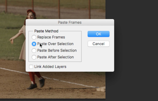
next you're going to move into the next gif you want to use and follow the same process (timeline icon - select all frames) the only thing different is that you are going to select paste frames instead of copy frames!!!
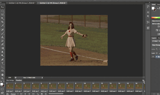
click on 'paste over selection' and hit OK
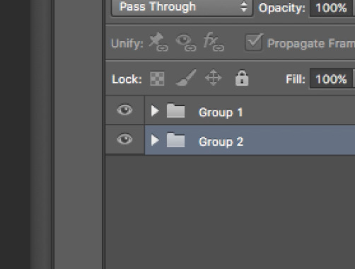
your toolbar to the side should look like this, with group 1 and group 2 together. once they are together on the same tab, you can rearrange them however you want.
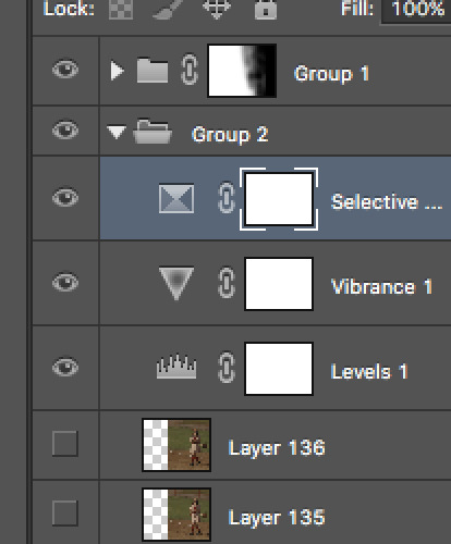
next, go through your normal editing process. i'm putting what i used below

now we are going to get into the actual blending. this took a little bit for me to learn but i followed tutorials similar to this and now i'm fairly comfortable with my process. everyone does it differently so feel free to workshop it!
go up to your toolbar on the lefthand side and grab your dotted ellipse selection tool (should be around the crop button). draw a circle around your gif (you can do whatever size you want; sometimes i only do a person, sometimes i do the entire gif. doing the entire gif allows you to erase more if you want to)
then head up to the toolbar at the top and hit select - refine edge - and then fiddle with the settings until you like it (it really doesn't matter that much just go with your gut tbh)

after you hit OK, head down to your workspace on the right and at the bottom there is a circle inside of a square. this is a mask and it's super important for blending. click it. now you should see a vector mask on top of one of your groups of choice (mine is on group one)
now it's free time! use your eraser tool to make your masked gif more transparent, or use your paintbrush tool to bring some areas into focus. i use large eraser and paint brushes with low opacity and just click and drag until i like what i have
next, before we go forward, we need to make sure our 2 separate groups are actually 1 group. to do this, you're going to use the same method from earlier (select all layers - group layers or command - shift - G). now it should say 'group 3'. that's perfect.
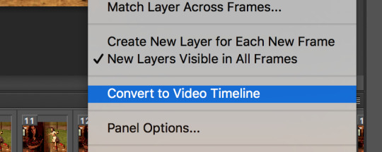
now, go back to that horizontal icon in your timeline. find 'convert to video timeline' and it will change your individual frames into one long gray bar. we do NOT want it to be gray, so to change that and make it editable we scroll up to the top toolbar, find 'filter', and click 'convert for smart filters'. this will turn your timeline purple. that's perfect! now its editable.

now we want to change the frame rate (otherwise it's gonna be super slow and laggy). go back to that timeline horizontal icon (man i use this a lot more than i think...i need a new name for it) and there should be something that says 'timeline frame rate' or something similar. when you click it, you're going to see a pop-up that asks the fps. change that baddie to 10 (it will probably be at 30 before you change it...that's gross don't keep that)

now we can sharpen! sharpening is SUPER important and its what makes the gifs crisp, even when on top of each other. besides coloring, sharpening is the best thing to do for great quality.
at the top, find 'filter'. scroll down to 'sharpen', hit 'smart sharpen' and my personal settings are on the right there. use them if you want, they're a pretty standard setting that i actually got from other users

now your gif is super crisp!!! the BEST thing to do now is change the image size. this is going to make it a little bit sharper and more defined since we are reducing the size but keeping the sharpened settings. you must always do sharpening before image resizing to get the best gif results.
(as a final touch to keep speed correct, i will save the gif and then reopen it, change the timeline speed to .05, and save again. if that's confusing just lmk)
and voila! you're done! this is the final gif. she's clear, she's crisp, she's beautiful. we love.

9 notes
·
View notes
Note
wait how do you the affect of the overlapping characters https://www.tumblr.com/hiddenqveendom/745433650277007360/virgilia-price-coriolanus-snow-she-expected
hi there, i am horrible with explanations but i will try my best to touch base on the basics. after editing my two gifs, i pulled them both into on canvas in photoshop (photopea works too), then changed the visibility to the gif i wanted on top to "screen." from there i put a layer mask on each gif and erased some the the messier parts with the black brush tool. after that, i merged the animations and got this:
anywho, i hope that was of some help. i am going to link a few tutorials i have used myself below just in case.
1 , 2 , 3
0 notes
Text
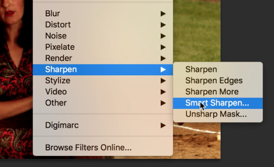
COMPOSITING HOMEWORK
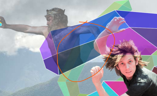
FIRST IMAGE: GREEK GOD FROM JASON AND THE ARGONAUHTS

Firstly, placing the image down in the project, and giving it an overlay of itself so I can see what I'm adding/erasing.
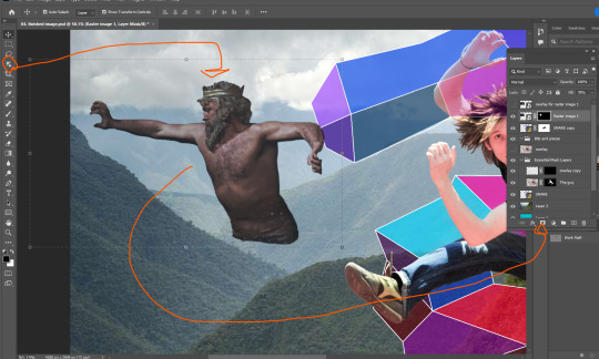
Here, using the easiest tool first. The Object Selection Tool to get a simple outline of the God, then turning it into a selection using the Work Path (alt + click on the box beside the Work Path text). After that, we just make a mask of the selection.

I want him back behind these hills. That'll involve erasing some of him so he isn't in front of the hill.

Here I've moved him behind the hill, and also behind the vector snake. But I've got some edges to smooth out.

I've cleaned up a lot of those lines using the soft brush brush tool, making the lines less defined makes it so he looks further back in the image. I also lowered the opacity of the God layer, just to make him look further back.
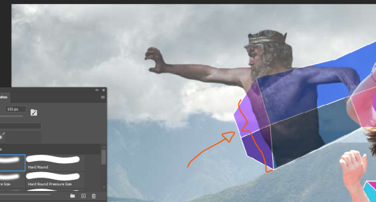
I felt the parts of the God's body behind the vector snake were too present, so I went in with the brush tool at about 3 transparency and made those parts more transparent.
Decreasing the opacity of this layer again, just makes him look like he's right back.
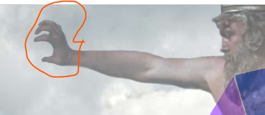
I went in with a small brush as to fix up the weird hand as a result of him holding onto a rock in the original image.
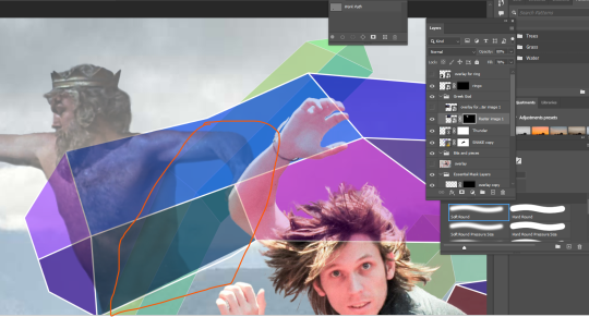
SECOND IMAGE: RINGO

Next I wanted to try and incorporate a small image into my work, so I decided that RINGO STARR would be a funny guy to place in. I went for this black/white photo to place, mainly because I wanted to try and incorporate that into the composition.

Pretty much applying the same formula I did with the Greek God, using the object selection tool to take Ringo and his chair out. The trouble is these small bits around here, so I just used the Pen tool to draw around this parts and then converted that into a selection, and filled that selection with black pixels on the mask layer.

The trouble now is how to hide that cut foot.

So I just placed him behind this bush, more specifically I removed his leg so it looks that way.

There he is, right in the back, looking on.
VECTOR IMAGE ONE: THUNDER
Unfortunately I forgot to document the creation of this file, but I made sure to open the whole photoshop image in illustrator (flattened), found where I want my thunderbolt, took an outline of it (the yellow squiggle), and then saved the file to this IMG folder. Making sure to keep it in that IMG folder.


Next, going into file and then place linked, just going to place that squiggle in place, then I can start editing it. Not skipping out on changing that setting circled in red to Media Box.
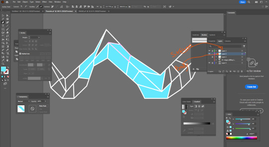
Here I'm taking a very similar approach to how I made the other vector image, but now I can explain it. First, I make two more layers, the top most layer being this white skeleton that outlines the bolt, and then a second layer for the colouring of the body. Also adding this gray background to make life easier in seeing the skeleton, but make sure to have that invisible when I save.

Then I go in and diversify the colours.
Here it is.

Making sure to place this bolt under the Greek God layer, I now go in and clean it up by creating a mask, and erasing all overlap with the hand (due to the transparency of the Greek God layer).

There it is.
VECTOR IMAGE TWO: Simple S
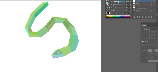
Pretty much following ever step as the previous vector object. I wanted to add another S behind the original, not sure why but I thought it'd look cool.
I need to add some more transparency to the Greek God as two layers are now overlapping him.
Just going in with the transparency turned to about 3 and a soft brush to lighten this pare up a little.
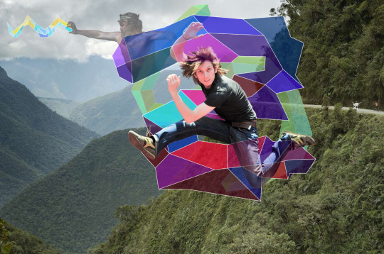
Finally complete, the full image.
Reflection:
I definitely stressed a lot while making this, and also cutting it close to the deadline doesn't help (just struggling to manage time at the moment). I completely forgot about the skeleton/body method when it came to making vector objects, so just went back and inspected the first one I made for this image. So, I wish I documented that process originally. This definitely helped build my skills, but it also stressed me the hell out, but that's life I suppose.
ALSO AN EXPLAINATION FOR WHY ALL THE IMAGES HAVE A GOOGLE LINK: I found Tumblr to be an annoying way to store screenshots, so I just chucked them into a google doc, turns out taking those images from the doc and placing them in links them as an image from google drive, I'll make sure not to do that again as it kinda annoys me.
here's the doc link: https://docs.google.com/document/d/1LazwekuUFVEyU9cOZBdAik50wVuxgqdyPpAmv9W9FjM/edit?usp=sharing
0 notes
Text
ILLUSTRATOR WORKSHOP

we learnt lots of things from this workshop :
NOTES I TOOK:
Essentials classic on workspace
Touch type will edit text (click hold text)
Create a path and type on a path (click hold text)
Or create a circle and type on a path
Gradient:
Make a square. Use gradient tool to click on the shape. Change type of gradient. Change colour by double clicking gradient buttons.
Put text in front and command shift close spare brackets to bring in front of square
Select both, Object, clipping mask, make or command 7
To create star or shape hold it whilst making it and press up or down to create more points on shape
Drag star into clip group on layers so it’s within clipping mask
Drag it into a text thin so u can see it within
Windows, artboard, add a new one
Add 2 circles overlapping, window, pathfinder, divide and move the middle part away
Make 2 circles. Make them just touch. Make a bigger circle over top. Command Y to make outline view. Select all. Shape builder tool. Select any part of shape. Alt and click path of shape. Can drag shape into another shape to combine
Make a circle. Click hold eraser. Knife tool. Cut shapes
Select multiple shapes. Blend tool. Double click. Specified shapes. 5 steps. Bosh
Command shift O. Make into outlines.
Make text. Effect. Extrude and bevel. Makes 3d. Bubble is fine leather
Select something. Object. Pattern. Make
THE GYM Collection = interpretation
OUR IDEA
Our topic in which we have chosen as a group is the gym. This is a very well known and popular environment which includes a lot of statistics and data we could collect to help us with our posters.
To start, we went to the gym and took photos of us carrying out different exercises and gym equipment to help us carry our initial research.
TARGET AUDIENCE: we would like to make our target audience every age between 15-80 year olds, this is because we are helping younger and older adults to choose the right gym for them.
GYM FACES (photos taken by Nujjiya)
GYM POSES / EXERCISES
GYM EQUIPMENT

0 notes
Text
Design and render a Character of my own idea.
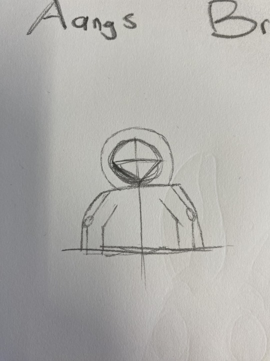
For this new character my idea was to create a modern day brother for Aang the Avatar. I started this process by researching some images of Aang online as well as some new age outfits to base my sketch off. I wanted to try sketching some different poses, as poses and positioning is one of my work on's.
I then started sketching my character. I would start with a stick figure and some circles to outline elbows and knees. I would do this to get the general shape and pose of my character. I would then rub this versions out but not all the way. This was so I could use it as a reference for my final sketch. I really focused on nailing details such as the hood and having the hair overlap slightly or make sure the shoulders are coming from the correct start point. I think this was super good practice and probably the best sketches i've done for a project, even though they are very small and not very detailed. Practising this aspect multiple times with different poses really helped my confidence and I think this part of my process will only improve throughout my coming character designs.
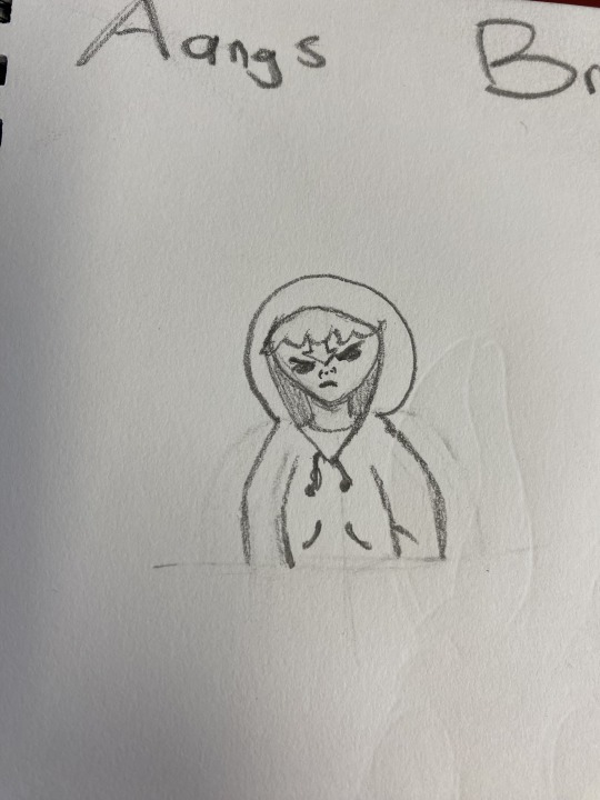
I decided to go with the slightly angry looking more simple pose. Even though this pose is more simple I feel like the silhouette will still look quite ominous which is the goal for this iteration. Thats not the main reason I picked this sketch though. As I said in an earlier post I want to experiment more with shadows and highlights and for this version of 'Aang's brother' he's transitioning into the avatar state and therefore his arrows and eyes are lighting up. I think this blue glow will be interesting to play with when doing the shadows and highlights part of the process.
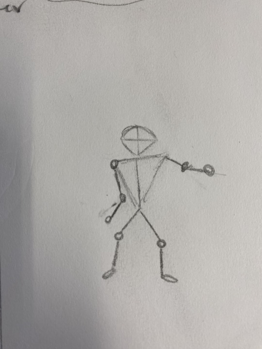
I started my computer version of the project by bringing my chosen sketch of 'Aangs brother' into my photoshop project file. I made the sketch layer slightly opaic and then started with the rough outlines.
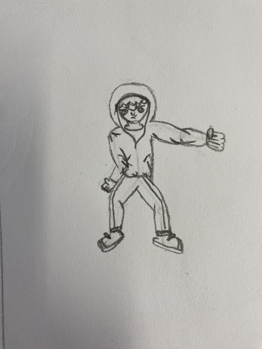
I then used the brush tool to start drawing over my outlines. I used the '[' and ']' keys to make my brush size bigger and smaller for certain elements as well as my 'smoothing' slider for my longer brush strokes that called for a steadier brush. I also used the pen tool on some of the more curvy outlines such as the hood. I would draw a path with the pen tool and then hit RETURN to create a stroke around my pen tool path. I would then hit delate to get rid of the path but keep the stroke. I was also using the 'R' key which toggled 'rotate'. I would rotate my canvas for more natural brush strokes when using the brush tool.

I then cleaned up some lines using the erase tool. following this I selected the space around my character followed by clicking COMMAND + SHIFT + I to invert my selection. I created a new layer and filled (OPTION + DELETE) my selection with black. this created my character silhouette. My silhouette doesn't look like much, yet I think this does represent this character quite well in this moment as he is angry and confined. I think creating a more exciting silhouette is something I should definitely try in my up coming drawing though. I think the line work went well in this drawing with heavier weights showing that his hoodie is bulky and even slightly weighing him down.
I then wanted to add the eyes, avatar arrow and other aspects like the drawn strings on the hoodie. I tried playing with guide lines and the pen tool to get the eyes to match but they were just never looking right. I decided to drawn a mask around the eye I had drawn and then cop and paste it onto a new layer. I could then transform, rotate and flip my eye and eventually my eyebrow all on seperate layers until they looked proportionate. Once I was happy with the result I merged the layers to keep the outlines all gathered together. I thought this would help to keep the filling process straight forward. When creating the drawn strings I used the 'ellipse' tool whilst holding down shift to get the perfect circle end. I then clicked this circle while holding down option to copy it. I then placed the circles where I thought the drawn strings would finish and then uses the brush to draw 'strings leading to their ends'.

0 notes
Text
Week 6 Design Fundamentals - Photoshop + Illustrator (compositing) 2nd April
Hello! Here is my post of what we did in week 5 of design fundamentals. But firstly Homework tasks!
Last week our task was to cut out two images and place them into backgrounds. sadly I don't have any images of my process but I will make comments to explain.
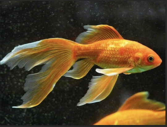
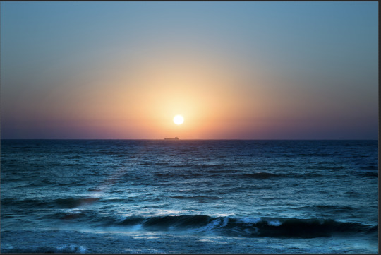
Here are my first two images that I combined. A fish and a sunset. To combine them I used the direct selection tool on the fish to get most of it selected, then I put a clipping mask on it, and used the black n white paint brush tools to go into details with the selecting. Next I saved it and put it into the sunset image.
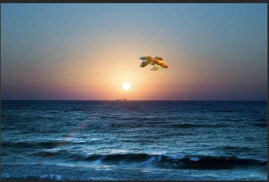
Here is the final image, I tried to give the illusion that the fish is flying through the air by making a copy of it, lowering the opacity, then moving it so its partially overlapping the original layer to give it some movement. There are definitely much better ways to make it seem like it is moving like feathering the edges etc, which I could have done, and would have made it look cleaner. and fit the background image better.
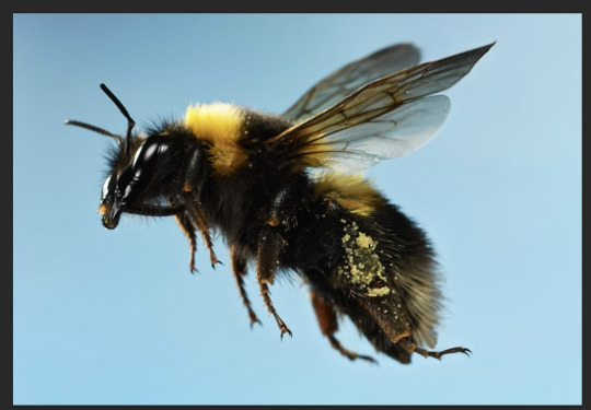
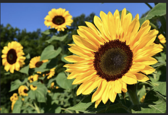
Here are my other two images that I put together. I mostly used the same method for the bee as I did for the fish. By using the direct select tool then clipping mask and brush tool. But I also on the image layer adjusted the colour of the edges of the bee by using the drop tool to pick up the right colours for my brush then lower the opacity.
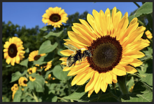
Then before the bee was in the image I flipped it to match the background, then in the image I resized it and edited the curves and colour balance so it felt more apart of the sunflower image. I also got rid of a little bit of the blue in bees wings. And that is my last image!!
Now we get to what we did in class this week.
We started off by using the pen tool to select fruit in the fruit image that you have seen in previous slides.
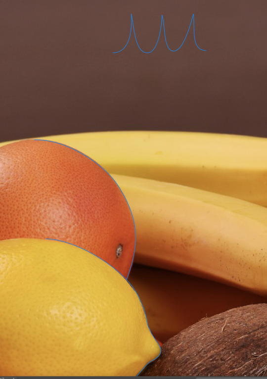
We were specifically looking at how to get to the next level in your pen tool work and using short cuts like option and the space key to do broken points and hybrid points while also adjusting your curves as you go rather than waiting till you have finished the shape, to adjust the handles. *INSERT NOTES*


Next as you can see in the images we took this selecting and put a clipping mask over it, then used the hue and saturation tool to change the colour of the lemon. And put a mask on the hue and saturation layer as to not colour the whole image. Oh and I forgot to mention we also looked at the spot heal tool before using the pen tool, on the lemon. To clean it up and get rid of some imperfections on it. Unfortunately I did not get any screen shots of this process. But I have never used the spot tool before only ever the patch tool so It was interesting to learn about a new tool.
Now we get into our main task for the session.
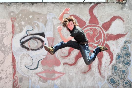
We were giving this image of this man jumping and were given the task to select it and remove it from the background layer in any way we wanted. For me and like everyone else we made first a copy of the image then turned the top layer blue on low opacity to make it easier to identify what sections were selected or not. ( I think that is how we did it, need to double check my notes) On that note of going back to check your process, I don't know if this is already a thing but If not photoshop should have a tool that automatically screen records your process like in procreate so you can go back and look at how you did a certain thing. Moving on....
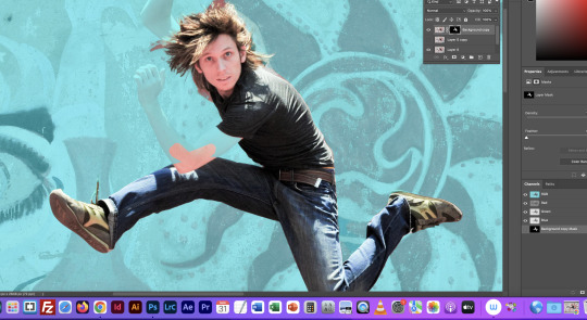
I first used the direct select tool to select the man, but it missed some of him due to the colours on him being similar to the background. So I made a mask on him then went in with my paint brush tool to fill in and erase information on the image that did not need to be selected. This was a bit tedious but I feel more confident using the brush tool rather than the pen tool and others to select and deselect what is seen on the mask. And because we were on a bit of a time crunch I thought It would be better to work with something I know better how to use. Like last year for my photography, when editing I hardly knew how to use the pen tool on photoshop and the other section tools so I basically just used the brush tool on a mask for everything, it tool a while for some aspects but I knew what I was doing. So it's great learning knew skills in class all the time.
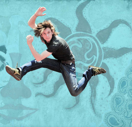
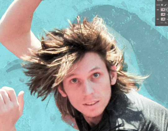
Here we have my jumping man fully selcted and a close up of the hair which was quite difficult I ended up having my brush on low opacity to go over parts of it slowly and give to the movement it needed as he's jumping.
Sadly for the next part I took no photos as I was quite focused on wrapping my head around what we were doing and I think I am still confused, So my explanation might not be the best, But I am going to look though Moodle and my work book notes (which I currently don't have) to check what we did. But we saved our work on the man and then went into illustrator to make this snake type shape. which you can see in my final image. then link it to our photoshop file, so we can go and edit the illustrator one and it will automatically change the data of the snake on the photoshop file. so we took the snake which I turned into a weird donut for unknown reasons combined with a tired brain, and put it in between our layers of the original image of the man jumping with the background and our new layer of the man selected by himself with no background. And this interesting piece of art was born.
And tada ! That is what we completed in week 6 of fundamentals. This class was very informative and I hope to have my physical workbook notes in here very soon. Thank you very much and thank you for listing to my TED Talk.
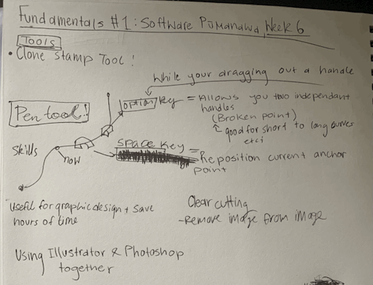
PS found my notes!! here they are. kinda short but tada
0 notes
Text
Fundamentals Week 5 - Homework task
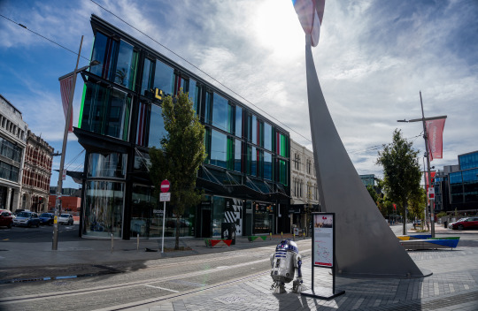
This week for fundamentals we were given the simple task of taking a Subject and placing it onto a background using the skills we were taught during our last session in Photoshop.
For my background, I have chosen this image of my own I had taken in the streets of Christchurch.
My goal for this image is to insert my subject onto the sidewalk of this image and adjust it in a way that it appears to fit in as if it was there when I took the photo.
For my subject, I have chosen this image of R2D2.
I have various other images of my subject as a backup in the event this one ends up not working the way I want it to, but for now, I chose this image as it fits with the vision I had when brainstorming an idea for this homework task, the angle of which he is facing in this image I think will definitely help sell the overall final product as my goal, again, is to have him blend into the environment as if it were just rolling through when the photo was taken. Another reason this picture was chosen was the fact that it had a solid coloured background which makes it easier for me to select and mask my subject.
I started by using the object select tool which (thanks to the solid background) selected my entire subject almost perfectly. Almost. Because of this, I then used the 'Magnetic Lasso' tool while holding down the Alt key (PC) to tidy up the selection area toward the bottom right of my subject.
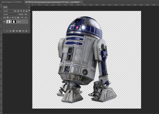
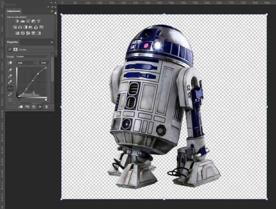
After making my clipping mask I then compared my subject to my background in order to ascertain what adjustments I may need to make before taking it over and placing it into my background image.
Given my background image is already edited, I wanted to edit my subject in a way that I would have when I did my initial edit. I first pulled up the Curves palette and boosted the contrast and a little bit of the brightness to have it appear as if they were edited together as one image. I applied my layer mask and put my image over into my background.
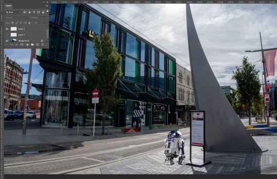
Straight away there are a few issues I am noticing, A) there is no shadow, B) it may be just slightly too bright, and C) it sits over the sign within my background image.
So first I went back to my subject image and reapplied my layer mask (Ctrl + Z and readjusted my curves
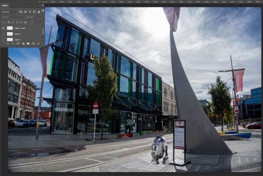
To make a shadow, I went back to my subject layer mask, and using the exposure palette, I created a silhouette. From there I took the eraser tool, decreased opacity by -40%, and put the hardness to 0. Gently going around the edges of my subject I, I softened the outline of what would become my shadow.
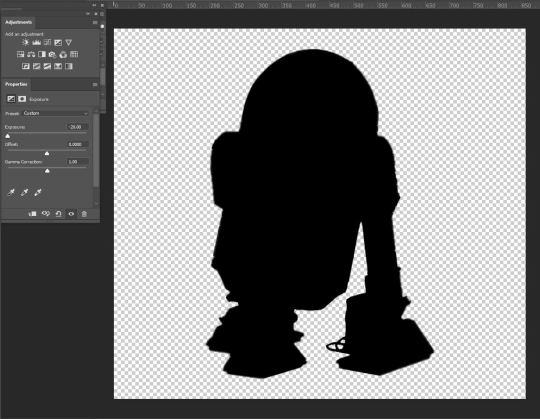

I then re-applied my layer mask and placed my silhouette into my background image.
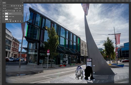
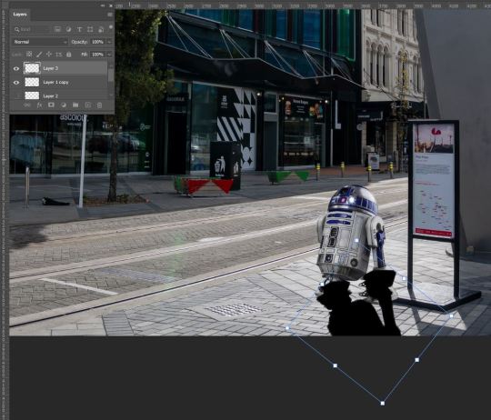
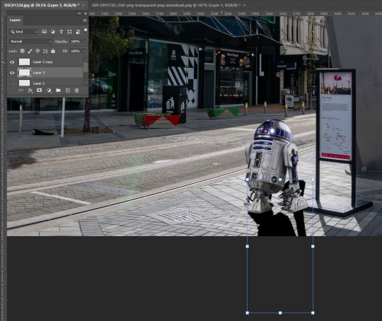
After placing it into the image, I then rotated it on an angle that matched the pre-existing shadows within the image, This was important as, given the time of day, If I wanted to sell the idea of R2D2 actually being in my image when this was taken, the angle and length of the shadow had to match. This was accomplished by Holding down the shift key and then clicking and dragging one of the corners of my image to elongate my shadow. I then flipped the shadow horizontally to create a complete shadow effect of my subject on the ground. Using the eraser tool, I cleaned up the parts that did not line up with my subject.
I then decreased the opacity to a point that matched up with the shadows on the ground in order to blend in. I was then faced with a new problem. The colours of the shadows did not match. To fix this, Selecting my Shadow layer, I used the Object Selection tool again to select my entire shadow. I then used the pipette tool to sample the colour of the shadow on the ground and used the brush tool (with my sampled colour and opacity at 61%) to colour in my selection area leaving me with this result.
to deal with the issue of the overlapping of my subject with the sign, I want it to be behind he sign to add depth to the image and give it more of a feeling that R2D2 was present.
I hid my subject and shadow and again used the Lasso tool to select the corner of the foot of the sign and created a copy (Ctl+C, Ctl+V) to layer over top of my layer.
After tidying up This was my final result. Taking into account that my subject still sticks out a little too much for my liking, I then went back in with the object selection tool with my subject layer selected and used the Burn tool to make my subject darker and boost the shadows. This felt necessary as the sun is placed behind my subject and as such should appear a bit darker with the already existing shadows on my subject also being darker.
Finished! It's not perfect, but I am overall happy with the outcome. I thoroughly enjoyed this task as with the way I approached it, I was faced with a lot of trial and error and problem-solving which was super satisfying to play around and fix! I am enjoying sharpening my Photoshop skills and look forward to only getting better with these tools and applying them in the future.
0 notes
Last Seen Blogs
mothykins
Moff

jovialkingsweets
Sem título
yeehawsoren
treasure sorgren

worldspotlightnews
WORLD SPOTLIGHT NEWS