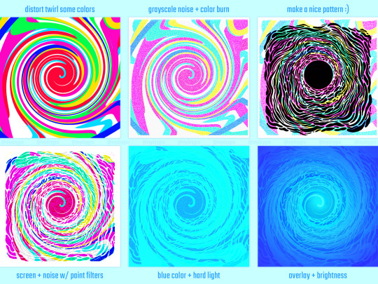
#blending tutorial
Note
Can you please do a blending/overlay tutorial!?!?!
ohhh i can definitely give you some tips on how i do it!
so, assuming you know how to make gifs and use the timeline/smart object gifs, this is how i usually go about it. I use photoshop cs5, for reference.
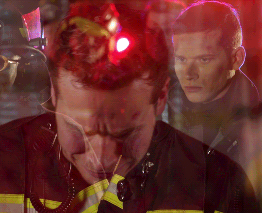
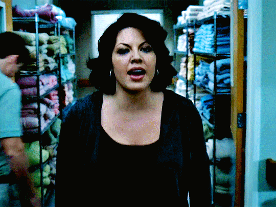
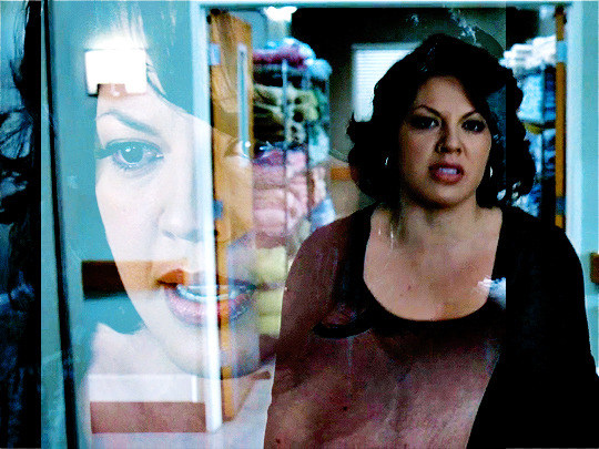
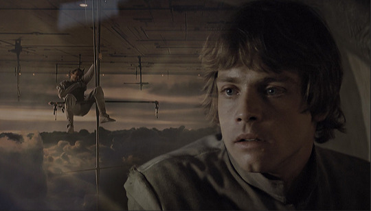
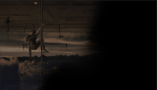
i'll use this recent gif from my don’t blame me gifset as an example:

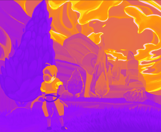
1. Choosing what to blend
It's much easier to blend 2 gifs together when at least one of them has dark areas. Two bright gifs don't usually work as well, but it's still doable with some work. For example these 2 moments are both mostly dark, so it makes things easier:

2. Bringing 2 gifs together
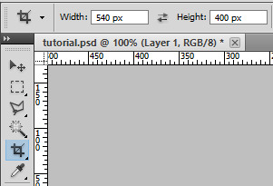
To put 2 gifs on the same canvas, what I usually do is:
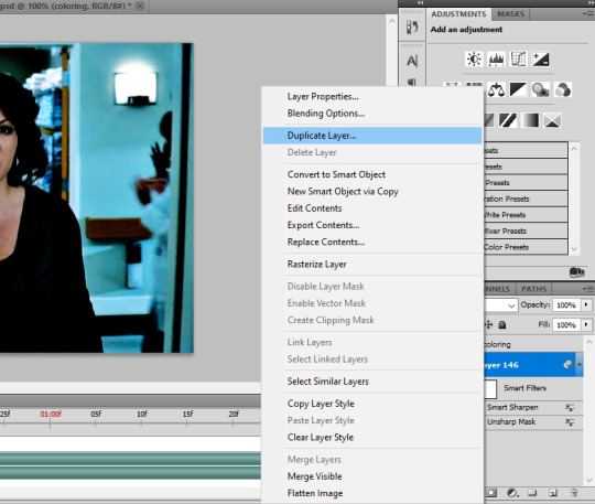
In one of the gifs, I select the size I want with the crop tool (540px by 400px in this case). You then drag the resize box how you want it on your gif. This will resize and crop your gif.
Then I go to the other gif and do the same thing. With that resized and cropped layer, I right lick on it, go Duplicate layer... and then choose to send it on my other gif's document. When both gifs are on top of each other you can start moving them around and blending them.
3. Blending options
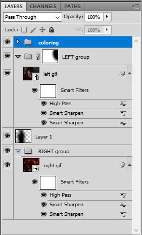
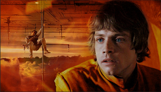
Photoshop has multiple blending options that will give you many different results. What works best for blending gifs is usually the option Screen. This is what I get when I put these 2 gifs on top of each other, with the top group with the left gif set to Screen. Make sure the Screen layer is always on top.
I like to put the gifs in groups, it makes things easier (and tidier) further down the road, but it will work anyway with the smart object gif layers. For this particular gif, groups were not 100% necessary, but for more complicated gifs with different colorings, it's definitely a must in my book.

4. Layer masks
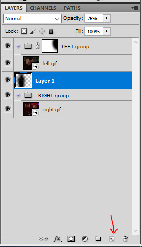
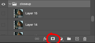
As you can see, this works, but there are definitely parts I would like if they didn't overlap, especially on the right ride. You can easily remove unwanted parts by painting them out with a Layer mask. In this particular case I want to remove the right side of the left gif, so I selected that group and made a layer mask by clicking on the icon at the bottom of the layers window. You'll get a white window next to your layer name. Select it. You then want to use a very soft brush and paint in black what you want to remove.
These layer masks act as "alphas" to drive the opacity of the layer. What is white will be at 100% opacity, and what is black will be at 0% opacity. You can definitely brush in some gray if you want an in-between look. Here I went full black.

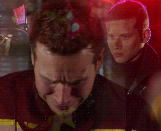
This is the result I get after masking out the unwanted right part. Now I only have that one gif showing on the right side, instead of a blend of the two:

5. Painted layer
So you can see other characters still showing through on the left side of the gif. You can definitely go and paint the parts you want to remove on the right group as well, but if your layer masks overlap, it can create some transparency in your gif and we don't want that. Instead, I create a new empty layer by clicking on the icon, and put it in between the two groups. This layer doesn't need a different blending mode. With a soft brush and the black color, I go paint where I want to mask the right gif, so it doesn't show on the left side.
I played with that layer opacity because I liked to still see some of the right gif's details peeking through. Here's the result:
6. Final touches
At this point I will usually sharpen both gif layers and make the coloring, and then I will adjust the layer masks if I feel like I need to. In this case I thought it was fine as it was so I didn't change anything.
For this one I simply put the coloring on top of both gifs because it worked fine for this example, but you can also have a different coloring for each gif if you want. Just make sure you put the two different colorings in their respective gif groups. Remember that the top folder should always be set to Screen for the blending to work, even with coloring layers/groups inside that "main" gif group.
And that's pretty much it! This one was quite simple, but it's incredible what a screen layer and some layer masks can do :) I hope it helps!
Also, @usergif has an amazing tutorials directory for more resources if you need! I always find great tutorials there.
#*ps help#resource#usergif#blending tutorial#userrin#tutorial#uservivaldi#userkosmos#usermills#usermarsy#userdean#userelio#usermadita#flashing gif#alie replies#anonymous#tusereste#userives#tuservaleria#usermorgan
673 notes
·
View notes
Note
do you think you could please do a tutorial for your greys anatomy edit (kinda similar to your brittana edits) i'm shocked if no one has ever asked you before for tutorials (and if you do i'd love to see them) your edits are so gorg and you're incredibly talented !
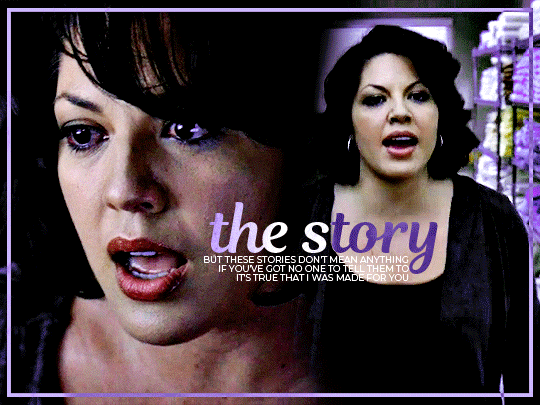
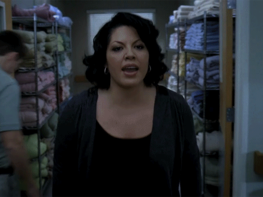
Totally! Bare with me, this is my first tutorial in like 8 years. Haha. I'll show you how I made this one:
For reference, I use Photoshop CS5. (My computer hates the newer versions. It'll run three different video editing softwares but hates photoshop. Idk lol.)
Okay, first you want to make 2 gifs with the same amount of frames. That's important. And then you want to convert them to a smart object.
So we have these two gifs.

Now, depending on what you're doing, you can do this next step now or you can color your gifs how you like, save them separately and then reopen them with all the coloring on them. Sometimes I do this if I'm working with a lot of effects but since these two gifs have the same coloring, we're going right click on one of them (it doesn't matter which one tbh) and you're going to select "duplicate layer"
A little box will pop up and this is where you're going to select the project name that you want to essentially paste this gif on top of.
Set the top gif to Screen.
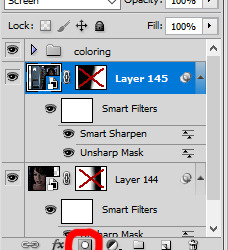
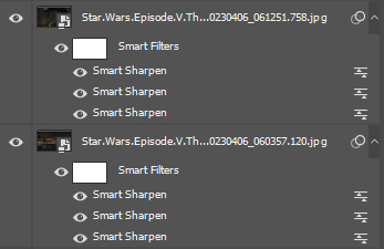
The first thing I usually do is sharpen them.
So I use Smart Sharpen and Unsharp Mask with these settings:
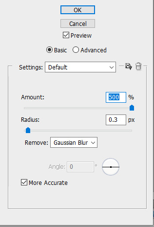
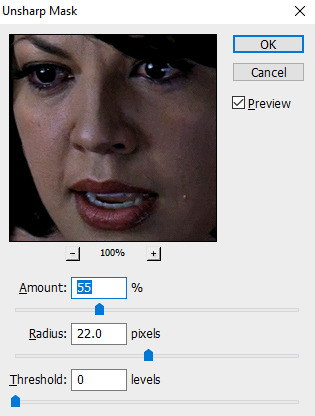
With Unsharp Mask, you have to tweak them depending on the gif, quality, what effect you're going for, etc.
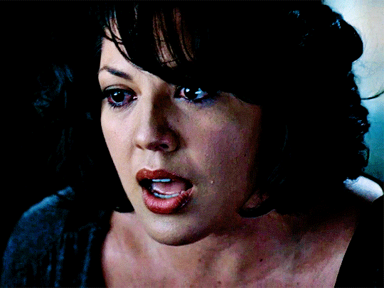
Then we add some basic coloring:
Now, I have a base for specific shows because all shows are colored different. Grey's is more blue toned whereas Glee is more yellow toned. However, since coloring is a bitch sometimes, I'll add a PSD that I use ALOT. You can download it here.
So now that we've sharpened and added some coloring, this is what we have (separately):
This is what it looks like after I set it to Screen (and I moved the top gif a little to the right.)
Obviously, we need to get rid of those lines and make it so that each gif is more visible.
So now we blend.
On the top gif, you're going to add a layer mask to that gif. So with that top gif selected, you're going to select the mask button that looks like this:
Select your brush tool and use a soft brush to erase what you want from the background of each gif. (Make sure to repeat the previous steps to get a layer mask on the bottom gif.)
I have this now, after using the brush tool.

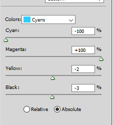
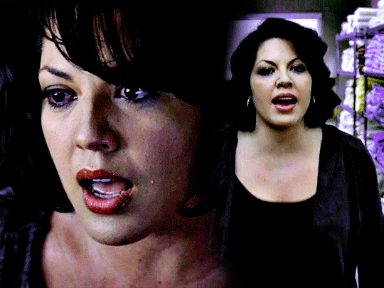
As you can see, it's very blue and I wasn't feeling blue for this gif so we want to change blue color. That's where the Selective Color comes in.
We're going to get rid of that cyan tone. So you're going to add adjustment layer and select Selective Color.
All I did for this one was adjust the cyan tones in the drop down box.
Now we have a pretty purple tone!
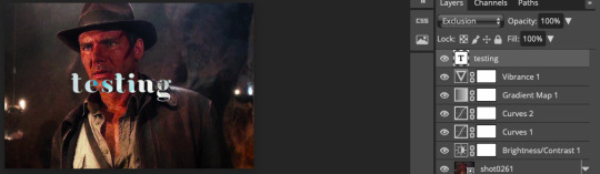
Now, we're going to add a light grey squareish box this to outline.
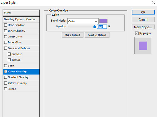
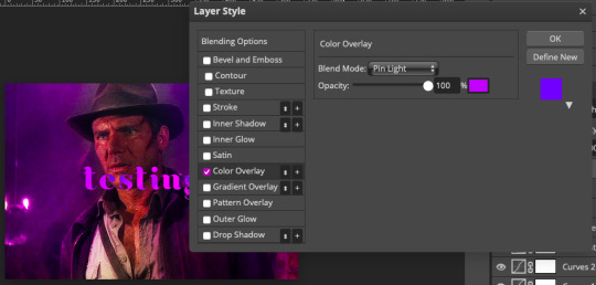
Set the blending mode to exclusion. To get the bar (and we'll do this again with the text) you're going to select the FX icon.
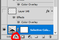
Select Color Overlay. A box will popup. You're going to set the blending mode to Color and then select whatever color you want the bar to be. (If it comes out with too much white, adjust the color of the bar itself to a darker shade.)
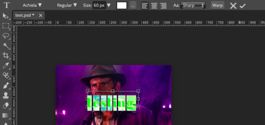
Lastly, we're going to add our text. For this gif I used Magnolia Script and Montserrat.
To get the purple effect on the "The Story" text, you're going to do the same thing you just did for the bar.
Voila! I hope this helped. If you need any further assistance, I'm always happy to help!
#tutorial#gif tutorial#blending tutorial#usergif#completeresources#mine#also anon you’re so fucking sweet
101 notes
·
View notes
Note
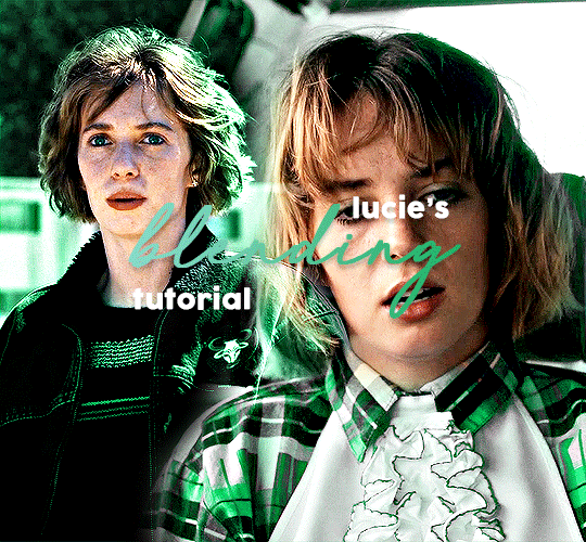
The blending in your Lucas gifset was absolutely gorgeous! Do you have or know a tutorial on how to do it?
Blending Tutorial!
Firstly, thank you for the compliment anon! Now, I'm going to go through the process considering that you already know how to make regular gifs and know how to use adjustment layers, so I'll be focusing specifically on blending but if you need those tutorials I can make them, just ask!
This is gonna be our end result after the whole process:

This specific gif from this gifset(with the typography removed) is focused on a color palette with only two adjacent colors so it's a bit easier to make the blending look good but this process works for any kind of gif! So let's start the tutorial!
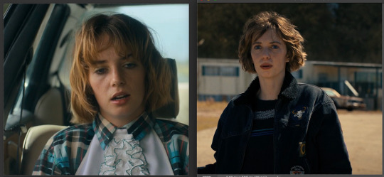
1. Get your desired gifs into the same canvas

These are the two gifs I'll be blending for this gifset. Make your gifs and resize them to the size of your final gif. Remember to turn the layers of each gif into Smart Objects so that you can move them around properly when blending.
I usually make the gifs and just copy and paste one of them onto the canvas where I made the other one. You can also make your gifs and save them separately from each other first and then put them into the same canvas, but I prefer to make all adjustments except for resizing in one canvas so I can tweak the positioning of each gif as well as the coloring so everything looks the way I want it to.
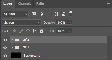
2. Put each gif into a folder

This will make it easier for when you start using adjustment layers on each gif so that the adjustments don't interfere with other layers.
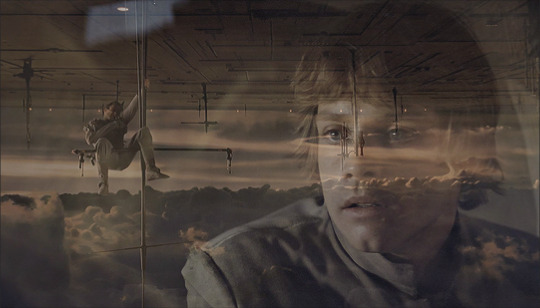
3. Set layer mode to screen
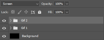
Set both folders to Screen, this will help blend them together better than if you were relying only on the opacity of the layers. I also usually create a new layer and use the paint bucket tool to color it black. Your gif should look something like this:
And your layers like this:
The black background makes sure there aren't any transparent spots in your gif when you use the layer masks to blend them as you can see here:


4. Create layer masks

Select each group one at a time and go into Layer > Layer Mask > Reveal All. Your layers should now look like this:
5. Start erasing each gif on the layer mask
Use a soft airbrush to erase each gif to your liking. With layer masks you can use the eraser tool or the brush tool. Layer masks work based on color value(how light or dark the color is). The darker the color you paint with your brush the less opaque it will be. Painting in black will erase the area completely and painting it white will make it completely visible. The eraser defaults to the same effect as if painting with a brush in black.
This is the final result of the blending:
This is how each of the gifs look after I erased them with the layer masks:

This is what my layers look like:

As you can see I've erased one of the gifs way more than the other, that's because I only erased parts of the gif that would interfere heavily with the gif I wanted to be more visible. Make sure to move around the timeline of your gif to see if you need to erase more or less of each gif since the person or thing you're trying to keep visible can move around and get covered.
6. Make your color adjustments
If you've already made your adjustments before pasting both gifs into the canvas you can skip this step. Since this gifset was focused on orange and yellow I adjust my colors to match that. I keep my adjusment layers in groups inside the respective gif's folder so I can turn them all on or off easier and so they occupy less space in my Layers tab.

And this is what the colors look like in the end:
7. Export your gif
This is what my export settings look like:
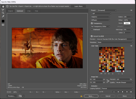
This doesn't interfere with the blending and a lot of these settings are personal preference but I thought it was worth sharing.
And finally we've arrived at our final result as shown previously:
Other blending tutorials:
Now the links to some other blending tutorials that might have different methods(sometimes because of different desired outcomes). I'll be tagging the creators for if anyone wants to look at their content!
Tutorial using gradients and lighten mode by @linda-darnell
Tutorial using erasing with layer masks by @eddiediaaz
Tutorial adding color on top by @miriammaisel
Tutorial using screen and color layer modes by @disaster-lineage
That's it! Hope this was helpful!
115 notes
·
View notes
Note
hii i was wondering how you blend gifs such as this one? it’s something i wanna start doing but haven’t got the slightest clue how🥹
hi there !! blending is definitely one of the more fiddly aspects of gifmaking, but i'm happy to help !! before i start, here's some tutorials that really helped me out/look really helpful:
difficulty: low (by morningstr)
difficulty: intermediate (more tailored to colourful gif blending) (by lamberts)
difficulty: intermediate (by yenvengerberg)
difficulty: low (by jackarthurdavenport)
difficulty: intermediate (by nelsonnicks)
before you start, you should have a basic knowledge in how to colour your gifs, sharpen, etc etc. if you want any information on that, feel free to send me another ask for that.
i use photoshop 2022 for all my creations. and big disclaimer my process is VERY different to to others, but i don’t think it should change too much of your result.
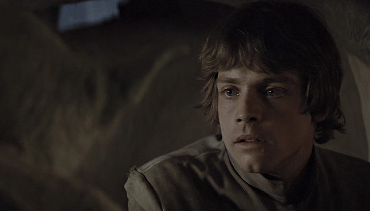
1. create two gifs.
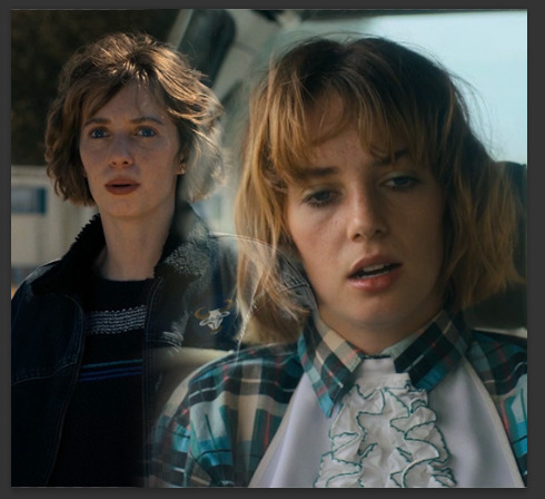
you’re going to start by creating two entirely separate gifs. when you’re blending, i find that it is typically easier if you can get two types of shots (mid, far, close up, that kind of thing) because it makes it easier to blend later on.
here we can see robin is kind of more of a mid shot on the right, but the left shot is zoomed in on her face to make it the focus.
from here, ensure your gifs have the same amount of frames and layers. you can delete the excess frames + layers to get them at the same amount. (eg. one gif had 42 frames, and the other 15, so i selected every layer + frame past 15 and deleted them.)
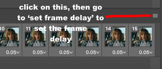
2. combining your gifs.
this is where it can all get a little hairy quick !! start by selecting all your layers, and putting them in a group. you can then rename that group so you can tell them apart when you duplicate them. then, select all your frames, change the frame delay to 0.05 and go from there.
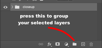
now, pay attention to this bit. you’re going to take ONE gif over to the other. to do that, click on the four lines i highlighted up ^^ and go to copy frames. make sure all your frames are still selected. then, go to the gif we’re going to place the other gif on, and go to those same four lines but press ‘paste frames’ this time. this menu will come up:
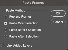
click the exact same one i have highlighted, then press ‘okay’. now, your frames and layers have copied over. you should have two folders, and the gif you were copying will probably be the only one you see, but don’t worry ! your other gif is just underneath.
3. blending your gifs.
this part differs for each creator, but here’s how i do it. select the top layer that you want to blend in, and open this dropdown menu:
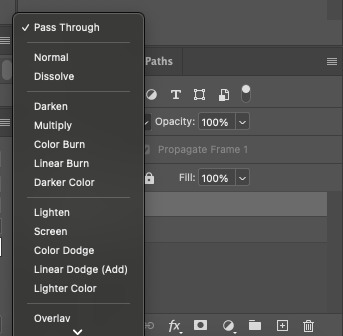
you’ll want to select either ‘lighten’ or ‘screen’. choose whichever looks better. your gif will now look like this:
so now we’re going to blend !
because of the negative space behind robin in the gif underneath, i’m going to try and move the top gif into it. how you blend and where is kind of down to just a visual thing. so, i’ll move my layers into that space and then i’ll properly begin blending.
now that i moved both of my gifs it leaves these pesky lines behind:

to blend them out, do the following:
select the folder itself.
go down to this bottom bar, and select the circled icon (it’s a layer mask):
now, you have a layer mask. to use it, go over to your brush colours on the side bar (pictured below)
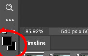
and make sure it’s on black. if it isn’t, you won’t be able to blend. after this, go to the gradient tool (in between the rubber and the blur tool on that same sidebar) and make sure your gradient looks similar to this:
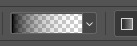
if you need to change it, click on that gradient, go to basics, go the one with the checkers and change the colours to black. now, go back to your layer mask, making sure that your gradient tool is selected and create little increments going across that line. make sure you work horizontally, otherwise it’ll blend your gif away.
then, just keep doing that until you’re getting results you’re happy with. i’ve done a layer mask on both layers, and i’ll show you a tip in case you need to do that as well. but for now, do a rough blend with the gradient tool.
after that, go to the brush tool, and change your brush to a soft round brush, probably on 75-100. you can brush over spots you want to blend, as it allows you to be more particular.
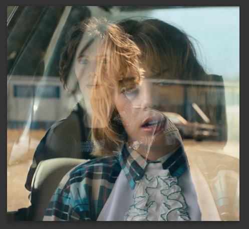
this is what my gif looks like now:
from here, you colour each gif in their respective folders, convert to timeline -> convert to smart object, sharpen and save !! this is my final result:
#*tutorials#completeresources#gif tutorial#blending tutorial#useranne#tuserkay#usernorah#tuserrex#userrsun
127 notes
·
View notes
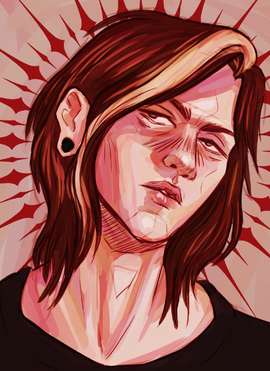
Text
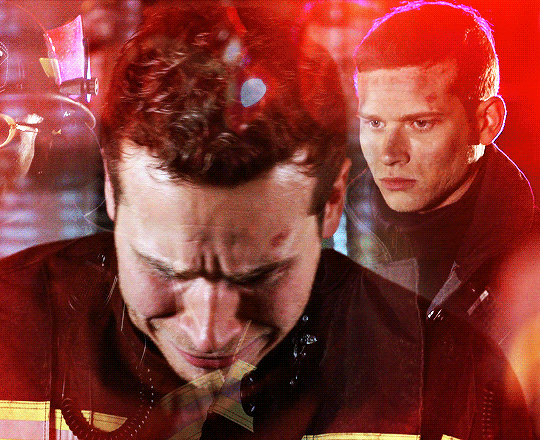
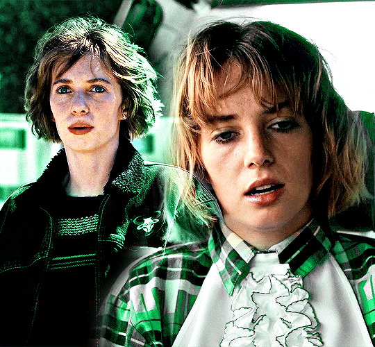
so a friend asked me if I could give some tips on how I blend gifs like these:
and LOL let me tell you I mainly recommend following tutorials like these (one, two, three) and honestly I owe so much of what little I know to @anya-chalotra especially the text lol I learned how to do that text line thingy from her. but I just wanted to give some pointers and maybe help explain why some scenes work and some don’t. it’s all trial and error.
setting a layer to screen in photoshop makes dark spots in the layer see through so I try to line up the parts of a scene that I want to highlight with those darker spots. I found a scene that had jyn backlit so that I could just turn up the contrast and make her silhouette darker (after I had finished the basic coloring I do for gifs). then I took the scene with cassian and put a gradient map over it, but I made sure to brighten the shit out of the scene so that it wasn’t just a dark blue blob, that there was a decent amount of contrast in his face.
now if you imagine the gif as having four quadrants, and I’m sorry I’m lazy so you’ll just have to imagine it for yourself, look at the top right quadrant. what I could have done was put a clipping mask on a new layer above the scene with cassian and drawn a bit of black with a big, diffuse brush (set to normal) in order to erase the bit of blue from cassian’s scene that is near jyn’s nose (I actually did that underneath but idk I guess I liked the look of it lol) and that is a good way to hide parts of a scene that you don’t want showing through the other scene. why black? because with a clipping mask layer it will only show up for the layer that is it is clipped to, and since black/dark shades are more transparent with a screen layer, it will allow the other scene to show more clearly.
this works best with scenes like these where the subjects aren’t moving too much.
but with this gif, the movement is the point:
it was completely unintentional, I just lined up the two scenes are noticed when the people with the helmets walked past cassian, you could see the other scene of him walking away more clearly - and the theme of the gifset was spy, so it just ~~fit the theme to me. that his face would be hidden and you’d see him in the background, walking away, in flashes.
in this case I think I literally just put the two scenes on top of each other, set the scene with the gradient map to screen, brightened that layer up significantly and called it a day. it helps that they are both from the same scene in the film, so there is a uniformity to the mess of these individual scenes that are cohesive. but usually all this movement can obscure the subjects and that’s generally not what people are looking for when making gifs. in this case, it works because of the theme.
it also helps that there is a contrast between the lighting of these scenes - the background scene has cassian silhouetted and backlit. so there are more dark spots to show the foreground scene, which has cassian’s face highlighted and bright.
conversely, when using two light scenes like in this gif
I actually darkened/added more contrast to the scene with jyn and cassian and sloppily did that clipping mask with the black brush onto the scene with the gradient map (and you can actually see it a bit lolll it was late I was very tired) in order to create more contrast between the overlapping subjects. if I felt like redoing this, which I don’t, I would make that black brush a bit more diffuse in order to blend more nicely.
I hope this helped and sorry for the laziness.
49 notes
·
View notes
Photo

Layer Effects Tutorial by Robin
#art#layer techniques#digital art#digital art tutorial#layer effects#rockinrobin#blending layers#layer effect tutorial#digital art techniques
6K notes
·
View notes
Text
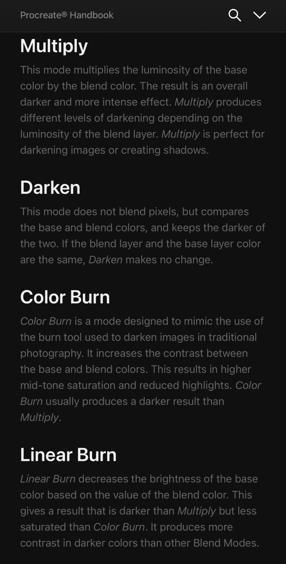
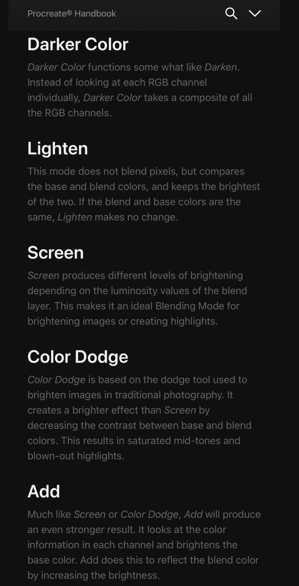
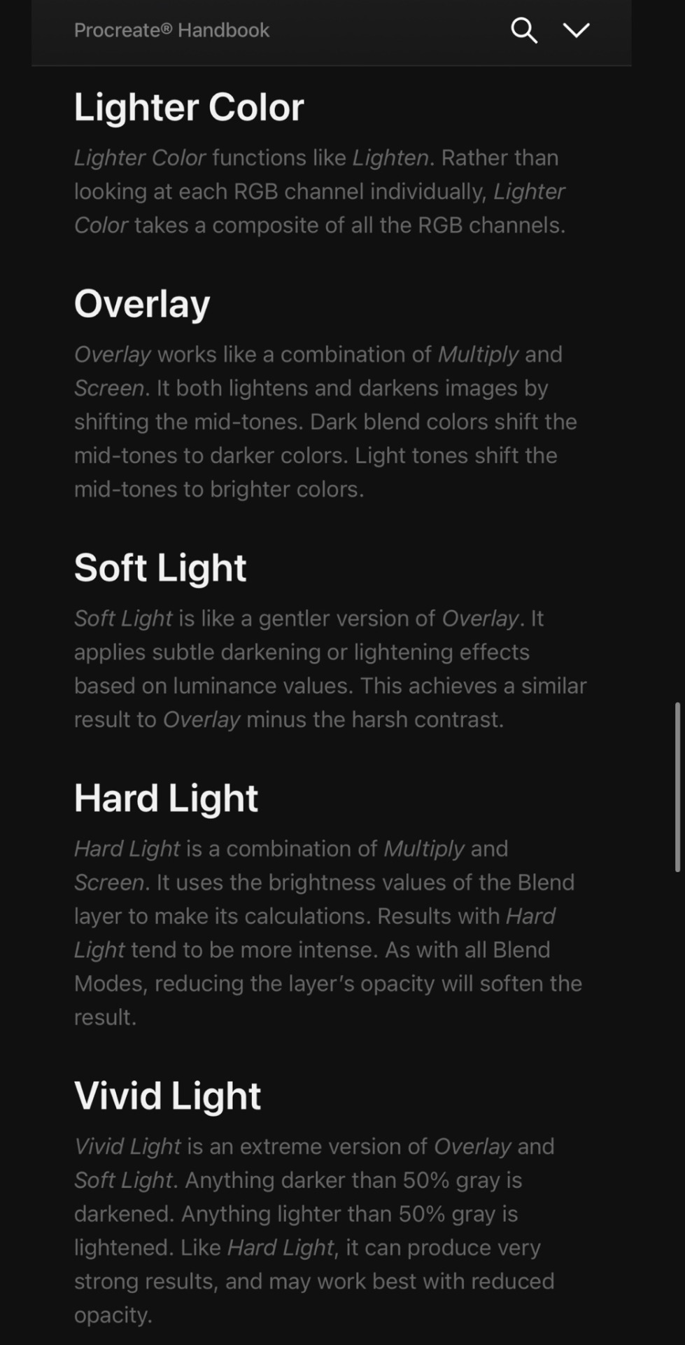
Blend Mode Types for Digital Art Drawing (Procreate, Clip Studio Paint, Photoshop, Fresco, MediBang, etc)


Credit: Procreate Handbook
#random tip#random tips#tip#blend modes#blend mode#shadow#highlight#colour#color#multiply#overlay#screen#art tutorial#drawing tip#art tip#art tips#art tutorials#drawing tips#drawing tutorial#drawing tutorials#art#coloring#colouring#layers#laye#digital#lighting#mood#atmosphere#terminology
1K notes
·
View notes
Text
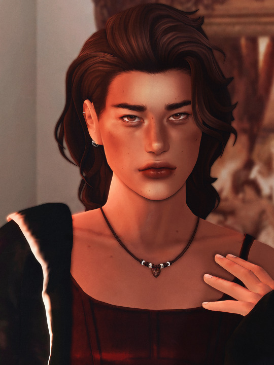
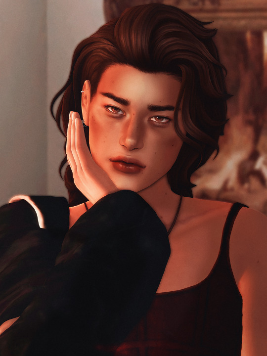
spill the milk
#simblr#sims 4#ts4#ts4 edit#ts4 cas#river dipping#theodore doe#echthroi#🦇#river how long did you just spend editing these photos of theo?#.........do not ask me that i'm fragile#i've been watching lighting tutorials from artists on youtube lately so note!!#i've highlighted around the corners of his lips and nose then blended it out a ton and then added little triangles under his eyes#honestly i could stand to take the opacity down on the shading and highlighting layers but i think i like the dramatic effect more#also i did say yesterday that theo's just some guy but then went into cas and gave him a cunty little outfit#i can't help it#let's just say this is a clubbing outfit#and i..... technically took these just to show off theo's face moles (i got VERY distracted in photoshop tho lmfao) but...#how am i supposed to crop out his little outfit when it's tewww good#just zoom .#i'm in loveeeeeee with his eye moles but he had those before#my new favorites from the ones i made for him are the two on his lips :3c#i... am not sure how well you can see them here tho#when i turn on my desktop i'll reblog this with closer pictures!!#i really just couldn't crop it closer to his face jdnghkjnh i LOVEEE this outfit
170 notes
·
View notes
Text

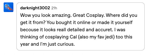

Thank you so much everyone for your kind words on my Cal Kestis cosplay!!! It was a blast to wear around the con, and I can't wait to wear it again!
My mom graciously was the one who made my cosplay, and she did an amazing job!!! She is a very talented seamstress, and I def need to learn how to sew from her haha BD-1 I got from Galaxy's Edge at Disneyland, and my lightsaber I got from Disneyland as well.
#cosplay#cal kestis#star wars#star wars cosplay#jedi survivor#the shoulder armor thing is made of EVA foam and the belt buckles are actually made of shrinky dinks!#the wig is from epic cosplay which is my favorite place to get wigs and for the tattoo I made it with temporary tattoo paper#the pants tho are from amazon haha but they worked perfectly and were super comfy since technically they're more cargo pants#the scar makeup i did was literally from a short tutorial on youtube i found#you basically use 2 shades of pink lip liners and then one red one and keep blending them on top of each other to create the scar illusion
61 notes
·
View notes
Text
HOW TO USE THE "MAKE ART GOOD" BUTTON TO MAKE YOUR ART GOOD
HEY, YOU! Yeah, you, amateur artist! Have you ever seen a digital artist with really good fucking colours and wondered "HOW DID THEY GET THOSE REALLY GOOD FUCKING COLOURS?!" Is it experience, talent, and an eye for colour? FUCK NO. I'm here to tell you what the pros don't want you to know, which is that right within your very art program (assuming you're using Clip Studio Paint) is a single button that will MAKE YOUR ART GOOD*
* or like, marginally better than it was before most of the time
Let me show you how I took this BORING, UNGOOD Slime Rancher painting I did as a final project for my traditional art course from BORING...
TO RAD AS FUCK
IN APPROXIMATELY FIVE MINUTES
THIS IS IT. THIS IS THE BUTTON.
You'll have to put everything on the same layer (I recommend putting it in a folder, duplicating the folder, and then collapsing all the duplicate layers together so your original work is still untouched), but after that, you can open the Gradient Map menu and go hog fucking wild.
This is what you're gonna see:

Basically, what gradient maps do is they map the darkest colour in your piece to the darkest colour in a gradient, and the lightest to the lightest, and then VOILA. All of your colours have been changed to the colours of the gradient. Neat!
You can use this to do things like automatically change skin tones or hair colours, or in our case, colour the whole painting!
You can download sets off the asset store and load them into your program by selecting the wrench icon and picking "Add gradient set."
All you need to do is load a gradient in the tool and voila...
...okay actually that looks like shit. (The gradient I'm using is #11 from the Yunywave set on the asset store! Go download it! It's a good set!)
So, our solution here is going to be different depending on the goal, the gradient, and whether it's a colour piece you're trying to zhuzh up or a B&W piece like this.
For this one, I duplicated the original layer and set the second one to Overlay at 100% opacity, then applied the gradient map to it.

INCREDIBLE! PERFECT!
Here are some other examples of how I've used gradient maps...


See, Overlay is a really good blending mode to use for this kind of thing, especially if you painted it with "normal" colours and just want to give it a little kick! But you should experiment with other modes, too. For a pastel piece, try Screen. For a subtle change, try Soft Light. For a moody or dark piece, try Multiply.
And you can also add even more details over the gradient layer to add that extra punch to it! In the example painting, I wasn't happy with the foreground tree's highlight being so dark, so I painted over it with an orange colour picked from the background, duplicated it, recoloured it to a dull yellow, and set the layer to 60% Glow Dodge.
Digital art gives us so many tools to make SICK FUCKING ART with, and gradient maps are like, the most powerful tools of all! USE THE SHIT OUT OF THEM AND GO MAKE COOL STUFF!
#i'm actually terrible at picking colours! i'm just good at using gradients and blending modes to fake it!#art tips#art tutorial#my art#clip studio paint#i'm sorry if the images show up wrong they're all supposed to be next to each other but it keeps glitching out on desktop lol
635 notes
·
View notes
Text
I'm coiled up like the venomous serpent / Tangled in your trance and I'm certain / You have got your hooks in me.
"How is it that Bhaal has two Chosen?"
"It is not for me to question my father. Do not think of us two. We are but sides of a single bloody coin, he and I."
anson belongs to @alistairs
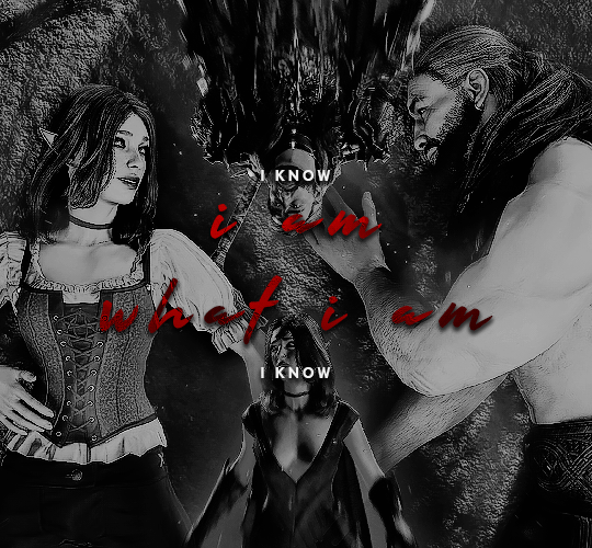
#game: baldur's gate 3#oc: kahlan#baldur's gate 3#baldursgate3edit#bg3edit#bg3 spoilers#bg3 oc#bg3 tav#gamingedit#videogameedit#the result of 2 million tutorials and endless font tests#what happens when you get struck with an idea but it's full of things you've never tried before#i'm very proud of this actually#specifically blending i've done blending once but never to this extent#don't ask me how many times i'll be reblogging this bc i can't count that high
78 notes
·
View notes
Text
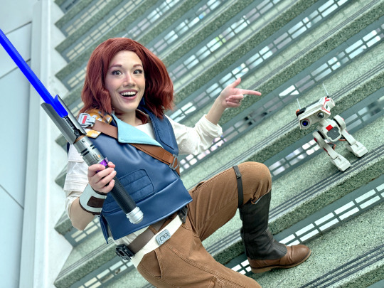
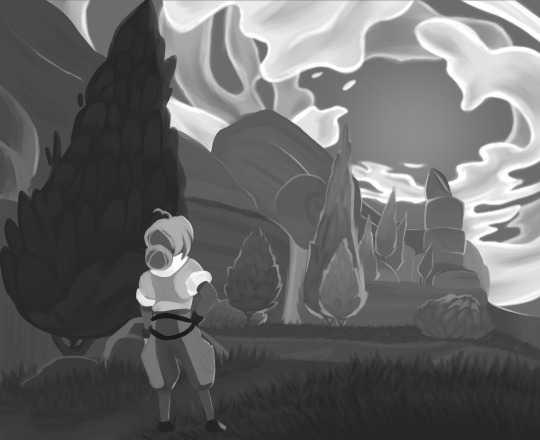
a small process for my recent underwater illustration
sorry if it's very random, but each step looks cool enough to be its own thing so I wanted to put it out somewhere haha
#skipped some minor tweaks#but the main idea of which blending modes got used is here#not sure if this is going to be of use for anyone#but the least it can do is inspire someone to play around with this stuff themselves#it's fun and cool and you should try it too#art#my art#artists on tumblr#art process#art tutorial#sort of?#digital illustration#digital art#digital painting#photoshop#blending modes#illustration#drawing#process gif#artist process#drawing reference#drawing resource#gif#flash warning#flashing gif#cw: flashing
62 notes
·
View notes
Note
Hi! Would it be possible to post a tutorial of how you created the text in this post /post/707087448305451008/removing-yellow-tint-on-photopea-heyyyyyy thank you :)

💜 TYPOGRAPHY TUTORIAL (PHOTOPEA EDITION) 💜
Hi anon! It's really easy! here's how i do it! <3 as always, basic gifmaking knowledge is required. feel free to ask if you have more questions <3
tutorial below the cut 💜
i. prep-work & coloring
You write out your text as normal in white, then you change the blend mode to exclusion
right-click on your text layer, and click on blending options to open the layer style window. Tick the color overlay box and click on the tab. there you'll be able to change the overlay color and the blend mode (i used pin light for this, but you might have to play around with the color and blend modes to find the one best for your gif)
(i also added a background color to match the text)
at this point you'll also want to add drop shadow to make the text readable. i usually turn down the distance to 0 and keep the rest of the settings as is, except maybe increase the opacity (which i didn't do here bc i'm laaaaazyyy)

ii. wobbly text
okay! so now the coloring bit is done. double-click on the white square on your text layer to select all of your text. on the top of the page you'll see options to change font, text size etc (idk what this is called but you know what it is). you'll need to click on the box that says wrap
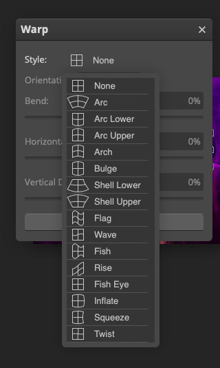
click on style > flag, and then you'll be able to adjust how "wobbly" you want the text to be (in this example the bend is at 40%)
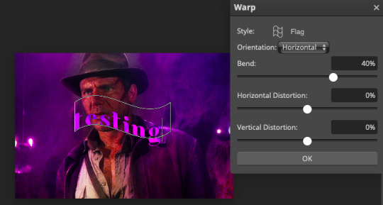
press okay and you're done! hooray!
iii. white outline
the last step is to add a line to make the text pop even more. first, create a new blank layer
right-click on your text layer and click on select pixels. click on the blank layer you just created. then you go to edit > stroke. these are the settings i use.
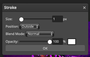
after pressing ok, you'll now have a white outline around your text. move the outline layer around until you're happy
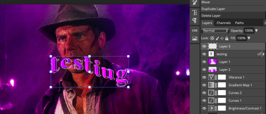
this is how it looks when it's done!
really not my best work but :P this scene is meant for a different gifset but i kinda like this coloring lol hope this answers your question!
#allresources#photopea tutorial#gif tutorial#typography#usergif#photopea#tutorial#*tutorial#it's not exactly like the text in my other tutorial but it's the same#it's all about the colours you chose and the blend mode
279 notes
·
View notes
Text
whenever i see people make art of poc and it Does have the correct lighter palm color, it still doesn't look right and i think it's because people always draw a hard line of separation between the main skin tone and the hand one. like it needs to be very evenly blended or else it just kind of looks like kind of uncanny valley
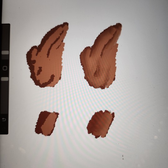
a bad drawing but it illustrated my point. no human has sharp color lines on their body. even moles or birthmarks would be depicted kind of fuzzy so skin tones should be treated the same
#sort of a psa for artists#and also a recommendation: always use references#art#artist#poc#people of color#digital art#procreate#tutorial#drawing tutorial#tip#artist tips#im black btw im literally looking at the shades blend on my hand#tag for when i write posts
57 notes
·
View notes
Note
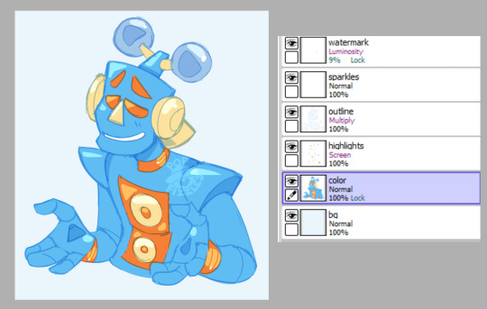
an odd question but do you use blend modes?
yea tons of times;
my sketch lineart is usually set to Multiply; my watermarks are almost always set to Luminosity with the opacity turned WAY down, my shading is color-picked from the lineart color being set to Shade and lowering the opacity to about 10-30% as needed, and my highlights are the same color above the original layer set to Screen.
Here's a breakdown of most of that, taken from a random sketch of Mike :)
here's what it looks like with Multiply turned off on the outline;
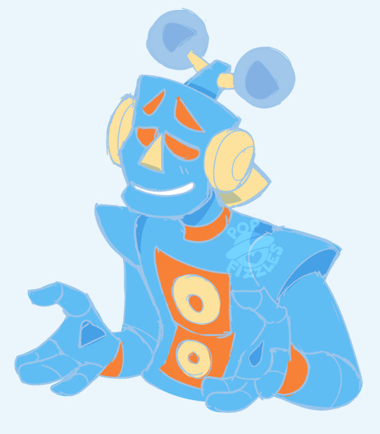
and here's what JUST the highlights and outline layers look like (no blending modes)
hope this helps!
#fizzles answers#art tutorial#???#art tips#don't be afraid of blending modes. embrace them. we love blending modes here
91 notes
·
View notes
Text

Morrotober Day 5/October 5: Fly || Sunset || "Time to go home."
RAAUUGGHH HAPPY LATE MORROTOBER EVERYBODY FIRST ONE OF THE MONTH AND EVERYTHING I DID HERE I HAVE NEVER FUCKING DONE BEFORE SO IM KINDA PROUD OF IT LOWKEY
slight variations under the cut lol
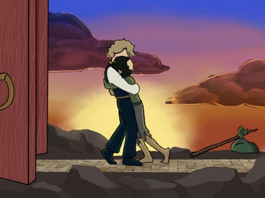


i tried doing the yellow filter thing they had in the show but i dont know how to do that so i just put like brown over top and hoped for the best and idrk how i feel about it tbh tell me which one yall like better
#HELLO MORRO ENJOYERS HOW ARE WE DOING#DO. YOU RMEMEBER ME YET#i’ve never done hugs i’ve never done sunsets i’ve never done rocks hoooLY#IT DOESNT EVEN LOOK THAT BAD LOWKEY I LIKE THE CLOUDS#I BULLSHITTED MY WAY THROUGH ALL OF THEM#i googled tutorials and none of them helped so i did it myself based off of the thumbnails LMAO#morrotober#morrotober 2023#morrotober2023#i don’t think i’ll be doing every single day simply cause i don’t have ideas for all of them#and also i don’t have the time#but OO I HAVE THINGS PLANNED IM EXCITED#lets see if i can fucking finish them in time first#au week is gonna be MY WEEK#hopefully#i didn’t want to start morrotober off with a doodle so unfortunately i skipped the first 4 days#i straight up used a picture for the floor lmao i didn’t want to do it it would have taken forever#this new program doesn’t tell you how long you spend on one thing so we’ll never know#but it was at least like a good 5 hours#it also doesnt have a fucking blend tool for some reason i had to use smudge#ninjago#lego ninjago#morro ninjago#ninjago morro#morro wu#wu ninjago#ninjago wu#sensei wu#master wu#jellos scribbles
50 notes
·
View notes
Last Seen Blogs

truperarm
Untitled
universos-desconexos
Universos Desconexos
httpsdotpng
⌨️🖱️

saspowertech100
Untitled
bronzed-babyy
bronzed baby 🍯