#i will get better at blending and typography
Text


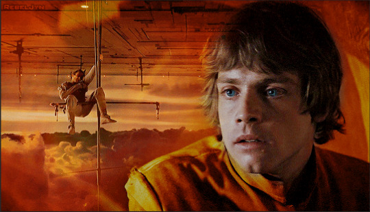
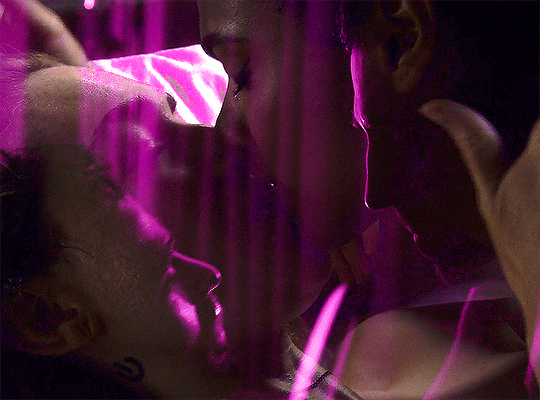
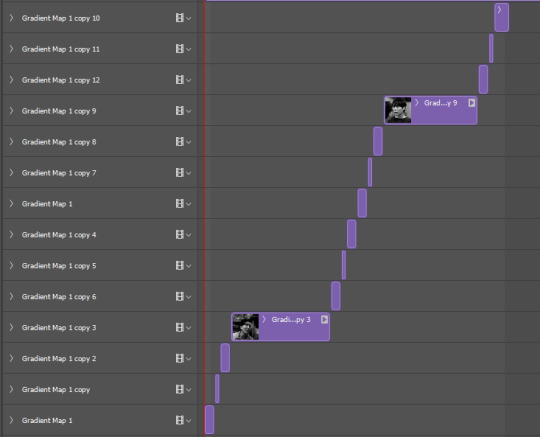
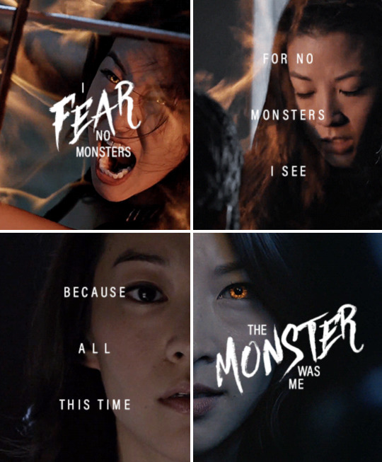
The Midnight Club: members
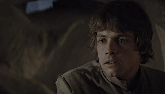
#themidnightclubedit#the midnight club#midnightclubedit#tmcedit#netflixedit#tvedit#**#*gif#*the midnight club#i tried.jpg#i will get better at blending and typography#manifesting it#🤡🤡🤡
421 notes
·
View notes
Text
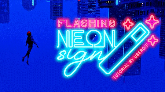
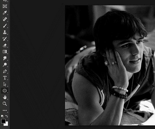
HOW TO: Make Animated Neon Text
Hi! No one asked for this tutorial, but this is one of my favorite typography effects as of late — so I thought I'd share how I do it. You can see this effect in the first gif of this *NSYNC Celebrity set and the last gif of this Anthony Bridgerton set. Disclaimer: This tutorial assumes you have a basic understanding of gif-making in Photoshop. It's also exclusively in Timeline and uses keyframes for the fading effect seen on the blue text.

PHASE 1: PREP YOUR BASE GIF
1.1 – Choose a dark scene.
This effect looks best contrasted against a dark background. You can definitely do it with a bright background, but just like a neon sign irl, you only turn it on in the dark/at night — so keep that in mind!
1.2 – Determine the length of your clip.
Depending on how much you want your text to flash or fade in, you'll want to make sure you have a scene long enough to also allow the text not to flash — reducing the strain it takes to actually read the text. For reference, my gif is 48 frames.
1.3 – Crop, color, etc. as you would.
New to gif-making? Check out my basic tutorial here!
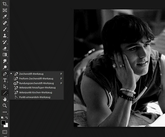
PHASE 2: FORMAT YOUR TEXT
Before we animate anything, get your text and any vectors laid out and formatted exactly as you want them!
2.1 – Finding neon sign fonts.
It's easy as going to dafont.com and typing "neon" into the search bar!
2.2 – Fonts I used.
Neon Glow by weknow | Neon by Fenotype | Neon Bines by Eknoji Studio
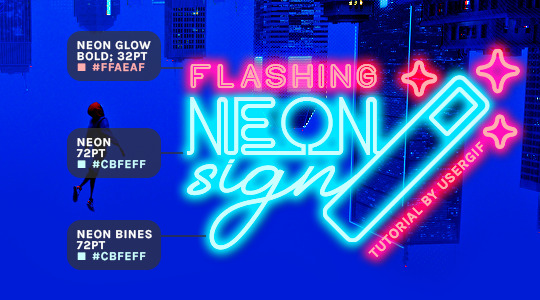
And to not leave my fellow font hoarders hanging, the font for "tutorial by usergif" is Karla (it's a Google font) 🥰
2.3 – Group your text layers. (Conditional)
If you plan on having multiple text layers like I did and you want them to appear connected (like how the last letters of "NEON" and "sign" intersect with the wand icon), I suggest putting the layers into groups according to color (the shortcut to group layers is Command+G). If you don't group your text and just apply the outer glow settings to each individual layer, you'll end up with something like this:
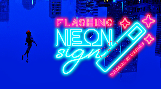
—where you can see the glow overlap with the line, instead of the smooth connection you see in my final example gif. I'm using 2 colors for my text, so I made a group for red and a group for blue.
2.4 – Apply Outer Glow.
Right-click your text layer (or your group if you have several layers) and select "Blending Options" to open the Layer Style menu. Check "Outer Glow" and feel free to play around with the settings until you like the way your text looks!
Your outer glow color should be darker and more vibrant than the color of the text itself. The text should be within the same color family but much brighter and, sometimes, almost white (see Step 2.2 again for my text colors).
Here are the settings for the Red Glow (the glow color is #FF3966) and Blue Glow (#00F0FF):
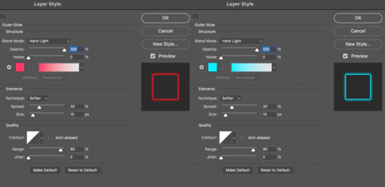
These aren't always my exact settings but they're pretty close to my standard. I always set the blend mode to Hard Light and usually have the opacity at 100%.
For every gif I use this effect on, I like to play around with Spread and Size. Spread will make the glow look denser and "expand the boundaries" (source: Adobe) and Size will diffuse the glow and blow it out so it covers a larger area (Adobe says it "Specifies the radius and size of blur").
2.5 – Duplicate your text layer/groups and remove glow.
We're only going to be animating the glow on our text, and since doing this affects its opacity/visibility, we want to preserve the base text by creating a duplicate.
I just hit the Command+J shortcut to duplicate my groups and delete the Outer Glow effects, making sure that the "No Glow" version is above the "Glow" version:
I also put all these groups into one group called "Text" for organization and so I could apply a drop shadow to all the elements for better visibility.
PHASE 3: CREATE THE FLASHING EFFECT
This is for the effect you see on the RED text in my gif!
3.1 – The 0.03-Second Rule
If you've read any of my animation tutorials before, you're probably already familiar with this rule. In my experience (and for reasons I can't explain), Video Timeline pauses every 0.03 seconds (try clicking the forward button a few times, you'll probably find a "duplicate" or paused frame). So, keep all your layers a duration of 0.03-second increments (e.g. 0.06 or 0.09 seconds can also work) and align them on the Timeline at 0.03-second intervals. If you don't follow this rule, you'll get duplicate frames when you export, resulting in a choppy final gif.
3.2 – Trim and arrange your text layers.
Only on the layers/groups WITH the Outer Glow effect, trim them into several segments of varying lengths where the glow will be "on" (visible) and leaving spaces where the glow should be "off."
Typically, I'll have a mixture of 0.06 and 0.03-second text. That's when the glow will be visible. Between each "flash" of visibility, I've got a 0.03-second blank space, baby *pen clicks* and I'll write your name:
The layers shown above are arranged with a few flashes and two long segments of no flashing. This is the order and duration of each segment shown above (purple = visible segments):
0.06 blank, 0.06 visible, 0.03 blank, 0.03 visible, 0.03 blank, 0.03 visible, 0.03 blank, 0.24 visible (the long bit where "FLASHING" doesn't flash at all), 0.03 blank, 0.03 visible, 0.03 blank, 0.12 visible
(I only did this for the text that says "FLASHING" to give it a glitching effect. The other red text keeps the glow visible starting at the first long segment.)
PHASE 4: CREATE THE FADE-IN EFFECT
This is for the effect you see on the BLUE text in my gif!
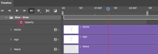
4.1 – Animate using the Opacity Keyframe.
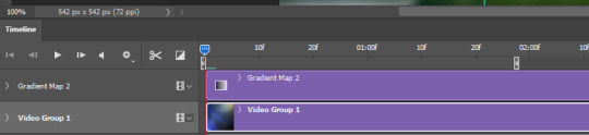
Again, we're only touching the layers/groups WITH the glow effect. If you only have one layer of text, you'll find the Opacity Keyframe by clicking the film reel icon:
If you're working with groups like me, you'll find it in the Timeline panel under the group when it's expanded:
As you can see, I already added my keyframes (lil diamond babies). And luckily, it's super easy to do!
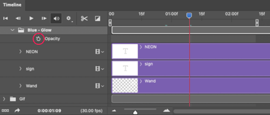
4.2 – Add the ending Keyframe first.
We're starting at the end because our layers/groups are already at 100% opacity. Drag the playhead (the blue arrow attached to the red vertical line) to a spot where you want the glow to be 100% opaque — this is where the glow will be fully "on" or visible. [Again, follow the 0.03-Second Rule. You will get duplicate frames regardless when using keyframes (this will be explained in the note in Phase 5), but abiding to the rule will mitigate the amount of dupes you get.]
Then, click the clock icon by "Opacity" to place a keyframe:
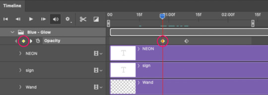
4.3 – Add the starting Keyframe.
Go backward from the ending Keyframe you just placed (I went back 0.12 seconds — but you can play around with the duration of the fade, just keep it a multiple of 0.03):
And drop another keyframe, this time by clicking the diamond icon by "Opacity":
4.4 – Reduce the opacity on the starting Keyframe.
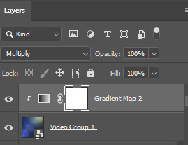
Keeping that keyframe you just placed selected, go to the layers panel and reduce your layer's/group's opacity to 0%:
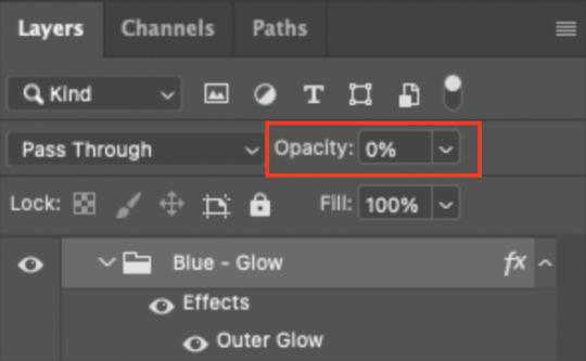
Now, this Outer Glow will slowly fade from 0% to 100% opacity.
And just for a visual aid, here's where my fade-in keyframes are in relation to my flashing segments:
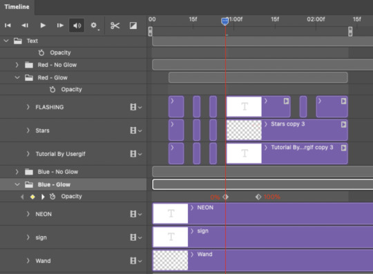
To refresh your mind, the 0% Opacity Keyframe starts when "FLASHING" is visible for 0.24 seconds (the first long segment of visibility).
With these keyframes, you'll get a smooth fade-in à la ✨light switch with a dimmer✨
PHASE 5: EXPORT
Yay, we're finished! Convert from Timeline back to Frames and export your gif!
NOTE: If you only did the flashing effect and followed my 0.03-Second Rule, you shouldn't have any duplicate gifs.
BUT if you included the fade-in effect using keyframes, you WILL have duplicate frames. 'Tis the nature of keyframes. 🤷♀️ I had 4 extra frames where the fade-in starts, which I deleted. So, as always, I recommend checking your frames when you convert from Video Timeline back to Frame Animation — and manually delete any duplicate frames.
Sorry this tutorial is so long 🙈 I over-explain so you're not just mechanically copying steps, but understanding the WHY behind each step! Thanks for bearing with me
If you have specific questions about this tutorial, feel free to send a message to usergif and I'll try my best to help! :)
More USERGIF tutorials • More resources by Nik • USERGIF Resource Directory
#typography#gif tutorial#completeresources#usershreyu#useryoshi#userelio#userzaynab#userives#usertreena#usercim#userrobin#userkosmos#usersalty#userhella#alielook#uservalentina#uservivaldi#*usergif#*tutorial#by nik#flashing gif
736 notes
·
View notes
Note
hi alie, please could you tell me how you made the lens flare and film grain effect on your recent rwrb fonts gifset? it looks so beautiful! i'm working on my very first gifset with blending and overlays and things, and i'd like to try my hand at learning some more new stuff 💛
hiiii! thank you!! <3
i've found these overlays on youtube over the years, i don't remember exactly which videos they were, but if you look up "film strip overlay", "kodak overlay", "film grain overlay", etc for the film one, you should find something that you like. same goes for the light streak one: if you search for something like "light streak overlay", you'll get a bunch of nice one. then i download them via a website (i often use y2mate) and make a gif with screencaps from the dowloaded video(s) like i would any other gif.
once you have your overlay(s) ready to go as a smart object, duplicate it onto your gif, on top of everything (or under the typography layers), but definitely on top of coloring and blending, etc. put the overlay layer in a group, and if you have more than one overlay, put each overlay in its own group.
if the overlay is mostly black with some white specs/other colors, set that group's blending mode to screen (or lighten if it looks better). this will make everything that is black in the overlay transparent. and if the overlay is mostly white with some black, you can use the multiply (or darken) blending mode (it will make everything that is white transparent).
the reason why i prefer putting the overlay in a group and change the group's blending mode, instead of the overlay itself, is because it's easier to change its color that way if you wish. to change its color, i use a gradient map layer. the colors should be black to whatever color you want, and this layer should go into the overlay group, and n top of the overlay layer.
for my gifs in this rwrb set, there was also actually an animated grainy overlay below these two overlays. i've uploaded it here as a psd if you want, since it's pretty light. i put that layer in its own group and changed the blending mode to hard light and the opacity to 10%. i only used a gradient map to change the color on the color steak one to make it more of a pastel orange color, the two other overlays are as is without any color correcting layers.
i hope that was clear enough :)
#alie replies#skatingthinandice#*ps help#photoshop#resource#tutorial#completeresources#resourcemarket#allresources
86 notes
·
View notes
Note
Hi!
I was just wondering if you have a tutorial on how you created this effect in your gifset, it's something I'd like to try but have no idea where to start. Your set is so pretty! Any helps appreciated x
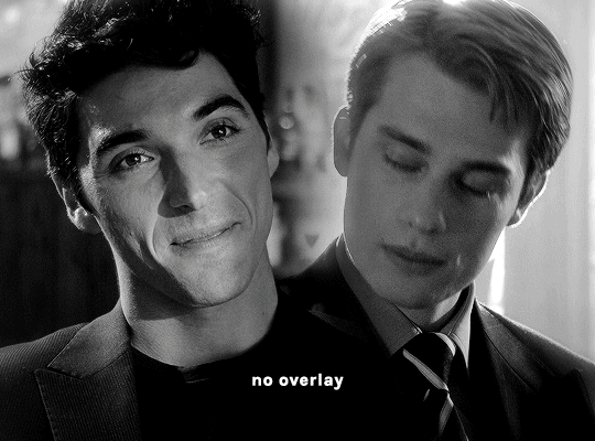
https://www.tumblr.com/tawaifeddiediaz/712911415428743168/ill-take-you-with-me-then-well-both-die-you?source=share
Hey Nonnie, thank you! This is super late, but I don't actually have the psd for this set anymore (I delete them as soon as I post them), so we're just gonna wing it with a gif I made the other day. I think this ask is about the text, but if it's anything else, just drop me another line and I'll get to it when I can!
I'm pretty sure I got this tutorial from the wonderful @eddiediaaz but I then turned it into Lazy Girl Hours :)) anywho, here we go!
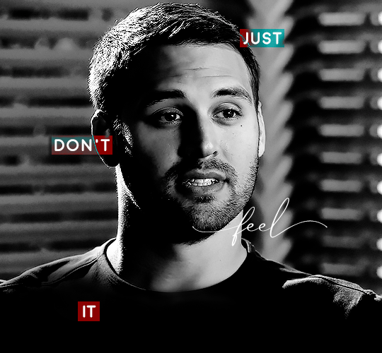
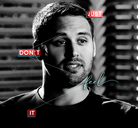
We’ll be making this gif:

This tutorial assumes basic knowledge of gif-making, Photoshop, and coloring. I’ve only described the typography tutorial in this, but you can reach out if you have any questions.
Tutorial under the cut:
Couple things to note beforehand:
There is a lot of trial and error involved when doing any sort of effect, and this is no exception! You might have to play around with the colors and the settings before you find something that looks good and readable and that fits your set!
This text effect works better on big gifs (540px width).
For this, I find that a simple font works better than a fully-cursive one, but play around with what you like. The boxes may need some adjusting if you use a font with too many tall or tail letters (i.e. text where all the letters aren't on one uniform line - that's why capital letters work so well.)
Movement works really well with effects like these, but again, it depends on your gif + readability. If you have a blended gif, it may take a little more trial and error.
I work in frame animation for all my text effects, but this works just as well in timeline as well.
We’re going to start with this gif:
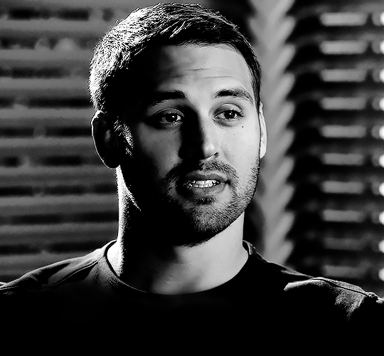
First, I like to put my text on the gif. You can obviously move this around later so don't worry too much about how it looks right now.
The dialogue is "Just don't feel it." "Feel" is one of those Big Words for this quote, so I'm going to emphasize it with cursive text.
I am using Moon for the sans serif text, and Santa Fe Spring for the cursive text. Keep both of these in white for now:
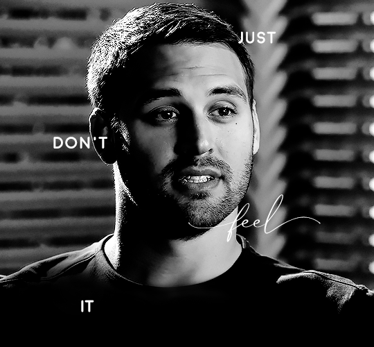
Next, we're going to use the rectangular marquee tool to draw our rectangles around the capital letters (we're not touching the cursive text right now). I just eyeball this, and then try to center it as much as possible.
(The rectangular marquee tool has a keyboard shortcut of M, and it's the second tool in that little toolbar on the left of most people's Photoshop.)
This is what that'll look like:
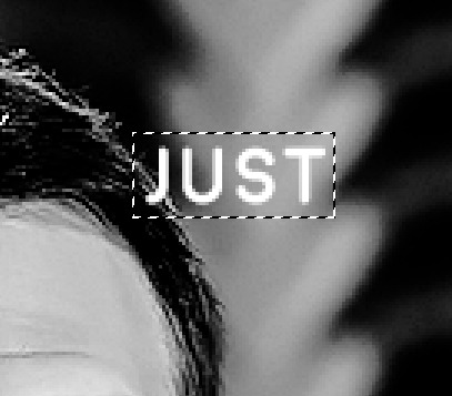
Next, we're going to go down to the icons at the bottom right of the layers panel and select the half-black half-white circle > Color Fill.... You should get a color dialogue box. Choose your color - I'm using #8d0000. Then, we're going to move that layer below the corresponding text layer, and set its blending mode to Difference. This is what that looks like (click the image for better quality):
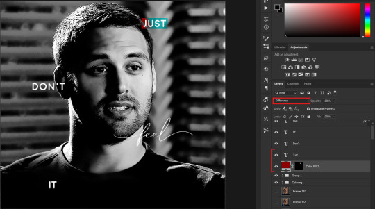
I'm going to repeat that with the other two boxes as well, using the same color. The boxes will look different with the Difference blending mode because of the shadows underneath.
For example, the box with "it" looks like a solid red square because it's against a completely black background, while the other two have some blue shading to them since there are some highlights behind them.
This is what my gif looks like now:
Next, I like to go The Lazy Girl™ route and put all three color-fill layers into one group underneath all the text layers. This just lets me edit the drop shadow of all three of them at the same time.
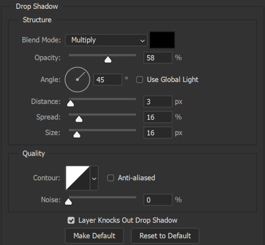
Right-click the group and open up the Blending Options. In Drop Shadow, these are the settings I'm using. The drop shadow color is #0c6477:
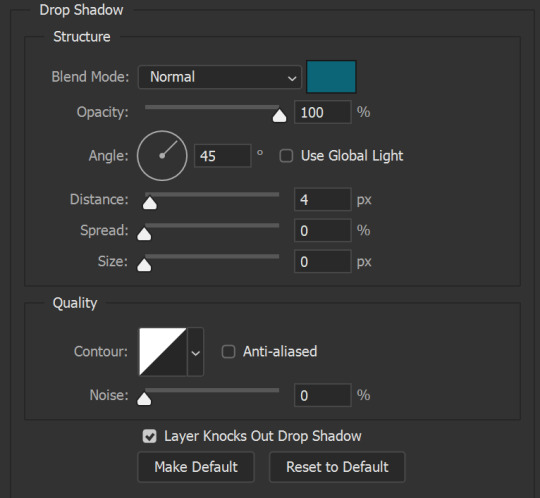
(Note: uncheck "Use Global Light" especially if you're working in frame animation to make sure all the drop shadow has the same angle on all frames.)
This is what my gif looks like now:
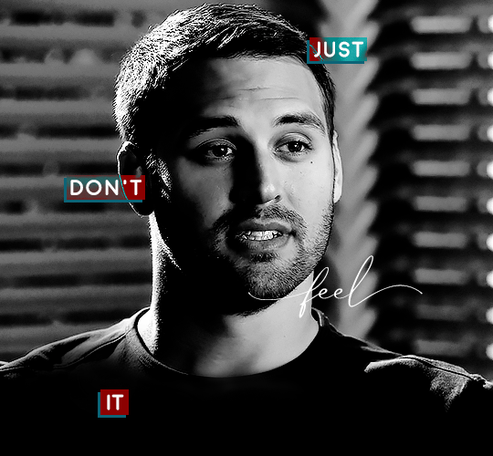
Now that we've finished that, time to move on to the cursive text.
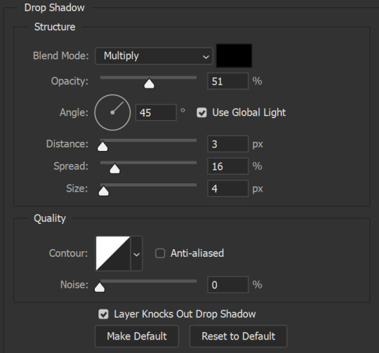
I usually match the cursive text to the palette of the rest of the text, and since the drop shadow is our "accent" color, so to speak, I'm going to use a lighter version of that color. I am also going to add a drop shadow for readability.
The color I used for the text is #acfffe and I actually ended up adding two drop shadows, just because I needed something subtle that doesn't overwhelm the text, especially since it's a delicate font. Here are the settings for both layers:
And here's what my gif looks like now:
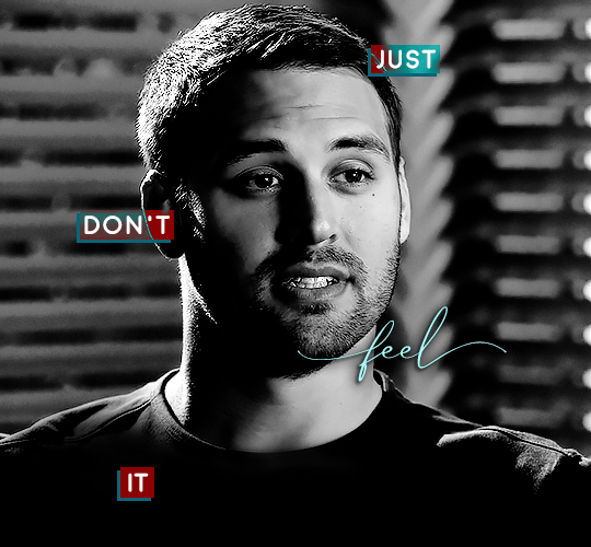
Now, before we move on to the lines, just check the adjustment of all these text layers, see if there's anything you want to change. It's easier to change now than after the lines are added, since you'll most likely have to redraw them if you move the boxes after the fact.
To draw the lines, we're going to use the Line Tool. I just freehand all of this, and I try to go from center to center of the boxes when I can. It all depends on your angles.
My lines are 2px thick, but you can change these depending on your preference. Here's what mine look like right now:

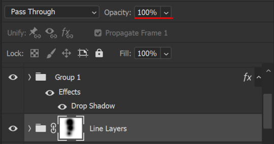
We're going to do the same lazy hack that we did for the color fill, and put all three line layers into a group. Move this group below the text layer and the color fill layers. The reason for this is so that the lines look like they're coming seamlessly from the box, rather than from on top of them or something.
Then, set the group to opacity 50%. I like more subtle, simple looks in my gifs, so I don't like super high opacities.
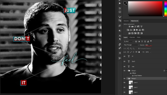
And that's it! This is our final gif:
Some final notes:
Absolutely play around with the blending modes of the color fill layers for this effect. These two gifs are the exact same color we've been using, just two different blending modes. You can see how drastically different they look. The first one is Linear Dodge (Add) and the second one is Vivid Light:
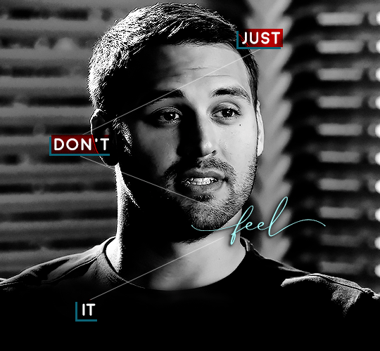
It can change how your gif looks in a BIG way, so play around with it, see what you like, especially if you don't really like the "two toned" thing going on.
Sometimes, I also like playing with the width and height of the text in the font settings, making it shorter and wider, or making it taller and more compact. You can play with the letter spacing as well. The world is your oyster, etc etc.
One other thing I've started doing is erasing the lines with a big brush, just to fade them from his face a little, like this:

To do that, use a layer mask on the line layer folder, and a brush that's 0% hardness, and at least 200px big. For this gif, I also changed the opacity of the lines back to 100% so the fading effect is a little more pronounced:
(this gif isn't the best example for this, but oh well. Anywho, hope this helps, Nonnie! Let me know if you have any questions.
Enjoy!
#zee's tutorials#tutorials#gif tutorial#photoshop tutorial#resources#dailyresources#completeresources#itsphotoshop#allresources#dailypsd#userisha#userdahlias#alielook#userabs#tuserheidi#userelio#userjaelyn#userisaiah#usermorgan#usergert#zee answers#im so pissed at myself for losing the tutorial the first time like you do not know how mad i am right now#i didn't even do anything tumblr just hates us all
187 notes
·
View notes
Note
The blending in your Lucas gifset was absolutely gorgeous! Do you have or know a tutorial on how to do it?
Blending Tutorial!
Firstly, thank you for the compliment anon! Now, I'm going to go through the process considering that you already know how to make regular gifs and know how to use adjustment layers, so I'll be focusing specifically on blending but if you need those tutorials I can make them, just ask!
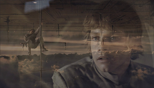
This is gonna be our end result after the whole process:

This specific gif from this gifset(with the typography removed) is focused on a color palette with only two adjacent colors so it's a bit easier to make the blending look good but this process works for any kind of gif! So let's start the tutorial!
1. Get your desired gifs into the same canvas

These are the two gifs I'll be blending for this gifset. Make your gifs and resize them to the size of your final gif. Remember to turn the layers of each gif into Smart Objects so that you can move them around properly when blending.
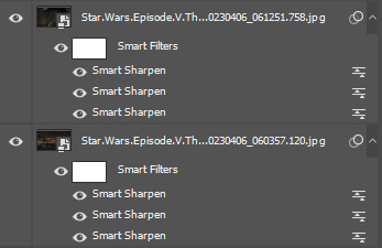
I usually make the gifs and just copy and paste one of them onto the canvas where I made the other one. You can also make your gifs and save them separately from each other first and then put them into the same canvas, but I prefer to make all adjustments except for resizing in one canvas so I can tweak the positioning of each gif as well as the coloring so everything looks the way I want it to.
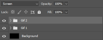
2. Put each gif into a folder

This will make it easier for when you start using adjustment layers on each gif so that the adjustments don't interfere with other layers.
3. Set layer mode to screen
Set both folders to Screen, this will help blend them together better than if you were relying only on the opacity of the layers. I also usually create a new layer and use the paint bucket tool to color it black. Your gif should look something like this:
And your layers like this:
The black background makes sure there aren't any transparent spots in your gif when you use the layer masks to blend them as you can see here:


4. Create layer masks

Select each group one at a time and go into Layer > Layer Mask > Reveal All. Your layers should now look like this:
5. Start erasing each gif on the layer mask
Use a soft airbrush to erase each gif to your liking. With layer masks you can use the eraser tool or the brush tool. Layer masks work based on color value(how light or dark the color is). The darker the color you paint with your brush the less opaque it will be. Painting in black will erase the area completely and painting it white will make it completely visible. The eraser defaults to the same effect as if painting with a brush in black.
This is the final result of the blending:
This is how each of the gifs look after I erased them with the layer masks:

This is what my layers look like:

As you can see I've erased one of the gifs way more than the other, that's because I only erased parts of the gif that would interfere heavily with the gif I wanted to be more visible. Make sure to move around the timeline of your gif to see if you need to erase more or less of each gif since the person or thing you're trying to keep visible can move around and get covered.
6. Make your color adjustments
If you've already made your adjustments before pasting both gifs into the canvas you can skip this step. Since this gifset was focused on orange and yellow I adjust my colors to match that. I keep my adjusment layers in groups inside the respective gif's folder so I can turn them all on or off easier and so they occupy less space in my Layers tab.

And this is what the colors look like in the end:
7. Export your gif
This is what my export settings look like:
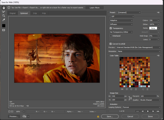
This doesn't interfere with the blending and a lot of these settings are personal preference but I thought it was worth sharing.
And finally we've arrived at our final result as shown previously:
Other blending tutorials:
Now the links to some other blending tutorials that might have different methods(sometimes because of different desired outcomes). I'll be tagging the creators for if anyone wants to look at their content!
Tutorial using gradients and lighten mode by @linda-darnell
Tutorial using erasing with layer masks by @eddiediaaz
Tutorial adding color on top by @miriammaisel
Tutorial using screen and color layer modes by @disaster-lineage
That's it! Hope this was helpful!
113 notes
·
View notes
Note
Hey!! How do I get into making gifs? Any tips for a beginner? I literally know nothing about it just that the I'd like to start. Also is not having photoshop a big obstacle?
Hi there! Yeah I can give you some tips to get started! Keep in mind I use windows to make my gifs and not a mac.
So to get into gifmaking you don't need to have photoshop. If you find that you enjoy making gifs I do recommend you look into getting photoshop (and there are ways of getting it without paying *raises pirate flag*) but to start there are several online programs you can use.
Here's a few that i've used before I learned how to do it in photoshop:
photopea
ezgif
giphy
imgflip
makeagif
This is an excellent tutorial to using photopea to make gifs
Each one of those will allow you make a basic gif. For complex coloring, sharpening, layouts, typography, blending, etc you'll want to upgrade to using photoshop because the quality is just way better and you can do so much more but when you're just wanting to get start all of these websites are great places to learn.
I also recommend learning how to take screencaps because I find it's a lot easier to make gifsets using screencaps than it is to try and screen record, cut, and upload videos.
My recommendation for screencapping is KMPlayer. It's a video player that you download to your computer and has a very easy way to save screencaps. Then you can just upload the jpgs into whatever program you're using to make gifs.
I made a basic gif making tutorial using photoshop and kmplayer here if you want to take a look at it.
Basic gifmaking steps:
Get your video. You can download it through pirating sites or use dvds or screen record. I download from sites like soap2day.to.
Take screen caps of the specific scene you want to gif OR cut your video to just the scene you want
Upload either clip or jpgs into the chosen program
Set the speed
Do any trimming of the scene and/or cropping the sides you want to do
If your program allows you (some don't) you can sharpen it, brighten the colors, add text
Then just save it as a .gif
Some other things:
The higher quality video, the better quality gif. 1080 is better than 720. Try to get a nice quality video if you can
Some websites will have a watermark on it that can't be removed so keep that in mind. Another reason why I prefer using photoshop.
Try to keep the gif either the same speed as the episode or just a little slower. Too fast isn't good.
That's all I got for now! If you have any other questions please feel free ask! I'd be happy to help with anything!
104 notes
·
View notes
Photo

Yeah idk why i’m doing this either i guess i just wanted to make myself feel better about turning 30? Also i’m admitting i probably should been a bit more prepared for this celebration thing but maybe 5 days is enough time?
Seriously though someone tell me how ‘93 was 30 years ago 😭
Soooo i figured i’d make a prompt list for my fellow creators to participate in (if they want to of course 😉😅)
Gonna try and keep the prompts simple because i’ve never done a prompt list like this before, and also it’s all fandoms friendly so go nuts with it (even if it’s a fandom i’m not a part of - i’m trying to get into some other stuff atm anyways)
🖤 Monday 10th 🎉🎂✨
skill: blending // colours: vibrant
💜 Tuesday 11th
skill: typography // colours: cool palette
💙 Wednesday 12th
skill: transition // colours: warm palette
💚 Thursday 13th
skill: overlays // colours: black and white
💛 Friday 14th
skill: free space // colours: free space
Rules are pretty simple - you can do one or both whatever you like (mix and match with the other days even if you want to lol)
We don’t have to be mutuals to take part in this either btw I just wanna see some pretty gifs and stuff to cheer myself up (plus recently it feels like my dash has been a little sparse for content i enjoy)
Gonna be tracking these under my normal tag #useraimz but gonna be tagging them under aimzbday*
Tagging some much loved mutuals below the cut in no particular order (signal boost or not it’s completely up to you) and as per always i never know who to tag because you guys know how much of a socially awkward loser i am - so if i miss anyone i’m sorry 👉🏻👈🏻🥺
@jeysuso @foundlingrogu @achingly-shy @machine-slays-dragons @heroeddiemunson @emziess @eddemunsn @iero @deanncastiel @lamberts @stars-bean @bylrndgm @buckysbarnes @stargyles @santinacedes @reysorigins @usershiv @ellie-joel @greatcometcas @ofalltheginjoints @buckleydiaz @finalgalnancy @bitchsteve @padme-amidala @eddiemunsens @alivedean @starrystevie @rogueddie
#i wanted to do prompts or something for my writer mutuals too but i would have no idea what to even do with that... sorry guys#aimzbday*#aimz talks
68 notes
·
View notes
Text

hi anon thank you for the ask! i’m gonna start with links to some blending tutorials that i have found really helpful (especially when first starting): tutorial by @yenvengerberg, tutorial by @jackarthurdavenport, tutorial by @sith-maul, tutorial by @nelsonnicks
also there is a high change this might not make sense, writing and like making sense in general are ummm not my best skills sdfjsdlfkj so if anything really doesn’t make sense or is confusing just let me know and i will do my best to clarify!
I. PICKING SCENE
so i think one of the most important parts of blending (at least for me) is not actually the making of the gif but picking scenes. there are a few things i keep in my when i’m starting to pick scenes to gif:
first is the overall brightness of the scene. it can be really hard to blend a bright scene such as an outdoor scene with a dark scene like a nighttime scene (it’s not always impossible but take a lot more work with the coloring)
and it helps if each scene has i guess the best way to put it is little contrast?? like if it’s a dark scene that does have any little part it’s just not gonna show and the same with a light scene that has little to no darker spots

you can see this with this blending. you only really see the green gif and the other gif is really hard to see

here is another example that could work better. you can’t really see the overlay gif of lito and hernando at first but does show up really well when the other gif is darker
II. CROPPING AND PLACEMENT
once you have the scene you can go through your typical process to load your gif and then crop. sometimes i won’t crop right away and will just change the gif size to the height i want so i can place around with the placement of each gif a little more
but whatever you decided to do once you have finished you will copy and paste one of the scenes onto the other one. i usually do with frames because that’s how learning but some of the tutorials i listed show how to do this on timeline
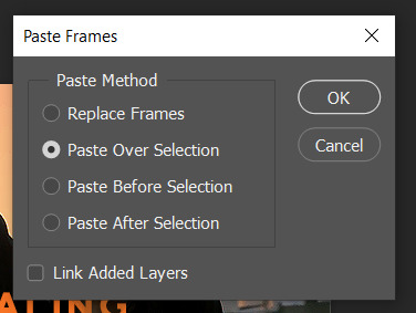
if you are using frames, you will select all of your frames and then go to the menu on the top right of the timeline and choose copy frames

once you have it copied go to the other scene, select all frames and go to the same menu then hit paste and choose the option below
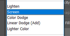
then change one of the groups to screen (you can also try lighten but i normally use screen)
this is normally where I place around with placement if i’m not sure. to do this you select one of the gif groups and hit ctrl + t to be able to move the gif around. Once i’m happy with the placement i will crop and go on to coloring.
III. COLORING
i normally make only one scene visible when coloring and check how it looks with the other gif throughout my coloring process.
and for some gif instead of doing my normally coloring i will use a black and white gradient map and then a color fill set to color


you can an example of this in the gif below
when i am done with coloring both gifs i will do a final check to see if i need to change anything. if i’m okay with how everything looks i will just add a final brightness/contrast layer over both gifs
if i’m not happy i have a few thing that i will do:
sometimes if one gif is showing more than the other, i will reduce the opacity of the brighter on
you could also place around with the coloring of each gif to help the blending by increasing brightness or contrast. i would be careful with this (especially brightness) because it could affect skin tone
if there are certain spot that needs to be dark, i will make a new layer set it to soft light, and paint with black until you are happy. when doing this i normally use a soft brush set to 25% opacity. you can also change the opacity of this layer as well!
without layer
with layer

once you are done playing you can add any final touches (like typography and whatnot) and then save as you normally would.
if you get discouraged or frustrated know that it definitely gets easier! the more gifs the better idea you get a scene of what will and won’t work. also, i have definitely had times where i’ve scraped the scenes i’m working with because they just aren’t working. a lot of blending if it is trial and error. it helps once you find your favorite types of blending and whatnot. like i really like to have at least one of the gifs i’m working with have some movement. i don’t know why exactly, but i just know those gifs end up being some of my favorites!
here is example and some of my favorite blending! (also i didn’t psds save for the calliette love trope set which is why it still has the text)

if you want some additional resources on blending or gifing in general you can check out my resource blog @oblivionresource i would recommend looking at the resources on @usergif they have a lot of good resources and tutorials!
#ps asks#*tutorial#uservivaldi#uservalentina#userrobin#usernanda#useremi#tuserabbie#userelio#tuserlucie#usershreyu#usersalty#tuserrex#tuserbea#userrsun#tuserheidi#usermarsy#userrainbow#userkosmos#userk8
224 notes
·
View notes
Note
3 & 8 ❤️
hi angel!! thank you
3. Who/what inspires your graphics / gifs?
i think all of my creator moots give me some form of inspiration, even if it's to get better at coloring. i'm alwasy obsessed with learning how y'all color like yes teach me new things even tho i've been photo editing for a very long time. just to name a few off my head: @djo, @heroeddiemunson, @saltandspite, @natscatorrcio, @rachelsennot, @gatortillmans, & angel herself @ricky-olson. i really love seeing your stuff on my dash and i love lowkey seeing it from source blogs going hey this is so & so's. also a huge blending inspo is becca @yenvengerberg and i hope it's not weird at all that i am tagging her. just a little shout out bc if ur not following becca then idk what to tell u.
also shout out to motionless in white for bigging my biggest music inspiration that i've made multiple edits from lyrics.
8. Your favourite graphic and or gif created by yourself
the max mayfield x you're a ghost set. i was happy with the blending and the coloring and honestly happy with the typography. honestly the three max specific edits i have are some of my favorite.
gif/graphic maker asks
14 notes
·
View notes
Text
2023: A Year in Review
tagged by the wonderful @weiwuz thank you!!
rules: link your favourite and/or most popular post from each month of this year (it's totally fine to skip months and tag some CCs you love!)
i'm going to link more than one because i feel like i've improved a lot over this past year as i adapted more to using photopea & explored a lot more when it comes to giffing using it & i'm proud of how far i've come this year! (also you can see when i went from only doing 1 gif a month to like multiple 🤣) apparently i didn't make very many sets in may that aren't in my eyes "boring" 🤣
JANUARY
first love: hatsukoi + terminal by lewloh & julia gartha
kurodachi | cherry magic + moment by jeff satur — for userdramas event 3: beginnings
lan wangji | the untamed (golden core reveal & all the things he said to wwx when he didn't know he was coreless because i love inflicting pain)
FEBRUARY
kodama sakuko | koisenu futari — for userdramas event 4: love
asatsune | reversal orchestra (with a quote by r.m. drake)
MARCH
asatsune | reversal orchestra ep 8
mike chinnarat in midnight museum ep 2 (this one might also be most popular people were rightfully unhinged when they saw this set/him in this drama)
asatsune | reversal orchestra ep 9
core four | brush up life
APRIL
jiang cheng | the untamed — for userdramas event 6: second time to shine
JUNE
takahashi satoru | koisenu futari — for userdramas event 7: identity
(it's rainbow coloured what else can i say)
jeff satur lucid mv
(aka the set i still kick myself for forgetting i could've used this for userdramas bingo)
wasteland by kang daniel set
(another set where i kinda used b&w and didn't hate it also i just love the blending in this set, & the og mv for SOS was like yellow)
JULY
wei wuxian | the untamed — for userdramas get to know me bingo: character
AUGUST
takahashi satoru | koisenu futari — for userdramas event 9: icon
SEPTEMBER
xiyao | the untamed — for userdramas event 10: emotions
(i really loved how this one turned out with the transition of the colours & just the colouring in general i really love)
asatsune | reversal orchestra — for userdramas get to know me bingo: relationship
(i had a lot of trial and error with this set, it took a whole like 7 months for me to finish it because i kept going back and redoing the colouring because reversal orchestra if you haven't seen it is like literally colour coded yellow/orange, you can also tell it took me this long because this is one of the few sets after like july where i used my old gif size)
OCTOBER
xiyao | the untamed — for userdramas event 11: inspiration
NOVEMBER
songxiao | the untamed — for userdramas event 12 loss
(this one is actually probably my favourite set of mine of all time)
yaojing | lost you forever — for asiandramanet nov bingo: animation
(fade transition effect used, this one took me a long time to make & it turned out so much better than i expected)
tushan jing | lost you forever — for asiandramanet nov bingo: quote
(i'm not a lover of using yellow in my gifsets & i actively tend to avoid it but i wanted to use yellow because i think it embodied the quote well and i surprisingly loved how it turned out)
tang lian | the blood of youth — for asiandramanet nov bingo: blending
DECEMBER
zhening | story of kunning palace — for asiandramanet dec bingo: black & white
(b&w is another thing i tend to avoid with my gifsets because i usually dislike the outcome but i really loved how this turned out)
yunqing | reset — for userdramas secret santa + asiandramanet dec bingo: overlay
jinwoo/moeun | tell me that you love me — for asiandramanet dec bingo: free choice
(i've been wanting to use this quote for agessss and it was just perf for them & this set has grown on me a lot)
yaojing | lost you forever (ep 33) — for asiandramanet dec bingo: typography
(ironically for this what i love about it is the colouring)
jinwoo/moeun | tell me that you love me (ep 9) — for asiandramanet dec bingo: comfort
i'm too lazy to tag people so please feel free to say i tagged you, & if you read the whole of this post ilysm
#lex waffles#long post#me: i don't use b&w often#also me: here's a bunch of sets with a few b&w gifs#okay this got hella long#really proud of myself this year#and i feel like the set i'm working on right now could also make the december list but i won't be getting that done until before sunday lol#the way i colour my gifs & the way i blend i also changed like midway through the year along with my gif sizes lmfaoo#i can't pin point where exactly the colouring/blending change happened but i feel like i want to say it was the xiyao emotions set
5 notes
·
View notes
Note
Artists and designers self rec! When you get this, reply with your favorite five works in any medium that you've created, then pass it on to at least five other creators. Let’s spread the self-love 🤍
AHH TY BESTIE ILYYY <3
In no particular order:
eddie + better than revenge are we surprised? i'm so glad this turned out the way i wanted it to and i'm forever gonna be proud of it <3
ineffable husbands + false god i just really love the colours i used in this and how the typography turned out
buck + you're losing me again i love the colours and blending here, and it's a buck set i'm biased 😌
buddie + the entirety of reputation (with bonus anti-bucktaylor) i'm so happy every song worked out and i really want to make more album cover based edits now alskjdfl
eddie + drown this is my baby with such a special place in my heart i don't think anything will ever top it, it's the edit that started it all for me <3
ty for sending this alie!! <3
5 notes
·
View notes
Note
okay I’ll bite! what are your top 5 gifsets you ever made? 👀
also, what kind of feature in photoshop you like to use the most? Is there anything you still want to try out? my english is not the best but I mean like some kind of typography or blending or some new effect maybe?
oooh i love this question. pardon my delayed response, i wanted to be on my laptop when i answered it teehee :) it's hard to narrow it down to just five, but i'll do my best.
here are my very tentative choices (for now) of the top 5 sets i've made:
bts eras instagram feed
jungkook's 26th birthday set
vmin string of fate
love yourself era
blond + black hair hobi
i think those are good examples of my skills improving over the last couple years when it comes to more elaborate ideas, but i think i still have a lot to learn and excel at. i do wanna get better at color manipulation and blending, i still don't think i have the best understanding of it no matter how many sets i've attempted it on. i avoid it because i don't think i've mastered it yet. i wanna keep experimenting with fun overlays and vectors that bring a little more life to certain concepts. i have a whole bookmark folder of inspo gifsets i see on tumblr that i sometimes browse when i wanna challenge myself and try out a new effect or technique. :)
2 notes
·
View notes
Note
Hi hi! I love your gifs and especially love the typography and was curious if you knew of any good tutorials or had any tips you'd be willing to share for novice gif makers. All I find when I search is typography on stationary images so I'm probably not getting the right words in. Thanks!
hi dear! ❤️ sorry this is a bit late but i hope it'll still be useful!
first of all, speaking of tutorials: i feel like @anya-chalotra has some really great tutorials on fonts, typography and all the neat text effects you see on gifs these days. outlined text, gradient text, blending modes and a lot of great general font guides. diving in there is a) really helpful and b) very inspiring. a lot of the stuff i'm doing with my text, you can probably find there (and better explained than i ever could).
the rest is under a cut because it got a bit longer. so if you’re interested in anti-aliasing, justification of text, putting your text in a circle or a path, combination of fonts and stuff like that, keep on reading.
as for tips (i’m always super willing to share but i also have the memory of a goldfish when doing a general post like this—so, please, if you ever see something you’d like to have me explain, just let me know): i think one of the most important settings, before we even get into style or effects, is anti-aliasing your text:


i usually go with “smooth” but as you can see, there’s not a huge difference between sharp, crisp, strong or smooth. so choosing between those is more a preference or dependent on the font you’re working with.
(there is, however, a big difference when you use “none”—it makes the edges look jagged and not pretty. so, always use anti-alias, kids!)
i play around with my settings a lot, especially the font style, spacing and the usual suspects like bold, italic, capital letters etc. also, if your font comes with glyphs (special versions of a character or an extra combined version of two characters) that’s also fun to play around with. if your font package contains glyphs and you highlight a character there should be suggestions of all possible versions of this highlighted character—but you can also find the available ones under that second “A” in your task bar.

combining fonts is actually the most fun (but also sometimes the most time-consuming) part of gifmaking and what i like to do is just throw some non-serif fonts together with either handwritten, serif or brush fonts and see what sticks—the part of the quote or lyric i want to emphasize usually gets the bigger and flashier font and more effects (like a gradient or colour fill etc.), like so (for this one i added shadows, set the blending mode to “difference” and added a gradient overlay—that’s my usual go-to mode for typography):

there are times when two flashy fonts work well together but i would advise to be careful with it as it can get overwhelming to look at. this is very much a trial and error process. lots and lots of trying, looking for new fonts, remembering the ones i already have and then just seeing what looks good to me.
how to justify your text:

this skips in the middle because my typing seems to be slow as fuck but basically what you do is, you drag your textbox over the image, start typing and then start playing around with your paragraph settings. (you can choose justify right, left or center or full justification—that basically defines how the last line will look like.)
how to put your text into a shape or path:
for this you can either use the shape tool or the pen tool to create a shape/path to your liking. create the shape without a colour fill or outline and then select your text tool—when you hover over the shape you should see your normal text cursor with a little “wave”. click on your shape and then start typing (keep an eye on your text alignment and that everything is legible) et voilà, your text is following the path of your shape. super easy, super fun.
aaaand i think that’s it for now as this is already quite long.
this is honestly just the tip of the iceberg and there’s so much more fun stuff to do with text, typography, all kinds of fonts. i can only just once again stress that it’s absolutely okay (welcome, even!) to ask me about anything—about a specific gif or edit or what have you. my askbox is always open and i do my best to answer as soon as i can! ♥
72 notes
·
View notes
Note
hiiiii i really love ur gifs so much !!!!! im trying out some effects recently and i really like the third gif here : https://www.tumblr.com/khaotunqs/732573928879472640/i-cant-live-without-you-sand-me-neither?source=share how did u make this!!!! <3 (if its ok for u to share)
hello!!! thank you so much! 💖💖💖
here is the set anon is referring to!
here's me being way too long-winded about how i made that gif:
note: this assumes you use photoshop, and that you already know how to make gifs. i work primarily in timeline, so everything i talk about is specific to that method.
this wasn't super complicated, i don't think? i used @cal-kestis's tutorial on motion blur transitions with timeline to get that shift effect. i didn't make any adjustments of my own, since i liked the end result.
i made the two gifs that i wanted to shift between, and then clipped and blurred according to nik's tutorial. this is what my timeline looks like once i had my clips chunked:
once i had the two gifs in the motion blur transition, i wanted to add something to give it a 'shining' quality, if that makes sense? i used this light leaks video on yt to make that happen!
since the video is an .mp4, i was able to open it up directly in ps, which i always do when i can, since it means to don't have to take screencaps of it. it automatically opens as a smart object and i can get the entire clip so i can move it around in timeline to get a segment that i like over the gif.
i set the video group to 'screen' and added a gradient map with my focus colors (green and yellow) on top of that. i created a clipping mask to clip the gradient map layer to the video group so the gradient map would only be applied to that specific layer. i set the gradient map layer to multiply (i found 'screen' made the whole gif too light).
so there's the gif part (i think i remembered everything?). now on to typography!

'you think i want you as my' and 'of course not' are in quicksand, bold, 10.5pt. 'boyfriend' is a font called pinch my ride, regular, 60pt. i changed the case for 'b', 'r', and 'd' from lower to uppercase bc i just thought it looked better!
in blending options, i added a gradient overlay in my focus colors and set the angle to -90 as i wanted a even lined gradient. i set that gradient overlay to 'hard light' and then set the layer to 'difference'. then (i'm sorry this is so long) i copied that text layer. went into blending options again, deselected the gradient overlay and drop shadow, selected 'stroke' and went with a 1px white stroke set to 'outside'. back in the layers, i set the fill to 0% so only the stroke was visible. once i had the stroke, i shifted that layer down and to the right (five cursor strokes each).
i converted my timeline back to frames (god bless @anyataylorjoy's action for this step) and tadaaaa:

i am truly terrible at tutorials, so i really hope this made some kind of sense! you can always send me another ask <3 thank you for asking, and happy giffing!
2 notes
·
View notes
Note
bestie hi omg i just this set of yours https://at.tumblr.com/arthurpendragonns/arthurpendragonns-we-did-very-genuinely/svgqddh3e6ci and i had to come here and tell u that this is the most perfect thing i've ever seen in my life. i havent watched merlin but im so reblogging that set because WOW. at first i was speechless bc WOW. it straight up looks like a painting or smth i- it's too good. and the coloring and blending the CROWN ON ARTHURS SILHOUETTE (thats his name right? 😭) ANYWAY. and the transition with the blur!! im so using that. you're so damn creative!! you're a pioneer!! i have so much left to say im sorry if this is too long akjshdkd but like. your typography is so good too. i think u just became my fave gifmaker aksjdh also the tv!! OMGGG. im gonna be thinking abt that set forever. congrats cause i dont think that can ever be topped!! 🥰
IVES MY BELOVED! i've literally been staring at this ask since yesterday, giggling, dying, screaming, losing my mind, giggling again and having so many feels. you have no idea what this means to me, i can't stop reading this message. you are seriously such an incredible creator, every set i see of your I GASP. you bring so many new things to the table EVERY. SINGLE. TIME. YOUR HUMOR AND CREATIVITY ARE UNMATCHED. you're so fucking funny and creative and it shines on each and every one of your sets. i'm in awe. i'm rereading your message again while replying HELP. it made me so so so happy, you inspire me so much to keep going. being a content creator on this site is the hardest job and amazing people like you make it easier. YES HIS NAME IS ARTHUR YOU'RE RIGHT 😭 he's for me what jake is for you, you get me! i have so many things to say, so so many, this will end up an essay dasjdhkadja THANK YOU SO MUCH. i'm literally 😭 ily ives, every time i see you on my dash you make it better. i hope you decide to watch merlin one day, this show has altered my brain chemistry forever. hence the insane sets dskahjdakd i feel so honoured to get such a message from someone so top tier like you, a legend i would say. thank you, again, i'm giving you ALL MY LOVE! and happy holidays if you celebrate, otherwise have the most beautiful days ever 💚
7 notes
·
View notes
Note
hi mem! i love your work. i was looking at your 'scott as nogitsune' set and i wanted to ask: how do you decide whether to go with big gifs vs smaller ones for a set involving typography?personally i go big but the way you did that set is so well done and coherent, i'm v inspired 🥰 sorry i hope this makes sense
ah this was so kind 🥺 i'd be happy to walk you through the thought process for that set!
deciding how the text is divided is usually my first step for figuring out what a set is going to look like. for the nogitsune set, i chose a quote that easily breaks up into four lines, so either i could have 4 gifs with text on each, or 8+ if i wanted textless gifs in between. this is already a plus as i personally prefer quotes that break up into even numbers for side-by-side sets, as that way you can start the first gif with text, and end the last gif with text if you’re doing a zig zag pattern.
i should probably also mention that part of the decision for that specific set was that originally, i was going to use a clip from a 480p video:

so a style that used heavy color block & maybe wasn’t a full 540 would’ve allowed me to fudge the lack of detail better. this was useful also as i knew i wanted a mixture of black & white & red for the Drama™ of it all, and i personally really like it when that kind of layout is every-other, which lends itself really nicely to a side-by-side look. side-by-side/smaller gifs also allow for a lot of cropping, which is great when you want to focus on specific details.
...also, sometimes i just feel like it! especially during an event when im doing a lot for one character, variety can be a fun challenge. i like how the gifs feel like they’re interacting visually so much more when they’re smaller, instead of more like a separate unit.
so! in sum, smaller gifs are especially helpful when you:
have footage constraints
want to crop heavily
are focused on contrast
just want to!
ok now some thoughts on typography.
part of the struggle with doing side-by-sides is that it’s really easy to get overcrowded really fast, or conversely, for them to all start blurring together. because of this, i generally prefer to do text on every-other gif going down, like in the nogi set.

there are a few things that help tie the text to the set: the red colour matches the red of the opposing gifs, while still popping out of the b&w gif they’re on. The slant on one of the text blocks adds dynamics and movement, whereas the horizontal text on the other helps you linger there for a bit. the font work is also not something super complicated, as at the end of the day it’s just an accent font and a supporting font.
this isn’t the only way to do text on side-by-sides, ofc, as you can do one for every gif—if there’s variation.
specifically, the sort of variation wherein one side is very dynamic, but the other side is very calm, like in the kira set:
doing the heavy text on both sides would make the gifset harder to read, as you’re getting too much information vying for your attention at once. so here, i balanced it out by having an accent font on 1&4, but then just the supporting font on 2&3.
i think side-by-sides are also fun bc they allow for that mixing of font work in ways a large blended gif wouldn’t, so you can either highlight lone images (like in the nogi set) or add special emphasis to parts of the quote (like the kira set).
i’m not sure how much i’ve actually answered your question, but hopefully this was at least a tiny bit fun. 🥰
#asks#personal#memtorial#gifmaking#content creation#teen wolf#mem speaks (to herself)#also to the anon that's asked about a blending tutorial#i haven't forgotten you#it's just gonna be a lot#so i keep putting it off#but i haven't forgotten
5 notes
·
View notes
Last Seen Blogs

chris6859
Smoker Chris
questionable-of-cosmo
becks
elrisstuff
pow pow
sharmanclub
Daniel Sharman
atomiccattus
君の元へ帰るんだ