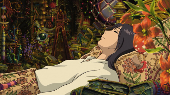
#And the focal point isn’t in the center of the canvas!
Text

🧡 Queen Amidala and her Handmaidens 🧡
#fanart#star wars#queen amidala#padmé amidala#handmaiden sabé#the phantom menace#and everyone else :)#Trying to make an interesting composition where the different colored figure isn’t the focal point#And the focal point isn’t in the center of the canvas!#I had fun with this#I realized I never have any oranges in my pieces#Orange is awesome …
3K notes
·
View notes
Text
The Role of Retail Placemaking in Urban Design

In an era marked by rapid urbanization, the essence of our cities seems to blur amidst towering buildings and endless concrete. Yet, retail placemaking emerges as a beacon of promise, seeking to reintroduce vibrancy and warmth to our urban centers. Beyond its commercial facet, retail placemaking serves as a bridge to enriching social infrastructure. It crafts spaces for communities to converge, bond, and flourish. By embedding retail within urban designs, we amplify our cities’ social infrastructure, making them not only vibrant but also sustainable and welcoming.
Unpacking Retail Placemaking
Retail placemaking is the art and science of molding urban areas with a strong inclination towards community-focused design. While these areas often merge commercial and retail elements, their primary objective is to uplift the quality of urban life. Central to this initiative is the amplification of social infrastructure.
If you’re pondering over the term ‘social infrastructure,’ it signifies the binding ties of a community. It’s those shared spots – parks, libraries, community centers, and modern-day retail spaces – where individuals interact, forge connections, and build shared memories.
Community Benefits: Beyond the Aesthetics
Diving into the transformative realm of retail placemaking offers cities a treasure trove of benefits:
Increased Social Interaction
Within these innovative spaces, retail areas transcend their commercial identity. Positioned thoughtfully and crafted with precision, they blossom into pulsating community focal points. Be it families savoring a weekend meal, buddies reliving memories over a brew, or artists finding collaborative sparks, these arenas bolster social infrastructure, rejuvenating the very soul of community bonds.
Economic Boost
The vitality of these retail spaces draws in residents and tourists. As the influx of visitors grows, local establishments experience heightened patronage, infusing the broader economic canvas with renewed vigor. The ripple effect? Flourishing businesses, job generation, and a buoyant local economy are all fueled by an enhanced social infrastructure with Phil Myrick.
Safety and Security
Bustling streets and vibrant public areas act as natural deterrents to unlawful activities. Animated locales resonating with chatter, melodies, or mere daily exchanges naturally exude security. Such environments, bolstered by a rich social infrastructure, ensure both residents and visitors experience an inherent sense of safety.
Enhanced Aesthetic Appeal
Retail placemaking isn’t solely about utility; it’s equally about aesthetics. When chiseled with design finesse, it revitalizes mundane urban corners into captivating spectacles, enhancing the city’s visual narrative and reinforcing social infrastructure.
Environmental Upside
Somewhat overshadowed but crucial is the environmental upliftment that retail placemaking brings along. Green nooks, sustainable architectural choices, and environment-friendly materials together contribute to a cleaner ambiance, tempering urban heat pockets and bolstering urban biodiversity. In doing so, they also add another layer to the city’s social infrastructure.
Witnessing Retail Placemaking in Action
Globally, cities are adopting retail placemaking methodologies to rejuvenate their urban fabrics. With a spotlight on social infrastructure, once-neglected areas are metamorphosing into dynamic activity centers.
For illustration, picture a dilapidated alley in a bustling metropolis. Earlier, it might have been an area most would skirt. Yet, introduce retail placemaking components – be it artisanal pop-ups, open-air cafes, or impromptu art shows – and behold the alley’s transformation. Such spaces not only catalyze economic growth but also reinforce the locale’s social infrastructure.
Tackling Challenges
Of course, the path is full of obstacles. Integrating retail placemaking demands investment and vision. Authorities must strike a balance, ensuring that while accentuating social infrastructure, they don’t compromise on other critical urban services.
Public-private collaboration emerges as a solution. Local enterprises joining hands with urban developers can actualize retail placemaking concepts. Such synergies lessen the city’s fiscal pressures and ensure that the evolved spaces truly resonate with community needs.
Moreover, inclusivity remains paramount. Revamped spaces must cater to all, unfettered by age, physical abilities, or economic background. Prioritizing social infrastructure ensures inclusivity and harmony.
Conclusion
The accelerating pace of urbanization underscores the urgency to craft lively, inclusive, and engaging urban spaces. Retail placemaking stands out as a potent strategy to address this. Through its emphasis on strengthening social infrastructure, we can reimagine our cities as spirited, inclusive, and united entities. As we progress, it’s pivotal to remember that cities aren’t mere infrastructural entities; they are living, breathing amalgamations of their inhabitants. And it’s these inhabitants we must prioritize and cherish.
Read More:
The Art of Place Making: Shaping Spaces that Resonate
Empowering Communities Through Creative Collaboration: The Role of Placemaking Consultants
Crafting Spaces, Shaping Lives: An Exploration of Placemaking
0 notes
Text
Color Psychology in Interior Design: How Different Colors Impact Mood and Atmosphere
In the realm of interior design, color isn’t just about aesthetics; it’s a powerful tool that can shape emotions, influence perceptions, and create atmospheres. The study of color psychology delves into the intricate connections between colors and human psychology, making it an essential aspect of crafting captivating living spaces. At LivStudio, we understand the nuances of color psychology and how to harness its magic to create interiors that evoke the desired feelings and moods. Join us as we explore the fascinating world of color psychology in interior design.
The Language of Colors: How They Speak to Our Emotions
Colors have an innate ability to communicate with our emotions on a subconscious level. Each color carries its own unique message and evokes a specific emotional response. For instance, serene blues can instill a sense of calmness, while vibrant reds evoke energy and passion. At LivStudio, we consider color as a language that allows us to create narratives within spaces, enhancing the overall experience.
The Warm Embrace of Earth Tones
Warm earth tones like beige, terracotta, and warm browns bring a sense of coziness and groundedness to interiors. They evoke feelings of comfort and natural beauty, making them perfect choices for creating inviting living spaces. LivStudio specializes in utilizing earth tones to infuse warmth and tranquility into interiors, making your home a haven of relaxation.
Cool Blues and Serene Greens: Nurturing Tranquility
Cool colors like blues and greens have a calming effect, reminiscent of the sky and nature. These hues are known to reduce stress and promote a sense of relaxation. Whether it’s a serene blue bedroom or a lush green living area, LivStudio knows how to harness these colors to create peaceful retreats that soothe the senses.
Energetic Reds and Passionate Pinks
Reds and pinks are associated with passion, energy, and vibrancy. They can stimulate conversations, evoke excitement, and add a touch of drama to interiors. LivStudio understands how to use these colors strategically to create focal points and add personality to spaces, making them vibrant and captivating.
Timeless Elegance of Neutrals
Neutral colors like whites, grays, and blacks provide a versatile canvas that can adapt to various design styles. Neutrals exude sophistication and elegance, allowing other design elements to take center stage. LivStudio specializes in using neutrals to create timeless interiors that stand the test of time and effortlessly blend with different aesthetics.
Harmonious Blends: The Power of Color Combinations
In interior design, it’s not just about individual colors; it’s about how they interact with each other. Creating harmonious color combinations can amplify the desired emotional impact of a space. LivStudio has a keen eye for balancing color palettes, ensuring that your interiors resonate with the right emotions and atmospheres.
Color psychology is a remarkable tool that enables interior designers to orchestrate emotions and create memorable spaces. At LivStudio, we specialize in harnessing the language of colors to craft interiors that reflect your desired mood and atmosphere. If you’re ready to experience the transformative effects of color psychology in your living spaces, let LivStudio be your guide. Our expertise ensures that your home will not only be a visual delight but also a reflection of the emotions and ambiance you wish to cultivate.
0 notes
Text
Refreshing Your Space with Orange Dining Tables
New Post has been published on https://dinnertables.net/refreshing-your-space-with-orange-dining-tables
Refreshing Your Space with Orange Dining Tables
Get ready to buckle up, because today we’re diving headfirst into a terrain where dining tables aren’t mere furniture—they’re dynamic bursts of energy and your very own creative canvases. Imagine a fresh revolution of color and bold statements that not only redefine your space but also inject warmth and positivity. So, if you’re all about swapping the ordinary for the extraordinary, hold on tight! We’re about to embark on a journey where orange dining tables could transform your dining area into an exhilarating playground of exuberance. Let’s infuse your home with zest and imagination!
Contents
1 The Power of Orange
1.1 Orange Kitchen Tables
2 Choosing the Right Shade of Orange
3 Orange Tables as Focal Points
4 Complementary Elements and Styles
4.1 Orange Wood Dining Tables
5 Adding Playfulness and Personality
5.1 Orange and White Table Decor
6 Orange Dining Room Sets
The Power of Orange
Is your heart set on a dining area that beams with the comforting glow of a sun-soaked afternoon and resonates with the uplifting vibes of your favorite song?
Orange Dining Room Table
Discover the impact of orange, a color that’s more than just aesthetics and taps into emotions. It’s the hue that whispers, “Hey, let’s have fun!” and shouts, “This room is alive!” Studies even show that colors can influence our mood, our appetite, and even our interactions with others. So, why not saturate your dining area with a surge of vigor that’ll have everyone feeling alive and invigorated?
Orange Kitchen Tables
Orange isn’t just a color; it’s an attitude. It’s the thrill of a summer adventure, the coziness of a fall evening, and the zing of a citrusy twist. It’s a hue that knows how to make an entrance, and it’s about time to take this showstopper to the center stage in your home.
Orange Colors Dining Room Decorating Ideas
Choosing the Right Shade of Orange
Now that we’re on the same wavelength about the awesomeness of orange, let’s talk about finding your perfect shade. From the punchy vibrancy of tangerine to the soothing warmth of burnt orange, there’s a shade for every mood and every personality. But hold on, it’s not just about picking a shade; it’s about crafting an atmosphere that jives harmoniously with your existing decor.
Orange White Table Chairs
Think about the lighting in your home. How does the sun play with the walls? How does it dance across the floor? Orange reacts to light like magic, so consider the natural and artificial lighting in your room when choosing your shade. But don’t worry, you’ve got this. It’s all about striking the perfect balance, like adding just the right amount of zest to your recipe.
Orange Painted Dining Room Table
Orange Tables as Focal Points
Imagine your dining area as a blank canvas waiting for a masterpiece. That masterpiece? Your orange dining tables—roaring statement pieces that captivate effortlessly. Gone are the days of boring, unassuming tables that fade into the background. Your space craves character that sparks conversations, sets moods, and weaves memories.
Orange Dining Table Spandex Fit Table Cover Indoor
Treat your orange table as a significant piece that’s more than just furniture. It’s the heart of your gatherings, the core of your celebrations, and the base for your culinary escapades. Arrange your domain to let your orange table shine like a star—clear the stage, dim the lights, and let the magic happen.
Complementary Elements and Styles
Now that we’ve got the spotlight on your orange dining table, let’s talk about its entourage. Think of complementary colors, textures, and patterns as the supporting cast that makes your star shine even brighter. In sleek mid-century modern, orange adds a vibrant pop to clean lines. In free-spirited Bohemian decor, it’s the enthusiasm that complements diverse patterns and earthy vibes. In whatever mix of eclectic styles, orange interacts well with all.
Orange Dining Table Wood And Epoxy Lava Style Design
Orange Wood Dining Tables
Why stop at the table? Let the color dance on your plates, your focal points, and even your wall art. You could also pair orange with neutrals like whites and grays for a chic contrast. Amp up the drama with deep blues or lush greens. Decorate with metallics for a touch of glam.
Vintage Wood Orange Dining Room Orange Tables
Picture sleek whites, rustic wood, and pops of orange—throw in copper tableware, succulent centerpieces, and gold pendant lights. The possibilities are endless! Whether you’re into vibrant contrasts or subtle harmonies, orange is your trusted sidekick on this design quest.
Orange Dining Table Wood Vintage Style Leg Base
Adding Playfulness and Personality
Let’s take a moment to appreciate the playful, energetic vibes that orange brings to the party. It’s like a deluge of confetti, a splash of creativity, and a dash of fun—all wrapped into one hue. But here’s the secret: you don’t need to dive in right away. Test the waters with little touches: a cushion here, a placemat there, or even a quirky piece of artwork that makes you smile.
Orange and White Table Decor
Orange With A Hint Of Golden Dazzle In The Dining Room
Personalization is your superpower. Your space should reflect you, your adventures, and your dreams. And orange? Well, it’s the medium that’s primed to tell your story.
Orange Dining Room Sets
There you have it, design adventurers—the vibrant expanse of orange kitchen dining tables. We’ve journeyed through the psychology of color, the art of picking the right shade, and the magic of letting your table take the forefront. Remember, this isn’t just about decorating; it’s about infusing life, vigor, and identity into your space.
Orange Table Setting
Finally
So, are you all set to embrace the zest of orange? It’s time to transform your dining haven into a vibrant oasis that leaves a lasting impression on every guest, a smile on your face, and a spark of energy in your heart. Let’s bring your tangerine dreams to life, one stroke of color at a time. Cheers to a space that’s as bold, vibrant, and energetic as you are!
0 notes
Text
Virtual Sketch Book 2
1) Journaling: Principles of Design
Unity: This principle of design is a way of oneness and simplicity in a piece of artwork that incorporates good amounts of elements of arts but doesn’t overdo it. When analyzing a piece of art, unity is important because it allows the person to take everything in consideration and it isn’t overseen with other elements of art.
Example:

Georges Seurat - Bathers at Asnières
This artwork is a clear example of unity because of the colors used throughout the artwork. There is color harmony, but also a variety of colors presented throughout with the cool tones.
Variety: The principal design of variety refers to the diverse amounts of elements in a single artwork to present a message. Sometimes a variety artwork might have other mediums in the artwork to really make it pop. The purpose is to add excitement, thought, and curiosity.
Example:
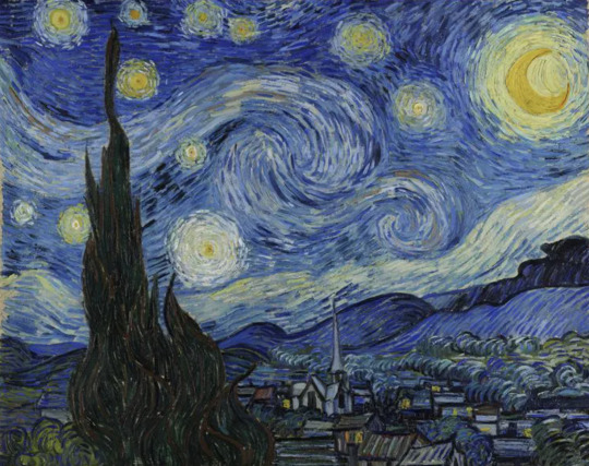
Vincent Van Goh- Starry Night
This artwork has a variety of colors presented throughout which adds a great element to the night sky, which gives us an idea of movement.
Balance: The best way to define balance is an equal distribution of visual weight or elements. Sometimes the balance of an artwork can be symmetrical, which means that there is an equal sense of harmony on either side of the painting/artwork. For asymmetrical there is more of that weight on one side of the art.
Example:

The Great wave of Kanagawa is a good example of asymmetrical balance because there is more weight of the waves on one side of the figure, than the other, but the colors and meaning is the same throughout.
Emphasis: This principle of design is ironical easy to point out, as it refers to the focal point of a work of art. It doesn’t exactly have to be in the middle of the painting as it could be a certain color that really makes an artwork pop. Another example emphasis is if the artist intentionally changes the scale of something to create a message.

Subordination: This principle of design is a technique which is where the artist downplays certain backgrounds of the artwork to add more emphasis to the focal point of the art. The way an artist can do this is by decreasing the contrast of an image. We can see this in the example with the lighter colors of the landscape to add emphasis to the center of the artwork.
Directional Forces: This principle of design is used to carry the eye throughout the artwork. The majority of artist use line in order to achieve this movement, as our eye will naturally follow through. Directional forces, also adds a sense of movement throughout the artwork. In this example of the jets, we can see the movement of the jets with the smoke, but it also allows us to see the whole image.

Repetition: This principle of design is used to deliberate use the same pattern or elements of art throughout the artwork. Sometimes the reptation could have variation, but the main message or image is always there. Repetition also adds a sense of unity to the artwork, for example, we can see the same image of birds throughout the artwork, but it also has a sense of unity because of the colors and that they are all the same.

Rhythm:
Sometimes rhythm and repetition can get intertwined, but with rhythm there is visual movement throughout the artwork that creates a sense of unity and harmony throughout the artwork. In this example we can see the lines and smoothness of the colors throughout the artwork. More importantly it all consists of the same color and gives off that sense of unity.

Scale/ Proportion: This principle of design can used to refer to the relative size, or proportion of an object. The most important thing to grasp about these words is size, and how compare that size to other things around us. In this example, we clearly know that chickens cannot be that big, therefore there size isn’t proportional to reality.

2. WRITING AND LOOKING
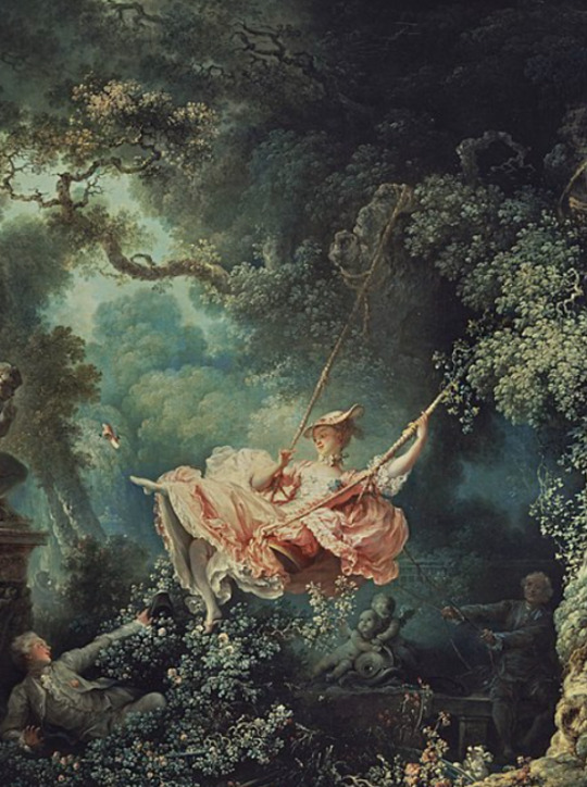
Jean-Honoré Fragonard. Happy Accidents of the Swing. 1767. Oil on canvas 31 7/8”
x 25 ¼’’
Page 301 of textbook
Emphasis, due to the colors of the lady on the swing being bright, subordination, due to the wonderful yet details background, implied movement, due to the momentum of the swing in the air, lines, due to the tries in the background going every which way, and also I see the use of neutral or natural colors throughout the artwork.
3. CONNECTING ART TO YOUR WORLD –
Throughout most of life I have had to share a bedroom with my siblings. That was until last year when I got my own personal room that had white and blank walls all throughout. This seemed like an opportunity of a lifetime and I just couldn’t wait to decorate the walls and make them fit my personality. Throughout the process I figured that blue was my ideal color and it really effected my mood throughout the day while I was in my room. When I felt stressed the cool colors of the walls smoothed my temper. Or when It was dark and I was alone in my room I felt as if I was floating through the sky. To me the intensity and saturation really matters to me as I don’t want them to be too bright. However, if I had to pick a color scheme I would go with the primary colors, Red, yellow, and blue as I could make whatever color I want.
4. ART PROJECT – ARTIST’S CHOICE

5. PHOTO/DESIGN
Black and White Vs. Color Photography
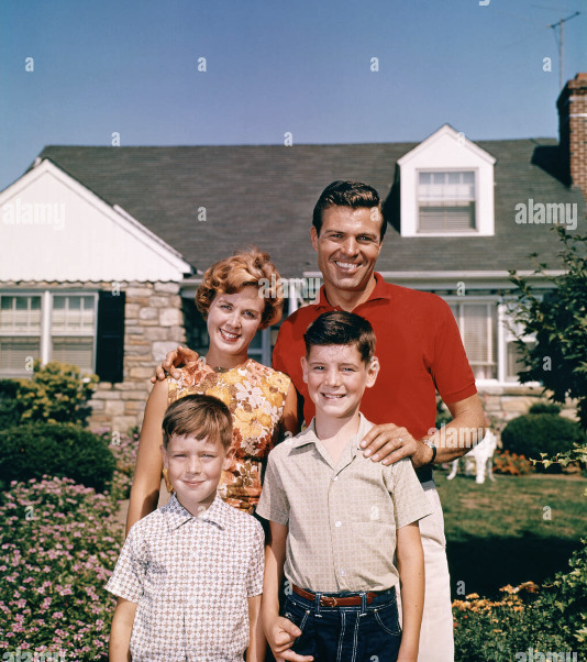
1. The black and white photograph, also known as the "Migrant Mother" was taken during the times of the Great Depression. The choice for colors was becasue it gives a sense of emotion, and when you look at the photograph you really get a feel about what the image is conveying; despair, stress, and sadness. The Colored photograph is of a happy family and I can get a sense of that because of the bright colors, and expression across the peoples faces. Overall, both pictures were taken wisely, and the photographer knew exactly what to do when choosing the colors.

1 note
·
View note
Text
Black frame wall art ideas for your home
Black wall art in a classic frame is a look that will never go out of style. This artwork is ideal for any space, no matter your personal aesthetic. Black will complement every surrounding shade, and framed art is truly timeless. Our design experts are major fans of incorporating a black statement piece into your home. We’ve put together our top tips for selecting the best black wall art for your space. Let’s get started!
Psst…do you want to make your black wall art pop? We just dropped a bunch of new frame colors! Choose the frame that best fits your unique space.
Black Wall Decor & Color Schemes
Black framed wall art will go with any existing color scheme. However, there are a few trending shades that will make your artwork pop. Consider contrasting black with a pastel hue like dusty rose or grey-blue. Sage is also a great neutral alternative that still looks sophisticated.
Expert Tips
ElephantStock’s interior design expert Elimar Lobo Sáenz suggests the classic color pairing, black and white:
“Black and white interiors will never go out of style, and this iconic pairing can create an interior that is full of possibilities. Add shades of grey into your black and white color palette for a trendy, monochromatic look. This chic color scheme will make your home feel more modern and contemporary. For another ultra-trendy technique, try adding a splash of geometric patterns and textiles.”Discover black framed wall art ideas >>

Black Wall Art for Bedrooms
Framed black artwork is an excellent choice for your sleeping space. This chic color will give your bedroom a designer touch. Hang a piece of contemporary art with black accents for a striking look.
Expert Tips
For bedroom-specific design tips, consider this excerpt from our guide to black decor for every room:
“When it comes to crafting a modern bedroom, focus on sleek textures and finishes. You want your sleeping space to look clean and sophisticated. Use white as your base color, and add black accents for a refined appearance. Hang an abstract print that is eye-catching but not too chaotic It’s all about balance when it comes to achieving contemporary design. Your bedroom should look relaxing but not boring, and luxurious but not over-the-top.”
Explore black wall decor ideas >>
Black Abstract Wall Art Styles
There are plenty of black artwork styles, but none so versatile as an abstract theme. Abstract art (especially in neutral tones) can instantly elevate your interior. Wall art with an abstract theme has been the go-to for upscale interiors for decades, and this trend isn’t going anywhere. In fact, 2023 has seen a major boost in dark-toned abstract artwork.
Expert Tips
Our resident decor pro Elimar Lobo Sáenz explains the appeal of abstract art:
“Nothing improves the look of a room quite like abstract wall art. Abstract artwork represents pure, unadulterated freedom. Not to mention, it works well with a wide range of interior themes. This creative style of art will make your room look trendy without taking over your living space. It’s up to you to decide between a neutral color palette, or a vivid print with eye-catching colors. Ensure that your wall art is big enough to grab onlookers’ attention, and don’t shy away from funky, daring decor ideas.”
Browse black abstract wall art >>

Large Black Wall Art Sizes
If you want to make a major statement, choose a large print. The biggest faux-pas amateur designers make is selecting a size that is too small for their wall. Preview some of our top picks for oversized dimensions below:
“If you’re planning a gallery wall above your furniture, the best size for your main statement piece is 52 inches by 32 inches. Hang asymmetrical canvases, and arrange them symmetrically create an eye-catching look on your wall. Framed prints look best in a gallery wall setting, but you can also hang an unframed canvas as the center piece, and smaller framed prints around the focal point.
If your main goal is to instantly catch your guests’ attention, go with these dimensions: 66″X33″ This is the perfect option for starting an oversized gallery wall as well. Take up space in any room that has a large, empty wall. Just make sure to measure the space before installing your canvas, as this size can look overwhelming in a smaller room.
Lastly, if you’re looking for something really dramatic for a huge empty wall, opt for 68″X45″! Hang a giant, oversized canvas that measures 68 inches by 45 inches in height and width. If you want to cover the entire wall above your couch, bed, or credenza, this is an optimal selection for your space.”
PS While it can be hard to find framed art in mega-large sizes, you can always combine both framed and unframed art for a balanced look.
Find black art prints and more >>
Black Framed Wall Art Shapes
There are plenty of benefits to framed artwork. First, it looks super sleek and polished. If you still need convincing on why you should experiment with black framed wall art, skim this excerpt from our article on framed vs unframed art:
“Because of the small gap between the canvas and the frame, your print will appear as if it was floating. This will give your art a truly stunning look. Another major visual benefit of framed artwork is that it looks very light and airy, which ultimately results in a neater overall appearance.
Achieve the Perfect Polished Look
Framed artwork always looks perfectly polished. The look of refinement subconsciously impacts the viewer’s perception of your overall space.
Embrace the Floating Illusion
Because of the intentional gap between the canvas and the back of the frame, the print appears to be floating. This will give your wall art an ethereal, eye-popping look!
The Coveted Low-Profile Appearance
One of the major advantages to framed artwork is that it looks low-profile, which results in a polished, distinguished appearance.
View black canvas art and framed prints >>

Topics Beyond Black Wall Pictures
Now that you know how to choose the perfect piece of framed black artwork, it’s time to spruce up the rest of your home! Visit our decor blog and learn how to make the most of your interior. From expert tips to trending styles, design has never been easier!
0 notes
Text
Journaling-Virtual Sketchbook 2
Unity and Variety
Unity is used in the appearance of an artwork that has consistency. For example, an artist painting every object in a painting one color or shape. Variety is the opposite of unity. Variety allows many different shapes, colors, objects, etc. An example of unity could also be someone painting their entire house the color gray, inside and out. An artist usually finds themselves finding balance with variety and unity within their artwork. Too much variety or too much unity could make the artwork boring or chaotic.
Balance
Balance involves equality within something. People use balance everyday while juggling work, school, kids, hobbies etc. People need balance so that life isn’t overwhelming or chaotic. Within art, the design is symmetrical or asymmetrical. Symmetrical involves matching both sides of an art piece. Whatever is on the left side will be the same on the right side. An example of this is if you painted a portrait of a flower. There would be the same number of petals and colors on each side of the canvas. Asymmetrical involves balance within an artwork, but both sides of the art are different. To achieve this, there has to be meaning and the elements must flow together.

Emphasis and Subordination
Emphasis is something that draws your attention with meaning. An example of emphasis within an artwork would be a large, bright object that is centered within the work. Subordination is the opposite of emphasis. Subordination involves the neutral colors and positioned in the back or away from places with emphasis. Subordination supports emphasis areas by being more neutral to allow emphasis to pop.

Directional Forces
Directional forces are the imaginary paths (implied lines) or real paths (lines) that lead you to a focal point or emphasis area. Directional forces allow for an artwork to show motion or the opposite. Directional forces guide our eyes throughout an art piece. An example of directional forces is a drawing of a tunnel leading us to the opening or the emphasis point.

Repetition and Rhythm
Repetition is a multiple of something or an object repeating for a meaning. An example of repetition is a pattern. Rhythm is created using repetition and creates a sequence using multiple items. Rhythm uses multiple objects to come together as one. An example of rhythm in music is when the drums, guitar, and singer all work together to make a song.
Scale and Proportion
Scale is the size of something compared to other objects around it. An example of scale is a tall building next to a smaller one. Proportion also involves size but it involves size as a whole. An example of proportion would be the tall building may look large next to the smaller one, but within the city, there are taller buildings.

0 notes
Photo

Some of my lovely friends asked to show how I do my blending, so here is a very long tutorial! I will explain how to:
Blend GIFs with lots of movement
Blend three or more GIFs on one canvas
You will need:
Any version of Photoshop with a timeline
Basic-intermediate knowledge of GIF making (including cropping, how to use adjustment layers for color correction, applying layer masks, and placing multiple GIFs on one canvas)
Since the way I blend depends on the footage I'm able to work with, I often end up going in a different direction than I first planned. So this isn't a strict step-by-step guide that can be applied to everything you make. These are just some tips!
Read the rest under the cut.
TERMINOLOGY:
(Pretty sure you already know this but I will be repeating these a lot here, so just in case!)
Highlights & Shadows - The highlights are the brightest parts of the image. The shadows are the darkest parts. Remember that just because it's bright doesn't mean it's actually white, and just because it's dark doesn't mean it's actually black!
Negative Space - This refers to empty space around your subject. When there's negative space, it's easier to spot the focal point of the image.
BLENDING GIFS WITH LOTS OF MOVEMENT
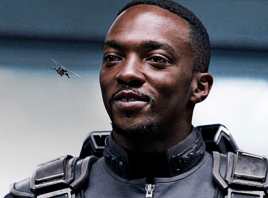
Number of GIFs: 2
Main GIF: Closeup of Sam (“big!Sam”)
Secondary GIF: Sam flying (“flying!Sam”)
STEP 1: Find the right scenes
Since the subject of the secondary GIF is much smaller and basically cuts across the frame, it’s important (but not always essential!) that the main GIF has less movement and a decent amount of negative space.
STEP 2: Make your individual GIFs
Make your GIFs like how you usually do (Important: Remember that your GIFs need to have the same number of frames). When it’s time to crop, it’s best to have the two files opened in Photoshop at the same time so you can compare them against each other. It’s absolutely fine for them to overlap because that’s the whole point! The secondary GIF has Sam flying in from the top left to the bottom right, so I cropped the main GIF with him off-center so there would be space to see flying!Sam.
Now we have these two GIFs:


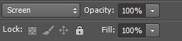
STEP 3: Combine your GIFs
Place the secondary GIF over the main one and adjust the blend mode. Setting the blend mode to Screen usually works, but in this case, this is how it looks:
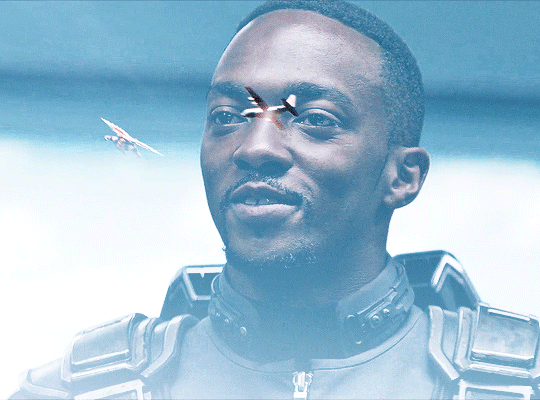
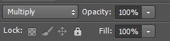
As you can see, the highlights in the main GIF are obscuring flying!Sam in the first frames. You can only see him clearly when he’s flying over big!Sam’s face. This is because the shadows on the top GIF will lighten and/or disappear against the highlights of the bottom GIF when set to Screen. It would be too complicated to fix this with a brush (which we will get to later) because of the movement in the secondary GIF, so instead I set the blending mode to Multiply, which is the opposite of Screen. Now here is the GIF:
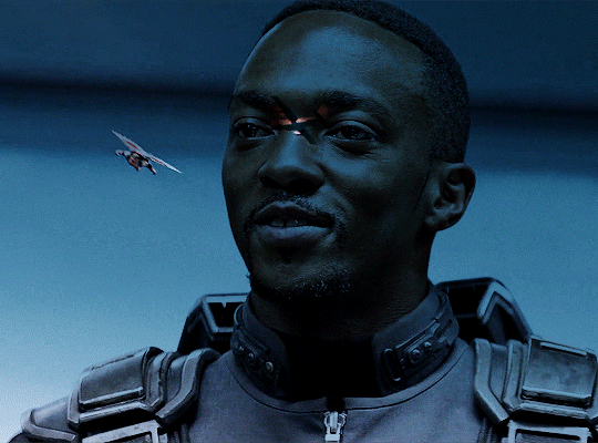
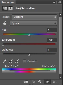
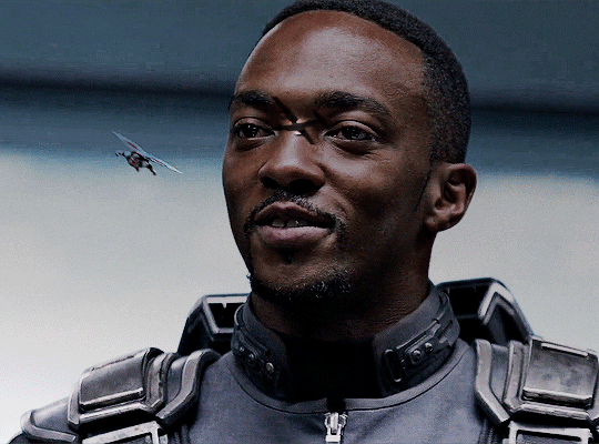
We can now see flying!Sam. But the blue of the sky is now a pseudo-filter over big!Sam’s face up until the last frames. So I applied a Hue/Saturation adjustment layer over the secondary GIF to remove those colors. The sky in the GIF is made up of cyans and blues, so I dragged those sliders down to -100. Here is how it looks now:
STEP 4: Erase the bits you don’t want
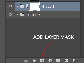
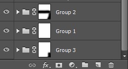
So that big!Sam’s face isn’t covered by flying!Sam’s wings and that pesky airplane up top, we have to use a brush to erase those parts. In the Layers panel, make sure your GIF layers (in this case, groups/folders) are selected and click the Add Layer Mask button. A little rectangle next to the layer/group name will show up like so:
Then in the Tools panel, click the Brush tool, pick a soft brush and set the size to around 180-210px. The larger the brush, the softer the look. I learned this from Becca (@inejz-ghafa) who made an amazing tutorial a while back (will link it in the source at the bottom)! Adjust the brush size if you have to.
Now click on the little rectangle layer mask of the group you want to erase (in this case, the secondary GIF). When you do this, the Foreground and Background Colors buttons in the Tools panel will revert to the default black and white.

Painting with black will erase and painting with white will undo the erasure. So I erased the airplane and the bits of the wings covering his face. I didn’t erase the parts that overlap with his uniform, just to keep the effect of flying!Sam zooming across the GIF. And here is our finished product:

BLENDING THREE OR MORE GIFS ON ONE CANVAS
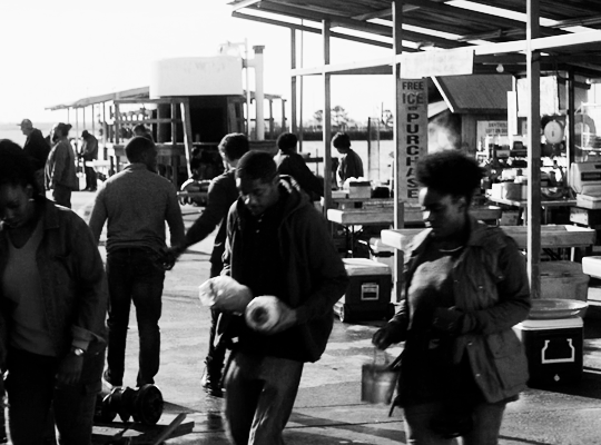
We will be working with these two GIFs since they use different techniques:

STEP 1: Compose your image
Find the scenes you want to put in your GIF and choose which of those is the most important. Once you've decided on that, you can build the rest of the elements around it.
Sam's GIF: Multiple Exposure Effect
Number of GIFs: 3
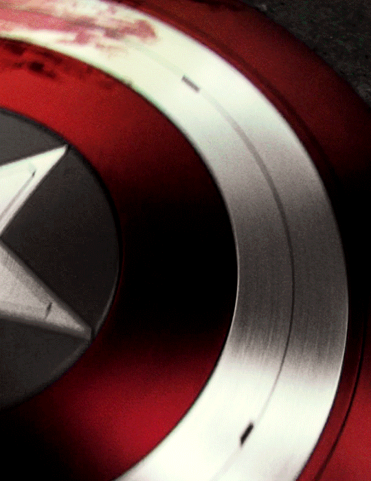
Main GIF: Bloodied shield
Secondary GIF: Closeup of Sam
Tertiary GIF: Bucky with the shield
STEP 2: Make your individual GIFs
Since the shield is the most important part, I made it the largest GIF and cropped it close to emphasize the star and the blood. I made Sam's GIF the same size, but cropped it with his face off-center so that the star wouldn't completely cover his face. Again, it's totally fine for the images to overlap! The tertiary GIF is the least important so I cropped it smaller. To determine the size of that GIF compared to the shield, I made the Rulers visible (View > Rulers; or Ctrl+R) then clicked the top ruler and dragged down to create a guide to where I wanted the smaller GIF to end. Then I measured from the bottom of the GIF up to the guide to determine the height of the smaller GIF. (Tip: It's better to make the tertiary GIF too large than too small. That way, you have more to work with. So size it larger than it will appear on the final GIF.)
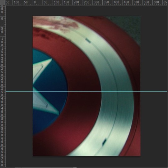
This is only a stylistic choice for this particular set, but I removed the blue from the shield and set the tertiary GIF to black and white, so that the only notable colors in the GIF are red, black and white. Varying up the coloring of each GIF (i.e. color vs. monochrome) adds some spice to the image, so play around with these different styles if you like!
Here are our three GIFs:
STEP 3: Combine your GIFs
At first, I made the main GIF of the shield the bottom GIF. Then I placed the secondary GIF over it and set the blend mode to Screen, but found that it lacked depth. So I switched them and made the Sam GIF the bottom GIF (blend mode: Pass Through) and placed the shield GIF (blend mode: Screen) over it. And this is what I got:

Notice how the window behind Sam on the left side is distracting? It also partially obscures the star. So I went back to Sam’s GIF, created a New Layer and painted over the window with a black brush. Now here is our GIF:

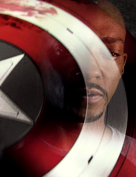
This is just my personal preference, but I wanted the area around the star to be a solid black rather than gray, so this time I created a New Layer over the shield GIF and applied a layer of black with the Paint Bucket tool, setting the blend mode to Soft Light. Now we’re done with the main and secondary GIFs:

Now let’s add the last GIF:
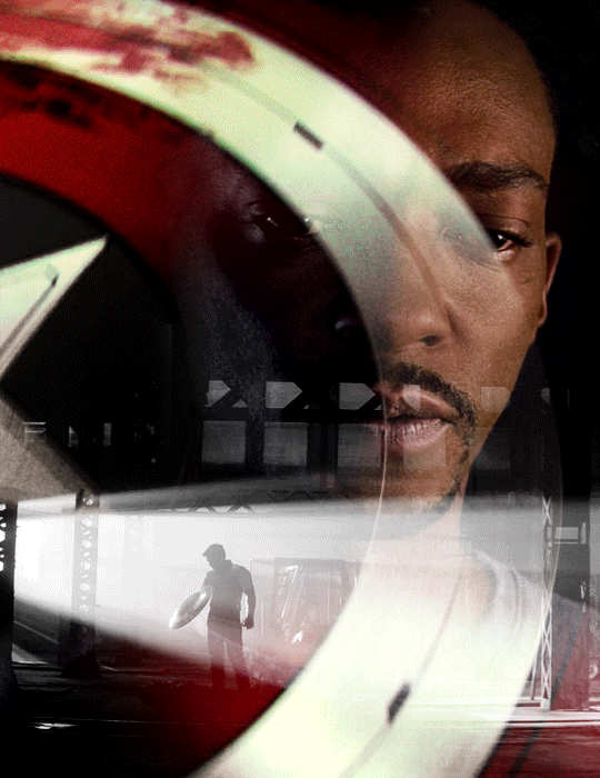
STEP 4: Erase the bits you don’t want
Lastly, I erased the warehouse rafters over Sam’s face and a bit of his shirt and the warehouse floor on the bottom right corner using Layer Masks and a soft brush (like in the first tutorial). And we’re done!

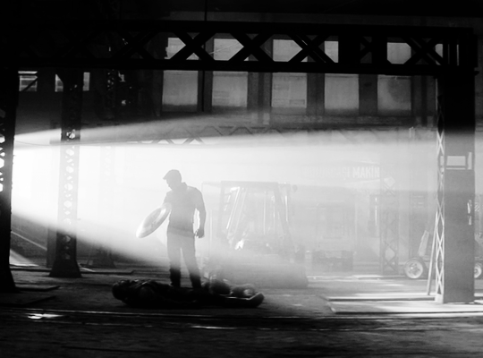
Bucky's GIF: Silhouette Effect
Number of GIFs: 3
Main GIF: Bucky holding the notebook
Secondary GIF: View of the sunrise from the boat
Tertiary GIF: Sam and Bucky walking away
STEP 2: Make your individual GIFs
To achieve this silhouette effect, the main GIF needs to have a clear focal point, which means it’s better to have negative space around the subject and for there to be minimal movement. In this case, the subject is made up of Bucky’s hands, notebook, and part of his shirt; and there’s some movement but we can still work with that. The other two GIFs will then be placed “inside” the subject. Because the negative space in the main GIF consists of highlights, I chose a secondary GIF which emphasized the shadows. For the smallest GIF, I used a guide like in the previous tutorial to measure its size.
We have these three GIFs:


STEP 3: Combine your GIFs
Place the secondary GIF over the main one. In my case, I didn’t measure it right so I had to nudge the top GIF a bit to the right to fit it inside the silhouette. The important thing is that the edge of the secondary GIF should not overlap with the silhouette itself, or else the illusion “breaks.”

Now let’s add the third GIF:
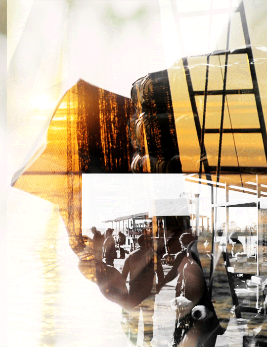
STEP 4: Erase the bits you don’t want
For this GIF, there’s a lot we need to erase! Using Layer Masks and a soft brush again, erase the parts of the secondary GIF that extend beyond the silhouette. It’s entirely based on personal preference if you want to keep some parts of the secondary GIF outside the silhouette (like I did here) or if you want them completely removed. And for the small GIF, erase the edges for it to blend with the secondary GIF while also staying within the silhouette of the main one.
Now here is our finished GIF:

And that’s it! If you’ve made it this far, thank you for reading. I hope this was useful! Remember, there is no definitive way to blend GIFs, so keep experimenting. And don’t be afraid to make mistakes either, because we learn a lot from those. Happy Photoshop-ing!
- Elle
#completeresources#allresources#blending tutorial#photoshop tutorial#userpavi#tusergabriela#usersae#userrex#usertk#supervalcsi#usernums#userringo#userkraina#usersmile#tuserlouise#usersof#mine#my tutorials
2K notes
·
View notes
Note
do you have any tips on like backgrounds/environments? every time i try to do a detailed background i get really overwhelmed, but i really want to do detailed backgrounds with lots of objects, i just can never seem to know how to fill the space and how to make it look varied and interesting.
Struggling with backgrounds are a very typical problem amongst growing artists ( and established artists too even ). We have a tendency to gravitate towards drawing characters, animals or objects when we start out - then as we progress we want to branch out and tell stories with our pieces, which is where the presence of a background can become an invaluable tool.
Though knowing how to construct backgrounds is a very timeconsuming endeavour. Especially due to how different each environment, scene and atmosphere can be, and what matter of fundamentals the likes of drawing scenery requires to look convincing. Because of this freedom and variety in what backgrounds can and cannot consists of - it’s possible that you’re looking to improve your skills on drawing anything that you haven’t practiced before.
So let’s take a look at it.
Backgrounds as a scene, not an afterthought
First and foremost, considering which background to incorporate into a piece is, for many who have predominantly been drawing characters or objects with no background, secondary.
We tend to consider our character the star of the illustration. That’s why we tend to give that character the majority of space in our illustration. This can work for illustrations that should feature the character in a context where their presence is the most important part. But if we put our character slap-dab in the middle of the composition, taking up the classic 2/3rds of the canvas every time - we miss out on the incredibly powerful ways a fleshed out backgrounds can tell the story of the image. Sometimes, an environment needs to take center stage to tell the story most effectively.
For inspiration on this, we look to comics. Comics and graphic novels have long been contending with the masterful craft of compositioning characters and backgrounds into meaningful images, that through the background and the character(s) placements conveys a comprehensive scene.

https://www.pinterest.dk/pin/695735842416817035/
Especially eastern comics have perfected this particular way of compositioning through some of the genre’s great works.
But like comic artists, we illustrators ( and aspiring comic artists ) must start considering the use of the environment as a key part of our planning progress.
This conscious design process can be explored through the use of thumbnails. Small experimentative drafts that shifts our character(s) and environments around to find the most optimal placement for each, in order to tell the story of our illustration the best.

More on how to thumbnail here: https://theredlinestation.tumblr.com/post/179392771897/how-do-we-draw-thumbnails-before-drawing-i-dont
Considering composition
Naturally, knnowing how to composition an image properly is going to help you find out how to layout your background the best. I remember at first ‘knowing’ that good composition was ‘good’ for your art. But the moment i realized how much the layout of an image can change the way viewers percieve it, i was immediately hooked on exploring the matter, and make it one of my predominant studies for the better of two years. This is still very much a craft i’m only getting started with, but after having studied composition somewhat consistently, the discipline completely re-ignited my interest in visual storytelling as a static medium.
Learning the basic grips of composition, such as rule of thirds, fibonacci, the way contrasts frames focal points, and how to create flow in your illustrations - is going to elevate your pieces before you even start planning out the fineprint of your backgrounds.

https://keithhornblower.wordpress.com/tag/composition/

https://www.pinterest.dk/pin/430586414367069135/
Another appealing thing about knowing your way around composition, if the promise of stronger pieces isn’t enough for you, is that putting down a solid layout for your background, means that you have a lot more freedom to be as simple or complex as you want, and the piece will still look compelling due to the strengths of it’s composition alone.

https://www.behance.net/gallery/28573195/Sketch-Series-Light-Composition-Illustration
More on composition here: https://theredlinestation.tumblr.com/post/623115556175888384/can-you-explain-the-rule-of-thirdsthe-golden
Get your grips on perspective
Just like the basics of composition, i highly recommend you start looking into the fundamentals of perspective. The use of perspective makes for very dynamic compositions, and in backgrounds - it is a cornerstone to conveying environments ( unless you do more abstract backgrounds for your pieces ).
And if you master the skill of seeing, planning and executing things in perspective, you will have immense and incredible freedom to do almost whatever you want with your environments. From basic street layouts, to fish-eyelens shots or warped, distorted dreamlike landscapes, you’ll be able to make almost anything look interesting.
I personally think it’s worth trying your hand with as many perspective types as possible, but for starters - i recommend looking into the basics of 1-point and 2-points perspectives. These are typically the ones we encounter in real life, and thusly will be the more common kinds of perspective used in illustration for storytelling.

https://artdepartmental.com/blog/perspective-drawing-lessons-thomas-romain/
More on perspective:
Background and perspectivehttps://theredlinestation.tumblr.com/post/182875714745/i-have-a-bunch-of-tutorials-on-buildingobject
Drawing in 3Dhttps://theredlinestation.tumblr.com/post/182344072564/hai-im-sorry-if-this-sounds-stupid-but-do-you
Character interacts with background

https://www.boredpanda.com/may-the-mermaid-of-lily-lake-illustrated-story-andy-ivanov-part-two/?utm_source=google&utm_medium=organic&utm_campaign=organic
When planning out your composition, there are little tricks you can deploy to make the character integrate more with the environment, and more effectively convey the story of your image. Having your character interact with the environment in some kind of way is a very effective method for this kind of intergration. Above^ - the mermaid and her companion cause ripples in the water, and part the algae on the water mirror as they move through the lake. This indication of motion and interaction is not that complex, but it still relays plenty of information about direction, speed and movement to our viewers, which makes us merge the characters with the background itself.
Subcontextual symbolism and metastorytelling

In addition ( and yet not really ) to the point above: you can relay subcontextual storytelling to your viewers by having characters react to objects ( or other characters ) in the environment. A hungry child staring at a cake through the baker’s window. A scared girl hiding away from a grandfather clock. A man glaring at his reflection in a mirror. Or as in the example above, a character staring at a ring on his sill from his bathtub.
All of these setups tells us that the character is in some state of mind, prompted by the environment they’re in. This makes our characters, not just “ additions” to an environment, or an environment a “prop” to the character.It makes them co-dependent and working symbiotically, as the story would’ve never have been conveyed at all, had one of the two been missing.
Interaction across the planes

Usually, we divide our compositions into layers depending on which plane is closer to the “camera” and which isn’t. Something like this: ForegoundMiddlegroundBackgroundThere’s nothing wrong with doing this, it can help you in the early stages of planning, and also help you decide on colours and lightsetting ( say if, for an example - you want to work in the LMD (or DML ) spectrum for that cinematic light ). However, incorporating objects, characters or other elements that travel through multiple layers of this 3-part division ( like the snake-creature above, which stretches from the middleground to the background ) conveys depth and gives flow to the piece. Now for this - you are going to rely heavily on your perspective skills, so make sure you have those at the ready when trying for something like this.
Referencing the specifics
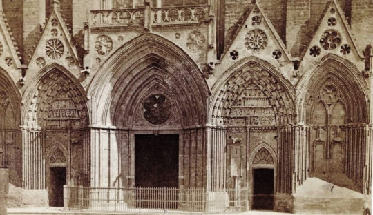
https://www.normandythenandnow.com/gothic-architecture-in-normandy-photos-from-1865/
A common pitfal for the likes of us who aren’t used to putting much thought into backgrounds is that we forget to research the design for the worldbuilding we want to do for the illustration we’re making.
This can result in us falling into stale, overdone or plain shapes and sizes, that never really takes us out of our comfortzone, and fails to interest our audience.
This can be especially damning if you’re working with environments with lots of architecture involved. We all know how to draw a house, a birch tree or a field of grass - but do we really know how to draw it well and interestingly?
Never skimp on your research. Let yourself be inspired by any specific type of foilage, building or layout, so that your background will spice up and live up to your characters.
More on referencing here:
What is a reference?https://theredlinestation.tumblr.com/post/177721492973/im-sorry-but-what-exactly-do-you-mean-by-a
Finding referenceshttps://theredlinestation.tumblr.com/post/184999456720/so-i-know-of-multiple-reference-sources-that-i
Using a reference without tracinghttps://theredlinestation.tumblr.com/post/189480282011/not-really-a-dumb-question-at-all-simply-put-in
Build from the ground up
So you planned it all out, you’re ready to start drawing your background. Nice!
Remember to go slow. Construct everything from the ground up, so that you don’t miss out on crucial perspective flaws, or errors in the consistency between shapes.
It’s okay to spend a long time on backgrounds. Especially if they make for a significant part of your image. So take as much time as you need, and don’t let yourself be stressed out if you have to go over certain parts again and again, for it to look right.
If you work digital like me, i can recommend “building” up your background in layers. Use a new layer everytime a new layer of “depth” is added to your background. Like this you can always toggle layers on and off for the perfect overview of your environment. Plus, you have all the freedom to go back and erase, change or alter something in the base shapes wihout having to disrupt the more detailed layers.
I don’t typically add the final lines until i’m completely satisfied with the background. Everythings constructed and very little is left for later-me to fill in. This helps a lot, as i am also new to backgrounds, and need things to be pretty cut out for me the moment i start laying down the final linework, otherwise i might misinterpret part of my sketch and get something wrong in the lineart.


More on linearthttps://theredlinestation.tumblr.com/post/187696646782/do-you-guys-have-any-tips-on-making-the-lineart
Detail and rendering
Howl’s moving castle
When drawing backgrounds it’s worth asking yourself how much detail you want to add in. Usually, this can come naturally as part of your style. Though sometimes the likes of clutter, detailed textures or a busy background can forego the confinements of style and relay information about the story. The clutter in Howl’s room for an example, tells us of an eccentric character who has been far and wide collecting all these marvelous items. This walks hand in hand with Gibli’s use of highly detailed environments in this ( and many of their other movies ) flick. Though, it is not always that the presence of many “objects” is the solution to a naked looking environment. In fact, sometimes this kind of clutter can, in worst case become too chaotic looking to fit the scene, and at best- a lot of work that could’ve achieve the same as something half as cluttered.
To know just how much detail you should put into your illustrations, it is worth diving into how many other artists have done backgrounds, take inspiration from them, and tweak it to fit your style and to your illustration.

https://www.themarysue.com/comics-to-read-for-new-hellboy-movie/
Opposite Ghibli, comics like Hellboy and Vagabond frequently show environments with “few” objects in them, or at least very simple objects.
Hellboy treats its backgrounds with a level of roughnes derrived from its use of pitch black shading to carve out blocky textures in the objects in the environment. Giving us just about enough information to be able to decipher the feel of the environment, but not much more. It has a simple grade of rendering
https://qmanga.com/mangareader/vagabond/reader?page=304
Vagabond on the other hand, makes use of pen and ink and a painter-esque approach to its backgrounds, which results in the objects in the backgrund often boasting thousands upon thousands of penstrokes that conveys depth and value. This comic has a complex grade of rendering.
Both of these comic book’s styles are highly artistic and effective in compliance with their own styles. Though they all invoke very different feeling for their environment and their respective story.
You should delve into your own use of detail and rendering when you set out to draw backgrounds consistently. Find out what level of detail you’re willing and able to default to, and what benefits your style most. Keep in mind that just because a background has many things in it - doesn’t necesarily make it a good background. It just makes it a busy one.
Consider your pallette

https://www.artstation.com/artwork/Yqob
Naturally, you might want to try and integrate the pallette of your characters with the lightsources and pallette of your environment. At least unless you’re working with some more abstract techniques to frame your character in the environment.
Seamlessly blending your characters into the environment consists of mastering ( editing ) your colours so that their values correspond with the hues in the scene. Like above ^The characters, despite wearing blueish outfits are all topped off with a red overlay, that mimicks that of the firey light source in the room. Some people can plan for this kind of mastering in the pre-stages, but for me, i mostly always get around it at the later stages of my process.
Light it right

https://www.digitalartsonline.co.uk/features/illustration/the-best-illustration-stories-of-2018/
A good, directional light can set the mood and lay down the atmosphere for a illustration perfectly. The use of light is easily one of the most effective ways to establish the tone of your piece. So make sure to pour some much needed attention into it. No matter if your environment is simple or complex, splashing it with anything but ambient light will make the composition jump out at the viewer.
And remember to colour your light! The colour of your light and your ambient shadows will relay information about the temperature of your scene, or information about the general environment you’re in. Say for an example, how the golden light of the image above^ tells us of a warm sunset. Or how the picture below indicates a cool, mystical room.


More on lightinghttps://theredlinestation.tumblr.com/post/186754404056/do-you-have-a-tutorial-or-reference-for-making-the
Atmospheric detailing
Last but not least i want to give a quick nod to the use of special effects in art. ( predominantly digital art ). Where the use of a well placed gradient between your foreground and background, or a dab of fog, godrays and clouds can make anything look epic and grandscale. As well a help us distinguish the planes of the background from one another, by giving depth to the invisible space between the planes. Naturally, not all styles or scenes can make use of these kinds of effects. But i reckon you’d have fun experimenting with them nonetheless, and maybe you’d be able to develop your own little tricks for your backgrounds.

Whev, ok! I hope this was of some help. I know this one took forever to go through, but i needed a while to contemplate how to methodically go though something as broad as backgrounds.
There’s a lot to it as you can see. And i’ve only touched on some of the more meta-contextual things you can do with a background. So to actually go and study the likes of architecture, perspective, landscapes, etc - is next up for you to do.
Remember that it takes a long time to master something like backgrounds, because you are teaching yourself a completely different skillset from drawing characters or objects. But don’t give up! Slowly things will click into place, and you’ll start seeing your pieces get a lot more interesting to look at.
- Mod wackart ( ko-fi )
182 notes
·
View notes
Text
What is Emphasis in Art?

The basic purpose of an emphasis is to draw attention to a certain element of a composition. Emphasis may be used to draw attention to a key point in a composition or to keep the viewer's eye occupied with a particular part of a work. For example, an artist may use white pencil to emphasize the face of a subject in a portrait. Another technique is to use acrylic paint to create pointillism or another style that features a single color.
Although emphasis is a simple concept, it requires skill to accomplish. An example of an emphasis is the placement of a compositional element. A bullseye is located in the center of a dart board for a reason. The center of a composition is the first thing viewers look at. Similarly, placing important objects in the center of a canvas can help add emphasis. However, it's a good idea to place them near the center of a piece instead of in the middle. Placing the focal point in the middle will de-emphasize everything else in the piece. It can even cause the viewer to miss the entire image.
While emphasis is simple to understand, it requires skill and practice. Most artists use contrast to create the impression of emphasis. In general, contrast is used to make areas of a composition stand out. In addition to using color and shape, artists also use contrast to grab the viewer's attention. Objects that are large and prominent will draw the viewer's attention, whereas low, slender objects will be less noticeable.
A common technique used by artists to achieve emphasis is contrast. By employing different techniques, artists can create an impactful effect. Some artists use multiple techniques in a single piece, such as shadowing or underlining. If an object is placed too close to the center, it will de-emphasize the rest of the composition. As a result, the viewer might miss the entire image. That's why it's important to know the differences between the two.
Emphasis is the element that draws the viewer's eye to a particular part of the composition. It is a central element that communicates the significance and interest to the viewer. It is the most prominent and important part of the composition. If it isn't, the viewer will ignore it and continue to look at the rest of the composition. If the focus is too small, the viewer will not focus on it.
The concept of emphasis is the primary element in any composition. The central object, or focal point, should be the first thing that attracts the viewer's attention. This area should be the object of the focus. When a single object is placed in the center, it will de-emphasize the rest of the composition. Likewise, a small and insignificant object will be overlooked if it is in the center of the composition.
The location of the compositional element contributes to the feeling of emphasis. The center of a dart board, for example, is the bullseye. The center of a composition is where viewers first look. In art, important objects should be placed near the center of a canvas, but not directly in the center. Doing so will de-emphasize everything else in the composition and may cause a viewer to miss the entire image.
An artist can use contrast to create emphasis. For example, a sculpture with a large head might be emphasized more than a small one. The large head of the sculpture would draw the viewer's attention, while a small, low-set head would draw the eye. This is another way to use contrast. By incorporating a high-low contrast in an art piece, an artist can highlight the content of the composition.
Emphasis is the process of drawing the viewer's attention to a specific object in a composition. This is the main purpose of the composition. The objects should be placed near the center to attract the viewer's attention. Then, place the focal point near the center of the canvas. This will add to the feeling of emphasis. A large head on a low-set sculpture will be overlooked by the viewer.
2 notes
·
View notes
Text
The Tower: Family - 8

The Tower: Family
An Avengers Fanfic
Series Masterlist
PREVIOUS //
Pairing: Avengers x OFC, Bruce Banner x Bucky Barnes x Clint Barton x Wanda Maximoff x Steve Rogers x Natasha Romanoff x Tony Stark x Thor x Sam Wilson x OFC (Elly Cooper)
Word Count: 1534
Warnings: Pregnancy
Synopsis: With new powers, Thor now living on Earth full time, a wedding to plan, and Natasha and Wanda expecting, a lot is changing for Elly and her large and rather unconventional family. When Elise’s parents try to reestablish connections, Elly questions what being a family actually means.

Chapter 8: Return to the Tower
Our honeymoon was over too soon, though I couldn’t pretend I wasn’t missing my babies like crazy. We picked them and the puppies up from Sam’s sister and took them straight to the tower.
It was strange going back to the tower but not in a bad way. I had a lot of happy memories attached to the building. This was where I fell in love with my family. Going up in the elevator, all of us crammed together - we were going home.
The elevator opened up right into the penthouse. It was a huge open space, the ceiling seemed to start at what would be normally two stories above us and funneled up as it got to the window on the opposite side, so it was several stories of glass overlooking the city and acted as the focal point of the room. Closest to the window was an open circular sitting area that had a modern chandelier hanging over it. It was slightly raised and there were plenty of seats for all of us and more to sit around, and despite how large it looked, it also looked cozy and inviting. In the center of the space, a glass spiral staircase led to the upper floors, and running down the middle of it was a glassed-in fountain, the water running right down the glass. My immediate thought seeing it was that it would be a great place to put the glass Thor and I had inadvertently made.
Directly to the left and right of the elevator were rooms split into two levels each with stairs running up in a curve along the lower level. The bottom level of each was a solid wall with large dark wood doors, while the top levels had glass walls. Along with sculptures and other decorative pieces, there were various paintings, photographs on the solid walls. None matched and yet they all worked together. It included things like a Monet, photographs of the city skyline from the early 40s, artwork featuring the Avengers that you could find in poster form at Walmart, and photos we’d taken of each other or the kids, printed onto canvas.
“Alright, so,” Tony said as we spilled into the entryway. The puppies immediately just took off, running around and sniffing everything. “On the left, there’s a cinema room on the bottom and games and playroom on the top. On the right is the kitchen and above it a home gym.”
He led us toward the sitting area. “The bedrooms are all upstairs,” he said as we passed the stairs. “I cut the number for us down to just three. One big family one and two spares for when we might need space. There are more kids’ rooms and a nursery.” We reached the sitting area which brought the rest of the space into view. On the right was a dining area with a large glass table and a bar at the far end. To the left was some more entertaining space. Couches, a big-screen TV, and a grand piano. “There are bathrooms at either end and obviously more upstairs. What do you think?”
“It’s perfect, Tony,” Steve said.
Clint collapsed down on one of the couches and put his feet on the coffee table. “I think to celebrate our triumphant return to the city, we should order a bunch of pizza.”
“What a surprise that you’d suggest that, Clint?” Natasha said, sitting down next to him.
“What? Pizza is good,” Clint argued.
“You heard the man, FRIDAY,” Tony said. “You know what we like.”
“Yes, sir,” the AI replied.
“Where’s dis?” Riley asked as she walked over to the window and pressed her face against it.
“This is our new home,” Tony answered. “What do you think?”
“Dis isn’t home,” Pietro said. “No…”
“Oh, honey,” Bruce cooed, going down on one knee and drawing Pietro close with one large green hand. “We still have the other house and this one means you get to go to a nice school.”
“But I wike da outside. Dis too high up,” Pietro sobbed, his lip quivering. “And my books.”
“Come here, bumblebee,” Bruce said, scooping him up.
Pietro started crying and hid his face in Bruce’s arm. “I wanna go home.”
Bruce carried Pietro over to the window. “Your books and toys and clothes are all in your bedroom. We can take you to the park and look - look at all the things you can see up here.”
Pietro poked his head up from where he was hiding it in Bruce’s arm. “So much,” he said in a hushed voice.
“Pretty cool, huh, buddy?” Clint said. “And there’s a garden just downstairs with a slide and even a pool. We can go there every day with the puppies.”
“This is where your new brothers and sisters will be born and where you’ll start making lots of friends who are your age,” Bruce soothed.
“Kids?” Riley asked.
“Daddy Tony worked really hard on your bedrooms too,” Bruce said.
“It’s true,” Tony agreed. “Your bed is up in the roof and has a special walkway to it, so it looks like your bed is in a tree. And Riley’s looks like a pirate ship. And if you don’t want to sleep in different rooms, that’s okay, because the wall can move the wall and you’ll be in the same room.”
“An’ my books are hewre?” Pietro asked.
“Yeah, all your books are here,” Bruce assured him. “Will you give it a go? For us?”
“Otay,” Pietro said, softly.
“Why don’t we all have a nice movie night?” Steve suggested. “We can make some popcorn and eat our pizza while we watch Frozen.”
“Yeah!” Riley said, bouncing over to him. Steve scooped her up and spun her upside down, making her squeal loudly and a breeze pick up in the room.
“Then let's go make some popcorn!” He carried her out to the kitchen, and Bruce followed after him carrying Pietro.”
“So, how’s this gonna work?” I asked, taking a seat on the couch. “I mean, staff wise and going into work.”
“Well for starters, you’re not doing Avengers stuff while you’re pregnant, so you don’t have to worry about going into work,” Tony said, folding his arms over his chest.
“If I knew you were going to be such a pest, I wouldn’t have said yes,” I snarked.
Clint snorted. “Like you didn’t know he was going to be like that.”
“We all do agree though. You guys need to take it easy while you’re pregnant. No missions and backing off on the training,” Sam said. “Even Nat.”
Natasha shrugged. “It’s true.”
“Traitor,” I pouted.
“The labs are still here, including your one,” Tony said. “You can still do that, and I’m going to focus more on R&D over Avenging too.”
“Fine,” I huffed.
Clint started laughing and he put his arm around me and pulled me close. “You’re worse than the twins.”
“The landing bay for the Quin is directly under the garden,” Tony said.
“And there are offices here as well as the training arena. So we’ll keep up with what we can here, and when we’re needed we’ll use the Quin,” Sam said. “Probably one or two of us will go over to the compound every day, but by Quin, it’s only a half-hour. Hopefully, it starts running without us being there all the time and we’ll just be desk-jockeys unless it’s something big. And then with all the new enhanced popping up, hopefully, we can basically bow out of the hero-ing game and focus on the training and parenting game.”
“That’ll be good,” Bucky hummed, stretching back on the couch and putting his hands over his head. “Maybe I can go back to school.”
“That would be wonderful, Bucky,” Wanda said. “This could be a chance for all of us to get the things we missed out on.”
I smiled and hummed, curling into Clint’s side. “We’ll almost be normal.”
“There ain’t nothing normal about us,” Clint said, pulling me close.
“We may not be normal, but we are happy,” Thor said. “That is better.”
“Yeah, it is, you big softie,” Sam teased. Thor laughed, pulling Sam close and kissing his cheek.
“The pizza has arrived, do you want security to bring it up?” FRIDAY announced.
“Yes, please, FRIDAY,” Sam said,
Steve came out holding both the twins and he was followed by Bruce who had a huge bowl of popcorn in one hand and a box of soda’s under his arm. “Come on you lot,” Steve announced. “Time to have some family time with our kiddos, who we missed so much.”
The kids giggled and kicked their legs and we all got up and followed after them. The pizza arrived as we were heading into the cinema room. Clint and Sam collected it and Bucky called the dogs along. They immediately followed him into the darkened room thanks to his new powers and jumped up onto the recliners with the kids. As I settled into the large reclining seat and Wanda tucked herself into my side, pulling a blanket over both of us, I relaxed. It was good to finally be home.

// NEXT
#the avengers#steve rogers#bucky barnes#tony stark#natasha romanoff#bruce banner#clint barton#wanda maximoff#sam wilson#avengers fanfic#avengers x oc#steve rogers x oc#bucky barnes x oc#tony stark x oc#stucky#clintasha#natasha romanoff x oc#wanda maximoff x oc#clint barton x oc#bruce banner x oc#sam wilson x oc#all caps#thor x oc#thor#fanfic#fanfiction#smut#the tower#pregnancy
121 notes
·
View notes
Text
Top Renovation Tips to Transform Your Basement
An incomplete cellar is an incredible spot for some extra stockpiling, yet very little else. More mortgage holders are hoping to add more bearable space to their homes and have an incredible loft cleaning, and the least difficult approach to do that is by completing an incomplete storm cellar. As opposed to including an exorbitant augmentation, completing a storm cellar is a financially savvy approach to include conceivably many square feet of bearable space to your home.
There are numerous approaches to redesign a cellar into a bearable space. An incomplete cellar is a clear canvas that can be transformed into for all intents and purposes anything. Here are some commonsense remodel tips to change your storm cellar.
Preparing Your Basement
Before you include covering, paint, and furniture to your storm cellar, you have to prepare your storm cellar toward the start of the redesign. This implies including protection, recessing your lights, destroying rug, and putting in new ground surface. You may need to destroy dividers or add basic help to your steps. There might be water harm that should be fixed before remodels start.
The best thing you can do toward the start of your remodels is to have your storm cellar examined. A reviewer will give you what's up with your storm cellar and will furnish you with evaluated fix costs. When you've accomplished the prep work, the fun can truly start.

Include Entertainment
The main thing you ought to choose when you need to redesign your storm cellar is the means by which space will be utilized. Most completed cellars are utilized for diversion. Indeed, even a little storm cellar can oblige a TV with seating or a game table, for example, a pool table or foosball. It's normal for the storm cellar to be the fundamental diversion territory of a house.
While thinking about diversion, you likewise need to guarantee that space is appropriate for that amusement. Ensure there are sufficient outlets for electronic diversion. Check the room temperature during the time to check whether it gets excessively hot or excessively cold. Dampness can cause harm and awful scents in your cellar. In the event that your storm cellar isn't happy, your family won't have any desire to invest energy there.
Consider Functionality (talk about including a washroom or bar)
Your remodeled storm cellar should be an utilitarian, decent space. While numerous storm cellars are utilized as amusement territories, they don't generally need to be utilized that way. A storm cellar is an ideal spot for a home office. Regardless of whether you telecommute all day or you simply need a space to be innovative, a straightforward cellar get done with another work area or sitting territory can include the space you need without including a great deal of expenses.
A washroom is another significant expansion to any home or when you get an office cleaning. On the off chance that you have a two-story home with a storm cellar, having a restroom on each level can positively affect the estimation of your home when it comes time to sell. A full washroom probably won't be vital, and a half-shower won't take up as quite a bit of your cellar space.
Give your home an exceptional touch by including a bar in your cellar. A storm cellar is a great spot to hang out and is a perfect area for the bar and parlor zone. Include a pool table and a TV to make your space considerably additionally engaging.
We prescribe adding neon open signs to your space for a real bar look. Neon lights can be hand crafted so you can get precisely what you need for your home. Custom neon lights can begin beneath $200, while non-custom lights are as low as $60, making them a practical and effective update to your cellar zone.
Give Ample Seating
Seating is one of the most significant updates you can make to your storm cellar. Without sufficient seating, your companion and family won't be agreeable in your cellar, regardless of how engaging your storm cellar is. It very well may be hard to have enough seating without the space looking jumbled, particularly in a littler storm cellar. Be that as it may, with vital position and the correct seating style, you can include enough seating without making space look a lot littler than it is.
Pick seating that has a light shading, for example, tan or light dim. These hues reflect light, which gives the deception that space may be greater than it is. While lining seating against the divider makes space in the focal point of the room, it can likewise cause space to feel shut in. Setting some seating all through the room gives the storm cellar profundity.
Make a Focal Point
The absence of a point of convergence is an issue with numerous rooms in a home, not only a storm cellar. Either there are an excessive number of central focuses or the point of convergence isn't clear. At the point when this occurs, visitors aren't certain of where to concentrate, which can cause space to feel awkward.
Central focuses focus the room and give an establishment on which you can structure the remainder of the space. A bar-mounted TV with a sitting territory or chimney is all phenomenal central focuses for a storm cellar. In the event that your storm cellar has little windows, attempt to keep your living space in the territory of the windows to permit some regular light to enter the space. Normal light can help feature your cellar's point of convergence.
Enhancements and Accessories
Polish off your recently revamped restroom with improvements and adornments that coordinate the style of your home. Examples and surfaces give the space differentiate regardless of how the cellar is being utilized. Enhancements and extras ought to be utilized whether you're making a bar zone, an amusement space, or a home office.
Storm cellars can be dull if there isn't sufficient overhead lighting previously introduced. Floor and table lights add all the more light to the room, yet they can likewise be utilized as highlight pieces. Neon lights can give your space a fun, engaging vibe that everybody will appreciate.
There's such a great amount to consider when you're remodeling your cellar. With these commonsense remodel tips, you'll be prepared for your next task. From amusement zones to home exercise centers, your storm cellar can be transformed into your fantasy space. Get more details from BasementBro.
1 note
·
View note
Text
The Land of Monet~
Entry 5
First Impression: I'm tired.
Sadly enough, I was too tired to even realize that I was at the Musée Marmottan-Monet. It only processed my brain when I saw the banners say the "Musée Marmottan-Monet" and when our whole crew had to go in to buy our tickets.

But looking back at the pictures that I took and just studying them, I realized how beautiful the building was from the outside even before going in. The side of the building was just constructed with two rows of windows. Although most of the windows were closed for Museum purposes, there were two windows at the top left corner that was open with the curtains showing through, which was just enough to give the comfortable feeling of the building. What really caught my eye though was the number of details carved into the building, making it look as if there were drapes going around the wall.
When I actually did go in, the first thing to greet me was a small room, explaining what the Museum used to be. And I was shook when I found out that it was actually a House of the art historian Paul Marmottan who later bequeathed the house and his collections including Renaissance tapestries and sculpture, Consular and First Empire portraits, medallions, paintings, and furniture, all to the Academie des Beaux-Arts in 1932. Then in 1966, Michel Monet, the second son of Claude Monet, bequeathed 65 canvases that he inherited from his father. (Which that's when I realized oh! that's why its called Marmottan Monet! ding ding ding)
The room next to it was other permanent collections that the museum held.
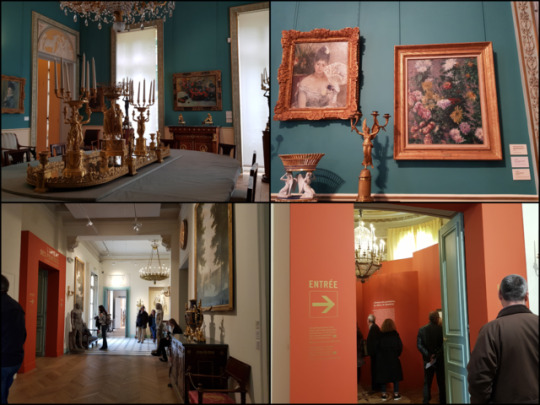
Overall the museum was really easy to navigate. Also, I really loved the interior because they hung the paintings just as how it would be hung in a house with other settings, like different furniture to decorate the rooms. However, despite the easy navigation, we had a really hard time trying to find Monet himself because we couldn't find the way downstairs.
Eventually, we found out that we had to go through the orange opening which led to the temporary exhibition, and at the end, there were stairs to (behold~) Claude Monet.

The first thing that greets me after the stairs was another exhibition that was on the opening to THE UNEXPECTED DIALOGUES by Fromanger. They were very amazing, having a very modern-y twist to the whole museum.
And then finally.
At last.
We come to Monet.
To be very honest with you, I didn't really know Monet. I knew his name and I knew his work, I just didn't know it was his until like.. now. And I was ShOoK.
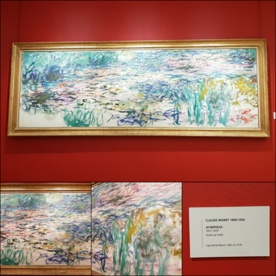
These lily pads. Really, they look just like a simple gesture drawing. you really see the artist's hand appearing in the piece. Some are very dry brush works like the work on the top while others are thicker paint brushstrokes like the bottom.
And what is so fascinating is that these, what look like gesture paintings from close up, are actually a piece, a scene that is depicted, from far away. All these fast strokes and lines all come together to make one beautiful piece.
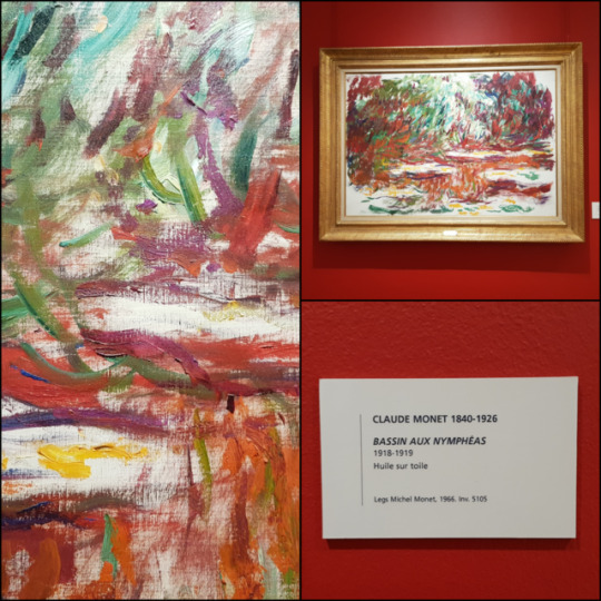
And I really love the diversity of the lily pad. The one on top is very warm colors, with the ground really showing through the paint while the bottom one is very cool colors where the ground isn't as visible.

But what I loved the most were his landscape paintings. While his lilies were on the right (when facing from coming down the stairs) and center of the basement, the left side had all his different landscape paintings and they were amazing to look at. His style of effortless-looking painting is so gorgeous and like the people are depicted with two brushstrokes but they totally look like humans. They were very different from his lily pad paintings, but had (somehow) the same feeling.. the same vibe.
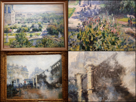
This piece specifically caught my attention when I saw it.

I really loved, instantly, the very limited marks he used to paint this. Also, his color palette is very pastel and light, very much tinted with white. It looks as if he is using oil paint with no solvent on some places because we can literally see the pure paint just dried and created this creamy, almost sculpture-y quality to it.
The picture seems to be indicating a church because the architectural feeling of the painting is very much a cathedral. The overall building is painted in pale pink with a bit of pale brown in the middle to indicate an arch of (what seems to appear as) a stain glass window. There isn't any detail to the building but ironically, the limited light blue marks are just enough to display the painting in a scene. The light brown comes back into play at the very bottom of the canvas, with some spots of white and light red. There are also bits of blues behind and on top of the brown paint. I think he is using a wet on wet style of painting because the paints are less crisp but more mixing.
I feel like the focal point of this piece is the section in the middle where there is a chunk of paint just smeared onto the canvas without any solvent to smoothen it down. My eyes are drawn back to that one spot where the white, the yellow, orange, pink, and blue all meet up.
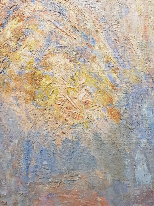
Literally, we all just sat there and was able to admire his work for like years because it was so worth just staring at for a long time. I also really love how the museum was curated, with the permanent collection being in the rooms and the exhibition being into the leading into Monet so you can see the temporary exhibitions on the way to Monets paintings. The paintings were all amazing and I feel like it was arranged in a way so that we gradually go through the museum until we meet the Monet's paintings, the grand reveal. Which I really liked, personally, how the way the museum was arranged because we were able to look at all the paintings and it was made in a way so that we couldn't just look at Monet and leave, but we were introduced to the permanent collections, through the temporary exhibitions, and ending with Monet.
2 notes
·
View notes
Text
Enhancing Daily Dining: Striking Kitchen Island Tables
New Post has been published on https://dinnertables.net/enhancing-daily-dining-striking-kitchen-island-tables
Enhancing Daily Dining: Striking Kitchen Island Tables
In today’s bustling homes, the concept of an island with a dining table has gained prominence, redefining the way we experience our dining areas. As central hubs for daily activities, dining spaces hold a crucial role in our routines, and these surfaces serve as multitasking marvels, accommodating meals, discussions, and even last-minute work tasks.
Contents
1 Stylish Kitchen Island Dining Tables That Impress
2 The Functionality of Island Tables
3 Designing with Distinction
3.1 Small kitchen island tables
4 Creating a Focal Point
4.1 Modern kitchen island tables
5 Enhancing Social Interactions
6 Versatility and Adaptability
7 Incorporating Island Tables in Different Spaces
7.1 Kitchen island 72 inches
8 Practical Considerations
8.1 Portable kitchen island tables
Stylish Kitchen Island Dining Tables That Impress
This exploration delves into the pragmatic and tangible benefits that island tables bring to our everyday dining occurrences. With a focus on efficiency and sociability, we’re here to shed light on how these pieces can revolutionize not only the way we dine but also the way we connect, gather, and enjoy our regular regimens.
Kitchen Island With Dining Table
The Functionality of Island Tables
An island table isn’t just furniture; it’s a dynamic dual-purpose essential that reconfigures kitchen functionality. Beyond their surface, they offer profound convenient advantages that cater to modern lifestyles as they are more than just a platform for meals but also facilitate vigorous culinary experiences. With generous seating and ample space, they’re tailor-made for gatherings and engaging.
Island With Dining Table And Square Chairs
Their multifaceted purpose harmonizes cooking, dining, and socializing, encapsulating a versatile spot. Moreover, integrated storage options, like drawers, shelves, and cabinets, streamline kitchen essentials for easy access. Emblematic of efficiency, these island tables emerge as focal culinary pieces in contemporary kitchens. Through their convergence of suitability and aesthetic, they underscore how kitchens can evolve into vibrant, productive workspaces.
Designing with Distinction
Kitchen Island With Dining Table Extension
More than function, an island table turns into a canvas for innovative design and materials providing a wide spectrum of choices. The play with various shapes, sizes, and customizable configurations turns it into a centerpiece of individuality. Incorporating innovative materials, including the clever use of contrasting elements, adds visual flair.
Small kitchen island tables
Island With Dining Table White With Marble Top And Towel Holder
Positioned at the center, these furniture pieces reconstruct interactions, bridging communications and meals seamlessly. Every design choice works in harmony and speaks volumes about your home’s character. By connecting bold design with a feasible purpose, these tables stand as a testament to your taste, values, and the way you embrace both style and substance.
Creating a Focal Point
Instagram.com Kitchen With Island And Dining Table 24
A dining-table-enhanced island effortlessly assumes the position of an alluring focal point within dining rooms. Its presence draws attention, enriching the overall aesthetic of the space. These surfaces possess the ability to harmonize by complementing existing decor or stand out through creative contrast. By incorporating thoughtful design elements, the spotlight on the island table intensifies.
Modern kitchen island tables
Mid Century,modern,designer,kitchen,with,exposed,beams,and,stone,surfaces.
Pendant lighting suspends the artistry above, while color contrasts playfully energize the visual impact. Decorative elements and centerpieces strategically accentuate the space, magnetizing attention. Transcending aesthetics, there’s a psychological sway – evoking a sense of uniqueness and influencing how we experience meals and interactions.
Enhancing Social Interactions
The heart of a home is often found where meals are shared, and an island with a dining table takes this notion a step further. These furnishings serve as radiant key elements where rich interactions thrive, weaving connections among family and guests. Meals become more than just nourishment; they become moments of bonding.
Island With Dining Table Expandle With Pull Out Chairs
The communal atmosphere they foster is a departure from traditional setups, breaking down barriers and promoting a sense of togetherness. The allure lies in their ability to blur the lines between cooking and conversation, making everyone feel like they’re part of something greater.
Versatility and Adaptability
The charm of the island table extends far past meal hours, revealing its remarkable versatility. Functioning as much more than just a spot for eating, these surfaces effortlessly adapt to various scenarios, making them an indispensable asset in the modern home. They fulfill as convenient homework or workspace solutions for children, fostering productivity and focus.
Island With Dining Table With Built In Cabinets
At the same time, they effortlessly transform into informal entertaining hubs, creating a makeshift cocktail area for guests. When it comes to dining, these fixtures effortlessly transition from casual weeknight dinners to grand formal gatherings, accommodating different occasions with their adaptable design. In a world where flexibility matters, these tables prove to be not just furniture, but dynamic lifestyle enhancers.
Incorporating Island Tables in Different Spaces
The Ultimate Guide To Kitchen Islands Grain And Frame
Incorporating an island table into your residence isn’t confined by dimensions; it’s about intelligent design. These furnishings prove their adaptability by effortlessly fitting into various room sizes and layouts. When space is a premium, they shine as space-efficient solutions, serving multiple roles from dining to workspace. Smartly integrated into small areas, flexible island tables become key players, maximizing utility without compromising style.
Kitchen island 72 inches
Island With Dining Table Gray Painted With Metal Handle Doors And Cusioned Pull Out Chairs
Their space-saving benefits are evident in designs that ingeniously combine dining, preparation, and storage. These surfaces don’t just fill rooms; they seamlessly merge, proving that thoughtful placement and diverse designs can transform any room into an adequate and visually appealing spot, regardless of the space available.
Practical Considerations
2 Antique Beam
When it comes to an island table, practical considerations take center stage. Keeping these versatile pieces pristine requires simple maintenance and cleaning strategies to keep them looking their best. Regular wiping and using suitable cleaning agents can help maintain their appeal. While selecting seating options, comfort and compatibility with the island table’s design are key. Addressing challenges like proper incorporation in the available space or design cohesion is vital.
Portable kitchen island tables
Chapter One Mcnair 2
Ensure the furnishing doesn’t obstruct movement and accounts for the kitchen’s workflow. Solutions include opting for space-saving designs or incorporating flexible seating arrangements. In the end, these practical aspects contribute to the purpose, ensuring it remains a useful and appealing centerpiece in your home’s heart.
Finally
In essence, the island with a dining table transcends its utilitarian roots, presenting a gateway to enhanced day-to-day dining. The journey through its various dimensions – functionality, design, adaptability, and pragmatism – reveals its remarkable potential.
Modern Island Table
From fostering social connections to adapting seamlessly in different spaces, these surfaces reshape dining areas into lively nooks and revamp everyday occurrences. With these insights in mind, why not consider the transformative power of an island table in your abode? Embrace the possibilities, create an experience that’s as engaging as it is enjoyable, and enrich the shared moments that make a house a home.
0 notes
Text
Worthless

Prompt: THIS FUCKING MASTERPIECE
Author: @destielthedeathofme
Pairing: Dean/Cas
Tags/Genre: Destiel, Painter! Dean, Critic! Cas, it's sadder than I anticipated, I'll try to make it funny, it's kinda angsty
Summary: read bro
Author's note: beep boop
~♡~
Dean cursed as Gabe nearly knocked over a display.
"Dumbass! Watch where you're going."
Gabriel just stuck his tongue out at him and proceeded to walk around.
Today was the biggest day of Dean's career and a Twizzler addict was not going to ruin it.
"Hey Dean-o why so glum?"
Dean winced as Gabriel's sickly sweet breath came in contact much too close to his face. Man, personal space seemed to just not affect Gabriel. He didn't expect any more from Gabe. Dean anxiously ran his hands through his hair, he could give Gabriel a million reasons but Dean settled on one.
"Because I'm fucking nervous you dwarf."
"Ouch." Gabriel put his hand to his chest in mock hurt.
Sam wandered over to Dean, but as soon as he spotted Gabriel, started walking fast. In the other direction.
Gabriel's eyes lit up in mischief, "HEYYY SAMMMMYYYY."
You may think by mischief, Dean refers to something childish. But no, simply because Gabriel is the embodiment of mischief.
Dean sighed, he wasn't going to survive today. But at least he was better off than poor Sam. Dean narrowed his eyes at
Charlie who had decided to take a break. Charlie gave him a terrified smile and got up again, undoubtedly cursing him off under her breath. She probably deserved one. Sure he was being a bit bitchy, but he had the right. Everything had to be perfect today.
Dean was your average struggling artist who just moved to the city two years ago. He lived in a tiny apartment where cockroaches ruled and the water tasted like lead, but he was alive and grateful. Dean knew he had to live with it because he was the one who chose to paint. He was the one that chose to paint and he would live with the consequences. Painting wasn't just colors and a canvas to Dean. No, it was much much more. Painting consumed him. Every stroke, every speck. And there wasn't Dean without art.
Too bad his father couldn't see that.
But Dean was still grateful, nonetheless that Sammy had flown out to see him. Sammy was the only family he had left. His friends were the best. He couldn't be more grateful for Gabriel, Charlie, Benny, Garth, and Jo, all of whom had shown up today.
Dean didn't like being the center of attention, how ironic that he was having an exhibition, full of his works, everything that symbolized him. Sure he liked to fool around at parties and make jokes like his life depended on it. But when it mattered, Dean didn't like attention. Maybe because he grew up without it.
Dean stifled a laugh as he saw Sam start to run away from Gabe, who seemed to catch up to Sam within seconds although his legs weren't even half as long. Funny what love could do.
Someone came up from behind him and Dean turned, sensing the "boo".
Jo pouted at him, hands at her hips, "You're no fun, Winchester."
Dean smirked, "Honey, you and I both know that's not true."
Jo hugged him, laughing, Dean loved Jo she was his best friend next to Charlie and the others. Her mom was also kind of his mom. Ellen has raised him, especially when John couldn't.
Dean circulated throughout the room, eyeing every exhibit, making sure it was set to perfection. He nodded approvingly at his friends, Garth and Benny, especially who had shown up a little early to help him.
God, what would he do without these people?
A voice chimed in, "Crash and burn."
Dean grinned at Charlie who had probably heard him although he was fairly sure he didn't say it out loud. Dean wondered how she was still beaming even after missing out on nearly 2 meals. Sure they ordered food but Charlie was hell-bent on helping.
"So I did some digging online and I know some critics that are going to show up today."
Dean's face lit up, finally some good news, there wasn't a single critic in the area that he didn't know. Dean would be prepared for them.
"Well? Spit it out."
"Okay geez, anyway I've got Balthazar you know the party freak, Chuck the guy who used to be a prodigy, Amara the one who's always trying to get in your pants, Rowena the bitchy one, and Castiel?"
Dean's face when white at the mention of Castiel.
Castiel Novak was a legend in the art industry. Anyone and everyone knew him. But he'd gone quiet over the years, just sort of disappearing. Much to Dean's disappointment, no amount of stalking would even bring up a picture of the guy or where he was. He was Dean's inspiration in art, for as long as he could remember. Castiel was known for his attitude and infamous temper. Maybe that's why Dean liked him so much. Hell, the focal point of tonight’s exhibition was a piece inspired by Castiel. Dean had named it “Angel”, and as cliche as that sounded, it was true. Castiel specialized in angels and supernatural beings, as did Dean. But his Angel tonight had been to honor his mother, Dean tried his best to replicate her and hadn’t let anyone see that one yet.
Here's the million dollar question.
How the fuck did he know who Dean Winchester was?
"Earth to Dean Winchester!!"
Dean blinked, "Uh yeah right here."
Charlie huffed in annoyance, "Dean you look like you just saw a ghost, are you alright? You know what, don't answer that, go take a walk."
Charlie pushed Dean towards the door, as much as he protested, but maybe this was a good idea.
As Dean opened the door, his nerves multiplied as he saw people start entering. The exhibition didn't start till 5:00 but there were some people trickling in.
something that would hopefully help him relax. But as fate would have it, Dean doesn't get to relax. Dean opened the large door of the exhibition hall and started walking outside, but there were too many things on his mind and so he bumps into someone.
Naturally, Dean's first response was,
"Are you blind?"
Dean looked up at the man who was frowning at Dean. Dark hair and blue eyes the guy reminded Dean of someone he knew but he was too pissed off to care. Now if Dean Winchester had been paying attention he would have noticed the way the man’s hair curled around his neck and how gravelly his voice was. But Dean totally wasn’t paying attention to those things. Totally not.
"You bumped into me."
"Whatever."
By the time Dean had finished taking a walk, it's time for the exhibition to start.
Dean would like to think that he's relaxed at this point, many people had already offered deals on his artwork, commissions, praises. But Dean isn’t. No, Dean was waiting for Castiel. If Castiel would so much as nod at his painting Dean would be complete.
It was time for the Q/A session and as far as Deam could tell, Castiel was a no-show. This was it. The time for the big reveal.
Dean pulled the sheets from over the painting.
Little gasps erupted amongst the crowd and Dean felt a huge weight being lifted off his shoulders. He looked over to Sam who had tears in his eyes.
Dean’s voice cracked as he spoke, ”This is my final piece of the night.”
He took a shaky breath.
“A-Any questions?”
At least a hundred hands shot up in the air and Dean felt like the room was getting smaller. He patiently answered them all, beaming at the positive responses.
“Who is your inspiration for this piece?”
“Well the actual piece is of my mother but one of my favorite artists Castiel Novak inspired the style.”
When the crowd quieted down, one hand remained in the air, and between the blinding lights with a mix of nerves Dean almost didn't see that hand.
“Would you like my opinion of your work?”
Its the same voice from earlier and Dean can’t help but feel a strange sense of deja vu.
“Yes.”
“It's worthless.”
The crowd gasped as a few shouts were aimed at the man.
Dean went a little numb. And at that moment Dean blessed his smart-ass self.
“I know but tell me anyway.”
The crowd roared and Dean could've sworn he saw the man smirk.
“My name is Castiel Novak and I will pay as much as you’d like for this painting.”
Dean was going to faint but his ego wouldn’t let him.
“It's not for sale.”
“My point exactly, this painting is worthless for anyone but you, because it holds much more meaning for you than it ever will to anyone else.”
“And since you won’t sell me this painting I would like to commission a painting from you.”
“For my entire fortune. But one exception, you will do so under my roof and my rules.”
“Do you accept?”
“I do.”
36 notes
·
View notes
Text
WRAPPING YOUR HEAD AROUND CANVAS
HTML5 is never again a 'method for the future ' as it is increasingly normal spot now that the greater part of us, if not we all, are beginning to actualize it into the things we make.
One of the freshest highlights that have the vast majority of you cooing, beside the new video and sound labels, is Canvas. It has been named a helpful trade for the utilization of glimmer in the program, and it interprets well over numerous gadgets.
The name of the HTML label wholes up the premise of its execution. Canvas gives a 2D attracting API to pictures, content, lines, shapes, etc. Now and again it brings back recollections of utilizing MS Paint; I know I'm not the only one in this conclusion when I see sites like canvaspaint.org. Also You Can Download office.com/setup by clicking this
The truth is the point at which you delve down into it, you can do as such considerably more with Canvas, and it could be one of the greatest enhancements to HTML.
You're just genuinely restricted by your comprehension of the API and creative ability. What you'll have the capacity to do toward the finish of this arrangement will be up to you, however I trust that if this canvas arrangement doesn't help you a large portion of everything about HMTL5 Canvas it will at any rate give a springboard to you to jump profound into the API.
LET'S BEGIN WITH THE BASICS
Program SUPPORT
One of the greatest inquiries confronting us is obviously program support. Most programs have been dealing with making increasingly present day forms to stay aware of the majority of the new components that HTML5 and CSS3 have presented. Presently even IE9 underpins most if not the majority of the new advancements that drive these dialects. Lamentably for those of you that are screwed over thanks to utilizing variants of IE like 6, 7, and 8, JavaScript might be more help in those circumstances. In actuality, there is a JavaScript similarity fix for IE8 called The ExplorerCanvas venture. You should simply incorporate the additional JS document before any of the canvas labels in your page. You can bar this sweet little bit of JS from alternate programs that as of now render Canvas by utilizing contingent remarks.
<!- - [if IE]><script src="excanvas.js"></script><![endif]- - >
Beginning WITH CANVAS
You would execute canvas as you would some other new HTML tag by utilizing the <canvas> tag. The essential working size is 300px by 150px and will appear unfilled or undetectable. It's a smart thought to put in some fallback content on the off chance that the program does not bolster canvas.
<canvas id="yourCanvas" width="300" height="150">
I'm sad you're program doesn't appear to help Canvas right now.
</canvas>
Consider canvas like your new illustration cushion and since it is setup, we can start to attract that space. Remember that when you are utilizing canvas, you are not drawing on the canvas component itself, yet rather you are drawing on the 2d setting in which it renders. This would be the place JavaScript API becomes possibly the most important factor. You'll discover your canvas component by utilizing getElementByID and after that you can introduce the setting that you might want. Make sure to put your <script> labels either previously or after, as so:
<script>
var canvas = document.getElementById('myCanvas');
</script>
At that point you can indicate the unique situation (ctx for short):
<script>
var canvas = document.getElementById('myCanvas');
ctx = canvas.getContext('2d');
</script>
Presently we should construct a straightforward square shape after our setting variable:
<script>
var canvas = document.getElementById('myCanvas');
ctx = canvas.getContext('2d');
ctx.fillRect(0, 0, 150, 100);
</script>
Congrats! You simply completed the process of keeping in touch with you originally bit of canvas proportional to the 'welcome world' proclamation.
With that accomplishment indented in your HTML5 dev belt how about we investigate the 2D API. Making essential lines and shapes is the thing that lies at the center of canvas, as you found in the past code above. Utilizing the fillStyle or strokeStyle you can render the hues and strokes of the shapes all the more effectively. When moving toward the shading esteems, remember that they are equivalent to the CSS esteems rgb(), rgba(), and hsla().
So to draw an essential strong square shape we would utilize fillRect, and use strokeRect to make a similar square shape with just fringes. Simple right? I mean so far this all is by all accounts really straight forward. presently given me a chance to acquaint you with clearRect. You can execute this property to clear a bit of your drawn square shape. Utilizing the X, Y, width, and tallness properties can and will be utilized in each of the three of these strategies underneath, you can even change your line thickness. We should investigate:
ctx.fillStyle = '#CCCCCC';
ctx.strokeStyle = '#000000';
ctx.lineWidth = 2;
Presently how about we make our crates:
ctx.fillRect (0, 0, 150, 50);
ctx.strokeRect(0, 60, 150, 50);
ctx.clearRect (30, 25, 90, 60);
ctx.strokeRect(30, 25, 90, 60);
Ways
Making ways is similarly as basic as making essential shapes. Ways enable you to make custom shapes, the dilemma is that you need to make the diagrams, at that point you can include strokes, lastly include the fill. To begin with your custom shape you will utilize beginPath. The code isn't too entangled to even think about understanding how about we draw a circle:
ctx.beginPath();
ctx.arc(75, 75, 50, 0, Math.PI*2, genuine);
ctx.closePath();
ctx.fill();
The subsequent item gives you a filled hover at the x, y directions of 75, 75, with a range of 50. The following contentions in our line of code are the begin and end focuses in radians. In the above precedent, we needed to make a total circle, so we began with 0 and finished at Math.PI*2 which is equivalent to 360 degrees. The last contention advises in what heading to draw the hover, in this case we selected clockwise so our announcement is 'genuine' You can add a touch of shading to the circle presently utilizing fillStyle:
ctx.fillStyle = '#FF1C0A'
ctx.beginPath();
ctx.arc(75, 75, 50, 0, Math.PI*2, genuine);
ctx.closePath();
ctx.fill();
Since your head is loaded with a wide range of fun with making bends, it's an ideal opportunity to push ahead and investigate something a bit increasingly perplexing, such as making Bezier bends. With techniques like bezierCurveTo and quadraticCurveTo you can make different bends and ways that have a sweep that aren't focal the bend. By utilizing control focuses we can characterize where and how to draw the bends. In the event that you are hoping to make a bend with numerous focuses, at that point the bezierCurveTo might be only the thing instead of the quadraticCurveTo that just has one control point.
ctx.lineWidth = 4;
ctx.beginPath();
ctx.moveTo(50, 100);
ctx.quadraticCurveTo(250, 50, 450, 150);
/(quadraticCurveTo(cpx, cpy, x, y);)
ctx.srtoke();
How about we investigate the quadraticCurveTo strategy, all the more explicitly the contentions that it calls. The first is the 'x' position of our control point, next there is the y position of a similar point, at that point the x arrange of the finish of our way, lastly the y facilitate of the finish of our way.
The bezierCurveTo strategy isn't excessively unexpected other in comparison to the way that you currently are getting out 2 control focuses:
ctx.bezierCurveTo(cp1x, cp1y, cp2x, cp2y, x, y);
End
Voila Folks!
You presently know how to setup and start functioning in Canvas. It is not necessarily the case that I anticipate that you should take what you've realized here to move the following extraordinary thought in canvas, however at any rate you are starting to assemble a strong establishment of understanding the innovation.
We'll plunge into increasingly about the highlights and what Canvas can do in my next article, so watch out for section 2 of 'Folding Your Head Over Canvas'.
1 note
·
View note
Last Seen Blogs

lavendeluxe
LL

iloveoctober
Untitled

sh4d0w-gl
📼#1Genloser📼

miiahgase
Ahgase is Our Name
odoroshi-rider
THE BOX. YOU OPENED IT.