#<3 yellow psd
Text

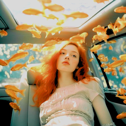


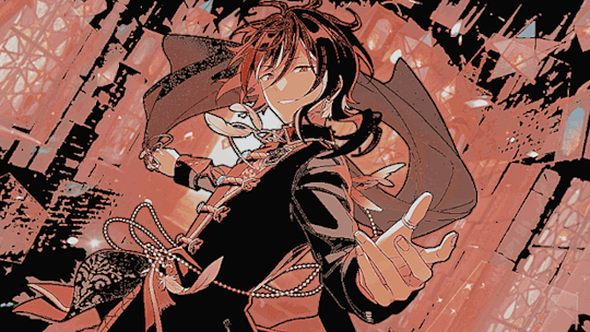
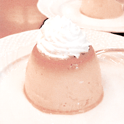
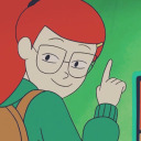
Pisces PSD #039 by Mila
psd
#psd#psdcoloring#colouring#psd photoshop#icons with psd#photoshop#psd coloring#artists on tumblr#coloring#pisces#blue psd#yellow psd#orange psd#<3 orange psd#<3 blue psd#<3 yellow psd#pisces moodboard#portgas d ace
16 notes
·
View notes
Text


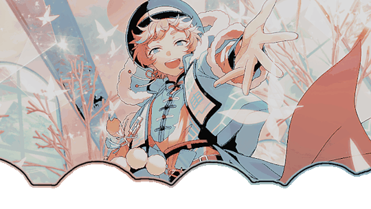


𐙚 ⵧ SWITCH Layouts ☆
ⵧ winning event prize 4 @enchantedmirage !
♡ rb & cr to use ...⠀click me !
#ong what a FLOP#🎀 𓂃 edits.png◞#🌊 𓂃 requests.pdf◞#🐚 𓂃 layouts.png◞#uhhh whisper inspo :3#rare footage of kio not adding 3 more headers#AAJAJAJ#switch#enstars switch#ensemble stars#ensemble stars!!#tsumugi aoba#natsume sakasaki#sora harukawa#enstars layouts#layouts#messy layouts#tumblr layouts#icons#pfps#headers#blue#red#yellow#psd icons#dash icons#messy icons
37 notes
·
View notes
Text

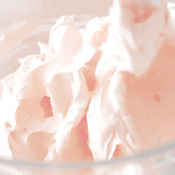

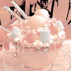

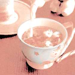


Say Hello in the SEKAI !! ♡ SAKI FEAT. POMPOMPURIN !!
╰┈➤ 🥞 | 🧇 | 🥞 - 🧇 | 🥞 | 🧇 - 🥞 | 🧇 | 🥞 ˚ 𝄞 ₊

#ට#update jiji got airi & my melo so expect a board of that card too <3#apolocheese for the psd jiji also doesnt know what happened here#yellow#orange#brown#beige#white#stimboard#sensory#visual stim#stimblr#pudding#flan#pouring#drinks#drink pouring#hot chocolate#cozy stim#mixing#baking#fluffy#texture#sanrio#pompompurin#pjsk#saki tenma#eyestrain#eye strain#eyestrain cw
41 notes
·
View notes
Text


#O . | Just a Ramblin Man | . O O C .#T B D#// idk but i feel satisfaction#// from this psd#// it smooth#// tho i cant get the yellow hue / saturation right#// this is fine :3
0 notes
Text


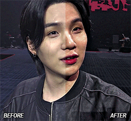
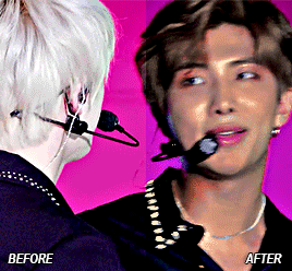
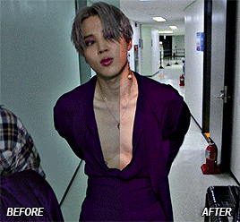
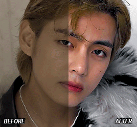
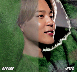

CREATOR TAG GAME ◆ post some gifs before and after colouring!
thanks so much for tagging me, beloved @heybaetae, @jkvjimin & @thisfuckingdeadlife <3
I'm sorry for already having posted most of these in my before after colourings posts before, I usually only save psds that I'm especially proud of...
as always, the enemies remain yellow and cyan tints, absolute whitewashed skin and sad, lackluster colour grading, but nothing 25+ photoshop layers can't fix am I right?
original posts: 1 | 2 | 3 | 4 | 5 | 6 | 7 | 8
I'm tagging @ye-xiu, @cordiallyfuturedwight, @btsiu, @jung-koook, @rjshope, @fireworksgalaxy, @jinstronaut, @lesbiansuga, @agustd3 and @spicyclematis 🤍
#support you cc’s (colour correctors!)#I'm very sorry I really only save the 'heck yeah' ones 😭#tag game#before after colourings#*gifs
198 notes
·
View notes
Text


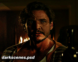
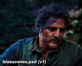
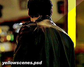
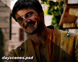

psd pack #1 by perotovar
i saw @heroeddiemunson show the difference between their gifs edited vs unedited and it made me wanna do the same! i have a few psds that i cycle through depending on the scene and figured i'd share them with anyone that was interested!
if enough people are interested, i might do a second batch of some fancier/more experimental coloring 👀
they're pretty basic for this first batch, but they can be decently customized for a lot of things. i obviously can't make a universal psd but i can certainly try to cover the basics lol
psd links under the cut! please like or reblog if you use!
you can have all of them in a pack -> here <-
or individually:
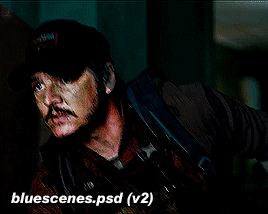
base
blue scenes (there's 3 versions within the psd)
foggy scenes
dark scenes
yellow scenes
day scenes
ezra
#pscentral#completeresources#psd#photoshop#coloring#psds#resources#pedropascaledit#ppascaledit#pedro pascal#usermaguire#useriselin#userallisyn#xuserannie#userallii#userfanni#userkam#idk if y'all want to be tagged in this kind of thing#but i figure it's at least useful? lol#feel free to ignore this if you want!#oaks#psd*
508 notes
·
View notes
Text

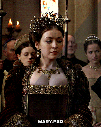
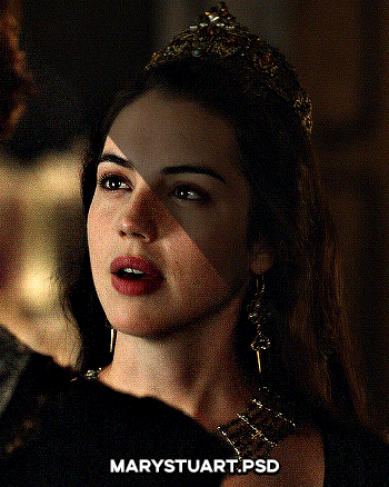

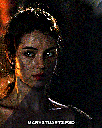
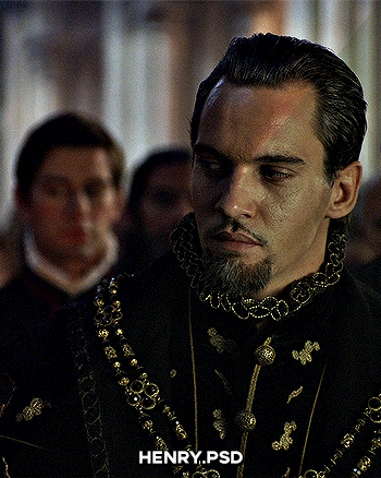
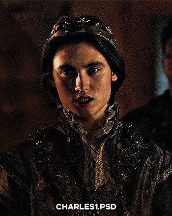
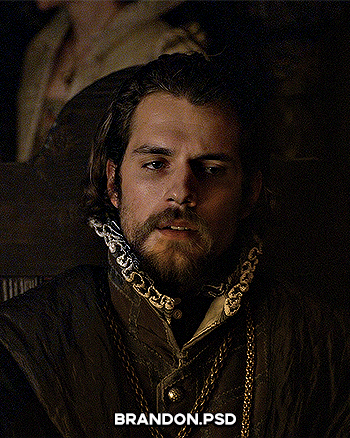

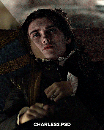
PSD PACK #1 — period dramas
in this folder, there's ten psds created for the shows: reign and the tudors but they should work across any period drama with dark or yellow/green lighting <3 just remember to always adjust the curves (and channel mixer if necessary) to suit the lighting of the scene
a lot of these are pretty basic colourings, and some are pretty similar but these are the ones that i use the most often!
#dailypsd#psdresources#completeresources#allresources#psd pack#psd colouring#photoshop resource#gif psd#01#ps help#useratz#usershreyu#userzil#usershri#usermery#userbloomingwarrior#niniblr#usercats#userfaiths#usermare#userbess
288 notes
·
View notes
Note
hi :) i love ur buffy gifs so much! they always look so nice!! would you be willing to do a coloring tutorial to show how you usually color btvs? or perhaps save the PSD the next time you gif buffy and share that?
oh i feel your pain!! and thank you so much <3
i colour each gif from scratch and don't save psds so i can't offer you something there but i've done up a buffy colouring tutorial here!!
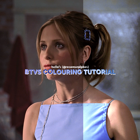
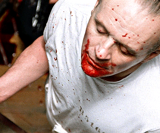
Here's the uncoloured gif.

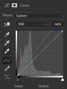
Step 1: The nice part about giffing Buffy is there is usually a grey or blueish grey pixel in the whites of her eyes that is perfect for a white point curves. I played around with different pixels on different points on the gif until I found one I liked.
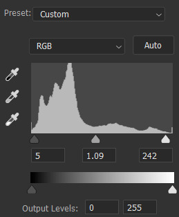
Step 2: I always like to do the brightening first so I added on Levels and Exposure layers. BTVS has weird highlights where its very prone to white or yellow/white patches so I try to use as little as Exposure as possible but I like the Gamma Correction part.


Step 3: Channel Mixer is a lifesaver for Buffy because it usually has such a warm tint. I pretty much only use the Red and Blue settings but it helps make the gif cooler without the effects on shadows and midtones like Colour Balance.


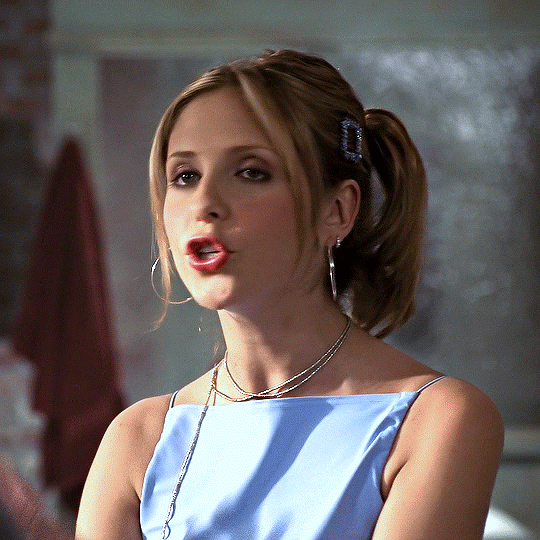
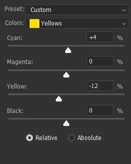
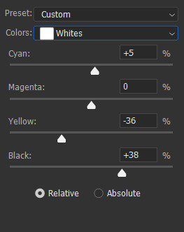
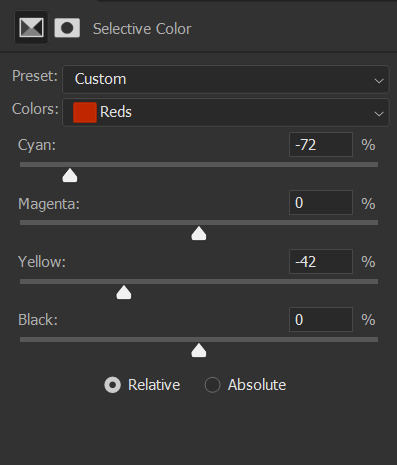
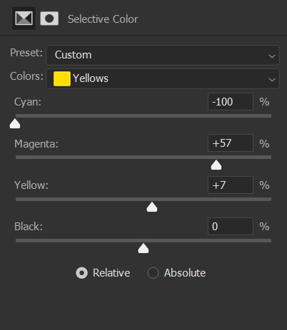
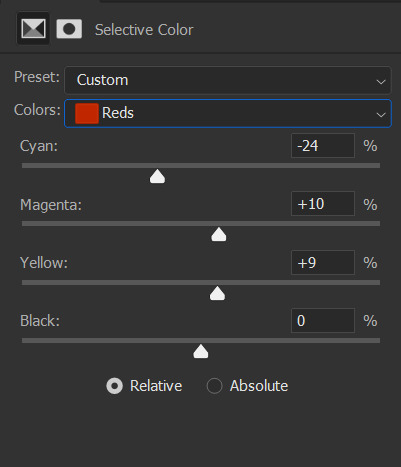
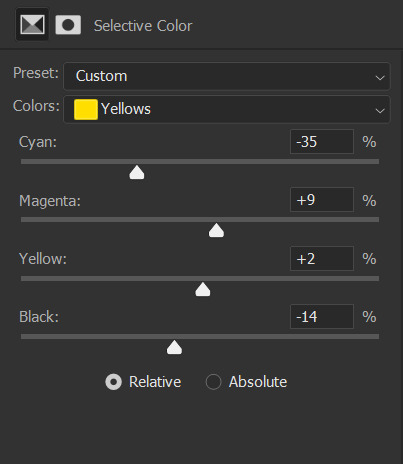
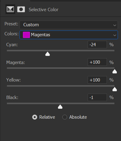
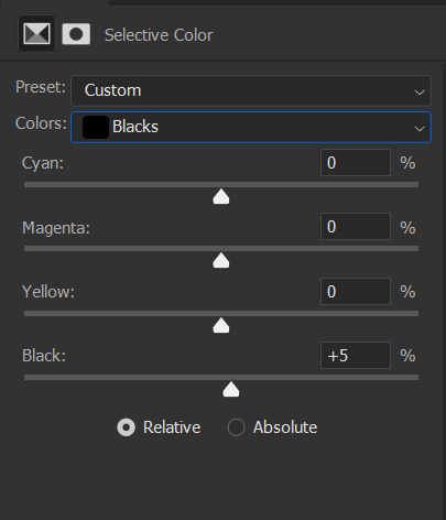
Step 4: Selective Colour is mostly just to fix skintones and background colours. I typically wind up adjusting the cyan and yellow sliders for the reds and blues until her hair and skin looked normal. Sometimes BTVS has magenta in the shadows on her face so I increased the yellow there (while it makes sense to actual reduce the magenta, I'm going to a natural skintone not green).
You can also see that there are some white spots on her shirt, right arm, and the right part of her face. On the white, I increased the blacks and reduced the yellows to fix the colour and reduce the brightness.


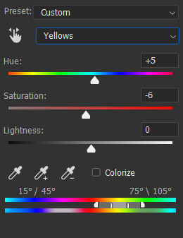
Step 5: Hue/Saturation doesn't make a hugely noticeable difference here but it's a good opportunity to make final tweaks to colours and reduce overall warmth saturation. My personal preference is to have lower red/yellow saturation so I lowered that and made slight Hue adjustments (the yellows were still a little red for my liking). There was also some magenta in her eyes and teeth so I completely lowered the saturation and upped the brightness to fix that.


Step 6: The gif is still a little dark for my liking so I threw on a final Levels layer to brighten up her face. Usually, I would use exposure but if I did that I would end up with some serious white patches.

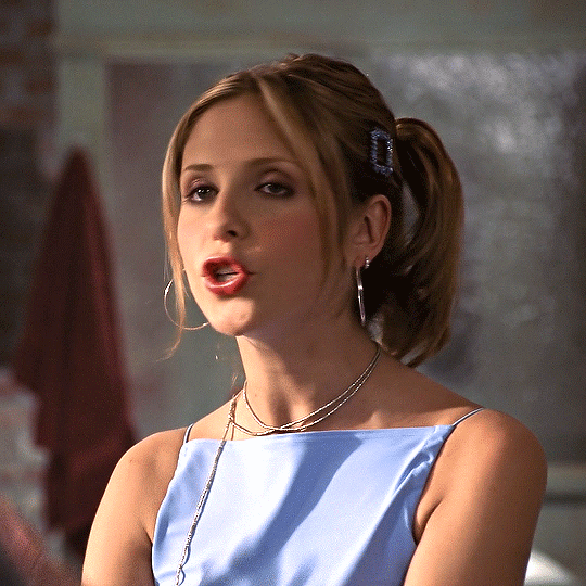
And that's it!! Each Buffy gif is slightly different but I would suggest making the gifs cooler and increasing the brightness through Curves and Levels without using Exposure.
#gif tutorial#tutorial#tutorials#photoshop tutorial#coloring tutorial#hella's inbox#anonymous#hope it helps!!
64 notes
·
View notes
Text
CMYK Explanations
Hey there Kääryleet!
We have heard you. Y'all want to know what is and how to use CMYK. So here's a quick explanation:
1-What is CMYK?
CMYK is a colour setting! It stands for the 4 colours of ink a printer uses: Cyan, Magenta, Yellow and Black. By layering these inks on the paper, we can print pretty much any colour we want! It follows the rules of substractive model of colour, like paint.
2-Isn't that how it is by default?
Anything you do on a screen is by default in RGB (Red, Blue, Green), and that's because your screen uses light and not pigment to show colours. That's the additive colour model. So, unless you selected CMYK or Print in your software, you're working in RGB.
3- What does that mean for me?
All you need to do is to set your file in CMYK. Depending on the software you use, it should be in the "File" or "Edit" menus. It's VERY important that you set the colour mode BEFORE you start your work. Why? Because going to CMYK from RBG means you're re-encoding your colours, and they will look duller/bad once printed, and there's a fairly good chance it will stop looking good on screen too. It's also pretty hard to correct once it's done. Don't forget we will be providing a PSD template, and we'll set it to CMYK.
4-Is there any colour limitations to CMYK?
Short answer? No. Just set your file to CMYK and start drawing. Pick any colour you want, as many as you want. Long answer? Yes, but it's simply because some colours cannot be printed with the normal printing process, as they require special pigments and ink. But that's not important for our project, so no need to worry about it.
And that's about it, folks! I'm leaving you with this short video that explains the colour models a bit better:
youtube
115 notes
·
View notes
Text


ೄྀ࿐ ˊˎ- GENDERANCiENT : a gender system that feels related to a long forgotten era.
interpretations could include feeling like your gender originated long long ago or is of unknown/indiscernible/incredible age, feeling like your gender can only be understood with long forgotten ancient knowledge, or feeling like your gender feels foreign in the sense that it belong to a forgotten era.
this gender system may also be interpreted as a stand-alone gender.
⎯ ✶ coined by The Wayfarer : requested by no one .
⎯ ✶ to - do list : godancient , natureancient , skyancient , starancient , ruinancient
⎯ ✶ coined by others : nightancient , also ancientalien
PSD and PNG file link : ✶
[ Flag ID 1: a flag with 9 stripes of uneven thickness in a gradient going from dark grey at the top and bottom to a light grey at the center. the flag is bordered at the top and bottom by blocky spiral shapes that intersect and create a more complicated symbol in the middle. ]
[ Flag ID 2: a flag with 9 stripes of uneven thickness in a gradient going from reddish grey-brown at the top and bottom to a grey-yellow at the center. the flag is bordered at the top and bottom by blocky spiral shapes that intersect and create a more complicated symbol in the middle. ]
[ Flag ID 3: identical to the first flag. ]
#⎯ ✶ starlight#genderancient#mogai#mogai term#mogai blog#mogai coining#mogai flag#xenogender#xenogender blog#xenogender coining#xenogender flag#liom#liom term#liom blog#liom coining#liom flag
326 notes
·
View notes
Note
how do u edit an image of an irl guy to look like a troll? yknow, like troll will smith.
Gonna do this one quick and dirty, and with Photoshop in mind.
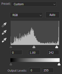
Step 1) Desaturate the image by adding a Hue/Saturation adjustment layer and dragging the saturation slider all the way down to -100.
Step 2) Add a Levels adjustment layer and darken the skin and hair by dragging the white output levels slider down a bit. This just adds pure black to the colors, so the same effect could be achieved if you paint black on a new layer over the image and decrease its opacity.
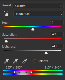
Step 3) To make the eyes yellow, add another Hue/Saturation adjustment layer and enable the "Colorize" option. Adjust the hue/saturation/lightness until the color is yellow-orange or whatever. Seems like Hussie painted black over the irises beforehand making them appear flatter, so do that too if you want.
To selectively adjust certain parts of the image using the adjustment layers, you can use the layer masks to do so. White areas are affected by the adjustments, while black areas are not. It's like going from 100% to 0% visible. If the program you're using doesn't have a feature like adjustment layers, then you can create a duplicate of the image and apply adjustments destructively as normal, and still create layer masks on those. If you don't have layer masks either then figure something out.
By default, the layer mask is entirely white, so for the Levels adjustment layer, click on the layer mask and go to Image>Adjustments>Invert. Then take your pencil tool, switch the primary color to white, and draw over the skin. Quickly outline the main parts and then use the bucket tool to fill it in. Faster than just drawing it in entirely by hand, but you do you.
Do the same thing for the Hue/Saturation colorize adjustment layer and draw over the eyes. Essentially, you're done. You can fill in the rest from here.


PSD here.
79 notes
·
View notes
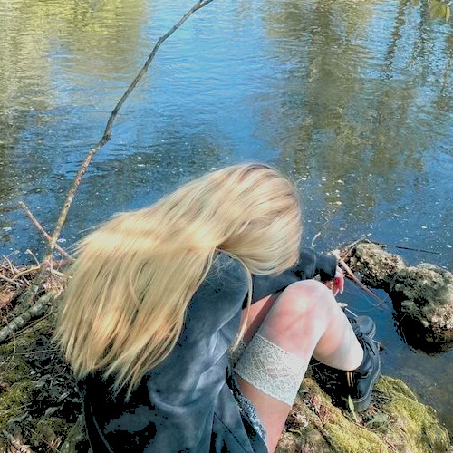
Text


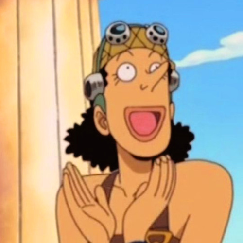
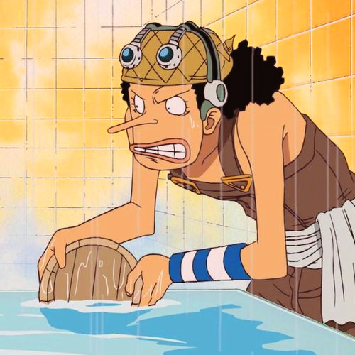
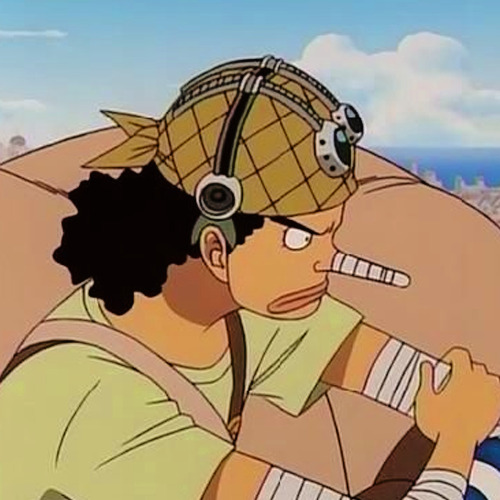


❀ Polaroid Love PSD, by Mila Design ᶻz
.:♪*:・’゚♭.:*・♪’゚。.*#:・’゚.:*♪:・’.:♪*:・’゚♭.:*・♪’゚。.*#:・’゚
ask is open !!
rules ➜ Fav + Reblog if you download;
Don't share it;
『 Polaroid Love 』
#psd#coloring#psdcoloring#colouring#psd photoshop#icons with psd#psd coloring#one piece#usopp#one piece usopp#<3 blue psd#<3 yellow psd
12 notes
·
View notes
Text
tagged by @adawongs thanks for the tag ♡
before/after gif challenge:
rules: from your creations, choose as many gifs as you’d like and do a before and after to show off your colouring and sharping skills.
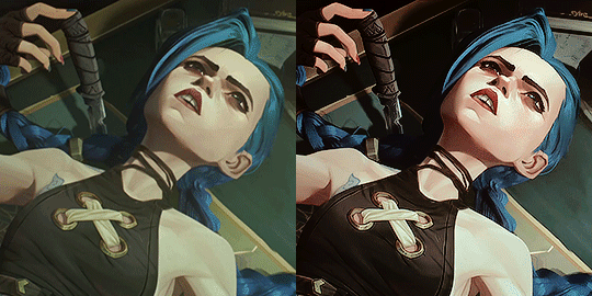
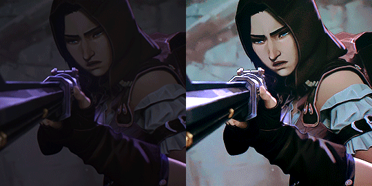
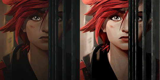
My thoughts with coloring my Arcane Gifs under the cut:
So.... Arcane... soooo painful to make gifs sometimes lmao. Anyways, for around 95% of what I make, I have a base Arcane PSD which you can see in the first 3 gifs of Vi, Jinx, and Cait. Then, I adjust the curves, color tones, and color balance when necessary. Most of the time, it turns out okay, and I really like it for brighter scenes.
But oh god does it STRUGGLE in dark gifs like the one for Cait lmaoooo. A LOT of colors need to be adjusted, and even the Caitlyn one doesnt come out perfect. Since it's super dark, I can almost never use it for large gifs. It's why I just cherry pick which scenes to make into larger 540 x 540 scenes. The darker ones I typically either leave alone or make smaller crops so that you don't get to see much noise. I really need more practice on coloring them.
There are very rare times wherein the base PSD doesn't work, like the last Vi set, which had to be colored entirely different. I just don't like seeing a lot of yellows on my gifs (as a personal preference), so I decided to have a different coloring for it. I might experiment with more coloring next time, since I almost never feel satisfied with my colorings. But I still find my base PSD to be good enough for majority of the scenes. I’m still deciding if I should stick to an even more basic coloring style to preserve the original animation.
My sharpening settings are the same across the board, I don't really do anything else other than my smart sharpen and gaussian blur settings.
Overall, Arcane for me is pretty difficult to color lol, but it's mostly because I always struggle making dark gifs. I love the series, so I still try my best to make as much gifs as I can. I'm not much of a graphic maker though lol, because I'm not that creative. I usually just stick to making basic gifs instead. I’m always so awed at how other editors color and edit their Arcane sets because they’re all so good!
I'm really glad that I finally managed to have a base PSD so that it makes coloring a lot easier! Hopefully, I can continue to make more when S2 comes out.
164 notes
·
View notes
Note
I LOVE your colouring!!! do you have a psd / tutorial?
wow thank you so much!! and because you asked so kindly here's a simple tutorial on how i color gifs 💜
(to save on time i won't be showing how to create a gif or how to sharpen them)
CREATE YOUR GIF BASE
first things first is to create your gif and sharpen it to your liking. i'm using the latest version of photoshop just so you know
2. LEVELS LAYER
when coloring, i immediately start with a levels layer. obviously these settings will differ depending on the scene you're giffing. however, my goal is to balance the colors so that the highlights and shadows aren't color tinted. ultimately i want the whites to be white and not off-white - and i want the blacks to be evenly black.
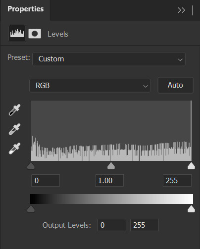
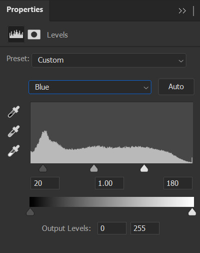
this scene is already pretty bright so i'm not going to lighten it in the RGB channel. instead, i want to wash out the yellow in the whites with the blue channel.
when increasing the blue highlights, the shadows will become blue tinted as well so its important to balance the shadows by dragging that far left dial inwards

repeat that process with the green and red color channels until your satisfied
also important to note that you want your skin tones to be even, meaning not too green/yellow and not too red/blue. play around with the individual channels until you find that sweet spot
⭐ brighten your scene in the RGB channel if needed!
3. SELECTIVE COLOR LAYER 1
next is to saturate the reds in the scene and further dull the yellows with a 'selective color' layer
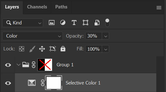
at first your gif will appear to be very discolored. you'll want to go to the 'opacity' tab in the 'layers' channel and set the percentage to 30% for this layer. like so ↴

4. SELECTIVE COLOR LAYER 2
time for the second selective color layer. this time the opacity will stay at 100%
again, just adding saturation to the reds and pinks and dulling out the yellows
i added a bit to the blacks to darken the shadows more
5. VIBRANCE LAYER
this is an optional layer i sometimes add when a gif is lacking in color. in this case it definitely needed it


END NOTES!
i just want to add that i don't always color my gifs this way. it changes with every scene i work on. a lot of the time my colorings are more complex and i end up with like 10+ layers. i wanted to keep this simple. hopefully it helped you a bit. but if you're looking for a more specific tutorial, please feel free to send me another ask 🩷
45 notes
·
View notes
Text
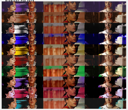
B221 // MIDNIGHT PSD PACK. a psd pack.
this pack contains 10 psds all part of the midnight series i just did. you can download them individually or the entire back. you must use the adjustment folder in order to get the desire coloring (specially leves + selective color + color balance.)
remember to reblog if you save/use. credit has to be visible on your carrd/doc if you use. (reblog, not like. please.)
consider donating through paypal or buy me a coffee through ko-fi.it truly helps me a lot. i am currently in the need of some cash so if you can spare a dollar, that would be great! if not, please just spread the art!
this psd pack is 13 DOLLARS VIA PAYHIP. each individual psd is 3 dollars so you would be saving 17 dollars.
THE PSD PACK CONTAINS:
midnight ruby (red based)
midnight jade (green based)
midnight eggplant (purple based)
midnight gum (pink based)
midnight red (cyan based)
midnight opal (yellow based)
midnight sapphire (blue based)
midnight diamond (white based)
midnight citrine (orange based)
midnight indigo (soft indigo based)
#icon psd#rp psd#psds#coloring psd#rp resources#roleplay resources#( cali psds. )#psds packs#i never did a pack ever so here we go#consider this a holiday pack? or just a fun pack
38 notes
·
View notes
Text
⠁ ⠀MIDNIGHT MASS ⠀———⠀ MAELSTROM

MAELSTROM is a MIDNIGHT MASS TIER EXCLUSIVE dark golden and dark blue coloring, a bit similar to my other coloring psd HALAZIA. it transforms all warm colors in red and yellow and cool colors into blue. may require some adjustments.
Our model today is soloist SOOJIN in the "아가씨 (AGASSY)" music video. congratulations on your debut, soojin! 🥳🎉
⠀⠀߸ ⠀⠀⠀⠀߸ ⠀⠀⠀⠀߸
𝟎𝟏⠁ ⠀ENGLISH ⠀———⠀IMPORTANT
1. don’t repost / reupload
2. don't reuse my layers
3. don't claim it as yours
4. personal use only
5. credits are MANDATORY
𝟎𝟐⠁ ⠀ PORTUGUÊS ⠀———⠀ IMPORTANTE
1. não reposte/repasse
2. não reuse meus recursos
3. não reivindique como seu
4. apenas para uso pessoal
5. créditos são OBRIGATÓRIOS
6. 𝗚𝗥𝗔𝗧𝗨𝗜𝗧𝗢 𝗣𝗔𝗥𝗔 𝗕𝗥𝗔𝗦𝗜𝗟𝗘𝗜𝗥𝗢𝗦 me mande uma dm no twitter
119REMIZ on twitter
DESTIMNESIA on ko-fi
#soojin#g idle#agassy#seo soojin#♱﹔coloring#rp psd#psd#rp resources#coloring#psd download#psd coloring#roleplay#coloring psd#photoshop resources#character psd#psd for icons#psd moodboard#psd template#psds#roleplay psd#soft psd#icons with psd#filter#aesthetic#rp#twitter#twitter rp#discord rp#discord#rp help
33 notes
·
View notes
Last Seen Blogs

