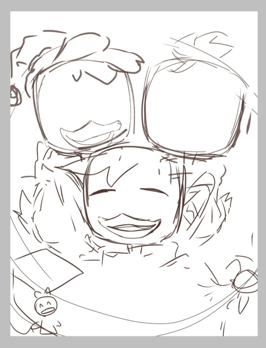
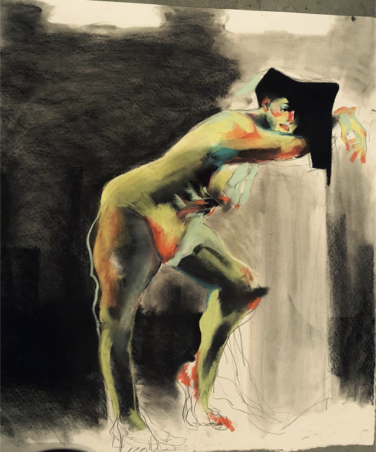
#was mostly experimenting with art styles and stylizations with this
Text
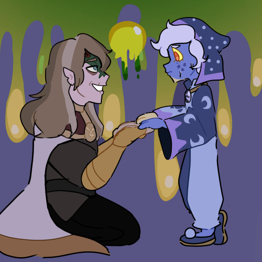
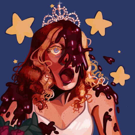
Honeyed Words.
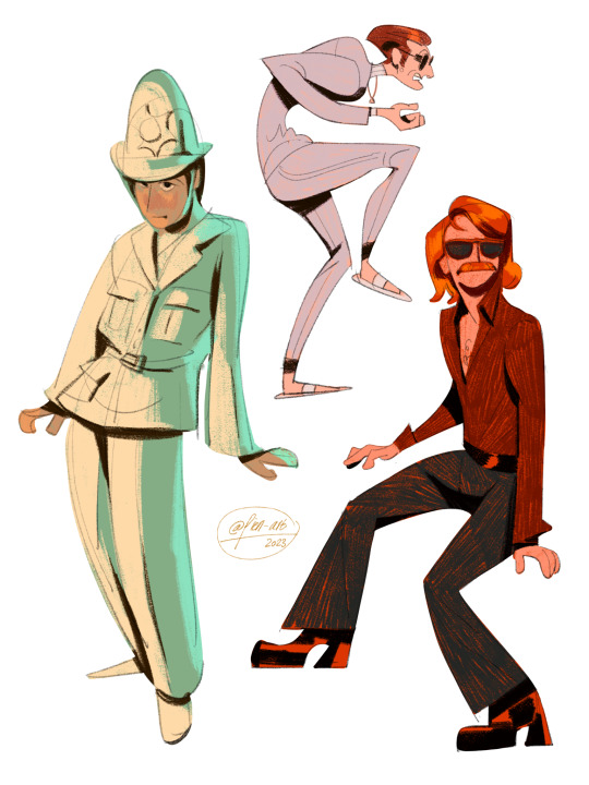
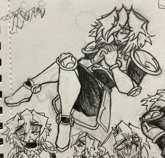
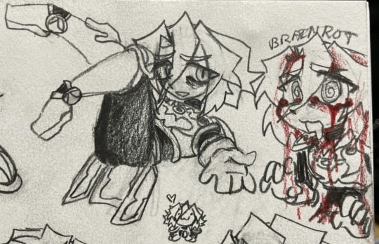
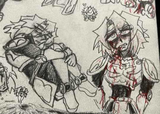
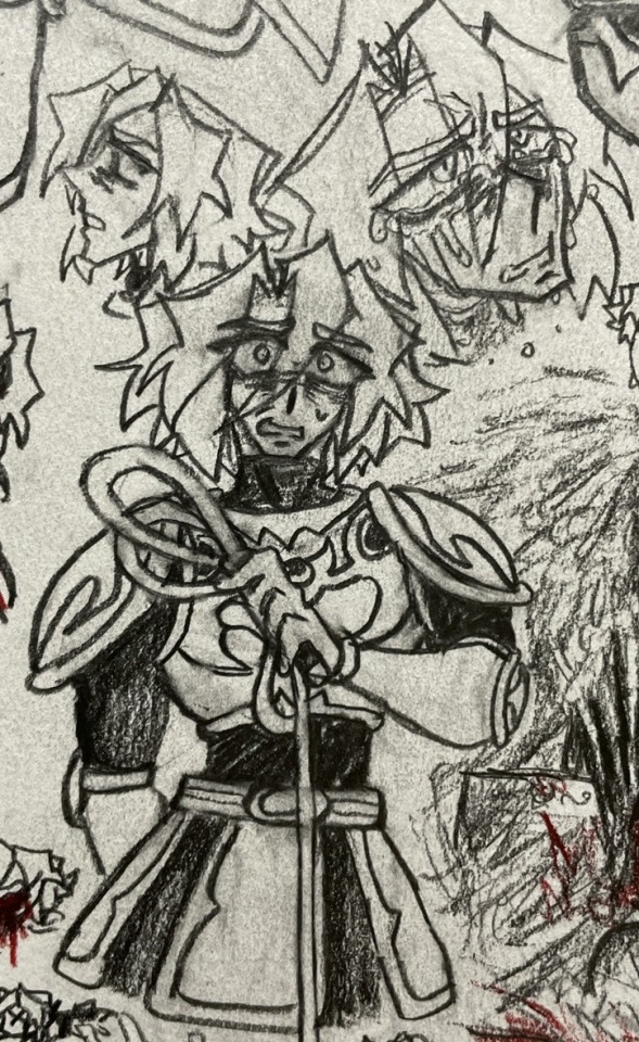
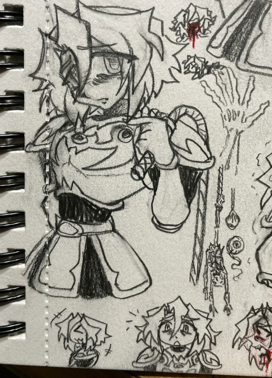
#the owl house#toh#the collector#emperor belos#philip wittebane#collector toh#belos toh#philip toh#toh fanart#fanart#was mostly experimenting with art styles and stylizations with this#honestly?#i thought belos was going to turn out like#so fucking ugly#but i think i finally nailed his design so THANK GOD#anyways local 500 year old man caught again manipulating children#he totally was gaslightly towards the collector with words of affection#like#just complimenting tge kid to keep him hooked#MANNNNNNN HE IS CREEPY#laughs evilly
242 notes
·
View notes
Text
Some movies that stylized their animation before Spider-Verse in 2018.
Fantasia 2000 by Disney in 1999. It takes CGI and 2D animation and mix them together.
The Peanuts Movie 2016 by Blue Sky's. It was mostly 3D, but the expressions and motions had 2D in them. Which is beyond creative because they only had dots for eyes and a line for a mouth. Which limits expressions, but the 2D lines they had, like when they fall or jump, really add expressions to the charaters. The background looked very flat as if the characters were standing in front of a painted scenery and were performing on stage. Super cute.

Captain Underpants 2017. By Dreamworks. Same as Peanuts' Movie. Made to look like they were in a book, and the movements were very Loony Toon style.
Trolls franchise 2016 by Dreamworks. I can go on for hours on how creative this franchise got with their animation. They used scrapbook materials to build their world. The water is fabric, the waterfall are streamers, the waves are marbles, the sand is glitter, the forest is fuzzy, the ground looks like a carpet, the fire looks like troll hair, the Funk Trolls kingdom are mirror's and reflective material, the Rock Trolls kingdom is leather, the Classical Trolls kingdom are cotton balls, it's endless creativity. They even hired a professional to sculpt a forest with fabrics and glitter so they could get an idea of how they were gonna make this world. AND they created a whole new program just to animate glitter. The same way Spider-Verse had to create one to animate Hobbie. Yeah, Spider-Verse was not the first film to do that. It was Trolls 2016. And then the franchise adds in live action and 2D animation here and there, and that makes it more unique and gives an 80s style to the film.
And then we have other films that also made their world building look unique. Book of Life made their characters look like traditional puppets in Mexico. Lego Movie made it look like toys were moving around. Like if a kid were actually playing with them. Is their any smearing in the Lego Movie? I swear every frame is clear with no stretching or smearing.
Finally, the one that I feel like deserves a lot of credit because it was the one that was experimenting with 2D and 3D animation waaaaaaaay before Spider-Verse.


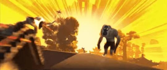
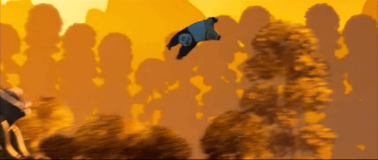
This is just the intro to the 3rd film.
Kung Fu Panda franchise 2008 by Dreamworks. The 1st film has a small dash of 2D in Shifus flash back. I think. But the 2nd film in 2011 100% has that mix of 2D and 3D. Epically during the training montage for Po and Shen. The lighting looked 2D on 3D modles. And there were times in the 3rd film where it was meant to look like Chinese art. And you see this combination throughout the entire film. The animated shorts are meant to look like traditional Chinese art as well. And they look great!
I have no problem with Spider-Verse being the one who finally broke the mold and inspired other animated films to do the same. But can we acknowledge that Kung Fu Panda was the one that was experimenting with it the most? Unless there's one that I'm over looking way before 2008. But the Dreamworks Kung Fu Panda franchise was the one that walked so Spider-Verse could run!
#spider man#across the spiderverse#spider verse#into the spider verse#peanuts#peanuts movie#captian underpants#dreamworks trolls#trolls dreamworks#trolls#book of life#lego movie#kung fu panda#kung fu panda 2#kung fu panda 3#2d animation#animation#3d animation#i really feel like people over looked Kung Fu Panda big time
211 notes
·
View notes
Note
LR is really, really good but I just wanted to say something- this is probably more about the readers than LR itself, but when it's said that LR is so much better than LO artistically (which it is!!), like say in terms of writing, pacing, and art - I think it's also not an apples to apples comparison, since LR has LO to draw inspiration from and a lot of external reactions to LO to learn from for what to do and not to, while LO is both time-constrained and (when it started out), didn't have much basis to compare to.
(The SA plotline is one example.. many criticize RS and say she shouldn't have written it in the first place but that's the thing - she actually didn't know. While I agree it's really shitty and RS has definitely ignored a lot of criticism she should take into consideration, the conclusion that she shouldn't have written it in the first place wasn't something that she knew about until after fans pointed it out. She definitely is mishandling it now, but I think writing that in at the start was born out of actual ignorance - different from her problems now, since she's now actively ignoring and shutting down the feedback she does need to get better. This blowing up educated a lot of people- probably not you specifically- and opened up a lot of dialogue for things that Rachel likely didn't have access to at the start of LO. and has no excuse for now.)
Anyway, yeah - Love Lore Rekindled, thank you for creating it! Genuinely, I do - this ask isn't meant to be a bad thing against you at all, nor do you need to reply to it.
Not a bad thing in the slightest, I honestly agree with you! The reality is that LR wouldn't exist without LO, so to try and compare them feels kind of like... it defeats the point?
Like obviously Rekindled was made with similar intentions, I'm not gonna sit here and pretend like Rekindled wasn't made out of spite over what could have been, but at the heart of it all, it doesn't exist to 'flex' on LO, really it's just to help recapture that joy and beauty that the original comic had that I fell in love with in the first place. It's only because I loved the original concept and foundation of LO so much that it exists. That's also why I call it an "AU" of sorts, as a sort of "alternate reality where LO didn't turn out the way it did" experiment lmao Mostly by maintaining the consistency in the original art style and paying off those earlier plot threads that didn't payoff the way we were anticipating or were dropped entirely. Sure, it's trying (and in some ways succeeding) to be "better" than LO, but that definition of "better" and how it's applied was what we were hoping to get out of LO in the first place.
So yeah, when people say "the art/writing is so much better than LO's!" part of me tries to take it as the compliment it's undoubtedly intended to be, but also I'm like "ack, that's not the point!! the art still doesn't look exactly like LO, I'm failing!!" LMAO I suppose that's part of the magic, but it doesn't fully align with my original goals or intentions. That's the struggle of art stylization, you can try and mimic another person's work as much as you want, but you can never mimic the them that's in their work, just like how you can't remove the you that's in yours. I want to be at peace with my own work and what I put into it, so I try not to compare them too much and just treat them as their own unique separate things (even if one of them is directly trying to resemble the other). It's okay that Rekindled doesn't look or read exactly the same as LO, but in saying that it's 'better' defeats the point of why Rekindled exists in the first place and diminishes LO's part in the process. LO has to exist - all of its best and worst parts - for Rekindled to exist, so putting LO down just to raise LR up... isn't that kind of what we criticize all the time within the comic, how it can't seem to hold up its best parts without putting down others? Why can't they both have their own things worth appreciating on their own exclusive of one another?
This is also why I generally ask people to not share Rekindled with the general Lore Olympus hashtags or post about it in the fan groups (and why I don't mirror it on Webtoons) because I just like... don't want it to come across as some "booo you like LO??? go read this instead!" type deal. I want people to be able to enjoy Rekindled as its own standalone story as an extension of LO, in the form of what could have been. There's a very thin line in the sand between Rekindled being just what it is and it being used against the fans as if it's a crime for them to still genuinely enjoy LO. I can't enjoy LO in good faith anymore, but that doesn't mean I make Rekindled for the sake of ruining that good faith in others. I was a fan too, once upon a time, so Rekindled is just as much for the fans as it is for the people like me who started off loving this comic just to be disappointed in the end and yearning for the "what if" that could have been.
And yeah, it's absolutely an advantage that I have in my court that I have the knowledge of knowing what LO started as and where it went wrong to work off of, an advantage that Rachel didn't have. It's like when I look back on my original pages in Time Gate: Reaper and think "man, I wish I had known xyz when I made these so they could be better!" but if I hadn't made them like that the first time, I wouldn't be able to reflect on them now knowing I've improved. In that same regard, Lore Olympus had to run so that Lore Rekindled could crawl. And I'm forever thankful to LO - and Rachel - for giving us something we could all connect over to such an extensive degree that Rekindled could exist at all.
#ama#ask me anything#anon ama#anon ask me anything#lore olympus critical#lo critical#anti lore olympus#lore rekindled#lore rekindled ama#lore rekindled comic
68 notes
·
View notes
Note
Hello ! I am a big fan of your art and was wondering if you could give me some tricks.
How did you come up with your current style ? Was it something you searched to developp or did it come naturaly ? If it's the first option, what made you stylize it like this ? Do you have any idea what I could do to stylize my own art ?
I am a somewhat semi-realistic artist (still learning a lot though) and was searching to also developp a more cartoony style like yours alongside it, so I would appreciate some help to understand what to do.
No need to answer this if you don't want to, for any reasons though ! Just wanted to ask you if you are willing to help me, even just a little bit :)
Thank you !
Hello. ^^ Thank you for the detailed ask and taking your time out to write it 🙇♂️.
I developed my current art style through a combination of both exploration (“naturally”) and it being something I searched to develop. In my head, I always wanted to adopt a sharper, blockier art style with bright colours. I was inspired by a lot of different styles, but most importantly I was pursuing an aesthetic I liked.
[1] Trying to introduce new elements in your art takes time, but it was mostly me staring/spending a lot of time looking at people’s art works that I enjoyed. The more you look at the things you like, the clearer the image you have of it is in your mind, so it would be easier to replicate it. The idea is to study what elements you like exactly in a style and then slowly try to transfer them into your own works. Your current style will eventually merge with it to form something that is unique. 🤔
If you are having trouble keeping the image that you want to recreate in your mental space, you can always put your canvas side by side to the thing you want to replicate, if that makes sense. Observing things you like and then devoting time to it was what helped me a lot, but patience tends to get you far in general.
[2] Stylising your own art requires a lot of trial and error. In addition to observing other people’s works, you need to have somewhat of an idea of how things can look like in your own works. If you like something with bright colours, the bright colours you choose for your own work may feel inappropriate or out of place simply because they haven’t been adjusted to your liking yet. A lot about art style is really adjusting things to your own tastes while keeping the courage to experiment. Since you have a semi-realistic style and want a more cartoony one, the idea is to squash/reduce elements of realism and increase the use of shapes that stand out.
^ For example, you can see from this style that the characters have larger, round and doll-like heads, and the colours used to fill them aren’t at all that realistic or “balanced”, more so abstract and played around with (observe how Homura’s leggings are a mixture of blue that bleed to red). If Homura was drawn “realistically”, she would instead have normal colours and her usual palette scheme that don’t seem to jump everywhere. The characters’ anatomy are also simplified, smaller and easier to shape.
The style I have is mainly reducing details on the character and exaggerating their appearance with shapes or certain features. You can choose to make their eyes look more dramatic and detailed, for example, compared to the rest of their bodies. In fact, one way of making things look detailed in a cartoon style is by grouping large shapes together for them to resemble something. You could draw rectangles for fingers and that would still be understood as long as they’re arranged in a way that gives off that impression, not necessarily being a 1:1 real life replica of it.
[3] Overall, experimenting with colours and shapes are important to the style, but it’s not something you have to simply focus on. You can make something look cartoon even just by making the composition look dramatic, which isn’t limited to colours nor shape, but more on your sense of “space” in a drawing.
In summary: you have to first know what you’re inspired by, and then work towards it at your own pace. Attempt to replicate those elements in things you like by observing them and then transferring them onto your own works. Playing with shapes and colours, exaggerating or minimising proportions and anatomy can give you different results, although it may not seem satisfactory at first. The most important thing to developing your style, ultimately, is still giving yourself time and spending time with the things you like o(^-^)o. You can’t exactly rush out a style, so please enjoy the process of drawing!!
I hope this was helpful, if even a little bit, since I’m not good at explaining things, and I’m not a professional 😭🙏🙏. Thank you for the ask!!
21 notes
·
View notes
Note
I had a similar experience with you going to "regular" art school, but partway through i stopped and took an animation program at a different university. And THAT taught me so so much about art/stylization. So maybe look into some animation resources? The thing that helped me the most was the ability to throw away drawings: to be able to do many quick sketches instead of working at one for way too long. Also, life drawing! Life drawing (with a good instructor), especially doing quick gestural studies. We rarely did poses that were longer than 10 minutes (at the other school we did mainly long poses) and i found that helped a lot.
this is actually great advice, thank you! one of the things about character art that i struggle with the most is getting that sense of movement, of personality conveyed through pose and expression - and it makes sense that studying animation would help with that. (and the throwing-away-drawings thing is a good tip too; i have a tendency to overwork things both in art and in writing.) i imagine it'd help with facial expressions and composition too.
i used to love life drawing, but since there aren't any classes near me i mostly practise by working from reference images. it's helpful for studying anatomy, but the lack of a living breathing model means the drawings end up looking kind of stiff and self-conscious:

whereas what i'm aiming for is something more dynamic and gestural. i love the character designs that @lackadaisycal-art puts out:
@pien-art also has some stunning pieces:
and @quezify has one of the sickest art styles i've ever seen. their stuff has been getting into my dreams lately

some of my other favourites (for character art specifically) are quentin blake, dave mckean, ronald searle, egon schiele, chris riddell, and tony diterlizzi
26 notes
·
View notes
Text
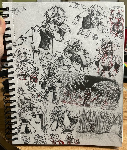
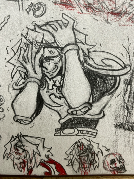


General Simon brainrot sketch page :3, as per usual, explanations under a cut. Apologies if my posts tend to be kinda huge and difficult to scroll past, I try to do the cuts to make sure they do the least inconvenience to anyone! (>-< ;)
Just the whole page in full ft. My thumb lol
Expression practice! Simon is feeling the weight of his situation rn alas :(. I’ve always imagined him being panicked the whole game; the overarching entire game timer really gives a pretty good feeling of dread imo. The two doodles at the bottom were attempts at multiple ideas I’ve seen floating around about the curse, but they’re kinda bad in execution looking at them no tbh. But the first one is based on the idea that the curse gives some vampire traits like sharp teeth and would probably lead to proper vampirism if he were to die from it. The second was general attempt at like skull practice and comparing facial features to skull structure, but oh my god the page kept smudging and I tried making it look ok with some random blood on there but it just made it look even sillier 💀.
These next two are based on two random like liminal space images I ran into on Pinterest and I drew them mostly because I suck at backgrounds and idk Simon’s Quest itself is like Castlevania: Liminal Space Edition a lot of the time, so it fits X,,,,D. The first one I really liked the composition of the path on the far side contrasted to the trees. Imagine the water is the purple cursed swamp :3. Hopefully Simon has laurels just standin around in there.
This second liminal space for Simon to be in was this neat nighttime photo of a graveyard! Trees are HARD TO DRAW, especially just in pencil and a solid black background. There’s blood on the ground and stuff cause he was just fighting some monsters, probably those two headed lizard guys. It’s the awkward stillness after clearing out an area of enemies.
The pose for this one is based on the LOL~lots of laugh Miku figure lmao 💀💀💀
Simon is very fun to put in exaggerated poses! Especially cause you have to exaggerate them more to get the same ratio of pose to negative space because muscles and armor. I had no idea how to make metal belt armor thingies sit in a like legs up floating sort of pose like this so they kinda bend a little weird but eh he looks cute otherwise. The other doodles present are one that says “brainrot” which is kinda making fun of my own dedication to an NES character 💀 and also cause haha rot like the curse. Also, teeny tiny Simon with a heart!!! :3
Yippie! Simon posing again! I think the first pose was inspired by this like random old anime style angel figure??? Idk I think she was just an original character figure and the pose was pretty different, I just used the reference mostly for the arm position. Anyway, he’s vibin, just sitting curled up and momentarily comfy. Alas, the horrors persist in the second doodle that was an attempt at showing how the curse kinda deteriorates him but he just kinda ended up having a scarily snatched waist and it looks more stylized than like sick. Also the armor kinda bends around him in a way that makes it look like it shrunk with him which is so dumb lmaooooo (XwX). I’ll have to revisit the concept eventually idk, just look at his face for this one XD. Hahaha tiny doodle based on Larval Rin on the left there, nothing to see here—
The main doodle is just Simon looking into the distance bewildered and holding the whip, standard stuff. There’s also a side profile doodle and an attempt at drawing crying again cause I was getting kinda rusty at both of those things.
Simon Belmont but if he was 2000s anime lol. A fun little style experiment, I might keep this as like another secondary art style. There’s also some doodles of a hanged man skeleton, the eyes of Vlad, a skeleton hand, and a couple little chibi Simon’s of various expressions.
More 2000s anime Simon, but in a more silly way like the art style change for joke sections. One is him just goofily holding up Dracula’s head, but it’s contrasted immediately with a more gritty usual art style doodle of him with harsh shading lol. Get you a man who can do both I guess 💀
I gotta practice more on backgrounds and composition and stuff, probably also get some curse effects consistent augh. Lately I’ve been on and off working on random things or just staring into space tired, getting back to using social media is hard and an exhausting uphill battle unfortunately (_ _ ;). Sometimes I feel like I should probably split these up into multiple posts to make things more visible and to put more focus on specific drawings, but idk I don’t really want to, it just feels weird to me breaking up a doodle page like that, if that makes sense??? Eh idk.
#castlevania#castlevania games#akumajou dracula#castlevania ii: simon's quest#castlevania simon’s quest#simon’s quest#simon belmont#art post#my art#fanart#sometimes I forget that the turtleneck addition to his undershirt was like something I added somewhere along the line 💀#seeing the actual box art and staring at his visible neck like where your clothes at and then I remember oh wait#I did that I was the one that who made him cover up 😔#ok also the hair lmaoooooooo hahahashshs prince of eternia lookin ass#Simon really out here with that fuckass bob Konami what barber did you send him to#I forget that like there’s not the sections and piecing I usually draw and that he really just has his bangs straight cut in that#I guess the way I draw his hair is like a middle ground between his manual doodles and the cover art?#yeah that makes sense I’m using that explanation of it now XD#anyway love him I’ve got another page of him I’ll try to post soon hopefully#past that is some really quick OC concept sketches and like idk dissociating#aaa I gotta talk to people but I keep losing all track of time and then can’t because of guilt augh it’s a miracle I’m posting this rn tbh#daydreaming is a horrible coping mechanism don’t do it guys I’ve been stuck with it since fourth grade 💀💀💀💀💀💀#it’s addictive it starts out like ‘time to imagine a character to this song :3’ then it’s been two months#vent in the tags#but mannnnnnn 😔😔😔#anyway here’s a whole sketchbook page of my comfort character who hasn’t seen a day of comfort in his life uh—#idk if posting at like 10 PM at night is a good idea but eh whatever
18 notes
·
View notes
Note
hai uh question
im bad at body anatomy BUT YOU SEEM SO GOOD WITH IT can you show us how you do anatomy and stuf,f,.,, it doesnt even have to be detailed i jst want a little chart.l.
KYAAA I APPRICIATE YOUR FASCINATION WITH MY ABILITY. To be honest even I still struggle with anatomy at times (mostly when I get artblocked lol..) and a lot of the time I just tend to wing it, but here are a few key things I try to remind myself any time I DO lose track of things or struggle on where things should be (also just general rules I taught myself while trying to develop a less jelly-style)
Note: I am not a professional this is just based on personal experience. I hate instagram art tutorials so erm...just consider this like some "offered tips" I gave you in a back alley and definitely not "this is the right way to draw". This is only offered for people to help with getting to a VERY generalized/over simple grasp on how to keep track of anatomy or people who want to try out an artstyle generally similar (less cartoonishly-exaggerated poportions but still cartoony) to mine.
Also I apologize if this is worded weirdly my neurodiverse traits are the inability to communicate/explain properly (usually because I go in too much overspecific detail)

Though the biggest thing I suggest is dont be afraid to look at refrences!!!!!!!! it helps a lot to analyze how the parts of the body sit when in certain positions.
For me initially, I always had to remind myself "the body parts are bigger/longer than i think they are" because just a few years ago my artstyle was more cartoony with gianter-heads and more contorted poportions (which isn't a bad thing, I'm just specifying in case there's anyone that specifically WANTS to come out of a similar place) so I had to teach myself out of my instinctive minimalisticness (because I personally wanted to get out of that)
However final disclaimer:
art is subjective, enjoy what you like, draw noodle arms or blocky bodies and flat poportions all you want. Cartoonish stylizations are not any better or worse than more realistic stylizations and this is just based off my personal experience with art and if youre interested in going a similar route about art. ^_^
#dsaf#davesport#ask#txt#art#artistry#tutorial#jack kennedy#old sport#dave miller#dayshift at freddys#dayshift at freddy's#art tutorial
98 notes
·
View notes
Note
Hey, do you have any art tips that you use or anything? Any advice?
Uhhh that's kind of a broad question! My art advice is mostly situational.
A few very very broad suggestions for you:
Use references. Your brain can only hold so much, and most images we stick in our head are symbols. Aside from a select few very impressive people, no one can photographically remember, say, a tree. You can remember a symbol of a tree [Brown and red and green, in a specific shape], but you're not going to remember off the top of your head how tall an ash tree is relative to its surroundings, how all the leaves look from a distance, etc. So, use references. This includes references for things like poses, or colors, or art styles. I've gotten in the habit of collecting things I think are aesthetically pleasing for exactly that reason.
Draw from observation or life, as practice. Kind of an extension of above, but even if you don't draw realistically, you can learn a lot about stylizing, say, a bottle, by staring at the bottle and drawing it. Same with landscapes and buildings and animals and people. Different lighting and their affects on color and things. Its a great way to learn what looks realistic, in terms of relativity -- figuring out where shadows fall, how cloth lays, that funny shape your arm makes when its pointing straight on. Another interesting twist on this is making copies of artworks you like. Pick up the prettiest watercolor you've ever seen, sit down and try to make it. You won't come close, but you'll learn a lot about what that artist thought was important. Draw This In Your Own Style memes are also good for this.
Use tracing and replication for what they're made for: building skills. They're very good tools for teaching yourself how to take things apart and put them back together again, which is how we as humans tend to learn best. You learn how to do math by learning 2+2, and then you figure out 22+22 is basically the same thing, but when you were 5 learning to count in preschool, they didn't start you out with the 22 bit, did they? Same goes for art. All those "How To Draw X" books start you out with "First a circle then some lines" for a reason. If you can break up the big bit into tiny bits, you can figure out how to build stuff from scratch. Tracing and copying art styles, coloring styles, and poses can go a long way to teaching you how to break up all those things into digestible shapes.
Draw often. There's some saying somewhere that you need to put a thousand hours into something to advance a level. So, 1000hrs to go from "I know nothing" to "Beginner." 1000hrs from Beginner into Novice. Etc. It's not a literal rule. I'm sure I've put a few thousand hours into art, but I wouldn't call myself an expert yet. But art is a muscle as much as it is a skill. You only learn how to draw a straight line by drawing 50 wiggly lines and then miraculously one of them is straight, and you feel how that line felt in your wrist and you try to make it feel that way again. You make a really nice texture by accident once and you try it again 100 times before you can consistently remember its by crosshatching there and erasing over there. A long time ago I used to swear by comics [the largest leap forward I ever made in art was when I sat down for a year and drew a comic when I was, like, 13. It had a couple hundred pages, and rapidly progressed from "I'm basically tracing deviantart wolves every pose because I can't see them in my head" to "I can pose these little guys on my own and they actually kind of look like who they're supposed to look every time!"
Uhm... smaller advice tidbits.
Play with as many mediums and art supplies you can get your hands on! Thats how you figure out what you like, and also you draw wildly differently with a brush than a pen. Its really fun to see those differences and integrate them into other things.
If you're working digitally, experiment with merging layers and drawing over them. If you're insecure about it, copy the whole thing into a new document and draw over top of it. It's really fun, lends to experimentation, and there's a lot of effects you just can't achieve by fiddling with your layers.
If you drop your pencils, you will break the lead on the inside. That's why sometimes you sharpen a pencil and it just keeps breaking until there's no pencil left. This happens especially often with colored pencils, because the lead is super soft. Protect your pencils with your life.
For every "pretty sketchbook" you keep around, keep beside it some shitty copy paper/lined paper book with a ballpoint pen. Its good for warm ups, and for getting over the anxiety of "but I don't wanna ruin my pretty sketchbook" :( anxieties
Keep a bottle of water in your art space. This is good for drinking, for spilling on things, and for reminding you you are human and have needs. I recommend one with a cap if you do watercolors, so its less likely you'll dip your rush in it.
Get in the habit of resting every hour. If you have tendonitis [like me] rest every half hour. Set a timer if you have to. This keeps your wrist from exploding, and it keeps you from randomly picking up objects three days from now and wondering why your hand just decided it didn't want to anymore.
Don't feel pressured to post everything you make online -- in fact, keep from that habit as long as you can. The little seratonin rush is very nice when people comment on your work, but if you rely on it to motivate you, you will stop working on things. I have pieces that live in a vacuum, that no one will probably ever see. Most of them art shit, some of them aren't. The fact that no one can see them and tell me they're pretty is good and healthy, actually.
Don't destroy your work. When you finish a long project, there will be a little demon in the back of your head that whispers "I have never hated anything so much as this. Burn it. Kill it. Punish it for existing. I hate it." Do not listen to that little demon. It has been starved of all your existential angst while you were Stuck In Creation, and it is hangry. Put your art away somewhere, wait a few days, a week, a few months even, if you have to. Eventually the little demon will get involved with something else, and you will look at your art and go "Oh, hey, that's not so bad actually" :)
If you wait a year and you still think its shit, objectively, it might be, but I still maintain its demon is probably just being stubborn.
27 notes
·
View notes
Text

My part of the art trade with @obi-art , with my drawing of their oc, Dulcet. But where instead of just drawing him, I decided to create a more stylized illustration, mostly to make the art trade more interesting, and for me to experiment with different art style.
22 notes
·
View notes
Text
Rushing this to print as I’ve just seen Barbie. Frankly, it lived up to the hype. Did not exceed it.
When people talk about how Continental (read: mostly French) philosophy and art movements precede American ones by roughly ten years, they aren’t kidding. Which is to say that the Barbie Movie (2023)’s fresh whip-smart metamodernist style can be found in what French surrealist horror comedy Rubber was doing in 2010.
Barbie’s plotline exhibits this through a hyperselfawareness that utilizes childlike naïveté (like Elf on five degrees of abstraction) and genre-savvy metacommentary (Existential Ken Doll Dance Offs) to communicate directly to the audience in explicit and unspoken fourth wall breaks. There is the sense that everyone knows they’re in a movie yet they’re still participating in said movie and they cannot just break the fourth wall and escape the narrative despite their knowledge that there is a narrative in the first place.
I’ve got to say that Rubber did it better. This is partially because Barbie doesn’t know what it wants to be (a symptom of a lot of metamodernist texts). One minute Barbie’s getting sexually harassed in stylized but very adult ways, the next minute oversimplifying serious subjects in some attempt to remain child friendly. I feel the other part of this is that, with all respect to Greta Gerwig and Noah Baumbach, the movie didn’t stick all the landings.
With the caveat that this is Mattel’s Capitalist Propaganda Film and so Greta had a corporate veto hanging over her head, there were some places that could’ve been improved. Chief among them was some of the messaging. The movie had a lot to say about the Patriarchy and the female experience (something Gerwig is an expert at communicating) but toward the end the movie abandoned the narrative excellent social critique and delivered the equivalent of a 30min 50’s anti communist propaganda PSA but for twitterbrained feminism. It wasn’t bad, it was just lazy, preachy writing from people who I know can do better.
The overall length should’ve been 20-30 minutes shorter, and the movie could’ve tightened things up and cut unnecessary plotlines that felt like fluff padding out an extravagant runtime that could’ve been leaned out some.
The ending (up until the very last couple scenes) itself was structurally mushy. Partially as a symptom of the Barbie Movie not knowing what it was, partially as a symptom of mismanaged pacing, but too many loose ends gave it a disorganized feeling that was only saved by a fantastic final sequence.
And that’s the kicker. Greta Gerwig is one of the best directors of our generation and despite some noticeable missteps I enjoyed the movie on both a personal and artistic level. The script is whip smart. The art direction is to die for. The film is beautiful and the performances are fantastic. There’s an extended Ken Doll rock opera song. Barbie visits the gynecologist (Twitter moment). The final sequence had the audience in tears.
Everyone’s gushing over the film already but I need to stress it’s artistic and narrative merit, and that I give Gerwig and Noah a lot of leeway because a Mattel-funded blockbuster of the year is a take the money and run once in a lifetime chance to overindulge, and Gerwigs ambition really paid off even if the landing was bumpy. For a movie with supercharged hype, Barbie satisfied me and made watching the capitalism machine print money feel better than it ever felt this side of Reagan. This is worth the watch, but there’s no need to rush to beat the opening weekend crowds to it either.
I hope they get Werner Herzog to direct the Polly Pocket Movie
19 notes
·
View notes
Text
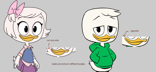
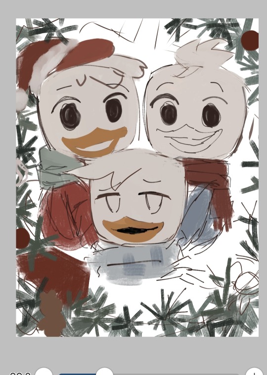
Someone asked me for a tutorial on how to draw louie duck. here you go.
I will generalize it to duck kids, or kids that look like Louie.
I use brushes that blend colors with each other. Switching between color brushes and a normal one is a crucial part in the process. Switch whenever you feel it's the right time.
If the blending is too much and you need to stay to one color, go normal mode. If your brush is fine, keep going.
Since this is a tutorial for my ducktales art, keep a cartoony yet stylized image. I do so by mixing the structuring with the "painting style". Decide on a pallete you want to try. Keep a good balance between those to make your resulting piece look pleasing to the eye.
duck children tutorial (dt17):
using my unreleased christmas art that i will post this new year's eve
step 1: make a sketch. try to stay close to the show's art style and get your basic shapes right. I don't want to repeat several other tutorials on how to draw the ducks' structure, but with sheer observation, their shapes are pretty easy to catch. You can put the character layers in a folder for better organization.
fun fact: there is a small difference between male and female beaks. For the adults, there isn't really much of a difference.
I usually start with a very simple idea sketched on my head, but as my process goes on, i think of ways to make the piece look better and more detailed. Think of a cool experience and imagine something you can make with it (my art in general).
sketch:
step 2: put the base colors (bottom layer from the sketch)
[see picture below]
Lineart is a big no for me. It's not like i can't do it, but it takes up most of my time because of my quest to make it look perfect. It is still an option, of course.
step 3: detailing/rendering. I render using the sketch layer itself, by putting color on top of it. You can shade using that method, or add in combinations of multiply + overlay. I use both. the blending modes are on the top layers.
Make sure to figure out what lighting or pallete you'll want to use ^ ^
steps 2 and 3 together: my processes don't go in a certain order after sketching. Base color below, detailing on top. It's very disorganized.
decoration detail:
the progress by this time was weird to look at. It's a part of it.
step 3.5: shadowing. You can clip "multiply layers" to the character folders for this. If you want to go for a softer-looking piece, use a softer brush, and vice versa.
knowing how to manipulate blending modes is good too.
step 4: check the piece. look at every detail to see if something is missing or you want to add something new. This is mostly for detailed pieces or if you want a background.
also the step which i am on currently:
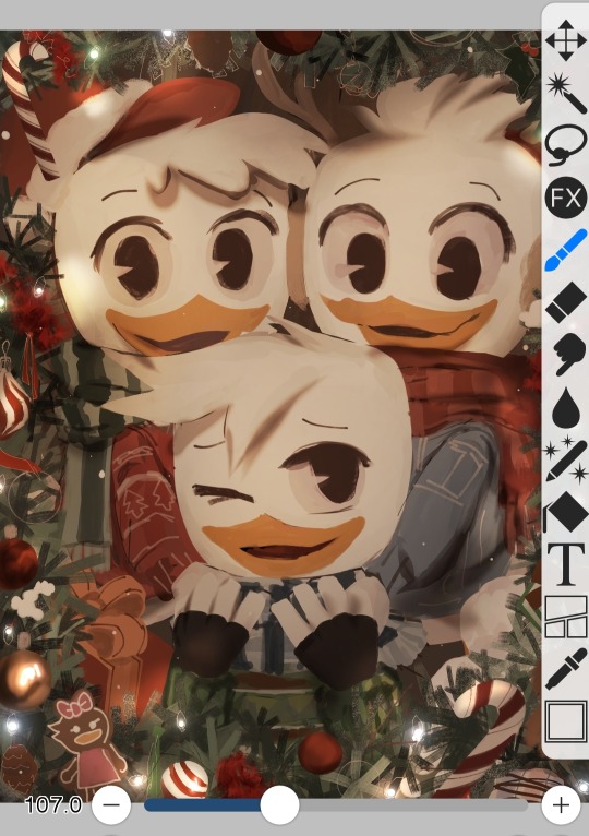
Speaking of which... make backgrounds cohesive but don't go too overboard with the details. I realized when i was making the "Louie Chess drawing". That's what kept its release on hold.
"Hold on, this is a cartoon show about ducks. maybe i shouldn't add too much detail on the background."
Well, That's pretty much it.
idk if that helped, but if it did help you, that's nice.
55 notes
·
View notes
Note
Hi I love your art style! Especially how dynamic your poses and how distinct and expressive your faces are.
For somebody currently struggling with their own style, do you mind sharing how you got to where you got? Probably lots of studies, right? 😅
Did you focus on realism and built your more stylized take on that? I'm mostly a digital artist but I have heard that practicing a lot with pencil and paper may help, do you have any experiences with that?
I'd love to hear if you have any advice <3
Hey! First of all, thanks so much! ♥
In terms of stylization, aiming for and sticking to a single style is something I've heard that some people do, but was never something I really thought about too much myself. I started by just copying the artists I liked, so in the beginning I was just mimicking another's style 1:1 for the most part. After doing that with several artists, the styles naturally started to blend together, until I was eventually able to develop a more conscious sensibility of what I did/didn't want to include, which just comes through a lot of the practice. Over the years my style has been really all over the place, from Extremely anime influenced, to western comic book style and cartoonish, to fairly strict realism, to where I am now which I think is something like stylized realism. It's inevitable that you'll go through a few styles as you grow as an artist, even if you're only sticking to one genre, and I believe it's important to allow that to happen, rather than trying to strictly force yourself to stick to one in specific. I don't draw in the styles I used to, but I think little touches of it still remain in my current one, which I think helps give it a little bit of uniqueness.
In regard to my current style though, yes, I do studies from life almost every day to help me keep a strong grasp on realistic anatomy as well as to continue to grow my understanding of it. I use references too with almost all my drawings, but then I add stylization on top of it, which is something I wasn't able to do with much success until I had been practicing for years, so don't be discouraged if this is a struggle. I will say though as soon as I began to do studies regularly, my improvement went like 500% faster than it had before; just about the only thing I wish I'd done differently on my journey with art would have been to start doing studies from life sooner. So if stylized realism is a style you're interested in, I can't recommend that enough! And even for more cartoonish styles, the better your understanding of forms and anatomy, the easier time you'll have exaggerating it confidently, tbh.
Re: digital versus pen and paper, this isn't so much related to style specifically, but even as a primarily digital artist myself, I highly recommend getting in some practice with real media too. It forces you to be more deliberate and decisive with your mark making, especially if you're using something like pen-- once the line is made, you can't erase it-- and that skill carries over to how you draw your lines digitally. I still try to do pen studies at least once a month and I think it definitely influences the confidence of my digital lines.
Lastly, I'd also say keeping some sort of inspiration board is a great tool. I have a side blog for saving pieces that I see which I would like to incorporate elements of into my own style, whether because I liked the way the figure was posed, the expressions, the artist's mark making, the composition, the interaction between the subjects, etc. There's so much like that which all goes into influencing an artist's specific style and it's really interesting to think about when you consider what you want from your own! Whenever I'm feeling a little dry on inspiration I look through my dash over there or in the folder of inspiration I've saved and it almost always helps get some new ideas flowing. Like I said, I don't think it's necessarily a good idea to focus in on just one specific style and constrain yourself that way, but to instead consider how you'd like to use bits and pieces of many styles can be very helpful to growing your own.
There's a whole lot more than can be said on this subject, but I hope this much is of some help to you ♥♥
#i've also been rereading one of my favorite books on style recently that i've been intending to post some excerpts from soon#it says a lot of things far more eloquently than I could so maybe also look for that post i make in the near future :D
34 notes
·
View notes
Text
EXCUSE ME WHILE I RANT FOR A BIT
So anyway I finally started with the graduation project and, lemme tell ya, it was annoying. I mean I expected this, but it's still annoying.
The school and the mentor wants things to be of a certain aesthetic and standard so it can fit with the general public's taste and eventually it can be picked up by a publisher. it has to be commercial and easy to digest, for a lack of better words. Which is like, the opposite of essentially what i am as a person and as an artist.
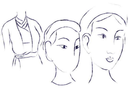
So anyway I'll be doing Truyện Kiều again, illustrating the full book with better art this time. Here are some sketches I did:


Below is the mentor's very quick sketch for demo:
Which is. Ok cool, it's very traditional, Vietnamese fine art design and aesthetic. The thing that you see everywhere in books and media. The thing that is taught in fine art school. And it's also very HIM because he's a very prominent artist since a long time ago. I'm not talking about the difference in the era clothing tho because he demoed in Nguyễn dynasty while mine is of the Trần dynasty.
My style was criticized (politely) that the face doesn't look pretty, the nose is too prominent and big, the lineart is too scratchy and loose, and that I have to restrict the freedom in my lineart more.
Which is. Like. Pretty much all the things that i like about my art the most. I don't really like drawing "pretty" people, I wanna draw distinct and unique people. I like the fact that the nose is prominent because that's a very Vietnamese facial feature. Our nose is big, flat and flared. And I like it. AND I DIDNT EVEN DRAW IT THAT BIG. it's already stylized and stuff. The lineart is scratchy and spontaneous because that's how my ADHD brain works! And I like the freedom, the raw unfinished feel to it. And my way of scrawing is kinda similar to sculpting in a way that I like to put in a block of line or shape (yang) and then erase it and putting in more nothing space (yin). And I like Maximalism and Kitsch and Neo-traditionalism so I love to do things a bit crazy and new and filled with emotions.
My mentor comes from a very different generation, and a different field than me. He's very commercial, leaning more into minimalism, fine-art conservative and traditional aesthetic. WHICH IS THE OPPOSITE OF ME. Sadly we don't get to choose mentor cos there's only one lmao.
And also I don't understand why I have to aim for publishing in Vietnam too, because that's not where my target customer is. I'm a niche artist with limited customer base and they are international clients (who mostly pay better, treat you better, and appreciate your art more than the general public in VN do). Luckily I have a bachelor in business admin so I know how to do brand and marketing myself, othewise id just keep on trying to please everyone (flexing a little bit, but i was graduating with excellence and on the top 10 of my intake lmeo). Not to mention the fact that why do I even have to publish in the first place, because this is a school, it is a place to experiment, make mistakes, and learn. It's not a place to conform to the industry to make a living. If I wanna do that I would not be here and start working for a company already!
I understand it when they said that it would be a huge advantage if you can get published, but then again, that route is not for everyone, and it's not the only way to be an illustrator like they said. I have my own path to walk on, and I don't think they are aware that we even have those paths, because they are from a different generation. I mean, that's why I was struggling so much before to find a footing, because virtually no one here knows there are other paths! I had to dig things up myself through sweat, blood and tear.
Anyway I rant but i will keep trying to fight and do it on my own terms. They can't make me anyway. There's gonna be sticks and stones, but I mean, I can't physically make myself do something I do not wanna do. There's another option which is to drop it because I don't need the certificate anyway, but I wanna finish a big project of my own too.
#might regret posting this later tho#but i doubt it because i know where i am now finally#and i know where they are too and its not where i belong#my Việt babies here probably know of the mentor if i mention his name#he is from a waaaaay different place than me#i mean this school is a commercial art school anyway#but like im cant attend fine art because thats even more far off than what i am lmao#cryptic na posting
12 notes
·
View notes
Text
How the Cogs of Toontown Online Are An Anti Capitalist Metaphor
autism be upon ye
foreword: this was written as a "fuck it, we ball, pick whatever topic you so desire" research paper for a creative writing class, with a pre-determined format to follow. as a result, my writing style may seem off here. hope you enjoy.
READ ON MY WEBSITE HERE
What I Knew and What I Want to Know
While I was both too young and didn’t have the money to fully play the game while it was still under a subscription service, Toontown Online has always been one of my more intense interests, mostly due to the charity that is several private servers that keep the game running, sticking to the original, or branching out into a modernized experience, but for now, sticking to the original game. Toontown Online was a kids’ aimed MMORPG (Massively Multiplayer Online Role-Playing Game) started by Disney in 2003 and shutting down a decade later, with a pretty lively presence in the genre during this time. The plot was basically that you played as, well, a cartoon anthropomorphic animal, and kept the world cheery and fun against the ongoing invasion of “Cogs”, which are these businessmen robots, heavy emphasis on businessmen, with all the boredom and drab that comes with such. You fight against them using stereotyped cartoon gags, because, well, Cogs can’t take a joke. Rinse and repeat this basic basis with variations of the fighting format all throughout the game as you progress, as well as other stuff to do (grinding gets boring, and Toontown Online was notorious for grinding), and you have what remained successful until it was pushed off to the side for Club Penguin.
I’ve always been much more interested in the Cogs than the toons when it came to this game. Their origins, which elaborated on with a simple flash animation within older installers for the game, are mostly unexplained. And, of course, the unified designs of just average, uncanny office workers with little variation except for head design and suit color dependent on department, are a specific, stylized sort of cool. There’s also probably something to say about my own personal experiences with work and neurodivergency and the want to be one, but that’s not the point.
The point now will turn political – despite the game being aimed at kids who could afford ten dollars a month to play, there are some specifics parts that addle to my now an adult brain, that make it think of the further lore implications, and what it means in the greater scheme of things. What do the Cogs represent? What does the war between the Toons and them mean? Of course, it’s also very easy to compare such a thing to the workforce in our own daily lives, and how big corporations play a role, reaching in, making evil decisions, and yet, giving us no choice but to consume their product. And what would I use any of this information for, to look into the implications of Cogs as a symbolism for real-life capitalism and its evils? Probably just rewording this entire paper into an essay to be posted on my website, but also, for my own fan-writings for the game, because, well, making fan content is fun.
My Search Process
The main treasure chest of information when it comes to Toontown Online nowadays is the Toontown Preservation Project, a website hosting game design documents, concept art, and much more, donated from the developers of Toontown Online while it was still active, such as Bruce Woodside. There’s also, of course, the many still-standing videos and posts on old forums about Toontown Online, as well as the gameplay that remains in private servers (mostly relevant to Toontown Rewritten, which is actually the group that runs the Toontown Preservation Project as well). The documentation is vast, encompassing things never implemented into the game, removed early or in beta testing, but for almost all of the conception, there is no use of the word Cogs to describe the Cogs. Instead, they are called Suits, and no discussion into the robotics parts, either.

However, these are not decisions that made it into the final game, and thus, could mean nothing at all in the long run. What was in the game, however, was Unites, a reward for completing a certain boss that replenished either your gags or your Laff (the toon equivilent of health), which were considered the most useful of boss rewards for obvious reasons. When a Unite was used, your Toon also shouts “Toons of the World,” and then a slightly varied prose based on the type of Unite. In addition, if you went a little bit out of your way, you could get a Speedchat (pre-picked) phrase of just “Toons of the world, Unite!”.
While if you had any clue of the book or the man behind it, you probably could’ve seen this coming, but there is something to be said of Toontown Online’s central themes and including a rip from “Workers of the world, unite” (Marx), which is straight from The Communist Manifesto. While it has never been confirmed, nor probably ever will, if the recycling from such a fundamental source of socialist theory was on purpose or merely a coincidence, it sure does work for my point here.
In addition, take into account the setting of the game, and how Toontown’s economy seems to hinge upon a plethora of small businesses, there is the obvious comparison one could make to themes of anti-monopolization. Toontown is defending itself against what the fate of plenty of smaller towns has become, which is depending on one or two companies to carry the entire area in terms of business, and while the Toon’s shops all serve all sorts of purposes (but being boiled down in gameplay to just throwing quests at you), the Cogs only have one overbearing one, so at least there’s one major reason to keep them out of sticking their stick into the ground.
What I Have Learned
What I can gather from all of this is actually pretty interesting into the accidental symbolism the Cogs have become over the years, as, in my own eyes, the unavoidable evils of a society that hinges on capitalism and the selfishness of product become more obvious. They are a stereotype, sure, but also a stripped-down truth to the place of most workers in the eyes of company – in the truest form of the word – just another cog in the machine. The robotism of Cogs can also be taken as a symbol of automation, as more of the bottom-line, repetitive work becomes shelved out by machinery and AI to replace humans, at the cost of jobs for those who do not have a specialization in anything at all, or who’s specialization has become the menial labor needed for these, such as factory work.
There’s little variation compared to the colorful forms of toonery you play as, having to fit into these molds, and perhaps, business stereotypes as the Cog types are most often named after. There is no deviation. You serve a purpose, serve it well, and that’s all there is to it. That’s your life purpose. Have fun doing that until you die.
I’m also not the only one who’s attempted to co-relate their own life to the satire situation of Cogs. During the research part, I was stumbling over some less than reliable sources of social media, and plenty of older Toontown Online players had ended up in office positions themselves, and mentioned how, in a way, they had become what they once fought against. Sometimes, this was more obviously aligned with the office positions shown in-game, with one user stating “When I was having an early 20s life crisis when the song Suit and Jacket by Judah and the Lion came out and I have a vivid memory of standing in the shower hating working at a bank and being pushed to ‘sell’ checking accounts and that’s when I had the sleeper memory of toontown cogs awaken in me” (goddessbotanic). In the system of modern life, where one has to almost kill themselves, emotionally or otherwise, just to be able to keep up with the frivalities of modern life, to keep a roof on their head, the best you can do is try and keep your tooniness alive, though only at the side.
What This Means to Me, and How I’ll Use It
I’ve always cared about little silly niche topics to try and explore like this. Though there is probably no true intention to any of the evidence brought upon the table except for really in-line coincidences, it all seems to add up to a more mature way of seeing a game I’ve cared about since my first years using a computer. I’m all too big on nostalgia – most of my best memories of technology were with the early 2010s net, which encompasses the later years of Toontown Online, as well as the earlier years of some of my other favorite games, as well as an era of content that wasn’t as dopamine-trapping and headache-causing as the modern internet feeds. Something like this is a bright, fresh light, and makes it all too easy to keep caring about Toontown Online.
Fortunately, I am not trying to embrace a grave. The spirit of Toontown Online still lives on in the form of private servers that keep the game running and available to play, and, in both spite of what made Toontown Online shut down in the first place and to avoid copyright troubles, entirely for free. The two most popular are Toontown Rewritten, which keeps to the base game for the most part for nostalgia reasons, and Toontown Corporate Clash, which adds new content and quality of life changes to change Toontown and modernize it into an all-new, exciting experience. I’ve invested a lot more hours than I would like to admit on a few renditions of these servers, but time having fun is not time wasted, despite what the Cogs think.
Works Cited
Marx, Karl, 1818-1883. The Communist Manifesto. London ; Chicago, Ill. :Pluto Press, 1996.
“r/Toontown - Ever Realise We Grew up to Be the Cogs?” Reddit, Dec. 2022, https://www.reddit.com/r/Toontown/comments/zmwjtm/ever_realise_we_grew_up_to_be_the_cogs/.
Luthin, Stefanie. “The Unique Anti-Capitalist Journey of Toontown Online.” VGA Gallery, VGA Gallery, 24 Mar. 2022, https://vgagallery.org/vga-zine/toontown-anti-capitalism.
Woodside, Bruce. “Toontown Preservation Project.” Finalized Suit Turnaround -- Toontown Preservation Project, Toontown Rewritten, 28 Aug. 2022, https://toontown.online/Finalized- Suit-Turnaround-4393ef3db89341638e8a55242b79ee0a
Toontown Preservation Project, Toontown Rewritten, https://toontown.online/
#toontown#toontown online#i have no idea how tumblr will take this but. hope you guys like big ol textposts at 8 in the fucking morning bc i have to go get ready#for class after posting this ^_^#nephro.txt#nephro.pdf
22 notes
·
View notes
Note
How do you come up with the stylization for your amvs? I want to make a sin triangle video myself of my ocs, but i can only ever picture it in the same/similar style as yours and I certainly don’t want to rip you off.
i mostly look for style inspo from other amvs n stuff
think abt the content of the video (e.g. lighthearted tone might mean more colourful vs serious story stuff might mean darker or muted colours)
experiment with different line style/colour style/art style/composition style (for example my bluestar amv some stuff was in comic book panel things)
Also i feel like black/white with lineart isn't a super unique stylization ?? Maybe the switching between black vs white bg combined with the sin triangle song is a lil more specific to my amv But I wouldn't mind if you used a similar style for your video! bonus points if you include a link back to my amv in the description or smth to mention where you got the inspiration from :)
#anon#ask#ppmpost#hope this sounds ok im a lil low on spoons#im rlly strugglin with gettin into the art stylization process of the amv im thinkin of working on#Especially cause i kinda cant decide which video concept i should actually work on LOL
16 notes
·
View notes
Note
I’ve been seeing you get a lot of Asks about your art so sorry if this is getting repetitive but I wanted to ask how you went about developing your personal style? Do you have any particular inspirations or other artists you tried to emulate with how you draw? And is there anything you’d want to change/improve on with the way you currently draw?
Don't be sorry! I actually really prefer talking about it... It gets me thinking about things I don't normally get to think about, and I also really love sharing information about how I do what I do because I really believe in making all info as accessible as possible when it comes to art!
I am gonna put this under a break tho since it got pretty long;;
1. To me, building a style is about so many different, miniscule conscious and subconscious choices. A huge part of it has to do with the act of drawing itself... Like, how heavy handed I am, how I hold my pen, what lines physically feel good for me to make. Drawing is a stim for me, so all that stuff really matters. It made drawing a very physical thing. I like doing heavy-handed lines and ink splatters and grungy ink work because it feels good to do in real life, and also it looks cool. I can also replicate it on a tablet.
This is why even though my style might change slightly depending on what I'm drawing, there are still certain things that are consistent throughout:

So as well as using elements of things I liked in other people's styles (things like eye shapes, face shapes, etc.), being able to figure out how I liked drawing traditionally and experimenting with lots of different kinds of art supplies and methods of making art really helped a lot.
2. I spent a few months trying to draw like Gerald Scarfe in college... Though before that it was Egon Schiele... And in 6th grade I tried to draw like Jhonen Vazquez... And in 5th grade I tried to draw like Jamie Hewlett....
...
I think I'm pretty happy finally being able to draw mostly like myself, now.
Not that I don't get inspiration from artists of course... I'm still inspired by all those styles, as well as other artists I see on Twitter or Tumblr or while I'm around vending. I think it's important to surround yourself with the things that inspire you, especially if those things are coming from other artists. I just don't find myself emulating as much as I used to.
3. YEAH there's TONS of stuff I wanna get better at. I know I said this before but backgrounds and colors are two big ones for me. I have my safety color palettes, but I need to find more. Also backgrounds suck and I'm bad at perspective. BUT I'm trying to force myself to draw them more.
...Coloring backgrounds is double hard...
I also want to be able to make more interesting comic pages... and I need to get better at writing comics... and I also need to learn how to flat properly and quickly so I can do it for money.
I'm also slowly trying to get better at drawing stylized animals, but it's not a main focus yet.
Also I'm trying to improve my printmaking skills, since I'm not very good at relief carving yet.
Also I want to learn how to paint someday.
That last one's mostly out of spite tho.
20 notes
·
View notes
Last Seen Blogs
eclipse-strider
Big Oof

mukul18d
Untitled
cassedyevihtt
Cassedy's Main Plaza

thebonnetsimmer
The Bonnet Simmer