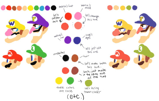
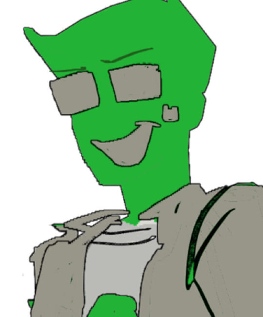
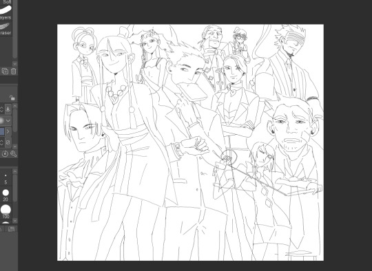
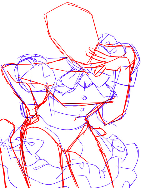
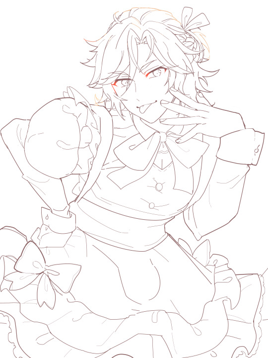
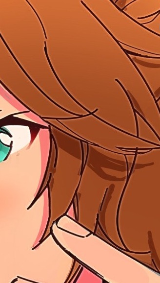
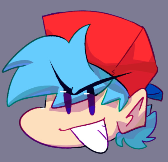
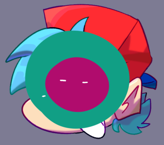
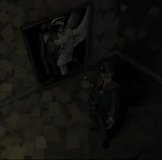
#i dont usually use lineart but i did in these so
Text
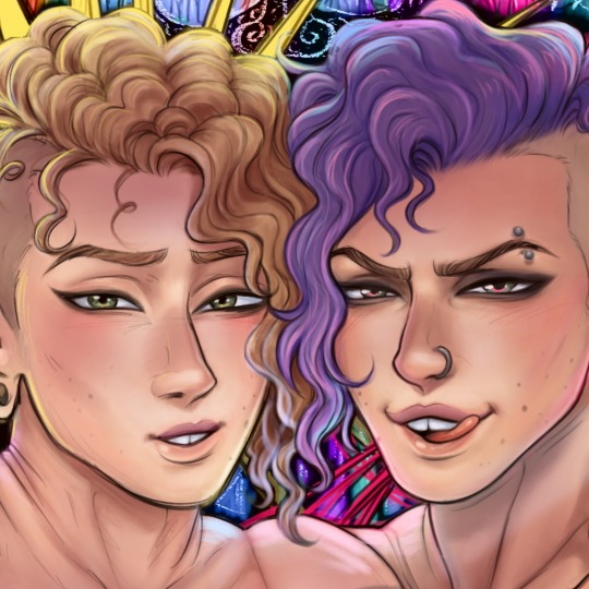
“At least I didn’t loose my golden fiddle to some Hillybilly in Georgia”
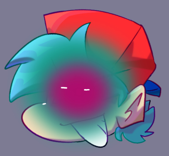
I heard this audio and immediately thought of @tswwwit ‘s familiar au. This just Feels like the kinda shit Dipper would find out and use as ammo in their argument’s and I mean come on. Golden Fiddle? We already know Bill’s musically inclined! Who’s else would it be?
#this was literally like done in a day#i wanted to try smthn new too#i dont usually use lineart but i did in these so#idk how i feel about it#i also didnt use any references#at all#so#def not my maximum effort#but i wanted to get it down and out and it looks alright#bi.f.art#bill cipher#gravity falls#human bill cipher#billdip#dipper pines#gravity falls au#tswwwit’s familiar au
260 notes
·
View notes
Note
Hey seiishin, I'm a beginner artist and i was hoping you could give a full tutorial on how you color?
hello! this is a bit of a hard question to answer since i dont think giving a tutorial of how i colour without learning any foundational colour concepts first would be very beneficial, so i'll try to give you some basic tips on picking colours instead since this is a very VERY expansive topic and im simply not the kind of person that can pass on that knowledge very well especially since im not the best at it lol
when im picking colours for my drawings, i try my best to "unify" the colour pallet so that it seems more cohesive, this tip from ggdg sums it up pretty well i think
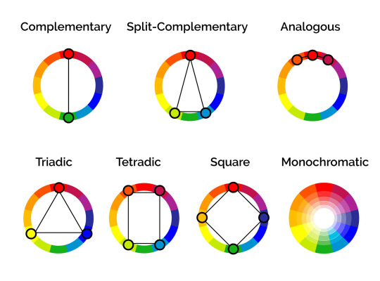
other than that, i usually try to pick colours that generally look good together based on different colour harmony concepts, like these!
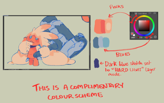
i'll try and show you an example with something i'm working on right now. you'll notice i didn't colour pick tinkaton's colours from its art and went for a warmer pink and saturated the blues of the hammer a little.
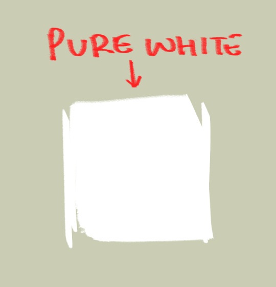
you'll also notice the canvases i draw on are NEVER pure white. this isnt to say pure white is something that can never be used but white is a colour that usually influenced by surrounding colours, so pure white in most pallets just wont look right. so its not usually a colour i would use as a backdrop if youre trying to pick good colours for your art. but again, there's always exceptions and this isnt a hard rule. here's pure white compared to the colour my canvases usually start with
another thing i should touch on briefly is colour relativity and the importance of value and saturation.
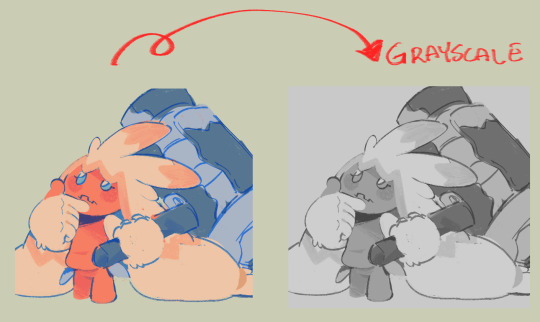
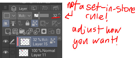
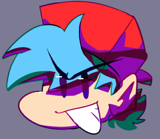
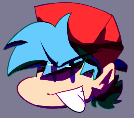
value is SUPER SUPER important for making sure all the colours in your art stand out from each other and read clearly. as you can see here, most of the values here stand apart from each other, and i can see that i probably need to adjust the darkness of the light blue in comparison to the pink hair tips, though the lineart separates them well enough already i think. this is also a good way tocheck you havent made any dark skinned characters too light. values are important guys!
hot tip: put a layer of pure black on top of your art and set that layer to "colour" and BOOM! you can see the values of your art in grayscale.
and i'll also briefly touch on colour relativity. because we percieve colours relative to each other, we usually read a colour as something its not when its surrounded by certain other colours. let's take a look at my background drawings in the cover i did for the shuichi saihara zine:
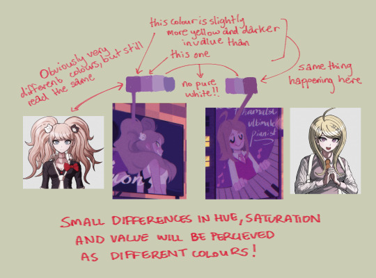
though i only used a bunch of different purples, when all of them are perceived in relation to each other, a warmer purple can look like blonde hair amongst all the other purples!
as for the brushes i use while colouring, i like textured brushes! i bought these so i cant share them for free but im sure there are many free alternatives out there
anyway, sorry if this isnt exactly what you wanted, but there are TONS of people out there that have worded this better than i ever could, i would suggest looking up some youtube vids on colour theory, but i hope these little tips are useful enough!
2K notes
·
View notes
Note
have u ever talked anywhere about your coloring or composition processes? u are honestly one of my favorite artists and i would love to hear any insight on how you make pieces 💓
wahh thank you TTT !!! I did sorta give a very simplistic answer here but it was more of my simpler sketchy style so lemme redo that, ill try to be consise and make this understandable ?? its a bit hard cuz it honest to god depends on what Kind of piece im even drawing, cuz for some i go the whole length of doing lineart flats and all that, others i just just fuck around untill it looks right?
i do usually start with a rough sketch or colour draft, especially with more compley pieces this helps with figuring out the feel, honestly i should spend more time drafting properly, figuring out poses and such but im so lazy i just go w the first thing that looks good
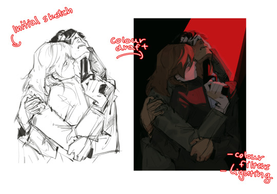
then just lines over the colour draft, fixing lots of anatomy and proportion stuff, and depending on how i wanna do the colours ill either keep the colour layers or merge them together and have the edited colours as the base colour (this might not even make sense help)
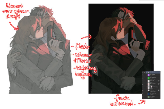
see this piece at the time gave me an insane ammount of trouble with lighting and colours, so after trying to render i ended up merging everything together....which i dont USUALLY do but the rendering is pretty similar except usually i have colours be seperated by layer,
ANYWAYS sadly i dont have a process on how it got from flats to this specific render for this piece...but i still followed my initial drafts/plans with vibe and colours and just painted over it, its why i make it after all!
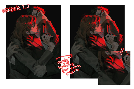
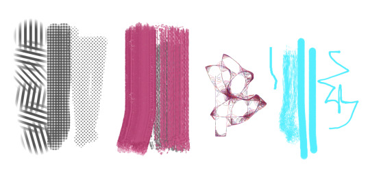
but honestly a lot of times its just very simple colours and just trying to mainting good contrast and values !!!! and THEN fucking around with colours and rextures, for other pieces i kinda just paint as i go? i have this timelapse of my justice piece that may be a bit more help!
it includes the initial colour draft, the cleanup/lining process, flats, rendering, and all that so its probs the most accurate timelapse of my morecomplex work processes, with stuff that doesnt include heavier backgrounds, which is a whole OTHER topic honestly
im sorry if i cant explain it more cohesively, i genuinely barely know what im doing most times and go by muscle memory and stuff i Know but cant. Explain? like i know how light and folds work since i observed and studied them but i cannot put it into words at all )--)0
my brushes also contribute a lot to how i render and colour, depending on what i use, you can find the swatches for them here !
133 notes
·
View notes
Text
Handy book of tips and tricks for using Krita (by a user thats used krita for a while)
HI! So i'm a krita user, and i figure since i know fellow artists that are moving to krita, i might as well make a handy guide to some of the tricks i use to snazzy up my art and basic howtos. This will be splitup into three sections: Tools, Layers, Filters. I'll also be interspersing how i used them in my art as examples!! Thisll be a two parter so hold on tight.
Shortcut keys:
P = colourpick
E = eraser
B = brush
Tools:
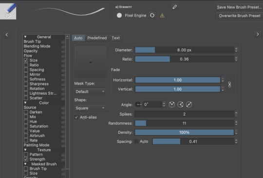
Obviously try using all of the brushes and seeing which ones you like. Krita has a myriad of handy and good brushes, and you can even make your own if you feel like it. I personally like to modify the rectangle eraser to a normal brush and using it, before i modified it a little more to be my own brush.
You can change the settings of the brush youre using on any layer by clicking this little dropdown menu in the top left of your screen. That little three dot button by the left side also goes into more detail about the brushes in case you want to fine tune a brush to your liking.
Personally, these are the custom brush edits ive used to make my art just that bit crunchier. As you can see, theres a lot more options you can tick and mess around with if you feel like it too.
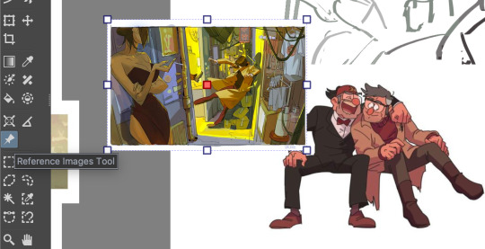
The pin button is the reference tool. If you copy paste an image into krita while the pin tool is selected, it will appear as its own image above all layers that can be moved around using the pin tool to use as a reference. Real handy so you dont waste layers on ref images.
Layer styles
Ok, you probably know the basics of how to change layers, (its this little dropdown menu here) but did you know that krita has a cool thing called LAYER PROPERTIES??

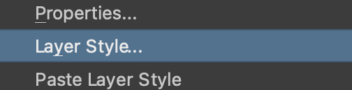
If you right click a layer and click this little button here..it should bring you to this handy menu with styles! These are really useful
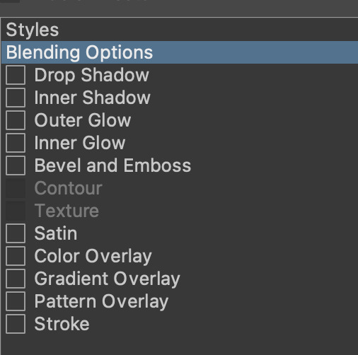
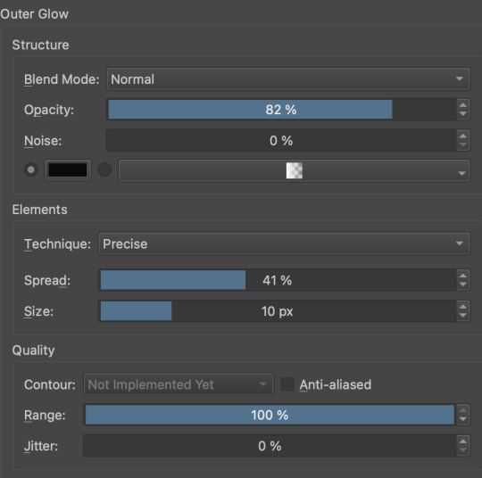
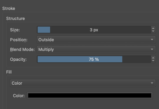
Now, i used to usually use outer glow set to these parameters to give the illusion of lines (and this is how anime artists usually line their very delicate pieces of hair and stuff), but i found an even better way!!
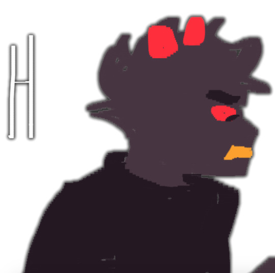
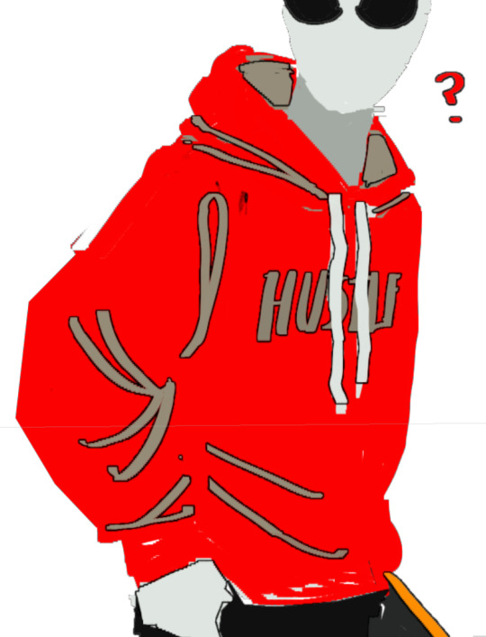
Its called stroke, and you can just modify it to be as thin or thick as you like. I recently used it for these two pieces, because its more precise, and used across multiple layers makes your work look cool and like you gave a damn about lineart. This is especially helpful if youre a stubborn son of a bitch that isnt going to to take the time to line your lineless work, or if you want to line really small items like string on shoelaces and not have it look messy (just set the colour to white and draw as usual.)
PART TWO
64 notes
·
View notes
Text
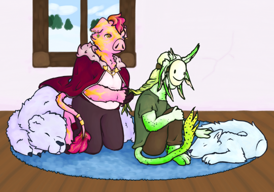
My gift for the @technoblade-gift-exchange !! i was assigned to @simplepotatofarmer who asked for dsmp rivals duo. i hope you like it Loyal!
rambling about headcanons, designs, and my process and stuff under the readmore, because i wanna talk about it but dont want the post to be super long !!
i had originally planned to not have a background and then at the last second i decided to speedrun drawing one in a few hours so um. quality difference but its fine. also unrelated but im pretty sure everything about how i draw animals and anthros makes it very obvious i used to be in the warrior cats fandom lol. anyway onto the designs!!
the gold on techno is scars from the totem at the execution, which i think is a pretty common thing for techno designs. he isnt supposed to be a piglin, but rather similar species of anthropomorphic pig. also his mane and tail fluff are naturally brown but he dyes them pink ^_^ so cool !! um. i maaayyy have forgotten the crown until i was way too far into the piece to add it. haha. oops. pretend its missing because. uuh. hes in a casual outfit. "but he still has the cape" yeah its comfy. "but dream has a mask thats not casual" dream is dream he does Not relax fully ever. see entirely intentional i would never make a mistake.
dream is an original shapeshifter species i came up with because i couldnt decide what i wanted him to be. i havent decided on a name for the species yet but i plan to make almost every solid-color or nearly solid color mcyt into this species. theyre mostly involuntary/unconscious shapeshifters. so like they change slowly over weeks or months to adapt to their surroundings, with little conscious control. basically i wanted him to be like five different things so i shoved them together lol, rabbit ears but in a pattern that looks like an axolotl, a cool tail, TOE BEANS tho you cant see them. this was actually the first time ive ever had a dream design im happy with so thats really nice.
i um. i made full use of my time lol, i spent a bit over a week on the lineart, another week on the coloring, and maybe a week and a half on rendering. unless i suddenly became shit at math(which is possible) that adds up to roughly the amount of time i had to work on it. im really proud of myself actually since i usually take a while to do art, and i wasnt sure i would be able to make something id be happy with in this amount of time. but i did! woah!! this was my first time participating in a fandom gift exchange and it was so fun, and also helped motivate me to draw more instead of getting distracted like i usually do (classic adhd moment) lol. anyway super cool!!
Loyal if u decided to read all this for some reason then again i really hope u like it!! u are so cool and i really love ur rivals duo opinions and creations so i hope u like this! i know theres been shit happening lately, i hope ur doing ok!!
#technoblade#dreamwastaken#rivals duo#dream smp#dreblr#technogiftexchange#<- thats the tag right?#also wow i think i said too many words. i dont think anyone else rambled that much about their gift. um. in my defense the only thing more#powerful than my written language learning disorder is my adhd and autism. so. yeah. lots of words.#aaaaaa i feel like how i wrote everything is so awkward. i am just a creature imitating others i have no idea how to interact with people..#hmmm. posting now before anxiety gets the better of me!#edit: wait fuck i forgot my art tag. how do i ALWAYS forget my art tag.#chara makes things
150 notes
·
View notes
Note
Is there a genre/story you want to do for your future webcomic?
I think your use of color is fantastic! Do you often rough in colors before finishing your lines? Was peeking at the wip you posted, and was curious about your process(👀👀👀)
my planned comic story, if I ever end up working on it, is gonna be fantasy, horror, tragedy!
These three are my main characters:


And Maheloas is currently getting a redesign because I want him to be more asymmetrical but jfc its hard. I'm capital S Struggling.
And thank you so much!
Hm my progress really depends on how serious I take the drawing I work on and how easy it is for me to draw in that moment!
For example for that one og trilogy AA fanart I did recently I only did this very rough sketch here:

and then I went into the lineart already without doing a clean sketch. Or I guess in this case my clean sketch is the lineart lol.
So for this drawing I didnt do any color blocking at all!

I then colored everything in. I usually just pick whatever color feels right so during this step I usually dont even fix much at all unless its super off.
And then I start adding effect layers.
For this one the amount of layers I put on top is very limited as I wasn't trying to do any crazy mood setting so this is what I did:

I usually put a light beige color on top of my drawing and then try out various layer settings and copy and paste it and then I play around a little with gradient maps, this purple to orange one being my favourite. Then at the very end I add a paper like texture on top and put it on 50% soft light to get that grainy look.
Since you asked about me doing the color blocking in my wip, I usually do that when I draw something that is more out of my comfort zone to establish the shapes or when my sketch is becoming too incomprehensible for me so I need something to tell things apart.
I hope this was helpful and thank you for the interest in my progress! :]
27 notes
·
View notes
Note
the- the way you line details with white????!?!??!? its so pretty ;v; where did you get this idea from?
hahaha thank you !!
i think it started with this drawing from december iirc?? i accidentally set an overlay to "add" instead of what i was meaning to use, and it came out as this highlight thing instead which i found i kind of liked

eventually it evolved into like what you see now <3 its really subtle above but now i really like to use those bright highlights in places that you would usually see dark lineart!! it makes a really great contrast in art (at least i think so) :D
i dont often see people using highlights this heavily but!! whenever i do it makes me so happy bc i think its such an underrated tool fr <3
#ask koko#thank you for asking!#kaede akamatsu#probably my favorite kaede drawing ive ever done :)#also!! sorry there is a lot of asks in my ask box i will get to them at some point sorry its just kind of overwhelming sometimes
114 notes
·
View notes
Note
I am all about constructive criticism. I mean, how am I supposed to get better at writing/drawing if people won't be honest with me and give me tips to get better. I personally think that people who can't take constructive criticism aren't very bright. How are they supposed to get better at things if they don't listen to others who are just trying to guide them?
Also, I would love some more tips on how to make the shell better. If you are willing, of course. :)
I am horrible at drawing. I usually have to trace things to get a decent drawing. (For instance, I traced like five different things to make Mikey a pony.)
I'm so much better at coloring than I am at drawing. My writing needs work, too, but I'm getting better.
First of all, can I just say that you shouldnt worry about tracing art to improve your own (as long as u aren't posting it as soley your own but thats a whole other rabbit hole) I did too! It helps build ground work for a good understanding of anatomy and poses.
However there are a few holes in tracing. Forst of all it is quite limiting in the outcome of your work, as your art is stuck static in one pose. this can alkost hinder your ability to see things in '3D' and visualise objects for multiple angles. it can also lead to 'skin wrapping' , which i think is the hole you fell into here (and also a term i just made up now)
with the shell, you only coloured it within Mikey's trace lines - this caused the shell to loose a lot of its mass - making it look, quite frankly, not like a shell.
a way to improve on this is to look at more references of Mikey's shell in the show and its shape from different angles. this can help you get a good idea of how it should look, and it is a good idea to practice drawing it from these angles. this will improve your ability to think in a 3D space, (which is so darn hard, but seriously useful)
however, and you may have noticed this yourself, when you add new additions to the figure, the line art just doesnt line up! the line quality is different!
This is because the line you have done for the addition is Your Line. And we love your line.
so lets make the rest of the traced lineart fit into your style, instead of you fitting yours into theirs okay?
You may notice that when you trace art, the line work is just not the same, the lines are shakier than the original and it just doesn't look as good. this is not a reflection of your skill.
It is because, usually, (at least when I did it) you follow the original line so closely that it turns out shaky, probably taking your pen off the page a few times to take a break from the oen stroke. while the original artist did that line in one sweeping stroke.
a way to fix this, and make the line arr cleaner and more you, is to instead use the drawing as a very close reference. for example:
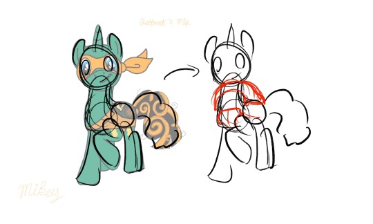
instead of tracing the exact lines of the art, merely trace the general shapes of the art. not only then do you add your own flair and gesture to the drawing, you are then more free to add more shapes to this sketch.
You can still use the reference drawing as closly as you want, but try to focus less on getting the exact lines copied, and more on the general shape. you linework wont be perfect the first time, it might be really messy compared to your usual tracing, and thats fine! you should see some of my sketches before i refine them!
But these will be your lines, theyll be smoother and more gestural, and overtime you will get better control over your penstrokes doing this.
Okay I cant really think of anymore to add here, I hope this helps! i think this was just one big word vomit lol. Keep drawing!! cause no matter what you do, as long as you are actively drawing you are always improving! dont be afraid to push yourself out of you comfort zone! who cares if it doesnt turn out the way you wanted it to? Its your art, You Created That with your Own Hands, and I think that is amazing.
<3
#asks#animal-lover-forever#i really hope this helped#its always hard for me to articulate my thoughts like this lol#YOU ARE GETTING BETTER#YOU ARE ALWAYS GETTING BETTER#art help#i hope#rottmnt#rottmnt mikey#mlp
36 notes
·
View notes
Note
how do you nail the enstars style so well... what are your ways... (only if you want to ofc im just curious if you have any tips)
hi!!
i dont know if i have anything that could be helpful, but heres my process!
first, i get the pose down
i either use a picture of myself as reference or a persons pose from pinterest ( i used multiple references for this one)
lineart:
i make the canvas huge, so i dont stress too much abt the lineart being clean enough
i heavily reference official cards, especially 3* because they have less angles and dynamic posing than 5*
i try to make it thinner and cleaner than my usual style but not too thin
outer lines are thicker than inner ones if that makes sense
i make it a dark brown instead of pure black and set it on multiply instead of normal
edges of the eyelashes are redder and softer, blush lines are always a subtle pink/peach shade
sometimes i make a second cleaner sketch before jumping to lineart, depends on how confident im feeling though
then the flats, pretty straightforward step

rendering:
i try to replicate the rendering on official cards as much as possible by keeping the references in front of me and color picking
i always make the contrast between shaded and non-shaded areas higher than im comfortable with usually because its what often makes the pieces pop (to me) and i make sure to add reflected light
i use gradients a lot, especially for hair
i make the lineart lighter in areas where the light is hitting like this
what i generally do for the eyes:
another tip is that i duplicate the lineart layer, make that duplicate into the "add" layer mode and glaussian blur it to give that lineart glow effect you find in cards:
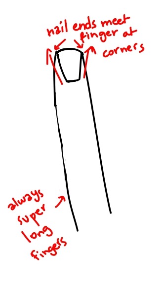
i also noticed this is how nails tend to be drawn and i kind of adopted that into my own artstyle because i love how it looks:
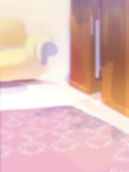
-lastly for the background, i used the ingame dressing room as a reference, did some blocks of color to express it and blurred it so i dont have to bother with any details because im lazy <33

-i lastly added some sparkles and stipples and a white blur around the edges to make it look more finished.
thats pretty much it! ofc take all of this with a grain of salt because im no expert HAHA this is just what i learned works from trying my hand at fake cards over and over again, so its practice too <3 i hope this was somehow helpful!!
46 notes
·
View notes
Note
I'd just like to say that I love your art! The colors that you use for some of the artworks, the way the lineart looks... all of it! I have a few questions to ask you about it though. 1, what app do you use for art? 2, what brush? The type of brush that you use for lineart gives it some sort of vibe and I'm here for it! Also sorry if this sounds a little awkward, I don't usually send things lol.

TYSM!! Don't worry abt sounding awkward, as long as you get your message across, you did well!
For apps, I use Clip Studio Paint
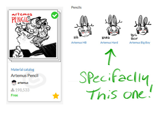
I change up my brushes a lot from time to time bc I get bored of how they feel, so idk how long I'll last w these. Regardless, i use the Artemus pencils!
it feels so cool.... and it's got tilt pressure where it gets bigger when you tilt it and gAH so good.
i dont know if you also wanted to know what i use for coloring.. but i'll answer anyway. for now i'm using these two, the rinotuna line/sketch brush and flashito!
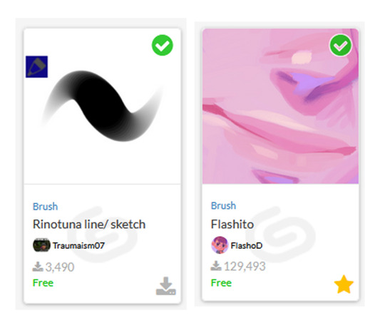
the rinotuna one is my main one, but i sometimes go in and paint stuff with the flashito. i also use a standard air brush tool but i mess around with the hardness to get what i want. i draw, add a noise filter, RGB reverb, and you get my art!
#not art#cult leader cameo#you have no idea how insane it was for me to get this question#i always asked other ppl this.... and now im the one getting asked.... so cool.......#but yeah!#if you have anymore questions about my materials. dont be shy to ask#though i think i answered everything?#who knows
28 notes
·
View notes
Note
Hullo! Do you have any tips on just coming up with designs and markings and how to colour those designs/lines without making stuff clash? You're always able to make such creative and nicely made designs and I'm curious if you have anything you get inspiration off of and how you're able to colour your marking lines so smoothly?
i would make a nice image tutorial like i did yesterday but i do Not have the time to Sadly so you get words instead
colouring lineart:
colouring the lineart is easy peasy lemon squeezy. you gotta wait until youve FINISHED the colouring to do this part. okay, so, for the characters ACTUAL LINEART, when i draw their legs & tail & face & whatnot, i colourpick the DARKEST colour on the character, whether it be in their markings, eyes, accessories, or whatever. and then i take that colour and make it just... a LOT darker! and maybe shift the hue around aswell (ex: if the character was mostly yellow/cream i'd give them orange or red lines)! and then for the MARKING LINES i take the darkest MARKING. ignore the accessories and characters eyes they dont matter JUST pick the darkest coloured marking. and then make THAT darker, but not as much as you did the actual lineart!! you can also change the hue on this :3
how i come up with designs + inspirations:
hmm well i'm going to be honest with you i don't exactly know how i come up with my designs? a lot of it just comes from how i picture the character in my head! especially if its a warrior cat design! i don't tend to stray away from those thoughts unless i picture them as like stupidly boring LOL !
inspirations is a biiit tricky, but i guess i kind of just look at a LOAD of other warrior cats animations & art, and uh! anime! lol! looking at how other people draw cats has gotten me better at drawing anatomy & whatnot, and watching various animes is why i started giving my cats hair lol! it's kind of hard for me to explain like, my EXACT process on why & how i design certain characters im sorryyyy x'''P i would if i could but literally 90& of is me drawing whatever and then thinking 'does this look good' and then saying yes or no LOL
how i colour my designs:
similarly to how i DO my designs, it's a lot of my just asking myself if it Looks Good or not, but there are a few things i do!
a lot of designs i do i jump around the colour wheel a LOT! hue wise, i mean. i think i've managed to find different ways to use every single colour on the colour wheel lol! blues and greens and purples are good for greys & blacks, blues & yellows & oranges are good for white/ light markings, red & orange & yellow & purple are good for brown cats, etc etc etc!
the other main thing is layer effects! sooo like if i draw a character but i'm not super happy with their colours, i find it hard & annoying to fiddle around and change each colour individually, so instead i make layer above the colouring, set it to one flat colour, and go through all/most of the layer options (like multiply, linear burn, lighten, glow dodge, difference, subtract, the list goes on) and find something i like! and then i usually do that a BUNCH of times with ALL sorts of different colours until the character ends up looking good!
also hi mossy !!!!!!!!!!!!!!! i hope this helps maybe? if you wanna get specific with another question, or maybe send some images (u can here on tumblr or message me where ever) then id love 2 help more!!!! this goes for anyone, i'll always accept art-help/tips/how i do things questions lol!
27 notes
·
View notes
Text
how i do my (coloring) shit
ok so literally nobody's gonna see this im just doing a tumblr post so i can compile as many fuckin images as i want
first step: do ya line art. bf from friday night funkin is gonna be our subject fo today
note: put the white highlights on a separate layer

aight you followin?
step two. ya phlat colors
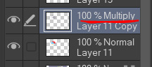
set your lineart layer's blending mode to multiply (shown in the flat lineart color as well)
while my lineart color is usually a very deep navy blue, this can also work with black
step three: make a clipping layer/lock the transparency over your line art and then color that shit to make it pop

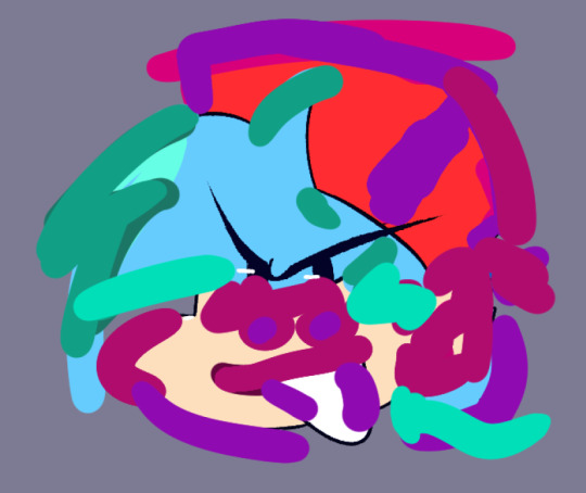
i unhid the clipping to give you a general idea of what i did to help with my color picking. i hueshift depending on what i want it to look like and go from there. if i dont like the color, i adjust the saturation and/or the value to help with that
there's no method to my madness, i just kinda do what i think looks good LOL
step four: shading time!
use dark saturated tones to help with making it pop.
here's what the layer blending looks like at normal with 100% opacity
note how i'm mixing in multiple different colors that seem to mirror the tones in the lineart! not required, but helps keep a piece cohesive. mix in different values to really help with this!
step four addendum: this is not required at all but i definitely like the look of it. take your shading layer and duplicate it. take both shading layers to 100% opacity
now gaussian blur the duplicated layer to however you want the thing to look!

and then adjust accordingly!

there's nothing i do this for other than to give a softer look to my shading without wasting my time blending it lol
step 5: highlights :3
this is what REALLY makes the colors go off

do the same thing you did with your shading to add some more interest in the highlights! you can see this particularly where i did the hat highlights
you're basically done here LOL! buuuuut... if you're feeling quirky, you can read below for some extra stuff to make this boy pop!
have fun colorin shit!
EXTRA STEPS!
extra step one: ok so bear with me. y'all remember that fuckin pizza trend? u know this one
ok well do that and blur the hell outta it
also not required but might help: duplicate the pizza layer and use your different blending modes

lineart layer uses the pin light blending option at 100% opacity, the color layer uses overlay blending option at 70% opacity
extra step two: use highlights like you're using a white gel pen on a traditional piece

bada bing bada boom. there he is. the beeper!
hopefully this was coherent enough! if y'all have any questions, rb this post and ask in the tabs OR ask in my ask box! thank you guys so much!
#art#digital art#art tutorial#coloring tutorial#fnf#fnf fanart#fnf boyfriend#fnf bf#clip studio#clip studio paint#cspaint#csp art#my art
9 notes
·
View notes
Note
I just saw that insane Sasha Nein art you did, where he’s smoking and his mom is in it. I have to say that was some of the COOLEST ART I HAVE EVER SEEN ON THIS SITE, EVER. And I saw that you said you draw on your phone?!?! I’m actually begging you to tell me what app you use pLEASE (also I have always wanted to know how to render but I don’t even know how to start is there any in progress shots you can show so I have something to go on ;U; ty)
GYAHHHHH THANKSS YOUI wwhhh… I had written more in response to this but… Tumblr crashed and deleted it so… Im trying to remember all the points i went over haha… But… Yes… I do draw on the phone with my fingers. The key? Ibispaint… Its really good. You just gotta believe in yourself…. Its rlly not that hard :)
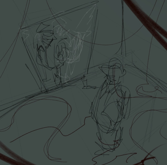
But… On rendering, i feel like everyone renders differently… It really depends on yout artstyle… But i will gladly go over my process (again(thanks tumblr)). Ill be using a different piece as an example (the one of sasha? I didnt render that in my normal way. Just kinda Drew Shapes) -
So i always.. sketch it out. Roughly. Get the details down, yes, but this part will pretty much be invisible, so it doesnt have to be perfect. (yees there was gonna be red string but i didnt like it so. Goodbye red strintg.. Sorry boyd) In this piece (and some others) i redid the sketch a few times to get everything placed and sized how i like it…
After this..? I just put in the colors under the sketch. Here, id like to get them relatively like how i want them to be (though sometimes ill just put in a single color and choose the colors WHILE im rendering)… Its Good To Keep Them Messy I Think
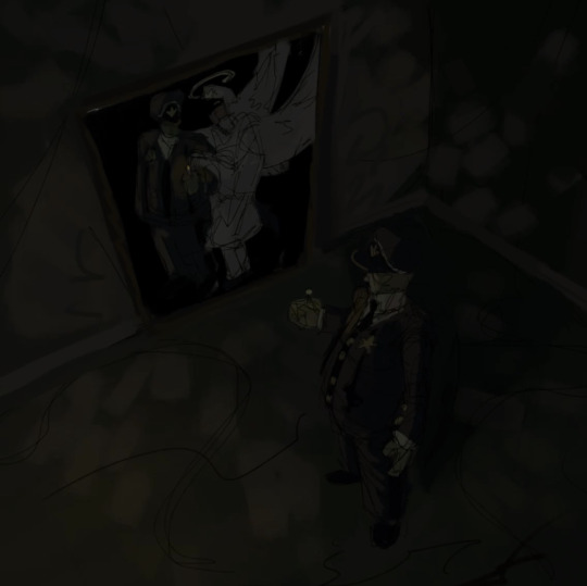
And then… I put all the layers into a folder and render it all on a new layer…. Its that simple… Some people will do it on a bunch of layers to keep all the different elements separate, but i feel its confusing and youll get tripped up in all the layers… I simply use one. Sometimes ill make a new layer if im not feeling confident about a detail, but, usually, its just one. The colors i laid down? im simply colorpicking those and making them more defined, usually blockier.. And dont worry! Its easy to move things around, having to repaint some stuff isnt as bad as you think (ESPECIALLY if you dont use lineart. I hate lineart sometimes😌)
And its done after i get alll the details i want in (sometimes, you dont need to detail everything. Focus on whats important! If you like..). Well, the drawing part is, atleast. I usually run it over with some special brushes i made to make it look more scratched up and dirty. Then i do some chromatic abberation shenanigans! And some noise. Then… Its done :)

Though… if there is one thing i must say…… You can wiggle around the hue and saturation a little while rendering it makes it more interesting and flavorful… You can wiggle it around ALOT to make things look holographic…. Oh! and keep it simple… And also desaturating colors a lot combined with the context of other colors around them can do some crazy stuff… I can make orange look like green 🕴️ (Okay that was . More than one thing. And?)
But really..:: Do what YOU want. Its your art :) I cant tell you what to do! Do all of these things. Do none of these things. Just do what YOU want to. Nothing I or ANYONE says dictates what you must do or what is correct in your expressions.
Yay!
7 notes
·
View notes
Text
my drawing process (thank you @pepper-ika!)
i draw and colour for a long long time. i don't do the traditional sketch + lineart + colour -- sketches are hard to line, they're kind of time-consuming and usually they end up better than the lineart, so i just draw like normal and clean it up before colouring. i start at the head and end at around the feet, kinda like a person showering (lol). here i'm using your typical pencil brush you can find in any standard art program.

a tip i got from another artist was to colour using a thick, opaque pen brush that varies a lot in width. it saves a Lot of time. before they showed me that, i made the mistake of using a soft, painterly brush to colour my art. it hurt my wrist because i had to press really hard to get flat colour -- when all that time i could have just been using a pen brush! also, i start with soft colours because they're nicer to look at.

2. i do colourful midtones like redness in the skin or maybe a blue five o clock shadow if they have one. from this point onward, i use a flat square-ish brush combined with a painterly smudger and a soft airbrush.
i read somewhere that you should apply perfume on the moistest parts of your body so i kind of use that same idea when drawing redness. usually i do it where skin meets skin: folded arms, a crunched back, closed hands, and that place where the thighs touch the buttcheeks, lolol. and of course: the nose, lips, and ears. it makes the skin look real and warm and lively!

3. i lay down my shadows and lights, usually in that order. and at this point, i'm throwing extra shadow on wrinkles, fat, bumps, lumps, etc. a body without rolls is like an angel without wings!
also i smudge like CRAZY here. just like how it's impossible to have "too much gravy" on your chicken, it's impossible to have "too much blending" when you're drawing skin. blend that ish.
when it comes to the colour of the shadows, i always make shadows the base colour but darker and more saturated, and i move the hue a little to the left (for example: orange goes to red, green goes to yellow, purple goes to blue). i do that with, like, every colour. i can't tell if it's lazy or not but at this point i'm too scared to ask.

4. finally i make some minor adjustments like liquifying to fix lopsided eyes or oversized heads/hands. when i was in high school, my art teacher would say "great, but watch the size of the feet, hands, and neck," lolol. he was right ofc. when i go "hm... that looks a little weird," i have to trust that gut feeling because when i do fix it, it ends up looking way better. here is a horrifying gif illustrating that.

AHH!!!
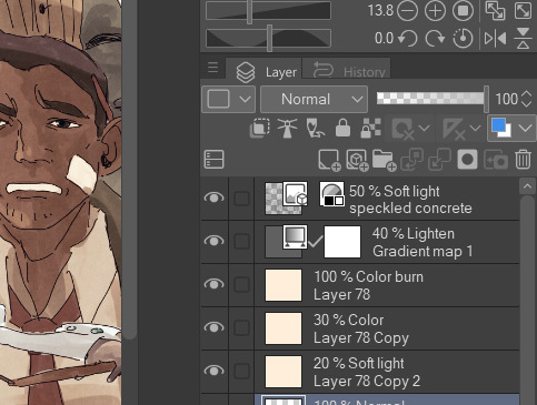
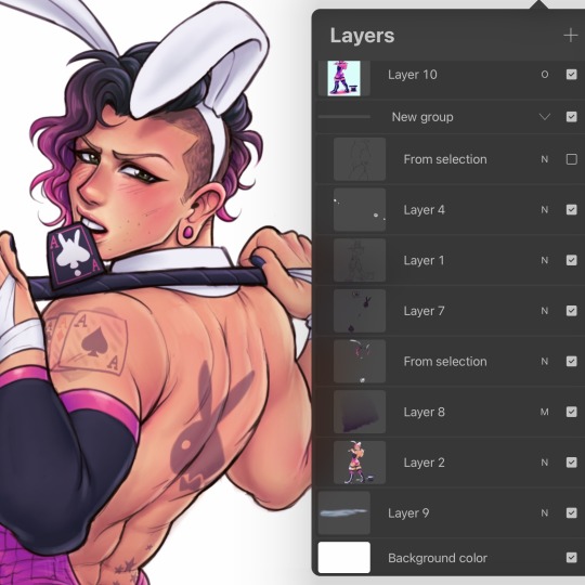
alternatively you could do a messy line and color, then do a whole paintover like i did here. this is awesome for details because you dont have to go back and change the lineart - you just paint over and add whatever you want and redraw the line to fit it.
i dont really use the different layer modes that much. in this one i used a gradient map of the drawing as an overlay. idk if that really does anything major but it does create a new range of colors to play with. i also used a multiply layer to cast a big shadow over the card (layer 8) because it has this tiiiny little pattern that would be a pain in the butt to draw shadows over. everything else is pretty standard.
(and no i dont name my layers... yes i will be changing my name and moving countries)
another thing worth noting: i use airbrushing A LOT. i remember reading somewhere that using airbrushes is like. a cardinal sin. it’s not, man. it’s great. airbrushes and smudging are dope and i use them all the time.

i hope you found this helpful! have a great weekend <3
33 notes
·
View notes
Text
kinda spoilers for magolor epilogue
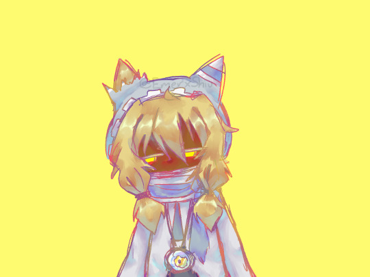
did this at 2am, it was gonna be a animation but i knew i wasn't gonna be able to keep up doing something like this for like, 10 frames or more, so i just left it like a drawing. lately i wasnt really liking anything i was drawing but damm do i really like this one, now all thats left is for me to like my next drawing and not open 30 canvas and only finish one.
i was trying to make my interdimensional magolor gijinka, he doesnt really change that much, except for the ripped parts of his cloak and cape. the energy sphere he has is also a bit broken, but i forgot to add that when making the drawing. my magolor wears one energy sphere, like a necklace, he says it's because its the brightest energy sphere he has, wich, is a lie, but im thinking of explaining this unnecessary headcanon i had come up with just because i thought it'd look cool on him and then decide to give a reason to on another post (i wanna do a comic abt it), if you are wondering about the sclera, i forgot to add it but i was already used to this drawing not having them so i just left it like that.
i also made three versions, this one is my favourite by far, but thats just because im a sucker for bright colors in drawings like these. honestly i was kinda surprised that i liked it, i usually dont shade like this, well, i do kinda but it doesnt look like this, its a bit more messy and usually combined with cell shading at the same time, i dunno how to explain, also my lineart tends to be a bit(? more cleaner (most of the time) but i really like this one drawing of magolor, probably one of my favourites on digital, and i might start shading like this more on other drawings.

i also made a desaturated one, dont really have much to say for this one, i had a vision of how i wanted the animation to look but i couldnt get it right, in fact i was originally just gonna have plain colors, no shading, but i coulnt help myself. i planned for this like, bright background and character with more darker colors, as in contrasting, but it kinda hurt my eyes when i did the background (it was a very bright yellow) and as i said couldnt get the look of magolor how i wanted. but i still like the image, all of the versions.

close up of my favourite version
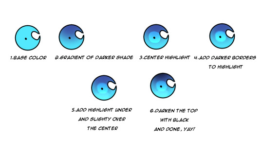
sorry for always writing an entire wall of text when i post
Jambuhbye!
#art#fanart#kirby#kirby fanart#kirby gijinka#magolor#magolor fanart#magolor gijinka#magolor epilogue#interdimensional magolor#magolormagolormagolor#kinda wish i posted this on magolor day#but i couldnt wait i really like how it came out#magolor im going to kill you#be prepared#this is a threat and at the same time not
9 notes
·
View notes
Note
heyyy! I just wanna say your art is gorgeous and I’m obsessed with it. What app do you use…? How do you get such soft brush stroke and smooth rendering? I’m working on smth right now and I just needed some tips because I’m not thar good at digital art 😭 Keep up the great work!
(sorry so so sorry for late rp mi got wintered) uuuuuuuuuuuuuuuuuuuuuuuuuuuuuuuuuuuuuuuuuuuuuuuuuuuuuuuuuuuuuuuuuuuuuuuuuuuuuuuuuuuuuuuuuh *melts*
i did posted abt brushes here and here (w working link! i checked it!)
im drawing in Photoshop cs 6 cause im old and duwwana update it im used to it i guess (color wheel is useless to mi cause i dont know theory or anything)
for smooth lines its usually smudge tool(finger? i think it calls) its set at 70-80% on a simple round brush. I use it on edges and colour blending so like when u smudge foundation w bronzer. sometimes i just draws with it(its good tool its my friend)
the whole thing is that i dont do much of a lineart aside from hands and details and it goes like this
i draw line with simple non texture brush and then i erase it till i like what i see
and i drop colour like immediately cause i have no patience and i have to see the idea of pic in order to run w it
hopefully it was informative (lol no) but hey pls feel free to poke mi more abt draw staff i want how it goes to u <3
#and thank u for ur kind words dear peachy¬^¬#ask#art stuff#sorry for late rp like for real#i got to pc and like GASP AAAAAH these ask aaaaaaaaaaaa#no
15 notes
·
View notes
Last Seen Blogs
sotrueworld
OtherWorld
wakaran-art
luke
105nt
rather snappish, but not 'rageous

noticiastucuman
Sin título
emptyhearts
human error