#colour theory
Text
So I'm reading for an art history class, and Baudrillard is talking about the trends in colour usage from generation to generation (mostly in interior design, but there's definite spillover into fashion, architecture, etc.), and how every new colour movement is a direct rebellion against the previous one, like how the bright colours of the 60s/70s were a direct response to the austerity and seriousness of the WWII/postwar era, and how a shift back to organized, moralistic neutrals were a direct rejection of 60s/70s gaudiness, etc., and that all makes sense, people find their parent's style tacky, sure
But he goes on to observe how we've now been stuck in a lull of pasty tones and naturalistic finishes for some time, and I'm thinking yes, he's so right, but that's weird, because its been hanging around for so long, like what is it rebelling against anymore? What is it answering to? Well all I had to do was be patient because lo and behold, Baudrillard provides the following sentence, which caused me to completely wig out:
"...except of course, for the spheres of advertising and commerce, where colour's power to corrupt enjoys full
rein"
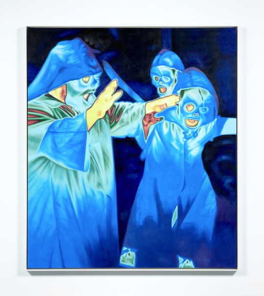
And I'm like ooohhhhHHHHHH, so this colourless minimalist wasteland of a design principle:
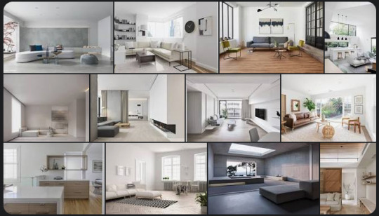
Is maybe hanging on so stubbornly because this corporate hellscape:

is assaulting all of our eyes, inside and outside of our homes, every waking second, and is tainting the very concept of colour into something we can't relax around in our living spaces.
EDIT: The reading was The System of Objects by Jean Baudrillard, 1996 Ed., Part A, Section II, Subheading "Atmospheric Values: Colour" (p. 30-36 in my copy). Even if this was a passionate spur-of-the-moment post, omitting this was pretty silly; my bad.
EDIT 2: I was trying to be chill and leave this one alone, cuz I know most people in the notes are talking to themselves and their followers and not actually me, but 11,000 notes in it's starting to get to me - yes, I am aware that decreased homeownerhship/increased renting/landlord specials/hyperfocus on resale values, are all very direct causes of this too. I totally agree. For me, those were the obvious answers; I think we all get why the owning class is serving this to us. My epiphany moment was about understanding the flip side, the psychology of the consumers who keep accepting it, and even seem to enjoy it. That's what I couldn't understand before, but now I suddenly do. (And for those of you saying such people don't exist, no one actually wants to live without colour - check the notes, bb, they're everywhere. Not everyone has the same brain as you. We all deal with the horrors of capitalism differently.)
#art#interior design#colour#colour theory#home dec#i mean its jsut a theory but#do you start hyperventilating at that second image#bc i sure do#also when you google ads BOY is there a lot of red#I guess bc colour theory you know
24K notes
·
View notes
Text
Getting the fountain at the new children's hospital ready for opening day.
36K notes
·
View notes
Text
ok but the way they've been on again off again for three seasons specifically shrouded in the colours of the swedish flag - showing us the monarchy has intruded on their relationship. even the good, even the private, and always, always the bad and the ugly.
💙💛
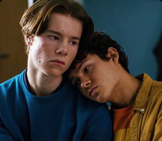
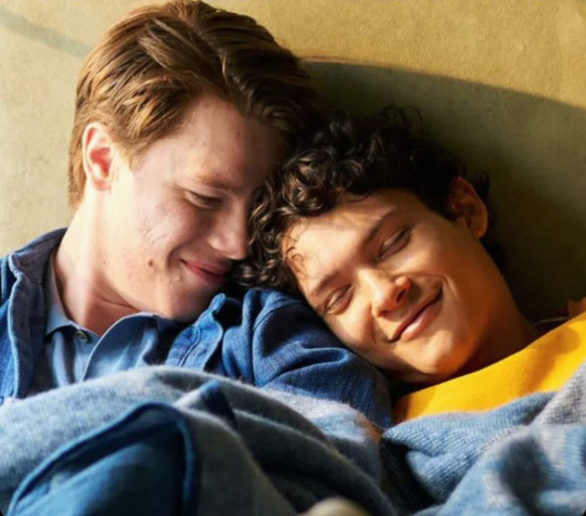
makes this white flag moment of surrender even more powerful. they're stripped of this blue and gold brushed over them by society, colourless and allowed to create their own existence - together, a blank slate. themselves, again and only - forever.
🤍🤍

#I know you've missed me xoxo colour theory lili#young royals#Young royals analysis#Colour theory#Young royals s3#Young royals season 3
2K notes
·
View notes
Text

From the combined braincell of @animeandbooksarelife and I, bc she is incredibly good at words and very good at cohesive narrative, while I sure do know how to draw.
It took me so long though, you can see my art skills substantially develop and also my artstyle change. It's actually really neat if you ask me.
#colour theory#who's she?#art#silmarillion#tolkien#aredhel#eol#Maeglin#my obsession with aredhel's 100% canonical divorce continues#by divorce I do mean divorcing Eol's head from his body with an axe
488 notes
·
View notes
Text
data collection 2: electric boogaloo
#tumblr memes#I WANTED TO PUT GLUP SHITTO AND SHOELACES SO BAD BUT THERE AREBT EBOUGH POLL OPTIONS AREHHGSGS#plinko horse#eeby deepy#blorbo#blorbo from my shows#miette#miette sends you to jail#for ONE THOUSAND YEARS#superhell#eeby deeby elevator#its me boy im the ps5#ps5#colour theory#colour theory in the childrens hospital#childrens hospital#what#huh????#you KICK poll?????#you kick poll like plinko????#oh...OH#to JAIL#JAIL#FOR ONE THOUSAND YEARS#vanilla essence#vanilla essence actually smells so good dog#like MM#ok thats enough tags now#i lied no its not#wait...i can only have 30...? ok thats actually enough then
2K notes
·
View notes
Text
BIG leak? not really. Old old concept by the art director!

#hunter the parenting#hunter the parenting leak#colour theory#teletubbies#all jokes stolen from staff
578 notes
·
View notes
Text
putting Buck in yellow for that scene is so loud and important I can't even begin to tell you
yes its communication and all the other things I've talked about with the use of yellow
but its also the colour they put Shanon in the most, (in fact we don't really see Buck wearing yellow until after Shanons death) and in combination with the fact they sat all three of them in the same spot on the bed and the fact Shanon wasn't wearing yellow when she was sat on the bed so this was in colour theory, costume and directing speak acknowledging the passing of the batton from Shanon to Buck in the raising of her son
317 notes
·
View notes
Text
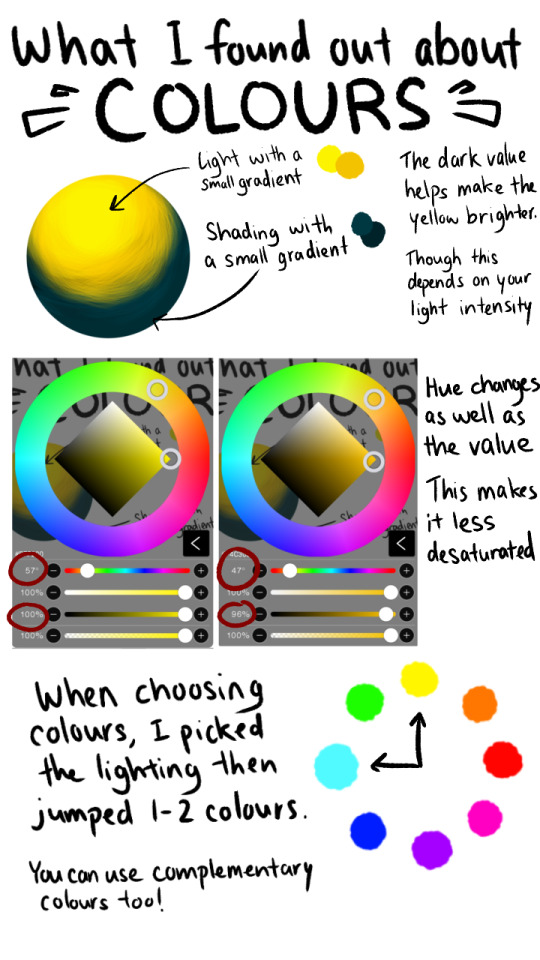
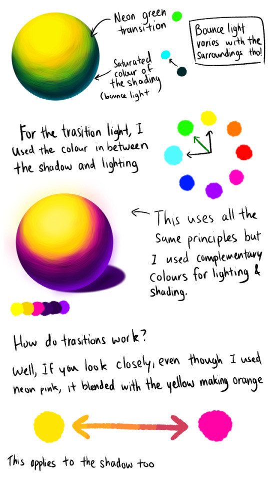
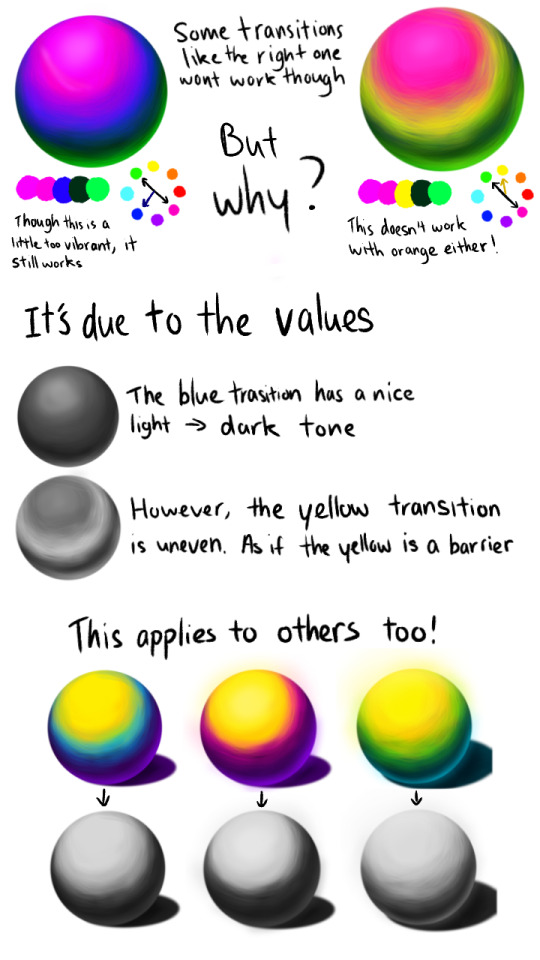
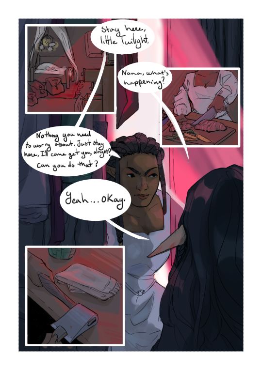
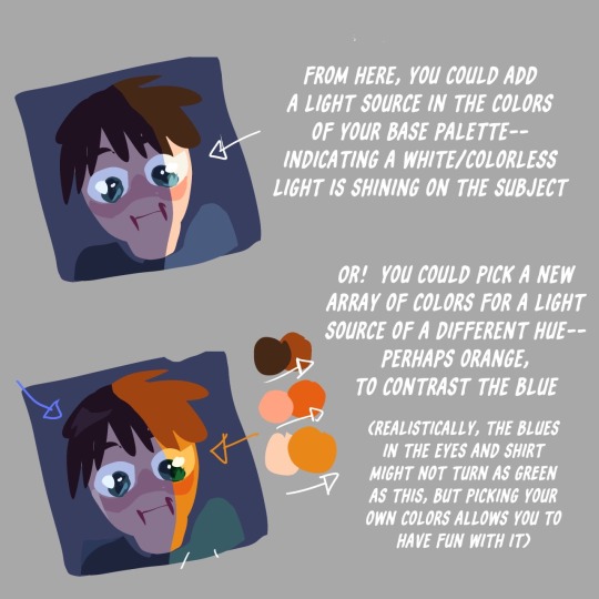
For the glowy effect I just used the same colour of the light and bounce light and just used an airbrush over it ^^
------------

You ask, I deliver 👀👀✨ @an4mations
Remember that this is just my own personal take/discovery and that it might not be 100% accurate! I'm still learning after all ^^
-
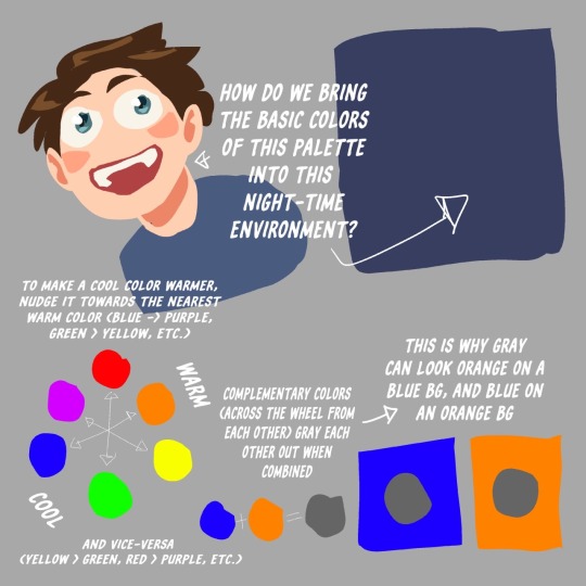
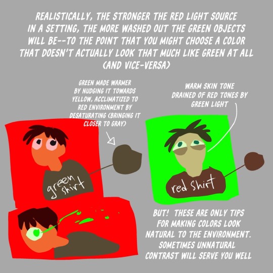
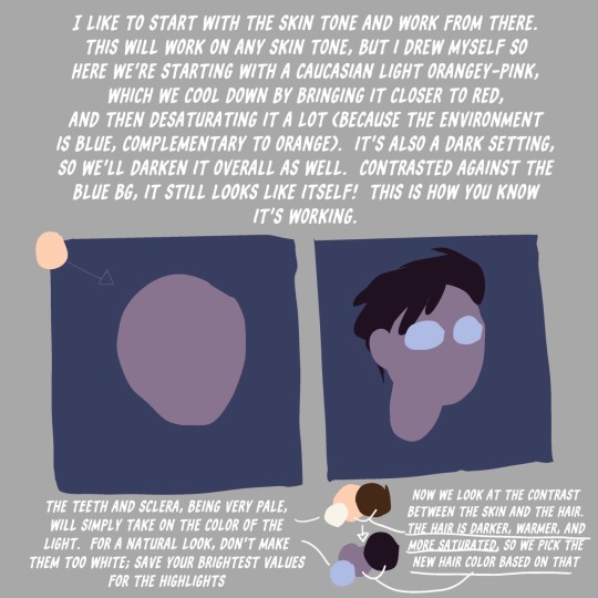
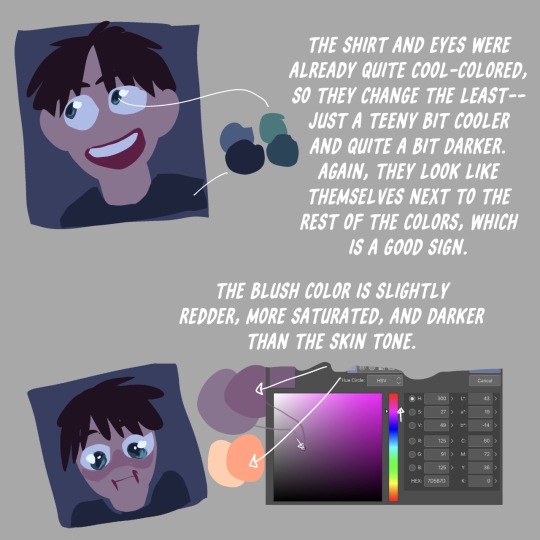
For people new to art and might not know what the diff terms mean...
Hue -> Colour (basically the original colours like red, orange, etc.)
Value -> How dark or light something is
-
#Note that this works best with neon colours ^^#colour theory#colour#art tips#art guide#art theory#colours#artist#artwork#art#artist on tumblr#digital artist#tumblr polls#polls
471 notes
·
View notes
Text
Toastyglow: “local colors!!!! relative hues!!!! listen I love a good adjustment layer they are so helpful especially when you need to work fast. but I also love picking special colors myself so here is a crash course in that–as I understand it, anyway.”
Source: Twitter toastyglow
#relative colors#art tutorial#digital art#art reference#art tips#illustration#drawing tips#local colors#relative hues#color theory#colour theory
344 notes
·
View notes
Note
Hey seiishin, I'm a beginner artist and i was hoping you could give a full tutorial on how you color?
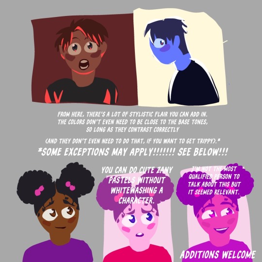
hello! this is a bit of a hard question to answer since i dont think giving a tutorial of how i colour without learning any foundational colour concepts first would be very beneficial, so i'll try to give you some basic tips on picking colours instead since this is a very VERY expansive topic and im simply not the kind of person that can pass on that knowledge very well especially since im not the best at it lol
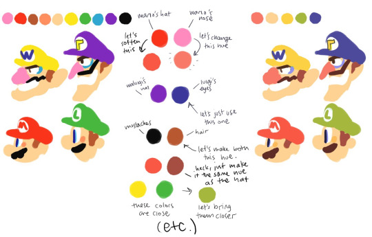
when im picking colours for my drawings, i try my best to "unify" the colour pallet so that it seems more cohesive, this tip from ggdg sums it up pretty well i think
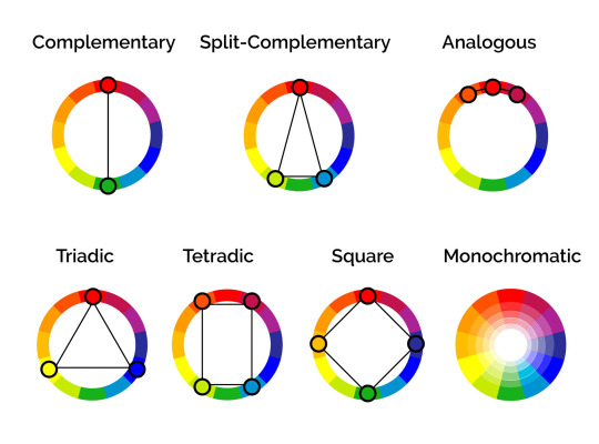
other than that, i usually try to pick colours that generally look good together based on different colour harmony concepts, like these!
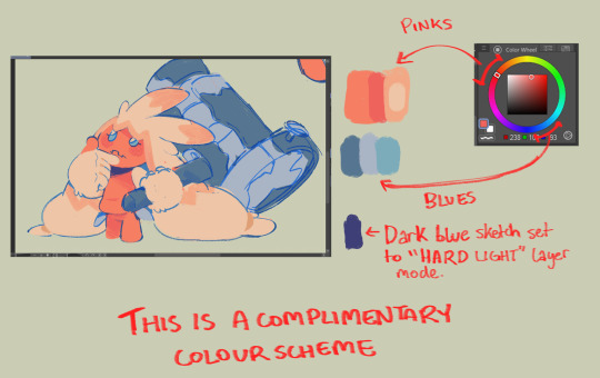
i'll try and show you an example with something i'm working on right now. you'll notice i didn't colour pick tinkaton's colours from its art and went for a warmer pink and saturated the blues of the hammer a little.
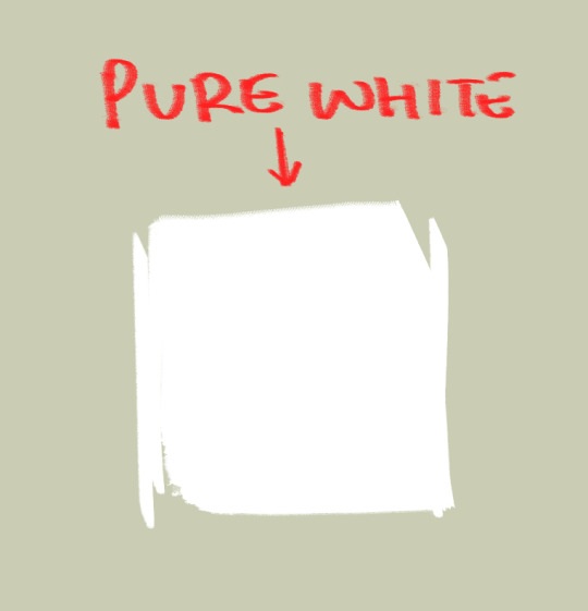
you'll also notice the canvases i draw on are NEVER pure white. this isnt to say pure white is something that can never be used but white is a colour that usually influenced by surrounding colours, so pure white in most pallets just wont look right. so its not usually a colour i would use as a backdrop if youre trying to pick good colours for your art. but again, there's always exceptions and this isnt a hard rule. here's pure white compared to the colour my canvases usually start with
another thing i should touch on briefly is colour relativity and the importance of value and saturation.
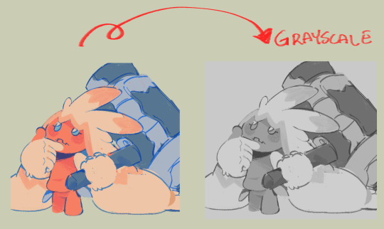
value is SUPER SUPER important for making sure all the colours in your art stand out from each other and read clearly. as you can see here, most of the values here stand apart from each other, and i can see that i probably need to adjust the darkness of the light blue in comparison to the pink hair tips, though the lineart separates them well enough already i think. this is also a good way tocheck you havent made any dark skinned characters too light. values are important guys!
hot tip: put a layer of pure black on top of your art and set that layer to "colour" and BOOM! you can see the values of your art in grayscale.
and i'll also briefly touch on colour relativity. because we percieve colours relative to each other, we usually read a colour as something its not when its surrounded by certain other colours. let's take a look at my background drawings in the cover i did for the shuichi saihara zine:
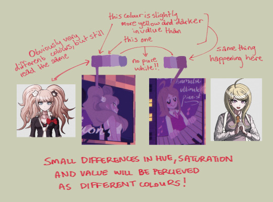
though i only used a bunch of different purples, when all of them are perceived in relation to each other, a warmer purple can look like blonde hair amongst all the other purples!
as for the brushes i use while colouring, i like textured brushes! i bought these so i cant share them for free but im sure there are many free alternatives out there
anyway, sorry if this isnt exactly what you wanted, but there are TONS of people out there that have worded this better than i ever could, i would suggest looking up some youtube vids on colour theory, but i hope these little tips are useful enough!
2K notes
·
View notes
Text
Sorry to put maths on your dash this early in the morning, but the polls to make colours are fundamentally biased, because all values should be independent to get the full spectrum. But in a poll, all values are related by the simple relation that a+b+c... = 100%
It means that most colours will not be obtainable from such polls !! Example given in RGB, to get white you would need 100% R, 100% G and 100% B. That is not a result you can get from a valid poll.
In more mathematical terms, if you project your RGB/HSV/whatever space on a cube where values ranges from 0% to 100%, the result set would be restricted to the intersection of this cube with the plane x+y+z=100. It's called Maxwell colour triangle.
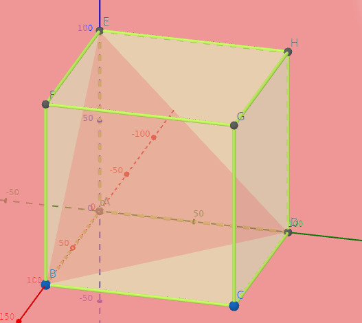
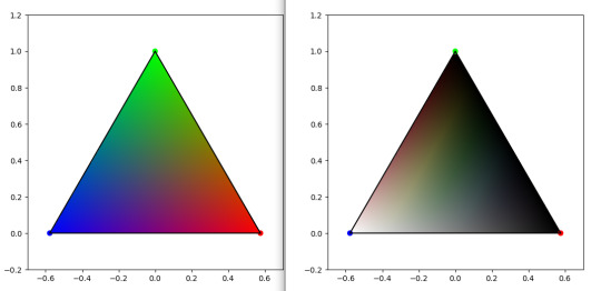
On left, Maxwell triangle for a RGB cube. On right, Maxwell triangle on a HSL cube. Plot code based on this website
So here you have it. The result from these polls will inevitably fall in these. cw spoilers I guess
EDIT : the joke about gay being bad at maths was a bit unconsiderate as it vehiculate stereotypical ideas. English is not my first language, and sometimes I would just replicate some things that I read elsewhere, but I should be more cautious. I edited it, but I thought it was important enough to acknowledge
Also edited some sentences a bit for clarity. Oh and also also : this is not inherently a bad thing, and poll makers are generally aware of this. I just want to share a fun fact !
#polls#colours#mathematics#rgb#HSL#science#maths#colour theory#color theory#color#spoilers lmao#science for your dash#please don't let me flop it took me 1h to gather all this data lol#I didn't eat because of that
2K notes
·
View notes
Text
So you’ve just had yet another instance of the Colour Theory Joke cross your dash. Do you:
1. Reblog it so you can piss and moan in the tags about how Tumblr Only Has One Joke, thereby increasing that joke’s exposure and directly contributing to the problem you’re decrying in the very act of decrying it.
2. Not do that.
2K notes
·
View notes
Text
Hi im emi and i think way too much about sk8 the infinity part 261
COLOUR THEORY TIME i just had like, a brain blast in realisation.
Reki is yellow coded, langa is blue. Usually people would ASSUME reki is the "red" character of the show because of his hair, but i think that just helps to show off his passionate and firey personality. His colour is yellow because he is energetic, friendly and most often optimistic (especially when it comes to helping people learn how to skate or make friends)
Langa is blue coded, usually used for quiet, cold and mysterious characters, or those with lots of sadness (think inside out). BUT because he is pastel blue, his sadness is lighter because of people like reki lifting him out if it. He is still young and has time to grow.
Because they are yellow and blue coded, its different from what is the usual trope of red and blue which are most often rivals or opposites. BUT because theyre yellow and blue, theyre actually perfectly made to compliment each other. I like to see it as reki being the sun to langas moon.
Now. You know who IS red coded? Adam. He is passionate and all about love and anger, the two emotions most connected to red. Because he is red, it links into his whole idea of thinking he "belongs" with langa, but he is already fulfilled by being with reki.
Then we see adams colours slowly change from red to that dark blue we see him wearing in the finale. He comes to realise that he was chasing after langa because he thought they were the same (blue = sad and hurt. Adam being a deeper blue means his emotions and sadness runs deeper aka because he has had YEARS longer to sit with his feelings and trauma) but it takes langa, a fellow blue, being happy and excited and wanting to skate with REKI not him, to show him that he doesnt have to put on this red boisterous persona. If we look at Adam through the years, he's never really had a red-coded personality. It's always an act. How he thinks people wANT him to act.
He's a blue, just like his hair and the suit he wears.
Now. Joe and cherry.
Cherry being pink is so INTERESTING TO ME. Its seen as graceful and youthful, but is also just a toned down version of red. Cherry CAN be graceful and composed, but is also full of so much anger and emotion (especially towards adam) and the fact the two are similar in colour makes me so invested. I also think Cherry has a complex colour pallet- being not only pink, but also wearing deep blues and whites. He is elegant and complex.
THEN JOE. oh joe. My deep green giant. He is down to earth (haha get it) and is always trusting his gut with everything, AND IDK IF YOU HAVE NOTICED THIS BUT HE NEVER GIVES BAD ADVICE!! Green is usually associated with grounded and level-headed characters, but green is also the colour of jealousy. Joe doesn't seem like the jealous type, but he has this strange loneliness to him. All he has is his restaurant and Cherry. He never seems to be able to fully grasp what he wants, so finds his fufillment in other places.
Now onto the fact that pink and green ARE opposites and so are cherry and joe. Where cherry is quiet and reserved, joe is loud and energetic. Their lifestyles and jobs couldn't really be more different. They argue and bicker and always seem to know what perfectly annoys the other most.
BUT!! Pink and green (while being opposites) ARE ALSO COMPLIMENTARY!!!! they work well together beCAUSE theyre so different. And being together just seems to work out somehow.
ANYWAYS. Yeah. Sun and moon coded renga are very special to me :)
#sk8#sk8 the infinity#renga#matchablossom#reki kyan#langa hasegawa#kojiro nanjo#kaoru sakurayashiki#ainosuke shindo#sk8 adam#reki x langa#colour theory#the brainworms really love using my brain as a skatepark :)
456 notes
·
View notes
Text

he's so babygirl and nobody is talking abt it 🙁
#the spot#spiderman#spiderverse#into the spider verse#across the spiderverse#spiderverse fanart#babygirlism#come here babygirl#babygirlifying him#babygirlification#procreate#colour theory#illustration
700 notes
·
View notes
Text
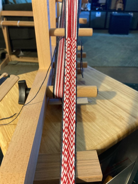
I'm calling this one colour theory
Pattern
#weaving#color theory#colour theory#inkle weaving#fibre arts#what can I say#it's my favourite tumblr joke
103 notes
·
View notes
Last Seen Blogs

whyshedisappeared
You are not your mistakes.
otps-of-an-adolescent
Main Blog for My Secondary Account.

rt-closetcryptic
Trying to start with positivity

missing-eclipse
lacrimal gland enthusiast

mostly-pov
Mostly POV