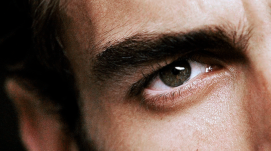
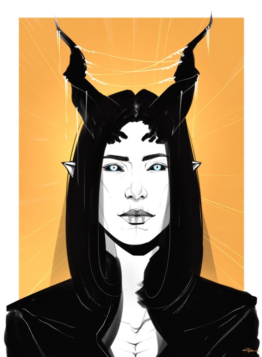
#hq tutorial
Text
GUIA COMPLETO DE COMO EDITAR FOTOS EM ALTA QUALIDADE (HQ)!
oiê, bem vindos(as)! à pedidos, estou trazendo um tutorial bem abrangente sobre como editar fotos no geral para icons, headers, etc., em alta qualidade. neste guia/tutorial trarei dicas, truques e informações gerais sobre o que é preciso para editar em hq. lembrando que o conteúdo deste guia é sobre como eu edito, a maneira que funciona comigo e meu progresso e aprendizado ao longo de quase 12 anos editando icons, ou seja, o que contém neste guia pode — e deve — ser adaptado à sua maneira e ao software de sua preferência. aproveitem e se divirtam!
nota: este tutorial está bem longo, então, se possível, veja este guia pelo pc/notebook!
O QUE VOCÊ VAI ENCONTRAR NESTE GUIA
softwares necessários com links para download;
onde e como baixar as fotos para as edits;
métodos de edição e passo a passo;
como melhorar a qualidade de uma foto;
como salvar a foto corretamente para postar;
dicas de actions e outros resources.
clique em “continuar lendo” para ver o tutorial.
1. SOFTWARE
photoshop
eu recomendo fortemente o uso do photoshop cc na versão mais recente, ou outra versão com camera raw ou filtros neurais suportada pelo seu pc ou notebook.
você também pode usar o photopea como alternativa (eu particularmente prefiro o photoshop pois acho que as edits ficam com mais qualidade). se você preferir o photopea, algumas dicas desse guia poderão não funcionar devido à falta de algumas funcionalidades que o photopea não oferece (ex: camera raw, galeria de filtros, filtros neurais e outros).
eu uso a última versão do photoshop (atualmente, a versão 25.5.1) e uso a versão paga (obrigada adobe pelo desconto de estudante!!!!!), mas vou deixar alguns links para você baixar o photoshop gratuitamente caso você não seja estudante e/ou não tenha condições para assinar um plano.
atualmente eu uso um mac mini 2014 para editar, mas sempre usei windows, então, as dicas e os links valem para os dois sistemas operacionais.
links
macos: 1, 2 & 3.
windows: 1, 2, 3 & 4.
2. BAIXANDO AS FOTOS
galerias de fotos
muitos artistas têm fansites com galerias de fotos e você pode achar facilmente digitando no google: “nome da pessoa + gallery”.
o artista que eu quero não tem galeria própria e agora? tranquilo, ainda temos galerias de fotos de famosos variados como hqdiesel, hqsource, hq-pictures e até mesmo o theplace.
em último caso você pode usar o gettyimages e usar um removedor de marca d’água ou um site como o gettyimages downloader.
instagram
para artistas estrangeiros que tenham apenas instagram e/ou não tenham fotos em galerias de imagens, eu recomendo o instagram pessoal da pessoa.
você poderá fazer o download das fotos com extensões de navegadores como o image downloader for instagram (para firefox e google chrome), ou sites como o saveig, o snapinsta ou o igdownloader.
eu recomendo baixar pela extensão do navegador, pois ela baixa a foto direto do site do instagram no computador, diferente dos sites que você precisará ir foto por foto, copiar o link e colar no site para fazer o download.
mas, caso a extensão esteja indisponível, com algum erro ou pare de funcionar, o site é uma excelente alternativa (só precisa ter mais paciência).
nos sites para baixar fotos do instagram, geralmente eles dão a opção para você escolher o tamanho da foto. você deve sempre selecionar a resolução maior da foto (acima de 1000px é o melhor).
pinterest
em casos extremos de artistas low profile, sem instagram, sem aparições públicas, sem galerias de fotos, nadica de nada, eu recorro ao pinterest.
porém, é preciso ter muito cuidado ao fazer download de fotos do pinterest, porque são muitas fotos repetidas e muitas com baixíssima resolução e qualidade.
se você for baixar fotos do pinterest, escolha a foto com maior resolução (imagens maiores que 500px já são ok para editar icons), e depois de baixar a foto, eu recomendo fazer um tratamento na foto para melhorar a qualidade dela, como vou ensinar.
3. EDITANDO
3.1 importando a foto no photoshop
apertando ctrl+o ou cmd+o uma guia vai abrir no programa, onde você vai até a pasta onde a foto foi salva. selecione a foto e clique duas vezes nela para abrir.
3.2 cortando a foto nas dimensões desejadas
muitos tutoriais de edições de icons sugerem que você copie a imagem e cole ela em um documento novo já do tamanho da sua edit, mas eu não recomendo essa opção, pois ao redimensionar a foto com a ferramenta de transformar (ctrl+t), ela dá poucas opções para manter a qualidade da foto e se você não souber o que cada opção faz, poderá perder a qualidade da imagem. então, eu sempre faço o recorte na própria foto para não alterar muito a qualidade dela.
aperte a letra c no teclado para abrir o atalho da ferramenta de corte. (se o seu photoshop for alguma versão do cc, eu recomendo que você marque a opção para usar o modo clássico de corte, assim fica mais fácil e você tem um controle maior sobre a ferramenta!). para fazer essa alteração é simples, vá no ícone de engrenagem, clique e marque a opção “usar modo clássico”.
para fazer icons, você deverá cortá-lo usado dimensões quadradas, ou seja, 1x1, e para headers 15x5. você pode mudar as dimensões na caixinha da ferramenta de corte.
3.3 redimensionando a foto
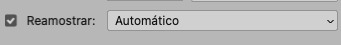
nessa parte você precisará prestar atenção, pois ao redimensionar a foto, você poderá perder ou ganhar um pouco mais de qualidade na foto, e para isso você usará uma opção chamada reamostrar (ou resample se seu photoshop estiver em inglês). deixe a opção marcada para usar as definições.
3.4 explicando as definições do reamostrar e qual definição usar de acordo com o resultado que você quer
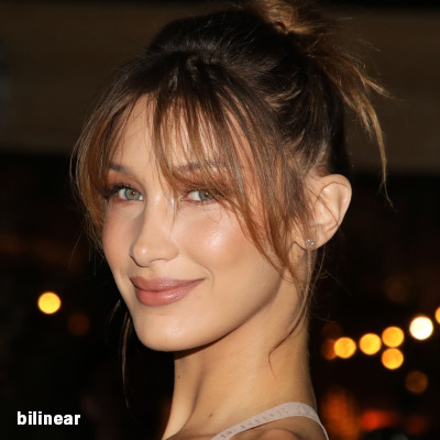


bilinear: a melhor opção para redimensionar gifs, mas para fotos não é tão bom pois dependendo da foto algumas partes ficam nítidas, outras mais suaves e se você for aplicar action de nitidez, pode ficar com um aspecto de “craquelado” com as bordas granuladas, o que eu pessoalmente acho que fica um pouco estranho.
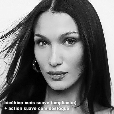
bicúbico mais suave (ampliação): como o nome já diz, ele deixa a foto mais suave, ou seja, os pixels “craquelados” e granulados da foto ficarão mais suaves. é uma ótima opção tanto se você for aplicar actions de nitidez ou actions mais desfocadas e mais suaves.
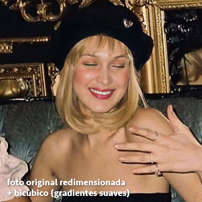
bicúbico (gradientes suaves): pode parecer a mesma coisa do bicúbico mais suave, mas esta opção além de suavizar a imagem, cria um “desfoque iluminado” nas transições das cores da foto. é a melhor opção para fotos sem muita qualidade e principalmente se você for usar actions suaves e desfocadas, sem muita nitidez.
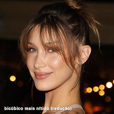
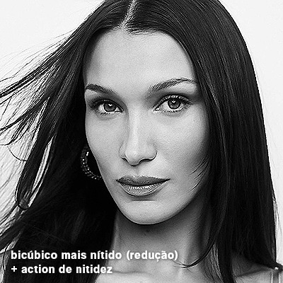
bicúbico mais nítido (redução): acentua os pixels e as arestas nítidas da foto, ou seja, essa definição redimensiona a imagem mas preserva a nitidez da foto. se você usa actions de nitidez que não tem desfoque nas configurações, essa é a melhor opção de reamostra. (mas cuidado, se sua imagem ficar muito nítida com essa definição, você precisará usar outra opção. caso contrário, quando você aplicar a action, a edit poderá ficar muito exagerada e/ou com aspecto áspero.)
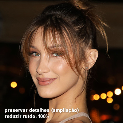
preservar detalhes (ampliação) com redução de ruído: esse em especial é ótimo para quando você precisar redimensionar uma foto para deixá-la maior sem distorcer tanto a imagem. você pode ajustar a redução de ruído para deixar a foto mais suave, sem perder muita qualidade. (obs.: essa opção não deve ser usada para redimensionar imagens muito pequenas, por exemplo de 200x200 para 400x400, ou a imagem vai ficar muito distorcida. ela deve ser usada quando a diferença de pixels não é muito grande, por exemplo, você cortou a foto e ela ficou no tamanho 370x370, aí sim você pode redimensionar para maior sem perder muito da qualidade. então você pode ir ajustando a qualidade com a porcentagem da redução de ruído).
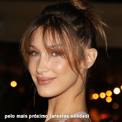
pelo mais próximo (arestas sólidas): essa é uma opção traiçoeira, pois não fica bem em quase nenhuma imagem (a menos que seja um pixel art). essa definição redimensiona a imagem e mantém os pixels nítidos, ou seja, a foto fica menor mas tudo nela que tem aspereza vai prevalecer. é muito usada para redimensionar pixel art, pois preserva as bordas ásperas. pode ocorrer de ficar boa em uma foto aleatória mas não será possível aplicar action, ou a imagem ficará exagerada.
3.5 aplicando a nitidez depois de redimensionar
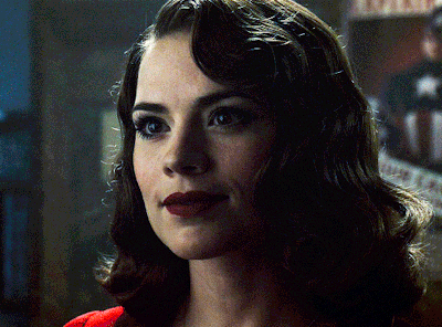
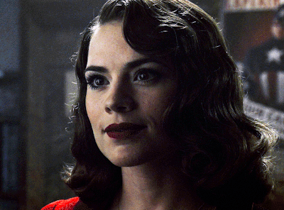
depois de escolher a foto, baixar, redimensionar de acordo com o estilo da action da sua escolha, está na hora de aplicar.
eu fiz duas versões para mostrar como fica com cada tipo de action:
assim, os dois icons tem uma alta qualidade usando actions diferentes, graças a remostragem ideal para cada tipo de action :)
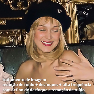
4. TRATAMENTO DE IMAGEM PARA MELHORAR A QUALIDADE
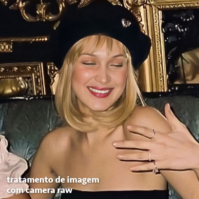
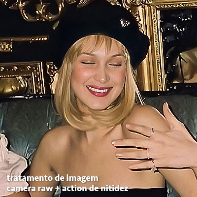
nesta parte, é muito importante que você tenha baixado uma versão do photoshop com neural filters e/ou com o camera raw, mas caso você não tenha, tudo bem também, vou ensinar como fazer uma melhoria na foto de três jeitos: com camera raw, com neural filters e com desfoques. a melhor forma vai depender de quão ruim está a qualidade da sua foto. em geral, apenas fazendo ajustes no camera raw você já tem um ótimo resultado na maioria das fotos.
camera raw
se seu photoshop tem o filtro do camera raw, ele vai estar em filtro > filtro do camera raw...
tudo que iremos fazer será na aba de “detalhe”, ali você deve dar mais atenção ao ajuste de redução de ruído, pois é ele que vai remover o ruído da imagem e melhorar a qualidade dela.
vá mexendo nas configurações de redução de ruído até que a foto fique mais suave. ajuste também o detalhe e o contraste da redução de ruído.
essa parte será mais no olhômetro mesmo, pois as configurações vão variar de foto para foto, mas eu recomendo muito você mexer também na nitidez para não deixar a foto tão desfocada, mas nada muito intenso para não interferir na action que você irá usar.
eu mexo também na redução de ruído de cores, porque dependendo da foto, algumas cores estarão saturadas ou com muito ruído. só cuidado para não colocar um número muito alto, pois esse ajuste pode tirar a saturação da sua foto e deixá-la apagada.
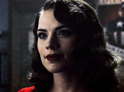
enfim, aqui está uma comparação da foto original com o tratamento feito com o filtro do camera raw e depois já com a action de nitidez aplicada:
e essas foram as configurações que usei nessa foto em específico:
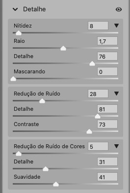
como eu disse antes, as configurações irão variar de foto para foto, a depender da qualidade de cada uma e de quão ruim a foto está, mas com essa configuração básica, você já vai conseguir melhorar algumas fotos.
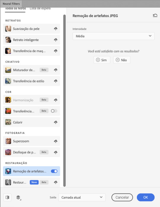
neural filters
se a versão do seu photoshop vem com neural filters (ou filtros neurais), ele estará em filtro > neural filters...
irá abrir uma janela com vários filtros mas o que a gente irá usar vai estar em “restauração”, com o nome “remover artefatos jpeg”. se precisar, faça o download do filtro.
eu recomendo usar a intensidade sempre média, a menos que a foto esteja muito ruim, aí você usa a intensidade alta. mas em geral, a intensidade média ou baixa já dá conta do recado.
a saída deve sempre estar na camada atual, ou seja, na camada da foto selecionada.
assim:
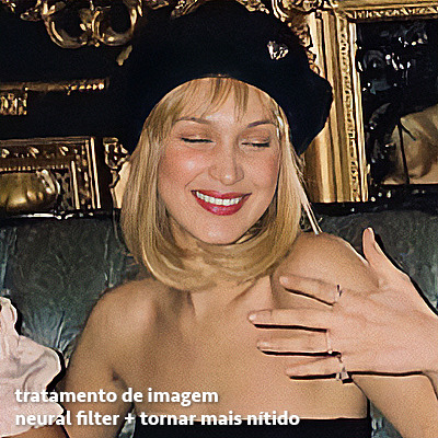
e aqui está uma comparação da foto original com o tratamento feito com o neural filter e depois já com a action suave com desfoque aplicada:

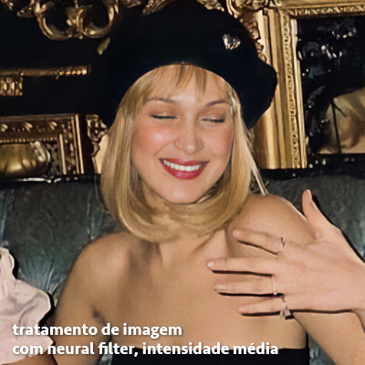

a opção do neural filter é uma ótima alternativa ao camera raw, o único contra é que ele deixa a foto com uma textura áspera, e quando você usa uma action de nitidez eles ficam muito visíveis e acaba não ficando muito legal.
porém, um bom jeito de contornar isso é adicionando ruído na foto. eu uso o efeito de granulação do camera raw para adicionar ruído no icon (você também pode adicionar o ruído em filtro > ruído > adicionar ruído..., mas eu prefiro o camera raw pois ele dá mais opções para ajustar o granulado do jeito que eu preferir).
no primeiro icon abaixo, dá para perceber a textura áspera que o neural filter deixa depois de melhorar a foto e adicionar nitidez; já no segundo icon eu mostro como eu adicionei o ruído e contornei esse defeito.

as configurações de ruído que usei no camera raw foi 12 de granulado, 35 de tamanho e 20 de aspereza.
lembrando que, se você for usar uma action de desfoque e/ou remoção de ruído, não será necessário adicionar a granulação, pois a própria action já vai suavizar a textura do neural filter (a menos que você queira adicionar o ruído, claro).
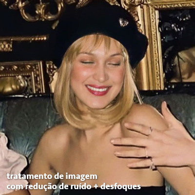
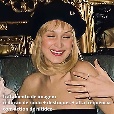
redução de ruído + desfoque
caso a sua versão do photoshop não tenha nenhuma das opções de camera raw ou neural filter, caso você use um photoshop mais antigo, photoshop portable ou prefira usar o photopea, essas alternativas podem ser úteis.
mais uma vez, irei me basear no olhômetro, de acordo com a foto e irei ajustando as configurações de acordo com o que eu quero e acho necessário.
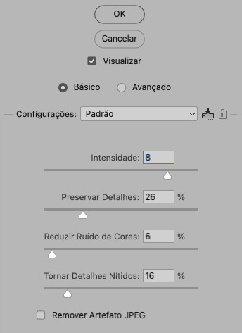
vamos começar com a redução de ruído! ele está em filtro > ruído > reduzir ruído...
na janela de redução de ruídos você verá alguns ajustes que são: intensidade, preservar detalhes, reduzir ruído de cores e tornar detalhes nítidos e vou explicar cada um para que você possa saber ajustar eles de acordo com sua foto:
intensidade: o número de 1 a 10 irá definir a intensidade da luminescência, a intensidade do filtro e o quanto da imagem você quer preservar ou extinguir, sendo 1 o mínimo da intensidade do filtro e 10 o máximo;
preservar detalhes: o número digitado irá definir a porcentagem de detalhes a serem preservados. quanto maior o número, maiores serão os detalhes mantidos na foto, como ruídos, manchas e outras aberrações da foto;
reduzir ruído de cores: o número digitado irá definir a intensidade e reduzir o ruído cromático, ou seja, vai reduzir as aberrações cromáticas, como por exemplo, fotos que distorcem as cores. preste atenção na porcentagem inserida, pois quanto maior o número, menos saturação sua foto terá e poderá ficar com aspecto de foto envelhecida;
tornar detalhes nítidos: o número digitado vai definir a porcentagem de nitidez para restaurar pequenos detalhes da foto. quanto maior a porcentagem, maior vai ser a intensidade dos detalhes da foto. preste atenção na porcentagem inserida, pois se a intensidade da nitidez for muito alto, vai afetar a sua action, seja ela de nitidez ou de desfoque.
sendo assim, para a foto usada eu fiz estes ajustes:
obs.: se você for um usuário mais avançado do photoshop, poderá explorar a opção avançado, que possui as configurações básicas para melhorar a foto e também as configurações para remover ruído das cores primárias (vermelho, amarelo e azul) individualmente. mas, mesmo se você não for um usuário expert, eu recomendo você dar uma olhada nessa opção e explorá-la, mexendo nas configurações e ir ajustando e aprendendo, pois o resultado poderá ficar ainda melhor nos ajustes avançados.
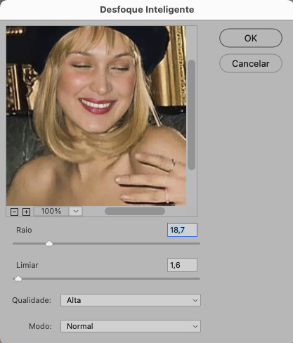
aplicado a redução de ruído, vamos partir para o desfoque! eu estarei usando o desfoque inteligente antes do desfoque de caixa. você vai achá-lo em filtro > desfoque > desfoque inteligente...
na janela que abrirá, você verá os ajustes: raio, limiar, qualidade e modo. vou explicar eles:
raio: vai determinar o tamanho da área que será considerada para o desfoque. quanto maior o número, mais detalhe serão preservados;
limiar: vai determinar a diferença dos pixels entre si antes de serem alterados pelo desfoque.quanto maior o número, maior será a área em que o desfoque será aplicado;
qualidade: vai determinar a qualidade e intensidade do desfoque. ao escolher a opção mais alta, mais partes da foto o desfoque atingirá;
modo: vai determinar o traçado das linhas de bordas que o filtro identificar. o modo normal aqui é o ideal, pois os outros modos “somente arestas” e “sobrepor arestas” irão identificar somente as bordas da imagem.
sendo assim, esses foram os ajustes:
após o desfoque inteligente, partiremos para o desfoque de caixa! ele está em filtro > desfoque > desfoque de caixa...
(você também poderá usar o desfoque gaussiano a depender da foto, mas para esta em questão, o desfoque de caixa funcionou perfeitamente)
a intensidade do desfoque de caixa, assim como do desfoque gaussiano, é medida em pixels e o mínimo é 1 pixel, e para icons é uma intensidade forte, então eu coloco o número mínimo (1, no caso) e depois de clicar em OK e aplicar o desfoque, vou em editar > atenuar desfoque de caixa... e ajusto a porcentagem de acordo com a foto. nessa foto deixei a porcentagem em 33% e ficou ótimo.
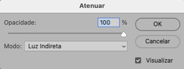
no entanto, infelizmente, por não ser o melhor método para melhorar a qualidade de uma imagem, ela ficará um pouco desfocada demais. mas podemos contornar isso usando o filtro alta frequência para devolver um pouco da nitidez e detalhes na foto. você encontrará esse filtro em filtro > outros > alta frequência...
o filtro de alta frequência, assim como os desfoques, é medido através de pixels e quanto maior o número, mais detalhes passarão despercebidos, ou seja, menos detalhes e menos nitidez sua foto terá. eu recomendo em torno de 2px se você quiser mais detalhes e em torno de 5px se você quer mais suavidade.
a primeira vista esse filtro parecerá estranho e distorcido, mas dará tudo certo, você só precisará mudar o modo de mesclagem. para isso vá em editar > atenuar alta frequência e mudar o modo de mesclagem para “sobrepor” ou “luz indireta” se você quiser que fique mais suave. se preferir, poderá também ajustar a opacidade para os detalhes ficarem mais ou menos intensos.
assim:
assim fica o resultado sem o filtro de alta frequência e com o filtro:

sendo assim, fica a seu critério usar o filtro ou não.
aqui está a comparação das fotos com o tratamento de redução de ruído + desfoque com e sem o uso das duas actions:
5. SALVANDO A EDIÇÃO
e chegou a melhor parte: salvar a edição para postar!
seja a edição um icon, uma header, ou qualquer outro gráfico estático (edições não animadas), a melhor opção é sempre, sempre, SEMPRE, salvar no formato PNG!
o formato jpg ou jpeg não preserva a qualidade original como o formato png preserva. então, sempre escolha esse formato ao salvar suas edições estáticas!
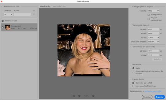
a melhor forma de salvar uma edição em alta qualidade é exportando ela. sendo assim, vá em arquivo > exportar > exportar como...
em “configuração de arquivo”, selecione o formato PNG e desmarque a opção “transparência” se sua foto não é uma imagem com fundo transparente; em “tamanho da imagem” deixe como a altura, a largura e a escola como estão, apenas mude a opção em “criar nova amostra” para BICÚBICO AUTOMÁTICO; e em “espaço da cor” marque a opção CONVERTER PARA SRGB, porque assim, independente da calibração do seu monitor, a foto ficará com as cores originais e não sofrerá alteração.
assim:
no entanto, se você tiver um pc ou notebook lento, ou apenas não tiver paciência para salvar sua edit em exportar, você pode salvar no modo normal, indo em arquivo > salvar como... OU arquivo > salvar uma cópia..., no entanto, se você for usar essa opção, não esqueça de marcar a caixinha para “incorporar o perfil de cores srbg”, essa opção geralmente fica na parte de baixo da janela que abre quando você vai salvar a edição.
6. ACTIONS & RESOURCES
para facilitar pra vocês, todos as configurações de filtros usados neste guia, estarão disponíveis para download em uma pasta de action. para fazer o download é só clicar aqui: ★. já a dupla de actions usadas (a de nitidez & a de desfoque suave) estarão disponíveis para download na lista de dicas abaixo.
dicas de actions de nitidez
– premium & gratuitas (free)
lovie potion by @loviestudio [premium]
action #26 by @harupsds [premium]
action #25 by @harupsds [free]
01 action by @harupsds [free]
cherrie by @loviestudio [free]
action #11 by @miniepsds [premium]
face action by @miniepsds [premium]
crispy by @nebulies [free]
scarlett by @l-agallerrie [free]
eight action by @peachcoloring [premium]
bubblegum by @hisources [free]
kendall by @hisources [premium]
hekate by @hisources [premium]
sharpen by @l-agallerrie [free]
#01 action by @buntterflies [free]
dicas de actions “suaves”
– premium & gratuitas (free)
teddy bear by @loviestudio [free]
action ten by @peachcoloring [premium]
caelestis by @miniepsds [premium]
fleuriste by @hisources [free]
angel by @loviestudio [free]
action #13 by @harupsds [premium]
action #12 by @harupsds [premium]
wild action by @hisources [free]
outras actions
– premium & gratuitas (free)
denoise action effect — remove o ruído das fotos sem perder muita qualidade by @loviestudio [premium]
photopea quality action — action para melhorar a qualidade da foto no photopea by @loviestudio [free]
exclusive hq actions — um conjunto com as actions que foram usadas neste tutorial by @girasois, @loviestudio [free]
denoise and sharpen actions — conjunto de actions para melhorar a qualidade da foto automativamente by heavnsent
7. BÔNUS: DICAS EXTRAS
a adobe cc learn tem muitos tutoriais que você pode dar uma olhada e aprender muito mais sobre o photoshop e outros programas da adobe!
o youtube é outra fonte incrível para você aprender edição no photoshop, lá você encontra tutorial para quase tudo de edição de fotos e muito mais! se você entende inglês, eu recomendo muito os canais piximperfect e brendan williams tutorials.
para fonte de inspirações, o tumblr é o lugar certo! se jogue nas tags para se inspirar e nos blogs de photoshop para ver muito mais tutoriais e muito mais resources.
o blog @looksgreat infelizmente não é mais atualizado, mas você ainda pode encontrar muitos tutoriais sobre quase tudo de edição, e o melhor, todos os tutoriais são em português!!
ainda recomendo outros tumblr brasileiros de resources e tutoriais: @miniepsds, @harupsds, @peachcoloring, @gmfioart, @colour-source, @l-agallerrie, @wasirauhlpsds, @hisources, @opulenceps, @sunshinepsds, e @loviestudio; e no deviantart: jungrainsoul, rockjealous, heavnsent, aureangels e rohdossantos.
8. CRÉDITOS E INFORMAÇÕES
crédito colorings
off hearts + whimsy by @miniepsds ♡
informações
antes de tudo eu gostaria de pedir desculpas pelo tamanho deste guia, mas eu quis abranger o máximo de dicas possíveis para vocês e deixar o tutorial super completinho.
em segundo lugar eu gostaria de agradecer todo o carinho de vocês, isso me motiva muito a continuar. obrigada, de coração!
enfim, é isso! minha ask estará sempre aberta para dúvidas, sugestões, pedidos e mensagens fofas (sempre com educação e respeito, claro)!
#tutorial#photoshop tutorial#tutoriais#tutorials#resources#hq tutorial#tips#useful#ptbr#adobe photoshop#photopea tutorial#tutorial tips#dicas#dicas de edição#dicas de actions#guia completo#guia#guia de edição#guia de edits#edits tutorial#edit tag#masterpost#long post#editing tips#icon tutorial#header tutorial#hq edits
66 notes
·
View notes
Text


all face, body, hair, and skin details on chris and quinn ✨
(1) hairstyle no.1 (2) hairstyle no.2 (3) hairline
(4) eyebags no.1 (5) eyebags no.2 (6) eyebags no.3
(7) nose mask (8) nose shader (9) blush
(10) highlight (11) cheekbones (12) age lines no.1
(13) age lines no.2 (14) lips (15) beard no.1
(16) beard no.2 (17) beard no.3 (18) sideburns
(19) body overlay (20) body blush (21) body hair
(22) freckles (23) moles (24) nipple tints
(25) hand details (25) leg details (27) feet details
it's been a long-time project building and adjusting all the cc that goes into the appearance of these two, thank you for giving me an excuse to be gratuitous about my favorite sims :)
- note: I use a number of these details merged together as one layer with adjusted opacities, sort numbers, and composition method values, this gives some details a different look (tutorial here if interested)
#wf.wcif#is this a lookbook? maybe?#click for hq#also thanks for an opportunity to brush up on my design skills#I certainly needed the practice and I quite like how this turned out#the note at the bottom also explains how I'm able to have 20+ details on a sim#if you're interested in the tutorial I can definitely answer any questions about the process
319 notes
·
View notes
Text

and they were “roommates”, friends, even…
#💿#ts4#ts4 sims#ts4 edit#ts4 screenshots#ts4 gameplay#ts4 simblr#sim: tammy hinsch#sim: heidi hedquist#click for hq or something like that idk… i think#tttthank you kashisun for the editing tutorial i had no idea that some of these things existed fhdhjsn#thank you glittery mutt for being epic and sweet and amazing and epic ??#and also for inspiring me ???#🙏💗#yeah#i edited something on it in picsart ?? n what about it
51 notes
·
View notes
Text
Want to make high quality animated gifs?
Quickly? Without photoshop? Using only simple FREE programs? And little to no experience? Then this half-assed tutorial is for you!!
Aw yeah 18 seconds (291 frames) @ 400x225 px and just under 9mb. Suck it, photoshop!
I'm gonna start with two assumptions:
You have a windows PC. (Never fear, for mac there's a gifski gui that replaces like half these steps. If you run linux you probably don't need this tutorial.)
You have a video clip (.mp4 preferably) of the scene you want to gif saved to your hard drive.
Check and check? Then let's go.
EDIT AGAIN: Found a VirtualDub fork that comes ready with all the plugins necessary to open newer video formats. AND it outputs to multiple formats unlike the original. Extract the zip anywhere you want and run VirtualDub64.exe, no install needed.
Get yourself gifski. For windows you want the CLI (command line interface) version, which should be the only option. It will be unzipped, not installed, and run as an executable from a command window. (Text only, bitches!)
Make yourself a new top level directory on your main hard drive. Give it an easy name with no spaces or weird characters. Make another folder in it for your "active" files. (I'm calling mine working.)

Open the gifski zip, find gifski.exe, and copy to your working folder. It simplifies the commands you'll have to enter if the executable is in the same directory as the files it'll use.
That's all you need!
part 2: bonus ramble about gifs
part 3: extracting frames with vdub
part 4: encode that shit
#gif tutorial#gif editing#gif tools#kinnporsche#the i'm lazy but want hq gifs method#sub's kinnporsche stuff#kpts#kinnporsche the series
56 notes
·
View notes
Text

Drawing ToonTown NPCs - Tutorial Tom and HQ Harry
I HC that these two are brothers :^)
43 notes
·
View notes
Note
Hello! I just want to say I adore your Sandman art,it's so pretty!!I have a question do you have any tips on drawing male heads or male anatomy?
Why thank you!
Oh gosh, I feel like I'm terrible at giving tips or anything since I don't know where to start or what's... kinda fundamental uuhhhh. It's usually said that masculine features are more angular, bone and muscle structure are more prominent. Feminine features are rounder and softer. But it has so much variety depending on stuff like race or age or body type or just.... because people are different.
I always suggest doing life/figure drawing if possible. The point is to train your eye, observe the forms and shapes and put on paper what you see. The more you do it the more you start to see patterns and when you have just a couple of minutes to draw the pose you figure out the key shapes. I hope that makes sense. There are some websites for practicing figure drawing, like Line of Action and Quickposes and I guess there are pinterest boards dedicated to these sort of photos as well. And when you see a photo with a nice face or a nice body, save it and draw it.
#was this useful at all??? I don't know#I've been drawing for forever and I draw dudes a lot and I just.........draw them?? idk I'm so bad at this#I've learned from so many very specific tutorials floating around the internet over the years and it's kinda hard to pinpoint what would...#...be a good tip to share.#doing image search on buzzcuts gives good results on young adult head shapes :D#hair cut results in general too#or image searching mens underwear for body reference#I wish I could have HQ screenshots of that clip of Tom Sturridge training as refs so I could draw those muscles
25 notes
·
View notes
Text

Fucks sake people block and report these fucking users idc if you potentially shoot dead new users when a blog w/o icon follows you, that is tumblrs problem! Not yours!
But i'm fucking tired of getting these every other day just bc someone probably didn't block and report them!
The fact that new users are guided to follow new blogs before setting a pfp is really not your problem! @staff needs to fix that on their own. But i'm not in the mood to get these spam messages day after day just bc someone was scared of blocking and reporting a new user!
#fckn hell#if you're a new user and you don't set a new pfp within the day you make your account you just lost imo#staff needs to incorporate setting a pfp into their tutorial for new users#that would honestly be the best option#but they're cowards#if i get deleted for that i'm coming for hq next
2 notes
·
View notes
Photo


I wanted to use this outfit, it was the entire inspiration for this sim, and yet I didn’t take any full body pics of it lol.
#these are tiny and lq bc i have a tutorial on how to take more hq shots saved and i have yet to look at it. ill learn eventually.#no name tag bc she doesnt rly have a name i dont think ill play her it was just playing around w cas. i might have to make a tag for that
18 notes
·
View notes
Note
How did you learn to make gifs?
hi! 💕 i read up on tutorials i found on here and went with what i found more comfortable/took less time bc im lazy haha 😅 in case you’re looking to start here is a tutorial on how to make those super hq gifs. this one is more similar to how i make them except i made some actions to sort of automate a bunch of steps to save time 💗 the more you read and try the more you’ll understand the process and see what works for you 💫
#ask#i could never make hq gifs just reading the whole tutorial tires me but yall sure do gif pretty lol!!!!#also my brother is my tech guy hahaha he knows how to torrent+crack so he downloaded photoshop on my computer for free :)
4 notes
·
View notes
Text
about to learn how to make gifs just for murder at the end tbh
#sunny txt#tutorials for downloading hq clips are helpful for video edits too#but who has the time YKWIM?#<—— man who finally has interest in fandom contribution beyond fanart in 2023
1 note
·
View note
Note
What do you mean with ‘neutral colorings’ ?
Basically just a very natural coloring that isn't pale nor vibrant but just enhances the colors that are in the gif/scene anyways agsha if that makes sense (examples of what I mean: x, x, x) idek what it is about this sort of coloring because I feel like it should be the easiest one but I just can't make it work asgdja
#I love this sort of coloring#but I just can't achieve it LOL#like whenever I try it my gifs turn out either too pale or too vibrant#or just ugly in general tbh adgsha#idek how people make them looks so good an hq#like HOW#and I literally looked at like every tutorial there is about this#and still can't figure it out#*clown emoji*#(if anyone has any tips agdhsja)#(I'm desperate over here agsdhaj)#answered#anonymous
0 notes
Text
Bonus ramble about gifs
part 1: let's gif some blorbos!
Gifs are inefficient because they're super oldschool. The format was last updated like 33 years ago, back when nobody had broadband, file size was a hugely limiting factor, and browsers and monitors couldn't decide on a common palette of 256 colors that could be displayed without dithering. Dithering is placing different color pixels near each other to mimic blending and additional colors.

Why 265 colors?
It's a limit inherent to the way gifs are saved. Each individual pixel is allowed up to 8 bits (2^8) to express its color. So there can only be 8 bits (256 units) worth of unique colors in each gif or frame of an animated gif. It's why gifs are bad at representing full-color photos and especially video. Also, the fewer unique colors used, the smaller the size. Enter dithering to give the illusion of having a larger color palette than is actually available.
Transparency used to be more important
Raise your hand if you were ever personally victimized by LJ's icon size limits. 🙋 One trick to compress moving image files is to "recycle" pixels. If you have a static red background, for example, it wastes space to have to save red, red, red repeatedly. Transparency means that instead of displaying a new pixel, the identical one from the previous frame is kept.
What's up with tumblr converting some gifs to h264 video?
Video compression is now way more efficient than gifs, meaning gifs will take up more space for lower quality. HTML 5 has native video support, so substituting a .mp4 for a gif should seamless and undetectable on the user's end.
Let's talk frame rate.

Think of a video file like a flip book. The frame rate is the # of still images per second that makes up the moving image. The goal is to minimize the number of frames while still keeping smooth motion. 24-25 FPS is common for videos, but may result in gifs that are too large for tumblr, so we're going to knock down the FPS some.
part 3: extracting frames with vdub
part 4: encode that shit
#gif tutorial#gif editing#gif tools#the i'm lazy but want hq gifs method#gif making#sub's kinnporsche stuff
11 notes
·
View notes
Text

COLORING + SHARPENING TUTORIAL
someone asked for a coloring tutorial and my sharpening settings, so here it is! there are also a few tips to achieve more HQ gifs. :)
tutorial under the cut!
FOR HIGH-QUALITY GIFS
FILE SIZES
it doesn’t matter what your sharpening settings are if the file you’re using to gif is too low quality, so i tend to look for the best that i can get when downloading stuff.
usually, movies (+2h) look better if they’re 5GB or more, while an episode (40 min/1h) can look good with even 1GB. the minimum definition i try to find is 1080p, but i gif with 2160p (4k) when available. unfortunately, not every computer can handle 4k, but don’t worry, you can gif with 1080p files just fine if they are big enough. contrary to popular belief, size does matter! which means sometimes a bigger 1080p file is better than a smaller 2160p one, for example.
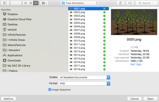
SCREENCAPPING METHOD
this can too influence the quality of your gifs. as a gifmaker, i’ve tried it all: video frames to layers, directly opening video clips, loading files into stack, and i’ve finally settled down with opening screencaps as an image sequence. with bigger files, it doesn’t matter much what technique you use, but i’ve noticed with smaller files you can do wonders if you screencap (either by loading files into stack or opening as an image sequence) instead of using video clips. for example, this gif’s original video file was only 4GB (so smaller than i’ve usually go for), if you can believe it!
here’s a tutorial for setting up and screencapping with MPV, the media player i use to screencap. again, you can keep using video clips for bigger files, but you’ll find this useful when dealing with dire causes. i don't file loads into stack, though, like the video does. i open as an image sequence (open > screencap folder > select any image > click the image sequence button). just select OK for the speed. this will open your screencaps as a video clip (blue bar) in timeline mode (i'm a timeline gifmaker, i don't know about you). you will need this action pack to convert the clip into frames if you're a frames gifmaker. i suggest you convert them into frames even if you're a timeline gifmaker, just convert them into a timeline again at the end. that way you can delete the screencaps right away, otherwise you will delete the screencaps and get a static image as a "gif".
ATTENTION if you’re a Mac Sonoma user, MPV won’t be an option for you unless you downgrade your system. that is, if you have an Intel chip. if you have M1 Max chip (or even a better one), here’s a fix for MPV you can try while keeping that MacOS, because nowadays MPV is skipping frames in its latest build. or you can use MPlayer instead for less hassle. here are two tutorials for setting and using MPlayer. Windows users are fine, you can use MPV without trouble.
FOR EVEN MORE QUALITY
ADD NOISE
here’s a tutorial for adding noise as a way to achieve more HQ gifs if your original material is too low quality.
REDUCE NOISE WITH CAMERA RAW
instead of adding noise, you can reduce it, especially if your gif is very noisy as it is.
the path is filter > camera raw > detail > nose reduction. i do this before sharpening, but only my video file isn't great to begin with. because it’s a smart filter, you can reduce or increase its opacity by clicking the bars next to its name in the layers panel.
TOPAZ AI
i use Topaz Photo AI to increase the quality of my screencaps when i need to. it’s paid software, but there are… ways to find it for free, usually on t0rrent websites. if someone’s interested, i can make a tutorial solely about it in the future.
SHARPENING SETTINGS
here are my sharpening settings (filter > sharpen > smart sharpen). i sharpen things twice: 500% 0.4px + 10% 10px. here's an action for it, for more convenience. here's a tutorial on how to use Photoshop actions. for animated stuff, i use this action pack.

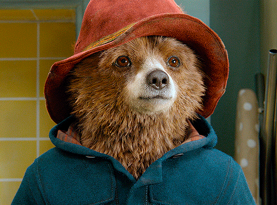
COLORING
here’s the gif i'm gonna use as a base. it’s already sharpened like the way i always do it.

LIGHTNING THE SHOTS
half of the secret of a good coloring is good lightning. i always useCurves (layers > new adjustment layer > curves) and Brightness & Contrast (layers > new adjustment layer > brightness & contrast). the settings depend on the scene you’re giffing, but i always try make my gifs bright and with high contrast to make the colors pop.
CURVES
besides lighting your scene, the Curves adjustment layer has four automatic options that will color-correct it for you. it’s not always perfect and it doesn’t mean you won’t need to do further coloring, but it’s a great start. it’s a lifesaver for most ridiculously yellow scenes. look at the difference! this gif uses the 3rd automatic option (the screenshot below isn't mine btw so that's why the fourth option is the chosen one), from top to bottom. what automatic option you need to choose depends on the gif.

sometimes i like to tweak my Curves layer. not everybody does that, it’s not that necessary and if you’re not careful, it can screw your gif up. to modify your layer by hand, you will need to click and drag points of that straight line in the position you desire. this is the concept behind it:

basically, the lower part of the line handles the shadows, while the upper part handles the highlights of the image. if you pull a highlight point up, the image’s highlights will be brighter. if you pull it down, it will make them darker. same thing for the shadow points. you should play with it to get a grasp of it, that’s what i did when i first started giffing.
BRIGHTNESS & CONTRAST
then i added a bit of brightness and contrast.

CHANNEL MIXER
the scene looked a bit too yellow, so i used the Channel Mixer (layer > new adjustment layer > channel mixer) adjustment layer. here’s a tutorial of how it works. not every scene needs the Channel Mixer layer though, i mostly use it to remove heavy overall tints. in this particular case, the Curves layer got rid of most of the yellow, but i wanted the gif to be just a bit more blue so the Channel Mixer tweaks are very minimal.

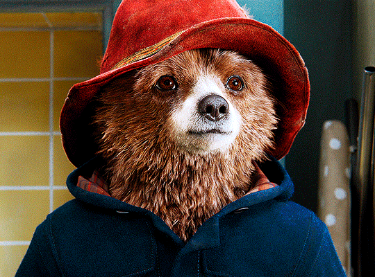
SELECTIVE COLOR
now, this adjustment layer i always use: Selective Color (layer > new adjustment layer > selective color). this is THE adjustment layer to me, alongside the Curves one. this is how it works:

ie, you can separately edit a color this way, giving it tints. for this gif, i wanted to make the colors more vibrant. to achieve that, i edited the selected colors this way:
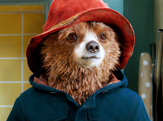
for the reds, i added even more red in them by moving the first slider to the right, making the color more vibrant. for his hat to have a more warm tint, i added yellow to the reds (third slider, moving it to the right). finally, to make the reds stronger, i moved the last slider to the right (more black).
for the yellows, i made them brighter by adding white to them, thus making the tile wall and Paddington more bright as well.
for the cyans and the blues, i just added the maximum (+100) of black that i could.
i wanted for Paddington's nose to be brighter, so i added more white to the whites.
lastly, i added depth to the blacks by increasing their own blackness.
you should always play with the Selective Colors sliders for a bit, before deciding what you want or need. with time, you will automatically know what to change to correct the color grading. it all takes practice!
HUE/SATURATION
i don’t know if you noticed, but there are some green spots on the blue wall behind Paddington. to correct that, i added a Hue/Saturation adjustment layer (layer > new adjustment layer > hue/saturation) and made the saturation of the greens 0%, making that unwanted green disappear from the background.

while the green spots on the wall are specific for this gif, i use hue/saturation a lot to tweak, well, hue and saturation. sometimes someone’s skin is too yellow, i made it redder by tweaking the reds and the yellows, or vice-versa. the hue bar follows the rainbow bar, so the maximum settings (+100 and -100) give the selected color to change its hue to something more red or pink (the rainbow extremities). changing hue can give pretty whacky results, like turning someone’s skin tone to green, so you will need to play with it to get the hang of it. you can also tweak the opacity of your hue/saturation layer to further improve your gif’s coloring. i didn’t do it in this case, the opacity is still 100%. the reds and the blues had their saturation increased to make them pop just a bit more, without affecting the other colors.
COLOR BALANCE
the highlights of the gif still had a green tint to it due to the automatic correction of the Curves layer, so i used Color Balance. this is how it works: instead of giving specific colors some tints, you can give them to the shadows, highlights, and mid-tones. if your shadows are too blue, you counterbalance them with the opposite color, yellow. same thing with the cyan-red and magenta-green pairings. in my case, i added a bit of magenta.


B&W GRADIENT MAP
now, if this gif was a dish, it’s time for the salt and pepper. i always add a Gradient Map (layer > new adjustment layer > gradient map) (black to white gradient) with the Soft Light blending mode, thus giving my shadows more depth without messing with the mid-tones and highlights. it also doesn’t “deep fry” (you know those memes?) the gif too much by adding even more contrast. usually, the opacity of the layer is between 30% to 70%, it all depends on the gif. it always does wonders, though!
COLOR FILTER
finally, i like to add Color Filters (layer > new adjustment layer > color filter) to my gifs. it’s very handy when giving different scenes for the same minimalistic set because it makes them kind of match despite having completely different colors. in this gif’s case, i added a “deep blue” filter, opacity 50% density 25. you can change the density and the opacity of the layer for further editing, again, it all depends on the gif.

VIBRANCE
if i feel like it, i add a vibrance layer (layer > new adjustment layer > vibrance) to make the colors pop. this can ruin your coloring sometimes, especially when regarding skin color, so be careful. i didn't do it in this gif because i felt i didn't need it.
TA-DA! 🥳
AN OTHER EXAMPLE
the color grading of the original scene it’s pretty good as it is, to be honest. let’s see a worse scenario, a VERY yellow one:
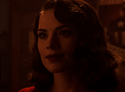
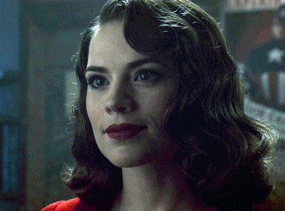
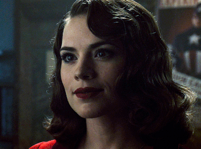
no channel mixer this time because the automatic curves option dealt with the yellowness, but you can see it made the gif too green. i needed to correct that with the following adjustment layers:
curves (automatic option) (gif 2) >> same curves layer (tweaks) (gif 3) >> brightness & contrast (gif 4) >> hue/saturation (tweaked cyan+blue+green) >> selective color >> color balance (gif 5) >> b&w gradient map >> (sepia) filter >> vibrance (gif 6)
i added a hue/saturation layer to remove the blues & greens before my selective color layer because i thought that was more urgent than tweaking the tint of all colors. color balance (gif 4) was the real hero here, though, by removing the green tint. the selective color layer was meant to make the red pop more than anything else, because the rest looked pretty good, especially her skin tone (despite the green tint). you can notice that tweaking the curves layer (small gif 3) also helped A LOT with the green problem.
tl;dr 😵💫😵💫😵💫
here's a list of my go-to's while coloring and lightning gifs. it's not a rule, just a guide. there are gifs in which i don't use all these adjustment layers, or use them in a different order. it all depends!
1. curves (automatic option + tweaks)
2. brightness & contrast
3. channel mixer
4. selective color
5. hue/saturation
6. color balance
7. b&w gradient map
8. color filter
9. vibrance
i'll suggest that you study each adjustment layer listed for more info, either with other Tumblr tutorials or YouTube ones. the YouTube ones focus on images, but you can translate what they teach to gif making very easily. you can ask me to further explain any adjustment layer, too! i was brief to keep this short (which i kinda failed lol).
feel free to ask me for clarification or something else about gifmaking wise, i always like to help. ❤️
#*#*tutorial#gifmaker tag#resources#resource: tutorials#ps help#uservivaldi#tuserjen#userrin#userelio#useralien#userzaynab#userchibi#userbuckleys#usertj#userbess#tuserlucie#useraljoscha#userdavid#usershreyu#usernolan#userhallie#userisaiah#tusergio#tusergeo#userjesslynn
323 notes
·
View notes
Text
A Comprehensive Guide for Writing Advice
Sometimes, despite enjoying writing so much, something is not working for you. Maybe your well of ideas has run dry. Or your WIP has hit a corner and you can't find your way out to the end of the story. Or you need to go back to your finished draft and see if there are any kinks to clear up.
Fortunately, everyone at Writeblrcafé has experienced such, and to help you out, we have a bunch of links to helpful posts by fellow writers to help you along on your writing journey as well as some helpful links to other websites, resources and software.
General:
WHY IS WRITING IS SO FUCKING HARD? (@writers-hq)
Writer Block First Aid Kit (@isabellestone)
Websites for writers (masterpost @2soulscollide)
Writing advice (masterpost @theliteraryarchitect)
Writing resources (masterpost @stinastar)
One look thesaurus (a reverse dictionary where you can enter words or concepts)
Coming Up with Ideas:
97 Character Motivations (@theplottery)
Character Flaws (@fantasyfillsmysoul)
Character Profile (@mistblossomdesigns)
Characters Unflawed (@emptymanuscript)
Why Theme is More Important than Plot (@theplottery)
Weekly writing prompts on Reedsy
Drafting:
3 of the worst story beginnings (and how to fix them) (@theplottery)
Cheat Sheet for Writing Emotion (@myhoniahaka)
Creative Writing for Writers (@writerscreed)
Describing Physical Things (@wordsnstuff)
How to Craft a Natural Plot (@theplottery)
How to Write a Story? (masterpost @creativepromptsforwriting)
How to write: ethnicity & skin colour (@youneedsomeprompts)
What the F is Show Not Tell (@theplottery)
Writing advice from my uni teachers (@thewritingumbrellas)
First Draft: story outlining template meant to help with planning your next big writing project (@fauxriot)
The wonder/ discovery arc (@evelynmlewis)
How to structure a chapter (@theplottery)
How to pace your storytelling (@charlesoberonn)
How to write and research mental illness (@hayatheauthor)
Seven Blogs You Need To Read As An Author (@hayatheauthor)
Editing/Revising:
Eight steps in making the editing process of your book easier (@joaneunknown)
Kill Your Darlings (@tibodine)
Self editing tips (first pass) (@projecttreehouse)
Publishing:
Chill Subs: biggest database for literary magazines and small presses; track your submissions and get your writing published!
5 steps to get your novel ready to self-publish (by @nanowrimo)
Resources for finishing and publishing your novel (masterpost by @nanowrimo)
For self-publishing: this page gives you the exact pixel count of a book spine based on its page count, and/or a template you can use for the correct width/height ratio.
Software:
Scrivener: one time payment of $60 or 70€ (macOS/windows), $24 (iOS; no Euro listed for iOS); used by professionals, many tools to write and organize your novel
Bibisco: free and "pay what you want" version; multilingual, world building, character profiles, writing goals, story timeline, mind maps, notes and more templates to write a novel.
Manuskript: free open source-tool; outliner, novel assistant, distraction-free mode
Ghostwriter: a free and open alternative which has a decent interface with some interesting features, like Hemingway Mode, which disables one's backspace and delete keys, emulating a typewriter.
NaNoWriMo: an international contest to encourage writers to finish writing their novel with many events, groups for exchange with fellow writers, helpful writing advice and help for self-publishing and publishing traditionally.
Campfire Writing: website, desktop app, and mobile app, with tools built in to help manage characters, magic systems, research, etc. It has a great free option, plus monthly, annual, and lifetime purchase options. It also has built-in NaNoWriMo compatibility and a catalogue of tutorials and writing advice videos (suggestion by @harfblarf)
Websites And Writing Apps Every Author Needs In 2023 (@hayatheauthor)
Let us know in the comments if there are any links we could add to it! Reblog this post to help a fellow writer.
Support our work by buying a cup of coffee on KoFi.
#wc.admin#writing community#writing advice#writing tips#writers on tumblr#creative writing#writing resources#writing software
2K notes
·
View notes
Text
bg3 Dune AU
Astarion: House Atreides. Vapula: Bene Gesserit
I had the vision and made a wip right after my tutorial about Astarion’s ear/cheekbone alignment. cause the first strokes I made ended at his nose and reminded me of Dune right away.
I wanted to give Astarion fremen robes, but his look spoke ‘royal’ to me, and with all my love for house Atreides, I just had to draw him in something black, but still with tube [forgive me my artistic liberty]. Vapula is a wizard, so Bene Gesserit sits just right
HQ on twt:
https://x.com/skeptical_lynx/status/1773700388979355705?s=46&t=EuBiJuFrpmM7JiLiuDbaCA
#baldurs gate 3#dune movie#bg3#astarion ancunin#astarion x tav#baldur’s gate 3#tav#baldurs gate astarion#bg3 astarion#astarion#baldur’s gate tav#baldurs gate tav#bg3 tav#my tav#tavstarion#dune#bg3 oc#vapula
187 notes
·
View notes
Last Seen Blogs
nenmul
낸물
lifeoflanguage
Learning One Step At A Time
ori-x
Ozzie
lifeoflanguage
Learning One Step At A Time
oldbookofknowledge
the frustrated social scientist