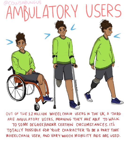
#drawing disability
Text
Please stop giving your leg amputees weird robot toes. I don't know why this is as much if a pet peeve to me as it is, but there's a reason why even the most advanced prosthetics irl don't have them and its not because the tech isnt there yet (kind of).
Making that many joints so close together is very difficult and will make the foot increadibly heavy for function that can mostly be replicated by a sheet of bendy carbon fibre (what irl prosthetic feet are usually made of). That many articulated joints are hard to control (even on hands, it's a challenge, and your hands dont have to weight bare), they will add a lot of weight, and will mean more power will be needed. Not to mention the joints would be points of weakness in an area that will be, at some stages in the walk cycle, bearing the majority of user's weight. Unless your character is going to be using their prosthetic feet as hands to grab things like that villain from Kim Possible, they are more trouble than they're worth, and your character doesn't need them.
And look, if the reason you want to give them robot toes is because you have a thing for feet... why did you make them a foot amputee, of all disabilities lol? Odd choices aside, if that's the reason, just be honest about it, because why else is it always "sexy cyborg" type characters that have them?
Joking aside, the goal of a prosthetic is not (usually) to look as similar to "the real thing" as possible, it's to improve mobility. As such, sometimes the best solution will not be what looks the most "normal with a robot aesthetic twist". In the event looking like the real thing is the main goal, we already have the tech for that. Many prosthetics have silicone covers that look so realistic you wouldn't be able to tell unless you can see the top of the socket (where the artificial limb meets the real thing) and you don't have to give up much mobility or functionality to use them, since that carbon fibre sheet I mention just gets hidden inside the cover.
Signed an amputee who finds your pudgy little foot fingers unsettling and wishes people would stop giving robot ones to characters unnecessarily for the sake of making something that looks "normal".
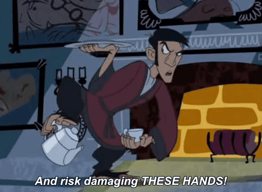
[ID: an animated gif of a character from Kim Possible in a red dressing gown, using his hand-like feet to pour himself some tea. he places the tea pot down and it focuses on his hands, in a close up. the caption reads "and risk damaging these hands?" /end ID]
#only half joking#scifi#disability#disabled#amputee representation#amputee#physically disabled#physical disability#writing community#writing advice#on writing#writing#writeblr#writing disability#designing disabled characters#disabled artist#drawing disability#artists#art advice#creative writing#writers of tumblr#authors on tumblr#character design#design#disability in character design
862 notes
·
View notes
Text
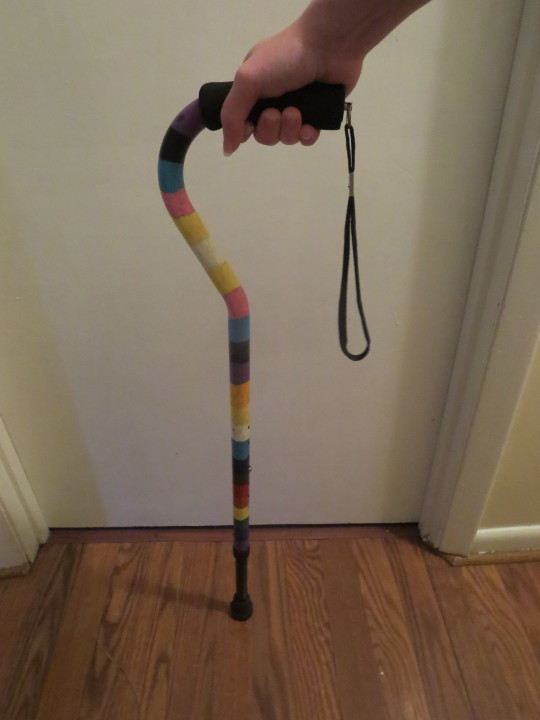

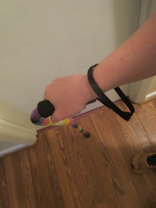
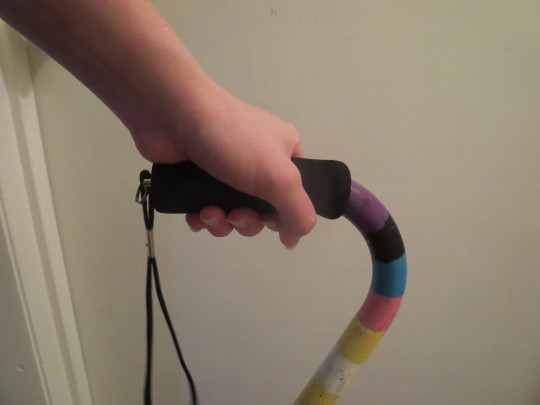


[ID: Nine photos of a white hand holding a painted cane at different angles, with white walls and a fake wood floor in the background.
The cane is first shown from the side, with the black wrist strap off, then on, then from above at an angle. The cane is then held in the other hand, and shown closer up from the side, at a different angle, and a above, with the wrist strap off. The last three show the wrist strap on, and still in the left hand from multiple angles at close up to show the positions of the fingers.
The cane is painted with three pride flags. The first is the progress trans flag with stripes of purple, black, blue, pink, yellow, white, yellow, pink, blue, black, and purple.
Then the aroace flag, with stripes of orange, yellow, white, light blue, and dark blue.
Finally, a rainbow of brown, red, orange, yellow, green, blue, purple, and black.
End ID.]
Some more cane drawing references so you can draw disabled characters better.
More photos at:
Cripplepunk - Offset cane collection on Pexels. is missing some because Pexels is annoying.
Web archive collection
I'd post them all here to tumblr, but tumblr keeps eating them and i don't feel like having to sit here an upload them all one at a time.
You're encouraged to download these if you find them helpful. That's why I'm making them.
#Cripplepunk#pose references#cane user#disabled characters#drawing disability#writing disability#cane reference#drawing reference#drawing ref#disabled ref#IDK#bye#art reference#pose#poses#hand proses#drawing hands#IDFK#I'll figure out tags for these at some point and copy and paste them in
260 notes
·
View notes
Text

Character Design Challenge July 2022: Marvel Fanart and Redesign Challenge.
I decided to draw Professor X for the theme since July is Disability Pride Month, and I thought it would be nice for the professor to have a small manual wheelchair. I think it would be easier for him to get around the mansion in something smaller than his fancy chairs in the comics.
[image description
A digital painting of Professor X from the X-Men sitting in a yellow and blue manual wheelchair. The spokes on the wheel create an "X". He is a bald man with strong eyebrows wearing a blue suit with a red tie and pocket square. On his lapel there is a disability pride flag pin. He is looking at the viewer and tapping his head with two fingers indicating that he is using his powers. The background is blue with yellow concentric circles starting from behind the Professor's head.
end id]
#professor x#x men#charles xavier#wheelchair#marvel#superhero#drawing disability#digital art#painting#drawing#2022#character design challenge
26 notes
·
View notes
Text
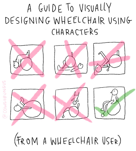


A guide to designing wheelchair using characters!
I hope this helps anyone who's trying to design their oc using a wheelchair, it's not a complete guide but I tried my best! deffo do more research if you're writing them as a character
#art#original art#artist#oc art#original character#queer#disabled#disabled rights#disability#disability pride month#tutorial#art tutorial#disabled character#design tutorial#drawing tutorial#Tumblr tutorial#character design#character illustration#concept art
89K notes
·
View notes
Text
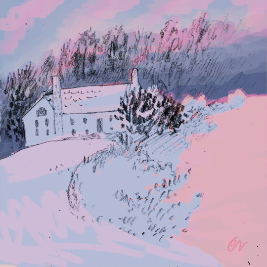
Study of a snowy landscape at dusk.
#cottagecore#cozycore#grandmacore#warmcore#cottage aesthetic#cozyhome#cozy#pencil drawing#artists on tumblr#sketchbook#female artists#illlustration#art#pastel aesthetic#digital art#traditional art#disabled artist#winter#winter aesthetic#snowscape
9K notes
·
View notes
Text


A short story about disability and friendship.
5K notes
·
View notes
Text
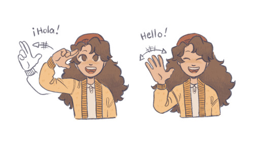
mcyt physically disabled week day two: sign language | deafness/HoH
i did say i’d try to do at least a few days of this week! i guess this kinda counts for both prompts, since tallulah is canonically HoH? i think of her as a bimodal bilingual, or someone who speaks vocally and gesturally, so here’s a small drawing of two sign language greetings, in LSM and BSL! i just couldn’t decide which one to go with haha
#i actually wonder if isla quesadilla would have its own local sign language? i like to think so#but i wasn’t about to draw whole new signs#it seemed cooler just to show off existing ones#qsmp#qsmp tallulah#mcyt physically disabled week#my art
2K notes
·
View notes
Text
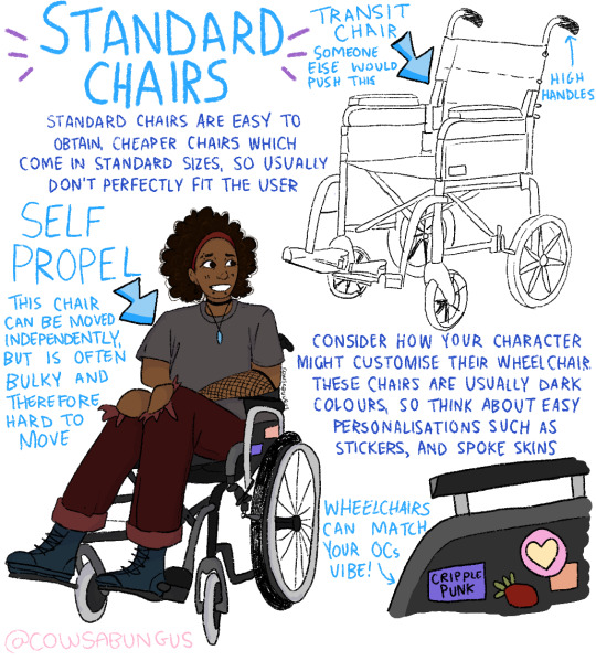
Manual Wheelchair Tutorial by Fade31415
So... I technically drew this 3 years ago but forgot to post it. I think I was going to clean up the end and make a nice recap, but I ran out of steam and then just left it as a wip for years. I got reminded of it because I was talking to a friend about how to draw wheelchairs today.
This covers most of what I view as the most common errors when it comes to drawing characters who use manual wheelchairs. I hope it helps you a lot.
Image description is in alt text, but there is a back up image description under the cut in case that does not work for some reason
[image description: a 4 picture long wheelchair tutorial. the background is white and the text, when it appears, is black and in calibri. each step will be labeled with "Step #" and a description of the drawing next to it, and "text" and then the text that is written to explain it to follow.
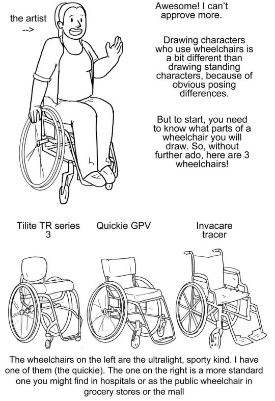
Step one text: So, you want to draw a character who uses a manual wheelchair? Awesome! I can't approve more. Drawing characters who use wheelchairs is a bit different than drawing standing characters, because of obvious posing differences. But to start, you need to know what parts of a wheelchair you will draw. So, without further ado, here are 3 wheelchairs!
Step one image: a simplified drawing of a chubby woman sitting in a quickie GPV manual wheelchair and resting her hand on the handrim of one of the wheels. this is labeled "the artist"
step two: next there is a lineart drawing of three wheelchairs. one is a tilite TR series 3. this is an ultralight wheelchair with a bucket seat (the back is lower than the front), a big cushion and a short backrest that kind of contours to the back of the person who would sit in it. the caster wheels (front wheels) are very small and the footrest is just two little metal bars. next image is a quickie GPV. this is also an ultralight wheelchair with a low back, but its caster wheels are slightly larger, the back has regular upholstery (it does not look like it was made to conform to the back of the person who sits there) and the frame is boxier -- there is no bar underneath the seat where the wheels would attach, rather each wheel is attached to the side of the chair. the next wheelchair is an invacare tracer. it is how most people imagine wheelchairs when they hear 'wheelchair'. it has no cushion and it has a high backrest with handles. it has high armrests that would be comfortable to rest your elbows on if you were just sitting. the wheels are not bicycle wheels like the previous two but are rather plastic. it has big footrests and big caster wheels.
text: the wheelchairs on the left are the ultralight, sporty kind. I have one of them (the quickie). the one on the right is a more standard one you might find in hospitals or as the public wheelchair in grocery stores or the mall.
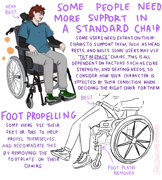
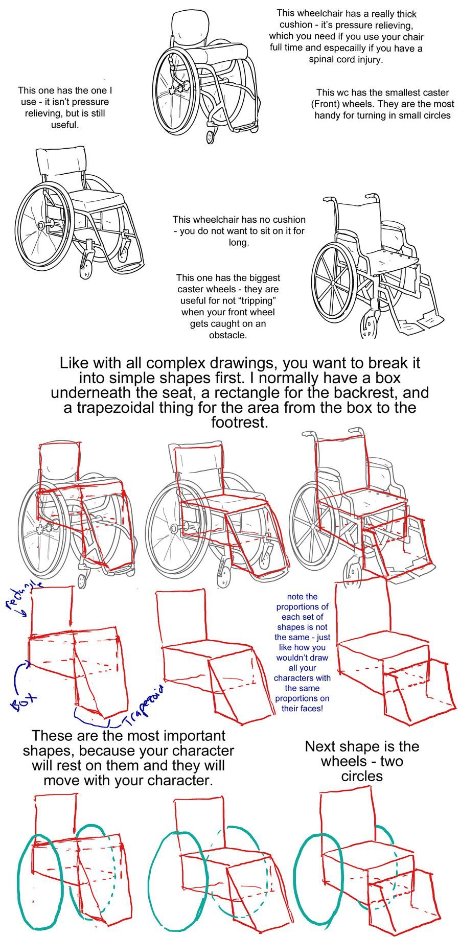
step three: first is text to accompany the tilite. "This wheelchair has a really thick cushion - it's pressure relieving, which you need if you use your chair ufll tiem and especially if you have a spinal cord injury. This wc has the smallest caster (front) wheels. They are hte most handy for turning in small circles." next there is text to accompany the quickie gpv: "This one has the one I use -- it isn't pressure relieving, but is still useful." next is text to accompany the invacare: "this wheelchair has no cushion - you do not want to sit on it for long. This one has the biggest caster wheels - they are useful for not 'tripping' when your front wheel gets caught on an obstacle.”
step four text: like with all complex drawings, you want to break it into simple shapes first. I normally have a box underneath the seat, a rectangle for the backrest, and a trapezoidal thing for hte area from the box to the footrest. these are the most important shapes, because your character will rest on them and they will move with your character.
step four image: the lineart of each wheelchair has been put on reduced opacity, so we can see the square representing the backrest of each seat (the square is the smallest for the tilite and biggest for the invacare), the box for each seat and area underneath it, and the trapezoid for the footrests. the next step labels the images of these simplified shapes as the lineart is removed. "Note the proportions of each set of shapes is not the same - just like how you wouldn't draw all your characters with the same proportions on their faces!"
step 5: we see the same shapes to form the wheelchair, but now with blue circles drawn where the back wheels would be.
text: next shape is the wheels - two circles
step six: next we see the wheels and shapes have been reduced in opacity and the basic structure of everything about each wheelchair: footrests, caster wheels, upholstery details, axles has been drawn on in orange.
text: the next stage is everything else that's structure - front wheels, handlebars, cushions, footrests.
Step seven: we see the lineart on top of the lowered opacity sketch.
text: you can then do detailing like axles, spokes, upholstery, etc and lines
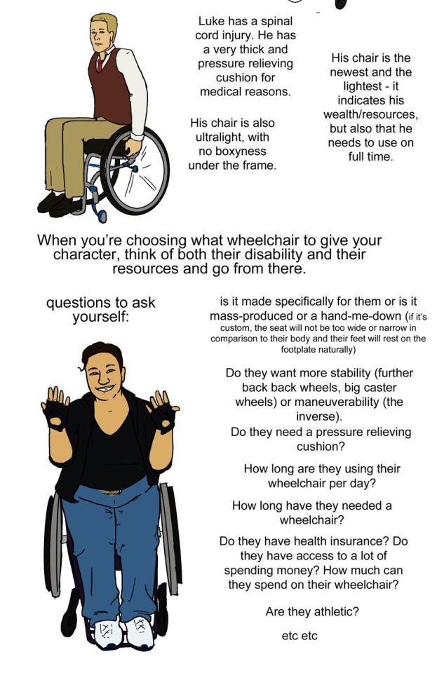
step eight: next we see three drawings of different characters. there is patience, a skinny white woman sitting in a blue invacare wheelchair. kelley, a slightly chubby black woman wearing a stripey dress sitting in a red quickie gpv wheelchair and doing a wheelie while smiling. then luke, a white man with short blond hair wearing khaki pants. he is sitting in a tilite chair.
text: once you get your wheelchair basics, you need to find out which kind your character uses. here are three characters who each use one of the example WCs. patience uses the invacare. she needs one with a better cushion, but circumstance prevents it. Notice the chair is a bit wider than her hips - it's not custom fitted. Also notice she has to turn her elbows out awkwardly to move. the high armrests prevent a smooth push. her wheelchair has big caster wheels and far-back back wheels. it is made for stability and difficult to turn,but also difficult to knock over. Her chair indicates a lack of resources or temporary injury, and is primarily a transport chair
kelley uses a wheelchair like mine - it is fairly sporty, but has a box-y frame underneath. this makes it heaver than if it didn't.she has a mediocre cushion - it protects her, but only some. her back wheels are further underneath her body than Patience's, which makes it possible to do the wheelie (demonstrated here). her wheelchair is supposed to look line one you'd use full time, but it is a little old.
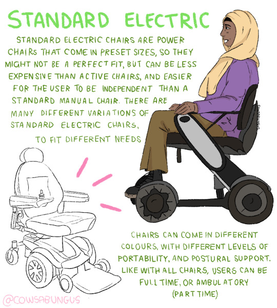
luke has a spinal cord injury. he has a very thick pressure relieving cushion for medical reasons. his chair is also ultralight, with no boxyness under the frame. his chair is the newest and lightest - it indicates his wealth/resources, but also that he needs to use on full time.
step nine: just a drawing of me sitting in my wheelchair holding my hands up to show fingerless wheelchair gloves. we're looking at me from above.
text: when you're choosing what wheelchair to give your character, think of both their disability and their resources and go from there. questions to ask yourself: is it made specifically for them or is it mass-produced or a hand-me-down (if it's custom, the seat will not be too wide or narrow in comparison to their body and their feet will rest on the footplate naturally). do they want more stability (further back back wheels, big caster wheels) or maneuverability (the inverse). do they need a pressure relieving cushion? how long are they using their wheelchair per day? how long have they needed a wheelchair? Do they have health insurance? do they have access to a lot of spending money? How much can they spend on their wheelchair? are they athletic etc etc
posing steps:
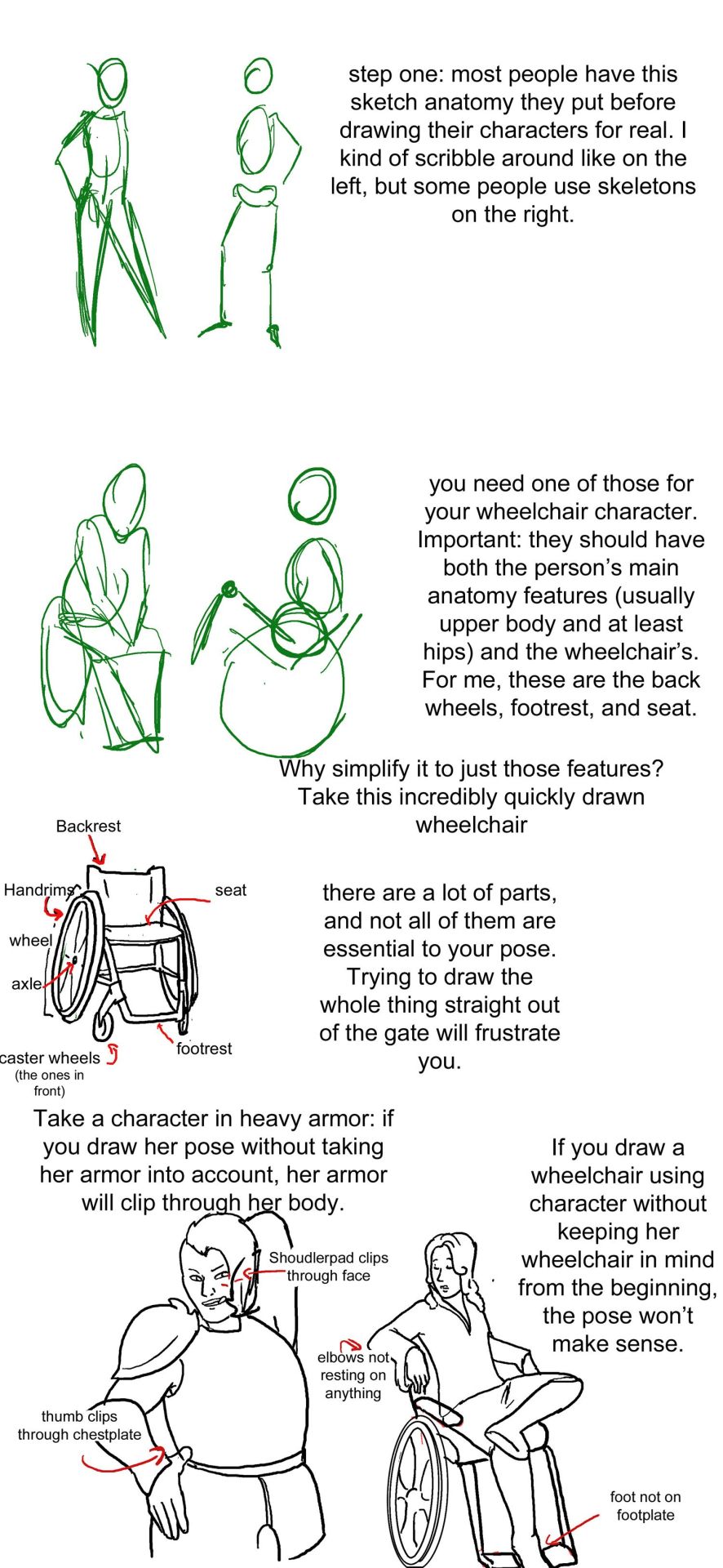
step one: a sketch of two people standing up. one just shows the outline of a person's body, with legs that are ind of triangle shaped, the other shows a sketched pelvis and rib cage to go along with the bones of the legs and arm. text: step one: Most people have this sketch anatomy they put before drawing their characters for real. I kind of scribble around like on the left, but some people use skeletons on the right.
step two: there are now too sketched pictures of people in wheelchairs. one shows lightly traced human form (arms articulated, curve for a stomach, legs that are kind of triangle shaped and pointing down) sitting in a wheelchair that is just the sketch of footrests and wheels. the other sketch shows the sketch of a body with a circle for hips and an oval for a rib cage and the person doing a wheelie (lifting the front end of the wheelchair off the ground and leaning back). their wheelchair is also sketched out and defined by a circle for their wheels and 2 lines, 1 of the seat and 1 for the backrest. text: you need one of those for your wheelchair character. important: they should have both the person's main anatomy features (Usually upper body and at least hips) and the wheelchair's. for me, these are the back wheels, footrest, and seat. why simplify to just those features? Take a look at this incredibly quickly drawn wheelchair.
step three: there is a lineart drawing of a manual wheelchair with slightly cambered (angled towards the seat) wheels, a backrest, and a footrest. the frame is light and there are no handlebars. there are labels pointing to different parts of the wheelchair: Backrest, handrims, wheel, axle, seat, footrest, and caster wheels (the ones in front). text: there are a lot of parts, and not all of them are essential to your pose. trying to draw the whole thing straight out of the gate will frustrate you.'
step four text: take a character in heavy armor: if you draw her pose without taking her armor into account, her armor will clip through her body. if you draw a wheelchair using character without keeping her wheelchair in mind from the beginning, the pose won't make sense.
step four image: next we see two lineart drawings of different characters. one is a bulky woman wearing plate armor. her hand is on her hip and she is trying to scratch her back with the other hand. there is the label "shoudlerpad clips through face" and "thumb clips through chestplate." the next drawing shows a woman in a wheelchair with one foot rested on her knee and her arms rested back, such that they would be rested on the back of a regular chair, but the back of her wheelchair is not wide enough for them to actually be resting on anything. the text here reads "elbows not resting on anything" and "foot not on footplate"
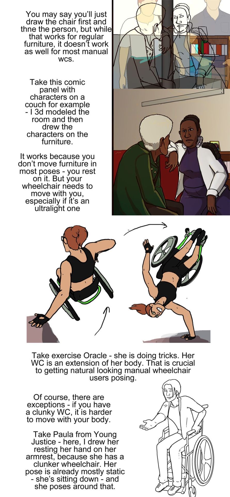
step five: there are two images, one is lineart on top of a 3d modelled apartment with sketchup, the other is a colored in version of that lineart with the background also colored in and no longer a 3d modelled screencap two characters, one old woman wearing a green jacket and one younger woman wearing a white shirt and blue undershirt, are sitting on a couch. the old woman is leaning forward and the young woman is resting her arm on the couch. behind the young woman is a bookshelf.
step five text: you may say you'll just draw the chair first and then the person, but while that works for regular furniture, it doesn't work as well for most manual wcs. take this comic panel with characters on a couch for example - I 3d modeled the room and then drew the characters on the furniture. it works because you don't move furniture in most poses - you rest on it. but your wheelchair needs to move with you, especially if it's an ultralight one.
step six image: there is a flat color drawing of barbara gordon in her wheelchair. she is wearing a black sportsbra and black shorts. in the first image we see she is doing tricks in her chair, zooming through the air (as if she has just launched herself off the ground in a skater park or somethign) while her left hand is resting on a structure and her right hand is heading towards the right handrim. the next image shows her right hand planted on the ground and her chair and body above her, such that she is briefly doing a one-handed handstand, but the motion line indicates that she is moving and this will not last. her left arm is near the handrim of her left wheel.
text: take exercise Oracle - she is doing tricks. Her WC is an extension of her body. That is crucial to getting natural looking manual wheelchair users after posing.
step seven: we see a lineart drawing of paula from young justice. she is sitting in a standard manual wheelchair with high armrests (goes up to the bottom of her ribs probably) and a high backrest (goes up to just below her shoulderblades). she is setting her hand on the armrest, leaning forward, and holding her other hand out.
text: of course, there are exceptions - if you have a clunky WC, it is harder to move with your body. Take Paula from young Justice - here, i drew her resting her hand on her armrest, because she has a clunker wheelchair. her pose is already mostly static - she's sitting down - and she poses around that.
#wheelchair#wheelchair user#manual wheelchair#wheelchair tutorial#tutorial#drawing tutorial#my art#disabled characters
49K notes
·
View notes
Text
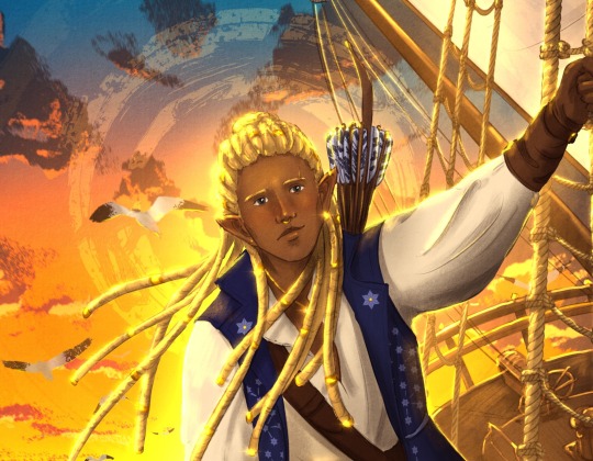
Eärendil the Mariner
Who deserves a pirate outfit more than Eärendil?
The background is largely inspired by one of Philip Sue's paintings. It was fun to draw a flat earth!
In other news, I love drawing ships but that was the worst angle possible to figure out. In my head, the Silmaril is at the prow in some kind of glass/mirror lantern that amplifies its light.
I wanted him to look soft, and little wry maybe, rather than fierce. I'm sure he's fierce aplenty but I mostly headcanon him as tired. His fate breaks my heart. Also, it doesn't really show here but my Eärendil is blind from overexposure to the Silmaril (and half-human fragile eyes).
I always waver between giving him locs or a shorter Mannish haircut, but his hair is really too kinky for the shoulder-length, Aragorn-style cut, so locs it is!
IDs in alt text.
#silmarillion#tolkien#fanart#earendil#the silmarillion#silm#lotr#echo's drawings#disabled tolkien characters#not sure if he should be part of the tag since he doesn't have a visible disability here#but on the other hand he's still disabled to me#vingilot#vingilote#ardamire#earendil the mariner#silm art#tolkien fanart
2K notes
·
View notes
Text
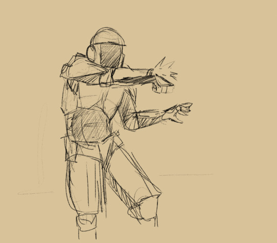
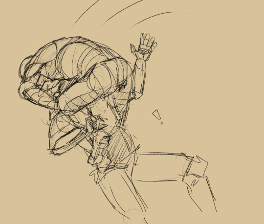
Go you funky little SecUnit! Go!
(One of my favorite scenes from the newest Murderbot novel: System Collapse)
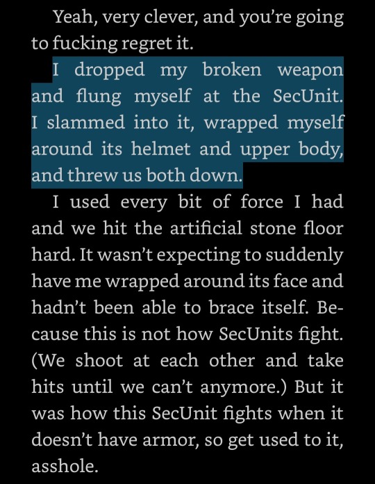
#love when secunit gets a little bit feral#system collapse#murderbot#the murderbot diaries#system collapse spoilers#I'm not good at drawing armor pls go easy on me#I just laughed so hard at this scene it's so fucking funny to me#imagine being the B-E secunit already having a terrible day#your clients are scheming and trying to murder each other#and then here comes the weirdest secunit you've ever seen and you need to neutralize it#you very cleverly disable its projectile weapon with a well-aimed shot oh you're so clever#and just like that it's flinging itself at your head like a fucking feral cat at the vet's office#grace makes art
2K notes
·
View notes
Text


im finally done moving into my stupid new apartment so i drew some symmetry icons of evil fucked up creatures to celebrate
#shadybug#claw noir#miraculous paris special#marinette dupain cheng#adrien agreste#dia draws#digital#fanart#free to use as icons ig if you want#super duper injured rn from hauling and building furniture#my disabled desk job working ass isnt built for moving#eye contact
1K notes
·
View notes
Note
question about your post regarding amputee scarring : i have a very cartoony style, would it be alright to mark the scarring with a small "x" like scar? - kc
Yeah, you can totally do that! Some amputees do have what's called an "x-fold" (I've got one on my left stump) where the skin looks like it kind of pinches in around the end of their stump. Usually it's caused by amputations of a more traumatic (medically speaking) nature but not always.
Though it's also ok to just not draw any scarring. Like I mentioned in my post, most amputees only have little scars from the amputation itself and a lot of them do fade. When I draw in my cell-shaded style, I don't usually bother for my regular amputee scars unless they're especially big or fresh. Seeing scarring is nice for representation but it doesn't have to be there if you don't think it fits.
12 notes
·
View notes
Text
more references
youtube
[ID: A link preview for a youtube video with a purple background that reads, "Crutches canes, walkers", with a small photo in the corner of people standing with underarm crutches, a cane, and a folding walker. End ID.]
(Please link me if you find videos like this of someone who actually uses the mobility aid instead of just a nurse)
#cripplepunk#drawing reference#pose reference#writing reference#drawing disabled characters#writing disabled characters#writing disability#drawing disability#disabled characters#physically disabled characters#injured characters#crippled characters#cane user characters#crutch user characters#walker user characters#cane#crutch#crutches#walker#video reference#Youtube
19 notes
·
View notes
Text

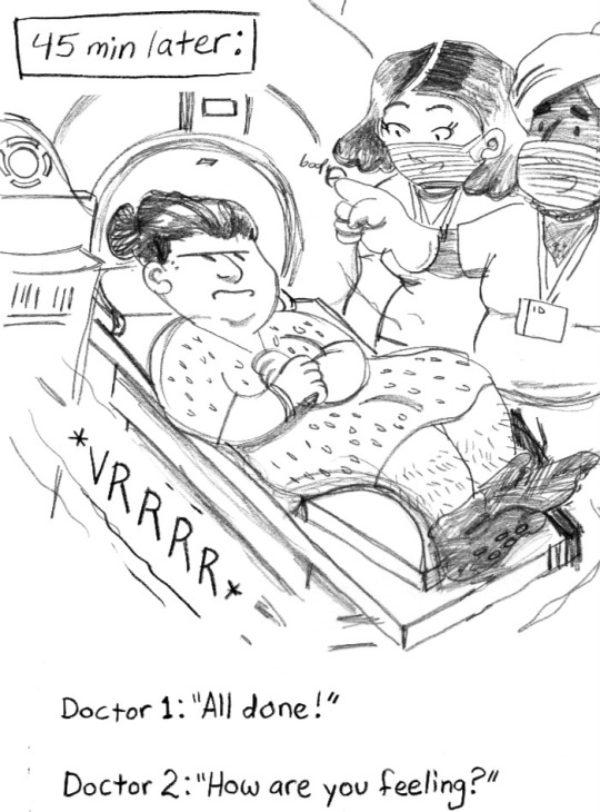
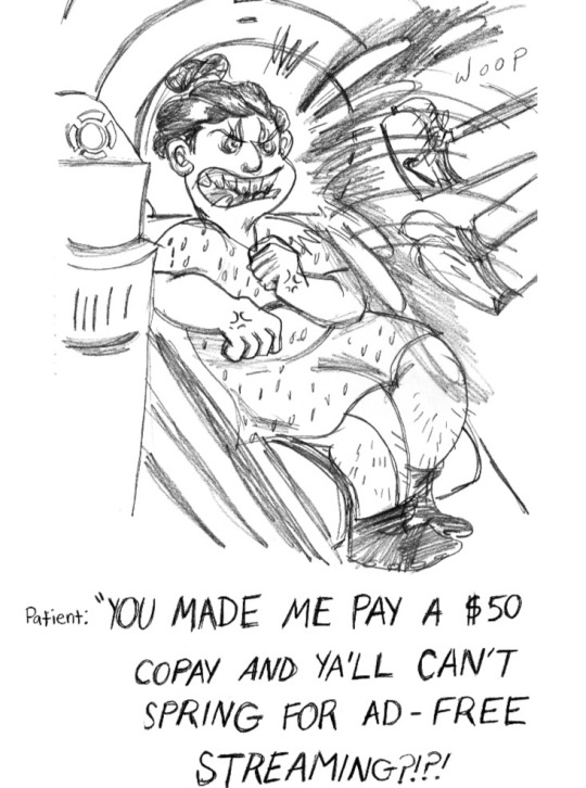
Next part- MRI shenanigans
#comic#comics#proud#drawing#sketch#artist#mri#mri scan#disability#disabled#osteogenesis imperfecta#arthritis#brittle bone disease#genetics#disabilties#cartoon#comix#webcomic#graphic medicine#graphic novel#book#books#book lover#booklr#comic books#bookblr#books and reading#memior#sick#get down with the sickness
873 notes
·
View notes
Text
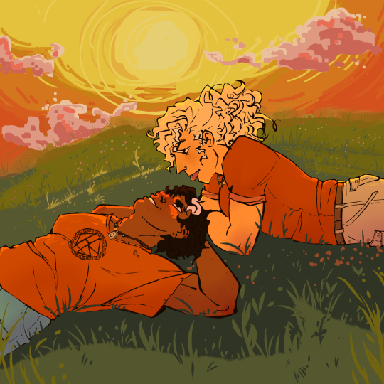
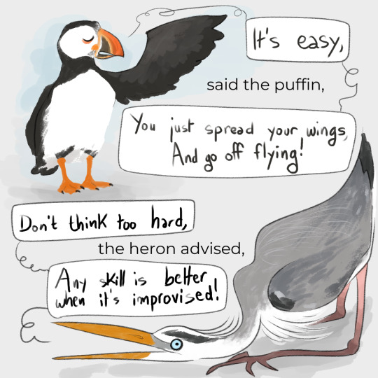
is blowing up a volcano after ur first kiss couple goals
#AAAAA I AM SO PROUD OF THIS#for reference i NEVER draw backgrounds#i just whipped this straight outta my ass#and it was SUPER FUN#also i colour theoried the hell out of this one#and i did it all fast and loose so it was not stressful i just had a great time#thats just the power of percabeth i think#anyway ive been thinking abt them a lot#especially annabeth....#to this day i really cant think of any other characters that are booksmart with 2 canon learning disabilities#that really meant the world to me when i was first reading this series!!!#also shes just the bestest ever#one of my main gripes with the show was just that i felt annabeth lost a lot of that dimensionality#leah sava jeffries girl u ate that up but im sorry they didnt give u enough to eat#idk maybe thats just me bc i have such an attachment to annabeth#shes really cool guys#percy jackson#annabeth chase#percabeth#pjo#pjo fanart#percabeth fanart#art by cricket
756 notes
·
View notes
Text

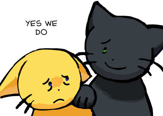
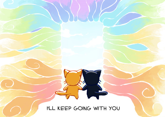
Reblogs got disabled on the original post so here's a reupload of my comic if you want to reblog it!
#goes without saying but don't be mean to the op for disabling reblogs!!#I think the ability to disable reblogs is an overwhelming good thing but maybe I should just post my drawings on their own#instead of adding on to other people's posts to avoid something like this happening again#art#cats#comic#comics#I'll keep going with you
2K notes
·
View notes
Last Seen Blogs

chocolatekingdompenguin
쇼핑다이어리

popculture-fix
Your Pop Culture Fix


ericthepentaxian
Eric the Pentaxian
dramawiie
Magic never ends