#damn the quality is shit
Text
this should of happened, loki is a wuss
also dm me if you want to join my sylki discord server
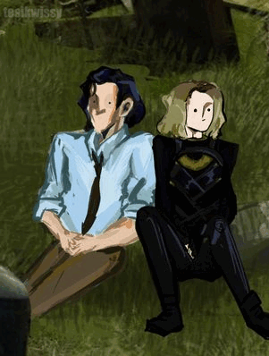
#sylki#lovie#lovedaggers#marvel#loki x sylvie#sylvie laufeydottir#loki#loki season 2#loki tv#loki series#loki laufeyson#loki friggason#loki s2#loki show#damn the quality is shit#yes i got lazy with the bg
106 notes
·
View notes
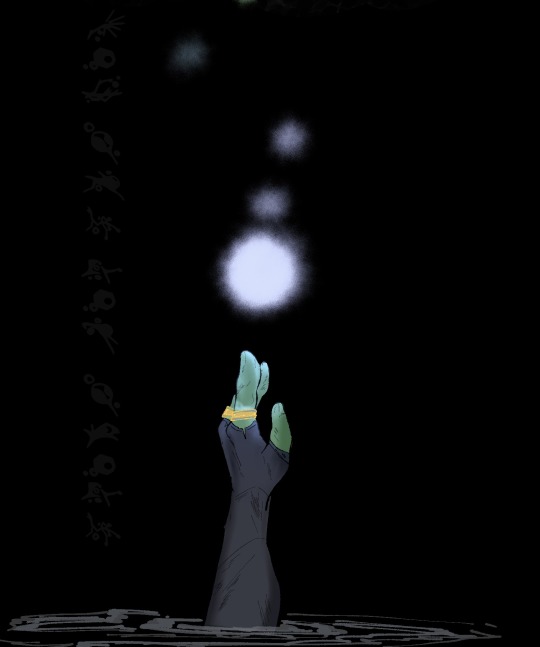
Text

reunion
#I want to paint this renaissance style but also I am sleeby#damn the quality is SHIT#hope it looks better on your side lol#also did not bother with a reference for stede's stache so that's why it looks weird if you're wondering lmao#use references kids#I was just not feelin it today cause I haven't finished something like this in so long#if you can call this finished#anyway hope you like it byeeee#ofmd#my art#sketches#stede bonnet#ed teach#blackbonnet#gentlebeard#stedward#which one are we using again??#I like blackbonnet but idk if that's the most popular ashgfdkj#our flag means death
265 notes
·
View notes
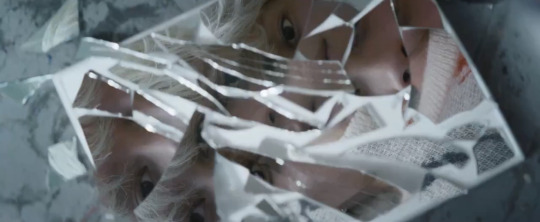
Text
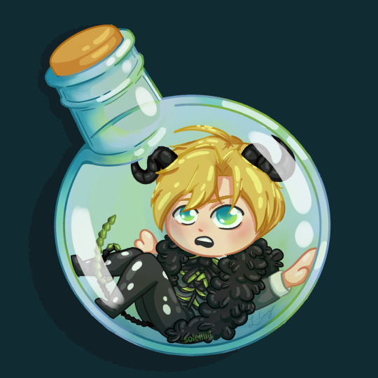
A little spell mishap happened
*disclaimer: replaced the orig. image since it was in shit quality. apologies*
#obey me#shall we date obey me#my art#artwork#finished#art#artists on tumblr#illustration#digital art#digitalart#digital painting#obey me satan#satan#damn the quality is shit#fanart#fan art
42 notes
·
View notes
Text

I am not a artist or a drawer but I think I did good :DDDD
Anyway, this is for my English subject, we had to write a Haiku and I based mine on Sky: Children of The Light.
My reference:
#sky: children of the light#sky: cotl#sky comic#Does this count as a comic?#Haiku#sky children fanart#Does this count as Fanart?#my art#eye of eden#This is basically my first time going into Eden#The moth is me#Yes I do dare pass those doors.#Honestly#Only reason I'm alive is bc of a veteran who held my hands#Yes we died#Yes they is my friend#Damn the quality is shit#But I am so damn proud of myself and this drawing#I love it#Mine.
4 notes
·
View notes
Text
"honestly, i feel like she's the underrated heartthrob of the film."
— ruby cruz on her character, hazel, sxsw 2023
#and who's gonna tell ruby that i literally fell for hazel as soon as she came on screen#MAIN heartthrob imo#i need her so bad it's very serious#it's bad for me yall i NEED her#and who cares if i'm talking about ruby or hazel#i NEED her.#bottoms movie#bottoms 2023#hazel callahan#ruby cruz#lover!#my coloring#gif#*mine#femalegifsource#userlgbtq#1k#2k#3k#i tried my damn best with the shit quality. AND she's unfocused in the bg???#this beat my ass trying to sharpen
4K notes
·
View notes
Text


🫧The Gifted🫧
LONG UPDATE CAUSE UHHHHHHidk
Look y’all’s I love colors now but my brain says it’s too slow for me. I wanna move faster so probs no more colors,?? Dunno yet
Posting at a weird time cause anxiety I wanna k bye
<|| The Gifter—Hello!Hello? ||>
#Spirits Reborn#oh boy#quality of images is gunna get shit on so hard…#anyways#tags i Guess lol#damn I’m tired af#coko doodles#rottmnt#tmnt iteration#tmnt#drawing#doodle#sketch#rise of the teenage mutant ninja turtles#teenage mutant ninja turtles#Splinter#Yuichi#Calimari#oc#ew#Raph#Mikey#Donnie#Casey jr#Cassandra#april o'neil#Spoider#special guest#hand
407 notes
·
View notes
Text
Suguru says happy chinese new year !
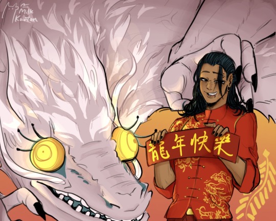
#posted on time for once holy shit#i died twice drawing that damn dragon.#tumblr air fried my quality dawg im gonna#suguru geto#jujutsu kaisen#geto suguru#jjk#jjk fanart#jjk geto#chinese new year#cny#lny
69 notes
·
View notes
Text
I saw a counterargument of the Wish movie that said something along the lines of, "The movie isn't Citizen Kane, so what?" Imagine typing and posting this absurd ass take and thinking it's a legitimate argument against those who criticize it. Considering that this is an animated movie released on their 100th anniversary, the fact that they delivered a "meh" at best movie should upset you when looking at Disney's movie catalog and their impact on the field of animation. If you don't hold Disney to a higher standard, they will keep putting out mediocre content, but unfortunately, too many Disney fans are sellouts to this company. Y'all wanna get mad at people for being too rough on and critical of modern Disney, but they earned this shit 100%. They became so arrogant and loved the smell of their own butthole a little too much that they did not foresee their inevitable eventual fall at all.
#disney#wish#txt#disney fans are so ridiculous#star wars fans have a reputation of being crazy and obsessed and have been endlessly mocked and criticized for it even by the very sw fando#but star wars will defend their shit regardless and do demand quality out of the movies#disney fans just accept mediocrity from the company that used to amaze us beyond belief and teach us great life lessons about selflessness#nowadays everything they teach is about the SELF and how you don't actually need to change a damn thing about you because you are perfect#the way you are. it's selfish#disney had their share of bad movies or movies with bad messages back then but nowadays this seems to be consistent#back then it was a “once in a while” thing now it's a consistent thing
61 notes
·
View notes
Note
About LO backgrounds isn't blending well and looking very 3D, while you're correct I honestly think LO is more tame case if you look to Webtoons like Midnight Poppy Land and Let's play for example; at least RS oversaturate the backgrounds with colors so it won't be very noticeable and doesn't make it hard (at least for me) to read the comic, I can't same the same for the aforementioned two!
(sorry if my English was weird)
oh yeah no, LO's backgrounds aren't even half as bad as Let's Play and MPL, both of those comics have their anime characters literally just floating on top of Google SketchUp and Acon3D backgrounds and it's so brutal. LO's backgrounds are definitely more "bad when you squint", though the tradeoff is that unlike in MPL and LP, the character art is WAY worse and so half the time you don't even look past the noodle limbs and brick shithouse bodies and bug-eyed faces to notice just how dull and empty the backgrounds are. Frankly I think the models they use would be fine, if they put more effort into actually coloring them instead of just washing them out with a single color that doesn't tell you anything about the setting (especially when those single colors make the foreground characters look even worse with the color disparity.)
Case in point, we sometimes use 3D models for buildings and furniture in Rekindled and I don't think people even notice half the time lmao LO's 3D backgrounds aren't blending well because they feel like they shouldn't even be there when they're just using void backgrounds anyways, vs. LP and MPL which are overusing 3D backgrounds with no effort put into blending them to make them look natural.
#on the one hand WT is definitely responsible for pushing their creators to such an extent they have to take the low effort way out#but then again there are also plenty of comics that have the same amount of panels and tons of action that still don't do this shit#like i guess WT can still be held accountable for not having any real quality control but damn#i don't think i could ever put out a comic that looks like that#that's not why i became a comic artist#ama#ask me anything#anon ask me anything#anon ama#lore olympus critical#anti lore olympus#lo critical
67 notes
·
View notes
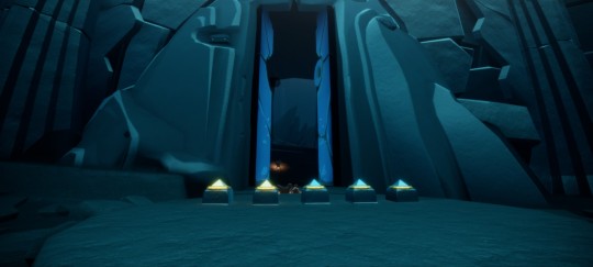
Text
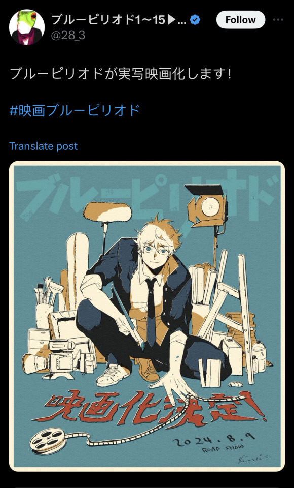
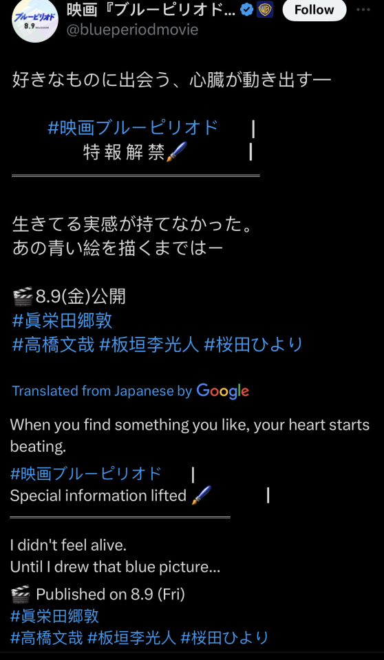

im shakigng
#solar-talks#A MOVIE .. WHAT THE HELL#AND THE SHOTS LOOK SO NICE ……. OH MY GOD … NO WAY ……. NO WAY ……………..#GREAT NIGHT FOR ANNOYING PEOPLE <- ME SPECIFICALLY#damn i havent seen anyone post it yet guess ill tag it#blue period#these r just screenshots from my phone so the quality is shit but THATS HIM … YAGUCHI MY DEAR OLD PAL ..#i was gonna put more of my favorite frames from the trailer but i got too impatient and ended up just staring at the shots again#the lighting … is so nice …….
21 notes
·
View notes
Text
hope that dsmp vol 2 flops so fucking hard & that a lot of the smaller CCs who got fucked over massively by dream and other large creators in dsmp vol 1 are able to enjoy other SMPs (i know aimsey is in area unknown iirc?) that r not tied directly to an incredibly shitty and disrespectful (at bare minimum bc u know i have a lot of fucking thoughts on dream) person.
#ik people will probably still watch vol 2 albeit way less than before#but i hope that it collapses inward on itself#and all the shitty communication issues and weird dynamics existing in the dsmp 1 cause it to fail#and that wilbr + q w/ their fucking incredible lore . stay out of it <3#not even bc i particularly care for those two above all else but#they clearly put their heart and fucking soul into doing their damn best to#(1) include as many other streamers as possible and (2) give us quality lore#like ik some streams were controversial especially w the former but#they were clearly thought out and coordinated and had passion behind them#versus whatever the fuck else happens when ppl like drm are given the baton to try and do lore#and it becomes a complete fucking disaster bc its clear that nobody corrdinated it nobody gave a shit#and they acted like the server only had 4 ppl and not yk like 30. like the fucking finale for instance.#discourse#whatever. i dont even care <- cares a little bit.
263 notes
·
View notes
Text
being a woman in any film space, be it filmmaking, cinephilia, film festivals, film school, any and all of it, and like not getting frustrated and leaving that world altogether? you are god's strongest fucking soldier and i love you so much.
#like every day i see the most casual sexism and it's all rot. literally it's damned if you do damned if you don't#if you're competent and successful and good at what you do you're a shill if you're a little more inconsistent in quality you're a hack#if you're passionate about film and watch a bunch of movies you're a fake but if you just tow the canon line again you're a shill#if you take up space on tee cee em you're taking the space of a man who deserved it more than you and you're a shill.#if your curated series is creative and unique it's BAD and ANNOYING! but if you show old standards.... again. HACK! SHILL!#i see a lot of people i consider friends perpetrate this btw. you guys get real weird when a woman is involved and don't extend that to men#typical nuance enjoyer when it comes to a film a woman made: time to say the most out of pocket misogynist shit! do u still think i'm cool
31 notes
·
View notes
Text
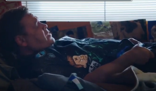
Lister has a little Rimmer (and "<- smeghead") and Lister patch on his jacket
#that is so fucking CUTE#My quality is preddy damn shit so I cant take better screenshots but ILL WATCH IT IN HQ EVENTUALY I pwommy @ stock#red dwarf#dave lister#david lister
37 notes
·
View notes
Text

Frankie redesign? Yeah frankie redesign 🔩🌩💚
#monster high#monster high frankie#monster high frankie stein#mh frankie#frankie stein#digital art#redesign#? kinda not really lol#idk i really like it but it could also use some work?#i fucking forgot their neck bolts lmao#anyways trying something new!#lineless art#woooow#i hate doing line art so here i am again#just refusing to do it LMAO#i did the same thing at 14 which is funny#line art continue to be an uphill battle for me lol#also damn i have no idea why the quality is s crunchy#oh maybe i made the canvas too small shit
32 notes
·
View notes
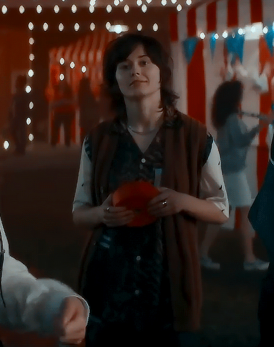
Text

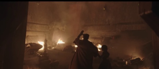


Certain losers are really still lying with their whole chest and trying to convince others The Acolyte looks “cheap and dull” lmfao. Like even in these lq screenshots from the trailer, this show is already the most visually stunning series I’ve seen from SW since The Mandalorian s1
#the acolyte#star wars#sw fans are always fed incredible work in visual and practical effects that to this day continue to revolutionize the industry#and then they shit all over it and swear its the worst thing ever seen#i think the quality of some shows or seasons have slipped from time#but these are tv shows and yall know damn well almost all of the visuals from this disneyplus hera have been movie level#i still think its funny when someone will say a scene looks terrible and blame the use of the volume#but those volume scenes theyre complaining about arent even shot using the volume 💀#people think theyre experts when in reality they dont know shit lmao
11 notes
·
View notes
Text

Always a good morning waking up to this looney tune 🤣💚🖤💚
32 notes
·
View notes
Last Seen Blogs

colocation
Colocation

olitheworm
Creature of the Dirt

carleyharkness
Wonderful World of Witches and Wizards

olivenza2
Olivenza2

tieubachlang
Xiao Bai Liang