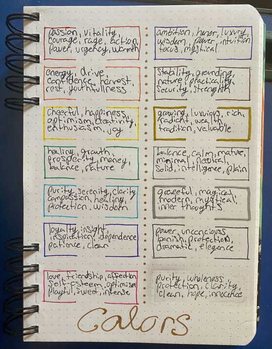
#color association
Text
Updated Post. Imma be real for a sec, some of the new information that was brought to my attention is amazing and, in fact, very helpful, so I'm making an updated post to this one here.
A Beginners Guide to Crystals.
How to spot fakes (typically glass) and dyed crystals, Crystal Shapes, and Crystal Color Associations are the topics in this post.
How to spot glass, resin, and other types of fake crystals. (You can still 100% use them in witchcraft, but if you want genuine crystals, then this guide may help you do just that!)
If you think that your crystals are fake, here are some things you can look and do to tell.
Rubbing your crystal with a finger should reveal tiny pores on the surface of the crystal. If it does not have any pores and is instead completely smooth, then it's possible that it's glass or resin.
While some crystals can have naturally formed air bubbles in them, it is rare and may just be glass that was shaped into the crystal.
You can easily search up "fake crystal name" vs. "real crystal name" and compare the two pictures.
You can also look up "dyed crystals" vs. "undyed crystals" to see what a natural coloring of crystals should look like.
If you're worried that your turquoise is fake, then you can take the tip of a hot pin and press it into the crystal, if it burns then it's real, however if it starts to melt its a fake.
Opalite and Goldstone are glass crystals, man made.
9/10 times if your Crystal looks very brightly colored it could have been dyed.
I'll put in some pictures of glass/resin crystals next to the real crystals to show the difference.
Natural coloring of crystals occurs because of the different metals and other minerals that are absorbed during the creation of the crystal. Quartz is just silica and oxygen, so it's appears colorless, but when iron is absorbed, it creates purple or yellow, depending on how oxidized the iron was in the creation of the crystal.

Natural citrine does form, but it's not going to look burned or splochty.
Splotchy color in crystals usually means that it's been dyed, as you can see in the first two images. Dyed crystals also very obviously look dyed because of how brightly they are colored.
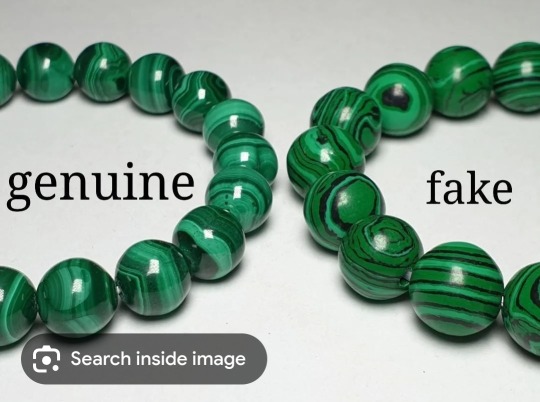
Even in Malachite, the green in the fake malachite is brighter than the genuine malachite. You can also look at the unnatural banding on the fake and compare it to real malachite.
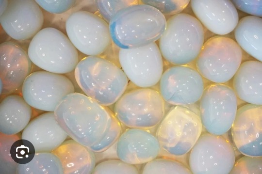
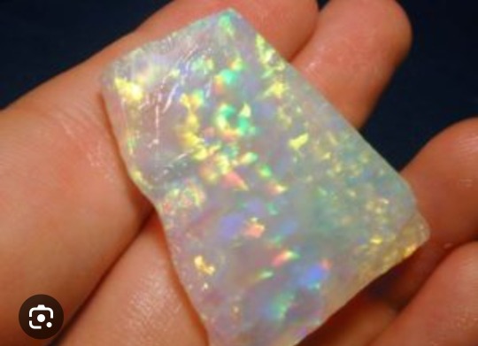
Real opal is not see-through like Opalite is. Real opal is more clouded with spots of color, while opalite will have streaks of color or look like the see-through ones above.
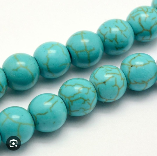
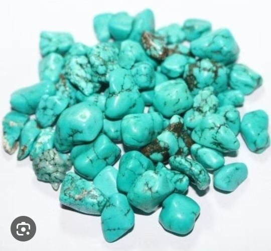
Real turquoise is going to have brown or black webbings and cracks or chips, while dyed howlite is going to be smooth with brown or black inclusions. You can take a swab of acetone and rub it across the crystal to see if any coloring comes off. If the color does come off or the crystal looks lighter in the spot, then it's more than likely dyed howlite. You can also do that hot pin trick mentioned above.
The picture on the left is dyed howlite, while on the right is the natural turquoise. You can see that the natural crystal has deep webbing into the stone, very obvious cracks while the holite doesn't have cracks, only webbing that looks like it but it's going to be smooth along those lines.
Crystal Shapes in witchcraft
Double pointed- absorbs and emits energy.
Cluster- Radiates energy.
One point- concentrates and directs energy.
Raw- Strong open energy.
If the crystal is more round then the energy is going to be calmer
If the crystal has multiple points, then the energy is directed off of each point.
The size of the crystal doesn't dictate the amount of energy it gives off.
Different crystals have different energies that they give off. The ones most commonly used in witchcraft and their properties are listed below.
Clear quartz- Clarity
Amethyst- Grounding
Citrine- Happiness
Rose quartz- love
Black Tourmaline- Protection
Obsidian- also protection
Aventurine- luck
Tigers eye- money
Labradorite- aura healing and protection
There are many other crystals that give off similar energies that can be used. As stated, these are just some of the more commonly seen ones.
Now, different crystals can give off different energies depending on the person using them. Some people may see use amethyst as protection rather than obsidian or black tourmaline. Some may use aventurine for money spells over tigers eye. That's 100% okay.
Crystal Color Associations.
Color associations can depend on how the witch feels about a color. This is the general association plus how I use colors in my path.
Red- Anger/passion
Orange- Courage (or in my case repulsion)
Yellow- Happiness
Green- Luck and money
Blue- Calming or sadness (depending on the mood)
Purple- Spirituality
Brown- grounding
Pink- self love
Grey- solemn, seriousness.
With some crystals, the color is also associated with the things listed above. However, again, not all witches will use the color associations of crystals this way, and that's 100% okay. Each witch has a different path and different associations when it comes to the tools they use in their path.
If you're interested in learning about what energies different crystals give off, often just googling "what is crystal name used for in healing" and you will receive an answer.
Though with any type of research, please look at 3-5 other sources that say the same or similar thing. Though it may take more digging to come to a conclusion.
Thank you for reading the updated post, and let me know if I missed anything or if you'd like to add anything. A big thanks to everyone who has corrected the previous post on this subject and any posts that may have contained misinformation in them.
#witchcraft#fledglings guide to witchcraft#witch community#witchblr#witch topic#crystals#color association
355 notes
·
View notes
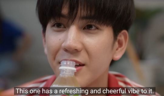
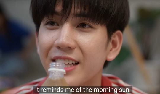
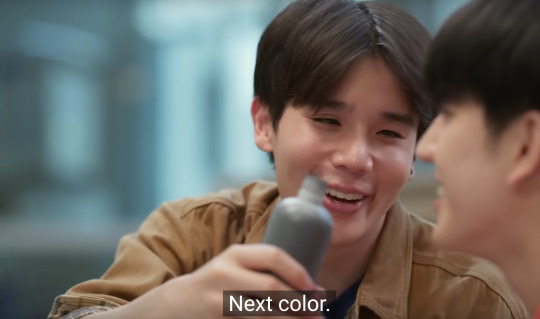
Text
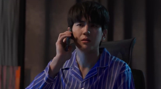
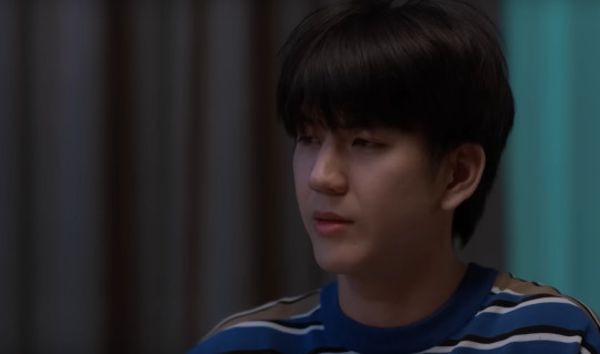
Living in this scene


White = Purity, Innocence, Simpleness, Cleanliness
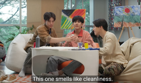
Red = Stimulating, Passion, Desire, Dominant


Yellow = Optimism, Creativity, Warmth, Cautious

Black = Secretive, Protective, Arrogant, Evil


Blue (Mork) = Dependable, Loyal, Intelligent, Sensitive
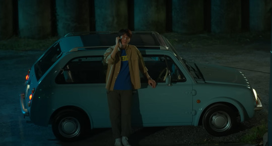


Bonus - Little Day, Big Mork's Boyfriend wearing his guy's color.
#last twilight#last twilight the series#the colors mean things#color association#the color exchange#Mork is a Blue Boy!
103 notes
·
View notes
Text
The Colors of the Rainbow
Timothée asks y/n what color he reminds her of, and she puts a lot more effort into an answer than he could ever imagine.
Warnings and such: it's. so. fluffy. also like one swear word? illusions to "adult situations" but nothing bad! not proofread!
A/N : i'm backkkk!! not gonna lie, i didn't expect to be gone nearly a month, but life sucks lately and it just kinda happened...im sorry!!! thanks for the continued love and support! also- i get my cast off in like 10 days! yay!
---------------------------------------------------------------------
"what color do you associate me with?"
His voice drew my attention away from the book in hand, the first words spoken aloud in hours. it was thought provoking; a color?
"what do you mean?"
"when you hear my name, what color do you think of?"
I had never thought of that before, but now seemed a good a time as any. I allowed my eyes to wonder over him as I thought about the best answer.
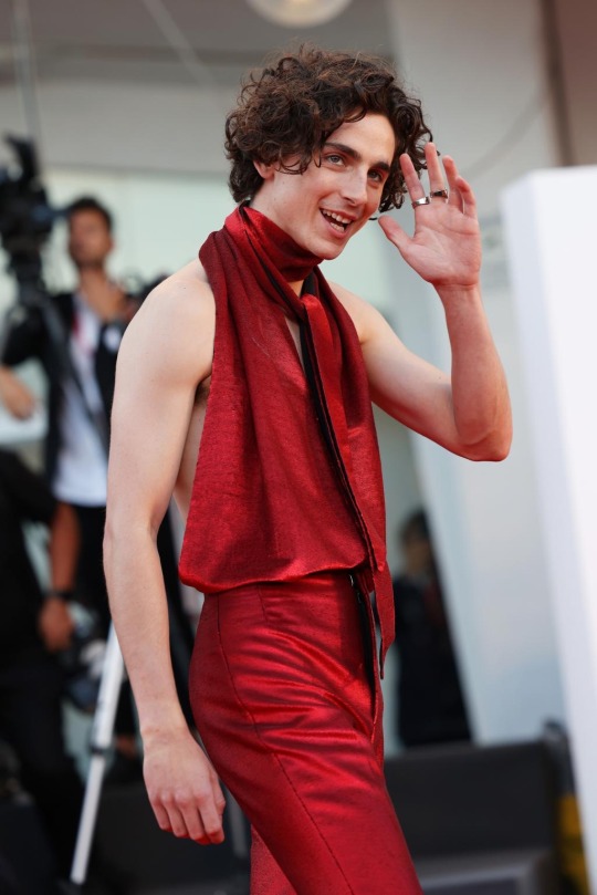
Red: bold and beautiful. a bright color, attention grabbing and hard to look away from. the color of our bedroom lights after too many nights spent apart. the color of his eyes after he smokes too much and giggles on the couch. The color of our lips when we finally pull away, gasping quietly for breath. Red. The metaphor of blood shed that went into making us, and making us work. red, bold and beautiful.
Orange: autumn. obviously. the color of pumpkins, of crazy sunsets and sunrises, worthy of photographs we'll never look at again but in the moment, it's important. the color of comfort, warmth and a cool breeze. orange, deep like fire, the burning desire for him, for me, for each other. the color that paints my insides when i look at him and remember that he is mine.
Yellow: not the neon yellow, but the soft yellow. the yellows the paint the sky for a brief moment in the early hours of the day, when the world is waking up again and the day is starting. the color that floods our bedroom and allows dust to dance in the air around us. the last color we see as we fall asleep together. the color night owls are always chasing. for him, it's the color he radiates when he walks into the room, bright and happy, a glow that follows him and intoxicates everyone in his path.

Green: earthy and holy. natural beauty, like the nature we crave amidst the bustle of the new york city. not a color i see him on often, but the color of his eyes. the color i get lost in when he talks, drunk on the sound of his voice. the color behind his entire world. it's calming and comforting. it's him. a color i would happily see every day for the rest of my life. a color i plan to see for eternity.
Blue: the color of water and cleanliness. he loves his showers, his pools, and the rare trips on boat rides for secret swimming holes. a water bug through and through. the color for which he starts every morning, a fresh start. the color of winter, cool and quiet. for nights spent close together under heavy blankets, skin on skin. the color that accompanies him to premieres and interviews, a color that demands attention in the softest tone.

Purple: both the softest and deepest versions. a child-like representation of each, a playful color. a color which adorns his body on quiet days spent shopping, or nights gallivanting around for basketball games and bars with his friends. a color i often associate with nights home without him, the undeniable fact that he'll stumble through the front door in the early hours of the morning, the smell of alcohol lingering on his breath as he tells me he loves me.
White: innocent, clean, wholesome. a stereotypical color, but there's truth to it. sure, he's not pure in the sense of what the color stands for traditionally (can you blame a girl?) except he is. through all of life's changes, the good, the bad, and everything in between, he's stayed true to who he is. he's happy, ready for life's adventures. he wants to be the person his generation can look up to, someone who defies the odds and makes a name for himself on his own. he doesn't need, or want, poor publicity or the lingering story of being a hollywood fuckup. he won't be- he can't be.
Pink: a color typically labeled for feminism, but golly doesn't he look beautiful in pink! it's bold and impossible to look away from. the lightest shades for the purest and most innocent, the darkest shades for the most demanding and defiant. why not break stereotypes?! the clothes make the man, so they say...but for him? no. he makes the clothes. he's what pulls the outfit together, the one who makes the color beautiful. beautiful, like the color that paints his cheeks when his heart flutters in his chest.
Gray: a color for balance. there's never light without the dark. with good days, comes bad. we get tired, sick and worn down but it reminds us we are human. a color reserved for coffee runs on lazy sundays, after sleeping away the stress of the previous week and preparing ourselves for the next. a comforting color, one that reminds us we are allowed to be sad, but the feeling will pass and the sun will shine again. be patient, good things take time.
***
"Black." I settled on the answer with a smile.
"Black?!"
"Yes!"
"Why?! That's the most basic color!" He chuckled softly, nudging me with his foot.
"No, it's the most important color."
"Important?"
"Well, it's a perfect combination of all the colors, and all their qualities. You've got the best of them all, love."
"How so?" There was no hiding the color pink on his cheeks.

Black: the perfect combination of all the colors that exist. the best qualities mashed into one, leaving ample opportunity to add more of the color that's most needed. black, the color of the room which we share in the middle of the night, where the only sounds are soft snoring or heavy moaning. sometimes both. it's in this color where we find solace in one another, an indescribable feeling of peace, a place which we call home. in the arms of the man i love. all the colors in the world, every combination of letters in every language- it'll never be enough to express the gratitude i have for the stars above that lead me to him.
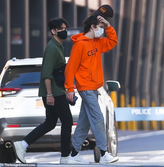
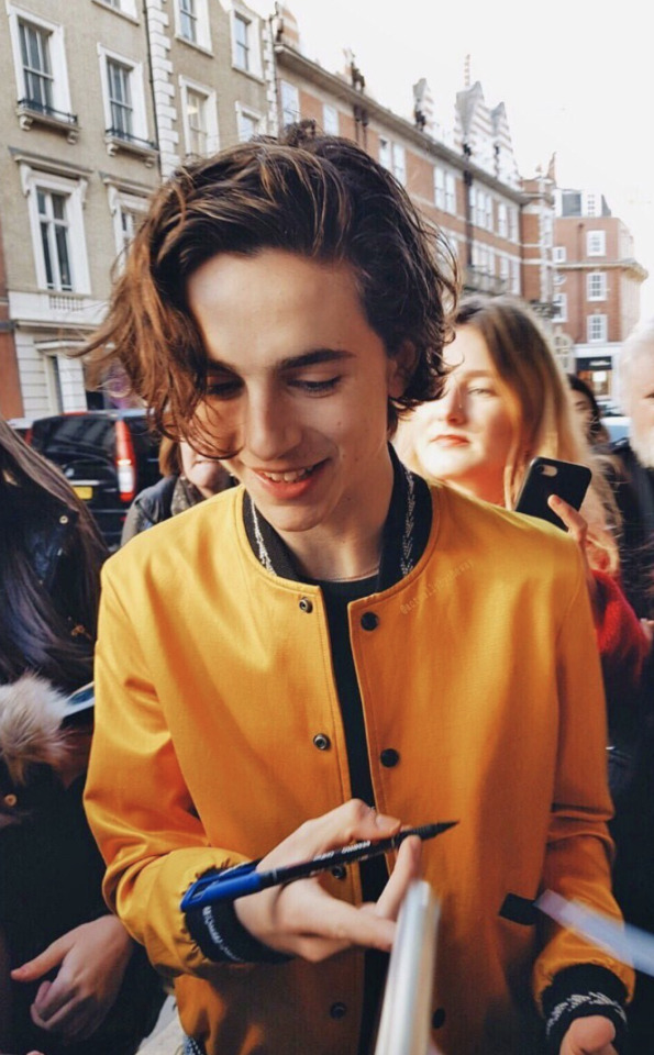
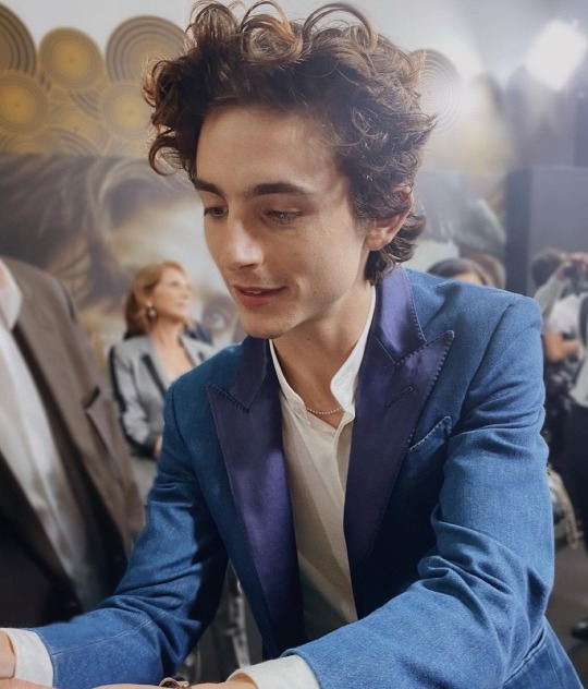
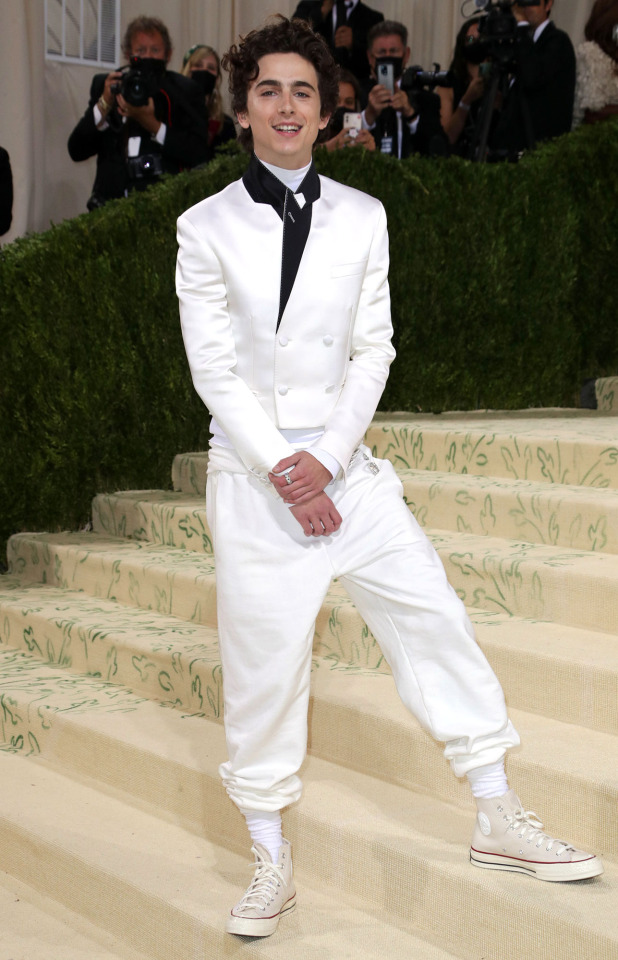
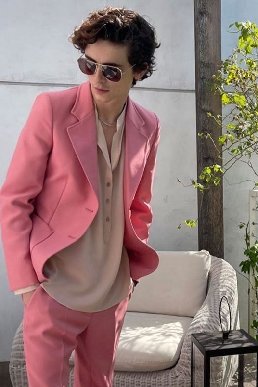
#Timothée chalamet#timothee chalamet#timothee chalamet soft#timothee chalamet imagine#timothee chalamet x y/n#timothée x reader#x reader#y/n#fluff#color association#red#orange#yellow#green#blue#purple#white#black#grey#pink#timothee chalamet as a color#timothee chalamet as regulus black#regulus black#reggie#regulus#regulus deserved better
108 notes
·
View notes
Photo
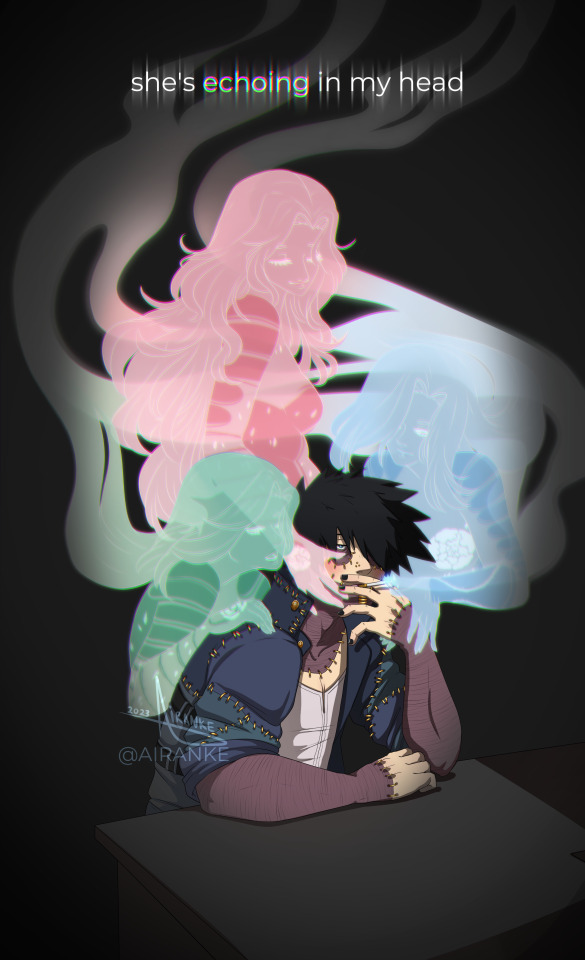
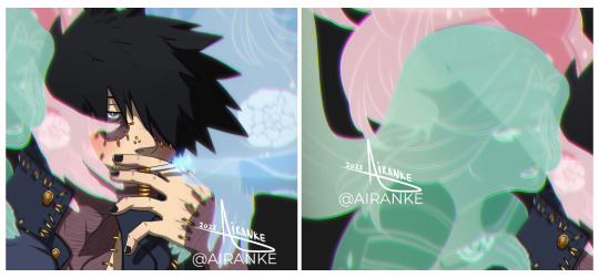
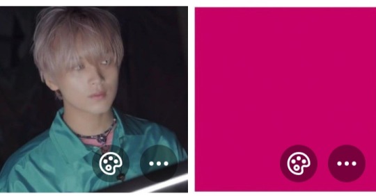
Can’t stop thinking about her, can you?
#Dabi#Touya Todoroki#todoroki touya#Abiteth Kenka#dabi x oc#oc x dabi#canon x oc#oc x canon#mha oc#bnha oc#My Hero Academia#Boku no Hero Academia#dabi mha#dabi bnha#Air's art#dabi art#fanart#color association#pink Abi for crush#green Abi for mischief#blue Abi for trust#and also because he associates her most strongly w/ these colors so#pink Abi for her hair#green Abi for her eyes#blue Abi because its her fav color#Dabiteth
151 notes
·
View notes
Note
Do you have any tips for me to stop associating good with light and evil with dark?
Yes, think about what other kinds of things you can associate with light and dark that don't really fit into this scheme! Some examples: Snow can be deadly if you're trapped in it. White phosphorus does horrific harm to people. Fertile soil is dark. Nighttime gives relief from the heat in hot climates.
34 notes
·
View notes
Text
Am I just weird, or are some characters synonymous with certain colors?
For instance I mentally associate Brooke Davis with the color red, Jay Hogart green, Ryan Atwood blue, Emma Nelson aquamarine/blue green, Rue Bennett purple, Maya Matlin yellow, Don Draper black, Zoe Rivas coral or pink, Elle Woods pink, and Devi Vishkumar maroon, just to name a few.
Idk I hope I'm not the only one. 🤷♀️ if so, what are some of your associations?
#the oc#degrassi#never have i ever#one tree hill#euphoria#mad men#legally blonde#degrassi next class#degrassi the next generation#characters#?#color association#fiction#tv#film#thoughts
15 notes
·
View notes
Text
Ever since I was little, whenever I heard music in a certain tone, I associate it with a color for some reason. My brain goes saying 'oh this is a blue tone' or 'argh it's too yellowy, the song would've been better in green'. I thought that no one would understand me cuz like who associates songs with colors? And it made it difficult for me to communicate with ppl regarding songs.
My kidself was always angry if someone sings a song in a different tone(I was very particular that if you had to imitate the singer it should be exact lmao). I was angry that a girl in my sixth grade won singing Chandelier even though she 'sang in a white tone instead of the og red one'. But obviously I knew that no one would understand. My sister sometimes sang and I preferred blue tones(she sung in the most horrid shade of yellow) but I couldn't just ask my sister to sing that way lmao without her being confused. I couldn't really express my words. But I grew up and realised that it didn't matter much. Like who cares which tone you sing in?
Today, I accidentally let slip to my friend about this and she was very curious and started asking about which songs are which color. She didn't get my color scheme lmao. She thinks I associate each color with an emotion so like sad songs are blue or happy songs are yellow. Tbf, I associate similar songs to be one color regardless of their content. But yeah we had a good laugh about it. One of my other friends had a good idea of my color scheme(it finally made sense to someone) but she calls the white tone as delicate which.... I don't necessarily agree with but makes sense tbh.
It's even more weird that when ppl talk, I can't find out which color their voices are since their tone changes everytime(and you have to extend the way they say a particular word to decipher a color). I tend to assume them a a mostly brown/grey. Apparently, my color association seems to be easy for songs.
So now I'm dead confused on why my brain thinks like this. Like I kind of enjoy that I can put a name to a certain tune but just.... why????
6 notes
·
View notes
Text
Basic color associations!
#hades and persephone#hades devotee#hades devotion#persephone deity#persephone devotee#persephone devotion#hellenic devotion#hellenic pagan#hellenic polytheism#hellenic religion#color association#grimoire pages#paganblr#witchcraft#hellenic witch#real witches#pagan witch#witchblr#grimoire prompts#grimoire#my grimoire#paganism#pagan blog
14 notes
·
View notes
Text
1 = white
2 = light blue
3= yellow
4= green
5= the spectrum
6= pink
7= blue
8= red
9= purple
10= black
Sorry i don't make the rules
#Color association#the only correct way#white#light blue#yellow#green#pink#blue#red#purple#black#every number over ten would just slowly turn into a flag out of the preexisting colors listed above#i spelt something wrong here#what are you doing toast
4 notes
·
View notes
Text
The characters of ROTTMNT (which is just the iteration I have become most acquainted with) I found are very linked to their colours. This could include other iterations as well. We all know that red usually means anger, but it also means passion and desire. It could also signify sacrifice, danger, courage, aggression, heat and war.
Orange means joyfulness, optimism, witty, eager, bold and energy.
Yellow means spontaneity, hope, happiness, summer and caution
Green means and is commonly associated with life, and can also represent money, luck, growth, fertility, health, generosity,balance, spring, rebirth and envy.
Blue represents the sky and the sea, freedom, intuition, imagination, inspiration and sensitivity. It could also represent depth, trust, loyalty, sincerity, wisdom, confidence, stability, faith and intelligence.
Purple represents luxury, royalty, trust, reliability, mystery, creativity, nobility, power, ambition, wealth, extravagance, dignity, grandeur, devotion, peace, pride, independence, magic, and corruption.
I don’t know if this was just really random, if this is too much or whatever.
#ROTTMNT#tmnt#thoughts#I don’t know#colour#association#color association#colour association#maybe maybe not was a hyper fixation#rise of the teenage mutant ninja turtles#I love them
8 notes
·
View notes
Text
I don't have synesthesia, I don't actually see colors when I hear certain numbers, but I do associate colors with numbers in my head. When I see "57" written on a page, all I see is the black text of the number 5 and the number 7, but in my head it seems like a lime green color with a yellow aura. The number 5 by itself seems green to me, dark green, and 7 is yellow, so putting them next to each other blends them together. I associate the number 57 with the packaging of lemon-lima soda, and I have no idea why.
Each digit to me has a distinct color, and the different combinations shine through in different ways.
Neutral; it doesn't have a color of it's own, it just takes on the color of the numbers next to it. I guess by itself it appears black.
Pinkish red, somewhere between magenta and red (approximately 255,0,128)
Blue, but not dark blue. Not light blue either; not sky blue, not cyan, just a nice standard deep blue
Light purple, perhaps mauve or heliotrope
Green
Orange
Yellow
Dark blue
Very dark purple, more blue than red, almost black
0 is like 1, it doesn't shine through at all. It has no color, not even black, just clear, invisible, nothing.
I tend to group numbers into pairs, with the leading digit taking charge. The 20s are all pink-red, but if I imagine each number individually they present themselves differently. 20 and 21 are standard pink-red, but 22 is very bright red because of the double twos. 23 is a pink-red 2 next to a blue 3, but 24 is a purplish-pink as if the 2 and 4 blended together. 25 is red and green like Christmas. 26 is a salmony orangish-pink. 27 is a bright artifical red like cherry flavored candy but the 7 stands out as a yellow highlight (27 reminds me of ketchup and mustard for some reason, no idea why). 28 and 29 are like 23, each digit standing alone without blending together. I don't know why some colors blend and others don't; there seems to be no rhyme or reason as far as I can figure.
For 3 digit numbers, the leading digit takes precedence, so numbers in the 300s are all blue, but the second digit can sometimes shine through. 367 is a teal 3, a ruddy orange 6, and a mustardy brown 7. 305 is blue with a green tail. 399 is dark dark dark blue. 311 is regular blue with a black tail.
For 4 digit numbers, the leading digit again tends to take over, except for 1000 to 1999, in which case the second digit is the strongest. I imagine years as being colored by the century; the 1700s are yellow like old parchment, the 1500s are a brownish green like dense foliage on a jungle floor, the 1900s are dark dark purple, etc. Within each century, some decades shine through better than others; the 1860s are dark blue and orange, the 1770s are muted mustardy yellow, the 1970s are purple and electric yellow, the 1950s are just purple with no green at all, the 1920s are purple and pink, the 1490s are light purple with a dark purple tail, the 2000s and 2010s are pure red-pink because the leading 2 takes precedence over the 0s and 1s, but the 2020s are very loud cherry/fire engine/flaming cheetos red (especially 2022).
5 digit numbers and on are nothing to me. They're just strings of digits, plain black text, nothing shines through. MAYBE the leading digit gives the string a weak glow, but I don't picture it broken down into pairs like I do for smaller numbers.
Pi is blue, slightly darker than 3 by itself but not quite as dark as 8. 3.14 is a gradient from blue to purple. 3.1415 is the same gradient with a green tail. 3.1459 has no green in it at all, it's just a gradient from blue to dark purple. 3.14159265358979323... is just dark blue. After a point, the digits stop influencing each other and the leading 3 is all I see.
Euler's number e is red, with the same ketchup and mustard association as 27.
The golden ratio phi is not golden to me at all; if I imagine the formula for it (one plus the square root of five, all over two), that's a dull brown, like the green of the 5 and the red of the 2 mixed together, but if I imagine the decimal expansion then it's orange because the 6 in 1.618... shines through brighter than the reat.
Give me a number between 0 and 9999, and I'll describe how it seems to me.
17 notes
·
View notes
Text
5 notes
·
View notes
Note
Hi! First off all, brain praise: I LOVE THE WAY YOU SEE I LOVE THE WAY YOU ANALYZE I LOVE THE WAY YOU THINK
*clears throat and shifts feet *
How much do you think the colors apply to people in real life? How far are someone's true colors (hah) identifiable through the colors and accessories they wear? And does your brain highlight those for you in real life too? (If yes please elaborate please)
Do people choose the colors they like consciously and then over time the qualities/traits get magnified/infused (?) or do the qualities make you subconsciously choose those colors as silent representation of the inner self?
Like if a red rascal consistently and consciously is trying to be a green guy or blue boy, will wearing those colors change his red rascal-ness over time?
Thank you in advance for taking the time to read through this
Anon, go look at your closet. What does it say about you? Is it an accurate representation of who you are as a person.

Maybe it is. Maybe it isn't. But I KNOW colors apply to people in real life, and I've written about this in other posts:
Why the colors?
Color-coding groups
Cultural color coding
Real-life color coding
Real-life color coding Part 2
Visual Rhetoric
But I'm going to be more scientific in my answer here since you want specifics.
TLWR: The colors mean things in real life, but we cannot color code the same as in visual media.
Most of these research studies are hidden behind a paywall, but the links will show you the abstracts.
A 2013 study found that people who were ovulating wore more red and pink clothing. It was a subconscious decision to highlight they were fertile [x]. However, when the study was conducted again in 2021, the results were not significant. The researchers suggested this change was due to a shift in unwanted attention (e.g. MeToo Movement). [x]
But women who wear red in the service industry receive more tips from men. [x]
Sports psychologist have long noted that players who wear red are deemed more aggressive than those who wear blue. Players who wear green are judged more fairly. [x] [x]
Several studies have found that people who wear black are seen as more attractive, specifically men [x]. There is an entire book about the historical context of Men in Black. [x]
During times of global competitions (World Cup, Olympics, etc.) color association is the strongest for national identities. For example, this study showed that orange was consistently associated with The Netherlands regardless if the person wearing it was Dutch. [x]
Research in educational design, interior design, and architecture concludes that colors affect the space in terms of emotions and production. [x]
Plants react differently depending on the color of the lighting they receive [x]. Animals as well. [x]
Colors mean things.
However, when you ask how colors affect people in "real life" I always have to give a tiny lecture because the term "real life" is broad. I know what you are asking, but art is real life. What colors we see on our screens have a real-world connection; therefore, they have real life implications. Barbie being pink is real life because pink in Eurocentric ideals is a feminine color, and Barbie is the epitome of femininity. We see this carry over into other pieces of visual media like Power Rangers where for thirty years, the Pink Ranger has been a woman.

The Japanese equivalent of Power Rangers finally had a male Pink Ranger in 2022, but culturally, Japan isn't tied to feminine pink the way the United States is. We use these colors in media because they mean something in real life.
But most people do not consciously go around choosing colors. People have favored colors, and they gravitate towards them more. People also have favored prints and styles such as florals or hoodies. So trying to categorize people based on the colors they wear in their everyday lives could quickly fall into dangerous territory, especially because a lot more goes into “real life” choices.
Neutral colors are more accessible in clothing – black and white. Blue can be found in nature; therefore, it has been easier to duplicate in dyes using natural resources. The red dye we typically use today comes from squishing a bug. When inventing new colors that weren’t seen in nature or that could not be duplicated through natural means, we used dangerous ingredients that could not and should not have been produced on a large scale.
All of this is to say that it is difficult for us to color code in real life because we do not have unlimited closets to pick items from like production teams. Most of us are not rich, so we must purchase what is available on the public market, and we must wear what we have available on the public market. Looking briefly at any clothing store, we can see how limiting those options can be:

This man cannot be a Red Rascal nor a Pink Person because the options do not exist for him at this store, and this is true of most men’s clothing. Because we live in a binary society, we get binary options. Men can’t be colorful unless it's blue (standard boy color), but women can. Prime example - The Met Gala.

And yet science tells me that we will find the man in the clothing ad more attractive in black. We will find him more approachable in white. We will deem him nonthreatening in blue-ish grey. We will see him as more of a worker in the tan/brown.
So, yes, I notice colors . . . because we assign meaning to colors.
If I see someone in a red suit in a crowd of black, I’m going to think that person is bold and wants to stand out, but that might not be true of his everyday nature.
People make subconscious decisions based on the society they live in, so if someone is feeling down or wants to appear more attractive, they might wear more black, but if someone wants to stand out or appear Dutch, they could wear orange.
But because it’s real life, we can’t always pick colors to match our emotions or personality. But we CAN do that in visual media, which is why we do. We can be more intentional about everything in visual media, so we are. Visual media is a more extravagant version of real life. So we can get the boy in the blue and the girl in the pink and when they come together, it makes purple.

I could write about this all day, but I have to work for a living and actually get to teach about this ALL SEMESTER because there is a lot to unpack. This is art, biology, psychology, anthropology, sociology, marketing, and so much more because this is life.
Colors are real life.

And they mean things.
#the colors mean things#color coding in real life#color coding is real life#color association#color symbolism#color psychology#color theory#it's everything#because colors are everything!
27 notes
·
View notes
Note
For your colour ask: my favourite colour purple 👀 I curious about which elves you're gonna choose.
Oh interesting — purple is associated with royalty, nobility, luxury, power, and ambition.
So I would choose hmmm:
Nerdanel because ✨️ambitious queen✨️
Fingon because royalty again — but also because he rescued Maebae.
Aredhel because I just want to give baby princess so much love — and come on she wanted to save Maeglin and herself from Eöl!
Lúthien — like hello ! ! — yes rescued Beren — and girl power 😏
Arwen too — 😊 because she's princess and badass
5 notes
·
View notes
Text
if nct 00 line were colors, which one would they be?
disclaimer: this isn't based on color theory or anything, is literally just based on vibes that i personally get from both the colors and the 00z.
Haechan as magenta
magenta is kinda pinkish and purplish, i think is such a charming color, is chic, powerful and warm. is a color i really like and it brings me a special joyful vibe, is a very fun color and it makes me think of a very very fun boy that also brings me a special joyful vibe

Yangyang as green
green is my favorite color and i think is well fitting for one of my favorites boys, i find green such a youthful color, every tone of green is so fun, warm and fresh. this color has a special place in my heart, and so do yangyang

Jaemin as purple
purple is a bright color that is also strong, is a impactful color with a lot of charm, is also a very addictive color and people tend to be obssessed with it. i love purple and my feelings for jaemin is very much the same

Renjun as pink
pink is a color that looks so delicate and comfortable, and if you have any sense, you can't help but love it. pink is a very attractive color and is also really powerful, one of my favorites colors and it reminds of one of my favorites boys
Jeno as blue
blue is well known for being a calm and comfortable color, but is also strong and impactful, like jeno, very warm and makes us feel safe with all of its charm. blue is always a nice color to see and have around, it feels like something we can count on

Shotaro as salmon
salmon is a pinkish orange (orangish pink?) that can be really soft but also really bright, is a fun color that makes me feel warm and happy. shotaro is really adorable and exciting to me, and so is salmon, a color that holds a lot of meaning in my heart
so, that was it, my color association list not based on color theory or any psicological color facts, is literally just vibes and me association my favorite colors with my favorites boys just like i do with everything
thank you for reading, it was fun to write and i hope you liked it too!
#random stuff on my account like usual#nct#nct 00 line#neo culture technology#neo city#ncity#nct 00z#my 6 sunshines#my favorite boys#color association#nct 00 line as colors#my nct 00 line agenda#wow theres a lot of pinkish tones in this list#well what can i say#i like pinkish tones#and bright colors#all of those feels really bright to me#renjun jeno haechan jaemin yangyang shotaro#renjun#jeno#haechan#jaemin#yangyang#shotaro#huang renjun#lee jeno#lee haechan#na jaemin#liu yangyang#osaki shotaro
6 notes
·
View notes
Note
you remind me of green mostly but i think I'm being influenced by the theme...
my theme is very influential because it even influences me to think i’d remind people of the color green😂
2 notes
·
View notes
Last Seen Blogs

just-want-to-be-skinnier
emo tumblr girl

epistrefei
BARE YOUR TEETH

pokegalla
The Power Of Memes, Fanfics, And Skellies

fluffykiddosstuff
Fluffy's tumblr
jadeabysse
JadeAA