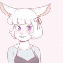
#the freckles too! such a fun character design
Note
sorry if this is bothersome but i just absolutely adore how u draw Cassie TToTT


I honestly adore drawing her!!
#ask reply#not bothersome at all btw!!#Cassie is a lot of fun to draw#the puffy sweater to her curly hair#the freckles too! such a fun character design#I hope I do her justice 💜💜#I hope she’s okay 💀 she better show up again in the games alive and well#or STEELWOOL will have to pay
1K notes
·
View notes
Note
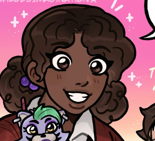
I absolutely adore how you make the human characters resemble their animatronics its so fun to notice and point out. like how liz has those big pigtails and the skirt also her shoes and charlie has stripes on her shirt which idk if that was intentionally connected to puppet butit reminded me of her. and cassidy has the buns in her hair that look like bear ears oughgh they r so cute i love them. I also love love LOVE ur ennard and molten freddy designs!! they look a lot more like freaky bundles of wires (especially molten freddy!!! i am obsessed with the centipede vibes :3) and your art in general is so nice to look at!!! its so pretty!!!
and also im curious if there was any other animal imagery that you added to the mci kids the way you did with the aftons and their bunny faces?
OH WOW you hit everything spot on!! I'm so happy that the little details came through, I was really hoping it would all translate hehe!!
The stripes are intentional! Her sleeves are also long and thick at the bottom like Marionette's arms! I also tried to theme her clothes with some Puppet colors: the purple/black/white/red combos!
And I still need to finish my MCI lineup drawing (so take this old WIP from my other drawing of them for reference RN LOL..), but Gabriel has Freddy's colors + the freckles on his face! Jeremy has big bunny teeth, and Bonnie's colors too. (Mix of blue/purples).
I'd like to think that the top of Susie's dress resembles Chica's bib a bit! Though it initially was not intentionally at all haha.
Fritz has physical disabilities, mainly regarding walking-- and one of his hands crunches up a lot. So I guess you could see that reflected in Foxy having his own physical issues. (And Foxy's hook!) So while it's not much of a little design detail in the way the others are there's still a parallel. (I might have given him a few crooked teeth though, to make them jagged like Foxy's?)
Fritz in particular also comes from a very bad household + is on the chunkier side! He's shy, and a little more emotionally distant. Which y'know, has its similarities with Michael, who is THE Foxy bro haha. I think that Michael would have been really affected by his death, maybe he saw himself in Fritz & wanted better for him. And that's why he uses Fritz' name in FNAF 2's location; in honor of him.
#Sorry for ramble LOL#Thank you for being curious + the love!! I love answering asks like this!#asks#asks open#fnaf#fnaf au#fnaf hc#fnaf missing children#fnaf mci
170 notes
·
View notes
Note
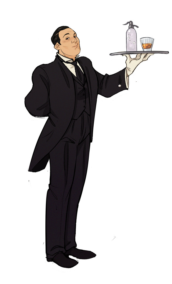
Hello Tracy, I am curious about something. I'm looking to make an OC who is a welder and I cannot help but wonder the following, how do one-piece protective suits work with cat tails?
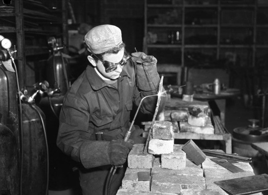
With this suit as an example, how would the tail, likely needing to be covered too, be implemented into the suit?
For the comic, the cat tails are not treated as explicitly literal. They're more of an exclamation point or italicization of gesture and expression. I don't alter the tailoring of the clothing at all to accommodate them.
We treated the tails like more of a physical reality in the animated pilot because, when things are in full motion, it's hard to pretend they wouldn't interact with the environment (or repeatedly smack Freckle in the face). Nevertheless, we'll continue to leave tails unclothed because I don't want the premise to be misunderstood as speculative biology of some sort. My sense is that their world would look and function much differently if they were actually bipedal cats. The feline aspect remains more a visual device than anything else.
But those are just my personal inclinations. I think any approach is valid for you as the character creator, though, and the idea of adding some extra protective layering to the one-piece suit to armor the tail would probably make for a fun design challenge. Maybe a little bit of articulated, laminated leather?
643 notes
·
View notes
Text
How to replace Skyrim NPCs with faces made in RaceMenu
(aka the method I used to make all my NPC overhauls)
This is an updated version of the tutorial from this post. I forgot a step originally.
Why use this method?
RaceMenu (RM) gives you a lot more creative freedom than simply editing NPC faces in the Creation Kit (CK).
Just installing RM gives you access to new sliders not found in unmodded Skyrim and you can install further slider mods (such as Expressive FaceGen Morphs, or Khajiit Character Creation Extended, etc.)
It also allows you to use Overlay mods (like DomainWolf's mod series or Freckle Mania 2) which give you many more options to layer warpaints or skin features and create a more detailed face.
Links are to the SE version of the mods, as that's what I'm most familiar with. They likely have LE counterparts.
Things you will need:
RaceMenu (and SKSE; be sure to get the correct versions of both for your game)
NifSkope - you will use this to open and edit the mesh. Here's GamerPoet's setup video
More Informative Console (especially if you're editing mod-added NPCs)
BSA Extractor (or similar mod that lets you open and extract BSAs)
Things I highly recommend:
Creation Kit Platform Extended for Skyrim - makes using the Creation Kit way less like pulling teeth
Unofficial Creation Kit Patch - if you're using AE
An alternate start mod - I like Dimes Quickstart for its simplicity, but any would work
Another Race Menu Rotation Mod - handy for seeing how the back of hairs look
Stand still in RaceMenu (OAR) - stops the character from wiggling out of frame
If you're looking to edit an NPC from an unplayable race (Elder, Child, etc.) you will likely need a mod that makes that race playable
Fun Stuff for diverse options:
Extra slider mods (I like Expressive FaceGen Morphs)
Skin Overlay Mods (for extra detailed faces)
If you want to get REAL funky with it, you can also use OutfitStudio to have a lot better time sculpting/getting super wild with assets, but that's too advanced for this tutorial (and my method is very 'goof around until it just works.'
I don't really want to cover using mod-added headparts (like eyes, hairs, etc.) There are basically two options there: add them as new headparts for your mod or make your mod dependent on the mod the headparts are from. The second way is probably simpler for beginners, but I definitely suggest installing Creation Kit Platform Extended, as it will allow you to load the other mods as masters without the Suffering™.
The Workflow
1. Design your character like you would a player character. For this example, I am redesigning Arcadia.
A recommendation: unless you really feel like you need to change it, it is typically better to make the Weight slider match the NPC's actual weight. You can see this value using either SSE Edit or the Creation Kit.
It is no big deal if you don't, but if you change the weight and load the mod into an already existing save you will get a gap between the NPC's neck and body (unless you use Save Unbaker.)
Be careful, though, there is a RaceMenu bug where if you load up RM again after exiting, it changes the weight by .01. So annoying.
For Skin Tone choice, if you do a custom skin tone (by pressing 'E' while hovering over the slider) I would recommend leaving the transparency slider (the 'A' value) at 100% (though I usually make the exception for Khajiit and Argonians.) This info will go into the Interpolation Value box in the CK, and the RM values can't be directly input, so you have to calculate the value with a (RM Number/255 = X/100, solve for X which is your Interpolation Value)
1a. If you are planning on adding faceparts from mods to your own plugin, I recommend saving and doing that now. Then come back to your save and change your headparts to the versions from your plugin. If you want to just have the other mods as masters, you can skip this.
2. Once you're satisfied with your design, I recommend saving your game and saving your head as a preset (click to enlarge):


3. Now, you will need to write down some stuff.
Skin Tone (RGB value):
Hover over Skin Tone slider. Press 'E'.
write down the R G B values (and A if you change it, see above note)
Even if you use a default skin tone, this is the best way to make sure you get the correct value for the CK.
Weight (number)
Scars (name) (if applicable)
Hair (name)
Facial Hair (name) (if applicable)
Eye Color (name)
Brow Type (name)
Writing down Hair Color is optional: with this method, the hair will inherit color from the head you export, not the CK value. Plus, RM's values are not really useful, because the default hair colors are named.
It's the same with the Face Complexion (wrinkles, etc), with this method it is exported with the head mesh.
4. Export the Sculpt:


It should end up in your SKSE folder (SKSE\Plugins\CharGen), wherever that is for you
5a. Method 1 (works for both Vanilla and Mod-added NPCs): get your NPC in front of you, either by console command (example with J'zargo):
~
help 'J'zargo'
then, using their RefID (the number that appears next to their name) type:
player.placeatme 0001C1A3
Or find them in-world.
With the mod More Informative Console installed, reopen the console (~) and click on them. Write down their BaseID.
5b. For Vanilla NPCs: close your game and search for your character's name on UESP and find their BaseID. Copy this number.
6. Open your BSA extractor of choice and Skyrim's data folder. Find the Skyrim - Textures0.bsa. Open with your BSA extractor, and paste the BaseID in the search box
Check the checkbox next to the main facegen file only and extract somewhere easy to find.
7. Repeat this process with the Skyrim - Meshes0 file.
8. Create a new mod folder. You can either make a mod directly in the mod organizer (MO2 lets you right click in the left pane -> All Mods -> Create Empty Mod Above) or on your desktop.
Cut and paste the 'textures' and 'meshes' files you just extracted into your mod folder. If you are installing it via archive, go ahead and zip and install the folder.
9. Now open the Creation Kit. Use the folder icon to load your masters.
Pick Skyrim, Update, DLC (if applicable), and any other mods you want to be masters for your mod (for eyes, hairs, etc.) If you've made your plugin already for headparts, just load it up.
10. In the Object Window, expand the Actors -> Actor -> Actor tabs and now you have a lot of tabs with Race names. Find the race your NPC belongs to then open the appropriate gender tab. Alternatively, you can just search the character's name in the searchbox.
11. Find your NPC's name and double click. This opens their Actor window, which is where you will use all the data you wrote down.
If you want a preview of their face, tick the box at the bottom of the window.

For weight adjustments: go to the Traits Tab. For all other values you need to worry about for this tutorial, go to the Character Gen Parts.
So, to parse this: you can ignore the Face Tint Layers box and pretty much everything on the left side of the screen.
Face Tinting Color
Type in your values for R G and B (you can ignore the Preset dropdown completely.) The Interpolation value corresponsed to the 'A' value, so unless you are working on Khajiit or Argonians, it will probably always be 1.
Base Head Parts
To change stuff in this section, click the line you want to change then go down to the dropbox below it and change it to what you want
Face - unless you're using something like High Poly Heads, you can ignore this
Everything else in this box: change to what you wrote down for each
Additional Head Parts
This is mainly used for scars and functions a little differently. To add a scar, you need to go to the Object window again.
You can expand the Character tab and click 'HeadPart' then search the name of the scar you want. Click and drag the line with your scar into the Additional Head Parts box and it should show up there.
12. Once you've got the above like you want it, hit 'Ok', save your plugin. Now, to make the next step a little easier, you can click the NPC name in the Object Window again and hit f4.
This will export the meshes/textures file folders to the mod you just made in step 8.
Go ahead and exit the CK now
13. Go your your files exported from the last step. Open a second window from the files you exported from SKSE.

Open both meshes in two separate NifSkope windows.

If your SKSE head has a weird broken neck mesh like above, that's not a problem and can be ignored.
You absolutely must make sure your headparts match the head you exported from RaceMenu exactly, or you will get the dreaded dark face bug.
Now, you will need to find the Head textures in the head you exported from the CK. If your NifSkope is set up like mine, it should look like this:
Copy this line and paste it into the SKSE head in the same slot.
Save the SKSE NifSkope and close.
14. Rename the SKSE files (both .dds and .nif) to the number your exported heads are. You can then copy and paste your your SKSE files to their respective folders in your step 8 mod folder:
the .nif file goes in meshes/actors/character/FaceGenData/FaceGeom/[name of plugin]
the .dds file goes into textures/actors/character/FaceGenData/FaceTint/[name of plugin]
And now you're ready for testing! At this point I also recommend taking a second and converting your plugin to an ESPFE via SSE Edit. It's pretty simple and there are tutorials out there.

Scully, you're not gonna believe this.
107 notes
·
View notes
Text
I'm focused on exams lately but I've been relaxing with Jeeves novels on the side, so I took a break to figure out how I wanna draw these two 🥃 (I'm getting there? Notes under the cut)
So these aren't the Fry and Laurie versions, but they got features I fully associate with the characters, like Bertie's high cheekbones and his fluffy curls in season 1.
I love the interpretations where he has blonde-ish/golden brown hair, and in general, I went with colors and shapes that contrast Jeeves' dark and slick ones.
I am physically incapable of making designs and not giving one character freckles. Only adds to Bertie's youthful look I think.
He's tall and lanky but Jeeves is still taller, ofc.
Not a design thing, but the voice I imagine when I read his lines is the L.A. Theater Works "Code of the Woosters" version.
I wanna give him all the funky colorful clothes (but also please excuse my lack of historical fashion knowledge)

Jeeves was more difficult for me to draw and I'm probs still not fully set on him. I'm more used to Bertie's triangular shapes, and Jeeves is more square (like with shape language, he's the stable, reliable, and traditional one), with broad shoulders, a strong chin, etc.
I still want him to look a bit more soft/pudgy (?) than outright muscular/stocky (that's more Harold Pinker's thing).
Anyway, big fun of the hooked/crooked/prominent noses for him (again, in contrast to Bertie who has a pointy one).
And I similarly like thin eyebrows and lips for him, allowing for these slight expressions of his.
Not too evident here, but I went with dark blue eyes for him here. Are his eyes ever described in the books as blue like Bertie's? Because I am tempted to go for greyish ones instead, rare and with a certain wisdom to them.
#bertie wooster#reginald jeeves#jeeves and wooster#pg wodehouse#bertram wooster#georgia's adventures in character design#nnobodiusart
694 notes
·
View notes
Text

(part 1 of part 2!!)
for shits n giggles, i tried my hand at redesigning dr stone characters (read: three)
i have too many emotions when it comes to this show's character design lmao. a vicious hate-love of the century
a couple of my process notes if anyone's interested: (vague spoilers up to season 3 of the anime)
there's a criminal lack of skin tones that i immediately wanted to take advantage of; and before Certain People start saying race-swapping; none is happening here, it's all just taking account of tanning and sunburns. sunscreen is a thing of the past here and a lot of time is spent outdoors in order to gather food
dramatic shifts in skin tones from what's given at birth happen pretty frequently in real life even with A/C and sunscreen; a huge missed opportunity to play with this in the color department methinks, but here we are (don't even get me started on the massive range of skin tones in east asian genetics alone)
so i played around a bit with contrast, nothing outlandish aside from giving Kohaku noticeable sunburns and freckles from (1) having caucasian blood in her to begin with and (2) not having access to any of the skin products our moderners would have
that being said, realism in the clothing color department was just about entirely thrown out the window. the blue dyes we know about are nowhere (naturally) near Japan, and here Ishigami village is in canon with deep navy on every villager; Inagaki and Boichi decided realism specifically here wasn't as important as color symbolism (which i personally think was a good creative decision), so cut me some slack-
so for colors it was just my personal taste on streamlining the palettes-
Gen in particular i thought would benefit from exposed shoulders without taking away how he needs bigger sleeves to hide shit up there. a lot of the guys have plain shirts and sleeves or just go shirtless entirely and i felt like it'd be fun to have him wear something in between to really push the magician/entertainer vibe
hairstyles were changed mostly to be easier to draw and to make their silhouettes just a bit easier to distinguish from each other. (hair colors were untouched except for Kohaku, purely because i have a personal preference for the more natural blonde color than any actual design significance lmao)
partial exception for Kohaku, cuz it annoyed me that the other characters say she has super thick, unruly hair...but then her hair is drawn no differently from everyone else's 💀
didn't wanna play into the stereotype of naturally curly hair being seen as something to be fixed (especially within the context of a makeover-), so i tried to imply chronically unbrushed hairdsjfsdf
can you tell from how many bullets are here about Kohaku how i feel about her design? last thing: body types.
Gen is supposed to be significantly tall, Kohaku is one of the strongest characters while being one of the shortest; it is very hard to tell that from their designs alone. it's mostly just the limitations of Boichi's art style,,,proportions that's i'm aware is nitpicky, but i wanted to show it here anyway 💀💀💀
smth smth disclaimer about subjectivitydsfsdfsd-
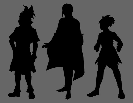
uhhhh, congrats for reading all that, have some silhouettes!
#dr. stone#dr stone#drst#gen asagiri#asagiri gen#ishigami senku#senku ishigami#kohaku#dr stone kohaku#redesign#character design#character redesign#doctor stone#dr stone gen#dr stone senku#dcst#anime redesign#anime fanart#dr stone fanart#can you tell that character design is one of my special interests-
99 notes
·
View notes
Text
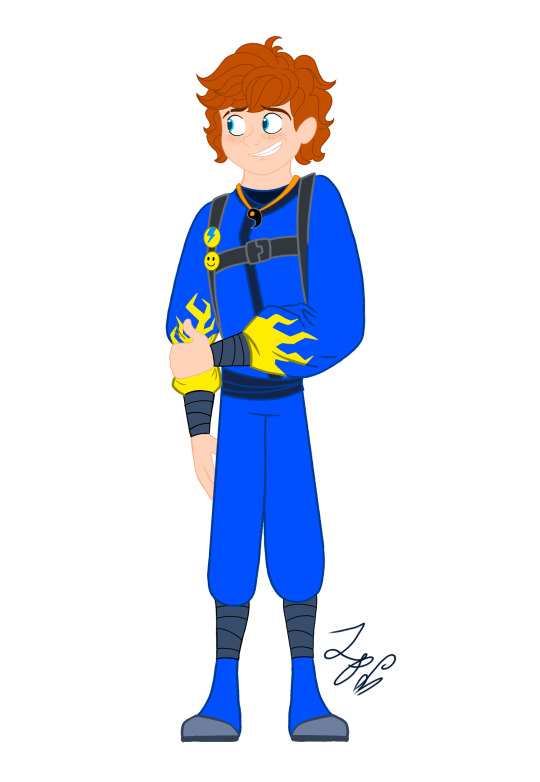
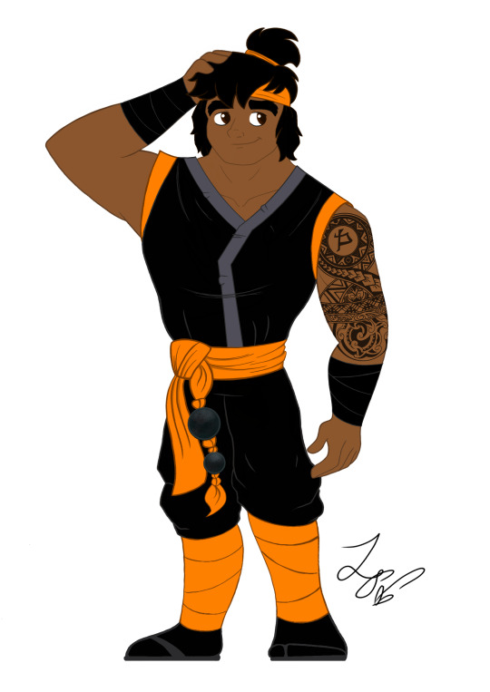
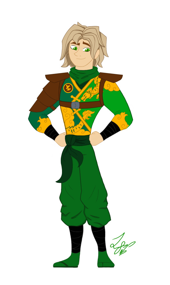
Ninjago Remastered Designs!

THEY'RE DONE! After months of work!!! They are DOOOOOOOOOOONE. WOOOOOOOOOOO! Lol! Welp, these are my Ninjago designs! Basically, this is my take on the Ninja if they were in a 2d animated cartoon! And yes! I will be drawing more characters. Tumblr butchered the quality, so close ups and design notes are below the cut. They're pretty detailed, so I highly recommend checking them out. Feel free to ask questions about the designs! ⬇️⬇️⬇️ - ✒️🐉


When designing these outfits, I tried to take inspiration from the ones in the show. And in terms of art style, drew inspiration from early 2000s cartoons, (Action Adventure ones specifically,) Anime inspired shows, and even a hint of traditional Disney animation. And while I designed them with a 2d cartoon in mind, most of the designs would most likely have to be simplified for them to be used in animation. So let's get started!
Kai: Kai was a pretty fun to work with. I actually didn't plan on giving him a sleeveless outfit. But it happened! And I like it! If you'll notice, the flame pattern on his vest mirrors the pattern on his sister Nya's outfit. I thought that would be a cool detail to include. It was inspired by their March of The Oni outfits. I also made sure to include his scar and bandaid. And gave him reddish brown eyes to signify his elemental power. Him and sister I imagine being Brazilian/Taiwanese. So I hope I captured their ethnicity properly. I'm pretty happy with this design. Especially his hair, which was hard to replicate.
Jay: Jay was a hard one for sure. I wasn't too sure how to vamp up his outfit. So I started by giving him some lightning patterns on his Gi. (At least I think that's what it's called?) And I decided to make it look a little baggy and soft. It just seemed to suit him. I tried something a little more form fitting and didn't look right. Also! A fun detail I included was his half the Yin Yang pendent around his neck! And of course Nya has her half. I imagine him having Irish ancestry, so I gave him pale, freckled skin. And gorgeous curly red hair. (As a fellow red head, I'm very proud.) Overall, I think he turned out pretty adorable. And his face is spot on.
Nya: Nya I pretty much got right on the first try! I just had a really clear vision of her in my head. I gave her a grey outfit with bright, vibrant blue details. The pattern on her Gi is inspired by Koi Scales. And she has her half of the Yin Yang pendent around her neck. I really like this one, because while it is simple, it's beautiful. And I think it reflects her element nicely. The only thing I missed was to give her a symbol like the rest. But overall, I love it! One more thing is that I wanted to give her and Pixal different hair. So when I finally release my Pixal design, you'll see that while they both have ponytails, I gave them different cut and styled ones. Should be neat!
Zane: Zane was the first one of the Ninjas I redesigned! I love how he turned out. I tried to give him a splintered ice effect on his outfit inspired by his Core minifigure and gave him his faithful falcon companion. Falcon has his old greyish purple feathers, but blue icy eyes to match his owner. I also wanted to give Zane flowing sleeves, that would look very majestic waving about in a blizzard wind. He is also incredibly tall. Taller than Cole even! I was inspired by the giant humanoid robots I'd seen in movies. In his cloaking disguise, I imagine him looking German. With blond hair, blue eyes, and light skin. I also like to think Dr Julian was German. (Was this influenced by my German ancestry? Who knows?)
Cole: You would not believe how many times I had to redraw this man's face. Haha! I just could find that sweet spot! That face that perfectly encapsulated his strong, but gentle personality. But I think I did it! His outfit is based on his Oni Trilogy Gi, with orange detailing. And he has his Island ponytail and bandana. I absolutely loved that hair style on him. So I had to use it! And if you'll notice, he has a beautiful tattoo on his right arm, with his symbol in the center. I imagine him being half Maori, from his mother's side. And the tattoo was inspired by Maori tattoos I saw pictures of. I'm not too sure how accurate those images were. But hopefully I hit the mark.
Lloyd: Finally! Our green Ninja Lloyd! His outfit was inspired by two things. Dragons, and his outfit from the Secrets of Forbidden Spinjitsu seasons. I gave him a beautiful golden dragon and cloud pattern on his clothes, a leather arm guard, and shoulder pads. If you look closer, you'll also see he has cat-like dragon eyes which pays homage to his dragon and Oni heritage. I like to think that depending on his emotions, his eyes will go from slits, to big and wide. So they are good indicators for his mood. I also imagine him being Japanese. But his powers give him his classic blond hair and green eyes. I'm very happy with this design. His hair, eyes, and face all look exactly how I see him in my head.
Well, that's all. I hope you enjoyed these designs and notes! I assure you, you will see more of the them.
Bye! - ✒️🐉
#ninjago#lego ninjago#ninjago lego#ninjago fanart#ninjago lloyd#ninjago jay#ninjago cole#ninjago au#nya smith#lloyd garmadon#lloyd ninjago#lloyd montgomery garmadon#jay ninjago#jay walker#nya ninjago#ninjago nya#cole brookestone#cole ninjago#cole brookstone#ninjago kai#kai jiang#kai ninjago#kai smith#zane ninjago#zane julien#ninjago zane#My art#ink dragon#Ninjago Remastered
76 notes
·
View notes
Text
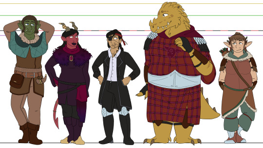
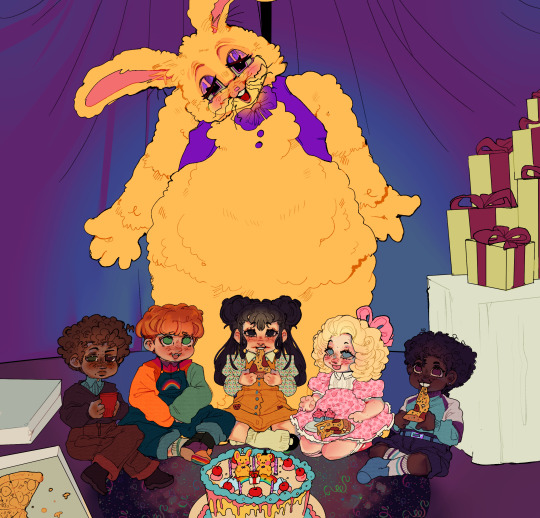
i was gonna wait until i finished the bitd and deadlands line-ups before posting these, but i'm not gonna get those done before the final season starts, so might as well bite the bullet now XD woohoo, oxventure d&d designs! i'll go into further detail below the cut for all of my thoughts on these designs and reasoning for smaller details, but for now, just know that i will never draw a cape. i simply cannot do it. hoods and weird draped fabric or nothing XD
okay i put like. waaay too many thoughts into a lot of these small details so im gonna allow myself to geek out here X3 firstly - though they're way too small to read properly, i did the little symbol eye shines i used in my first art for them! dob gets music notes, prudence gets fire, corazón gets hearts, and merilwen gets flowers. i usually draw egbert's pupils pretty thin to resemble a reptile, so he just gets normal eye shines, but i probably could have given him some here... he would get suns if i thought of that
dob - muscular in a wiry and dehydrated way, lol, hence having a more defined stomach/hips despite not being as strong as prudence or egbert. he has sad/down-turned puppy dog eyes at all times because i think the big-eyed endearing look is fitting for him, though i do make them darker blue than his canonical baby blues because i just... like how dark blue eyes look, lol. i'm pretty sure he canonically has the stomach scar, and obviously his facial scar has always been there, but i gave him a couple other ones just to show that hes pretty reckless. and he gets freckles because even though they arent mentioned in the dragon dogma's video, i noticed luke added some and. i like freckles a lot
prudence - i've said this before, but i love the thought of pru getting muscular after the werebear bite <3 i just think she should be a little bit hench. as a treat. once again, the heavy stomach scarring comes from the dragon dogma's video, because i found their design choices in that really fun. i change prudence's outfit the most out of any of the characters, just because her canonical outfit confuses me. i'm really bad at understanding/drawing fantasy wear as is, but her fit... i'm lost entirely XD so i free-balled a bit. her inner sleeves that hook around her fingers are based on jane's various prudence looks, and then the looser outer sleeve is just because i love prudence with a dramatic sleeve. originally the colors were closer to her canon outfit, but it just looked messy without all the details of the original, and then i tried red like jane's prudence looks but it didn't contrast enough with her skin. so i restricted them to just deep purples and black with pops of gold and dark magenta!
corazón - what can i say besides. transgender. LMAO honestly though, besides adding the top surgery scars, i just really like his canon look. i simplified the details, obviously, but i really love his big coat and his tall boots and the earrings and the black-on-black-on-black of it all. i didn't particularly feel like drawing hats when i was doing this, lol, so i stuck with a red bandana instead. the beads that are strung from it are black, red, purple, green, and yellow to match their guild's canonical color associations/the colored name plates they get in later seasons :] because corazón is the sentimental sort, even when he won't say it. also he gets a little cateye for his eyeliner, i dunno if i've ever said why i do that before haha
egbert - egbert my dearly beloved. literally just his canon look except he has la vache mauve on his tunic instead of fire! and the nose spikes i give him, i guess, but i forget those aren't canon. i actually usually draw him in mike's egbert get up, with the black robes and the golden dragon sigil, but i kinda wanted to move away from that to lean more into the end of legacy of dragons, where egbert fully commits to never going back to the dragon d'or. also i just love drawing little cow heads <3 also! i like the idea that rather than typical scar tissue, dragonborns grow thicker scales over places where they've been injured. so the thicker patches of small scales on egbert's body are meant to be scars! including his kidney scar, lol. the larger scales and the ones on his face were always there though, that's just dragonborn biology baby
merilwen - if i said i based merilwen's body on cartoon bears, would you forgive me... i just think it's cute LOL tummy <3 for the final dragon dogma's video reference, that's where her freckles and tattoos come from. ellen was right, merilwen with floral tattoos fucking rules. who am i to deny it. as a hairy woman myself, i also like making merilwen a hairy woman. she's a hippie, she would NOT shave. i also really love the red earrings she wears in her canon art, so i tried to carry that through to some other small parts of my drawing for her, and landed on the bands she has on her pants as well as the odd feather for her arrows. fun archery fact, for those who may not know - in modern archery at least, you usually will have a differently colored feather (or for my arrows, rubber fins lol) that indicate how youre meant to string the arrow! so i took advantage of that to give merilwen some more red, hehe
#oxventure#dob the half orc bard#prudence the tiefling warlock#corazón de ballena#egbert the careless#merilwen the wood elf druid#I really wanted to post all the line ups at once but I have fallen ill XD#and I’m busy tomorrow. so drawing is not in the cards for a bit#I’ll try and finish those soon 👍
32 notes
·
View notes
Text

An Alastor redesign!!
alright i have many thoughts abt this funny fella. keep reading for the design process + lots of ideas
ok so. i think he has too many "themes" going on - deer, radio, voodoo, shadow powers, tentacles, deal making, the list goes on. To have a balanced character one must make their "deal" clear and stick to only a few themes! So, based on that i chose to focus on the radio and deer aspect and then sprinkle some of the rest here and there.
To start, i wanted to make the main themes - radio and deer - crystal clear from his appearance. So i gave him some bulky headphones, similar to the ones radio hosts would use when broadcasting (and he's always broadcasting! more on that later) and painted his skin in deer-like patterns (freckles like deer spots!!! cute). i also gave him antenna/radio towers for his deer antlers.
Secondly, i got rid of his hairstyle and ears. but those are his main thing! i know but look it just doesnt fit much. Alastor is a mixed polite gentleman radio host in the 30's, and his hairstyle should if not directly reflect his past life, at the very least it should hint at it, and that bob cut is way too modern. what about the ears then? personal biased choice, really.
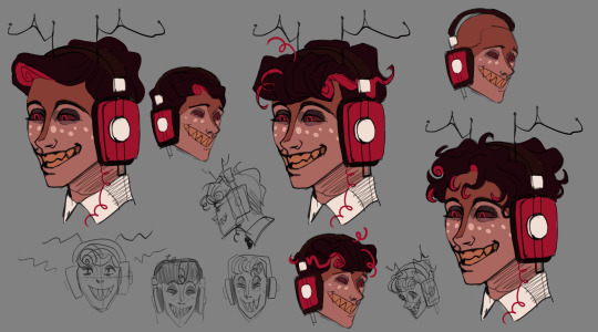
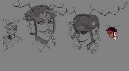
i played around with multiple ideas, throwing shit at the wall and seeing what stuck. i liked the idea of his hair having some curls like an old telephone wire and tried to mix that somehow with popular hairstyles for men in the 30's. don't mind the quality of the sketches
Next, his outfit! (the picture has the outdated hairstyle, which i changed cause i thought it didn't fit his gentleman vibe, despite really liking how it looked)

most of the changes i did were either because of personal opinion or because i had an interesting idea. i also wanted to keep the red suit going so that i did.
i gave his little mic little antlers and also a little "screen" that shows the radio waves it's recording, cause i think that's a neat look. some stripped pants cause it seems it was popular in his time, and his buttons are actually radio dials! i also kept the bowtie.
Alright, for the fun part now! when compared to Vox, who's the tv demon and quite literally a tv, Alastor sure didn't enough radio elements in his own body. so i had this idea, what if he had a radio built into his chest? instead of his voice (or whatever sounds he wants) coming out of his mouth, it would emanate from this radio, still with that old-timey effect he has. i also gave him a radio frequency dial that would change on it's own, maybe depending on his mood or when he's using his powers in a certain way, i havent fully decided yet.
Now, about his powers. most of them would work the same way, with a few tweaks. Since he's mouth-mute and is broadcasting his voice through the radio, i think it'd be cool if he made his voice echo from all nearby speakers - phones, tvs, whatever, he'd hijack them to ensure he's properly heard and grab everyone's attention, using the power his mic grants him. he could also be able to eavesdrop on audio transmitted through radio waves, so no phone calls or tv signals would be safe or private near him. when he wants to reach more people or crank up the volume his antlers would grow, extending the signal's range. with this, when he's angry or wants to look threatening, his antlers would shoot up, feeling like he's shouting at you from every direction. he'd fill the air with static, making your hair (literally) stand on end, and distort the sound around him to make sure only his voice is heard if he wants it to. these moments are when i imagine his frequency tune dial and button-dials spinning erratically on his body.
now onto his shadow and tentacle powers. i felt they didn't quite match his overall vibe BUT since they're such a core part of him i couldn't get rid of them. so i figured they could be like extra power granted to him after he struck the deal for his soul, very convenient and powerful but not entirely his own. breaking the deal would also mean losing that power which could be interesting for him considering how power-hungry he usually is and how truly desperate he would have to be to break the deal anyways. And so, since his shadow puppets (the ones he uses to fight adam and have the wall fixed) wouldn't be his this way, i changed it so they'd look like deer instead! and its part of his own power set. when the souls he owns and he "teared apart" aren't screaming on the broadcast he could summon them in and they'd help his fights out, just like normal.
heres some more sketches!

as some final notes, after his battle with adam some fun things would happen. with his mic broke and his wound fucking up the radio he has on his chest he'd have no way to broadcast his voice out, which would mean our beloved radio host would be unable to speak until he either fixed his mic or managed to heal up completely. fun stuff :)
thank you if u read all of this or just scrolled for the pictures, im grateful anyway. i want to make it clear i didnt make this redesign to "be better" than the original but rather as a fun creative assignment i gave myself, to enhance what i like about Alastor and smooth out the hard edges. i also wanna say i took inspiration from many things in the community - other redesigns, theories, rambles, they all helped me come up with this one. shoutouts to u all too
#this redesign took me so much time its not even funny#funny deer man is living rent free in my head now#send help#tw eyestrain#hazbin hotel alastor#hazbin hotel redesign#alastor redesign#hazbin hotel#hazbin hotel fanart#cosq hazbin art#cosq art
39 notes
·
View notes
Note
Hey Raven, are you going to watch the upcoming new Disney movie "Wish"?
I've seen mixed reviews, but i'm lowkey excited since we get to see a new Disney villain, especially since Disney got really lame villains after all the old classic movies!
Have you seen the trailer for the movie? What are your thoughts so far?
I saw Wish with a friend recently! I'll give my thoughts on the trailers here (in case you don't want spoilers for the film itself) and put my full thoughts beneath the cut (if you're okay with spoilers).
Looks-wise, I think Disney was definitely trying to go for something more stylistic and painting-esque for this?? And while I commend the effort, it definitely doesn't look as interesting as Puss in Boots 2: The Last Wish. The humor also definitely isn't for me, it feels very "quirky" and "so relatable" (Asha reminds me of Mirabel in that sense), and other times too juvenile (like the goat butt joke).
I do like the idea of the villain passing as a good guy in-universe and actually being vain and selfish, especially since the marketing is making it clear who the bad guy is rather than making it a "twist" villain scenario. Not sure if I like Magnifico himself though??? All the ads with him in it feel like Disney is trying too hard to make people thirst for him. From just the trailers, Magnifico does seem interesting and like more of a return to the traditional "villain" rather than the protagonist having to deal with an existential dread or concept.
***Spoilers for Wish beneath the cut!***
Right off the bat, my first impression is the narrative is SO ham-fisted. Within the first 5 minutes alone we're establishing so much information and in such a clunky, unnatural way. Like... Asha says hi to her friends but then they robotically have a dialogue where they overtly call each other "friends" just so it's clear to the audience (when in reality no one talks like that). It's telling instead of showing, and this happens sooo many times early in the film.
Could not for the life of me remember the friends or their names. There were just too many of them when 1 or 2 would have been just fine to move the plot along and to help Asha. (Yes, I know they're a reference to the 7 Dwarves but it's STILL not necessary to have so many just for a reference.)
Bruh, the makeup in this movie is on point. Every time there was a close up of a character, I was staring at their eye makeup (especially Asha and the queen's).
Asha as a protagonist was... fine? She feels very close to Mirabel and at times Rapunzel in her character. I didn't dislike her by any means, but she didn't reinvent what it means to be a Disney protag. Her motivations also come off as… really “out of nowhere”. We’re told she “cares too much”, but she initially only wants to save the wishes of her mom and grandpa; she randomly decides she has to free ALL wishes midmovie and that was jarring. There could have been a smoother transition. Instead, it was abrupt and Asha didn’t change in any meaningful way. Even her “I want” song was vague (what exactly is “to have something more for us than this”?) and didn’t connect well with her character.
I do really like her design though! Her freckles, earrings, and how her hair moves are my favorite details.
Valentino was not as annoying as I thought he would be. Still didn't care for his sass and brand of humor, but at least he helped out a few times.
I called it, the film is trying so hard to make Magnifico "hot" 🤡 I don't get it but okay, Mouse. I see your effort.
Loved his fit!! Very cool cloak and diamond/star motifs everywhere! His lab and study was also fun to look at.
I quite liked the moments when the queen talked to her husband and tried to smooth things over with him. “I can fix him energy”— Their relationship seemed very genuine at the start of the movie.
NOT THE WISH NEPOTISM...
If they were going for “sympathetic” with Magnifico, it didn’t work. He gave this backstory about how he was traumatized before + left as the only survivor of a great tragedy and so now he wants to use his magic to prevent that from happening to anyone else. Thing is, we only ever know about this via his word and staring at a half-burnt tapestry. We never see the event on screen, nor what was left of the tapestry. I was expecting a twist where it’s revealed that he lied all this time about his backstory and rewrote history so he could more easily manipulate the people of the kingdom he founded and live out the fantasy of being worshipped as a “good guy”. That was such a missed opportunity!!
Something else I was thinking of (this was during “This is the Thanks I get” was??? Maybe Magnifico started off genuinely good but became worn down over time as people’s wishes grew more selfish and they became ungrateful for what they had?? Then he could have become bitter and disillusioned by the behavior of his people.
Another idea is maybe Magnifico was “villainous” only in Asha’s eyes, since they don’t agree on how to best handle granting wishes. This would be more of a clash of ideologies rather than the traditional Obvious Evil vs Obvious Good that Disney is so known for, but hey, it could be a neat evolution of their storytelling from classic fairy tale roots.
This is to say that there were so many more interesting directions they could have gone with Magnifico’s motives, character, and portrayal 😭 but the second half of the movie never commits to any of these, they just blame his complete insanity and turn to the dark side on Forbidden Magic which is such a cop-out.
The trailers gave away the twist that Magnifico was the villain. It wasn’t revealed until like the second song into the movie. Would’ve worked better as an on-the-spot reveal rather than part of the marketing, in my opinion.
When they showed the wishes, the TWST fan in my was shouting, "OMG IT'S WISH UPON A STAR, THE LIMITED TIME STORY EVENT FROM THE HIT DISNEY MOBILE GACHA GAME TWISTED WONDERLAND!!!"
As Wish is Disney's anniversary film for 100 years, there were tooons of easter eggs scattered throughout. (I had fun looking for them!) Some were visual (I saw Aurora's dress, Snow White’s well, Peter's Pan's costume, Ursula's green smokey hands, Asha's robes resembling those of the Fairy Godmother, etc.) or extended imagery/scenes (Asha recreates Mulan's dinner and “Reflection" scenes), others were more overt lines of dialogue (Magnifico says the "Mirror, Mirror" lines along with others, a deer named “Bambi”, Valentino mentions an animal metropolis in reference to Zootopia, etc.).
In theory, the wish magic sounds cool but has so much that isn't explained??? And yeah, it's magic so it technically doesn't have to be. However, there are things not explained even when it is important to the plot. For example, Magnifico crushes some wishes and seems to absorb their power for himself (including the wish of Asha's MOM, so you'd think this would be important)? The consequence of this is that the wish's owners... become sad??? Okay, what are the long-term effects??? Why isn’t this fully explored?? But then later in the film we see the same people whose wishes were crushed... regenerate their wish??? So what, he has to keep reaping them??? And why are the wishes only taken at 18 years old? What if a wish changes? Ironically, the townspeople of Rosas have a scene where they question the technicalities of this wish magic. Magnifico essentially tells them to shut up, and it kinda felt like Disney was telling us to not question their lore www
It was weird that they never fully explored the ramifications of going without your wish. You’d think they’d show us people without ambition or hope (which would incentivize Asha to return their wishes), but everyone seems blissfully happy without their wishes?? The only exception is Asha’s friend that betrays her (cannot for the life of me remember his name), and that’s namely because his asshole friends keep ragging on him for it.
I thought the movie was going to go in a “you can make your own wish come true!!” direction but NOPE, turns out it’s just magic. Felt like Disney unintentionally wrote a whole movie about "wishes not coming true unless some big powerful entity allows it to come true” (Asha literally becomes the fairy godmother of Rosas at the end, making her ultimately no different than Magnifico)… ie a metaphor for how Disney owns so many properties it practically owns our childhoods www
"The power of friendship saves the day" ending 🤣 It was very Paper Mario ending-esque...
A song saving the day though?? It’s giving the Illumination Lorax film…
I was right about the humor. Too "quirky" and/or juvenile for me.
Animation was alright? Nothing awful about it, it just didn't feel as detailed or as experimental as other films with a similar style.
Songs were mid, which checks out with the recent Disney music excluding We Don't Talk About Bruno--
Some of the lyrics however were awful. “I let you live here for free and I don’t even charge you rent” is redundant. “So I throw caution to every warning sign” means you’ll show more caution than usual, not that you’ll forego caution. The correct expression is “throw caution to the wind”. Etc, etc, etc.
There was a cute after credits scene where they reveal that Asha's 100 year old grandpa (same age as Disney omg) wrote the "When You Wish Upon a Star" theme, which was sweet since his wish was "wanting to make a mark".
THE BEST PART OF THE MOVIE WAS STAR!! It was very cute (partly because it couldn't talk and just jingled and giggled, I was dreading another annoying mascot animal voice) and reminds me of my own pet… The way Star infused everything with glitter and formed unique shapes with the red twine was so fun 😭 I'M A STAR STAN, IT WAS ADORABLE AND KINDA BRATTY AND I'M LIVING FOR IT
Decent ideas, "meh" execution. Enchanted and Shrek did it better in terms of self-aware, fairy tale defying stories. It felt as though the movie was trying to deliver a profound message but got lost in the sauce of making as making Disney references possible and didn't fully commit to actually saying something meaningful. As a result, the film feels somewhat… hollow.
That one friend betraying Asha was the biggest surprise in the film but I still saw it coming 😂 I do get where he’s coming from though (being worried that his wish won’t ever come true) but it also felt like his conflict wasn’t resolved??? It might have gone better if the movie actually fully tried to push the “you can make your own wish come true” message (to reinvigorate the traitor to make his dreams a reality on his own) but they don’t 💦
Wish didn’t end up being “the wishing star’s origin story” because not once did anyone question where Star came from or why it was different from other stars (or what the significance of Magnifico blotting out the other stars was).
I think the people that would enjoy this movie are the people that are already highly invested in Disney and the nostalgia of it.
... Anyway, stan Star 🤩 (and the talking mushrooms 🍄)

#wish#disney wish#spoilers#question#notes from the writing raven#puss in boots 2#the last wish#puss in boots 2: the last wish#Mirabel Madrigal#Encanto#Asha#twst#twst wonderland#disney twisted wonderland#Rapunzel#Enchanted#Shrek#Queen Amaya#King Magnifico
87 notes
·
View notes
Text
jellicle lineups; part 1/4
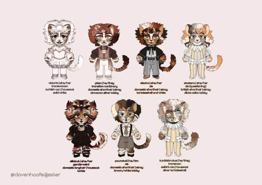
hi catsblur ! today i am presenting to you the fruits of my labor. my own little versions of the jellicle cats; obviously based on the replica designs With Fun Little Twists ! such as, they are not naked. ramble below the cut, both on designs and some personal thoughts on the characters
these designs are very much first-draft, subject to change, blah blah. you will very likely be seeing me drawing them differently if i post more of them. i just. urrbhhh. i had 2 draw them....
and the clothes ! even though they're very feline i draw them a bit too human-y for the nakedness to not look consistently weird. i will be drawing them closer to the stage designs in some instances but for rn. clothes. it was a fun exercise in character design too
the kittens are all young adults, think 18-20 ! as much as i love headcanons like demeter being sillabubs mother, it shrimply will not work out timeline-wise. so headcanons like that will be delegated to like... siblings and stuff
victoria | 🍧 💌 🩰
i started out with victoria's design not only because of her being the Main Kitten, but because she has such a concise and clear aesthetic to me. she actually started out with a simple pastel brown dance practice fit before i decided that i wanted to make the outfits ornate(ish) and ended up with a proper ballerina getup
i also quite like when victoria is not just solid white with some grey (love ones that are more yellow or brown) so i colored her fur with some blue and pink-ish tones not only to add more depth but to resemble the trans flag LOL
and i wanted to try something different with making her a bit more lavender than baby pink. i also based her overall look on obc victoria, portrayed by cynthia onrubia :^]
to move on to character interpretation, i think victoria is partially deaf and mute. she primarily communicates through dance. as one of the oldest kittens she'd be 19 in human years
plato | 💐 🕯 🍬
plato's design doesnt stray too far from his standard replica design but i tried to add my own flair . i tried to keep the creepy porcelain doll aesthetic going w their face added some more depth like some other designs with different colors and bold face stripes
i also really like the outfit i chose for them. the flower in their hair and on their shirt is a peony which is a popular wedding flower :") because im a sucker for platoria and very much subscribe to the idea that the ball we see is their funny cat wedding in a way
the outfit is based on standard ballerino costumes but i tried to stray from it with the silky half-skirt thing and pointe shoes. lets go queer cats lets go
i think plato is also very quiet and that's why he and victoria were so drawn to each other. i also quite like the idea that he was a bit of a troubled stray before he found the jellicles. they would be 20 in human years
electra |⚡🥭 🔔
boy i STRUGGLED with electra's clothes i struggled so hard. i think i'm happy with what i ended up with though—i originally gave her the babydoll dress that sillabub has (inspired by artsed electra) but figured that i wanted at least one of the girls to be more tomboyish/butchy. thank you to that one production which apparently had electra be one of the raffish crew and get in on some of the boys' choreography
im very happy with what i did with her fur colors as well. silly little tortoiseshell :] its based on a nonrep but i have no idea which one. enjoy her freckles too
i think electra deserves to be a little spunky. [whispers] i also think shes bombalurinas little sister. she'd be 18 in human years
etcetera | 🎠 🍯 🏅
i needed at least one cat with a circus aesthetic. say hello to my magnum opus: jacked tumbler acrobat etcetera. it was only a matter of time until someone said fuck it and let one of the girls perform lifts and stuff. this is mostly because ive always really liked how shes usually the cat to do the flying trapeze bit and wanted to push it further
i also struggled SO EXTREMELY HARD with making her colors look nice and makeup distinctive but i figured it out in the end—thank you obc cettie for the mismatched eyeshadow and such. i also wanted to give a cat a short bob type of head fur/hairstyle and she fit the bill
nothing much about specific character notes other than like... i want to make her related to some of the cats but cannot for the life of me figure out who 2 assign. also she'd be around 19 in human years, a couple months younger than vic
sillabub | 🌻 🧋 🎼
i think of all of these little fellas sillabub is my favorite. several elements are balanced in her design—the standard jemima with a darker/reddish palette, the more softer and lighter sillabub design, the red eye patch from il sistina jemima, and the overall aesthetic of obc jemima with the big hair and wide, deepset eyes
i've seen her typical design critiqued by some people and wanted to incorporate those critiques by making her look less similar to demeter/bombalurina, adding more red to her body fur, and making her makeup more distinct and less... wooo girl give us nothing. and i included the squiggly on her collarbone
i also really REALLY love her overall aesthetic of sweet kindhearted girl NAMED AFTER A DEMON WITH SHADOW THE HEDGEHOG COLORING AND GIGANTIC SPIKED COLLAR !!!! so i decided to push it by making the collar definitely too big for her, giving her a slightly "edgy" outfit and making her hair resemble devil horns
as for character stuff, i think she has magical powers though i haven't developed exactly What they are yet. beyond her sweet exterior they trouble her. [whispers] i also think shes demeters little sister. she would be 18 in human years, a few months younger than electra and tumblebrutus
pouncival | 🌱 🩹 🍵
i struggled with pouncival's clothing design like i did electra's because i didn't go into drawing him with a particular gimmick in mind. but i think i'm happy with the casual formal look. it makes him look like such a kind young man even if he's a little shit
i did have a lot of fun trying to make his makeup distinctive from tumblebrutus'—so many fellas with brown eyepatches ! so his colors are more dark and striking. i also tried to make him look less like Typical Cis Man by giving him a bit of black lipstick
enjoy his freckles too
but like. i think hes literally such a little cis guy. nothing else for me to add for my specific interpretation of him it's all laid out. this guy fucking loves rocket league, fishing and chess. he'd be 19 in human years
tumblebrutus | 🎡 🥊 🍦
SWEET TUMBLEBRUTUS. i think drawing him here gave me a soft spot for him. with his outfit mirroring cettie's i didn't much struggle with that. his colors are also based on obc tumblebrutus
when i was first conceptualizing my own versions of the cats i wanted at least one of them asides from grizabella to have wavy fur. and idk what it is, maybe it's the lack of content for him, but i was really drawn to the idea of curly tumblebrutus!
i wanted their design to be distinctive from pouncival's so i made their colors softer, kinda watercolor-y. OH AND THEIR FUR IS ALSO MEANT TO BE A LITTLE TRANS FLAG COLORED
as for character, i think he is also a bit troubled, as a son of grizabella's. you heard me, people. i'm probably the first person ever to headcanon that. he'd be 18 in human years
AND THAT'S ABOUT IT ! thank you for reading this far, have a great day and stay tuned for more designs in the days to come !
#cats the musical#cats 1998#character design#chibi#sfw furry#victoria#plato#electra#etcetera#sillabub#pouncival#tried glazing this; didn't love the artifacting effect so it remains unglazed#i suppose i am laying down and dying at the hands of tech bros#tagging 98 because theyre all based on it as a baseline#my art
42 notes
·
View notes
Note
When you were getting started with Lackadaisy were there any character designs that you had a hard time nailing down? Any that came to you really easily?
I had a little trouble with Nico's face proportions at first. Zib took a little while to adapt into proper triangle shape too. A lot of early Freckle looks off-model to me.
It didn't really feel like a struggle in the moment - I was having fun drawing them from the start - but looking back on early pages of the comic, almost all of the characters look like they're going through that awkward adolescent stage, and I realize I just had to sort of gradually find the right rhythm for each of them. Although I still occasionally tweak things about their designs, there's a lot of muscle memory to work with now. (But, of course, I still have those days on occasion where I have to erase and draw a face 12 times over before it looks right.)
384 notes
·
View notes
Text
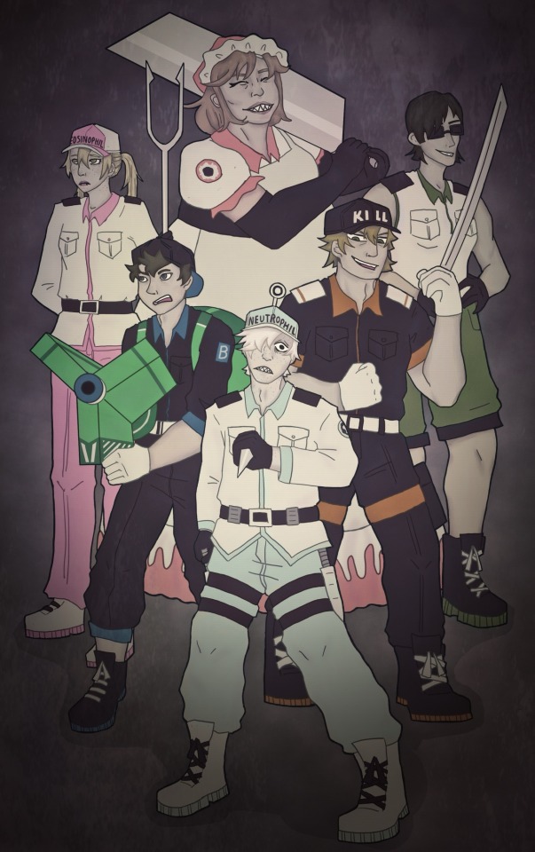
watch out pathogens ‼️
This drawing… has a lot of wrong with it but in my defence digital art is hard
Also fr click for better quality for some reason it’s especially egregious with this one
big ramble about design changes under the cut
Okay so basically my main thing was making them all just look like they are part of the same group since despite what CAW keeps implying design-wise lymphocytes are also WBCs. So NK and Macrophage’s outfits got a bit militarised. I also wanted to give the ‘subgroups’ (ie lymphocytes, granulocytes etc.) some similarities, so neutrophils and eosinophils get the same shirt.
I couldn’t justify having neutrophils being the only ones looking so monochrome but I also didn’t want to stray too far from the og designs so I just settled for desaturating everyone else and giving them grey skin tones to help them match. I also wanted everyone to have some white on them cause yknow WBC.
Basically innate immune system is white with black accents whereas adaptive immune system is black with white accents. Although NK gets black boots to make her match the other lymphocytes. Also I forgot B cell and Macrophage’s epaulettes whoops.
Some cells in the show have their own colour (like eosinophil wearing pink and B cell wearing blue) so I decided to extend that to giving everyone a colour. (Also anything to let the neutrophils wear something that isn’t white it’s hard to draw lol) Killer T got orange since it would give the T and B cells complimentary colours and a neat trio with NK’s green. Neutrophils get that light blue/green colour since it’s close-ish to white and I just thought it looked nice idk. Also I like to think the granulocytes get to rock the pastels.
Macrophage’s pale red was supposed to be a vague allusion to blood since they are the heavy hitters but idk I’m not settled on her design at all and I’m wondering if maybe a purple would’ve been better. That being said I like how the red compliments the neutrophils green/blue since they are the main phagocytes. Idk.
NK has sunglasses cause everyone else has something on their head and it felt weird that she didn’t but I didn’t want to give her a hat. Also eh I think she suits the bouncer vibe.
The granulocytes have freckles and the phagocytes have sharp teeth I don’t make the rules.
1146’s hat now says neutrophil instead of WBC because it’s a real pet peeve of mine since, again, basically all the other immune cells are also white blood cells. Eosinophil also gets her cell type on her hat cause why shouldn’t she. I was too afraid of messing up to put either in Japanese.
I changed the style of trousers for the neutrophil uniform to something which would be more comfortable for high activity admittedly it doesn’t look as good as the og style so idk.
Fun fact: quick google tells me macrophages are around twice the size of the other cells here (give or take a few micrometers depending on which cell) so she is now the tallest. by far.
Everything else is dictated by rule of cool or the limits of my artistic ability.
If anyone actually read all this, I greatly appreciate it. I spent way too long thinking about this lol but talking about character design is fun :D
#cells at work#hataraku saibou#u1146#killer t cell#eosinophil#nk cell#b cell#macrophage#I am incapable of drawing u1146 consistently#undescribed#m‘ealaín
20 notes
·
View notes
Text
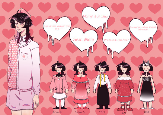
JUNS HERE!! I was having a lot of issues with her ref at first and it made me super unmotivated to work on her, to be fair I still think she looks a little wonky, but she looks SO much better and I'm actually pretty proud of how her ref turned out! Jun's hair is pretty much the same, but I did make the gradient more noticeable, and then of course she has different hair styles with each of her outfits! I decided to have Jun lean more towards natural looking makeup rather then fun makeup, though I do think she'd do fun makeup as well, you guys can draw her in any makeup you guys want! Jun's outfit is pretty much the same but I did want to add more patterns to it, I think I may have gone a little extreme with the tiny bunnies on the pink side of her cardigan, I still think she's cute though! I'm really in love with her outfits! They're all stuff I would wear in real life, fun fact Jun's main outfit is inspired off of an outfit I do wear. Another thing that's changed with Jun is her pronouns. Yep, Jun only goes by she/her now, so I'll be heading through my posts at some point and be changing her pronouns. This was decided today! As for your relationship with Jun in the story, it's changed as well. You and Jun are a lot closer, but still Jun used to be shy when she was younger so you weren't as close to her or Kage as you were with Haruto and Aki who are your age and more sociable, however you and Jun have gotten a lot closer seeing as she's become a lot more outgoing! As for her yandere tendencies, she mainly stalks and isolates you, she does not like getting her hands dirty. Also this isn't specifically Jun related, it's for all the love interests, but as you can see you'll now be able to actually go out on dates with them! I was hesitant to add this in given the short time period of the game, but you know all of the characters anyways by the beginning of the game and even then I want there to be plenty of time and content to really get to know the characters! I do also want you to be able to choose their hair style and outfit for the date as well! So for example you're going on a date with Jun, you could have her wear her normal date outfit, but have her wear her hair in pigtails like in her casual 2 outfit.
Here's some more info on Jun!
Height: 5'6 or 167.6cm
Birthday: 12/25
Likes: You, her sister, fashion designing, socializing, shopping, makeup, spicy foods, making videos, anything cute, cafe's, bunnies(or really just animals), Kage and Haruto are cool too ig
Dislikes: stained and/or torn clothing, societies standards, herself, her parents, sitting still
Family: Mother, Father, Older sister(Aki)
Signature Color: Pink
Extra: As you might be able to see, she also has freckles under her makeup, and her signature moles!
#💝-minevn#visual novel#yandere vn#🎀-Jun#sorry Jun took so long#she was originally supposed to come out on christmas#but once again i was REALLY hating how she was turning out that i couldn't even stand looking at the ref#it still looks weird to me but anything is better then how it looked before#ive also started college so yaaaaay updates will be even SLOWER/sar#anyways
32 notes
·
View notes
Note
so, Peccantum is some kind of deer demon like alastor?
Who is Peccantum?
Yes! Peccantum has the antlers, the hooves, the tail, he's def got a mix of humanoid and deer anatomy! Not entirely the same as Alastor though, as I really didn't want to mimic Alastor's silhouette when I decided on Deer Demon for Peccantum. I also wanted Peccantum's design to contrast Alastor's in some ways.
(there's more thought to his design so I'ma take this question and run with it! :3 continue reading for fun)
Since Peccantum wasn't originally from this series, some elements come from his old design, and some are completely new to this iteration. Some I changed, like his motif of Stars turning into Diamonds.
Deciding on what he should be in Hazbin was kind of difficult. I knew I wanted him to have a deal with Alastor, since no matter what story he's in, Peccantum is always desperate for power. I had always associated Peccantum with deer, but I initially shied away from that because... Well, Alastor. So I went back to what kind of character Peccantum was and tried to make connections from there.
Peccantum was a desperate, scared, ambitious character. He's skittish and young. He's had everything taken away from him and is starving to have it back. He's power hungry at times and has no self esteem. He also makes deals that put his wellbeing at risk. Originally he used magic that slowly destroyed his soul, but here... Well, he made a deal with the Radio Demon. So, I thought maybe Alastor himself could be the risk factor.
In other words, Peccantum is a deer because Alastor likes to eat venison
It is extremely fucked up but I kind of like exploring those dangerous and messed up relationships. Plus it would give opportunity for a deconstruction of Peccantum's character if the relationship got worse. And it could be the start of change for his character.
Deciding on a Deer gave me an opportunity to keep Peccantum's horns, but adding ears on top of that would be too complicated. Without the ears, he didn't read like a deer, so I had them to his side, which looked weird, and I eventually settled on having them down and melding into his hair.
Speaking of hair, I kept his hairstyle/color the same. It helps define his silhouette as being him. Darker hair with light tips also contrasted a character from his previous design and show what he had lost. Here it contrasts Alastor who has lighter hair with dark tips.
I turned the blacked out constellation on his skin into freckles. He's not spaced themed anymore but the freckles are cute! His eyes are also simplified for my sanity, and to make them unique among the main cast.
This version of Peccantum has a very different story, but the core character himself has stayed the same in a lot of ways. It's what I was hoping for when I started designing the Hazbin version of him and I'm very happy with how he turned out. I'm even more happy with this design than I was with his original!
#Peccantum#hazbin hotel#hazbin hotel oc#hazbin hotel original character#Hellaverse#vivziepop#oc#original character#ask#anon
24 notes
·
View notes
Text
Was able to create these redesigns while we had nothin to do in classes. Im tryin to slowly make myself fall in love with art again and my hyperfixation on mlp redesigns are helpin me do that >:'] ...and oh boi this is gon be a long post feel free to read my rewrites ehe
I had so much fun through the whole process for this one! (Tbh the mane 5 becomin more like semi ocs now) For my version, Pipp is more of an actress/performer who does multiple side gigs and hobbies. Shes basically the city's "angelic sweet girl" since shes known for playing a soft and whimsical persona, often doing her iconic closed in ears and faded voice to give a more innocent look for the public. Her attitude is no different in private but she forces herself to stay too positive even when shes in need of relieving some strong emotions. Im not a fan of Pipp being a stereotypical phone addict in the show so I instead headcannoned her as neurodivergent and needing a distraction everytime or else she gets all panicky when shes doesnt have anything to do, she tends to overshare info, forgets to rest, known to take other's spotlight away and dissociate a lot (especially when reading fan comments) Shes disabled and uses formed cloud wings designed by her sister.
As for her redesign, I made her mane to be more stylish as a way to show her expertise on hairstylin. Her tail and tiara is rose shaped to go with her last name "Petals". And her colour pallete is brownish purple and powdered pink to give her character a more softer feel.

Lmaoo I have a lot to say- Anyways heres an old piece i made for zipp Im still confused how to draw her hair patterns...
In my ver. Zipp is well known for bein hardworkin and intelligent. Shes not ready to be queen and often "slacks off" with her main royal duties but she organizes and fixes problems happening outside the castle by talking to the staffs. Shes extremely curious and learns a lot of random detailed infos since she was young which ended up makin her become great at managing situations happening in and out the city, which is why her mother is so persistent on makin her the next queen. Zipp is a solutionist and researcher but she only focuses on what catches her interest before goin on the to next. (Ngl all the mane 5 are neurodivergent to me) Because of how determined she is on those interest, shes made several secret places to avoid just doin main work. Her fav studies are chemistry, physics, cosmology, ecology and aeronautics. Shes mysterious to the public eye but her friends know that shes just a bundle of hyperactive mess once she starts discovering smth new. I assume og Zipp is secretly non-binary coded but for my version, shes a transmare and everypony already knows and accepts it.
I gave her a more light pink and blue green mane colour. Her bangs are like sherlock holmes' as to pay homage for zipp bein a detective in the series along with some side braids. I also gave her twilight freckles and tired,soft looking eyes (not only cuz shes a workaholic like Pipp but its also cuz of genetics)
Aight, I was never really a fan for givin the mane cast just one element and the fact that G5 series havent showed any mentions of it just made it seem unimportant. Soo I instead gave them multiple elements that the mane 5 will develop as their journey goes on. Pipp will be the element of Strength, Purity, Assurance, Control, Pride, Value, etc. While Zipp is the element of Curiosity, Determination, Potential, Wonderment, Eagerness, Persistence, etc. (I imagine if twilight would have ever come back from the dead she would most likely write down what their elements would be as she observes the mane 5)
#mlp gen 5#my little pony#mlp redesign#mlp art#artist on tumblr#mlp rewrite#redesigns#rewrite#art#I dont even like G5 much but damn I cant stop hyperfixatin on what the potential could have been#next time u will see me writin a bible-#school be damned my love for art is slowly comin back#digital art
95 notes
·
View notes
Last Seen Blogs
artblogbyhailey
Pretending I'm in a Sofia Coppola film
unstable-but-still-trying
Am trying

silv3randh0ney
Untitled
hellagayweird0
uh....hi there