#photoshop adjustment layers
Text
GIF Coloring Guide: An Introduction to Adjustment Layers in Photoshop
This is going to be a super basic guide meant to show you the power of Adjustment Layers in Photoshop. It’s not going to be a step-by-step tutorial, though, in which I dictate what exactly you should do because it will always be different for every gif.
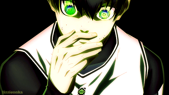
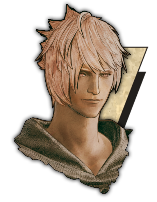
I’ll be turning this Isagi gif:

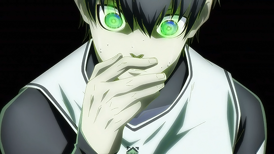
into this:
What you need:
Adobe Photoshop (any version should be fine. I use CC v23)
Basic gif-making knowledge using Photoshop
Basic Photoshop knowledge in general
What this guide is good for: A simple gif where the brightness and colors of each frame are about the same.
I’m writing this guide for those who already know how to make a gif in Photoshop. You’ve imported your frames, deleted the ones you don’t need, and you know how to save it as a gif. I will only be teaching you how to color, so I’m not gonna walk you all through the Photoshop basics. You can google that yourself.
Now, first things first, I want you to keep in mind that the GIF file format can hold only up to 256 colors. Thus, when coloring gifs, I try to “reduce” the colors by making the blacks blacker, the whites whiter, removing color noise, and de-emphasizing colors that are not essential to the overall scene. Otherwise, the final image will just look noisy or muddy because of the gif trying to compensate for all those extra colors—which is not bad in itself, by the way, if that’s the look you’re aiming for. I just prefer my GIFs to look HD.
And from what I’ve noticed, noisy and muddy gifs will also have a larger file size. The uncolored gif above, for example, is at 6.69mb. Meanwhile, the colored gif is at 4.96mb. Both were exported using the same settings. Although we have a 10mb file size limit for gifs here on Tumblr, I still like to keep the file size down as much as I can.
Now, with that out of the way, let’s get to the actual guide—
In the Isagi gif I’m using as an example, I made him look like he’s glowing in the dark and also partly blended him into the background. Here’s a screenshot of all the adjustment layers I used to achieve this effect:

All these layers should be on the very top of your gif layers. I grouped them together for convenience in toggling all changes on and off, allowing me to quickly check the “before and after” of the gif.
Before I explain what those layers do, I just want you to know that the order of those layers matter. I purposely put one Selective Color at the bottom, and that second Selective Color is no mistake. More on this later.
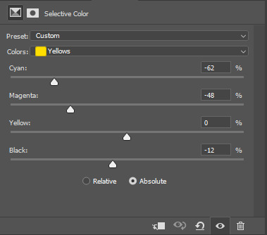
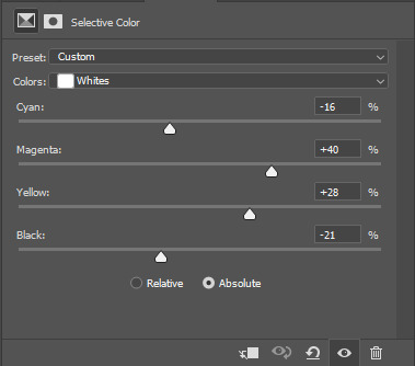
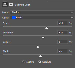
Selective Color 1
Selective Color is my favorite, and it’s also the most important. It lets me fine-tune individual colors without affecting the other colors much. It’s also usually the first thing I add as it lets me pick which colors to emphasize and which to de-emphasize.
Now, let’s look at our unedited Isagi:
(Above is a still image and not a gif. From hereon, I’ll be using still images coz the gif looks about the same in each frame anyway)
The colors on Isagi look too gray and cold to me. I want to make the black of his suit darker, remove a bit of that green tinge on his skin, make the blue of his eyes bluer, and just give him an overall warmer look.
Here are my settings for Selective Color 1:


Unedited vs Selective Color 1:

Although I said I wanted to remove the green tinge on his skin, I did not touch the “Greens” at all in my Selective Color 1 layer. That’s because doing so would also reduce the greens in Isagi’s eyes, and I didn’t want that. Instead, I tried to counter the green on his skin by adding some Magenta and Yellow on the “Whites” to make it appear warmer and more reddish instead.
Of course, I didn’t come up with the final settings above in one go. As I added more adjustment layers on top, I would go back to Selective Color 1 and play around with the different sliders until I was satisfied. Gif coloring doesn’t have to be a one-way process. With adjustment layers, you aren’t affecting the pixels of the image itself, so you can always go back and tweak your settings.
Dragging the slider to the right for positive values would return darker colors, while dragging it to the left for negative values would return lighter colors.
I want my Isagi gif to be vivid and for Isagi to look like he’s glowing in the dark, so I dragged the sliders in “Blacks” up to the positives. Then in “Whites,” I dragged the black slider down to the negatives.
However, if you want a more muted look like this Isagi gif 2:

...You can slide the black slider under “Blacks” to the negative values instead.
Curves
Curves, along with Levels, is usually the first thing a gif-maker learns to use. It’s good for quickly getting some nice brightness and contrast on your image. I’ve seen some gif-makers refer to Curves as the better version of Levels, but I disagree. Curves and Levels, though both affect contrast in an image, go about it differently and achieve very different effects.
In my Isagi gif, I used both Curves and Levels. But in some of my other gifs, I used only one of them.
Curves is what I usually add in the beginning stages of coloring (i.e. the layer is placed lower) when doing complex coloring. Although I never make Curves the bottom-most adjustment layer, sometimes I add it first just to give the image a burst of brightness or to quickly darken an image that may be too bright. I would then put a Selective Color underneath to make necessary adjustments.
Our Isagi gif, on top of being still muddy, is now also too reddish. I had only added those reds to get some warm undertones in our gif, and now that we have that, it’s time to reduce those reds. We’re not gonna do this via adjusting Selective Color 1 because doing so would only bring back the greens we wanted out. Instead, we’re gonna subtly bring in some whites to the gif by making it brighter with Curves. And while doing so, we can also enhance the contrast on the image.
Here are my settings:
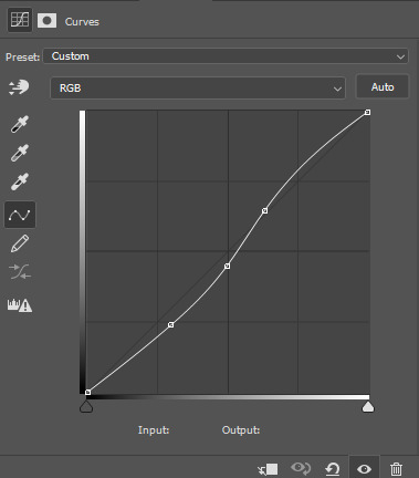
The more S-shaped that curve is, the more contrast and saturation you’ll get. I just want a subtle change, so the curve is nearly flat.
Unedited vs Selective Color 1 vs Selective Color 1 + Curves

See the difference? Now there are darker blacks and less green on Isagi’s skin. The colors are also starting to pop, and the gif looks less muddy.
If you want colors to look muted instead, like in Isagi gif 2, you can do a reverse S curve instead. Well, actually, feel free to play around with Curves. It doesn’t have to be S or reverse S. You can add as many points there as you like and form whatever curve you want.
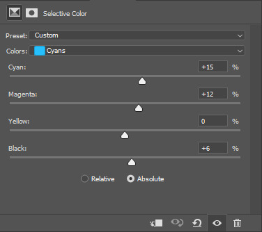
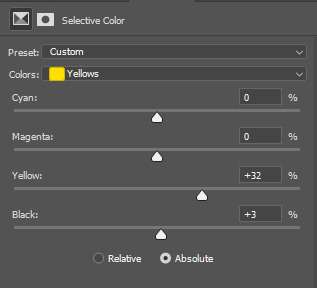
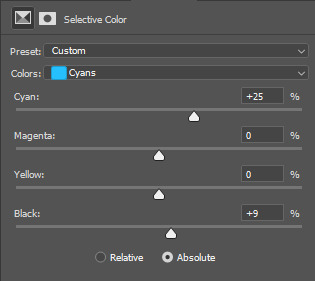
Selective Color 2
Remember when I said that the order of adjustment layers is not random? I’m now going to explain why.
When we added Selective Color 1, the image that layer is editing would be our unedited Isagi with all those greens and grays.
However, when we added Curves on top of Selective Color 1, the image we were editing was no longer the original Isagi but the Isagi + Selective Color 1.
Layers build on top of each other. It’s like when you’re painting. If you add red paint and then put blue above it, you get violet. If you want to put another color on top, you’ll have to work with the violet and not the red that’s no longer there.
That said, our Selective Color 2 here is not going to be redundant. Selective Color 1 was coloring the unedited Isagi, but Selective Color 2 will be coloring the version that has Selective Color 1 + Curves.
Now, I intend to use Selective Color 2 to enhance Isagi’s green aura as well as the blue of his eyes. We weren’t able to increase the “Greens” in Selective Color 1 because doing so would also make Isagi’s skin green. But now that Isagi’s skin is more red than green, we can play with the “Greens” of his aura safely.
Here are my settings:

Unedited vs SC 1 + Curves + SC 2:

Levels
Now, time to make our gif bright and vivid. You can use another Curves layer here or a basic Brightness & Contrast layer, but since the colors of our Isagi gif are predominantly black and white, I’m gonna go with Levels since it works really well with black and white images.
Here are my settings:
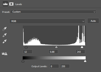
See those 3 sliders under that graph? From left to right, those are sliders for Shadows, Midtones, and Highlights. If you slide them to the right, said shadows, midtones, and highlights would turn darker. Slide them to the left, and they become lighter.
I often get carried away the first time I add Levels, resulting in extra vivid/saturated images which I later have to adjust. So yeah, try not to overdo it. It’s like vanilla extract. A little goes a long way ;)
Unedited vs SC 1 + Curves + SC 2 + Levels:
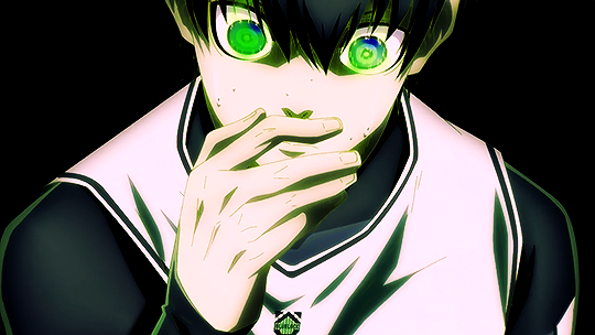
Beautiful ✨
The image is no longer muddy, but we’re not done yet!
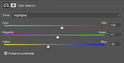
Color Balance
I haven’t used Color Balance much in my gifs because Selective Color often does bulk of the job for me. However, the Isagi we have right now hasn’t quite yet achieved that glow in the dark effect I wanted. I also want to give Isagi that techy Matrix vibe by really emphasizing his green aura, so for that, we’re gonna add Color Balance for the finishing touches.
I think the midtones of the image look okay, so I’ll just tweak with the shadows and highlights. Here are my settings:

....And with that, we are done!
Before and after:
Compared to pre-coloring, the gif is now more vivid and not at all muddy. We also made his green aura brighter without making him look like Shrek uwu.
I actually also went to all of the 104 frames of this gif and manually reduced the noise for each one so we can have a more HD-looking gif. That’s outside the scope of coloring, though, so I won’t be including it in this guide. I’ve also reached the 30-image limit for posts, so I couldn’t include it even if I wanted to 😩
Anyways, I hoped this guide helped! There are many more Adjustment Layers that were not covered in this guide, but they should be easy to learn once you get the hang of working with multiple adjustment layers. You’ll probably never even need to use every single Adjustment Layer out there, anyway. The ones I mentioned in this post are often more than enough.
Now tagging the mutuals who may be interested in this: @usagi-yoichi and @gachagon
#gif tutorial#gif making#gif coloring tutorial#gif coloring guide#blue lock#isagi yoichi#dailyresources#allresources#photoshop tutorial#coloring tutorial#completeresources#photoshop resources#photoshop adjustment layers#usergif#tutorial#resource#photoshop#miyamiwu.tut#lznkgifs#miyamiwu.src
67 notes
·
View notes
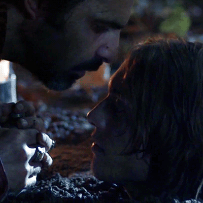
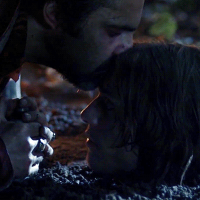
Photo
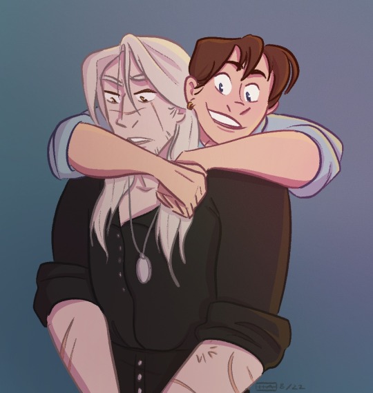
touchy touchy
#geraskier#geralt of rivia#jaskier#jaskier the bard#the witcher#the witcher netflix#fanart#the witcher fanart#procreate#digital art#Bitter Content#my art#banged this out in a couple hours im trying to get my groove back with procreate#i wish i could combine procreate and photoshop i cant choose which i prefer#its deeply annoying#procreate is so streamlined and its so helpful with lineart and shortcuts#but photoshop is just so much better at color#the adjustment layers are just. better.#cant they just like. combine#anyway. see look im not a s tranger things blog look here content!
2K notes
·
View notes
Text
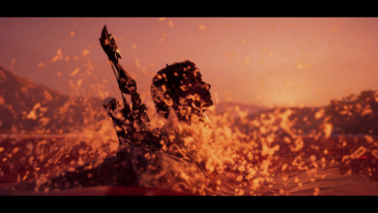


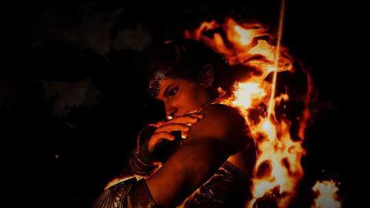
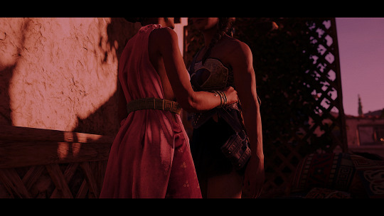
So you're the Eagle Bearer everyone's been talking about. I hope you live up to your reputation.
#acedit#ac odyssey#assassin's creed odyssey#kassandra of sparta#virtual photography#idk what the right tags are honestly tbh to be honest. let's hope these are enough#& yeah some of these have the silly 'movie-like' black borders. my sincerest apologies. it will happen again#anyway. i just think that Women--#im like uhhh 120 hours into a replay and at least 30 of those hours are just. Me Staring At Kassandra#shes my roman empire#also: these photos have Not been taken sobe.r#they have not been edited sober.#and they are not being posted sober <3#mine#did you know: i entirely forgot how to use photoshop. didn't know that was possible but here we are#me lookin at adjustment layers: good god. what are these
9 notes
·
View notes
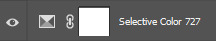
Text

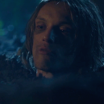
Will (2017) s01e05
#jamie campbell bower#jamie bower#jcb#kit marlowe#will tnt#will (2017)#YOUR LOCAL FUNERAL HOME IS BACK IN BUSINESS#I know the number of the episode now#and I've discovered adjustment layer in photoshop#I'm unstoppable now#my gifs
65 notes
·
View notes
Text
when people ask for photoshop advice or tips on how to color and i just look at my psd files like
#life#it's like.. photoshop is a vast and endless space and i'm the explorer#my general process is 'make adjustment layer -> play around until it looks nice -> lower the opacity of the adjustment layer to like 25% ->#rinse and repeat for 2 hours straight'
9 notes
·
View notes
Text
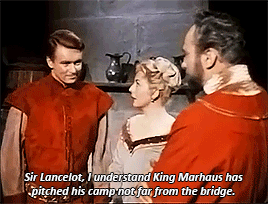
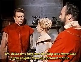
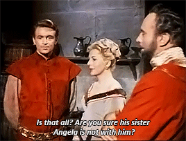
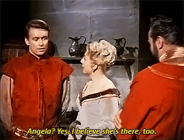
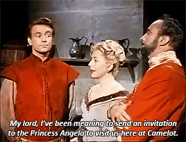
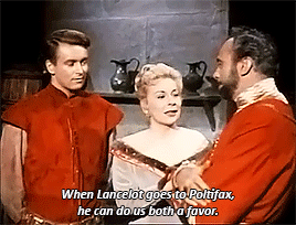
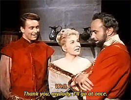
#sending your and your husband's boyfriend on a business trip to hang out with his girlfriend#the adventures of sir lancelot#william russell#ronald leigh-hunt#jane hylton#king arthur#lancelot#guinevere#i need a poly tag for them. hm.#all three of their smiles in the last gif......grrrrrggrrrrrgrgr they love each other!!!!!!! so much!!!!!!#ray.gif#everyone say thank you photoshop adjustment layers#and also to the noise reduction and smart sharpen features#if you think these are ugly you should see the files I'm working with lmao. love obscure 50s shows#lancelot and arthur matching in their lil red shirts......i love them.......
19 notes
·
View notes
Text
@shadow-jack replied to your post “well I’ve rewritten the dialogue several times...”
I just love that you’re still using paint shop pro, I think I still have the disc for that somewhere around the house 😀
Even funnier, the version I’m using is over 20 years old at this point and frequently struggles to even function properly in a modern windows desktop environment.
I’ve been meaning to replace it for... years, basically, and even bought a license for Clip Studio Paint some months back for that express purpose. I just... haven’t gotten around to actually start migrating to it yet because it’d take more time and effort to learn something new than to endure the peculiarities of old paint shop pro. It’s not like there’s a shortage of tutorials or anything for the purpose either, I just need to take the time and energy for it which has so far proven... difficult.
Plus all my image template files for Stray Stories and so forth are still in the *.psp format and I’d have to deal with all of that, too.
#look the first time I used a version of paint shop pro was back on windows 3.1#and photoshop always felt bloated and awkward to me by comparison#I've stuck to version 7 something of psp for the last two decades or so#even though it's become less and less reliable with each new windows release#honestly my ideal image editing software would basically be the psp I have#but more compatible with modern windows#and with some added/updated modern features in the mix#I don't really need it to be massively overhauled#just some better colour adjusting and effects#better implemented vector layer support#less janky saving of transparency for PNGs and TGAs#DDS support would be really nice too
2 notes
·
View notes
Text
trying to gif in photoshop except i have no idea what im doing
#mine#i figured out adjustment layers and curves and shit yay!#now im closing this window because its lagging photoshop
0 notes
Text
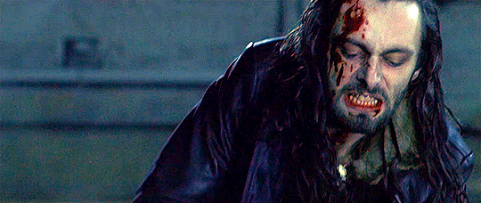
#underworld#movies#my gifs#540px#10mb#Vampires#Lycan#That shit we're all sick of by now#But this was before that#Chick is man role#Man is chick role#yum yum yum#I learned a new photoshop adjustment layer#that's the point of this
1 note
·
View note
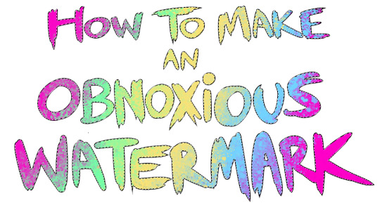
Text
...that your audience won't hate.
This is a method I started using when NFTs were on the rise - thieves would have to put actual work into getting rid of the mark - and one that I am now grateful for with the arrival of AI. Why? Because anyone who tries to train an AI on my work will end up with random, disruptive color blobs.
I can't say for sure it'll stop theft entirely, but it WILL make your images annoying for databases to incorporate, and add an extra layer of inconvenience for thieves. So as far as I'm concerned, that's a win/win.
I'll be showing the steps in CSP, but it should all be pretty easy to replicate in Photoshop.
Now: let's use the above image as our new signature file. I set mine to be 2500 x 1000 pixels when I'm just starting out.
Note that your text should not have a lot of anti-aliasing, so using a paint brush to start isn't going to work well with this method. Just use the standard G-Pen if you're doing this by hand, or, just use the text tool and whichever font you prefer.
Once that's done, take your magic wand tool, and select all the black. Here are the magic wand settings I'm using to make the selections:

All selected?
Good.
Now, find a brush with a scattering/tone scraping effect. I use one like this.
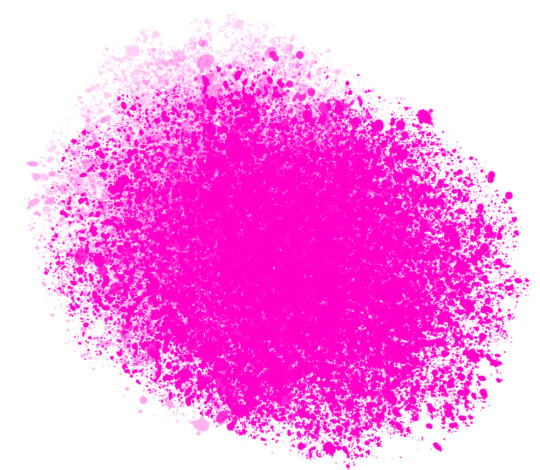
You can theoretically use any colors you want for this next part, but I'd recommend pastels as they tend to blend better.
Either way, let's add some color to the text.
Once that's finished,
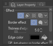
You're going to want to go to Layer Property, and Border Effect

You'll be given an option of choosing color and thickness. Choose black, and go for at least a 5 in thickness. Adjust per your own preferences.
Now create a layer beneath your sig layer, and merge the sig down onto the blank layer.
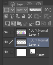
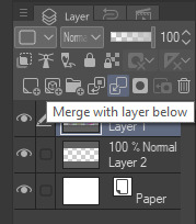
This effectively 'locks in' the border effect, which is exactly what we want.
Hooray, you've finished your watermark!
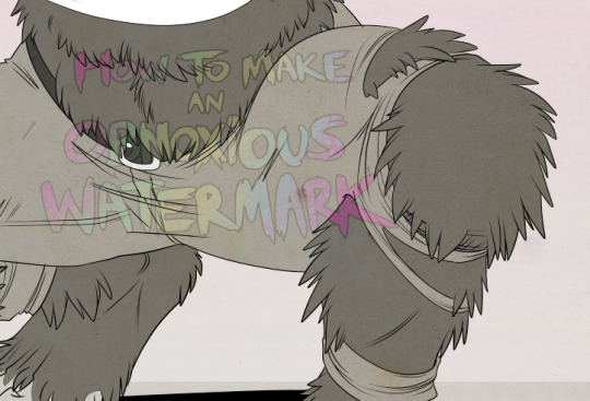
Now let's place that bad boy into your finished piece.
You'll get the best mileage out of a mark if you can place it over a spot that isn't black of white, since you'll get better blending options that way. My preference is for Overlay.
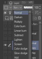

From here, I'll adjust the opacity to around 20-25, depending on the image.
If you don't have a spot to use overlay, however, there's a couple other options. For white, there's Linear Burn, which imho doesn't look as good, but it still works in a pinch.
And for lots of black, you have Linear Light
Either way, you're in business!
EDIT since this has escaped my usual circles, and folks aren't as familiar with my personal usage:
An example of one of my own finished pieces, with watermark, so you can see what I mean about 'relatively unobtrusive'-- I try to at least use them as framing devices, or let them work with the image somehow (or, at the very least, not actively against it).
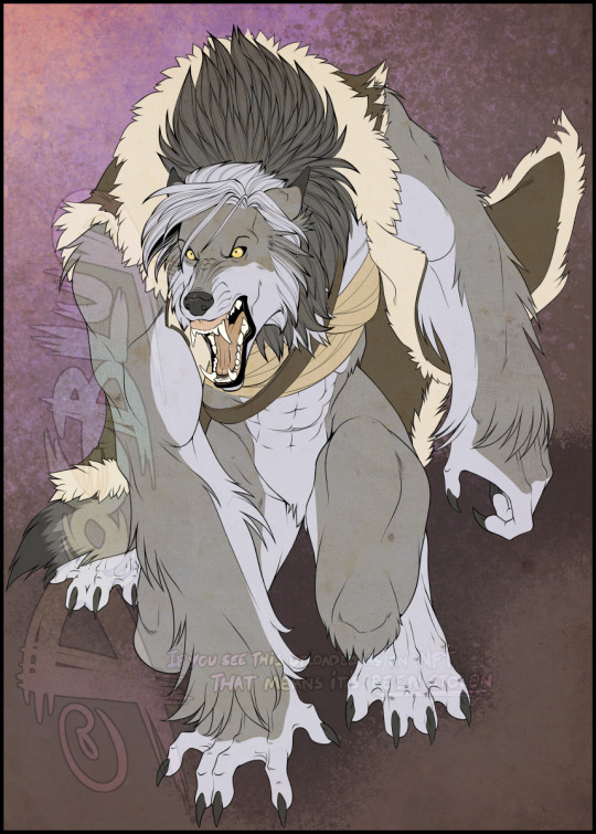
I know it's a bummer for some people to "ruin" their work with watermarks, which is part of the reason I developed this mark in particular. Its disruption is about as minimal as I can make it while still letting it serve its intended purpose.
There's other methods, too, of course! But this is the one I use, and the one I can speak on. Hope it helps some of you!
52K notes
·
View notes
Text
i'm gonna be completely real with you all & say that when it comes to photopea (photoshop but i am poor), i have very little to no idea what i am doing. as i've said before all i can really do is slap a psd on image & download fonts & type them onto the image. but even that? i'm not 100% i do right. like specifically with the psd thing, like i know there's a whole thing of adjusting layers ... but i have no clue what that means. i don't know how to do it. i download a psd, upload the image click 'duplicate into' on the psd & duplicate into the image. that's it, that's all. is that even the best way to do it? who knows, surely not me. which is probably why my pinned post image seems to have wildly different coloring than my icon & header. like no that's all the same psd. could i fix that by adjusting layers? no clue. no clue how to even do that, idk what i am doing but i am simply trying my best -
#( the smallest planet with the biggest heart // ooc )#(the font thing i think is the one thing i actually do fully right. i think. pretty sure - like i think i finally learned how to center#(my header image isn't centered on purpose). but like unless there's a way to make text not two different sizes in promos & stuff)#(if there is i don't know it)#(like i would love to fully learn how to do everything someday. learn all about this adjusting layers business actually learn how to make m#icons & use templates & all that. but for now ... you get what you get w me. & if you're a photoshop expert & i make you cringe i apologize#(anyways now partly on this subject i gotta fucking fix my image thumbnails on my photos on my laptop bc they fucked up AGAIN & then ...#i should be here. this is a long rant-y ramble ... feel free to ignore)#long tags tw
0 notes
Photo

something something sexy goose
#geralt of rivia#jaskier#julian alfred pankratz#geraskier#the witcher#the witcher netflix#my art#Bitter Content#fanart#digital art#photoshop#ive been chipping at this since finals week#i learned all these rules about perspective#so now i get to break them on purpose#fisheyes are very fun even if they take a lot of prep#and photoshop having shittier lines than procreate makes this harder#but i desperately needed photoshops adjustment layers for the amount of neon in this so whatever#this piece was for funzies but i am very happy with it
163 notes
·
View notes
Text
FF14 Battle Portrait Tutorial
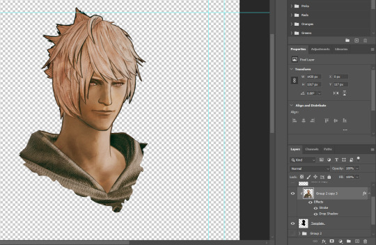
For the past few weeks I was trying to find a way to recreate the battle portrait from FF14 as there was a few characters that I want to see in that style but don't officially have one yet. I think I got it down more or less (see image below) so I thought it's a good time to share what I did.

First of all, I made a few files that would help make life a little easier. They can be grabbed here .
Note: I did use Reshade to do a bit of work at the screenshot stage to help speed up the process but the same effect can be recreated in Photoshop with a vanilla screenshot. There are a lot of tutorials on how to do comic/cartoon effect in photoshop and those would make good bases to work off of.
Step 1: Take the screenshot with the PortraitBase Shader on. I usually take two screenshots. One with "Comic" on and one with it turned off. This is so that I have more to work with if needed.

Step 2: Drag all the screenshots into photoshop and remove the background. In photoshop, arrange the layer so that the screenshot with the Comic lines visible is on top of the one with the effect off.
Step 3: Duplicate the the layer with the "comic" effect and apply Blur->Gaussian blur (radius 0.5)
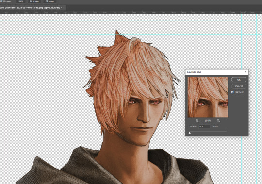
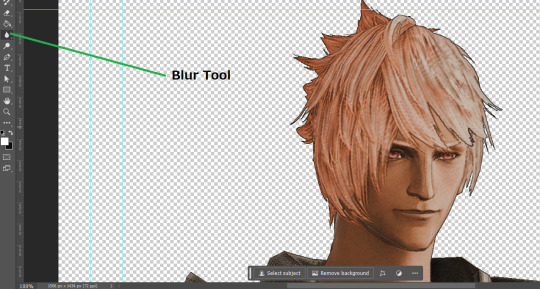
Step 4: Take a look at the hair. In Eric's case, It still doesn't look blur enough to me so I used the blur tool and blurred it a bit more
Step 5: Create a new layer above the layer in the previous step and use the brush tool to start outlining the edges. Where to outline is up to you but the idea is to make edges defined so that it looks more like a drawing.

Step 6: Duplicate the outline layer and then hide that layer.
Step 7: Merge everything under the outline layer.
Step 8: Drag and drop the "Texture.png" into the project and Clip it to your character layer. Set the blending of the texture to "soft light".
Step 9: Drag and drop the "stroke Texture.png" into the project and Clip it to your character layer. Adjust the size till you are happy then set the blending to "overlay".
Step 10: Adjust the opacity settings of both texture layers until it looks good to you.
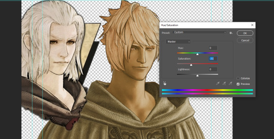
Step 11: Click on your character layer and go to image->Adjustments->Hue/Saturation (note: you will see I dragged in the official Hades portrait as a point of reference to work off of). Adjust the saturation till you are happy.
Step 12: Go to image->Adjustments->Color Balance and adjust the color till you are happy. In this example, since Eric is also wearing the Sophist robe, I tried to match that color to Hades' Sophist robe color.
Step 13: Once you are happy, drag the "Template.png" into the project and scale that to the size you want. Make sure it is completely covering the character. If it's not, you can just use paint more of it with the brush tool to extend it till it covers everything.

Step 14: Hide the "template.png" layer and select your character layer. Use the magic wand tool to select the outside of the character.
Step 15: With the selection still selected, click on the "Template.png" layer and press delete on your keyboard. You should now be left with a blank in the shape of your character.

Step 16: Drag the"Template.png" layer to be below your character layer. Then click on your character layer and clip it.
Step 17: Click on the "Template.png" layer and add a 2px stroke and shadow to it.
Step 18: Drag "Back_Deco.png" into the project and place it behind your character. Scale it till you are happy with it.
And that's it! Now you can recreate portraits for any NPCs that you want (in theory). A lot of it is also fine tuning to what you want but this should at least give you a decent base to work off of :)
735 notes
·
View notes
Text

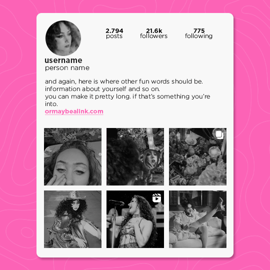
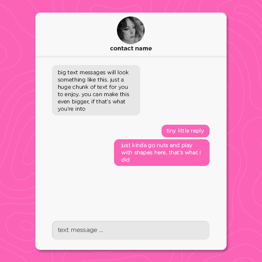


GOOD LUCK BABE! a social media template
I return from the depths with a new and improved social media template.
this template includes a lot; an instagram account, post, and story, a text message conversation, a smaller text, a music library, a music player, a tweet, and a camera roll. you need some basic photoshop skills in order to use this template, as it uses a lot of clipping masks and solid color layer styles. feel free to go crazy and adjust anything to your liking.
you can download the template here, or by clicking the link in the source. as always, please reblog and credit me if you use this template ♡
INFO
size: 540x540
fonts: gotham bold and light regular
#social media template#instagram template#rph#psd templates#my edits#my templates#idk why im suddenly like. Producing Content. but here we are#these are always so fun to make
409 notes
·
View notes
Text
bro, why do i get into these insane gif/edit-making times 7 years after the game's released asdsfdgf
#life#the bg3 adventures#me staring at my hands thinking where was all this back in uh.. august? september?#anyway#i'm having a good time and just playing around with my 45875 adjustment layers in photoshop#the only fear i have is this is uh my bg3 supernova experience
2 notes
·
View notes
Photo

How to Avoid Losing Original Images in Photoshop
Learn More.
#image#originalimage#needto#blackand#andwhite#thefile#theoriginal#inphotoshop#adjustment#save#original#layer#photoshop
0 notes
Last Seen Blogs

hotdreams0fyou
Happy Viewing

unsurefuture
Burned Bridges
that-one-artist
Shitposting, art and everything nice!
pizzekai-pt-au
Pizza Isekai
