#or almost lineless at least
Text
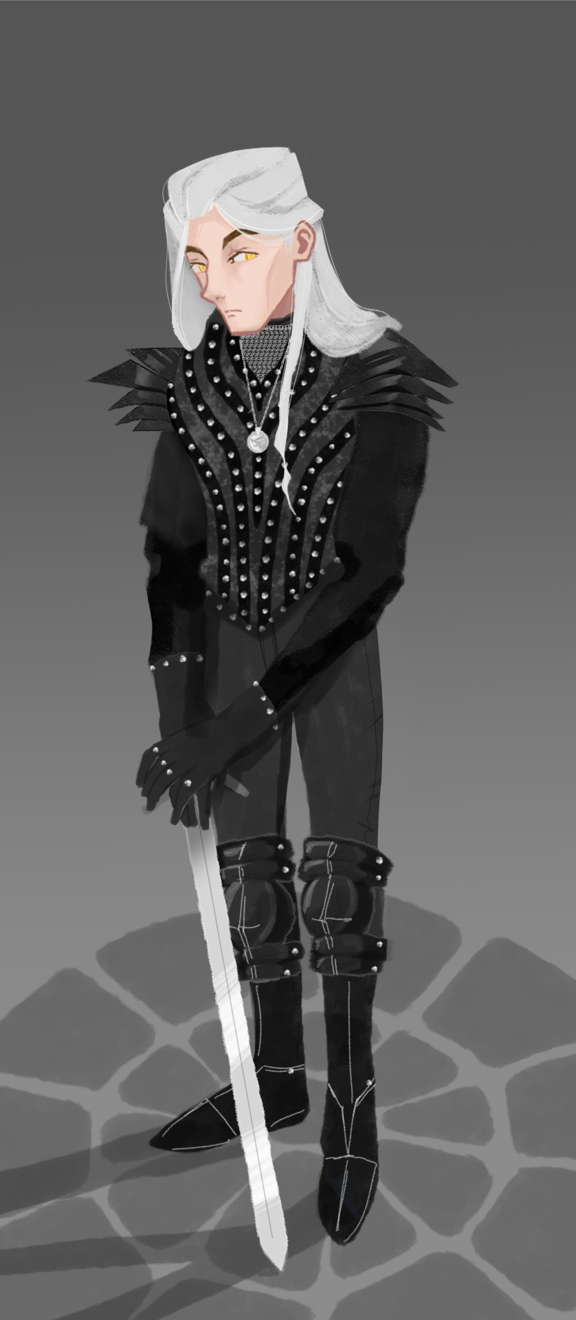
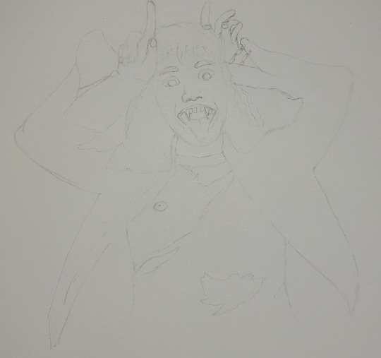
A bit of art to close out the year, inspired by this costume from MacBeth (1985). It was fun drawing it bit for bit, but I wanted to modify it a bit for more contrast. First draft under the cut for those curious.

#my art#my witcher art#witcher#the witcher#geralt of rivia#long post#my new year's resolution is to make more art since this last year had more of a writing focus#I also want to try more lineless art#or almost lineless at least#I may shrink the head a little if I look back and still don't like it#also there's something wrong with the nose but I can't tell what#it's buggin me though
215 notes
·
View notes
Note
Question about the Unknown Fazbear entities. Are they constructs made by Fazco, or did they just suddenly appear? Where did they come from?
Also, can I make a little friend for your Sun and Moon variant?
hi hi !!! im so so so sorry for taking so ridiculously long to respond to this but ah! this is something im hoping to get more into throughout the videos :) this is going to be long so i'll answer ur second question here: if ur still interested yes!!!! oh my god that would be so cool!!! what!!!
and for ur first question:
(actual answer + VD below the cut !)
they are a bit of both! Fazbear Entertainment being Fazbear Entertainment (and especially with the new AR mask stuff from the ruin dlc) was experimenting with a brand new virtual companion kind of thing ever since the pizzaplex burned down! its similar to the AR app (that.. isnt very canon as far as im aware but doesnt seem too far of a stretch from what they would do) & scp-1471 - with the fun twist being that its not an app. it's almost like a reality-warping virus, ig??
so to answer your question: yes, they were made by fazco! but (and i tried to hint at this in the third video but im honestly not sure how well they came across) despite limiting the first batch of these "virtual companions" to the beta testers that signed up for the program, a couple of strays ended up on the front porch of other people's brains (including "you"/the pov you play as throughout the videos)
the current idea im working with is that the entities are linked to the original (decommissioned) animatronics, but duplicated - think the way that freddy comments on there being other freddies in other pizzaplex locations. im really liking the idea of subtle variations between entities: same original source, same memories, but slightly different reactions, personalities and effects on their host!! i imagine especially so for entities based on aggressive animatronics like monty. some of them are a tad confused on why theyre there.
thank you for sending this ask!!! again im SO so sorry for taking so long to respond!!! at least part of it was waiting for myself to finish the third video and the other part of it was just me never getting around to it i fear :( i hope u have such a wonderful day !!!
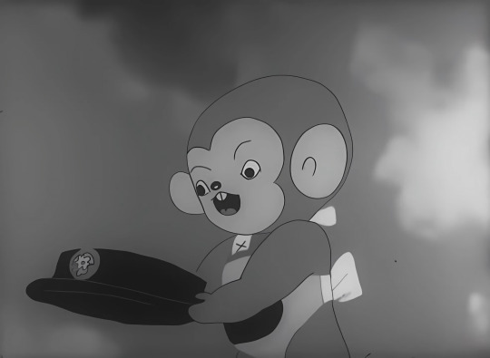
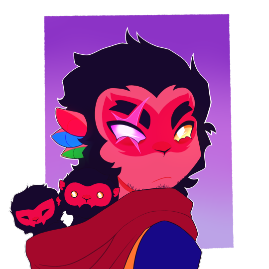
[VD: a video of entity sun speaking to the viewer through captions. entity sun is drawn in a simplistic lineless style. their face is half shadowed and they are missing a ray; they are cropped below their neck ruffles, which are larger than their canon ruffles and have a second pair of sheer ruffles underneath. sun stares at the viewer before saying, “where i came from?”. they tilt their head to the right. “a lot of thoughts you’re having there, friend.” “i don’t know if you need to worry about all of them.” Silence. “do you?” Silence. “Do you think you need to worry?” Longer silence. “Are you worrying about anything, starlight?”. This last dialogue lasts longer than the others. In the last few seconds of the video, moon faintly appears behind sun, looking distraught. The video cuts to black. / end VD.]
79 notes
·
View notes
Note
Hey do you have a process for your colored pencil work? Your stuff is phenomenal.
Hi, thanks for reaching out ! I think i've already answered bits of this question before (you can check my blog for the tag "answers" !) but maybe not so linearly ? It's strange thinking of my drawing as a "process" when for me it's just... How it has to go ahah !
But I do have a routine I follow ! I start off by building a fairly detailed sketch on basic printer paper, which I then tape to the paper I use for colouring (Clairefontaine Exacompta Bristol paper - very smooth, very thick paper, almost no grain at all !).
I copy that rough sketch with the help of a lightbox, then scan the clean sketch so I can digitally plan my colours ahead.
Once I've figured out what I'd like to do colourwise, I move on to lineart, which means erasing the lines of the clean sketch and going over them with a coloured pencil (so I technically do the same drawing three times !)
And once lines are coloured, *then* I can start putting down colours ! I tend to put rough flats first just to make sure I don't accidentally forget which areas are supposed to be white and then move from top left to bottom right, generally starting with the background. Rendering is very instinctive and I wouldn't be able to explain much of it apart from "I uhhhh, colour for a while, and then it looks ok ?" so I'm afraid I won't be able to be of much use to you there x)
But in terms of steps, that's really all there is to it ! Colouring definitely takes the longest but all the steps beforehand are kind of a handful, I'll admit. I kinda wish I was good/confident enough to go mostly lineless, I wouldn't mind skipping that coloured lineart part at least ! But I don't think I'm there yet.
Thanks for asking, let me know if there's anything I can help you with !
27 notes
·
View notes
Note
hihihi !! came across your tumblr while looking at hermitcraft/life series art (your art is lovely by the way, definitely going into my cool people with cool art collection) , and saw that you use/used krita !! as a krita user, i would love to know your main brushes and canvas sizes, and art process too :D would love to get into things like illustration but no clue where to start ,,
hello! since i get asked about stuff like that relatively often and i'm usually too lazy to answer properly everytime i'll use this ask to answer all of those in one big post :D
Brushes

i don't think i have main brushes? i jump from style to style quite frequently and i love love love trying out new stuff so the set of brushes i'm using for any given drawing can change drastically but there're a few that came to my mind

i've been vibing with the first brush the most lately! it's kinda has spray paint feel to it?? but not really? idk but it's fun to make messy sketches with :D 2nd and 3rd are probably the brushes i find myself coming back to most often bc they're just really basic lol
all of the brushes ^ are default krita brushes bc i dont like downloading brushes from the internet so if you wanna find cool non default krita brushes you'll need to ask sm1 else sorry
(btw my advice: don't care about brushes. limiting oneself to a certain set of brushes can also limit the creativity so don't do that)
Canvas Size
my default canvas size is 2000 x 2000 px and it usually goes up from that if i need other proportions for a piece - basically that means that the shortest side of (almost) any of my drawings is minimum 2000px (2000 x 3000, 2500 x 2000, etc). for pixel art it's the same rules but for minimum of 200px!
social media eats the quality of images really hard so i usually don't see the point of drawing on bigger canvases than that ¯\_(ツ)_/¯
Art Process
there isn't much to say about the art process for me bc i'm sure my process is not too different from everyone else's process lol for lineart stuff it's the usual:
super messy, super quick sketch
cleaner sketch (depending on the art style and the vibe i'm going for this step can be skipped)
messy colouring (also can be skipped sometimes; this step is just for myself to find the colour palette i wanna use and to determine whether i like the drawing so far or not so i can change the idea or completely abandon the piece)
clean lineart
flat colouring + shading
adding small details, colouring the lineart, making lighting prettier, etc. (this one cannot be properly described bc for me it's usually a mess of tweaking everything and nothing until i like the final product)

for lineless stuff i don't have a process - i put pretty colours on the canvas and just,, Pray for the best or smth lmao
it most likely won’t be helpful but i do have youtube channel where i (once in a blue moon) post speedpaints! they might help in understanding what my art process is
and that's it i think? i hope this was useful at least in some way :D it's not the best idea to ask me about any of art related things bc my approach to art can be summarised with throwing stuff at the wall until smth sticks lmao
#asks and stuff#this is a Mess#i got very sick exactly on january 1st (good start of the year) and i'm still sick#and bc of that my brain is slow at times so#if anything is incomprehensible i'm sorry
46 notes
·
View notes
Text
Meant to be Rocky, but I was partially looking at the show version, partially looking at the set version, and partially just straight up not paying attention.
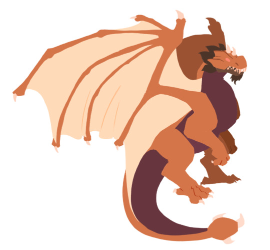
I regularly forget that I drew almost nothing but dragons for multiple years of my life and am therefore at least somewhat skilled at drawing them.
Also, I believe that with this I can no longer deny that I am most likely back in my lineless phase.
91 notes
·
View notes
Text
Okay after a lot of stress of doing this, I made this drawing!!!
and here's a version w/out the darkness:
And there was supposed to be a version that was just the bg, but...
that leads into why I got stressed
I'll explain, but I'll put it below a cut so people aren't forced to see me ranting
So rant below:
The combination of Kleki + my often-glitches chromebook is a free helltrip.
So, as I've explained probably in June, my tablet is not working, forcing me to use my Chromebook to interact, and Kleki, this random drawing site, to draw
And Kleki is already not preferred by me, since:
It has a limit of 16 layers (sure, it used to only have 8, which was worse, but I'd still prefer more layers)
It doesn't really have a blur tool (sure, it has a blurring edit labelled Tilt Shift, but it doesn't work really like a blur tool would)
You can't select a specific part of a layer (example: Say for the drawing above, I put two heads: One is SunBun's, one is Moonpie's. However, Moonpie's isnt where I want it to be! It would be simple to just... select Moonpie's head, right? Nope!! You can't select one of them, you select the whole layer!! I've at least found a cheat of duplicating the layer, removing Sun's head on one & Moon's on the other, and then moving the layer that only has Moon's head. However, ya cant do that when you already have 16 layers, can ya??)
You can't select & recolor a part of a layer. (this is something I honestly use a lot if I'm drawing Sun and/or Moon lineless. I select the head, and then draw the cresent, with no worry of having to erase the outer lines. However, this one doesn't do that, and that upsets me slightly, but it's not too big of an issue.
No folders for layers (I don't usually use folders w/ layers so this doesn't bother me, but I found out from someone who I won't name that folders can be helpful when drawing, and this site didn't have that, so yeah for any folder users or anyone who needs a lot of layers then good luck using Kleki)
Trying to undo something and hitting the Share button by accident (this annoys me so much. I make a mistake, try to undo it, and have to deal with seeing "Kleki.Com says sharing not supported" over and over again like I KNOW!!! SHUT UPP!!!!)
And probably many more issues that I just can't think of rn
Of course this is just how I feel about it, and most of my issues towards it are based off of how I used IbisPaintX (what I would draw with on my tablet), but Kleki just makes me wish my tablet gets fixed quicker...
Cus honestly drawing would be easier for me on IbisPaintX than on Kleki...
But that's not it...
Since at the start I said the combination of Kleki & my often-glitches chromebook, right?
I've explained Kleki, what about my Chromebook?
well...
the screen will randomly go black.
when you least expect it.
Like some examples:
Writing something? A story, or an assignment, or something like that? Boom, black screen.
Watching a video? Boom, black screen.
Looking/scrolling through something? Boom, black screen. (or sometimes it just freezes, but that's only happened if I'm scrolling mainly...)
Drawing? Boom, black screen!!
But for that last one, that's not just it!!
so to finish that little equation?
Kleki plus my often-glitches Chromebook equals....
Your drawing is now lost to the void!!! Yippee!!! (<- /s)
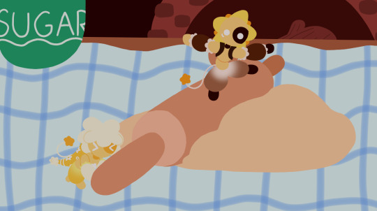
But yeah I was drawing (and I've learned almost every step you gotta save it), and while I was working on the oven & wall of the bg, it glitched & I lost it
And I had it stepped out like this:
Sunbun & Moonpie
Roller
Dough
Sugar jar BG
Table BG
Oven BG
Wall BG
I reached the oven, but started working on the wall at the same time, and it did the thing!!! And since I saved after the Table, that meant 1-5 were all now 1 layer, and I couldn't have a separate bg image anymore, since the sugar jar & the table was meant to be a part of the BG!! Yippee!!!
So yeah, though I'm glad it didn't glitch while I was drawing Sunbun & Moonpie (since I would've just given up then), I'm still pissed.
But that's enough ranting, cus I don't like ranting.
...at least, I don't like me ranting.
#my art#please don't steal my art#Pastry! AU#Pastry! Sun#Pastry! Moon#Sunbun#Moonpie#Sun & Moon AUs#rant#hopefully it doesn't remove the cut (cus it did that once on a post but I forget which one...)
11 notes
·
View notes
Text
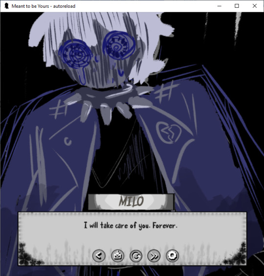
Perfect Love VN Devlog #3
I did a couple more drawings for the mini CGs, but I haven't been very motivated about it unfortunately. The real solution is to stop drawing so much and start figuring out other ways to show what happened. NOT because I'm lazy about it, totally not. That just means more black screens, but there are like almost 100 separate images for mini CGs, so I think you all have been spoiled enough.
I've decided for the main CGs for each ending, I'll mix the last choice (which is related to the color blue or red) into the mix, so for example for this CG, the last choice was blue, so the main color scheme is blue and grayscale colors. Plus I get to work on my lineless coloring/artwork so it's a double benefit to me. I was going to use the Action Editor plugin thing I saw on Visual Novel Design's youtube page, but I couldn't get it to work the way I wanted, so maybe I'll try it again another day.
That being said, I did code in the different name boxes I had for some of the characters. I need about three more of them, one of which is for Milo Pre to fit with the symbolism of eyes and whatnot. The symbolism of eyes is fairly important in the game since most characters don't have "their eyes open" to what Eris is doing. Of course except Eris. Thus the Heterochromia... Sort of.
Okay that being said I did get most of the sprite coding for about 3 of the eight endings (minus the secret ending or the "Perfect" ending, as I will call it), which is of big benefit to me since I kind of just used a bunch of background images for one of them. Don't...don't worry about it.
Also got bored and added in a bunch of things to the code for Mari (specifically you, yes, I'm looking straight at you right now) which you can all figure out whenever I get the game done. It's not super relevant to the story (or so I say, but should you really believe me?) but it is fun to do. I mean, in addition to the OTHER things I hid in the code but don't worry about that, you probably will not remember anyways (except if you're Mari, I say, looking deeply into your eyes).
Hopefully I can get at least threeish more endings for sprites done next week and/or some of the GUI for the save and load pages because THOSE are a huge mess right now because I changed the aspect ratio of the game. Whoopsy Daisies.
Oh and if you want a cameo or something in this game in terms of your name or a nickname you'd use, do tell me. I will add it in and it doesn't take me too long to code in a little message for you. ;3
29 notes
·
View notes
Photo
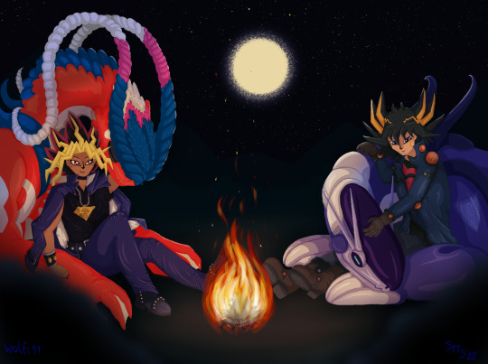
[ID: Digital, lineless fan art of Atem from Yugioh and Yusei from Yugioh-5Ds, sitting around a small campfire, together with Koraidon and Miraidon from Pokémon Scarlet and Violet.
Atem sits together with Koraidon on the left side of the image; Koraidon has its head on Atems shoulder. Yusei and Miraidon sit on the right side of the image, Miraidon rests its head on Yuseis lap.
Between them burns a small campfire on the ground and a full moon shines in the sky above. /End ID]
This took me almost three weeks to finish.
I just wanted to do a quick, sketchy thing because “HaHa, motorcycle Pokémon, HaHa”, but that didn’t work out.
Not only did I do the “shading” for everyone twice (because I, for no reason, decided to put actual effort into Atems shading, which meant I had to go back and re-do everyone else for consistency),
I had to take breaks between every single “piece” (like the jacket, the hair, etc.), because my brain just refused to stay focused for more than that.
But I finished it end after adding some nice “lighting” in Photoshop (because Layer Styles and Masks in Krita are weird, at least for me), it doesn’t look as bad as I thought it would.
Anyway, here’s Atem and Yusei chilling with their motorcycle-dragons.
And no, I still don’t know how to draw humans, but birds can’t ride motorcycles, only scooters.
I also tried adding an Image Description, but I’m bad at describing things, so I’m sorry if I either did it wrong, or it’s not very useful.
#yugioh#yugioh 5ds#yugioh dm#atem yugioh#yusei fudo#atem#ygo#synchroshipping#yuseixatem#pokemon#pokemon scarlet#pokemon violet#koraidon#miraidon#crossover#drawing#fanart
82 notes
·
View notes
Note
I'm totally in LOVE with your art,, artstyle and ALL!!!!!!!!!! If it's not too much to ask could u explain how do u make that glowey-like effect on your art :o?
Thank you!!! To be completely honest, I'm not quite sure what I'm doing that makes things glow but I will try to explain ^^;;
So there are many factors that can go into making something glow. One thing I do a lot is duplicate my lineart layer and use gaussian blur on it. I lower the opacity on the duplicated/blurred layer and it creates an effect like this:

You want to make sure it's subtle, it's very easy to go too far and make the blur too big or too dark! I blur it JUST A LITTLE and adjust the opacity accordingly. Then, after coloring, I almost always add some sort of effect layer, such as overlay or color burn. In this piece I used a lime green color burn layer.

As you can see this can have a very dramatic effect on colors, and it gives color to the Gaussian blur!

In this piece I used a desaturated blue overlay layer, it is hard to tell but it did give the blur a blue tint rather than just black/grey! AND THEN FINALLY, specifically when working lineless, I like to use a procreate brush I downloaded called "Bardot Speckle" in the background behind whatever I want to glow. Make sure the background is dark so the glow stands out against it! Any speckle brush should work. Adjust the hue and opacity until you get the desired outcome.
This trick is especially potent in making things glow! I hope this helps and makes at least a little sense!! I also have explained one of my coloring processes in case that is also helpful in creating glow: https://flandrepudding.tumblr.com/post/698739918734753792/hi-i-really-like-your-art-it-looks-so-cool-im
24 notes
·
View notes
Text
Animation Notes: evolution of the anime girl, part 1
So last week we investigated ways of drawing the human head in a realistic way. Armed with this knowledge, let’s see how to stylise it...
Nowadays, when people speak about ‘anime style’, or an ‘anime girl’, they probably mean a moe design like this:
(That’s Aoi Miyamori from Shirobako, designed by Ponkan8.)
Animators learn to draw this type of design, and various standardised symbolic expressions, in books like キャラの気持ちの描き方 (kyara no kimochi no egaki kata, How to Draw the Feelings of the Characters).
Certain features you expect to see here:
the basic structure is resembles the Loomis head: spherical cranium, jaw coming down.
the cheek/jaw contour is simplifed and comes to a point (or close to it), with an outwards curve along the cheek. There is no major sharp indentation around the eye socket, but there may be a gentle concave curve.
the eyes are very large, with a lot of detail put into the shading of the pupil, specular highlights, and the shape of the eyelashes; the face is balanced around these large eyes so it doesn’t look alien.
the nose by contrast is massively deemphasised to the point of just being a dot in many cases.
the face has almost no structure or shading, so that it’s almost always a completely flat colour.
the mouth is also drawn very small, with no shading or structure applied to the lips; a small shadow under the mouth might be applied.
the neck is very narrow, and meets the head in the centre, so the cranium goes back about as far as the face goes forwards in side view.
the hair is broken up into roughly triangular locks. (the number and position of these locks of hair is actually part of the settei and the animators are expected to keep it consistent.)
the hair has typically three layers of shading: midtone, shadow, and specular highlight. the shape of the specular highlight is part of the design and won’t usually be changed based on lighting conditions. the skin rarely has a specular highlight. the eye could easily have four or more layers of shading.
lines are very thin and even, and may sometimes be broken inside the form - particularly on a closed mouth. the contours of major forms are typically outlined, while shadows and highlights are usually lineless
generally speaking, characters’ heads are much bigger than they are on real humans relative to the rest of the body.
At some point I made a little turnaround based on that book of my best attempt at the time of a moe anime head. here,
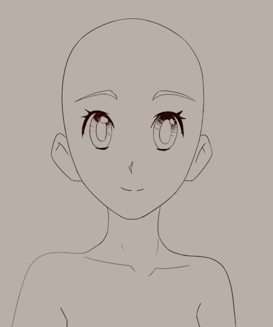
Looking back at this I can see some issues, e.g. with inbetweening the upper contour of the head, but overall this still works pretty well. Maybe soon I’ll try and do a more complex head turn with acting and like... actual hair lmao.
Anyway, this approach to stylisation could be considered something of a ‘default’ in the anime industry, but of course 1. it has evolved considerably over time, and 2. ‘anime’ encompasses a huge range of styles.
We could focus on a number of threads, but in this case, I’m going to zero in on drawings of main character girls in 3/4 view - chosen because these are some of the least diverse not the most, since, male characters tend to be more varied in general, either with more ‘realistic’ proportions or more exaggerated and stylised.
Actually, to comment a little further on that. The ‘large eyes’ stylisation is typically applied to characters intended to have a certain amount of cuteness, so in addition to the familiar genus of anime girl, it is also commonly applied to young boys. We can see this in the wildly popular ufotable adaptation of Kimetsu no Yaiba (Demon Slayer), which in classic shōnen fashion has a young hot-headed boy as its protagonist:
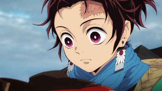
(Tanjiro, designed by Akira Matsushima)
However, as your anime boy grows up into an anime man, his eyes will tend to get smaller, closer to a real size. It’s hard to find another example in Demon Slayer (I couldn’t find anyone scanning the first few episodes) so let’s turn to another anime.
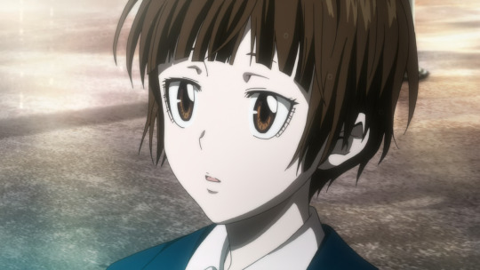
A much stronger of dimorphism example comes in Production I.G.’s anime Psycho-Pass. Here is protagonist Akane Tsunemori, designed by Akira Amano and Kyoji Asano, who has huge eyes with a distinctive shape:
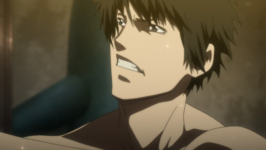
Starring alongside her is Shinya Kōgami, who’s 28 years old, and has much smaller eyes:
and for even stronger contrast, the older Nobuchika Ginoza:
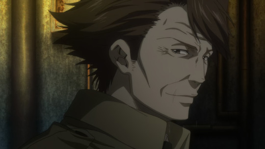
You can see therefore that as a character gets older, their design often (not always) shifts further towards realism: their eyes get smaller, and a lot more lines and wrinkles are added to the face. (The strong shadow under the cheekbone is incidentally a Production I.G. staple.)
Something similar also applies to women; smaller eyes and more structure tends to indicate maturity. Let’s take a different Production I.G. work, Seirei no Moribito; here is 30-year-old Balsa designed by Gatou Asou:
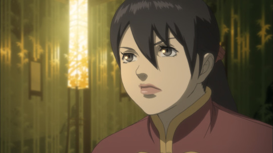
and returning to Psycho-Pass, here is Jōshū Kasei, the director of the police unit, an older woman:
Although the amount of extra face detail isn’t quite so extreme as Ginoza above, we see the addition of lines to indicate the nasolabial fold, and more complex shading around the eye socket.
(Of course, not every anime takes this exact approach. In particular, there are ways of stylising old people which push into exaggeration; Hayao Miyazaki loves doing this.)
Now, this ‘look’ to anime has only been the standard for a couple of decades at most. The styles used in anime of the 1980s tended to look very differen, as you can see comparing Gunbuster (1988-9), with characters designed by Haruhiko Mikimoto...
to its sequel Diebuster (2004-6) a decade later, with characters designed by Yoshiyuki Sadamoto:

This particular shot animated by Ayumi Shiraishi might be a bit looser, simplifying shapes for comedic effect, but one of the differences is precisely the greater willingness to go off-model like this.
Part of the difference is surely the transition from physical, painted cels to digital colouring and compositing, but as you can see looking at the settei above, there is a real difference in feel from the 80s design to the 2000s one. This comes in places like: the shape of the chin, the use of hatching, the general feeling of the shapes (more rounded in the 80s), the bulk of the hair.
So, where did the ‘anime style’ come from? Let’s trace its evolution across the entire duration of anime, in a manner similar to Kimi Rito’s ‘expressionist’ approach in The History of Hentai Manga. Of course, it would be impossible to comment on every anime ever made, but I’d like to find representative examples of most of the major styles used in the industry in their respective eras.
The Very Dawn of Anime
Japanese animation (whether or not we yet consider it ‘anime’) is pretty much as old as animation itself, i.e., started in the beginning of the 20th century.
Famously, Osamu Tezuka got the ball rolling on TV anime with Astro Boy, but prior to him there was a reasonable amount of film animation, and prior to that, short film animation. I believe the oldest known Japanese animated film is Namakura Gatana (1917) by Jun’ichi Kōuichi, a short film about a samurai with a blunt sword, in a cutout animation style looked like this:
Naturally this has little resemblance to any of the future styles that became known as ‘anime style’. To me it calls to mind a little ukiyo-e artists such as Sharaku, but also presumably shows the influence of international animators like Émile Cohl. We’ll skim over those first few experiments though - please read about them here if you’re interested!
In contrast to later styles of anime we’re going to cover, here the balance of features is essentially opposite with a large jaw and mouth, reduced cranium, exaggerated forehead. I’m not going to draw a study of this one.
1930s
Unfortunately many of the films of the 1920s are lost, so it’s difficult to comment on them. So rolling the clock forward a bit, we can observe one interesting example in Benkei tai Ushiwaka (1939), a fantasy/mythological film that came in a period when animators were largely required to make propaganda films for the nationalist government.
So here’s Ushiwaka (Minamoto no Yoshitsune); there’s no credited character designer but presumably the design is due to Kenzo Masaoka, the director of the four-person team. (He and his wife also did the voice acting.)
What influences this design? It’s hard to say without a much deeper familiarity with Japanese art history at the time. We might see the influence of Fleischer; at the time Japanese animators were competing with foreign productions by working cheaply (la plus change...), but American animations were widely shown, so no doubt Fleischer and their contemporaries would prove an influence - particularly in the animation itself which uses a lot of loops in the same way as Fleischer. And, indeed, in this film, Masaoka was experimenting with pre-recorded sound to follow the American method. Regardless, we’re here to study faces.
So here’s an attempt to copy Ushiwaka; no tracing, etc. I picked this character because he seems the most similar to future anime designs.
The way I broke this down is a kind of wedge shaped head (like a Loomis head), which I indicated with dashed lines, and then cheek chub added on to make a rounder head shape overall. The overall contour has a slightly thicker line weight. The forehead seems very large here, and the eyebrows faced very high, bc he’s a historical monk etc. etc. The big difference is that the eyes are simple and haven’t been drawn very big, and the way the nose is drawn.
Looking at the designs in this film, it doesn’t look exactly like any Disney/Fleischer characters, but I do think it shares a bit of a design sensibility with Disney of this era (notably Snow White).
Beyond animation, the other major cultural presence of illustration would be kamishibai paper theatre, where performers would show illustrated cards to a accompany oral storytelling. It’s a little difficult to find examples of kamishibai boards dating back to the 1930s, but here’s one I found in this article from a kamishibai called Cry of the Andes (アンデスの叫び Andesu no Sakebi) originally sourced from Manga Kamishibai by Eric P Nash.
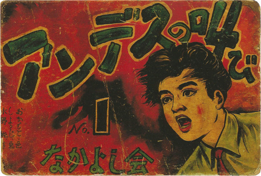
This has a painted style that resembles American commercial illustration in the same period, though notably the face is quite flat and without much shading away from the eyes, or the use of line weight under the nose.
1940s
After Snow White proved that an animated feature film was in fact possible, other countries jumped on in. So the first feature-length Japanese animated film - a propaganda film - came during the second world war.
(In fact, as an aside, Japan’s animators were beaten to the feature film punch by the Wan brothers in Shanghai who completed Princess Iron Fan under Japanese bombs! Animation Night 29 - that film may be watched here on the Internet Archive, though sadly it’s quite a rough print.)
In this period, the fascist government was exerting severe control on art, but also throwing a lot of money at those animators willing to play along and make propaganda films. That takes us to Momotaro: Sacred Sailors (1945), the sequel to the 37 minute Momotaro’s Sea Eagles (1943). It centres on the folk character Momotarō who had been increasingly appropriated as a nationalist symbol, portrayed as a soldier in the Imperial Japanese Army/Navy, since the First Sino-Japanese War.
This one uses mostly anthro animal characters, and features for its time extremely sophisticated animation of war machines, and generally a high drawing count. Shōchiku made a 4K print of it (complete with big disclaimer at the beginning) which can be viewed on Youtube here.
The actual character designs are very simple - perhaps even more so than Ushiwaka above. Very rounded cutesy shapes - an early instance of cuteness being used to promote imperialism and war I suppose. This character is a monkey, but we can look at them a bit like a human still. The face is very flattened: the overall head shape is two curves connected by straights. It’s kind of like a lego head.
Momotarō is mostly relevant because of the influence it had on later animation. Notably, a young Osamu Tezuka saw the film in 1945; WP unsourced writes:
He later said that he was moved to tears by the movie's hints of dreams and hopes, hidden under the appearance of war propaganda.
The staff on the film included Kenzo Masaoka, director of the above discussed Benkei tai Ushiwaka; most of its staff (quite a small list!) had a limited career in subsequent anime.
Kamishibai also took on a militaristic tone during this period, such as Kintaro the Paratrooper seen here:
I don’t have the evidence to really document whether the difference in style from the previous example represents a general trend, but these illustrations are a lot simpler and more graphical.
In 1945 of course Japan lost the war and the country came under American occupation. US comics, films and TV flooded into Japan, and this kicked off an explosion of manga creation - indeed, the definition of manga as an art form. So this is where our history really begins.
Next time: early manga, Toei’s films, the styles of Osamu Tezuka and Go Nagai, and the first steps towards more complex designs...
62 notes
·
View notes
Text
Commissions~
*Hello! I'm currently between jobs and actively looking, but no luck yet. The household is pretty hard up on funds right now and any additional income would be so very very helpful, especially with student loan repayments kicking in this month ;w;
*Regardless of the type of commission, I will gladly work with you throughout it and give updates/the opportunity to make adjustments if you would like!
Drawn
*The examples below range from about $4-$40 USD, ordered most to least expensive, all are based on complexity and time to complete. Prices are open to negotiate prior commitment, and can be made in multiple payments if needed! (some examples are a bit old)
*Anything that’s a meme or I highly enjoy the concept of doing is up for a potential discount :3
*If you’re interested, feel free to message me here or send me an email at [email protected] (anon asks are also enabled)
*Trigger Warning: One example has light gore/blood
________________________________________________
TRADITIONAL

~approx $35-$40 USD
________________________________________________

~approx $15-20 USD
________________________________________________
~approx $5-10 USD
________________________________________________
DIGITAL
________________________________________________

~approx $20-30 USD
________________________________________________

*approx $15-20 USD
________________________________________________


*approx $4-10 USD
________________________________________________
*NOTES -
*I can do lineless digital, but I’m not as practiced with it
*Traditional commissions will be scanned(or potentially sent in actual mail) for optimal quality. More colours/subjects will cost more
*Digital drawing is all around easier for me, and in general will be cheaper than an ‘identical’ traditional version would be
*As mentioned above, anything that’s a meme or I highly enjoy the concept of doing is up for a potential discount, more fun means its less taxing which means i can drop the price a little <3
*Will Draw:
-OCs
-AU characters
-Animals/fursonas/anthro
-Mecha
-NSFW
-Rough/simple animations and gifs (we can talk..)
*Won’t Draw anything:
-Explicit underage
-Discriminatory
-Taking place in hospitals/based around illness
*You can view more of my drawings at my DA Gallery or, for less polished but more religiously updated posts, here
________________________________________________
Written
*I always read a lot in school, and over the years that turned into writing stories. I have a few fanfics running currently, but any commissions would be given priority
*Thinking $5 per 500 words? May adjust depending on complexity/any needed research/longer pieces
*I’ve found I write best with fantasy genres, but you can absolutely commission something else! Some things you may want to consider:
-Is it original or fandom based?
-What point of view do you want? First, second(reader inserts), or third person?
-Past or present tense?
-Old timey speech or modern feel?
-Fluff, feels, something in between?
-Where are you in the spectrum of “can you relay enough information about what you want that I won’t need to overly interpret/fill in gaps myself” and “do you have an end goal or outline, and want me to make the rest happen” ? In other words, how much of this do you already know you want, and what if anything are you willing to let me interpret as the writer?
*Some excerpts:
First person
The brambles and lower branches suddenly appeared much denser than when we’d come from the other direction, and I kept as much distance from the two of them as I could. Their incessant arguing was still discernible, but not overly so.
We took our new torches–which seemed a little brighter than they should have been–and set off continuing our search for tracks, holding the fire as close as we dared to any brush and leaves that were near the forest floor. The quiet pulsing of the place at night was almost unnerving, and much different from our campout the evening before. Unseen critters chirped to a rhythm we outsiders weren’t aware of, falling silent if we at any point passed too close to them.
The eerie limbo was broken when I suddenly noticed a light coming toward us, followed quickly by Dagger who swooped low and squawked into my ear.
I batted him away and asked Dex if the light was Sara, but felt I already knew the answer.
“No,” he confirmed, squinting at it in suspicion.
________________________________________________
“Clariiisaaaaaa!” Sara shouted again, her voice tumbling across the vague grassy mounds that just barely made the classification of ‘hills’. “Clarissa!“
“Quiet down,” I finally warned her. “There’s more on the prowl after nightfall.”
She spun around to glare at me. “You say that like I don’t know. It doesn’t matter we have to find them.”
“We’re not going to find anyone if we’re dead.” I countered.
“Well what if they’re dead!?” she shouted.
I was a little taken aback at the sudden outburst, almost snapping at her in turn but pausing at what looked like a faint shimmer in her eye.
________________________________________________
It began to rain soon after we entered the wood. Drops fell in a constant, distant thrum on the leaves above, and it wasn’t long before a chill settled in around the trees. Heavy dampness filled the air as the rain increased, making its way below the canopy to turn patches of the ground to a sticky mush. I’d hastened my pace twice already, and the rain still continued to thicken. Mini waterfalls poured down here and there where the foliage had positioned itself just so, and the aftermath was sent streaming between roots and stone along my path. I gave up trying to keep my boots dry and went as quickly as I dared, careful with my step to avoid sprawling in the dirt.
________________________________________________
Reader Insert
There’s a soft *ping* and your body is suddenly overwhelmingly heavy, but luckily something else is holding your weight. You feel yourself rise a little into the air before being pulled forward, through the screen, through the words, through the space between, through the Barrier…
Into the Underground.
You notice you’re staring the ceiling. But not just any ceiling, New Home’s. And there are two faces looking down at you.
"ARE THEY OKAY??”
"they’ll be fine. just–“
"SANS,” he warns.
"a little down.“
"NNNNGH!! SANS YO–! HUH?” Papyrus turns to look back at you, as you’re practically dying of laughter on the floor.
You’re here! Actually here! They are talking and joking and breathing right in front of you…the skelebros, in the flesh heheh.
You tilt your head so you can Sans, tears in your eyes as you have a little difficulty breathing. He raises an eyeridge and grins a bit more than usual.
"it wasn’t that good of a joke…i like ‘em.“ he says lastly to Papyrus.
The younger brother mumbles something and reaches down to help you to your feet. Though they always seemed small, especially when younger, the monsters are around the same height as you. You wonder aloud how tall the king and queen must be.
________________________________________________
You freeze at the deep, rumbling voice approaching. Solid footfalls sound closer and closer still, and you find your gaze drawn to the large figure coming down the hall. You’re overwhelmed with the details. The apparent thick softness of fur, curved smooth horns threatening to reach the ceiling, and impossibly violet robe that drifted behind his gait.
"Oh, Howdy! Boys you should have told us you had, a…guest,” he stops, sudden distress plainly visible in his expression.
Your blood runs cold as you realize, you must remind him of them. He thinks you’re–
Chara?“ he falls heavily to his knees, tears streaming around his muzzle. His eyes search you over, filled with guilt, hope, disbelief, so many different emotions almost simultaneously. Papyrus runs up and tries to comfort him.
You lower your eyes and faintly shake your head, saying you’re sorry but, you’re not them.
The haze that you and the skeletons hadn’t noticed before returns to his expression. He squeezes his eyes closed and inhales deeply before looking back at you again.
"I, forgive me … what is your name?”
You find it a little difficult to speak, but manage to give him your name.
He smiles. “It is very nice to meet you.“
________________________________________________
Third Person
“Oh, oh dear.” Alphys was staring at the base of the chalkboard with a frown. “Has anyone seen the chalk?” She held up the stub end of one. It had an odd jaggedness on one side. “This is all that’s here…I’m certain there was still have a box left,”
No one answered, and Frisk certainly didn’t know, so they kept quiet as well.
The class crawled by about how one would expect it to. No one seemed particular enthralled by Alphys’ teaching, except for the girl in the front row. The bird Frisk was behind was ‘too smart’ to pay much attention, unless there was a point he wanted to argue. MK had a bit of a short attention span, and Temmie as well, but she seemed to be trying very hard. Probably wanted to get into a good college.
At some point in the lecture, Frisk stopped taking notes and looked through the pad of paper that had been in their desk. It had haphazard quotes and diagrams, some dated and some not, with some days considerably more organized and thoughtful than others. Frisk turned to the back and flipped the book around, making a new beginning to it. They started penning all their observations. Differences and similarities, people that they’d recognized, and every explanation they could think of that might be true of whatever had happened to them.
There wasn’t much in that column.
Before long a semi distant bell sounded, and Alphys released everyone for lunch.
“Is ours broken?” Frisk wondered aloud.
"Yo, you don’t remember?“ MK asked. “Susie totally busted the speakers last week! They still haven’t been able to fix it yet.” MK cocked their head. “Yo, Kris, you okay dude?”
“Fine,” Frisk answered briskly. “I um, I gotta talk to Alphy.”
MK raised an eyebrow and gave a tiny nod. “Uh, OK, sure…see ya.” They trotted off after the others to what Frisk assumed would be the cafeteria somewhere.
Frisk stayed in their seat a moment, wondering if this was really the best idea. Alphys didn’t seem to recognize Frisk as themselves either. And if they told her everything…they carefully closed the notebook and flipped it back the other way, then made their way to Alphys’ desk.
________________________________________________
The boy’s dark, messy hair completely shrouded his face from view at his stance. He stood behind one of the chairs, his head slightly bowed, gripping the back of the furniture as though it were his only lifeline to reality. The elder prince closed the gap between them with a few strides and put a hand on the boy’s shoulder.
“I…“ he trailed off, suddenly realizing he had no idea how he could begin to comfort him. “I am not sure, what to say–”
“There is nothing to be said.” the boy interrupted, his words strained. He didn’t look up. “If I had not been born, you would all have rest now, to live normally upon the morn. Mother would really smile again. No one wou–”
“It is not your fault, brother.” The eldest countered firmly. “You know the rules…If not you, then someone else, it has naught to do with you yourself. We all were chanced to be a part of it as equally as any other. This was none of your doing.”
________________________________________________
A certain heavy, comforting quiet hung in the air. Stillness that was enhanced by the soft hum and crackle of the flames. Sans and Papyrus had both fallen asleep before the fireplace amid the excitement, much like the first day they had arrived. Toriel had woken early, along with her husband, and was now reading in her armchair.
There was a knock at the door.
Papyrus sat up quickly, eyesockets half closed. “WH-HUH..?” he looked up at Tori, who’s eyes were crinkled in quiet laughter, and suddenly realized who the knock must be. A tiny gasp escaped him and vaulted off Sans, to mild protest, running down the hall toward the door. He tried stopping but had too much speed and slid past his mark, scrambling to get back to where he’d tried for. Papy gave a little jump and pulled the handle down, staring up in awe.
“Ho ho howdy little one!” Santa laughed heartily, fully dressed in his red and white outfit and with an old sturdy sack over one shoulder.
Papyrus’ eyesockets were practically sparkling. “S-SANTA! SANS!! SANTA HERE!!” he ran forward and grabbed Santa’s large leg, hugging him tight.
“wow. sure has a presents.” Sans offered, coming around the corner. He gave a stretch popped a few bones. “snow real surprise, though.”
________________________________________________
Thank you for considering and looking over the page this far! Feel free to contact with any questions, and stay determined <3
#just me#commission#commissions#support#i been outa work for 6 months now and currently relying on friends to support me ;w;#prices can totally be open to negotiation i just had to put something on them lol#sorry for long posttttt#job searches are a fucking joke rn#undertale#eddie munson#stranger things#atlantis#grillby#fullmetal alchemist#hollow knight#if youre unsure feel free to message anyway! i dont bite i promise#i appreciate everyone who wants to but doesnt have the funds<3#ive been in that same boat for years there are so many artists way more talented than me that i wana support so bad ;w;#anyway baiiiii ly
3 notes
·
View notes
Text
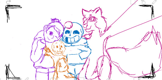
Deltaswap is cringe (I don`t think so)
I started drawing this lineless piece a long time ago, but I finished it only now.
On this art I drew one of my main headcanon that Lancer from Deltaswap is still the Jack of Spades. Initially he disguised himself as a club for his own safety as the son of deposed Spade King. Later Lancer began to hold a grudge against his father for 'not even trying", what led to his bias towards his own suit...
He wasn't part of the legend in the first place, but he put himself in the role of the "Prince of Darkness" to feel like he had purpose and meaning in the history of his dark world. Also, he didn't think that the prophecy itself is strict to follow, but it didn't save him from stressing out about the possibility of him messing everything up.
So Lancer thinks he is more fitting on the role of the Prince from the Dark then this uneducated carefree Ralsei. He often gets jelaous when that Goat-Boy gets closer to the Lightners. Lancer is afraid to be replaced and to be useless, but he doesn't let himself get out of control because of his own thoughts and emotions.
By the way! Lancer doesn't give Susie the manual at the start of her journey. He uses his magic book himself to be able to cast spells out of his natural abilities as a card. Also Lancer truly knows a lot because he spend most of his life in the abandoned dark-castle and its librarby where the most of the ancient knowledge is contained. So he is useful in certain situation even if he is not originaly written in the Runes of Delta.
At the end of the first Chapter Lancer confesses in his lies, because for him it seemed that he was at fault for Lightners almost dying in the battle with Rouxls. But I think that heroes do not blame him nor think that he is bad. At least I would like them still being good to the bouncy boy, because he really tried his best.
I don’t know how much Swap!Susie is uncomfortable being around him... From the second chapter it was clear that Kris doesnt have really warm feelings towards Ralsei. So I still need to think about Swap!Susie and Swap!Lancer relationship.
I personally think that Swap!Lancer sees in Swap!Susie the mother figure that he never had or at least as an older sibling. Therefore, he is strongly attached to heroine and tries to be good support for her. But what is in Susies heart is not yet known.
---------------------------------------------
My interpritation of Deltaswap AU is actually a mixture of the ideas of other two authors and my own. I hope it will not be comsidered as disrespect nor plagerism by their fans because I respect their original creations and I do not claim to be fully original.
Lancer's original Deltaswap design was created by cuchufliqwq, but I added blue gloves and boots to it as the original colors of the Spade suit. Also I want to say that I was inspired by @admiral-yasen-hurtc and hers 2019 drawing of my headcanons.
Deltaswap Susie is fully designed by me.
#ShuraBibertush#Bibertush_Deltarune#Bibertush_DeltaruneAU#Bibertush_Deltaswap#deltarune au#Deltaswap#digital art#art#doodle#digital drawing#fanart#lancer#susie#swap!lancer#swap!susie#swap lancer#swap susie#deltaswap#ds!lancer#ds!susie
42 notes
·
View notes
Note
I’m sure you hear this a lot, but your art style scratches my brain in just the right way, I’m just obsessed with your colors and lineless art style. It just looks so soft and sweet, like what holding a stuffed animal feels like. Whenever I see your art it fills me with so much serotonin and makes my heart feel so full!!🥰 It just nestles its way into my brain and I can’t stop thinking about it. Soft Beef Adrien has rotted it’s way into the deepest recesses of my brain and makes me smile when I think about it!
But what are the inspirations for your art style or how did you come into drawing the way you did?
IM SO GLAD I CAN SPARK JOY!! i Love to hear things abt myself and my draws bc my ability of self perception is about NIL (the other day i told my friend that like i know OBJECTIVELY its not tru but i FEEL like i dont have a personality and that i dont have like. a Style. im just BLAND. anyway he laughed uncontrollably so). i THRIVE off validation so im eating this ask
inspirations tho uh........................................ a HOT MESS STEW OF EVERYTHING I ENJOY I GUESS!!! i have a lot of shoujo manga elements bc i love everything to be feminine, but id say specifically my BIGGEST influence on that front has always been princess tutu. tbh i have a decent shoujo to shounen influence scale, so in equal measures itd be princess tutu (v shoujo) + immortal rain (shoujo from a shounen lense, a good mashup of both styles) + eureka 7 (okay tbh e7 is shounen thru a shoujo lense and is p feminine in terms of shape n form n whatever. nevermind i am influenced only by girly shit) + also bruce timm's style lol (the ROOT of my DORITO SHAPE SHOULDER TO WAIST RATIO preference).
i REALLY like geometric and simplified shapes and a lot of that has been influenced by the BARE BONES programs i gravitate towards. i am just really into economy of shapes and rationing of EFFORT, so lineless is like my fav thing to do bc it is absolute easiest to block out shapes and not bother with a sketch or anything, so thats probably what has influenced HOW i draw the most?? this means i am LAZY is what i am getting at here. i am the most CUT CORNERS bitch i KNOW. almost everything i do is done w the mindset of WHAT CAN I DO TO GIVE MYSELF THE LEAST AMT OF WORK POSSIBLE. HOW LAZY CAN I BE. this is probably the single greatest determining factor in the how and why of my STYLE DEVELOPMENT
#sorry i just woke up from 3hrs of sleep after a 13hr shift so idk if im making sense#kels talks#I FORGOT TO SAY FUCK YES IM SO GLAD I CAN SPREAD MY SOFT BEEF ADRIEN AGENDA
27 notes
·
View notes
Note
for the art ask!!!!! 7, 8, 13, 19, and 20!!!!
HEHEHEHEHEHEHEHUEHGUOGRSHG
7. show us a WIP

you already just met him like.... an hour ago but!!!! akira!!! my boy!!!!! and his stuffed raccoon dog poko who is also his best friend!!!!!!
8. what's the most fun and the least fun parts about your process
most fun is definitely coloring!!!!! i love slapping colors on the canvas and seeing what works and then shading it is like a brother to me
and then my least favorite is lineart bc i am Not Good with even lines but i also don't have the patience to learn lineless art so by god am i redrawing the same line five hundred times in a row!
13. how long do you usually take on a piece
depends on how motivated i am tbh!!! it could take anywhere between about a day to literal months (that does remind me that i do have a piece that i have been working on for several months and would like to finish within the year oh shit)
19. how often do you draw
oughougfhuosd i doodle almost every day and i sit down and try to draw every day but college is kicking my ass and my attention span has taken a major hit so it's usually every other week that i actually start a new piece orz
20. a piece from this year that you're really proud of
okay so i have three that i am very tied between THREE TWO ONE GO
first we have Girlboss doing Girlboss Shit(TM) and i like how i did the colors turned out on this one :3
i'm very proud of how the angle on this one turned out!! and also the rim light, i fucking LOVE how it looks
and finally!! macaque!!! i think this piece is the first time i've dipped into furry art and it is very fun, i do really like drawing guys who happen to also be animals!!!
6 notes
·
View notes
Photo

it’s the gals!!! I went through a Moment the other day and drew a whole bunch of my OCs in this (REALLY cute) lineless art style, and took the chance to play around with colors on those redesigns I posted a few weeks ago, and they look really nice actually? I’d love to get around to redesigning and drawing the rest of the cast like this sometime, when I get the chance. Sayara in particular came out so cute, it almost makes me feel bad about the things this story puts her through...
This is really more of a Book 3 design for Sayara, she’s not nearly this formal or shiny in Book 1, but I have made the executive decision that I don’t care.
Fun details to note: Sayara has a rose motif on her lapels, which you can also find in some other portraits I’ve made of her--the fairies have color associations that are punch-you-in-the-nose obvious, but they also have associated flowers, which is a bit harder to notice because it mostly only pops up when I happen to remember it. I use blue roses for Sayara, because they’re not found in nature. They’re only around due to the simple human determination to create something never seen before. Given various things about Sayara both established and spoiler-y, that symbolism really fits--she is all about doing the impossible.
I also like the visual contrast between Sayara and Violet--Sayara’s design, despite focusing around her diamond emblem, is very smooth and bubbly. Her epaulettes almost serve to soften her shoulders as much as they emphasize them, and pretty much all of her corners are rounded off. And then Violet on the other hand is sleek and sharp, with those severe angles to her shoulders, and even though her associated symbols and shapes are mostly composed of round ovals and crescents, she has a way of making them seem almost threatening. (At least, I think she does, and that’s what I was going for.) Violet’s a potential ally, but also an established enemy and an undeniable threat--so she gets to be a little intimidating, and I love that for her.
#taz draws things#feilan#sayara#violet#i REALLY really really love this sayara portrait#look at her you can FEEL the sparkles#it's undeniably a book 3 design... the yellow in the eyes and the crown prove it... but whatever#spoilers are fake we can have a little gold on the gal#love how sayara's gold accents represent starshard AND status AND her connection with aelia whose totem is yellow...#sometimes maybe i'm good at character design?
3 notes
·
View notes
Text

Art vs Artist ‘22!??!??? ((I’VE NEVER DONE THIS BEFORE))
Is this technically a face reveal? Have I ever revealed my face on Tumblr? I have no idea. Regardless, here I am now. In the flesh. With several pieces of art I’ve posted this year.
Looking back at the art I’ve made this year, I’ve come to an immediate conclusion… I need to start posting more shit I’ve made because goddamn some of the stuff I’m actually really proud of but just never post it for whatever reason!!?!??
Some of this art you might not recognize because it’s posted exclusively on my Twitter! It’s not because I want people to follow both my Twitter and my Tumblr. In all honesty it’s because I’m inconsistent LOL
I think this is the year that my art took the biggest leap in terms of quality. For the first time in a while I’m genuinely happy with what I’m dishing out, and spending a lot more time on each piece than when I used to rush through everything only for it to come out lukewarm in my eyes. I’ve absolutely rekindled my love for doing lineless work, but also developed a new style of lineart. Well, a couple, to be fair. unfortunately, I have not really made any traditional art this year. I feel a little guilty about that, but regardless, at least I am drawing, even if just on my phone and with my thumb.
((oh yeah. I do this all on Phone. I don’t use a stylus. I just use my thumb. For whatever reason people are always really surprised when I tell them this.))
What’s also really cool is that this year, it’s been a year ((and almost a half)) since I parted ways with my manipulative ex!! It’s been really freeing since then, even though a lot of the trauma is still present. But hey, if he’s reading this somehow, all I can say is this; I did it all without you. And I couldn’t be happier.
Seriously though. Even though I am a pretty small artist in terms of everything, for those who stuck around. Thank you. Here’s to an amazing 2023!!
#the kiwi speaks#artvsartist#artvstheartist#artvsartist2022#face reveal#((I think))#seriously. Thank you to everyone who’s stuck around.#and thank you to all of my friends!!#and most importantly. Thank you to my girlfriend. I couldn’t have done it without you.#The Kiwi Draws
2 notes
·
View notes
Last Seen Blogs
rerta
Child of da sun

bigmoneyshave
It's a Bald world Afterall
she-who-reads
Fifi
jho-knives-blog
JHO-KNIVES.com
echoooo000
My Silly Hyperfixations